Minimalist kitchen ideas – 10 simple schemes for the modern home
Minimalist kitchen ideas do not have to be stark or sterile. Here's how to create the perfect pared-back scheme
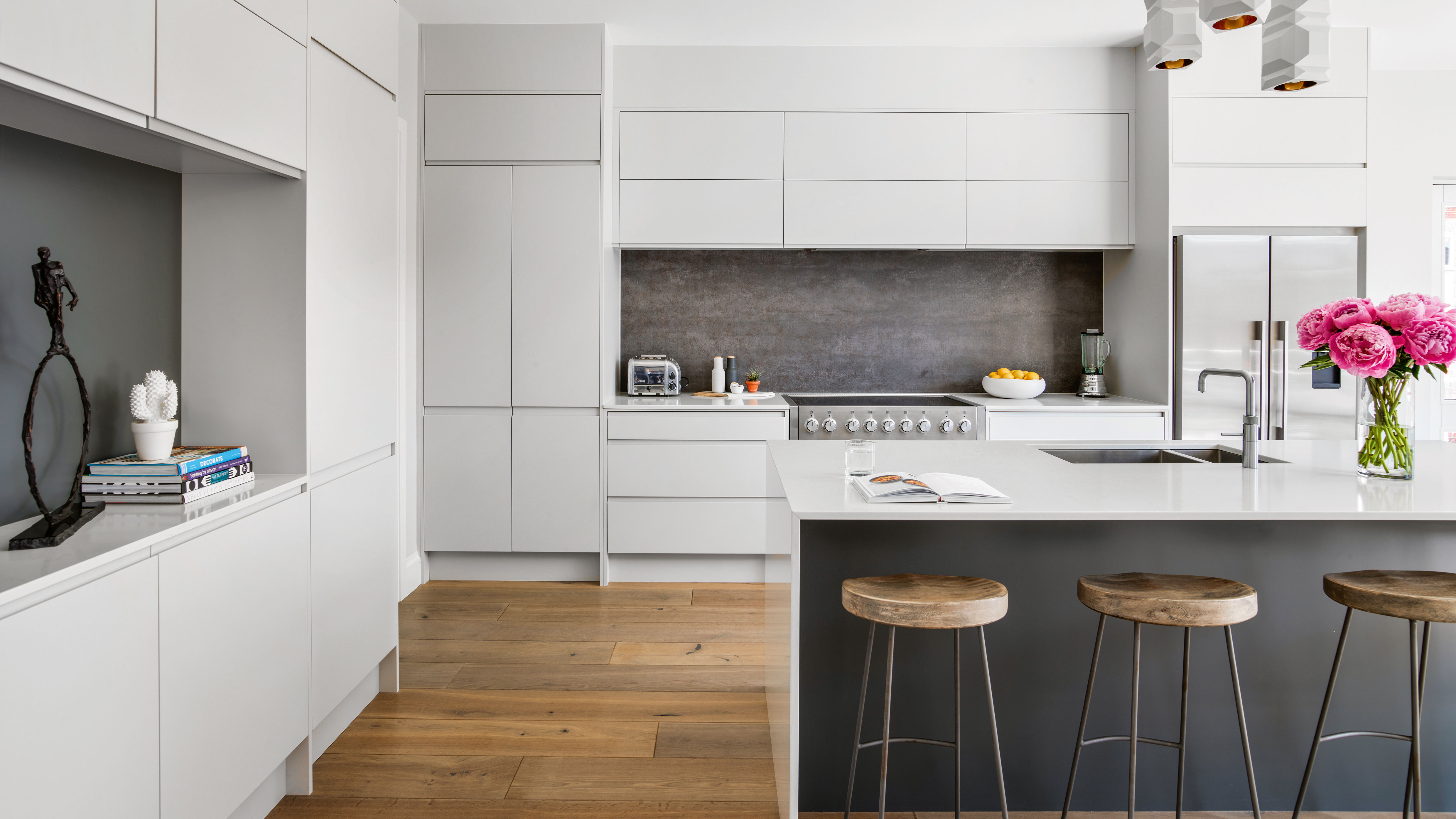

Minimalist kitchen ideas are everywhere on social media and when it comes to interior design and kitchen styling, less can often mean more.
With busy modern lives, homeowners are now more aware of their decorating choices and aim to find a balance between streamlined minimalism and luxurious comfort for their kitchen ideas.
But what is minimalist kitchen design, you ask? Minimalist kitchens are rooted in the principle of ridding this multi-functional space of unnecessary clutter. It is also about harnessing the power of a 'clean' space that features only a few meaningful, cherished items that spark joy – and usefulness. This design philosophy also centers around a sustainable, practical and more efficient way of living.
Minimalist kitchen ideas
‘Modern kitchen ideas are becoming more obviously functional – with little or no decorative detailing,' says Keith Atkins, Design Space London. Instead, their style derives from simple, architectural lines, the sheer quality of the engineering and the materials used.’
1. Go for an all-white kitchen design
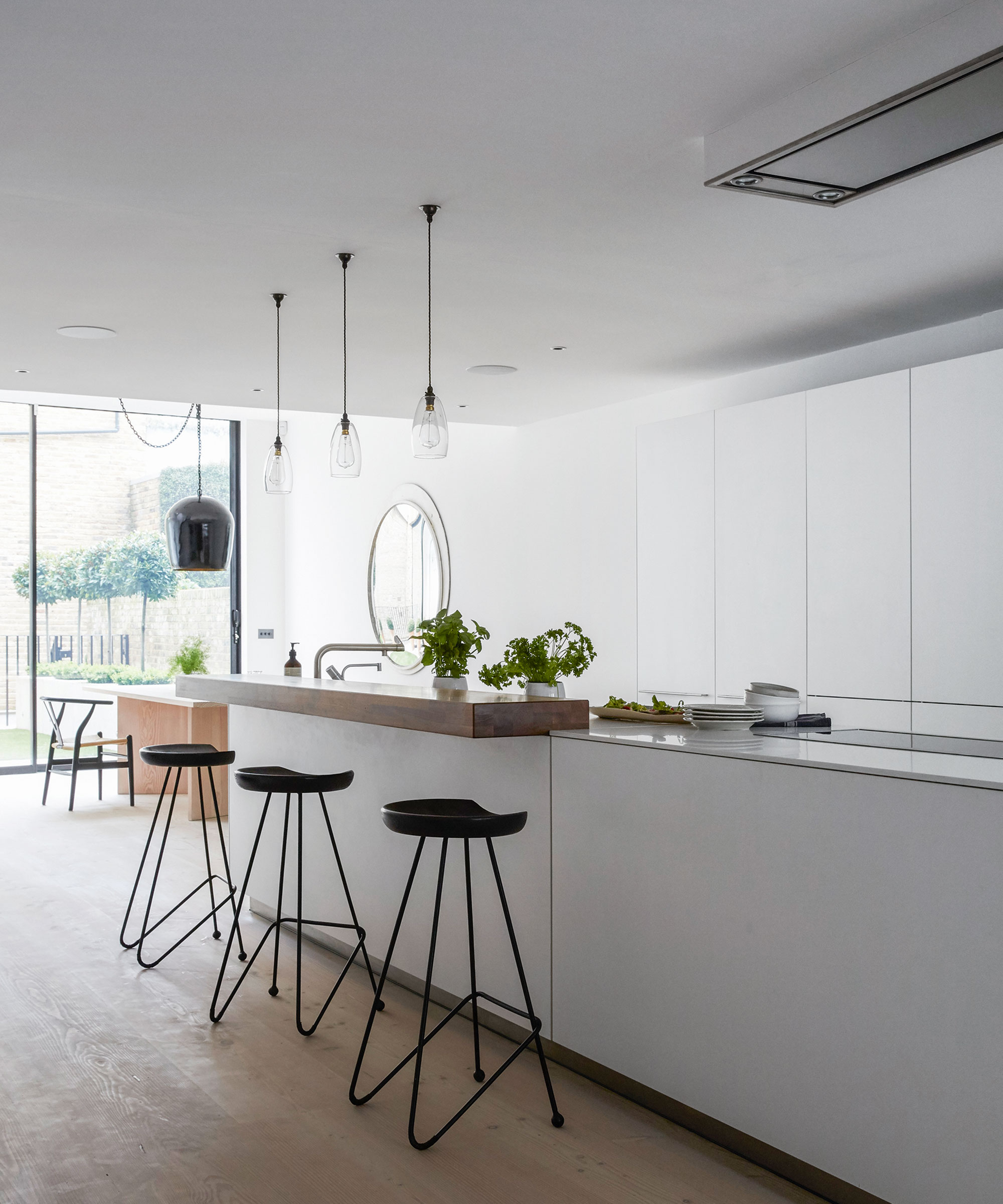
Minimalist decor and white kitchen ideas go hand-in-hand, so it pays to keep your color choices simple, understated and fuss-free.
There’s nothing cleaner or crisper than a pure white kitchen; whether that’s a modern kitchen design or a cozy country scheme, it’s a look that lasts, no matter what the latest kitchen trend may be. If you’re minimalist at heart and love clutter-free kitchen ideas then this is the look for you.
2. Focus on beautiful materials
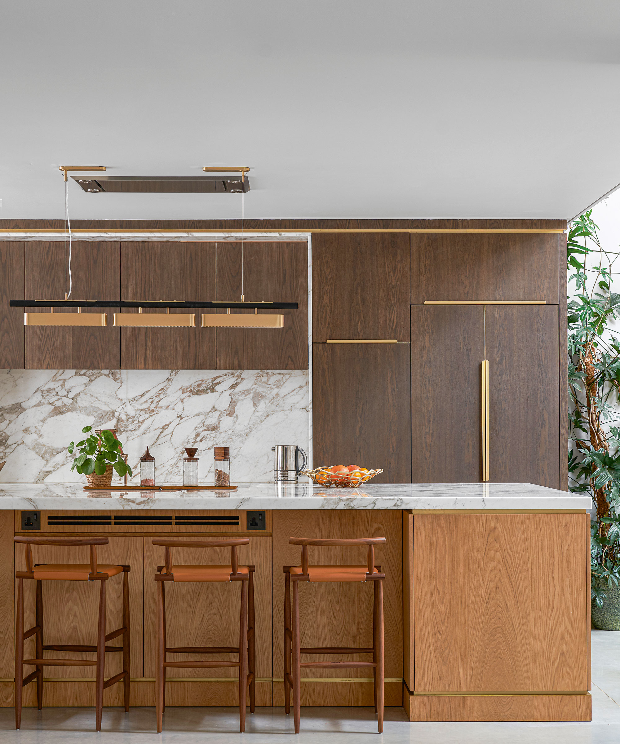
Marble radiates effortless style but going beyond crisp white Carrara can speak volumes. Colored stones have exquisite patterns and can be used for worktops, cladding and backsplashes to add texture and personality to your scheme. Marry with understated cabinetry so that the overall look is decadent yet maintains a minimalist edge.
To avoid the space looking too cold or clinical, add warm metal finishes like gold, brass and copper and introduce some wood on the floor and kitchen cabinets to dial up the visual interest.
Luxury finishes will always command attention and look particularly striking in a minimalist kitchen setting, fusing cabinetry with couture. Contrasting textures are key, so mix different surfaces to strike the right note.
3. Take inspiration from Scandinavian design
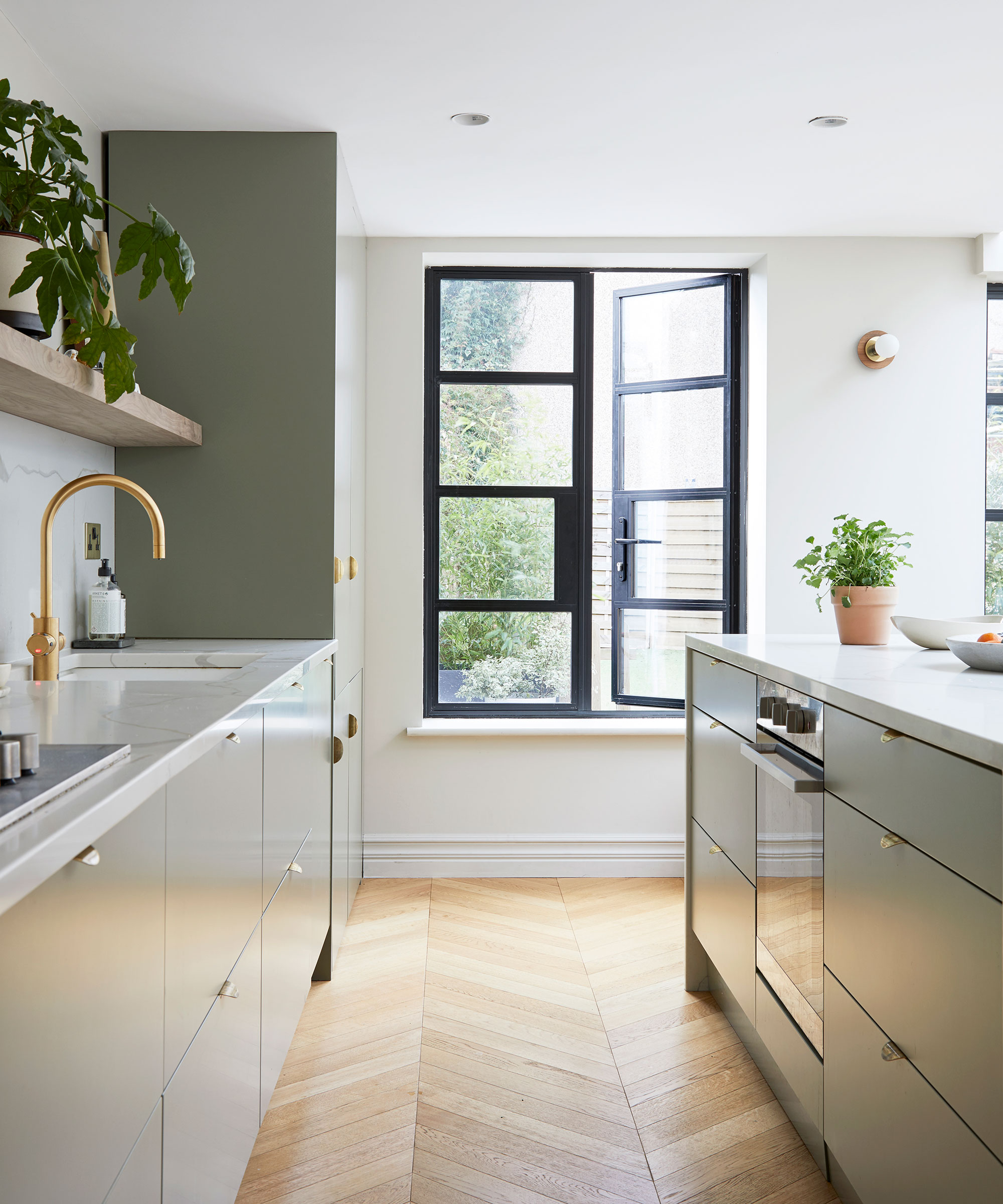
Scandinavian kitchen design is distinctive for several reasons: pared-back, minimal, uncluttered spaces – and a winning combination of form and function create aesthetically pleasing, yet practical kitchens.
Adopt Scandinavian design principles to create a minimalist kitchen that is focused – and features only a few meaningful and cherished items on display. Rarely will you see an abundance of clutter in a Scandinavian scheme. Instead, expect to see clean lines, modern color palettes and a focus on bringing the outdoors in through the use of materials found in nature.
The main purpose of Scandinavian kitchen is to improve daily life. Therefore, practicality is key for kitchen ideas, and the shape you select should be able not only to accommodate your lifestyle, but enhance it.
4. Make every inch count
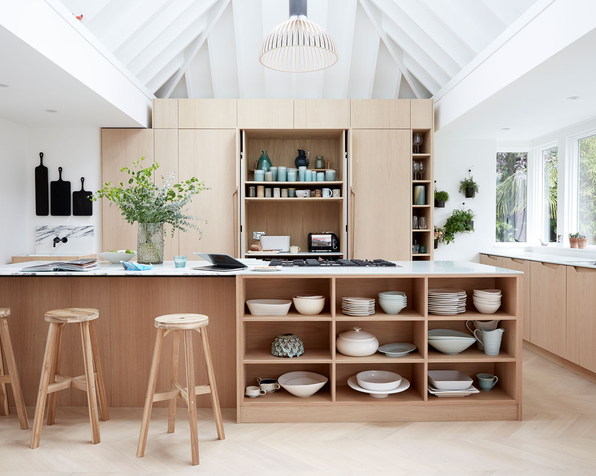
With the kitchen coming under increasing pressure to perform a variety of crucial roles, a good kitchen layout and adequate storage are more important than ever, especially in a minimalist space. Efficient kitchen storage ideas should be a priority when it comes to planning minimal kitchen – no one wants a hectic space after all.
To break up a large wall of kitchen cupboard storage or a kitchen island, it is a good idea to use a combination of closed and open solutions. 'Items such as cherished ceramics or less frequently used vases can be placed on open shelving to be enjoyed when not in use, while delicate glassware is best placed in closed cabinets,' says Jane Stewart, design director at Mowlem & Co London.
5. Go for monochromatic scheme
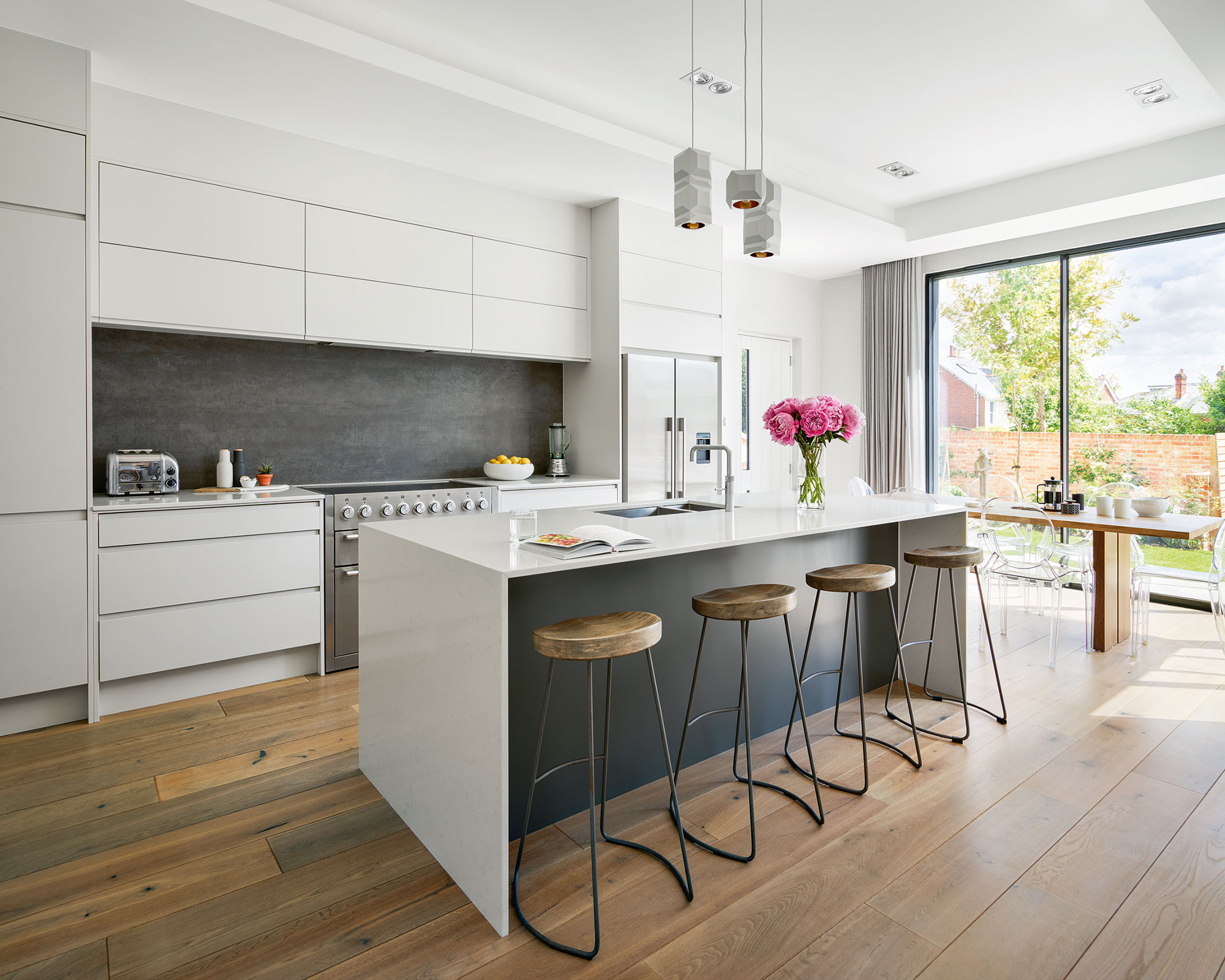
A white kitchen is a definite ‘lifestyle’ choice – there’s no denying that a white kitchen will always look fresh, stylish, and sophisticated. However, be realistic about the amount of care and attention it will need. From a practical point of view, go for non-white work surfaces to cut down the cleaning and wiping down. White gloss lacquer finishes are available from most showrooms and specialists, for a more subtle look, consider matt or satin or semi-gloss finishes.
An all-white kitchen will look ultra-stylish, but possibly too stark and clinical, so replace at least one or two elements with color and texture. Walls can be colorful – and changed yearly if necessary, for the price of a few litres of paint.
Good kitchen flooring ideas can be the real anchor to a scheme, and natural timber and stone (whether it’s real, laminate or replica vinyls or ceramics) often proves to be a warm contrast to glossy white cabinets.
6. Make a lasting impression with timber
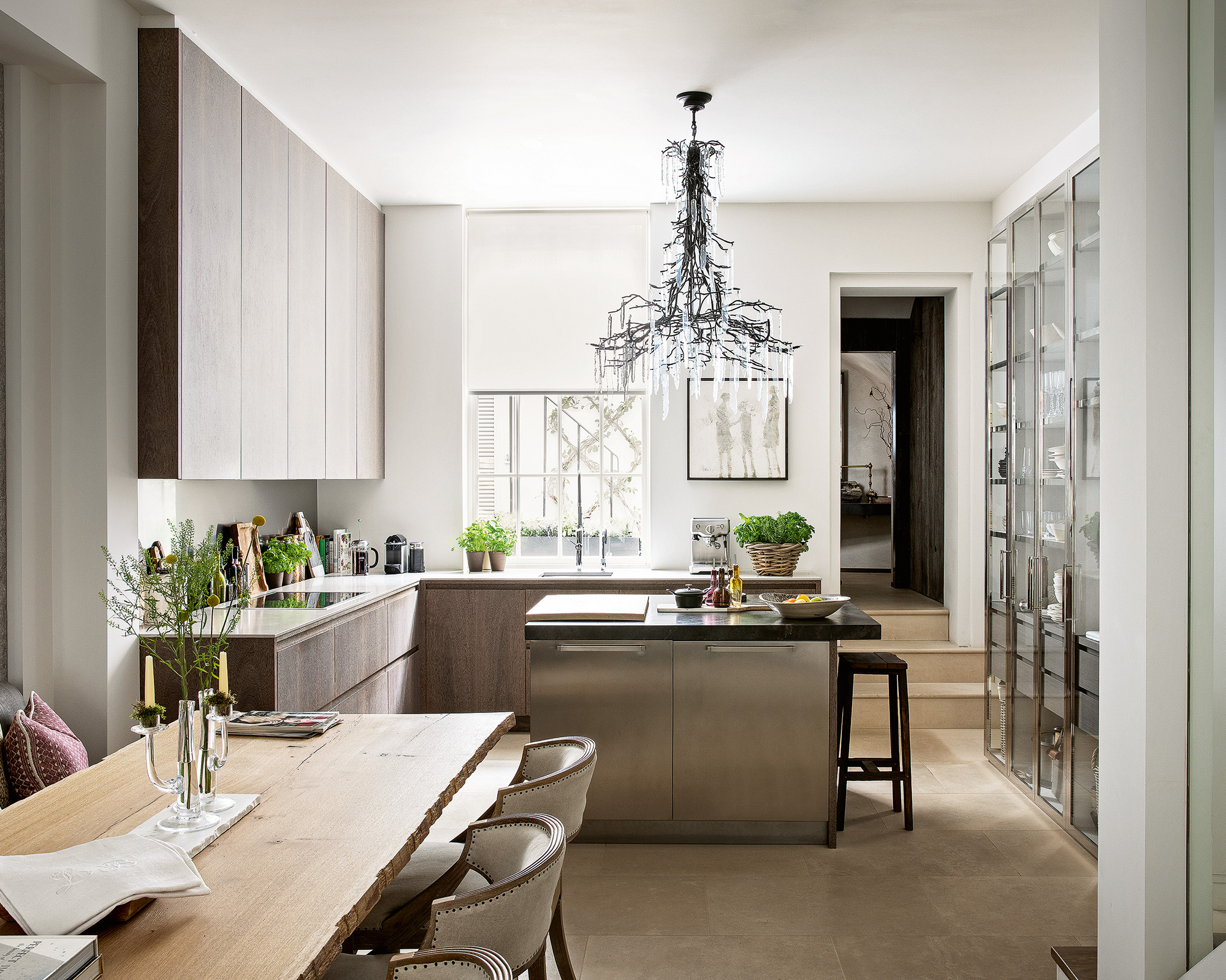
Never off the style radar, wood is a versatile material that continues to steal our hearts. The latest incarnation focuses on bringing real warmth and depth to a minimalist kitchen; using timber in its natural state and teaming with architectural details to keep on the right side of contemporary.
7. Invest in handleless kitchen cabinets
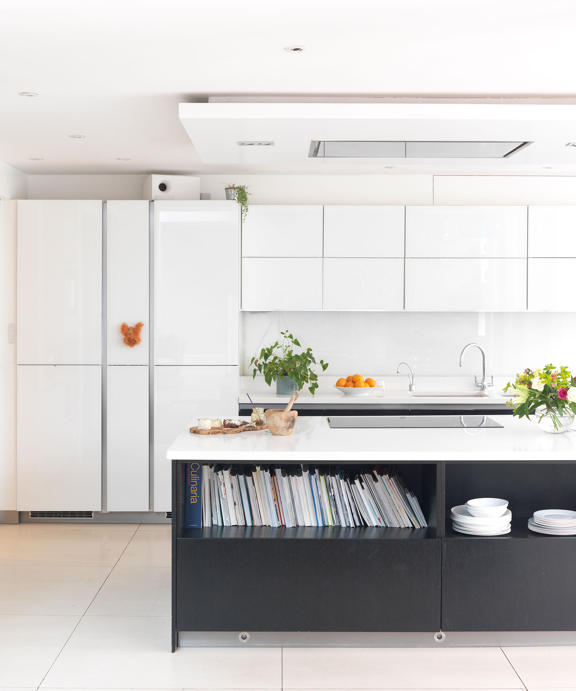
‘The key to a minimalist kitchen is to use sleek handleless cabinetry and a rich and authentic combination of materials and textures to create a really interesting and elegant scheme,' says Bernard Otulakowski, Managing Director, of SieMatic. 'Hidden storage will keep the kitchen clutter free, but include enough open areas to put special items on display.'
The use of mechanisms to roll back doors and slide them into cabinetry, has opened up a whole new world in design. First it was larders and breakfast cupboards, now whole sections of the kitchen including the cooking area can disappear behind smart, full-height cupboard doors when not in use, leaving a neat, streamlined living space.
8. Decorate with a modern color scheme
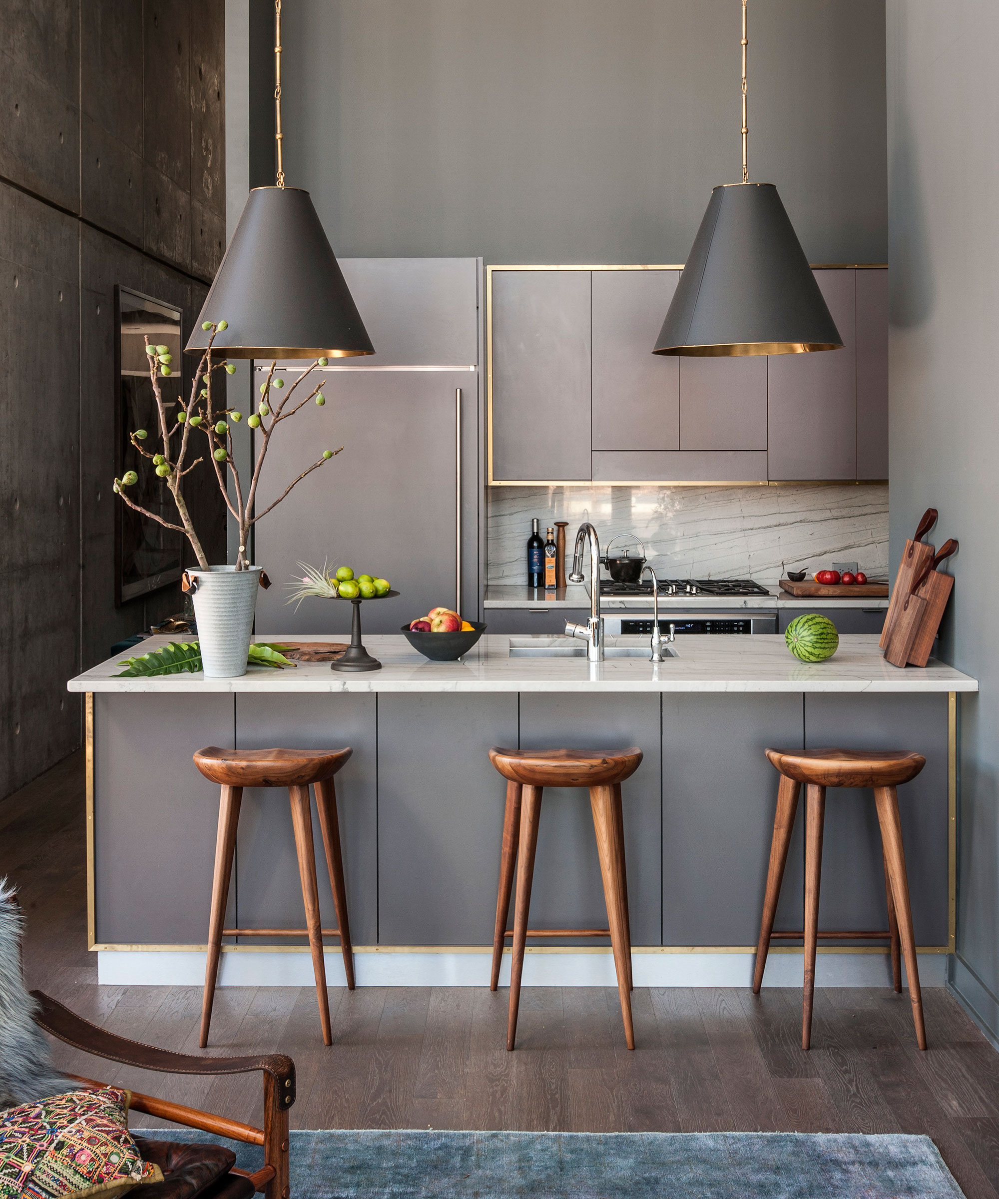
Color is a powerful design tool – not only can it completely alter the mood of a kitchen, how much or how little you add will affect which parts of the room you’re drawn towards.
‘The rule of thumb in a minimalist kitchen is to use color sparingly and in clearly defined areas,’ says Gordon Boyd, sales manager for Nolte Küchen.
‘Colors should serve a purpose rather than be used at random. Go for a basic color and then use another to accent certain areas. Alternatively, try corresponding pairs, such as shades of green or blue, or play with natural tones and add a more vibrant color to certain elements, for example a shelf, a sideboard or a bench.’
The shades you choose are just as important as how you use them. While it can be tempting to go for your favorites, it’s advisable to restrict strong colors to elements that are easy to update, such as the backsplash, opting for those that have greater longevity across large areas.
‘A trend that is growing in popularity is warm shades of greys,’ explains Jamee Kong, head of design at DesignSpaceLondon. ‘Unlike some of the sharper colors, grey kitchen ideas work well in both matt and gloss finishes and are very versatile.'
9. Keep it behind closed doors

The most exciting minimalist kitchens can sometimes be the ones that aren’t on display. Pocket or sliding doors that conceal a breakfast station, appliances or even the whole design, can be opened for ‘the big reveal’ to create a sense of drama. On a smaller scale, drawers with concealed sockets and internal lighting, or cupboards with electronic shutters recreate the same hide and show effect.
‘Choose your finishing touches carefully,' says Lee Thornley, founder, Bert & May. 'High-end lighting and premium fittings can transform an affordable kitchen into a design-led one.’
10. Put sustainability at the heart of your kitchen
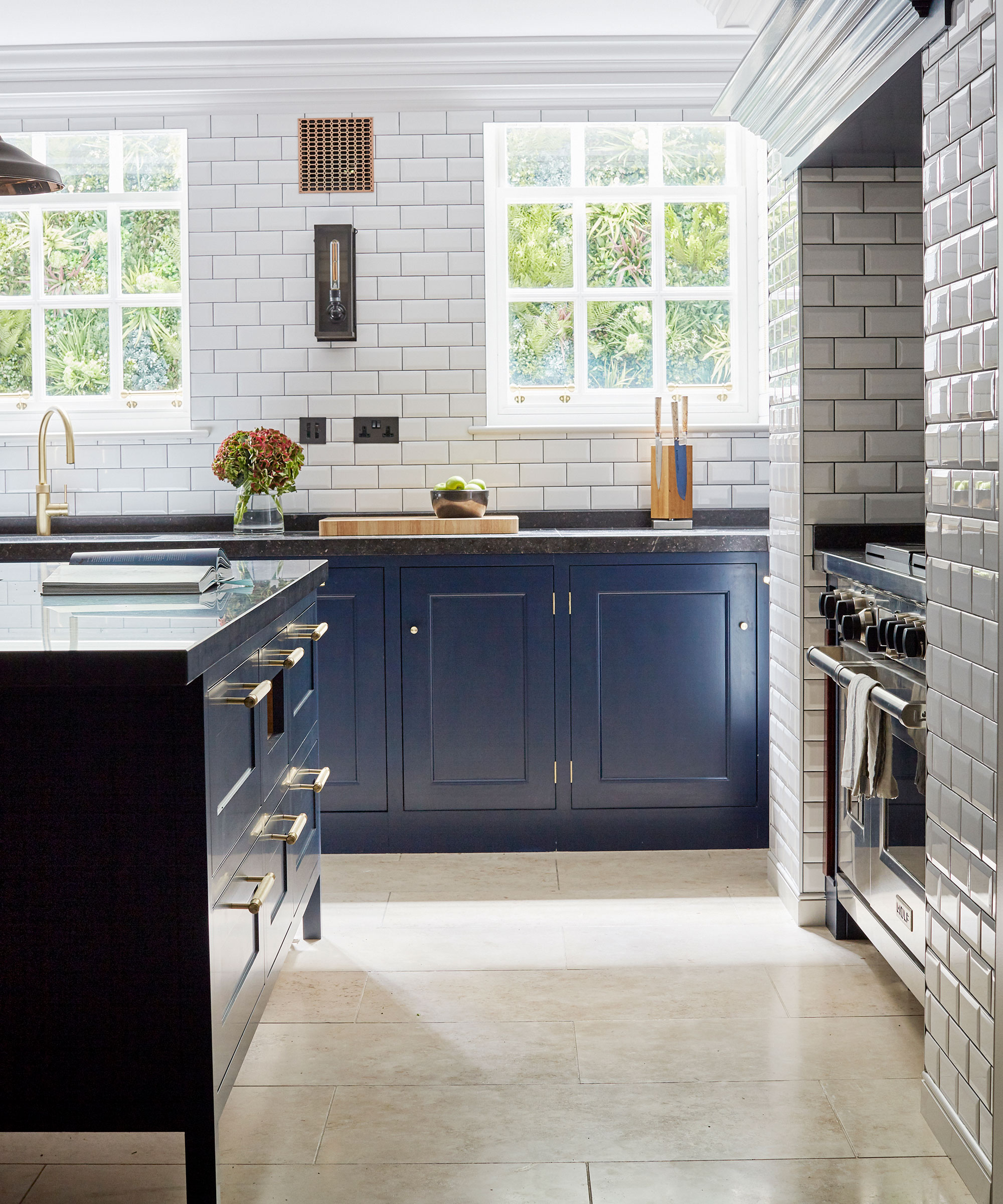
Reclaimed materials bring a sense of permanence to a minimalist kitchen space, plus as they’re repurposed, they’re more eco-friendly. Think about including salvaged timber cladding, antique mirror or reclaimed tiles as a simple way to add character and originality to an otherwise modern kitchen scheme or enhance the heritage of a traditional home.
What is a minimalist style kitchen?
The mainstay of minimalist kitchen design is simple flat-fronted cabinetry – it’s a sleek look and one that is ageing incredibly well. In fact, much of what we consider to be modern design dates back to the 1930s. Even the sleek, handleless cabinets so typical of modern kitchen design right now have been around since the 1960s.
‘The modern style of kitchen developed out of the 1980s trend for loft or warehouse living, and that has extended into the open-plan living that is now so popular,' says Keith Atkins, Director of Design at Design Space London.
For a while, minimalist kitchens seemed to take stark to a whole new level. Cabinetry was pared down and invariably white gloss, but it’s a look that can be too clinical for many. Thankfully, the current trend for modern minimalism is a far warmer affair. The clean lines and a fuss-free finish are still there but with texture, surface finish and soft color that bring character and are easy to live with. The simple lines show off clever engineering, form and finish, and the latest engineering techniques have helped give new life to materials previously out of favor.
How can I make my kitchen minimalist?
Make a conscious design decision about what to put on show and what to hide from view. For a truly minimalist kitchen aesthetic, conceal the functional elements such as ovens and other appliances in the kitchen as this will soften the impact on the space.
For minimalists afraid of missing out on the current vogue for color, painting the inside of cabinetry in bright hues could be the answer. Painting the interior of glazed cabinets, and installing lighting to make the color sing at night, is another great design trick for the color-cautious.
Sign up to the Homes & Gardens newsletter
Design expertise in your inbox – from inspiring decorating ideas and beautiful celebrity homes to practical gardening advice and shopping round-ups.

Jennifer is the Digital Editor at Homes & Gardens. Having worked in the interiors industry for several years in both the US and UK, spanning many publications, she now hones her digital prowess on the 'best interiors website' in the world. Multi-skilled, Jennifer has worked in PR and marketing and occasionally dabbles in the social media, commercial, and the e-commerce space. Over the years, she has written about every area of the home, from compiling houses designed by some of the best interior designers in the world to sourcing celebrity homes, reviewing appliances, and even writing a few news stories or two.
-
 Ina Garten's storage pantry is an insightful window into all of the best cookware used by the chef – and it's easy to recreate on your kitchen shelves from $48
The beautiful dishware in The Barefoot Contessa's Hamptons pantry showcases the tools she uses most often to cook – this is exactly how you replicate it
By Sophie Edwards Published
-
 Extend the lifespan of your appliance with 5 simple but crucial washing machine maintenance tips
From cleaning the filters to keeping the door open, experts reveal the washer tips they swear by
By Andy van Terheyden Published