Kitchen makeovers – 11 remodeling kitchen ideas before and after
These kitchen makeovers show how remodeling a kitchen can totally transform a space
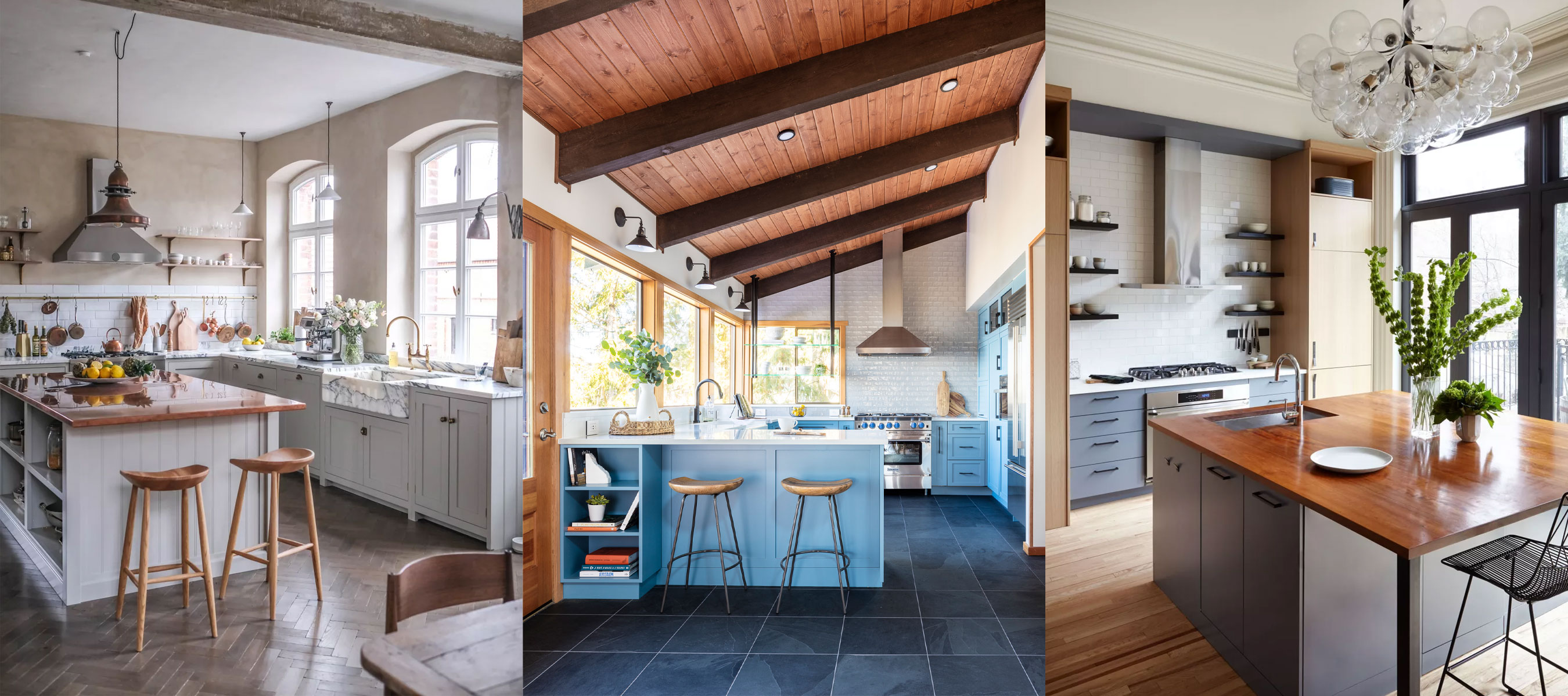

Sometimes, browsing kitchen makeovers is the best way to get your remodel underway. After all, it's not easy to look at a busy, cluttered existing space and reimagine that 'before' as an 'after'.
So, we asked some of our favorite designers to provide remodeled kitchen before and afters so that we could show you what can be achieved using the right mix of kitchen ideas and advice.
Kitchen makeovers – before and after
Below, we showcase kitchen remodel ideas that have become reality, with expert comment from the interior designers who created these stunning spaces. You’ll see old kitchens that are dated and cramped become light, airy and contemporary kitchen makeovers.
1. A dark and cramped space is now bright and colorful
Before
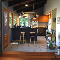
Small, dark and cold, this kitchen was in need of a modern refresh in order to make the space feel more spacious, stylish and bright, with the original woodwork for the kitchen ceiling ideas getting lost in the dark, mismatched scheme, rather than being a celebrated part of the design.
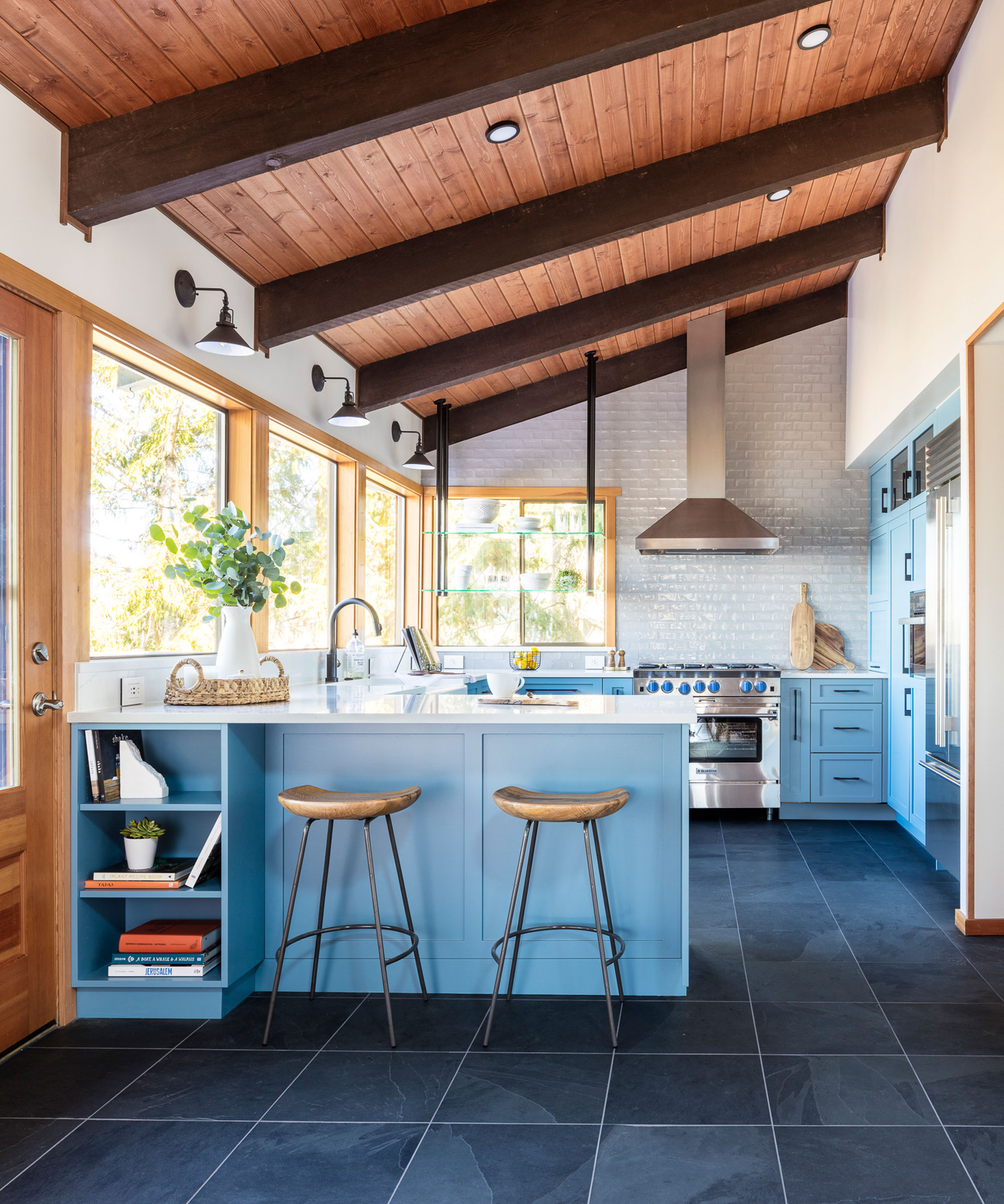
After
A beautiful transformation by Anna Popov from Interiors by Popov, this cramped kitchen is now colorful, spacious and bright; showcasing an elegant mix of materials and textures.
Anna says of the project, 'we were hired to reconfigure a very dark and cramped kitchen in a Mukilteo, WA home. To work with the original wood ceiling and bring the outdoors in, we redesigned the layout entirely to take advantage of the views, chose light and airy colors that complement the wood, and added a variety of smart storage throughout. A custom-designed coffee station is hidden in a side pocket allowing for a clean countertop with a place for everything and everything in its place.'
A great example of blue kitchen ideas, this use of color makes the space feel fresh and modern, and wonderfully complements the dark tones of the wood ceiling, which now has the recognition its deserves.
2. A dark cluttered kitchen transforms into a bright, modern space
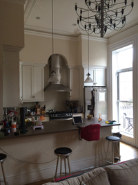
Before
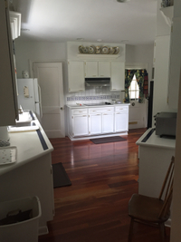
The most common issues with kitchens is lack of light and lack of storage. This kitchen had both, but with the high ceiling and potential for extra light, it clearly had potential but was desperately in need of a remodel.
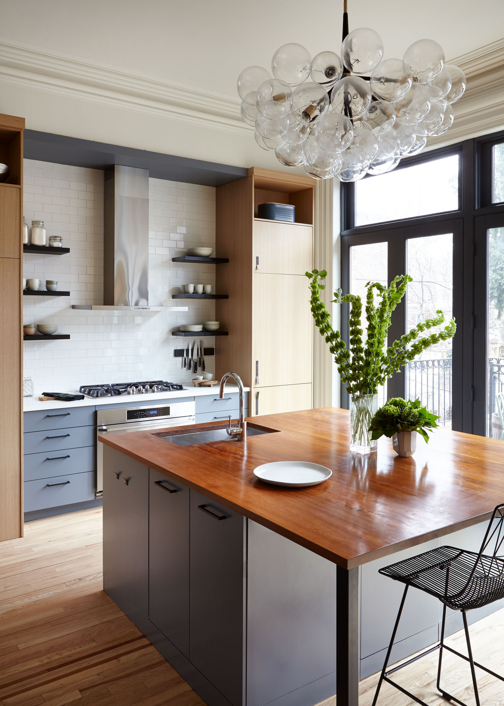
After
We asked Alan Barlis of New York based BarlisWedlick how he transformed this space into a fresh, contemporary kitchen that doubled its storage space and had room for an island:
‘We were able to open up the rear of the home to create a large eat-in kitchen looking out to the backyard. For its interiors, we divided the kitchen into zones that showcase different materials: four ceiling-height corner cupboards are made of white oak, while the stove, refrigerator, and island are painted a blue-gray tone.
'We also left cabinets floating on each side of the original mantel to reference freestanding pieces found in other parts of the home.’
3. A living room becomes a family kitchen diner
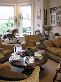
Before
When the H&G's Editor in Chief bought her home, the kitchen was in the basement, which overlooked the backyard. The ceiling of the existing kitchen was low and the room was a little dark, so she decided to relocate it to the living room on the ground floor, which was a large, bright, open-plan space (shown above, when occupied by previous owners).
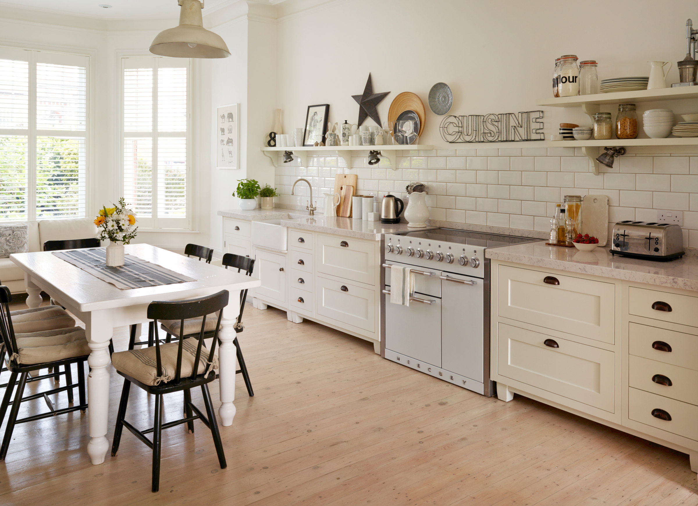
After
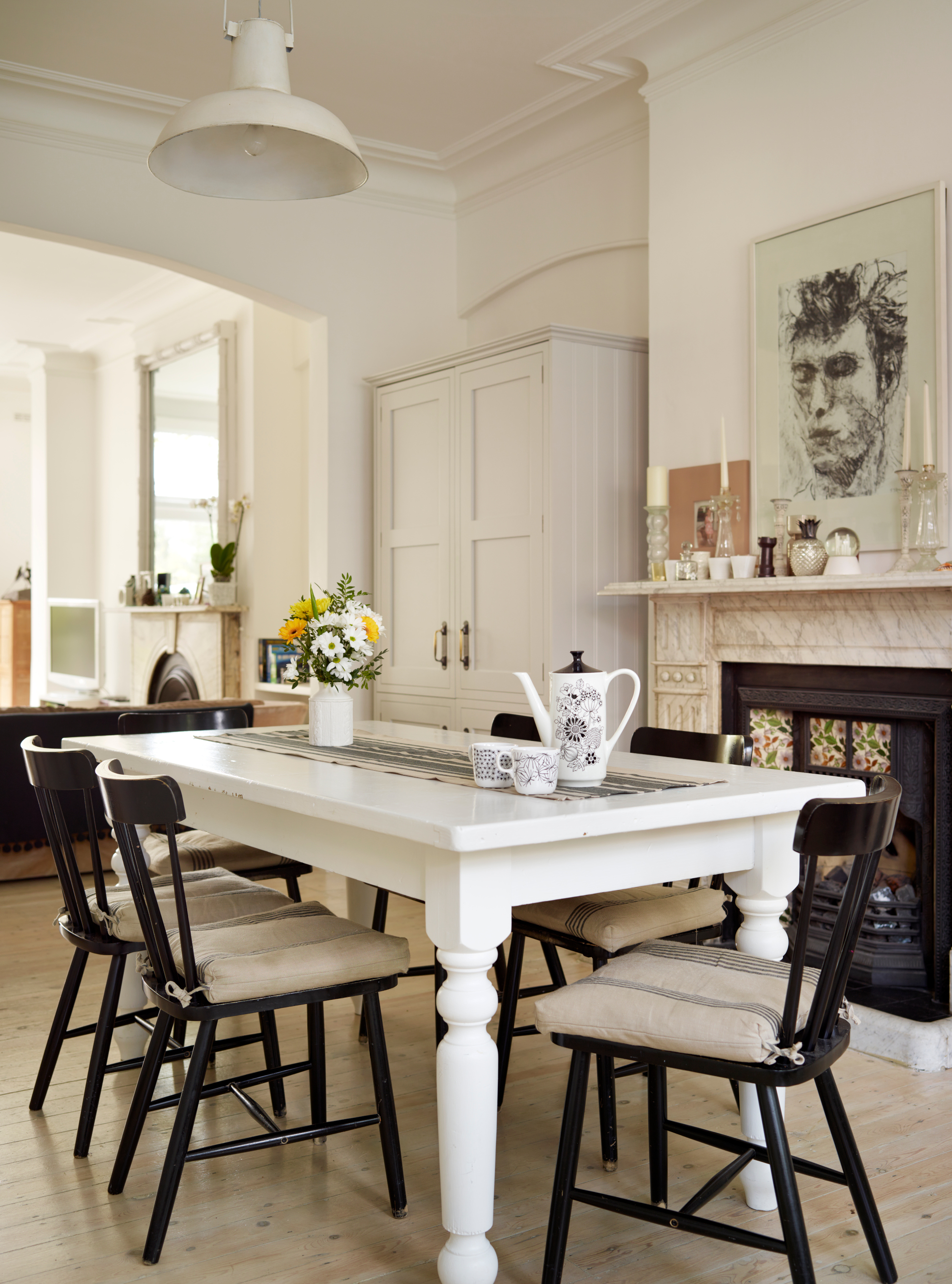
'The pictures above and below were taken just after we had completed the kitchen makeover,' says Lucy Searle. 'We had really only considered white kitchen ideas. Now, though, the walls have since been redecorated again with earthy colors, the lighting has been changed, there's now a warmer-toned herringbone wood floor and there's a rug under the dining table to make what is a very large room feel cozier. However, the bones remain the same.'
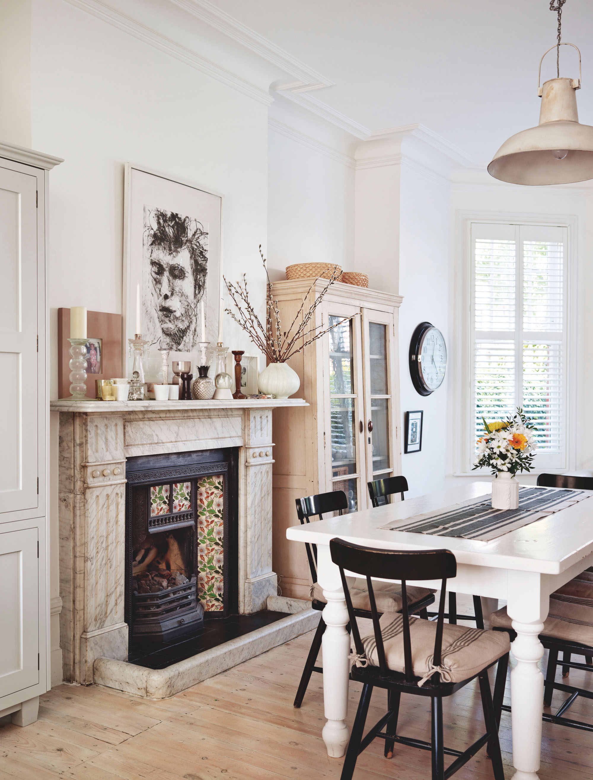
'We didn't even consider removing any original features, such as the Edwardian fireplace. Instead, we worked around them, hiding the refrigerator and freezer inside a large freestanding unit that doubles as a larder, and housing our china in an antique glass-fronted dresser.
'There might not look like there's a ton of countertop space but it works for us and we use the kitchen table for extra prep. It helps that we have a large walk-in pantry across the hall, too. And, before anyone wonders, we don't have a cooker hood – but we do have a quiet but powerful fan in the room's original vent, high up on the wall above the kitchen sink.'
4. An outdated and badly-configured space is now light and airy
Before
Looking for remodelling ideas for small kitchens? Reworking a whole-floor layout might be the best option.
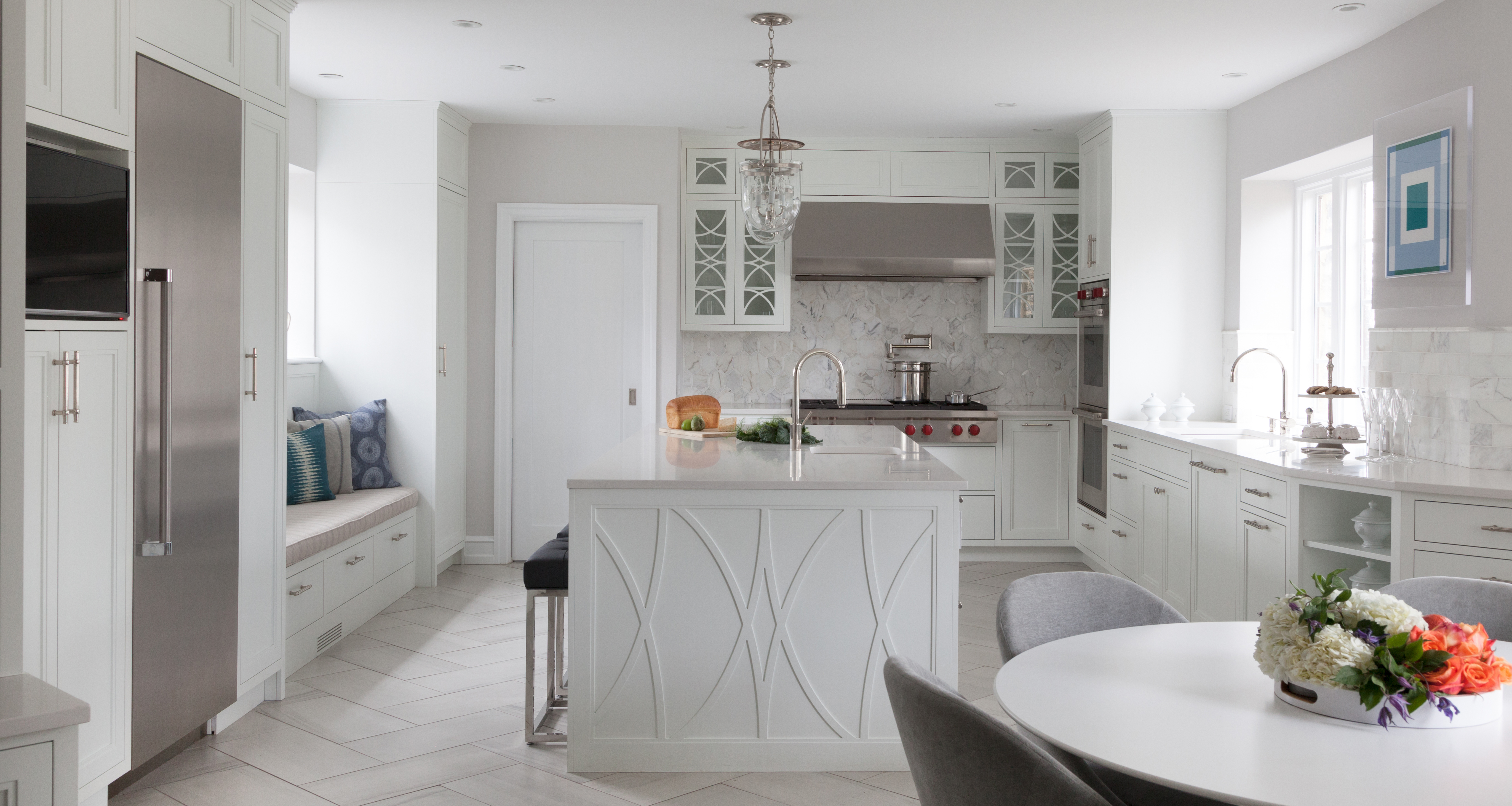
‘This first floor gut remodel of an outdated stone colonial in Chestnut Hill reconfigured a series of convoluted spaces, surrounding a poorly placed back staircase, into a modern and open, all white kitchen,’ explains Mindy O’Connor, principal designer at Melinda Kelson O’Connor Design.
After
'By relocating the basement stair, and eliminating the secondary back staircase, we were able to combine four disparate kitchen rooms into one large kitchen with an adjacent mudroom entry. The entire space was transformed.
'New cabinetry details were created with a nod to the historic character and older windows, and older ones were carefully restored.
'The homeowners favor a clean and crisp white palette with grey floors and calm palette of grays, off-whites, and cool blues. The kitchen leads to a historic wood paneled dining room, and the transition was carefully integrated to be harmonious.’
5. A plain kitchen is transformed into a bespoke space
Before
The beauty of this kitchen is that it proves you don’t need a large space to have a stunning place to cook in, the total floor space for this flat is 900 square feet, and the kitchen was tucked away on one corner. It has good natural light from a sash window but was in desperate need of modernizing.
After
Helen Parker, creative director at deVOL explains how they transformed this small kitchen.
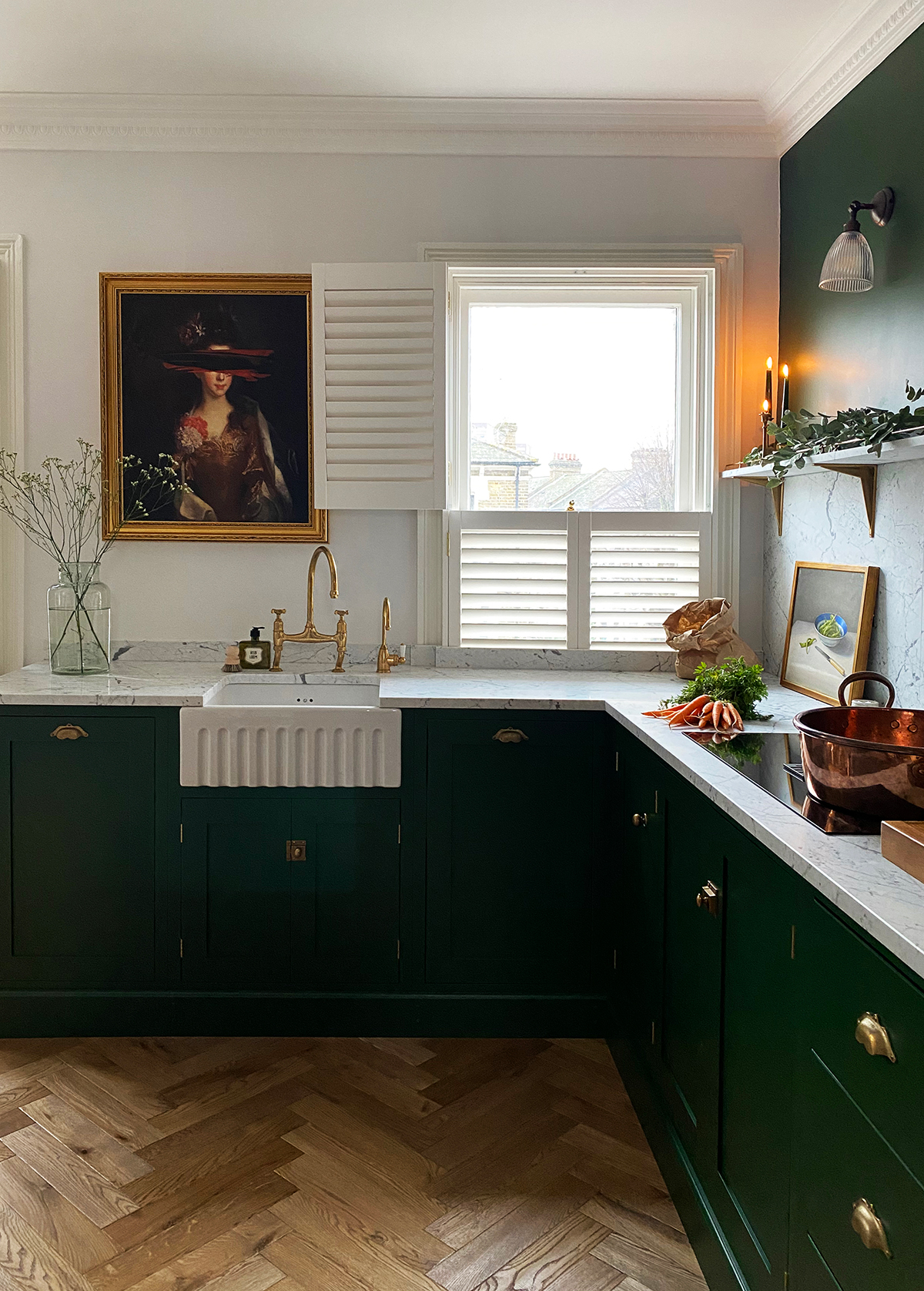
‘This kitchen is made up almost completely with our standard sized Shaker furniture and is a little reminiscent of one of our most iconic projects ever with its rich bespoke green color and large expanses of bold marble and brass but new and exciting all in its own way.'
Helen expands on working on ways to manipulate kitchen remodel costs while getting a bespoke look:
'It makes us so happy to see that you don’t always need bespoke sized pieces to create the overall look of a bespoke kitchen. Sticking to standard sized cupboards is also the most economical way to design, so if you’re working to a specific or smaller budget, there is no better option.
'The layout is simple, L-shaped and clean – perfect for this open-plan room where the owners do everything from cooking and chores, to eating and drinking together at the dining table and chilling on the squishy sofa, which is just out of shot.
'The apartment had really high ceilings so building up made total sense: one tall run with bags of storage, double stacked Miele ovens, an integrated fridge and freezer and a large pantry cupboard was so practical and allowed the rest of the room to feel uncluttered and easy going.’
6. A kitchen, dining room and an old conservatory combine into an open-plan space
Before
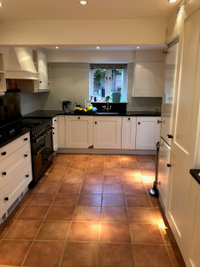
This property had an old conservatory and separate dining and kitchen areas that were all dark and enclosed. The owner wanted a kitchen makeover that resulted in a space that felt calm and inviting, a communal area to enjoy and relax in as a family from the busyness of modern city life.
After
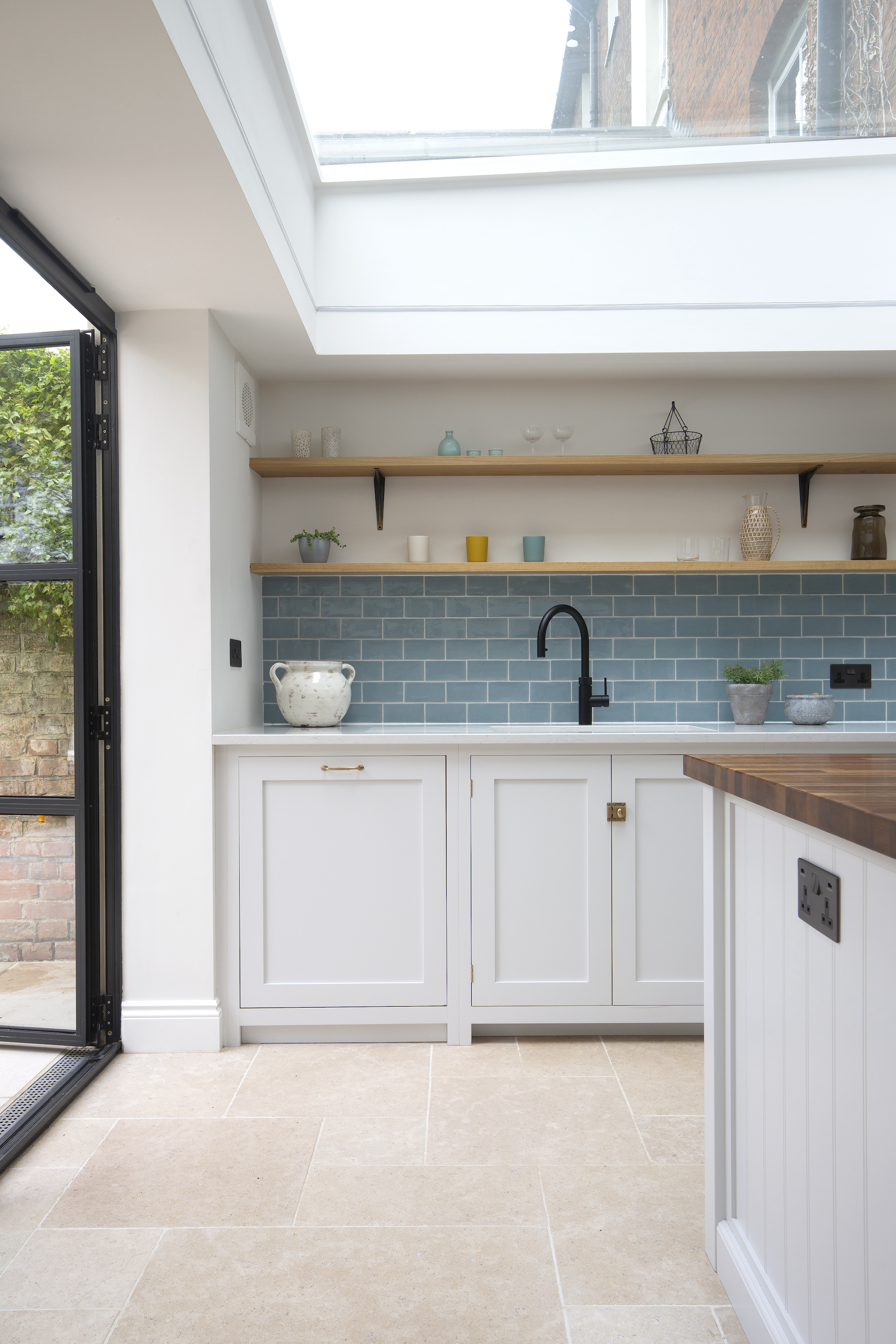
The brief was to create an open plan kitchen with plenty of natural light and a flow from the kitchen through to the backyard. The result is a fabulous light and airy space that’s been achieved by combining the old spaces together, adding in skylights, Crittall doors through to the backyard and a mainly all-white scheme. There’s a sky blue backsplash and open plan shelving both of which add a warmth and tie in beautifully with the Dijon tumbled limestone floor that completes the transformation – the kitchen floor tile ideas being a real focus of this bright space.
‘The customer visited our showroom wanting a practical tile with natural character, but one that would also complement the contemporary style they had in mind,’ says Isabel Fernandez, director at Quorn Stone.
‘Our Dijon tumbled limestone quickly became a favourite with its neutral tone, forgiving nature and suitability for inside and outside. The beige to grey tones and tumbled edge also soften the strong architecture of the modern Crittall windows and floating corner bi-fold doors.’
7. From old schoolhouse to dreamy kitchen makeover
Laura and Nora from the always beautiful ‘Our Food Stories’ completely renovated this old schoolhouse in the Brandenburg region of Germany, about an hour from Berlin.
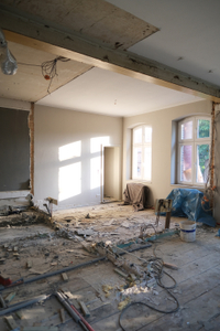
What used to be an old classroom within the schoolhouse had been turned into two separate spaces with a little bathroom but Laura and Nora knew they wanted to open it back up to the original structure for their kitchen.
After
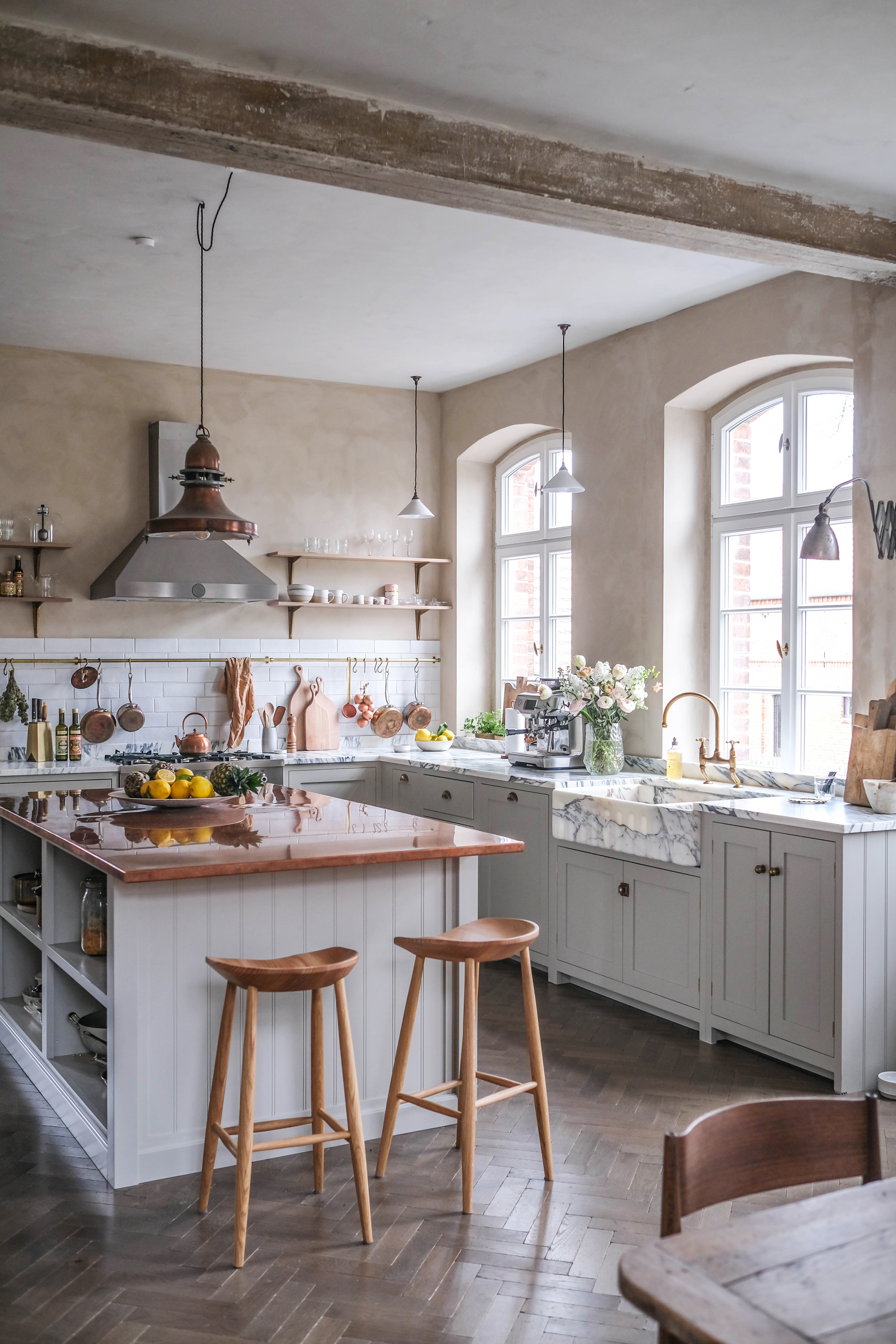
‘Laura and Nora chose deVOL’s Mushroom paint color for their Shaker cupboards and our Crackle metro tiles for the backsplash,’ says Helen Parker, creative director at deVOL. 'These two starting points set the tone for lots of brass accessories, which, alongside the copper countertop on the island, gave the room a little twinkle.
'The mix of materials and colors is what really makes this kitchen and all Laura and Nora’s renovations so memorable, they have an ease of style and tend to create rooms that have a simplicity and natural feel, yet they infuse them with a little glam. In this case, they chose Arabescato marble for their countertops and sink, a bold and dramatic choice but in contrast to the soft muted colors and incredible original features of the room – it just ups the wow factor without being too showy.'
8. A long, narrow kitchen becomes an airy space
Before
Charlie Smallbone, founder of Ledbury Studio describes challenges and solutions when remodeling this dark and narrow kitchen:
‘The existing kitchen of this 1920s house was long and narrow with very little natural light. Located to the rear of the house and accessed via an adjoining dining room off the entrance hall, the advantageous lofty proportions of the space were unfortunately complicated by three different ceiling heights. At the back of the kitchen was a door leading to a cramped utility room.'
After
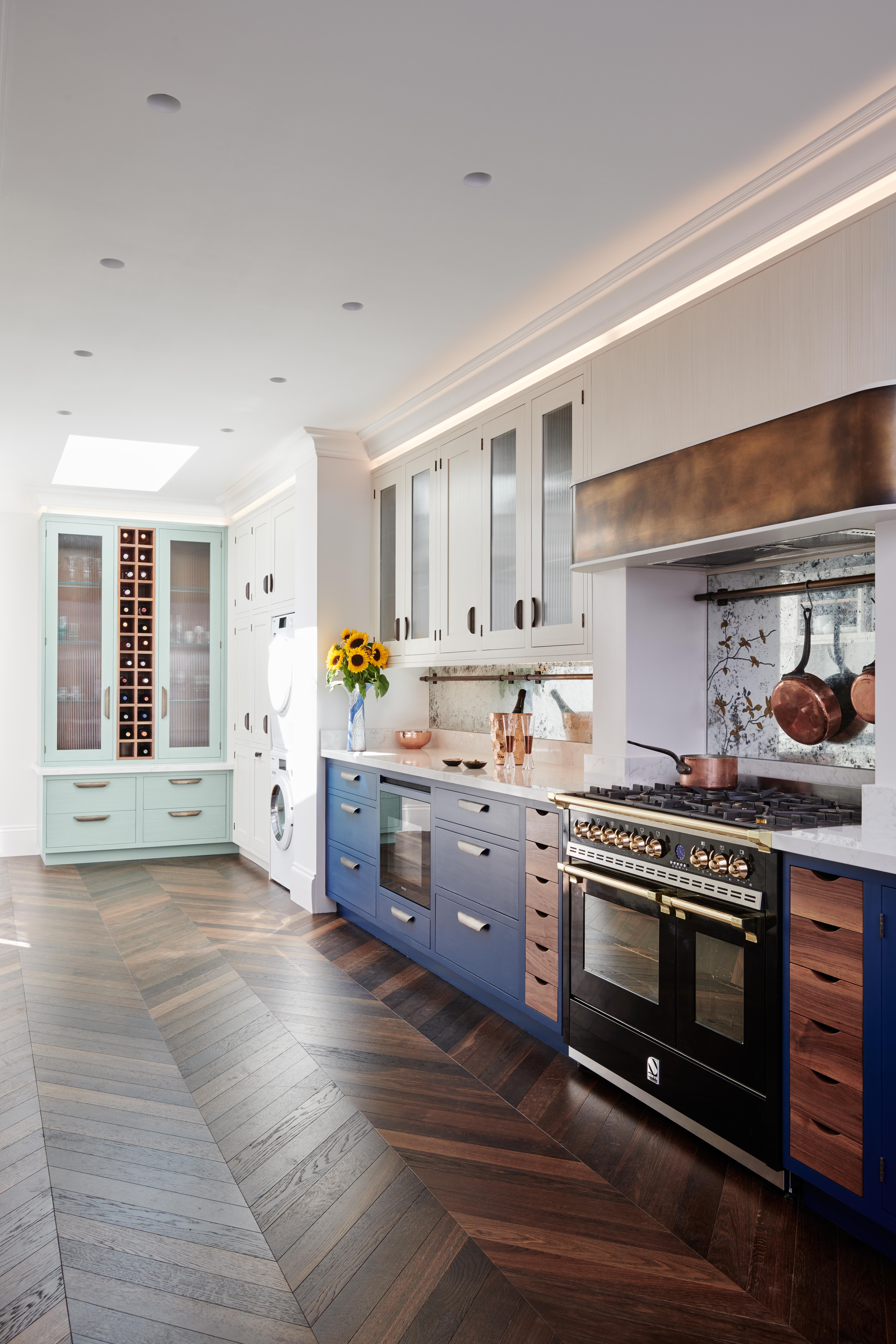
'Firstly, I wanted to get more natural light into the space. To achieve this, the utility room was replaced by a small lean-to extension accessed via glass doors at the rear of the kitchen and we also installed a large roof light. We put coving on top of the furniture and used this as the lighting recess that runs all the way round the room.
'We chose fluted glass for cabinet fronts to keep the design light and airy, but without having the contents on display as you would with open shelves. The countertops are hard-wearing Classico Marble Arabesque quartz coupled with Verre Eglomise backsplashes, whereby pure gold leaf was applied to the reverse of toughened glass and antiqued. The client requested a floral design be gilded onto the Verre Eglomise surface behind the hob, transforming it into a standout feature.
'The kitchen is mainly taken from our Ledbury Shaker collection, but the client was also keen to introduce our signature use of metals. We added aged brass to the edge of the cooker hood and also used it for the plate rack’s supporting brackets, the hanging rails mounted on the backsplashes and the cupboard handles.’
9. When small becomes spacious with clever planning and a better layout
Before
Previously Tami’s kitchen was chaotic, dark, small and pretty unusable, the layout didn’t work and wasn’t aesthetically pleasing. Although compact, she wanted a kitchen that had a freestanding look and a small island.
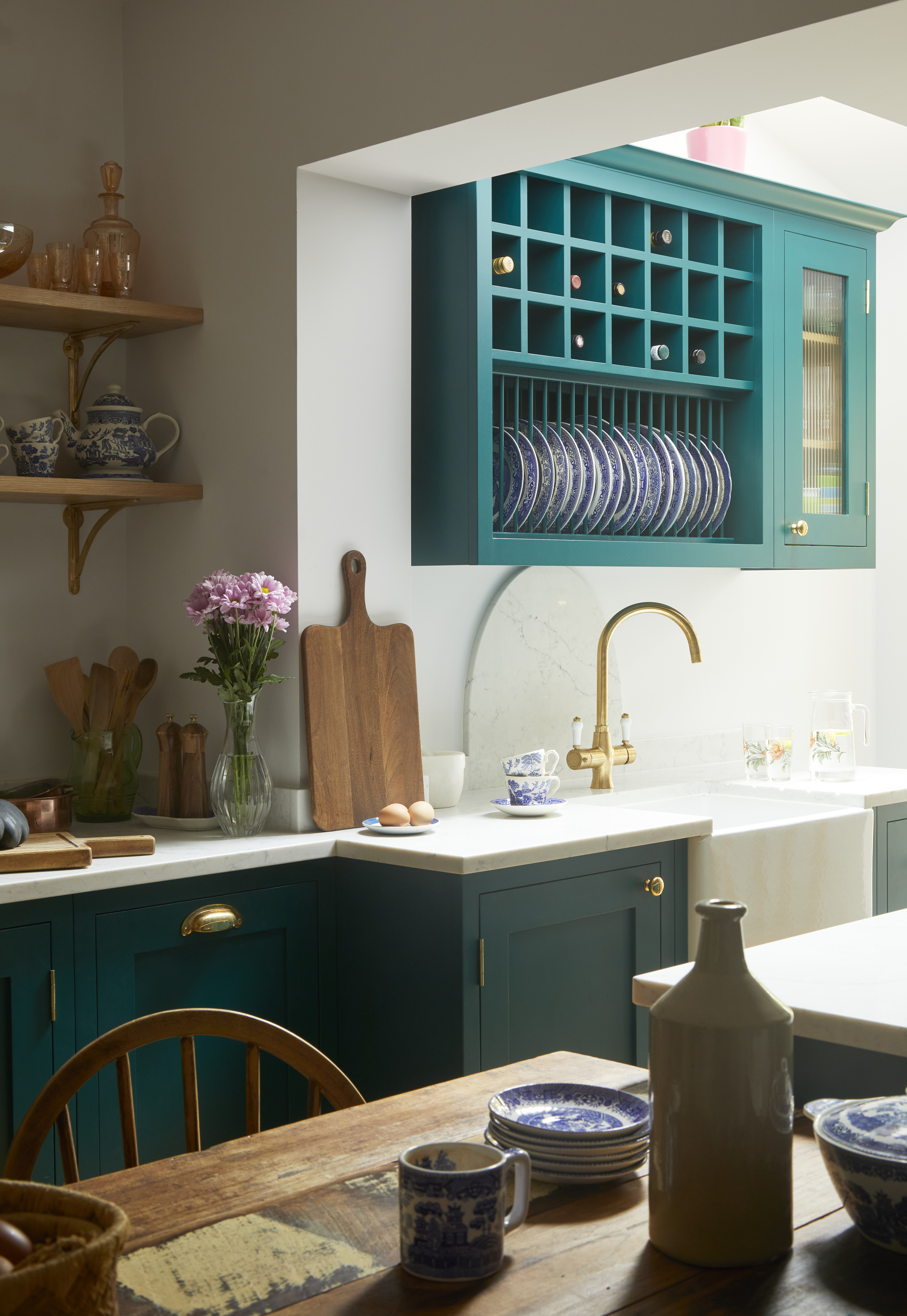
After
‘Every kitchen evokes a different emotion and this one evokes nothing but joy. A mix of exciting colors and contrasting textures, original features and contemporary twists, this small yet mighty kitchen is packed full of fun and function everywhere you look,’ says Al Bruce at Olive & Barr.
‘Celebrating a combination of bespoke cabinetry and open shelving, this little space is all about the little pleasures in life. Beautiful trinkets and brass hinges, original range cooker and state-of-the-art hob inductor, quartz worktops, parquet flooring and an all-purpose larder for both storing and serving.
'It is a space that feels like home, and we got to work with Tami to bring that vision to life, working with her on every aspect of the design to deliver a freestanding feel to this cozy corner. Small yet special, unique yet obtainable – this is a space that makes you smile.’
10. A complete kitchen remodel for this Victorian home
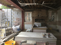
Before
Previously, this kitchen was a typical end of terrace style space, though it wasn’t necessarily on the small side, it was dark and the owner wanted to open it up to the garden with a wall of glazing. This is where Charlie Smallbone, founder of Ledbury Studio came in.
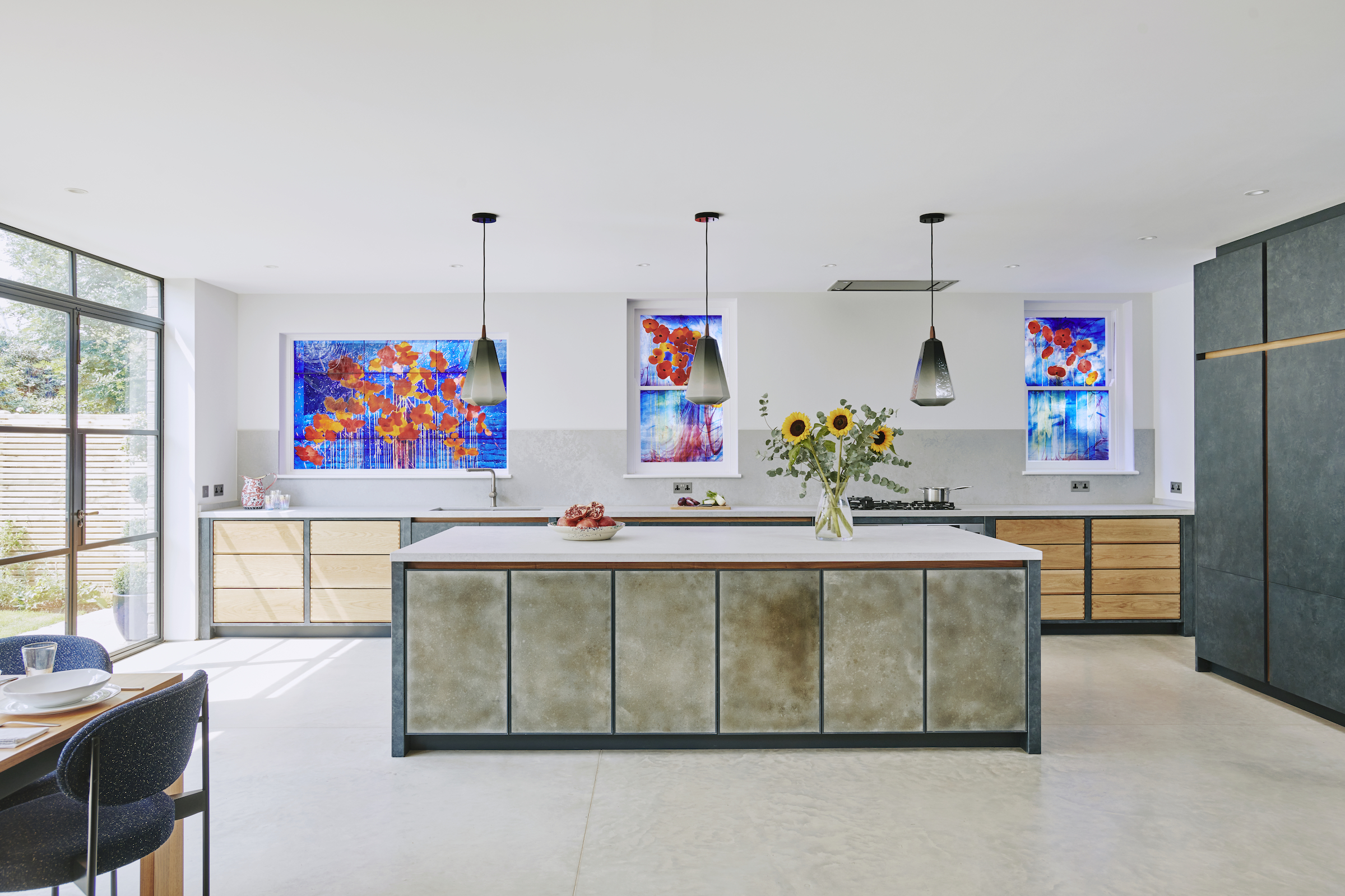
After
‘As a lover and collector of modern art, our client wanted a minimal look to the kitchen that would allow her paintings, as well as the stained-glass windows by celebrated artist Brian Clarke, to really pop,’ explains Charlie.
To achieve this, Charlie used aged, hand-finished solid zinc doors from the Metallics Collection on the side of the island facing the room. Elsewhere, the cabinetry features a specially commissioned paint-effect created onsite by Ledbury Studio’s resident artist Emma Culshaw Bell. ‘To maintain the less-is-more approach that our client covets, all cabinets are handleless to create a sleek, unfussy look,’ adds Charlie.
Two sets of natural oak drawers with exposed dovetail joints inject a craft-inspired vibe into the pared-back design. Airy Concrete Caesarstone was then chosen for the countertops; a perfect complement to the concrete flooring. The finishing flourish is Crittall patio doors that open into the garden – an essential element of any industrial-inspired kitchen.
‘This is a kitchen that works on so many levels,’ says Charlie. ‘It’s a highly functional family kitchen, a great open-plan entertaining space – that links so well with the garden – and the backdrop for some truly stunning pieces of art. I couldn’t be more delighted with the finished effect.’
11. A traditional wood kitchen transforms into a luxurious space
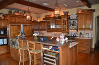
Before
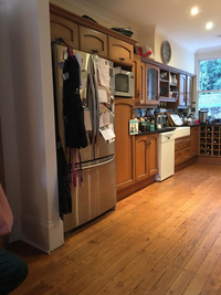
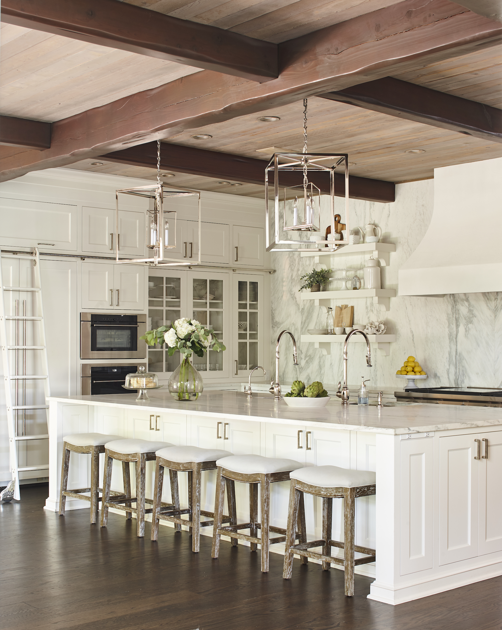
Old wooden units with a mis-match of countertops and a large amount of clutter meant this dark and dingy kitchen was in real need of a remodel. The transformation is dramatic and includes a striking wall of marble, stainless steel lanterns, handles and faucets, an all-white scheme and a contrasting dark wood floor.
After
'We wanted to update the home (that was built in the 1990s) with a brighter, more modern look. We updated every cabinet, finish, and detail, as well as thoughtfully selected the lighting and drapery to transform the room.
'In addition to the aesthetic, the goal was to create a welcoming space for the family, while also functioning well for large-scale entertainment,’ explains Mel Bean, founder of Oklahoma based Mel Bean Interiors of this beautiful kitchen makeover.
How much does a kitchen makeover cost?
Kitchen makeover costs vary from $5,000 to $5,000. The total cost of a kitchen makeover really depends on how dramatic the changes you will make to your kitchen layout. If you like your kitchen layout, you can remodel without having a complete refit, meaning that you can spend as little as $5,000 by putting new doors on or painting the existing ones. You can go further by adding handles and countertops, replacing flooring and lighting, too. This will drive kitchen makeover costs up towards $10-15,000.
However, if you would like to remodel your kitchen completely, expect to spend between $20,000 and $50,000, with costs influenced by the size of your kitchen, dramatic changes in layout requiring new plumbing and electrics, and more expensive materials, such as real stone countertops.
Sign up to the Homes & Gardens newsletter
Design expertise in your inbox – from inspiring decorating ideas and beautiful celebrity homes to practical gardening advice and shopping round-ups.

Sophie has been an interior stylist and journalist for over 20 years and has worked for many of the main interior magazines during that time, both in-house and as a freelancer. On the side, as well as being the News Editor for indie magazine, 91, she trained to be a florist in 2019 and launched Flowers Inside My Head where she curates beautiful flowers for modern weddings and events. For Homes & Gardens, she writes features about interior design – and is known for having an eye for a beautiful room.
-
 Zooey Deschanel and Jonathan Scott's breakfast nook is an innovative, effective use of kitchen space – it turns a 'dead area' into a cafe-style corner
Jonathan and Zooey have situated an eccentric yet elegant dining area in what may have been an otherwise underused corner
By Hannah Ziegler Published
-
 6 things you should never throw in the trash – and what to do for safe disposal instead
From batteries to space heaters, experts reveal what not to throw
By Andy van Terheyden Published
