Hallway ideas – 32 ways to make a great first impression with decor
Discover hallway ideas and expert advice to make it a stylish destination
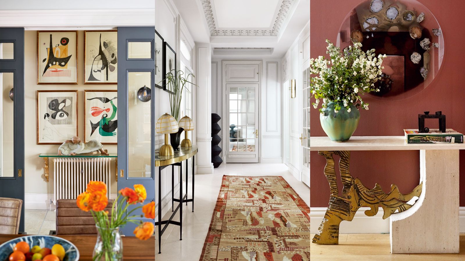
Planning great hallway ideas can be one of the more challenging aspects of designing interiors. But facing the task means that rather than an area of the home everyone passes through to get elsewhere, the hallway is elegant and stylish as well as welcoming.
There may be additional issues to tackle along the way, including a lack of daylight and, in some, awkward dimensions, yet there are plenty of ways to make it a destination, including small hallway ideas, hallway color schemes, wall decor choices, furniture, flooring, and more.
Here we’ve selected the best to stimulate your own choices, and asked the experts to contribute their advice.
Hallway ideas – 32 exceptional looks
There are so many reasons for making the effort with the hallway. After all, it’s the first part of your home that family and friends encounter when they visit, and the one you see after a hard day.
As the hallway is where guests are welcomed, it should say something about you and set the mood for the rest of the house, says Henriette von Stockhausen of VSP Interiors. ‘A hallway should flow into the rooms that come off it,’ she adds. ‘Art collections work well in spaces with vast walls and help lead the eye onwards. I keep flooring uniform throughout as it helps enlarge the space and avoids it looking disjointed. Introduce a statement piece to add wow factor. A stunning portrait above a console with a picture light works well.’
Whether you go for something fun and colorful or calm and soothing, here are some stylish hallway ideas to get you started.
1. Introduce Parisian elegance
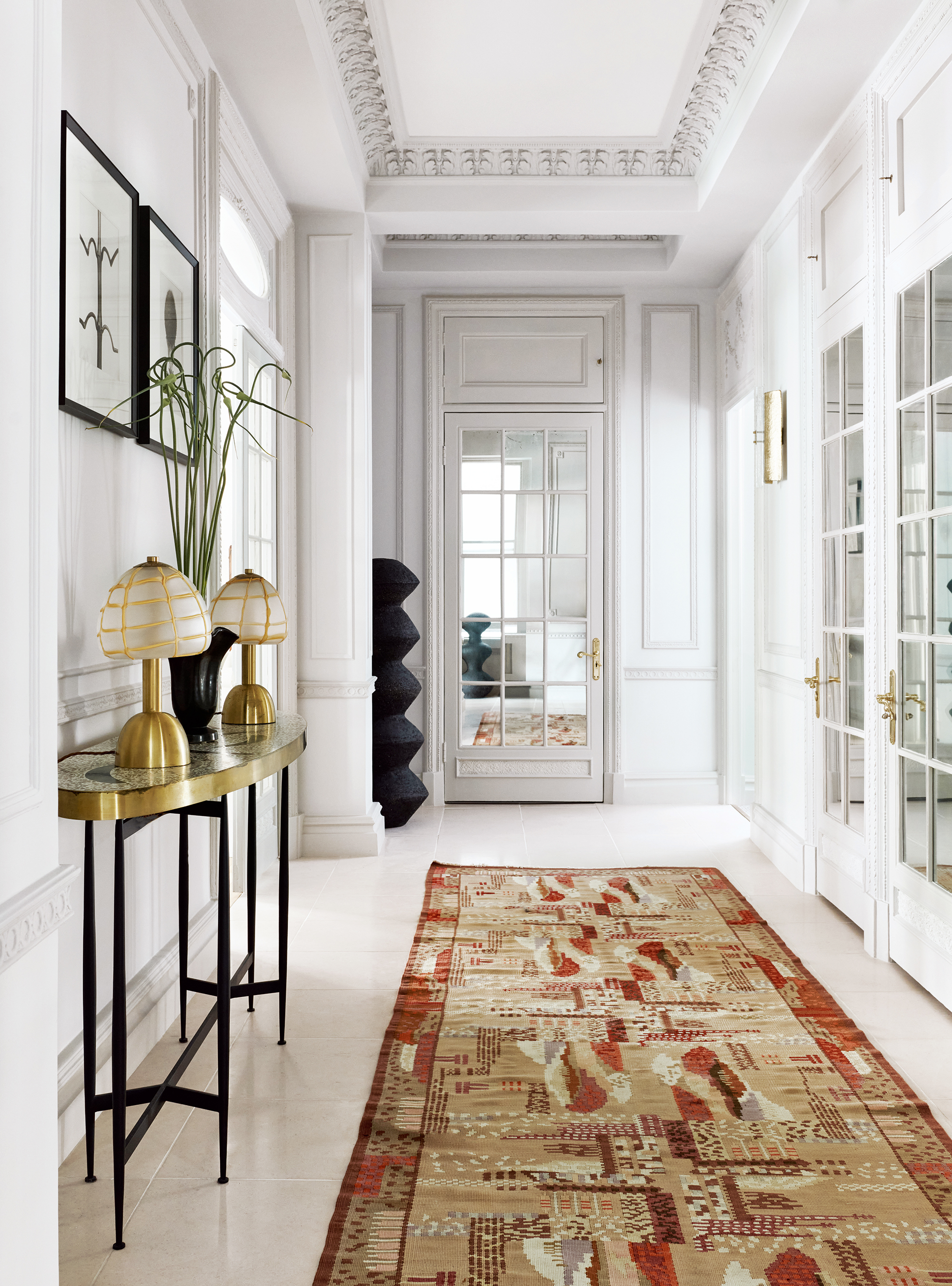
Hallway mirrors have long been used to extend the feeling of space but when paired with tall, glazed doors, high ceilings and elegant architecture the result is light and chic.
‘Given this property is an apartment means the hallway doesn’t lead to stairs, so we wanted to avoid it feeling like a long narrow hallway,’ says Jo Le Gleud, co-founder of Maddux Creative who put together this scheme. ‘We broke it up by adding mirrored panels to the doors, which helped carry light and show the original architectural detailing.’
She then brought in warm gold lamps, wall lights from Charles Burnand, a terrazzo console by Rooms Studio and an antique rug sourced through Robert Stephenson.
2. Lay down an interesting floor
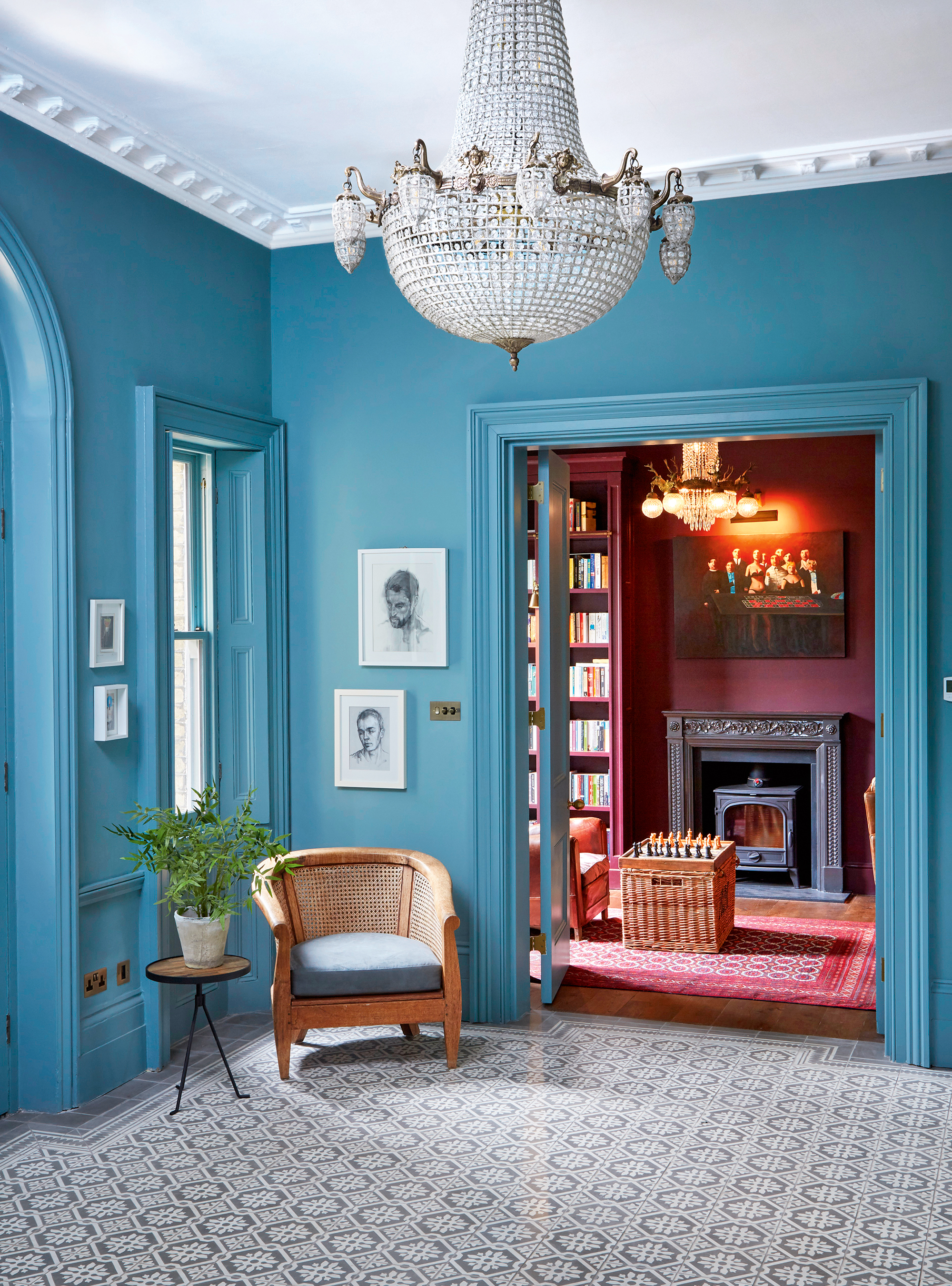
Very large entrance halls and grand staircases can err on the side of too formal for some – one way to counter this is by using an unexpected color on the walls and a modern encaustic tile on the floor. This project by the interior design duo Natalie Forbes and Louisa Rix of Forbes Rix required a total refurbishment of a large historic property in London. ‘We wanted to give this hallway flooring a contemporary twist. By using patterned encaustic floor tiles and bold hallway paint color on the walls and the woodwork, we retained the elegance, but brought it right up to date,’ explain Natalie and Louisa. Farrow & Ball’s Oval Room Blue was chosen for the walls and woodwork, paired with tiles by Bert & May on the floor.
3. Put art in focus
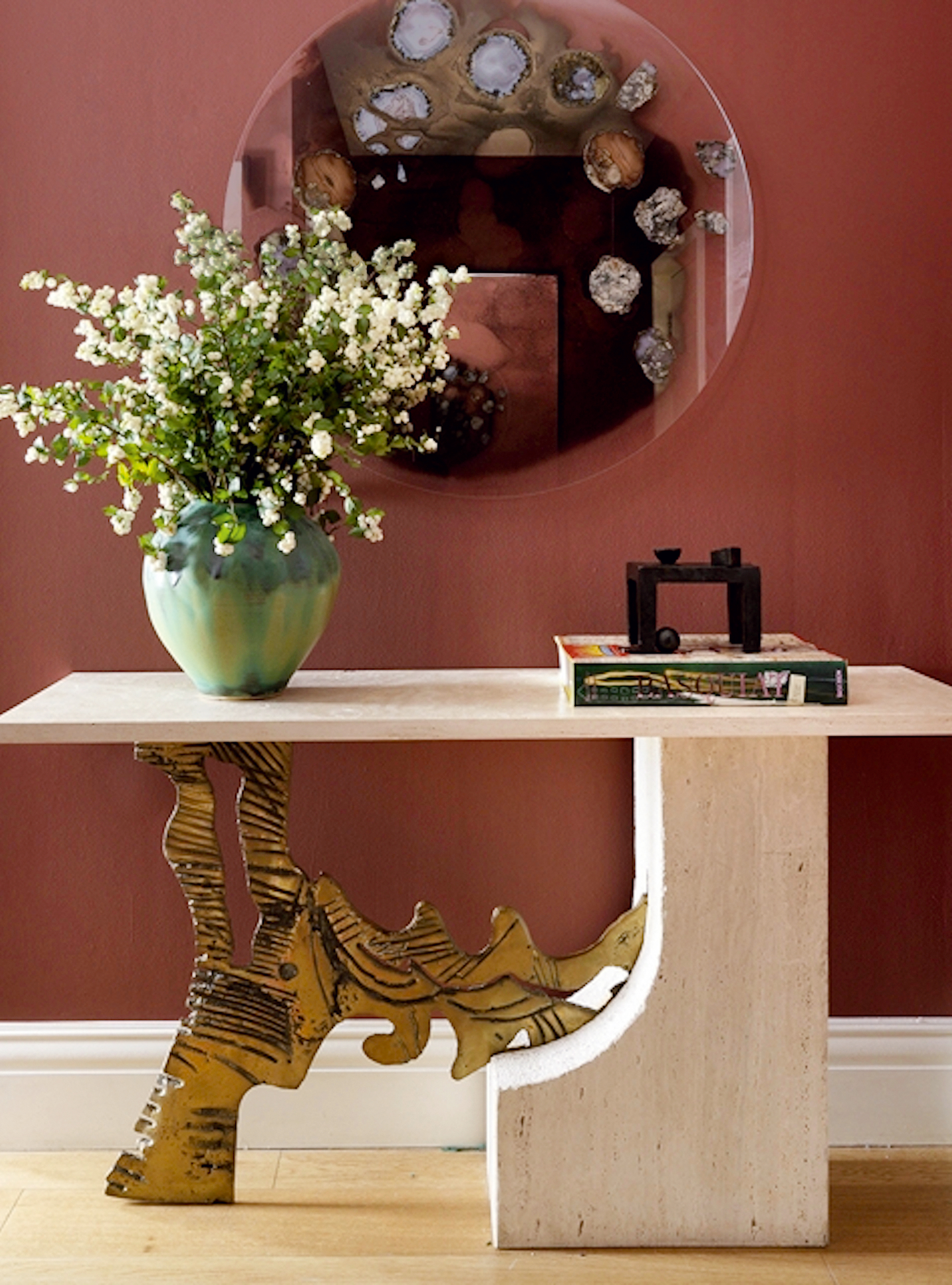
When there is room to store the usual hallway detritus somewhere out of sight of the entrance, take the opportunity to place a favorite piece of furniture, art or sculpture as a way of setting the stage for the rest of the decorative scheme in a house.
‘A strong, one-off unique piece of art is a great way to draw focus into a space that would otherwise be awkward or too small,’ says interior designer Natalia Miyar who used a russet red paint on the walls to set off the vintage console and statement mirror by New York-based studio Chen Chen & Kai Williams.
‘Often, you need a standout piece to bring life to the walls, and this will give you the opportunity to transform your hallway into a key feature of your house.’
4. Create a link to adjoining rooms
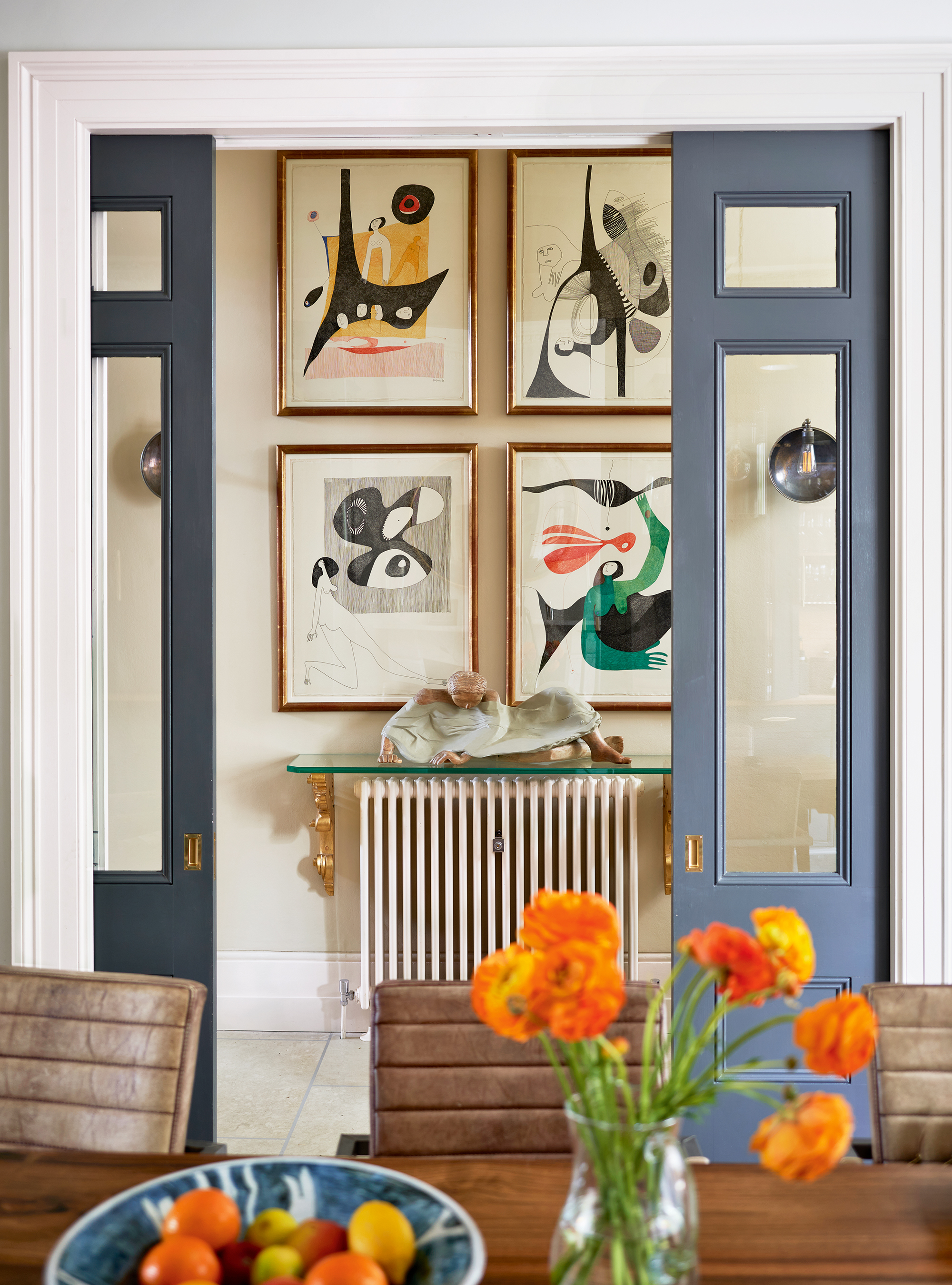
One way to maximize the feeling of space in a hallway is to replace solid doors into the adjoining rooms with glazed alternatives – a tried-and-tested method to allow light to travel between rooms. But there is another advantage to taking this route: making a feature of any pictures, paintings or sculptures that are in the hallway.
This example makes the most of the glazing by creating a focus of art in the hallway with the quartet of abstract paintings from Jenna Burlingham Gallery – which can be enjoyed whether the doors to the dining room are open or closed. Brass detailing on the shelf over the radiator cleverly links in with the frames and the metallic wall sconces, which helps subtly sew the scheme together.
5. Build in storage
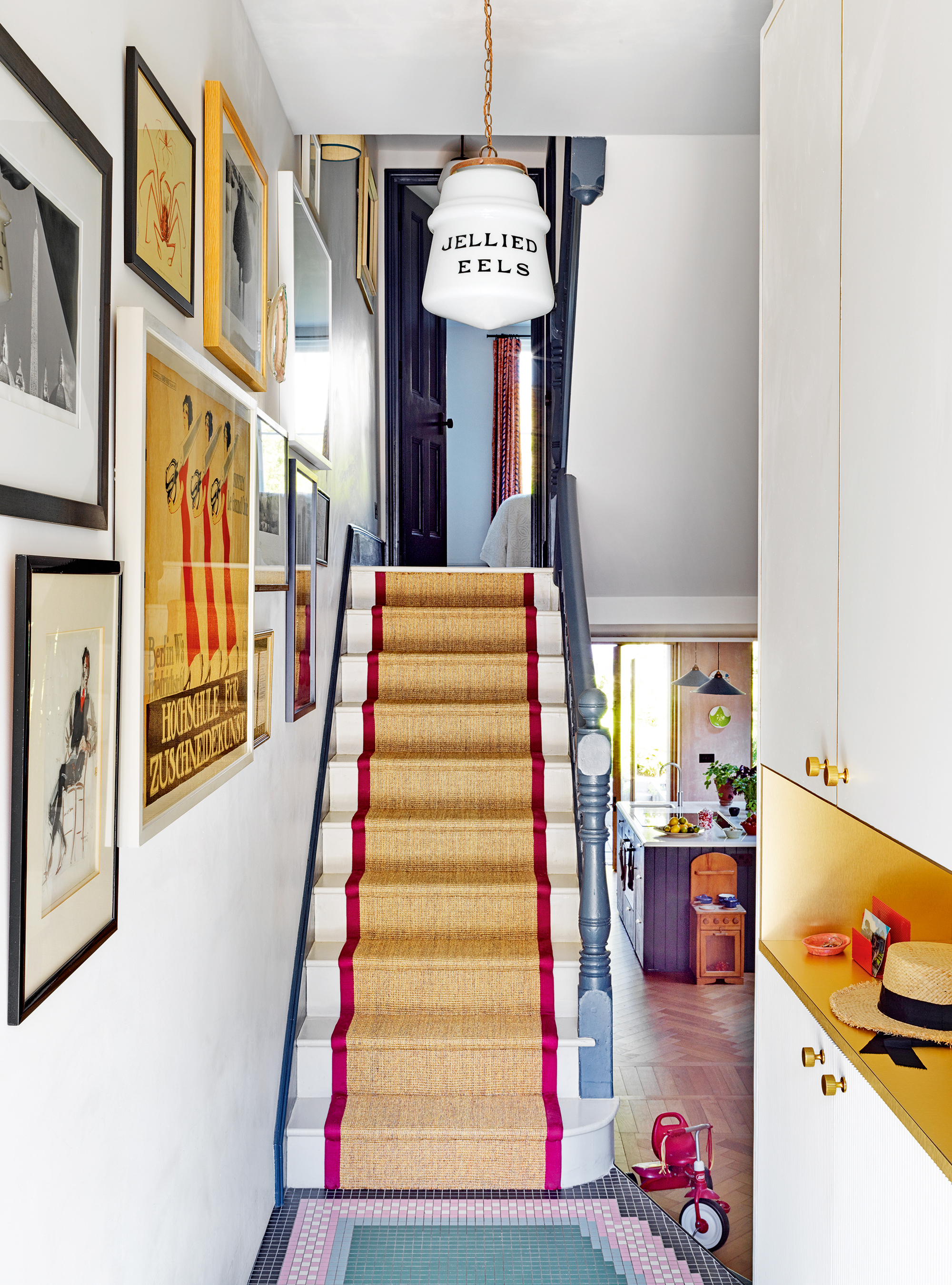
Nowhere is hallway storage handier than in a hallway and yet so often there’s little space to squeeze any in. If standard furniture runs the risk of getting in the way, the best option is to invest in bespoke joinery.
Beata Heuman cleverly plays a trick on the eye with the space in this narrow London hallway by designing a floor-to-ceiling cabinet to the right of the door painted in the same white to blend with the rest of the hall. The effect of borrowing about 30cm of width results in cupboards to hide away coats with a brass-lined niche in the center to accommodate keys and post. To distract the eye, she then added layers of color, with a tiled floor, sisal stair runner, close-hung artwork, and a witty pendant light.
6. Embrace rounded shapes and curvaceous design
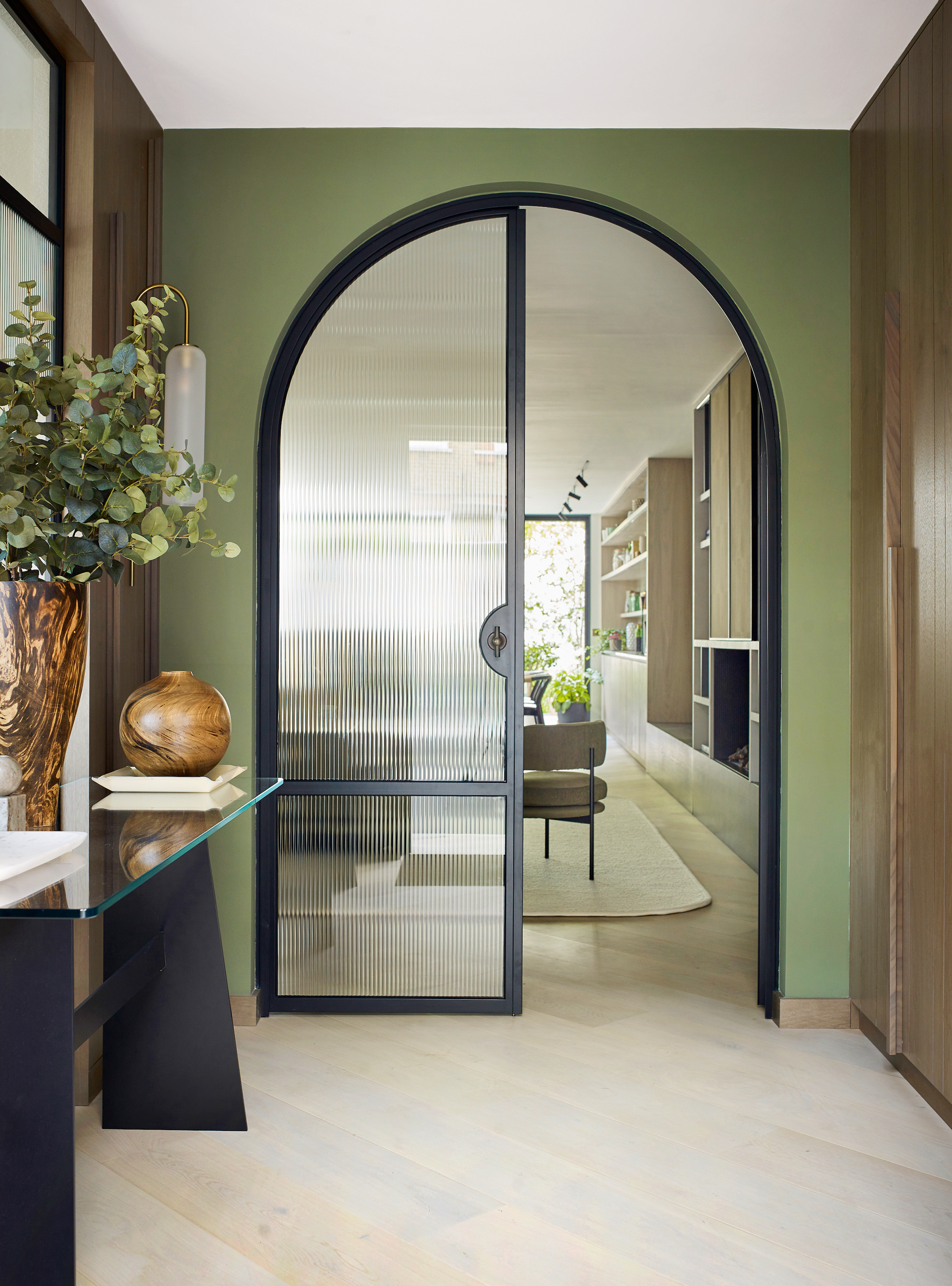
Victorian hallways sometimes feature a curved archway, a decorative ploy to soften the repeat of boxy right angles that hallways typically feature. When these details have been lost, or in the case of a new build, use rounded shapes to make a more welcoming entrance, recommends Irene Gunter, founder of Gunter & Co, who created this scheme for a house in London.
‘The curved arched doors in this hallway and curved rug beyond in the sitting room are just some of the many gentle shapes that are the backbones of the overall house design,’ she says. ‘Softer, rounded silhouettes are a clever way to stop a townhouse from feeling like a long tunnel of rooms, which is particularly important for a small hallway.’
7. Showcase art and decorative elements
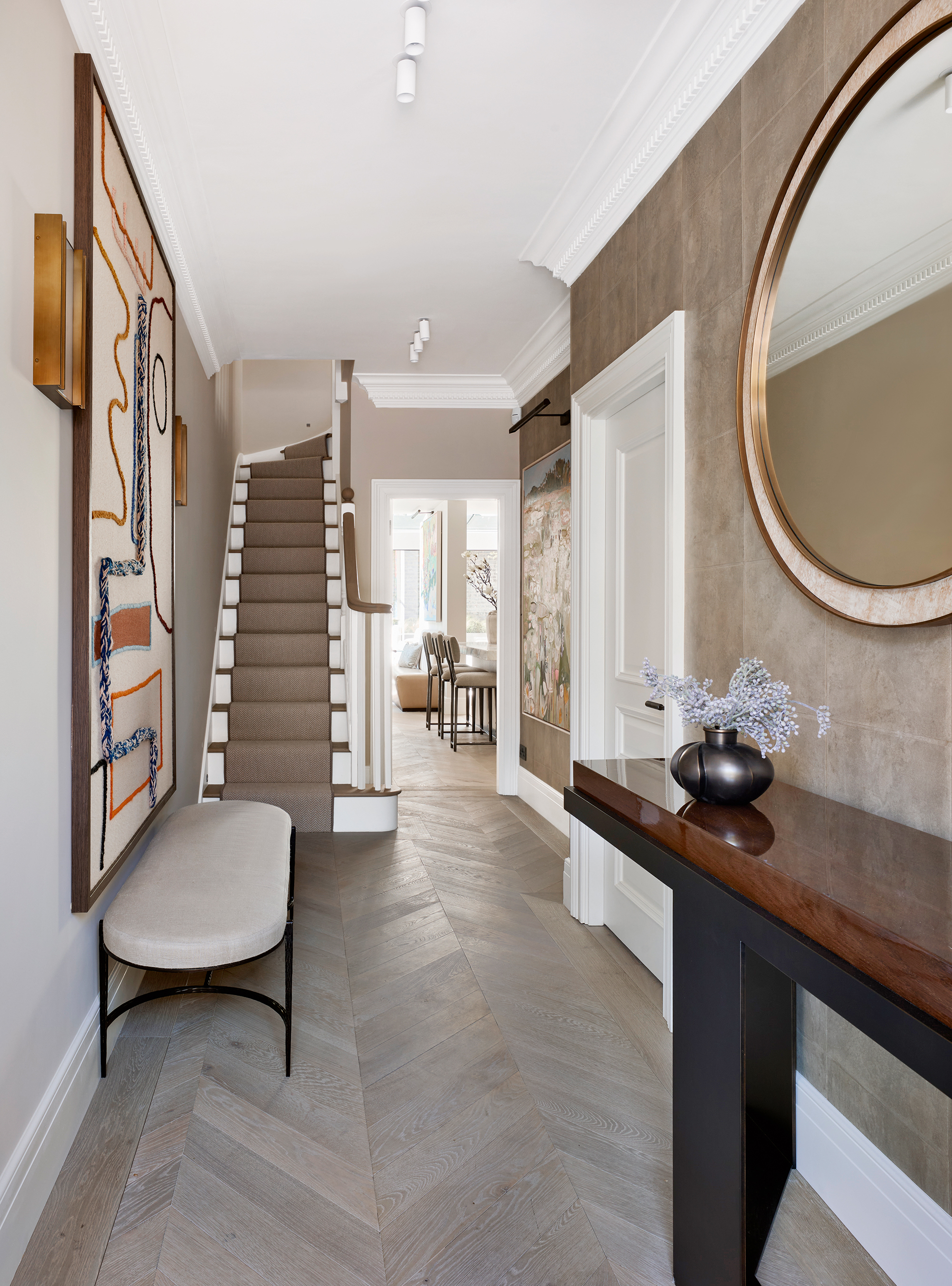
Keeping the palette of a hallway neutral creates a gallery-style space that is perfect for showing off art, as demonstrated in this scheme by Fiona Barratt-Campbell. ‘I particularly love the Moroccan tapestry by LRNCE on the left-hand wall,’ she says. Curating a decorative and delightful gallery wall is also a trick the experts use when staging a hallway for potential buyers.
8. Make a design statement with a console or buffet
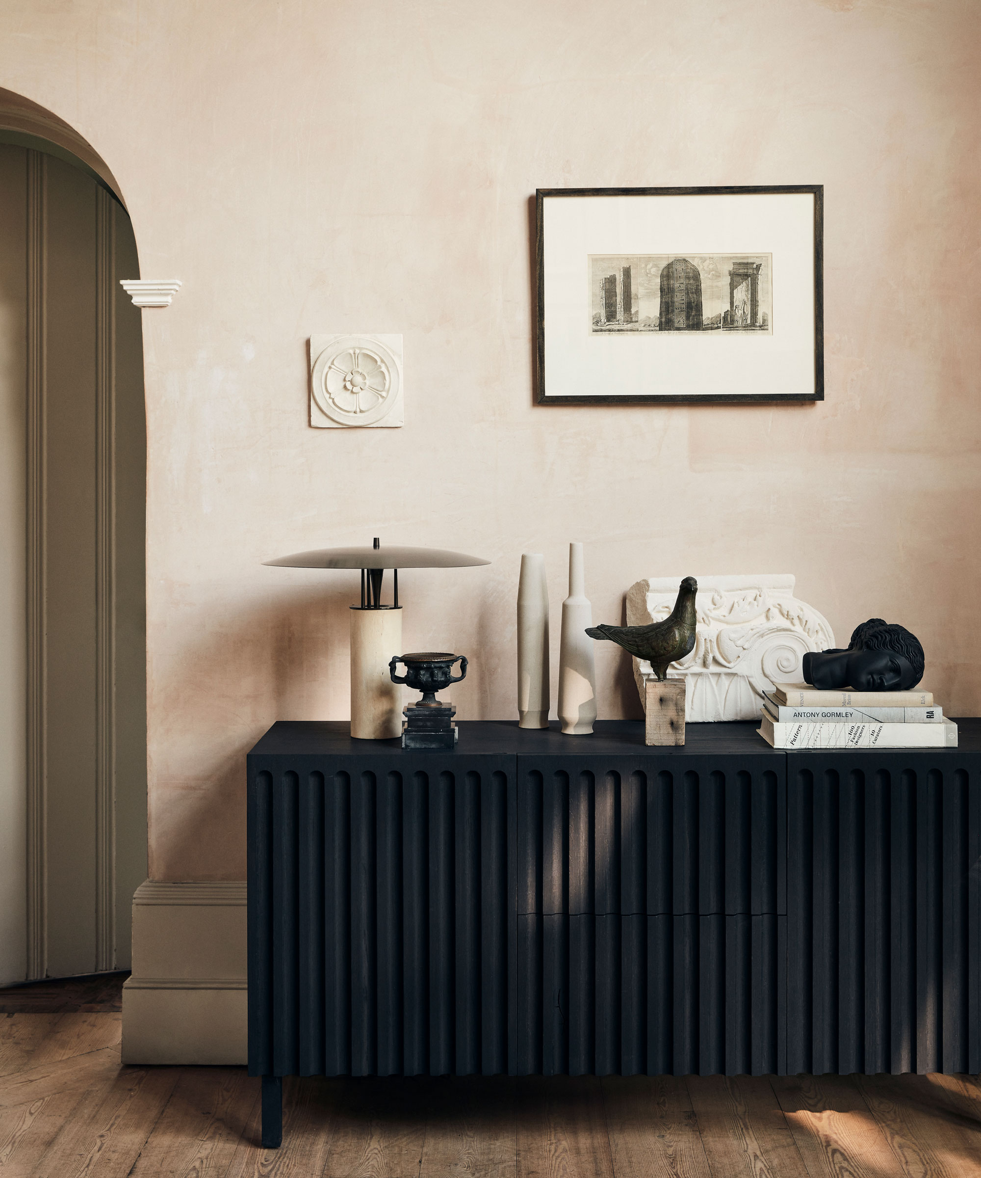
A hallway can be too small a space to be filled with pieces – so make what you do include really count in the design stakes.
A console table can not only work as a landing pad for keys, wallets and post, but as a stylish piece to set the tone for the house’s decor – and will fit in with narrow hallway ideas too. Or, opt for a buffet, which will be visually bulkier but take up no more floor space, and provides plenty of storage, too.
Here, space has been enhanced by soft tones of parchment, truffle and mole set against peach blush plaster walls. Don't forget to use entry table decor ideas in any hallway wide enough to take a table: a collection of lovingly curated objets is the star of the show, here, set above the rich black tone of the fluted buffet.
9. Bring pattern to an all-white scheme
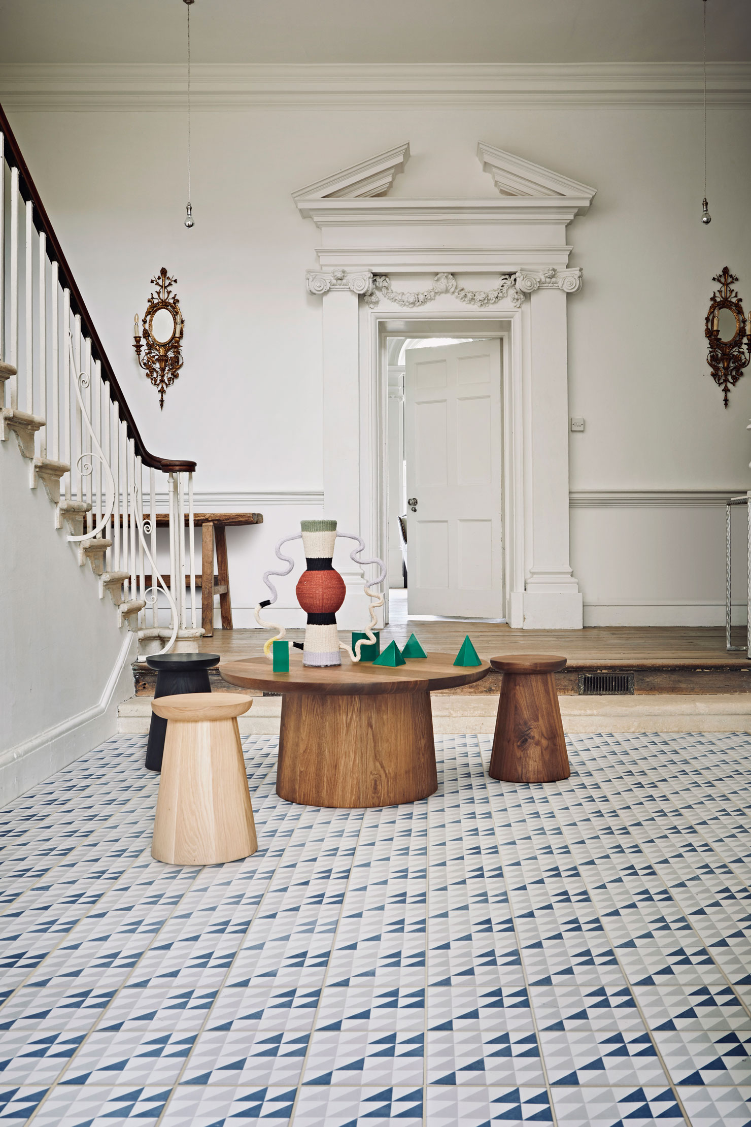
Add decorative detail to an all-white hallway with patterned flooring. It’s a tactic that doesn’t require a space this grand.
A small scale tile design like this is top notch as it’s light and breezy with a hint of color, and creates interest as soon as you walk in, great for blue hallway ideas. If your hall is on the larger size then using small tiles can make it more intimate. Conversely, if the hallway is compact, opt for larger tiles with fewer grout lines to avoid a busy effect.
The rest of the scheme here is white, including all of the woodwork and ornate detailing around the door and the original flooring and wood pieces add warmth.
10. Take a modern approach to checkered flooring
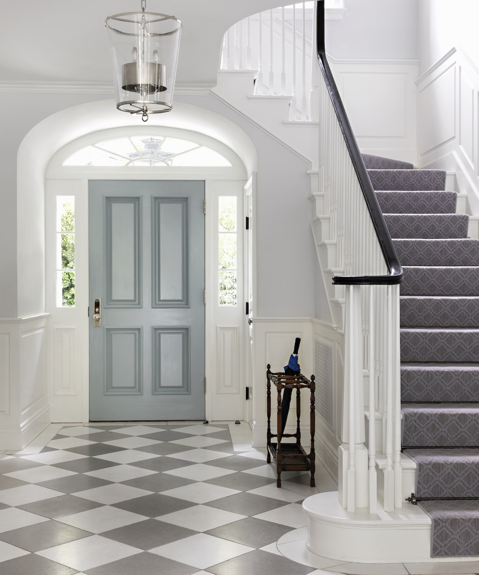
Checkered flooring has an interior design history that stretches back not hundreds, but thousands of years. Its place in foyers and hallways is particularly storied – if planning on using it to help your home make a grand entrance, think about how you can make it modern.
In this Bel Air home with interiors by Evens Architects and Windsor Smith, the traditional black and white pattern is swapped for a gray and white design, giving a light and airy feel to the space. Alternatively, opt for marble slabs with speckled patterns for added interest.
11. Create a warm rustic welcome
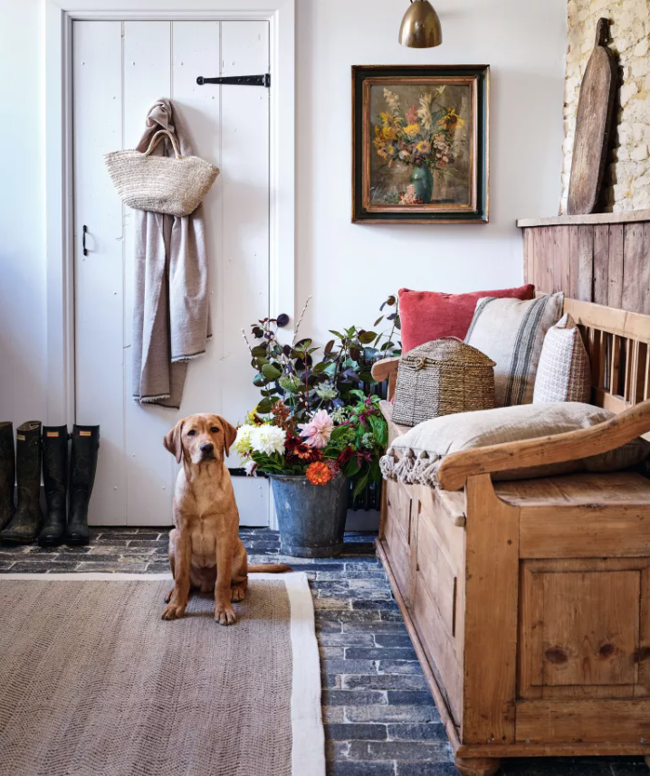
A hallway can feel like a hug with snug and smart fittings and furnishings. In this space, plank paneling and brick flooring is softened with cushions and seasonal flowers.
Seek out an antique bench and team with soft textures, such as natural rug. Accents of color come from the Dirty Orange velvet cushion from Oka.
12. Introduce a smart runner
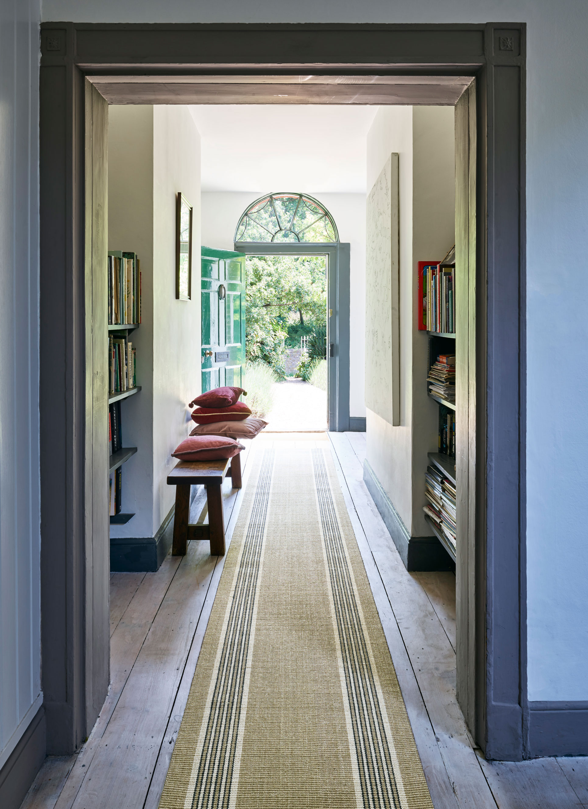
Opt for hallway runner ideas to add color and pattern to the hall and lead the eye up and down the space. It can reduce noise, too.
Note the books and pictures in this space – even tiny hallways can be furnished to feel like a room, not a thoroughfare, to make them feel far more welcoming.
13. Be creative with wallpaper
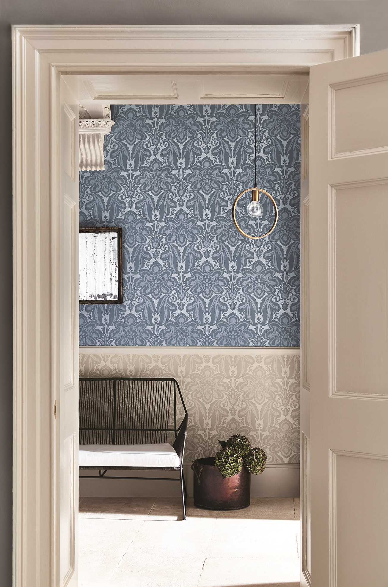
Generally, we recommend using a darker wallpaper below the dado rail, and a lighter one above. This hallway is the opposite.
It works for several reasons, however. The wallpaper design from Little Greene is the same but in different colorways, so this creates a sense of cohesion. And the color of the lower wallpaper matches the stone flags, creating a light feel. Note, too, that the woodwork paint shade matches the wallpaper and tiles to make this a beautifully executed combination.
And while this is a look that suits period homes, consider it to bring character to a modern hallway.
14. Use white to make a low ceiling feel taller
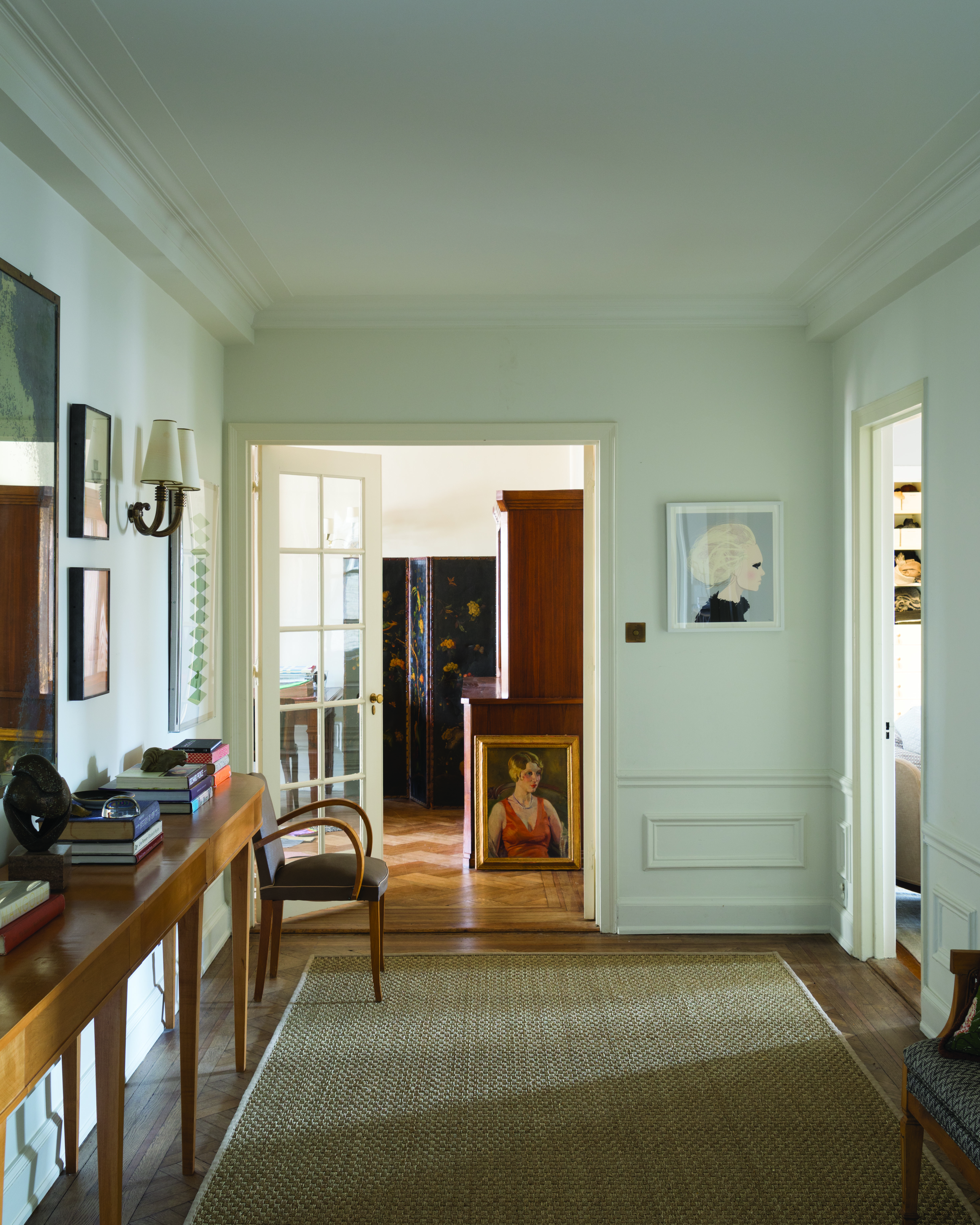
Hallways come in all shapes and sizes, and depending on the era of the property, can have low ceilings. White hallway ideas are generally the go-to in this situation as it will brighten the space, but if you prefer more subtle yet still uplifting color, then consider gray hallway ideas, such as using Dimpse by Farrow & Ball, seen here.
It’s a delicate gray that has elegance, and won’t be as harsh as a brilliant white. Be consistent and use it for walls and woodwork; that way you’ll achieve an all encompassing feel.
15. Lift the look with pink
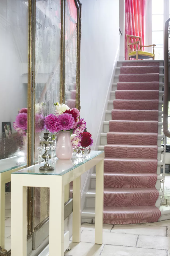
Think pink to elevate the look of a hallway. We love the way this shade follows through from the flowers, runner and up to the curtains at the top. As a side note, the glass on the top of the console also works to add reflection and life.
‘Mirrors are always a good go-to in a hallway but nothing beats a vase of flowers on a console to add life,’ advises interior designer Samantha Todhunter. ‘We used a vibrant pink stair runner to create a focal point at the end of the hallway.’
16. Add a pop of color for a quick fix
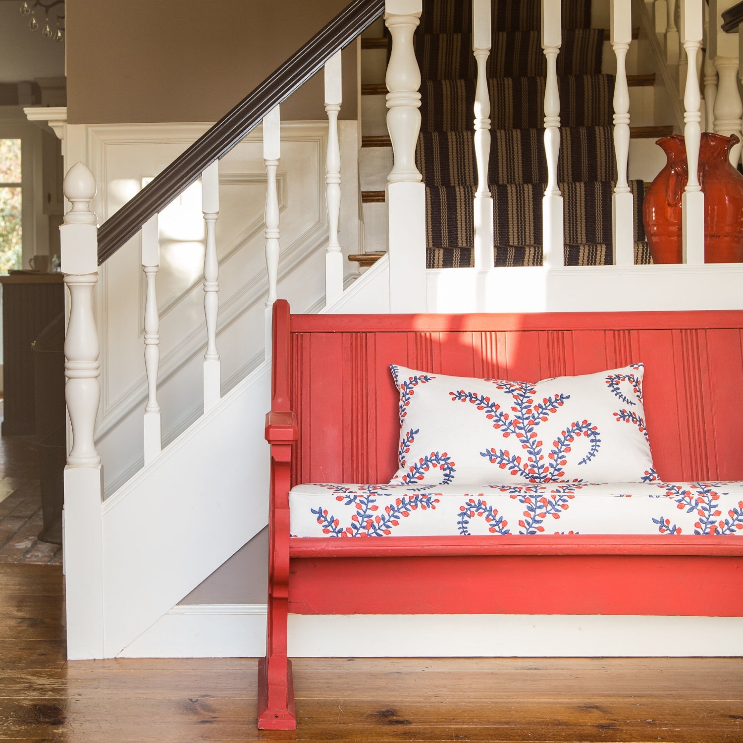
This farmhouse hallway has been given a pop of brightening color with a coral bench and multicolored cushions, a elegant example of red hallway ideas.
'Your entryway serves as the introduction to your home and the wonderful characters that reside within,' says Mary Maloney, owner and designer at Bees Knees Interior Design Studio.
'Your entry should suit the architecture of your home, along with the functional needs. The church pew in this entry holds sentimental value, along with a bit of family history, all of which suits this reproduction style colonial perfectly.
'Details count: the bright color and fabric add to the charm and welcome all who enter!'
17. Light the way
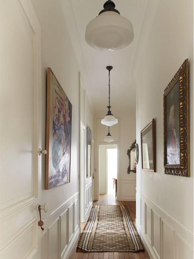
Apartment living means hallways don’t lead to stairs, so you can often end up with long narrow spaces that have a tendency to be gloomy. We asked Betsy Kasha, co-founder of Paris based interior design studio Kasha Paris for her top tips for lightening up hallways.
‘We tend to use soft white paint in hallways; not only does this brighten the space, but it is also a perfect background for art. Depending upon the ceiling height, we will either install gentle recessed lighting or simple, bright hanging lights.’
A design faux pas that’s often made in hallways is to only have a single pendant light, whereas in fact, you need at least three if your hallway is long and narrow. Make sure they’re a good size, too. The lights shown here are well proportioned within the space and also illuminate the artwork.
Hallway carpet ideas can reduce sound transmission in an apartment, or lay a runner over hardwood flooring.
18. Make space for art
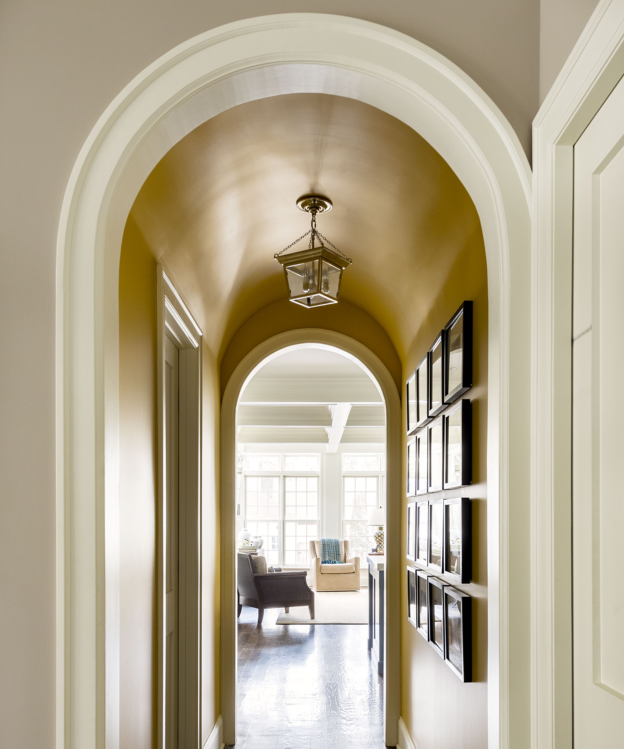
In a narrow hallway with very little space for furniture or bulky decor, make an impact with without straying more than an inch from the wall.
In this Lake Michigan home by M. Lavender Interiors, a small arched hall is turned into a space inspired by the owners’ travels in Africa. The walls are painted in Farrow & Ball's Sudbury Yellow to echo the color of the grasses in the Serengeti, while one is bedecked by framed photographs they took on a trip there to create a stunning gallery wall.
19. Introduce two shades of a color
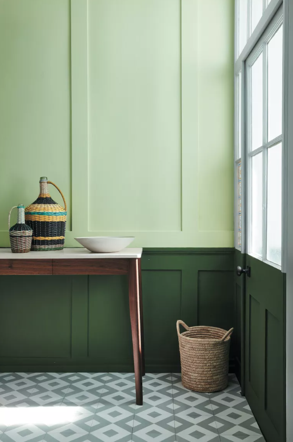
Using two shades of one color can add subtle interest to a hallway, but keep the look restful. Go for green hallway ideas, as in this space, to maximize the calmness of the atmosphere.
The top part of this wall features Acorn from Little Greene, while Hopper below the dado rail adds depth and is what your eye sees first.
The tiles act as the perfect foil to the flat wall color and create a lighter feel.
20. Enhance a sense of length with horizontal lines
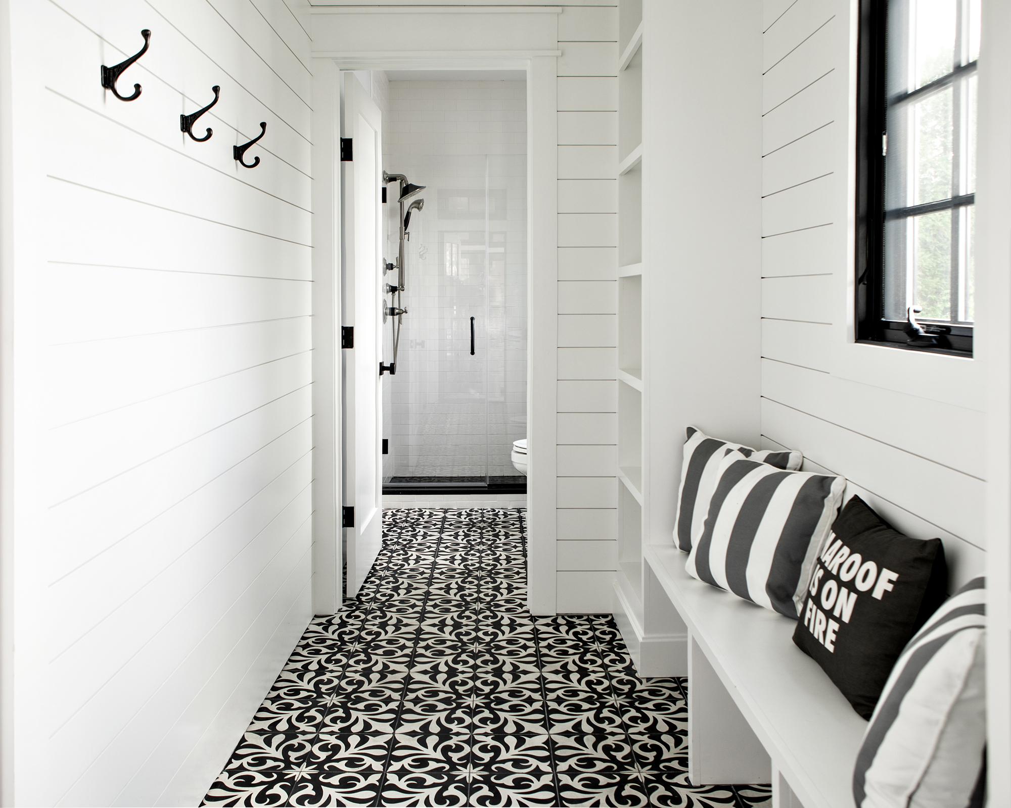
It’s not unusual to want to make a small hallway space feel bigger. This corridor, in a house with interiors designed by Marlaina Teich, shows not only how lighter colors are a great way to help make the space feel brighter, but that a little optical illusion goes a long way.
White shiplap arranged in horizontal lines creates a sense of distance between one end of the hallway and the other, as they disappear towards a vanishing point. This makes the space feel both longer and grander.
21. Choose paint with a soft sheen to reflect light
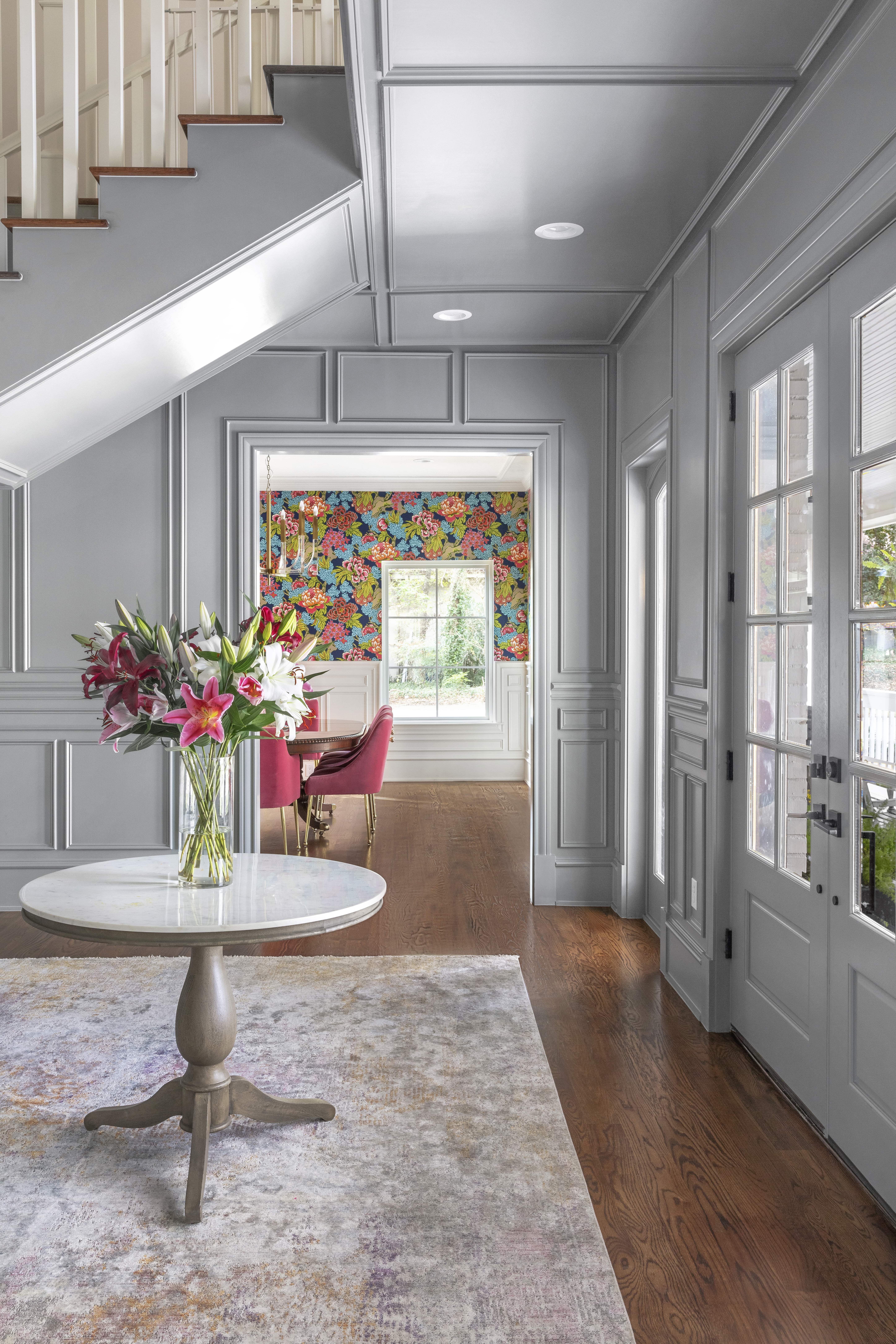
Note the paint finish in this stunning gray hallway – it has a soft sheen, specifically chosen to reflect light and to create a smart look in this roomy entryway. This trick, though, will also work really well in smaller hallways or those starved of natural daylight, enhancing light levels and make the space feel larger.
'Don't forget about the entry walls. Sometimes even after furniture and art an entryway can feel incomplete, so your entry may be calling for wallpaper or architectural wall paneling,' says Etch Design Group's principal interior designer, Stephanie Lindsey.
'We provided 2D elevation drawings for the paneling design. A classic traditional element, the wall paneling created sophistication at the entrance to the house but we painted it gray to modernize it.'
22. Go for a maximalist wallpaper
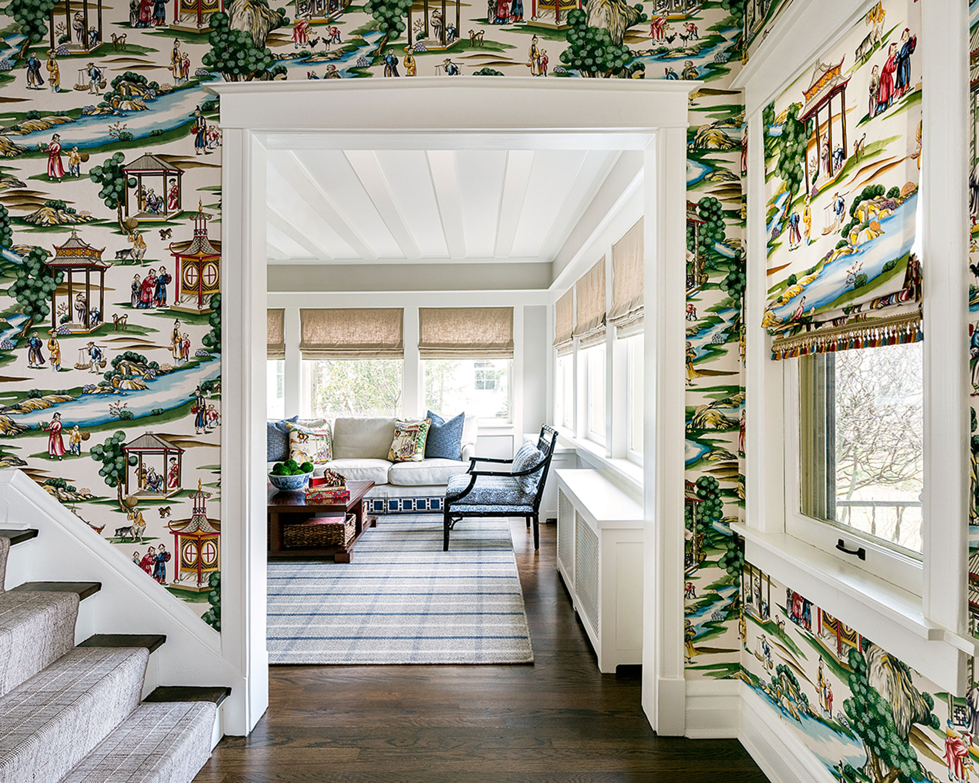
A hallway is the perfect setting to embrace your love of wallpaper. If you are looking for inspiring hallway wallpaper ideas, illustrative designs are eye-catching and create a fabulous welcome for your visitors.
It can really frame an entrance to another room too, which can look quite spectacular: it’s worth using the same colors within the room you can see in this case so the look is cohesive, and consider using the same floor so there’s flow from one space to the next.
23. Decorate with a warm tone for a welcoming feel
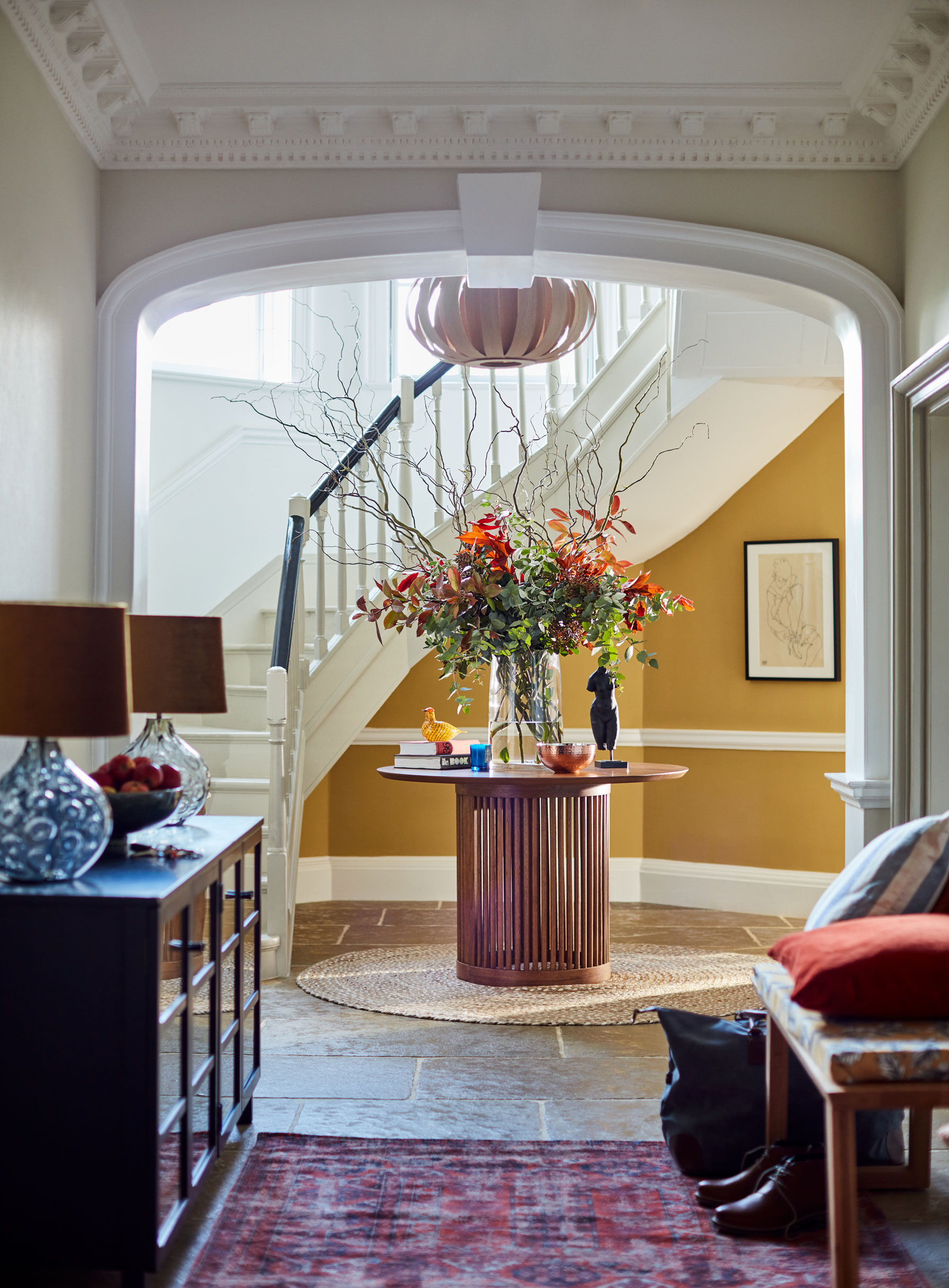
Hallways need to feel welcoming – not just for visitors but for when you come home, too. So, using even a splash of a sunny shade for yellow hallway ideas can be vital for creating an inviting atmosphere, especially if your space is poorly lit by natural daylight or north-facing.
A focal point in a hallway is always a win, too; here the entry table decor ideas attract attention. Tables can also accumulate clutter, though, so be sure to provide a storage option within a table such as this, or nearby.
24. Go for a dazzling woodwork display
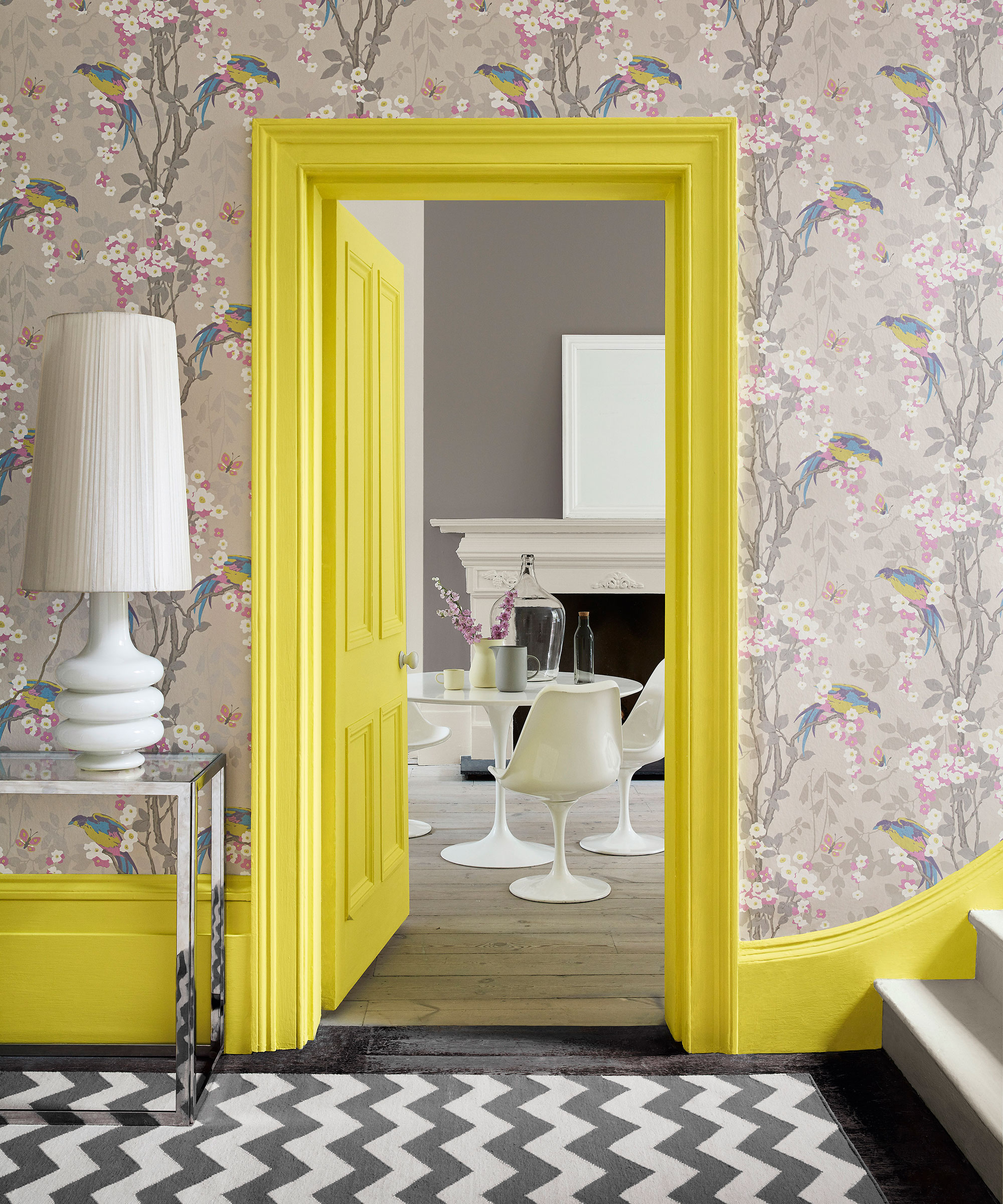
For sheer fun, match your skirtings to a color from your wallpaper, and don’t be afraid to go bright like in this exquisite hallway from Little Greene. Featuring the striking Loriini Dorian wallpaper, the reasonably traditional design – albeit in bright colorways – contrasts against the ultra modern paint shade, Trumpet (196).
It’s not for the faint of heart admittedly, but if your hallway is light and bright it can take it. Keep the rest of the scheme lower key and let the walls and paintwork do the talking.
25. Introduce subtle pattern
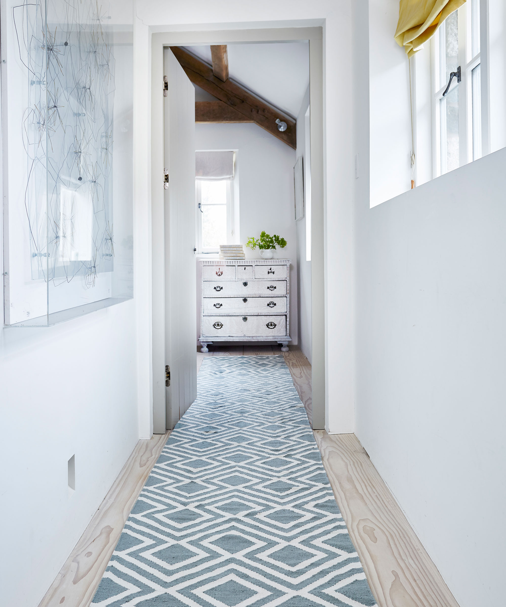
Plain walls give you room to be creative; they’re the original blank canvas to which you can add interest – for example with a hit of pattern.
Runners are excellent for this as Tasha Green, director of Weaver Green explains: ‘Runners allow you to instantly update and change the feel of a hallway. A statement runner can be the main design feature from which you complement other interior elements in your entrance. For example, a simple herringbone helps to create a classic timeless look, from which you can add vibrant or strong patterns and prints with other accessories.’
26. Enhance storage potential
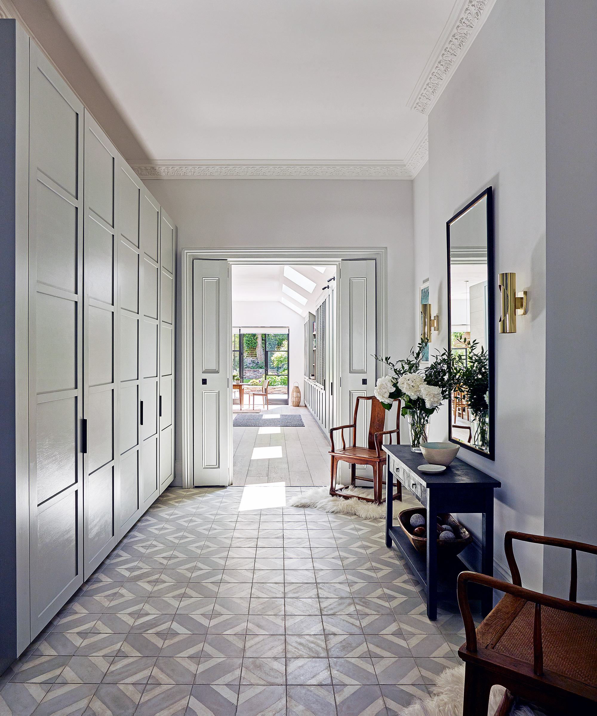
It’s the first place anyone sees when they arrive at your home, but a hallway is also a magnet for everyone’s stuff. Tidy it up with a few key buys and keep the everyday essentials close at hand.
Many are narrow, so keep all of your storage ideas along one run of wall. A high peg rail can be home to a variety of items, and keeps items off surfaces. Or, if space allows, a row of built-in cabinets is a neat and tidy alternative.
27. Create the right mood with lighting
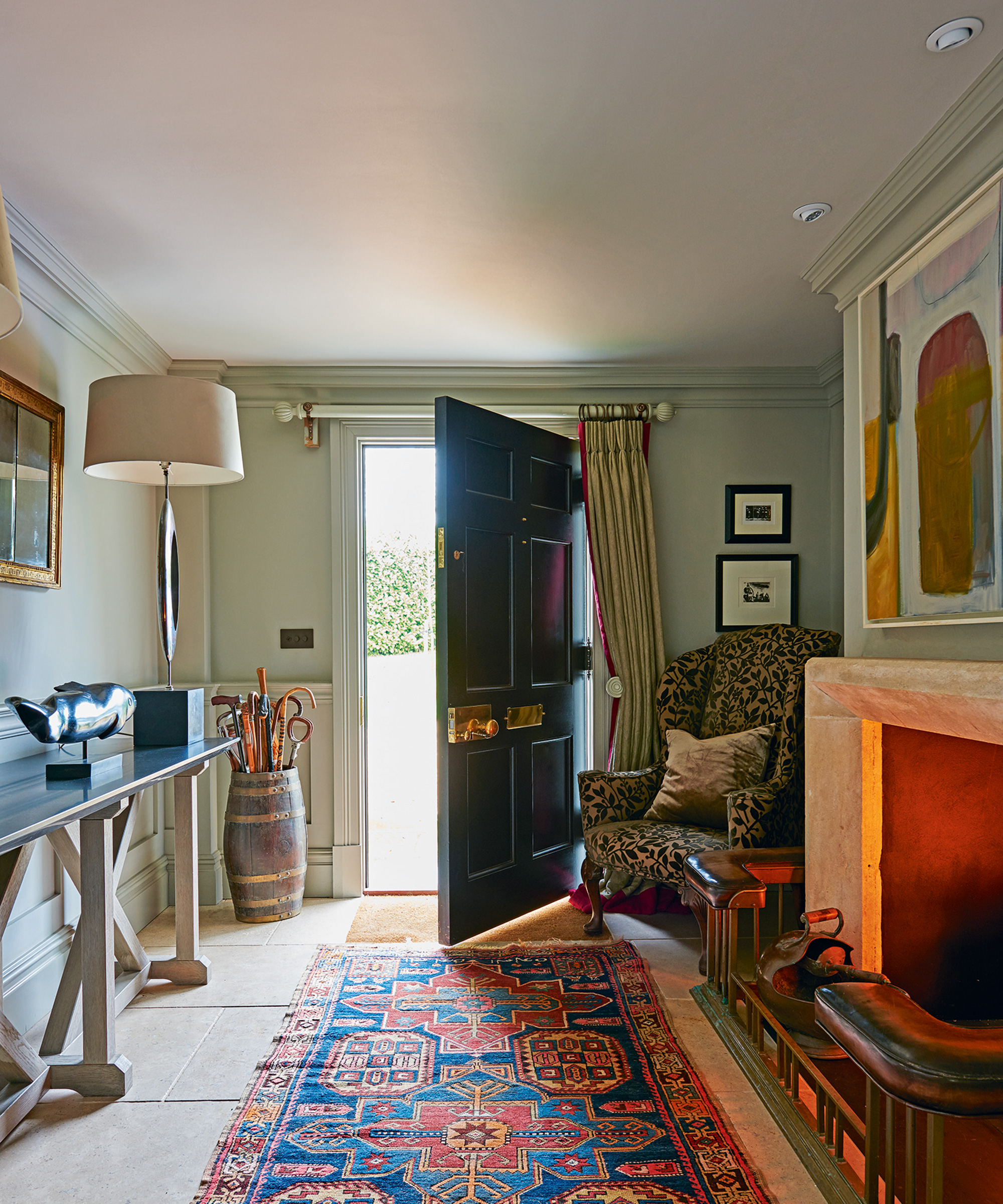
If you are planning a scheme with no, or few, windows, hallway lighting ideas are critical.
Try to include ambient or background lighting, task lighting for areas such as a mail table, and accent lighting to pick out features such as a mirror or doorway.
This hall includes LED spotlights, a table lamp and fireplace, for good measure.
28. Create a focal point with antiques
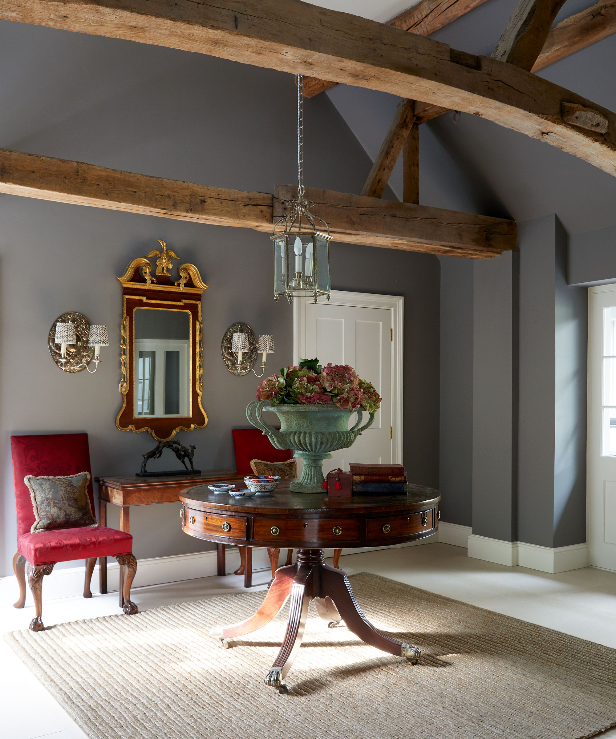
If your entrance is on the larger side, it’s a good idea to create a design statement so the space doesn’t feel too cavernous.
A beautiful antique table will do the trick; round is always best so you glide around it rather than getting caught on corners. Use it to display fresh blooms and groups of trinkets.
The color you choose is also important. Henriette von Stockhausen, creative director at VSP Interiors, explains, ‘I love how this color, Worsted by Farrow & Ball, together with the warm tones of the antiques and the beautiful damask print by Pierre Frey makes this room cozy and welcoming.’
29. Choose a classic look that never dates
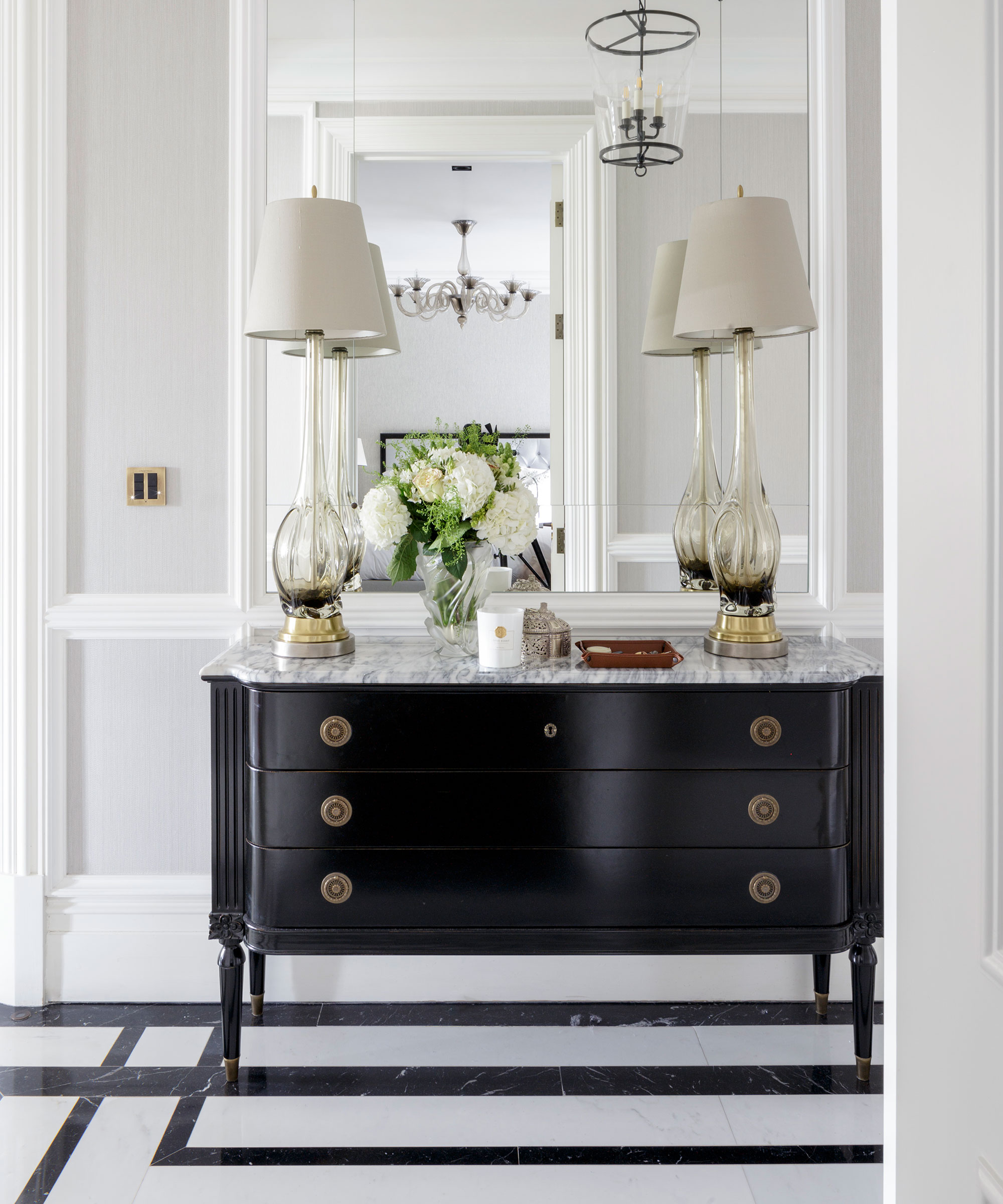
A classic that never dates, a monochromatic scheme is bold and beautiful. Irene Gunter, founder of London based design studio Gunter & Co, explains her design choices with this hallway, ‘In areas that tend to be dark, like a narrow hallway, a reflective floor combined with large wall mirrors will bounce the light around. A design in classic black and white marble is not only timeless, but also makes the hallway feel less long and narrow.
'A patterned floor, when designed carefully, is the best way of making a room seem bigger. A good patterned floor doesn’t show where each tile starts or stops, which gives a very homogenous effect, tricking the eye into making the space feel bigger.’
30. For dramatic effect choose two dark shades
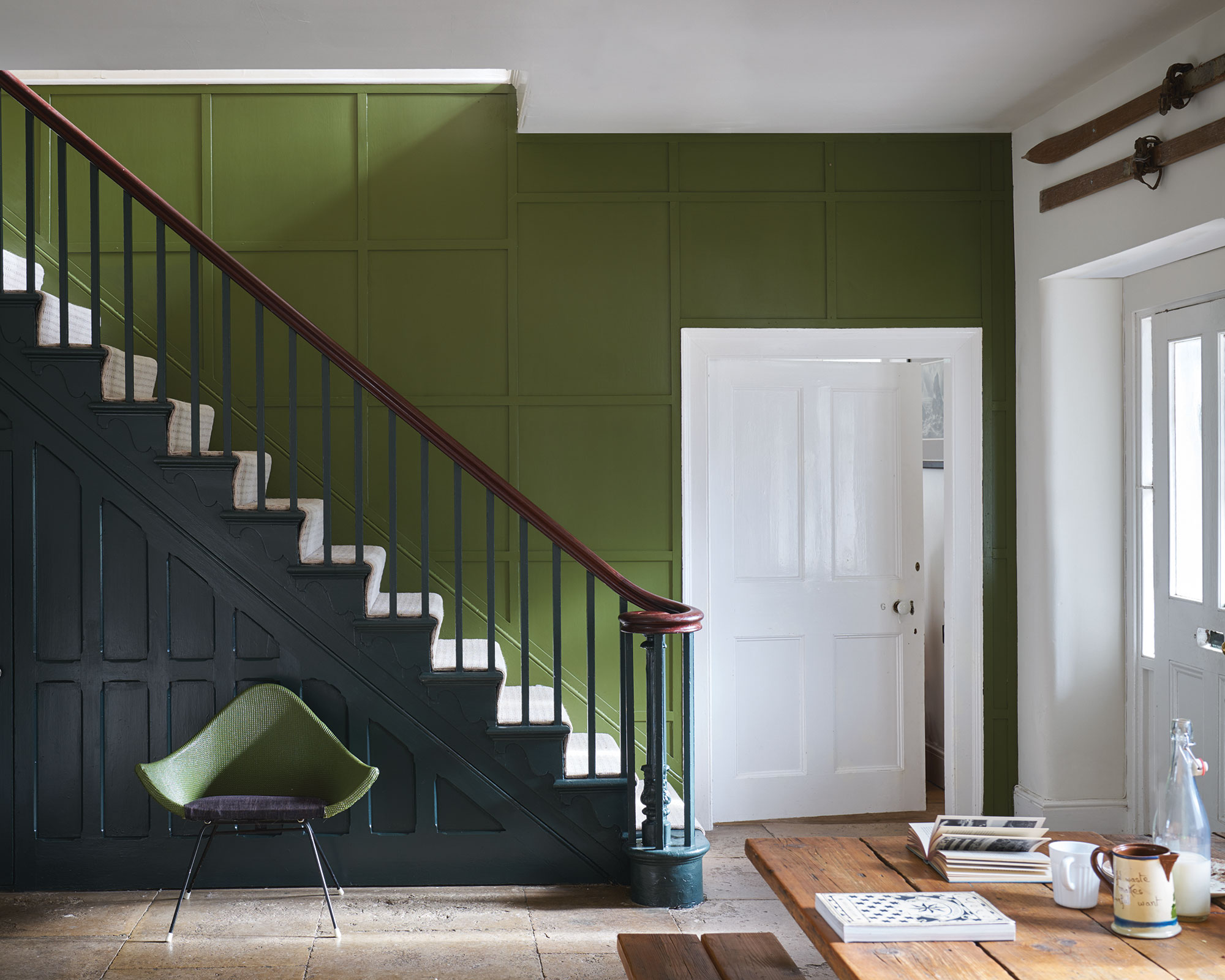
If your hallway is large enough, you can get away with painting a wall in two dark and vibrant shades. Olive green is on a roll currently, and Farrow & Ball’s version, Bancha No.298, looks rather fabulous with fresh white woodwork and the company’s Studio Green painted on the paneling of the stairs.
The neutral runner up the stairs creates a striking contrast right in the middle of the two shades, an intentional feature that’s worth copying.
31. Never underestimate the power of a mirror
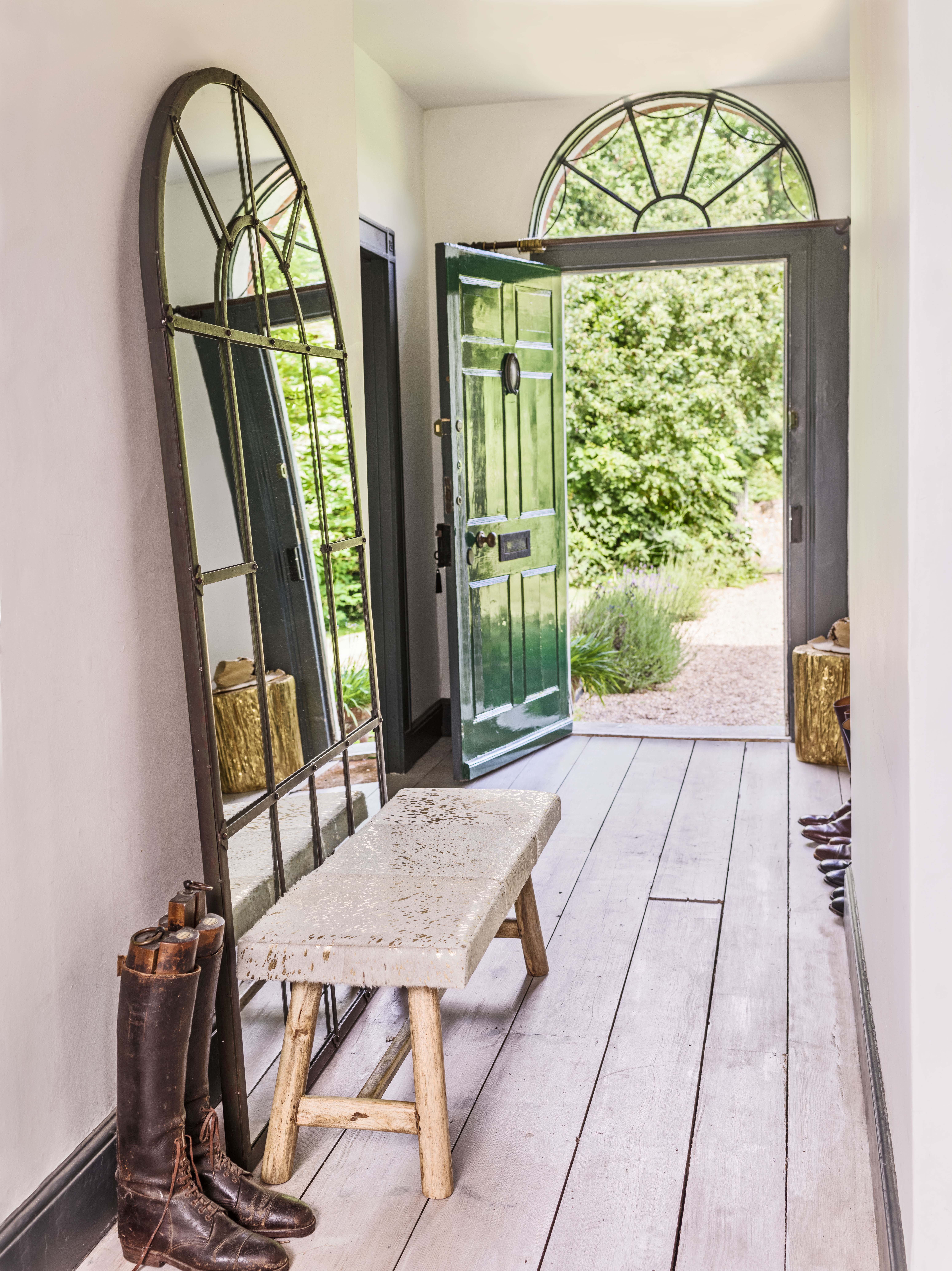
The larger the mirror, the more light you can bounce about, and a floorstanding design can easily be propped up against a wall. It will also be an impressive focal point for the hallway.
‘Mirrors are interior designers’ magic tool for creating captivating optical illusions,’ says Lou Graham, co-founder of Graham & Green.
‘They create the illusion of more space, of brightening up dark corners, of bouncing color from one side of the room to the other. They can even imitate doorways, like portals into other worlds.
'Hallways can be elongated into endless pathways with elegant floor-length mirrors, and blue skies can be brought indoors with window-like wall mirrors.’
32. Factor in texture
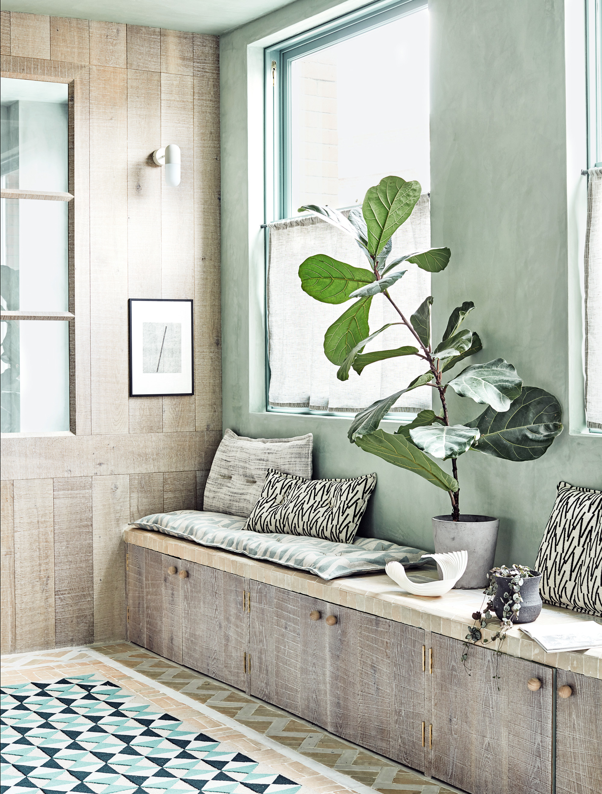
'If you have gone for a pale paint color in a hallway, it's important to work in texture, whether via natural materials or pattern in upholstery,' says Homes & Gardens' Editor in Chief Lucy Searle.
Paneling ideas for walls is one way to do this; aesthetically pleasing, practical and space-enhancing, paneling can be a real bonus in a hallway. We love how the material used here has been continued into the storage, while providing seating in what would usually be a thoroughfare given little pause for thought.
What is the best color for a hallway?
The best color for a hallway is a light color. Lighter colors give the appearance of more space, while darker tones will bring the room in, resulting in a cozier, more intimate feeling.
Similarly, wallpaper with a large motif will introduce a sense of drama, while a smaller design will help to make the hallway appear more spacious.
With no, or few, windows, hall lighting is critical. As with most schemes, the key is to layer different sources – this includes ambient lighting, task lighting and accent lighting to pick out your hallway's features, such as a mirror or doorway.
How do you make a hallway more interesting?
Whether it’s the first space your guests see or a route between rooms, a hallway merits serious design attention.
Winning schemes pay attention to wall and floor treatments, mood, and storage.
Whether concealed or statement, fit plenty, particularly focusing on hallway shoe storage solutions, to ensure that it doesn’t become a glorified dumping ground.
The hallway is usually the first area of your home that visitors encounter and, as such, should be a reflection of your taste and personality. You can go flamboyant or pared back: nothing is off limits as long as the scheme is in tune with the rest of your home and not a one-off statement that competes with other rooms.
Sign up to the Homes & Gardens newsletter
Design expertise in your inbox – from inspiring decorating ideas and beautiful celebrity homes to practical gardening advice and shopping round-ups.

Jennifer is the Digital Editor at Homes & Gardens. Having worked in the interiors industry for several years in both the US and UK, spanning many publications, she now hones her digital prowess on the 'best interiors website' in the world. Multi-skilled, Jennifer has worked in PR and marketing and occasionally dabbles in the social media, commercial, and the e-commerce space. Over the years, she has written about every area of the home, from compiling houses designed by some of the best interior designers in the world to sourcing celebrity homes, reviewing appliances, and even writing a few news stories or two.
-
 Victoria Beckham has a unique formula for perfect bedding: 'Very expensive sheets and cheap pillows' – you can follow her example from $15
Victoria revealed she goes for crisp, white bed sheets and pillows with neck support from Target – and you can shop similar buys at an ultra-low cost
By Hannah Ziegler Published
-
 I just discovered the best non-toxic product for getting rid of ants in your yard – and you probably already have it in your bathroom cupboard
This household item is an effective ant deterrent that doesn't leach harmful chemicals into your soil
By Tenielle Jordison Published
