Fall color schemes – 17 on-trend colors to decorate with this fall
Spanning rich and warming earthy shades to on-trend greens, these are the top colors to decorate with this fall, for a cozy and stylish space
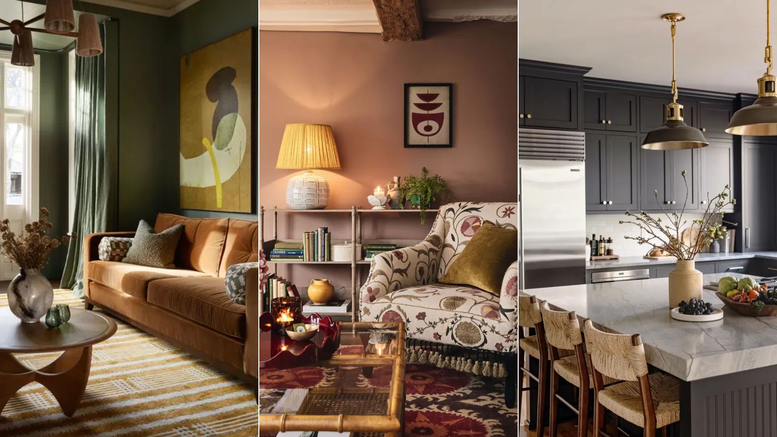
- 1. Go for gold for a luxe look
- 2. Channel the falling leaves with a burnt orange
- 3. Connect to nature with tranquil, earthy tones
- 4. Pick a palette of pinks for a more fresh feel
- 5. Opt for a deep eggplant shade for a cocooning feel
- 6. Layer calming coffee tones for a cozy, neutral look
- 7. Balance bright blues with cozy, contrasting shades
- 8. Fire up a scheme with deep reds
- 9. Pepper calming neutrals with rich autumnal hues
- 10. Ground yourself with dark browns
- 11. Choose warmer grays for a cozy neutral scheme
- 12. Uplift a room with a joyful use of ochre
- 13. Embrace a mid-century color palette
- 14. Pair tobacco hues with earthy greens
- 15. Opt for lighter tones for an unexpected fall color scheme
- 16. Choose moss green for a warming, cozy space
- 17. Decorate with dark charcoal paint colors
- Shop fall decor
- FAQs

Zara Stacey
Fall is fast approaching, and while there are plenty of things to get excited about at the beginning of the cozy season, decorating our homes to reflect the changing seasons is perhaps our favorite.
Waving goodbye to summery, saturated hues, fall decor welcomes rich, earthy colors that are timeless and sophisticated. There's something so universally appealing about fall colors, and fully leaning into these rich hues is guaranteed to enhance your home's decor.
From rich neutrals inspired by the changing leaves outside to deep and dark shades of green, fall colors are tied together with an appreciation for the natural world, which is perhaps what makes them so soothing and timeless when incorporated throughout room color ideas.
17 fall color scheme ideas
While a glance at your outdoor fall decor ideas and the natural surroundings that inspired them will likely serve you with ample chromatic inspiration, we’ve gathered some stunning ideas on how to integrate fall color trends into your home and asked the experts to highlight their favorite hues and combinations to help you get it right.
1. Go for gold for a luxe look
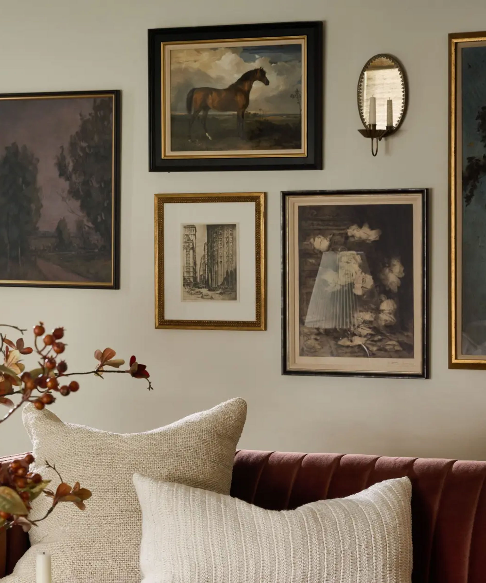
Gold is so often associated with Christmas decor ideas, but when used in the right way, a glistening gold scheme can enrich a room with plenty of cozy character and warmth, perfect for fall.
Fall color schemes do not always have to revolve around paint ideas, a golden fall color scheme can be achieved through the use of furniture, accessories, and lighting. As shown in this living room by Magnolia, the gallery wall, created through a stylish assortment of vintage and antique frames, as well as the elegant Oval Antique Mirrored Sconce, works with the rich red sofa and fall foliage to enhance the neutral room with a refined fall palette.
2. Channel the falling leaves with a burnt orange
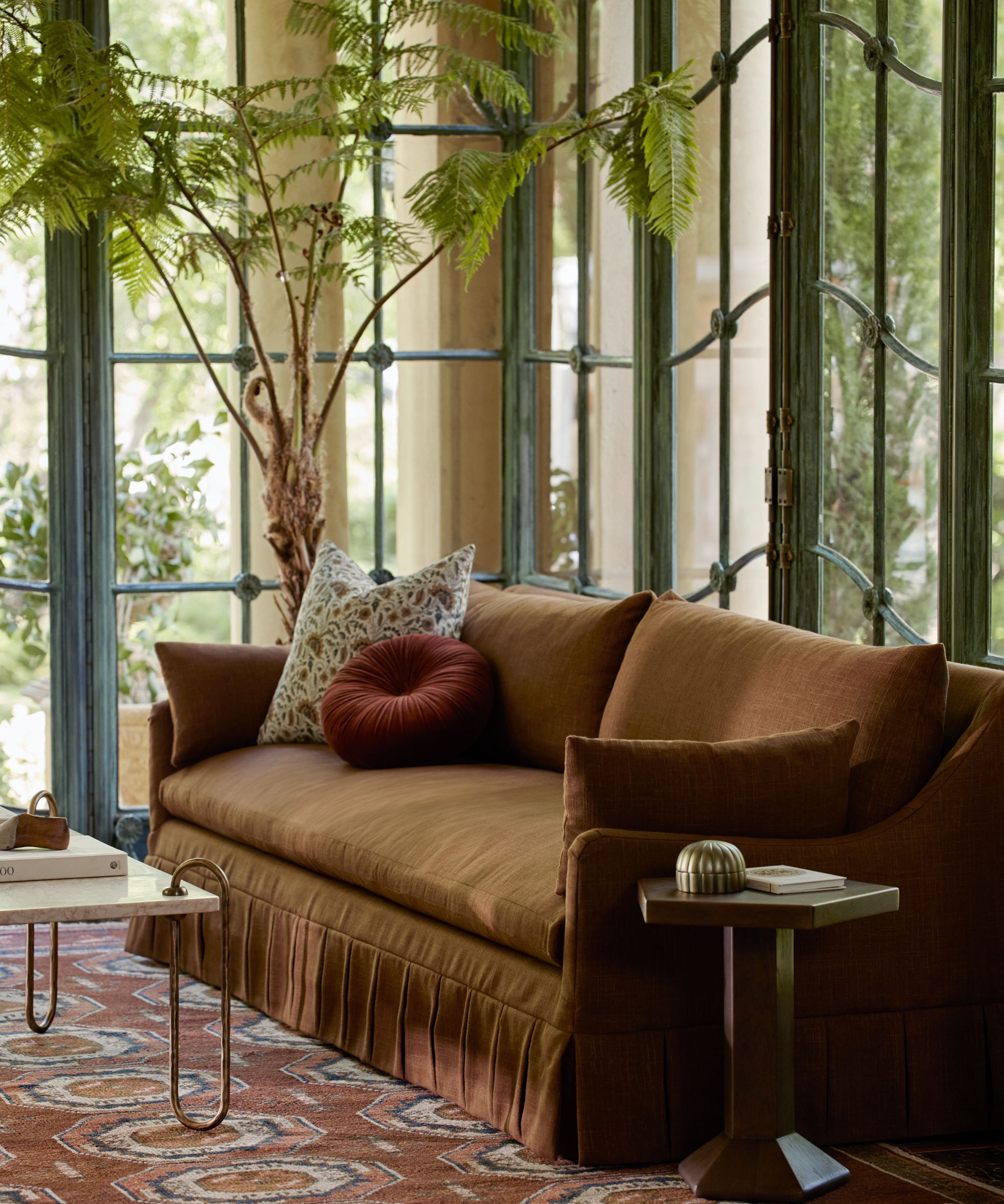
If you’ve started scouring the sidewalk for the most vibrant leaves to inspire your fall wreath ideas, don’t let the inspiration stop there. Terracotta decor is a wonderful addition to your fall color schemes.
The undisputed color of fall, using earthy oranges will wrap a cozy layer around any space. ‘Where we put on coats, scarves, and gloves, your home needs extra rugs, throws, and patterns,’ adds Martin Waller, founder of Andrew Martin. ‘Think burnt oranges and deep red tones in rugs and cushions just like the scattering of autumnal leaves.’
Refreshing your throws and cushions in the colors of fall is a simple and easy way to switch up your decor for the season, as interior designer, Brooke Spreckman says, 'one way to incorporate fall into your home is through re-doing your throw pillow covers with a new color palette. If you have lighter tones, try swapping all of them out with a richer palette of fabrics.'
3. Connect to nature with tranquil, earthy tones
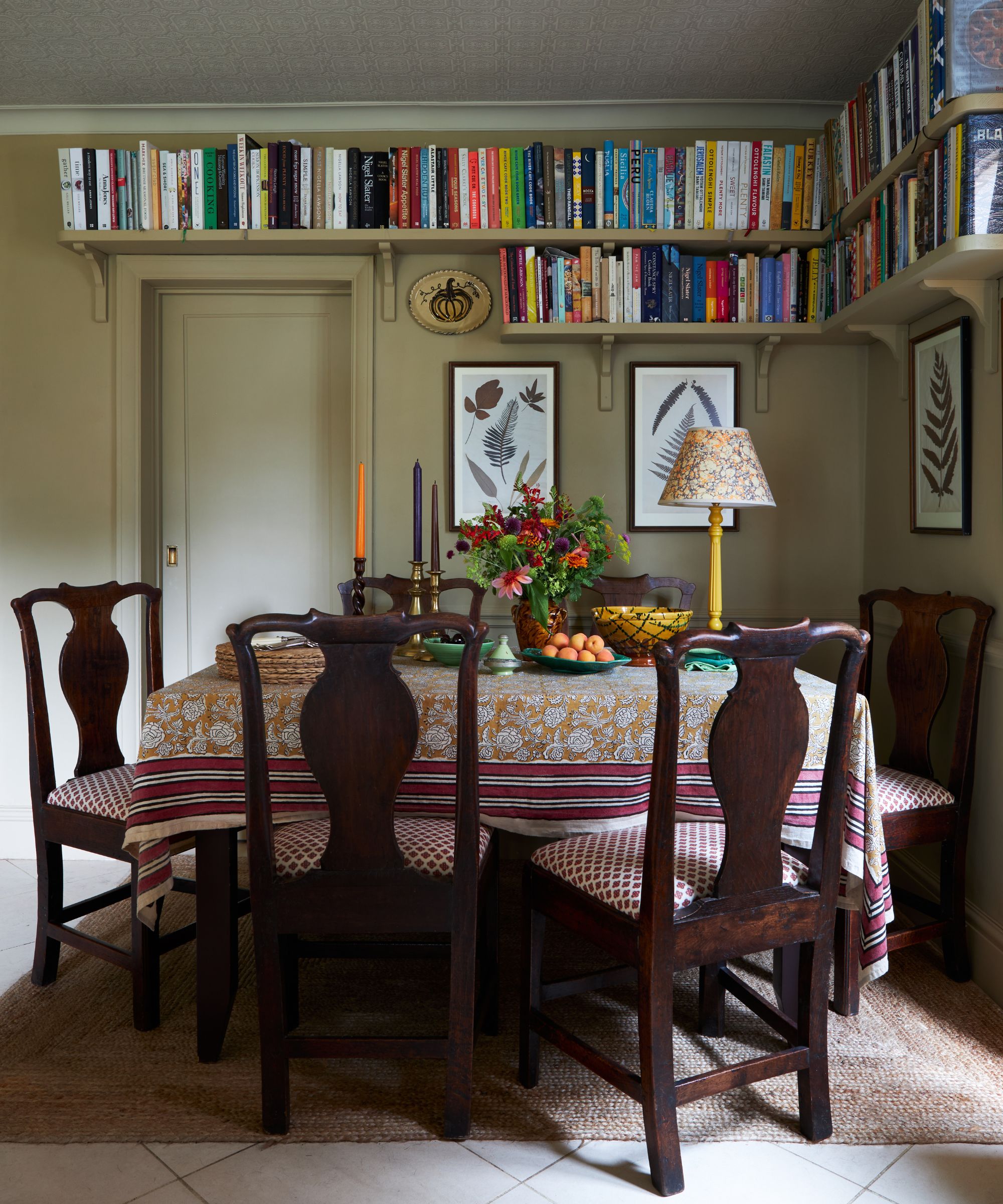
‘A palette of muted tones is the perfect way to bring a cozy feel in cooler months, and rich earthly shades offer an instant connection to nature, creating an ambiance that is calming and tranquil,' says Stefan Ormenisan, creative director of MindTheGap.
'Opting for a more refined palette such as this is also an excellent way to easily introduce a mix of patterns, where the muted colors act as a unifier for a mix of differing scales and motifs. It is also an easy palette to update, simply by adding a pop of color with a brightly colored cushion or throw.'
As the verdant greens of nature start to disappear for winter, fall is a great time to introduce earthy, green room ideas into the home. As shown in this cozy corner by OKA, the deep green walls add a moody yet fresh feel to the space, with the layering of rich reds and orange tones, and the use of warming, tactile, natural textures, perfectly balancing the green for a more cozy, fall color scheme.
To enhance your green fall color scheme even further, don't forget to decorate with plenty of fall foliage.
4. Pick a palette of pinks for a more fresh feel
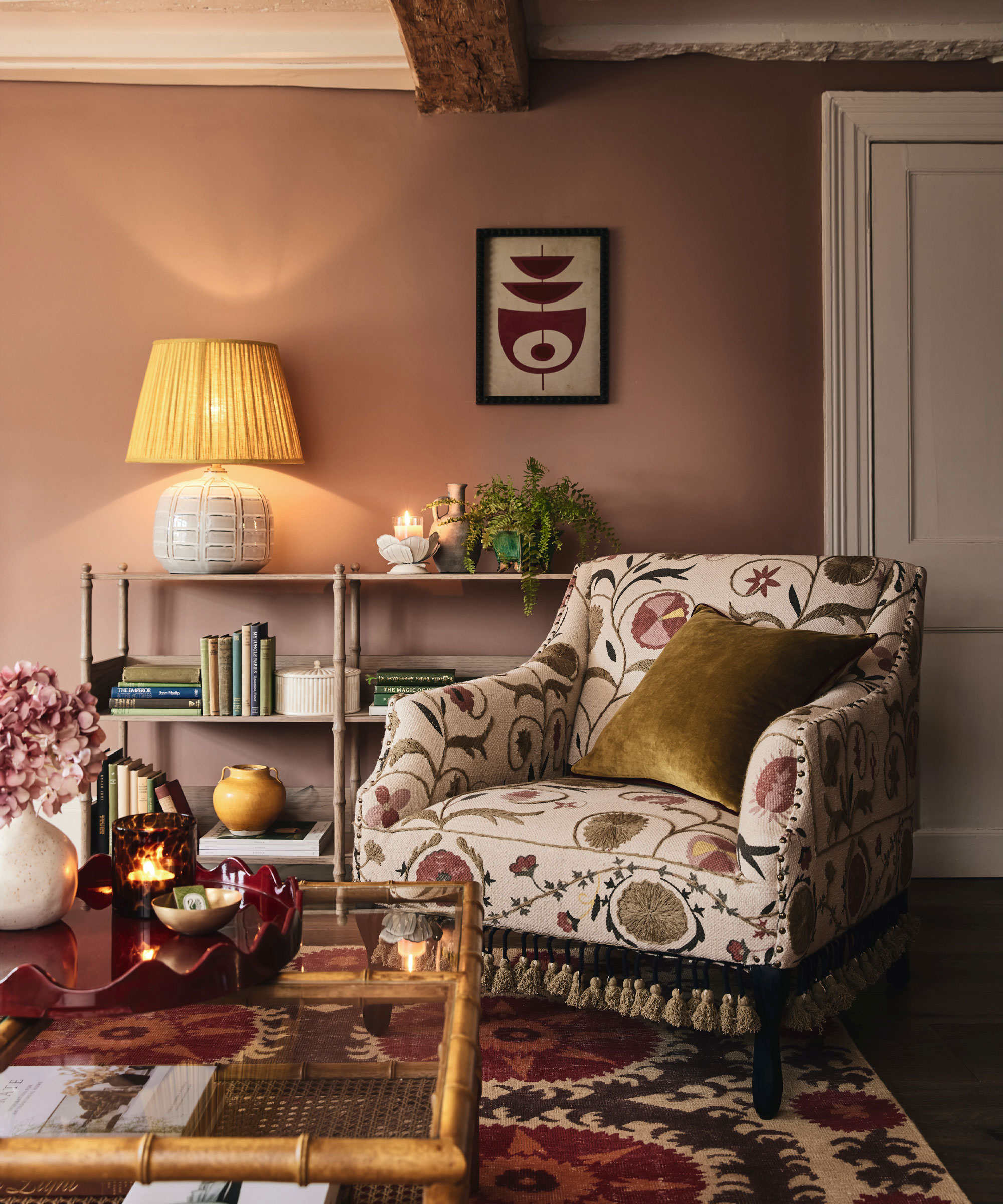
Looking for living room fall decor that will look fabulous year-round rather than relying solely on fall trends? Then look no further than a pretty pink palette.
There is no denying the rising popularity of pink room ideas in recent years, with many of us decorating with more muted, calming pink shades in the home – just like we would use enduring neutrals such as gray and cream.
Beautifully shown in the elegant living room by OKA, the earthy, pink-painted walls are complemented wonderfully by the patterned upholstery and rug, creating a rich, layered fall color scheme that is perfect for those who prefer more maximalist decor.
5. Opt for a deep eggplant shade for a cocooning feel
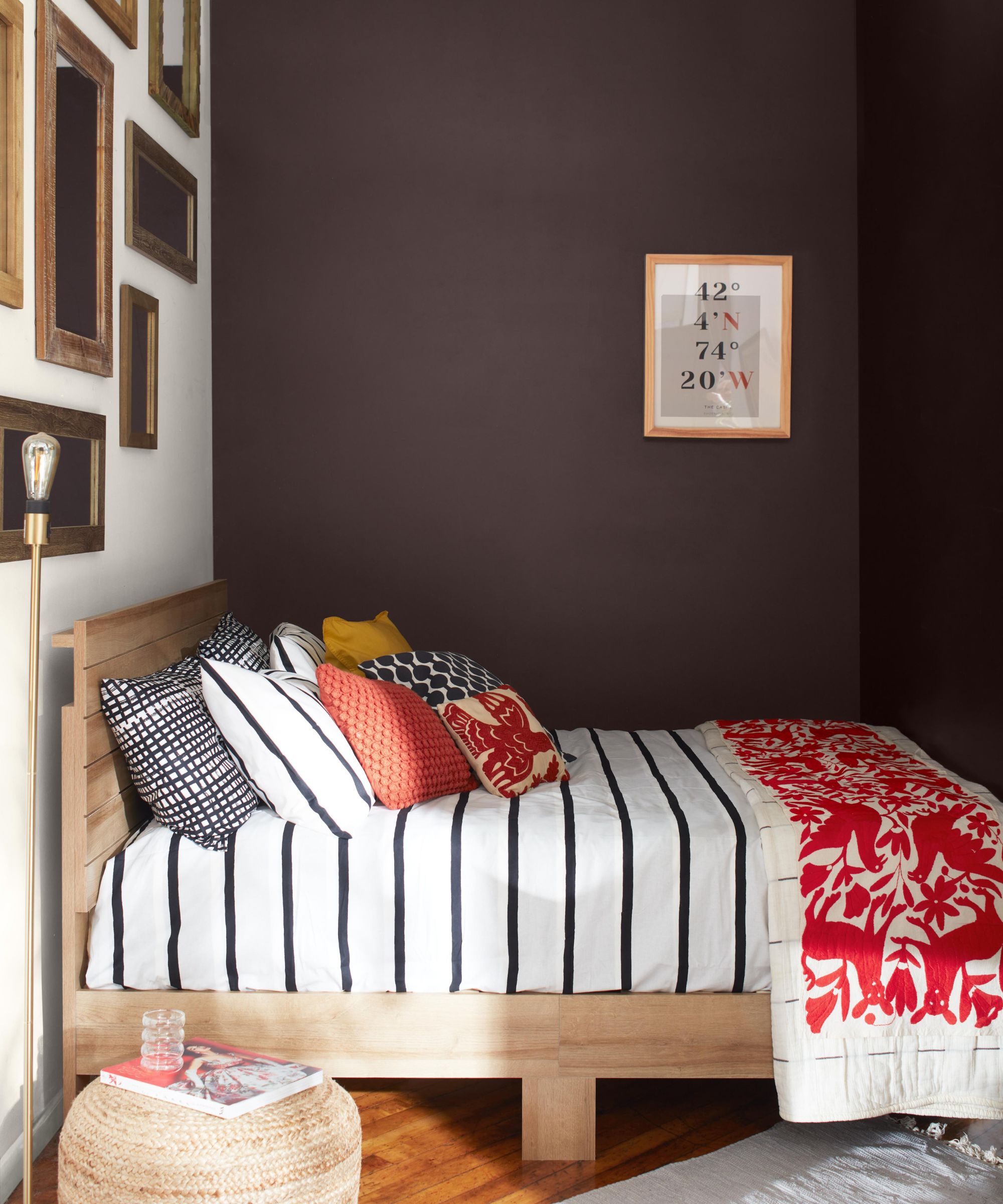
'So many of us have become more color confident over the last few years, that this fall is the time to take the plunge and redecorate at least one room in a rich color,' says Helen Shaw, director at Benjamin Moore.
'My favorite way to achieve this is to go bold. For the ultimate statement, create an ultra-luxe, all-encompassing, floor-to-ceiling finish in one color, such as a lustrous, deep shade burgundy.'
We explore decorating with purple further in our dedicated piece.
6. Layer calming coffee tones for a cozy, neutral look
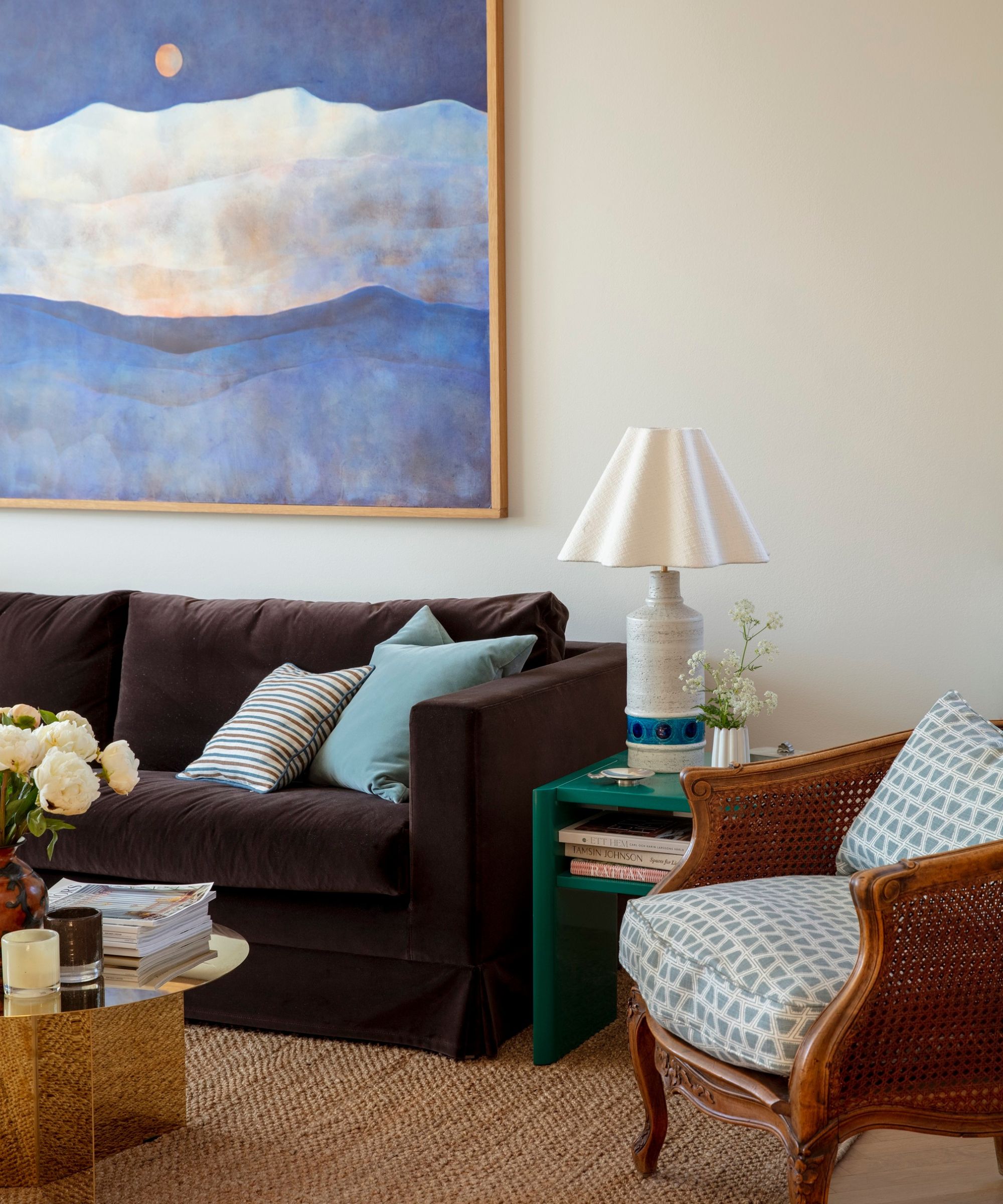
Beige and brown room ideas will always work wonderfully together, so if you're considering embracing beige for your fall color scheme, why not complement it with the warmth of brown?
Interior designer, Tess Twiehaus says, 'When decorating for fall, bring in more wood elements and don't be afraid to mix different tones within a space. A lot of people try to stick to one or two wood tones in a single room, but you really miss out by doing so. Mixing woods will always bring so much interest and warmth.'
In this calming living room by Cathy Nordström, the dark brown sofa adds warmth to the neutral walls – a gentle nod to the cozy season.
7. Balance bright blues with cozy, contrasting shades
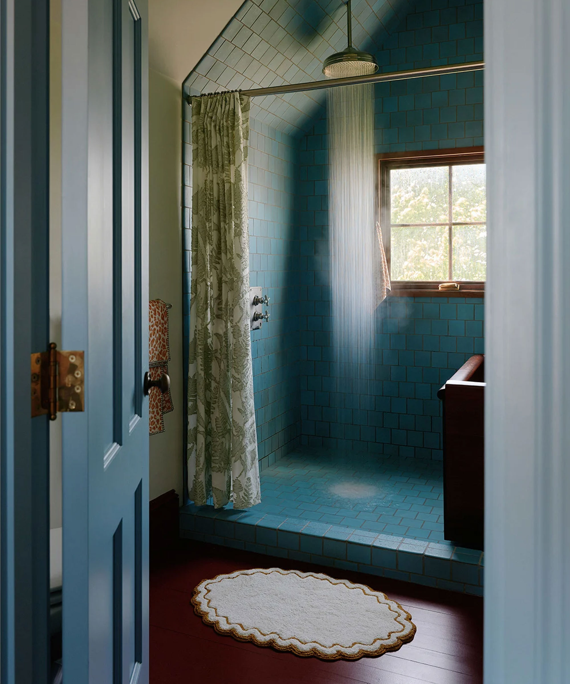
Decorating with blue is definitely possible for fall color schemes, it's all about combining the cool color with warming accents and layering the space with plenty of cozy, inviting texture.
When many of us focus on fall decor, we primarily decorate our living rooms, bedrooms, and dining spaces – but who says you can't decorate the bathroom too?
In this beautiful blue bathroom, the gorgeous blue tiles and painted woodwork have been paired with a rich, red-painted floor, with cozy elements of softness and texture added through the Anthropologie Maeve Leopard Bath Towel and the neutrally shaded Anthropologie Rosita Bath Mat. A beautiful balance of warm and cool, soft and hard, this colorful bathroom makes for a truly welcoming retreat.
Ok, so not all of us are going to be re-doing our bathroom ideas for fall, but incorporating simple changes, such as through new cozy bathroom towels, bathroom rug ideas, and even a fresh shower curtain, can help switch up your bathroom color ideas for fall.
8. Fire up a scheme with deep reds
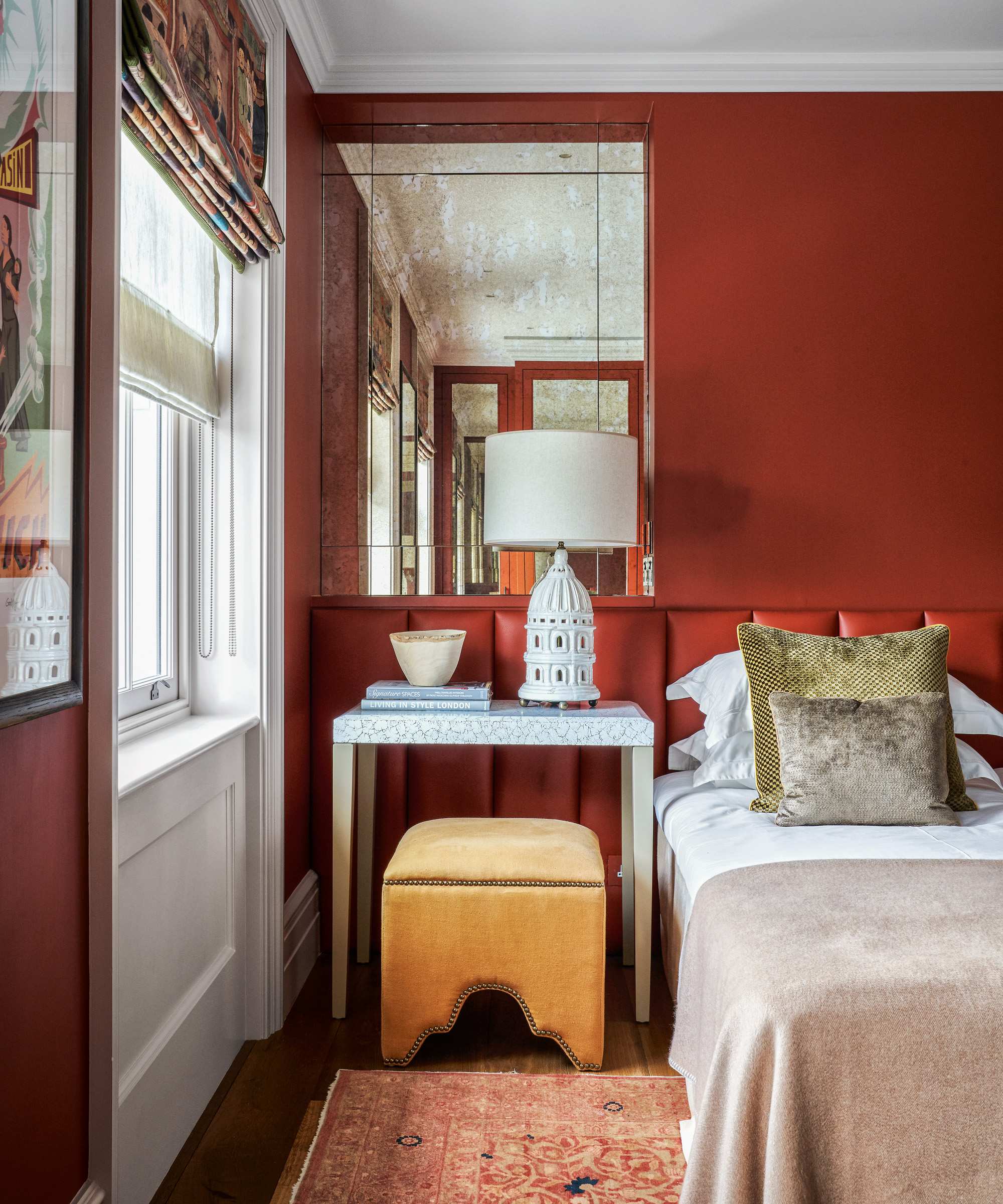
Perhaps the ultimate interior indulgence, sumptuous red room ideas are a daring choice, but inarguably enveloping when done right. ‘Deep maple reds from Farrow & Ball’s Blazer to Preference Red make for the perfect fall living room palette,’ says Patrick O’Donnell, Brand Ambassador for the paint gurus.
In this example, red takes the reins of the bedroom color ideas, keeping things light enough with white accents and warm neutrals, as well as a complementary yellow ochre stool. ‘Brick reds and rich mustard yellows look beautiful together,’ adds O’Donnell. ‘Use empathetic whites to balance the tones and avoid the room looking too cloying.’
9. Pepper calming neutrals with rich autumnal hues
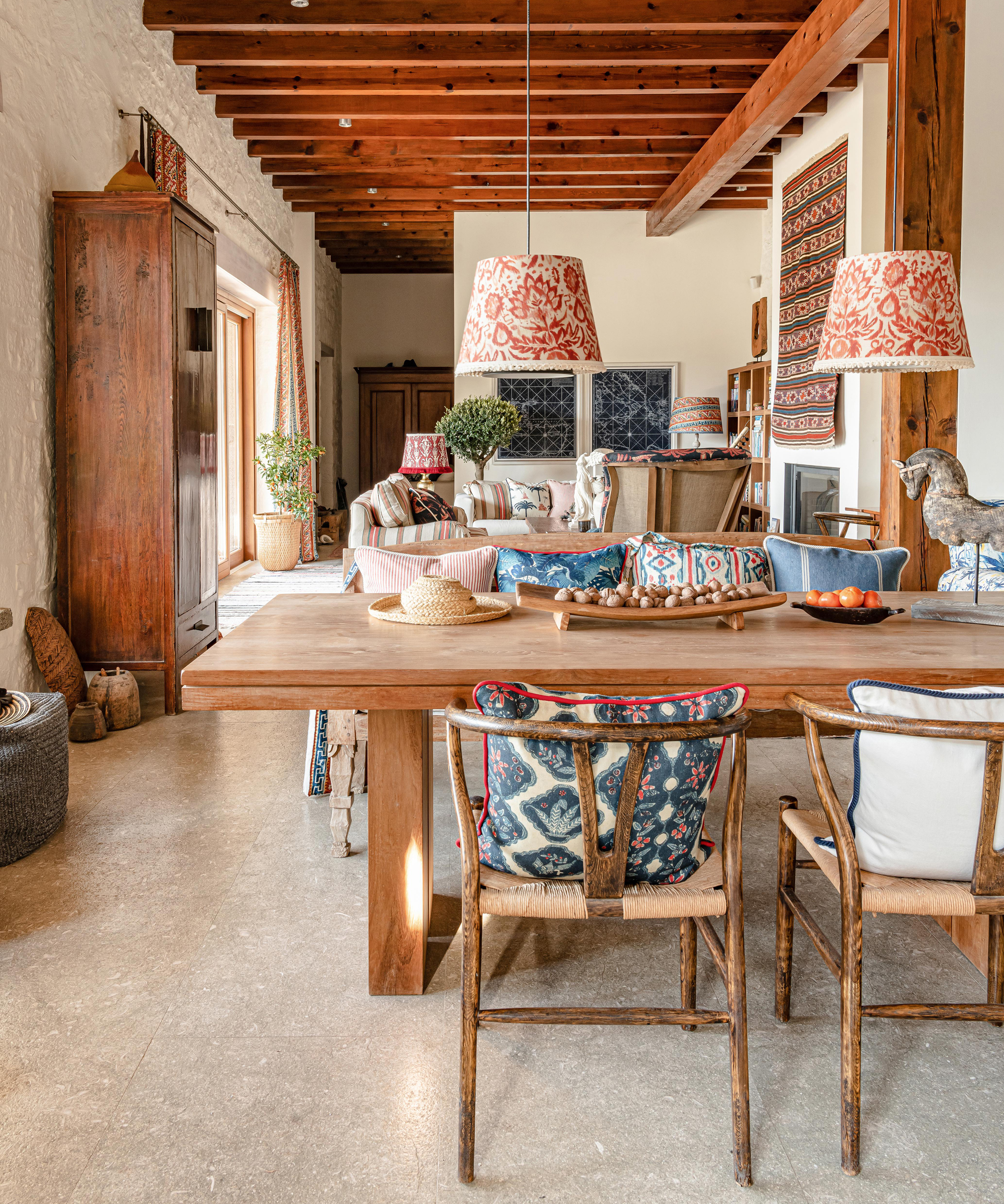
For people who like their color in small doses, it’s perfectly possible to create a fall color scheme with a neutral background.
In this example, a cream wall color is paired with natural brown woods with orangey undertones, and accessorized with soft furnishings from Mind The Gap that sport rusty red, muted blue accents, and tons of texture.
‘Muted shades like Pressed Putty and Pebble Shore look beautiful in combination with more rich autumnal hues like ruby, aubergine, or forest greens,’ says Marianne Shillingford, color expert and creative director at Dulux. ‘They quieten down the sharper notes and bring out something much more mature for spaces like the living room, kitchen, and adult bedrooms.’
10. Ground yourself with dark browns
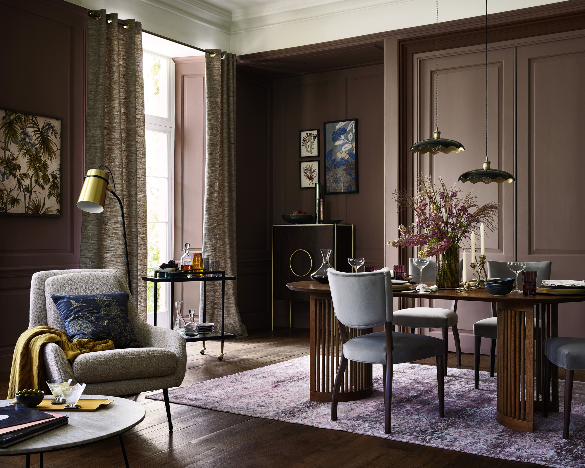
Decorating with brown is far from boring – as the nights draw in, it’s time to embrace the dark side.
In this room, shades of dark brown perfectly envelop the room, with their natural connotations emphasized by the grassy fall table decor ideas.
‘As summer rolls into fall, the natural exterior palette gently shifts to colors of spice and amber that inspire our interior choices,’ says Patrick O’Donnell from Farrow & Ball. ‘Mix together earth browns, rich chocolate tones, and the softest, most nuanced of whites. Rich browns such as Farrow & Ball’s earthy Broccoli Brown are an elegant yet practical choice for a fall color scheme.’
11. Choose warmer grays for a cozy neutral scheme
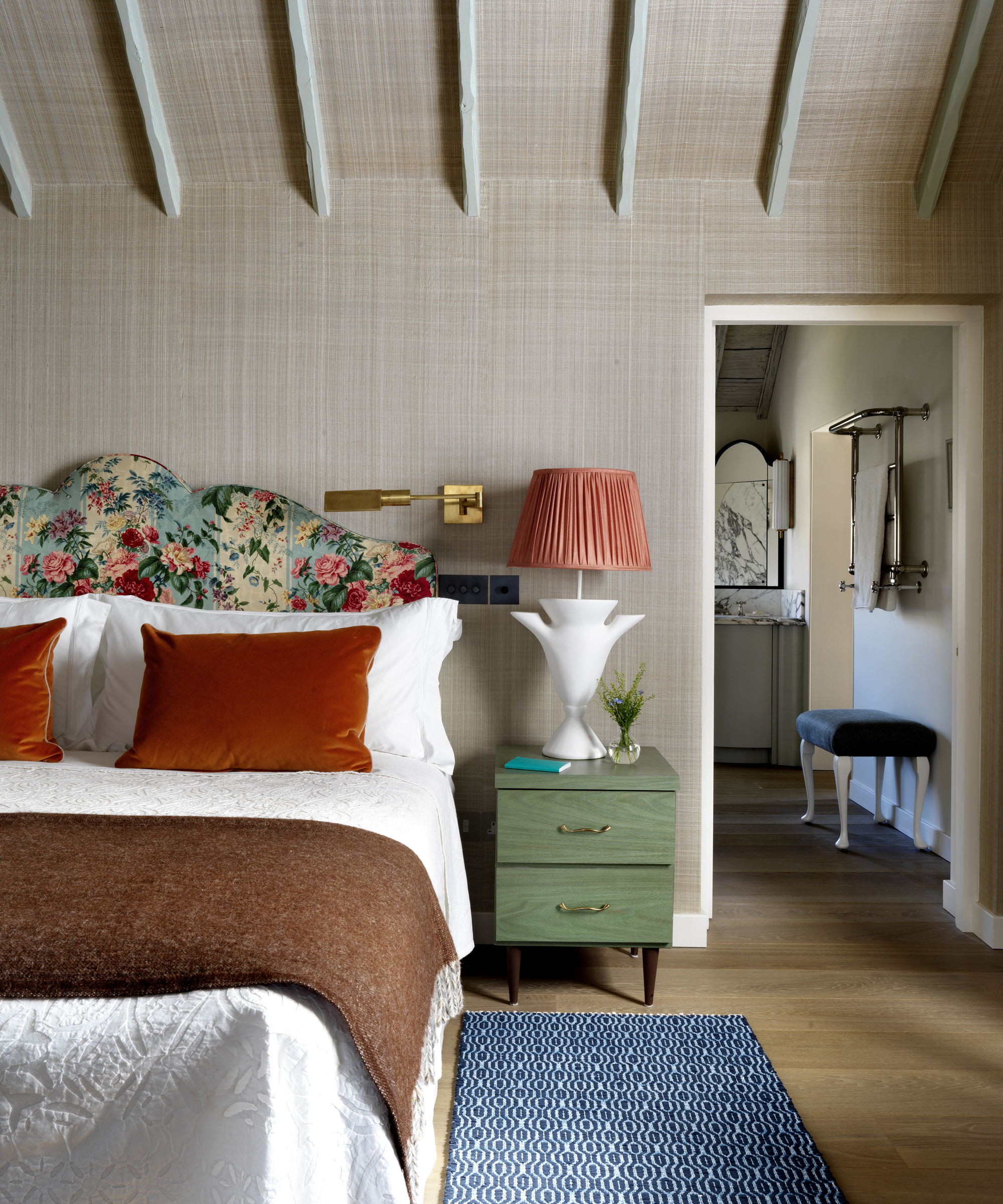
If you’re keen to mirror what’s going on with the weather during fall, then gray always has a place in a fall palette. To make your gray room ideas feel cozy rather than dreary, pick grays with brown, pink, or green undertones for a warming sensation that conjures the natural world.
‘Although gray, with its comforting versatility will still be with us for a while, we don’t see the rushed return to anything gritty urban – or indoors for that matter – anytime soon,’ says Marianne Shillingford. ‘Color-wise we are throwing open the doors and windows and inviting every shade of nature in for tea.’
In this example by interior designer Beata Heuman, gray bedroom ideas are given warmth and texture through the brown-gray woven wallpaper, and are enlivened by orange and green accents in the decor.
12. Uplift a room with a joyful use of ochre
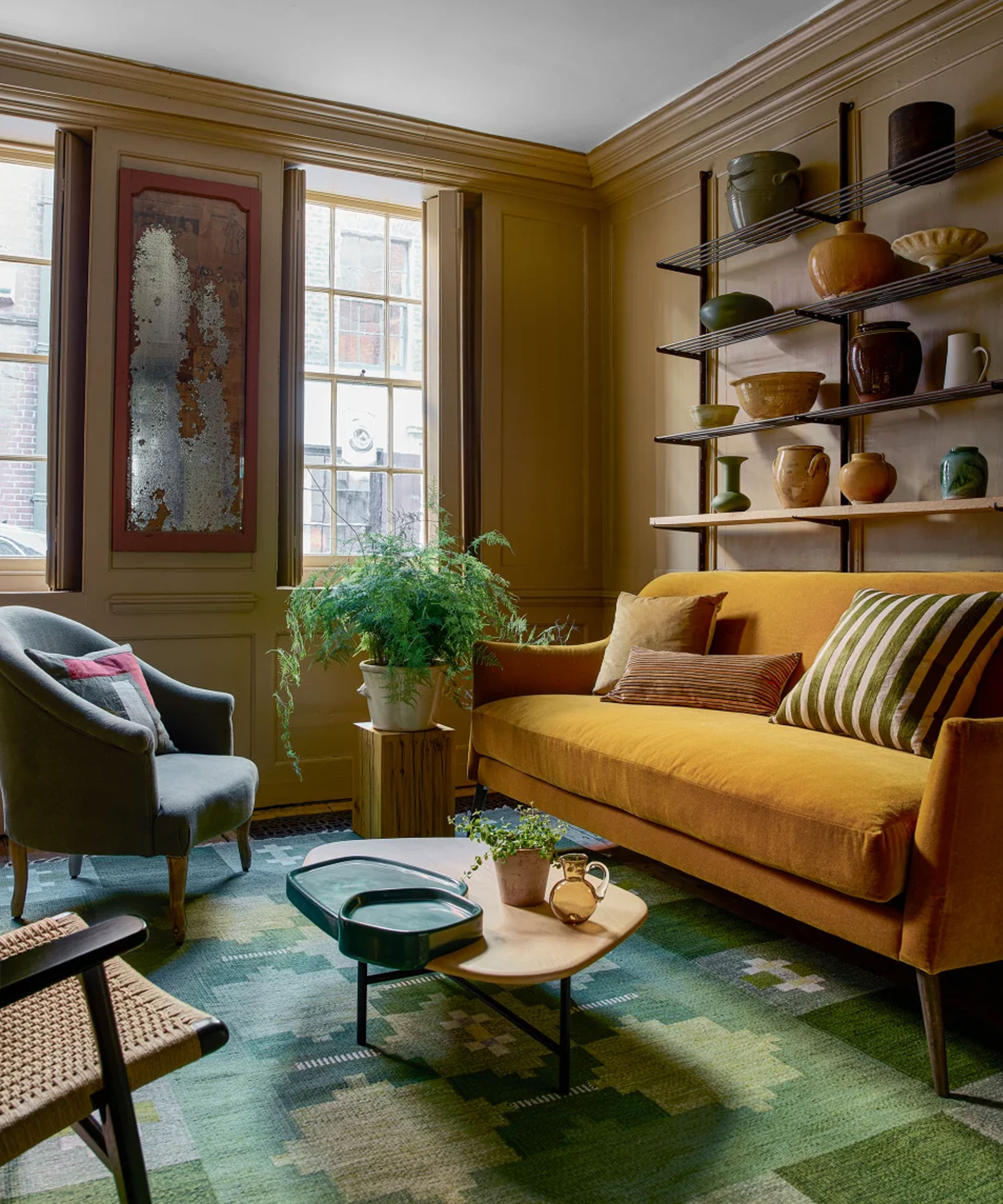
If you’re missing the sun already, welcome it back into your home by sprinkling shades of yellow throughout your space.
Temper a sunshine yellow to make it fall-appropriate by adding a hint of brown or a dark green into the mix. ‘Our wonderfully rich ochre India Yellow is a perfect choice for an interior that echoes the season outside,’ adds Patrick O’Donnell. ‘Layer it with strong contrasts for all-year relevance such as darker tones like Down Pipe for a bold counterpoint!’
Instead of embracing paint for your yellow room ideas, why not enrich a room with accents of yellow through furniture, accessories, or even artwork?
13. Embrace a mid-century color palette
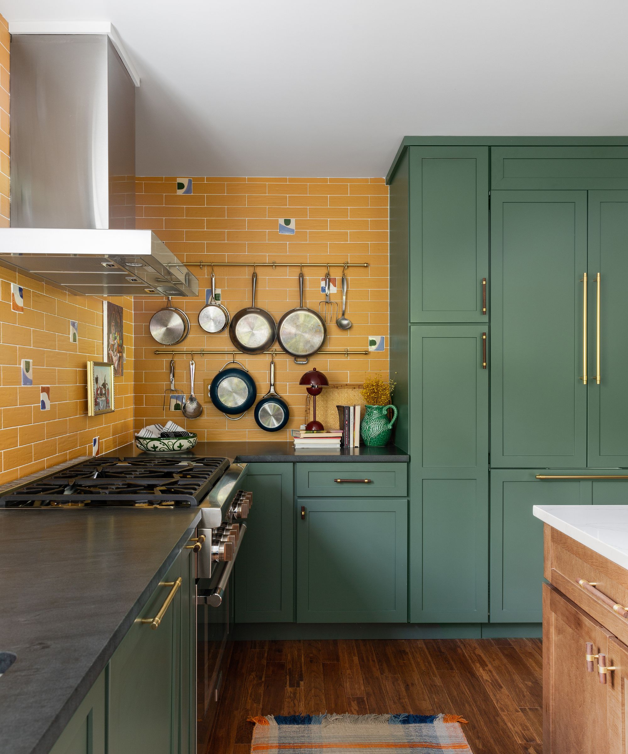
The hues we associate most with mid-century modern color schemes are earthy and natural, so they're naturally a great fit for the fall months. From muted shades of green to mustard yellows, a mid-century-inspired palette will look great long beyond fall, too.
'My most loved color scheme for fall is anything that reflects a mid-century vibe as these color palettes exude autumnal moods,' says interior designer Diane Rath, founder of The Rath Project, who opted for this palette in this kitchen.
'Think golden, mustardy yellows, deep rich reds, olive greens, rich teals, and warm woods – these tones reveal what nature intrinsically provides us with for inspiration during the change of seasons.'
14. Pair tobacco hues with earthy greens
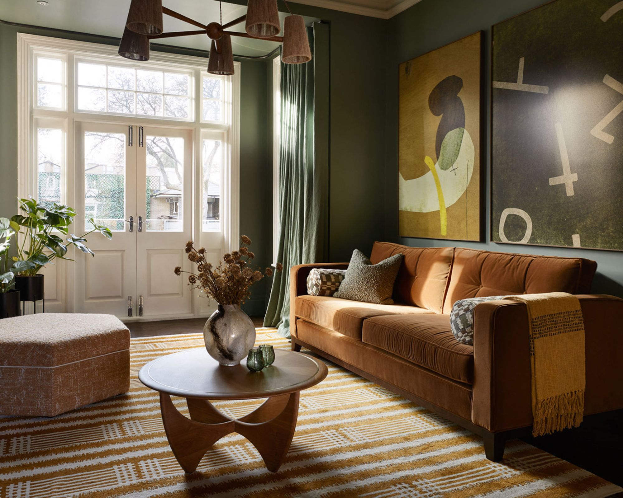
In this living room, interior designer Jenny Luck opted for an earthy palette of green, paired with a tobacco-colored sofa. Creating a cozy space to unwind, these rich and sophisticated tones are go-to's for fall and a great alternative to lighter beiges at this time of year.
'During the autumn season, I gravitate towards darker shades, such as dramatic greens which feel natural and pull us into the room, as it’s a time of the year when we start to embrace hunkering down and cozying up for the winter months ahead,' says Jenny.
'I like the paint palette to feel soothing and easy on the eye, almost encouraging us to take a bit of downtime. I love to use heavier textures such as deep pile velvets on the upholstery which feel really luxurious, particularly when in rich autumnal shades like the tobacco.'
15. Opt for lighter tones for an unexpected fall color scheme
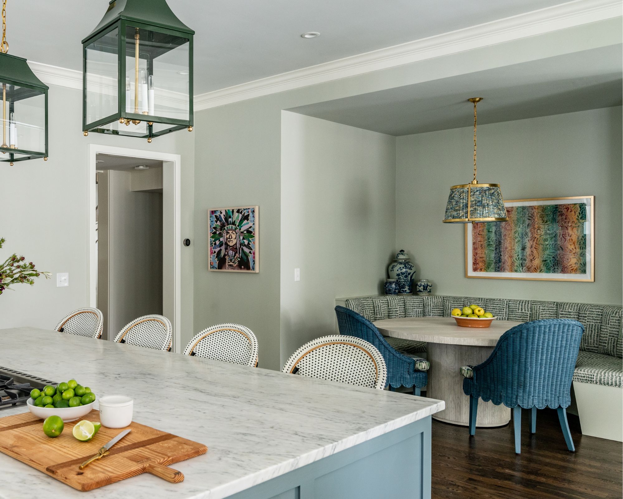
If moody, earthy hues that seem to dominate as fall nears aren't your thing, don't fret: lighter colors can work just as well. Although they're not the first colors you'd associate with fall, interior designer Bambi A’Lynn Bratton of Bambi A’Lynn Interior Design used a palette of light blue and green in this kitchen, and it's a stylish and transitional take on fall decor.
'My favorite color scheme for fall is a mix of rich greens and blues like Green Smoke or De Nimes by Farrow & Ball,' explains Bambi. 'The combination of green and blue makes me think of the change in season from the brighter colors of summer to the moodier colors of fall.'
16. Choose moss green for a warming, cozy space
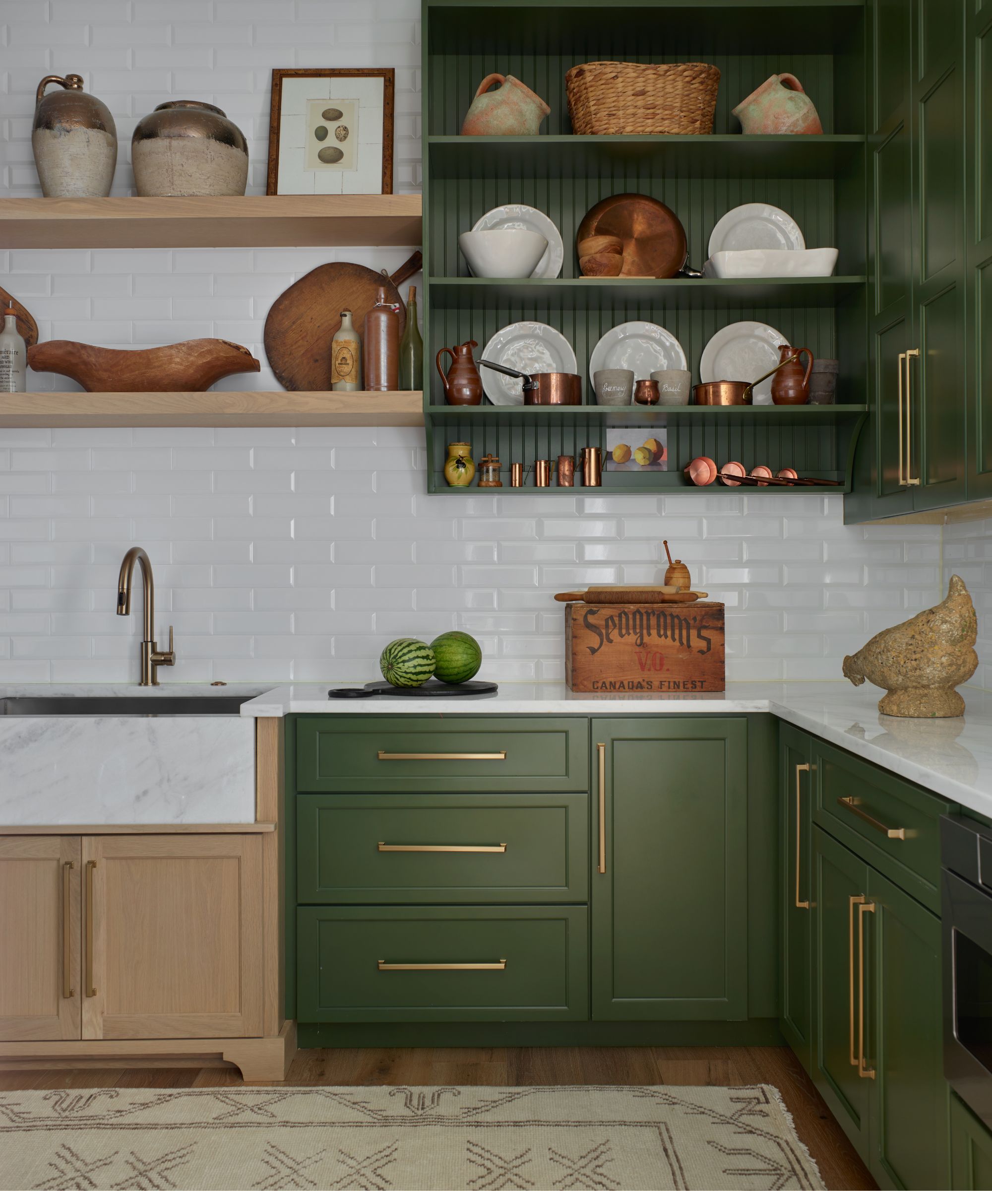
Not only is moss green a color trend we naturally associate with fall, but it's a timeless shade that will look stylish year-long. When paired with warm accents, a moss green color scheme is endlessly cozy and calming.
'We love this mossy green color that goes so well with coppers and brass colors,' says interior designer Connie Vernich of Vernich Interiors. 'We also love to pull terracotta colors into this room for fall; the mix is perfect for fall decor. Add some yellow sunflowers and you have a winning fall color scheme.'
17. Decorate with dark charcoal paint colors
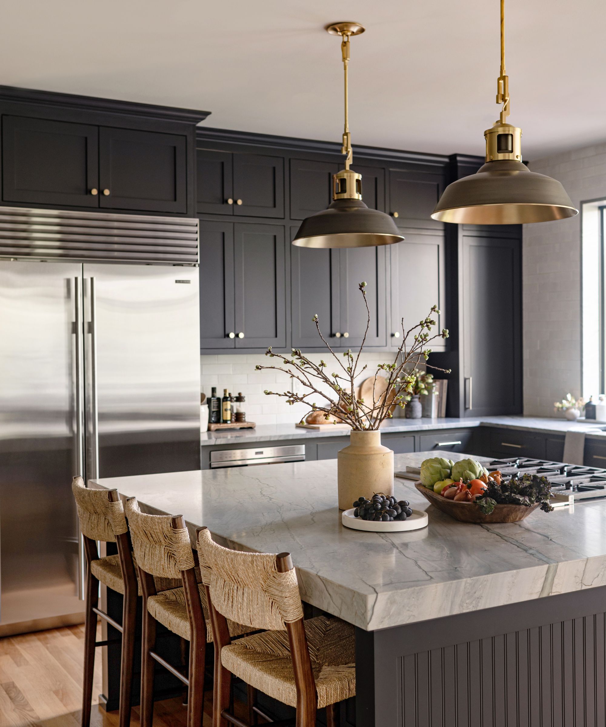
Why not go all out and create a dramatic, moody vibe in the heart of the home with the best dark paints? The darkest of paint colors are a timeless choice and come into their own at this time of year when we want our homes to feel as cozy as possible. In this kitchen designed by Cohesively Curated, Sherwin-Williams' Iron Ore is used across the cabinetry.
'My client wanted a dark kitchen and they were considering black or navy,' says the owner of the design studio, Emily Ruff. 'I proposed this dark charcoal gray that is a bit softer than black and has some blue undertones so it didn't feel harsh and would coordinate well with the color in the slabs we chose while still feeling timeless and perfect for fall.'
Shop fall decor
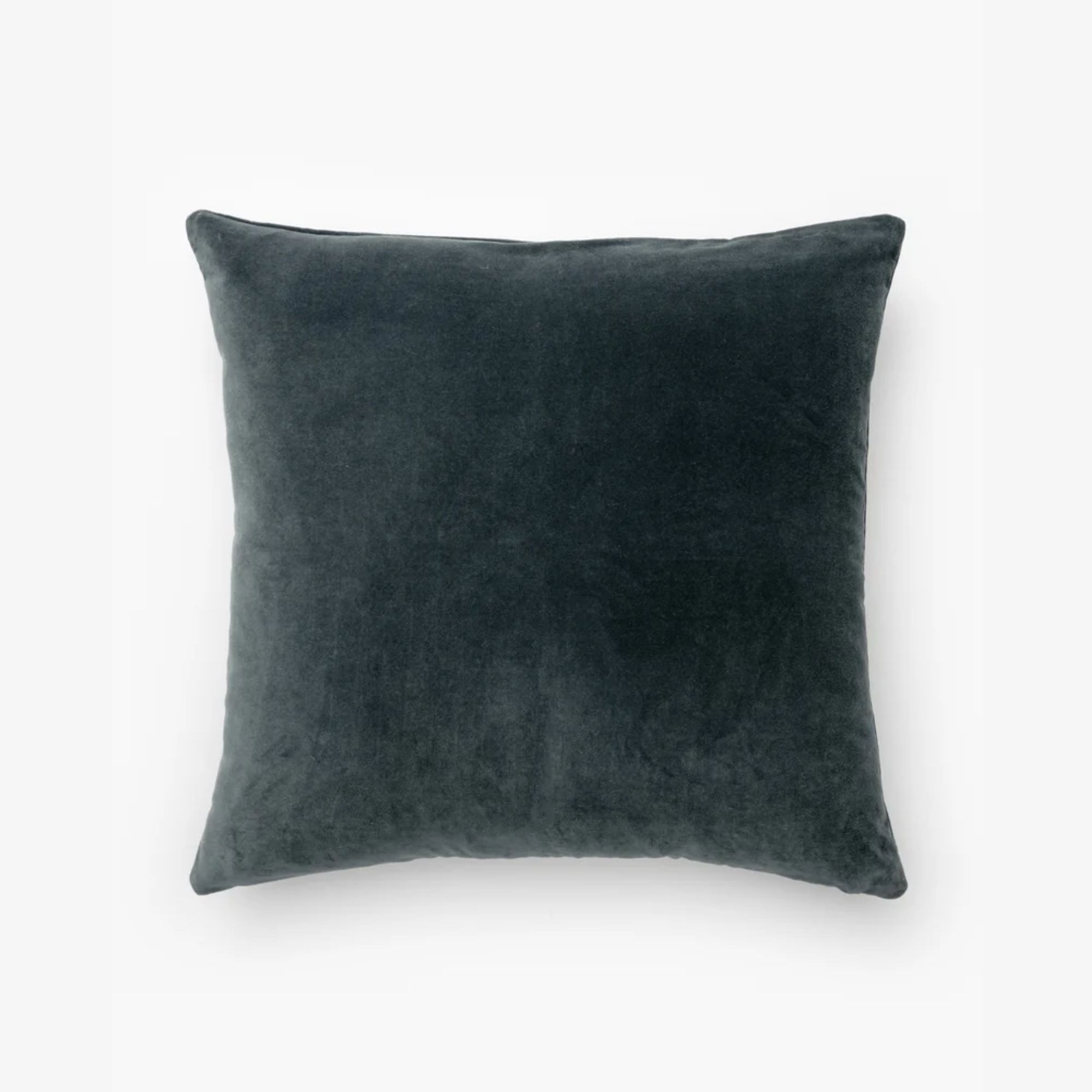
Refresh your neutral pillow covers with this blue velvet style for fall, perfect for adding textural interest to either the living room sofa or bedroom.
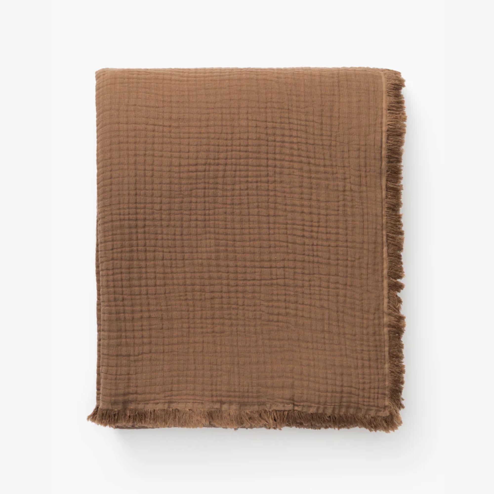
Throws are an essential decor addition for fall, adding warmth for cozy evenings at home while elevating your sofa with a layered look of fabrics and textures.
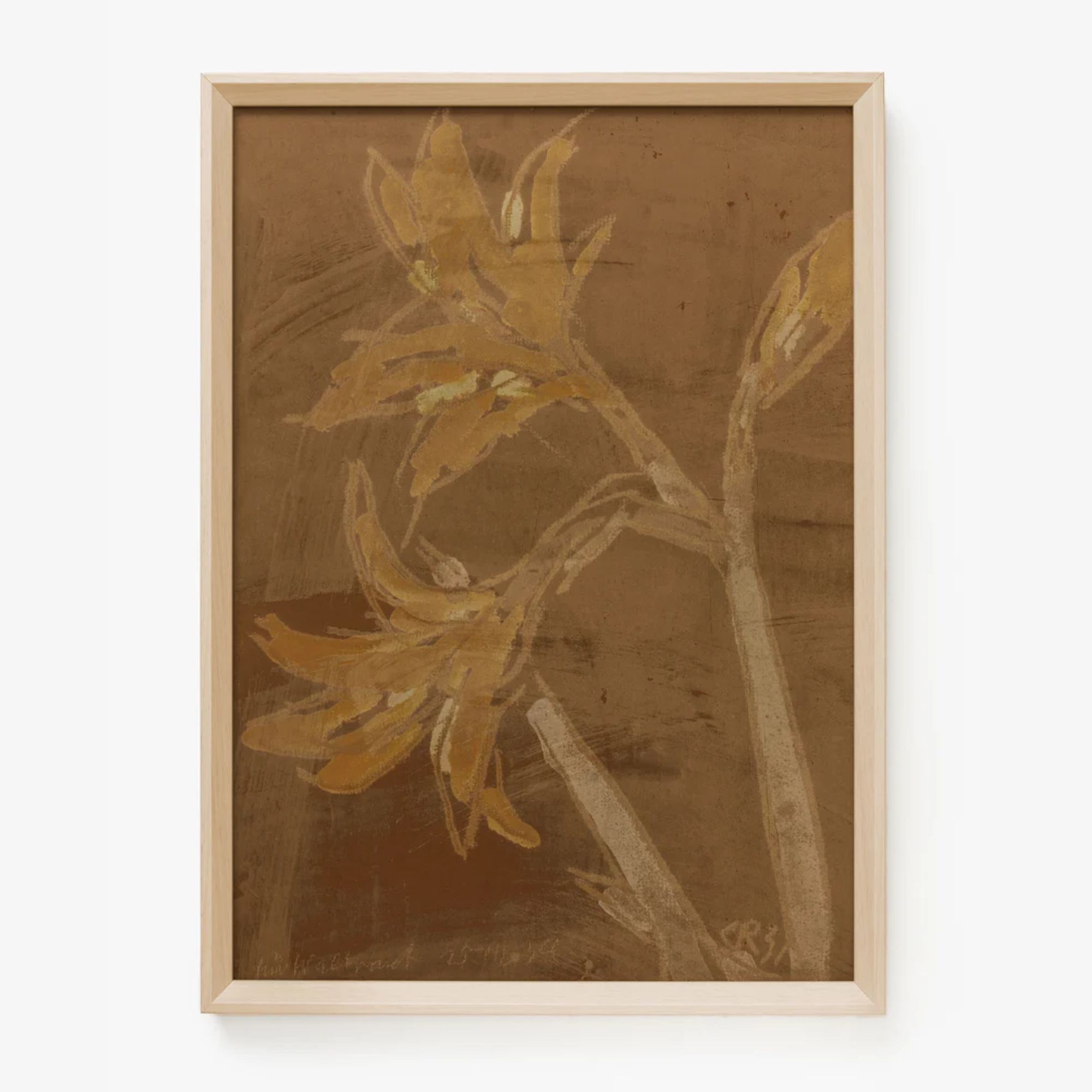
Switching out artwork as the seasons change is an effective way to create a whole new look. This option from McGee & Co. lends itself perfectly to fall with these warm, muted orange hues.
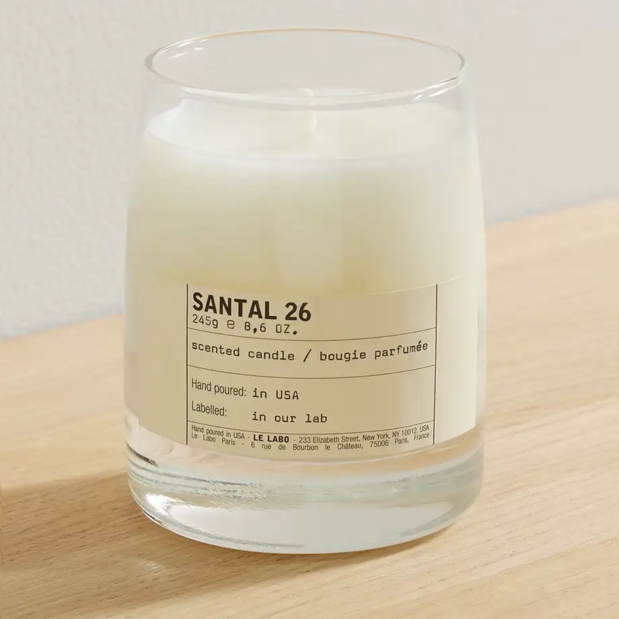
Now that summer is nearly over, candles are an easy way to add cozy appeal to your space. We love this one from Le Labo; with smoky notes, it avoids the overly sweet scents often embraced at this time of year.
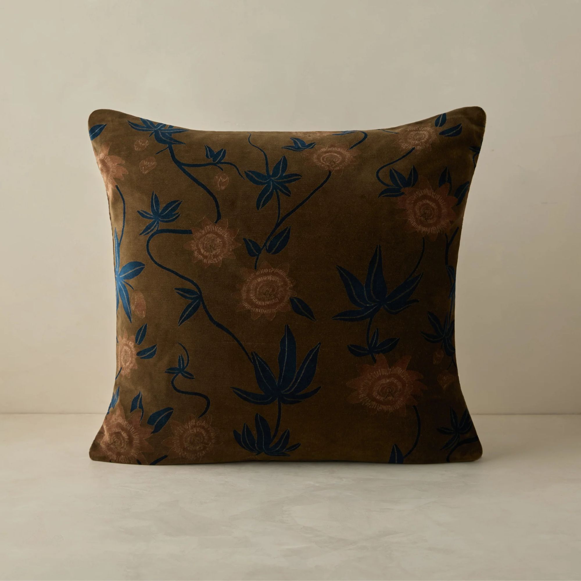
We love this velvet pillow from Lulu & Georgia with a subtle floral pattern. This rich, warm brown ochre is endlessly stylish and will transition well into the winter months.
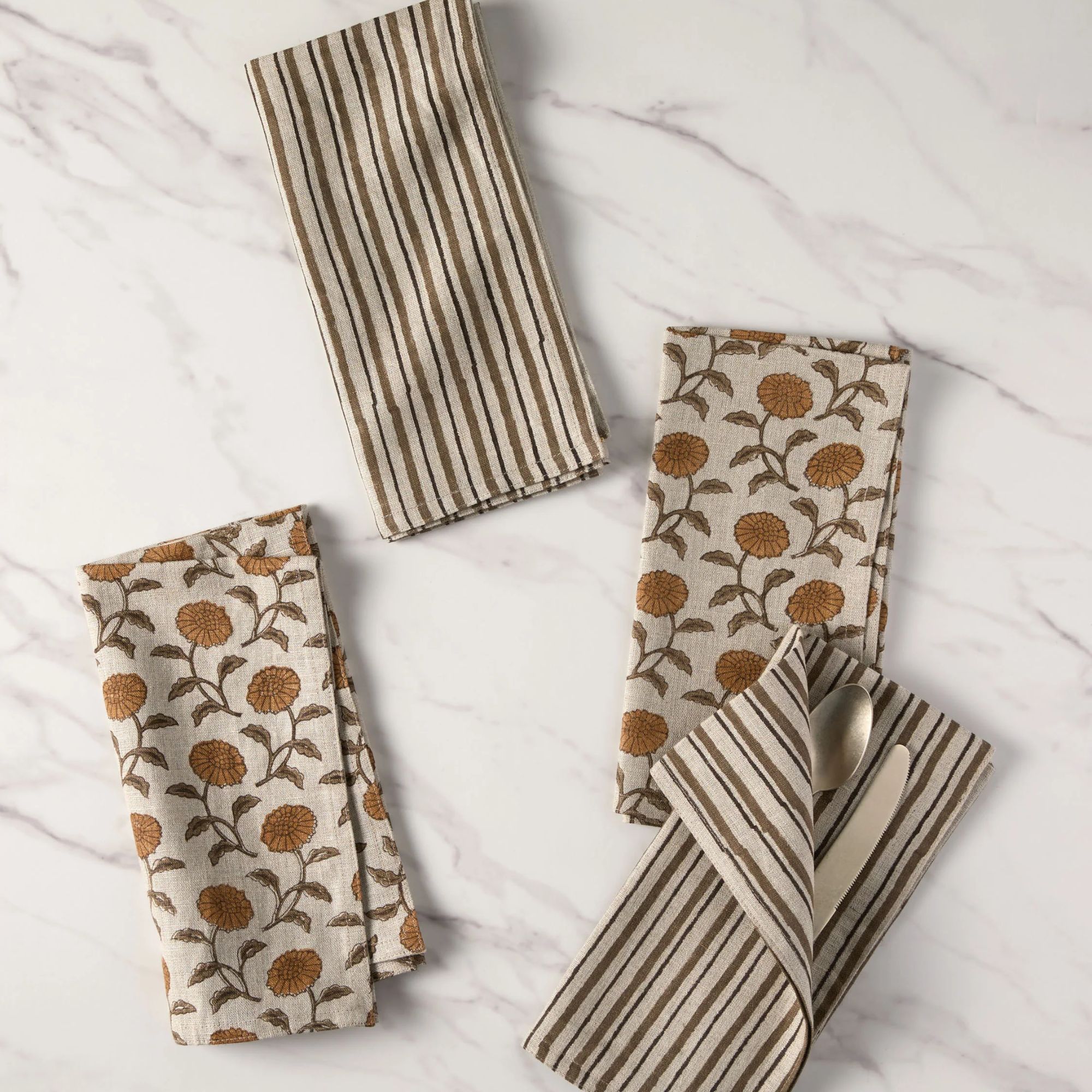
Fall colors should be considered for your fall decor ideas too, and these napkins are a gentle yet fitting nod to the changing seasons with their earthy hues.
FAQs
What are good fall colors?
The best fall colors are the ones that remind you of the natural world during these unique months. This can range from the season’s idyllic aspects to its less bucolic but equally atmospheric characteristics.
The color of falling leaves and plump pumpkins, orange will always be at the center of a fall palette. For a contemporary take, look to burnt oranges, coppers, and terracottas. For a wider view of warm colors, head to its complementary hues, red and yellow. To keep both feeling autumnal rather than aggressive, add a little brown and explore ochre shades. Brown itself is a fall staple, and pretty much anything on its tonal spectrum is valid.
Green has been having a big year with everyone craving sometime in the great outdoors, so also look for shades of this hue with brown undertones, like olive and sage. Cool colors can also feel autumnal and kept muted, so consider inky blues and aubergine.
By embracing these fall colors into your home decor, you'll soon benefit from their cozy appeal, whether in the living room or bedroom. What's more, each of these color schemes is timeless, meaning you won't need to redecorate in months to come, but rather you can enjoy these shades year-long.
Beyond decorating with color, take a look at our favorite kitchen fall decor ideas which will elevate the heart of the home in keeping with the seasons, while ensuring a practical space.
Sign up to the Homes & Gardens newsletter
Design expertise in your inbox – from inspiring decorating ideas and beautiful celebrity homes to practical gardening advice and shopping round-ups.

Emily is a freelance interior design writer based in Scotland. Prior to going freelance in the spring of 2025, Emily was Homes & Gardens’ Paint & Color Editor, covering all things color across interiors and home decor for the Homes & Gardens website. Having gained specific expertise in this area, Emily is well-versed in writing about the latest color trends and is passionate about helping homeowners understand the importance of color psychology in home design. Her own interior design style reflects the simplicity of mid-century design and she loves sourcing vintage furniture finds for her tenement flat.
- Zara StaceyContent Editor
-
 Barack and Michelle Obama's neutral accent chair is the perfect living room focal point – you can recreate their serene style in any-sized home
This designer-approved essential fits into every modern living room – it's beautiful enough to stand alone, while pairing well with your favorite cushion
By Megan Slack Published
-
 Should I choose a kitchen island or a kitchen table? This is the expert advice that helped me decide
It's all about how you use your space
By Molly Malsom Published