This idyllic West Coast newbuild has a classic interior with an East Coast vibe
Immersive views and beautiful architecture pave the way for a timeless interior that showcases color and pattern in this home that has us California dreaming
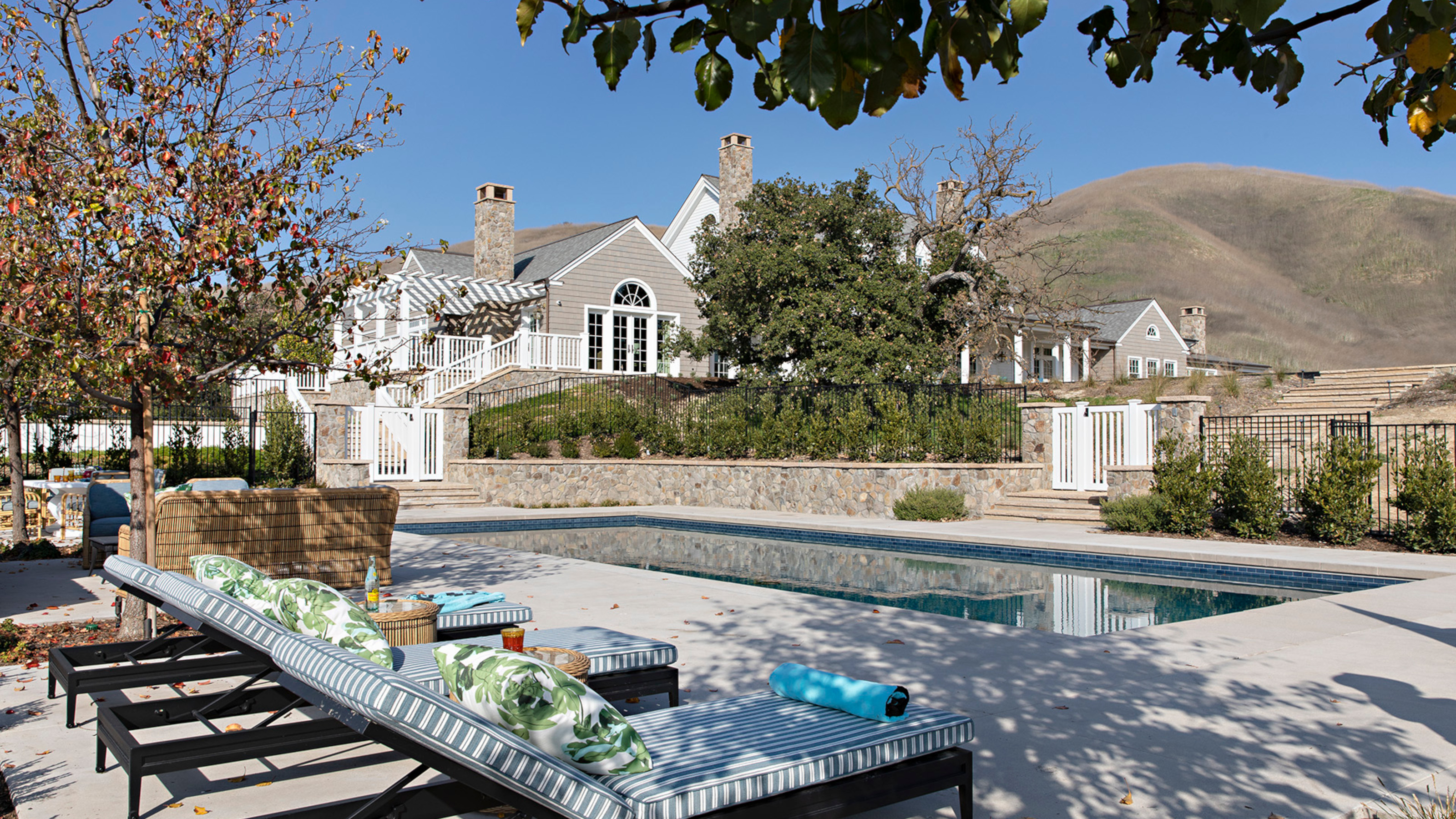

The owners of this newbuild American farmhouse returned to their roots when they moved from a busy Southern Californian beach community to a six-acre property, one of the world's best homes, in a rural setting outside Los Angeles where they both grew up and still have family.
Architect Erik Evens of Evens Architects who designed the house explains: 'The clients were interested in creating a comfortable family home that connected to the great tradition of American farmhouses. They also wanted the house to be the center of family life and to support outside living.'
As the property slopes gently toward the south, it was decided that the house should be sited atop the hill to capture expansive views of the Santa Monica Mountains to the south. The house is planned around and between beautiful and mature existing oak trees, which are protected in California.
A plan was devised, anchored by a central structure, a Great Hall, containing the formal living and dining areas, with adjoining wings that contain casual family spaces to one side and the bedrooms to the other, creating the impression that the house might have been added to over time. The central two storey part of the house is clad in white clapboard with a lofty gable roof and dormers, while the flanking wings are single storey and clad in cedar shingle.
As outdoor living is a hallmark of life in Southern California, at the back of the house, a spacious veranda provides a comfortable place for living and dining al fresco and there's also a swimming pool with a large pool terrace and outdoor fireplace.
Interior designer Joe Lucas of Lucas Studio, Inc, was brought on board to create a classic interior with a modern twist. 'The inspiration on the design side came from the clients’ wish for a more traditional East Coast style home,' says Joe. 'The clients’ love for blue and green started the color scheme and we built from there. We made sure the home reflected a young, more modern family and the beautiful California hills the house is situated in. The colors outside definitely informed our choices inside.'
Entry hall
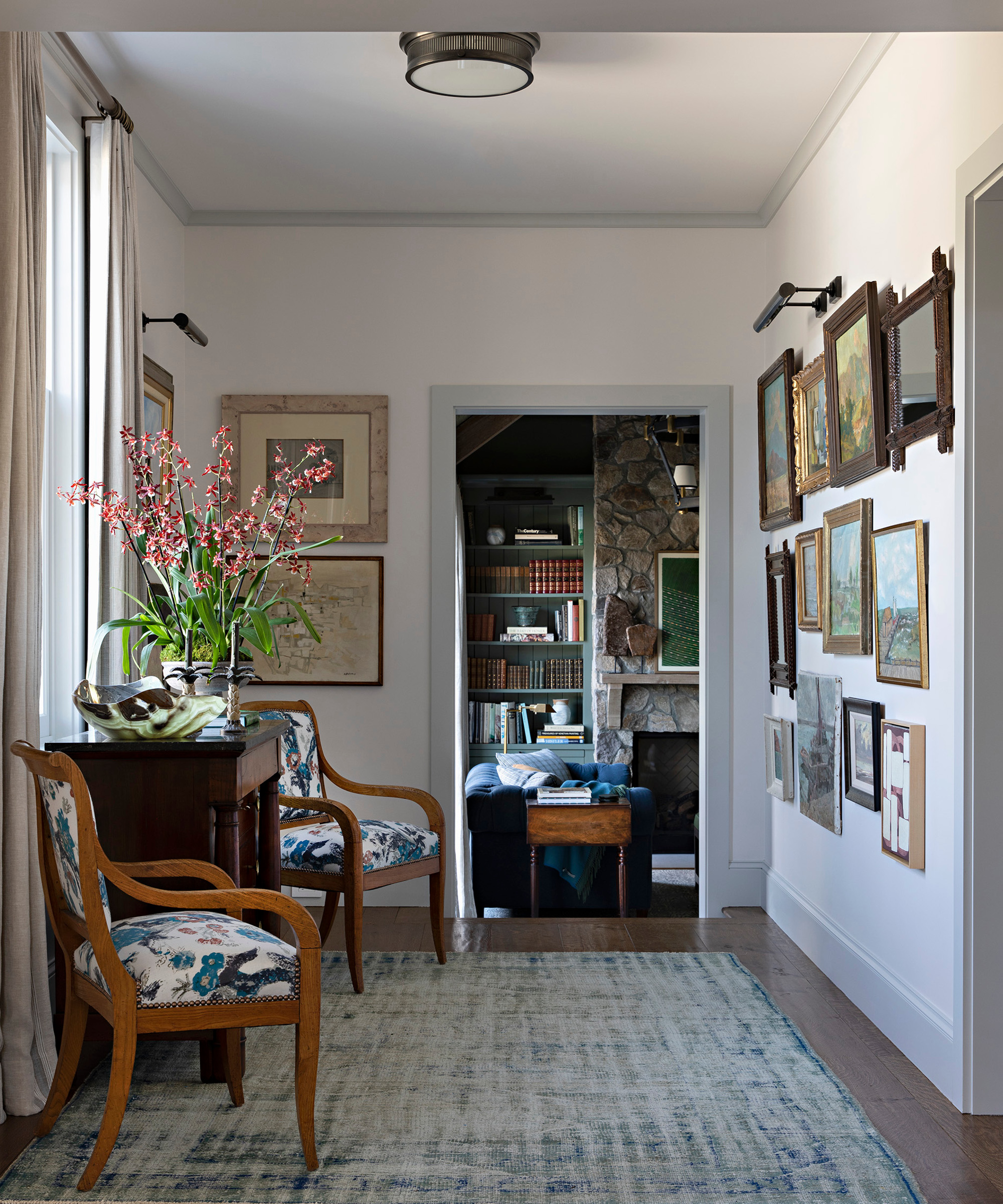
Creating a feeling that the house had been added to over time was important and Joe's hallway ideas to achieve this included a layered scheme consisting of an antique chest of drawers and chairs and a beautiful salon art wall.
Family room
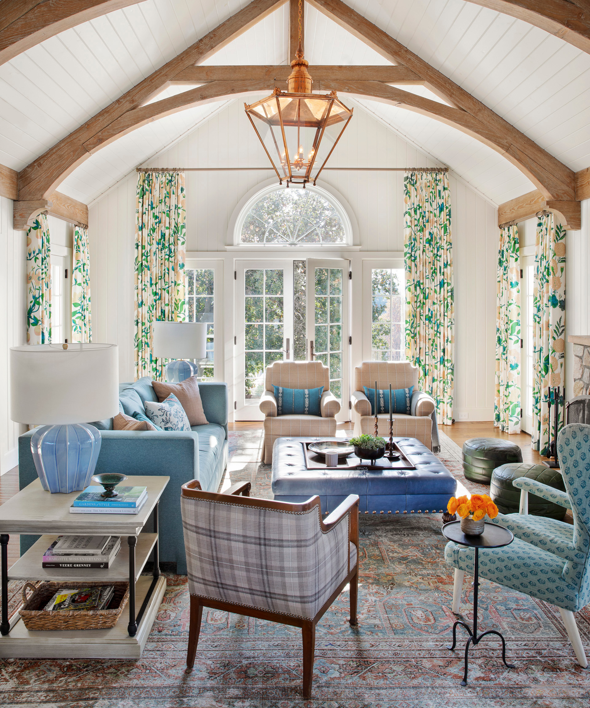
The family room features a statement lofty barn truss ceiling.
The must haves for the client revolved around comfort and the ability to entertain their large extended family with ease. Living room ideas include a versatile seating arrangement with a squishy sofa and plenty of armchairs and pouffes. Classic furniture enhances the timeless feel while pretty florals are a nod to the rural location.
Kitchen
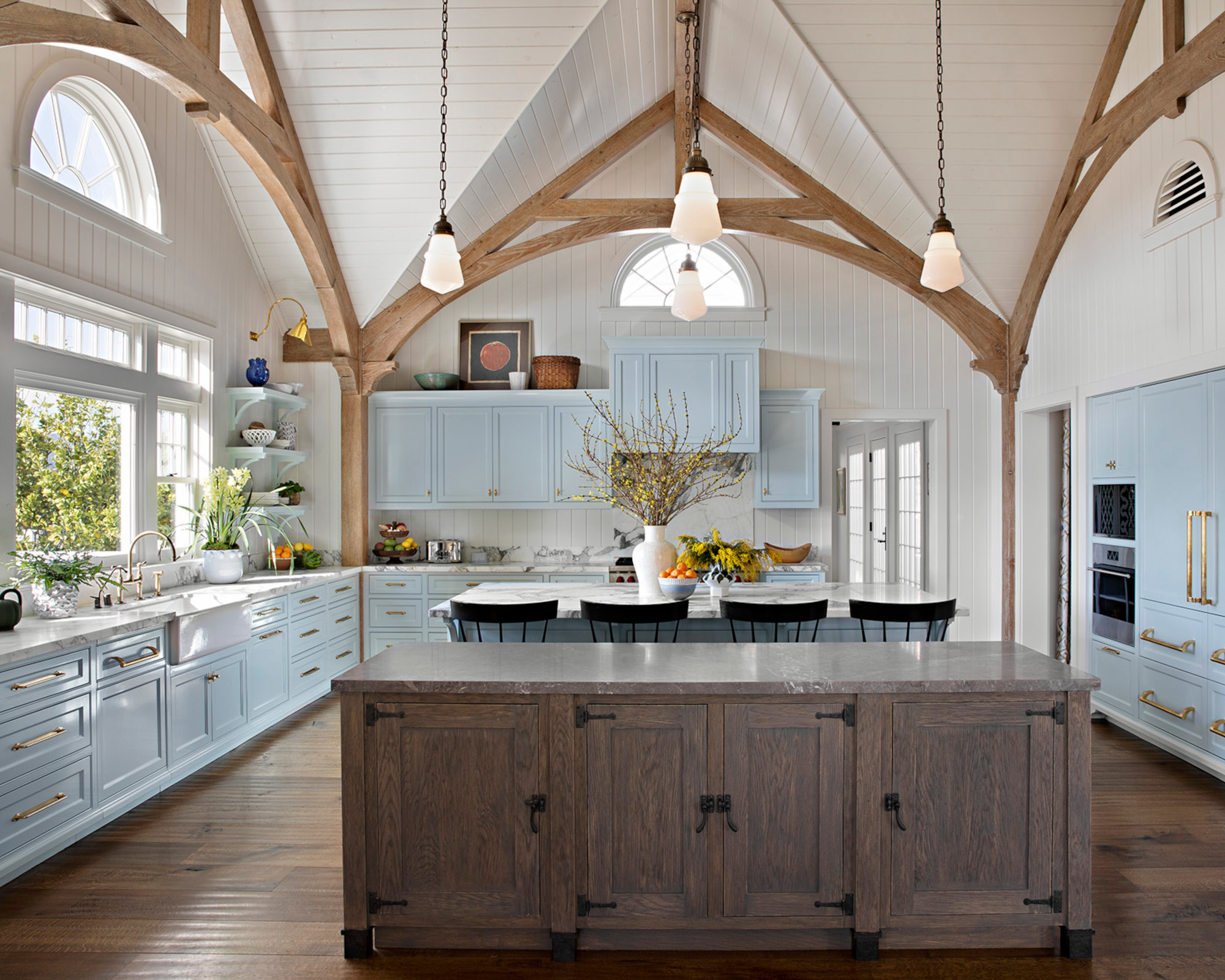
The kitchen also features a lofty barn truss ceiling. A large space like this could feel cavernous but Joe's kitchen ideas to offset this include wooden cladding on the walls and ceiling, elegant powder blue cabinetry, a breakfast bar for informal dining and a focal point wooden island. This has given the space a homey, farmhouse feel complete with a New England vibe.
Breakfast room
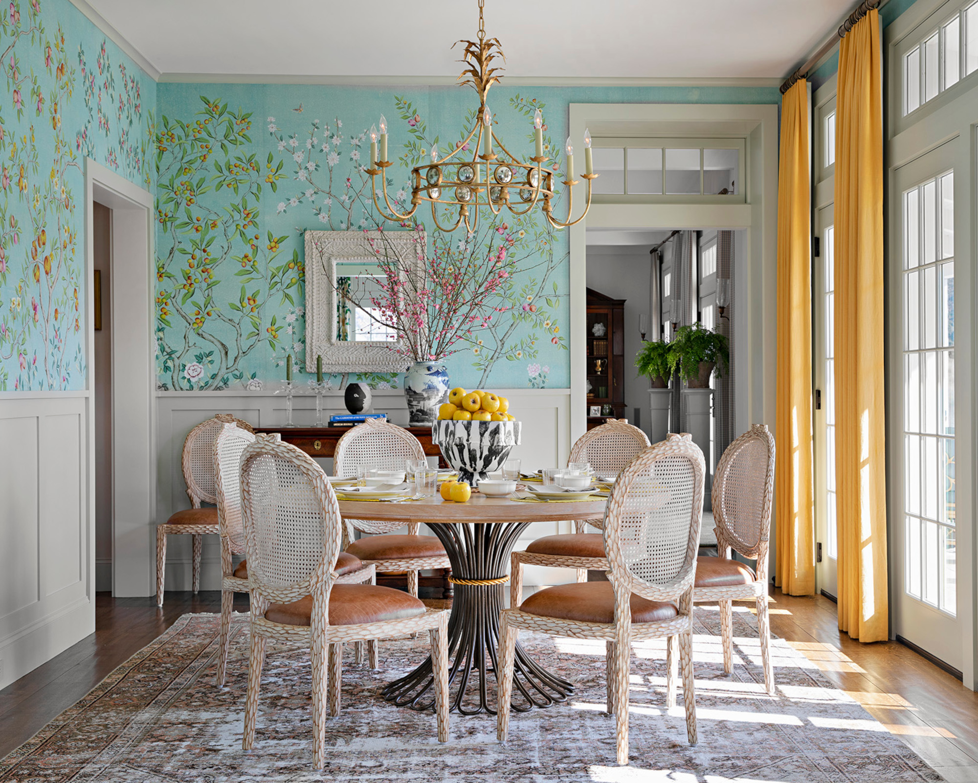
Dining room ideas center on the beautiful hand-painted wallpaper by Fromental above the period-style paneling. 'It was one of the first things we chose for the home and the client fell in love with it,' says Joe.
It creates a colorful backdrop to the chic cane-back French-style chairs and Bunny Williams Home table with its wooden top and wrought-iron base. Floor-length sunny yellow curtains frame the doors to the veranda. 'The scale of the room is wonderful because it becomes a cozy family dining space for them on a daily basis and the walls and textiles really make it a cohesive space that lives on its own,' says Joe.
Dining room
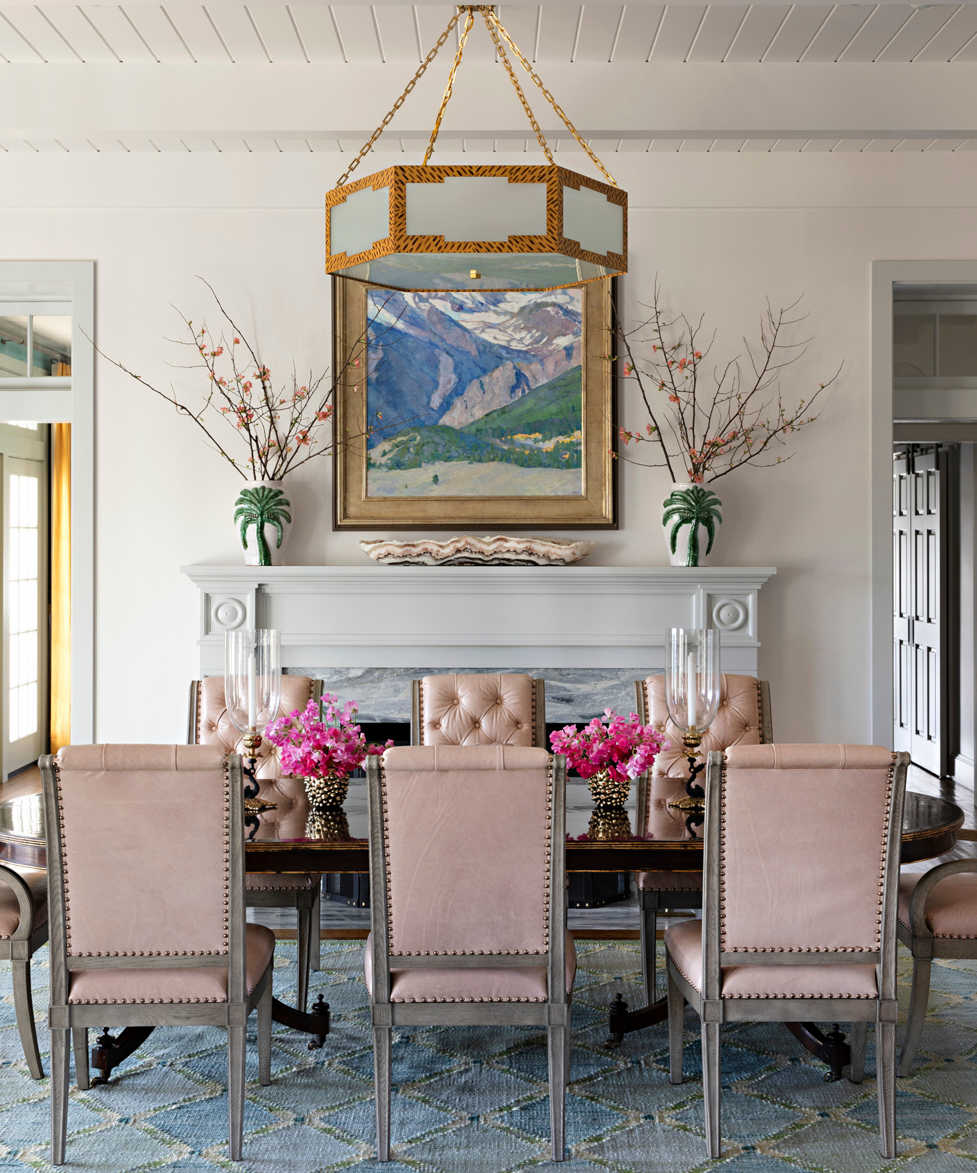
The more formal dining room sits at one end of the Great Hall. Joe has created a classic scheme with pink leather dining chairs, a large table that provides plenty of entertaining space for guests and a statement pendant above it.
Library
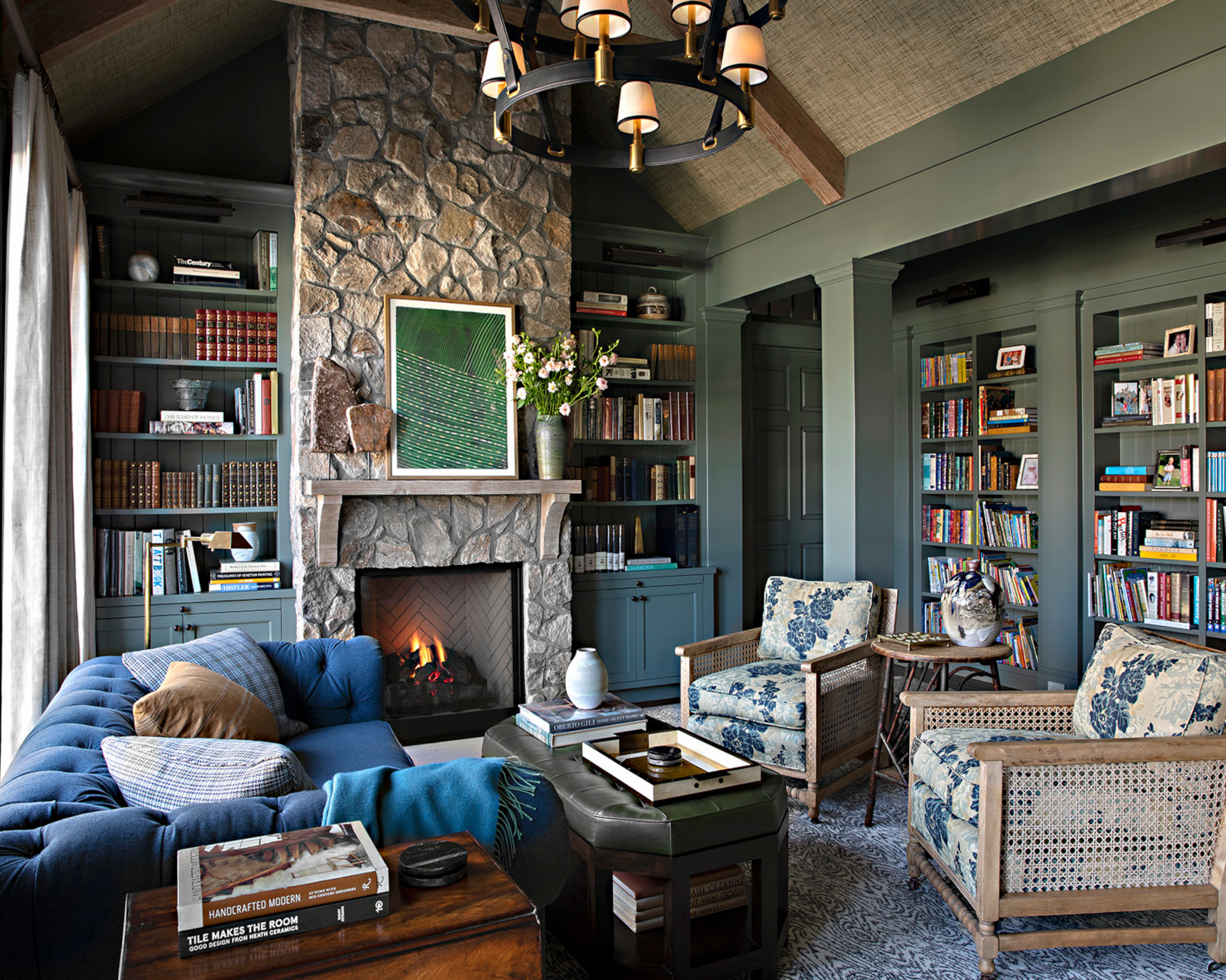
The clients wanted the library to be a focus of family life, and this was achieved with an aisle along one side serving as the path to the bedroom wing, so the children have to pass through it each day.
Joe has created a cozy feel with a palette of deep and smoky colors, while an exposed stone fireplace wall injects a rustic touch.
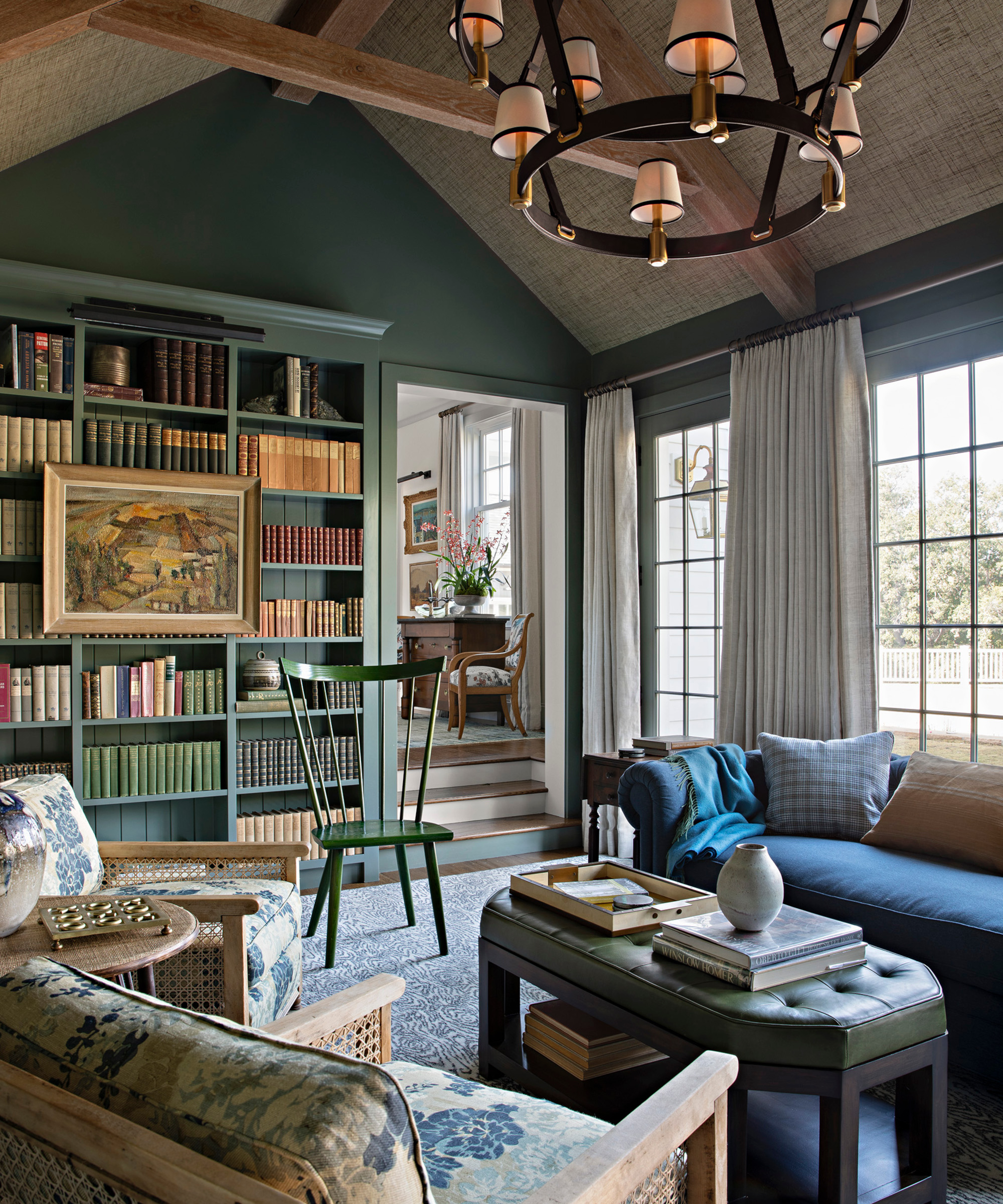
A large button-back sofa and comfy cane chairs provide the perfect spot to curl up with a good book.
Main bedroom
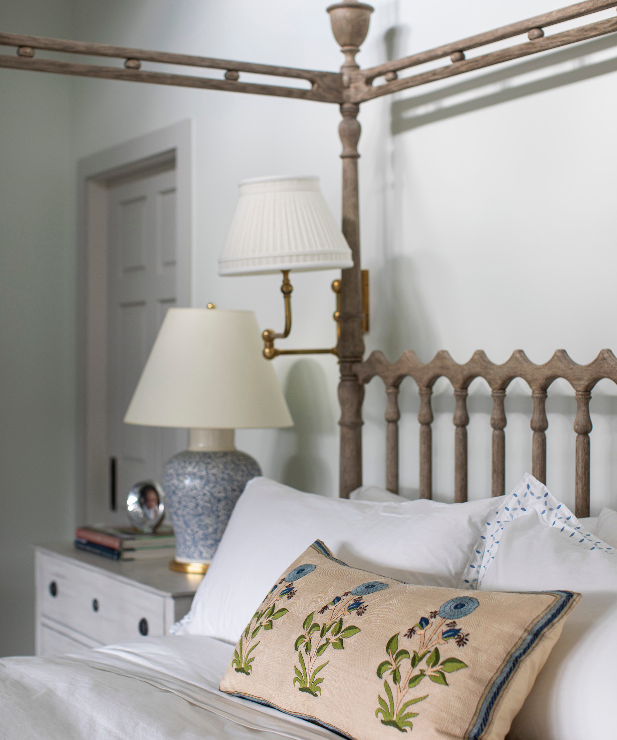
Among Joe's bedroom ideas was creating an eyecatching focal point with a William Yeoward gray oak four poster, inspired by traditional Mallorcan beds. It brings an elegant feel to the room, while a pillow made from an Alex Conroy Textiles fabric enhances the classic aesthetic.
Daughter's bedroom
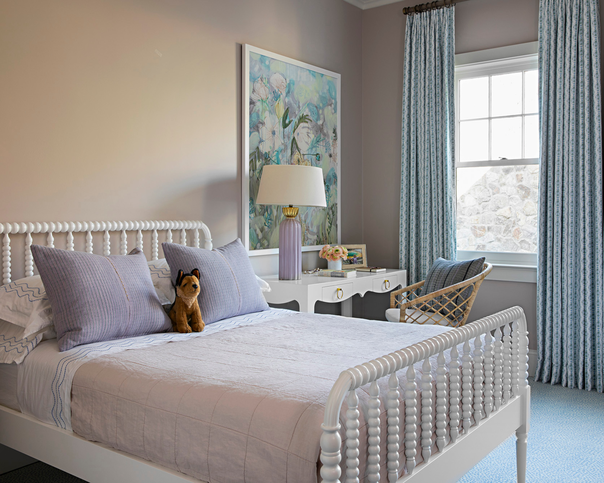
'The home needed to be able to be lived in and wear well but also be able to grow with them as a family and to age well,' says Joe. For that reason, a pastel palette, traditional white bobbin bed and a pretty white console table were chosen to conjure up a feminine scheme for the oldest daughter that will grow with her.
Daughter's bathroom
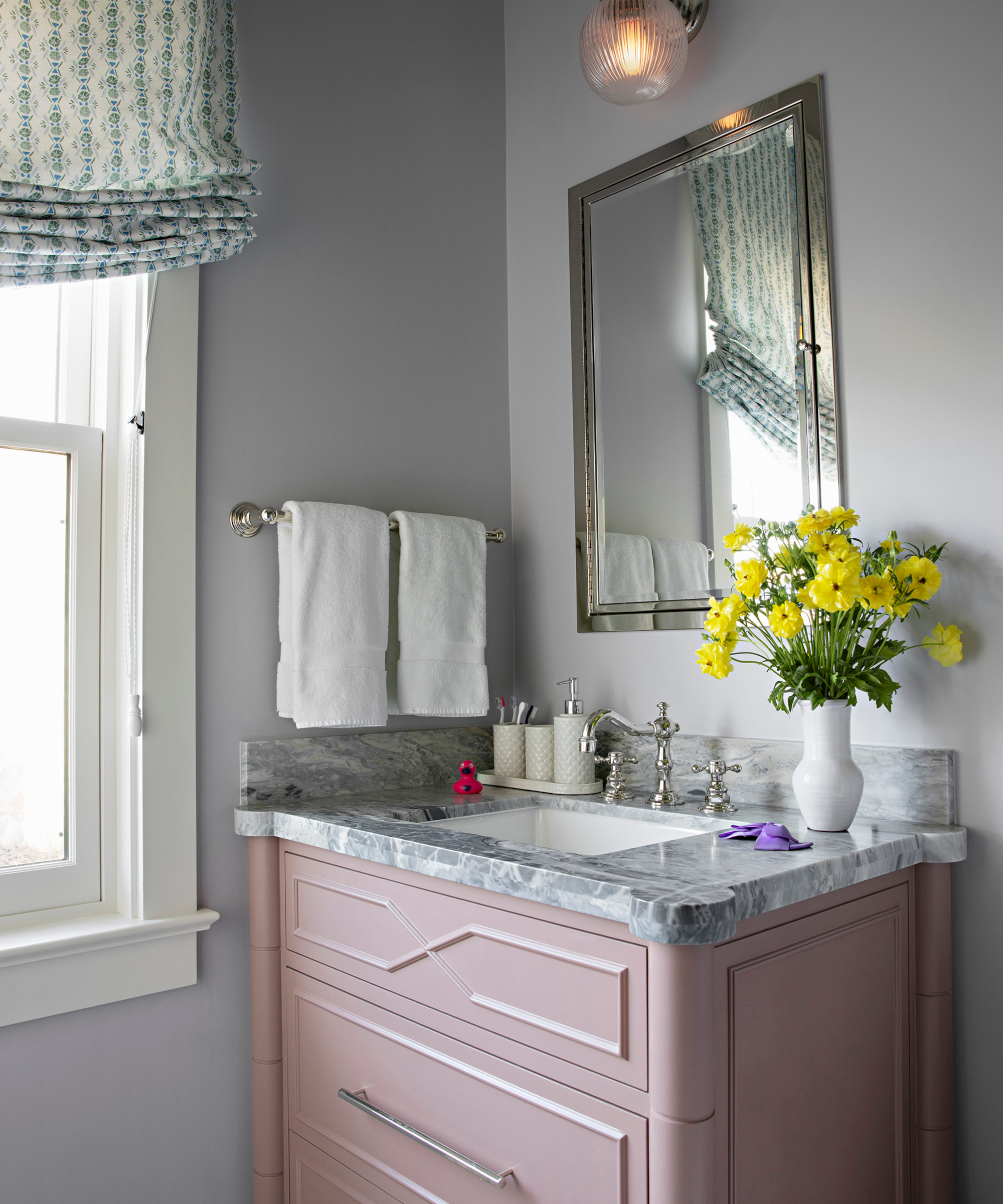
Joe was keen to continue the classic, feminine feel in the daughter's bathroom, so bathroom ideas include a dusky pink washstand with period-style faucets.
Interior design/ Lucas Studio, Inc
Architecture/ Evens Architects
Photographs/ Karyn R Millet
Sign up to the Homes & Gardens newsletter
Design expertise in your inbox – from inspiring decorating ideas and beautiful celebrity homes to practical gardening advice and shopping round-ups.

Interiors have always been Vivienne's passion – from bold and bright to Scandi white. After studying at Leeds University, she worked at the Financial Times, before moving to Radio Times. She did an interior design course and then worked for Homes & Gardens, Country Living and House Beautiful. Vivienne’s always enjoyed reader homes and loves to spot a house she knows is perfect for a magazine (she has even knocked on the doors of houses with curb appeal!), so she became a houses editor, commissioning reader homes, writing features and styling and art directing photo shoots. She worked on Country Homes & Interiors for 15 years, before returning to Homes & Gardens as houses editor four years ago.
-
 I learned how to keep my house permanently tidy when living in Iran with my grandma – the art of 'dido-baazdid’ permanently altered my brain chemistry
This cultural practice embedded manageable tidying into my daily routines
-
 How to grow yuzu – for an attractive and fragrant cold-hardy citrus tree with golden fruits
A fruit tree expert reveals planting and care tips for successfully growing yuzu