A ranch-style new-build showcases how to bring the wow factor to a neutral interior
Interior designer Jill Croka has transformed this Tulsa new build into a luxe family home that's the perfect place for entertaining
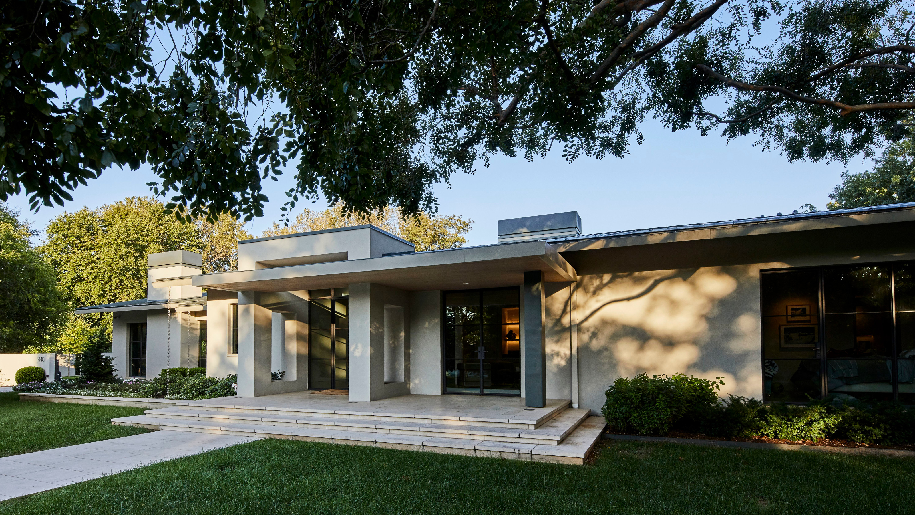

A carefully considered interior consisting of earthy colors, layered textures and interesting shapes has transformed this modern ranch-style new build into one of the world's best homes.
'The client wanted a warm, functional family home to raise her children and to entertain often,' says interior designer Jill Croka.
Jill and her team incorporated a wide variety of luxurious yet functional and durable pieces throughout the home, along with unique and personalized elements that really create the wow factor when entering each room. The millworks, the materials and the lighting are some of Jill’s favorite details. 'Each item was carefully selected and considered and no decisions were rushed,' says Jill. The result is a clean, organic design style.
In addition, the interior/exterior living spaces and outdoor landscaping give the home an expansive look that's perfect for entertaining.
Living room
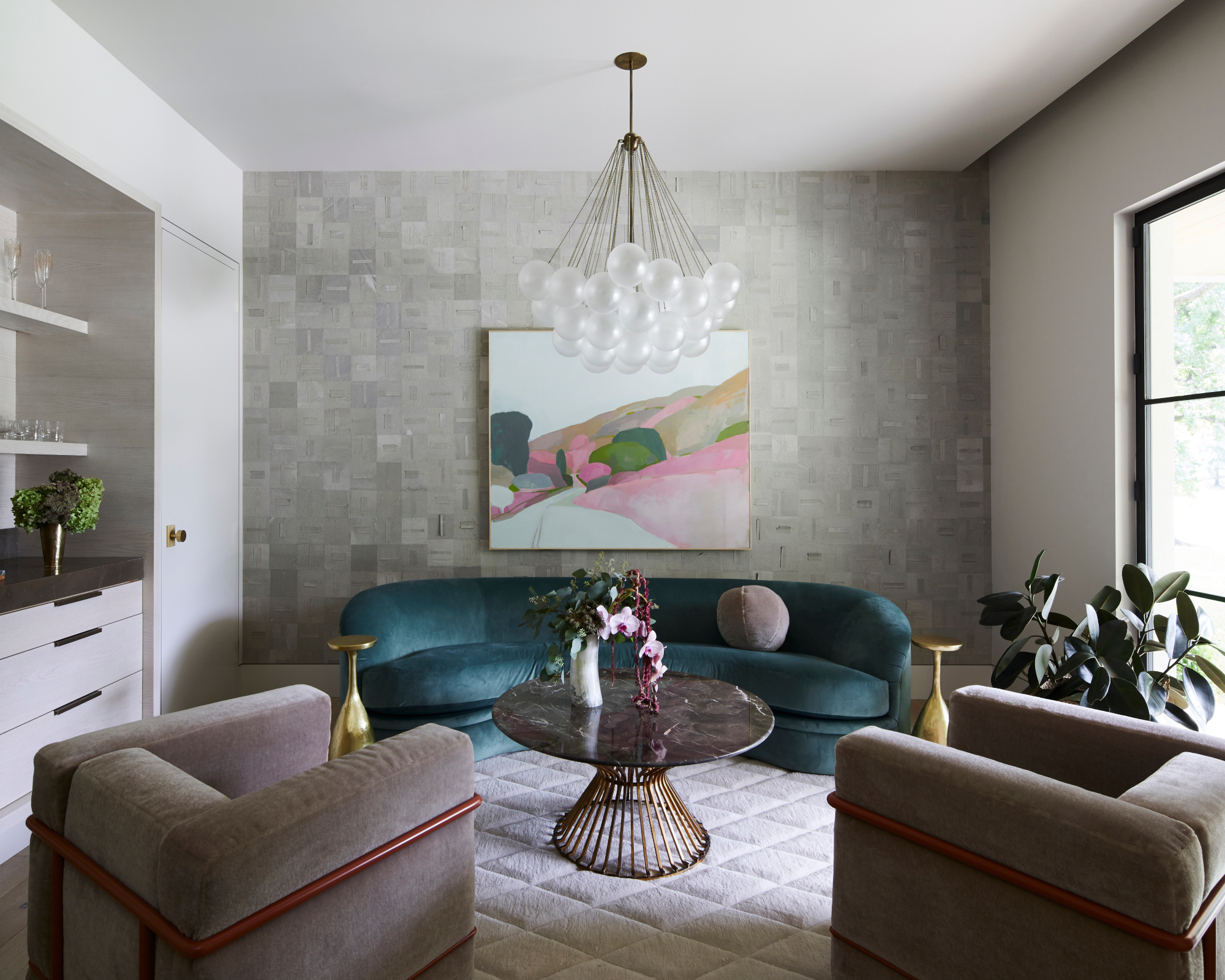
'This room is more of a reading and music listening space for the adults and older children,' says Jill. 'The family loves to enjoy quiet time in this cozy space.'
Living room ideas include incorporating statement lighting, the Cloud chandelier by Apparatus. 'The elegance of the fragile smoked glass and brass chains are a nice juxtaposition to the linear and confident architecture of the home,' says Jill.
Materials used were chosen with a specific purpose in mind. 'We used Elitis wallpaper to create a cozy and more intimate vibe,' says Jill.
Special attention was paid to the furniture too. 'We found a vintage Vladimir Keegan sofa and reupholstered the client’s existing Le Corbusier chairs in Jill Croka Designs' signature mohair and powder coated the metal to bring color and playfulness to the space.' The bar was specifically designed to read more as a furniture piece placed in the space.
Artwork is used to inject color. 'The client is very into art and loves to dive deep to find the right piece for the space, which has been so nice to work with and has continued after moving into the house,' says Jill.
The great room
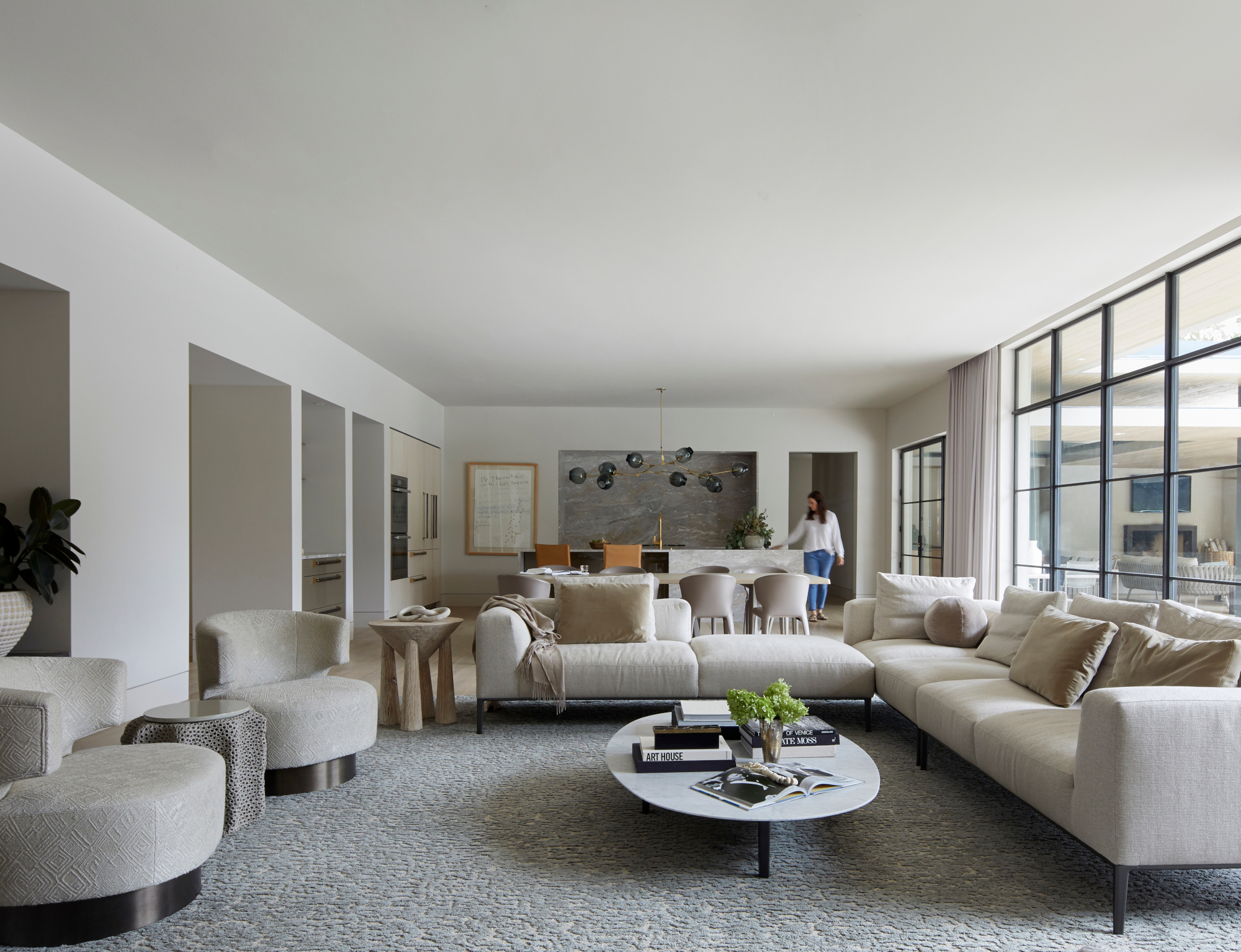
Floor to ceiling windows ensure light floods into this open plan space, which is perfect for entertaining as it combines living, kitchen and dining areas. A calming neutral palette was chosen to enhance the serene feel. 'We believe a home should be a place of restoration and recharge, this client was extremely trusting to help us achieve that,' says Jill. 'The starting point was the stone on the stove backsplash, with the tones advancing into the dining space and creating a colorway for the space to layer on.' Sectional sofas and comfy curved chairs provide plenty of seating for guests.
Kitchen
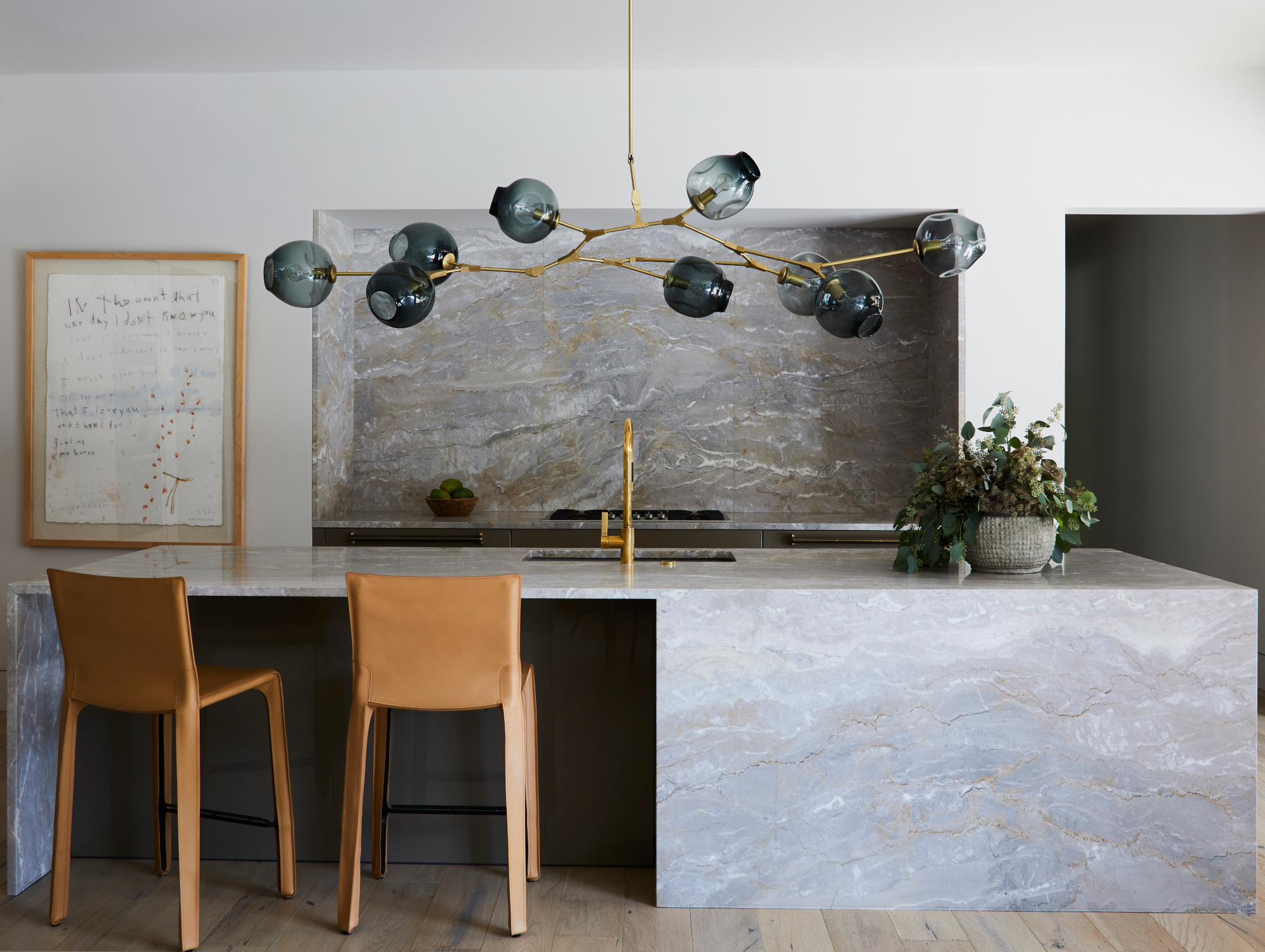
Jill was keen to create a sleek, streamlined space. Kitchen ideas included designing the kitchen with a pop up vent. 'It was really important to me to not have a big vent hood,' she says.
The stone, honed Dolce Vita from Aria Stone Gallery, is a favorite of Jill's and was used on the splashback and island.
A statement light fixture, Branching Bubbles in smoke glass by Lindsey Adelman, adds a touch of glamor above the island.
Main bedroom
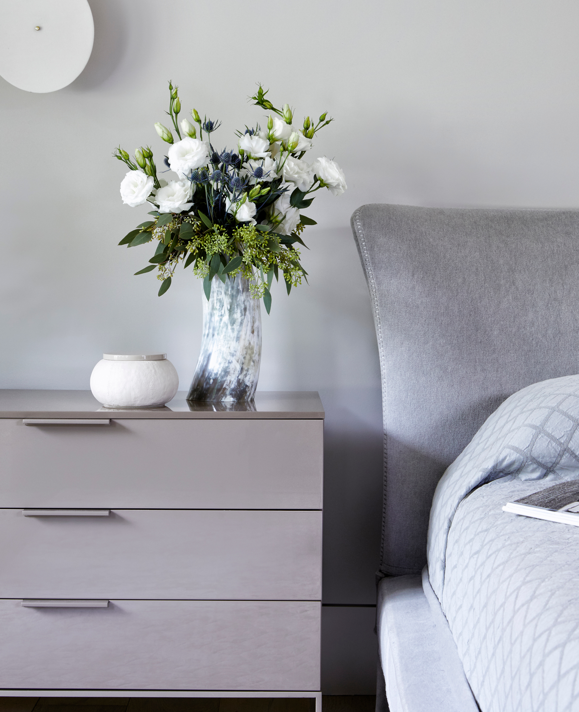
Jill has created a soothing scheme with a palette of soft grays. Sumptuous fabrics and statement disc wall lights evoke a luxurious feel.
Walk-in closet
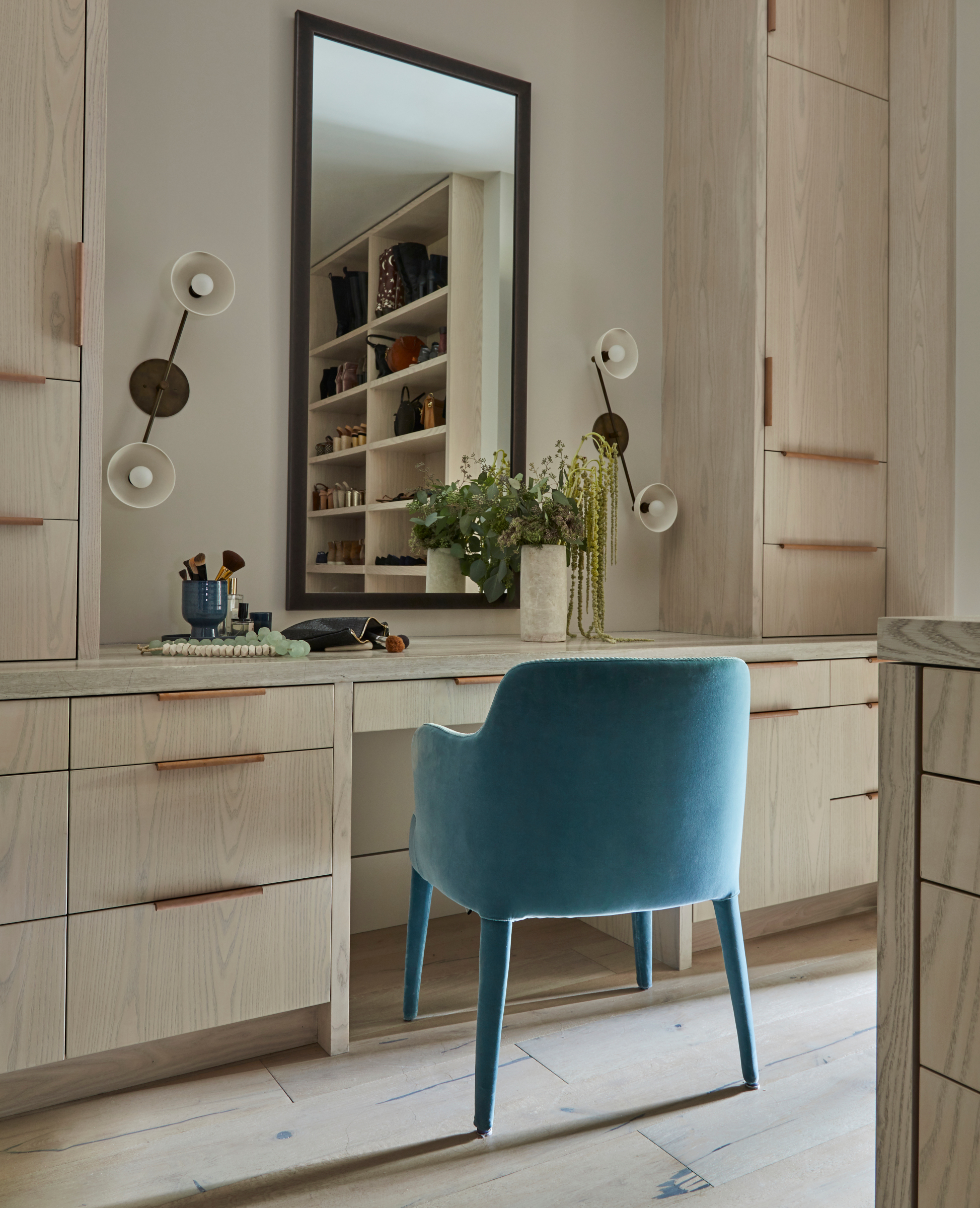
This 'hers' walk-in closet is made from ash and provides plenty of storage, while 'his' walk-in closet is made from walnut. A teal chair injects a pop of color.
Main bathroom
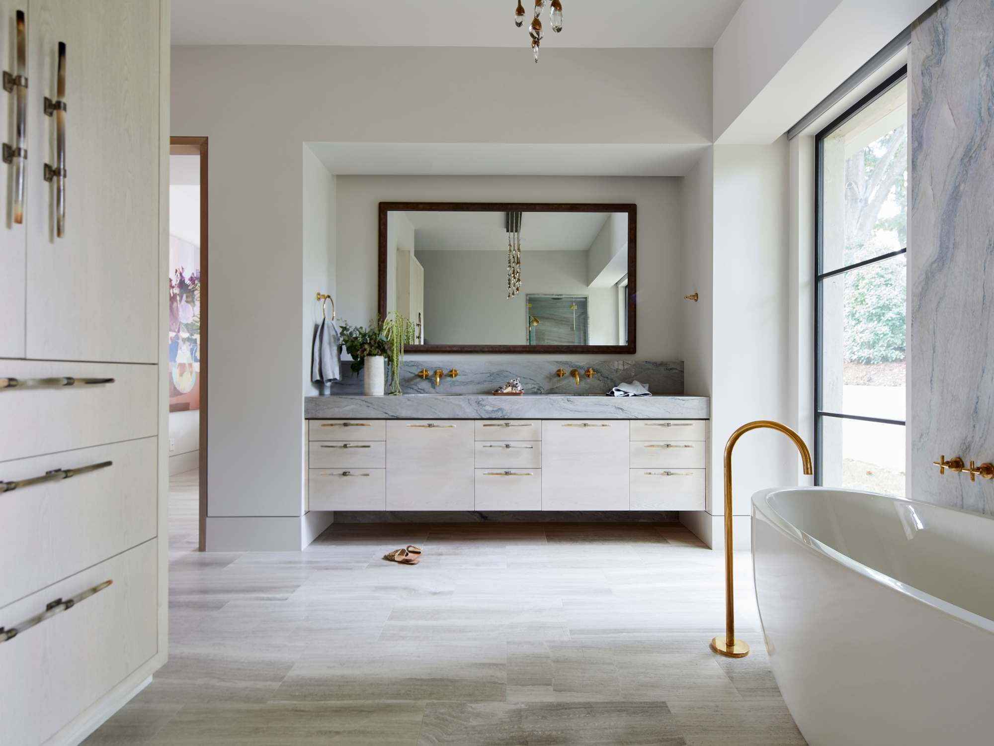
Opulent details such as rose gold taps and Ochre horn handles are among the bathroom ideas for evoking a luxurious feel. The vanity units are custom designed by Jill.
Son's bedroom
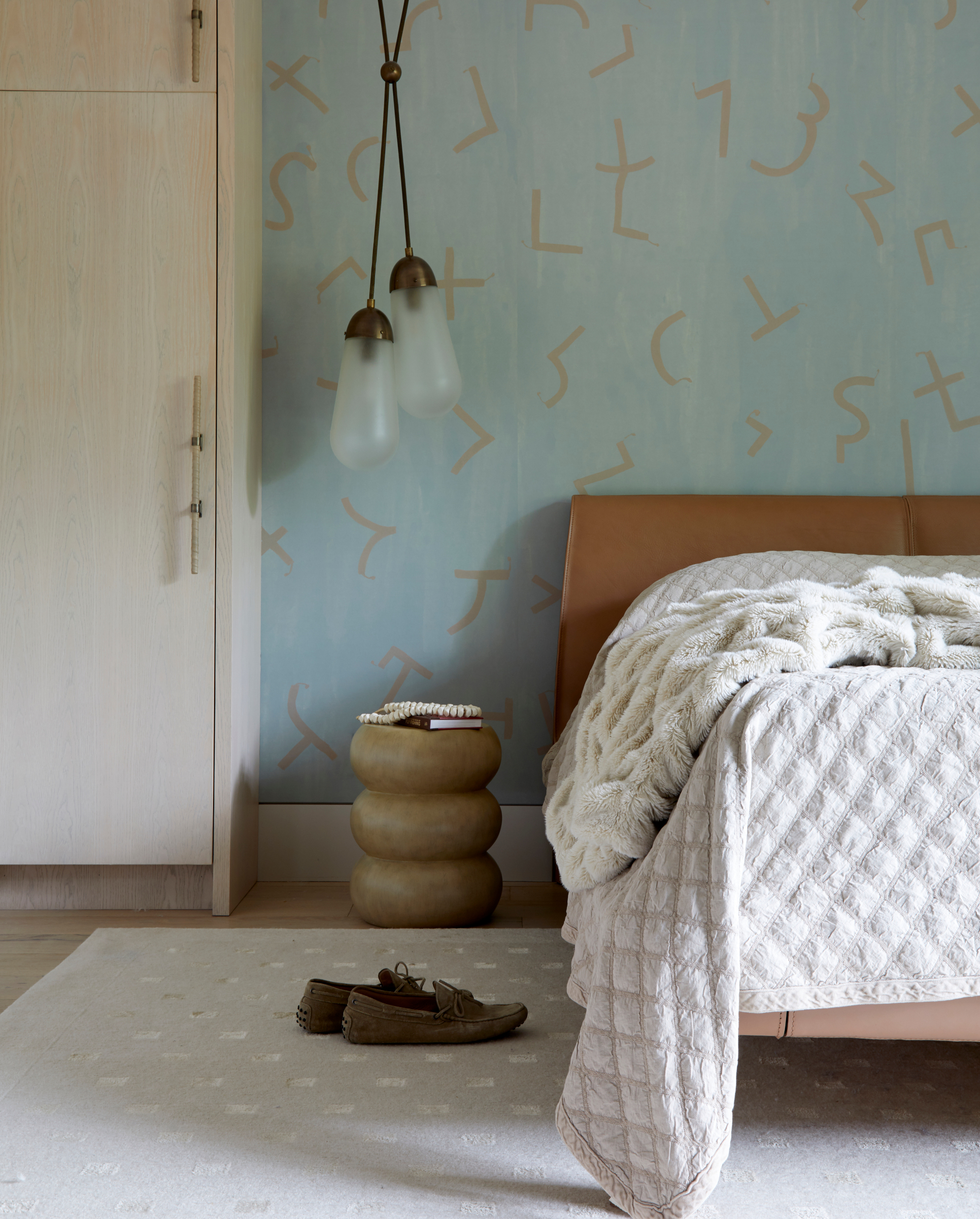
Bedroom ideas include introducing personality with a feature wall of handpainted wallpaper by Porter Teleo. Built in storage on either side of the bed provides plenty of storage, while Apparatus pendants inject an industrial touch
Interior design/ Jill Croka Designs
Architect/ Doyle Design
Photography/ Adam Murphy
Sign up to the Homes & Gardens newsletter
Design expertise in your inbox – from inspiring decorating ideas and beautiful celebrity homes to practical gardening advice and shopping round-ups.

Interiors have always been Vivienne's passion – from bold and bright to Scandi white. After studying at Leeds University, she worked at the Financial Times, before moving to Radio Times. She did an interior design course and then worked for Homes & Gardens, Country Living and House Beautiful. Vivienne’s always enjoyed reader homes and loves to spot a house she knows is perfect for a magazine (she has even knocked on the doors of houses with curb appeal!), so she became a houses editor, commissioning reader homes, writing features and styling and art directing photo shoots. She worked on Country Homes & Interiors for 15 years, before returning to Homes & Gardens as houses editor four years ago.
-
 Kylie Jenner, Tommy Hilfiger, and Lenny Kravitz transform their homes with prints – the London Original Print Fair Director has a method that makes their look 'accessible and affordable' in your home
Celebrities from the Kardashians to Lenny Kravitz decorate their homes with prints by famous artists, and it's easier to recreate than you might expect
By Sophie Edwards
-
 ‘Completion days’ are the answer to laundry doom piles, pro organizer claims – here’s how this hack can instantly stop fresh laundry from piling up once and for all
Stay on top of your laundry with the 'Completion days' method
By Chiana Dickson