One plot, two new homes, and several ways to capture classic East Coast style
These two luxurious homes share the same lakeside plot, but each offers a different perspective on traditional coastal décor

Picture this: a large plot with an idyllic lakefront setting. Would you build a house on it? No. You'd build two houses on it.
That's what the owners of this Midwest lakeside compound did, wishing to create two five-plus-bedroom transitional homes that would stand the test of time for their large-and-growing extended family. They wanted the two new properties to look as though they'd stood there for generations, with traditional reference points as well as some more contemporary influences.
The architectural details and interiors are stunning and now the finished main house and its slightly smaller scale next-door neighbor are among the world's best homes with their unique take on new-meets-old.
The team behind this ambitious project is architect Wade Weissmann and interior designer Teresa Manns. The pair worked together on the two homes, right from the concept stage, adding their own flair and insights to elevate the properties beyond their clients' hopes and expectations.
Designer Teresa Manns shows us around, highlighting the shared style points and the differences between the two homes.
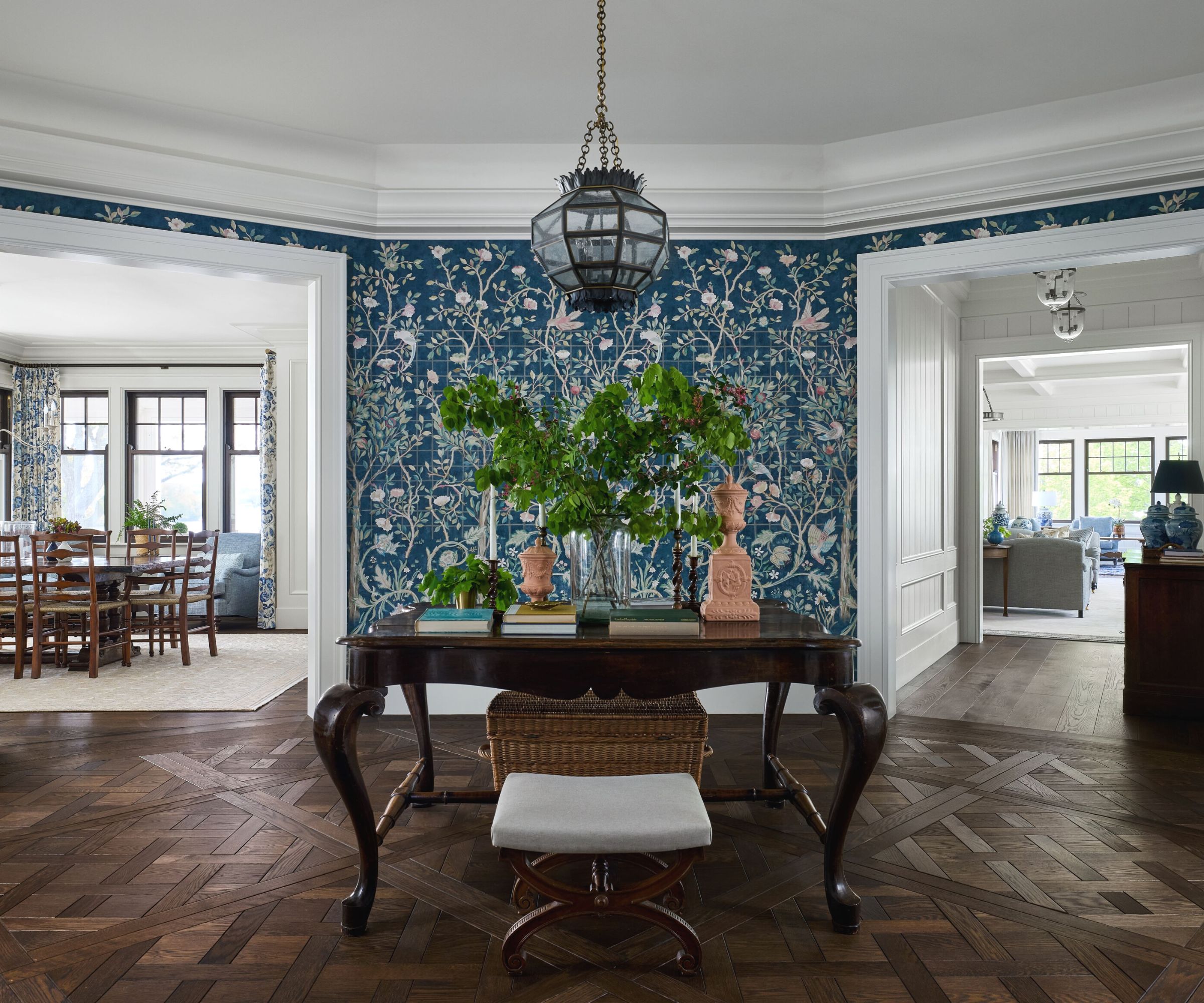
'We came up with a distinct project narrative before we built anything,' Manns says. 'The concept centered around creating a more formal main house that appeared as if it had existed for many lifetimes, and then a substantially sized guest house inspired by the idea of a historic ice house that had been added onto and modernized over time. A lot of inspiration for the interior finishes came from touring historic homes in Newport, Rhode Island, bringing that East Coast, shingle-style feel to the property.'
Thus, each of the two properties reinvents East Coast style in this Midwest setting, with subtle differences between the two homes' interpretations. Take the impressive main house entrance foyer, pictured above. Key to the hallway ideas for this space is its central position, with the main living and entertaining rooms radiating out through generous double doorways. The curved walls emphasize that 360-degree view of the ground floor from here. The entryway decor has a bright, welcoming vibe and introduces design themes for the rest of the house.
Morris & Co.’s Melsetter mural wallpaper stands up to the beauty of the lakefront views from the living and dining rooms. 'We wanted something arresting for the eye to land on,' Manns says. 'Otherwise, the views through the adjacent rooms would capture all the attention.' Custom-patterned floors create visual interest, while an Urban Electric pendant lantern highlights an antique Italian table, sourced through Balsamo Antiques.
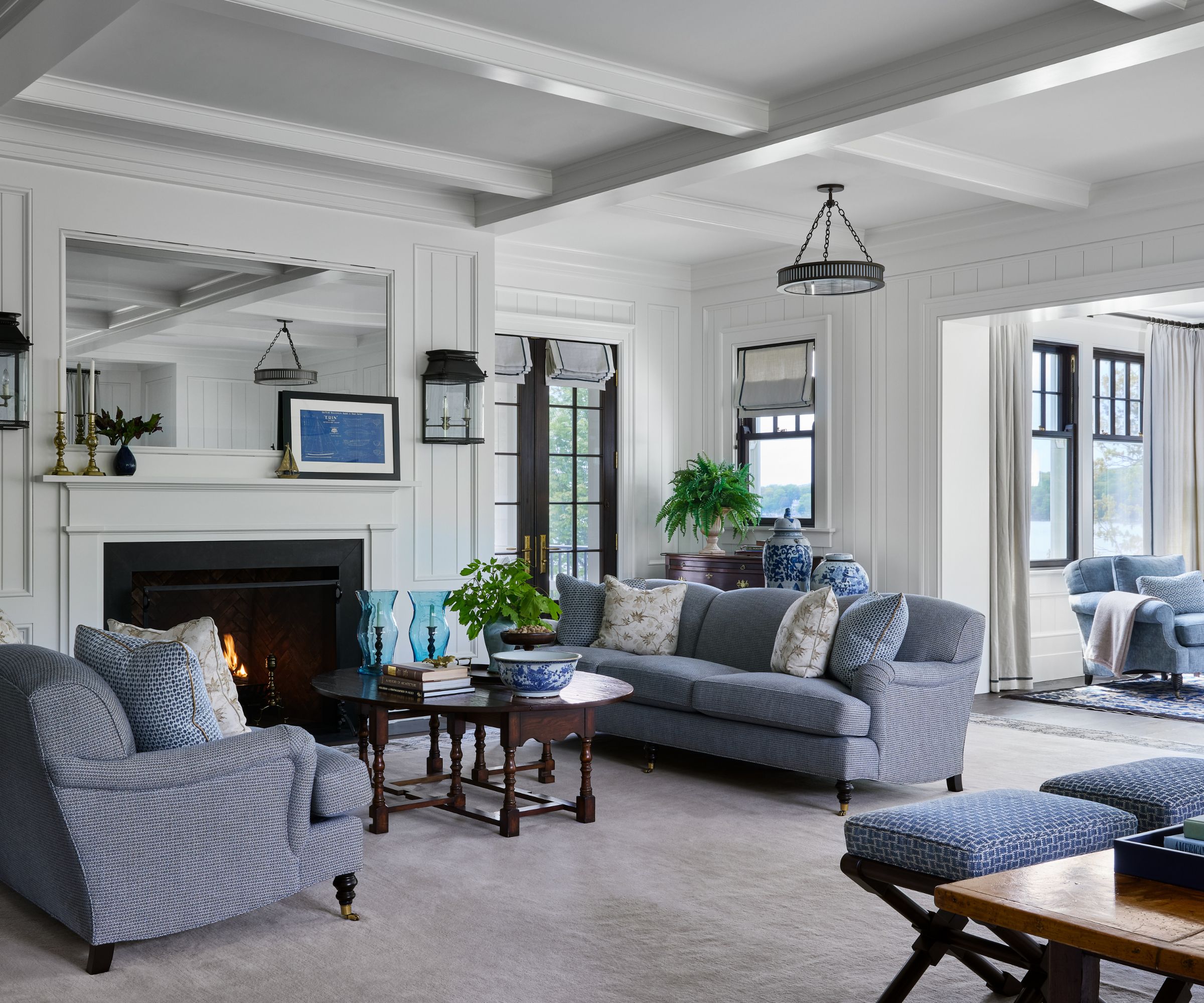
Large enough for a whole family gathering, but with smaller seating alcoves for cozy chats, the living room ideas here work well for every eventuality. The mirror integrated into the millwork above the fireplace doubles as a TV. Sofas, club chairs and benches are by Ferrell Mittman in Cowtan & Tout fabrics. Throw pillows in Kravet and Kerry Joyce fabrics complete the textile scene, while antique-inspired wall lanterns from Jamb give the new space a sense of history.

Known for conceptualizing homes that pair her former New York grit (working for firms like S.R. Gambrel) with her newfound classic Midwest charm, interior designer Teresa Manns is quickly becoming the go-to for homeowners seeking livability and legacy. From contemporary lake home compounds to modern farmhouses, Manns' approach considers the individualistic preferences and traditions of its inhabitants to produce spaces that last generations and encourage families to never want to leave.
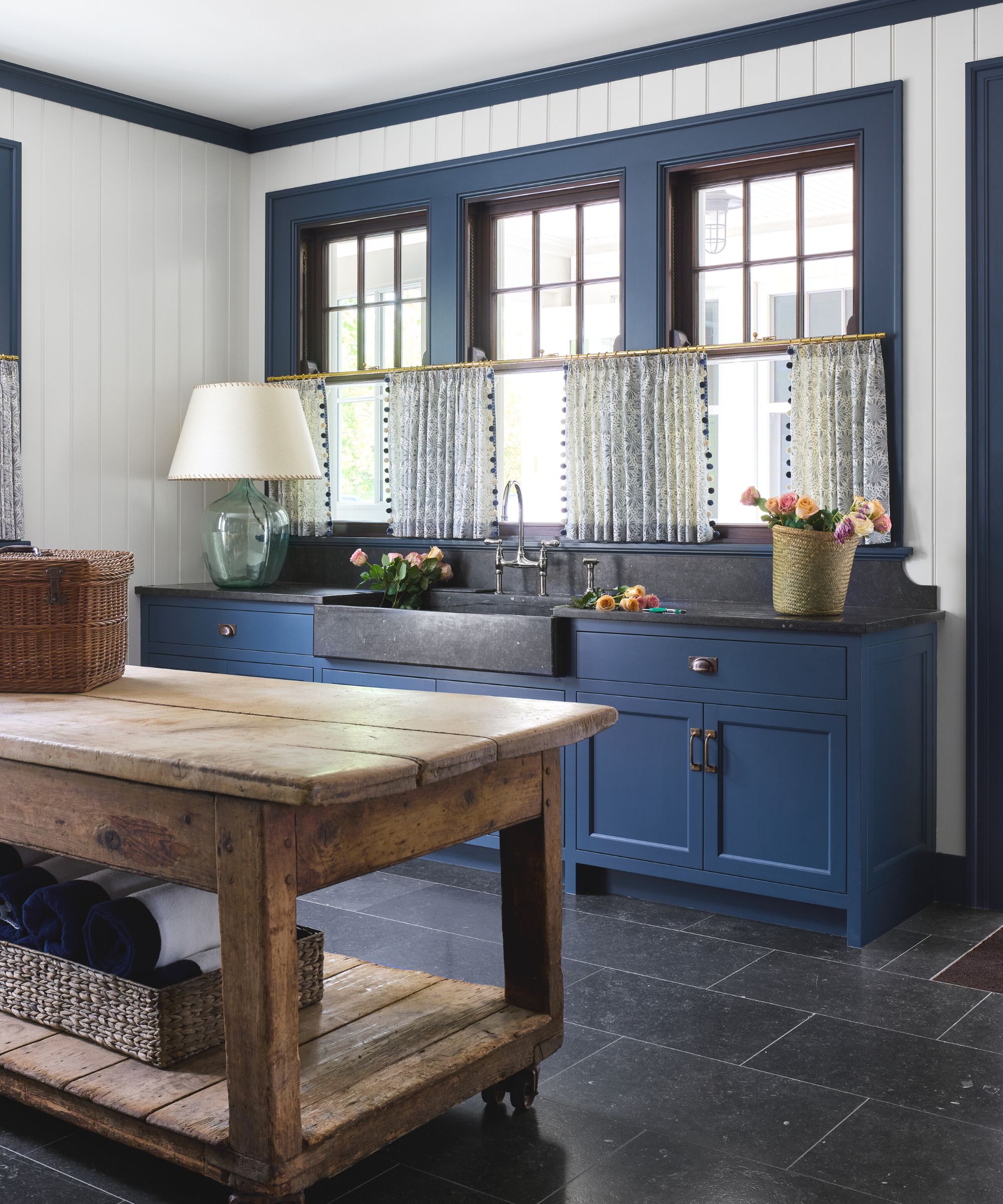
Kitchen ideas in the main house make a further play of the new-meets-old theme. The dark slate sink and backsplash give the shiplap boarding a contemporary twist, with cabinetry and millwork in a classic East Coast blue. A reclaimed pine workbench, used as an island, and sheer cafe curtains add further traditional style notes to the look.
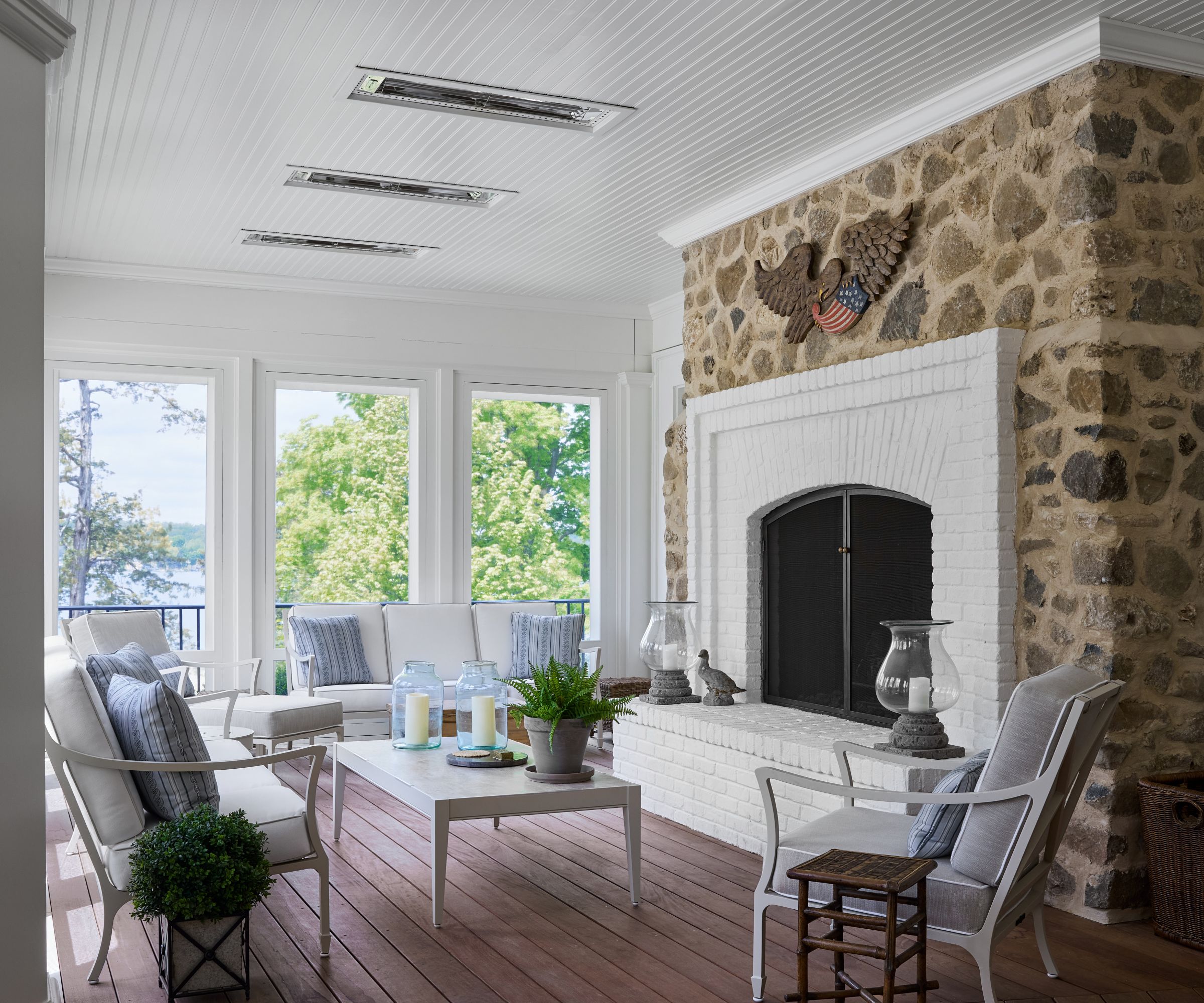
In a setting as beautiful as this, no one needs encouragement to embrace the concept of indoor-outdoor living, but this front porch space makes it an everyday essential. The fireplace and integrated ceiling heaters mean the porch can be used all year round. To add aesthetic interest, Manns scoured antique shows in Nashville and Atlanta for vintage accessories and American antiques. 'They have simpler shapes and a nice scale without being too fussy,' she says.
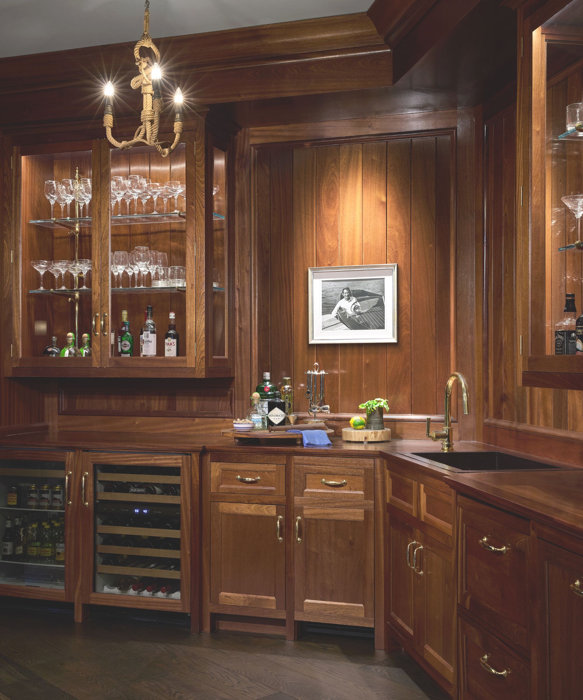
Among the many boating references in the two homes, the main house's bar area, with its high-gloss mahogany finish, was inspired by vintage Chris-Craft boats that are often seen cruising the lakes in the area. The pass-through bar area allows for a free-flowing entertainment zone. The vintage rope chandelier adds an informal nautical touch.
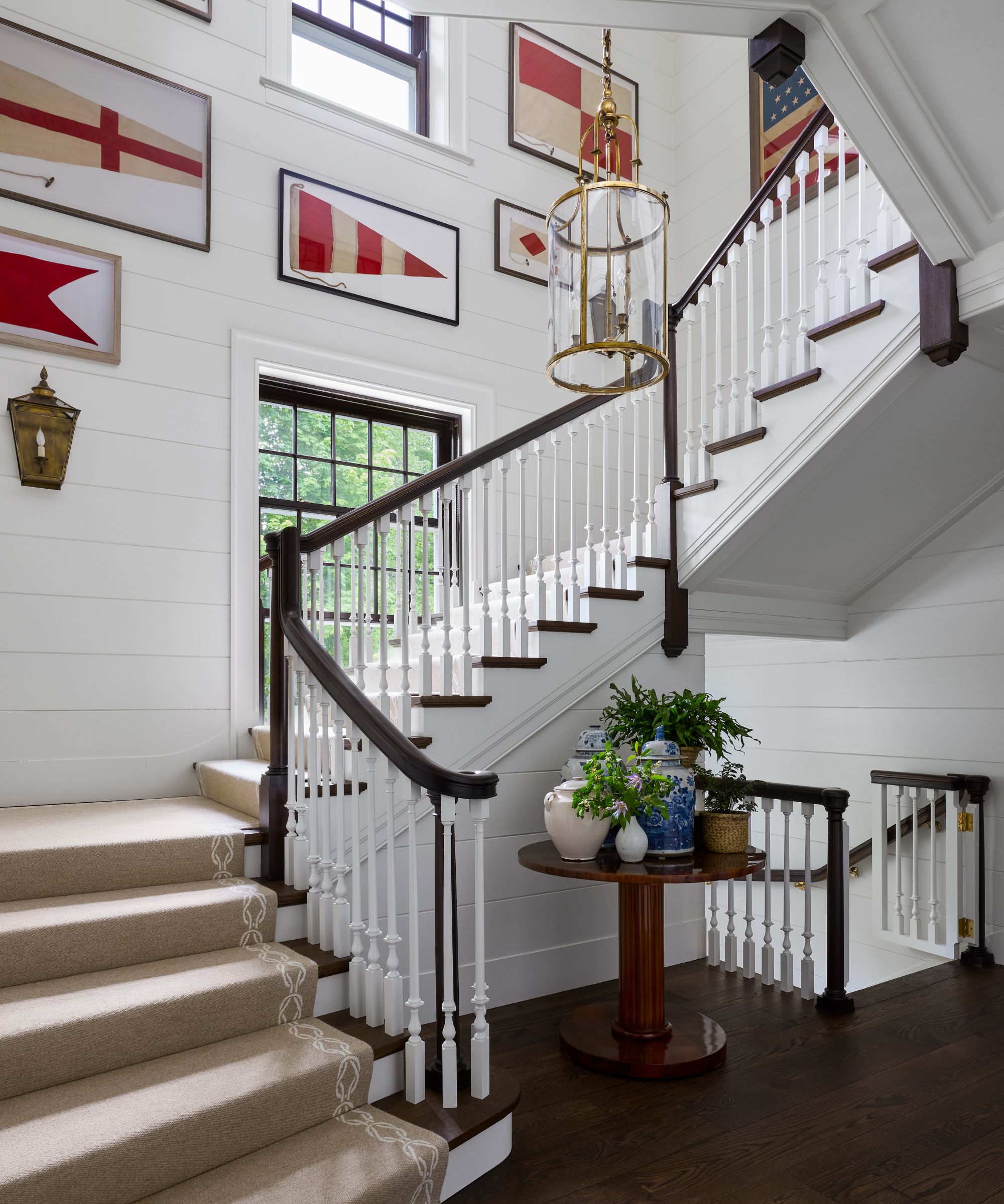
More vintage maritime memorabilia create a colorful gallery effect on the stairway, with shiplap paneling providing the perfect backdrop. The nautical pennants were sourced by designer Teresa Manns during one of her many antique buying trips for the house and add colorful coastal detailing to the scheme.
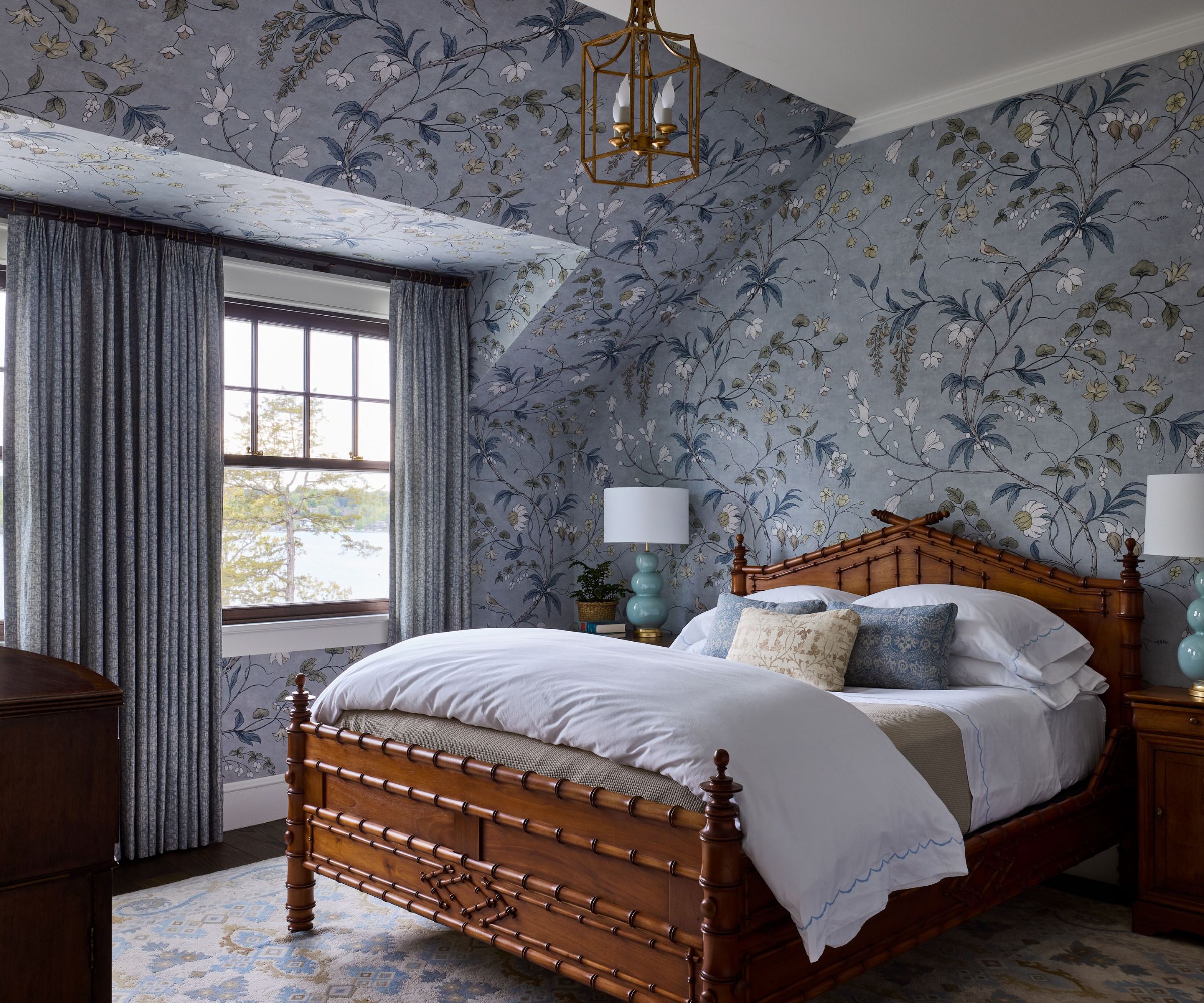
Featuring rooflines that were dropped to minimize the exposure from the lakeside of the home, architect Weissmann’s team created dormers that lend a cozier feel to the guest bedroom. Zoffany's Chambalon Trail wallpaper gives a dash of whimsy to the lake-facing room. A Leonards New England antique bed with bedding by Matouk, Rose Tarlow curtains, and a Doris Leslie Blau rug add to the feeling of rest and retreat.
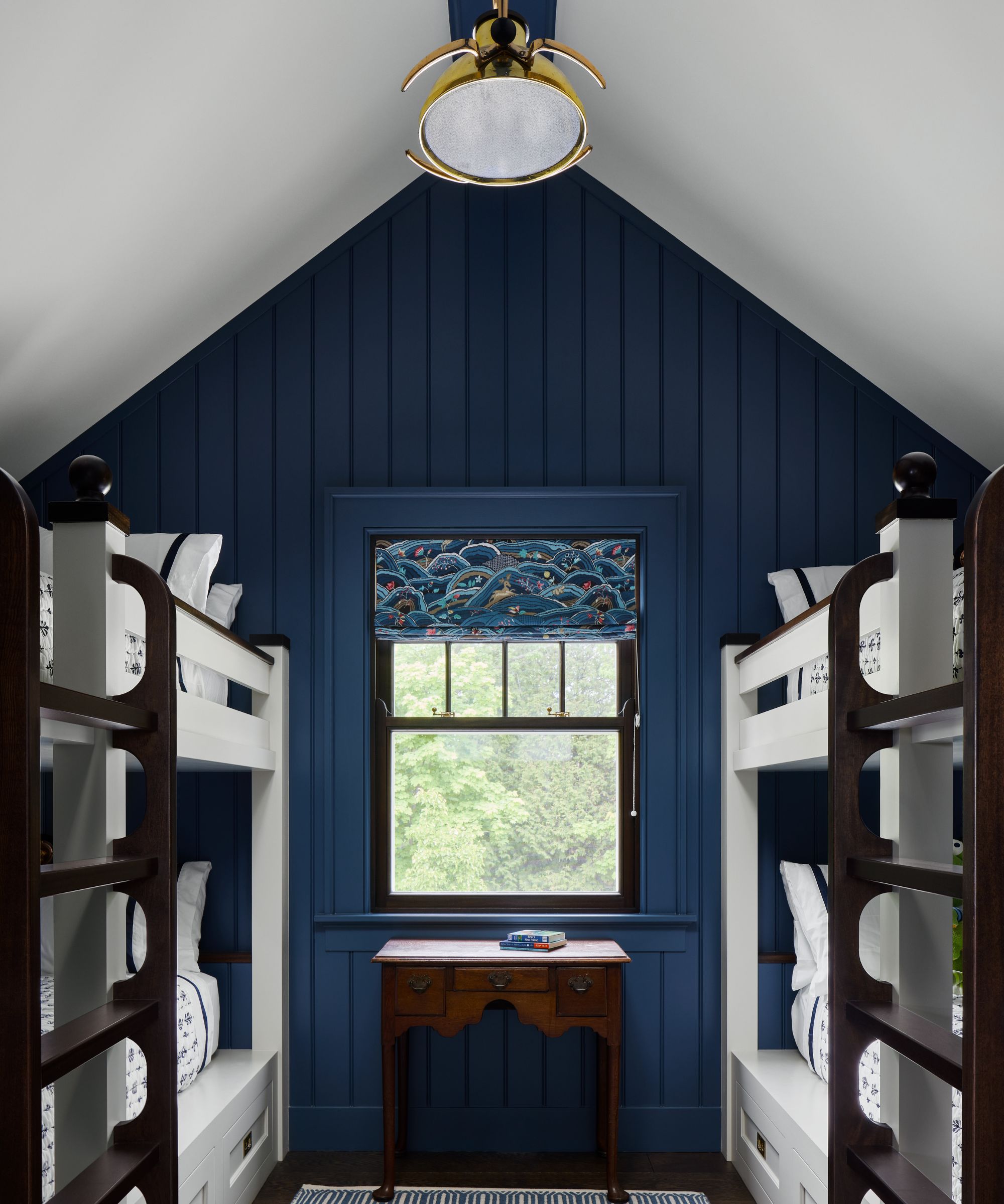
No coastal-inspired home would be complete without cabin bunks, and both the main home (above) and the guest house (below) include children's bunk rooms with appealing nautical details. Among the winning kids' room ideas in these appealing spaces, paneling with a Baltic blue paint finish and chunky, resilient ladders to withstand tough wear from enthusiastic young sailors.
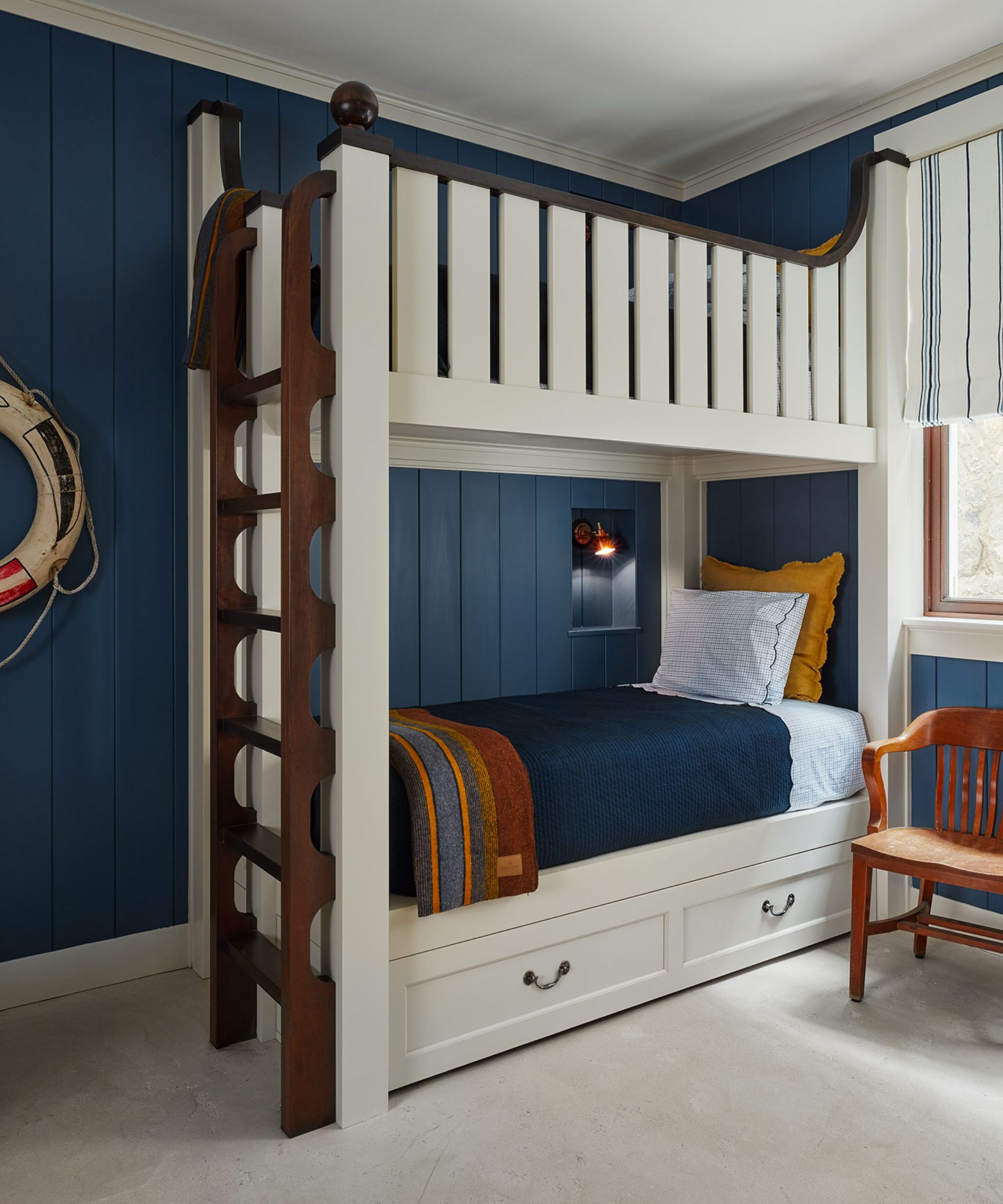
The bunk room in the guest house mixes in a touch of burgundy and gold, colors we'll see elsewhere in the smaller of the two homes, along with a more casual vibe.
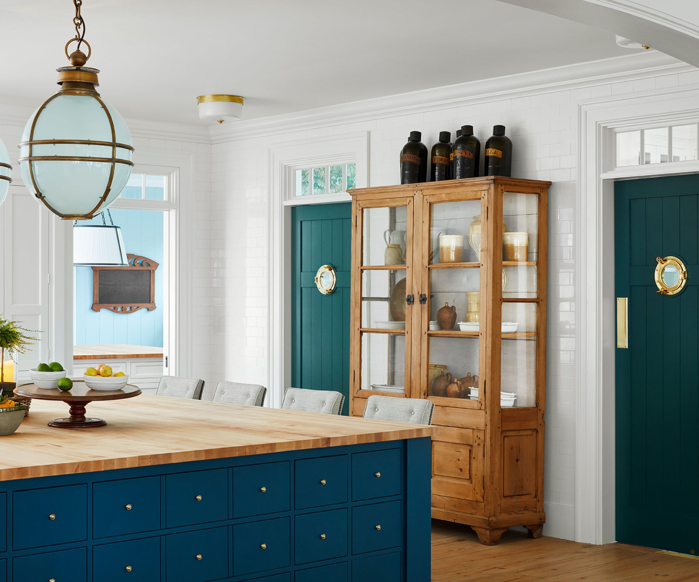
The Dutch-colonial style guest house has become a favorite spot for family dinners, which start in its bright, welcoming kitchen, designed to look like an old ice house with tiled walls, wide plank scraped pine floors. The 7' by 8' island features dozens of apothecary drawers, and has to be one of the best kitchen island ideas we've seen for a traditional-style kitchen. Oversized pendant lights from Jamb add nautical touches, along with the brass portholes.
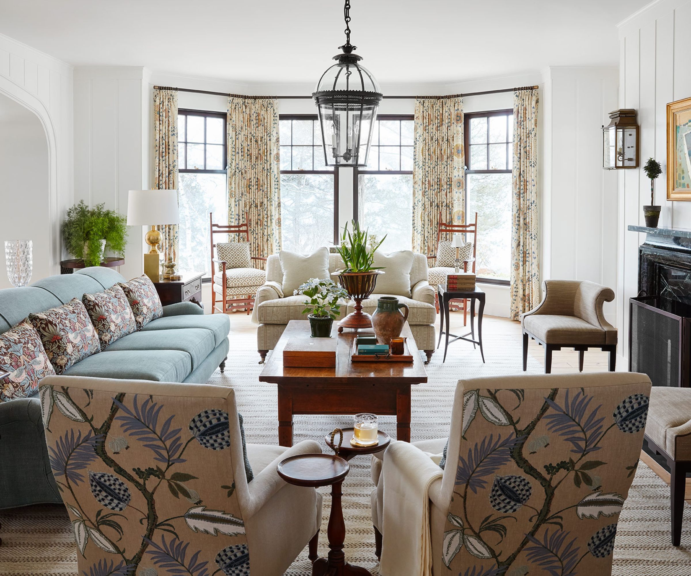
The guest house living room has a light and spacious feel, with furnishings just that bit more casual than those of the main house. Like the living room in the main house, the room offers various seating zones and combinations, and shares a similar palette of coastal blues and sun-bleached neutrals.
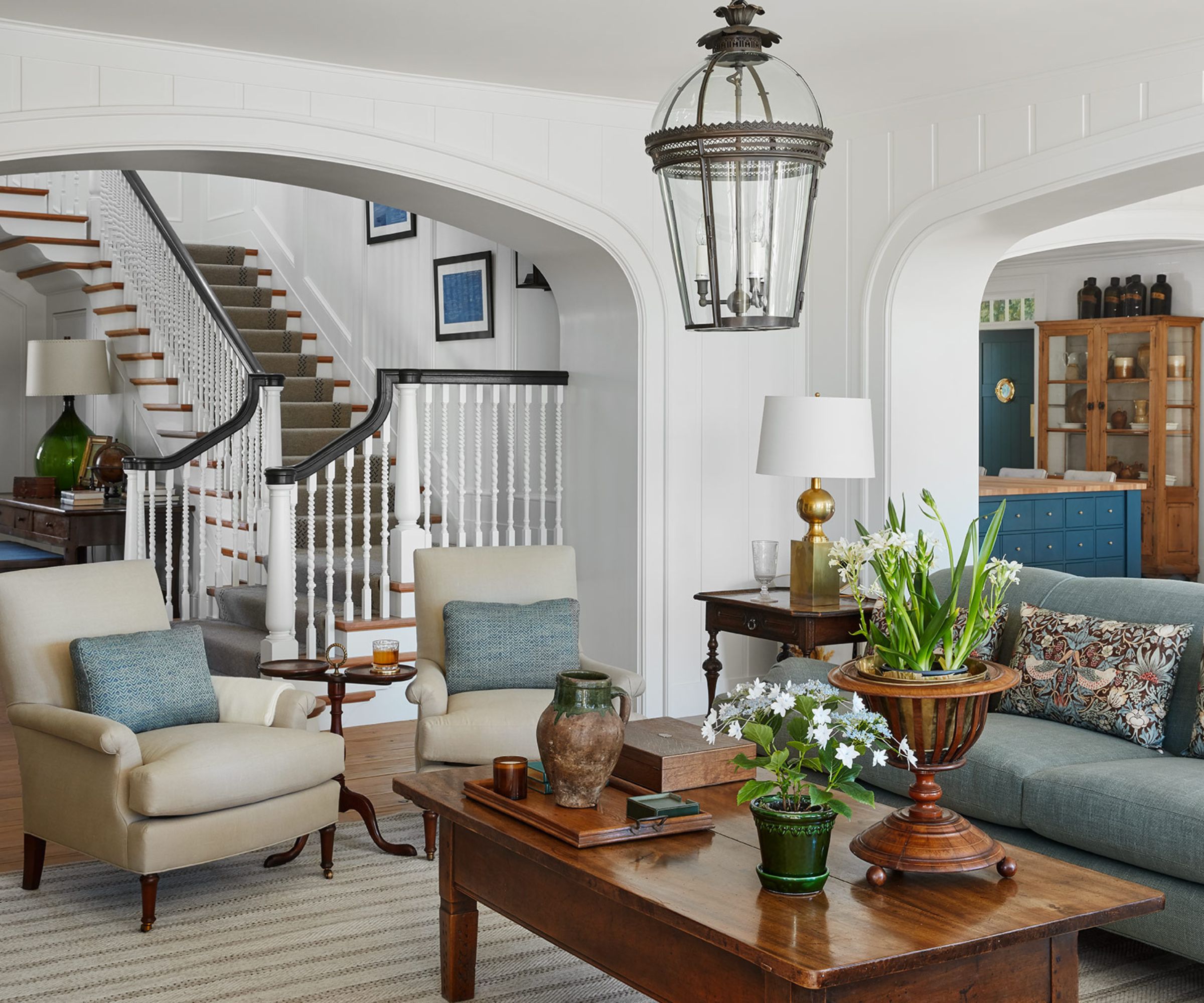
The living room's position at the heart of the guest house, adjacent to the kitchen and stairway, makes it a social space, perfect to settle family and friends into relaxed holiday mode.
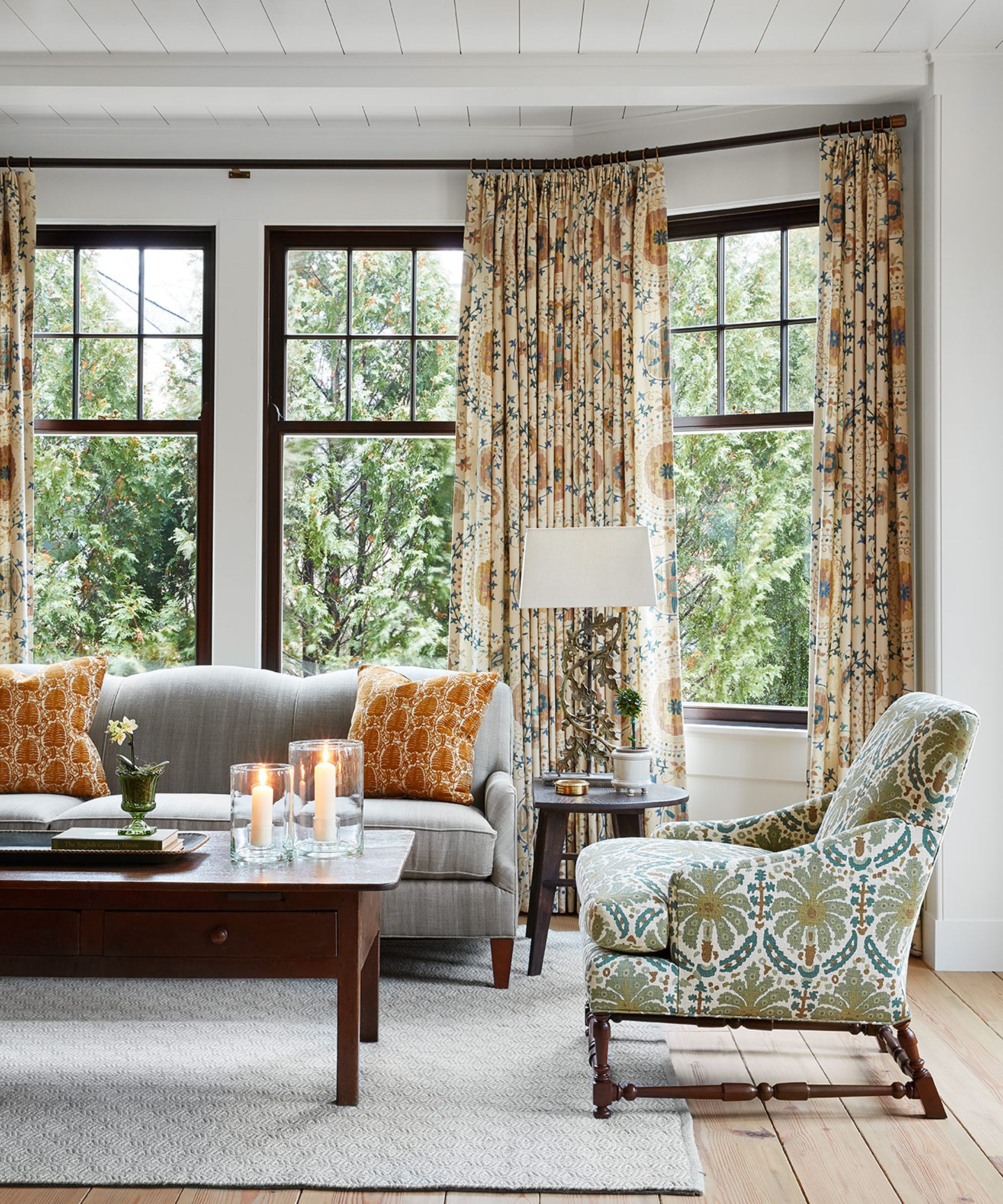
This part of the guest house living room introduces warmer colors, with the tall bay window creating a cozy nook for the sofa and floral-print armchairs.
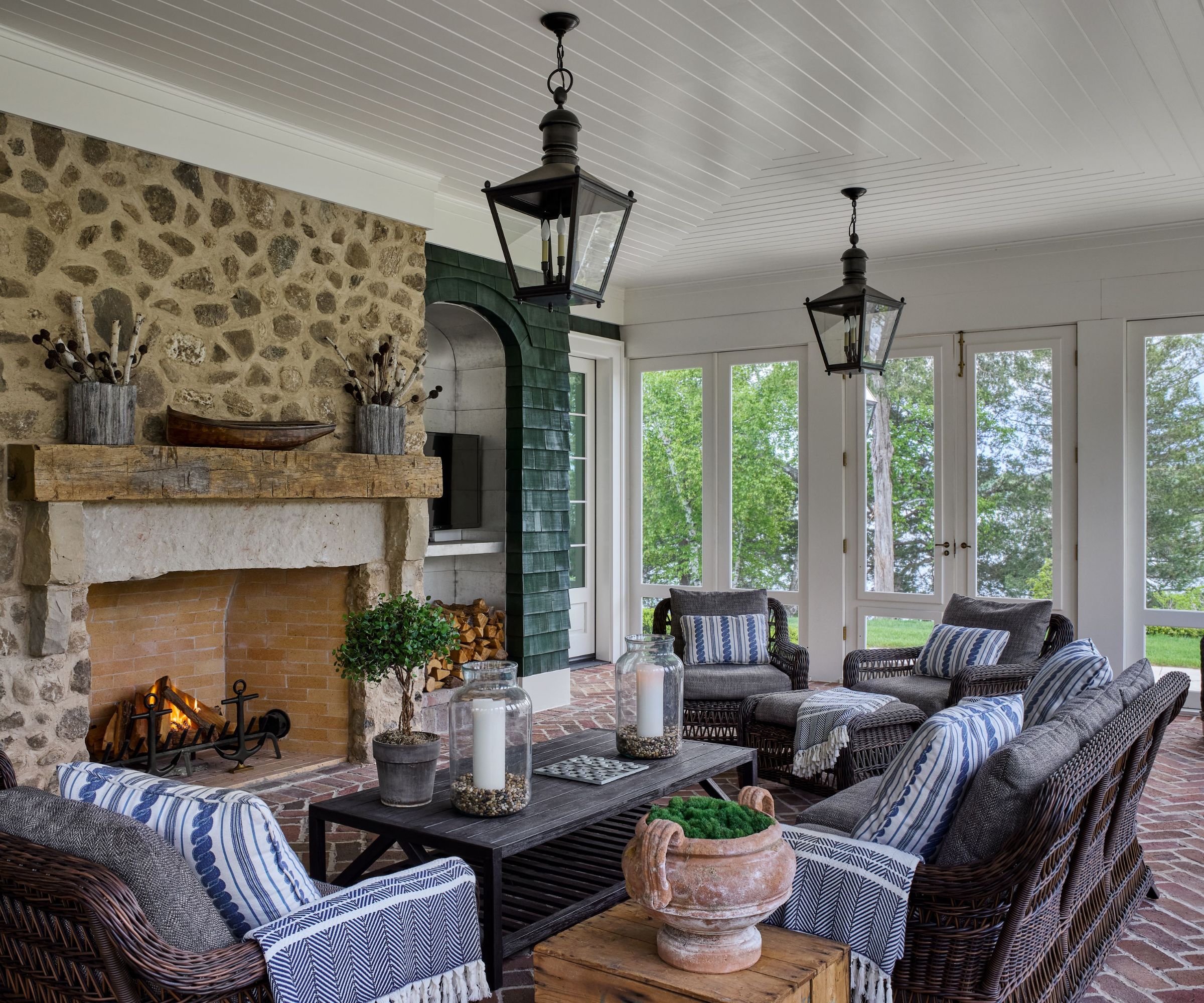
The guest house porch is just as important as that in the main house. A rustic reclaimed mantel, herringbone brick floors, and exterior stained shingle bring a sense of age to the cozy space, which is weatherproofed by motorized drop-down vinyl screens Circa lanterns and Summer Classics sofas and chairs invite guests to settle in whatever the weather.
Photographs: Dustin Halleck
Sign up to the Homes & Gardens newsletter
Design expertise in your inbox – from inspiring decorating ideas and beautiful celebrity homes to practical gardening advice and shopping round-ups.
Karen sources beautiful homes to feature on the Homes & Gardens website. She loves visiting historic houses in particular and working with photographers to capture all shapes and sizes of properties. Karen began her career as a sub-editor at Hi-Fi News and Record Review magazine. Her move to women’s magazines came soon after, in the shape of Living magazine, which covered cookery, fashion, beauty, homes and gardening. From Living Karen moved to Ideal Home magazine, where as deputy chief sub, then chief sub, she started to really take an interest in properties, architecture, interior design and gardening.
-
 Kevin Bacon and Kyra Sedgwick's rustic kitchen island is stunning, but controversial – designers say you can get the look without the hassle
A popular material finds an unorthodox home in the couple's kitchen, but experts disagree on whether it should be used – here's how to do it instead
By Sophie Edwards
-
 How to grow grapefruit for homegrown sweet and tangy, highly nutritious harvests – a fruit tree expert shares their planting and care tips
From planting to harvesting, this is all you need to know about grapefruit trees
By Drew Swainston