Explore the dreamlike interior of this 1980s Toronto home – a masterclass in transitional style
This modern space was designed to accommodate the busy family life of its owner, as well as reflect her personal creativity as a clothing designer
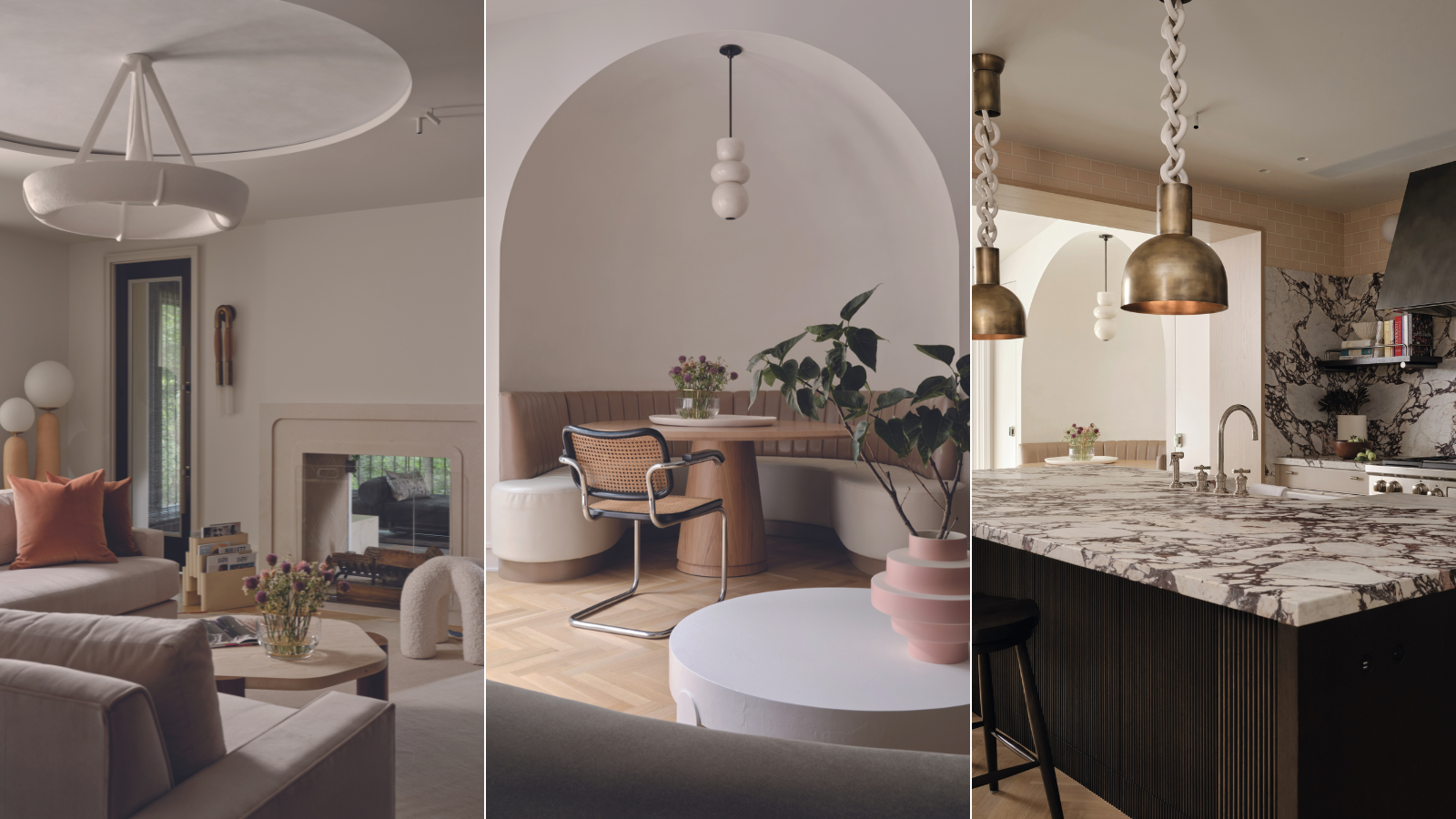

Built in the 1980s, this house sits on a picturesque tree-lined street overlooking a forested ravine in Rosedale, Toronto. Its exterior is adorned with the rambling wild roses that give the neighborhood its name. The stone facade with leaded glass windows evoke a traditional French country style that belies the contemporary interior within - a perfect lesson in creative yet elegant home design.

Walls in Vintage Black lime wash, Portola Paints. Bell armchairs and Dinn dining table, Sollos. Lofton bench in Lizzo fabric, Chai Ming Studios.
The owner moved here, with her partner and young boys, from New York City, where she pursued a career in fashion for several years. On returning to Toronto to raise her family, she became a style consultant and started a concept store focusing on vintage finds and curated designer pieces. It was important that the aesthetics of the interior reflected her creative flair.

Derring Sectional sofa, Kravet. Lob low table, Collection Particulière. Ricky rug, Atelier Février. Oo lamp and Stitch stool, both Eny Lee Parker. Pendant, 1stDibs. Sconce, Apparatus. Fire screen, Elizabeth Metcalfe Design.
The owners turned to Elizabeth Metcalfe, founder of Elizabeth Metcalfe Design. It was a true meeting of minds and Elizabeth knew immediately that she wanted to work with them. ‘We were inspired by the owners’ desire to create a family home that felt stylish, modern and had an eclectic edge. Nothing was ever off the table,’ explains Elizabeth.
‘It was important to design a space where their children and pets had full rein; an amazing kitchen for their passion for cooking; and approachable interiors to entertain and socialize with friends and family.’

Soriana chair, Cassina. Series 02 lamp, Adam Otlewski at Fair Design. Flooring, Fornace Brioni.
Spread over two floors, with a third-floor loft and a fully functional basement level, the 6,000 square foot house had huge potential. ‘As the full scope of the project unfolded and evolved, we found the homeowners open to bold design choices and unconventional materials,’ reveals Elizabeth.
The renovation took two years to complete, while the family isolated in New York City during the pandemic, relying primarily on weekly video meetings.
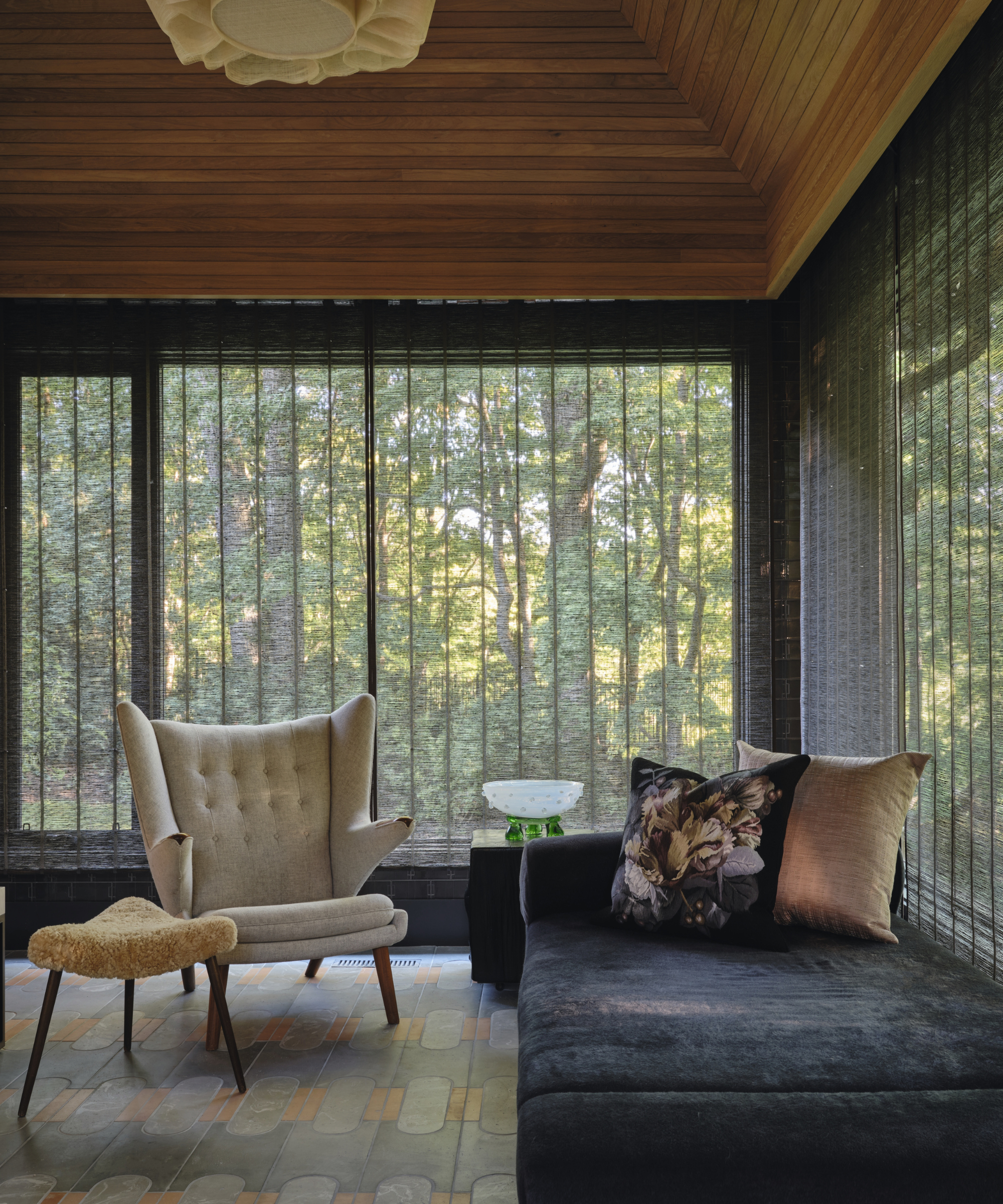
Papa Bear chair, Hans J Wegner. Elana daybed, Bright Chair Company. Flooring, Fornace Brioni. Cushion, The Rug Company.
The main floor comprises the sitting room and dining room flanking a central staircase, with the kitchen and family area along the back of the house; a sun-filled garden room that overlooks the leafy ravine; and a study tucked away behind a hidden bookcase.
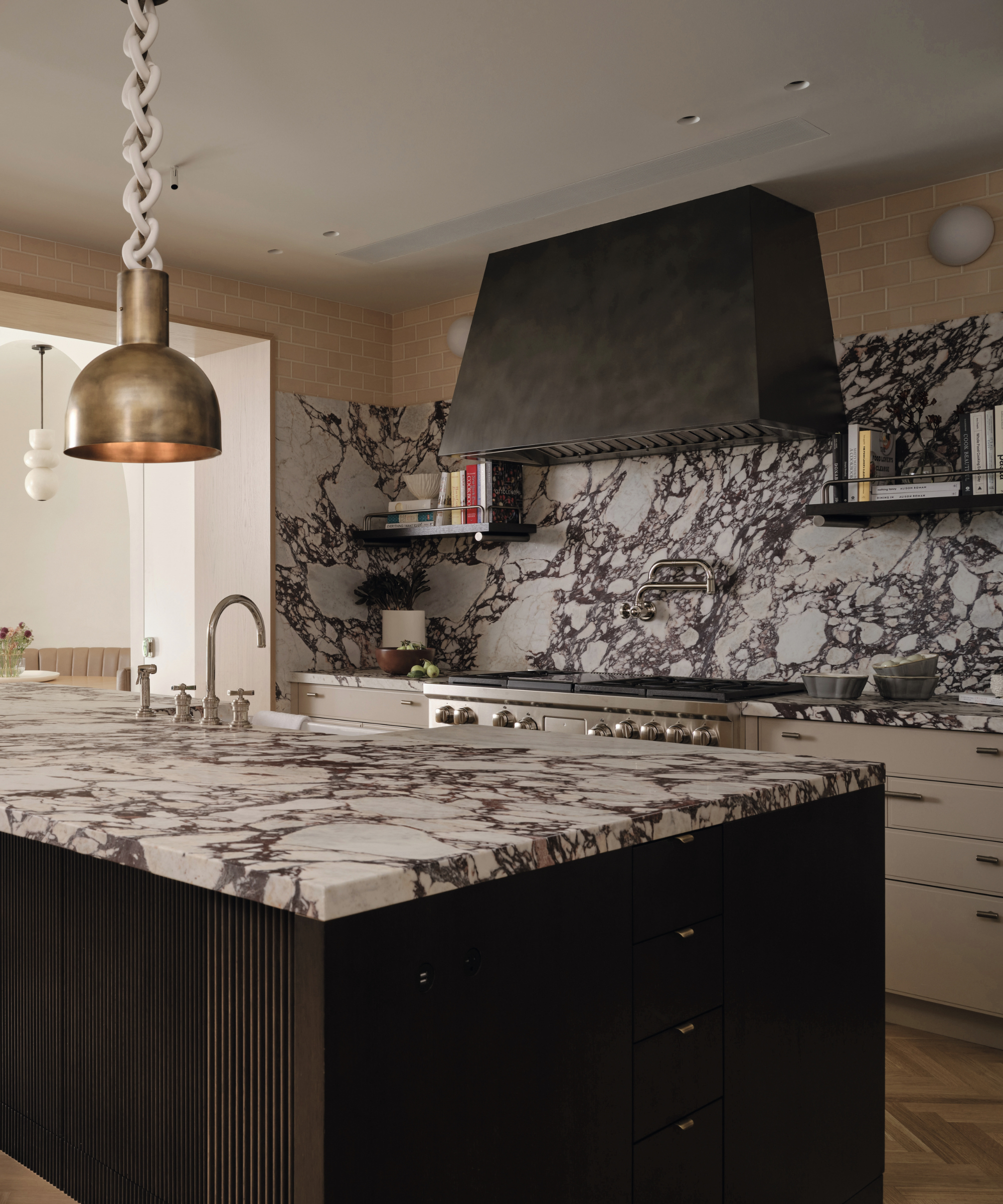
Custom cabinetry, Elizabeth Metcalfe Design; built by Cameo Kitchens. Link Porcelain pendants, Apparatus. Boden counter stools, Quintus.
The second floor consists of two areas: one with the main suite, including an en suite and double walk-in wardrobes, and one with a boys’ wing and shared bathroom.
Wrapped in a de Gournay handpainted silk wallcovering, the third-floor loft is dedicated to the guest suite that hosts family and friends visiting from Europe and the United States.
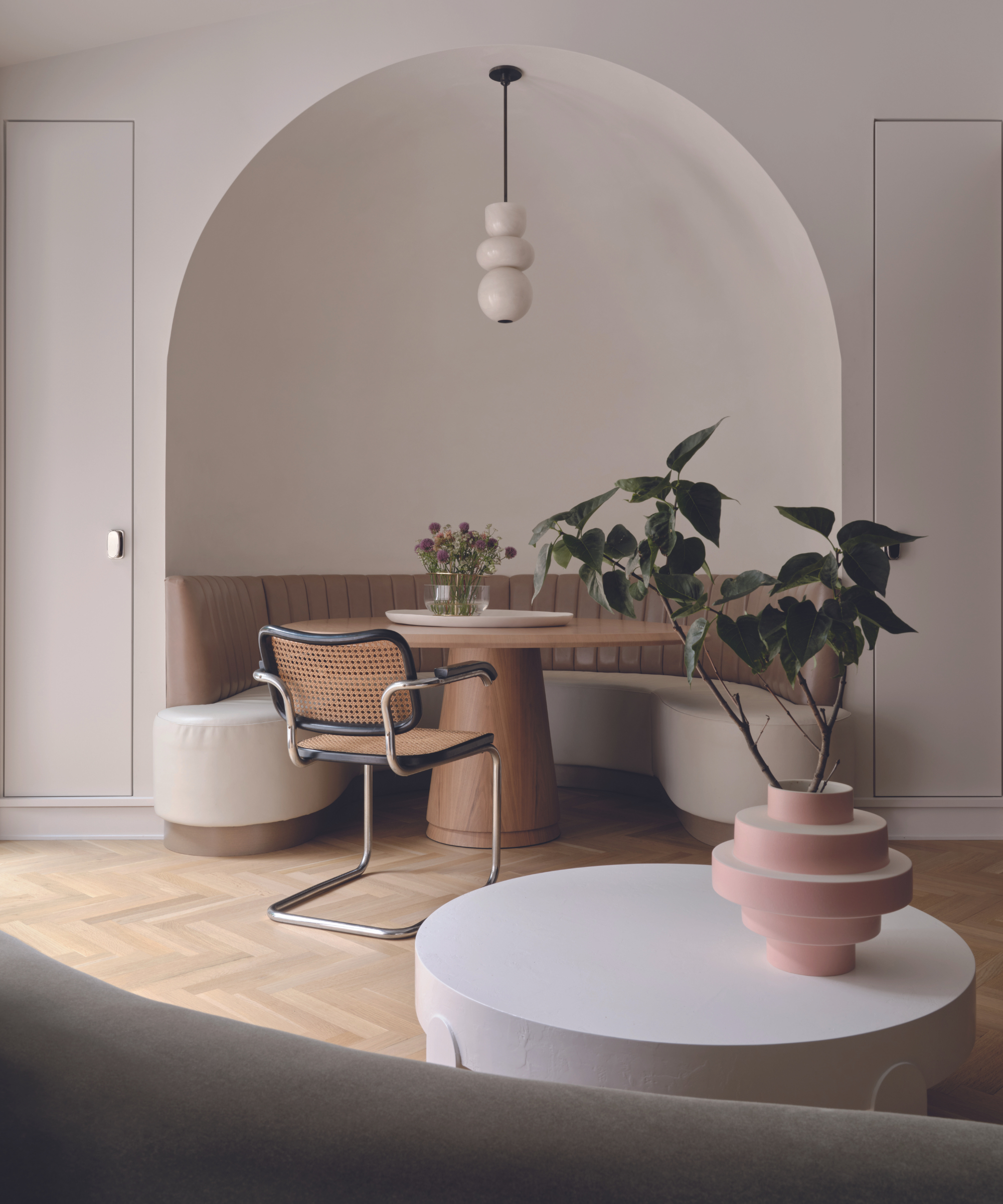
Custom breakfast table and custom banquette in Holly Hunt leather, Elizabeth Metcalfe Design.
Nurtured by the homeowner’s fashion background and love of beautiful textiles, the different areas feature a mix of natural fabrics including linens, cotton velvets, mohair and cashmere.
Hand-woven blinds by Hartmann & Forbes and hand-knotted rugs by Atelier Février combine with painted clay and lime walls by Portola Paints, high-gloss lacquer cabinetry, and handpainted silk wallcoverings, resulting in a soothing and inviting atmosphere that highlights the beauty of craftsmanship.
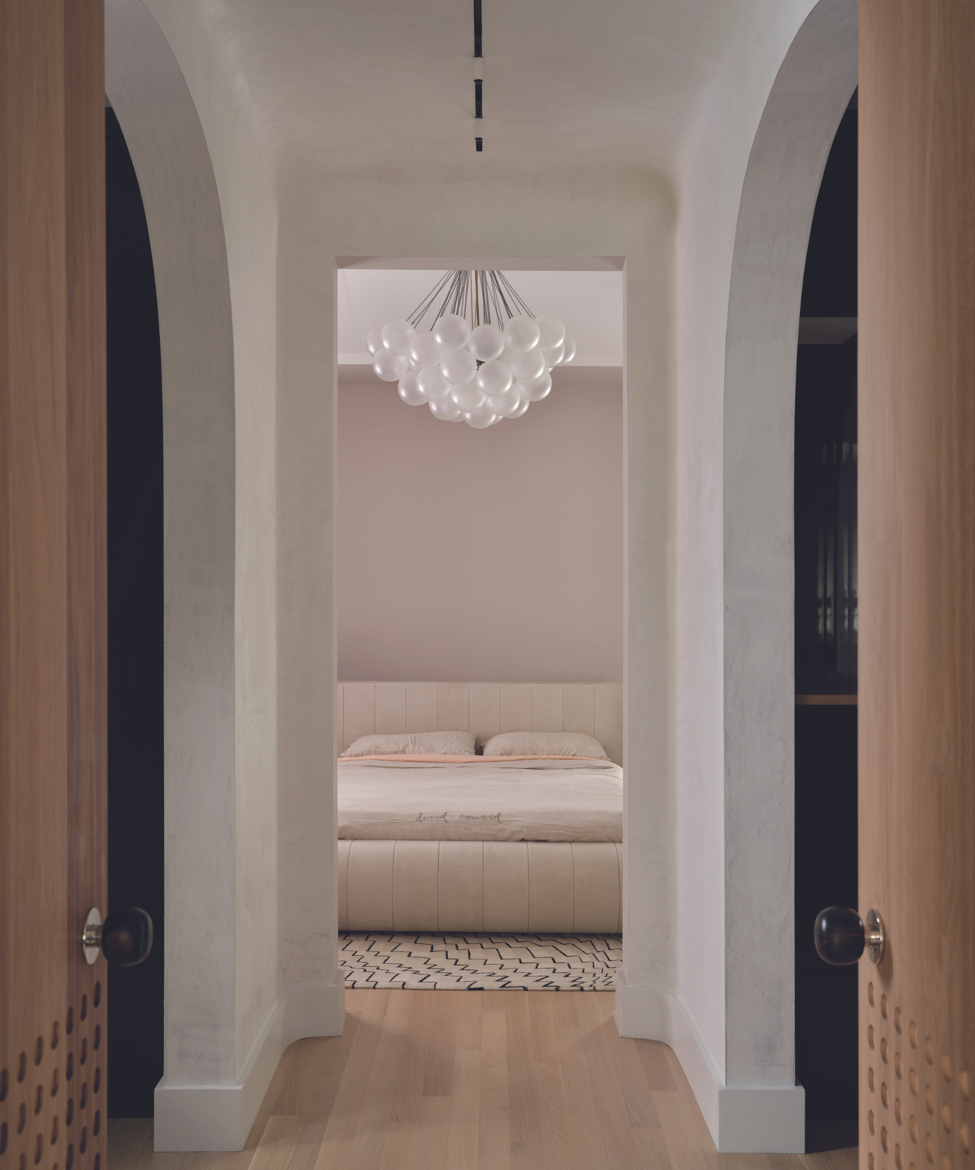
Cloud pendant, Apparatus. Docked en Rio bed frame, Vidivixi. Onda rug, Atelier Février.
Playing with pattern and bringing together unexpected pairings, Elizabeth has included vintage finds, such as a restored lounge chair by Adrian Pearsall with a high-back sculptural walnut base. ‘Colour is truly everything and one of our signature trademarks,’ says Elizabeth.
‘Our palettes have a distinctive point of view with an emphasis on subtle tonal complexities, creating a layering of hues that play off one another to form a cohesive story. Color should never feel forced or contrived.’
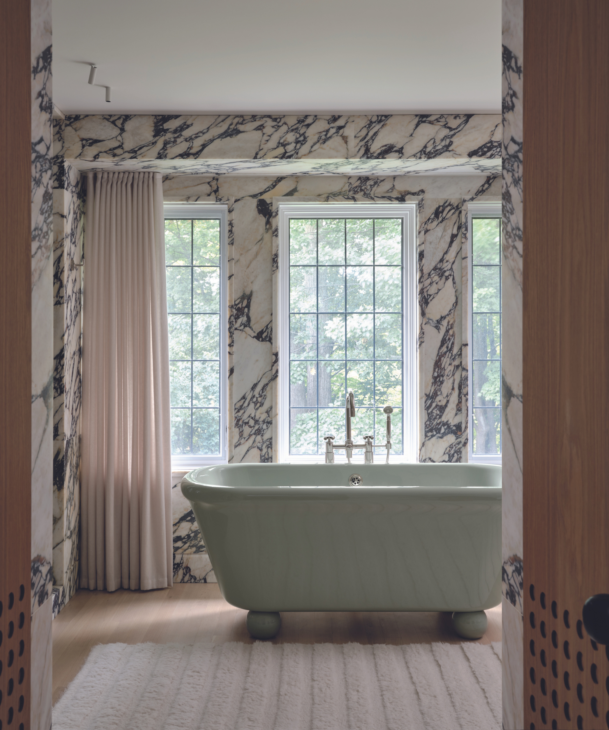
Rockwell bath, The Water Monopoly. Rug, Rosemary Hallgarten. Curtain fabric, Fox Linton.
Atmospheric neutrals with a dark inky blue, pale celadon, and chalky blush tones have been complemented by stripped-back natural oak, walnut, and cedar. ‘Through a very open collaboration, we worked together to create a home that reflects uncomplicated sophistication grounded with natural fabrics and finishes, while representing the owner’s unique sense of style and comfort.’

Rockwell bath, The Water Monopoly. Rug, Rosemary Hallgarten. Curtain fabric, Fox Linton.
MEET THE DESIGNER
Elizabeth Metcalfe shares her style inspiration
Which is your favorite room in the home?
The sunroom is magical. Natural light filters through from the forested ravine and engages everyone who steps into this room. Custom handmade clay tiles from Italy, a cedar-lined ceiling and beautiful handwoven blinds add charm.
What's your go to color?
I don’t have a ‘go-to’ color, but rather a ‘go-to’ palette incorporating chalky whites, soft lavenders, atmospheric blues and a faint blush.
Who is your greatest design hero?
I have two design heroes who have shaped how I approach my work. John Saladino and Thomas Pheasant have informed my sensibility to incorporate time-honored design principles that are the foundation of our design studio.
Choose three words to encapsulate your style.
Graceful, personalized, layered.
Which hotel has the best interior that we should know about?
The Amanzoe in Greece designed by the legendary Ed Tuttle. The interiors reference Greek classical architecture reimagined in a contemporary context. The minimalist interiors open up to beautiful views of olive trees, lavender fields and the serenity of water.
Sign up to the Homes & Gardens newsletter
Design expertise in your inbox – from inspiring decorating ideas and beautiful celebrity homes to practical gardening advice and shopping round-ups.
-
 Urban gardening ideas – 7 creative ways to grow in small spaces, balconies, containers, indoors, and more
Make the most of your space with these innovative ways to garden
By Tenielle Jordison
-
 'Sexy disco-era Italy meets Japanese farmhouse in the Brazilian jungle' was the description the interior designer gave this glass-walled modernist home
Offering a warm welcome that defies its stark, modernist lines, this archictectural gem is full of surprises
By Karen Darlow