This extraordinary timber clad house with its playful decor is one of a kind
Design team Studio Shamshiri and architects Marmol Radziner have distilled the wild beauty of LA’s lush canyons into this remarkable house
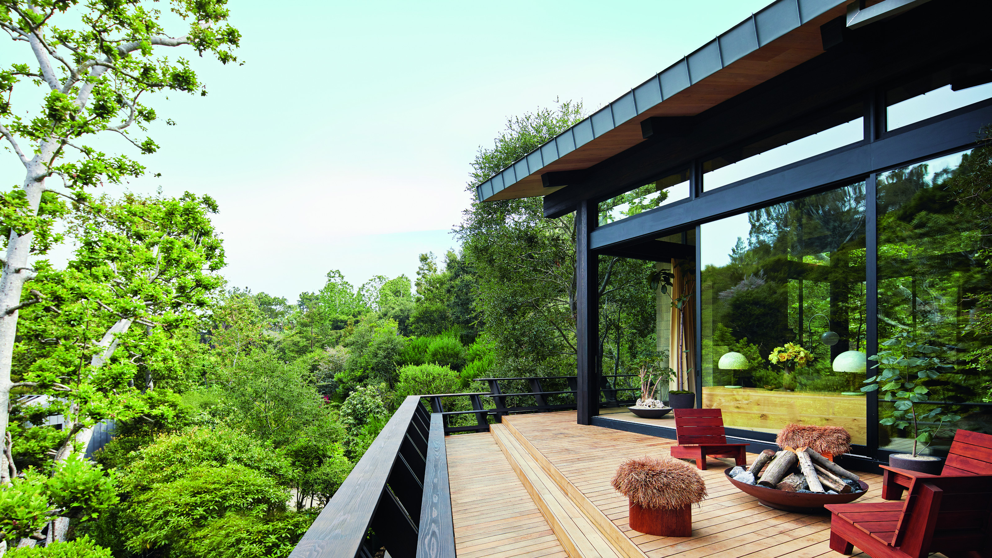

From huge glazed openings framing views of blue skies and greenery to terraces that appear to be perched among tree canopies, everything about the design of this Hollywood home, one of the world's best homes, embraces its extraordinary canyon setting.
‘We even clad the outside with blackened cedar so that it blends with its surroundings; it looks like a wood cabin,’ notes Pamela Shamshiri of Studio Shamshiri who, with architects Marmol Radziner, designed the house to also reflect the adventurous spirit of its owners.
The collaboration was a close one. ‘There’s a wonderful rapport between our two studios and our clients couldn’t be nicer or more creative people – they are adventurous and exciting and they were very involved with the design process,’ says Pamela.
The property comprises not one but three structures: the main house, which sits against the hillside with views over the canyon; an office and garage set a little distance from the house and looking back up the slope; and a guest pavilion at the lower end of the canyon.
Kitchen
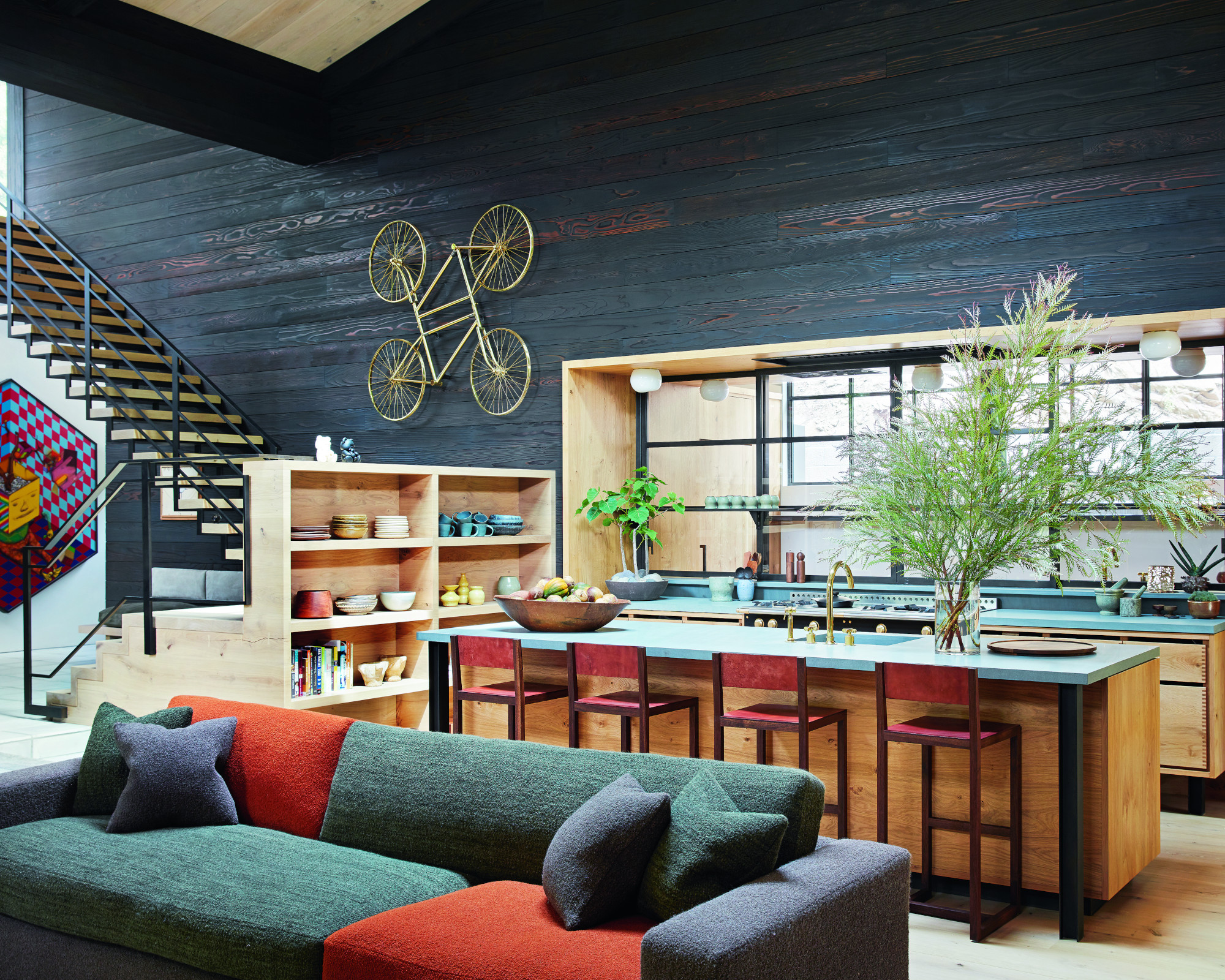
Timber played an integral role in the design, not just for the façade but also within. ‘We wanted to create a contrast with the exterior, so much of the wood inside is light in colour,’ explains Pamela of the choice of wide oak Dinesen boards for the floors and ceilings.
The same oak was used for the joinery throughout, including bedside tables and vanity units, and it also informs the kitchen – part of the main open-plan living space – where bespoke dove-tailed cabinetry highlights exquisite craftsmanship and blends in effortlessly.
Kitchen ideas include a wall of metal-framed glass to divide the kitchen from the pantry, where more functional equipment is kept out of sight.
The owners have an extensive collection of contemporary art and many of the works are displayed against the same blackened cedar used to clad the façade. ‘We really wanted to celebrate the art and the dark timber helps to ground the colours,’ Pamela explains, adding, ‘each artwork adds a layer of playfulness, which felt really true to the homeowners and their personalities.’
Living room
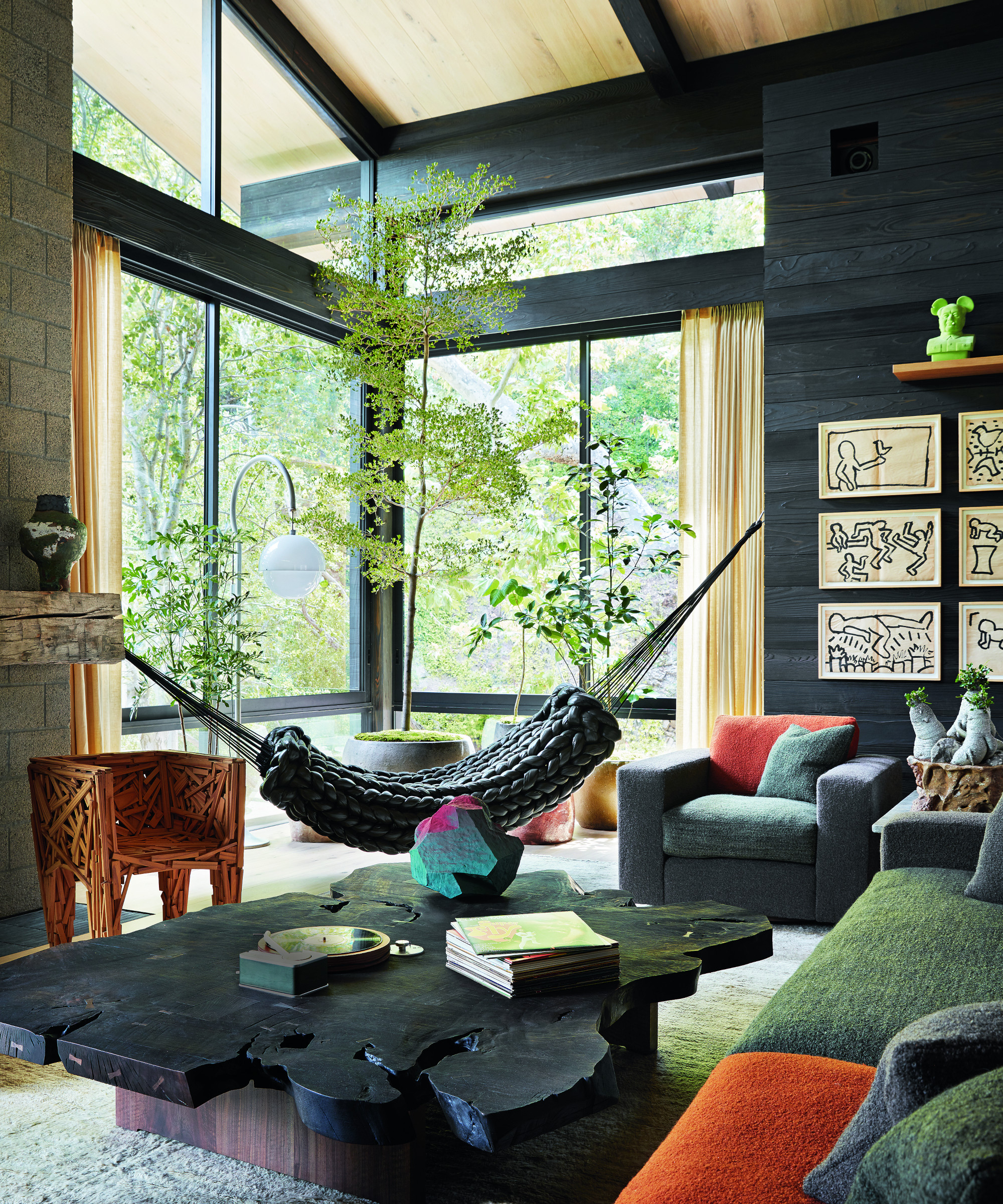
The living space’s vast glazed doors open onto a deep deck with spectacular views over the tree canopy.
The clients were open to commissioning bespoke pieces of furniture by contemporary creatives. In the living room, for example, a coffee table crafted from a slab of textural walnut features an integrated turntable.
Living room ideas include an eclectic seating arrangement. The color blocked, upholstered pieces invite relaxation. ‘We wanted to have slightly overscaled, extra comfortable and plush furniture; it needed to feel approachable and liveable, without much fussiness,’ comments Pamela, who reflected the owners’ sense of fun by hanging a hammock that appears to be woven from nylon puffer jackets in one corner of the living room and incorporating a sculptural chair.
Dining room
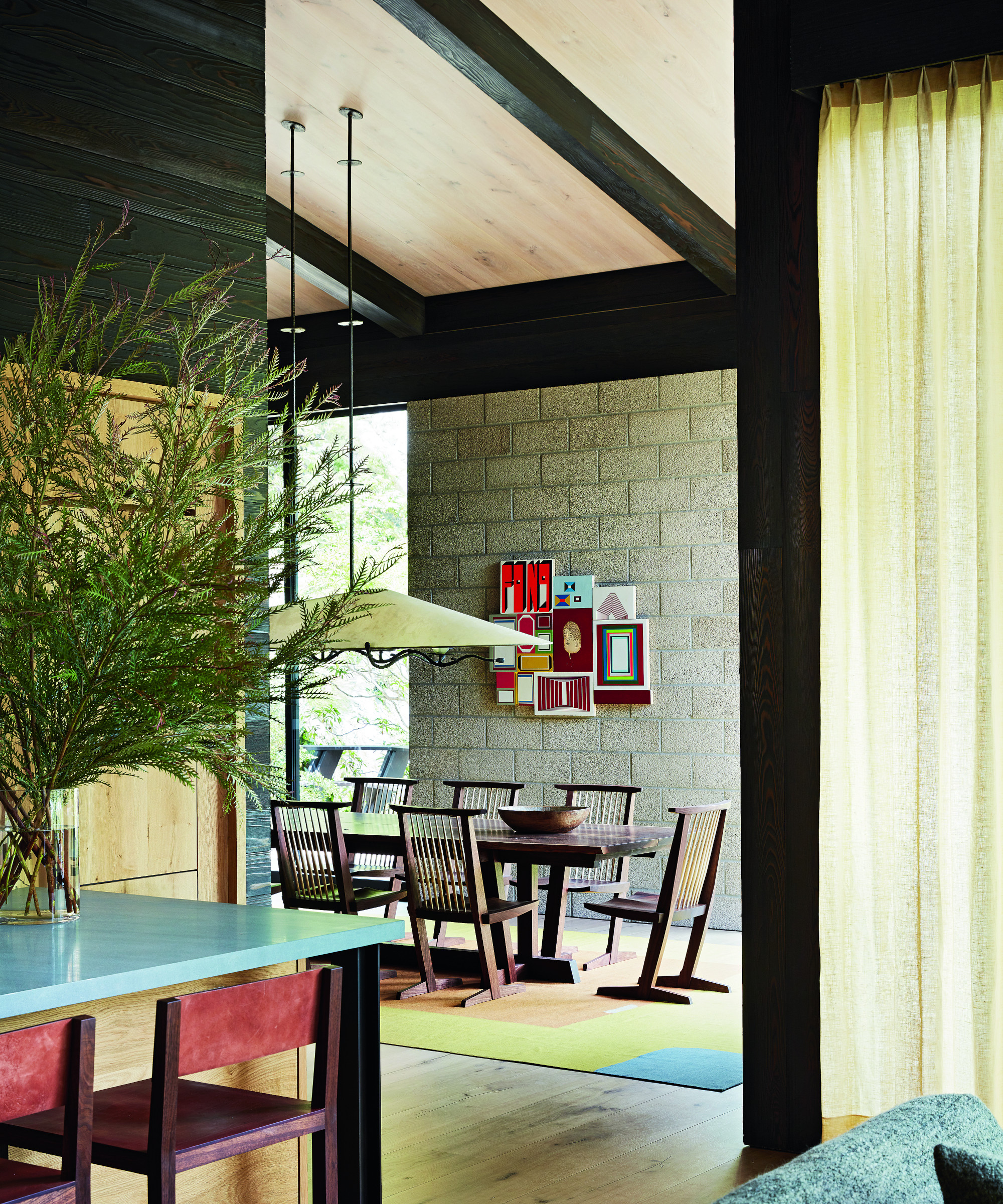
Dining room ideas include making a statement with an extraordinary artisan pendant crafted from parchment and bronze positioned over the dining table. The pendant highlights the space’s lofty proportions.
Library
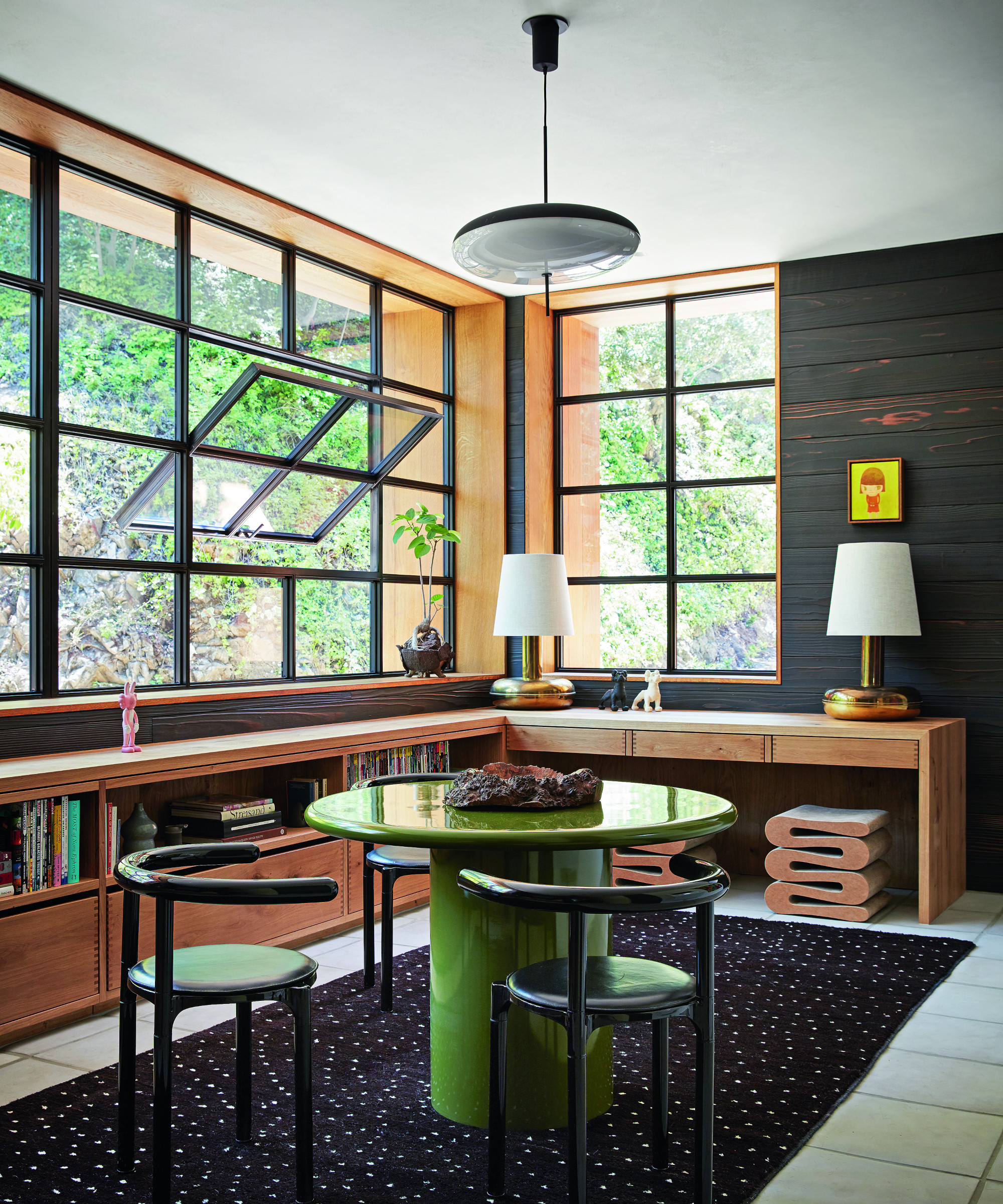
Low storage wraps around the library space, which is flooded with light from elegant metal framed windows.
Main bedroom
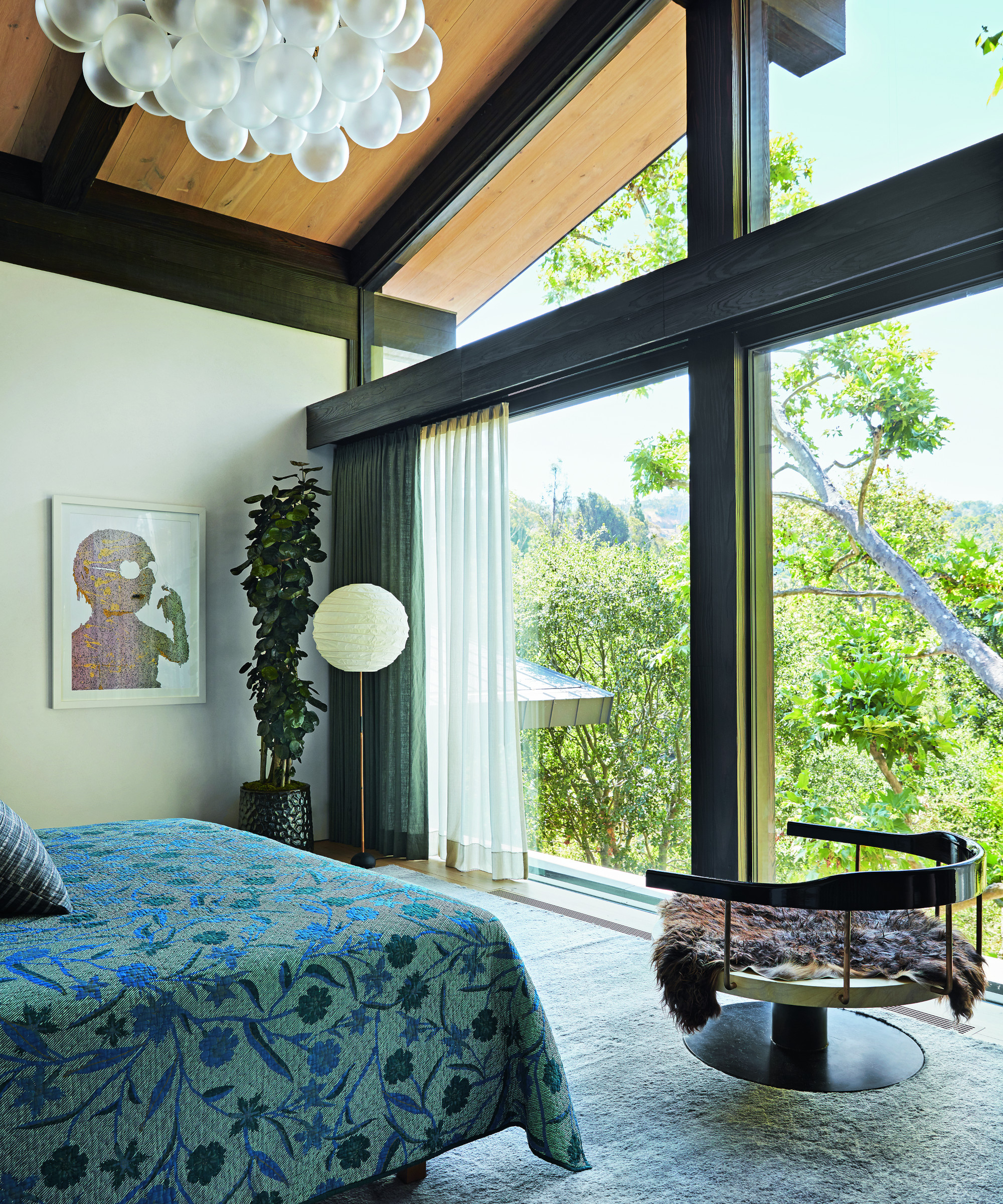
The entire upper level of the main house is devoted to the couple’s main suite and here there is truly a feeling of being nestled in an eyrie among the trees. The architects designed the building around the native oaks and sycamores, giving the sense that the spaces reach out into the landscape.
Bedroom ideas include suspending a cloud-like pendant from the ceiling to add to the impression that this room is immersed in nature.
Bedroom
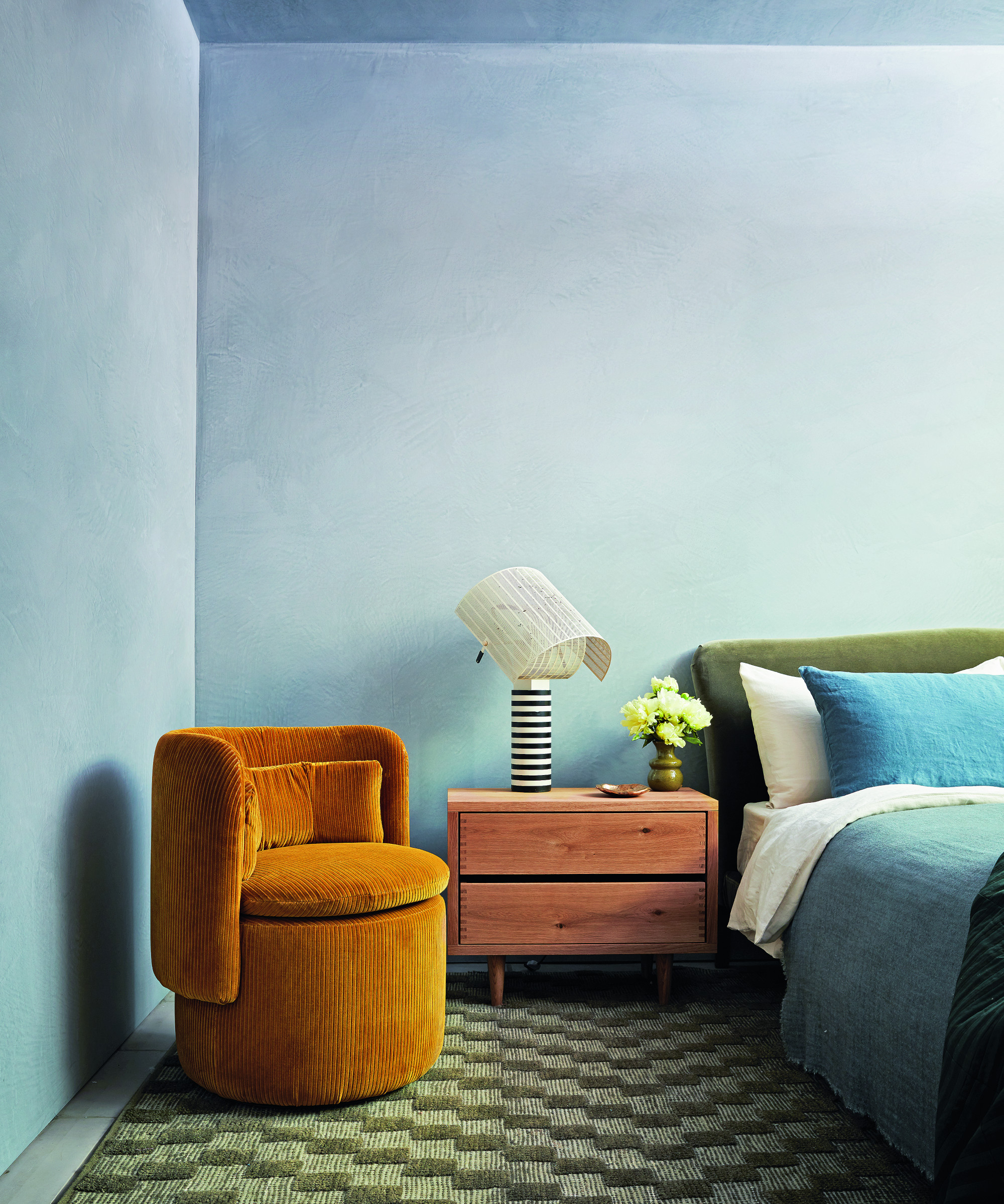
The walls and ceiling were treated with a pale blue Venetian plaster, which offers a cool foil to warmer shades of olive, rust and teal.
Shower room
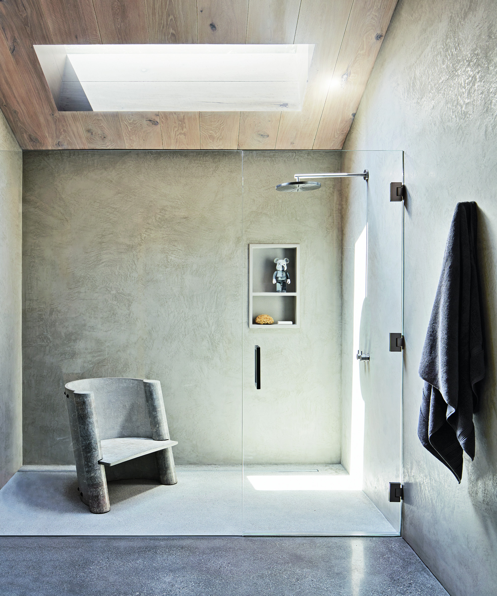
Designing a minimalist scheme was one of the bathroom ideas for this shower room. The crisp lines are complemented by a striking concrete chair. Natural materials, such as the wooden ceiling, link to the landscape, while a skylight coaxes light into the space.
The owners have reported that they love staying at home and, for Pamela, this is the greatest accolade. ‘They are focused on growing their plants and creating things – they are always working on various projects,’ she recounts, adding, ‘it’s the biggest compliment, it made me so happy. I have been told they are avoiding travel because hotels are not as nice as home. I also hear that a lot of their friends come to stay and when they do, they stay for a while.’
Interior design/ Studio Shamshiri
Architect/ Marmol Radziner
Photographs/ Stephen Kent Johnson/ Otto
Styling/ Michael Reynolds/ Otto
Text/ Rachel Leedham
Sign up to the Homes & Gardens newsletter
Design expertise in your inbox – from inspiring decorating ideas and beautiful celebrity homes to practical gardening advice and shopping round-ups.

Interiors have always been Vivienne's passion – from bold and bright to Scandi white. After studying at Leeds University, she worked at the Financial Times, before moving to Radio Times. She did an interior design course and then worked for Homes & Gardens, Country Living and House Beautiful. Vivienne’s always enjoyed reader homes and loves to spot a house she knows is perfect for a magazine (she has even knocked on the doors of houses with curb appeal!), so she became a houses editor, commissioning reader homes, writing features and styling and art directing photo shoots. She worked on Country Homes & Interiors for 15 years, before returning to Homes & Gardens as houses editor four years ago.
-
 This is the single best upright vacuum we've ever tested – and it's on offer with $130 off at Shark for a limited time only
You won't want to miss this one
By Dan Fauzi
-
 Nate Berkus says slipcovered sofas are back on trend – and I just found a way to create this designer-approved laid-back look from just $86
This classic style is making a strong comeback, but did you know you don't have to buy a whole new couch to get this Nate-approved look?
By Eleanor Richardson