Old, new, and retro-Southern styles are balanced to perfection in this charming Texas home
Inspired by the owners' eclectic tastes and retro collections, this Texas home is a little bit country, a little bit rock 'n' roll
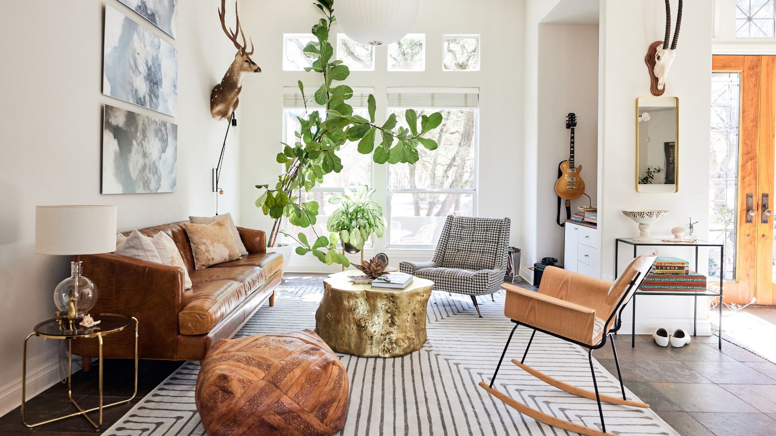
When does a house truly become a home? For me, it's when its interior design reflects the style and personalities of the people who live there. By that definition, this open-plan four-bedroom house in Texas is most certainly a home, and following a comprehensive redesign it's a very stylish one too.
Interior designer Jennaea Denhardt was responsible for creating a cohesive whole from a selection of somewhat disjointed spaces in this 1990s home. Even though the rooms were connected architecturally through an open-plan layout, there was much work to be done to give the home a sense of flow. The other challenge facing Jennaea was how to make the best of the homeowners' fascinating but eclectic collections of music-related items, vintage and retro furniture, and travel souvenirs.
Take the tour, as the designer talks us through the process and explains how she successfully captured the owners' personalities and style, and blended old and new elements to create transitional design perfection.
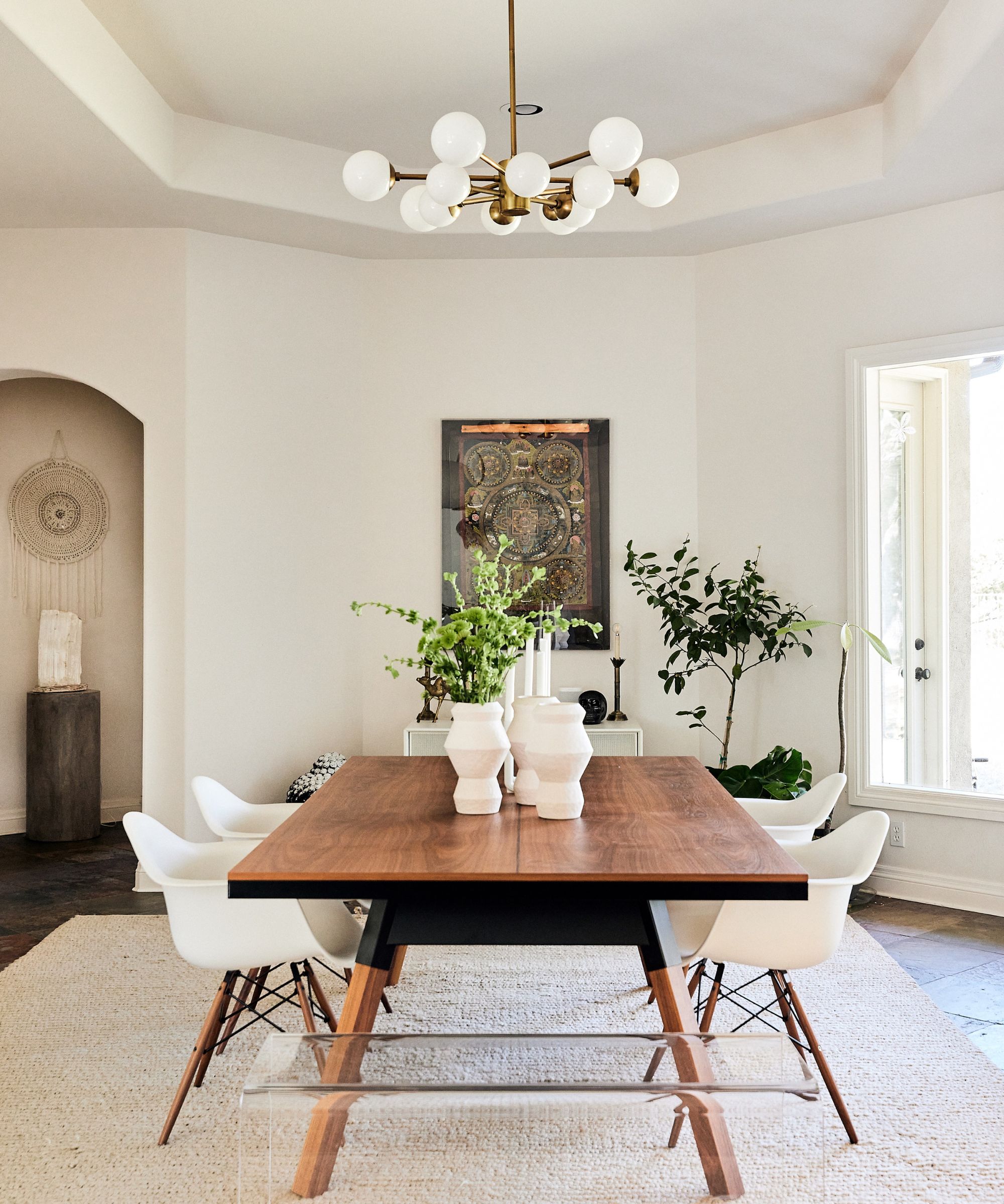
'The biggest challenge in this home was the layout itself,' explains designer Jennaea Denhardt. 'There is an awesome eat-in kitchen/great room where the owners spend most of their time. Then there is also a huge living room and a smaller dining room that are open to the entry foyer and the hall to the master.'
Making sense of how this plan could work was key.
'The solution ended up being something I often do in projects, namely throwing out the labels on the plan and renaming the spaces,' adds Jennaea. 'So what was the living room became this dining room. The dining table is actually a full-size ping pong table, creating a space that the owners can use any time they want, whether it is just the two of them, or a crowd.'
Besides that stunning walnut ping pong table, dining room ideas include Eames Eiffel-style dining chairs and a barely-there Perspex bench seat. The art includes a mix of classic Texas icons and pieces from the owners' travels around the world.
The designer introduced a quiet color palette of neutrals, natural woods, and warm white walls, a good choice of backdrop when you're bringing together collections on different themes.
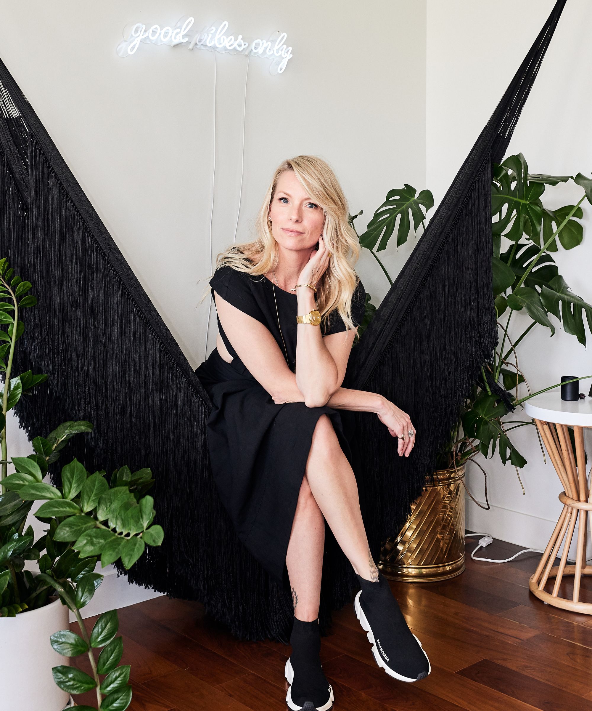
Jennaea grew up frequently moving homes with her family, an experience that fostered her obsessions with the way light from a window changes the mood of a room, the delicious smell of fresh cut lumber and the rhythmic sound of a moving paint roller. She studied economics before working in retail merchandising, product development, product sales and wedding planning. But the love for interiors that began in her childhood bedrooms never left her and fueled her independent design career and the unique design philosophies, processes and perspectives in her work with her own company Jennaea Denhardt Interiors
Based in Minneapolis and Baja, Mexico, but often traveling, you can usually find Jennaea at a desk with a candle burning nearby, out somewhere on a horse or at the beach trying to learn to surf. In any case, her music will be turned up ridiculously loud and her family and friends will be laughing loudly with (at) her!
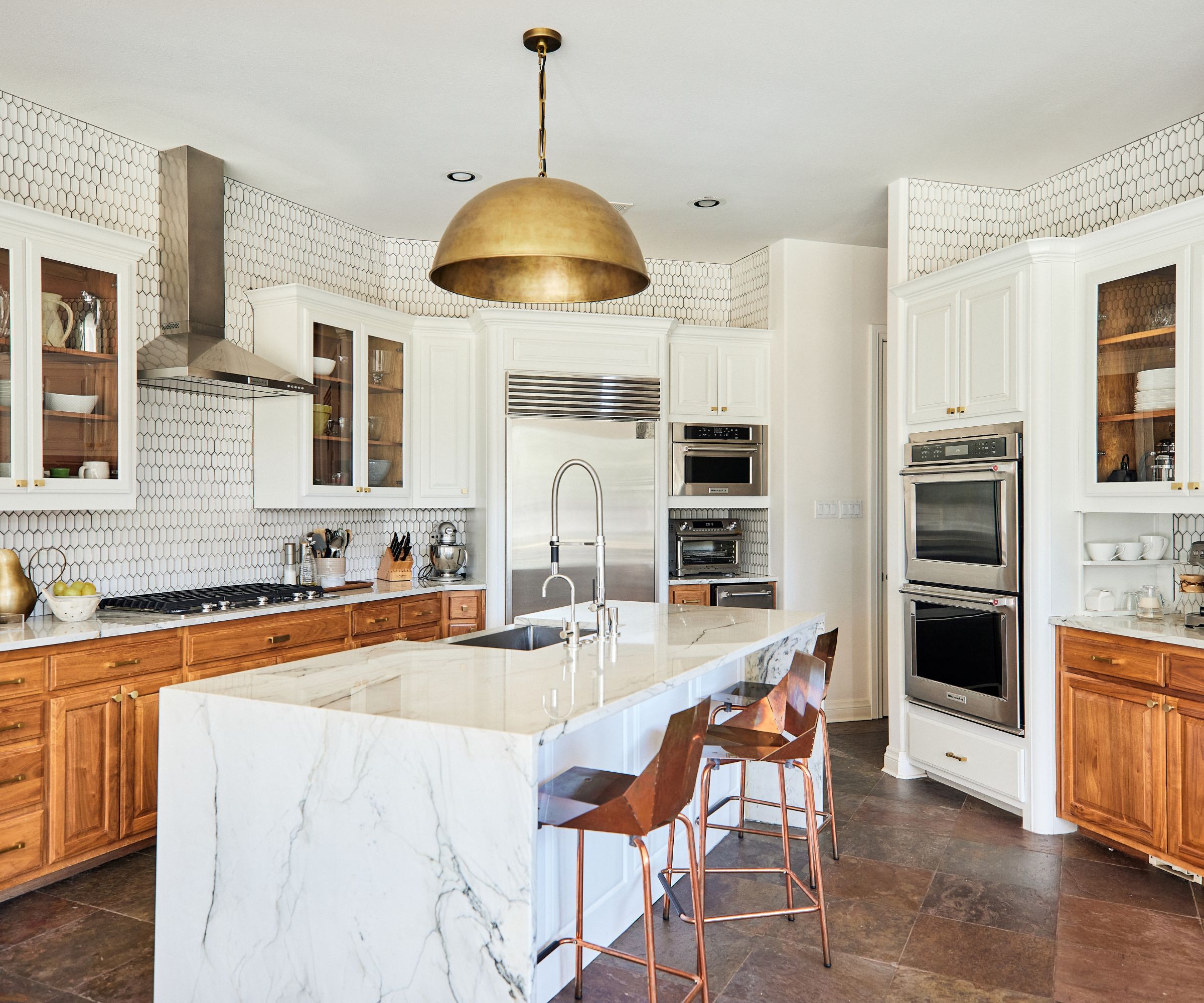
This kitchen corner is part of the much larger open-plan space, comprising the family room with an eat-in kitchen, and a sizeable butler's pantry and utility room.
Kitchen ideas for this practical space, explains the designer, were about 'creatively reworking the existing kitchen, and making a few minor changes in the family room to strip back some of what was there and feeling dated'.
'We squared off the island and reworked all of the existing cabinetry, painting uppers in the kitchen and adding glass panels,' continues Jennaea, who was delighted when the couple opted to modernize the outdated kitchen and decided to paint kitchen cabinets instead of bringing in full-scale replacements. The countertops are new, however, and freshen the overall look.
The flooring across the kitchen and family room is Texas slate, which was installed when the house was built in the 1990s and read a little dated.
The designer's solution to counteract and update the hard surfaces was to add softness and texture wherever she could. 'Because of the quiet color palette and the only real contrast being the walls to floors, the tiles we used became the art,' she explains. 'Thus, we took the textured kitchen backsplash right up to the ceiling.'
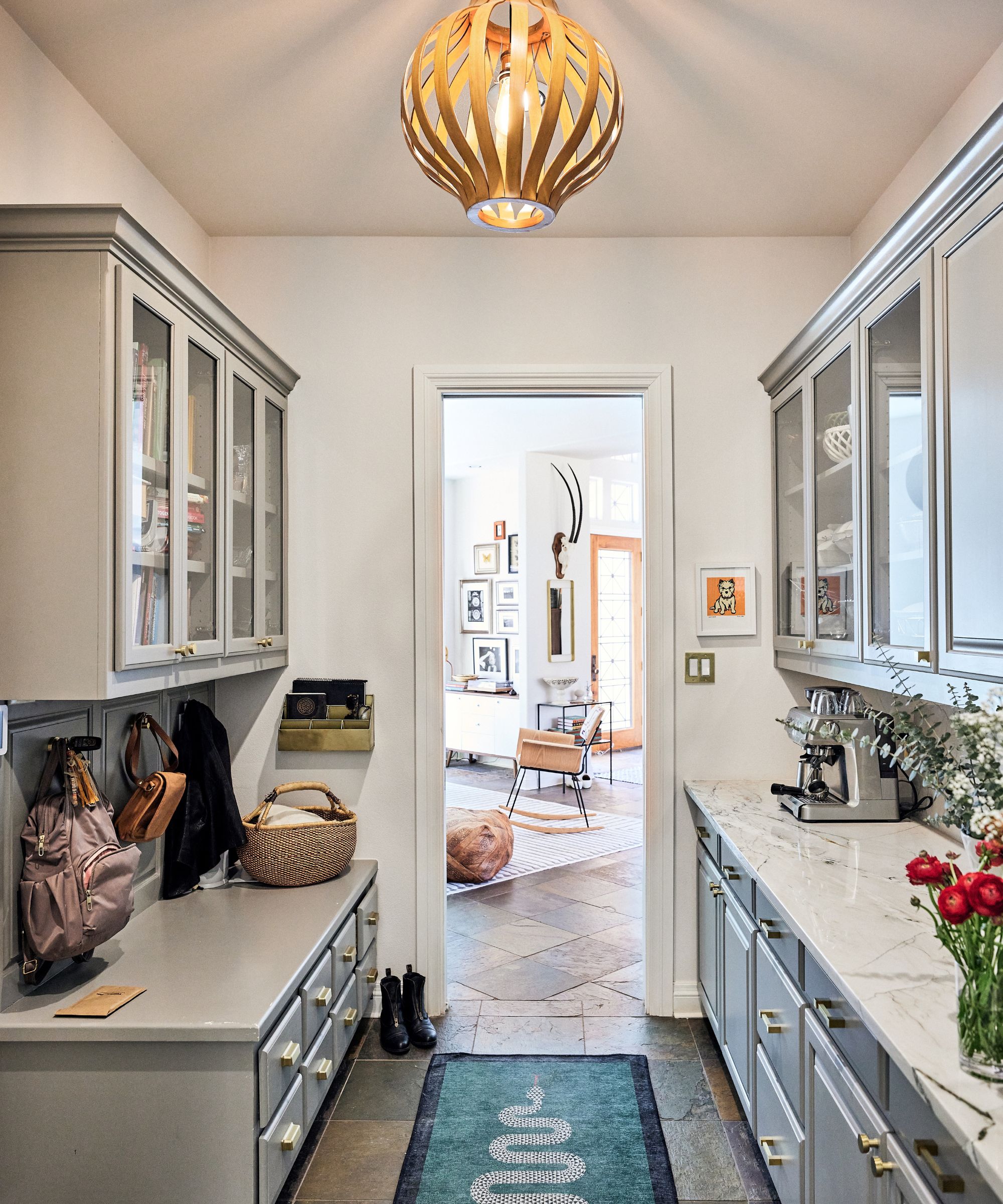
The refresh for the butler's pantry, consisted of repainting the cabinetry in a handsome gray, and changing the countertop materials. Designer Jennaea advised the owners to choose the same material for this smaller space, to match the kitchen countertop ideas. This helped to draw together the previously disjointed areas of the open plan.
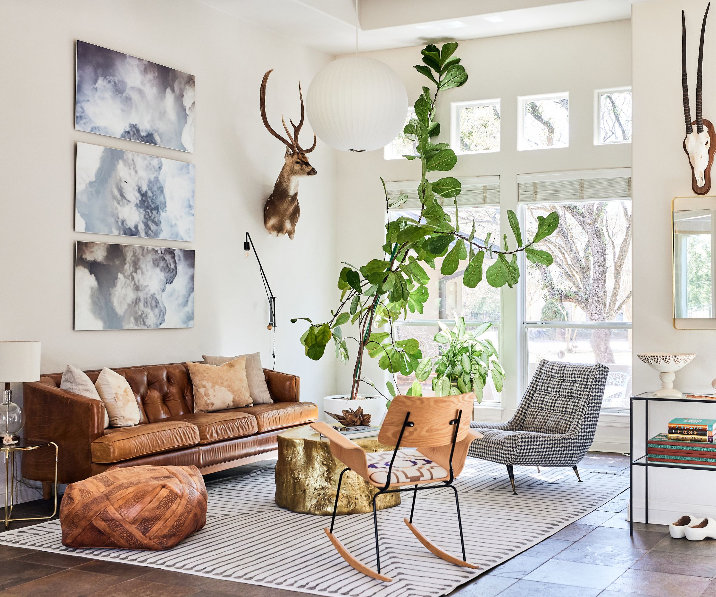
It's in this entrance space turned living room, however, where the designer's vision really paid dividends.
'This is both the homeowners’ and my favorite space in the home,' explains Jennaea. 'First intended as the dining room of the home, we shifted the plan and call this the lounge. It’s basically the home’s “hotel lobby.” This space truly embodies the clients style and vibe. It’s an eclectic mix of pieces from their previous space, new pieces, some vintage, a music corner, loads of natural light and an incredible plant, inherited with the house!'
Designer Jennaea worked with all these elements to create the reimagined space. 'It includes some comfortable but super interesting seating,' she says. 'And it's actually where several of the amazing pieces from their previous place came to shine. There's a bar nearby and a music listening niche, all right next to the entry of the home, so it just felt like the most perfect way to use the space.'
We love the idea of creating a living room inspired by a smart hotel lobby. It's the perfect solution for these particular homeowners who love to travel the world and creates an airy backdrop for some of their prized possessions and favorite pieces of furniture.
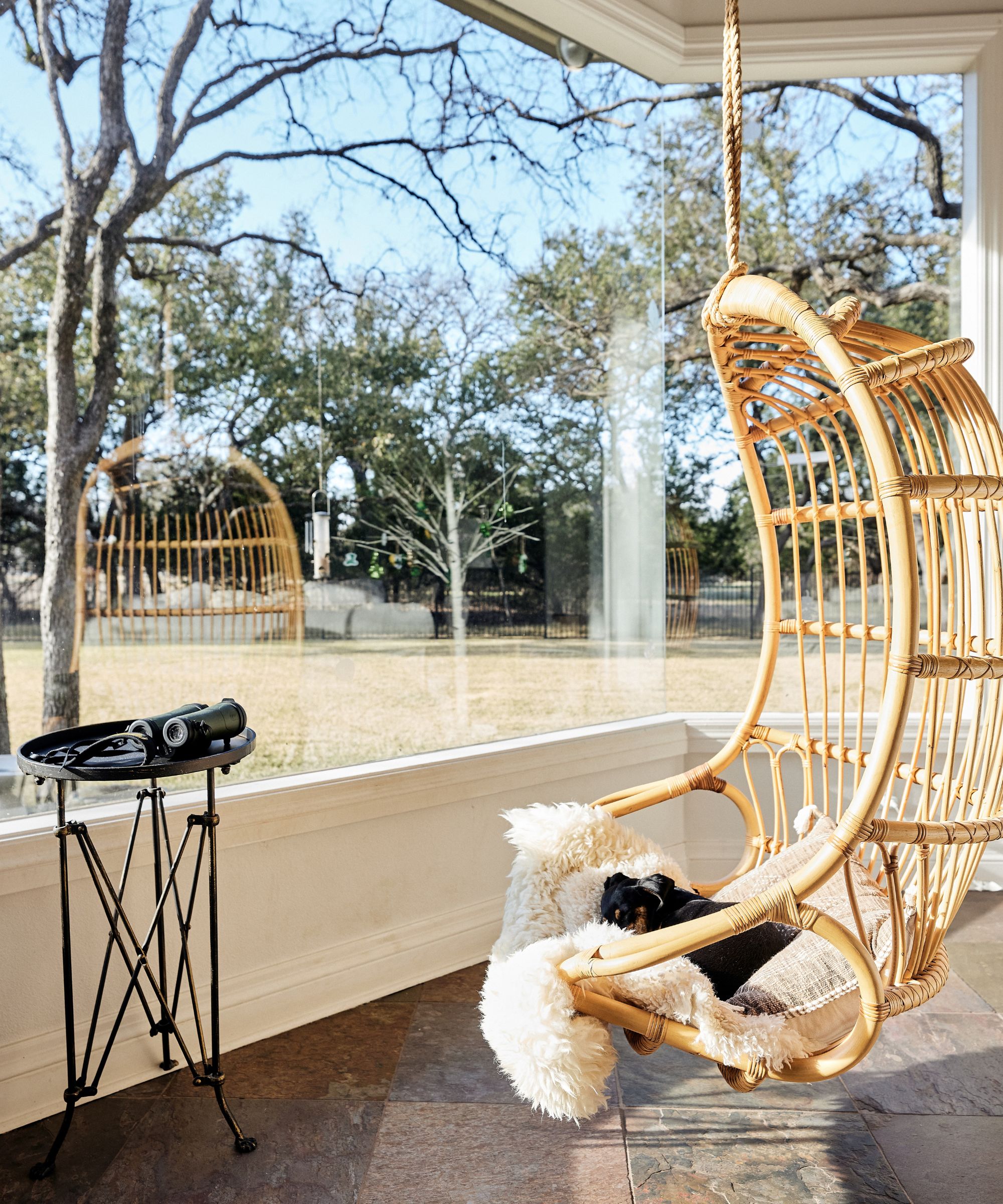
At the opposite side of the open-plan space is the eat-in kitchen, which is set up to enjoy the most stunning views of protected land at the back of the property. 'All the focus here is on the views out the windows,' says the designer. 'And we added a swing for a place to sit, sip coffee, and birdwatch!'
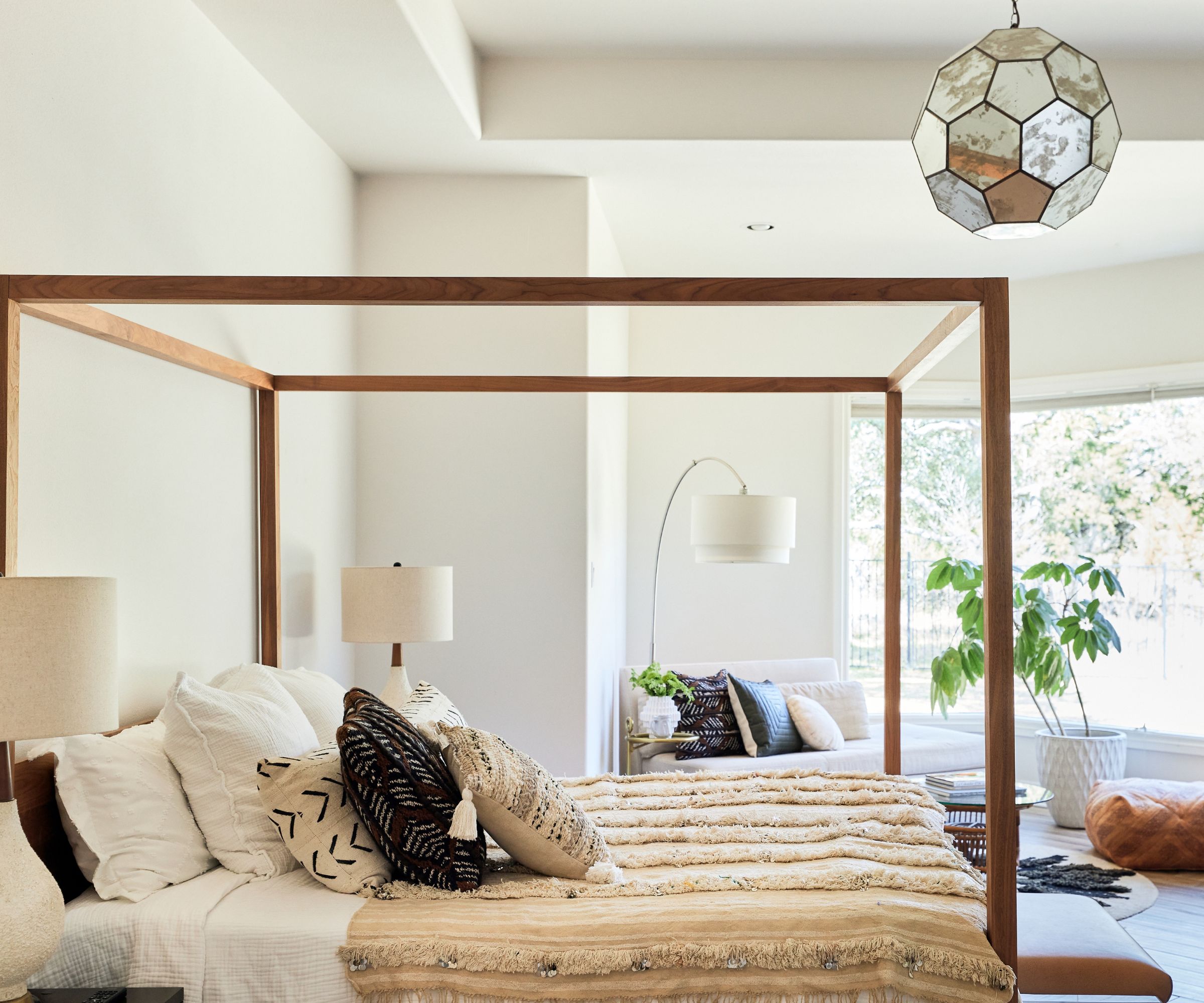
The primary bedroom suite is where the major renovation took place. The footprint stayed the same but the aesthetic and bedroom ideas couldn't be more different. The room was previously carpeted and changing all of the flooring for a wood-look porcelain tile created a more modern, yet bohemian space.
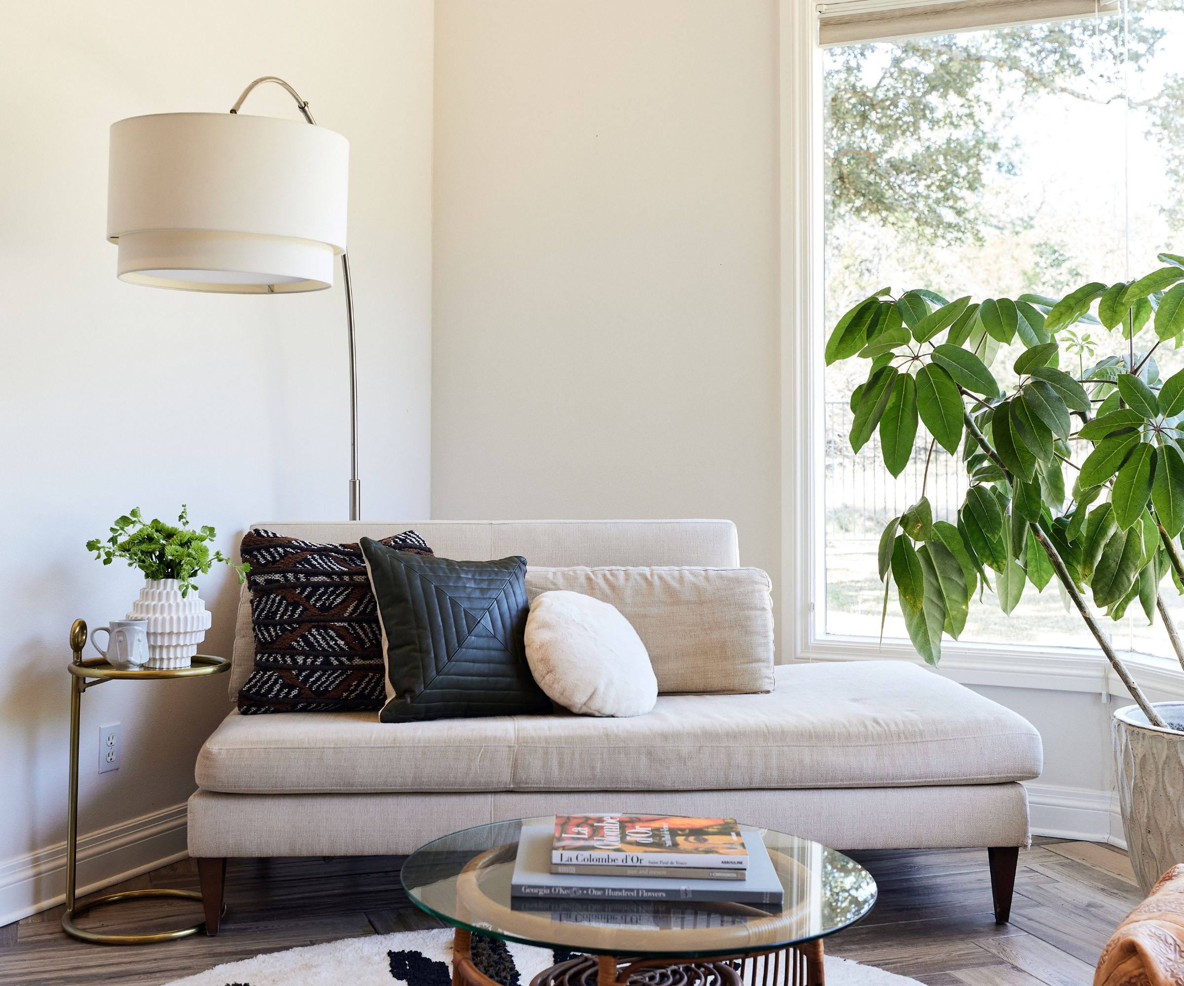
A nicely curated corner in the bedroom brings together some treasured vintage pieces and newer items, such as the chaise daybed. This inviting couch alternative is perfectly positioned to enjoy the panoramic view of open country beyond the property's boundaries.
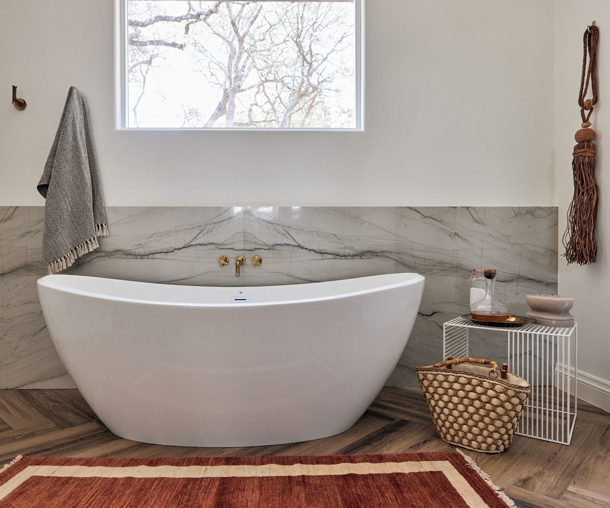
The bathroom was almost completely gutted. Designer Jennaea explains that her bathroom ideas for the primary suite involved removing everything but the cabinetry, which was refinished with white and black paint. 'We seated this new freestanding tub in front of a stunning stone wainscot,' she says. And with the high window above it to balance the scheme, this is the final piece in the jigsaw.
The home is now a showcase of new and old ideas, vintage and contemporary styles rubbing shoulders in these oh-so thoughtfully reinvented spaces. The owners' treasured but eclectic collections have found their true places. The owners in turn, and with Jennaea Denhardt's help, have found their true home.
Interior design: Jennaea Denhardt Interiors
Photography: Wing Ho
Sign up to the Homes & Gardens newsletter
Design expertise in your inbox – from inspiring decorating ideas and beautiful celebrity homes to practical gardening advice and shopping round-ups.
Karen sources beautiful homes to feature on the Homes & Gardens website. She loves visiting historic houses in particular and working with photographers to capture all shapes and sizes of properties. Karen began her career as a sub-editor at Hi-Fi News and Record Review magazine. Her move to women’s magazines came soon after, in the shape of Living magazine, which covered cookery, fashion, beauty, homes and gardening. From Living Karen moved to Ideal Home magazine, where as deputy chief sub, then chief sub, she started to really take an interest in properties, architecture, interior design and gardening.
-
 I've spent over 200 hours testing vacuums and swear by my two Dysons – this is how I properly clean a Dyson vacuum filter for longer-lasting appliances
Your Dyson vacuum will last much longer and clean at its best
By Dan Fauzi Published
-
 Bethenny Frankel calls this $695 machine the 'Rolls-Royce Cullinan of coffee' – it's a must-have luxury buy for iced-coffee lovers this springtime
The Real Housewife swears by a luxurious machine that makes nitro cold brew, cold brew, and cold espresso at the touch of a button – here's why it's worth it
By Sophie Edwards Published