Tour a Texas home that expertly mixes moody cool tones with warming neutrals
Bold colors and smart moves opened up a tired family home and gave it a contemporary European style update
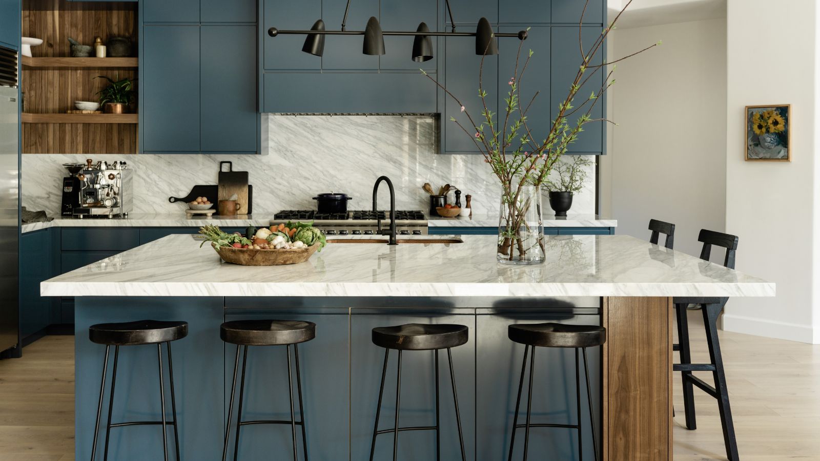
Built 25 years ago, this family home in Austin, Texas, was dragged down by a difficult floorplan and interior décor that had scarcely been updated in the interim.
Now, however, following a major redesign, the house is almost unrecognizable. Its smart new interiors and redesigned floorplan have created a much better flow and the results put the house among the world's best homes.
Interior designer Judi Fuller of J Fuller Interiors was brought in to redesign the space, and explains the very considerable challenges she faced on first seeing the house.
'One of the biggest problems was the U-shaped staircase positioned in the middle of the home that nearly blocked off the entry rooms from the kitchen and main living area,' says Judi. 'Typically American homes are known for their open concept design, but this house had no rhythm to it and the lines were all wrong. There were dead spaces that served no functionality.'
Take the tour to discover how the designer gave the house its dignity back, with many a contemporary style update along the way.
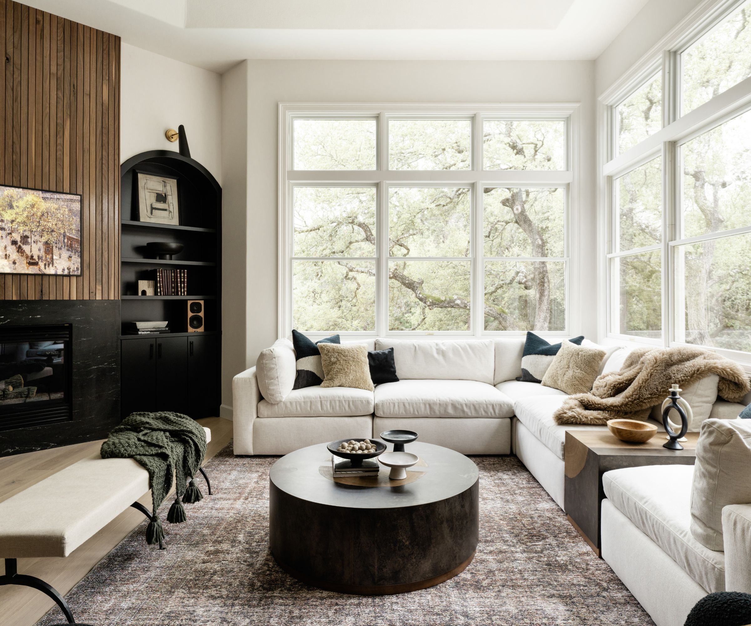
The backdrop to the couple’s main living area was the huge mature oak trees peeking in from outside. So far so good. However, the room's furniture layout proved challenging due to its unusual angles and the position of the fireplace.
Living room ideas for the space involved replacing the drab outdated fireplace surround with a black mist stone with minimal lines.
'From there we were able to formulate a functional furniture layout which included ample seating for guests and parties with a cozy L-shaped sectional from Arhaus and black swivel boucle chairs,' says designer Judi Fuller.
A bench was added to easily move in front of the fireplace when needed. A side table from is placed between two pieces of the sectional, and a round coffee table made of patinaed steel molded around a reclaimed yukas was crafted in Mexico, both tables sourced through Arhaus.
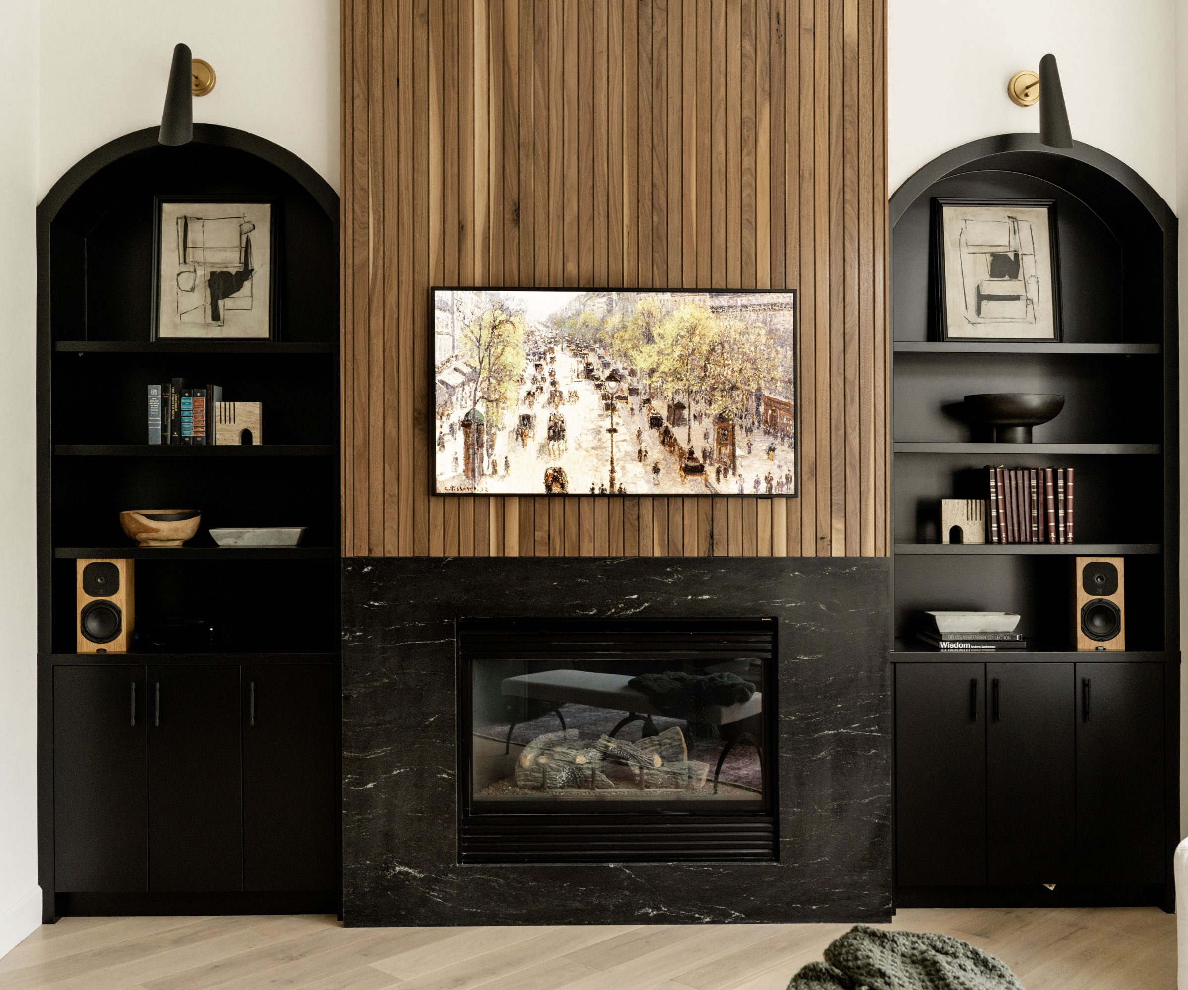
'To accentuate the fireplace wall above we added lap and gap millwork made of walnut (which tied to the same feature in the kitchen),' says Judi, explaining her fireplace ideas which were pivotal to updating the space. The built-in units flanking the fireplace are painted in Tricorn Black by Sherwin Williams.

The kitchen design was of special interest to the homeowner who loves to cook, Judi explains. He had two requirements for the space; the cabinet color had to be Farrow & Ball’s Stiffkey Blue and the countertops had to be marble. These were the two non-negotiable features he loved from their former kitchen. He was also keen to have a professional-grade oven range combo.
'This expansive kitchen needed a little extra something to break up the lengthy blue cabinets and island,' adds Judi. 'So we designed the typically disappearing corner in the kitchen to have custom lap and gap millwork and integrated shelves to display accessories and cookbooks.'
Kitchen ideas also had to work with the adjoining open-concept living room, with the same wooden treatment above the fireplace. To tie the two areas together, another walnut panel was placed on one corner of the island.
The art on the adjacent wall was an original painting from the homeowner’s friend.
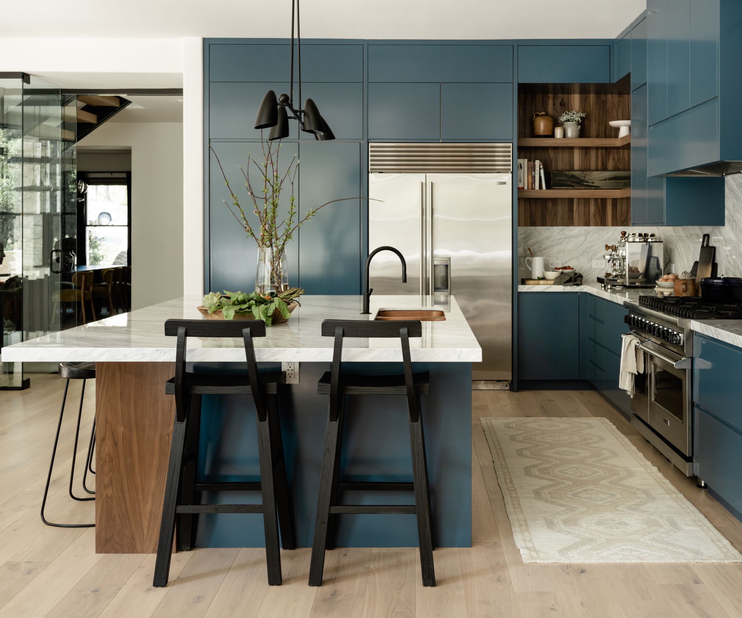
'The kitchen was coming together nicely but we knew the key piece was going to be the selection of the marble,' says designer Judi. 'After shopping multiple stone yards we settled on slabs that were so good that we had to have them as our backsplash as well.'
The black chandelier was sourced from 1st Dibs and custom-made from a shop in New York City.
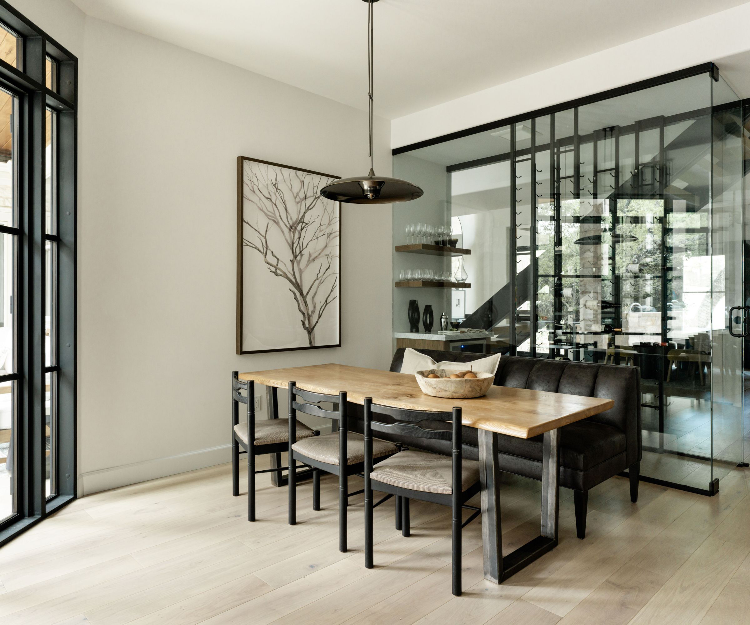
Redesigning the stairs made space for some very creative home bar ideas. Between the new floating stairs and breakfast room, above, is a small glass-walled wine room and bar. 'The breakfast area flanked our glass wine room and was a fluid extension of the kitchen,' explains Judi.
A long leathered bench seat from Arhaus and chairs originally from Paris and sourced at the Round Top antiques show, contribute to the cozy eat-in kitchen ideas for family meals.
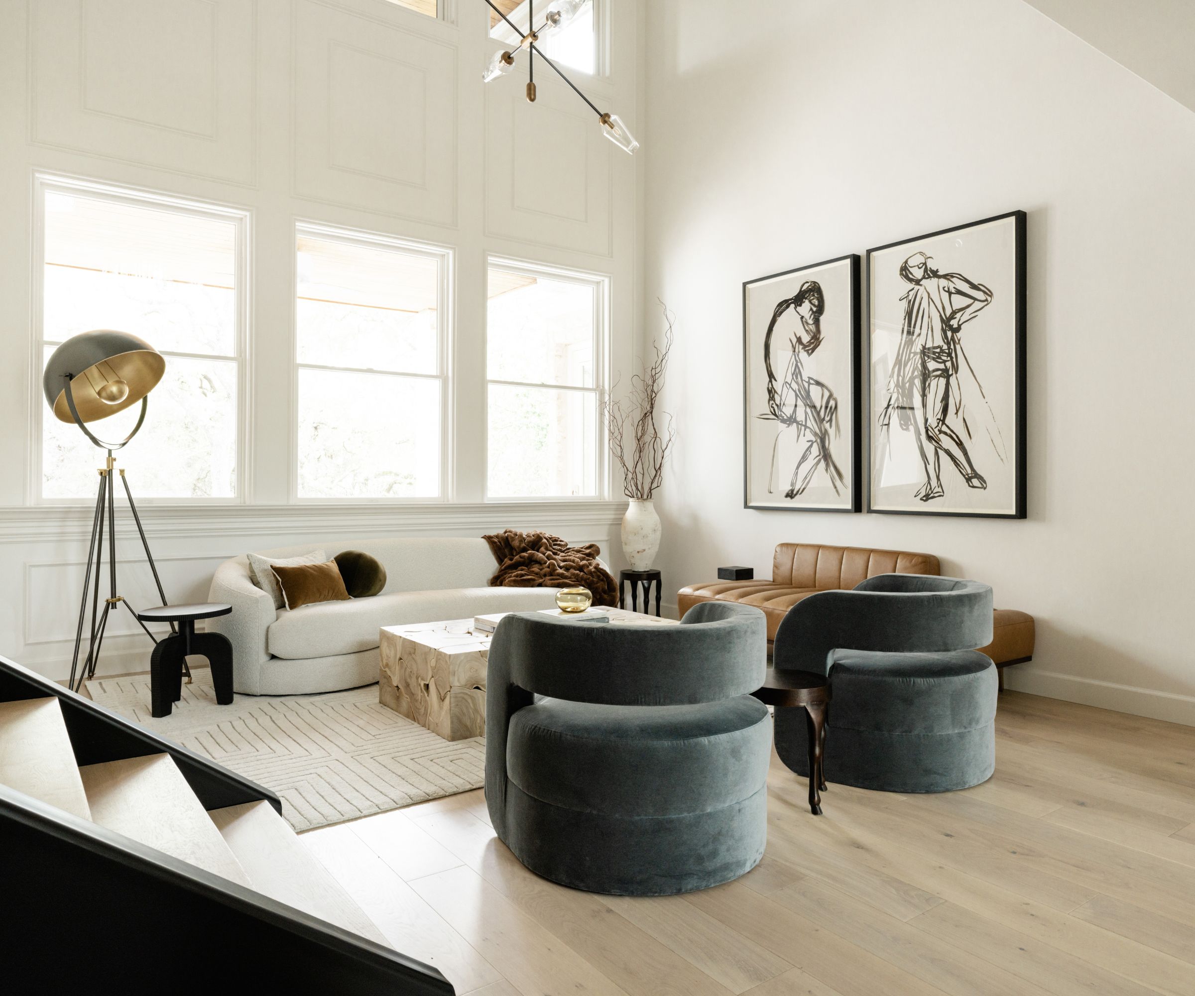
The second sitting room was designed to be a more intimate space, and Judi's den ideas took shape once the old U-shaped stairs had been replaced with a modern floating set. 'This proved to be the most striking architectural feature and was key to opening up the space visually,' the designer explains.
'The sitting room is set off with two oversized art pieces (from Wendover art) that have a European vibe. The curves in the kidney sofa have a modern element we were looking for while the blue swivel chairs are a stark contrast to the camel-colored leather daybed from Arhaus and the room has a clean, sophisticated modern Paris apartment vibe,' adds Judi Fuller.
The stand-out piece in the room is a natural teak wood coffee table that features organic shapes, also sourced from Arhaus, while quirky side tables with hooved-footed legs and a vintage-style floor lamp complete the scene.
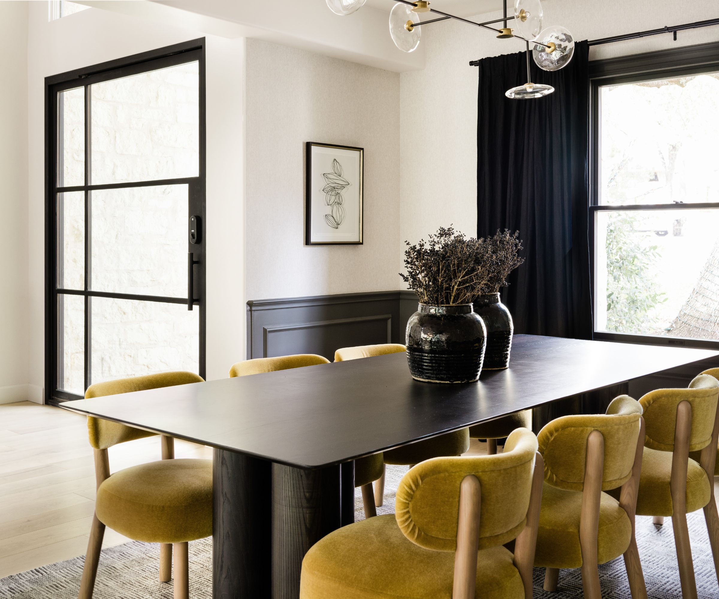
The home's formal dining room is open plan to the home's main entry. Key to the new dining room ideas are the amber-colored mohair chairs and a handcrafted black table with sculptural column legs, both from Maiden Home, and an Ian Fowler designed chandelier from Visual Comfort.
'The airy entry was grand in scale and we needed to match that feel in the furnishings,' says designer Judi. The most important of her entryway ideas was to change the front entry door to an extra wide steel and glass swivel door. This brought in additional light to the entry and dining room.
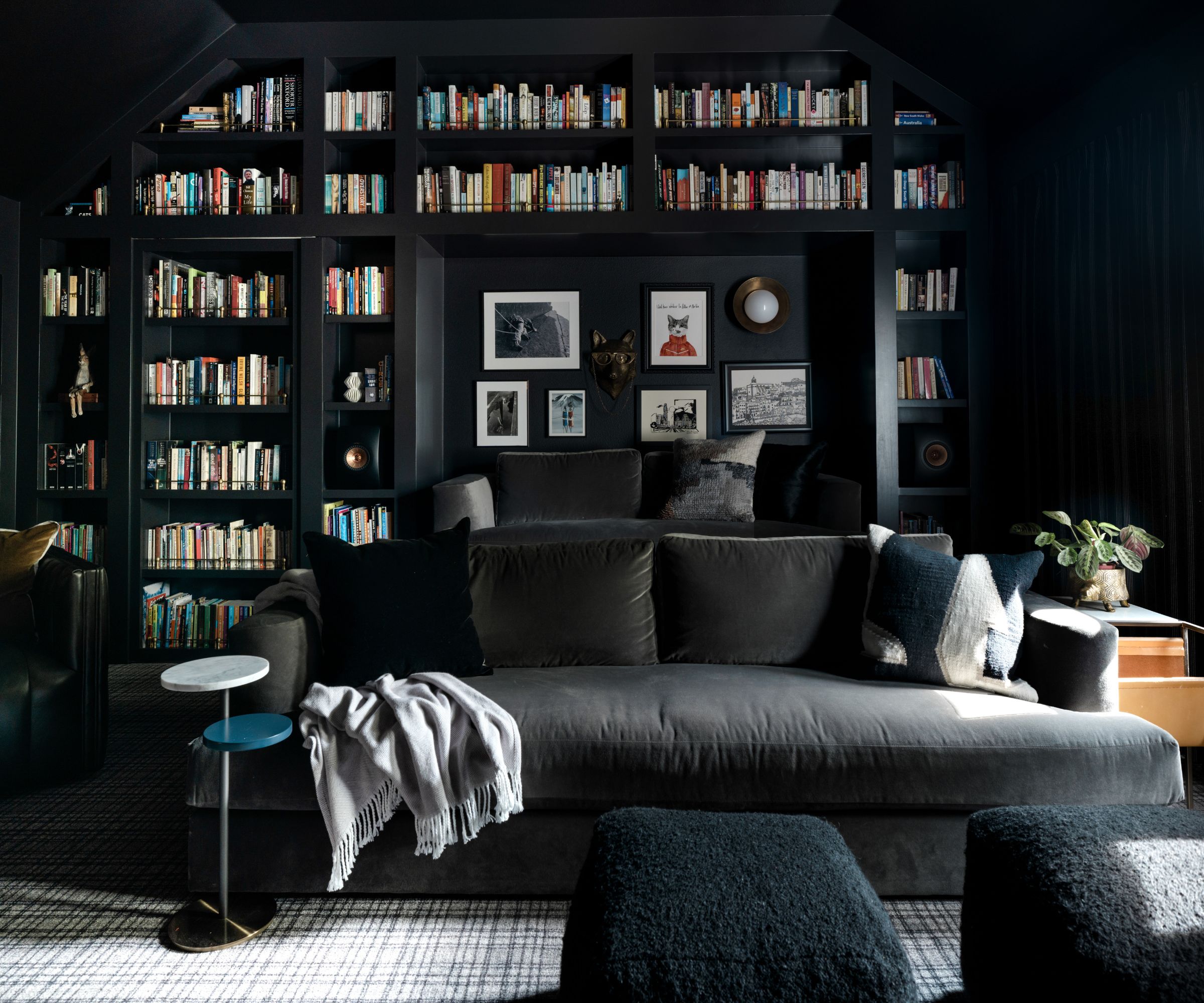
The new media room/library is a striking space, and one in which designer Judi says she was able to really let her imagination run wild. 'It is to date one of my favorite rooms ever to design,' she says. 'My inspiration was that of old England libraries found in large estates in days gone by. I began to envision combining both the library and media into one and jotted down a quick hand drawing, hoping everything I had planned would fall within the measurements of the space.'
As far as the colour scheme was concerned, Judi's media room ideas were brave and bold. 'Since the room had an entire wall of windows providing ample light by day, I was able to convince the homeowners that painting all the walls Caviar black by Sherwin Williams, including the ceiling and all of the built-ins.' Judi promised a show-stopping space, and she didn't disappoint.
Key pieces include couches from Maiden Home, swivel channeled brown leather chairs from Four Hands, unique mesh lanterns on either side of the television, from Hudson Valley Lighting, and Talon chandelier by Regina Andrew.
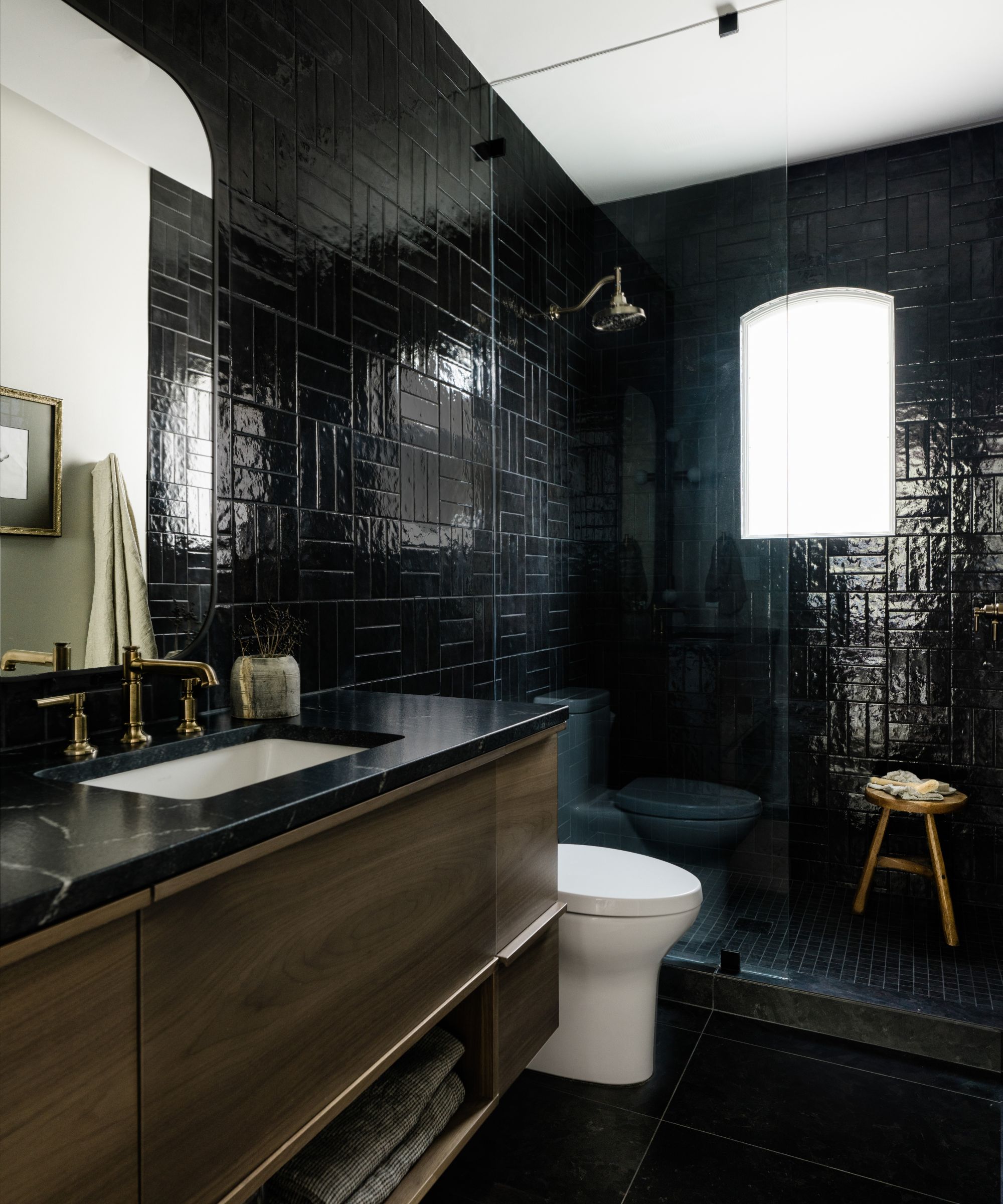
'This bathroom serves not only as a powder room (due to its location in the home), but also a full guest bath with a shower in the event that the adjacent office is turned into a guest room one day. The challenge was to have a fully functioning bathroom but with a powder bath vibe,' explains designer Judi Fuller.
Anyone looking for inspiration for their modern powder room ideas will find plenty here to delight, including the floor-to-ceiling Black Cloe subway tile from Bedrosians, which crosses the full vanity wall and into all sides of the shower. A triple crosshatch pattern adds further visual interest. Plumbing fixtures by Brizo in Luxe gold finish include a gooseneck shower head to help keep splashing under control. Black Zola Field tiles in Nero and matching mosaic shower floor tiles from Ann Sacks add to the fine details.
'Our moody bathroom was not complete without a custom-designed floating vanity in walnut. The final jewel to this bath was a modern rail sconce from Southern Lights Electric. A custom piece of art hand drawn by a friend of the clients added a touch of nostalgia,' adds Judi.
Interior design: Judi Fuller of J Fuller Interiors
Photography: Madeline Harper Photography
Sign up to the Homes & Gardens newsletter
Design expertise in your inbox – from inspiring decorating ideas and beautiful celebrity homes to practical gardening advice and shopping round-ups.
Karen sources beautiful homes to feature on the Homes & Gardens website. She loves visiting historic houses in particular and working with photographers to capture all shapes and sizes of properties. Karen began her career as a sub-editor at Hi-Fi News and Record Review magazine. Her move to women’s magazines came soon after, in the shape of Living magazine, which covered cookery, fashion, beauty, homes and gardening. From Living Karen moved to Ideal Home magazine, where as deputy chief sub, then chief sub, she started to really take an interest in properties, architecture, interior design and gardening.
-
 'Big results before you know it' – Experts urge you to use the ‘Take Away 10’ method for simple decluttering with zero decision fatigue
It can cut hundreds of items from your home in just a few weeks
By Ottilie Blackhall
-
 Kevin Bacon and Kyra Sedgwick's rustic kitchen island is stunning, but controversial – designers say you can get the look without the hassle
A popular material finds an unorthodox home in the couple's kitchen, but experts disagree on whether it should be used – here's how to do it instead
By Sophie Edwards