7 clever styling tricks that helped a family upscale from an apartment to a house
Moving from a small apartment to a larger home brings challenges – here are the great design tricks that helped a Long Island family upscale in style
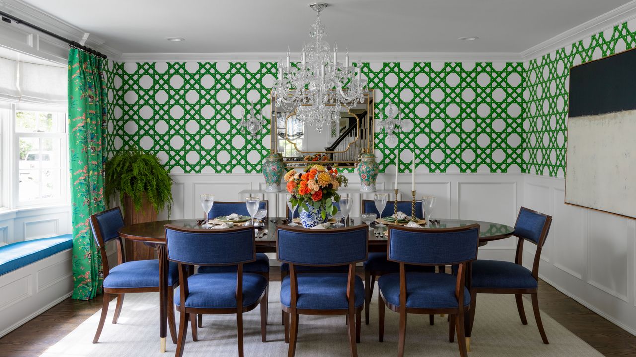
Michelle and Sean Denihan had just moved into their first home after living in a NYC apartment with their young family. Like most families upgrading from an apartment to a house they didn't have enough furniture and they needed help to adjust to the upscale. They also wanted to add personality and color to the larger space.
They asked a local designer to help them make the shift from their small NYC apartment to the new 3,400 square foot, 6-bed, 3.5 bath home.
The colorful transformation of the family's Long Island home makes it one of the world's best homes. And the design solutions that helped this family adjust to their enlarged living space could just as easily transfer to anyone who's choosing to upsize not downsize.
The couple found Manhasset-based interior designer Jennifer Markowitz of JNR Designs who came up with some great ideas to inject fun and color into their new home, as well as helping them to make the space work for the whole family.
We've picked out the 7 key design ideas that made this a smooth, happy transition to a larger home, ideas that can be used by anyone making the move to a larger living space.
1. Choose family-friendly storage that's built to last
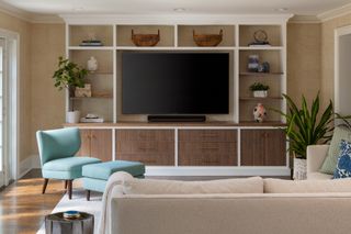
Anyone looking for family living room ideas can take heart from the design of this room. Not an ugly plastic toy in sight.
Designer Jennifer Markowitz says: 'I knew this family space would have to do some heavy lifting in this busy household, so a good quality custom built-in unit to hide toys and board games was a must. We used a reeded wood fabrication to complement the grasscloth on the walls. And the sectional sofa from Lee and rug from Surya are both family friendly and super durable, functional and stylish.'
'I really wanted Sean and MIchelle to understand the importance of picking quality pieces that will last,' adds Jennifer. 'Often in transitional living spaces people opt for inexpensive furniture that’s readily available. I love to educate my clients about quality and why pieces cost what they do and to look at this as an investment.'
2. Make the most of a room's unusual features
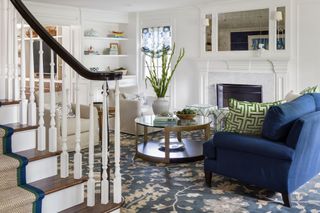
For some people having stairs straight out of a living room might be problematic, but Jennifer's clients, having moved from an apartment with no stairs, were happy to make the striking period staircase a key part of their living room ideas. So along with the original fireplace, the stairs are now part of the main living room's harmonious white and blue scheme with a smart green and navy-edged sisal runner to emphasise the unusual feature.
'We wanted this space to feel a bit more formal,' explains Jennifer. 'We used traditional elements to keep in line with the history of the home but added some whimsy with the fabrics for the drapes and pillows. Sourcing vintage items kept the home feeling warm and grounded in history. Adding an antiqued mirror above the fireplace helped bounce around light in a beautiful way.'
The coffee table is from Caracole and the rug from Surya.
3. Use pockets of pattern to break up white walls
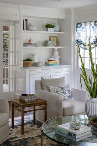
The living room's white walls, soft white armchairs and neat fitted shelves allow the beautiful blue patterned textiles to take their place in the spotlight. The drapery and shades are made up in fabrics from Quadrille with assorted pillows in Pierre Frey, Schumacher and Thibaut designs. Drinks table from Jamie Young.
4. If there's space for a home bar…
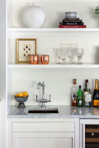
With space to play with in their upscaled family home, the couple were keen to add some fun elements. In the grown-ups' living room this takes the shape of a custom bar. After considering the home bar ideas with Jennifer, they decided that this understated, but eminently practical bespoke open shelving unit with built-in sink and wine fridge would work best for them. Designed to match the shelving unit on the opposite side of the living room door, it's not a showy element in the room but simply a useful addition to make entertaining easier and more fun.
5. Embrace color and pattern – together
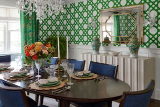
The colorful dining room was Jennifer's starting point as she prepared to guide her clients through the transition to their new home. The bright geometric trellis wallcovering was already there when the family moved in. The clients - and Jennifer - loved it, and soon came up with more dining room ideas to add to the symphony of pattern and color in the room, before moving on to consider how to use color in the rest of the home.
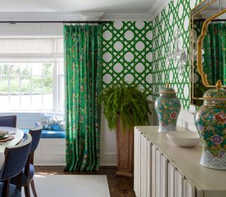
'A young family should live in color!' says Jennifer, and luckily her clients agreed. 'We used the dining room wallpaper as a jumping-off point. I pulled in a similar green for the curtains with the beautiful Ming Vase chinoiserie pattern from Schumacher to complement the geometrics in the wallcovering. From there we brought in hits of blues for the window seat and chair cushions which work with the living room colorscheme.'
Dining table from Caracole, chairs by Hooker, buffet from Bernhardt and mirror from Bungalow5.
6. Bright ideas and cozy textures for a child's room
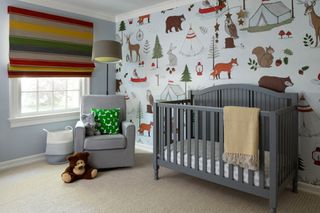
Although Jennifer says she finds it hard to choose a favorite room in the house, this child's bedroom is right up there. What parent – or young child for that matter – could fail to be inspired by the kids' room ideas in this special space?
'I adore the wallpaper and shades. They’re just too fun!' she says. 'I found the cutest mural of forest animals at Rebel Walls and decided that was the winner! I found shades that reminded me of a camp blanket and the carpet we chose from Campbell's Carpet is so soft and reminds me of a cable knit sweater. I was so thrilled at how happy and warm this bedroom came out!'
7. Opt for calm neutrals and natural textures in the primary bedroom
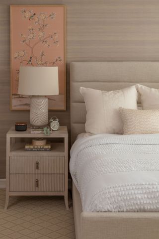
Part of using color with confidence is knowing when to pare it back and calm it down. That certainly was Jennifer's approach to the bedroom ideas for this home. 'The only space we held back on color was the primary bedroom. I often use neutrals here, as the primary should be a soothing retreat after a long day,' Jennifer explains. 'We wanted to give this couple a respite from their hectic days so I used a beautiful grasscloth from Phillip Jeffries to create a cocoon like feeling.'
Soft fabrics in taupe and blush create a serene space balanced with neat bedside tables from Bernhardt and more contemporary lighting from Jamie Young. A chinoiserie print from Chairish brings something extra special to the space. The bed is from Four Hands.
From the vibrant dining room to the calm textured natural shades in the primary bedroom, the color and style journey through this home offers inspiration to anyone upscaling to a larger home, and anyone still finding their feet with colorful interiors.
'I am thrilled with how warm and inviting this home turned out. And having happy, satisfied clients is the cherry on top. I wouldn’t change anything…except I'd probably add more pillows. Always more pillows!' says Jennifer.
Sign up to the Homes & Gardens newsletter
Design expertise in your inbox – from inspiring decorating ideas and beautiful celebrity homes to practical gardening advice and shopping round-ups.
Karen sources beautiful homes to feature on the Homes & Gardens website. She loves visiting historic houses in particular and working with photographers to capture all shapes and sizes of properties. Karen began her career as a sub-editor at Hi-Fi News and Record Review magazine. Her move to women’s magazines came soon after, in the shape of Living magazine, which covered cookery, fashion, beauty, homes and gardening. From Living Karen moved to Ideal Home magazine, where as deputy chief sub, then chief sub, she started to really take an interest in properties, architecture, interior design and gardening.
-
 Claudia Schiffer creates a sophisticated minimalist living room with these 3 pieces – designers say her look is 'enduring' and so easy to recreate
The model's Scandi-style living space transcends trends with its neutral color scheme and textured elements, which experts say is timeless
By Hannah Ziegler Published
-
 It's your last chance to buy one of our all-time favorite Shark upright vacuums in the Walmart sale – I'm a vacuum tester, and it's a seriously worthy upgrade
The Shark Vertex DuoClean PowerFin Upright Vacuum is now heavily discounted and brilliant for busy homes
By Dan Fauzi Published