This home balances classic spaces for entertaining with relaxed family zones
Reimagined with a clever mix of East and West Coast styles, this Kansas City home is cozy and smart all at the same time

Design expertise in your inbox – from inspiring decorating ideas and beautiful celebrity homes to practical gardening advice and shopping round-ups.
You are now subscribed
Your newsletter sign-up was successful
Want to add more newsletters?
How do you reimagine a late-1980s home in a smart Kansas City suburb into something that merges the best of Charleston and Santa Barbara aesthetics? That was the challenge facing the owners of this spacious family house, one of the world's best homes.
Having recently upsized from a smaller home, they were finding that the additional space in their new house, though very welcome, came with its own particular obstacles. First, the furniture they brought with them from their old house looked small and out of proportion with the high ceilings and generous room sizes in the new house. And although the kitchen was large, the layout was unsatisfactory as the workspace was cramped.
They owners turned to the design experts at Kobel & Co to help them solve these conundrums, giving the designers a clear steer on the kind of interiors they had in mind. 'Our studio named this project 'Charlebarbara',' says Elizabeth Bennett, partner at Kobel & Co alongside Mallory Robins, referencing the two cities that inspired the clients' aesthetic. 'The challenge here was to overhaul a late-80s build house in a way that felt classic and timeless, while adding modern touches to the furniture and décor that kept the home feeling like the young family that inhabits it.'
Article continues belowKitchen
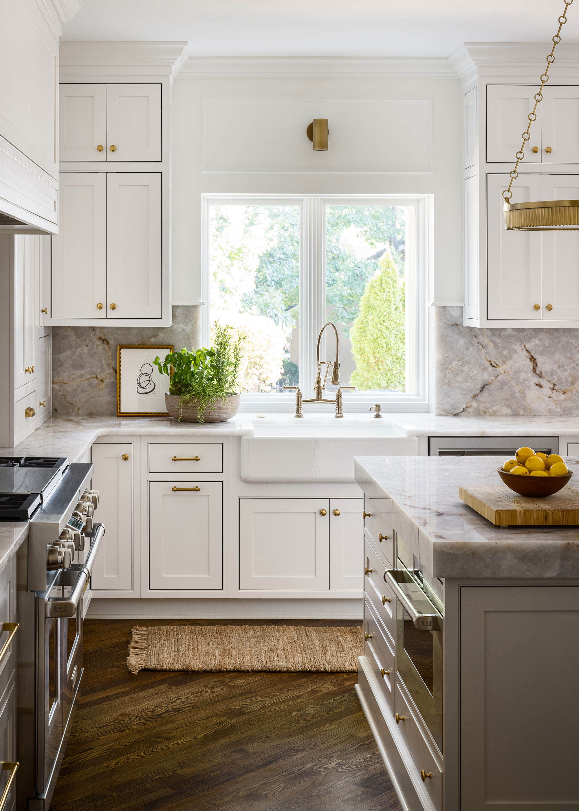
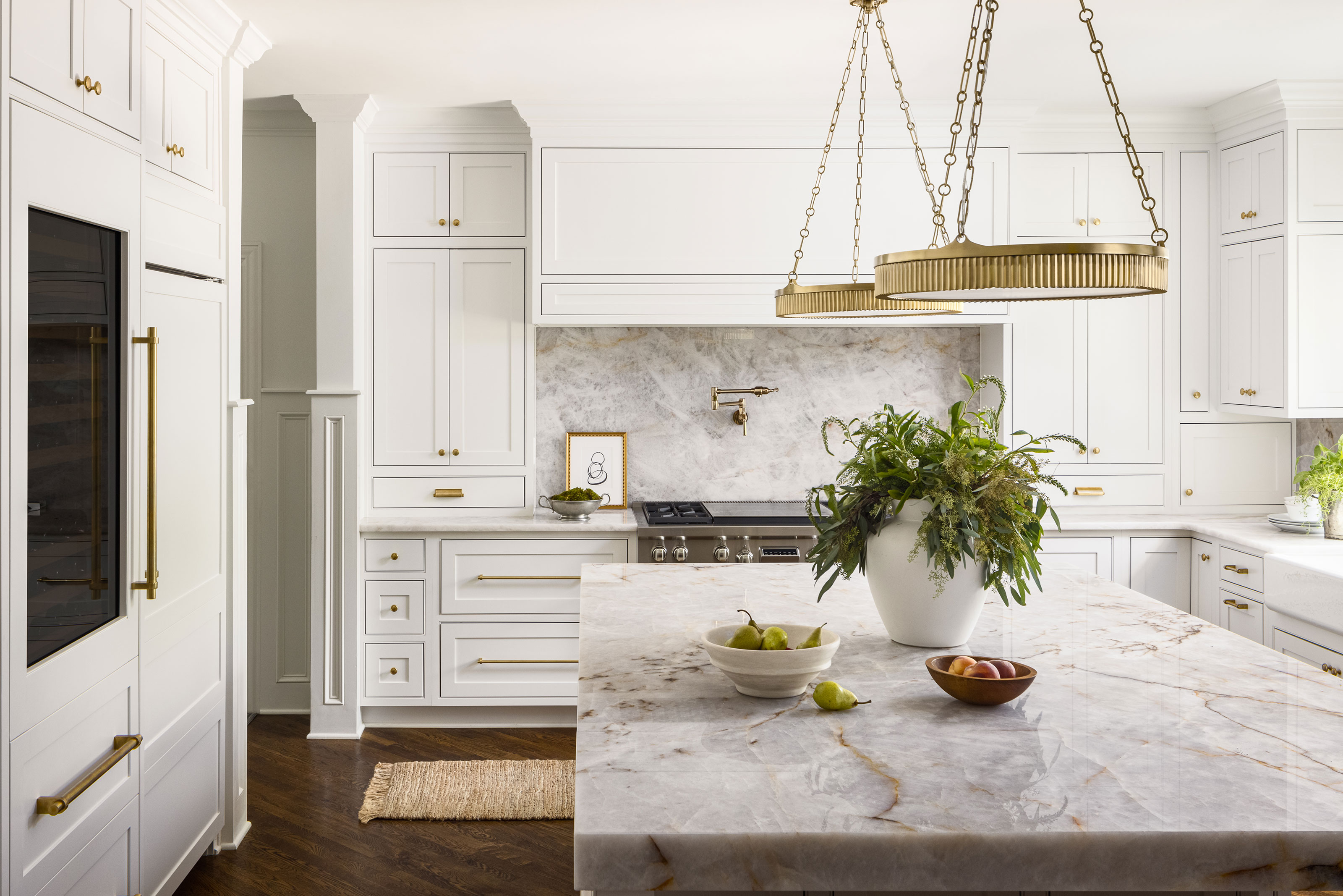
'The biggest design challenge on the project was reconfiguring the kitchen floorplan to expand the cooking and entertaining space and shrink the amount of space dedicated to soft seating,' explains Mallory Robins of Kobel & Co. The design team's kitchen ideas included expanding the island to three times its original size, and capping the kitchen with a new bar space – giving it a four sided feel.
Where the working section of the kitchen had previously seemed squashed, the design duo opened it up. 'Because we weren’t moving walls, we visually enlarged it by simplifying the elements in the kitchen with an integrated hood, a cold storage wall with paneled fridge/freezer elements, and an oversized island showcasing a Zurich Quartzite with mitered edge for an extra luxe look.'
The two Lynden pendant lights by Hudson Valley and unlacquered brass hardware by Classic Brass put the finishing touches. The perimeter cabinets are Sherwin Williams Pure White; the island is grounded with a coat of Sherwin Williams Pediment.
Living room
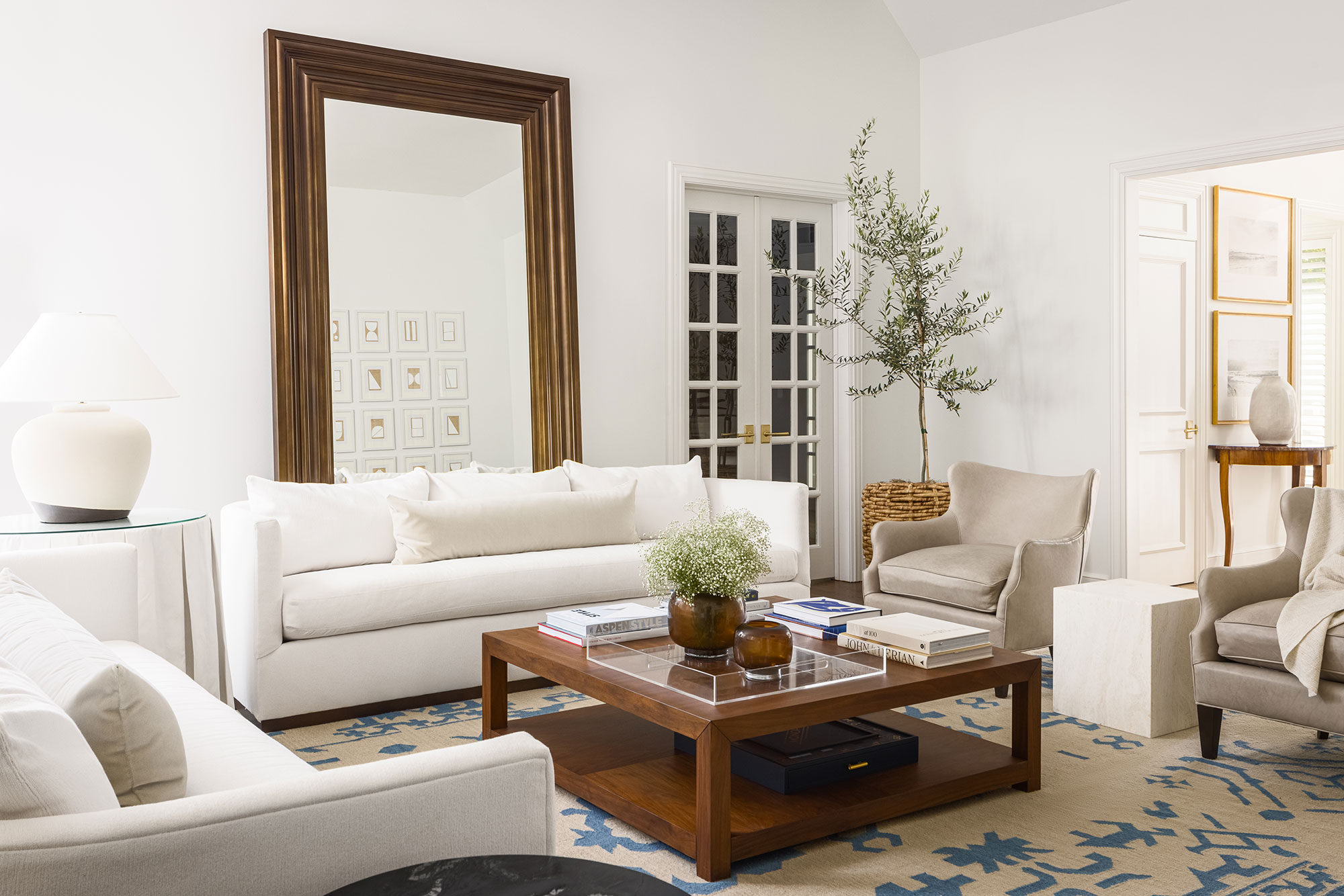
Living room ideas perfectly showcase the owners' mix of style influences, with a look that's at once smart yet relaxed enough to enjoy as a family. 'We aimed to maximize seating as this family loves to entertain,' says Elizabeth Bennett. 'They wanted a space that walked the line between formal and inviting, and we brought this to life with a simple color palette and beautiful curved lines on the upholstered pieces. The custom skirted table is a nod to southern style.'
Design expertise in your inbox – from inspiring decorating ideas and beautiful celebrity homes to practical gardening advice and shopping round-ups.
The white sofas have simple velvet lumbar pillows (Little Design Co) to keep the space from feeling stuffy and over-fluffed. The oversized mirror is from Restoration Hardware.
'To ensure balance with all of the new pieces in the space, we layered in an antique French walnut demilune (from Chairish) in the entry and a block print style blue vintage rug from our own company inventory,' adds Elizabeth.
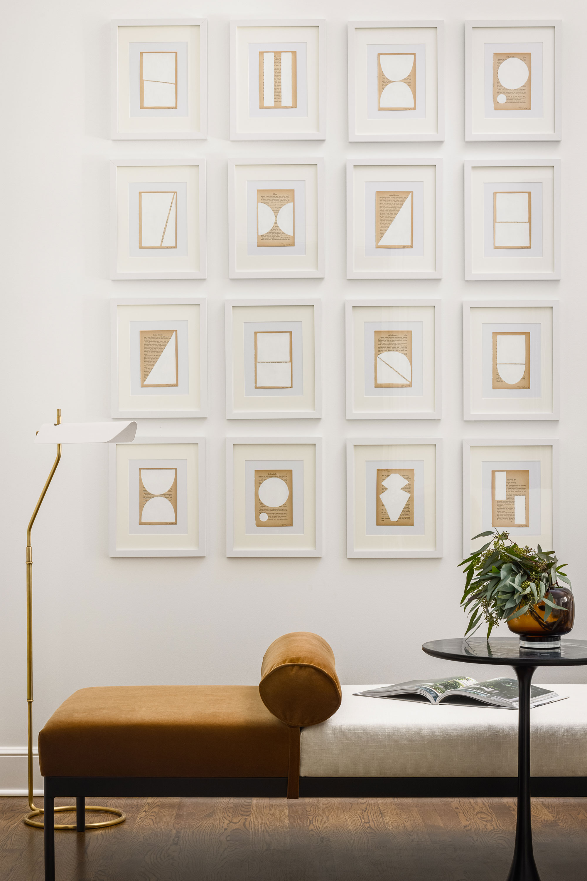
On the opposite side of the living room, bringing elegance to an underutilized nook, Kobel & Co sourced an upholstered daybed from Maiden Home in linen and amber hues, framed by a custom 16 piece art installation by artist Josh Young.
Family room
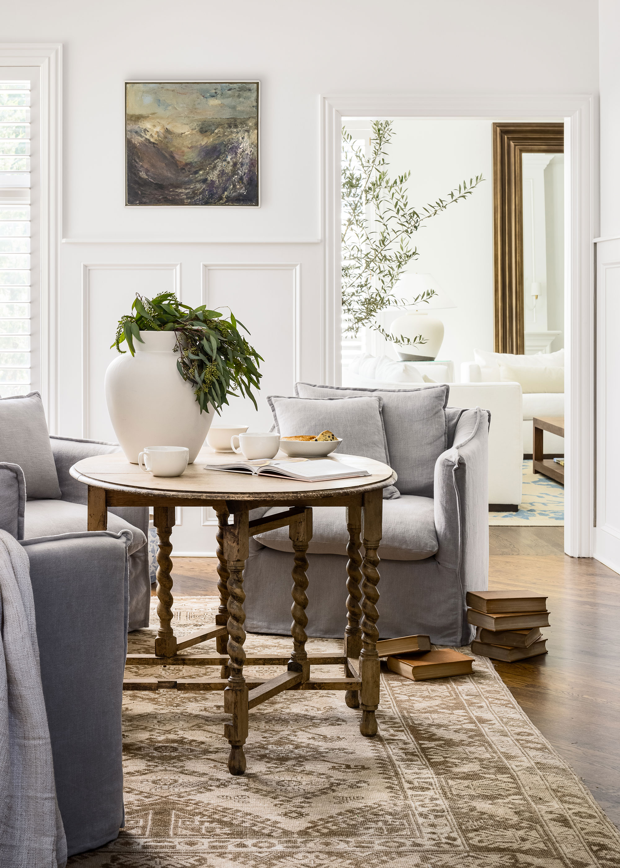
At the far end of the kitchen, around a fireplace, Elizabeth and Mallory repurposed a rarely used dining table to make a cozy seating area for four, using plush swivel chairs, with a vintage Turkish rug. This space is one of the pair's favorite design elements of the project.
'The cozy chairs around an antique French table are perfectly loungey by the fire, but still suitable for eating breakfast or doing homework. We kept the overall color palette here warm and neutral to complement the kitchen and balance the bright white walls,' says Mallory.
Dining room
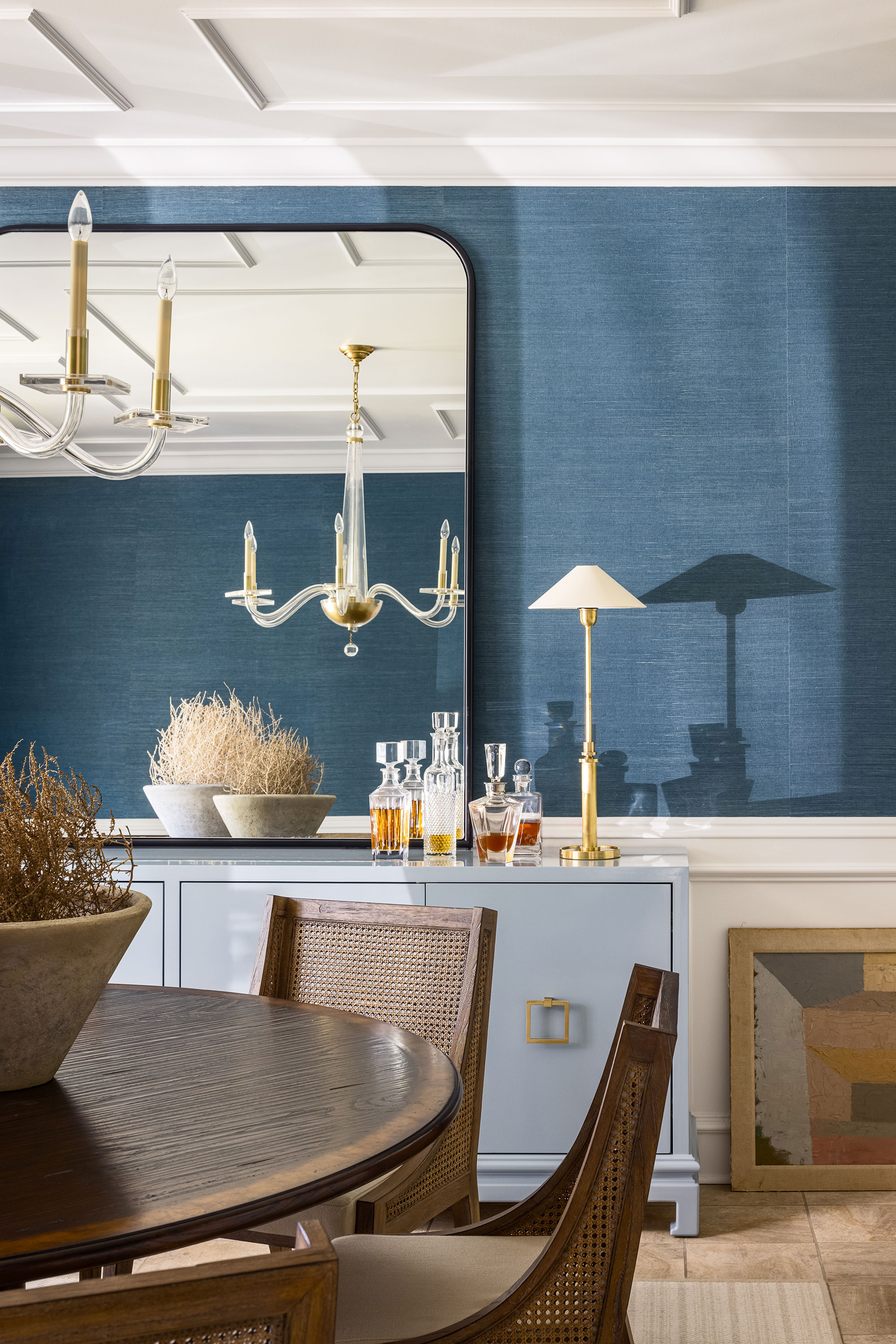
'To bring a classic look to the dining room, we designed a custom molding pattern on the ceiling, and layered it with classic blue grass cloth on the walls,' says Elizabeth, explaining the firm's dining room ideas. A six-foot Georgian style dining table accommodates eight – perfect for this dinner party loving family. A custom sized buffet in a lacquered light blue shade houses all of the clients’ serveware.
Primary bedroom
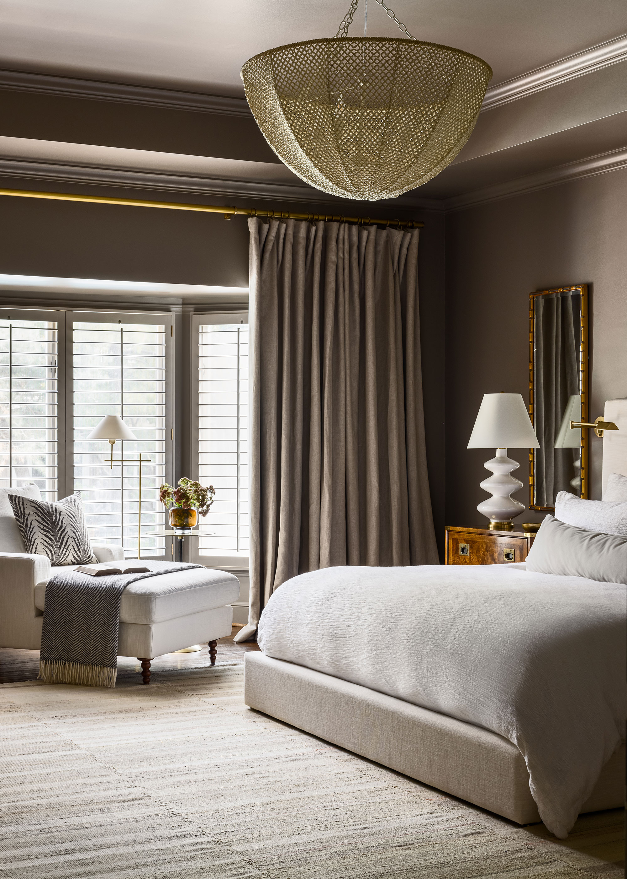
Bedroom ideas for the primary bedroom revolve around a tonal look, with an unusual choice of taupe and mushroom shades. These darker natural shades have been layered creating a harmonious and calming feel that's perfect for a bedroom.
'The deep muddy tones remain bright enough to keep the space feeling relaxing and airy,' says Mallory. 'A custom wall of linen curtains is tonal with the walls and also serves an important function for the homeowners who are both physicians – helping to black out the room after a long night on call.'
The Restoration Hardware bed and bedding are flanked by vintage burl night stands and a chaise lounge with custom pillow in Schumacher’s Creeping Fern. A chandelier by Palecek adds drama to the room, which is painted in Sherwin Williams Backdrop.
Mission accomplished for the bedroom redesign, and how do the designers feel about the project as a whole? 'We are thrilled with the finished result! It’s a major transformation from where the house started – and feels light and bright, and uniquely like our clients,' says Elizabeth.
Karen sources beautiful homes to feature on the Homes & Gardens website. She loves visiting historic houses in particular and working with photographers to capture all shapes and sizes of properties. Karen began her career as a sub-editor at Hi-Fi News and Record Review magazine. Her move to women’s magazines came soon after, in the shape of Living magazine, which covered cookery, fashion, beauty, homes and gardening. From Living Karen moved to Ideal Home magazine, where as deputy chief sub, then chief sub, she started to really take an interest in properties, architecture, interior design and gardening.
