This compact bungalow's harmonious new look is a masterclass in spatial design
How a small family home became a functional and beautiful space – outsmarting the open-plan layout was key

Design expertise in your inbox – from inspiring decorating ideas and beautiful celebrity homes to practical gardening advice and shopping round-ups.
You are now subscribed
Your newsletter sign-up was successful
Want to add more newsletters?
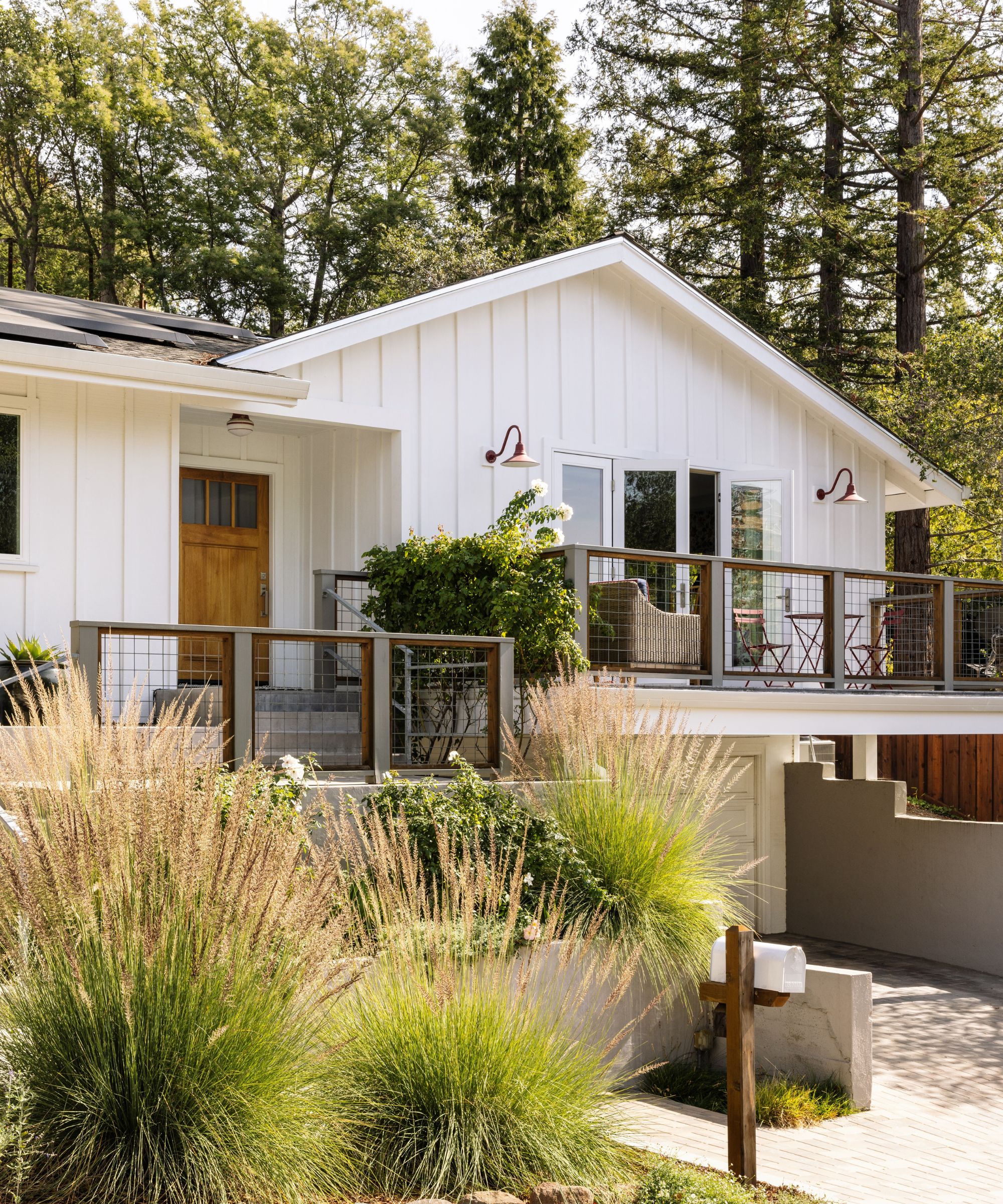
The property in question was a classic 1960s bungalow. Three bedrooms, two bathrooms. So far so ordinary. What was extraordinary, and the reason the current owners bought it, was the home's stunning setting perched in the hills of Marin County, California with incredible views for miles.
The house has reached a whole new level following a recent redesign, with the emphasis on making the most of every inch of available space and bringing harmony to the mostly open-plan layout. That's why we believe this to be one of the world's best homes and there are lessons here for us all in how to reconfigure a room plan and color palette to achieve a more spacious and harmonious look.
The owners had already completed a major remodel of the house some years before turning to interior designer Courtney B Smith for help with the layout and décor. 'By the time they reached out to me they were frustrated with what they thought was too little square footage, no space for the occasional overnight guests, and a lack of comfortable flow, both visual and physical,' explains Courtney. 'Like lots of families, they’d inherited hand-me-downs over time, or purchased items on a one-off basis, and nothing felt like it belonged. When we initiated, they were done with their Ikea phase, and ready for more permanent solutions.'
Article continues belowTake the tour, and find out how some well focused changes created a much improved sense of flow and established design connections between the distinct areas in the home.
'When we started, the home was a sea of neutrals of different undertones and mismatched furniture placed in ways that didn’t maximize its footprint,' says designer Courtney. 'The overall goal was to create a functional and beautiful home for this young family of four who needed selections that weren’t precious or delicate. They wanted to use existing pieces we could find a spot for, but weren’t hung up on saving things that didn’t make sense in the context of our plan.'
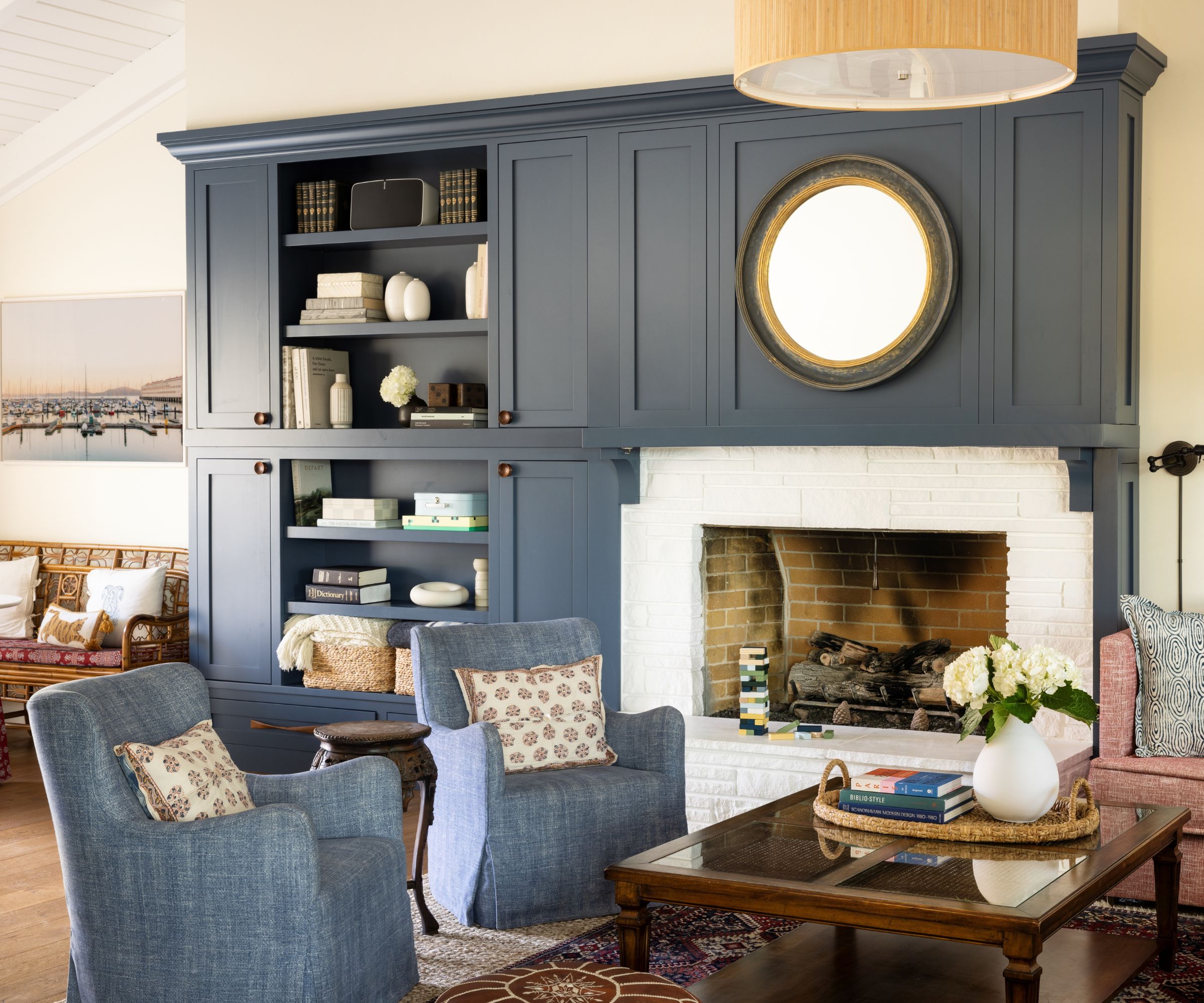
'The biggest challenge in this project was the great room, or family room, which is long and narrow, and open-ended on both sides,' explains Courtney. 'There was also a lopsided fireplace that dominated the room and needed to be balanced.'
Key to the family living room ideas here, were additions to rebalance the space, including a soffit above the existing fireplace, and incorporating it into a custom built library wall which had the advantage of creating lots of additional storage.
Design expertise in your inbox – from inspiring decorating ideas and beautiful celebrity homes to practical gardening advice and shopping round-ups.
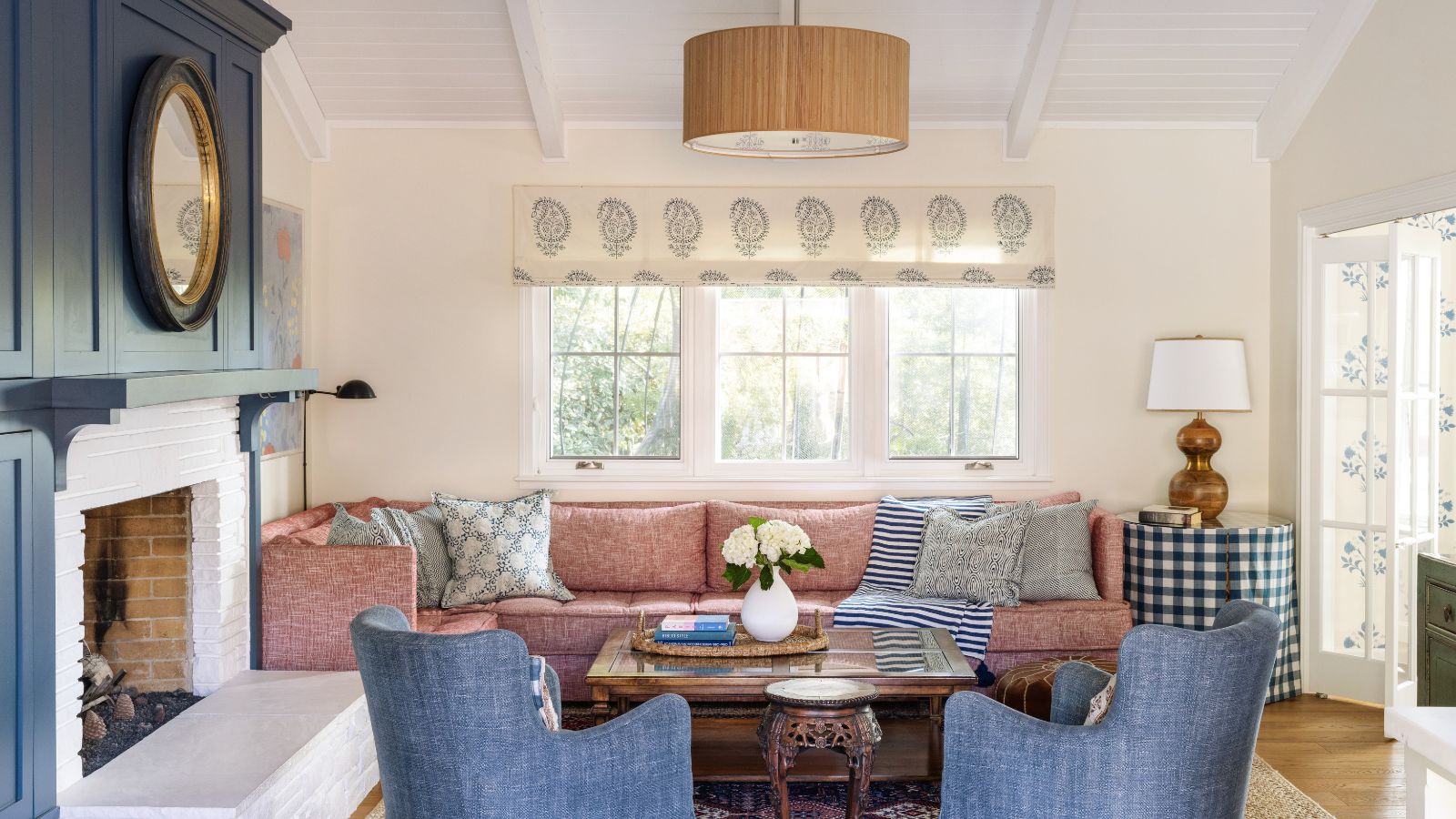
'This room is the heart of this home, and a multifunctional work horse,' says Courtney. 'We infused the room with more pattern, great art, and a decent amount of color.'
Key pieces include the blue swivel chairs from Lee Industries, pillows from Les Indiennes, and the mirror above fireplace from Ballard Designs. The coffee table and Persian rug already belonged to the owners and work well with the room's new design.
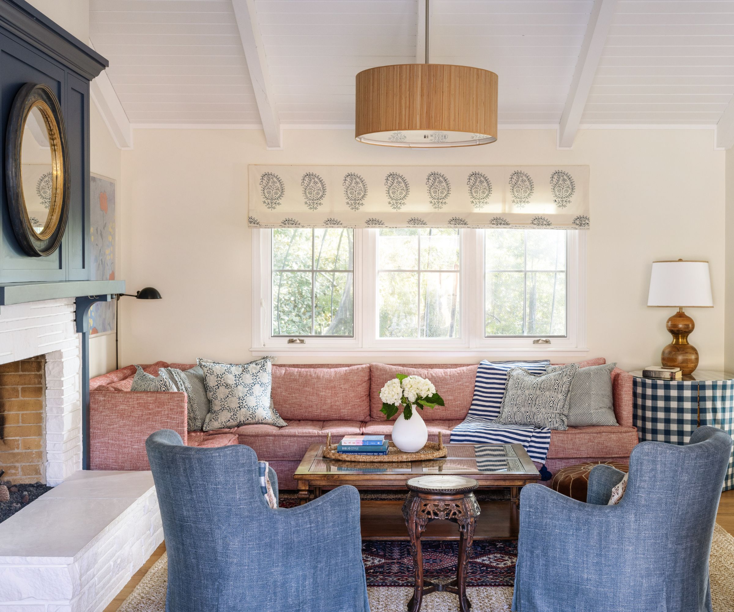
The new red sectional was a custom piece, designed to make the most efficient use of the space in the family living room. The upholstery is a Thibaut Performance fabric, a practical choice in a family home.
A fun gingham-style check skirt highlights the table by the window, and a Roman blind adds further pattern interest, both in Les Indiennes fabrics.
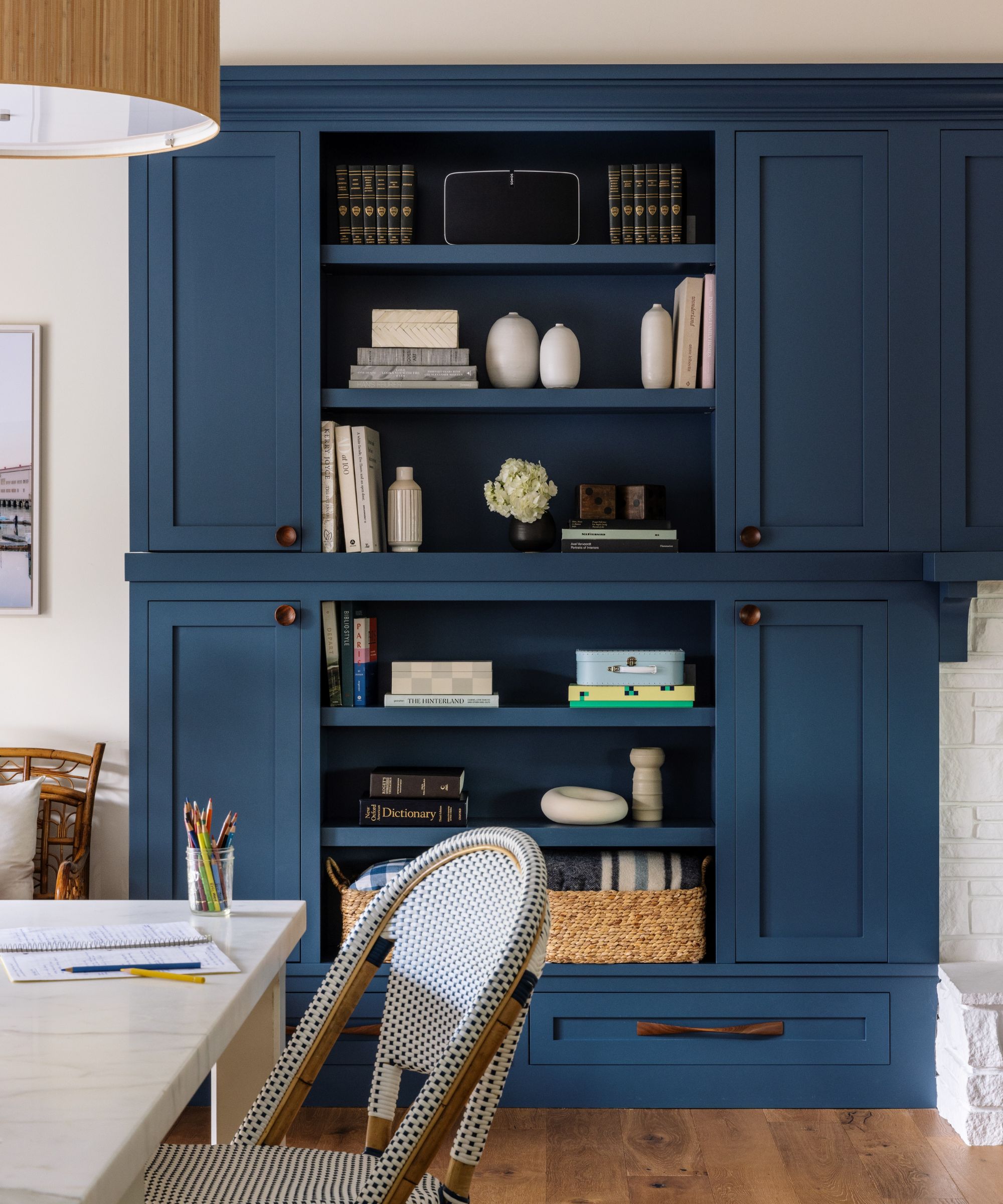
At this end of the bespoke fireplace built-in, the display ideas for decorating shelves are a mix of treasured objects and ceramics, as well as useful items such as table linens. Closed cupboards contain everyday crockery for the adjacent breakfast table.
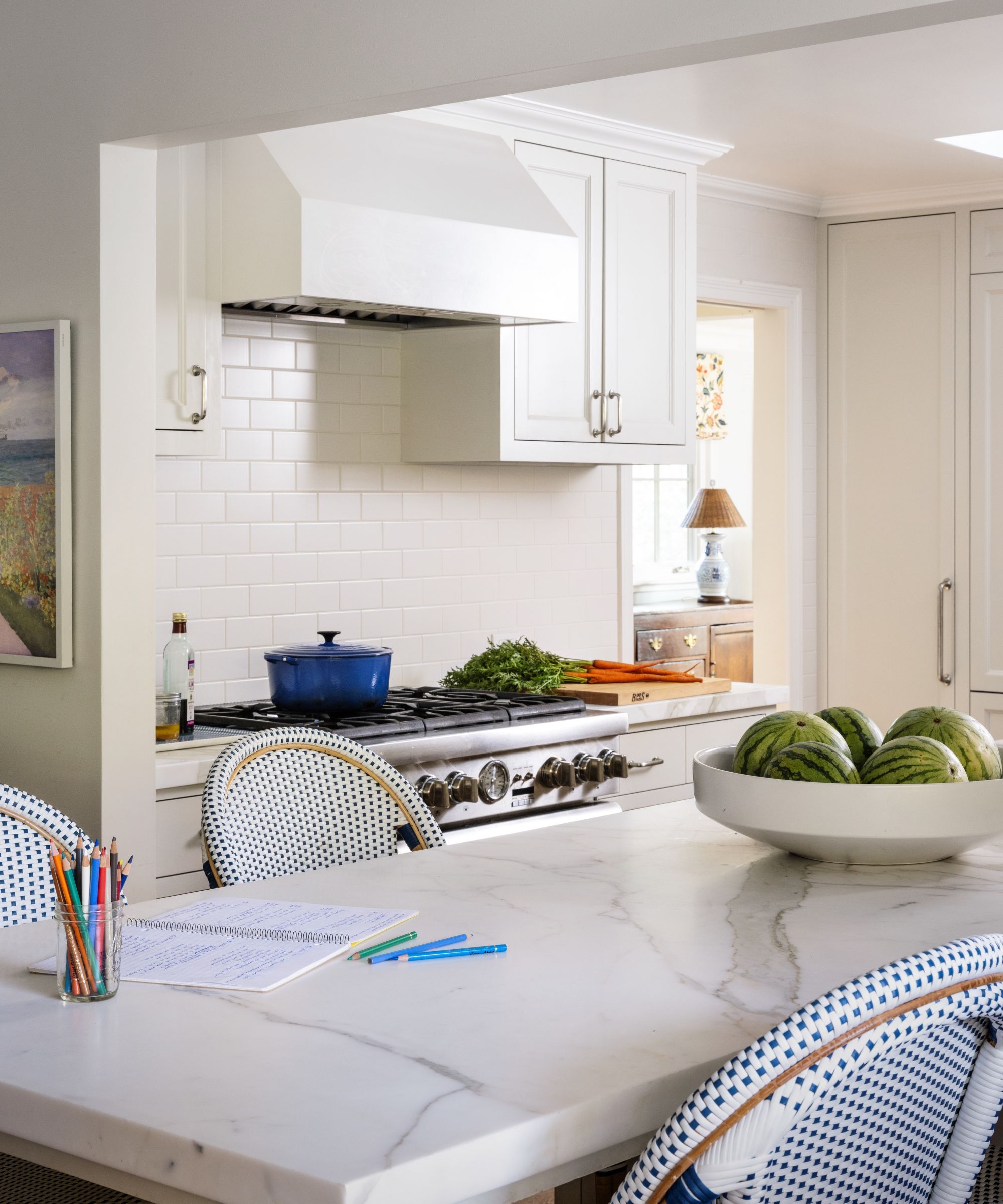
Open plan to the family living room and sharing one end of the clever library wall, the kitchen had previously been updated as part of the owner's initial renovations.
However, it still required Courtney's designer's eye and smart space-planning kitchen ideas to bring it into line. The counter stools from Serena & Lily are new additions, picking up on the blue in the new palette that weaves its way through the house.
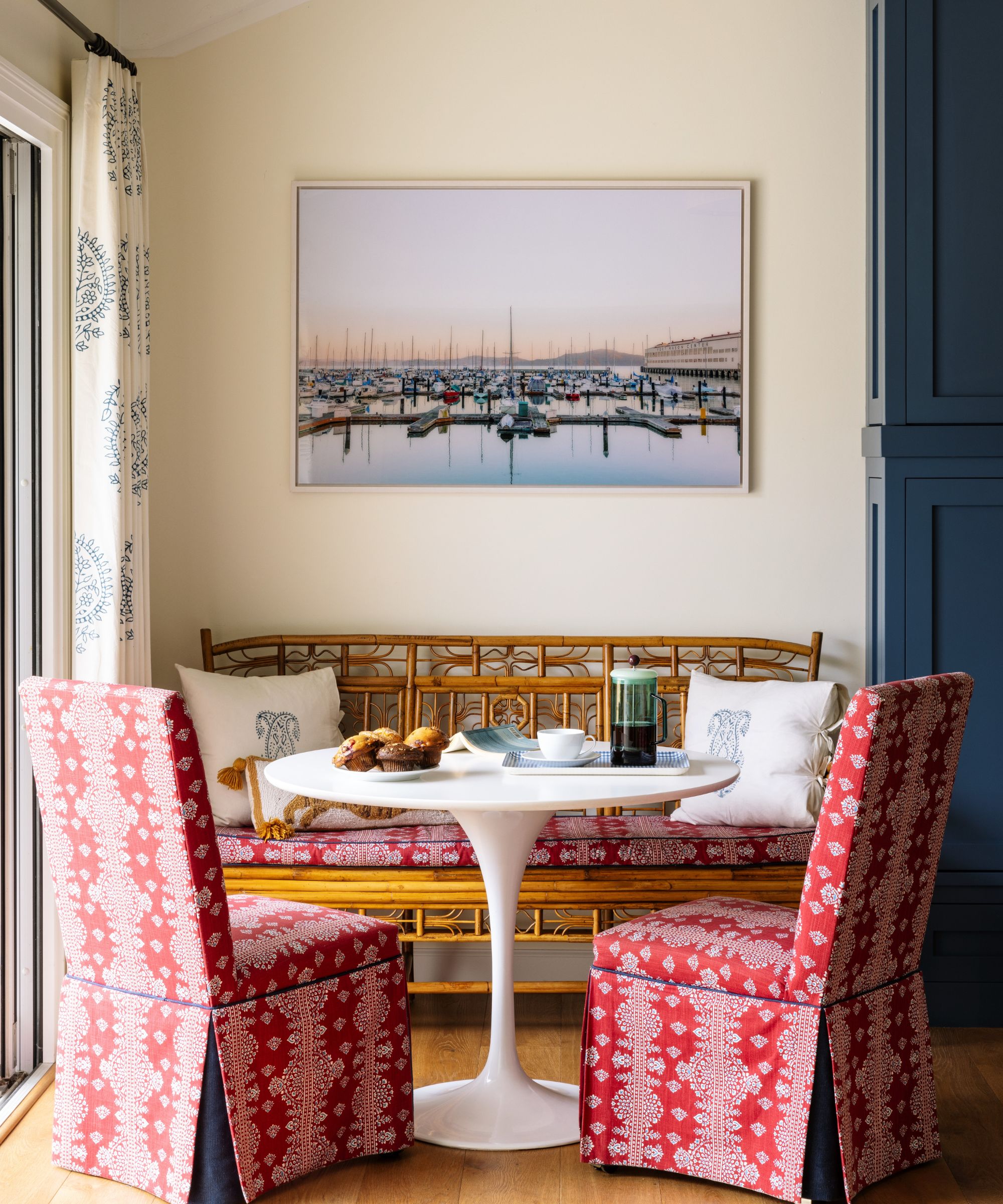
No open-plan family home worth its salt can be without a breakfast nook, and the eat-in kitchen ideas here have really nailed a relaxed boho vibe that adds layers of pattern and interest to the space. The tulip table is by Rove Concepts, the rattan bench from Red Egg, and the chairs are from Ballard Designs. The pillows are made in Les Indiennes fabric and the artwork abover the bench is by Caroline Pacula.
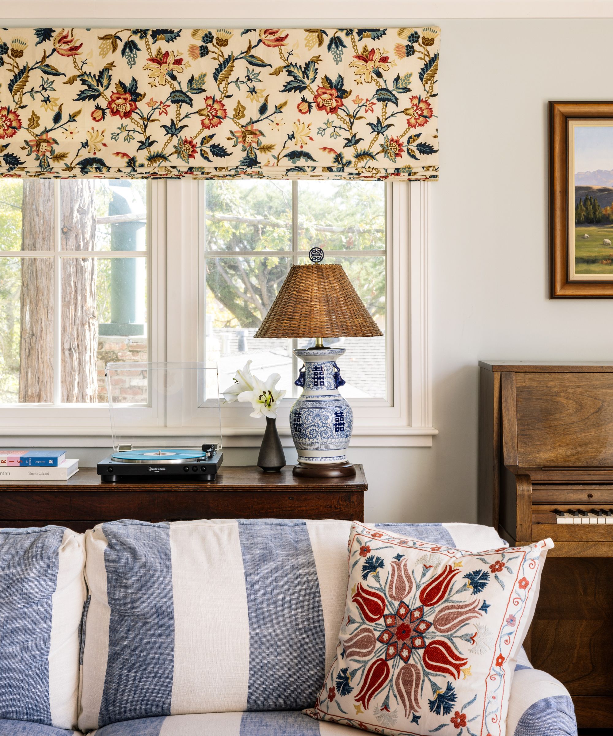
Living room ideas in this more formal space continue the color themes from the other downstairs rooms, maintaining the harmony that designer Courtney was keen to create for the home.
'Because the floor plan is a very open one, with sight lines from almost every space to the next, it was very important to consider the entire scheme together. Every room had to make sense in the context of the next,' she says. 'I love the layers of pattern and texture in here. The perfectly-scaled blue and white stripe pair of sofas, the patterned window treatments, and the statement ceiling fixture all work together to create a space that is warm, welcoming, and comfortable.'
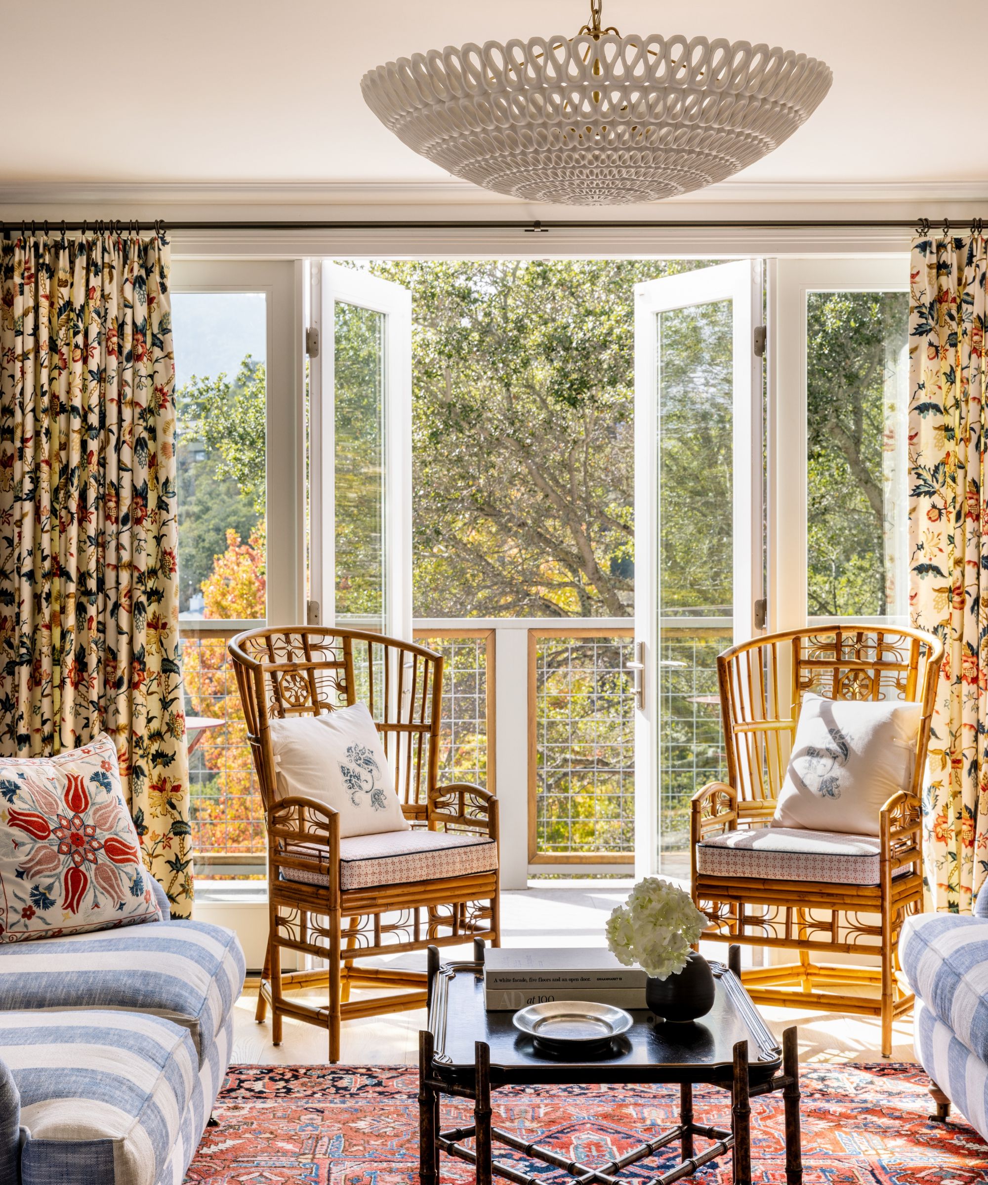
Don't underestimate the power of a good living room rug in harnessing a room scheme. 'One of the pieces we all loved from the start of this project was the family's existing living room rug. In shades of red and coral, with hits of blue, cream, gold and green, this became the foundation for our color palette, and we selected everything else to tie back to this statement,' says designer Courtney.
'This room looks out to a major view (hello Mount Tam!),' she adds, 'and is oriented for quiet visits and adult time, since the kids prefer to use the family room.'
The living room's hero pieces are: drapes in a Schumacher fabric; sofas from Robin Bruce; Suzani accent pillows, Etsy; vintage black chinoiserie coffee table,1st Dibs; ceiling lamp, Oly Studios; vintage blue and white lamp, Chairish; cane highback chairs, Red Egg, with custom cushions.
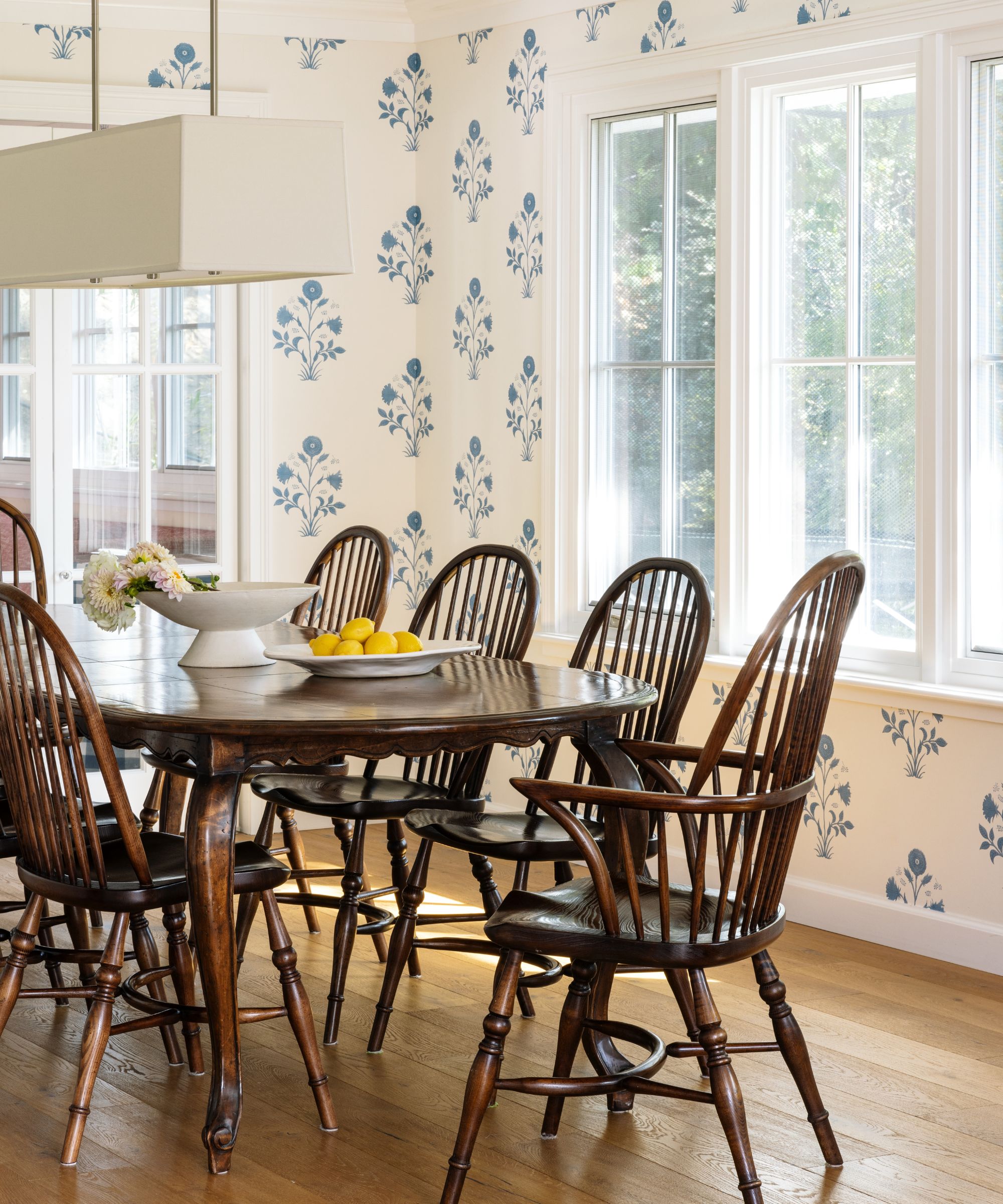
'The dining room is a room between rooms,' says Courtney. 'It’s a bridge between the living room and great room, and relates to both without overpowering either.' For exactly that reason, the designer's dining room ideas had to integrate well with all of the other downstairs spaces, and this quiet, curated and softly vintage look excels. 'I love the Les Indiennes wallcovering here – referencing the botanicals we’re all obsessed with in northern California, without screaming girly,' adds the designer.
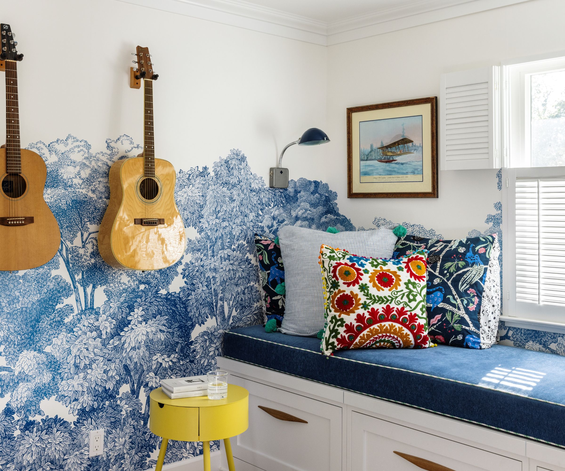
This striking and unusual space is the kids' play room. 'This room is small but mighty and we went for it in here!' says designer Courtney. 'Those forest walls are happy, and the cacophony of pillows on our custom daybed are pure fun.'
Topping the list of all playroom ideas of course, is storage for toys and games, with huge drawers incorporated wall-to-wall beneath a custom-built wide daybed/window seat. In doing this, the designer overcame the home's second biggest design challenge (after the great room), namely, finding space to accommodate overnight guests. The 11ft-long bench was cleverly designed to double as a spare bed for visitors and sleepovers.
Key pieces in the play room include wallcovering by Rebel Walls; pillows on daybed, Anthropologie; side table, West Elm; reading lamps, Schoolhouse Electric.
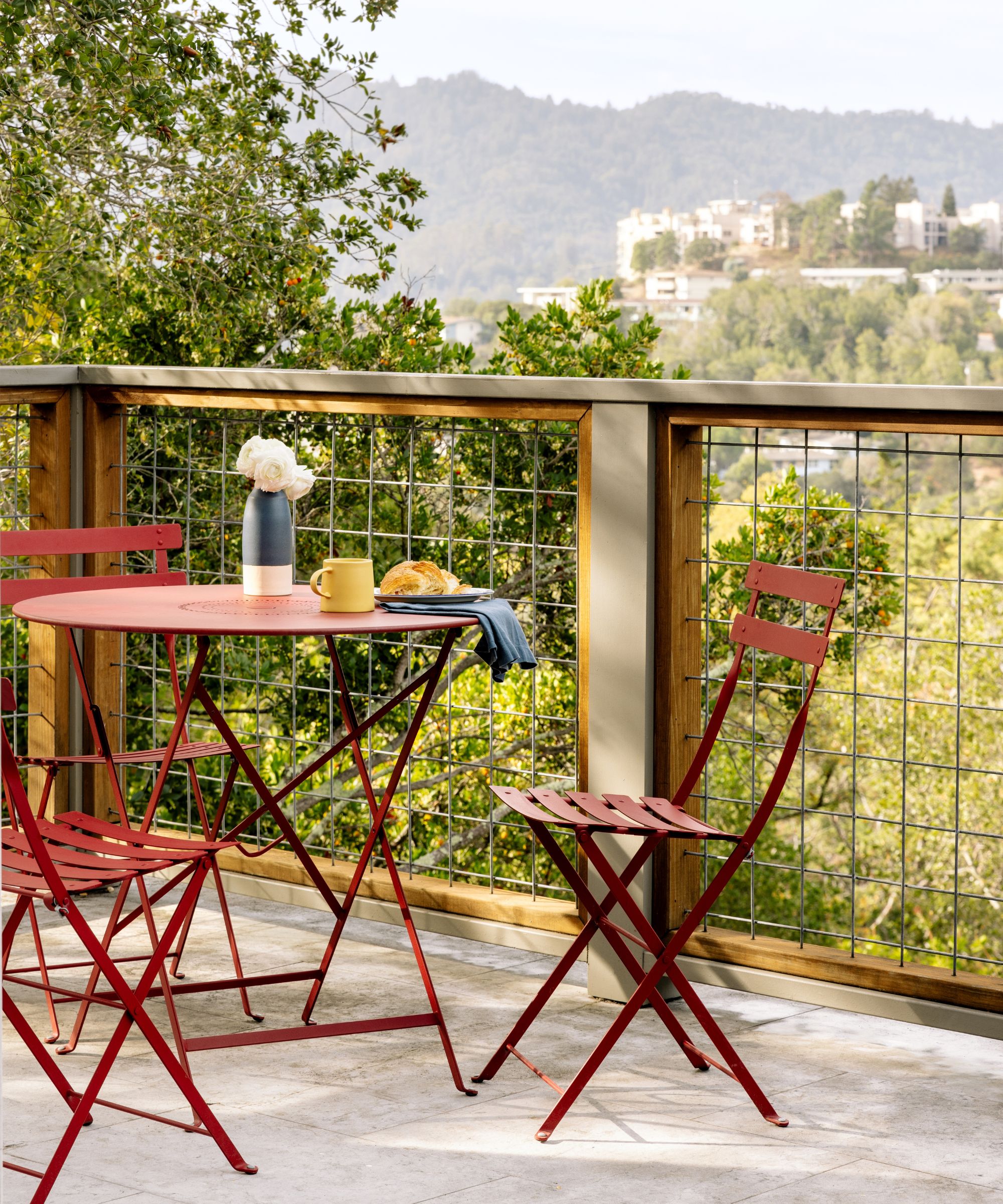
'Like many California homes, this one opens to decks and gardens which offer an immediate outdoor connection,' says designer Courtney. 'We were inspired by views of nature in every direction as we made design decisions.' The red bistro set is by Fermob. The backyard landscaping (below) was completed as part of the owners' first round of renovations.
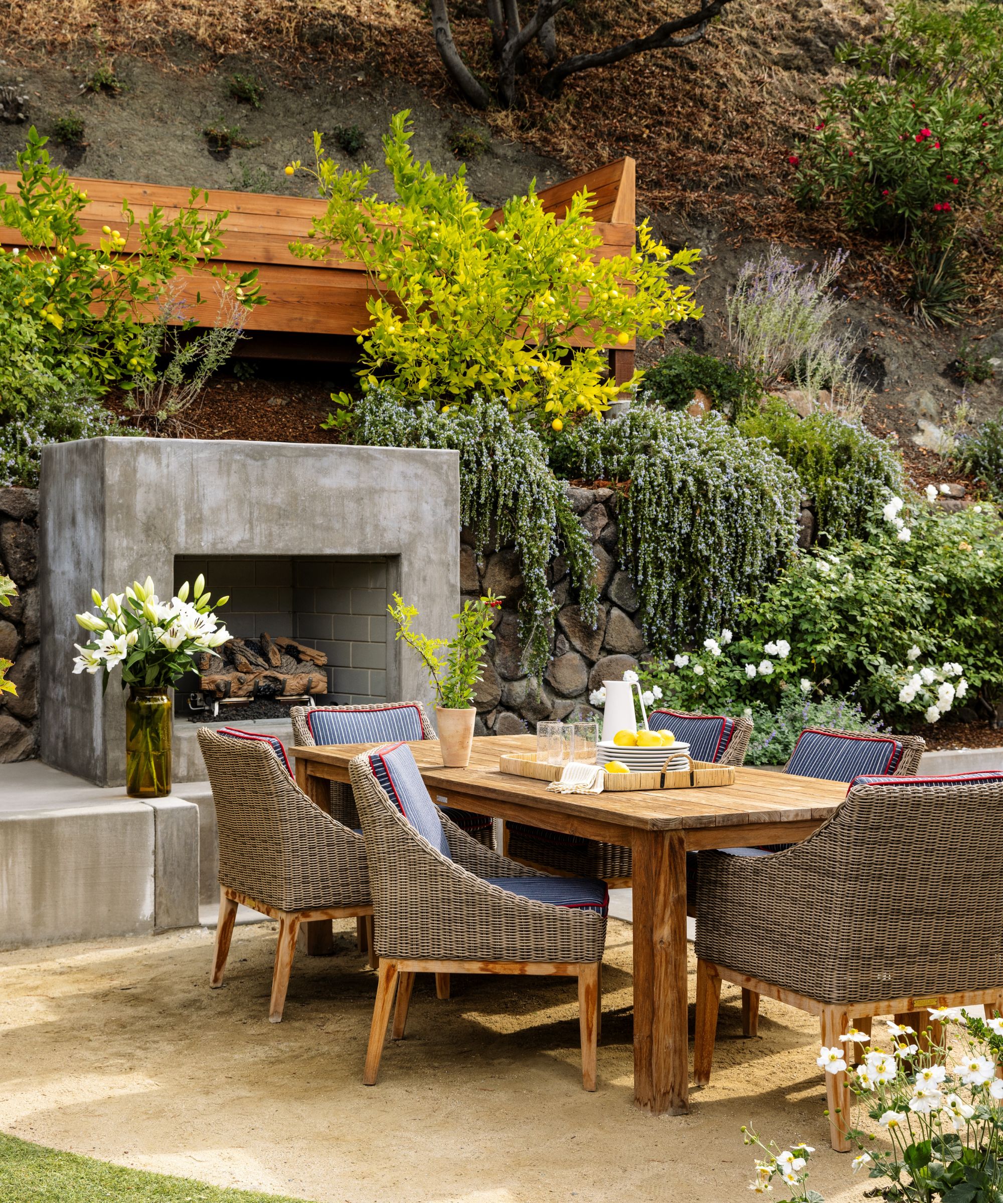
'I always start in the same place for inspiration: the home itself, and the people who live there,' says designer Courtney Smith. 'This home is a great bungalow perched in the hills of Marin County, with incredible views for miles. This is northern California: what you see out their windows is blue sky, green hills, and the twinkle of ambient light. We wanted to reflect that feeling inside, but in a fun and unexpected way.'
The result, as we've seen, is a truly harmonious home, at one with the landscape and with a strong design thread running through it. Practical and space-saving solutions have transformed family life in the home, and its aesthetic, allowing the owners to make the most of every room, and indeed every foot of available space.
Interior Design: Courtney B Smith
Photography: Alanna Hale
Styling: Mikhael Romain
Karen sources beautiful homes to feature on the Homes & Gardens website. She loves visiting historic houses in particular and working with photographers to capture all shapes and sizes of properties. Karen began her career as a sub-editor at Hi-Fi News and Record Review magazine. Her move to women’s magazines came soon after, in the shape of Living magazine, which covered cookery, fashion, beauty, homes and gardening. From Living Karen moved to Ideal Home magazine, where as deputy chief sub, then chief sub, she started to really take an interest in properties, architecture, interior design and gardening.
