This redesigned 1950s home is a lesson in how to tile in style – Scandi-style
Lee Thornley of Bert & May tiles shows us round his Scandi-style home, and has some sound advice for fellow renovators
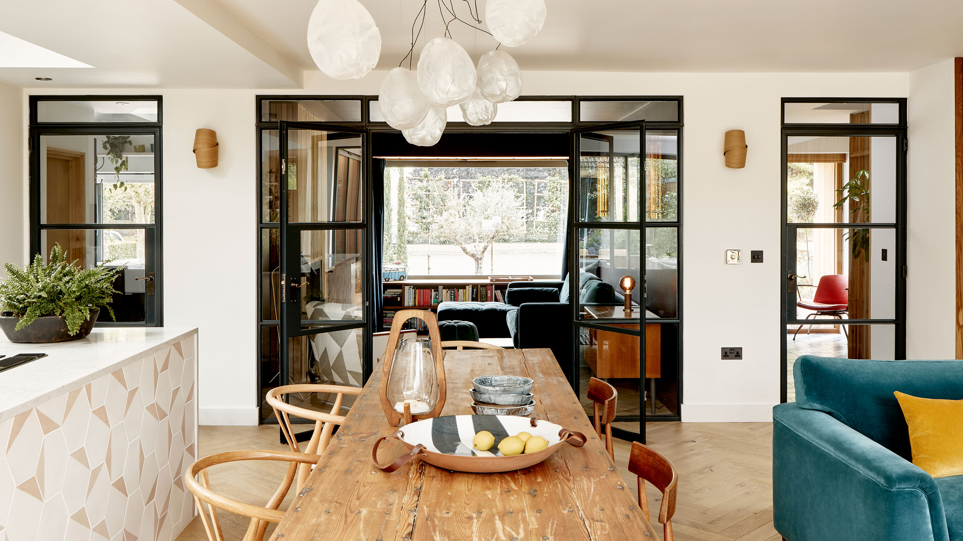
Smooth wood finishes, graphic tiles, highlights of deep, bold colors, spa bathrooms, and Crittal-style doors – it reads like the dream shopping list for a perfectly stylish home. And that's exactly what it is. Although this perfectly stylish home was anything but stylish before its current owners took it in hand.
The unassuming 1950s family home had little to recommend it, other than the fact that it was an almost blank canvas. Apply a little creative vision, add in that shopping list of improvements, and it has reinvented itself into a wholesome Scandi-style haven of comfort and good taste. It now truly is one of the world's best homes.
Oh, and in case you're wondering, the creative visionary behind its transformation is Lee Thornley, founder of Bert & May, supplier of handmade artisan tiles. Lee agreed to show us round his new-look home – and shared a few style secrets along the way.
Kitchen
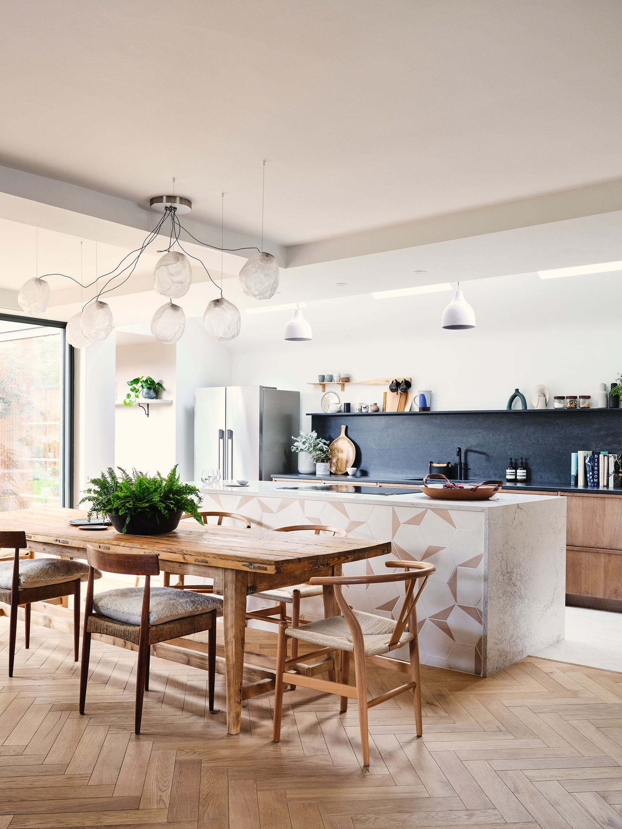
Lee's kitchen ideas started with a series of mood boards around the look he wanted to create. He and partner Phil were clear from the outset that they wanted a 'Scandi simple vibe' he explains. 'We then begun to create the palette of materials. As the Caesarstone backsplash was a bold part of the design, this was selected first, followed by the tiles to complement (not match), and then the timber.'
The tiles on the island are Bert & May’s Hexagonal Split tiles in Pearl and Brighton stone.
Family living space
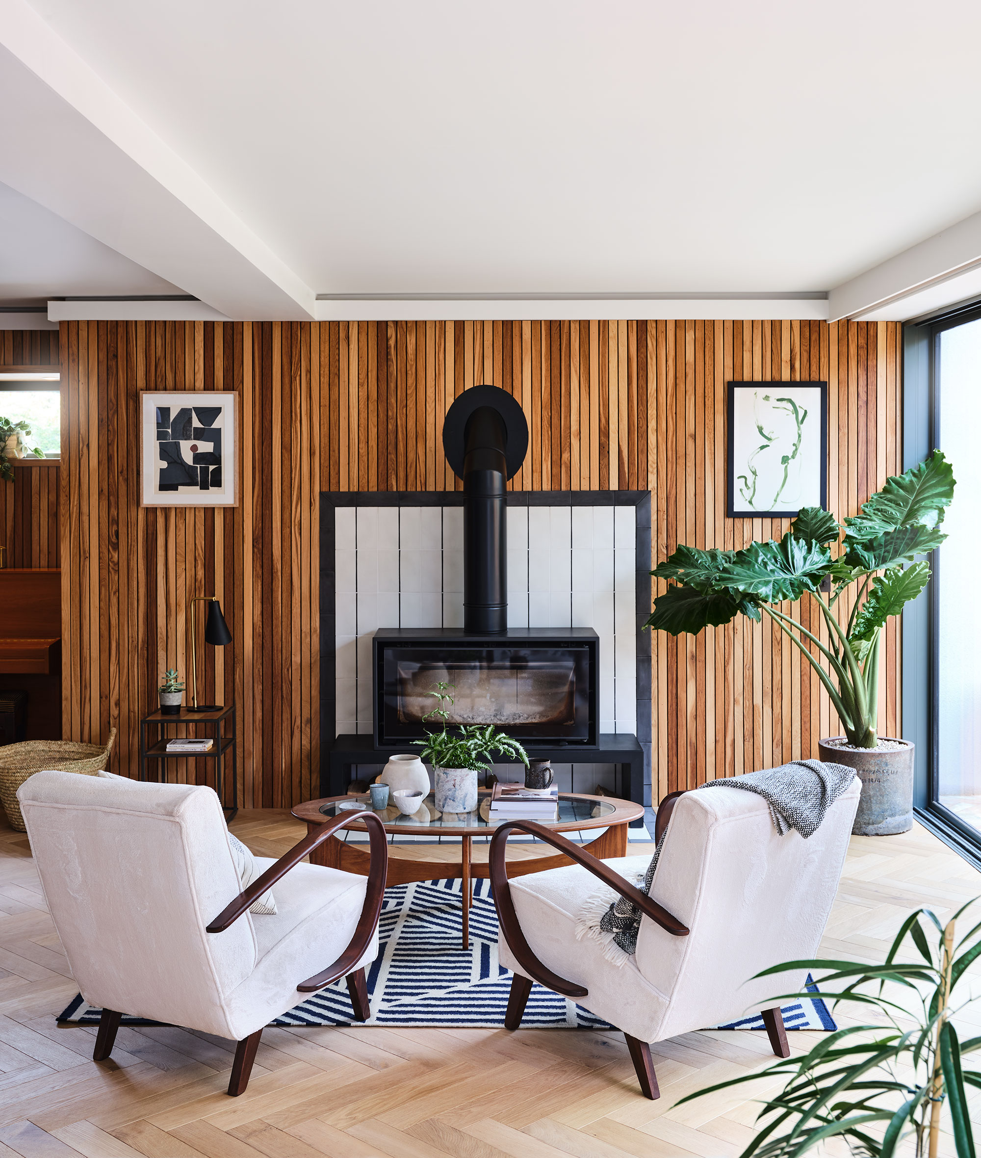
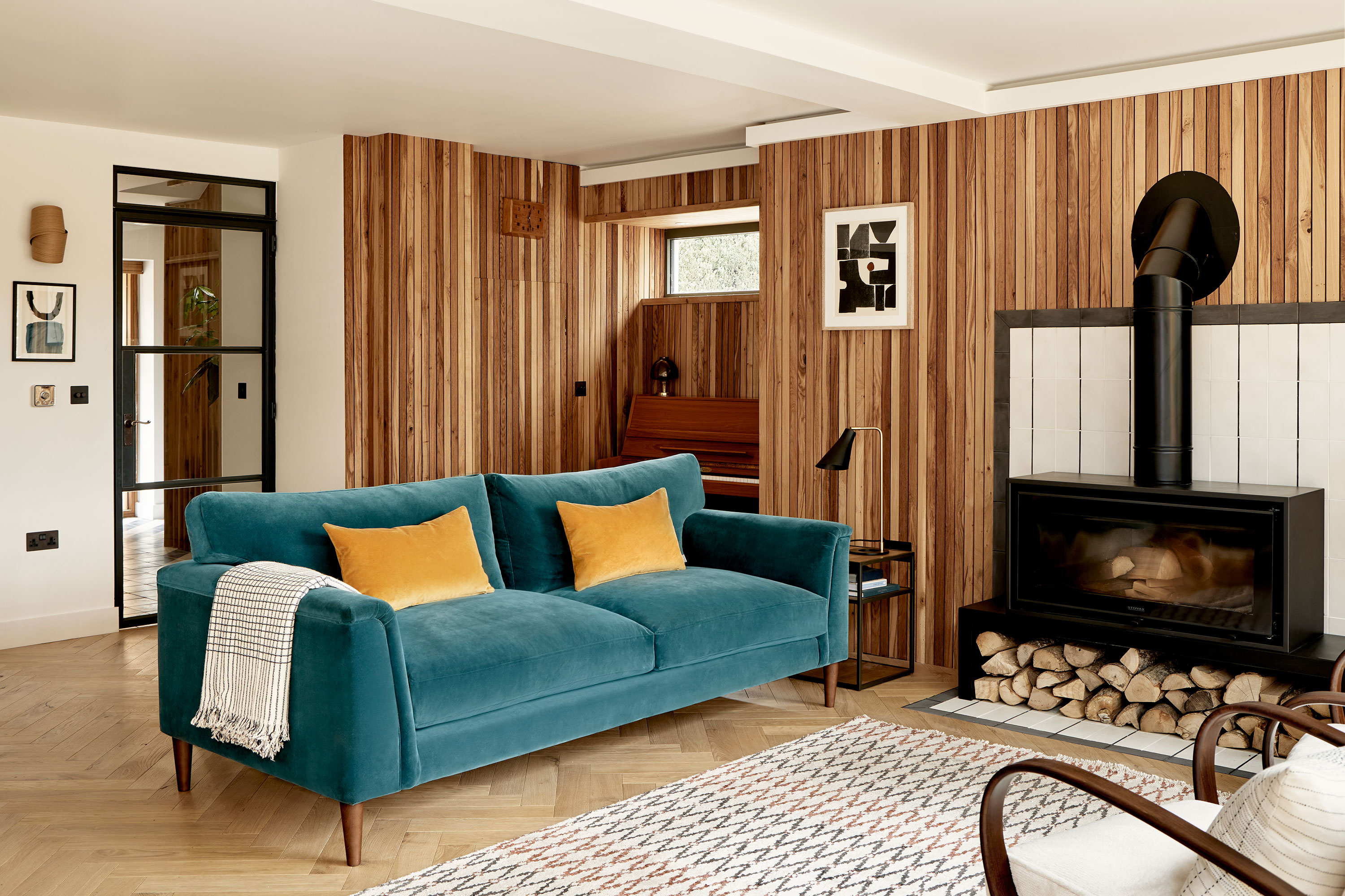
At one end of the kitchen is a comfortable family living room, with a sofa and chairs grouped round a woodburning stove. Great family room ideas here, include the Scandi-style wood cladding across the whole of the back wall, the piano tucked into an alcove ready for impromptu musical evenings, and the raised woodburner with log storage beneath it.
'The kitchen is the heart of the home and we spend almost all of our time in this space,' says Lee. 'The huge log burner makes it as appealing in the winter as the summer. When we are blessed with Yorkshire sun, folding back the large doors really does bring the garden into the home.'
Snug – a cozy living room for evenings
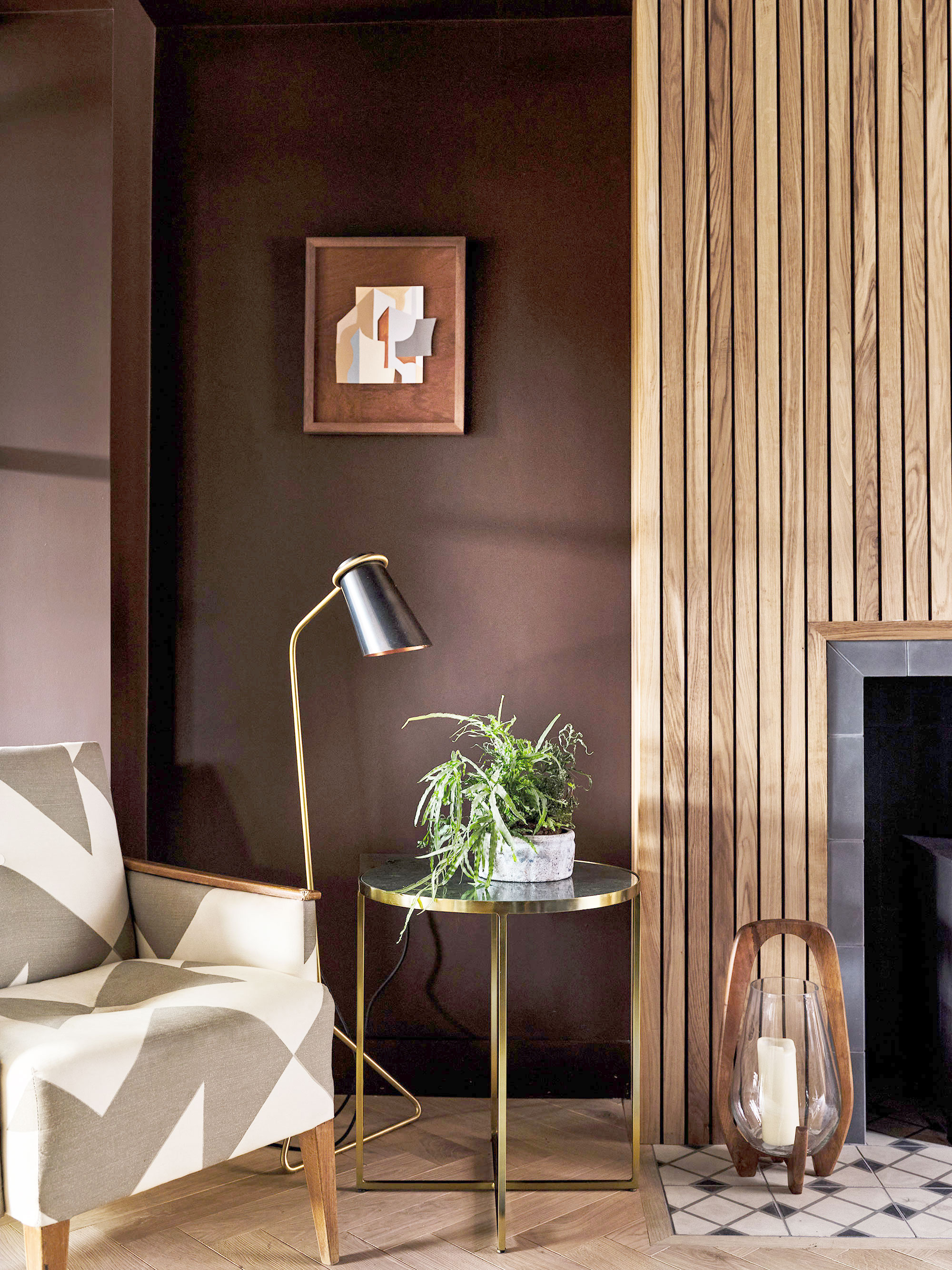
The dark walls of the snug create a cocooning space that's perfect for cozy family evenings. The walls are painted in Little Greene’s ‘Purple Brown’. The deep shade is complemented by a dark textured rug, and reclaimed wood flooring and timber cladding around the wood-burning stove. The different tones and textures create a sophisticated and sensual atmosphere, an ideal space for retreating to. Living room ideas well worth stealing from this space are those moody walls, and of course the rich wood cladding around the fireplace and chimney breast.
What advice can Lee offer to anyone trying to update and inject personality into a similar blank canvas of a house?
'In order to create a space that really feels like your own, don’t be afraid to be bold,' advises Lee. 'While neutral spaces are safe and calming, it is the more daring designs that bring spaces to life. For this renovation, it is the combination of smooth wood, graphic shapes and bold paint colours that really make each room distinctive and exciting. Experiment with textures and colours to give your home depth and create intrigue.'
Depth and intrigue? We're up for that.
Hallway and stairs
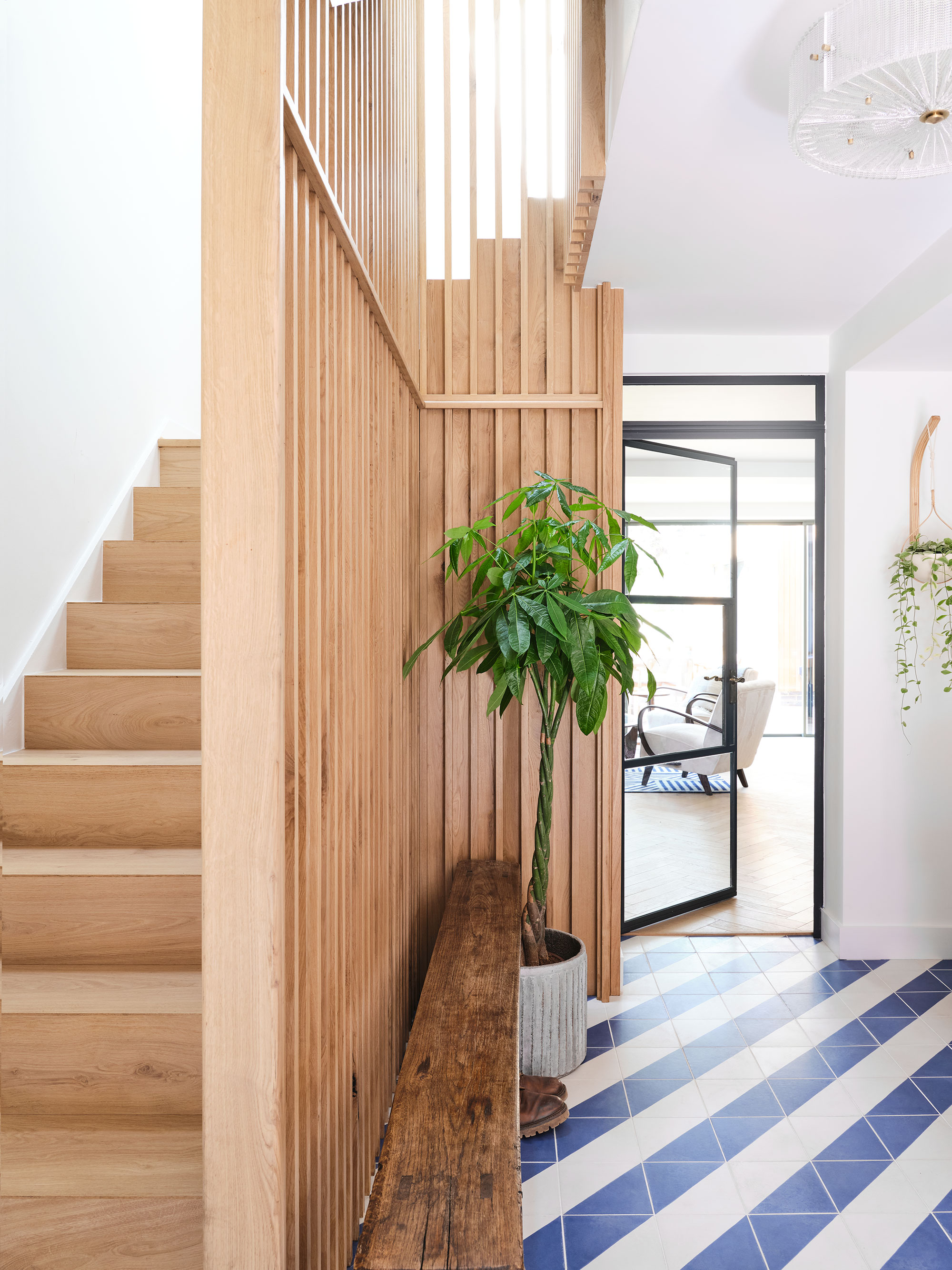
First impressions are lasting impressions in this hallway with Bert & May's Blue Alpardo tiles on the floor and a new light pine staircase to further brighten the look. Anyone looking for hallway ideas can take style inspiration from the fresh blue and white diagonal striped effect, which sets the tone for the renovated home's brighter, lighter interiors. Crittal-style doors and panels create a harmonious flow between all the downstairs spaces. Lee explains the thinking behind this particular design option. 'The aim when designing this home was to create a space that felt open and airy, which make Crittal-style doors the perfect choice. They allow us to separate different areas of the house, to enable a feeling of privacy and separation, while still maintaining the feel of a more open-plan space.'
Bedrooms
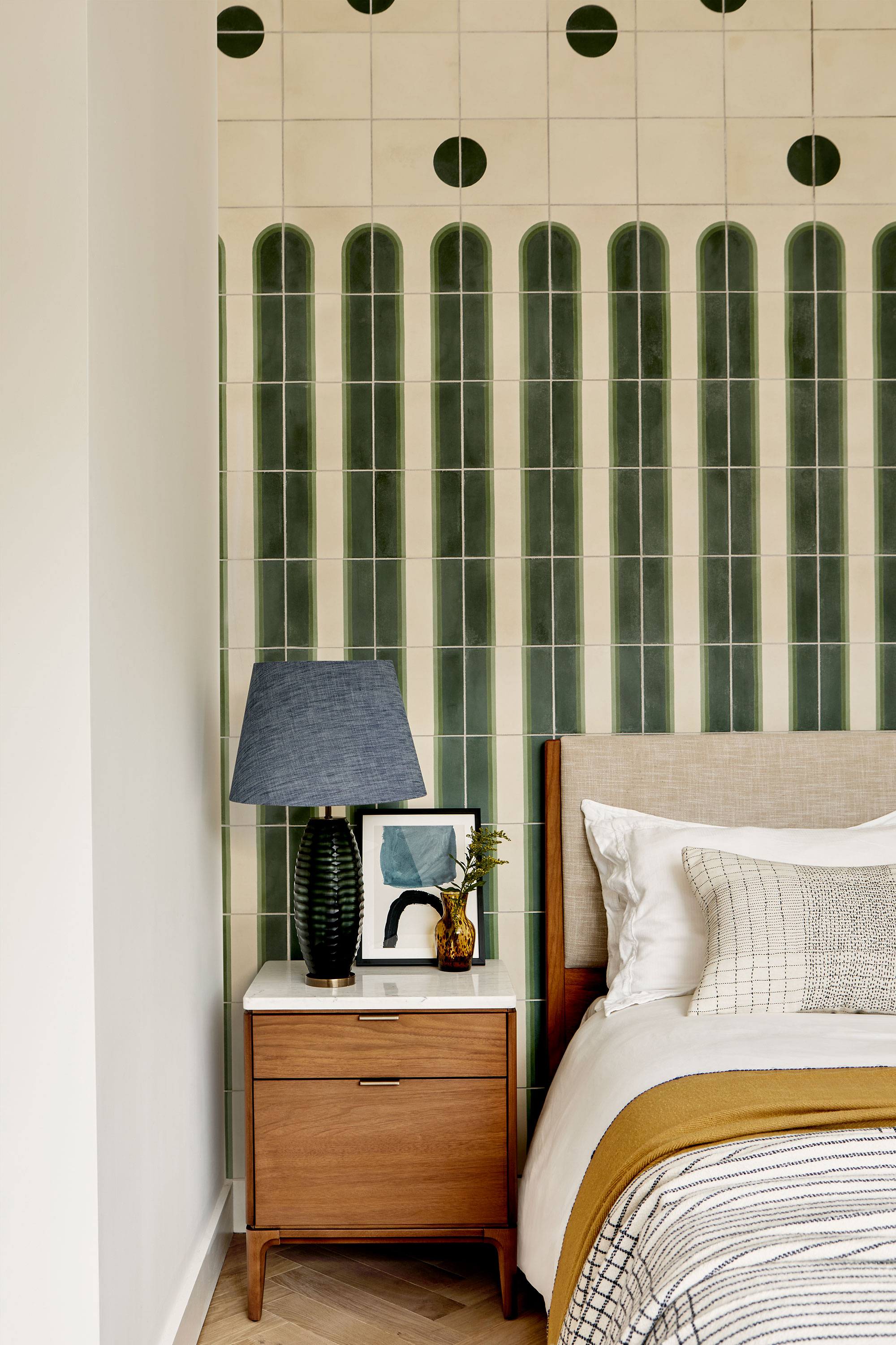
There's a distinctly Mediterranean vibe in this bedroom, with its cool and quirky bedhead wall of forest-green tiles and midcentury style furnishings. If you're looking for bedroom ideas that set you apart from the crowd, this stylish set-up could be the one could be for you.
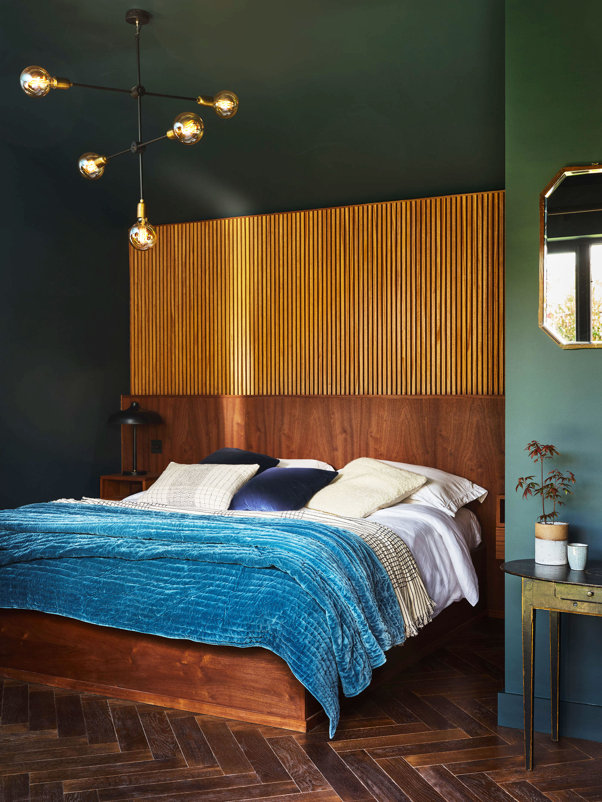
The main bedroom continues the nature-inspired forest green and warm wood palette, this time with bedhead in rustic slatted wood. Paired with the reclaimed dark wood flooring, and pine green walls, the Scandi vibes are so strong here, you could almost be in the Tiveden National Park.
Bathrooms – tiled to perfection
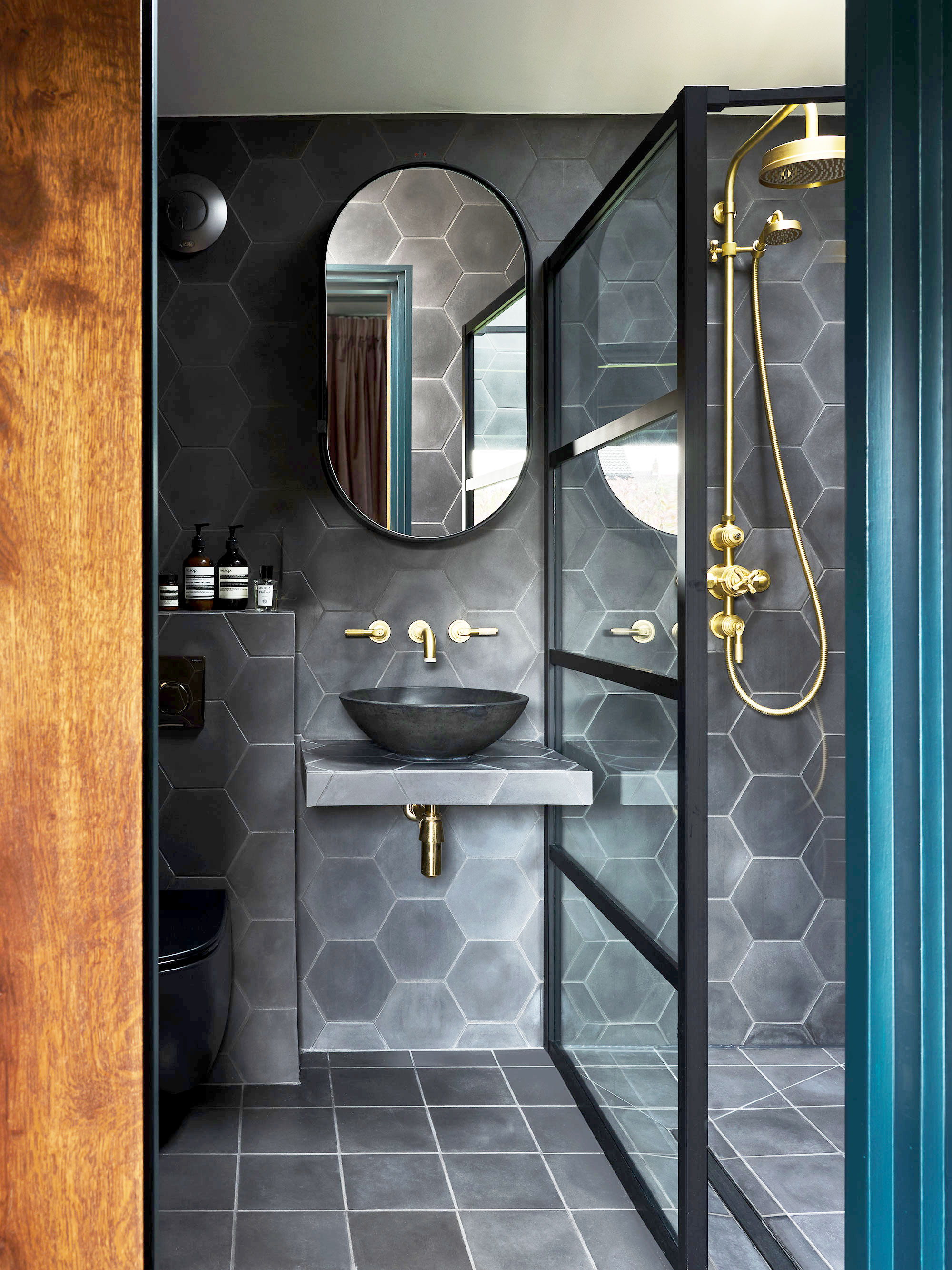
Anyone in search of bathroom ideas will be spoilt for choice with these three stylish spa-like bathrooms. The original home layout had just one bathroom, so Lee wanted to make the new rooms feel extra luxurious.
'While I am so happy with how the whole renovation turned out, the boldness and distinct personality of each bathroom makes them my favourite rooms in the house,' says Lee. 'For moody drama, my own bathroom is painted in Mylands’ deep Market Green™ No.38 to complement the deep black Bert & May Old Iron Hexagon tiles.'
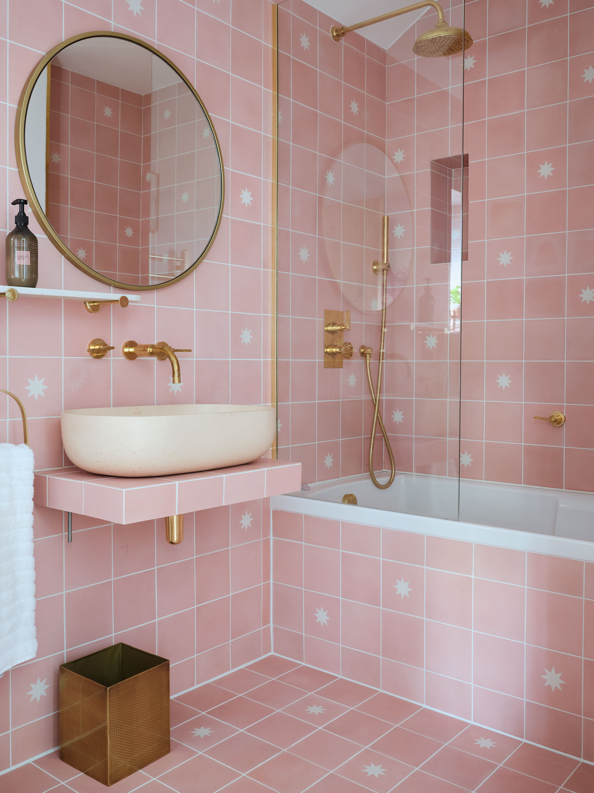
'For my daughter Iris, 8, we wanted something feminine and age appropriate, but also not a space she would tire of with age. The glamorous pink Luna Rose tiles that cover every surface were the perfect choice,' says Lee.
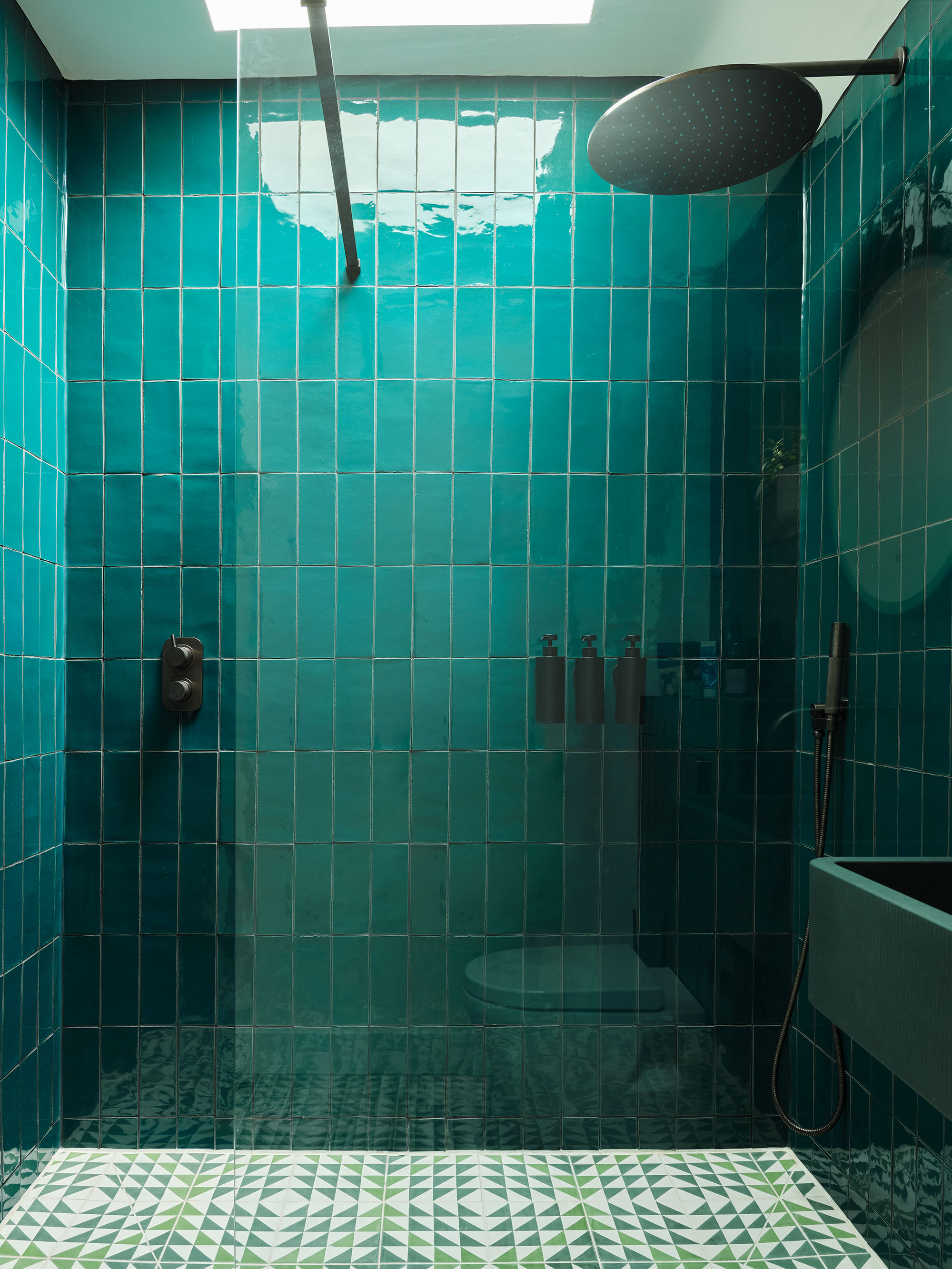
'In contrast, Layla, 11, needed a bathroom that was cooler and more adult as she approaches her teenage years,' explains Lee. 'Glossy jewel-toned green tiles from Fired Earth paired with sleek black fittings from The Watermark Collection create a bathroom that feels slick and grown up.'
Garden studio
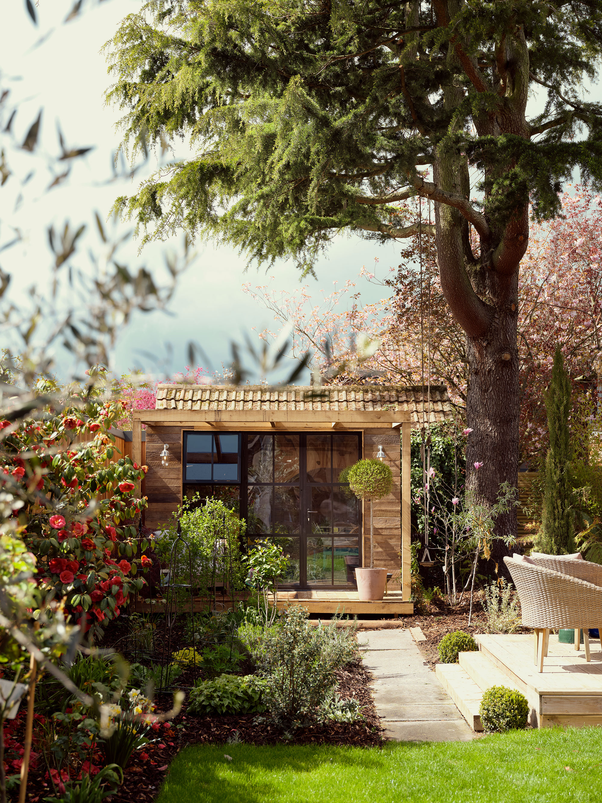
If you're looking for home office ideas, prepare to get workspace envy. This pretty garden cabin, with a view of trees in blossom and a lush green lawn, is the perfect space for working from home. It's a Study Box from the Bert's Box collection, a collaboration between architects Box 9 Design and Lee's company.
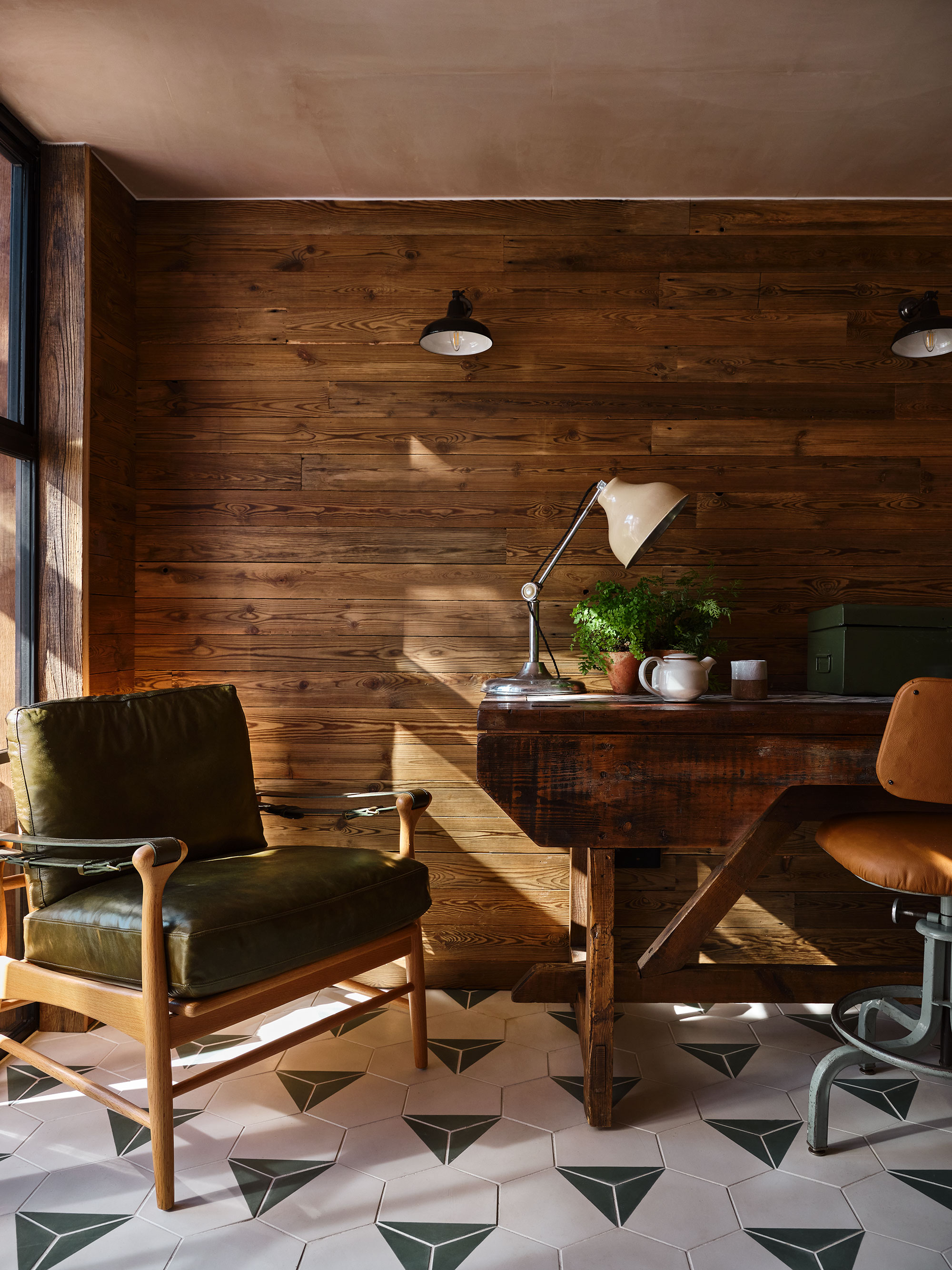
Lee's partner Phil, a potter, uses the garden Study Box as his studio. 'It's a very different space to the house. It is finished in Bert & May materials and so it has the same design language, but it is the perfect garden studio for Phil to retreat to,' says Lee.
Wood-clad exteriors
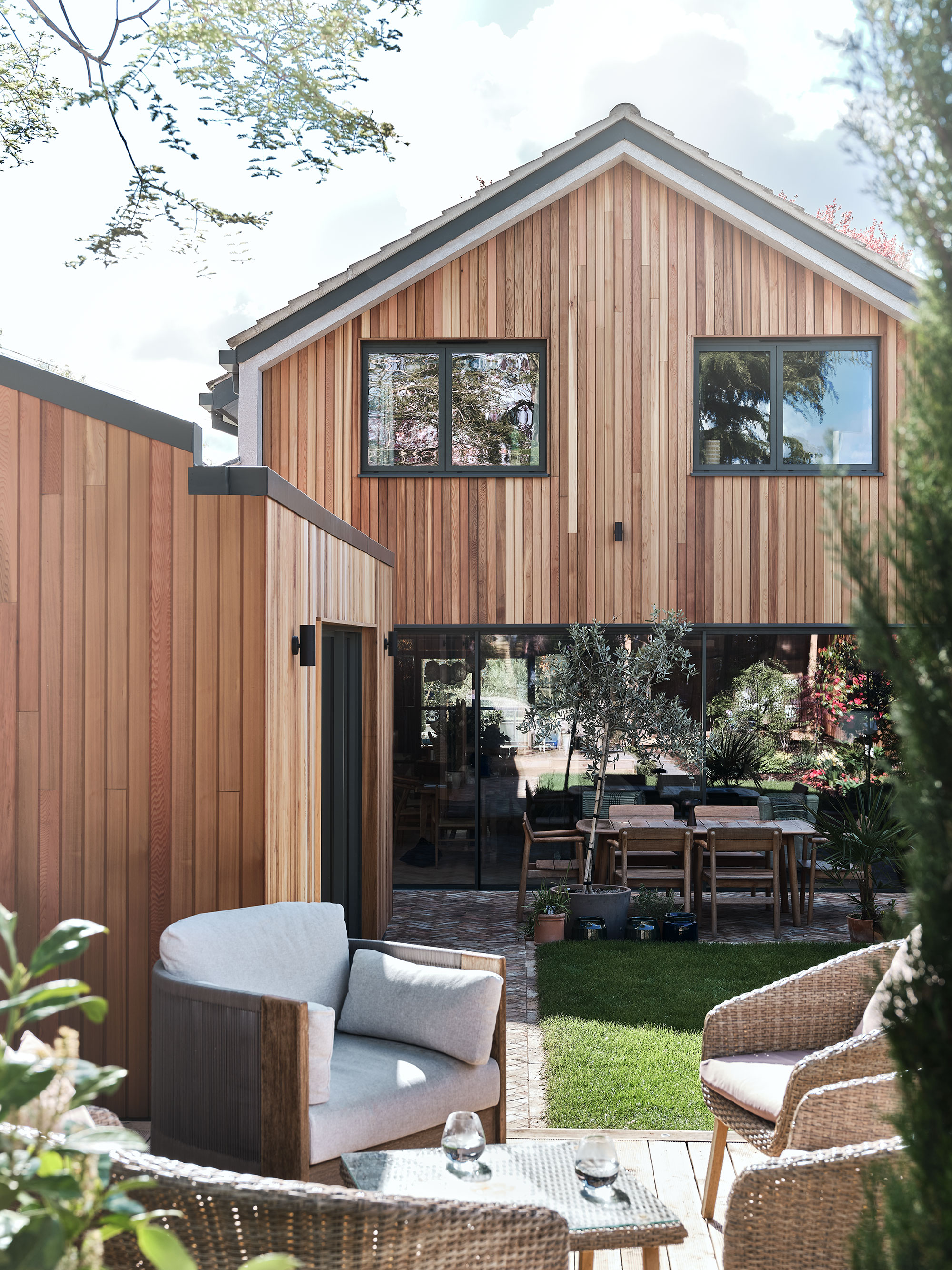
The final piece in the puzzle: the exteriors of this previously unremarkable home were timber clad to fit the Scandi design ethos Lee and partner Phil had in mind. The ultimate facelift, the home's new façade sets the tone for the relaxed family living space inside, and hints at the natural furnishings, neutral palette and bold injections of style to come.
Sign up to the Homes & Gardens newsletter
Design expertise in your inbox – from inspiring decorating ideas and beautiful celebrity homes to practical gardening advice and shopping round-ups.
Karen sources beautiful homes to feature on the Homes & Gardens website. She loves visiting historic houses in particular and working with photographers to capture all shapes and sizes of properties. Karen began her career as a sub-editor at Hi-Fi News and Record Review magazine. Her move to women’s magazines came soon after, in the shape of Living magazine, which covered cookery, fashion, beauty, homes and gardening. From Living Karen moved to Ideal Home magazine, where as deputy chief sub, then chief sub, she started to really take an interest in properties, architecture, interior design and gardening.
-
 Are you making the most out of the estate sales in your area? These are the 5 most valuable items you should be shopping for
Vintage lovers and antique experts share the objects you should always look out for when you're exploring an estate sale
By Eleanor Richardson
-
 How to grow sassafras – for a low-maintenance native tree that can even be planted in shady yards
For an easy-to-grow North American tree, you will not find much better than sassafras
By Thomas Rutter