This period NY townhouse combines traditional flair and modern glamor
A 19th-century Manhattan townhouse has been given a sophisticated new identity with fine architectural detailing and bursts of color

For any interior designer, working with repeat clients is a boon but when they assemble the same crack team of architect and builder it becomes even more of a blessing.
Such was the situation that New York-based Brad Ford found himself in when he was asked to create a Manhattan home, for a young couple and their four children, collaborating alongside architects Ike Kligerman Barkley on a 19th-century red brick townhouse on the edge of the West Village, location of many of the world's best homes.
‘They’ve been clients of mine for years and I’ve worked on a number of projects for them. It’s been interesting to watch their taste evolve,’ Brad explains. ‘Now they’ve become more engaged with design I’ve actually found myself having to go out of my comfort zone.’
While the house had benefited from a previous renovation making good its foundations and structure, both Brad and Joel Barkley, the architect, and his assistant on the project Douglas Crisp, believed a full gut renovation was unavoidable.
‘Inside was very plain but without character or integrity so the directive was to create something much more special and becoming of a townhouse,’ Thomas A. Kligerman (Tom), of Ike Kligerman Barkley explains. ‘Spaces were not well defined and rooms flowed into the next haphazardly,’ he adds.
With the house woefully lacking in its original character, Joel and Douglas created a whole scheme of internal detailing to revive its original 19th-century identity. ‘They looked at what’s great about city townhouses and gave these details a unique twist,’ Tom says.
Living room
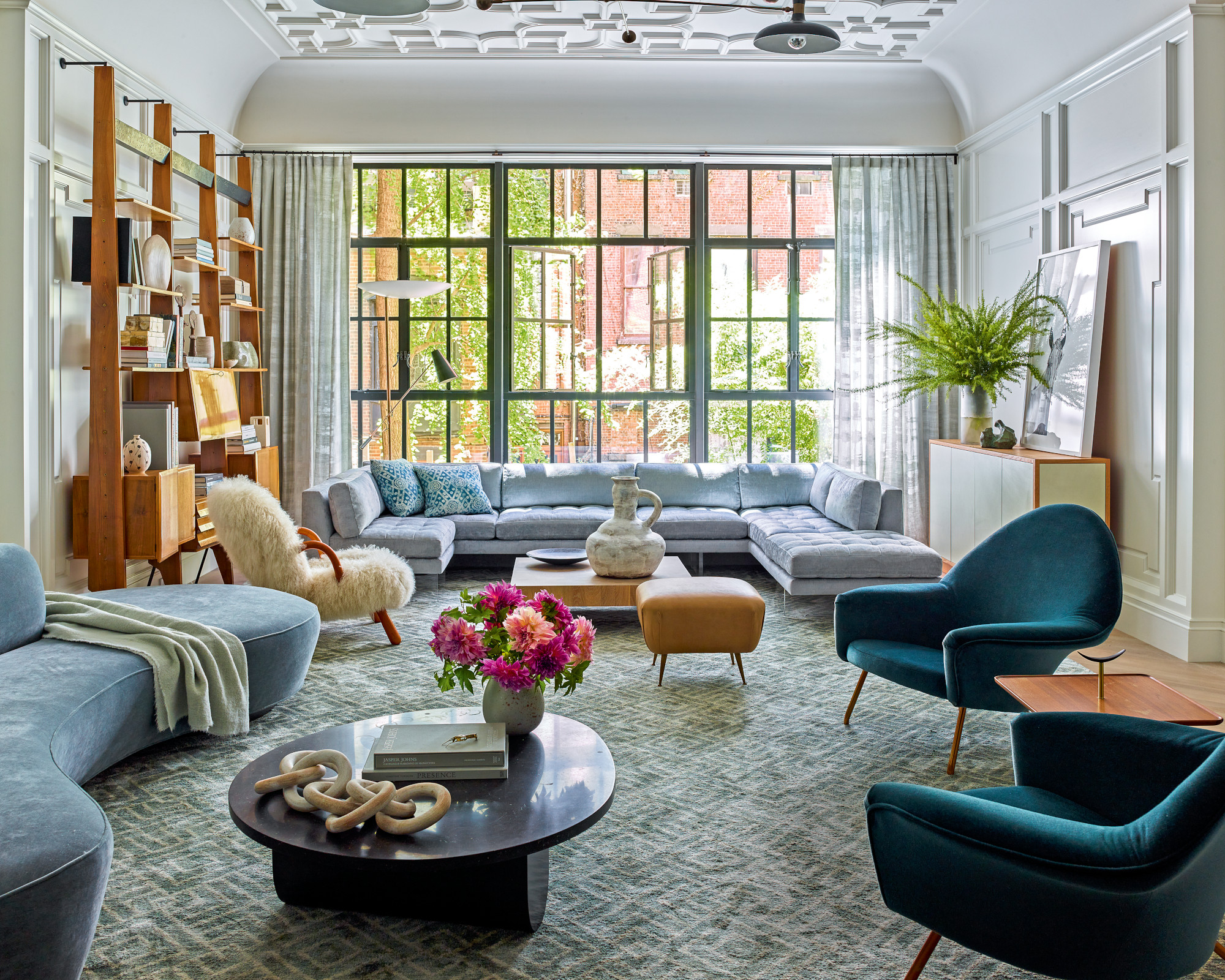
The living room has a tracery plaster ceiling 'that might have been more dainty in the past,' says Tom. 'We blew it up and modernised it. It has a quatrefoil pattern but it’s a little exaggerated and deeper than usual.'
Living room ideas include connecting the two seating groups through a play of curves and straight lines.
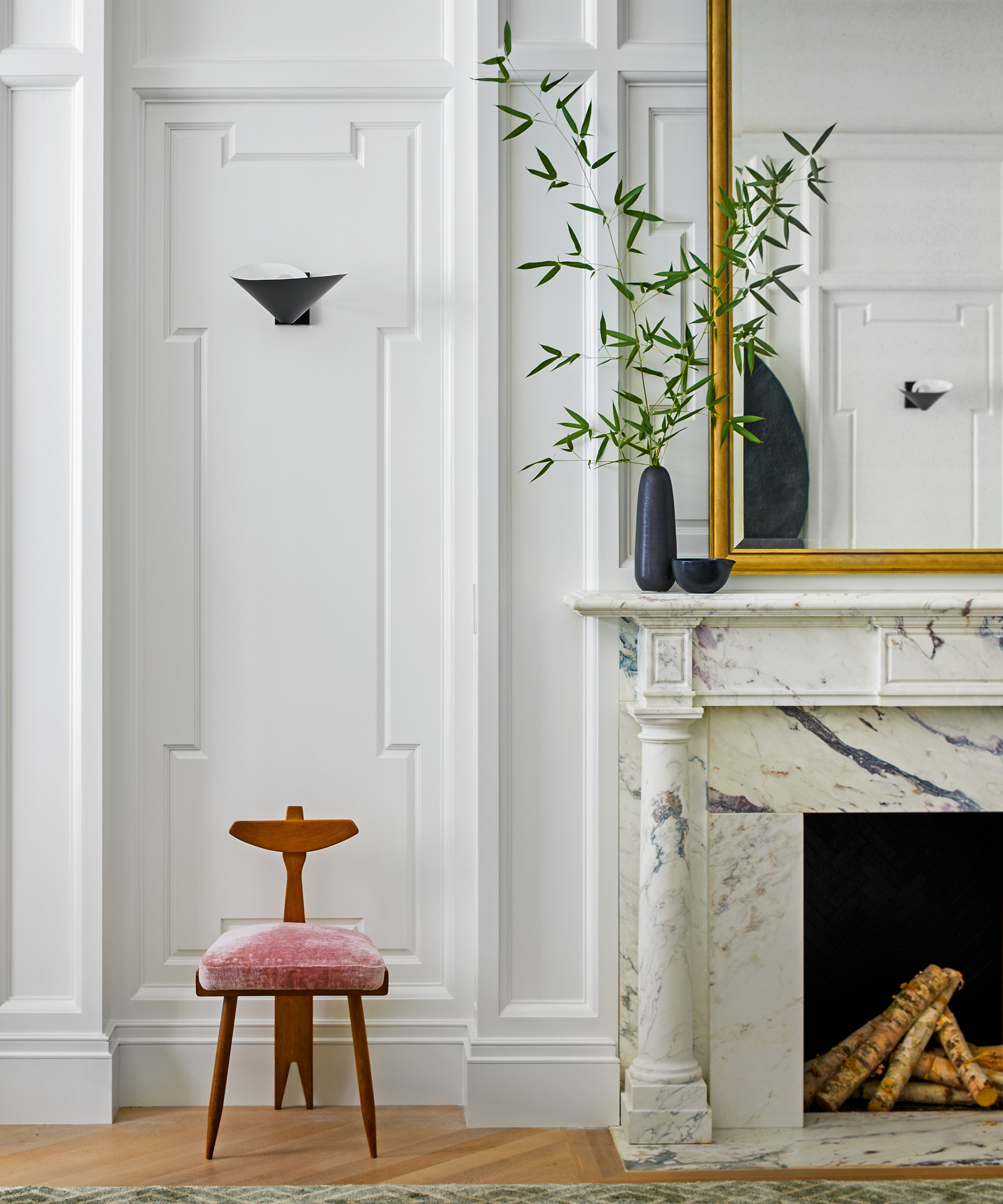
The high relief panelling in the living room is a modern interpretation of original 19th-century interior detailing.
Kitchen
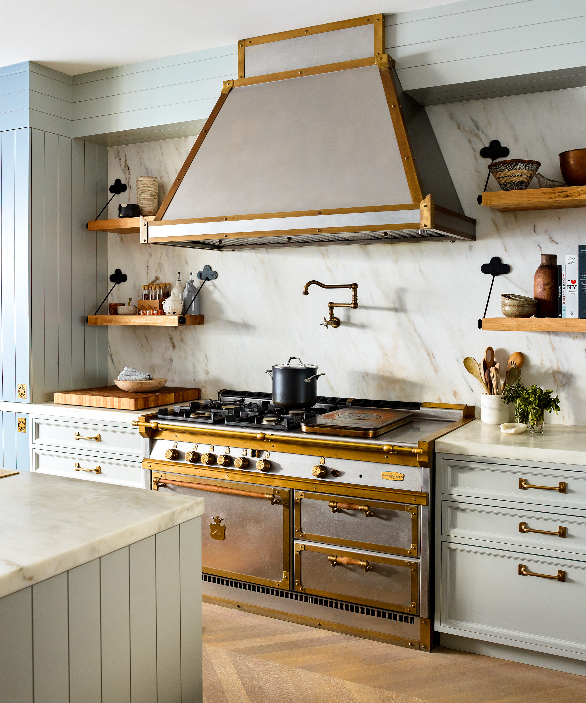
Kitchen ideas include introducing a cook space that has a touch of old-world elegance with lacquered brass hardware and an ornate range and hood.
Kitchen diner
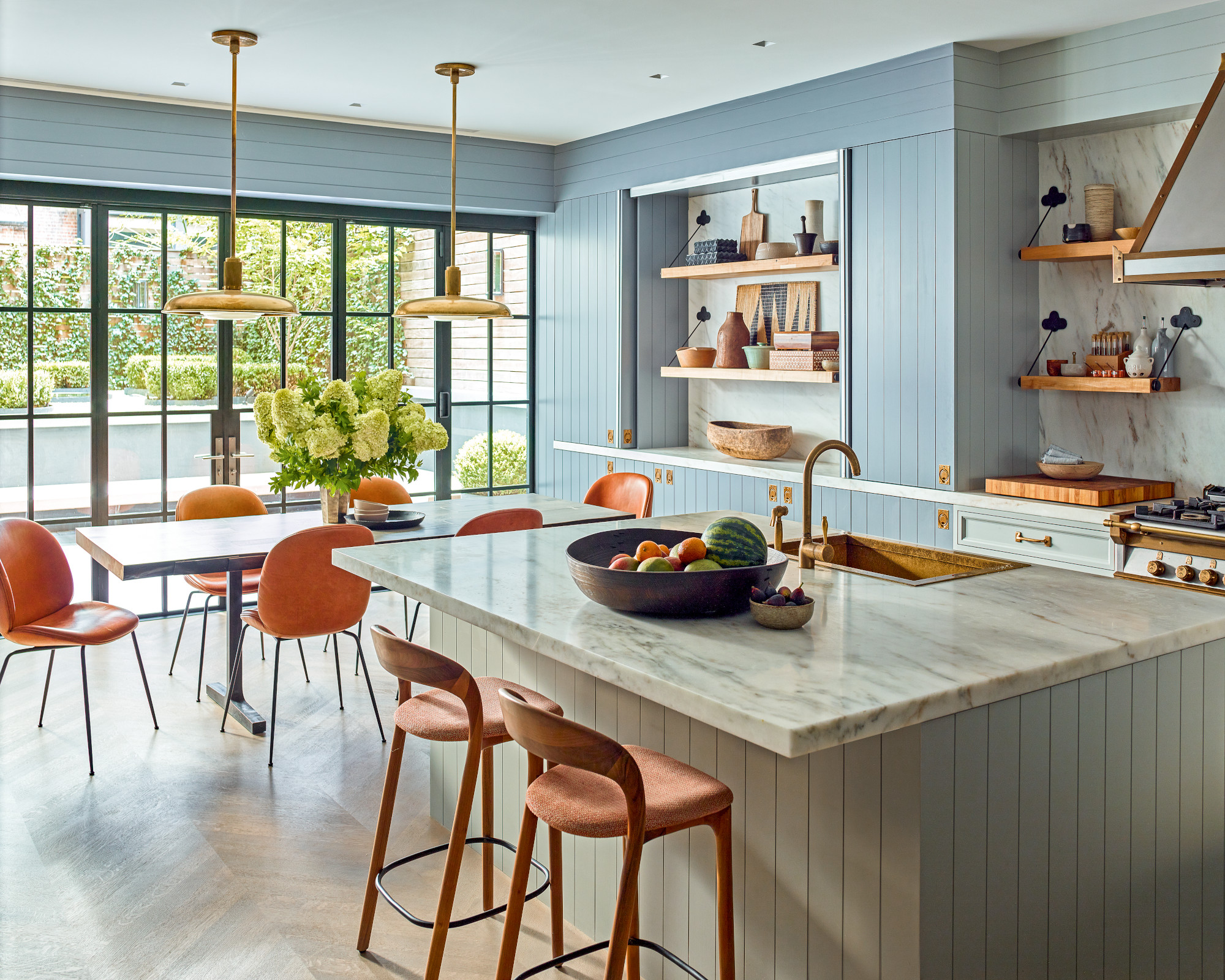
Positioning a dining area in the large kitchen that opens onto the rear garden was one of the dining room ideas, making it perfect for entertaining.
Vertical and horizontal lines in the panelling in the space are balanced with curves in the seating and lighting.
Coffee and cocktail room
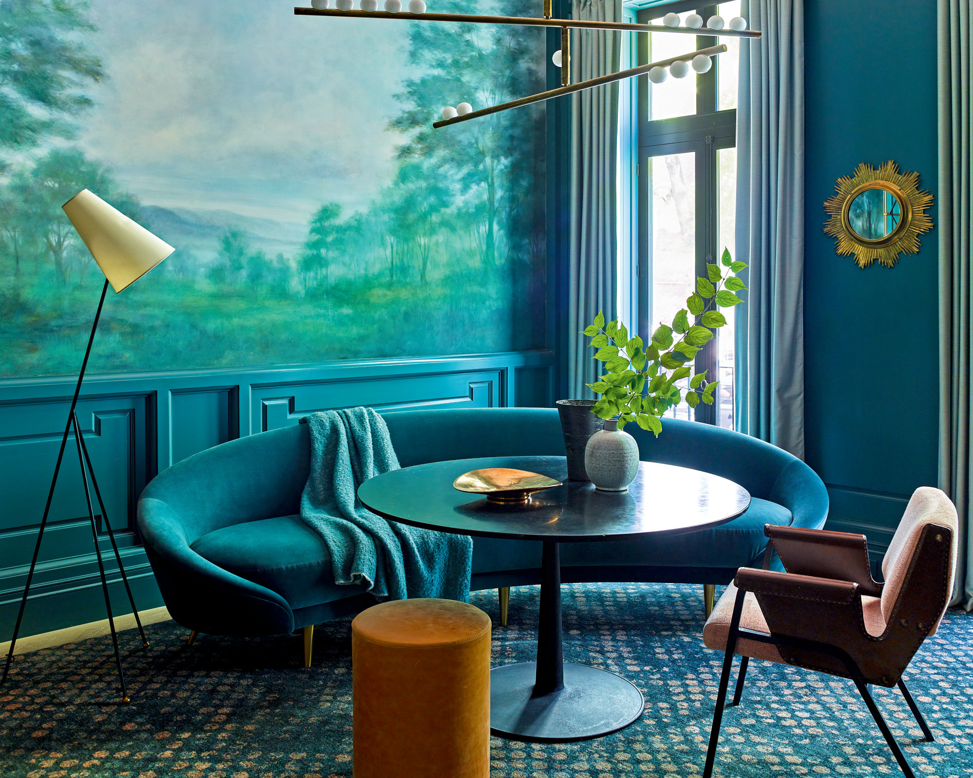
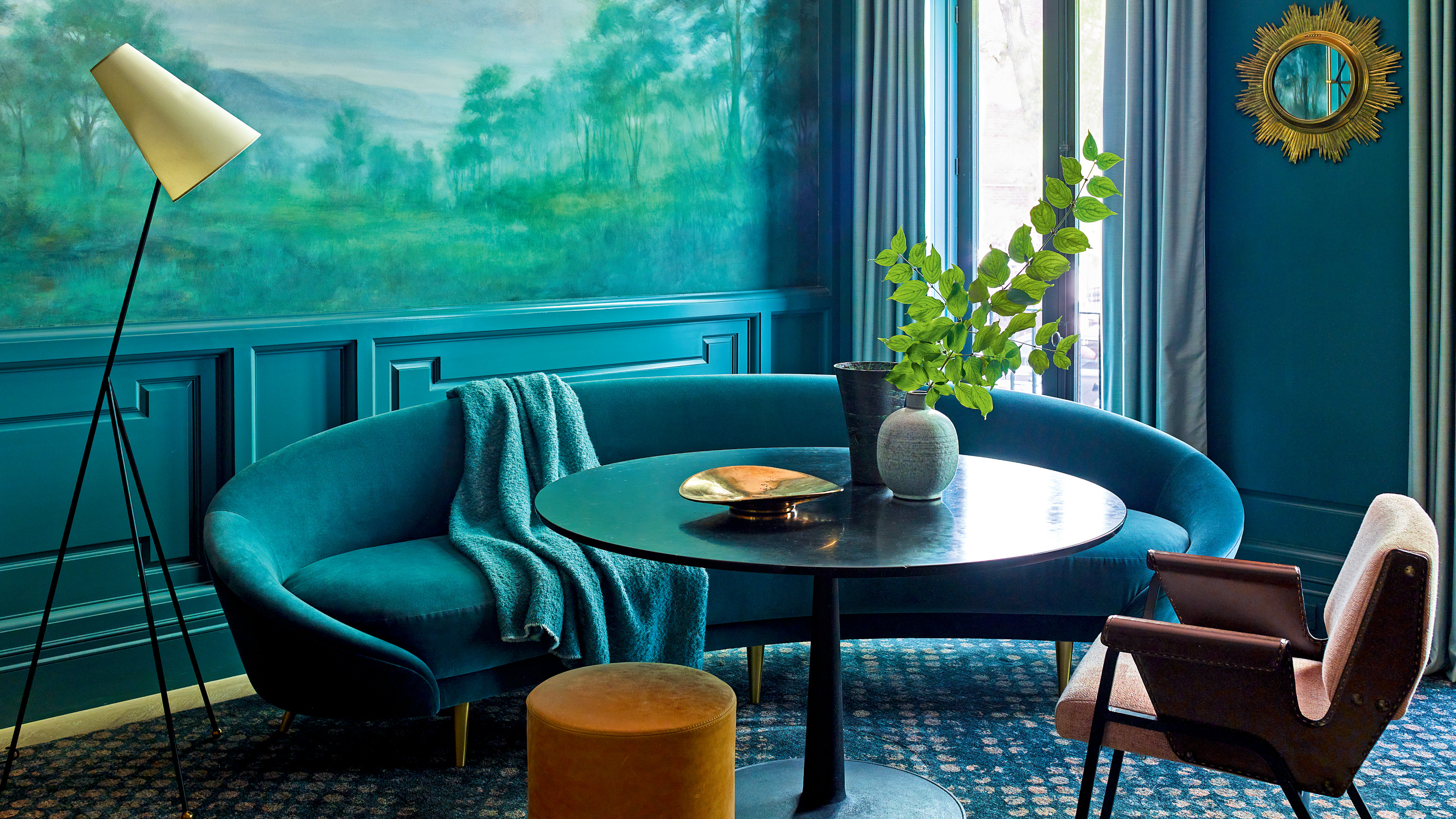
One of the most successful reinventions with regard to the layout is the ‘coffee room’. Brad elaborates, ‘The floor plan at parlour level was a bit awkward. The dining room was too far from the kitchen and we deliberated for ages as to what its new use should be, ultimately making it a coffee and cocktail room.' In a departure from the pale panelling on the rest of the ground floor, Brad boldly infused the walls with a dark hue that can register as blue, gray or even green in certain lights.
‘Typically, I work with a more neutral palette but here in response to the marble in the mantels and bathroom we’ve ended up with smoky jewel tones,’ says Brad. He was keen to angle furniture and fabrics towards a warm yet casual sophistication. ‘It was important that everything felt accessible. My client likes shapes that are organic and shapely inducing a cosy mood. Curves have the advantage of softening a space as opposed to hard edges,’ he notes.
The modern colors and furnishings are a foil to the pastoral mural.
Staircase
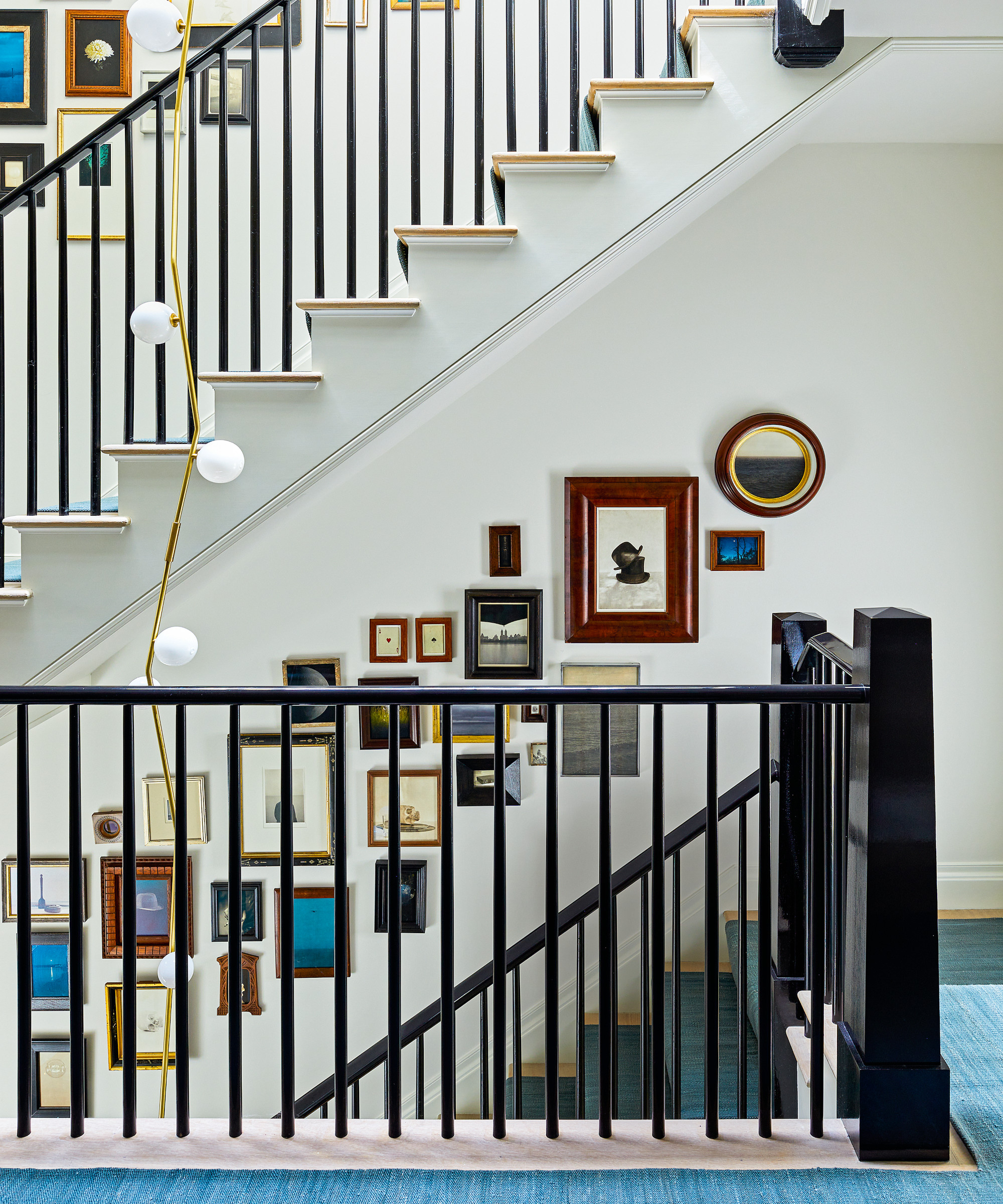
A salon-style gallery wall of silver gelatin, platinum and pigment print photographs are displayed in a combination of old and new frames.
'We reimagined the staircase, painting traditional Shaker spindles in an unusual black high gloss. It’s amazing what color can do to the same form,’ says Tom.
Main bedroom
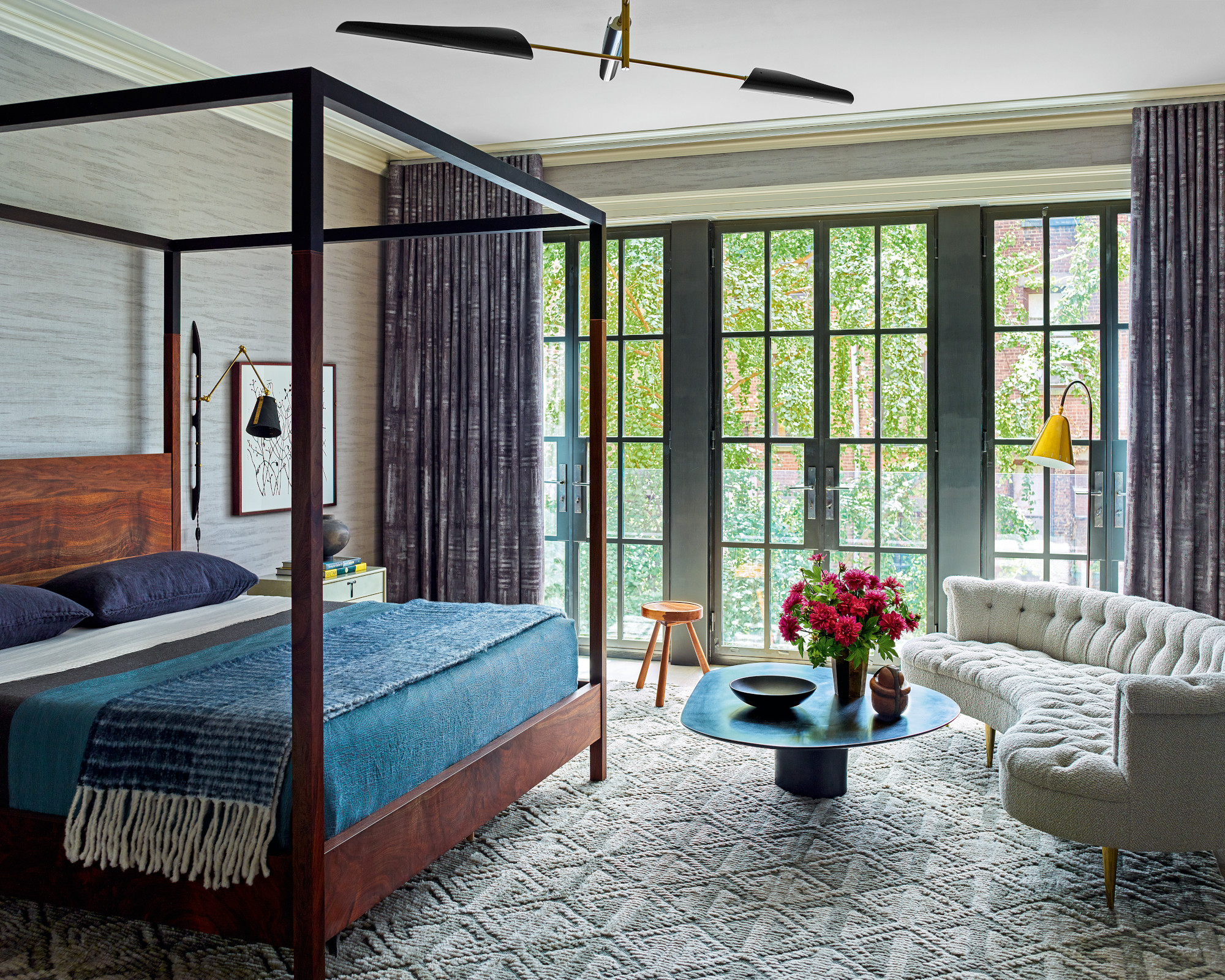
Creating a snug lounge area with a stylish curved sofa was one of the bedroom ideas. Rich jewel tones and textured materials evoke an intimate mood.
Main bathroom
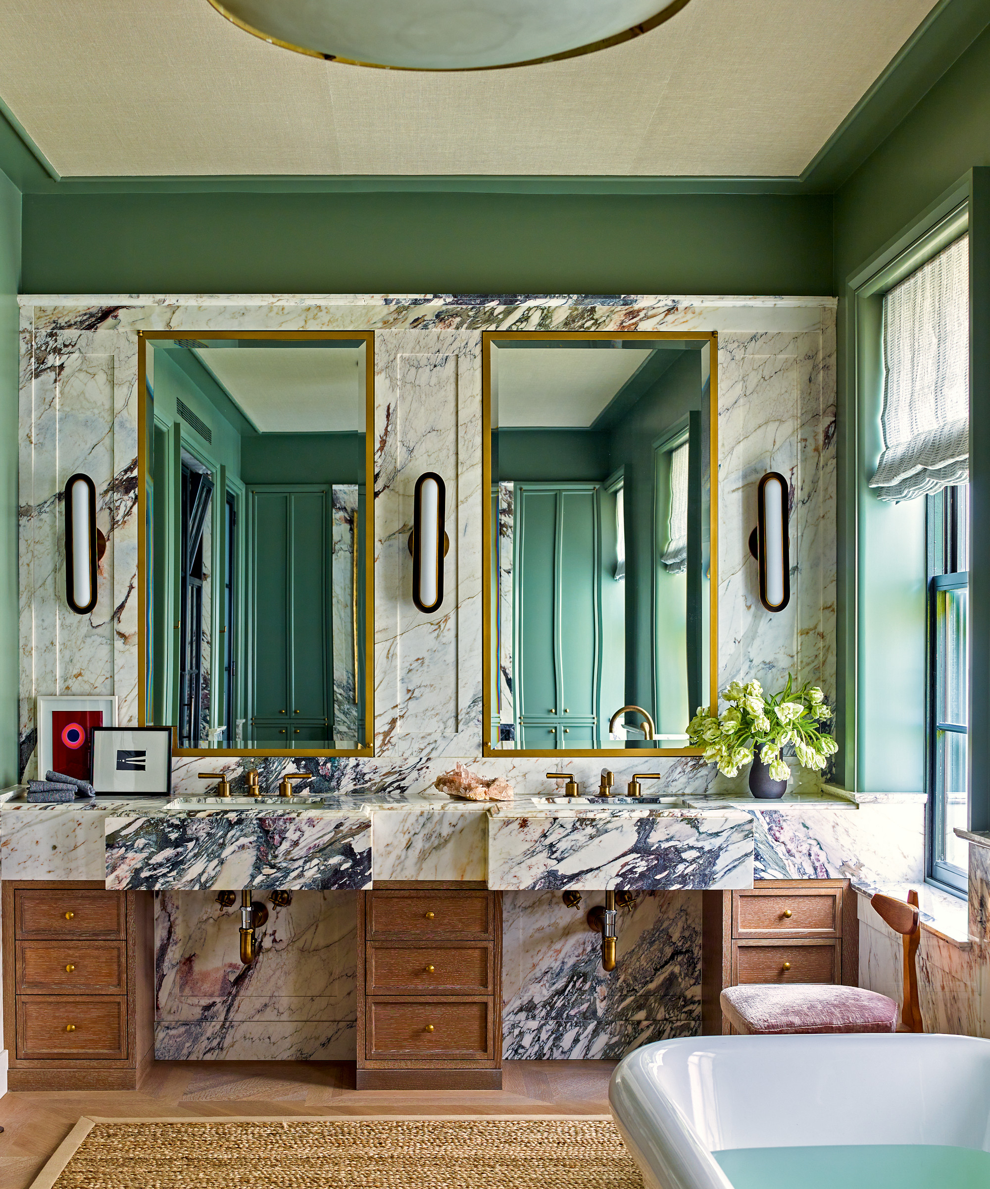
Bathroom ideas include introducing marble clad walls with dramatic veining to give the scheme a dynamic sense of movement.
Outdoor seating area
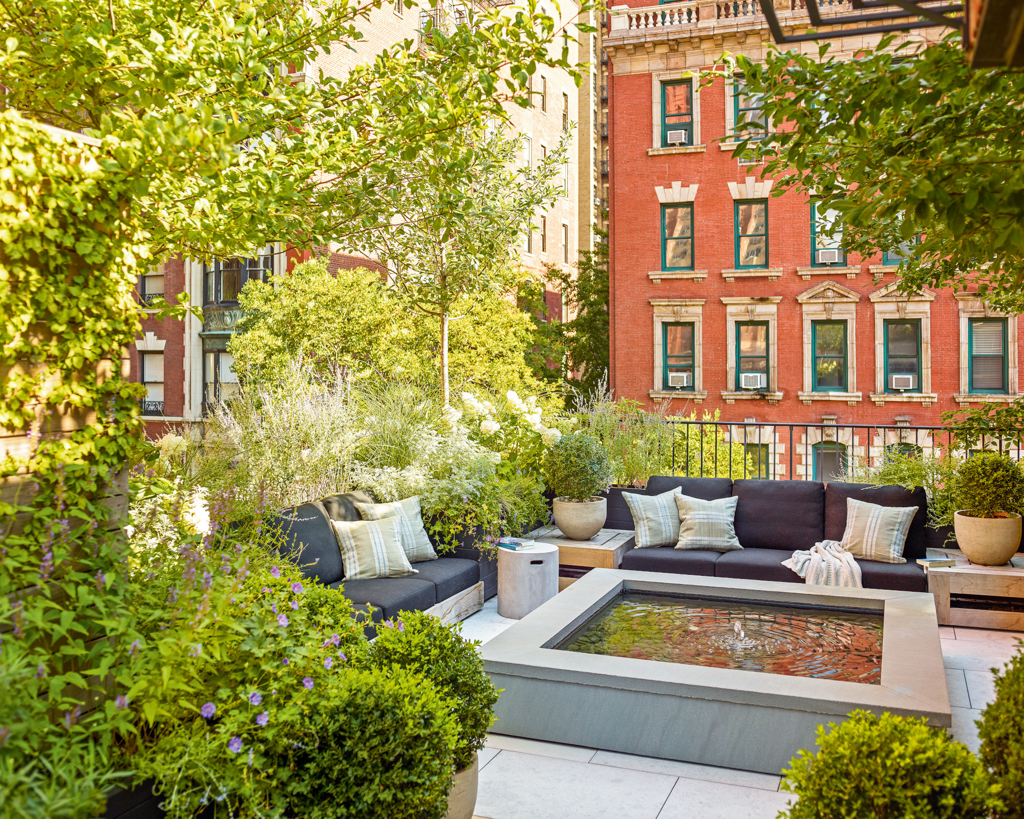
On the rooftop, great efforts have been made to create an outdoor sanctuary that shields guests out of the city. ‘We made it a lot more private with plenty of mature plants and a water feature to drown out some of the white noise of the city,’ says Tom. It is surely the crowning glory to a beautifully reimagined and perfectly executed Manhattan townhouse.
Interior design/ Brad Ford
Architecture/ Ike Kligerman Barkley
Photography/ Eric Piasecki/ Otto
Styling/ Anita Sarsidi
Text/ Juliet Benning
Sign up to the Homes & Gardens newsletter
Design expertise in your inbox – from inspiring decorating ideas and beautiful celebrity homes to practical gardening advice and shopping round-ups.

Interiors have always been Vivienne's passion – from bold and bright to Scandi white. After studying at Leeds University, she worked at the Financial Times, before moving to Radio Times. She did an interior design course and then worked for Homes & Gardens, Country Living and House Beautiful. Vivienne’s always enjoyed reader homes and loves to spot a house she knows is perfect for a magazine (she has even knocked on the doors of houses with curb appeal!), so she became a houses editor, commissioning reader homes, writing features and styling and art directing photo shoots. She worked on Country Homes & Interiors for 15 years, before returning to Homes & Gardens as houses editor four years ago.
-
 This is the single best upright vacuum we've ever tested – and it's on offer with $130 off at Shark for a limited time only
You won't want to miss this one
By Dan Fauzi
-
 Nate Berkus says slipcovered sofas are back on trend – and I just found a way to create this designer-approved laid-back look from just $86
This classic style is making a strong comeback, but did you know you don't have to buy a whole new couch to get this Nate-approved look?
By Eleanor Richardson