This pretty farmhouse home is full of inspiring and artistic decorative touches
This country home was dark and gloomy – but look at it now! Full of inspiring pattern and color after an artistic makeover
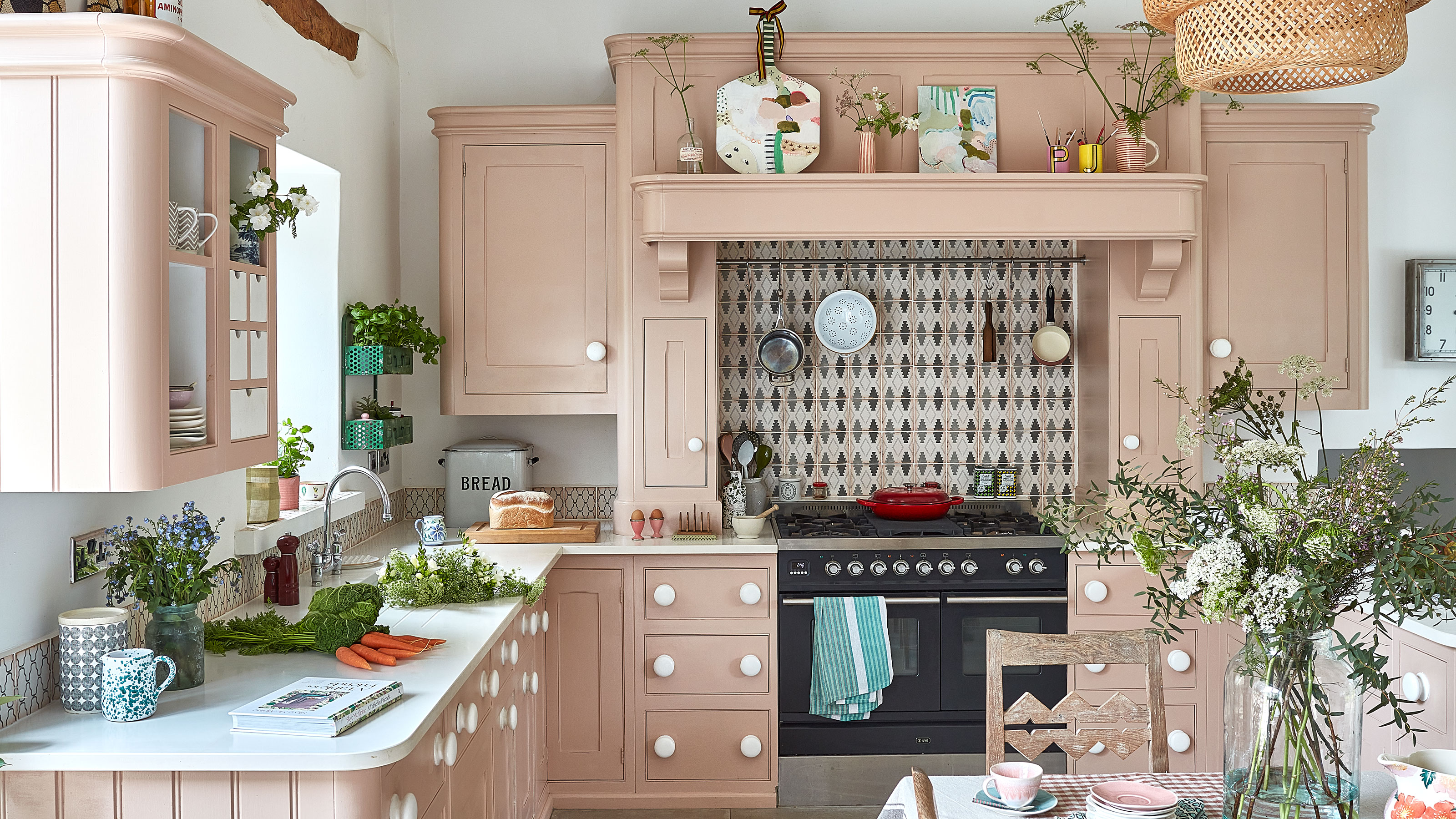
With a little help from artist Philippa Jeffrey and her husband Jonathan, this Grade II-listed 18th-century farmhouse has stepped out of the shadows and into the light. When they bought their country home five years ago it was very dark, with a dull gray and beige décor. But it is fast becoming a latter-day interpretation of Charleston style – the decorative Sussex home of the Bloomsbury Group. Rich, inspiring and uplifting shades and thought-provoking patterns make their marks in every room of the house. Philippa has left no surface untouched.
And the truly unique decorative finishes make this one of the world's best homes, full of inspirational touches we'd all love to see in our own homes. Here are the highlights.
Entrance hall – a place to linger
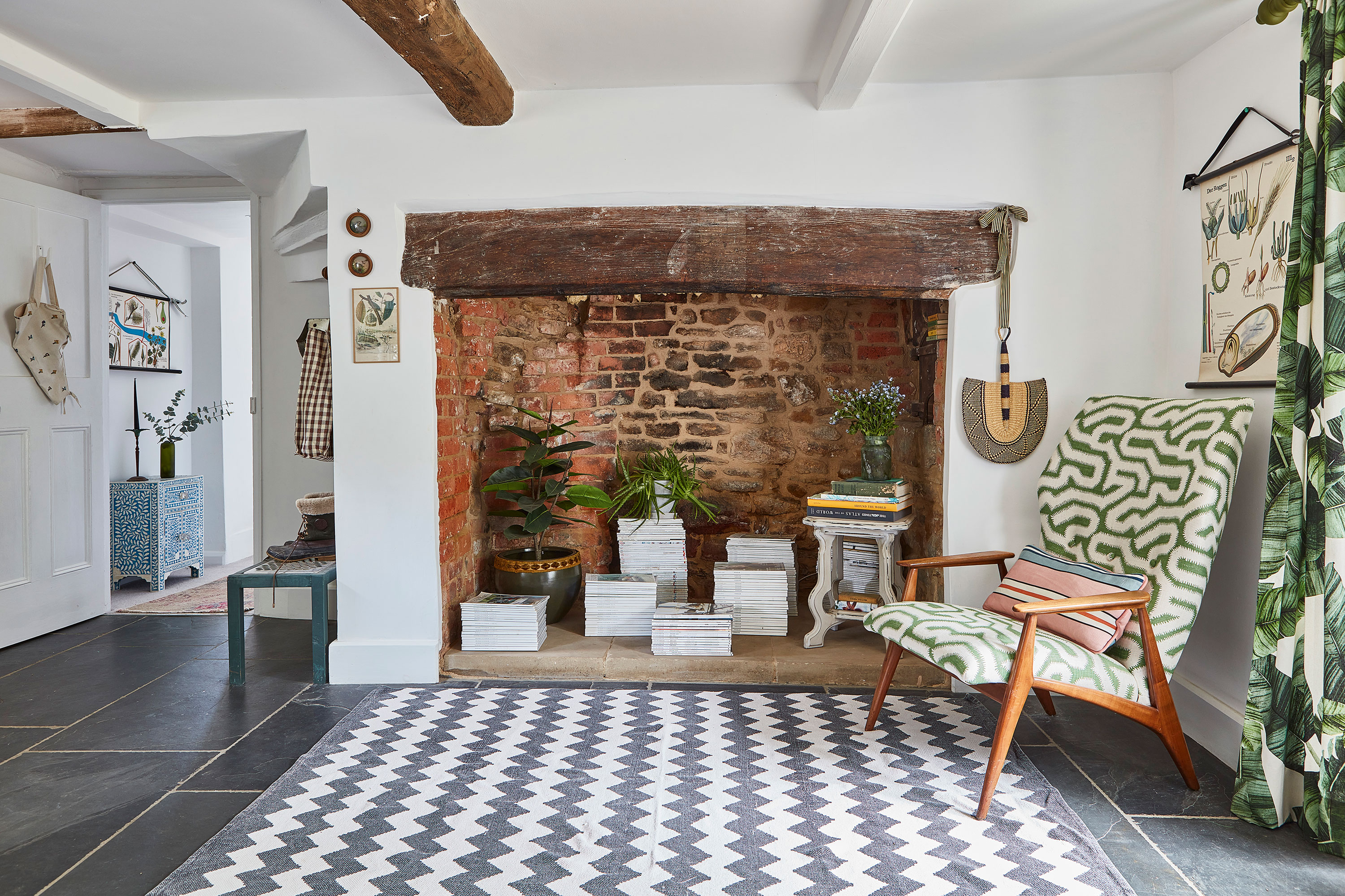
The spacious entrance hall is a place to linger, with a characterful inglenook fireplace and an inviting mid-century style armchair. The smart geometric print upholstery fabric and rug bring the look right into this century. Hallway ideas and updates like these would work just as well in a newer property as they do in this 18th century farmhouse. The slate flooring was added by the previous owners. In the fireplace are old magazines from Philippa’s days working for a fashion magazine.
Dining space with gallery wall display
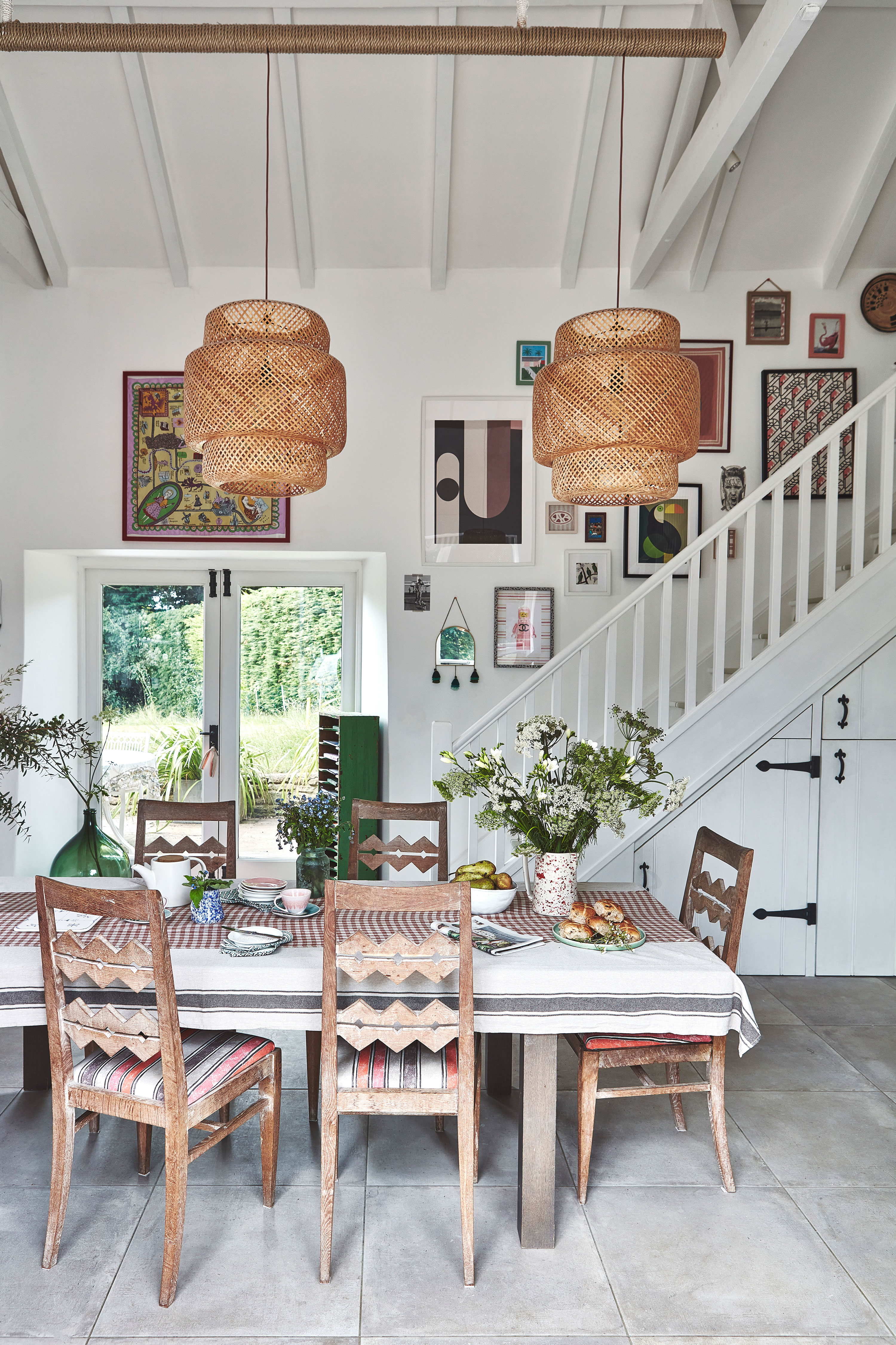
During the recent lockdown, in between homeschooling the children, Philippa decided to refresh the kitchen scheme, incorporating an unusual new decorative element that literally takes things to a new level. Built into the height of the kitchen is a mezzanine floor, added when the previous owners updated the kitchen. Philippa uses the staircase wall for a gallery display of paintings and prints. An art gallery may not be top of your list of dining room ideas, but any kind of gallery display near a dining table provides a good talking point at mealtimes, and injects personality into a space.
Kitchen with soft pink cabinets
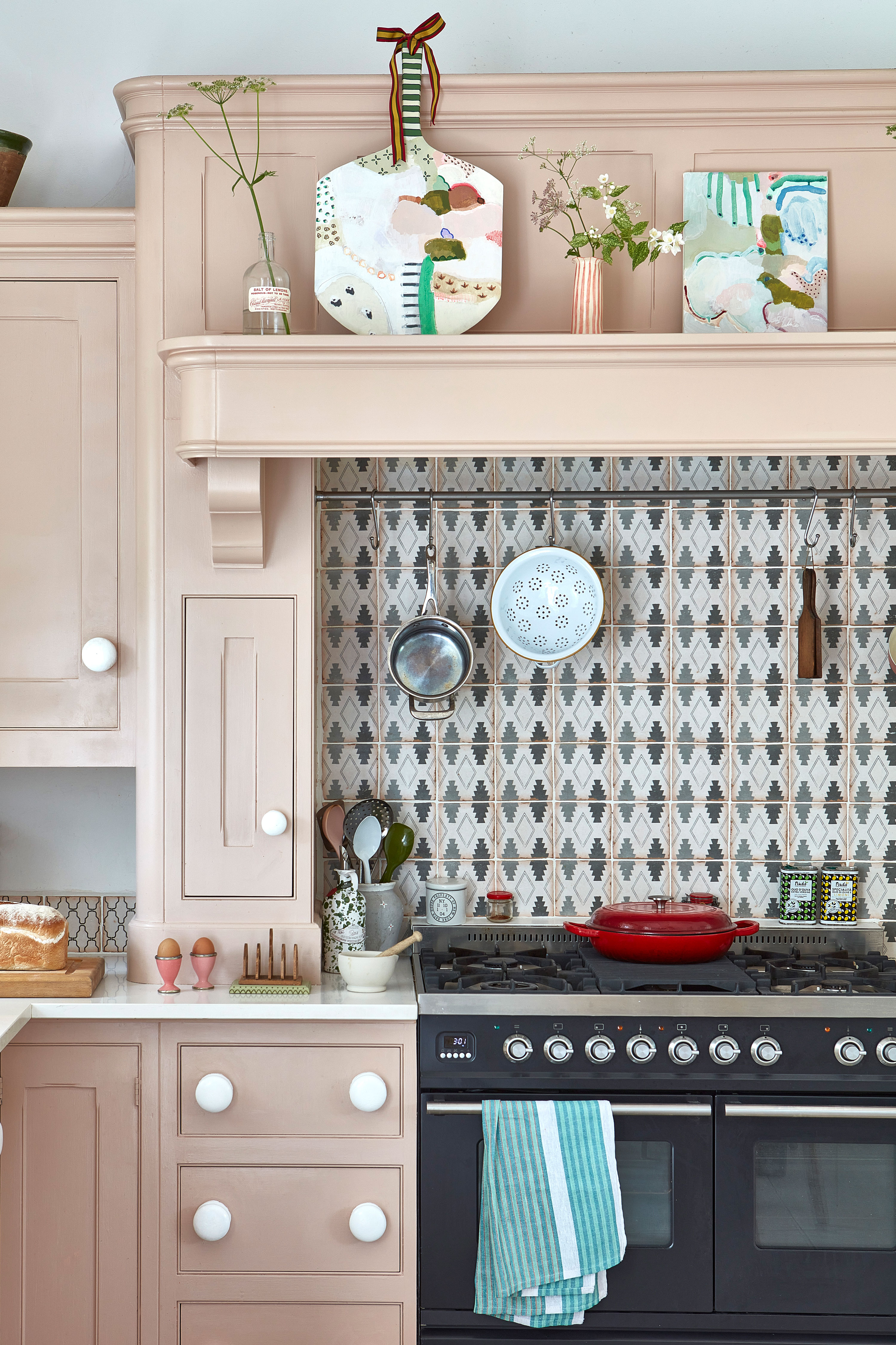
The kitchen was a later addition to the house, and Philippa wanted to do everything she could to make it as light and airy as possible. The previous owners had added dark wood beams and black granite worktops, so Philippa and Jonathan's kitchen ideas included replacing the worktops and painted the beams white – quite an achievement given the height of the ceilings. The kitchen layout was good, and the cabinets, in two tones of beige, were originally from Mark Wilkinson and were far too good to replace. Philippa wanted a fresh new look, and space for a table. And the pink cabinets are her favorite dusty pink shade that she uses a lot in her work, so the color felt like an obvious choice. This pretty room really is proof that you can create a very different look simply by applying a coat of paint in a fresh new shade.
Bedroom – an oasis of calm… and pattern
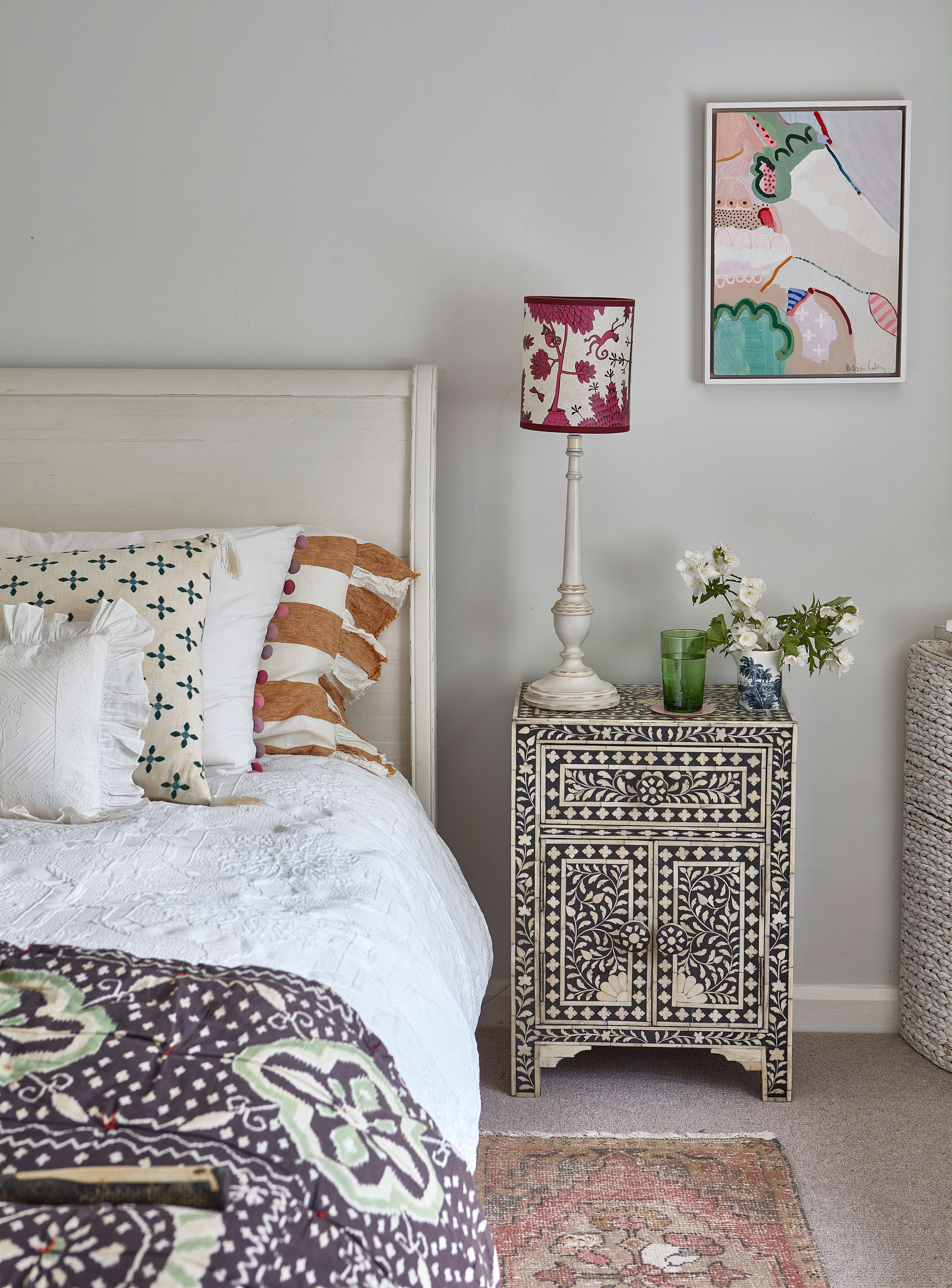
Above the pretty inlaid bedside cabinet from Graham & Green is one of Philippa’s paintings, one of the subtle changes that has given the room a real lift. Other bedroom ideas here, that are well worth copying, are to layer and combine bedlinen from different brands - nothing too matchy matchy. So vintage-style bedlinen is topped with a boho throw, with a stripy pillowcase and a vintage lace cushion.
Child's bedroom is pretty in pink
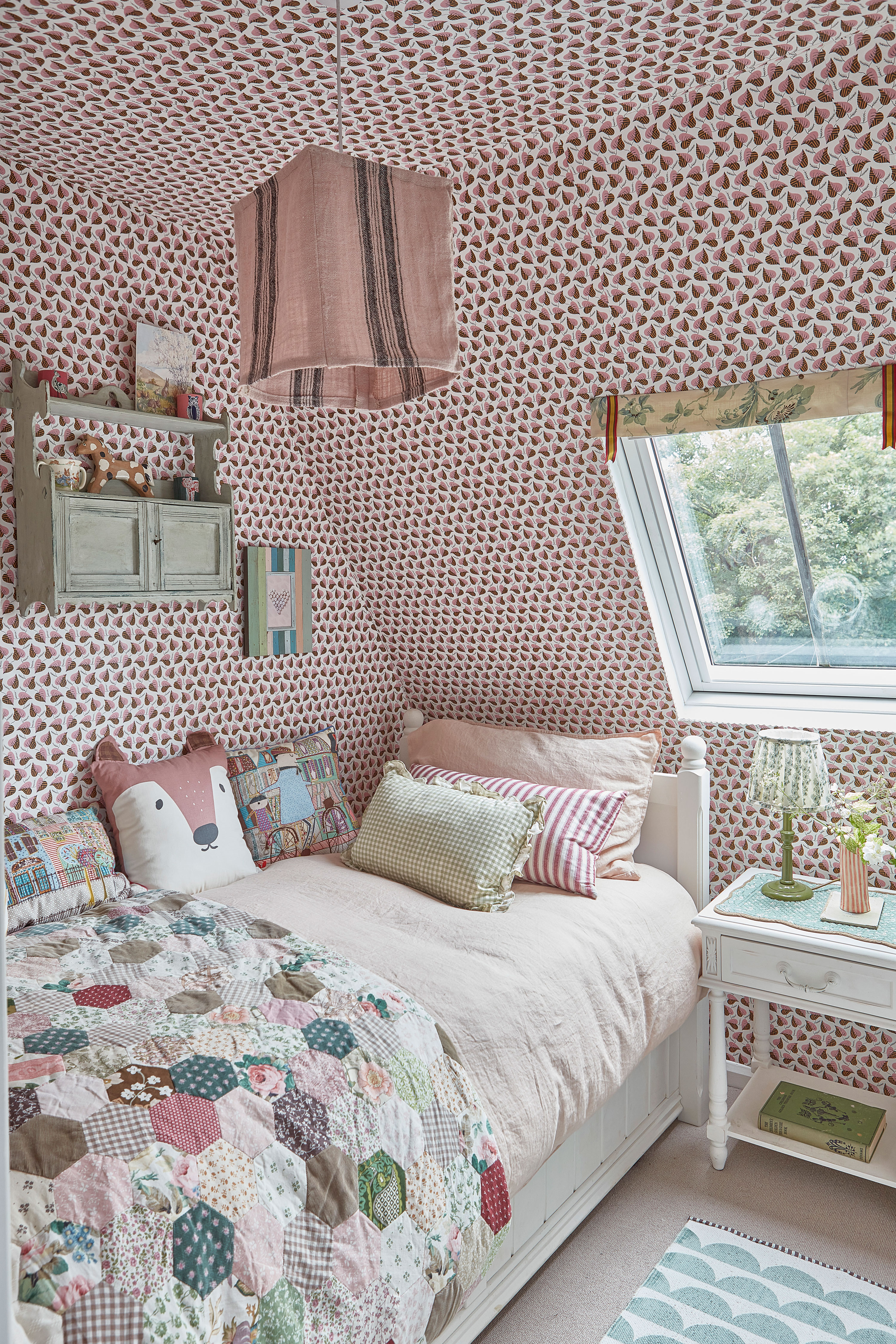
One of the most recent updates upstairs is in the children’s guest room. It was a lockdown project so as yet not many young guests have had chance to sleep over here. The couple worked on the room together, with Jonathan wallpapering all four walls and the ceiling to create a cosy, cocooning space. The wallpaper is Love Leaves from Common Room.
Philippa added accessories and furnishings in her favourite shades – many pieces are antique or vintage finds. Philippa made the lampshade herself, and the vintage patchwork quilt was made by her mother-in-law
Powder room beauty
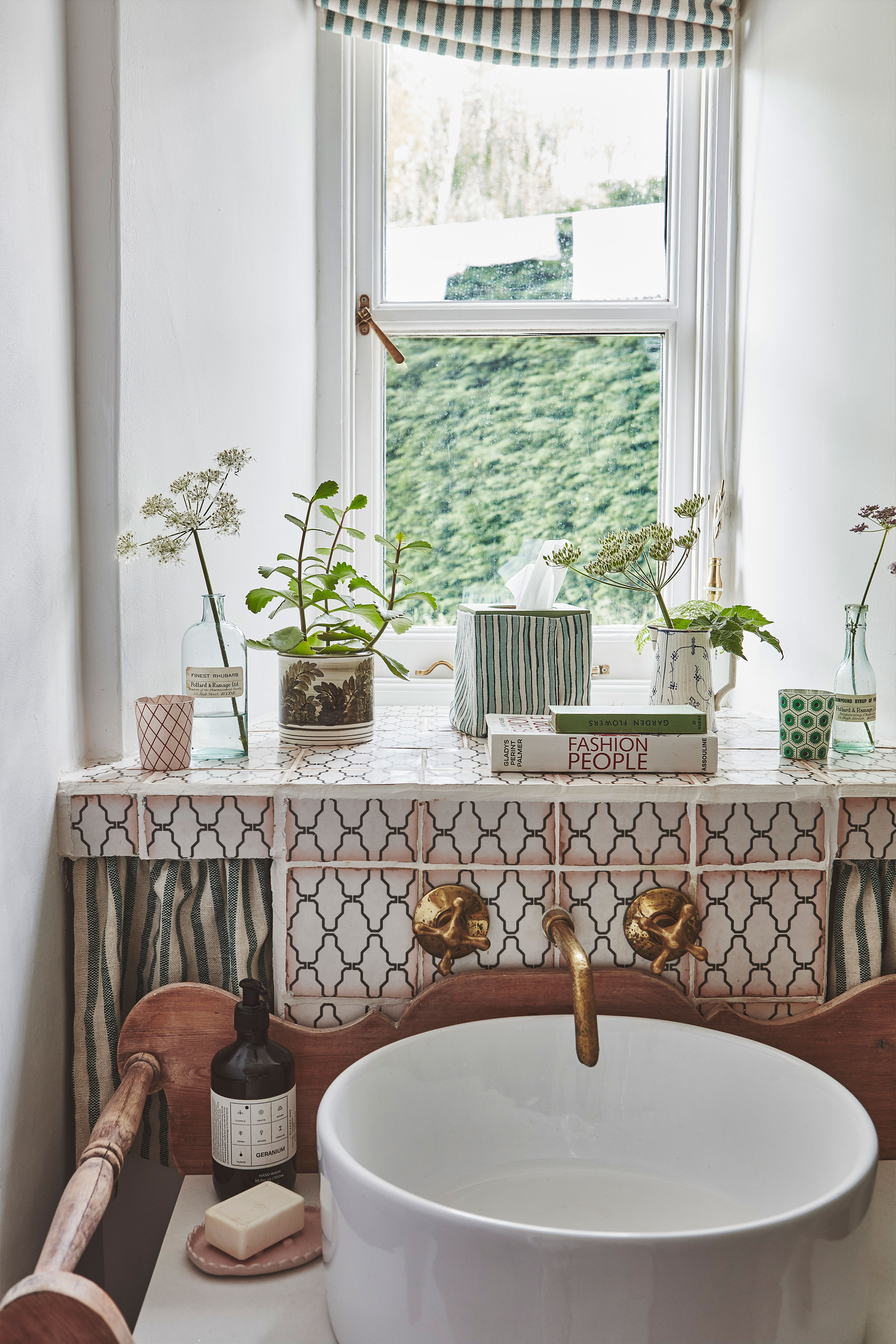
The downstairs powder room is full of inspiration that would work just as well as bathroom ideas for main bathrooms. The washstand is from a vintage store and the couple sourced the marble and round bowl online then added Moroccan taps from an Etsy trader. The fabric was also found on Etsy
The old farmhouse exterior view
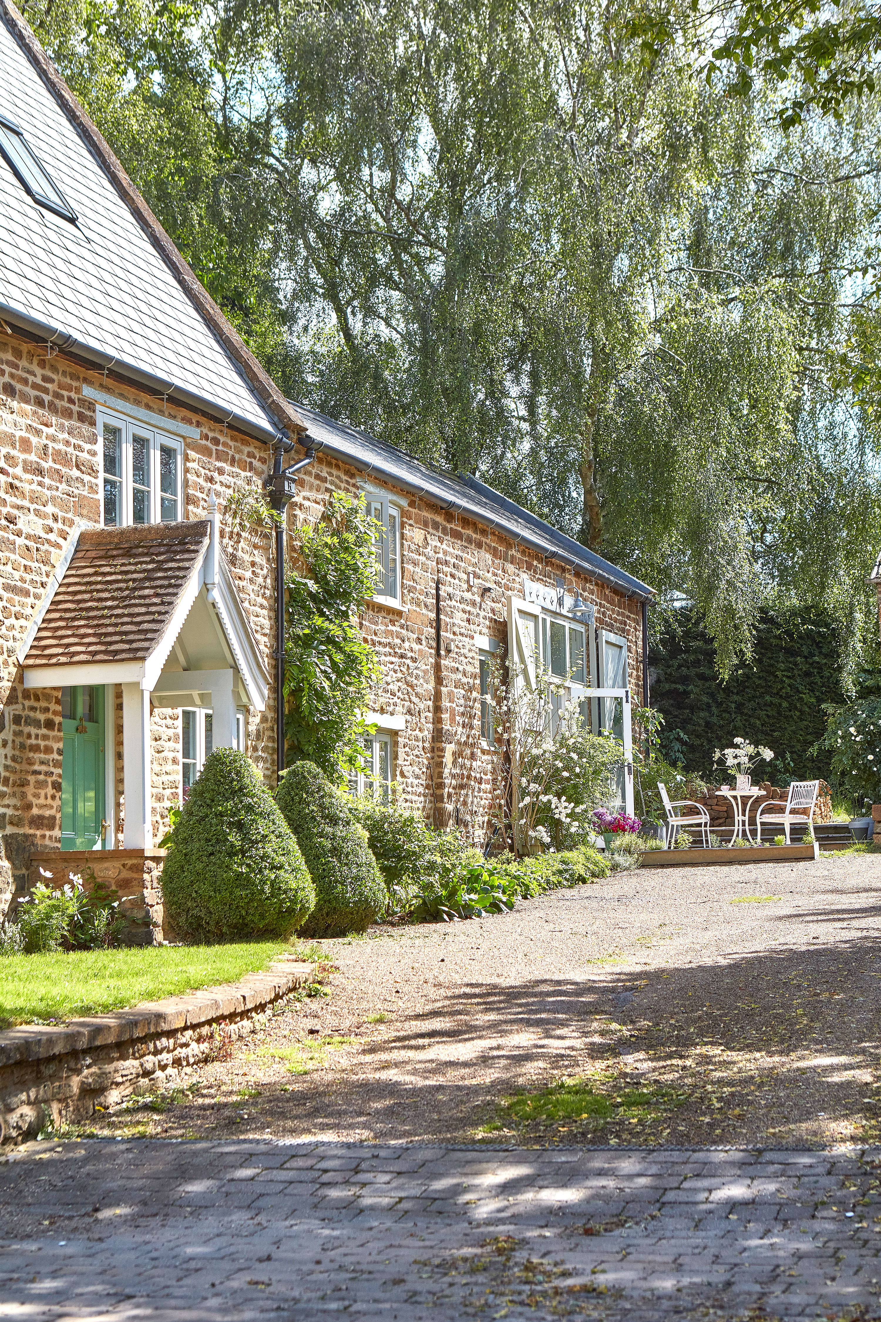
It's not just the interiors that have been updated. Every single window in the house had to be replaced as the old ones were rotten, causing heat loss and condensation. These are wooden heritage-style replacements. All of the house’s stonework has also been repointed using traditional methods and, much to everyone’s delight, the wisteria was preserved.
This has been a thorough and inspired renovation – inside and out - that has brought life and much-needed color back to the old farmhouse.
Sign up to the Homes & Gardens newsletter
Design expertise in your inbox – from inspiring decorating ideas and beautiful celebrity homes to practical gardening advice and shopping round-ups.
Karen sources beautiful homes to feature on the Homes & Gardens website. She loves visiting historic houses in particular and working with photographers to capture all shapes and sizes of properties. Karen began her career as a sub-editor at Hi-Fi News and Record Review magazine. Her move to women’s magazines came soon after, in the shape of Living magazine, which covered cookery, fashion, beauty, homes and gardening. From Living Karen moved to Ideal Home magazine, where as deputy chief sub, then chief sub, she started to really take an interest in properties, architecture, interior design and gardening.
-
 Jeremiah Brent's new NYC-inspired rug collection has got to be the easiest way to bring his modern Manhattan style into your own home
Jeremiah Brent has teamed up with Loloi Rugs to create a contemporary collection of home furnishings inspired by his city
By Eleanor Richardson
-
 I tried this one easy dishwasher trick and made the annoying need for manual drying a thing of the past
If you hate those little pools of water left on your cups and crockery, this towel trick is for you
By Punteha van Terheyden
-
 This fully renovated London townhouse expertly blends antiques and modern design classics
A curated collection of antiques, artwork and more recent design classics sit side by side in this renovated London home
By Karen Darlow
-
 This old farmhouse was renovated from top to bottom so its original features shine through
Snapping up this 18th-century farmhouse before it went to auction, its owners have carefully given it a complete overhaul
By Rachel Crow
-
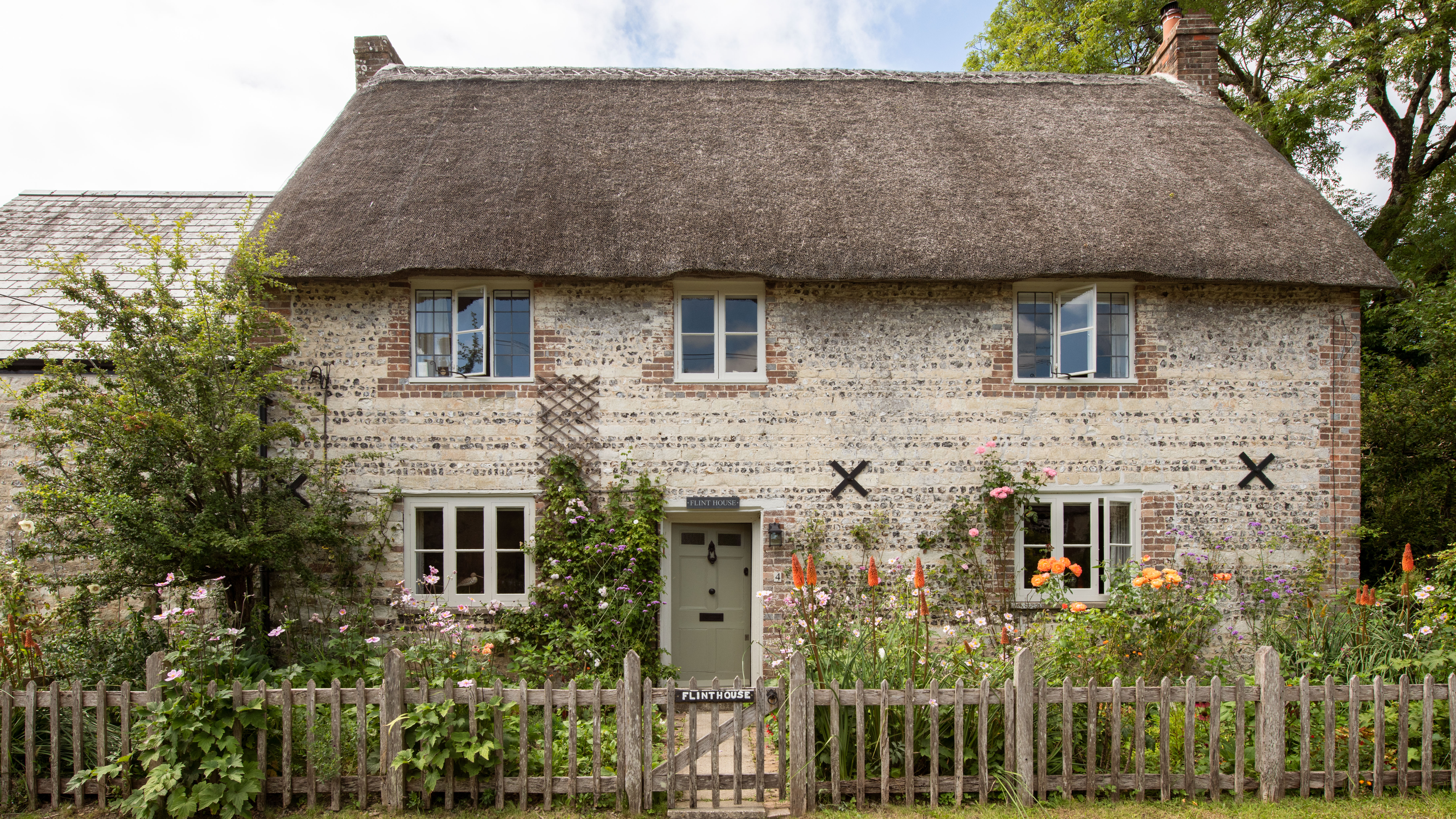 This ancient thatched cottage has had new life breathed into it
Restoring this beautiful old thatched cottage using traditional methods and materials breathed new life into its ancient frame
By Karen Darlow
-
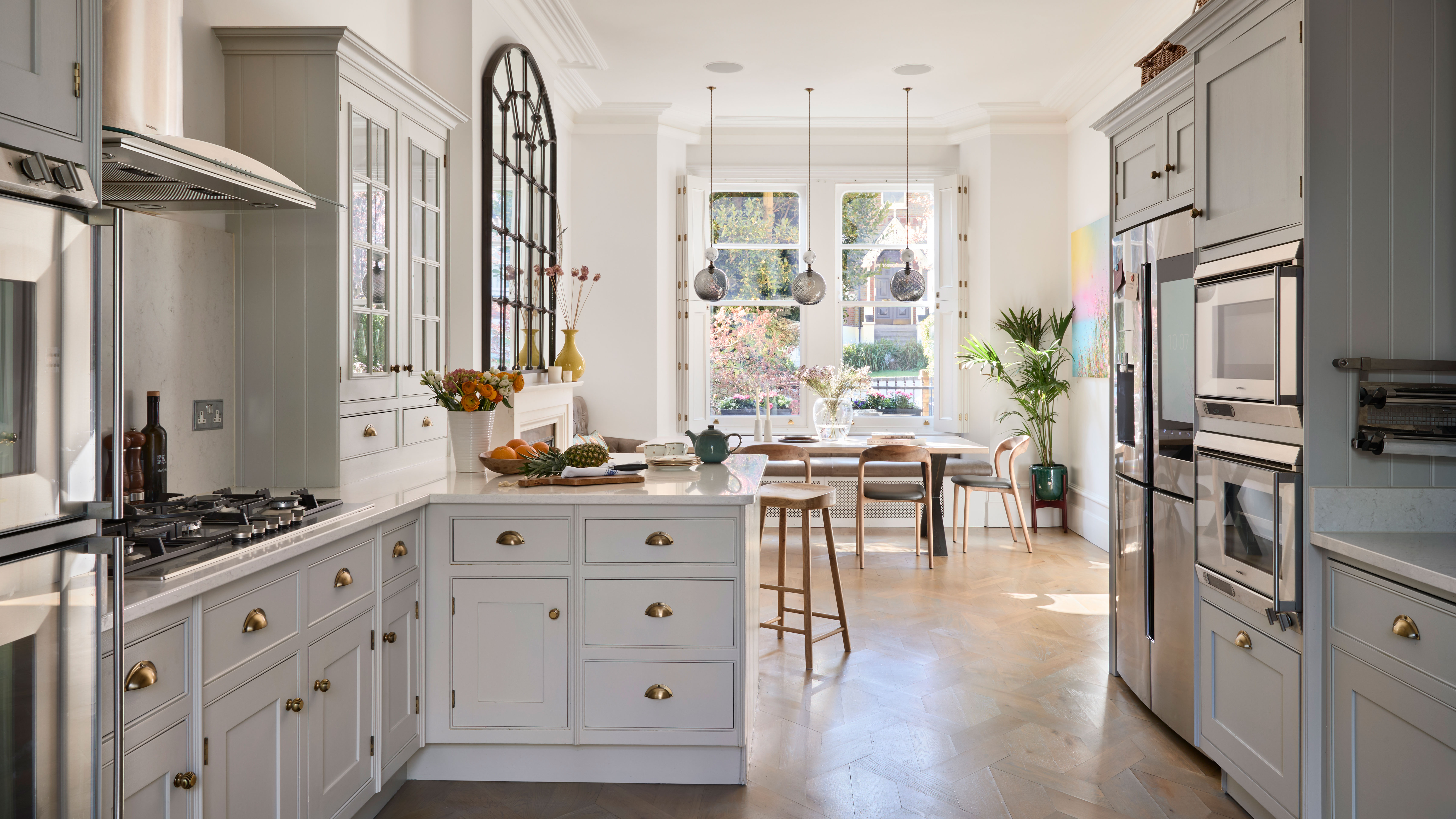 Reinstating period features to a Victorian home returned it to its former glory
With reinstated original features and decorated in an eclectic style, this Victorian townhouse is a perfect marriage of old and new
By Sara Emslie
-
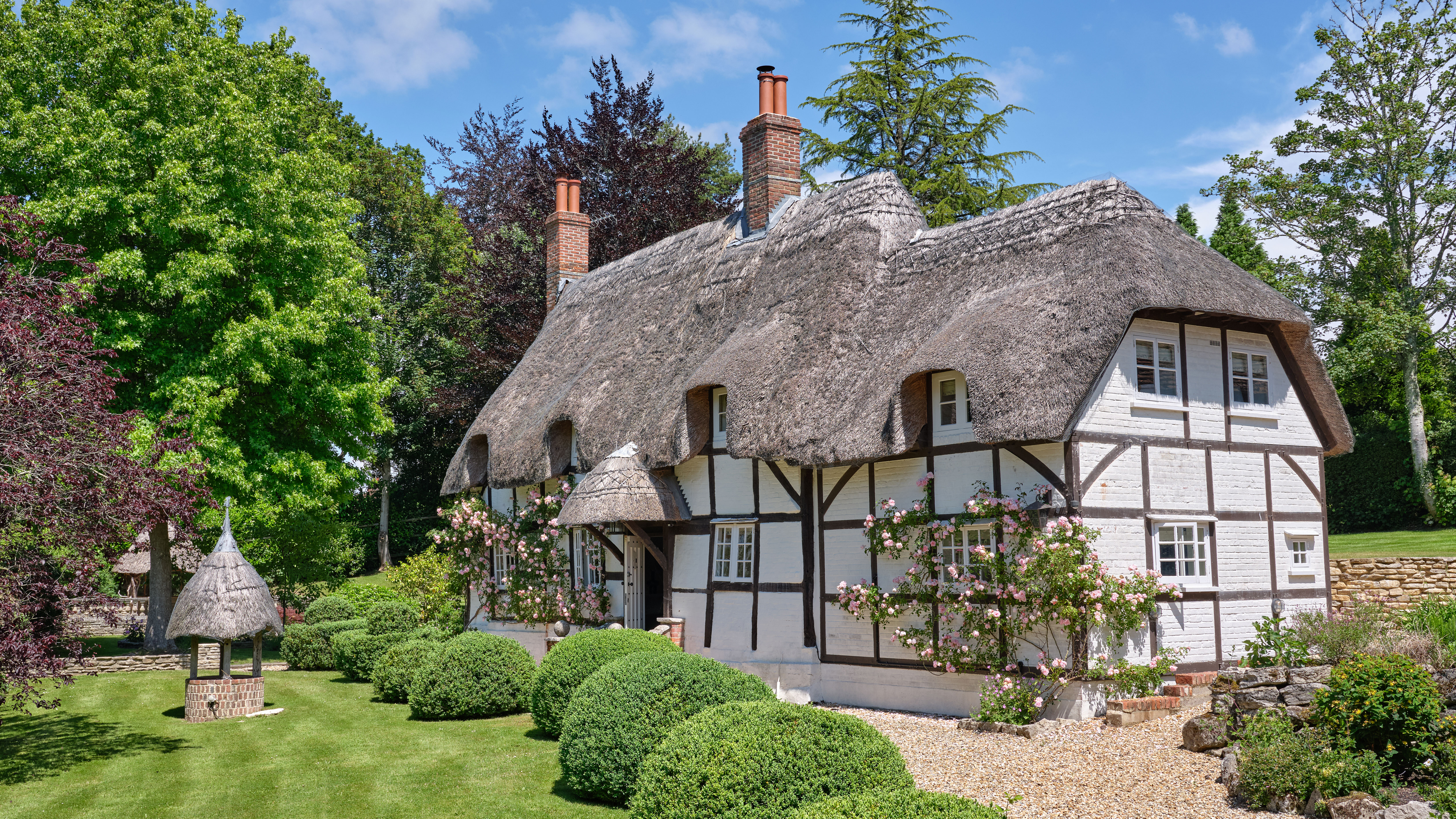 A fairy-tale thatched cottage updated with a light and tranquil interior
This fairy-tale thatched cottage in the woods has been sensitively updated by its owners with a calm and neutral decorating scheme
By Heather Dixon
-
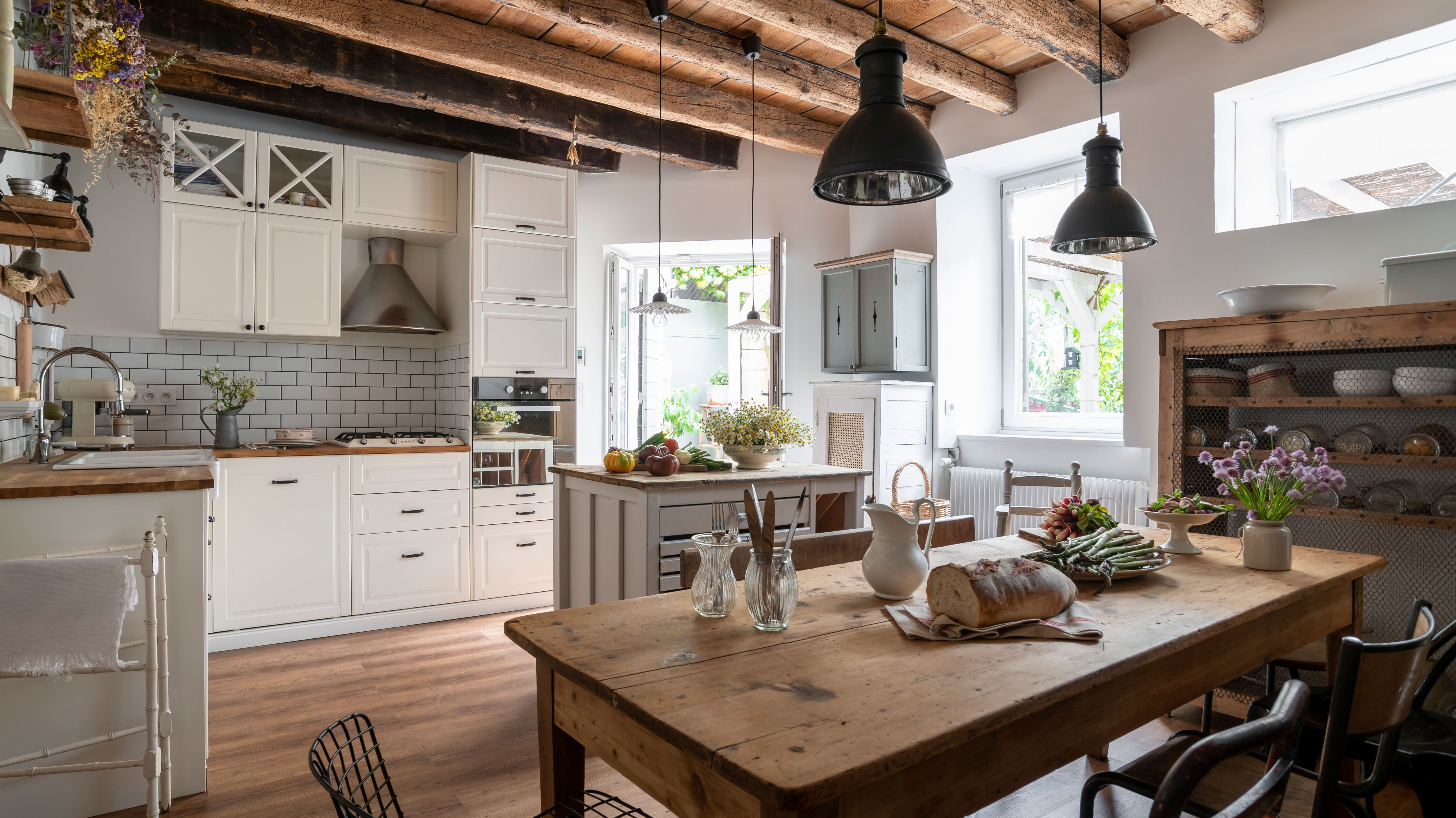 This 400-year-old rural French house is oozing authentic rustic charm
This 17th stone-built home in Burgundy, France, has been brought back to life with beautiful original features sensitively restored
By Rachel Crow
-
 This charming country cottage is full of pretty ideas for stylish vintage looks
Mixing floral fabrics with toile print wallpapers and antique treasures gives this cottage an eclectic but very pretty charm
By Karen Darlow
-
 Full of handmade quilts and vintage finds, this home offers the warmest welcome
This pretty home layers up checks, chintz and patchwork quilts to create a crafter's paradise with a touch of nostalgia
By Karen Darlow