This period Chicago pied-à-terre exudes irresistible glamor with its luxurious interior
Jessica Lagrange has created a sanctuary in the city that's awash with glamor and opulence and mirrors the owners' artistic flair

Design expertise in your inbox – from inspiring decorating ideas and beautiful celebrity homes to practical gardening advice and shopping round-ups.
You are now subscribed
Your newsletter sign-up was successful
Want to add more newsletters?
This French renaissance style 1920s co-op in Chicago, now one of the world's best homes, needed an interior as glamorous as its exterior.
'The clients loved the provenance and location of the building, plus its gracious layout that makes it the perfect size for a city pied-à-terre, but they knew the unit needed a major refresh that would make it an ideal spot for weekend getaways,' says interior designer Jessica Lagrange.
'The history of the home acted as a guide to creating a sanctuary for the couple when in town,' says Jessica. 'It needed to be sophisticated and mirror their own artistic flair. They placed heavy emphasis on finding interesting pieces and forms that felt collected over time.
Article continues below'We wanted to bring in a fresh new perspective to this vintage space, while celebrating the proportion and scale of its existing details. A re-envisioning of the floor plan allowed for a new open dialogue between the spaces; the former maids' quarters were removed to create a new family room space and more luxurious primary suite. The furnishings throughout are an eclectic blend of new and old.'

Jessica Lagrange is the powerhouse behind the eponymous Jessica Lagrange Interiors, formed in 1998. Jessica has more than thirty years of design and architecture experience, and she and her team have done projects from the East to the West Coast, as well as other parts of the world. Her work reflects her personality and style – luxurious and classic, with an edge – and this beautiful Chicago pied-à-terre certainly exudes those qualities.
Entry
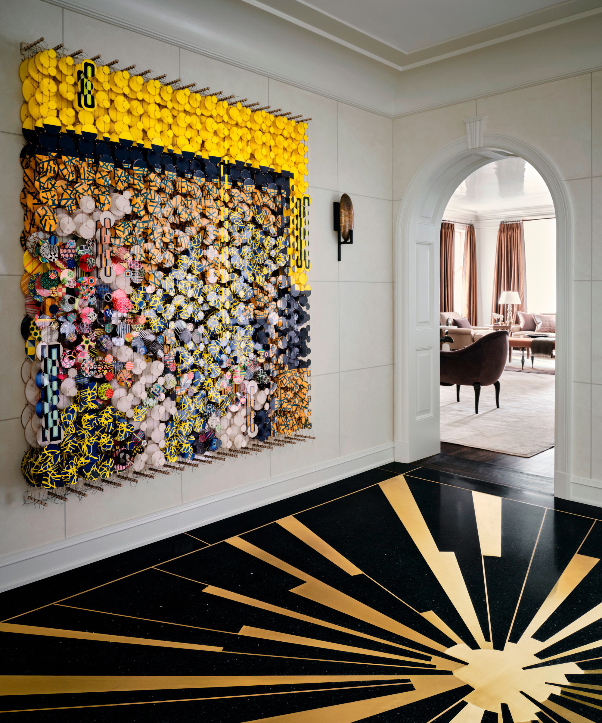
The original entry space had a red and green floral chintz wallcovering, and ceilings that felt unusually low.
Wanting to set the tone for the rest of the apartment and bring back the grandeur, Jessica found a way to increase the ceiling height, ultimately allowing appropriate scaled moldings to be added to the space. Key to her entryway ideas was an Art Deco inspired sunburst motif terrazzo floor, which makes this space a memorable one. Artwork by Jacob Hashimoto – The Long Goodbye to the Solar System, 2017 – provides the perfect finishing touch on the wall.
Living room
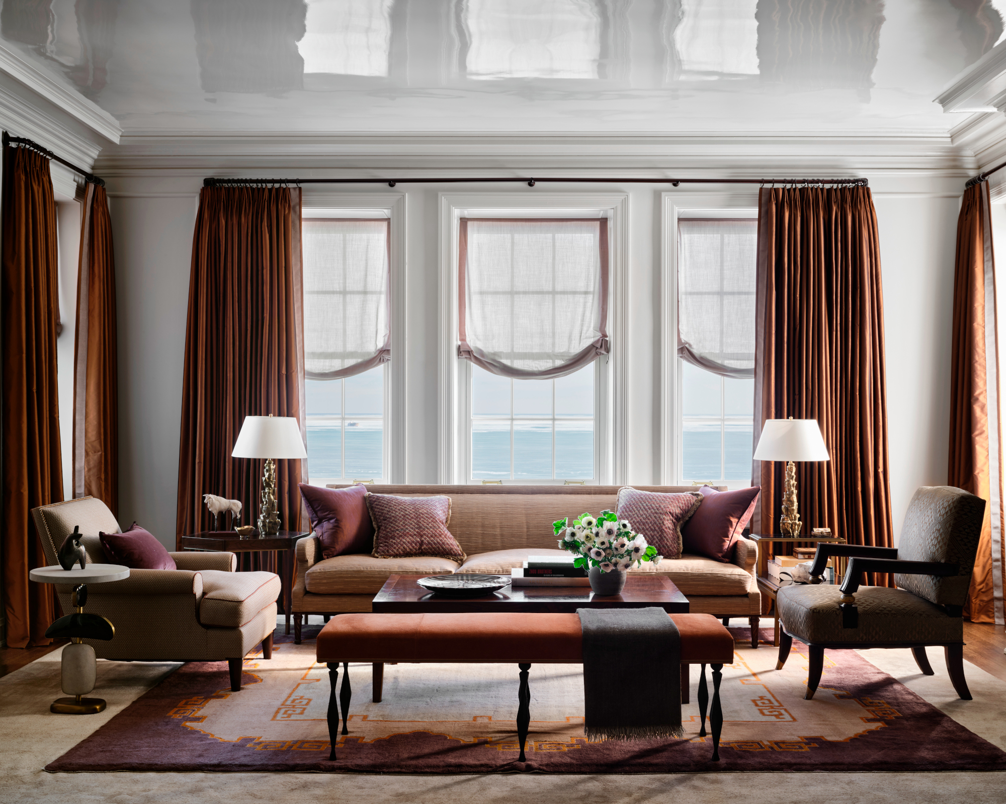
Among Jessica's living room ideas was opting for a simple white backdrop. She enhanced the ceiling height with a high gloss lacquered finish on the ceiling. The moldings, original applied trim, and walls were painted in this same white color to create a gallery-like aesthetic, perfect for showcasing the homeowner’s passion for collecting. Rich jewel tones were then interjected to create a striking contrast from the blues and grays of Lake Michigan and the Chicago city skyline beyond.
Design expertise in your inbox – from inspiring decorating ideas and beautiful celebrity homes to practical gardening advice and shopping round-ups.
‐
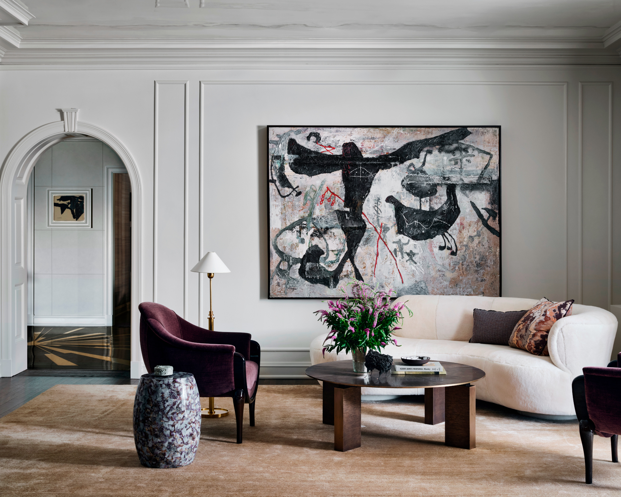
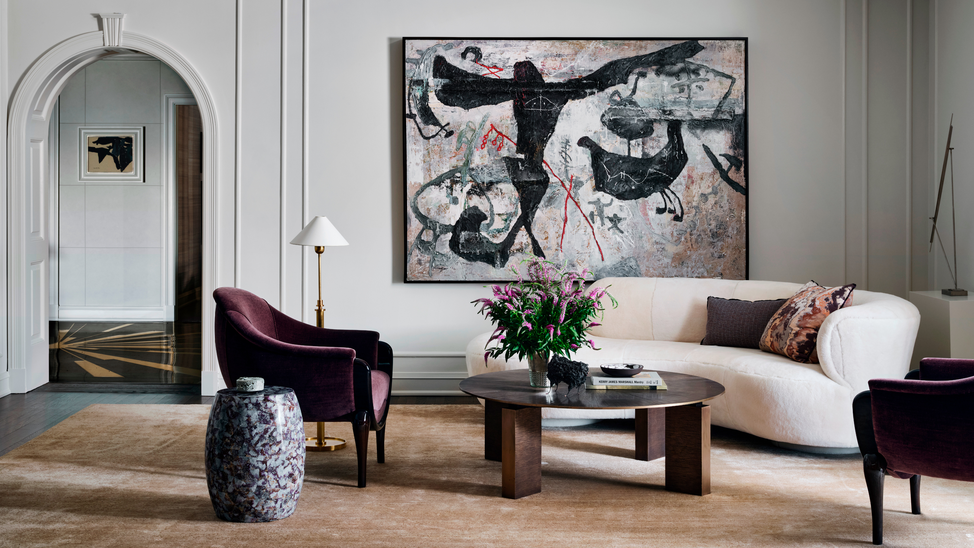
Curved statement furniture, such as the vintage Vladmir Kagan sofa upholstered in shearling, Jean de Merry's Lora armchairs and Tuell and Reynold's Carmel Coffee Table in Bronze, softens the lines of the room. The striking artwork above the sofa is Zhou Brothers' Spirit, 1990.
Dining room
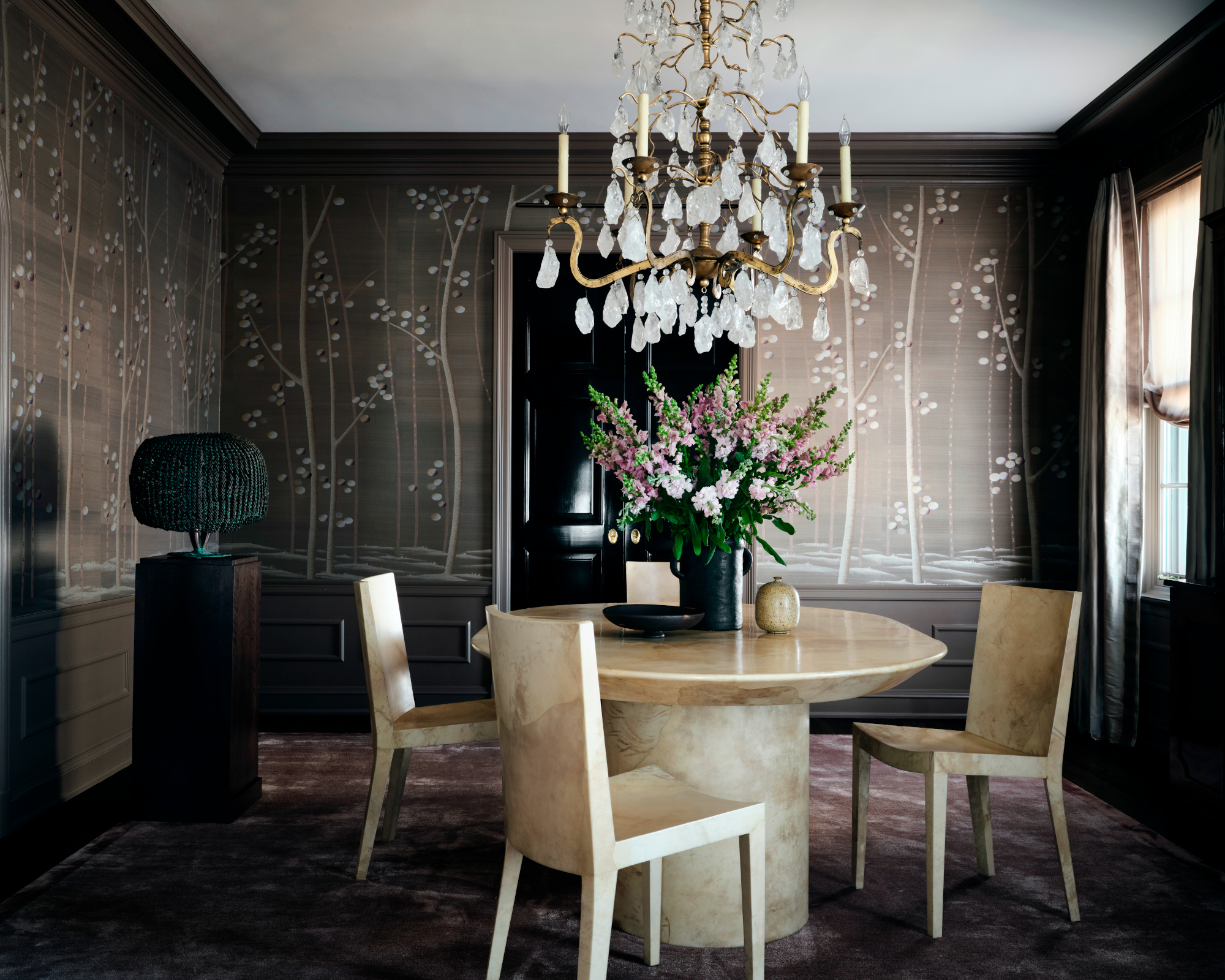
Jessica has created a sumptuous dining room. Dining room ideas include a statement Fromental wallcovering decorated with trees with hand embroidered leaves on a hand painted silk ground. The Therien rock crystal nugget chandelier is a nod to the period style of the building, while the vintage Karl Springer parchment dining table and chairs give it a more modern sensibility. A custom silk rug injects softness under foot.
Kitchen
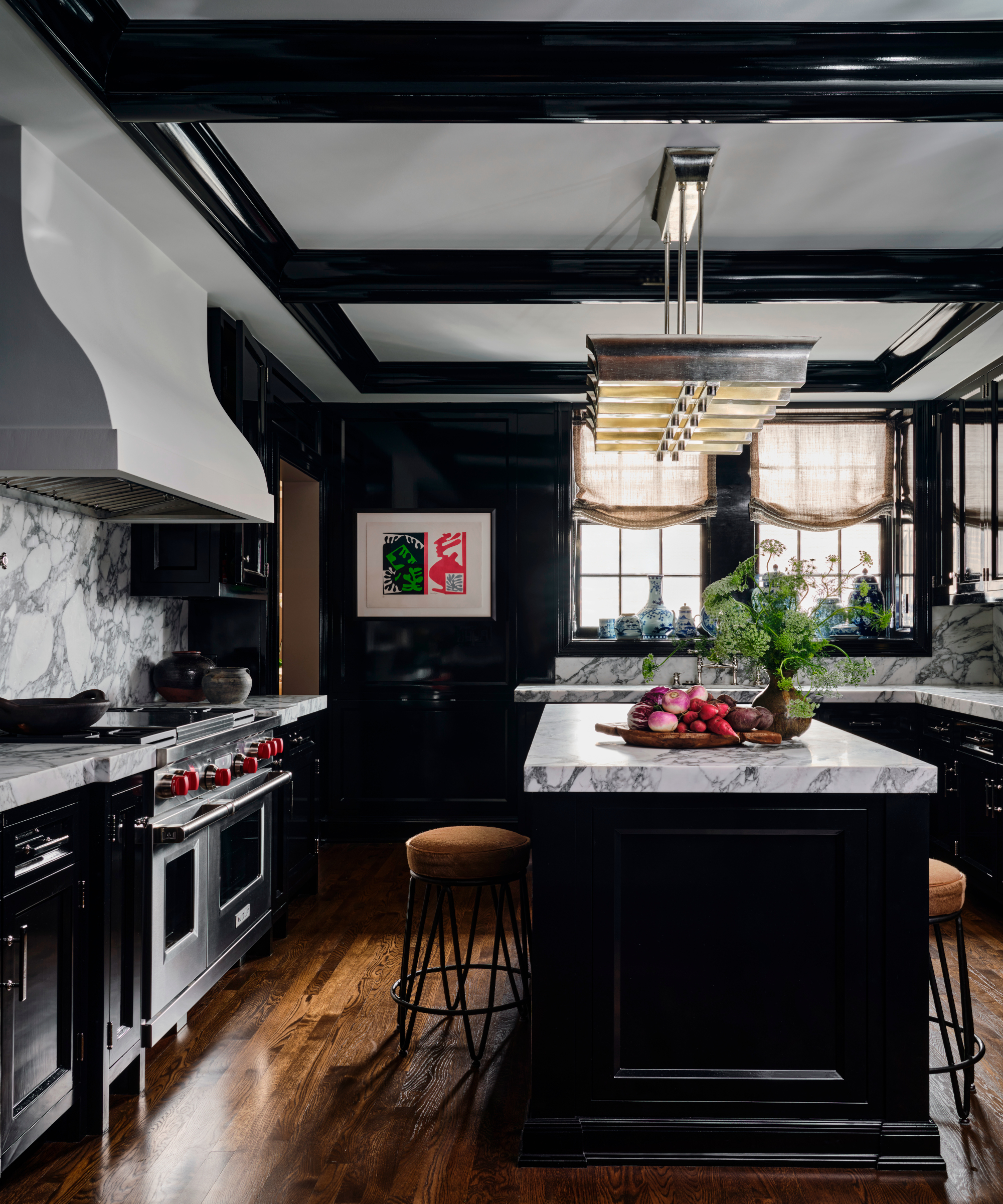
'The client came to us with one request for the kitchen – the cabinetry had to be black,' says Jessica. Among her kitchen ideas was painting the cabinetry in a high gloss finish to inject interest and highlight the cabinetry profiles, while honed white marble countertops with strong veining draw the eye and add depth to the space. Polished nickel hardware and a vintage 1940s inspired light fixture act as jewelry in the space. A punch of color is introduced by the Mattisse Block prints.
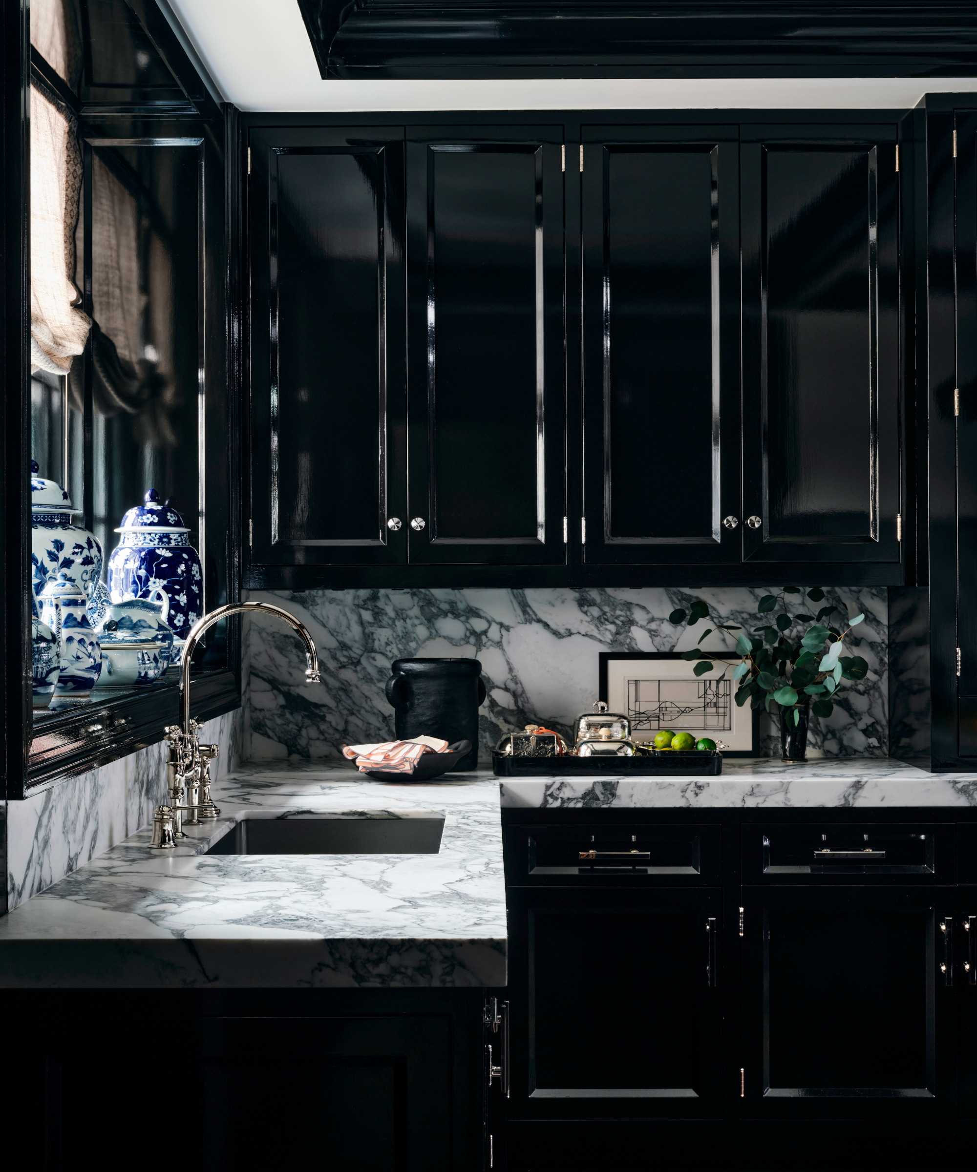
A framed line drawing by the client continues the monochrome theme.
Family room
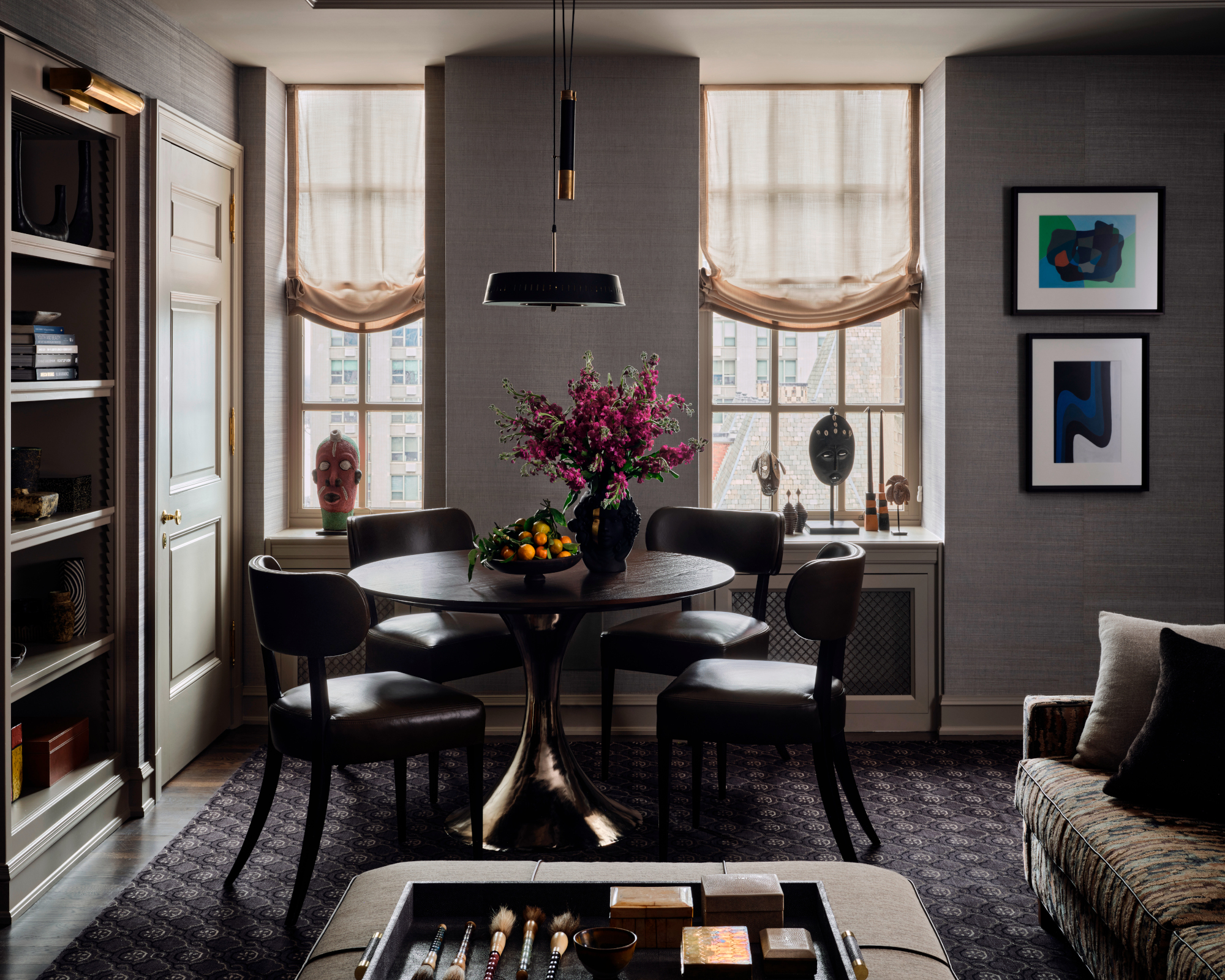
The floor plan reconfiguration in this space made way for the new breakfast/ family room. 'To garner the connection to the adjacent kitchen, we utilized the same black color palette but added in tones of khaki, green, and brown to make it more approachable,' says Jessica. 'A mix of metals was interjected along with pops of color via the clients’ own artwork.'
Library
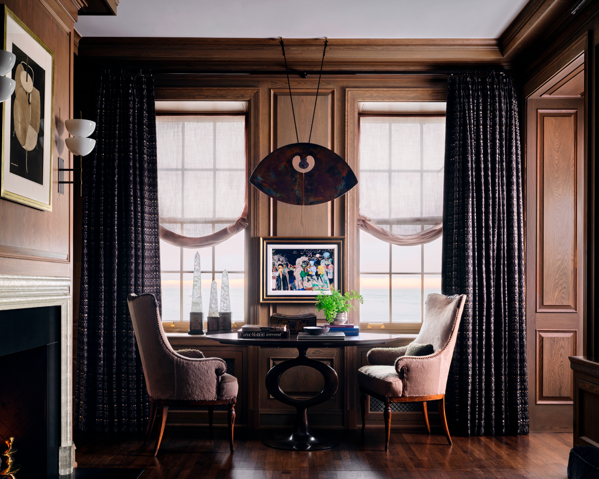
Wanting to honor the intent of the architect David Adler’s original plan, Jessica decided to bring back a paneled library. 'White oak paneling in a custom greige stain color was the perfect backdrop for the luminous cast glass fireplace surround. Capitalizing on the moody atmosphere created by the paneling, the textiles chosen are subdued in color, yet rich in texture,' says Jessica.
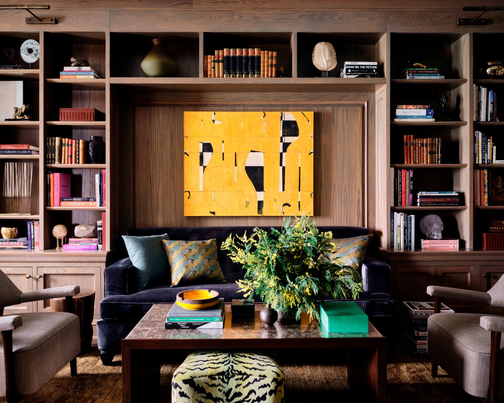
Among the muted colors, the artwork, Caio Fonseca's Fifth Street Painting C02.31, 2002, sings out.
Powder room
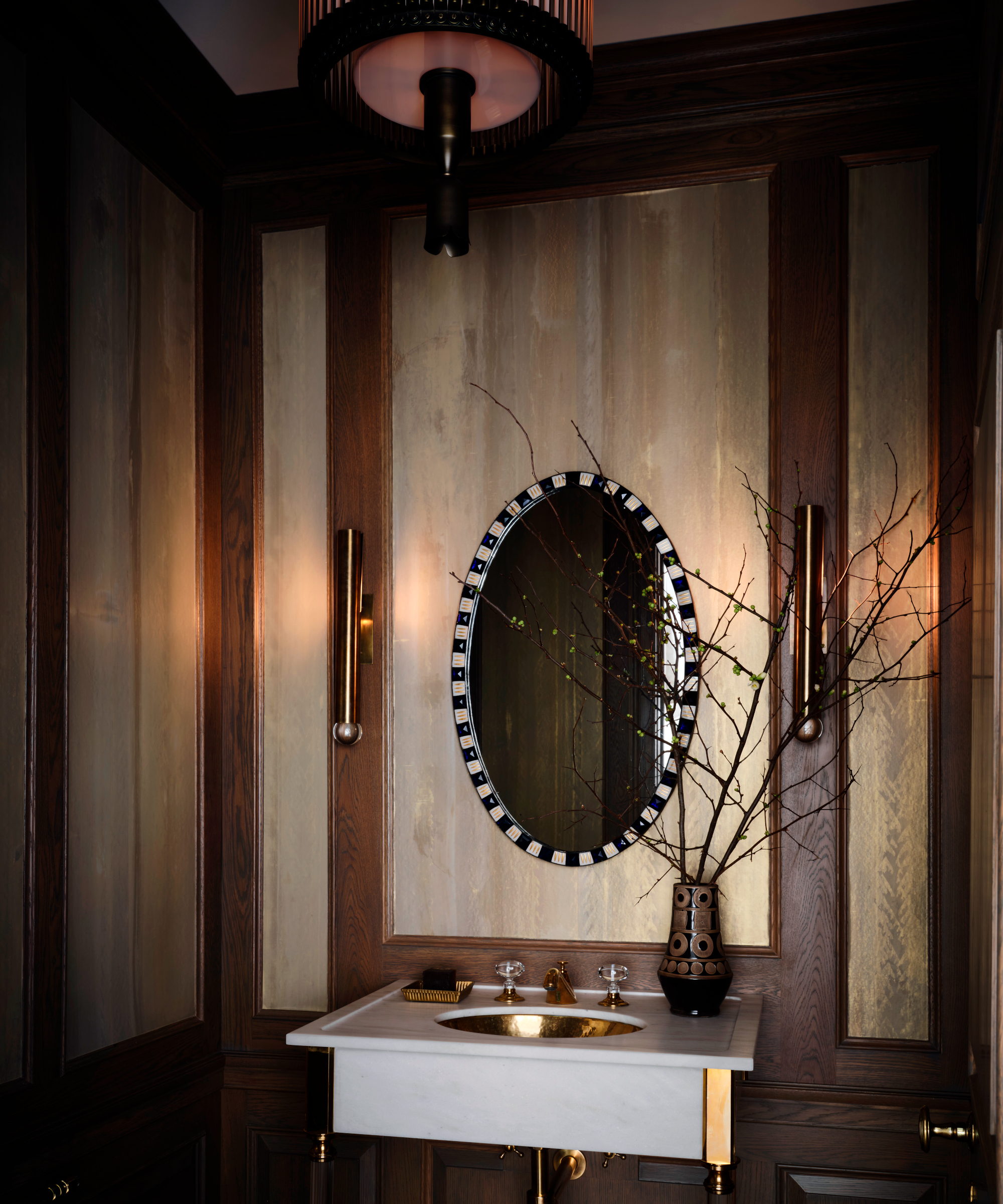
The orientation of the powder room was reconfigured to offer better sight lines. 'Continuing the stained white oak millwork in this space, but wanting to create a more ethereal quality, we added insets of Robert Crowder’s Mirage wallcovering – a combination of gold and silver metallic hues. In our opinion, every powder room should be a jewel box,' says Jessica.
Main bedroom
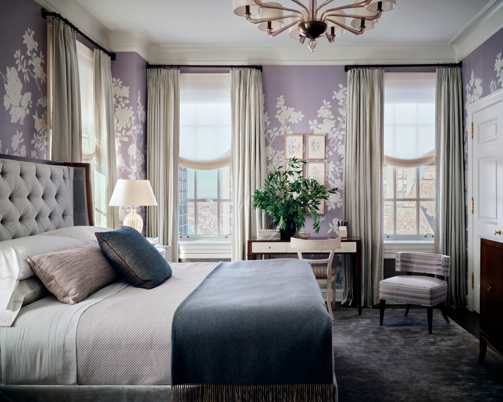
A softer more feminine approach encompasses the primary bedroom. Jessica's bedroom ideas revolve around contemporary floral motifs in hues of lavender, green and blue, French 1940s furniture profiles and Murano glass lighting. The custom wallcovering is by Brunschwig & Fils.
Main bathroom
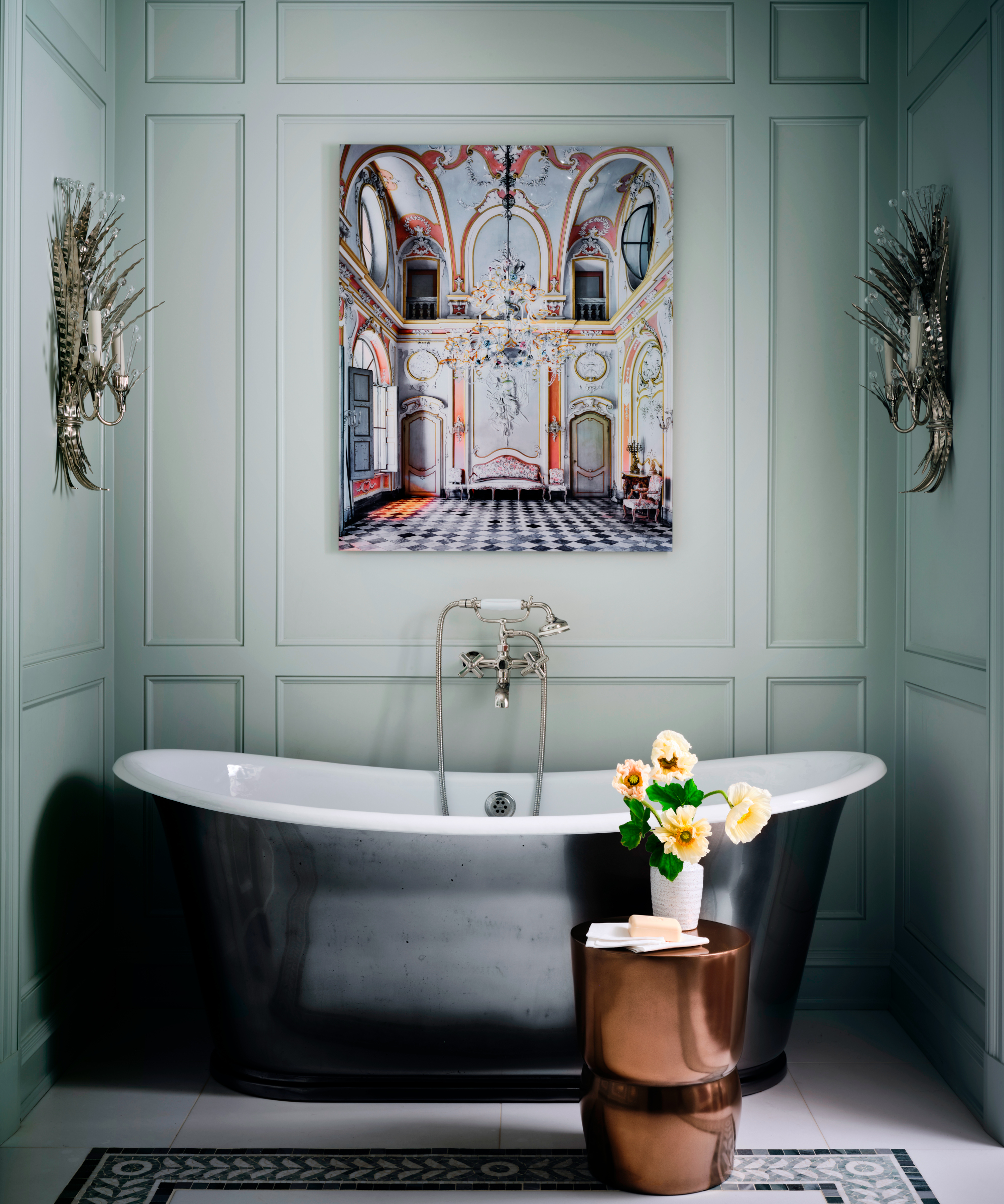
'Prior to the reconfiguration, the primary bathroom was the size of a shoe box. it was formerly a series of closets and smaller maids’ spaces,' says Jessica. 'By creatively carving out space we were able to create a nook for a proper tub, a separate shower room and WC. Jessica's bathroom ideas included continuing the green and blue hues from the bedroom, while Plume Sconces by Tony Duquette introduce a touch of whimsy and glamour. The striking artwork is David Burdeny's Pastel Room, Tenuta Berroni, Racconigi Italy, 2016.
Guest bedroom
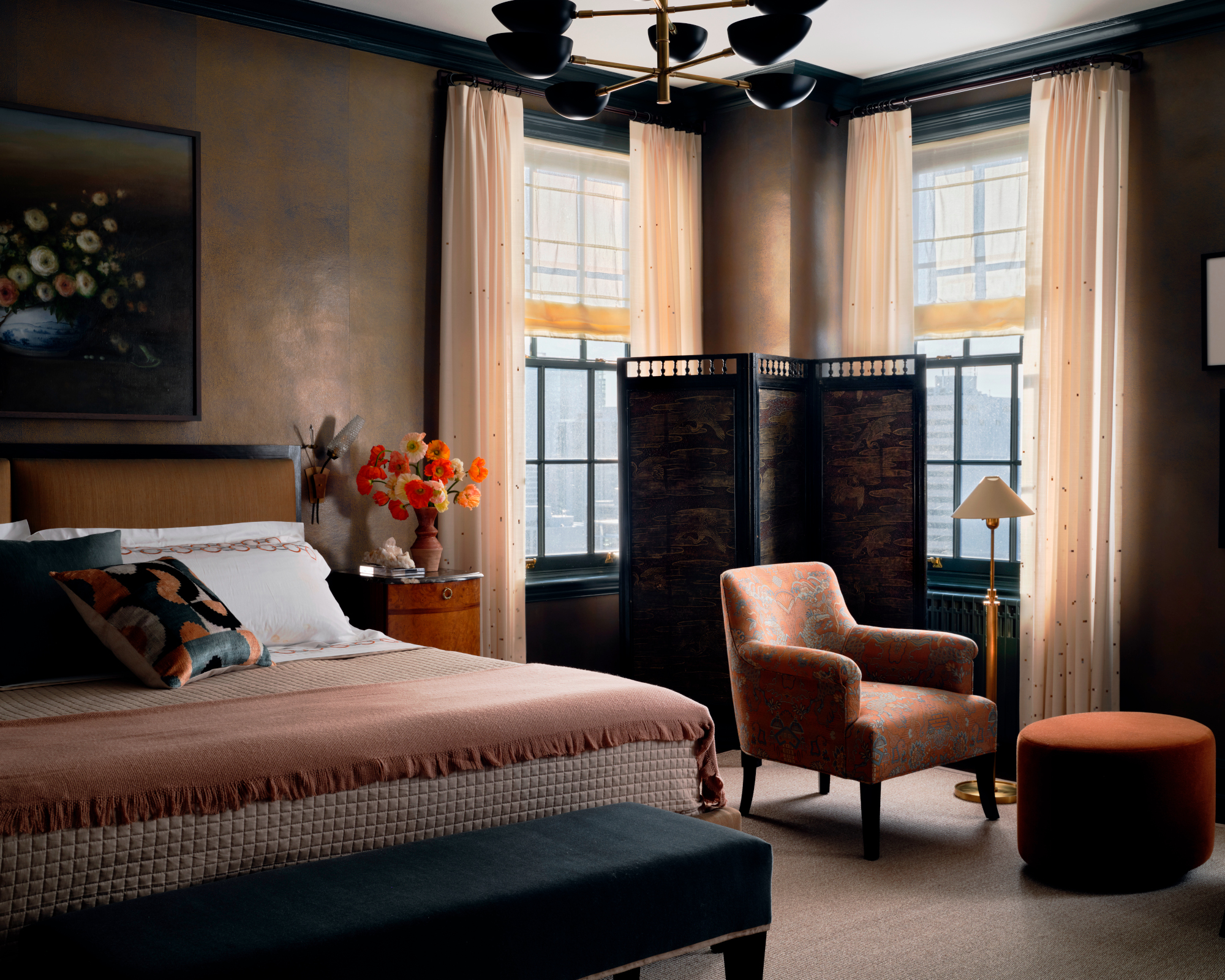
The guest suite was one of the few spaces within the home that didn’t need significant architectural changes.
A dramatic backdrop comprising Studio E's Venetian Plaster Shagreen Wallcovering makes a statement and is complemented by earthy tones of rust and deep turquoise on the mid century modern furniture.
Ensuite
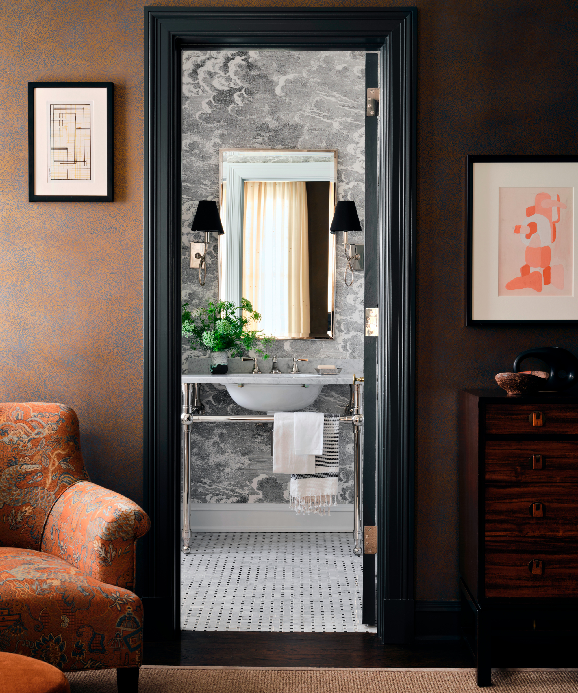
The ensuite bath is decorated in a classic black and white palette with fittings in polished nickel. The Fornasetti for Cole & Son Nuvolette wallpaper adds a touch of playfulness.
Interior design/ Jessica Lagrange Interiors
Photographs/ Douglas Friedman Photography

Interiors have always been Vivienne's passion – from bold and bright to Scandi white. After studying at Leeds University, she worked at the Financial Times, before moving to Radio Times. She did an interior design course and then worked for Homes & Gardens, Country Living and House Beautiful. Vivienne’s always enjoyed reader homes and loves to spot a house she knows is perfect for a magazine (she has even knocked on the doors of houses with curb appeal!), so she became a houses editor, commissioning reader homes, writing features and styling and art directing photo shoots. She worked on Country Homes & Interiors for 15 years, before returning to Homes & Gardens as houses editor four years ago.