9 lessons in nailing an open plan layout we've learned from this Maryland home
How a dramatic redesign brought new life to a Maryland family home, creating better flow and a clean, contemporary look
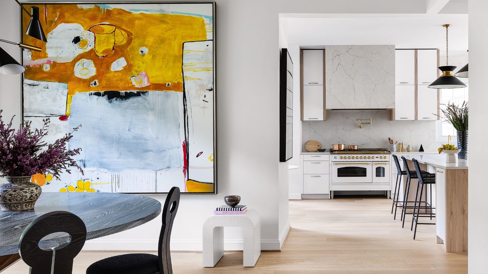
- 1. Opening up sightlines between spaces
- 2. Match walls and floors throughout for cohesion
- 3. Add subtle layers of pattern to a unified theme
- 4. Furniture, lighting and artwork create a strong contemporary look
- 5. Pare back on decor and let the architecture shine
- 6. Don't overcomplicate
- 7. Open plan spaces can be zoned into distinct areas
- 8. Comfort should come first
- 9. You can create big impact in the smallest of spaces
Built just over 30 years ago, this five-bedroom home in Bethesda, Maryland, a suburb of Washington DC, was ready for a revamp. Its owners have three young children and felt the was outdated.
The kitchen was small, the windows, fireplaces, lighting, and staircase detailing were all in need of a new look. And the owners were looking for a way to improve function and flow through the main level of the home.
A recent 10-month program of improvements has brought the house up to date, dramatically improving the cohesion between the spaces on the main level. With a clean, contemporary style that puts the house among the world's best homes, the redesign has achieved exactly what the homeowners set out to do.
Designer Dara Beitler, took charge of the home's new look, removing walls and relocating doorways, updating flooring, and renovating the kitchen, dining room, entry, living room, and powder room.
To do this, explains Dara, she took on board her clients' feelings about color, pattern, and style. 'Most importantly, I had to fully understand how they function within their home and what their goals are to maximize function amongst and within their spaces,' she adds.
Designer Dara gives us the tour, highlighting the techniques used to improve flow and harmony.
1. Opening up sightlines between spaces
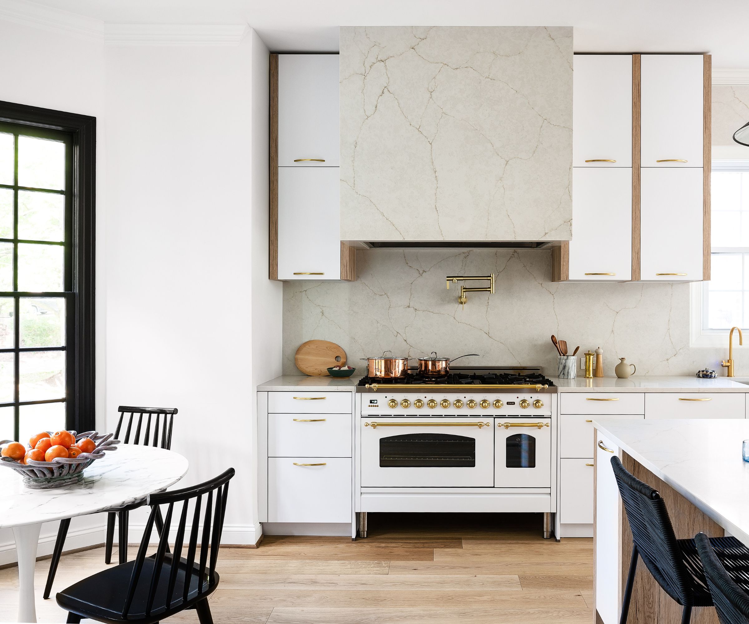
Walls were removed during the redesign in order to open up the sightlines between key spaces and increase the sense of flow for the whole of the downstairs.
Although the homeowners wanted to preserve some of their home's existing features during the updates, the kitchen was one area that required a more dramatic approach. 'They wanted a larger space to cook and entertain,' explains designer Dara Beitler, 'and a better flow throughout the first floor, improved storage and a kid-friendly open space.'
Dara's kitchen ideas ticked all those boxes, and then some. The pared-back, open-plan space now looks out from the central hub of the kitchen onto both the family's dining nook, and the more formal dining room, and gives a calmer look and a more relaxed vibe overall.
The round kitchen table was an existing piece, now repositioned to a bright sociable spot to fit in with the designer's family-friendly eat-in kitchen ideas and the kitchen chairs were from West Elm.
2. Match walls and floors throughout for cohesion
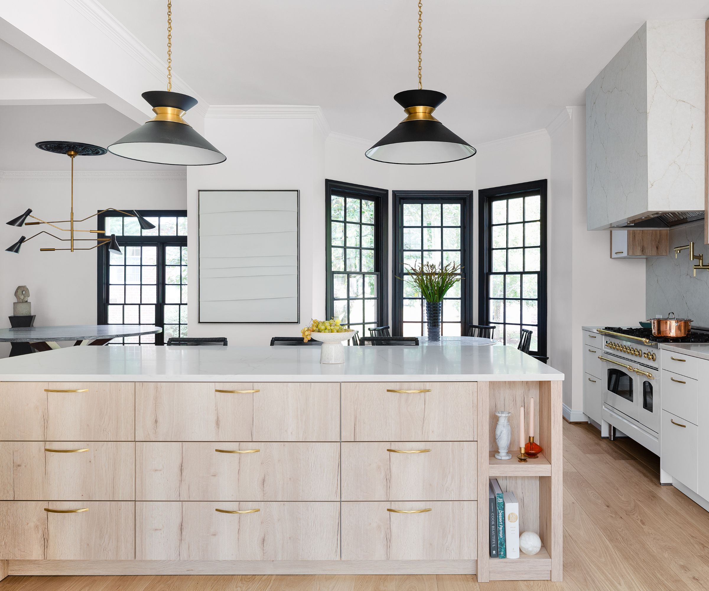
Key to the serene new look, is the beautiful natural oak wood flooring. In fact, designer Dara's kitchen flooring ideas were continued across the whole downstairs footprint to improve the links and flow between the spaces. The walls across the whole downstairs space are painted in Pure White by Sherwin Williams, while contrasting windows with black detailing in the brand's Tricorn Black to create a neat and contemporary new backdrop.
Anyone looking for kitchen island ideas could take inspiration from this largescale design, with multiple drawers on one side and a breakfast bar on the other.
'I invited Häcker Kitchens, Greenwich, to join my vision for the new epic kitchen,' says Dara. 'Together, we specified cabinetry in white and vintage oak, appliances, stone, plumbing fixtures, hardware, and functional and organization features to make an inviting and cohesive space within the home.'
The two striking antique brass and black pendants above the island are by Visual Comfort.

Dara is the principal and creative force behind Dara Beitler Interiors. She combines a unique mix of design genres in each of her projects. With a keen eye and passion for everything design, Dara develops and creates beautiful and eclectic spaces, while keeping in mind functionality and spatial awareness. Her personal style stems from her lifelong love of vintage furniture and decor, while also mixing modern and contemporary vibes with natural elements. For this Maryland home redesign, maximizing functionality and flow was key.
3. Add subtle layers of pattern to a unified theme
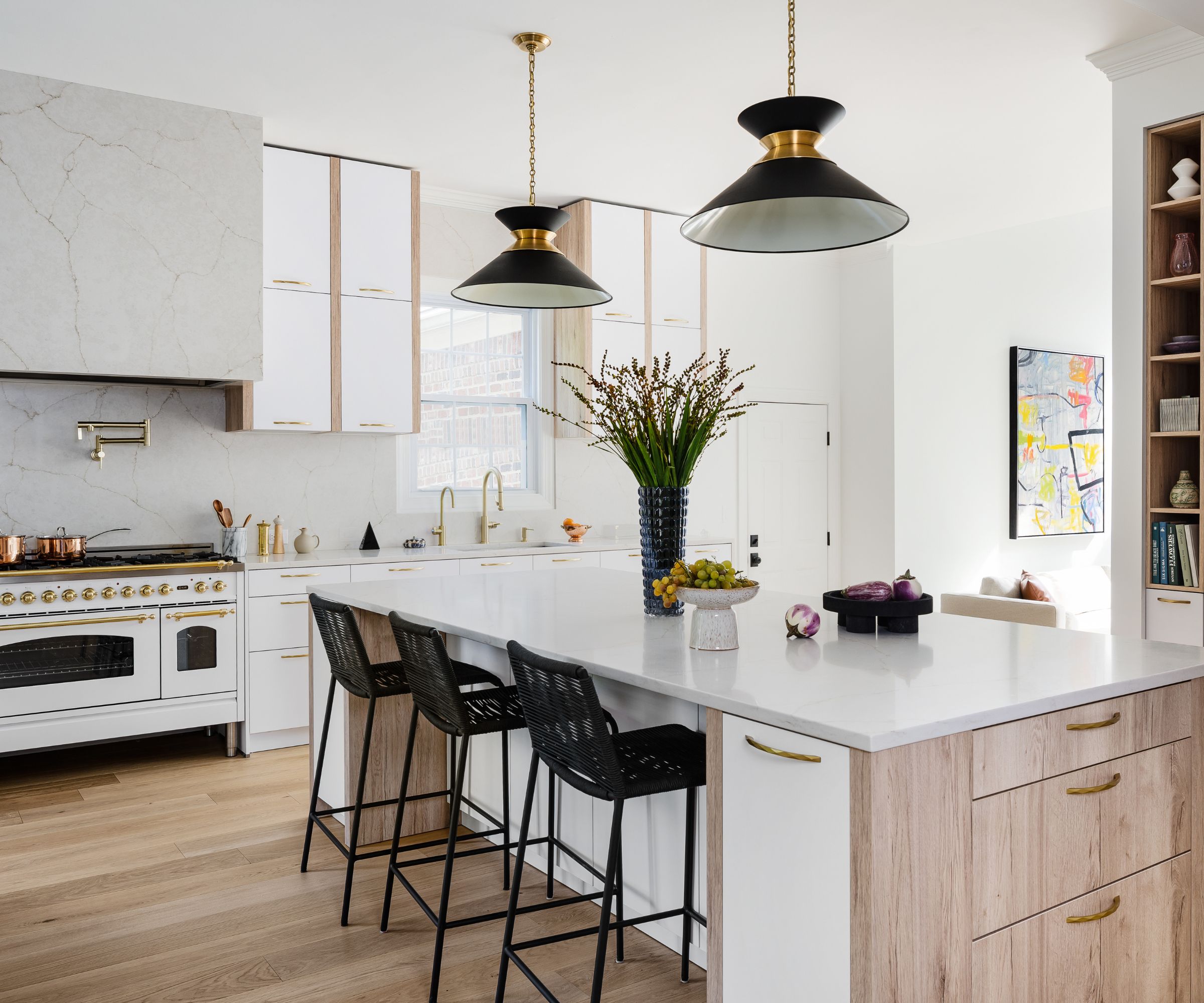
White walls emphasize the new open-plan flow in the family's living space and enhance the ample natural light, but it was important to add further layers and interest. The pale wood flooring and wood detailing on the cabinetry is further complemented with the striking kitchen countertop ideas. Calacatta Valentin® quartz countertops, backsplashes and hood encasement, all by MSI Surfaces, bring in a hint of pattern and a lot of luxury.
Key pieces in this working section of the kitchen include a freestanding oven range, the Nostalgie 48" by Ilve, with other appliances by Miele. The satin brass faucet and pot filler are from California Faucets. The cabinetry hardware is the Arch Pull by Hickory Hardware. Counter stools were sourced at Article.
4. Furniture, lighting and artwork create a strong contemporary look
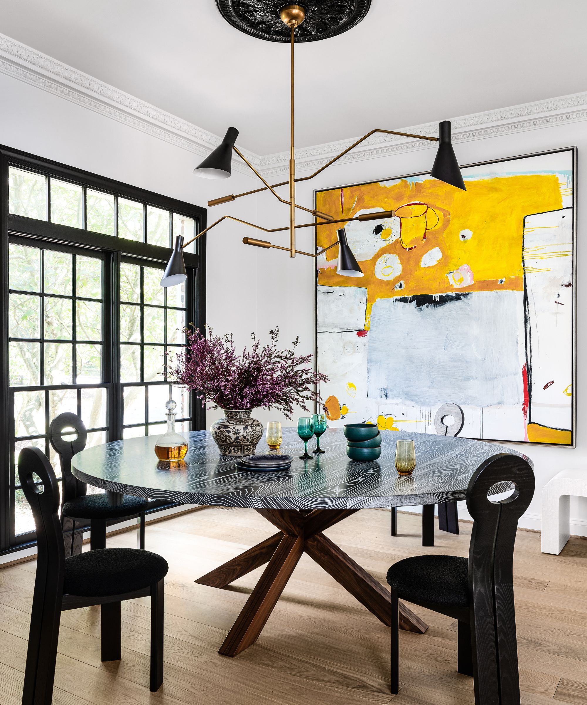
Dining room ideas came together once the custom round oak and ash table with walnut base was sourced from Aronson Woodworks. The statement table anchors this space beneath the sculptural and adjustable chandelier from Regina Andrew. Black oak and boucle chairs, designed by Sarah Sherman Samuel for Lulu and Georgia add flair to this space. The striking artwork is from Merritt Gallery, its vibrant colors the perfect complement to the architectural details and furniture in the dining room.
5. Pare back on decor and let the architecture shine
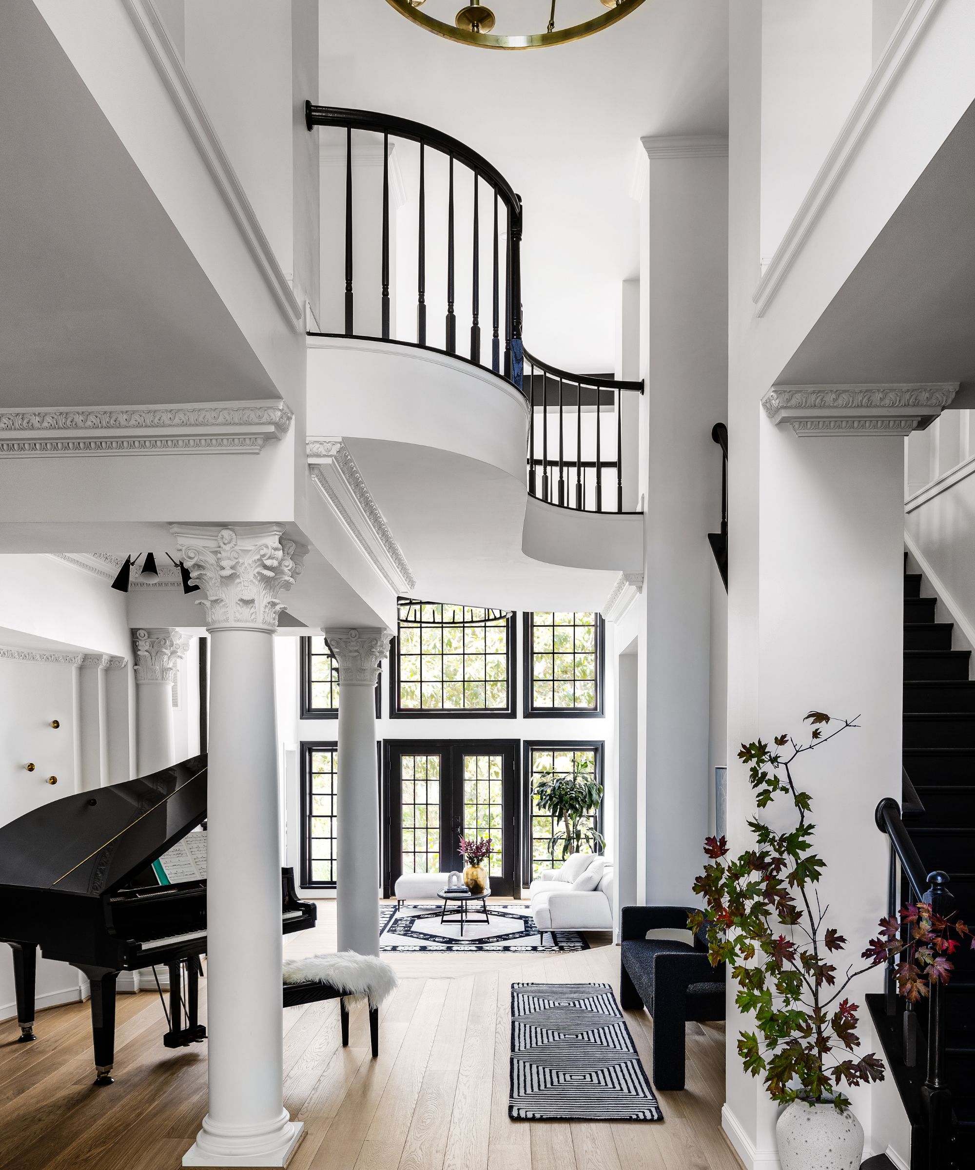
The two-story foyer was one of the problem areas facing designer Dara Beitler as she sought to make sense of the disjointed home and restore its flow. The old space was complicated with wall cut-outs, shelving, and a sunken floor but Dara stripped these back to create a much more harmonious entry space that sets the tone for the home. She also found a good place for the family's baby grand piano.
Entryway ideas include a three-tiered aged brass chandelier (just seen) by Hudson Valley Lighting Group, a stained staircase and painted rails, balusters, and posts.
6. Don't overcomplicate
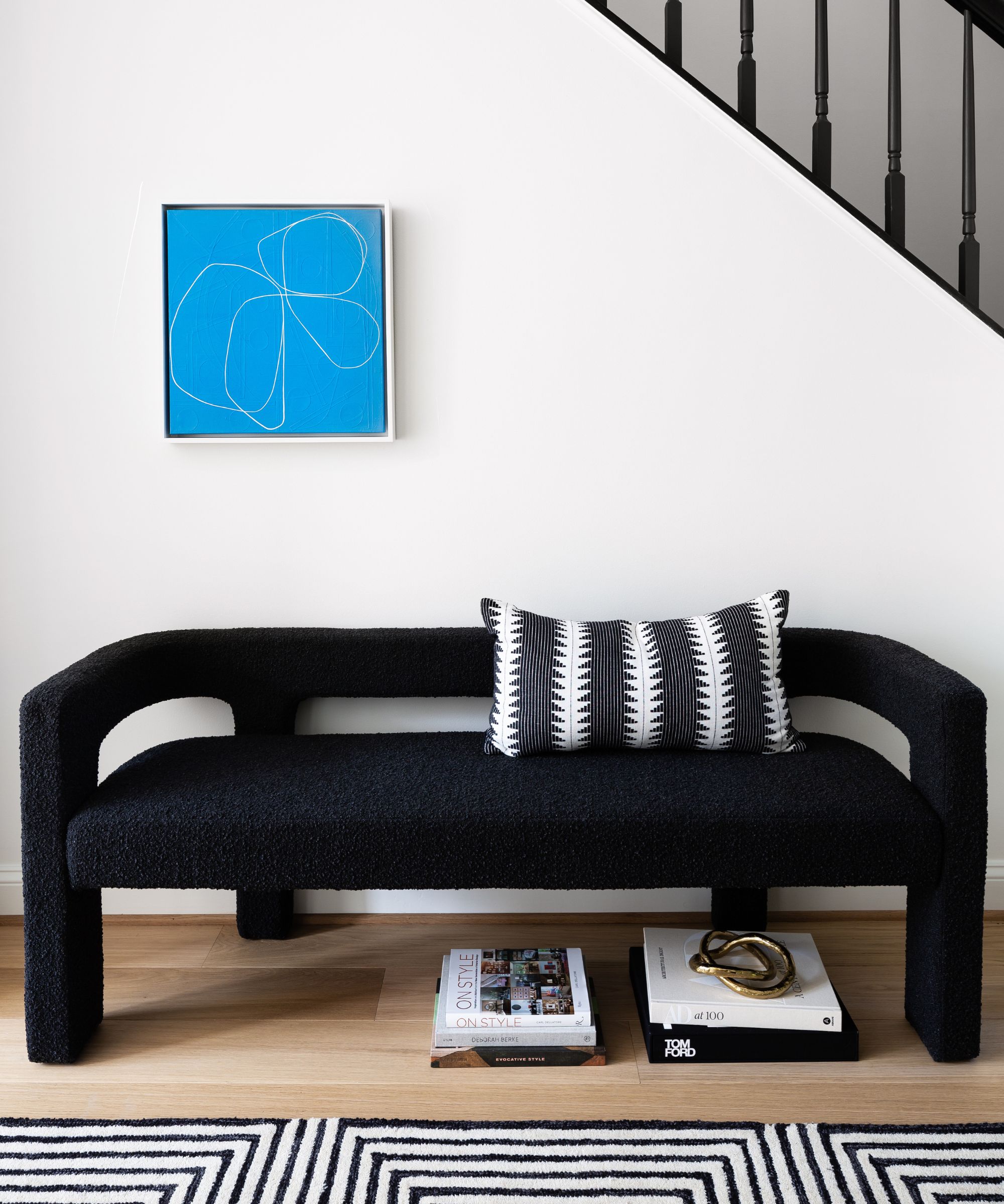
Proof that staircase ideas needn't be too complicated, and creating a showstoppingly graphic moment all of its own, this curved bench is perfectly positioned to complement the renovated stairs (and to enjoy listening to the family pianists!). A monochrome patterned rug and cushion enhance the striking effect. The bench in noir bouclé is from CB2. The simple blue artwork adds all the color that's required.
7. Open plan spaces can be zoned into distinct areas
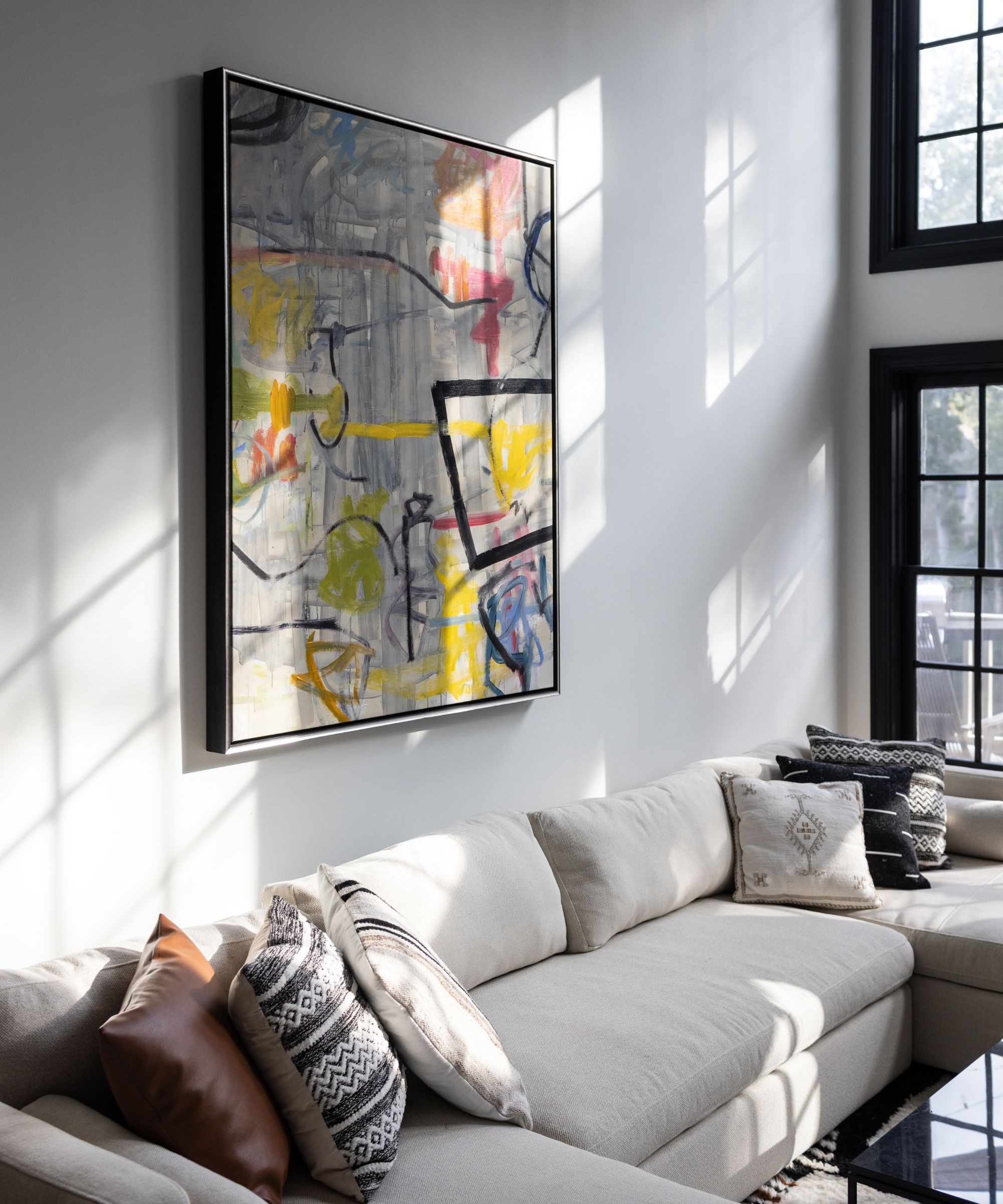
The family's main living room is part of the dramatic double-height foyer. By removing the shelving and wall cut-outs, the newly streamlined space has a far more contemporary feel, particularly now the bank of windows has been accented in black paintwork. The warm white sectional sofa is a good choice for the open-plan setting, as it helps to divide the seating space from the music area behind.
Living room ideas include textured rugs from Morocco to add warmth to the spaces along with sofas sourced at Article and Crate & Barrel. The tables are from Room & Board and AllModern. The artwork is from Merritt Gallery.
8. Comfort should come first
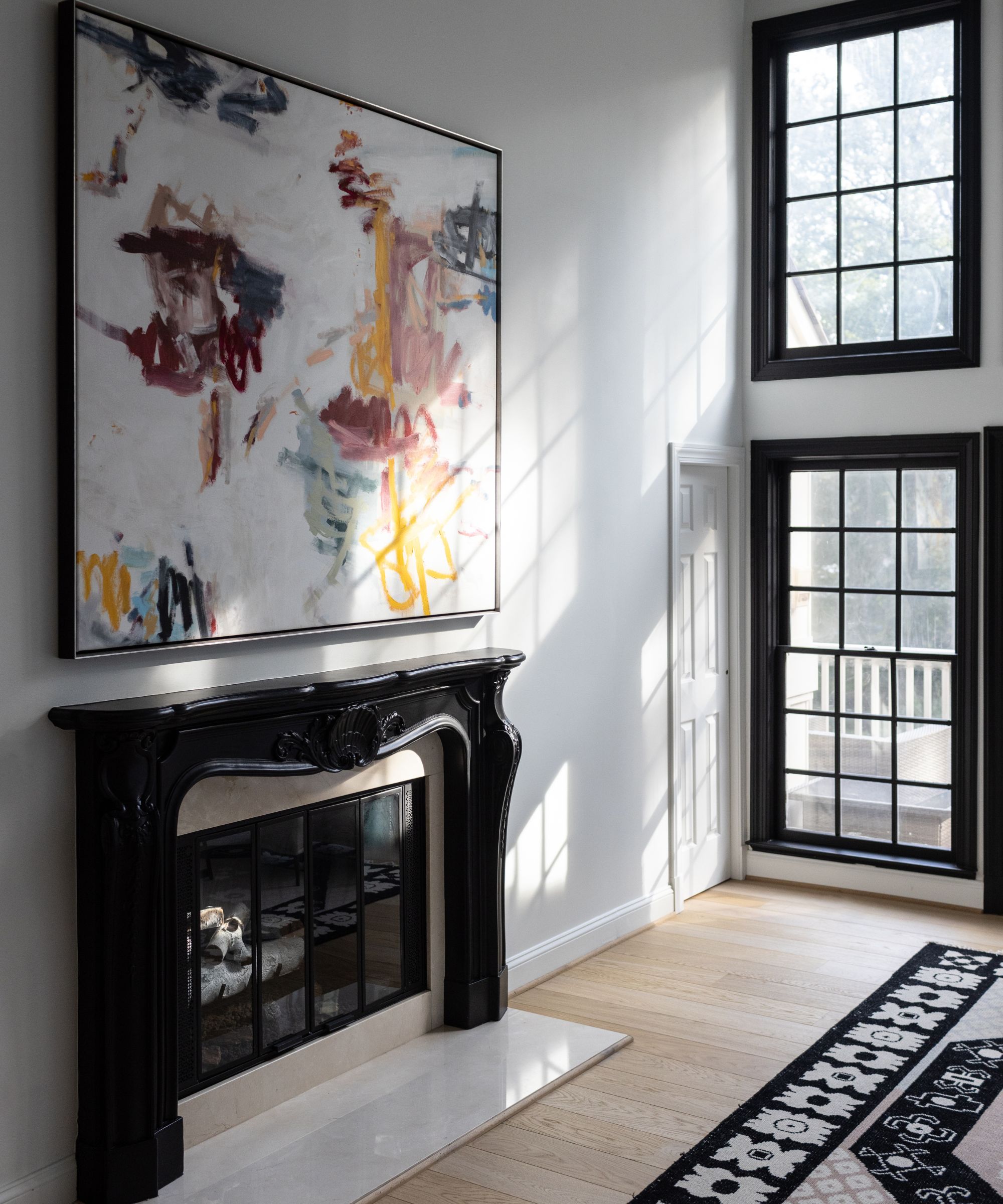
When it came to living room fireplace ideas, designer Dara Beitler had plans in mind to improve comfort and ease of use. 'In keeping with the original architecture and millwork, we enhanced the existing fireplace surrounds with paint and converted both wood burners with new white birch gas fireplace inserts by Real Fyre,' she says.
The new gas fires are easier to operate and maintain than the old wood burners.
9. You can create big impact in the smallest of spaces
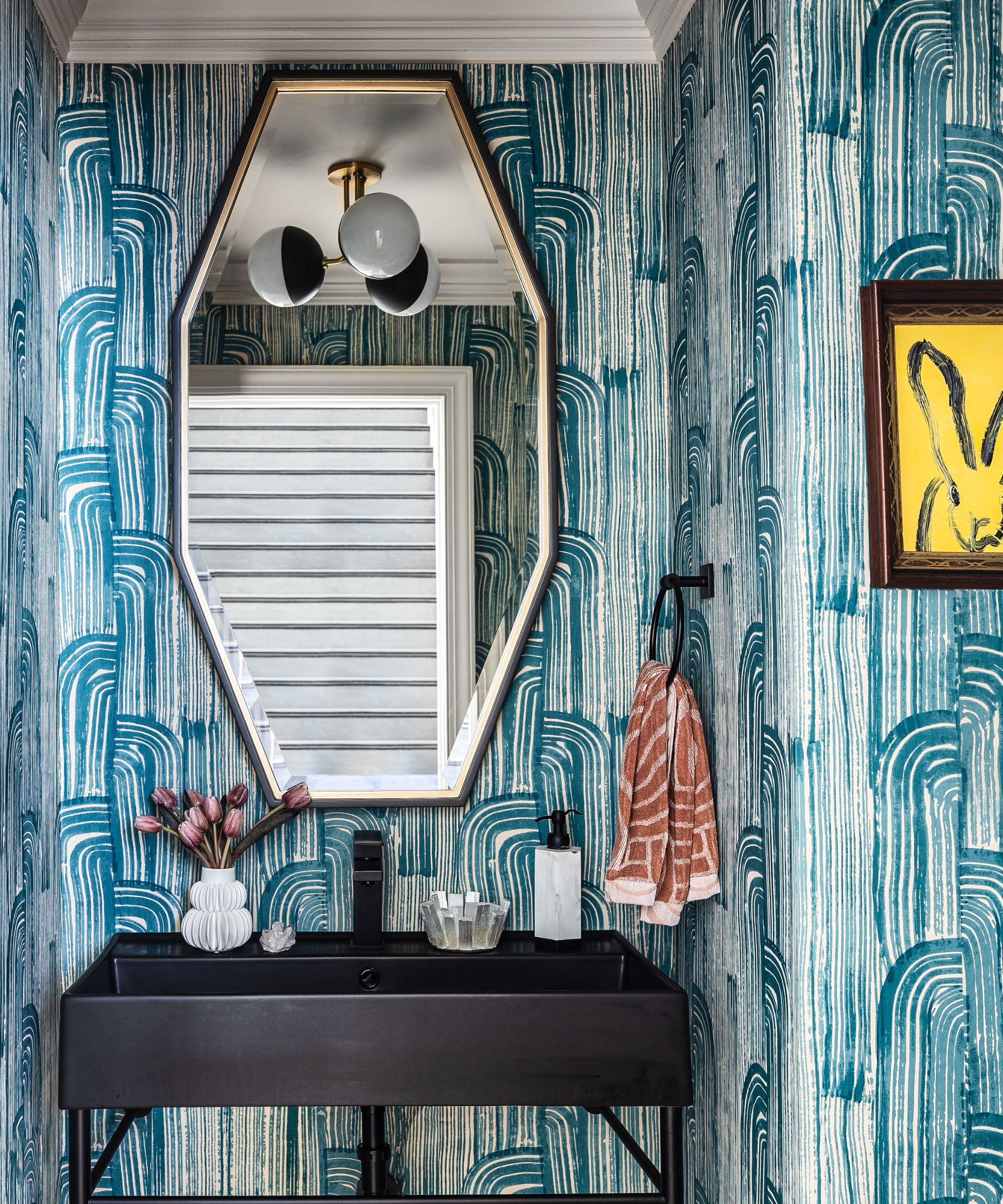
Powder room ideas gave designer Dara an opportunity to add bold color and movement, away from the white walls and pale wood treatments in the open layout elsewhere in the main level. That said, you'll still find subtle nods here to the home's main themes.
The wallcovering is the lake and cream colorway of the Kelly Wearstler Collection by Lee Jofa. A matte black ceramic vanity by Scarabeo Ceramiche anchors the main wall and references the black accents elsewhere in the home. 'The oversized dark espresso and gold mirror by Uttermost above aims to lift the eyes, thus creating a broader vertical view and reflection,' adds Dara.
Black plumbing and hardware fixtures are by Delta and the light fixture by Mitzi.
Interior design: Dara Beitler Interiors
Photography: Angela Newton Roy
Styling: Limonata Creative
Sign up to the Homes & Gardens newsletter
Design expertise in your inbox – from inspiring decorating ideas and beautiful celebrity homes to practical gardening advice and shopping round-ups.
Karen sources beautiful homes to feature on the Homes & Gardens website. She loves visiting historic houses in particular and working with photographers to capture all shapes and sizes of properties. Karen began her career as a sub-editor at Hi-Fi News and Record Review magazine. Her move to women’s magazines came soon after, in the shape of Living magazine, which covered cookery, fashion, beauty, homes and gardening. From Living Karen moved to Ideal Home magazine, where as deputy chief sub, then chief sub, she started to really take an interest in properties, architecture, interior design and gardening.
-
 5 key trends from Milan Design Week that are going to change the design direction of 2025
From floating furniture to silvered surfaces, here's my perspective on the key themes and new moods coming through from Milan Design Week 2025
By Pip Rich Published
-
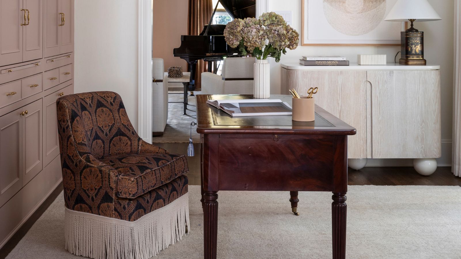 The rumours are true, the NYC trend for fringes and trimmings is actually happening – they are the secret weapon for making a room look expensive
A trim or a ruffle is the finishing touch that can take a scheme from ordinary to the extraordinary in an instant
By Jennifer Ebert Published