Bold color schemes bring original features to life in this historic home
This historic colonial revival home dates back to 1895 and has been given a quirky update that enhances its period features

Design expertise in your inbox – from inspiring decorating ideas and beautiful celebrity homes to practical gardening advice and shopping round-ups.
You are now subscribed
Your newsletter sign-up was successful
Want to add more newsletters?
Looking for a way to update their historic home in Newton Center, Massachusetts, the owners decided a glamorous, sexy and elegant look would be the way to go. They wanted to restore and enhance the property's many original features, and a sympathetic interior décor, with added 2020s sass has transformed this into one of the world's best homes.
Before they could even begin to consider the fine design details, however, there were some major obstacles to overcome - namely stripping away the not very complimentary architectural elements that had been added to the house in the 1940s, 80s and 90s. The main culprit and biggest challenge was the old 1980s kitchen that was falling apart.
The owners turned to designer Cecilia Casagrande to help them enhance the home's original architecture while making it ready for modern day living. Her solutions speak for themselves: this special home is now a celebration of original period details perfectly balanced with quirky and glamorous contemporary touches, Here are some of the highlights.
Article continues belowKitchen
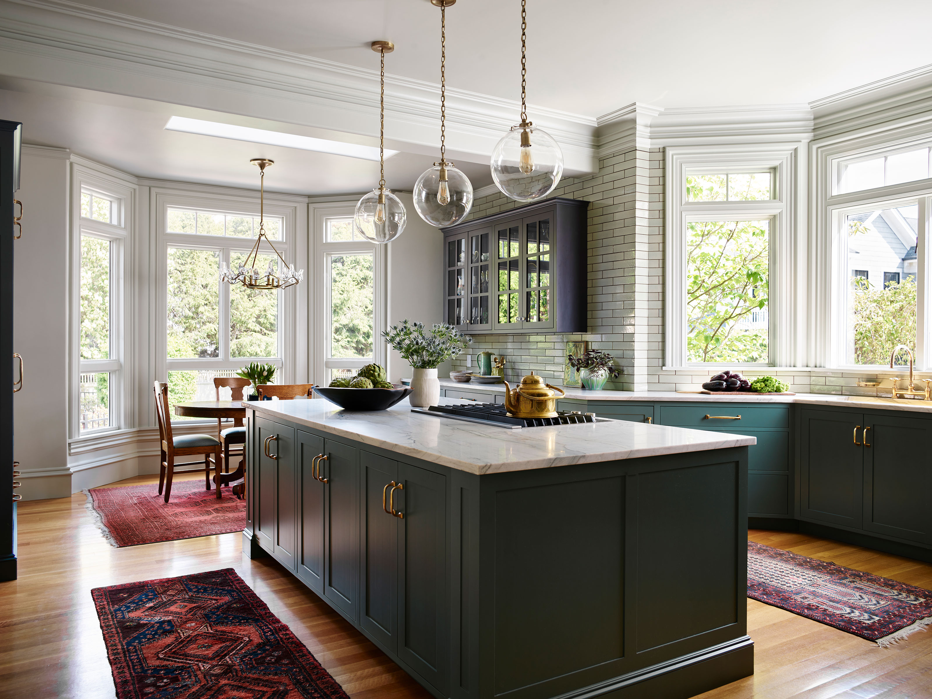
The new kitchen is unrecognizable from the decrepit 1980s fitted cabinets that were here before designer Cecilia stepped in. Looking for kitchen ideas and not sure where to start? Well, why not take a leaf out of Cecilia's book and let an accessory or treasured possession be the starting point for your scheme?
'The inspiration for the kitchen was my client’s Turkish Iznik pottery collection and antique rugs,' she says. And from those details the dreary 1980s kitchen was transformed into a bright and open space.
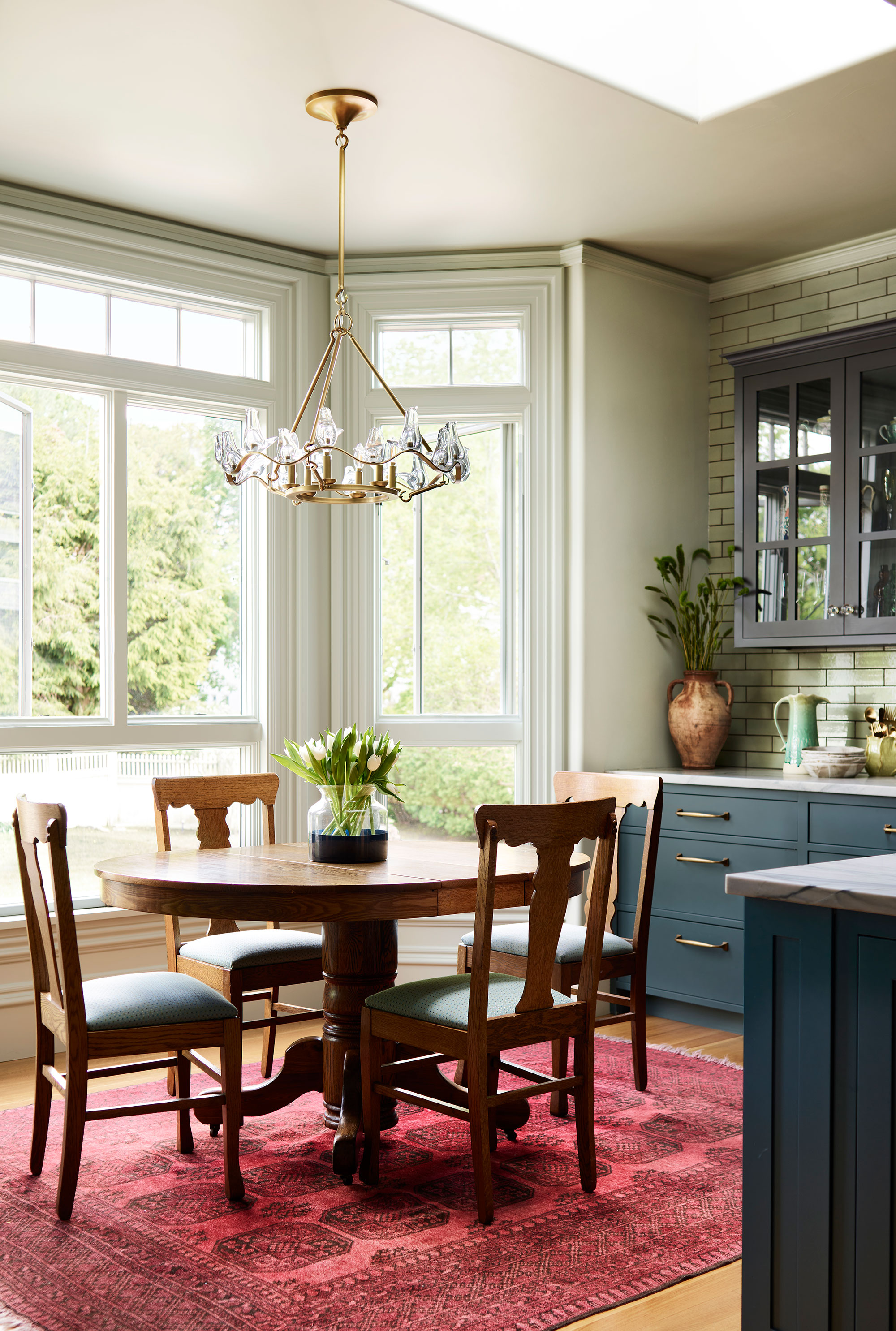
Cecilia explains that her clients wanted a true mix of midcentury, antique and modern. 'We did this in each room whether a midcentury side table is paired with a very modern bed frame and pillow fabric or a curved sofa with modern lamps,' she says. Thus, in the breakfast nook, an antique pedestal table and four vintage dining chairs add a note of Victorian balance to the updated kitchen, and look perfectly at home in the setting.
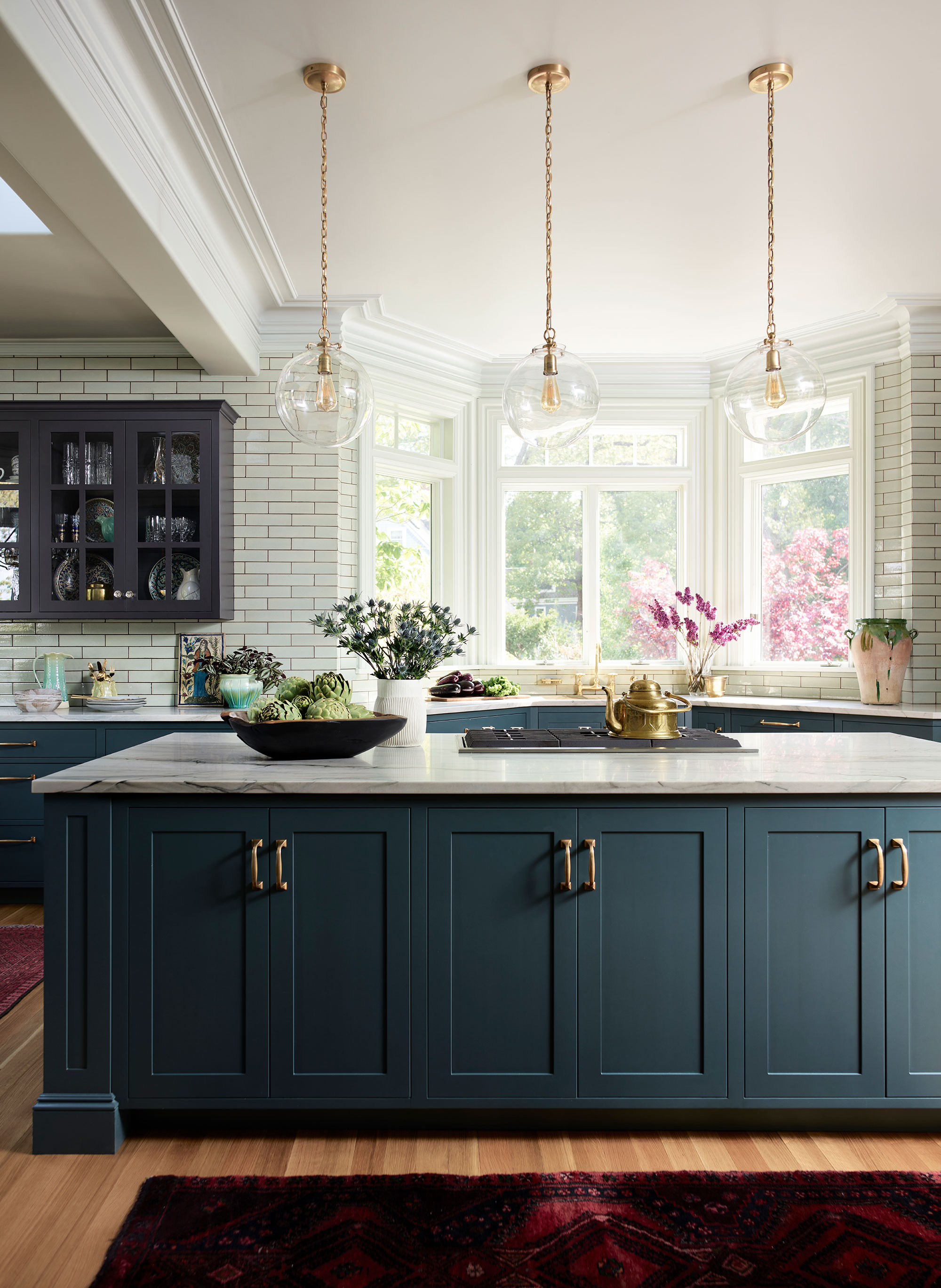
The cabinet colors were inspired by the gorgeous blues of the Turkish plate collection (Farrow & Ball’s Paean Black and Benjamin Moore’s Yorktowne Green).
Design expertise in your inbox – from inspiring decorating ideas and beautiful celebrity homes to practical gardening advice and shopping round-ups.
'With vintage rugs from Afghanistan, brass taps by Barber Wilson and handmade tile by Winchester Tile in England, there's a worldly point of view here, and the green stone gives an earthy touch,' adds Cecilia.
Living room
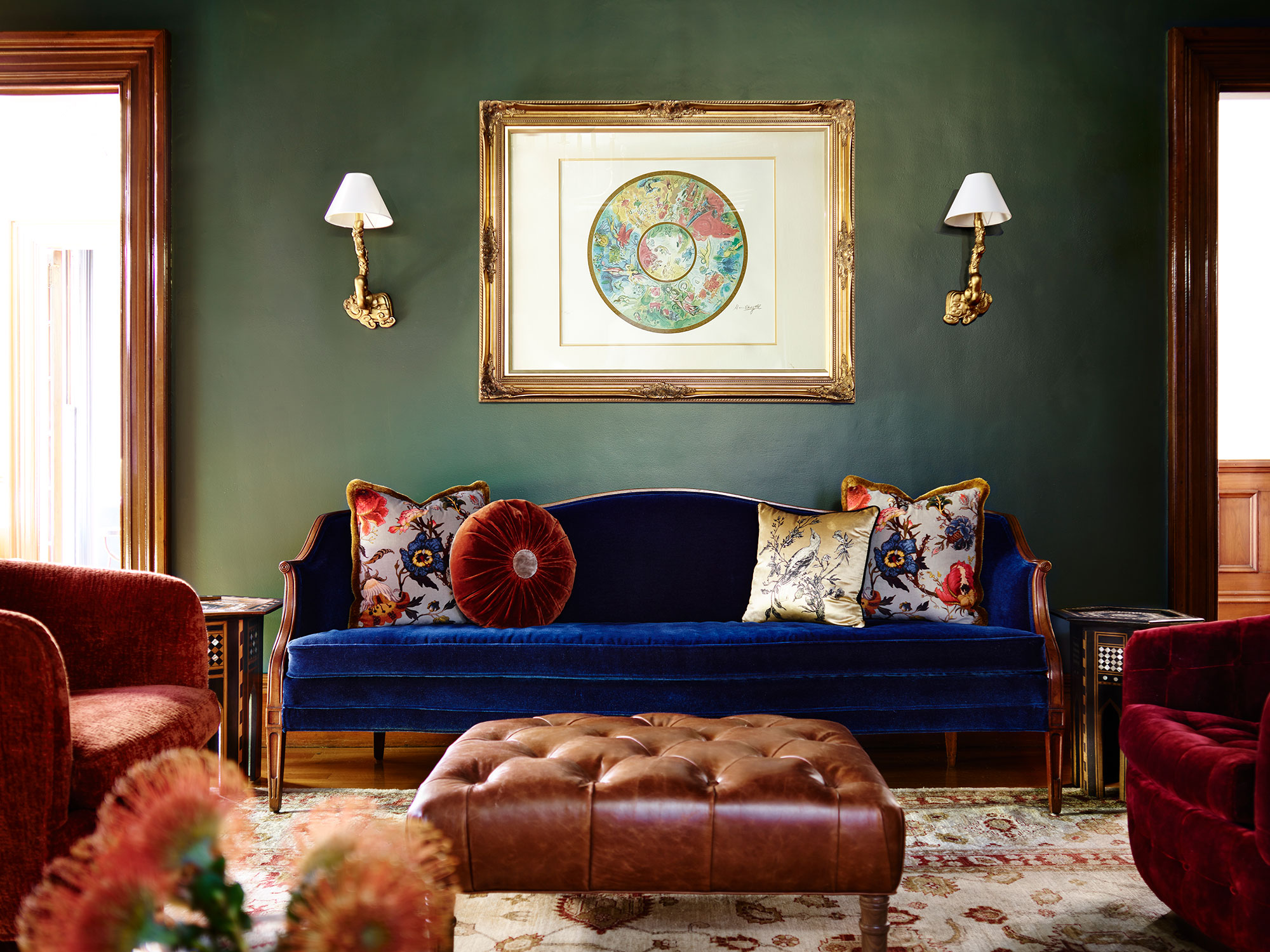
Living room ideas came easy for this large room with its intricate wood detailing and impressive bay window. 'My favorite design element is how we used the same rich Farrow & Ball paint colors on walls, trim and ceiling,' says designer Cecilia. 'It keeps the old ornate trim modern by wrapping the same all round, then when we used pure walnut on doors or trim we let those natural wood elements have their glory with just a clear poly.'
The walls and ceiling here are painted in Hague Blue by Farrow & Ball, which creates a cozy Victorian parlor vibe, but also adds a modern edge to the scheme. The sofa is a midcentury vintage piece, upholstered in mohair blue velvet.
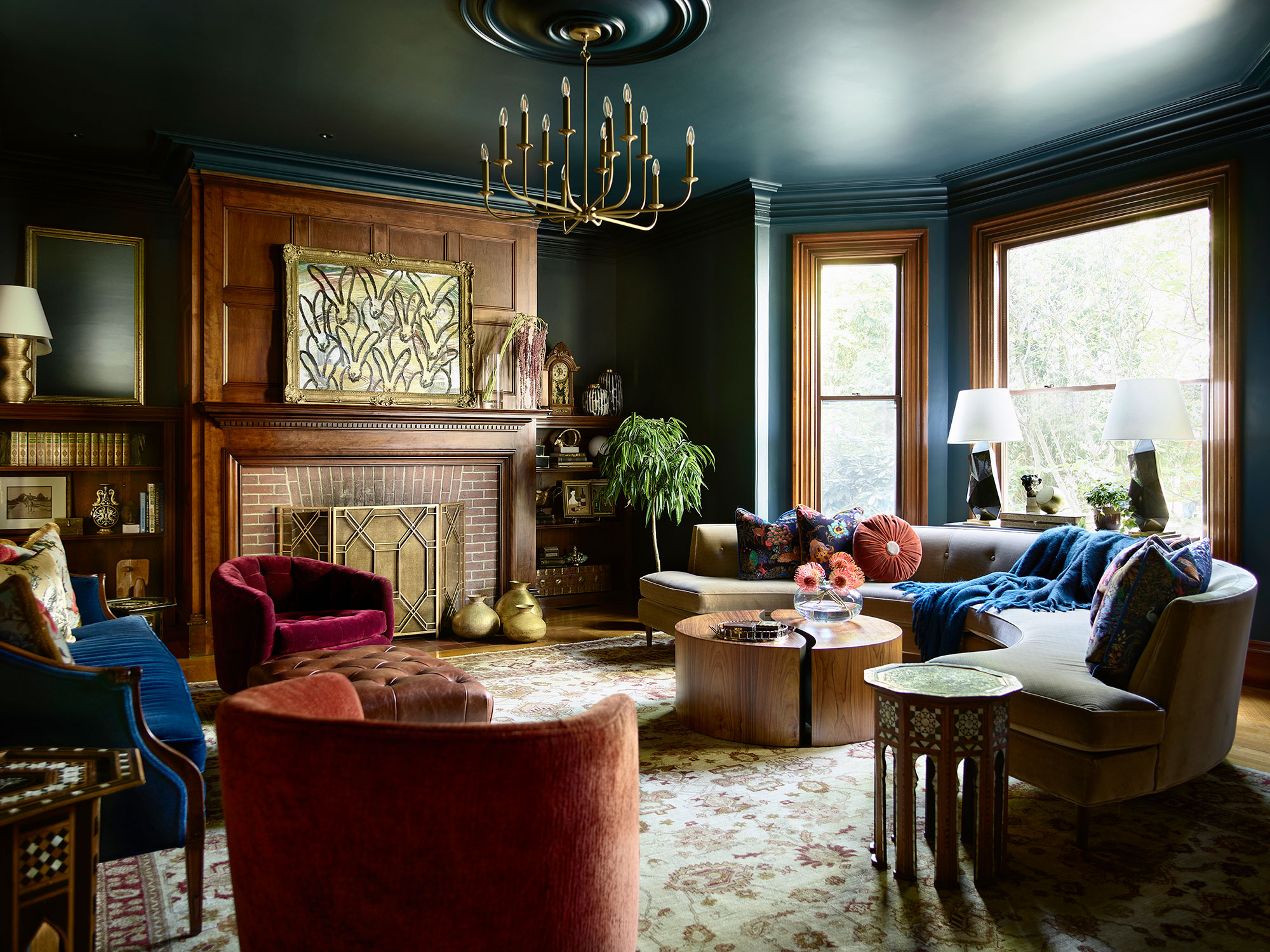
Cecilia decided to play up the living room's curves with a rounded modern Jonathan Adler Danner sofa and Kelly Wearstler lamps, which she says create 'a sexy vibe, as do the Pierre Frey and House of Hackney pillow fabrics'.
Midcentury furnishings including a vintage Thayer Coggin swivel chair reupholstered in a Kirby Design burgundy velvet, a new Thayer Coggin Roxy chair.
'The round midcentury pi-coffee table and Moroccan in-laid bone and mother of pearl side tables are accented with eclectic accessories sourced from around the world all creating a global sensibility,' adds Cecilia.
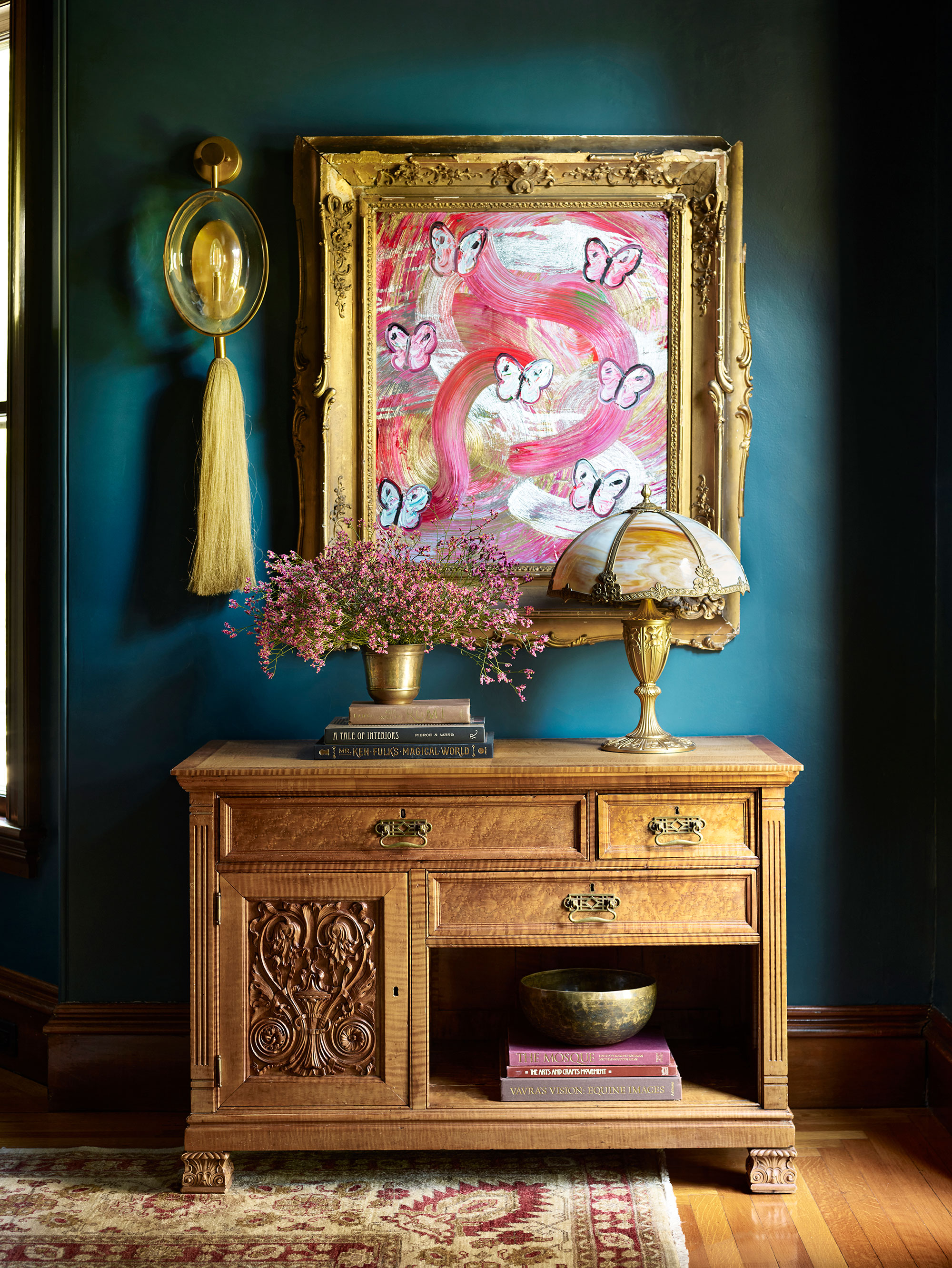
Bringing life and a vibrant splash of color to a corner of the living room, this artwork by Hunt Slonem also adds glamour in a heavy gilt frame. Below it is a vintage carved sideboard.
Dining room
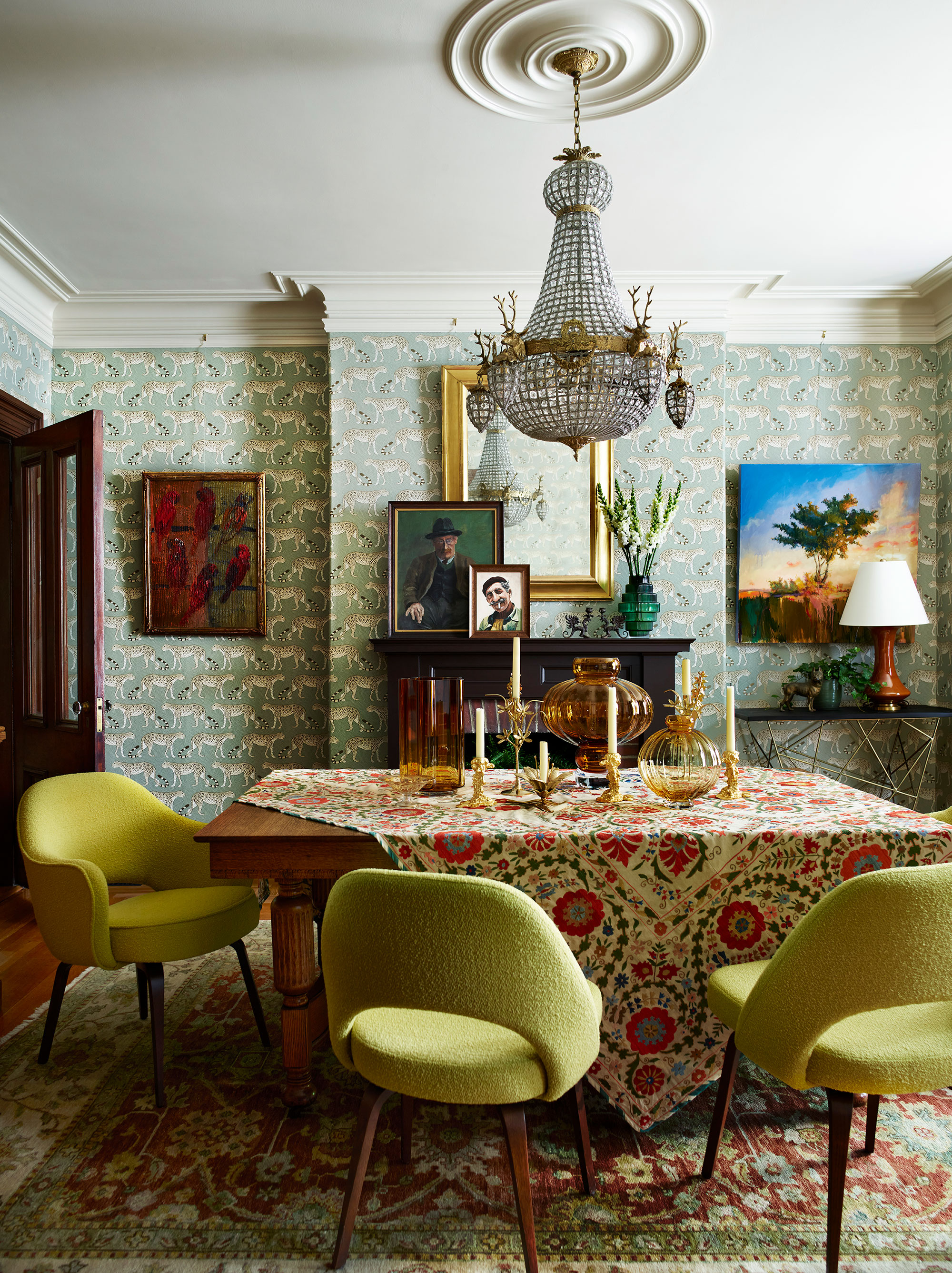
Cecilia's dining room ideas perfectly match her clients' wishes and their approach to the whole renovation. With quirky, contemporary elements, such as the Cole & Son Leopard Walk wallcovering; fun features that are a twist on traditional, such as the stag chandelier sourced in Germany; iconic midcentury Saarinen chairs and a stunning Suzani tablecloth, the overall effect is eclectic, joyful, and sympathetic to the bones of this historic home.
Cecilia describes the look as Victorian modern – exactly what her clients were aiming to achieve.
Upstairs landing
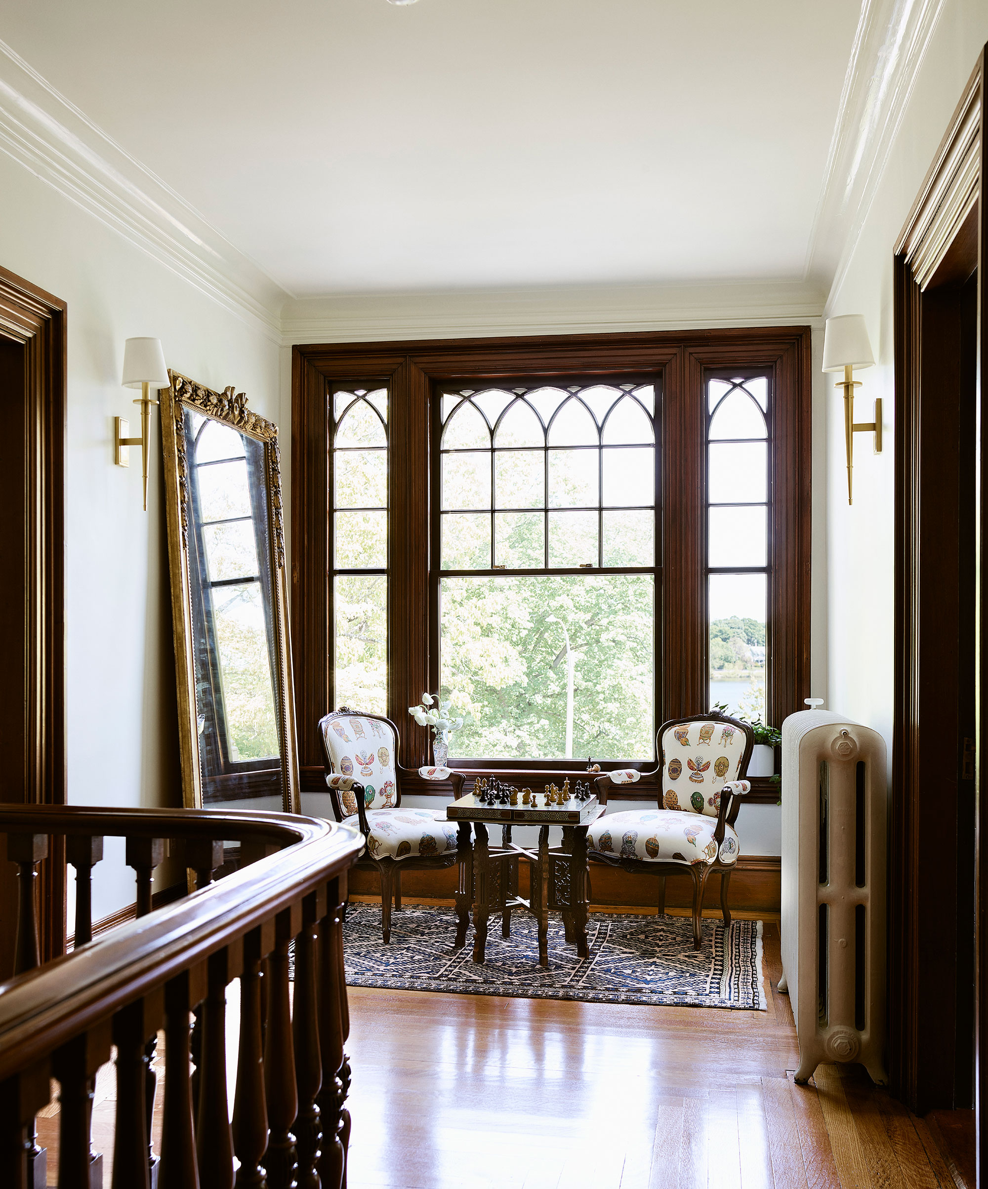
Hallway ideas for this spacious upstairs landing make the most of the good light from an original gothic-detailed 1895 window to create an inviting seating area with French-style armchairs and a chess set ready to go. Note also, the statement mirror and period-style radiator.
Bedroom
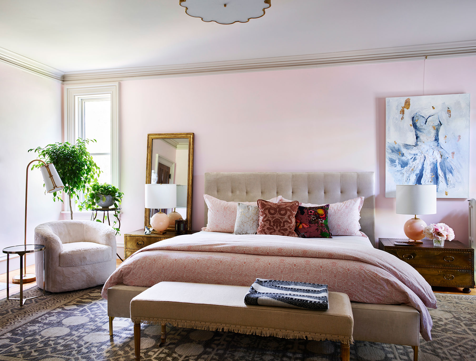
Pretty pastel pinks for the primary bedroom, where again there's a comfortable mix of antique, vintage and modern furnishings included in Cecilia's bedroom ideas.
Time-honored brass, like the Sarreid chests, antique mirror and large ceiling light, by Alexa Hampton for Visual Comfort, give character to the large room. The walls are painted in Middleton Pink and trim in Dove Tail both by Farrow & Ball.
'The House of Hackney and Timorous Beasties pillows add funk,' says Cecilia, 'while a modern bed in a champagne velvet and swivel chair in a furry faux sheepskin fabric provide the balance to all the vintage pieces.'
Bathroom
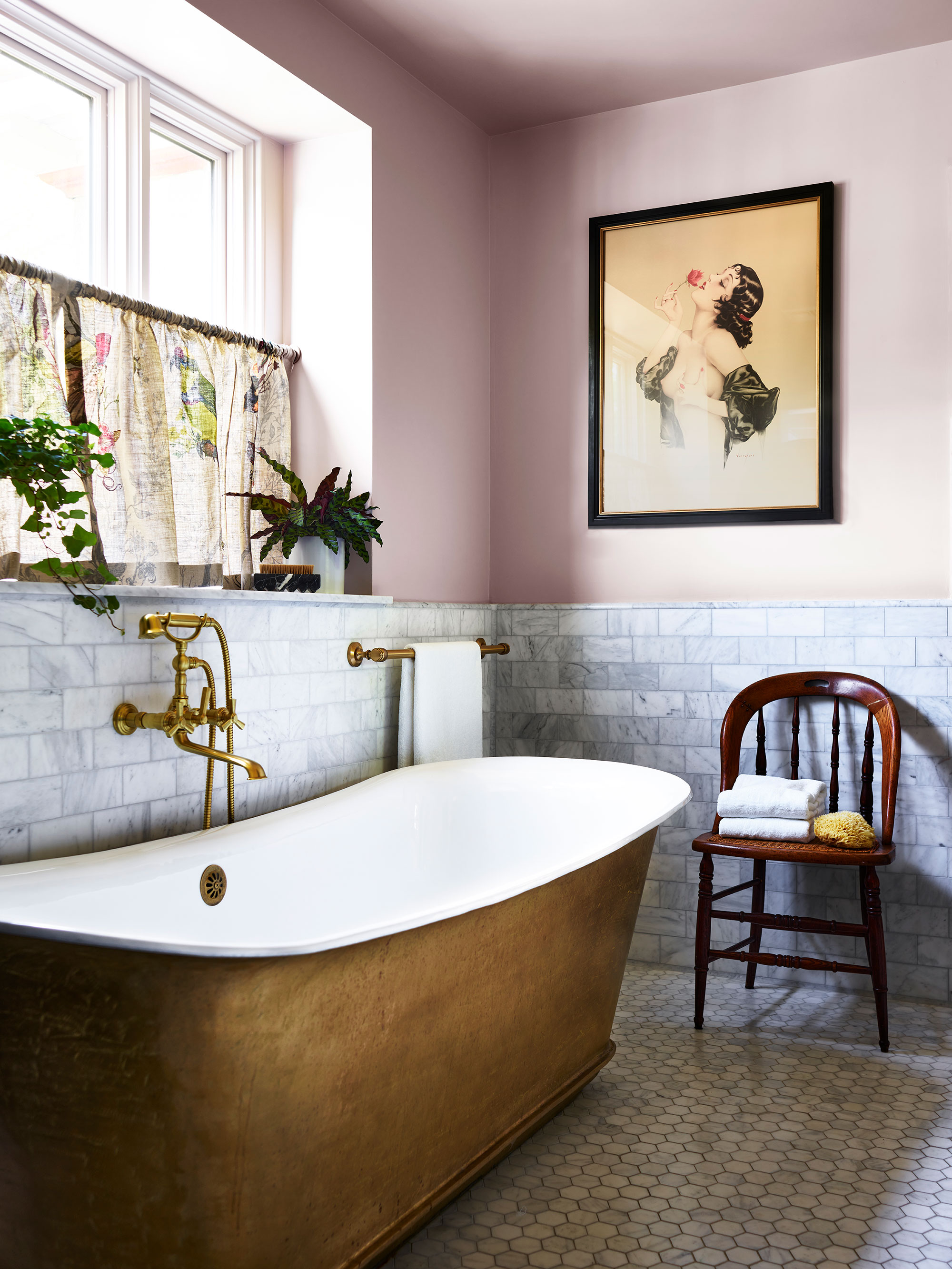
The bathroom is a real showstopper, and its star? The Penhaglion cast iron tub in unlacquered brass, which is the ideal choice for this historic home.
Anyone looking for bathroom ideas – whether for an old or new house – will find inspiration in this room, which offers a modern twist on a traditional bathroom scheme. The classic marble tiles, curtain in Timorous Beasties and brass accents are the perfect complements to the freestanding bathtub.
And what do the homeowners make of their new-look old home now the renovations and decoration is complete?
'They are absolutely thrilled with the choices we made and the home we created,' says Cecilia. 'Each room was well thought out and inspired by their beautiful collections, whether it was a rug, pottery or midcentury furniture piece. It was such a group effort from the architectural restoration to the pillow fabric.'
We couldn't agree more. We love the way this renovation has honored the home's original features, while still updating them with humor and subtly introduced contemporary touches. It's a thoroughly modern way to enjoy an old home.
Interior design: Cecilia Casagrande Interiors
Photographs: Jared Kuzia Photography
Karen sources beautiful homes to feature on the Homes & Gardens website. She loves visiting historic houses in particular and working with photographers to capture all shapes and sizes of properties. Karen began her career as a sub-editor at Hi-Fi News and Record Review magazine. Her move to women’s magazines came soon after, in the shape of Living magazine, which covered cookery, fashion, beauty, homes and gardening. From Living Karen moved to Ideal Home magazine, where as deputy chief sub, then chief sub, she started to really take an interest in properties, architecture, interior design and gardening.
