Expert design help turned this new house into a characterful, happy home
Adding texture, color and textiles turned an empty, featureless new build into a happy, stylish house full of personality
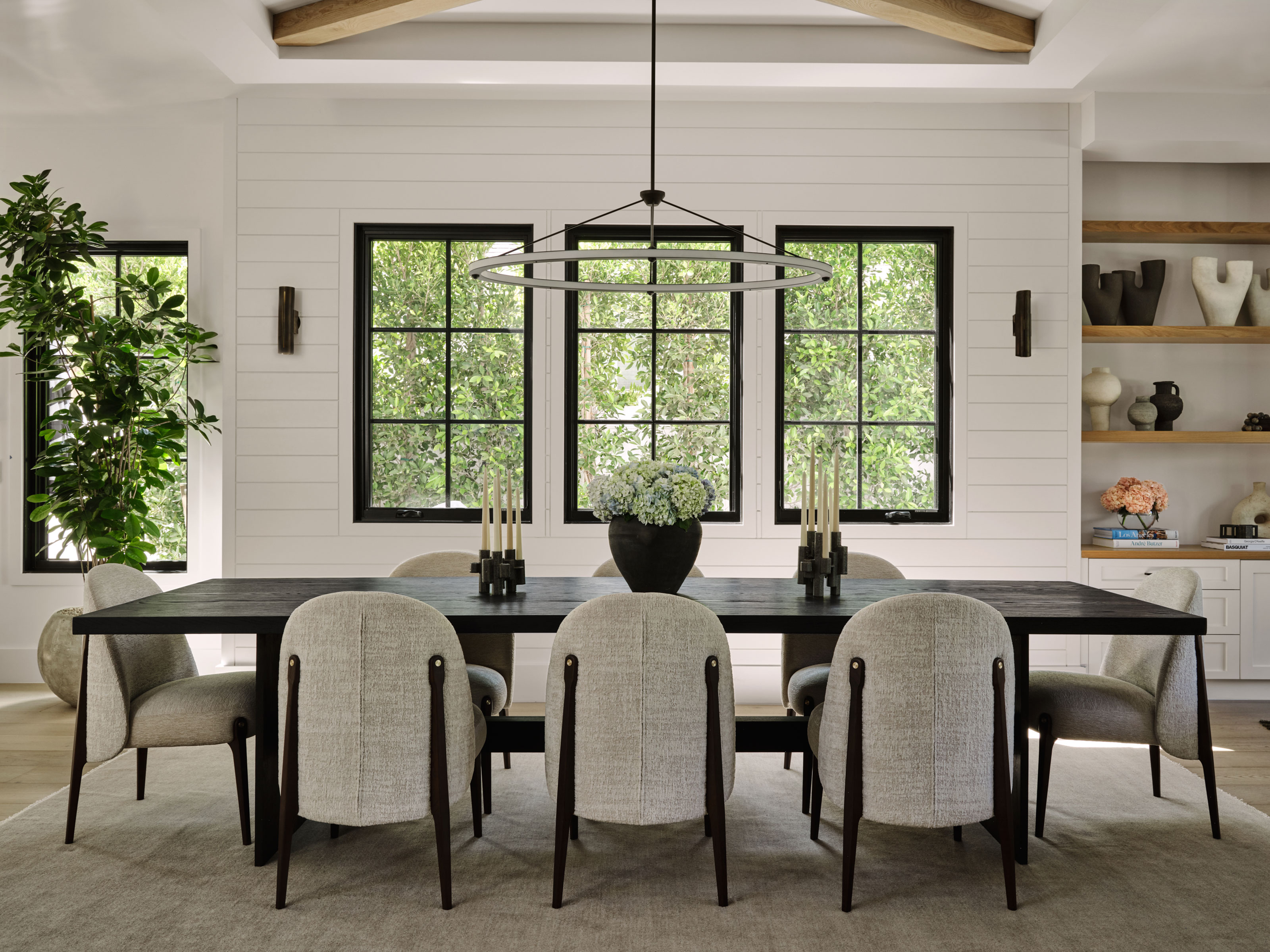
This five-bedroom, six bathroom home in Studio City, California, was a new Cape Cod-style construction, bought off plan complete with standard issue lighting, fixtures and fittings.
Its new owner, however, wanted to make it her own and introduce more interest, unique features and personality. Above all, she wanted to add happiness to her new home, with texture and natural elements, and called on the expertise of an interior designer to do exactly that. The result of the home's major redesign truly makes it one of the world's best homes – spacious, bright and full of clever design solutions.
The interior designer who brought about the transformation is Jessica Nicastro, of Jessica Nicastro Design, who worked closely with the homeowner to come up with the home's new look. 'We came in to de-spec the home,' explains Jessica. 'We swapped out lighting, all furnishings, and used the built-ins and beautiful custom roman clay to add visual interest. We wanted to give vibrancy to the home that has an open-floor plan with lots of white walls. And we wanted each space to feel special.'
Kitchen
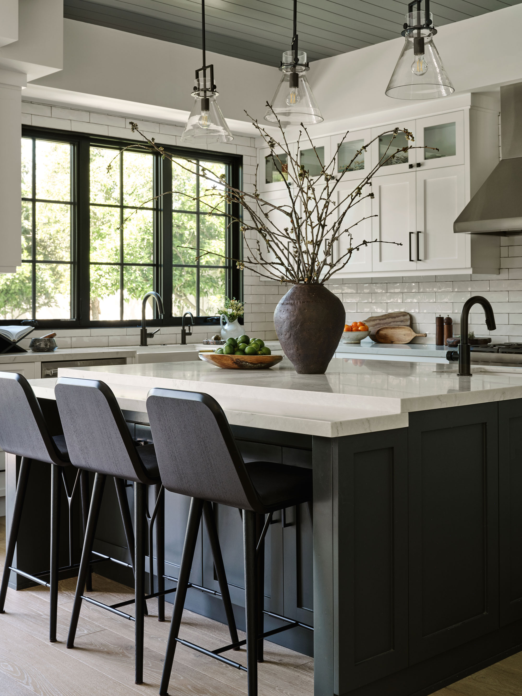
At the heart of the home's open floor plan is the smart kitchen. There are some great kitchen ideas here that would transfer well to any home, including the dark gray base unit cabinetry, island unit, topped with bright white quartz worktops, and white wall cupboards on the room's back wall. Black faucets and bar stools reflect the graphic steel-framed windows.
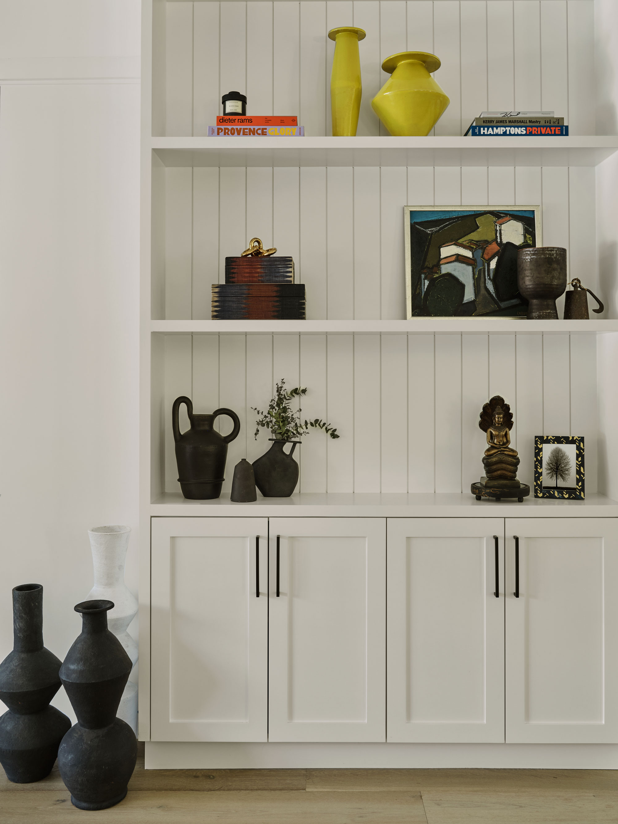
Built-in cabinetry provides extra storage between the kitchen and formal dining room. The shelves are backed with paneled wood, echoing the paneling used elsewhere in the home. Jessica used the built-ins to display the family's favorite treasures to make the space more personal and move the house on from its newly constructed state.
Living room
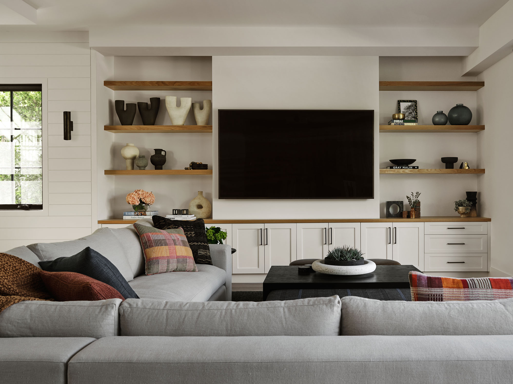
Living room ideas revolved around the room's huge TV. 'The client is a huge movie watcher so they wanted something functional and comfortable to put their feet up,' says designer Jessica.
A huge multi-seater sectional was the answer here, along with a custom coffee table/ottoman. Again, built-in cabinetry provides storage for games and display shelves for ornaments and striking ceramics. All these elements introduce the happiness factor the client had asked Jessica to bring to the home.
Dining room

Jessica is delighted with the way her dining room ideas came together, and this is now her favorite room. 'The scale of the lighting in the room with the simplicity of the table and curves of the chairs makes the new construction look personalized,' she says. 'The oval light fixture in the dining room was chosen to break up the horizontal shiplap on the far wall and layering vertical sconces,' she adds.
Guest bedroom
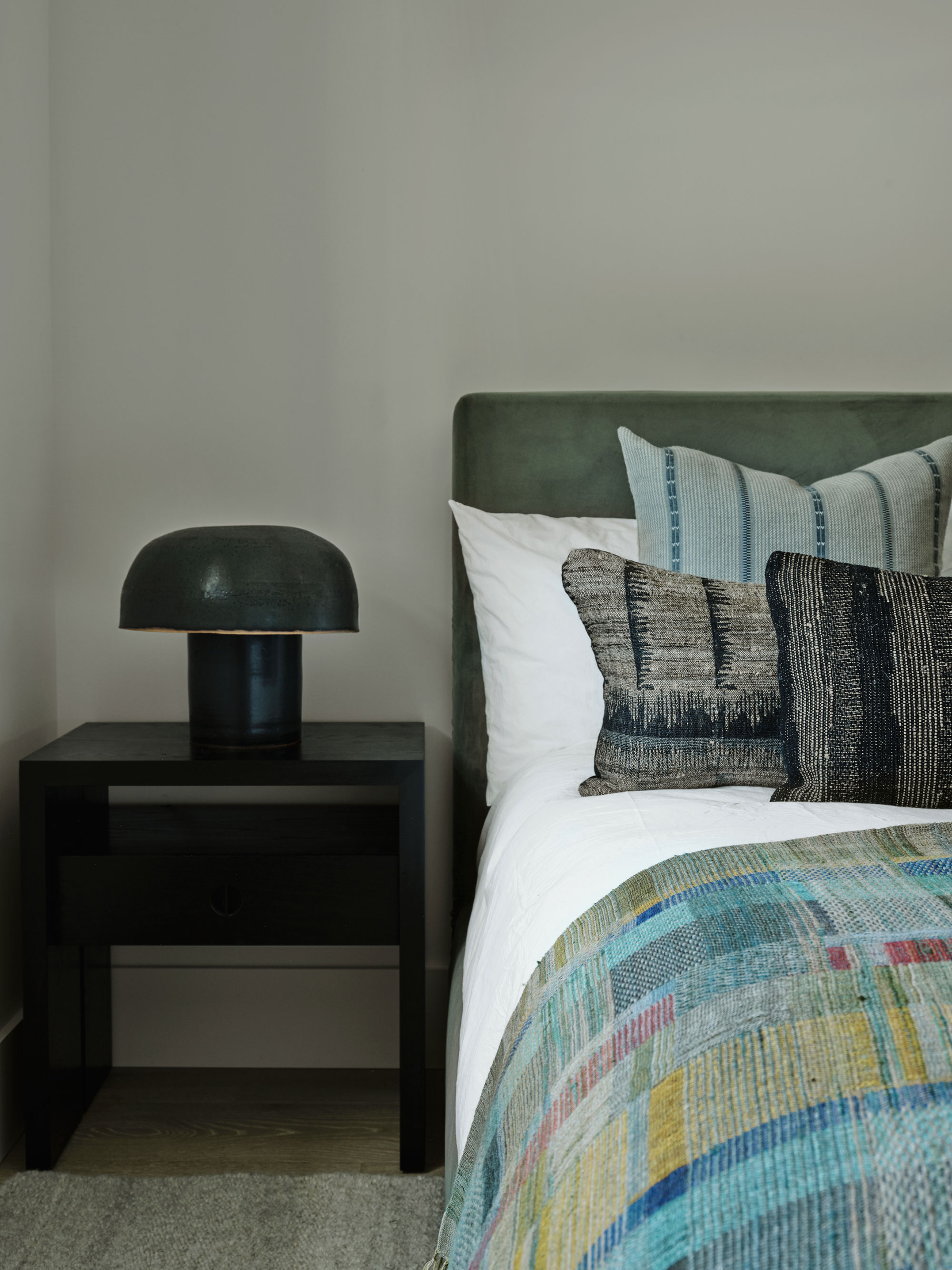
The guest room's darker palette lends itself to multiple layers of textures and colors. Bedroom ideas here are simple but effective, and the look can easily be changed or refreshed with new pillows and throws in alternative shades to give a different mood against the neutral walls and basic pieces of furniture.
Primary bedroom
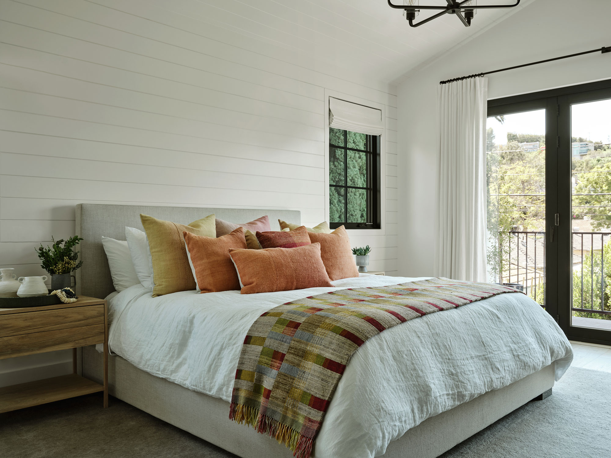
Spacious, bright and with a high ceiling, the primary bedroom was already an attractive space, with its glass doors to a balcony. As in the guest room, the basics are neutral, with shiplap paneling kept to a soft white. Color is introduced with blankets and pillow in peachy-apricot tones.
Primary en suite
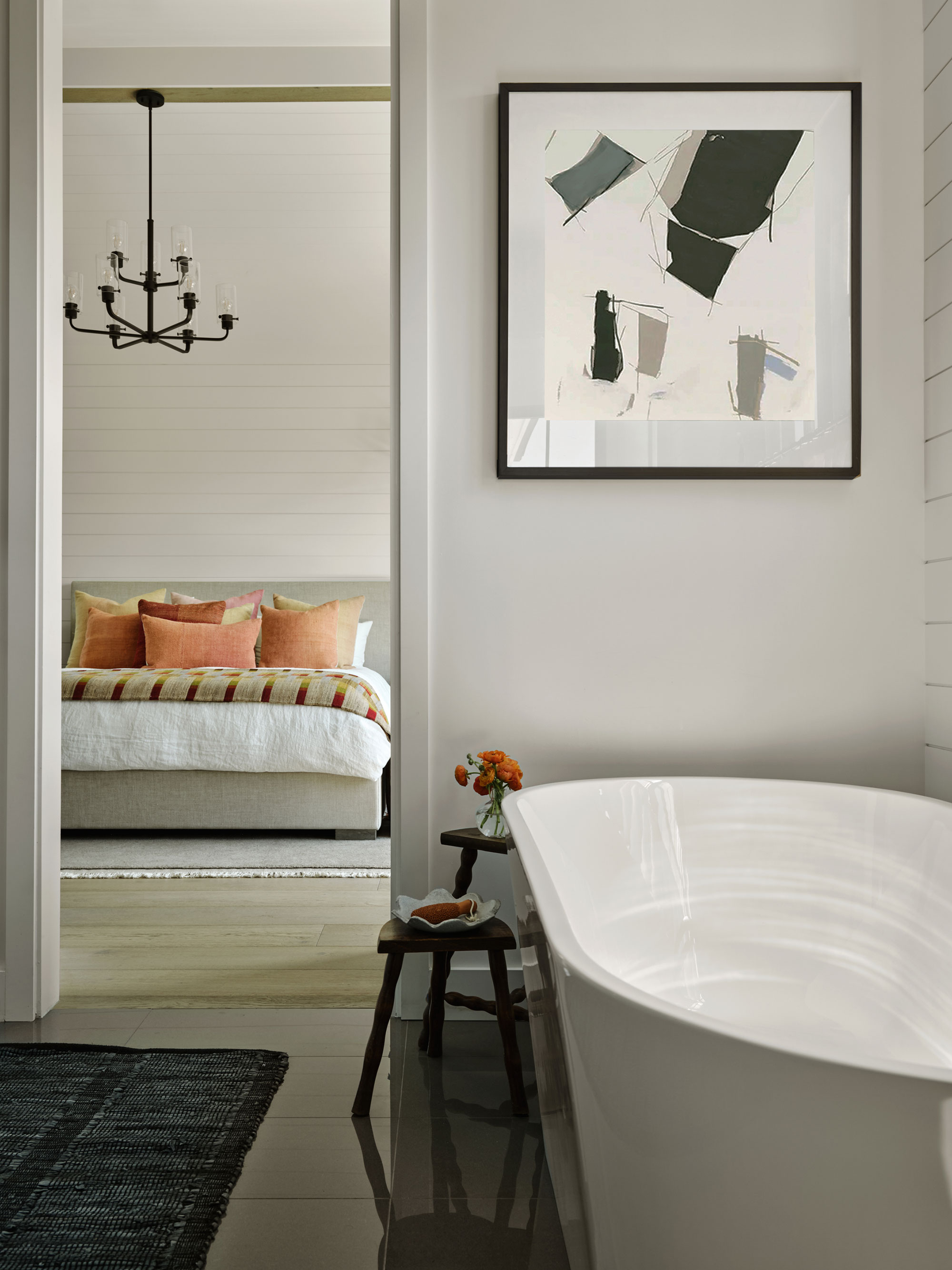
Bathroom ideas for the primary ensuite started with the unusual leaf-shaped freestanding bath tub. Clean lined and contemporary, the room is personalized with a striking modern art print and a dark rug on the polished marble flooring.
Jessica and her client are thrilled with the whole house redesign. 'It really shows how texture, color, layers and textiles can set a new-build apart and give it character and a ton of personality,' says Jessica.
Interior Design: Jessica Nicastro Design
Photographs: Madeline Tolle
Styling: William Graper
Sign up to the Homes & Gardens newsletter
Design expertise in your inbox – from inspiring decorating ideas and beautiful celebrity homes to practical gardening advice and shopping round-ups.
Karen sources beautiful homes to feature on the Homes & Gardens website. She loves visiting historic houses in particular and working with photographers to capture all shapes and sizes of properties. Karen began her career as a sub-editor at Hi-Fi News and Record Review magazine. Her move to women’s magazines came soon after, in the shape of Living magazine, which covered cookery, fashion, beauty, homes and gardening. From Living Karen moved to Ideal Home magazine, where as deputy chief sub, then chief sub, she started to really take an interest in properties, architecture, interior design and gardening.
-
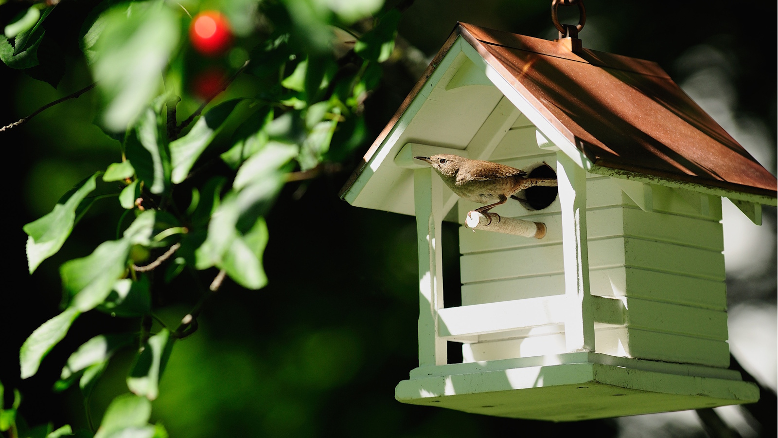 An architectural birdhouse is the most charming backyard trend I've ever seen – and there are lots on sale for Way Day
Will you treat your garden birds to a Victorian manor, or perhaps a Cape Cod cottage?
By Tenielle Jordison
-
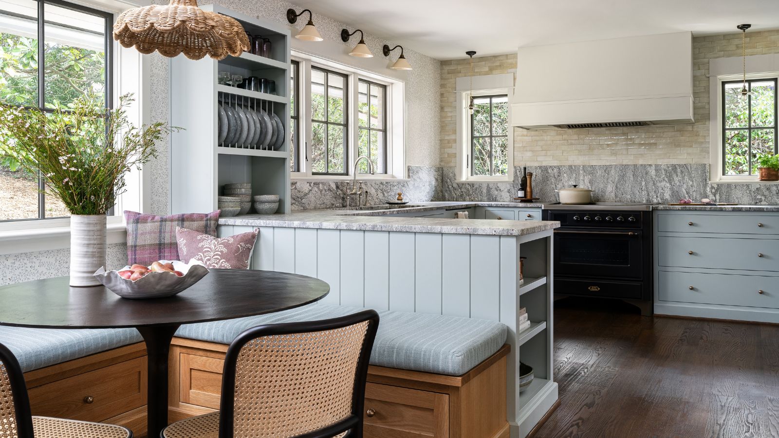 An unexpected layout has totally transformed this family kitchen – it's now filled with warmth, texture, and multifunctional zones
From chaotic to cohesive – this kitchen is a masterclass in choosing the right layout
By Molly Malsom