New home uses wood and natural colors to reflect its rural setting and mid-century roots
This new-build in Austin, Texas, is inspired by mid-century architecture and uses natural materials and textures
What do you do with a challenging sloping site? Embrace it of course. At least, that's what the owners of this newly built home in the Barton Hills neighborhood of Austin, Texas, did. They had fallen in love with the area and bought a house here in 2019, only to discover later that part of its foundation was floating seven feet off the ground and the property was sliding down the hill.
At this point the best option was to demolish the original 1950s property and rebuild from scratch on the site. The result proved not only to be the couple's dream home, but also one of the world's best homes. We spoke to Sara Cukerbaum, principal of SLIC Design, who worked with the owners on the new property. The architecture by Ryan Rodenberg and Sara's designs reference the original home's mid-century styling while updating it with clean design details and more modern lines.
Kitchen
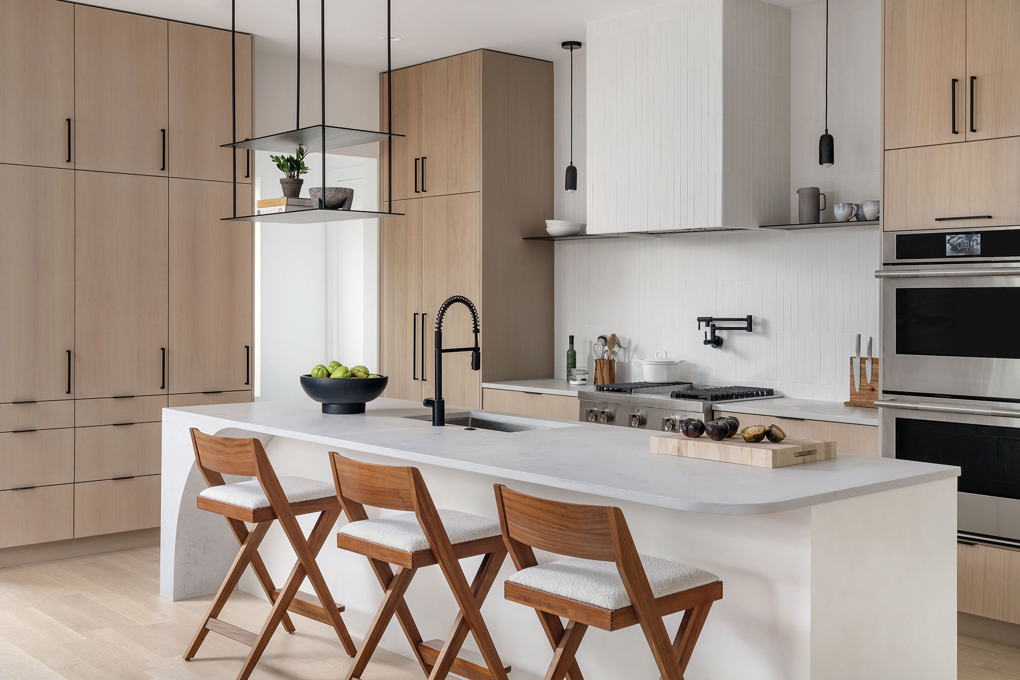
One of the elements that had drawn the owners to the home's Barton Hills location on the edge of Austin's greenbelt was the fact that they would be immersed in nature there. They dreamt of keeping chickens and ducks and looking out onto an expansive view of trees and hills. The couple asked designer Sara Cukerbaum to incorporate these rural and organic vibes in her designs, using lots of wood and organic materials to prevent the home's modern lines from looking cold.
Kitchen ideas for this new build really showcase the use of natural materials, but also balance out the clean cut look of the architecture. 'We stuck with crisp neutrals and warm textures,' says Sara. 'Everyone loves the kitchen. It is fun and features some standout moments but it is still practical. The owners cook a lot and asked for an efficient space that still had personality. I think this kitchen really delivers.'
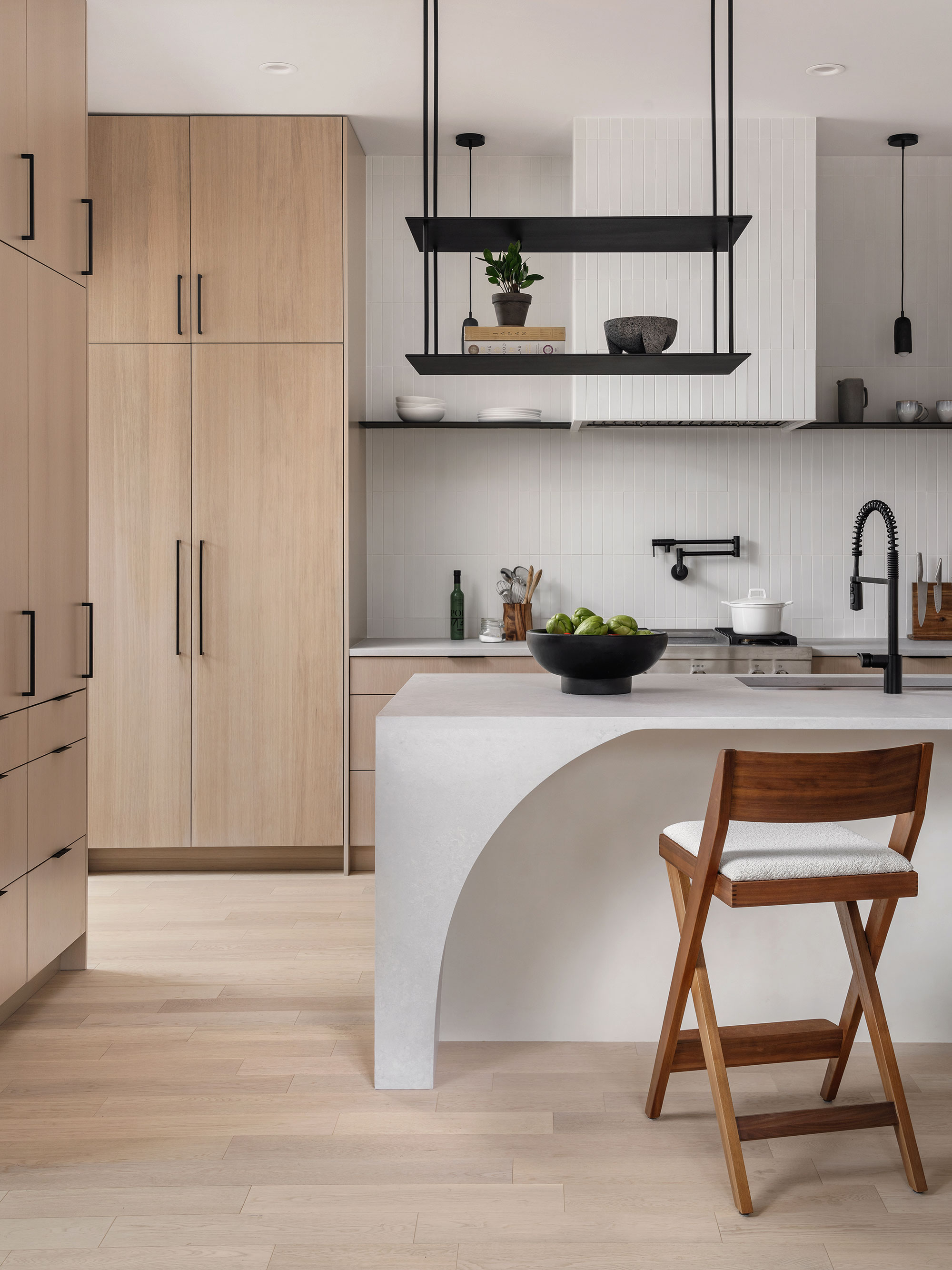
'The quartz fabrication team really delivered on this island,' says Sara. 'We asked them if they would be willing to bend the Caesarstone quartz and they did it without hesitation, using heat to bend the stone. That curved asymmetric island detail combined with the washed oak cabinets, Ann Sacks tiles and steel shelving, was a perfect way to create something full and special.'
The countertops are Caesarstone Cloudburst Concrete with Benchmark cabinets in white washed oak. The striking floating steel shelves are from Justin Kreizel Build Hudson. The teak counter stools with upholstered seats are by Industry West Compass.
Dining room
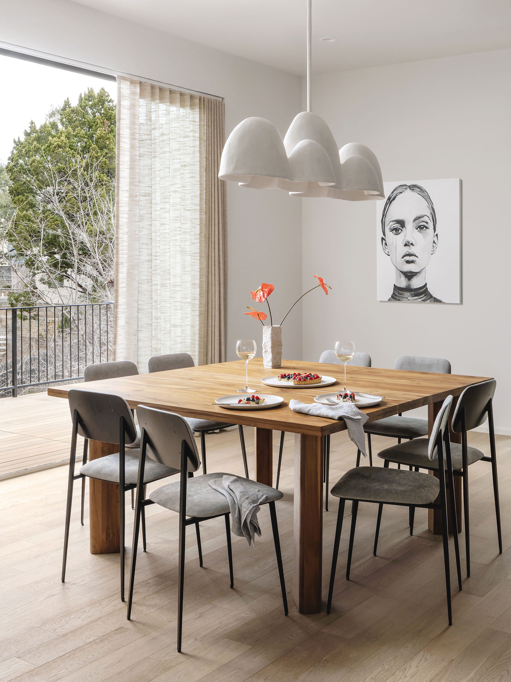
Anyone looking for dining room ideas, take note: this is a a room where statement lighting is definitely worth the investment. 'This custom chandelier is from Evan Sahlman, who had actually closed his retail store during the Covid outbreak but offered to build this fixture for us,' says Sara.
She decided a square dining table would be a better fit for the space, and the clients really loved the idea of being able to see all of their guests round the table.
Living room
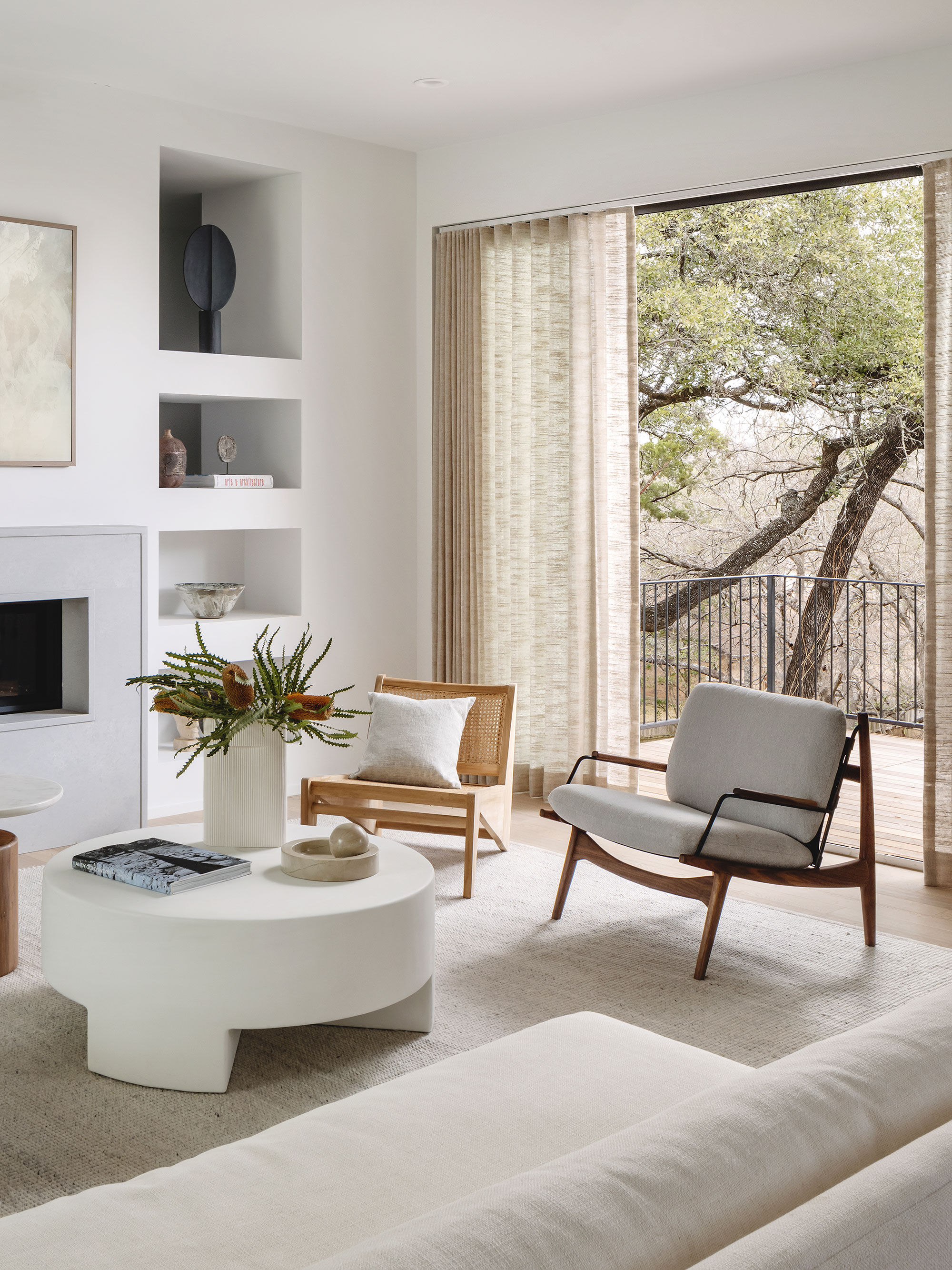
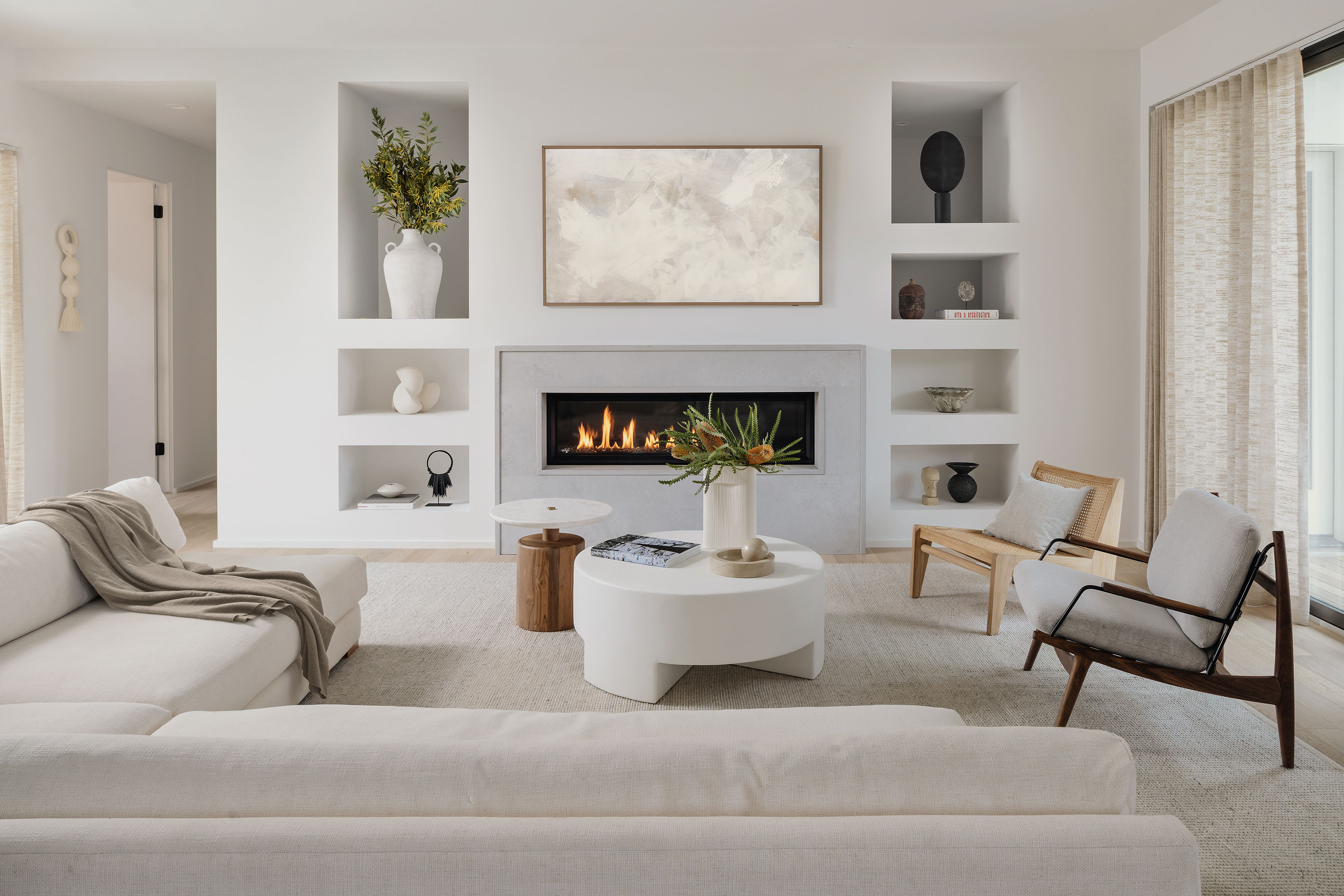
Living room ideas here take their cue from the home's unusual position on a steep hill, meaning that the room is on one of the upper levels, high up in the trees. 'We kept the interior palette really light and airy so the owners could really take in the tree branches hanging out over the living room balcony,' says designer Sara. The pared-back colour choices echo that of the rest of the house, calm and neutral to allow the setting's natural aesthetic to shine through.

Sara explains that they had originally planned to include a wooden slat detail in the living room but decided it would compete too much with the room's other elements. 'So we went with a quartz surround on the gas fireplace and created asymmetric open sheetrock cubbies to feature the client’s own artwork and precious objects,' she explains.
An oversized sectional brings coziness to the white palette while unique pieces from Lawson Fenning and Chairish add real interest.
Bedroom
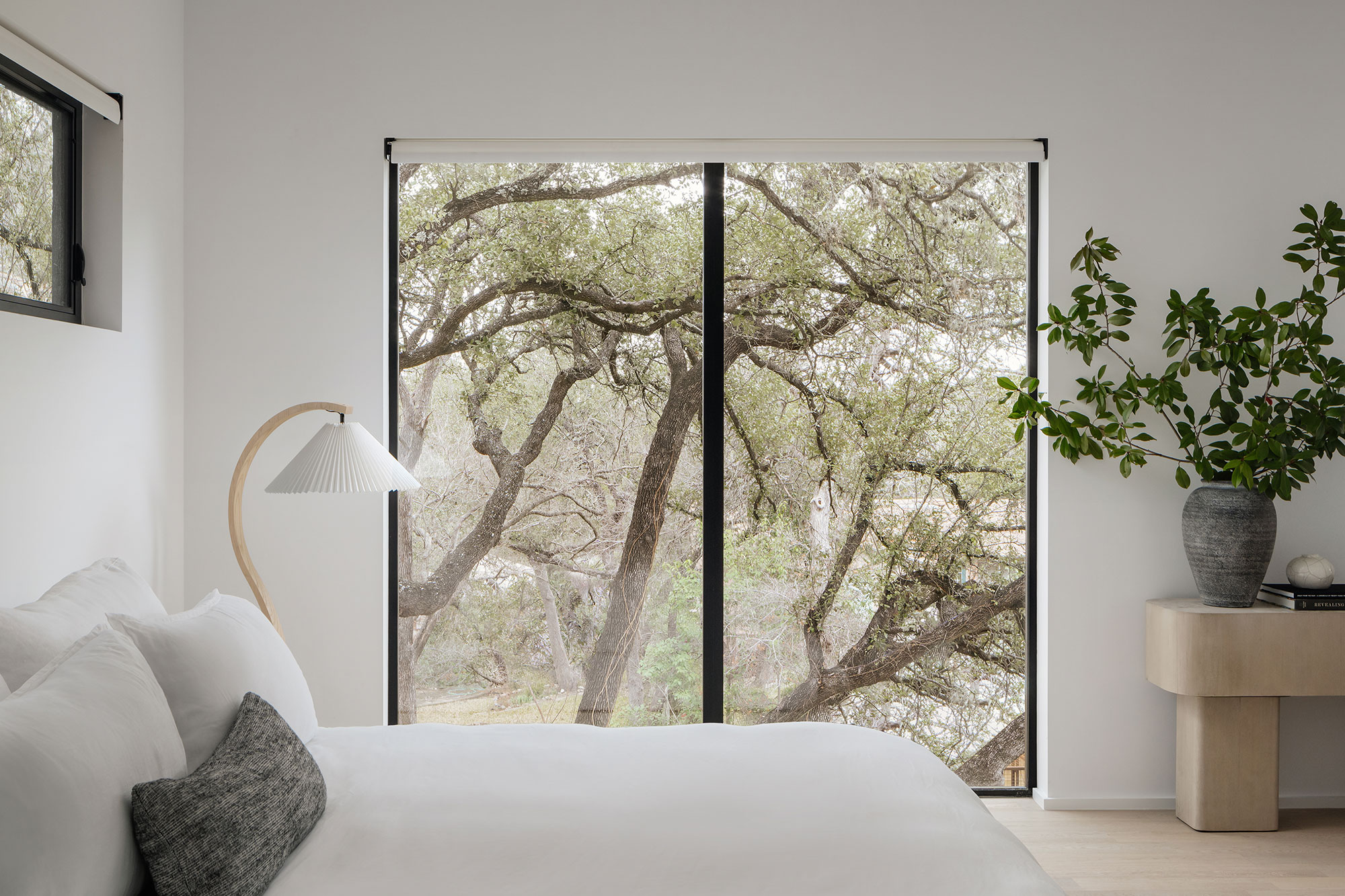
If you're looking for bedroom ideas, things don't get more relaxing than this pure white sanctuary. 'This is the most minimal space in the house,' says Sara. 'The clients asked that we keep the space soft so we brought in an oversized upholstered bed from Restoration Hardware and combined it with oak details. It’s simple yet warm and cozy.'
The views of the trees through the floor to ceiling windows add to the natural sense of calm and wellbeing in the restful space.
Bathroom
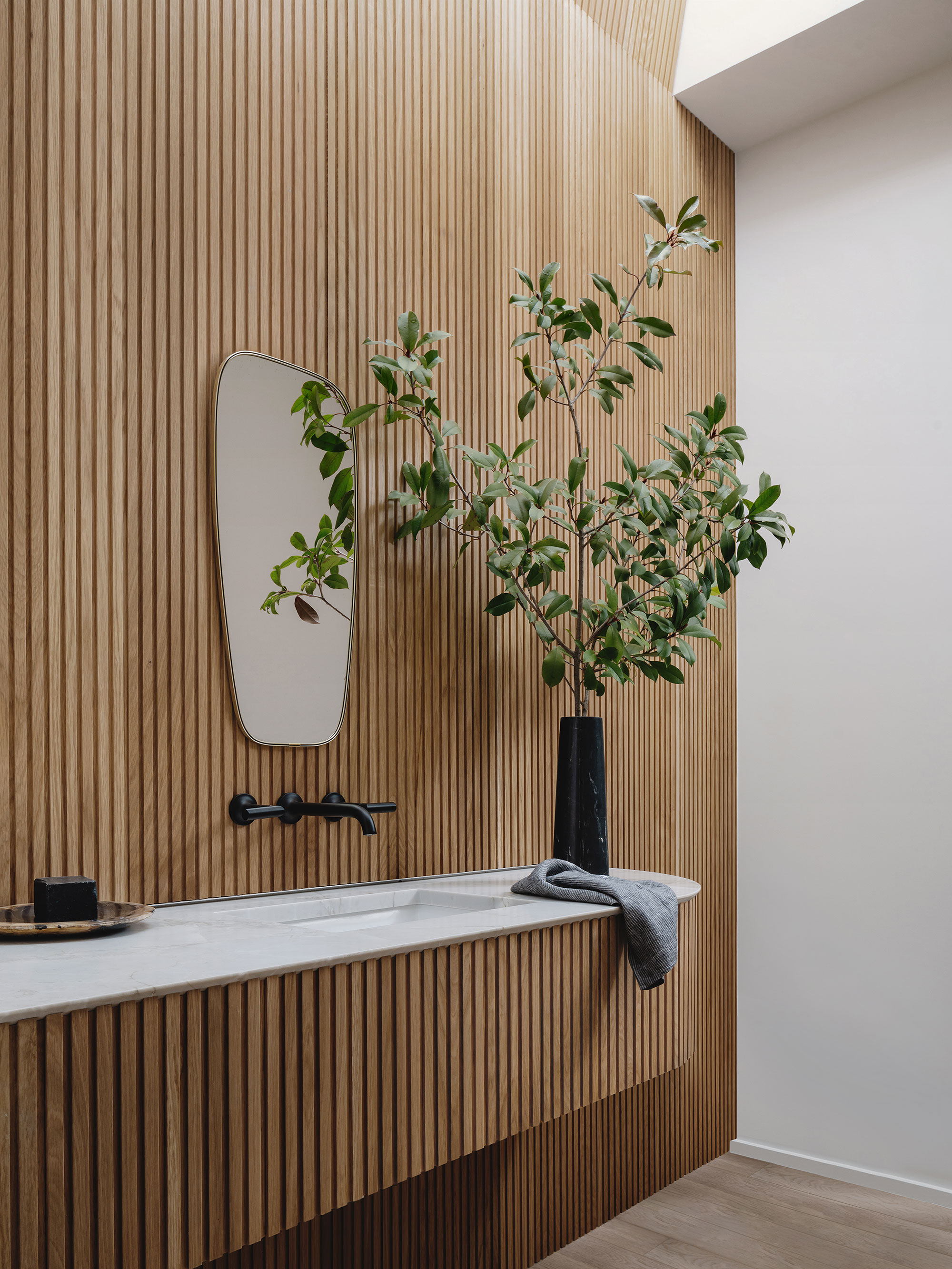
Sara was keen to look for bathroom ideas that included a nod to the home's midcentury roots, while still keeping to its lovely organic theme. Simple oak slats have been updated with a curve. By insetting the counter into the slat surround, the bathroom became seamless and dramatic.
Outside
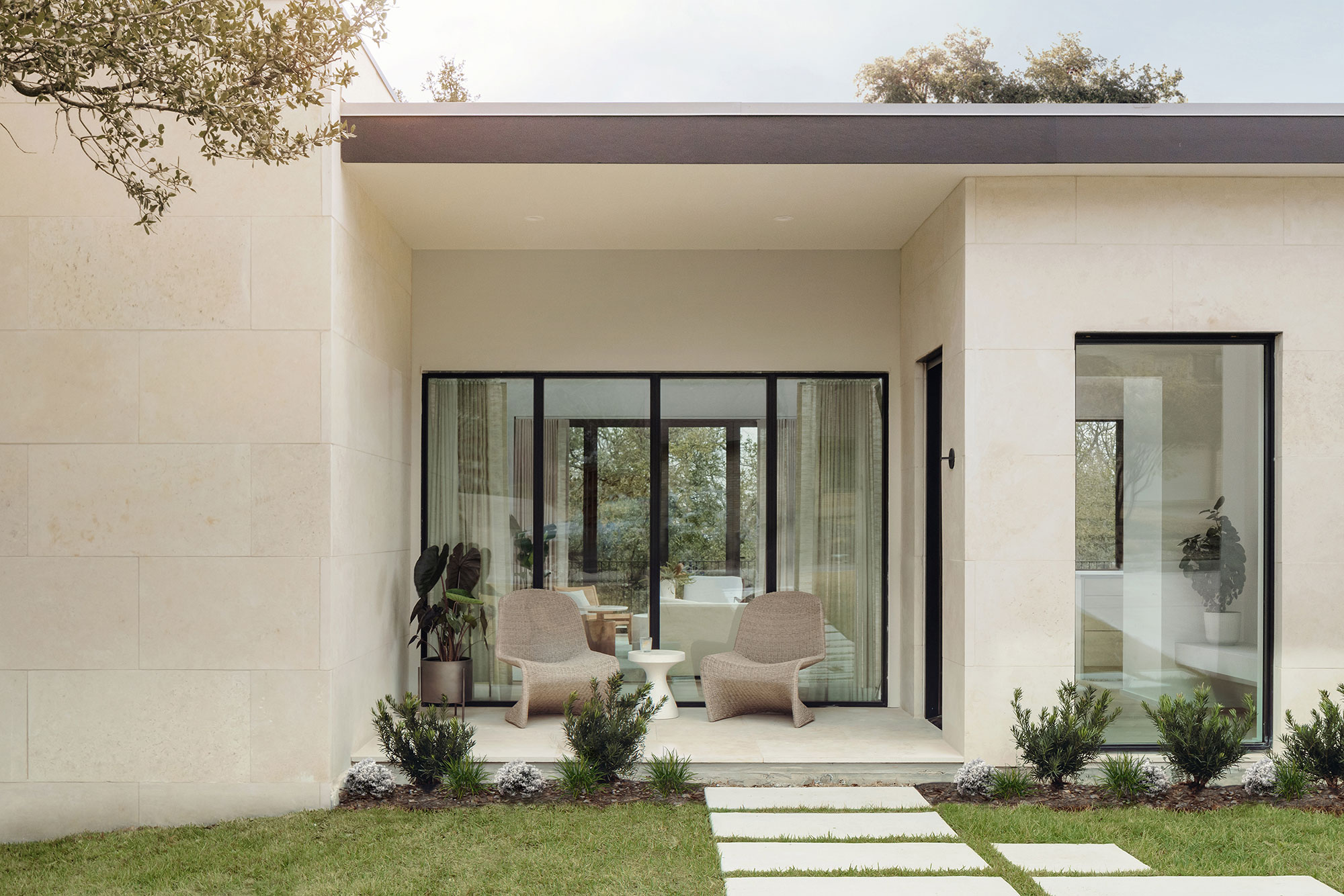
The new home's exterior is clean and simple, with steel-framed windows referencing the look of its 1950s predecessor and off-white stucco with a natural buff limestone lueder finishing the look.
Interiors: SLIC Design
Architectural design: Ryan Rodenberg
Photographs: Chase Daniel
Sign up to the Homes & Gardens newsletter
Design expertise in your inbox – from inspiring decorating ideas and beautiful celebrity homes to practical gardening advice and shopping round-ups.
Karen sources beautiful homes to feature on the Homes & Gardens website. She loves visiting historic houses in particular and working with photographers to capture all shapes and sizes of properties. Karen began her career as a sub-editor at Hi-Fi News and Record Review magazine. Her move to women’s magazines came soon after, in the shape of Living magazine, which covered cookery, fashion, beauty, homes and gardening. From Living Karen moved to Ideal Home magazine, where as deputy chief sub, then chief sub, she started to really take an interest in properties, architecture, interior design and gardening.
-
 These 5 plant species will help to attract and nurture an underrated nighttime pollinator that's crucial to every yard
Discover the best plants for attracting moths to your yard
By Ciéra Cree
-
 I have been looking for a versatile backyard furniture color that will look just as good in summer 2026 – Stanley Tucci proposes gray
Stanley's gray and wood patio furniture is modern yet natural, making it a timeless color choice for backyard color palettes
By Hannah Ziegler