Calm neutrals and mid-century magic – 8 key takeaways from a special LA home
It's all in the details… how paying attention to the little things turned a couple's first house into a harmonious home
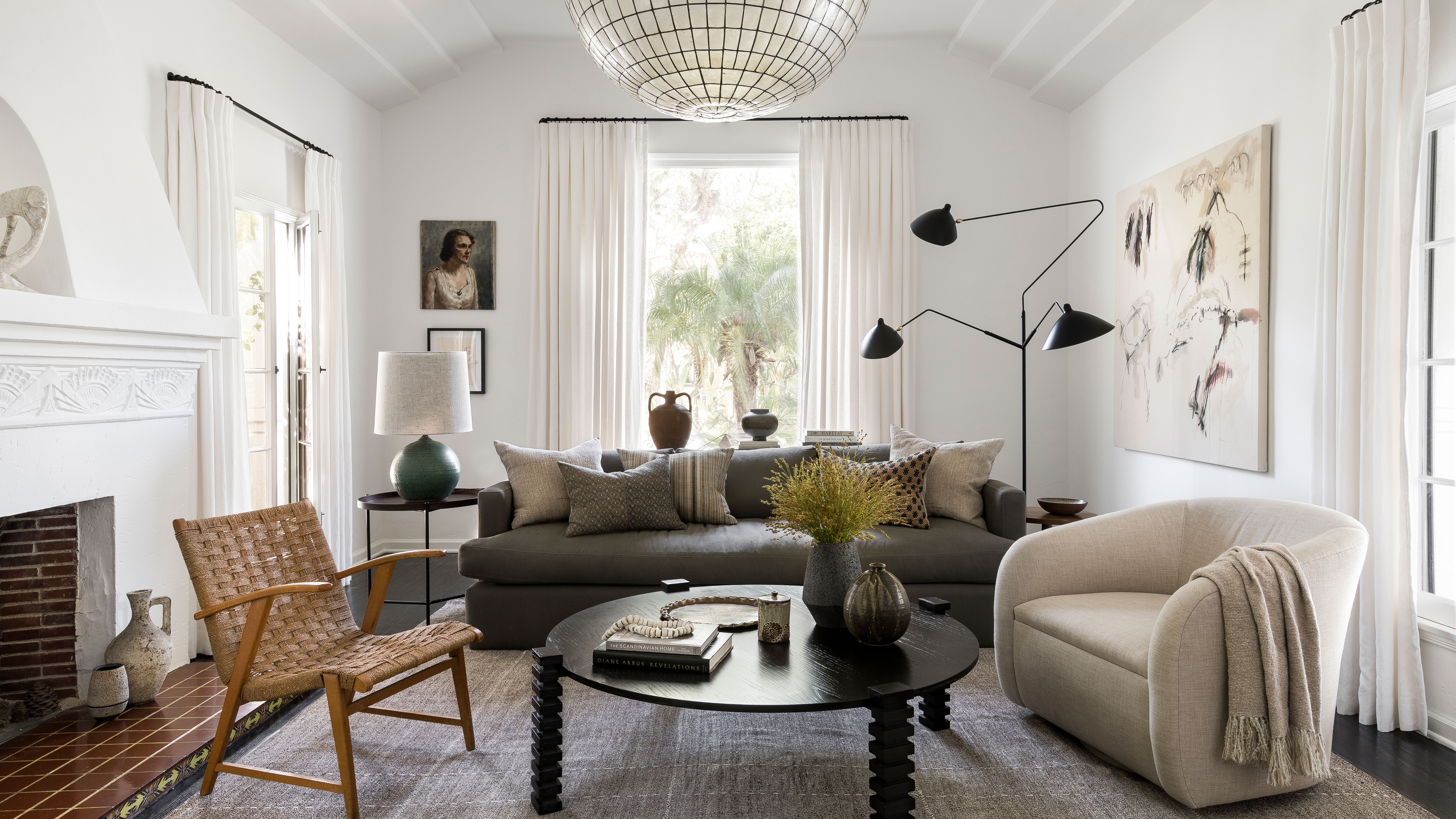
Step into the calm oasis of this 1930s Spanish art deco house. Situated in LA's central Mid-Wilshire district, it belongs to a professional couple in their mid-30s. The area is home to some of LA's notable museums, and to some equally historic homes.
This home is special to its owners for many reasons. Previously they lived in a one-bedroom apartment and they were excited to have the chance to put their own stamp on a whole house by renovating it and adding to it.
They didn't rush into making changes and wanted to get it exactly right. They hired an interior designer to help them keep an eye on the details and get the best out of their new home.
The results speak for themselves: it's a harmonious, comfortable space. Anyone who steps inside is cocooned in warm natural colors and fabrics, It's a space where you can't help but relax.
New additions and furnishings complement existing original features. Clever details add value to the already appealing space. Those key style elements make this is one of the world's best homes.
Designer Katie Hodges of Katie Hodges Design guided the couple through the redesign of their prized home. Above all, she says, they wanted the house to feel comfortable and approachable, but not too casual.
1. Create a cozy kitchen-diner
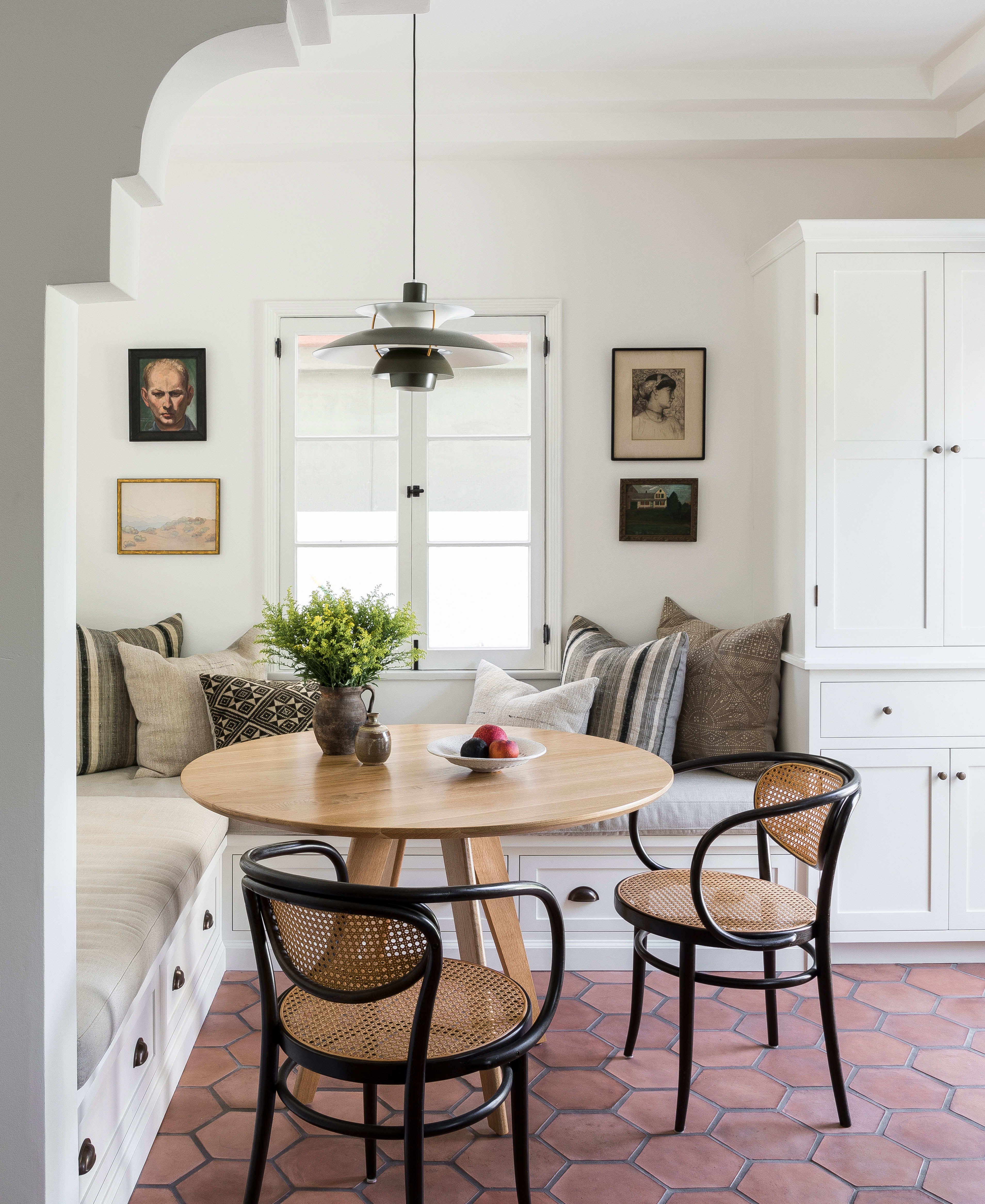
Katie discovered that her clients loved spending time at home, cooking and entertaining. 'Top of their wishlist,' says Katie, 'was a functional and organized kitchen, with space for someone to hang out with the chef on duty.'
The cozy breakfast bar and nook in the new kitchen-diner is Katie's favorite space in the new-look home and one of many attention-grabbing kitchen ideas in the home. The flooring here is Artillo Hexagon from Arto, its rustic finish the perfect choice for this home where a warm natural palette is king. The scatter cushions and bench seat upholstery fit the brief in style – layer up those neutrals!
2. Combine old and new spaces seamlessly
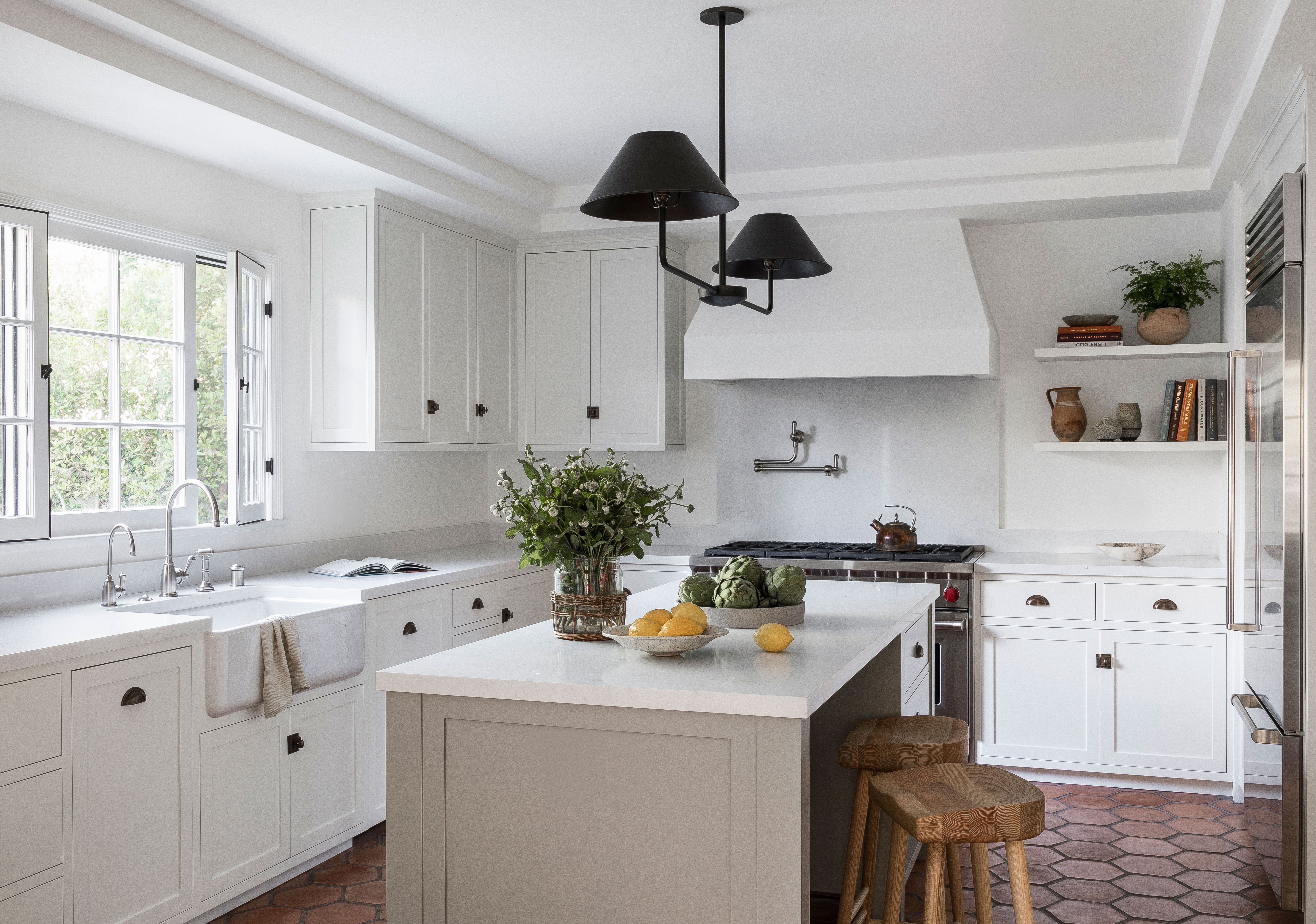
The original kitchen has been reconfigured and extended with a minimal addition. Re-imaging the layout of this kitchen was the most satisfying part of the project, says Katie. 'Formerly, it was broken into three sections with no connectivity amongst them. The window above the sink was created to match the original windows found throughout the house and disguised our addition as an original part of the house.
The striking ceiling pendant is from Nicky Kehoe
3. Design a dedicated dining room
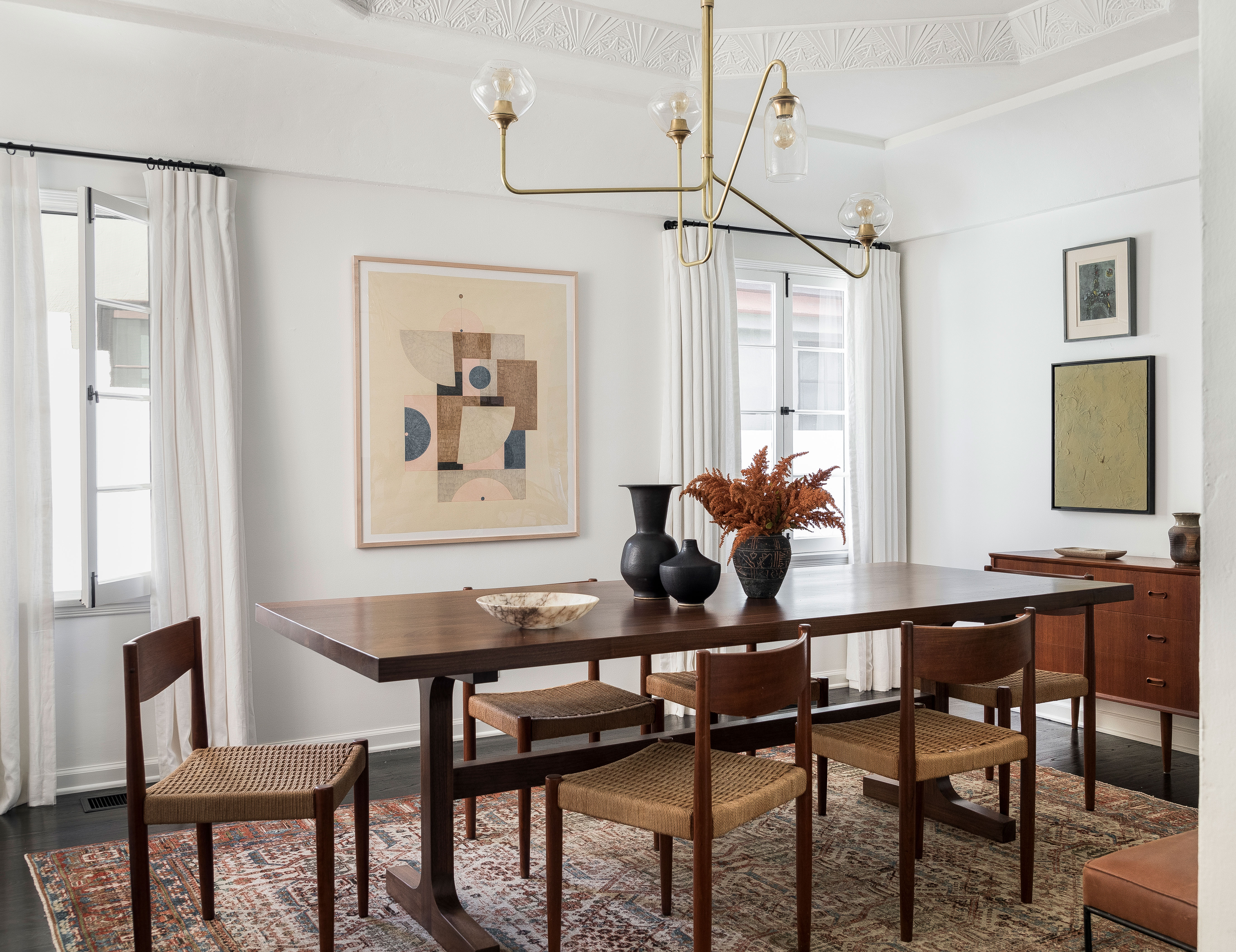
Not every home has the space luxury for a separate dining room. But for the clients who love to invite guests, it was important to get this room just so.
The color palette of rusts, blues and wood tones in the dining room works so well. And Katie's advice for anyone looking for dining room ideas? Start with a piece of furniture, a decorative accessory, or textile that you really love and base your scheme on that.
'We kicked off the design process with purchasing an antique rug from Mehraban,' she says, 'and almost immediately thereafter stumbled across the perfect complimenting piece of art from Nevia Pavletic. Just with those two strong pieces… the room was realized!'
It sounds so simple… and when a look comes together like this with such a sense of calm and belonging, we're not going to argue.
4. Devise a tranquil living room for relaxation
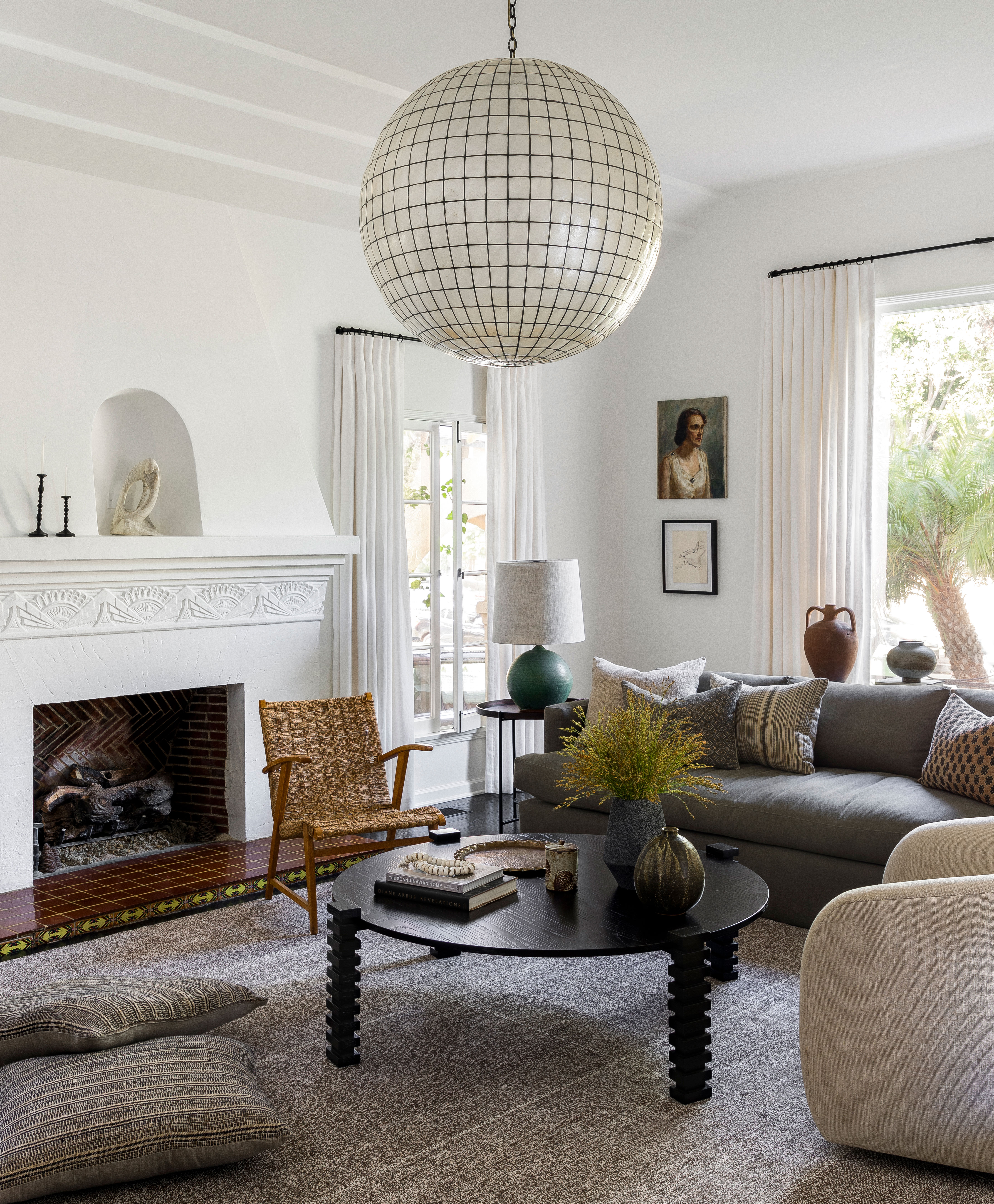
'These older Spanish homes often have one living room, so the challenge was creating a room that could be enjoyed watching a movie, and also equally suitable to host cocktail parties,' says Katie. This is the first room visitors see when entering the house. 'It packs a punch with its Art Deco fireplace, large curved window and high ceilings,' she adds.
There are plenty of design details here to inspire those looking for living room ideas. Katie kept the color palette earthy and soft to complement the original character of the home and highlight its architecture. 'Mixing modern with traditional silhouettes was important to the clients who expressed their love for midcentury modern furnishings and contemporary accents,' adds Katie.
The swivel chairs from Disc Interiors, Monterey coffee table from Sabin, and vintage rug from Mehrabhan were key pieces in achieving the midcentury look the clients wanted for the living room.
5. Opt for calm neutrals in the bedroom
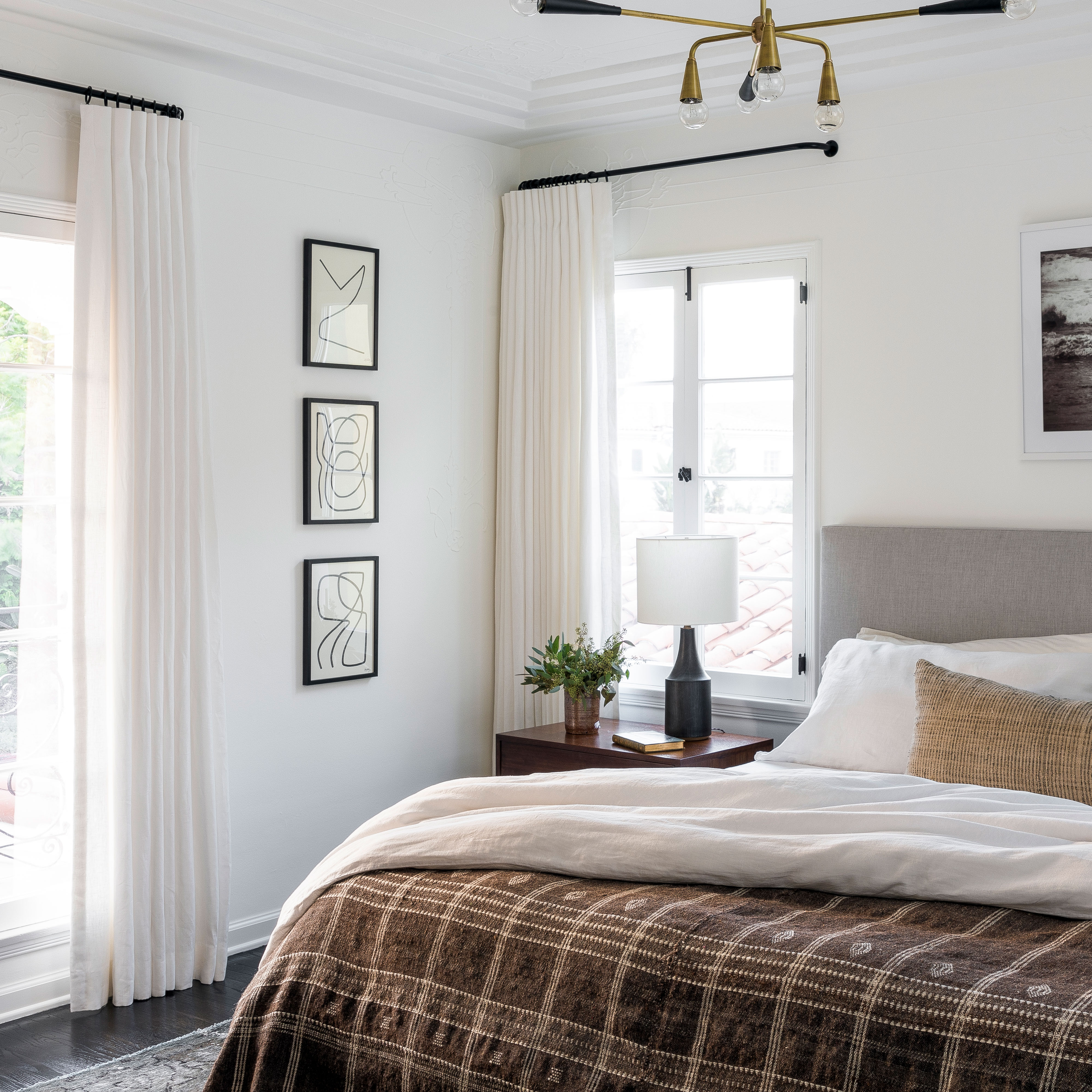
The primary bedroom’s design was intentionally kept simple and monochromatic. Earthy and serene tones complement the rest of the home’s color palette, while creating a sense of ease and coziness.
The bed is from Room & Board, the lamps are by Victoria Morris, and the ceiling light is by Lawson-Fenning and the three framed artworks are by Benjamin Ewing.
6. Craft a space for home office in an unused corner
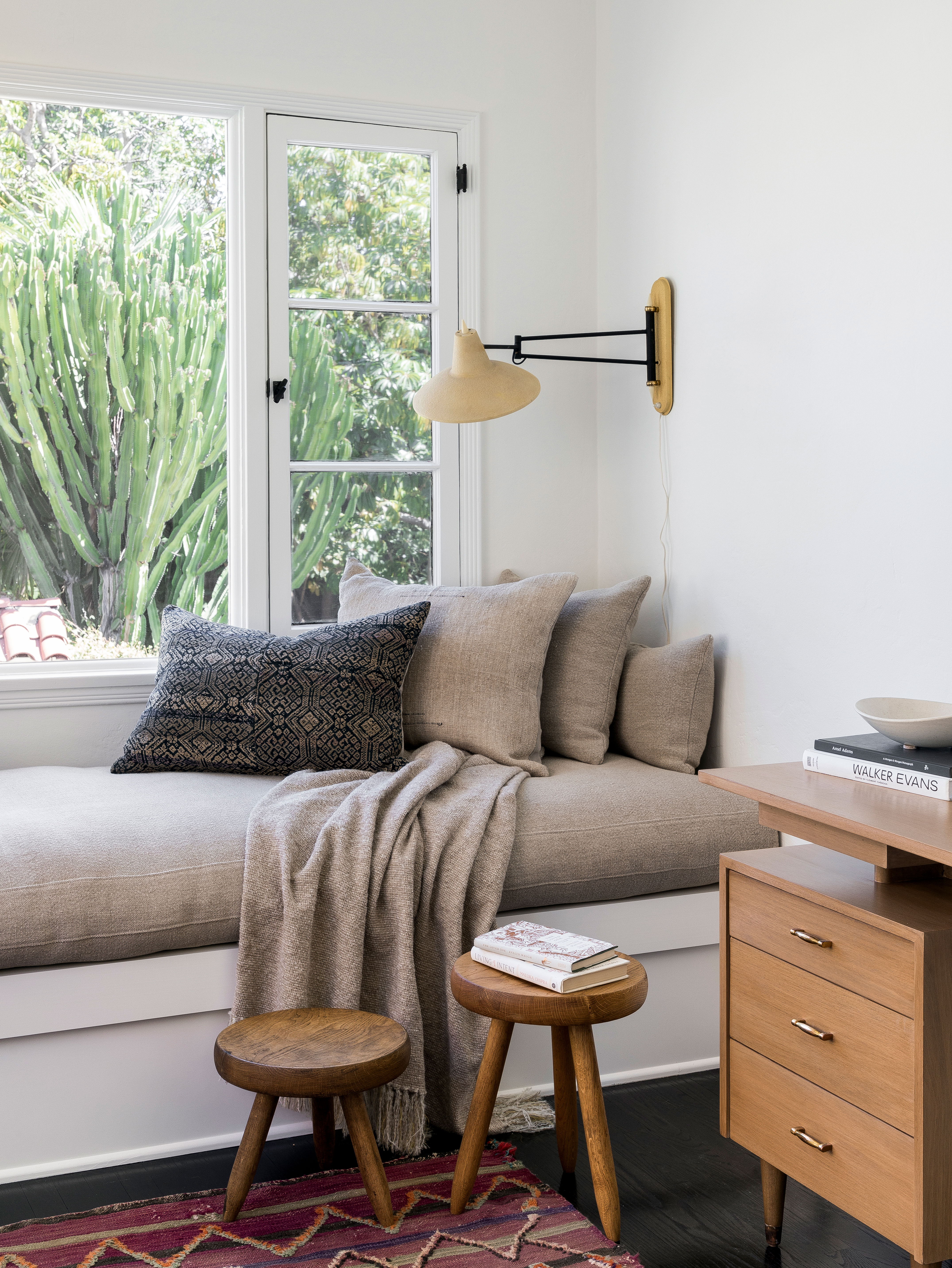
Adjacent to the primary bedroom is a small sunroom/office, where Katie created a cozy window seat and space for a small desk – mid-century, of course!
7. Keep it simple – and functional – in the guest room
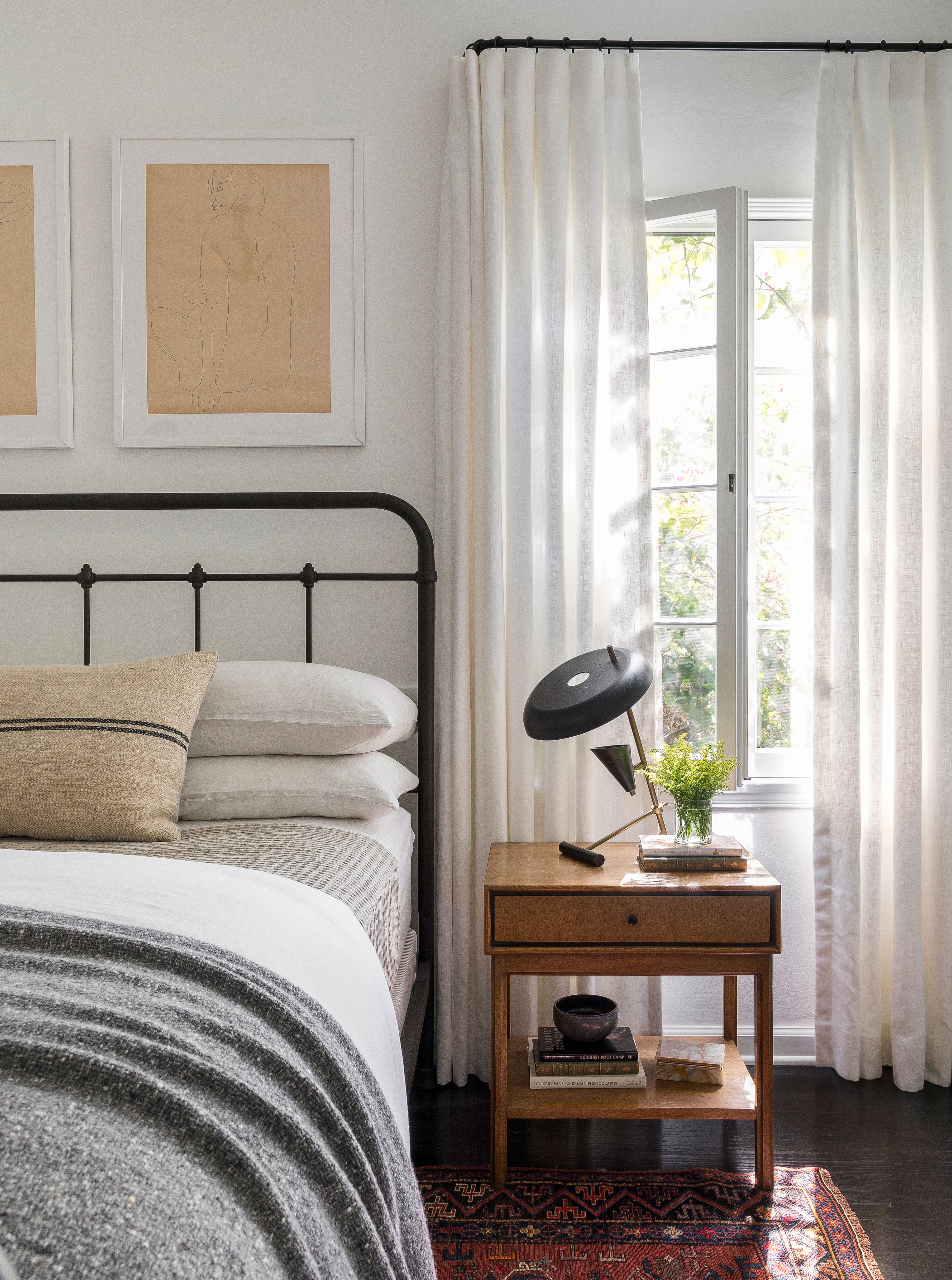
The bedroom was last on the clients' budget priority list explains Katie. 'So we played up the styling a bit more. Vintage nude sketches, soft blankets and fun lamps pull the look together.' The bed, art and lamps are all vintage pieces. The blanket is from Hollywood at Home.
8. Add decorative details to alcoves
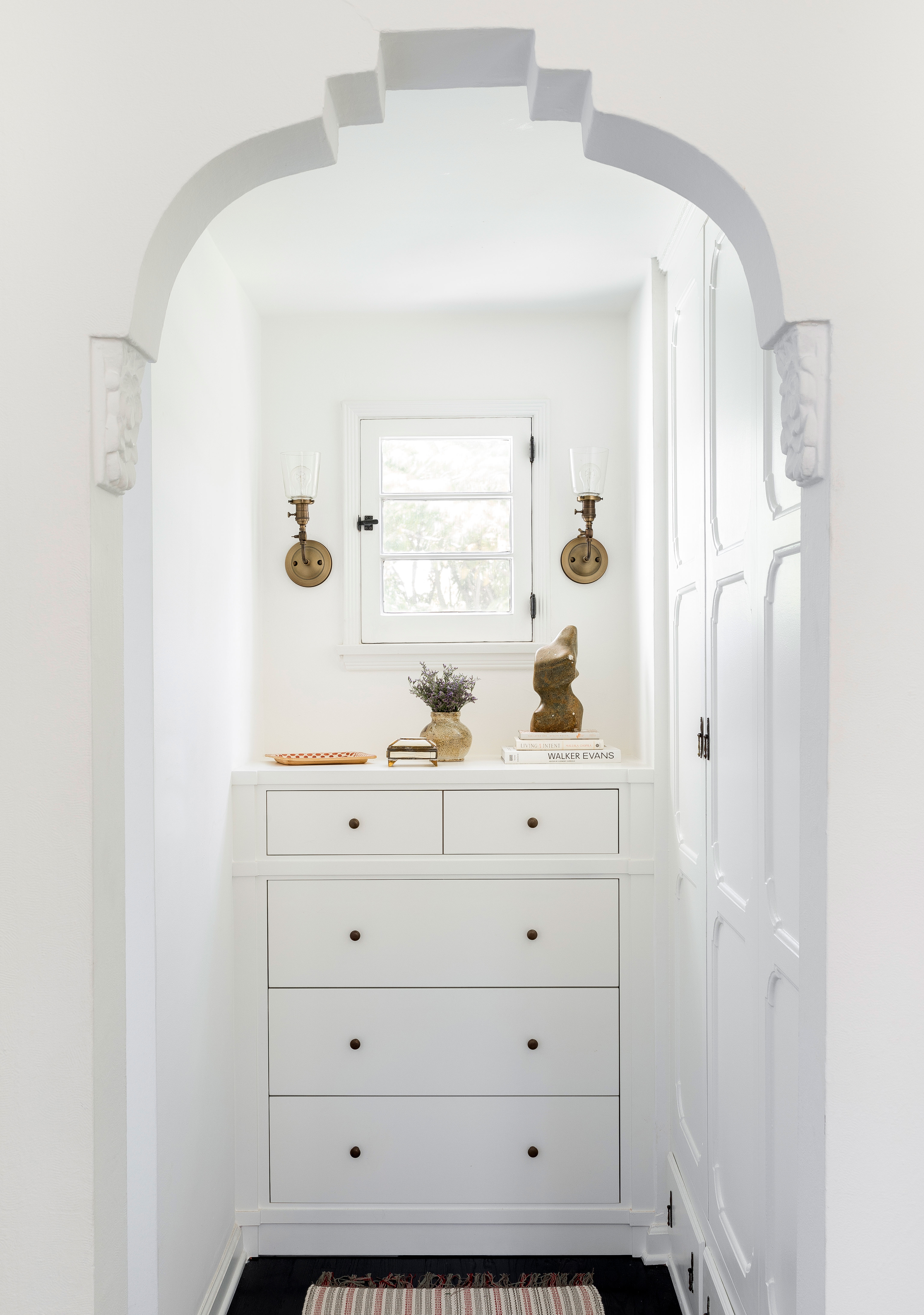
This closet alcove in the guest room with its fitted chest of drawers is Katie's favorite element that she re-created to feel original to the home. 'While it's such a simple design, we scrutinized over every detail from the spacing/size of drawers to the base moulding detail,' she says. References to the home's Spanish Art Deco origins are hinted at in the new moulding details.
It's the little design details like these that have given the already special home an extra touch of magic. It's a redesign that Katie Hodges is rightly proud of, and one that she hopes will continue to bring pleasure to its owners for years to come.
Sign up to the Homes & Gardens newsletter
Design expertise in your inbox – from inspiring decorating ideas and beautiful celebrity homes to practical gardening advice and shopping round-ups.
Karen sources beautiful homes to feature on the Homes & Gardens website. She loves visiting historic houses in particular and working with photographers to capture all shapes and sizes of properties. Karen began her career as a sub-editor at Hi-Fi News and Record Review magazine. Her move to women’s magazines came soon after, in the shape of Living magazine, which covered cookery, fashion, beauty, homes and gardening. From Living Karen moved to Ideal Home magazine, where as deputy chief sub, then chief sub, she started to really take an interest in properties, architecture, interior design and gardening.
-
 ‘It leads to more headaches than it's worth’ – 4 reasons you should never store things in your oven, including fire risks and serious illness
Your oven is for cooking, and cooking only, experts urge
By Chiana Dickson
-
 Urban gardening ideas – 7 creative ways to grow in small spaces, balconies, containers, indoors, and more
Make the most of your space with these innovative ways to garden
By Tenielle Jordison