The nature-inspired decor of this home suits its idyllic English country setting
Pia Design breathed new life into this home in the North Downs with an elegant English country interior that places the client's treasured furniture at its heart


'The views of the North Downs were a starting point of inspiration for the designs,' says Pia Pelkonen. The mock Georgian country house, one of the world's best homes, is situated in a breathtaking location in Surrey.
Pia, founder of Pia Design, was brought on board to breathe new life into the dated interiors. 'When we first visited the house it was wintertime and there were gorgeous panoramic views on all sides in an amazing natural setting high on the Downs. We felt that the view should be continued in the white blocks between the windows to achieve a continuous panoramic feeling so it seemed as if the outside was coming in. All the colors we used in the house are inspired by the changing colors of nature surrounding the property – yellow spring daffodils, fresh summer greens, fall rusty orange and moody winter blues.'
The clients had collected some beautiful furnishings over the years and it was important to them that the update minimised wastage and environmental impact wherever possible. The aim was to preserve and restore all the furniture that had lots of meaning to them. 'We didn’t want to replace anything and, in fact, the only furniture that was discarded were two tatty sofas,' says Pia. 'Everything else was used, with lots of pieces finding new homes in different rooms. We brought it all back to life. We also decided to keep all the paneling and skirting. The Douglas fir doors had a beautiful grain so we left these untouched. The clients were very pleased that we took this approach of preserving what could be saved, rather than wanting to start from scratch with all new finishes and fittings.'
Entry
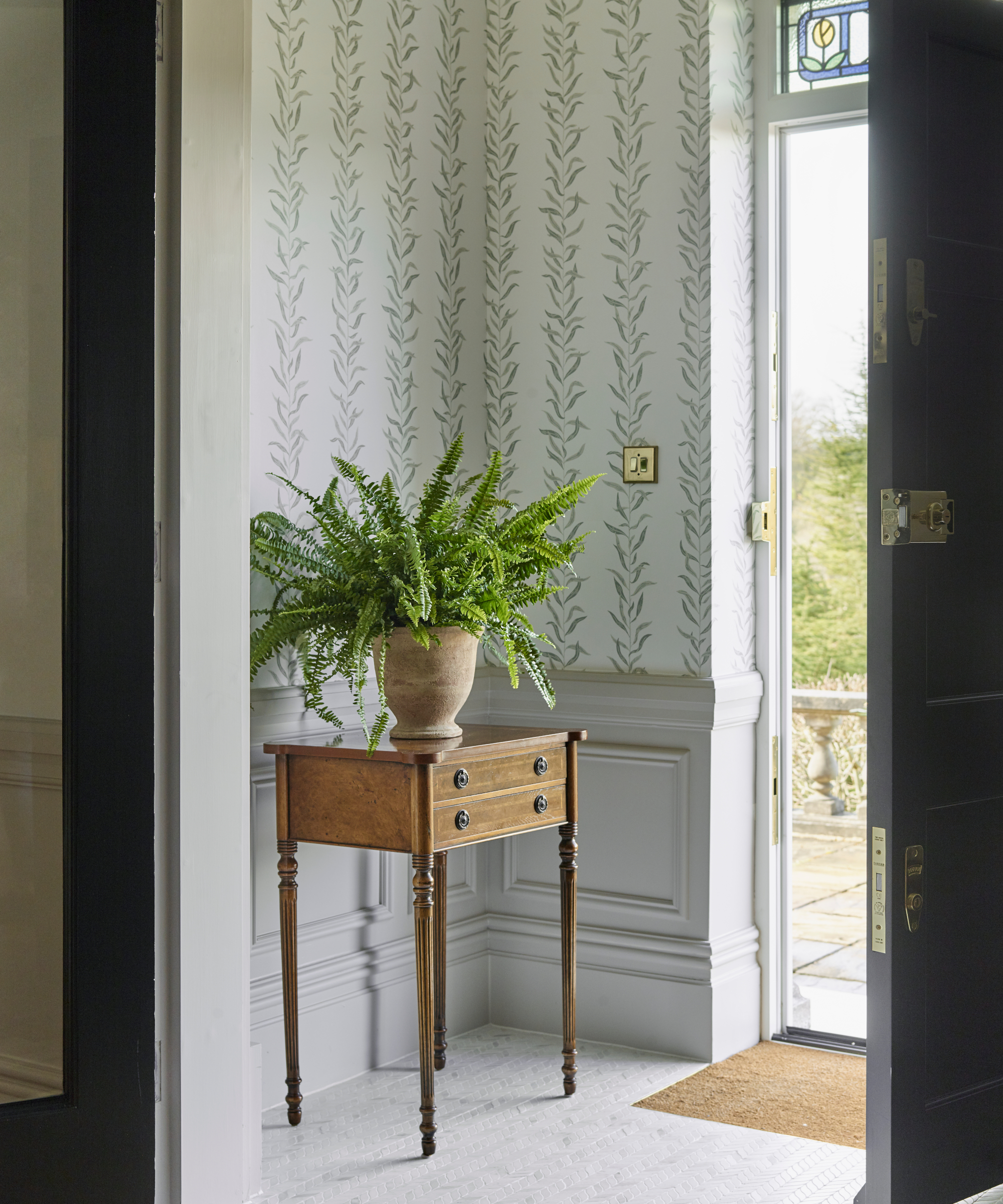
Pia created a smart entry by replacing the chipped and worn porcelain floor tiles with marble herringbone ones. The elegant Sandberg Pil wallpaper with its willow tree leaves mimics the shape of the tiles.
Other changes included introducing paneling in the style of the rest of the property and replacing the front door with a sturdier one. A lovely personal touch that makes the entry special is the bespoke stained glass panel, made by Luna Glasswork – the design is inspired by the daffodils growing on the client’s driveway up to the house in spring.
Hallway
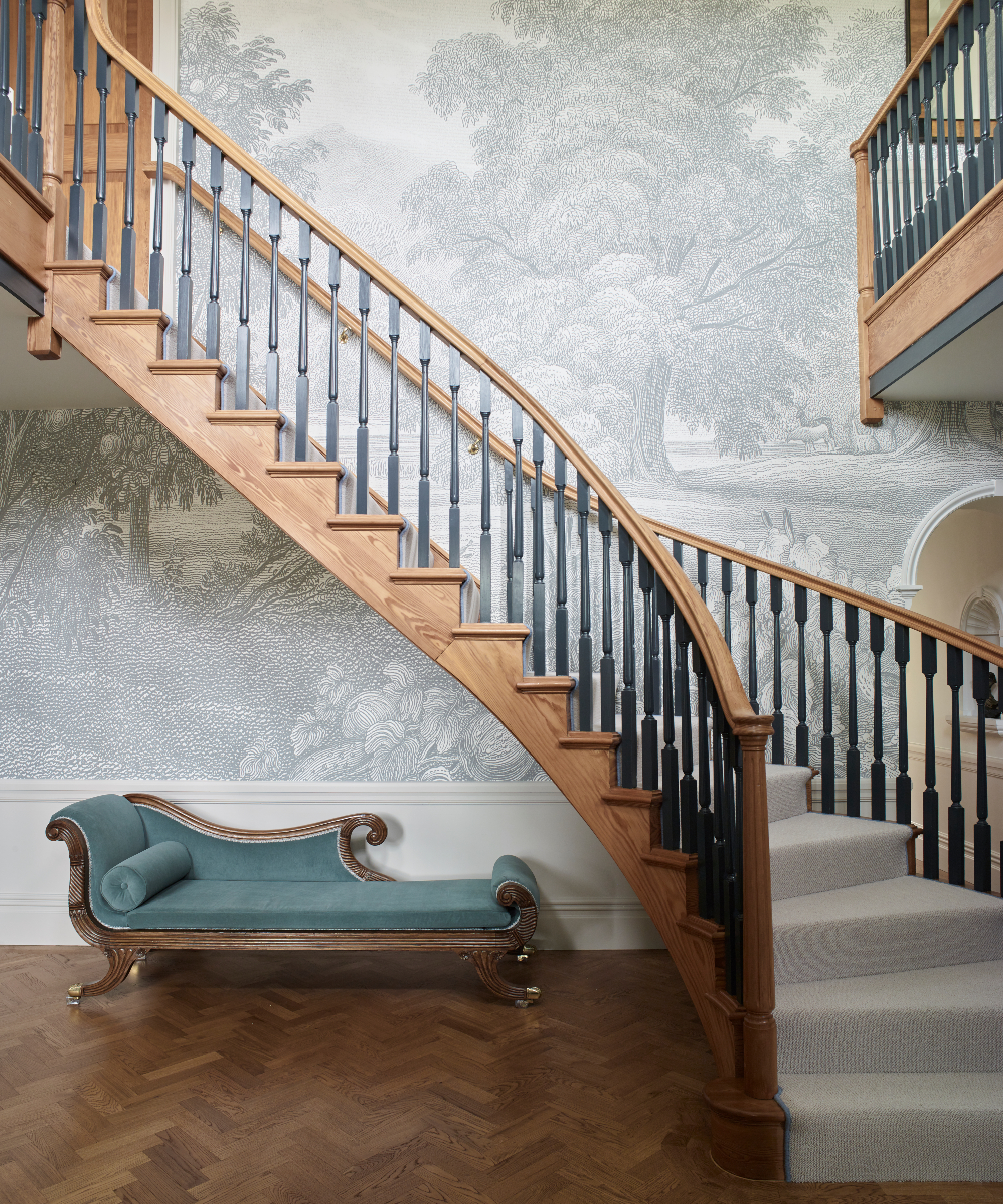
The elegant hallway with its Douglas fir staircase certainly makes a statement.
The clients felt it was quite a busy space previously so Pia wanted to create a serene but sophisticated feel.
Among her hallway ideas was introducing an eyecatching landscape mural by Woodchip & Magnolia. Patterned carpets were replaced with wooden herringbone flooring to match the staircase, and the spindles were painted in Farrow & Ball's Railings to break up the continuity of wood. The chaise longue belonged to the client’s grandmother and was reupholstered to give it a new lease of life.

The existing arches frame the views over the Downs beautifully. Panels with a mural by Woodchip & Magnolia are a nod to the location.
Dining room

Pia's dining room ideas revolved around creating a period aesthetic for this formal space and upcycling furniture. 'We reused the client’s existing furniture but moved it from the garden room to the formal dining room and reupholstered the dining chairs in a blue velvet,' says Pia. 'The pendant light was previously in the client's kitchen.'
Blue is one of the client's favorite colors so a soothing backdrop was created by repainting the walls and ceiling in Skylight and Dix Blue by Farrow & Ball.
Living room

'This room boasts amazing views of the North Downs so we wanted to continue those views uninterrupted with the addition of landscape mural wallpaper from Woodchip & Magnolia,' says Pia. 'It gives a panoramic feel.'
Among the living room ideas for evoking a period look was the introduction of three custom made matching sofas based on a historic design. 'They were one of the very few items we bought or had made new for the house and despite their upright looking shape, they are really comfortable for lounging in,' says Pia.
Garden room

As this room faces an internal courtyard with a rose garden and central fountain, Pia wanted to evoke an ‘inside outside feel’. Key to this are Sandberg’s trailing ivy wallpaper and a moss green sofa and chair.
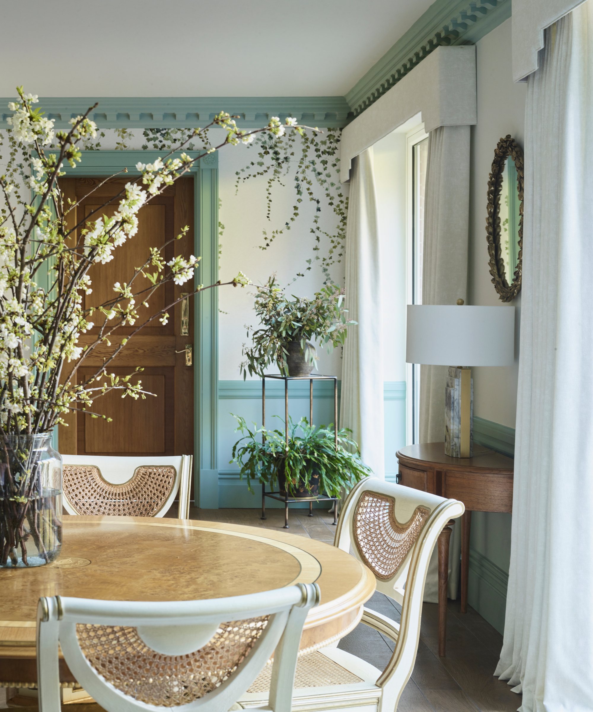
The client's existing wood and cane furniture was reused in this space to create an informal dining area.
Kitchen
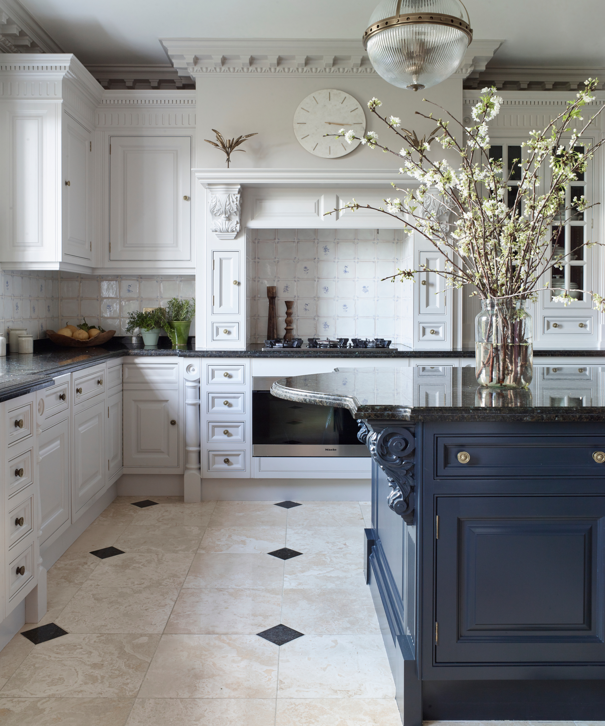
The kitchen was a relatively new addition to the house. One of Pia's kitchen ideas was to update it and add drama by repainting the island in Farrow & Ball's Railings. The original antique chandelier was moved to the dining room and replaced with a classic globe shaped pendant from Lux Deco.
Main bedroom
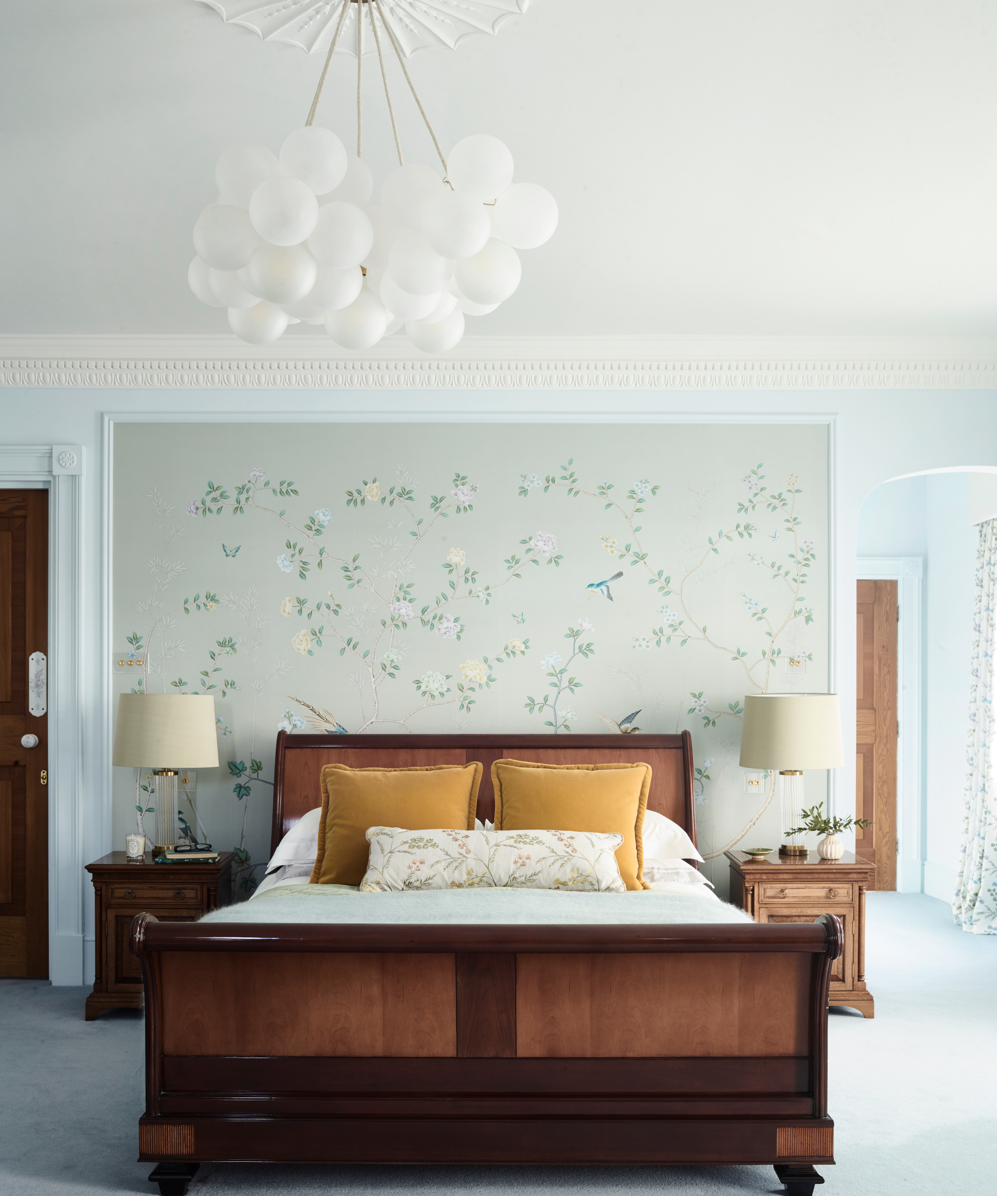
The clients loved their existing pastel blue colour scheme so Pia decided to keep it as it evokes a calming ambience. Among her bedroom ideas for adding the wow factor were a bespoke wall mural by de Gournay and a bubble chandelier by Dowsing & Reynolds.
Bedroom
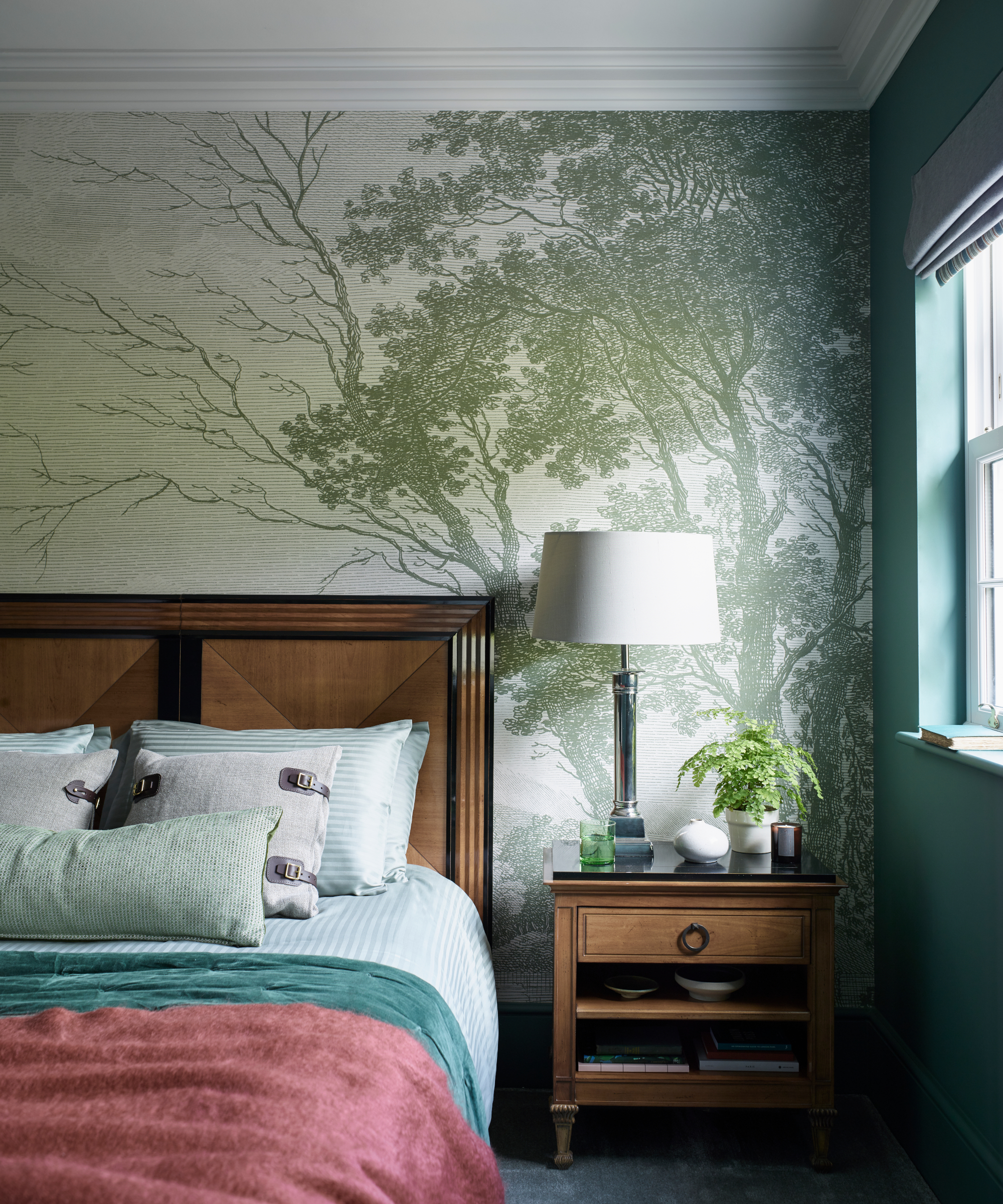
Pia has created a joyful bedroom scheme by injecting bursts of color and an eyecatching wall mural that complements the classic wooden furniture.
Bedroom
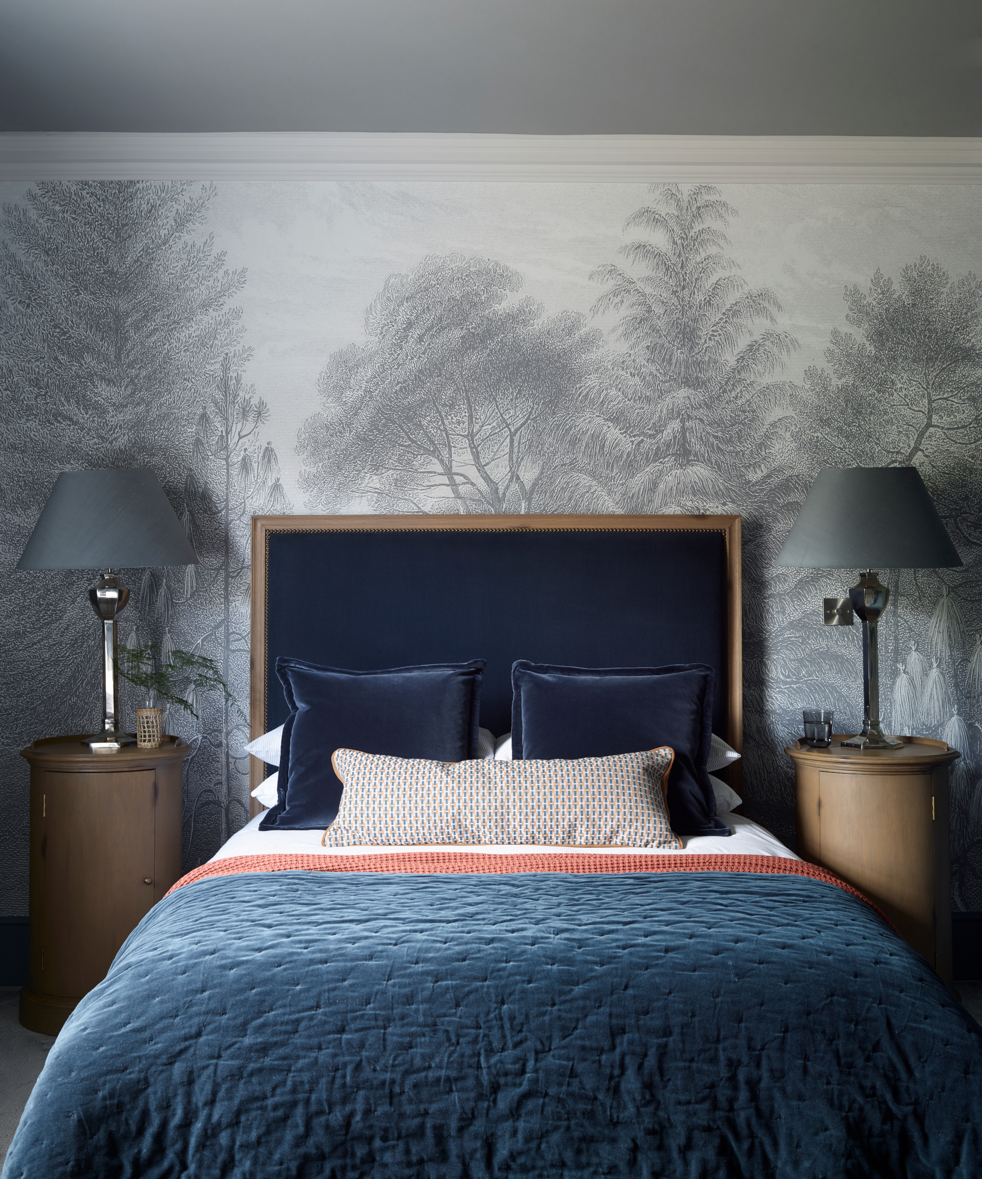
'The bedrooms at the back of the house were already furnished, but otherwise very plain,' says Pia. The bed, bedside tables and lamps were the client’s own so Pia introduced moody color with painted walls and ceilings, as well as a mural on the headboard wall, creating an atmospheric scheme.
Bedroom
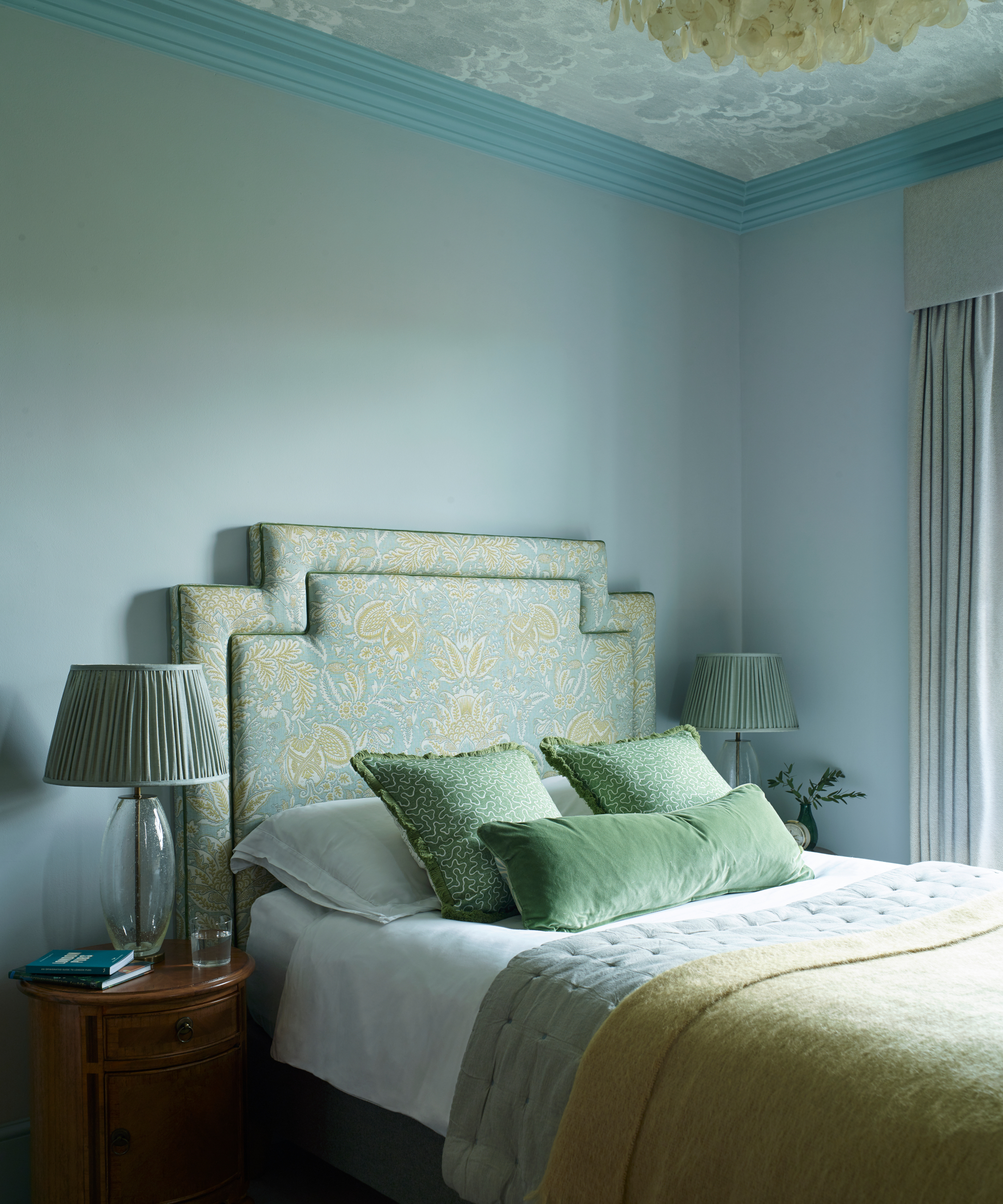
'This is the smallest bedroom in the house but with a big impact,' says Pia. 'We wanted visitors not to feel boxed in so we used Cole & Son’s Nuvolette cloud wallpaper on the ceiling to give the visual impression of the sky opening into the room.'
The unusual shape of the bespoke headboard was inspired by the existing cornicing in the house.
Bedroom
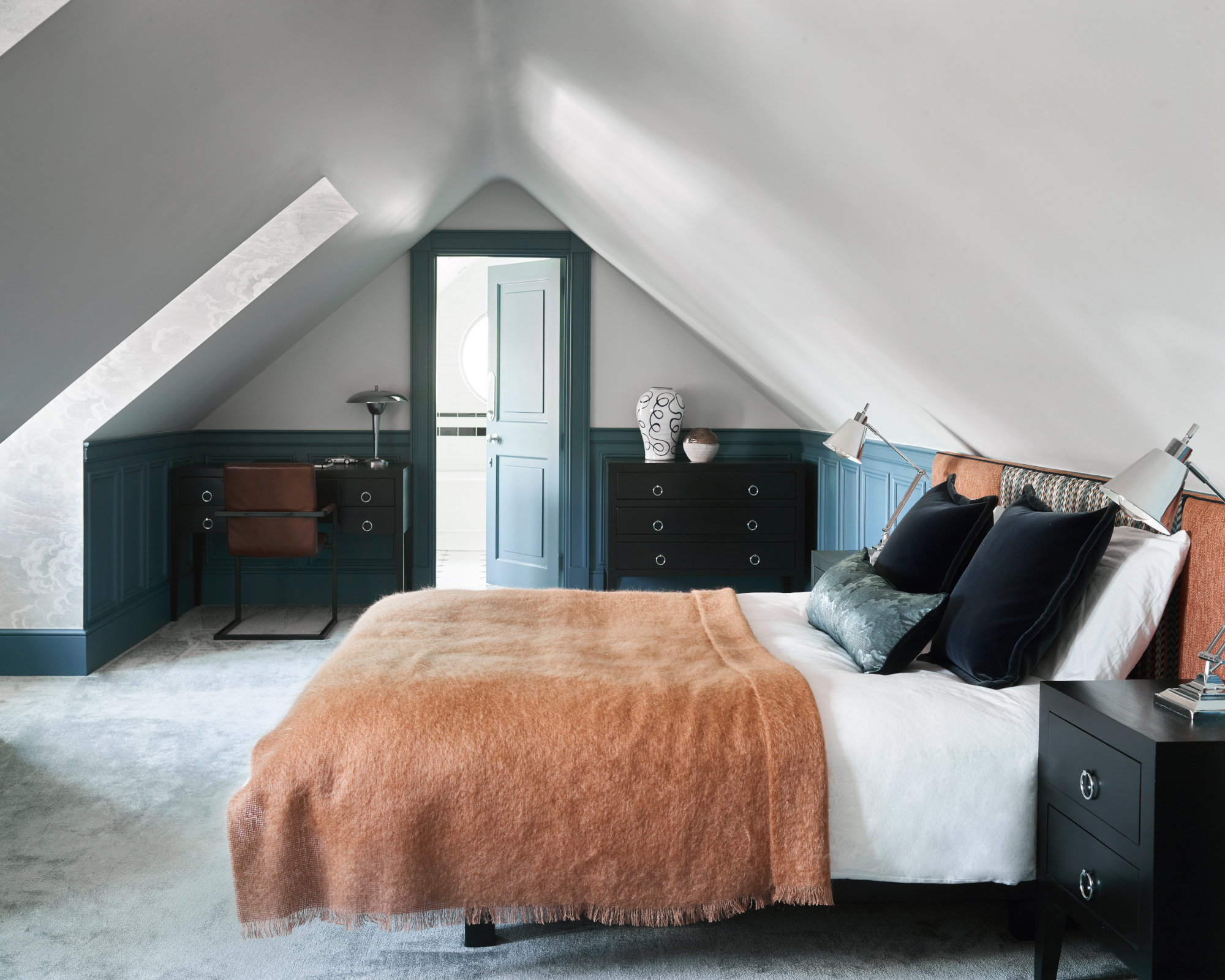
As this room suffers from reduced ceiling height, Pia used Cole & Son’s Nuvolette cloud wallpaper inside the window reveals and installed paneling on the walls for interest. A colorful custom headboard pulls together the shades used in the scheme.
Bathroom
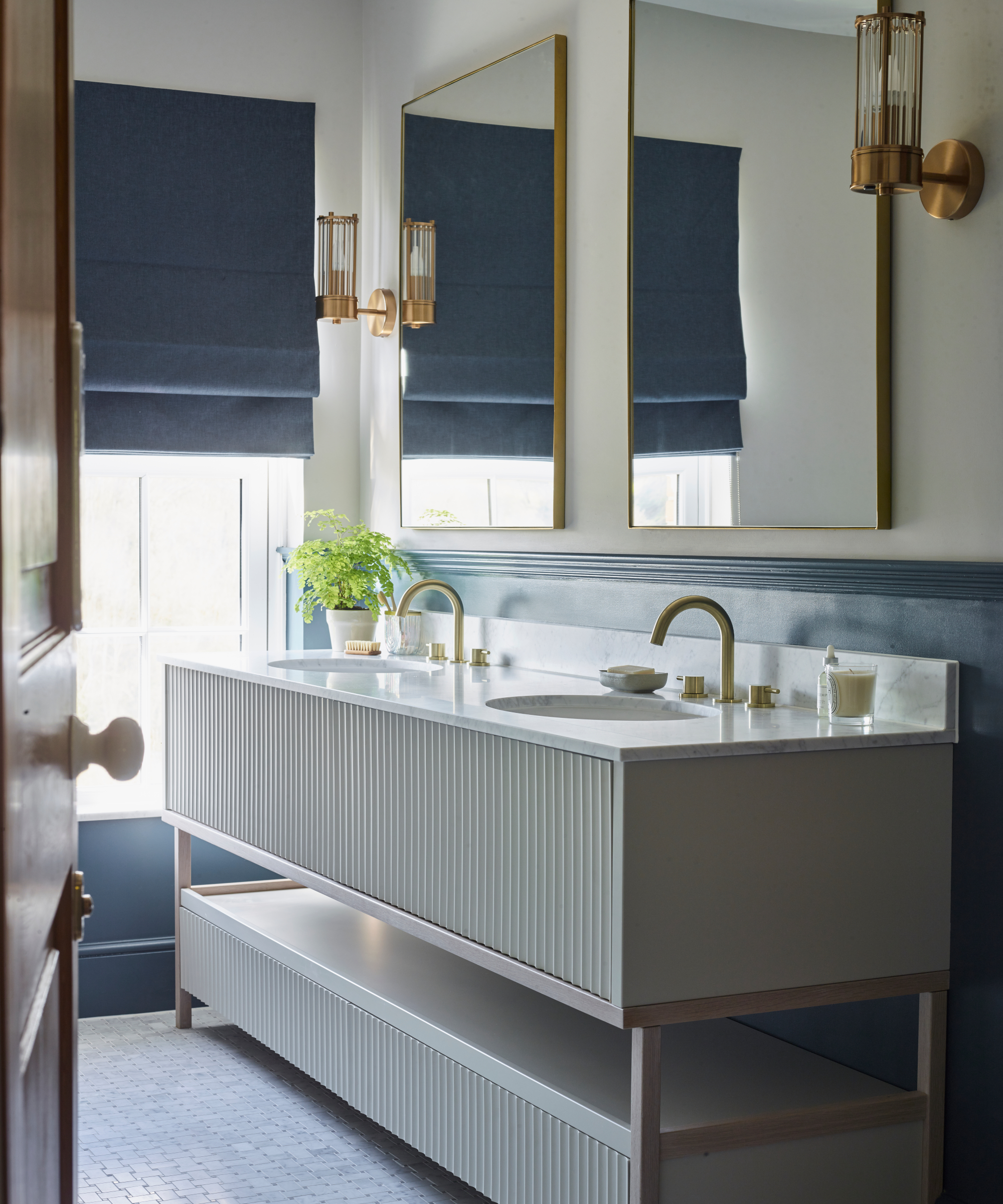
This space was looking dated and among Pia's bathroom ideas to create a chic new scheme was introducing a bespoke vanity unit with fluted drawer fronts. Marble mosaic tiles on the floor and Carrara marble on the shower splashback have been used to evoke a sumptuous feel, while dark blue paneling and blinds add drama.
Interior design/ Pia Design
Photographs/ Mary Wadsworth
Styling/ Milly Bruce
Sign up to the Homes & Gardens newsletter
Design expertise in your inbox – from inspiring decorating ideas and beautiful celebrity homes to practical gardening advice and shopping round-ups.

Interiors have always been Vivienne's passion – from bold and bright to Scandi white. After studying at Leeds University, she worked at the Financial Times, before moving to Radio Times. She did an interior design course and then worked for Homes & Gardens, Country Living and House Beautiful. Vivienne’s always enjoyed reader homes and loves to spot a house she knows is perfect for a magazine (she has even knocked on the doors of houses with curb appeal!), so she became a houses editor, commissioning reader homes, writing features and styling and art directing photo shoots. She worked on Country Homes & Interiors for 15 years, before returning to Homes & Gardens as houses editor four years ago.
-
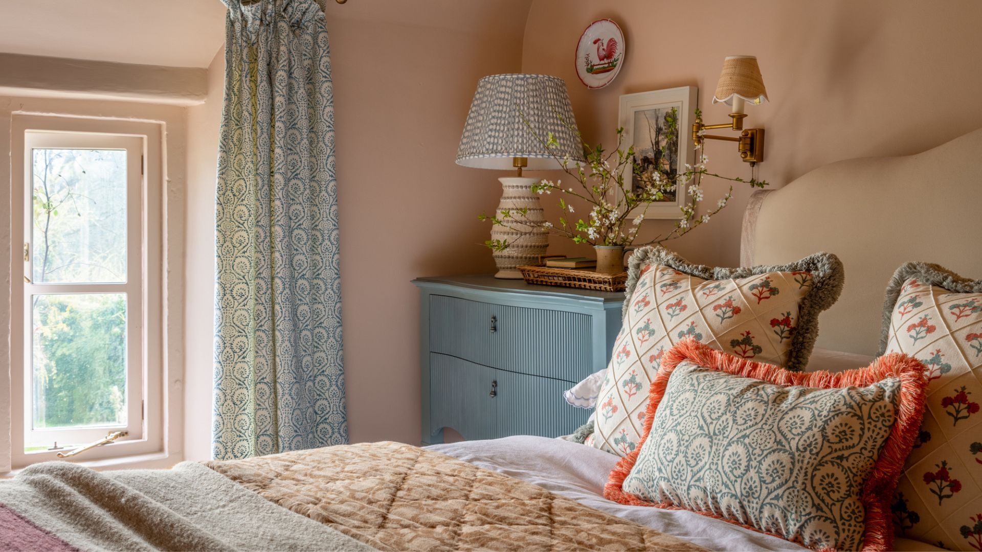 These are the 6 must-have colors to decorate with in April 2025
What do retro-inspired yellows and beautiful blues all have in common? They're on our hot list for the season ahead
By Sophia Pouget de St Victor Published
-
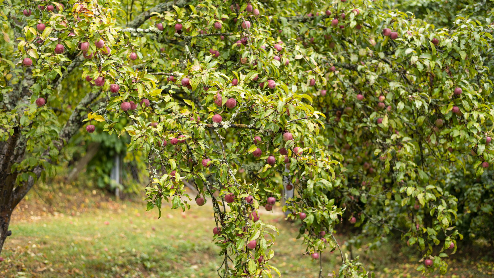 Plants never to grow next to fruit trees
Expert advice on which plants to keep away from fruit trees to encourage a healthy harvest
By Jacky Parker Published