Elegant color, supreme comfort, and artful touches ensure this curated home in London is truly one-of-a-kind
Sarah Fox of Fox Interior Design demonstrates her light-touch approach to modernizing this artfully curated home in west London, owned by Rupert des Forges
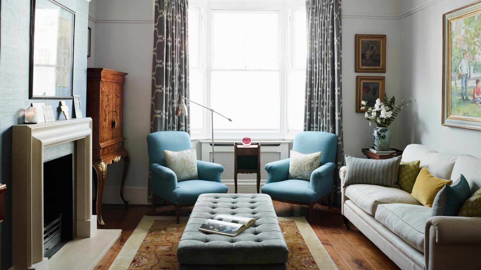

Decorative design and unparalleled attention to detail have always been integral to Sarah Fox of Fox Interior Design, so it comes as no surprise that the established designer embeds these elements in every single one of her projects.
Sarah has developed a reputation for designing homes that fuse supreme comfort with practicality. 'The most successful projects are those where the decorator has had a strong hand in pulling together all the elements but in the most subtle way possible so that the end result completely reflects the character of the owners,' she says.
In one of her latest projects, Sarah was asked by leading prime London estate agent Rupert des Forges at Knight Frank to help rationalize and redecorate his Victorian townhouse in Brook Green from top to bottom. 'He’d started the project thinking it was something he could manage on his own,' she explains. 'But by the time the house had been stripped, he quickly realized the scope of the work ahead and the hours that would be taken up dealing with the builders and all the detailing. So, he called me in to help.' The pair are friends from their teenage years but hadn’t worked together before. 'He’s very confident in his style, has great taste, and likes what I do so it was a dream job really,' adds Sarah.
While very few structural changes were made during the five-month-long project, Sarah’s touch is obvious throughout in the way she has re-examined the layout of rooms, introduced layers of light, given each of the five bedrooms ensuite bathrooms and created a coherent and continuous thread of color from the ground floor up. Each step of the way, she has incorporated her client’s existing furniture and art – including beautiful antique and vintage pieces.
The house is hard-working: Rupert and his wife have four teenage children and a border terrier, so it was vital to make sense of the space available. Her first move was to turn the top floor which previously had two bedrooms into a self-contained master bedroom sanctuary with a bedroom, jewel-like dressing room, and bathroom that wouldn’t look out of place in a top London hotel. Then it was a case of rationalizing the other rooms, finding pockets of extra space where possible (including a desk on a landing), and turning a bedroom into a flexible home office.
Let's take the tour.
Living room
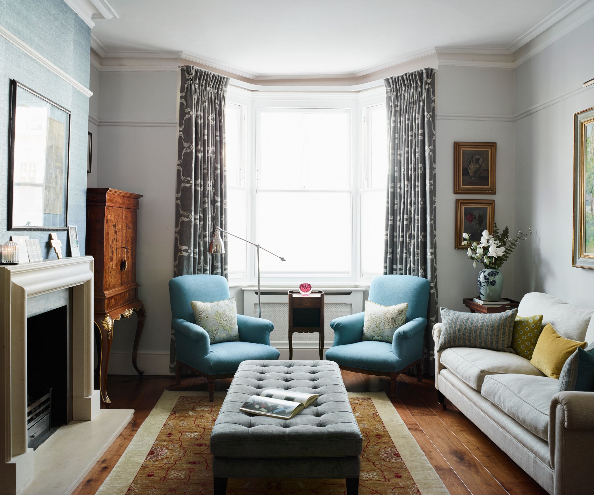
As this room is used when the family entertains, the living room layout is designed for socializing although the space is equally comfortable for Sunday morning paper reading, too. Sarah added a grasscloth in Delft by Colefax & Fowler on the chimney breast in order to carry the blue-grey color through from the snug and thus quietly sewing the two spaces together.
Another intervention here involved removing the '70s-era' oversized downlighters and replacing them with slimline alternatives. Further layers of light were introduced in the bookcase and the picture light, also from Astro.
Snug
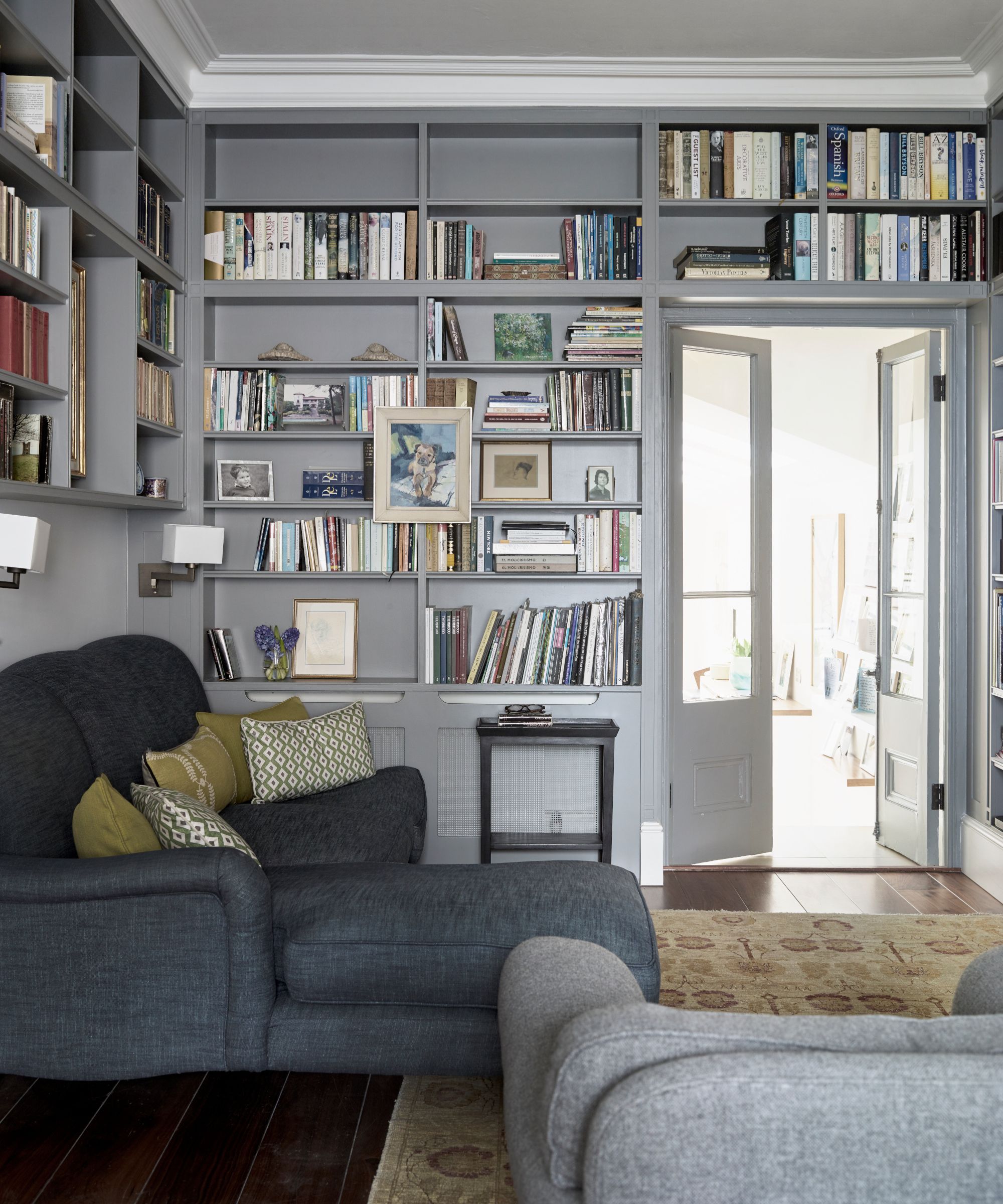
Like many terraced houses in London, the dividing wall between the two living rooms has been removed to create a larger space. This end is where the TV sits. Sarah painted the existing joinery in Lamp Room Grey by Farrow & Ball and added wall lights by Astro.
Home office
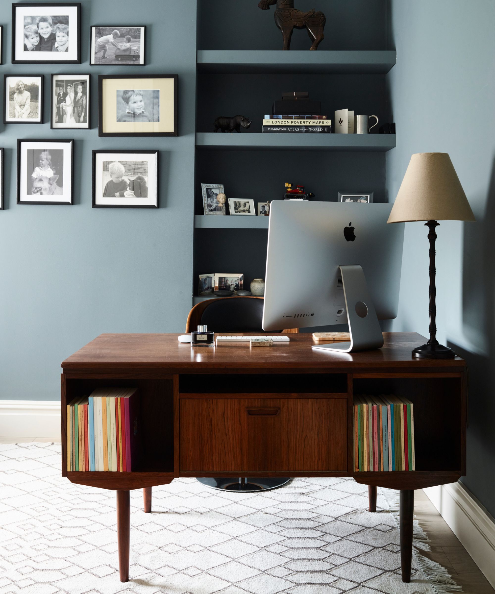
Previously this room was used as a bedroom but today it doubles as a smart small home office for the house, complete with Rupert’s Danish mid-century writing desk. The walls are painted in De Nimes which sets off the artwork and collection of family black-framed photographs.
Kitchen
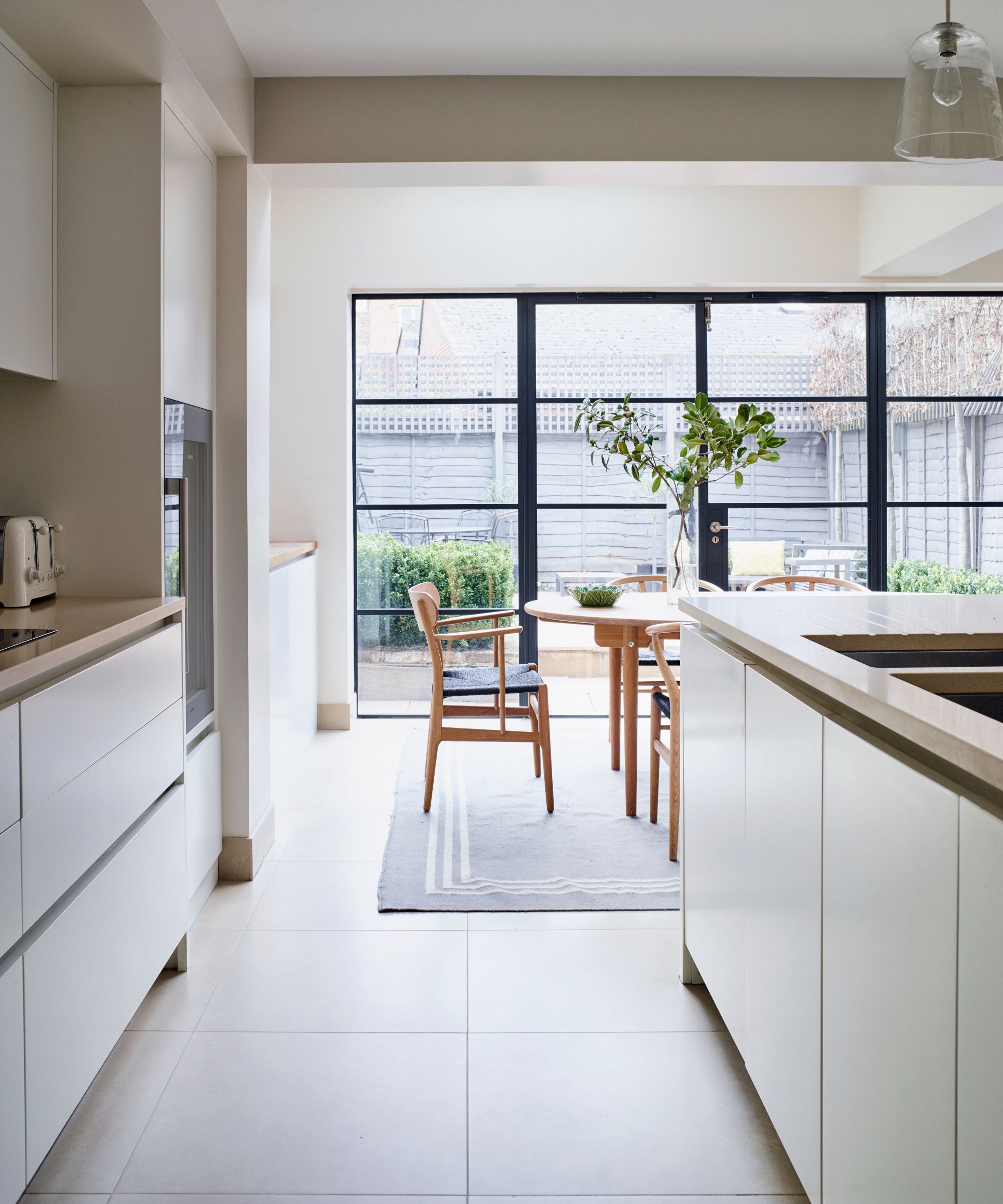
The bespoke kitchen by Holloways of Ludlow was existing and recently installed so the client was happy to keep it but Sarah was keen to open up the elevation to the garden. In lieu of doors, she had a set of Crittall-style doors installed which help to dissolve the divide between the inside and outside and bring much more natural light into the room.
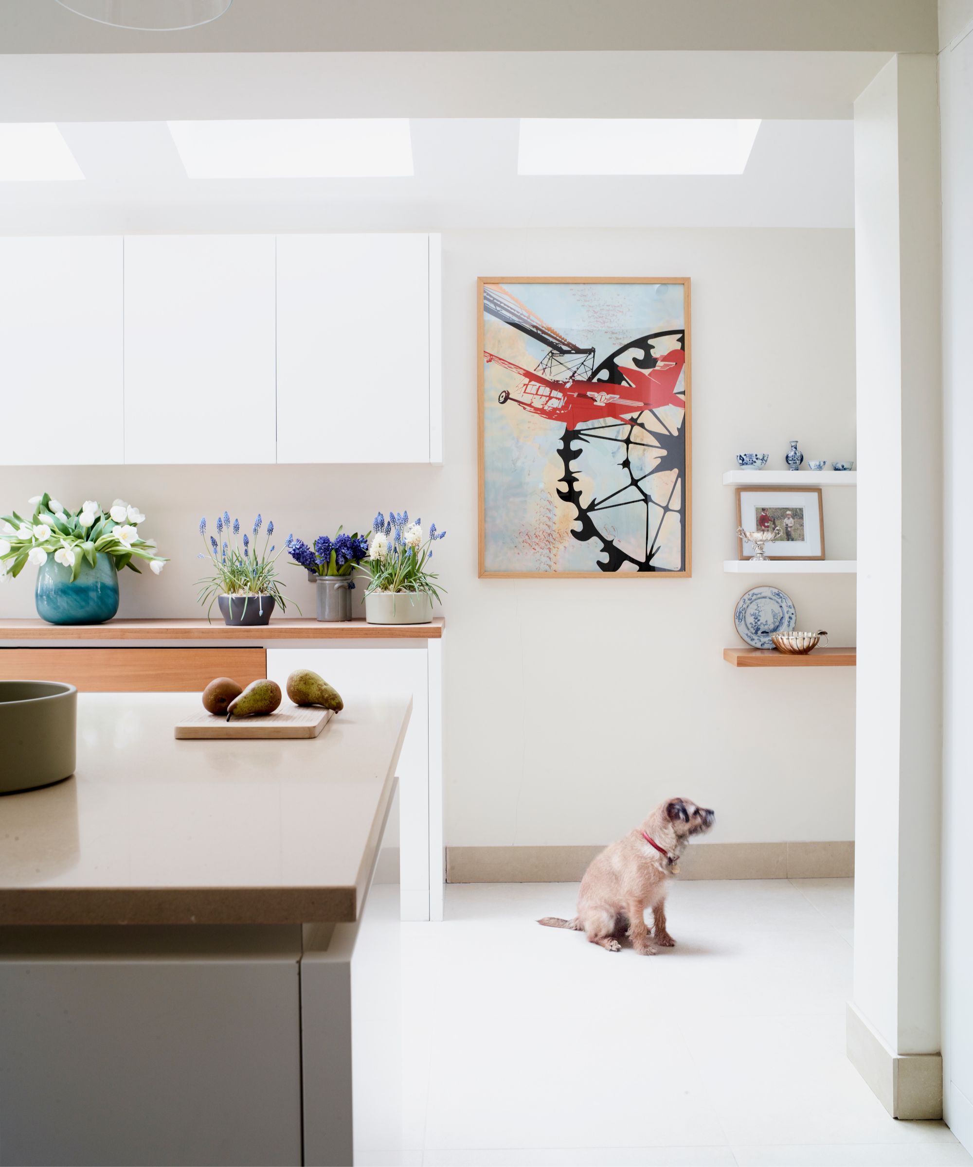
She chose a color Scandi-inspired color palette of light walls painted in School House White and a contrast beam in Shaded White (both by Farrow & Ball). Glass Bell pendants by Hector Finch hang over the island while the ambient lighting throughout the kitchen was upgraded. 'It’s a very calm space: the color in the kitchen comes from the artwork,' she explains.
Bedroom
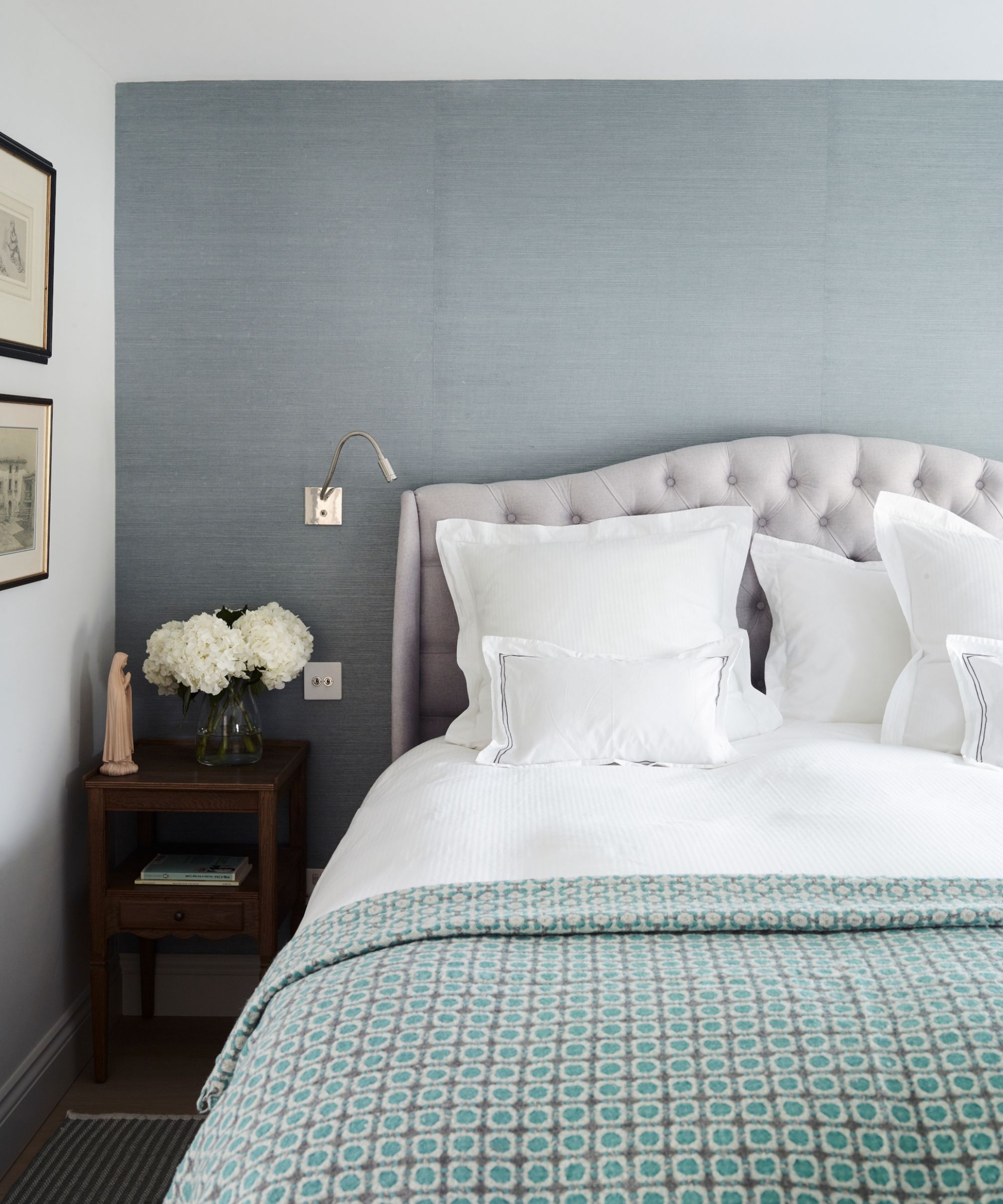
Fortunately, the ceiling heights at the top of the house were generous. In the main bedroom, she has added a grasscloth in a sea blue hue to the wall behind the bed to add a layer of softness and coziness as well as framing the headboard. The nickel reading lights flanking the bed are by Porta Romana.
Bathroom
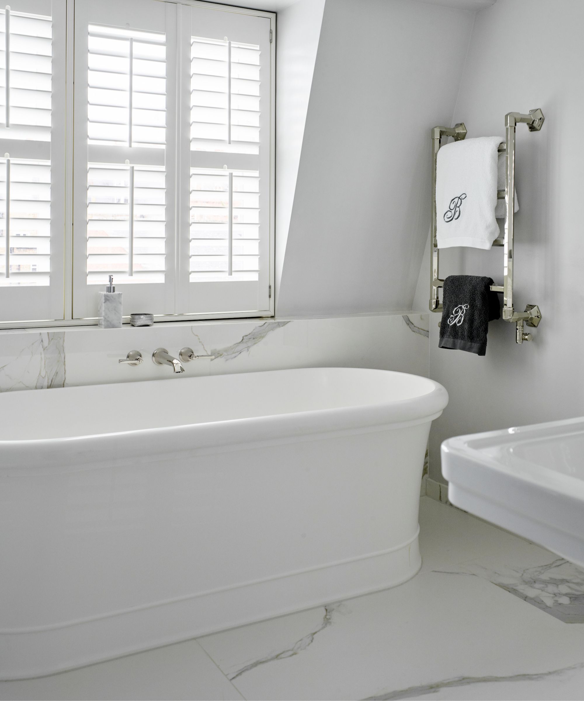
There is something life-enhancing about the transition out of the dressing room into the light-filled bathroom – ideal for the morning routine. Timeless details such as twin free-standing basins by CP Hart, traditional-style taps from Samuel Heath, and large panel white Statuario porcelain tiles from Stone & Ceramic Warehouse create a clean and luxurious hotel-style look. Art Deco nickel wall lights from Vaughan Designs add warmth and layers of light.
The home was truly a labor of love for Sarah and her clients. Unifying the entire home is a color scheme of blues and greys that not only provide a sense of calm but also act as an excellent backdrop for the art and furniture. 'I love to work with blue and treat it as a neutral much like an off-white,' explains Sarah. 'It works so well with the light in London. But you have to be a bit careful and stick to the grounding grey-green end of the spectrum – very saturated blues made from brighter green and yellow just wouldn’t have the same effect.'
Interior design: Fox Interior Design
Sign up to the Homes & Gardens newsletter
Design expertise in your inbox – from inspiring decorating ideas and beautiful celebrity homes to practical gardening advice and shopping round-ups.

Arabella is a freelance journalist writing for national newspapers, magazines and websites including Homes & Gardens, Country Life, The Telegraph and The Times. For many years she has specialized in writing about property and interiors, but she began her career in the early 2000s working on the newly launched Country Life website, covering anything from competitions to find the nation’s prettiest vicarage to the plight of rural post offices.
-
 The great bedding debate: top sheet vs no top sheet − which side are you on?
I asked an expert panel of bedding designers whether you really need a top sheet to keep clean and cool or if it's just another ploy to make you spend money
By Emilia Hitching Published
-
 Thoughtful modernism – how one Dallas home makes bold contemporary design feel warm, welcoming, and comfortable
With its mix of textural finishes and carefully curated furnishings, this modernist home is a refreshing retreat
By Karen Darlow Published