Yes, you can have it all – casual elegance and smart luxe finishes are balanced to perfection in this welcoming home
One house, two roles: a relaxed setting for weekend crowds, and a cosy weekday home for a family of three. Here's how it works
How do you make your home just as appealing and comfortable for a big weekend crowd, as it is during the week for a family of three? This house in Vancouver, Canada, seems to have got the formula just right, with interior spaces designed to reflect the sense of elegance of New York and European apartments while reflecting a casual atmosphere, perfect for entertaining and large family dinners.
Originally built in 1991, with a formal layout of distinct - even disjointed - rooms, the house has recently been redesigned and its ground floor reconfigured to create a much more open and welcoming feel. The property is owned by Joanne and Alan with six grown-up children between them, and only the youngest daughter at home. The extensive reworking of the main space created a refined, yet casual and relaxed setting for everyday family life and ensures a warm welcome when entertaining. And it's that clever and successful balancing act that puts this house among the world's best homes.
The couple enlisted the help of interior design firm Stephanie Brown Inc to come up with a new way of using and enjoying the ground floor, and Stephanie Brown herself explains the rationale and inspiration behind the new look. 'We reworked the layout of the main floor to create a more open-concept space, which would provide better flow for modern family gatherings, and fewer formalized spaces,' she says.
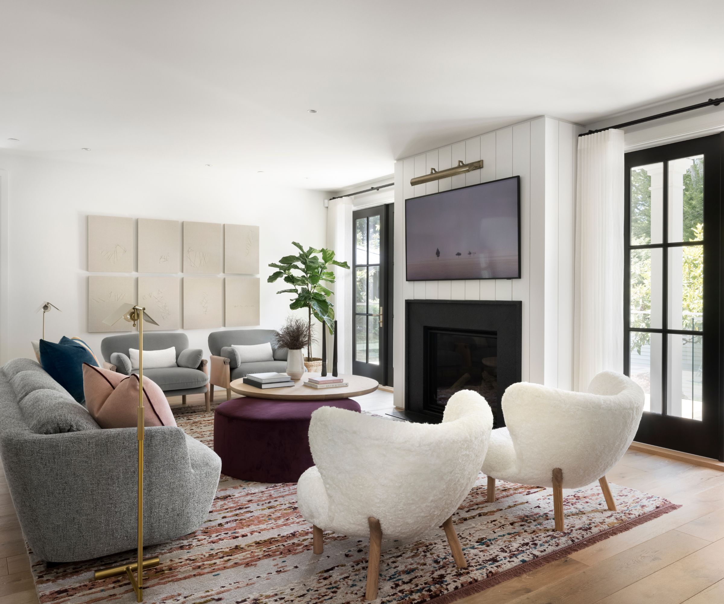
Living room ideas here are relaxed and welcoming, as this enlarged family room is adjacent to the kitchen. 'We took the far end of the room and created a hidden mudroom (which the house was lacking), and we reworked the fireplace and French door positions.
'This room is meant to feel open to the kitchen and welcoming for the whole family to hang out. We focused on various seating options with a unique contemporary mix (including the iconic Little Petra chairs) and custom ottoman, cushions and area rug pull the home's color palette together perfectly.' says Brown.
Based on a soft white tone, the color palette also comprises touches of deep black, blue and green for more drama and depth. 'The palette flows yet turns more dramatic and bold in smaller spaces, which are designed for entertaining,' explains Brown.
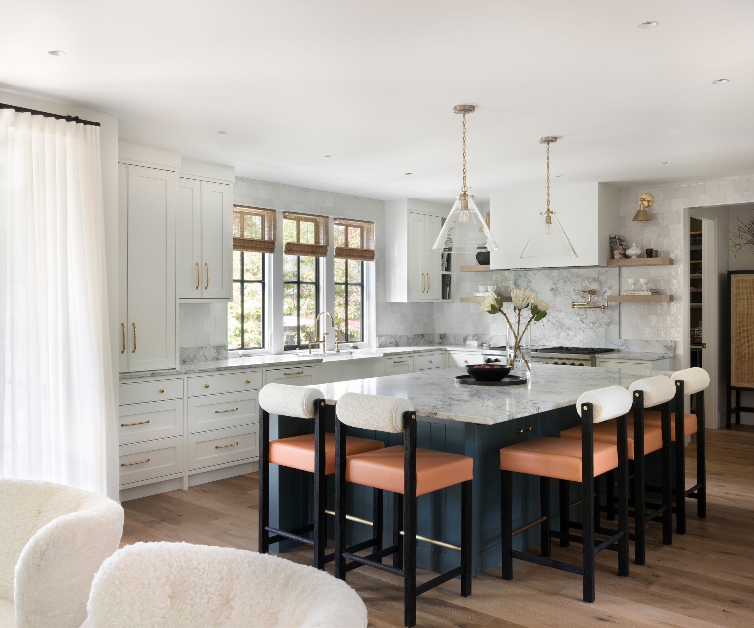
Kitchen ideas play on Joanne’s love for moody jewel tones, explains Brown: 'We selected a rich teal blue for the kitchen island which sets off the contemporary stools from Thomas Hayes, and worked in shades of burgundy and pink for lighter, more feminine accents.'
The marble-topped island is spacious enough for casual meals; no breakfast nook is required.
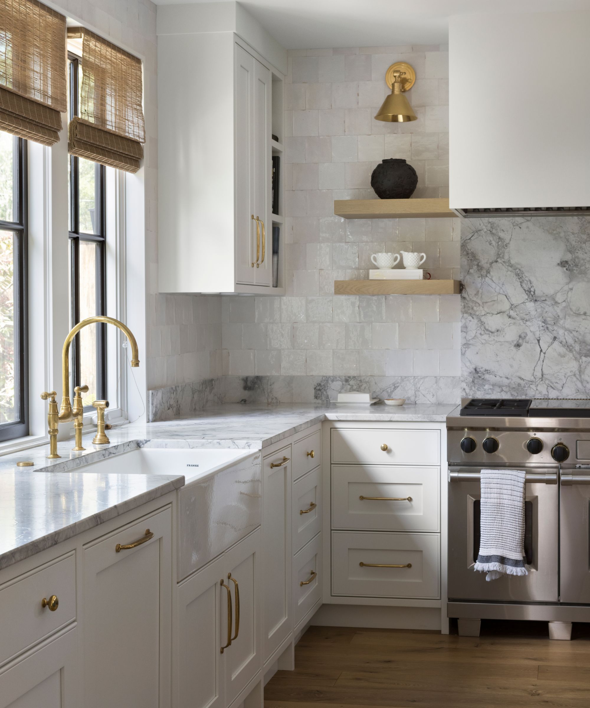
'The kitchen fixtures are predominately white, with punctuations of black, and unlacquered brass hardware and fixtures, which patina over time,' says Brown. Marble work surfaces and backsplash add luxury notes.
'While the kitchen didn’t move locations, we enlarged it, opened it up to the family room, and widened the windows for more natural light.' she adds. 'We designed classic white face-frame cabinetry, accentuated by unlacquered brass hardware and fixtures. The countertops are durable natural Quartzite, and the zellige backsplash tiles bring in old-world texture.'
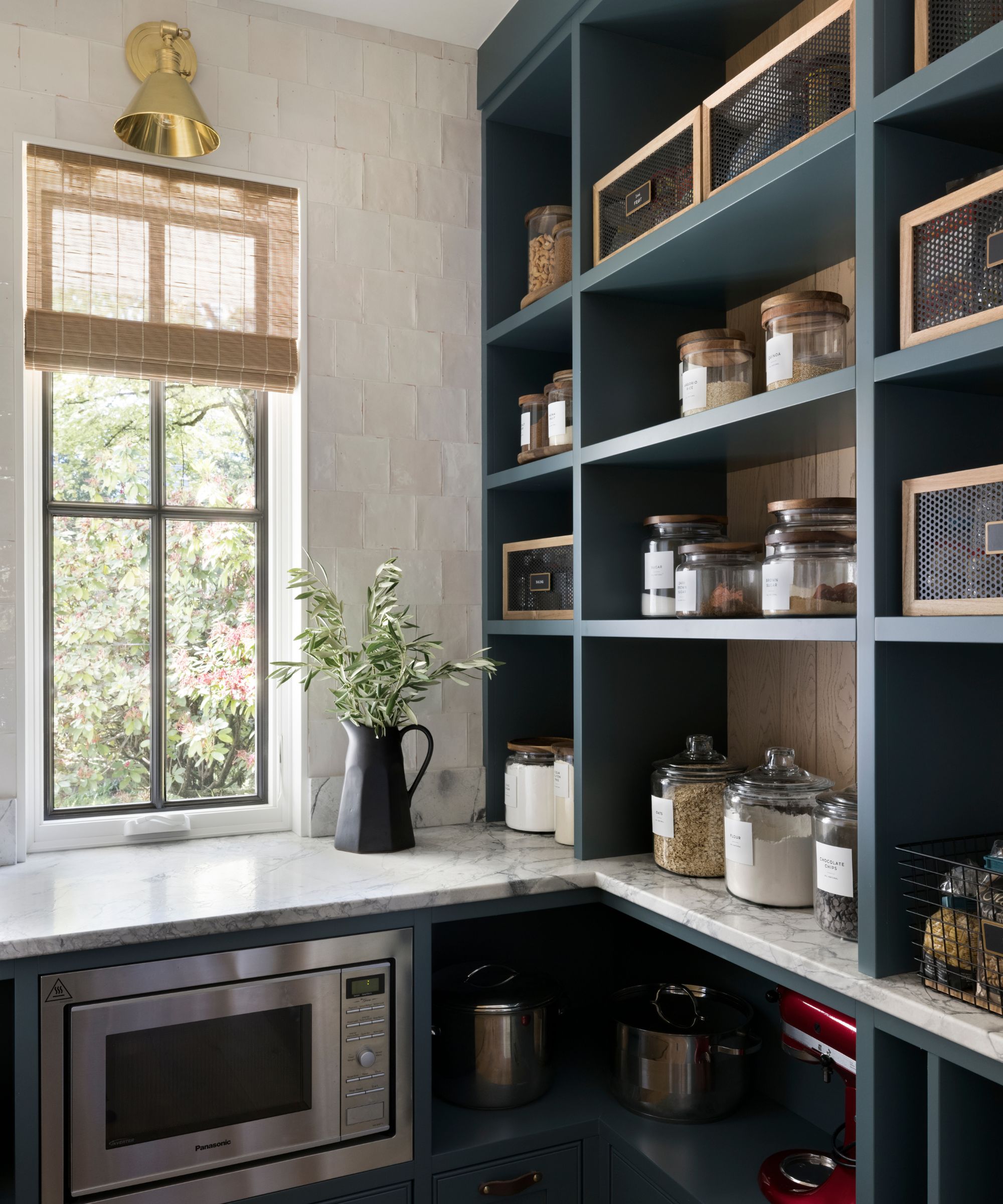
The pantry continues the luxe marble and zellige tile themes to link it to the kitchen, with teal shelving to provide a contrast.
'This room didn’t exist in the original plan,' says Brown. 'The laundry room was formerly in this location. We used the teal-green color from the island for some drama here and designed open shelves so all goods and appliances could be easily spotted and pulled out. Our client worked with professional organizer Sherry Borsheim to make sure the pantry (and other areas) would be super functional and curated.'
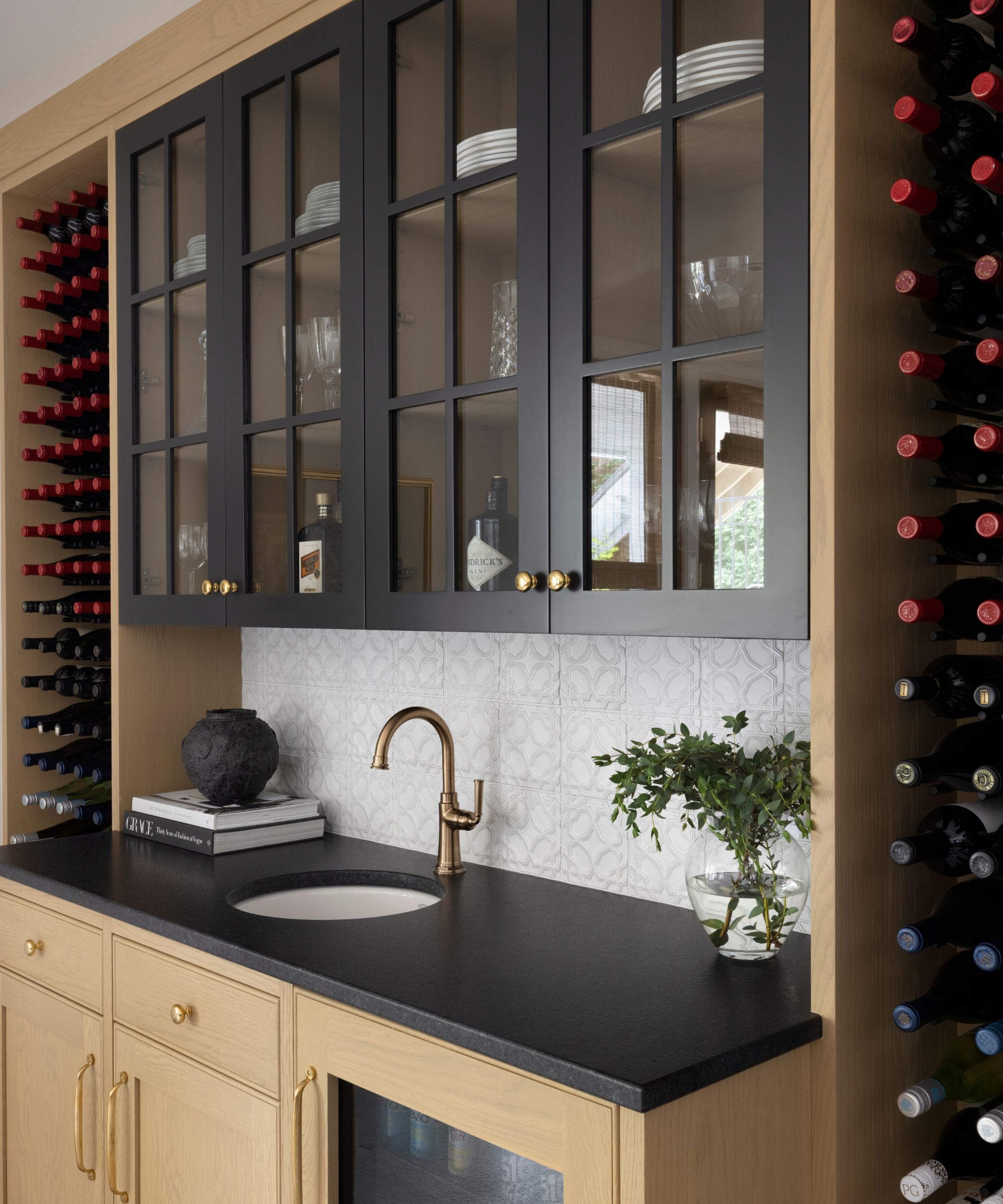
'We added interest to the basement rec room with the addition of a wet bar,' says Brown. 'It features plenty of open displays for our clients’ growing wine collection. The textural backsplash tile adds depth and interest.
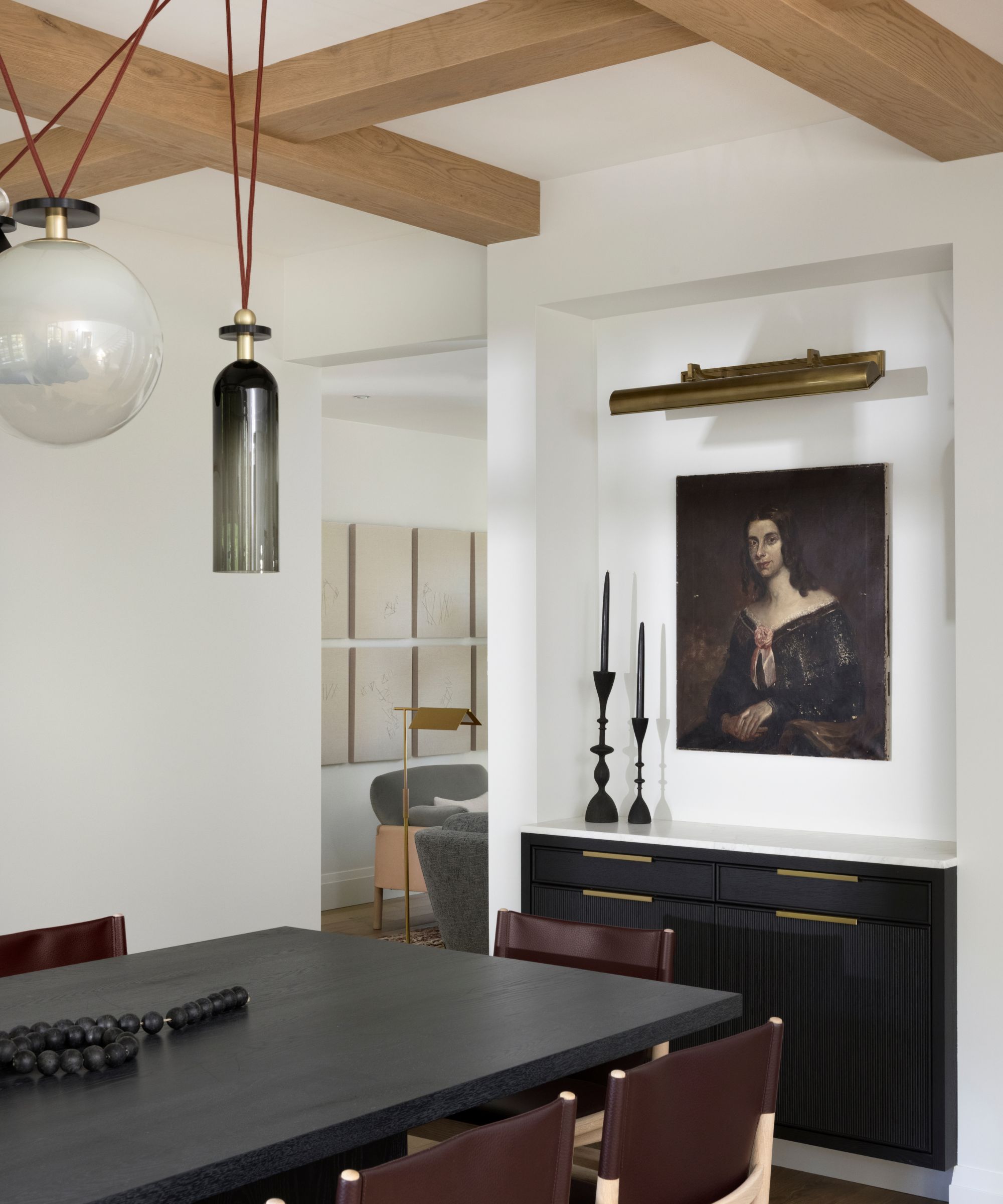
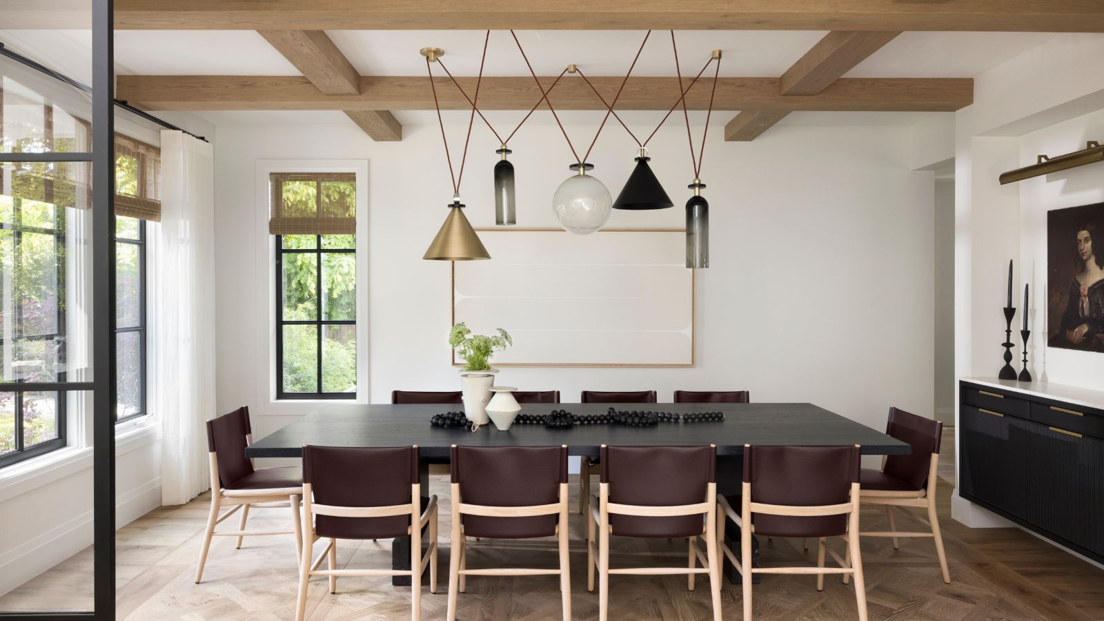
Explaining her dining room ideas for the new-look home, Brown says: 'We drew inspiration from New York and European apartments, which feature unique collections of art, furnishings and decor set against elegant details. 'We opted for a casual take on those interiors, but one where the play between classic and modern would still feel fresh and unique.
'This was previously the formal living room. The beams are partially structural, so we kept them and refinished them with wood, to tie in with the entry foyer beams. We chose a detailed, traditional parquet wood floor, and contrasted that with modern furniture including a custom-made table, and B&B Italia dining chairs. The striking light fixture is the piece de resistance, from Roll & Hill.'
So the house gracefully transitions from daytime family life to an evening atmosphere thanks to the use of tactile, approachable materials and simple elements interspersed with luxe fixtures and eclectic furnishings.
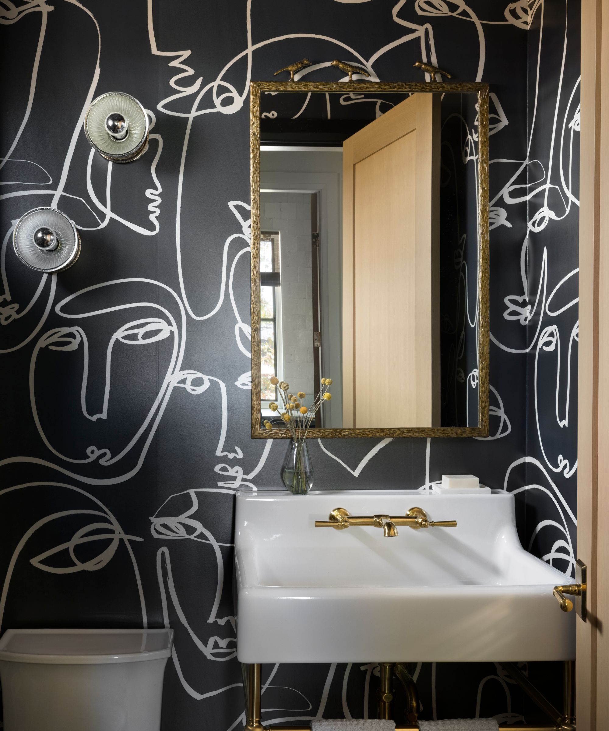
'The powder room was formerly in the middle of the house. We tucked it out of the way into a more private location, and went for total drama with the black and white wallpaper, which provides a fun, modern twist against the traditional pedestal sink.'
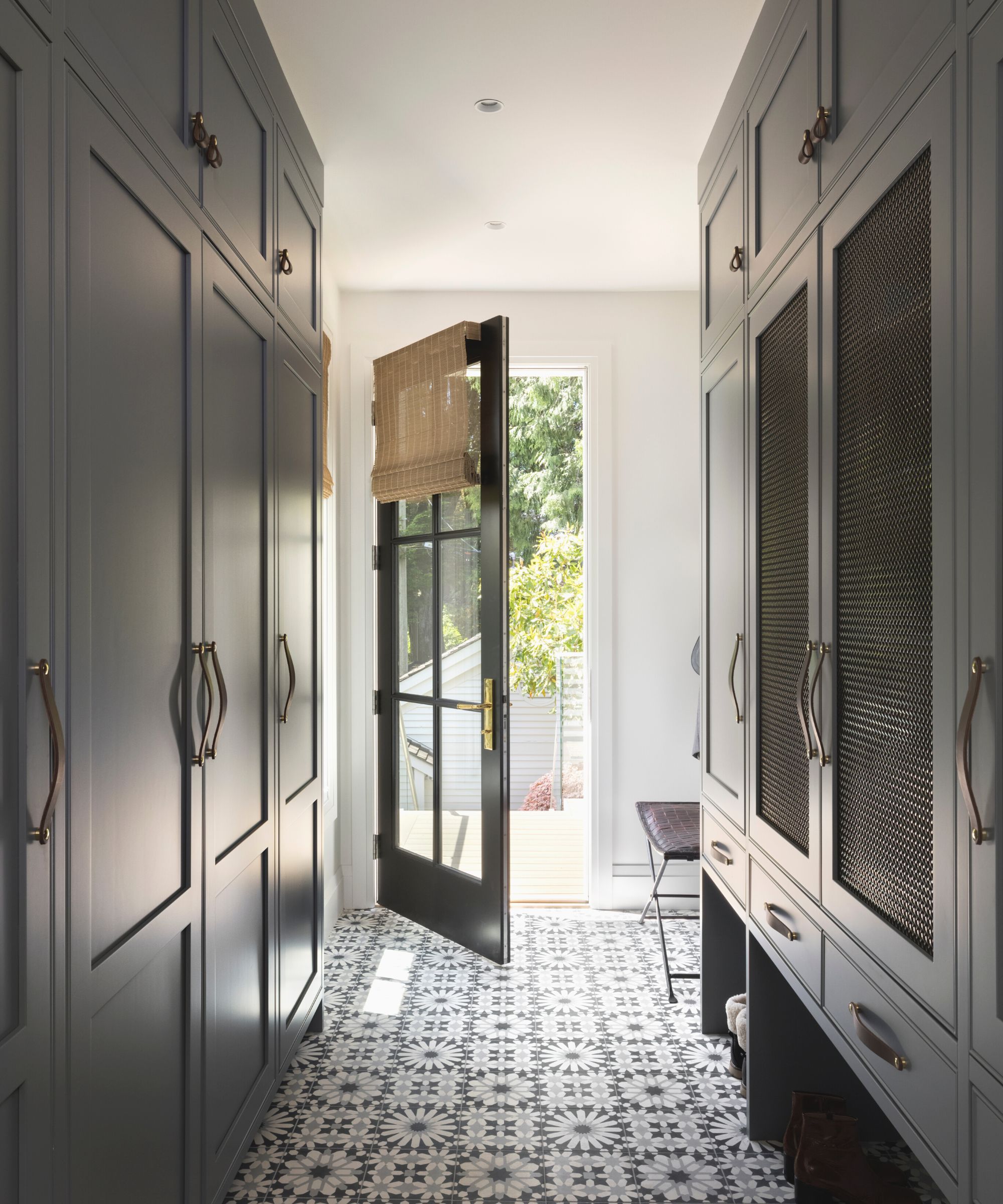
This mudroom space was carved out from the far end of the family room, as it offered the most logical place to enter the house from the rear garage. Boot room ideas include custom dark-grey cabinetry to store everything from shoes and coats to cleaning supplies, and a fun patterned concrete tile from Ann Sacks on the floor.
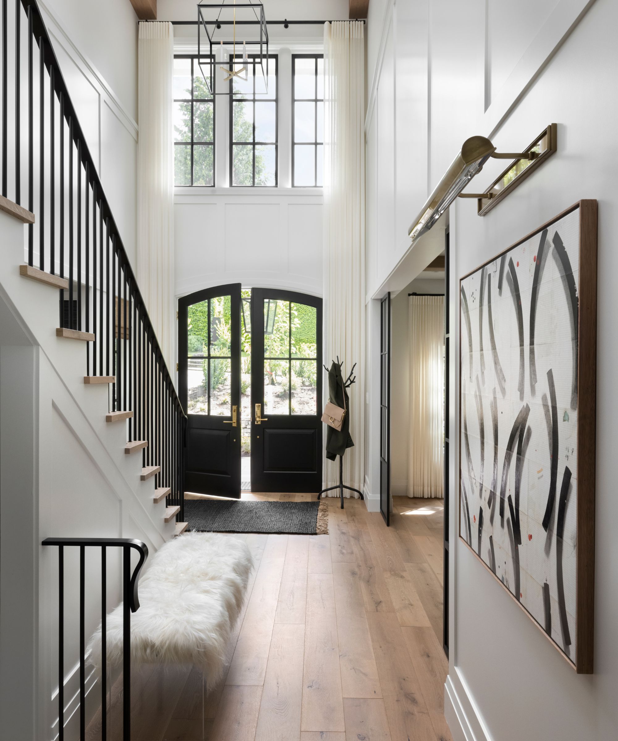
Perhaps the most dramatic transformation to the home is the addition of this double-height entry foyer. 'We opened up this space by moving the (above) master ensuite, which meant we gained a two-storey volume. We finished the space with crisp white paneling, warm wood beams, and contemporary lanterns. The sheer drapery was a functional request (for privacy) by the client, but adds a great layer and some drama,' says Brown.
As the design team wanted the main backdrop of the home to feel bright yet warm, welcoming and timeless, they selected a mid-toned oak hardwood with plenty of texture and character for the flooring.
So how would the homeowners sum up their new space, and how well does it fulfill its dual role? 'I think the true genius of how Stephanie Brown designed this place was maintaining warmth as well as openness in a house that goes from three people living at home during the week to 10 people for regular Sunday dinners,' says Joanne. Praise indeed, and mission accomplished.
Photos: Ema Peter Instagram @emaphotographi
Interior Design: Stephanie Brown Inc.Instagram @stephaniebrowninc
Sign up to the Homes & Gardens newsletter
Design expertise in your inbox – from inspiring decorating ideas and beautiful celebrity homes to practical gardening advice and shopping round-ups.
Karen sources beautiful homes to feature on the Homes & Gardens website. She loves visiting historic houses in particular and working with photographers to capture all shapes and sizes of properties. Karen began her career as a sub-editor at Hi-Fi News and Record Review magazine. Her move to women’s magazines came soon after, in the shape of Living magazine, which covered cookery, fashion, beauty, homes and gardening. From Living Karen moved to Ideal Home magazine, where as deputy chief sub, then chief sub, she started to really take an interest in properties, architecture, interior design and gardening.
-
 Sarah Michelle Gellar's entryway is tranquil and elegant thanks to white and wood accents – her neutral style is replicable from $33
The actress's entryway features a wood console table, wood floors, and crisp, white paint for a warm and inviting atmosphere
By Hannah Ziegler
-
 How to design a mini meadow in pots – and welcome birds, bees and butterflies to your urban wildlife garden this summer
Experts share advice on species recommendations, soil, and types of containers to use for meadow planting
By Holly Crossley