Clean lines, monochromes, and an open-plan layout transformed this family home
Opening up this Seattle home gave it a more modern aesthetic and created a family friendly floor plan with space to entertain
With sweeping views of Lake Washington and the Cascade Mountain Range, this Seattle home's location couldn't be faulted. The owners and their three young children are happily settled here but were looking to update the interiors with a more modern aesthetic, and improve the floor plan to create a more practical setting for family life. They also hoped to make more of that impressive location, putting the views of the lake and mountains at the heart of their property.
The family knew what they wanted but decided to call in expert design help to help them with their updates. The results have transformed this unassuming property into one of the world's best homes and the new look and layout are exactly what the owners had in mind.
Seattle-based interior designer Michelle Mele, who worked with the family on the renovation, shows us round.
Scullery and bar – an extra kitchen
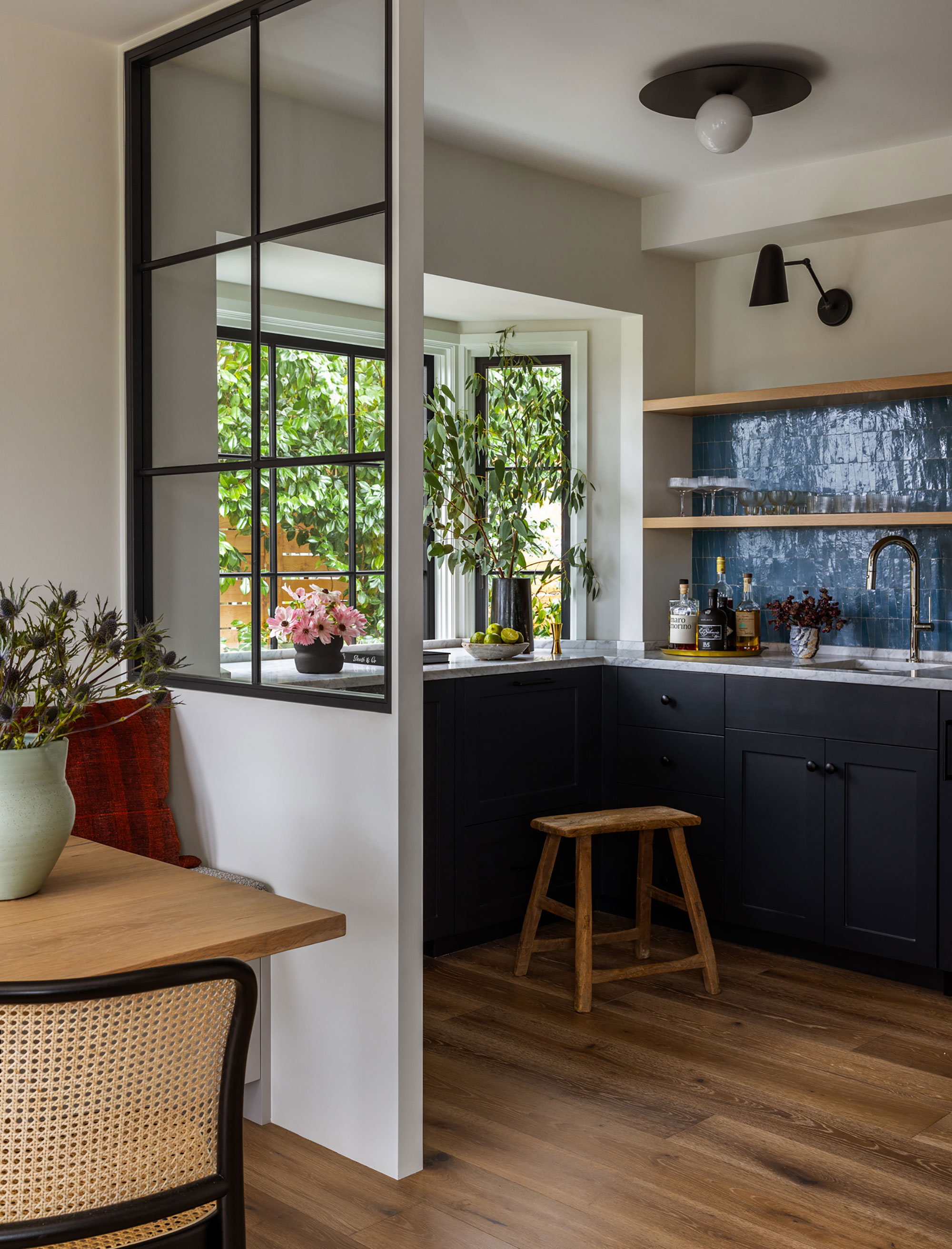
This neat space was the home's original kitchen, cut off from the rest of the home. As part of the renovation, designer Michelle suggested opening it up to create a new breakfast nook and turning the remaining part of the room into a second kitchen. The space incorporates an extra wall oven, ice maker and refrigeration drawers and doubles as a bar when the couple entertain.
'As a contrast to the kitchen, the client wanted a little more color here and the Blue Zellige tile from Les Ateliers Zelij adds pattern,' says Michelle. Cabinetry painted in Benjamin Moore Racoon Fur. Wall sconces from Cedar & Moss, ceiling light, Circa.
Kitchen
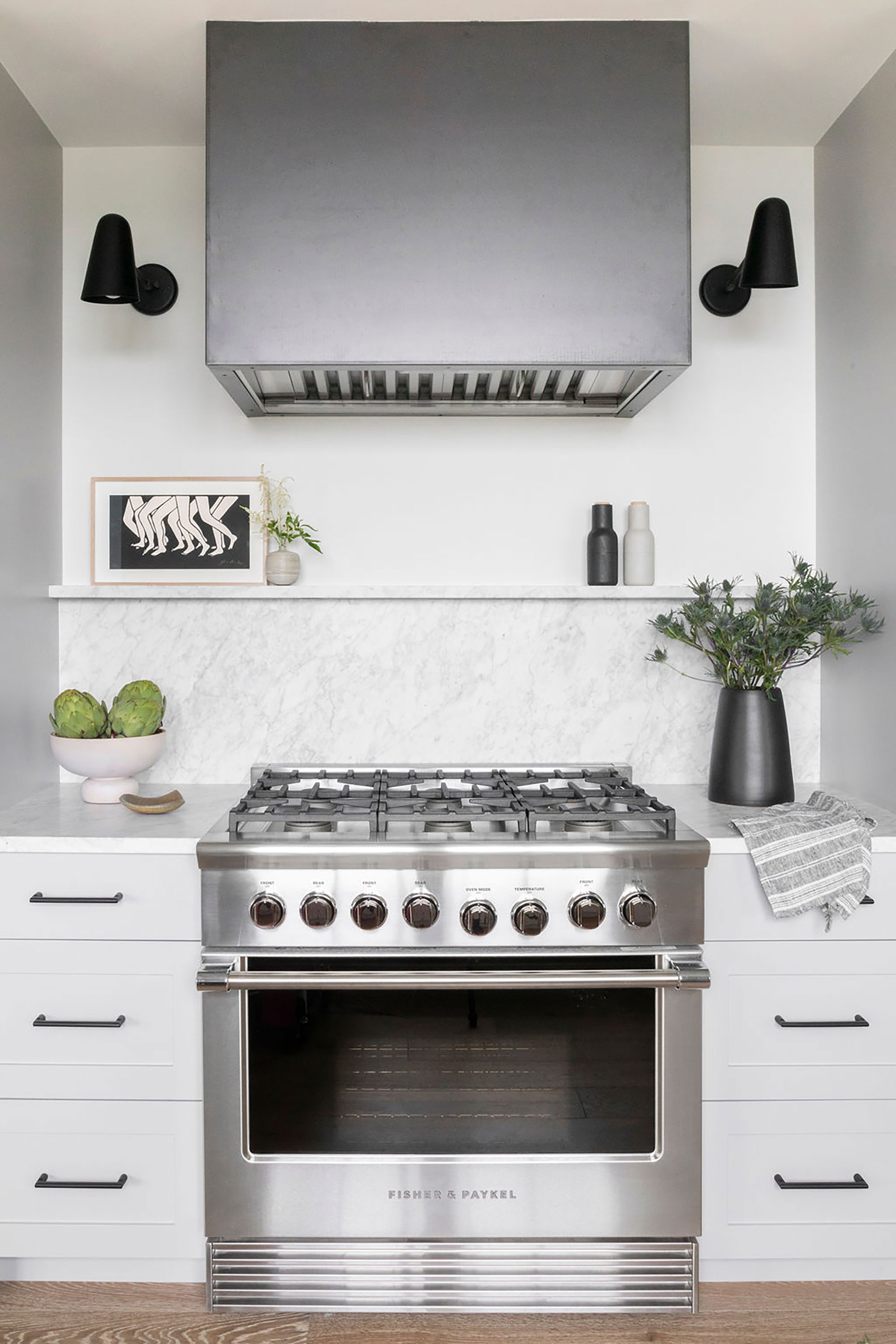
Kitchen ideas included finding ways to maximize the kitchen, breakfast nook and scullery. Here, a small alcove is put to good use to site the range oven, with narrow drawer units either side.
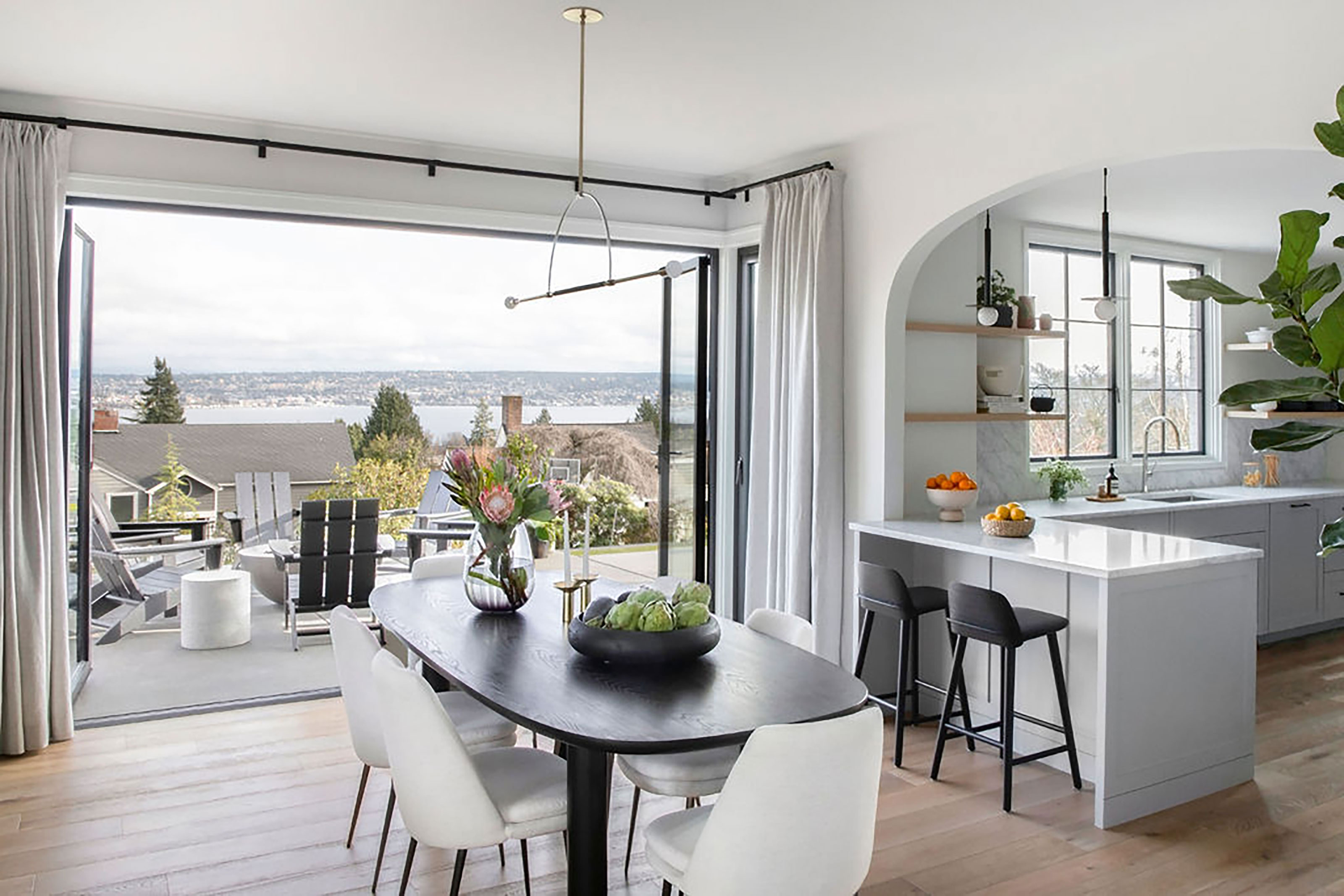
'I love how the space is now opened up allowing the kitchen to really shine. The whole space is bright and has such a great energy to it,' says designer Michelle, who explains how important it was to get this space right. 'To me the heart of the home is the kitchen. It’s where everyone gathers, no matter how many other seating areas you create.'
Dining area
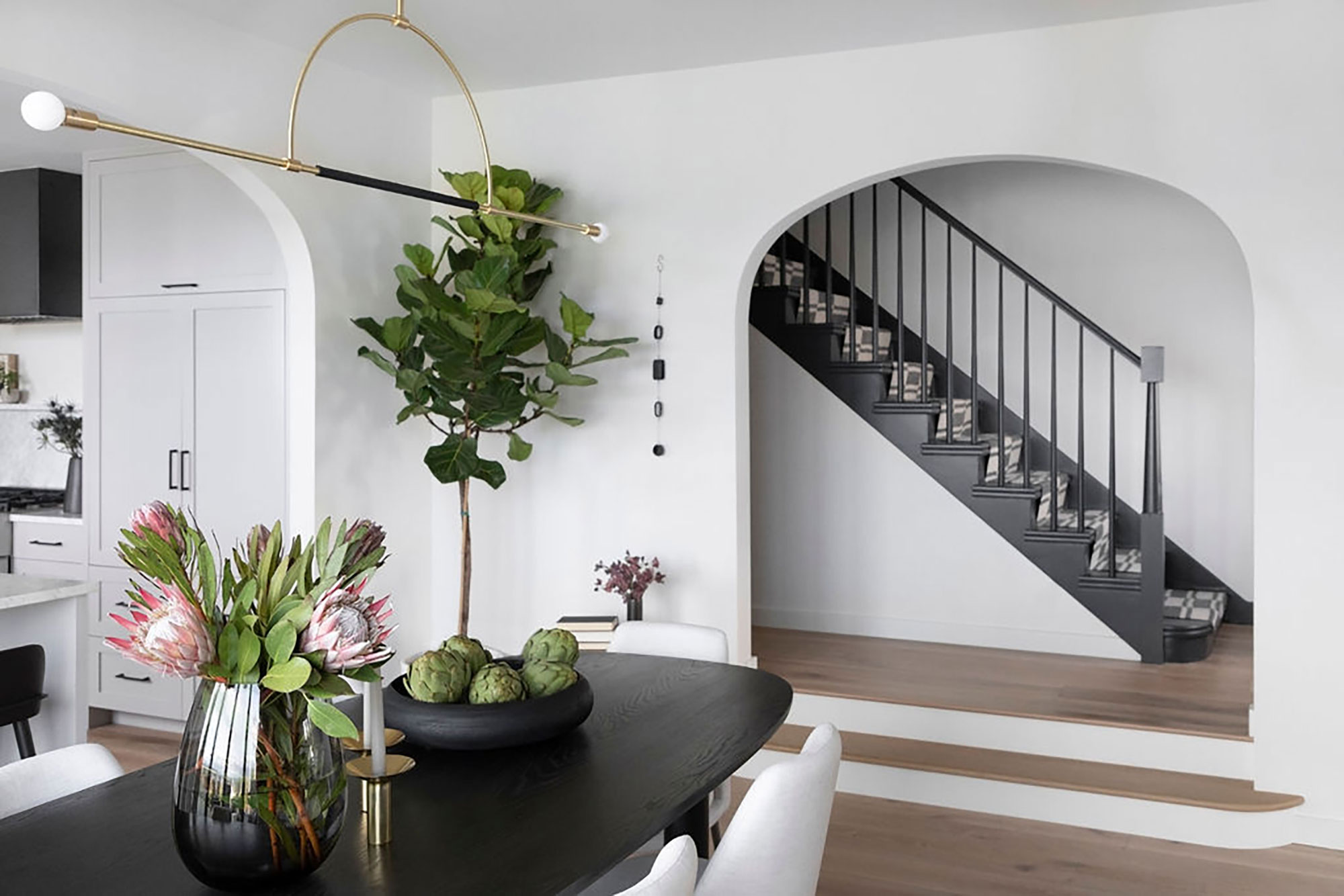
Flowing seamlessly from the new kitchen is a dining space, which continues the smart monochrome theme.
'We designed a custom oval dining table with a curved surfboard shaped edge detail. The clients built the table at a friends woodshed and it turned out beautifully!' says Michelle.
Dining room ideas for the new open-plan space were easily resolved once the bigger bifold window openings were fitted. The one-off table is positioned to make the most of the views of the lake and mountains. The lighting is a pendant from Katy Skelton. Full height draperies in a Mokum linen were made by a local drapery fabricator.
Living room
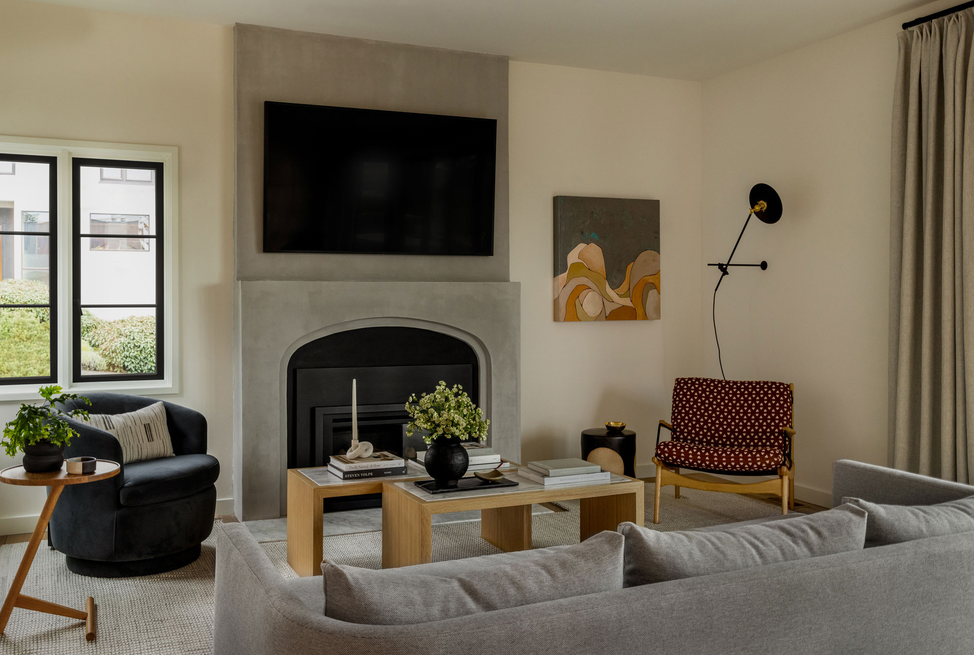
Living room ideas continue the monochrome palette, softening it with an earthy gray-beige sofa. The fireplace is a new addition, but integrates the original arch shape found in the home before the renovation. Michelle suggested a Portola Paint’s limewash finish to replicate the look and feeling of plaster.
'The homeowner had two small marble slabs from a piece of furniture from his grandmother. He had been holding on to them for some time, just waiting to bring new life to them,' says Michelle. 'We designed a pair of coffee table that incorporated these slabs and had them built for the space. I love that these slabs have been in the family for several generations and will continue to collect stories.'
Other notable furniture pieces include a lounge chair from Lawson Fenning upholstered in a Mokum textile, a Workstead wall light, and artwork by Melana Bontrager from J. Rinehart Gallery in Seattle.
'The overall design of the house embodies clean lines and simple styling while being classic and comfortable,' says Michelle. 'It is an unpretentious self-assured look and feel which will stand the test of time.' The new living room scheme embraces the simple, classic styling Michelle talks about.
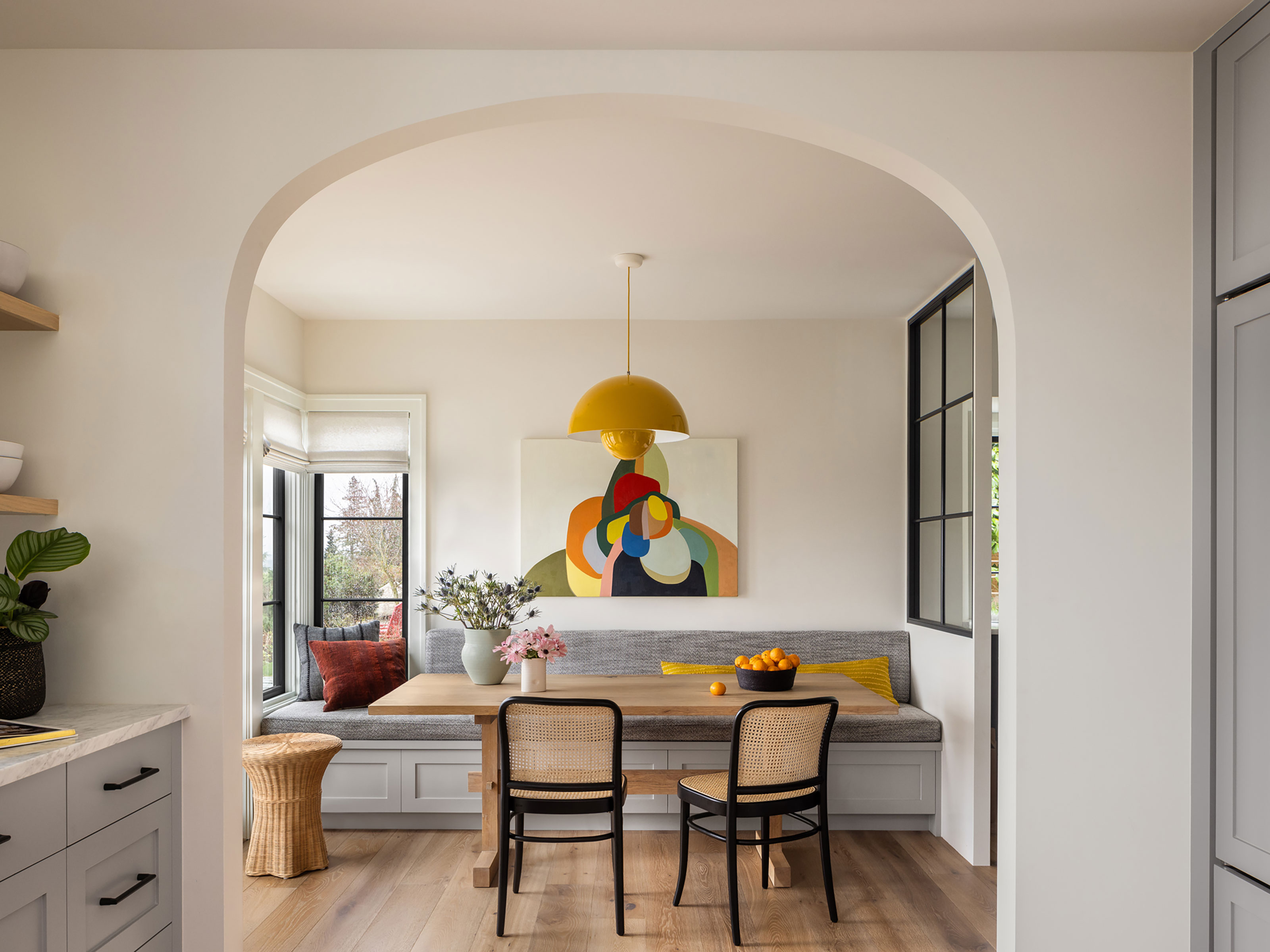
Stylish breakfast nook

This inviting breakfast nook was created from the space where the original kitchen was. The custom design banquette has a practical outdoor performance fabric on the bench cushion. The iconic & Tradition Flower Pot Pendant in Mustard brings a little extra sunshine in this nook.
'The table is another custom piece designed by our studio and built by the client,' says Michelle. 'The artwork by Johanna Christianson from Koplin del Rio gallery in Seattle is the perfect paring with the light and adds additional pops of color.'
Primary bedroom
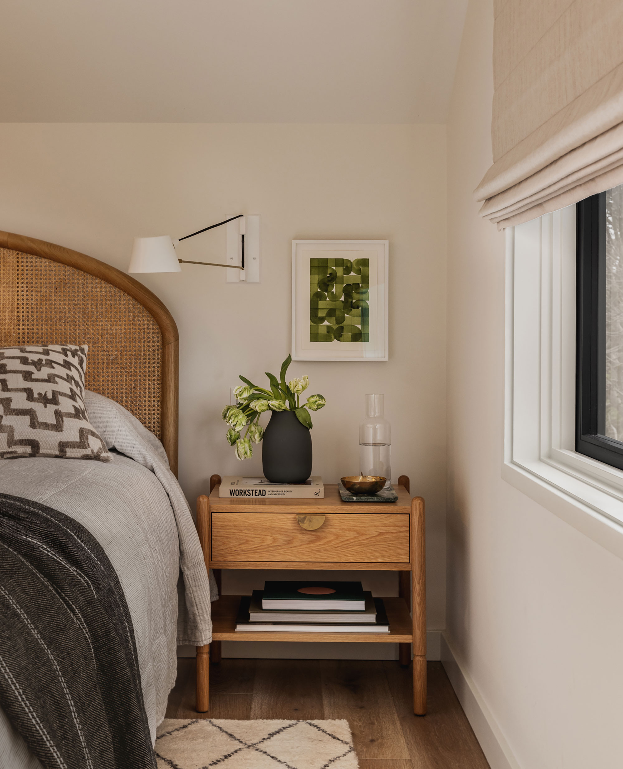
Michelle had some truly transformational bedroom ideas up her sleeve for this house, as she explains: 'The upstairs originally was a large open room which was being used as a communal space for the kids. We space planned this room to include a primary bedroom, office, two walk in closets and a bathroom that offers a spa like vibe - steam shower included!
'One of the only pieces we reused in the house was the clients' existing CB2 bed which paired well with the new Hedge House Furniture nightstands and Brendan Ravenhill articulating wall lights,' adds Michelle.
The bedside artwork is by designer Brian Paquette.
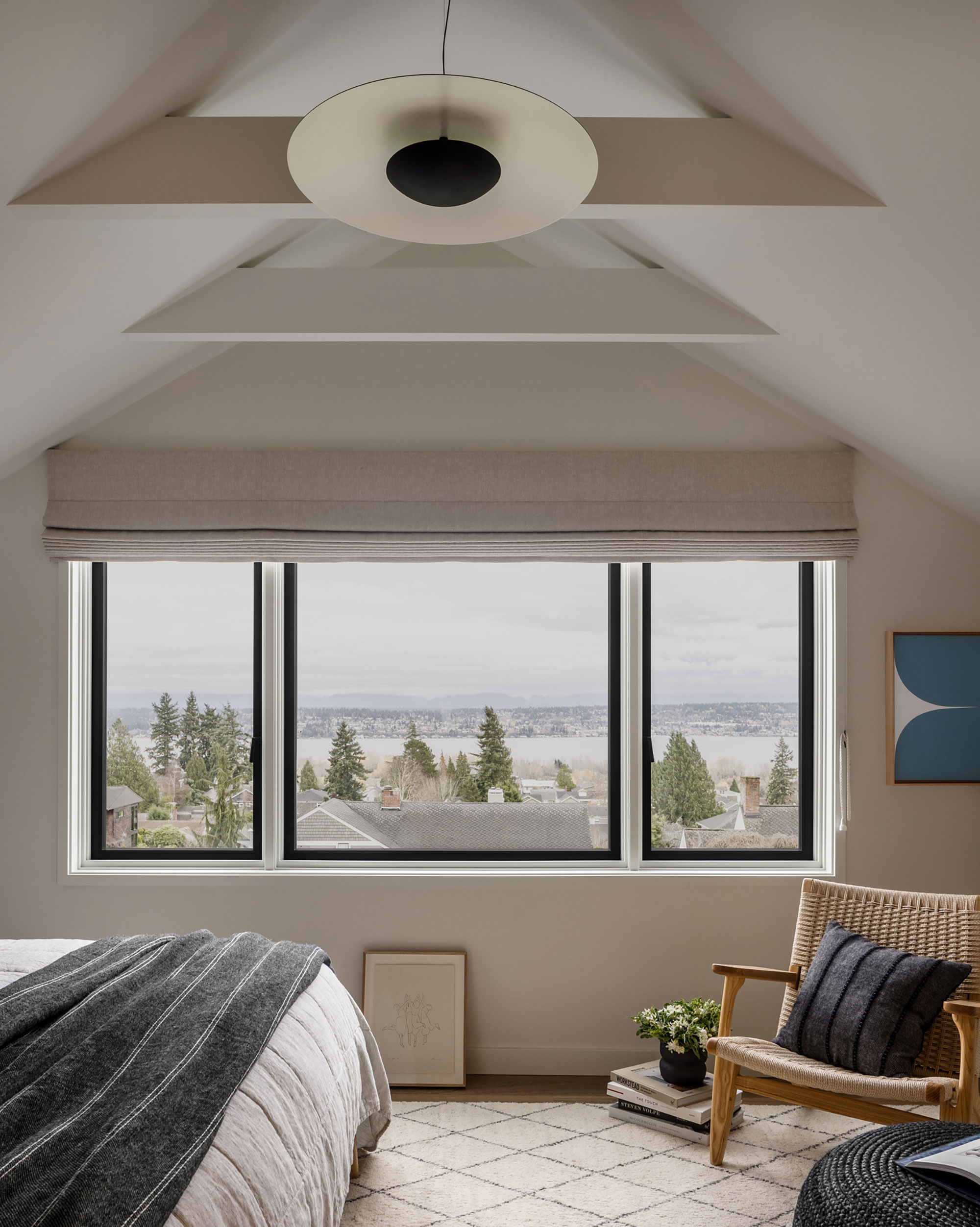
The ceiling in the primary bedroom was opened up to expose the collar ties, giving the room a more dramatic look, complemented by the large picture window that looks out over Lake Washington. The artwork by the window (above) is by Sara Genn from Winston Wachter Fine Art in Seattle.
Child's bedroom
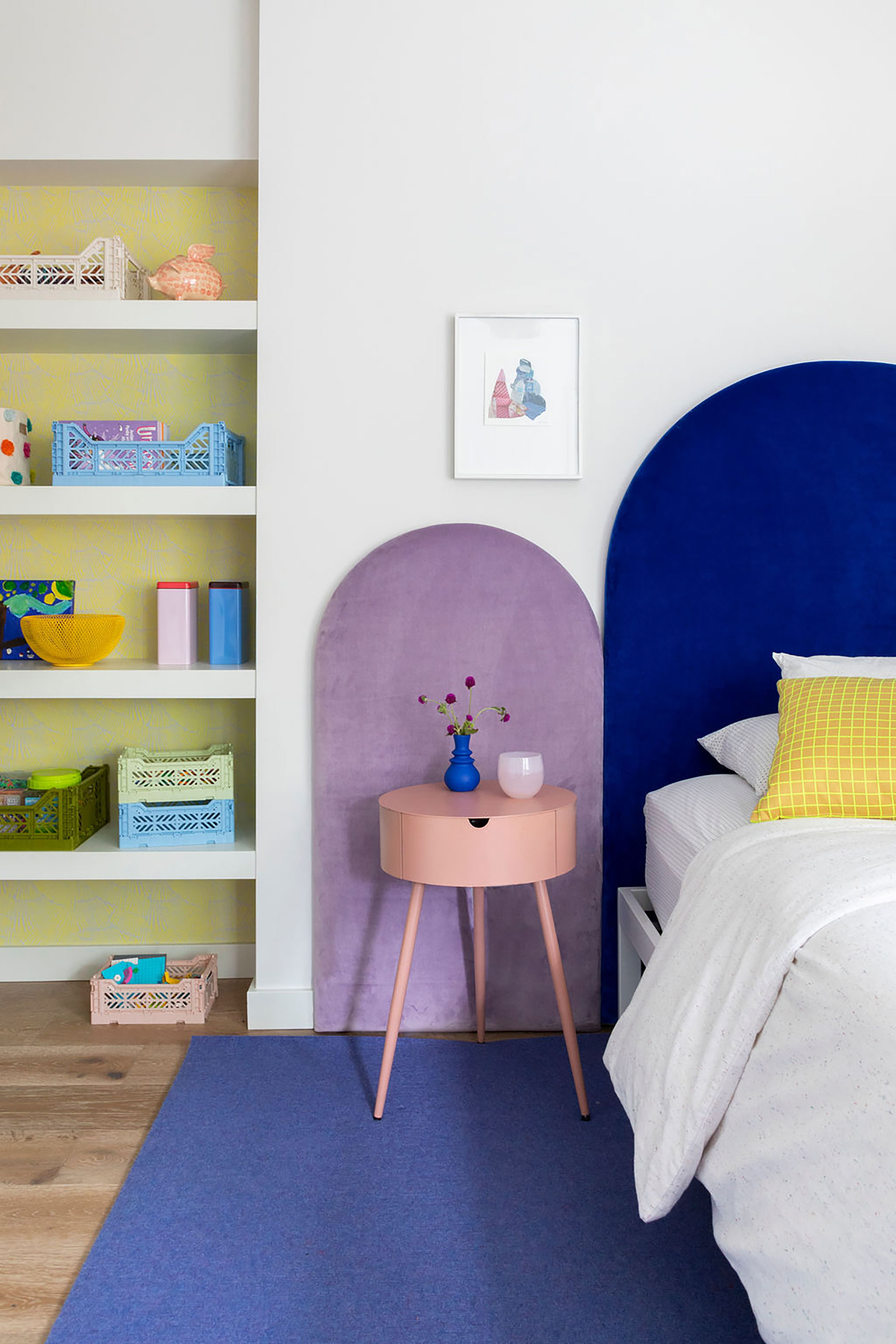
Anyone looking for kids' room ideas will find plenty of inspiration in this space, which is all about solid, bold colors. A custom designed and locally made arched headboard has been upholstered in a cotton velvet from Jab Textiles. New The artwork is by Johanna Christianson
Primary bathroom
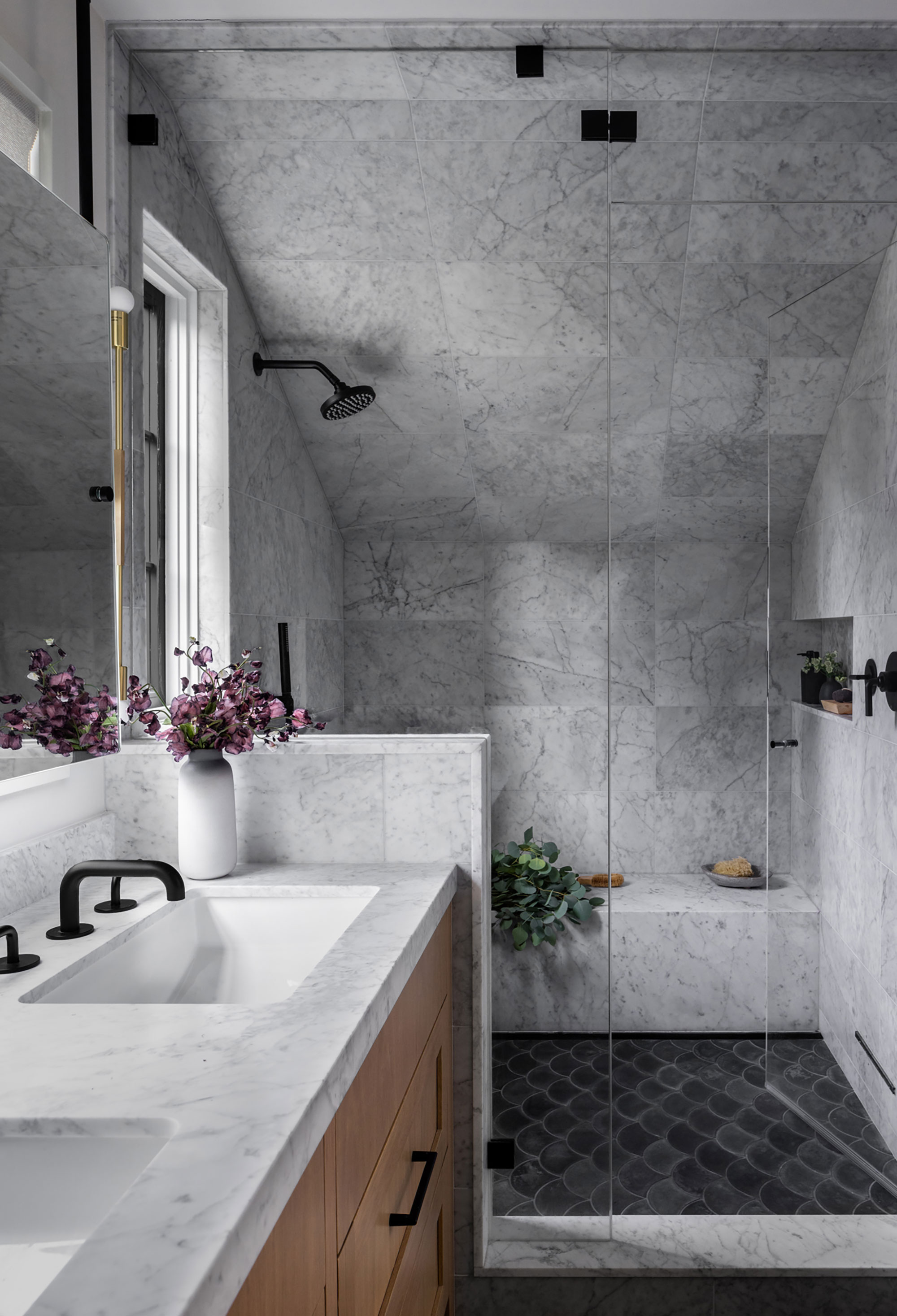
The shape of this room presented some complications, admits designer Michelle Mele, 'But we were still able to provide a large shower clad in marble and fitted out with Waterworks plumbing fixtures and a steam shower.'
Bathroom ideas include a black scalloped concrete floor tile from Concrete Collaborative, white oak cabinetry to add warmth to the black floor tile and marble walls, a light woven shade by Presidio Classics to offer just enough privacy, and brass wall sconces by Katy Skelton for a little extra sparkle.
'I was so happy that the clients were open to a unique bathroom layout which placed the mirrors in front of a window,' says Michelle. 'We modified the existing windows and added additional windows here to really brighten up the space. Hanging ceiling brackets allow the mirrors to sit in front of the windows.'
Reflecting on the finished project, designer Michelle Mele says, 'The goal was for a house that felt warm and inviting, playful and durable. We kept the palette monochromatic and used artwork, lighting and accessories to add color and sparkle to the house.'
Sign up to the Homes & Gardens newsletter
Design expertise in your inbox – from inspiring decorating ideas and beautiful celebrity homes to practical gardening advice and shopping round-ups.
Karen sources beautiful homes to feature on the Homes & Gardens website. She loves visiting historic houses in particular and working with photographers to capture all shapes and sizes of properties. Karen began her career as a sub-editor at Hi-Fi News and Record Review magazine. Her move to women’s magazines came soon after, in the shape of Living magazine, which covered cookery, fashion, beauty, homes and gardening. From Living Karen moved to Ideal Home magazine, where as deputy chief sub, then chief sub, she started to really take an interest in properties, architecture, interior design and gardening.
-
 This is the single best upright vacuum we've ever tested – and it's on offer with $130 off at Shark for a limited time only
You won't want to miss this one
By Dan Fauzi
-
 Nate Berkus says slipcovered sofas are back on trend – and I just found a way to create this designer-approved laid-back look from just $86
This classic style is making a strong comeback, but did you know you don't have to buy a whole new couch to get this Nate-approved look?
By Eleanor Richardson