This pretty open plan home exudes relaxed Cali contemporary style
Interior designer Mindy Gayer has woven her magic to create a calm, functional Californian home perfectly suited to her clients' way of life

Creating a welcoming home that was perfect for easy entertaining was the priority for the sociable couple with three young children who live in this 1980s house in Laguna Hills, California, location of many of the world's best homes.
They commissioned interior designer Mindy Gayer of Mindy Gayer Design Co to do a full-scale remodel in 2019.
'The original design of the home was much more closed off, and our clients wanted a more open concept feel for easy entertaining and an overall more functional layout,' says Mindy.
'We stripped the property down to the studs and opened up several walls and spaces to create the downstairs layout,' she continues. 'The trickiest part, especially in the entryway, was working with an existing roofline with a lot of funky transitions. The games room is a full extension of the house, which continues upstairs, so we also worked hard to make those spaces feel intentional and like they belonged with the rest of the home.
'The magic of this home is truly in all of the details,' says Mindy. 'We love all of the different types of millwork throughout the house that add so much character to each space. There are also a few unexpected color choices that really showcase our clients’ personalities, like the dark charcoal in the living room and the pale lavender in the laundry room.
'Perhaps most of all, we love when projects truly reflect the family that lives in them, and this home is especially personal. Many of the pieces you see are family heirlooms that have been passed down (and will be) for generations. The gallery wall in the family room is full of art pieces from places our clients have traveled to together, along with classic family portraits, displayed in vintage frames from a local antiques shop in New Hampshire.'
Entry
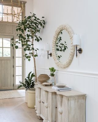
To accentuate the high ceilings, hallway ideas included wrapping the ceiling in a natural pine material that was then whitewashed for a warmer feel. A 15ft stain-grade white oak door and transom window inject drama.
Combining style with practicality, a statement console with sconces and a mirror by Palecek serves as a landing zone when entering the home.
Family room
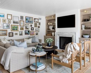
The family room space was designed as a retreat hangout for the parents when the children are in bed.
'We went with a play on prettier elements, including a custom plaid linen sectional, statement accent chairs, a gilded end table, and reeded details on the built-in white oak cabinetry,' says Mindy.
Living room ideas include a gallery wall, which was co-curated by Mindy and the clients. 'The goal was to make every piece feel collected. The horseshoe on the wall is actually something we found one day in the backyard while touring the backyard with our clients, and we decided to have it framed as an ode to the stables that used to be on the property,' says Mindy.
Kitchen
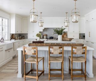
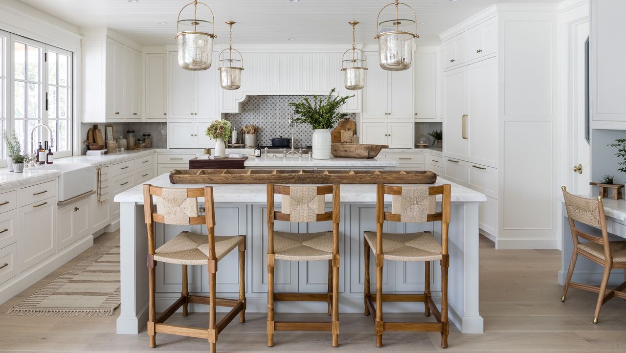
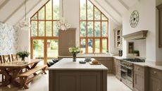
Kitchen ideas include two islands – one for working and one for seating, a must-have for the clients.
'Although the color palette is fairly simple, we added lots of rich and decorative elements to transform it from a plain white kitchen to one of our favorite spaces in the entire home,' says Mindy. 'The custom decorative hood serves as the focal point of the kitchen design with a hand-painted terracotta tile backsplash by Tabarka.' Other features include reeded details on the island end panels, a walnut butcher block on the island, and a built-in hutch for displaying family heirloom antique glassware.
Dining area
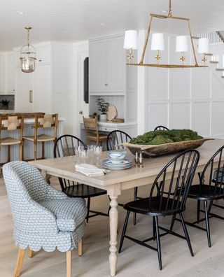
'The dining area is an extension between the kitchen and family room, and we wanted to make sure it had its own moment since there isn’t anything designating it as a separate space,' says Mindy.
The clients requested a large table for entertaining and holiday hosting, and a pine table with turned details on the legs proved the perfect choice. Dining room ideas include mixing and matching chairs. 'We added these beautiful upholstered end chairs with scallop details along with black metal Windsor chairs to play off of the English cottage vibes. As a bonus, the metal chairs are child-friendly, which is a must with three little ones at home.' says Mindy.
Games room
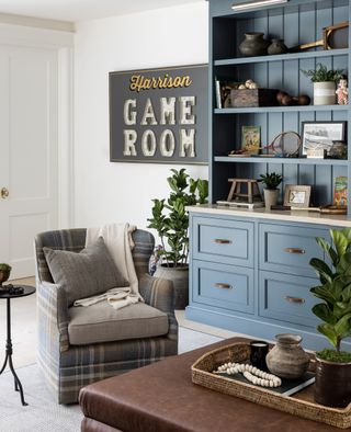
The games room is a zone for the children and their friends and is separate from the main living areas of the home. Mindy added a big TV and built-in storage, as well as a kitchenette on the back wall for popcorn and treats. 'Because it’s a more playful space, we wanted to play with fun colors, patterns, and a darker color palette,' she says.
Mudroom
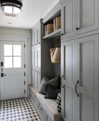
The mudroom serves as both a drop-zone and downstairs laundry room. 'We added a wall of tailored locker spaces as storage for the kids, which makes for the perfect landing zone when they come home from sports and school,' says Mindy. A two-tone diamond patterned floor and Shaker pegs add charm.
Powder room
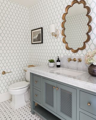
'This feminine and traditional powder bath was a chance for us to play with color,' says Mindy. White and green patterned wallpaper tones with the custom green-hued vanity, with its pattern cut door fronts adding extra detail. A gilded scalloped mirror makes a statement on the wall, while the marble mosaic flooring keeps the look classic and timeless.
Laundry/craft room
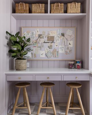
The upstairs laundry room serves many purposes. 'Our client wanted to have laundry upstairs where all of the kids are, so we combined her office/craft room/laundry room into one space,' says Mindy. 'Her favorite color is purple, so we landed on this fun lavender paint color, Eagle’s View by Dunn Edwards, for all of the millwork and cabinetry. The custom gingham pinboard ties in the purple color palette, and the desk area underneath serves as a space for the kids to work and play while our client crafts or folds laundry.'
Main bedroom
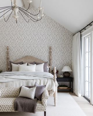
The aim for the main bedroom was to create a design that felt like a hotel retreat, so bedroom ideas include the use of a serene and soft neutral palette, with a settee at the end of the bed upholstered in a dainty floral print. An unexpectedly modern wallpaper is used as an accent wall behind the bed, and its subtle mauve colors pull in those hues from the settee and throw pillows.
Ensuite bathroom
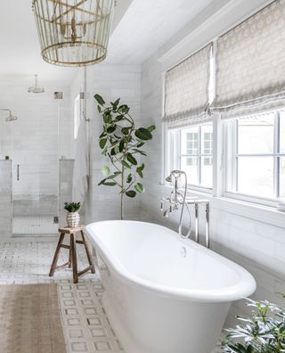
The neutral palette was continued into the ensuite bathroom, and bathroom ideas include adding interest with subtle patterns such as on the marble mosaic flooring, patterned custom window coverings, and vintage rug.
Girl's bedroom
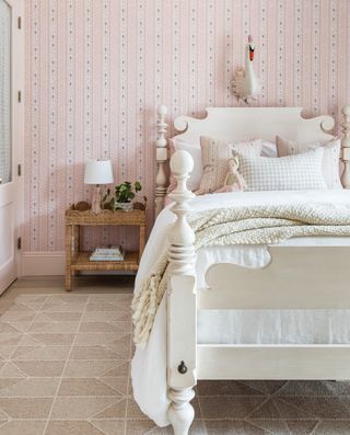
The clients requested a pretty, feminine, pink 'explosion' for the only girl in the family. 'We picked out this pink wallpaper with a floral stripe pattern, and painted out all of the trim, closet doors, casing, and beam in a pink accent color,' says Mindy. 'The bed frame is a family heirloom, and we love the elevated feel it adds to a more playful space.'
Interior design/ Mindy Gayer Design Co
Builder/ Todd Custom Homes
Photographer/ Vanessa Lentine
Sign up to the Homes & Gardens newsletter
Design expertise in your inbox – from inspiring decorating ideas and beautiful celebrity homes to practical gardening advice and shopping round-ups.

Interiors have always been Vivienne's passion – from bold and bright to Scandi white. After studying at Leeds University, she worked at the Financial Times, before moving to Radio Times. She did an interior design course and then worked for Homes & Gardens, Country Living and House Beautiful. Vivienne’s always enjoyed reader homes and loves to spot a house she knows is perfect for a magazine (she has even knocked on the doors of houses with curb appeal!), so she became a houses editor, commissioning reader homes, writing features and styling and art directing photo shoots. She worked on Country Homes & Interiors for 15 years, before returning to Homes & Gardens as houses editor four years ago.
-
 Anne Hathaway's 'uber-modern' kitchen shelving is the stuff of minimalist dreams – it is worthy of the finest art galleries
Gramercy Design used open shelving to introduce a delightful decorative moment to Anne Hathaway's white kitchen
By Jennifer Ebert Published
-
 I tried steam cleaning my dirty windows and it was unbelievably quick and easy – but this one water trick is essential
Steam cleaning glass is super simple with this secret ingredient
By Chiana Dickson Published