'Think of it as a comfortable one bedroom' was the directive for this expansive new build
The decorative techniques the designers used have made it feel comfortable, elegant and, importantly, cozy, despite its size
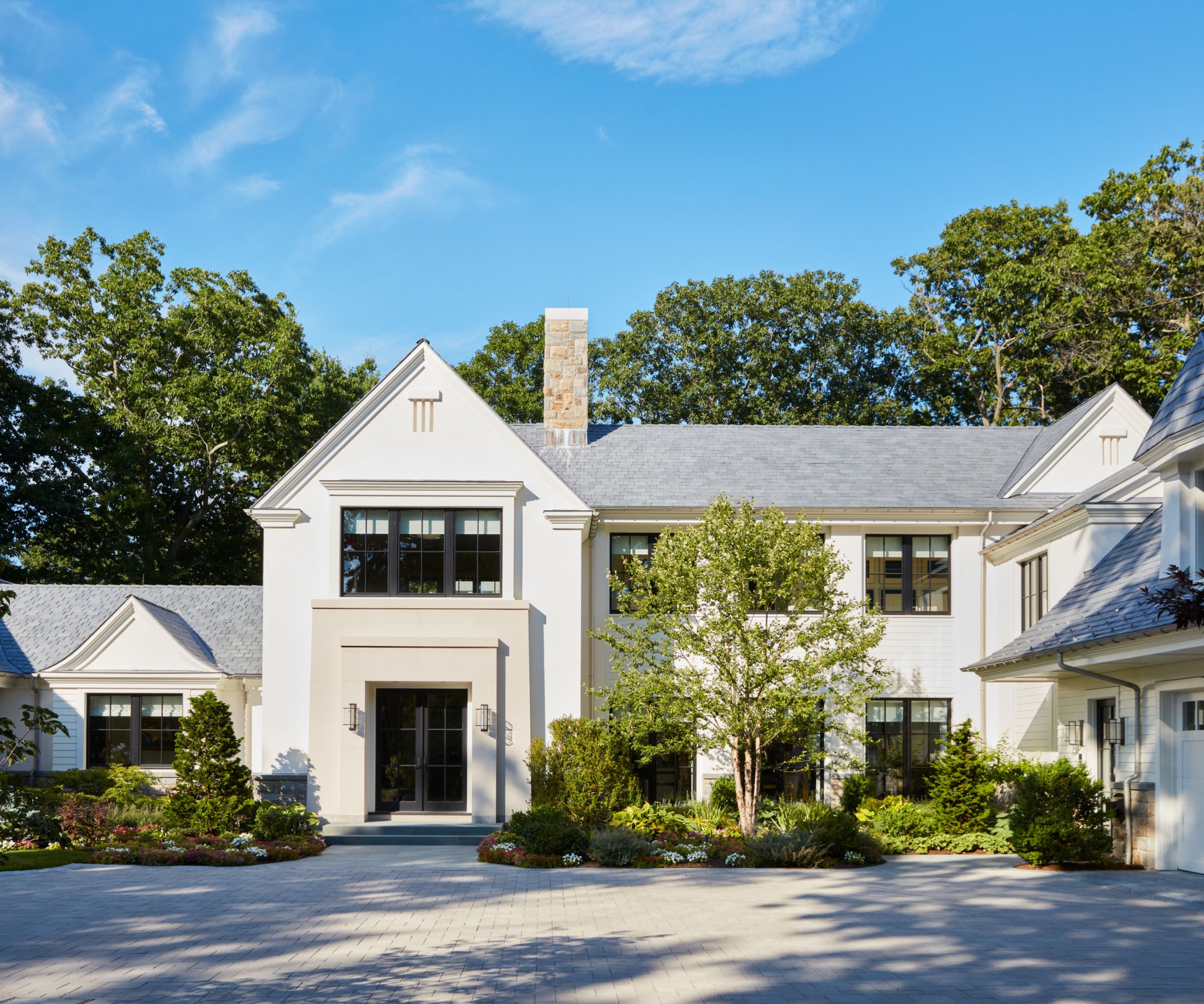

When the owners of this traditional four bedroom Massachusetts home commissioned the build, their directive to their architect and interior designers was that it should feel like a comfortable apartment.
Despite its generous size, the couple were downsizing from a significantly larger and more formal home, and it was important that their new house thoughtfully reinterpreted the key elements – comfort, functionality and use of space – so that it still felt like “them”.
'“Think of it as a comfortable one bedroom” was the clear directive,' says Michael Cox, Principal at foley&cox, who worked on the project with Design Director Zuni Madera. 'Considering we were designing and building a two story 8,000 sq. foot home, it definitely made an interesting challenge.'
Their third collaboration with Shope Reno Wharton, and their second for members of this family, this new build feels both timely and timeless.
'Designing, detailing, and executing exactly how the client defined comfort was like tailoring a Savile Row bespoke suit,' says Michael. 'Accessible but discreetly designed utilities were built into bedside tables. Leather was hand-selected to wrap the handrail of the stairway. Left/right hand shower door swings to allow his and hers access to temperature balance without touching a drop of water. The bevelled profile of the waterfall countertop on the kitchen island. Custom designed hand embroidery on the living room drapery. And then there is the museum quality art collection – Arp, Giacommetti, Warhol, Picasso, Matisse, Leger, Avery to name a few.
'When I look at the photos, I say to myself that house is just gorgeous that’s exactly how I’d like my home. it was a great team effort, and the results were a 10 plus.'
Let's take the tour.
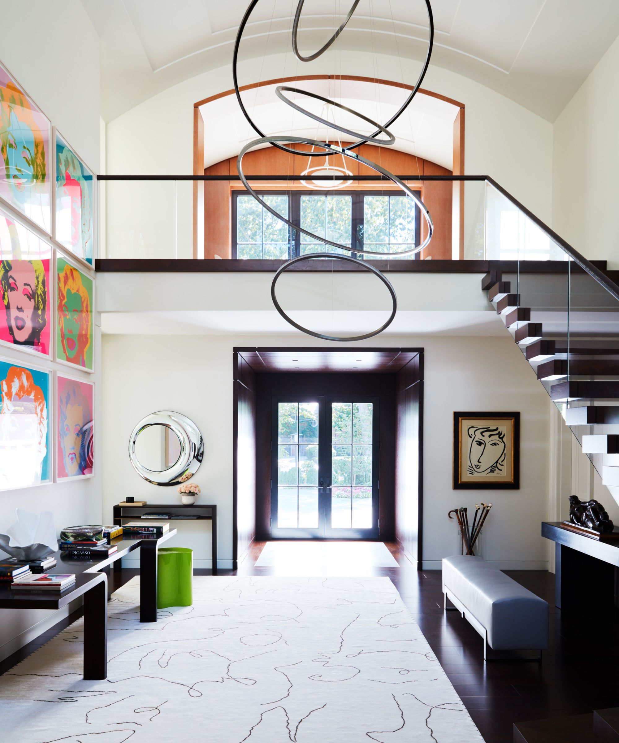
In the foyer: Rug by Doris Leslie Blau, Light Fixture by Cameron House Design, Leather Stair Hand Rail by Lance Wovens, Console from foley&cox Home, bench by Dennis Miller, Mirror by DDC New York, art: Marilyn Monroe by Andy Warhol: sculptures by Henri Laurens, and Alberto Giocometti
The interior architecture sets the tone for a sense of arrival and is softened with fluid lines of the modern multi-tiered ring light fixture and contour abstract pattern on the area rug.
The neutral palette and minimal architectural lines are a backdrop for the featured star, Marilyn. While the sophisticated play on scale, proportion, and rhythm through furnishings, art and lighting were design intentional, the entry embodies a welcoming sense of home with clients beloved art collection.
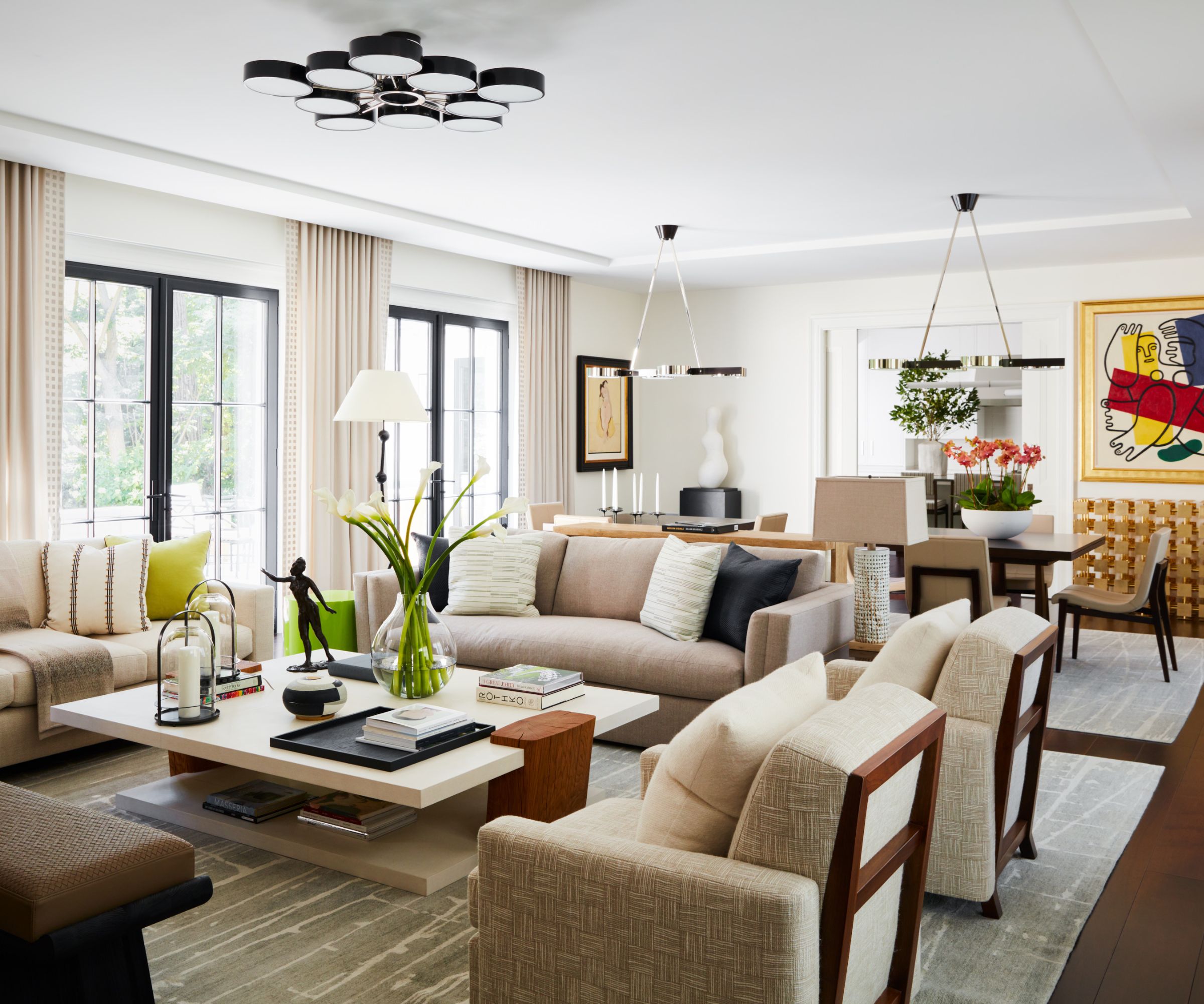
The Great Room: Cocktail Table and floor lamp by Christian Liaigre, Side Table by Hudson Furniture, area rug by Stark Carpet, ceiling fixture by Studio Van den Akker, custom sofas by McLaughlin
Airy and calm with elegant details such as the hand embroidered leading edge on the drapery, lacquered linen finish on the cocktail table, sumptuous textures on the upholstery and tonal patterns on the throw pillows were thoughtfully refined throughout the design to elaborate on attention to detail.
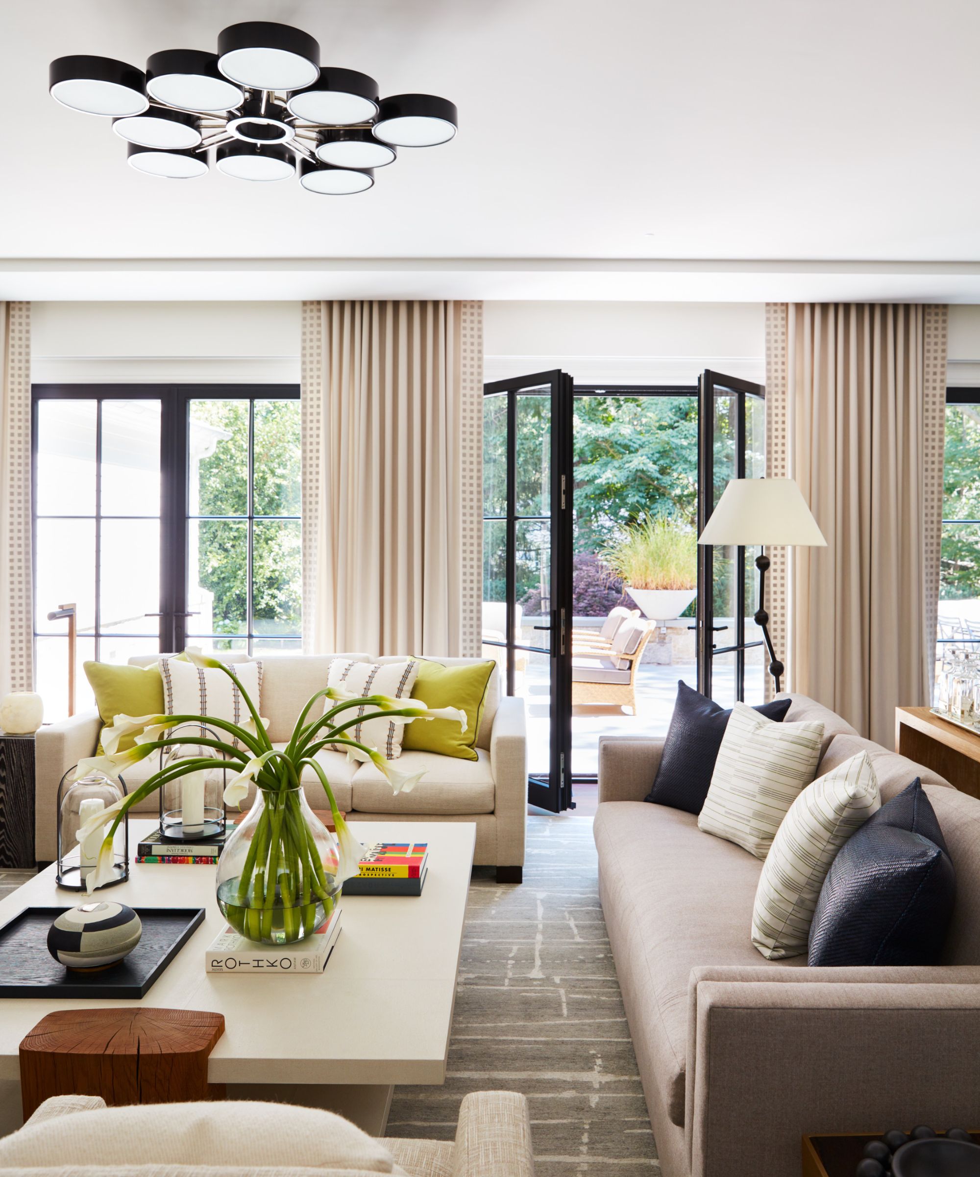
The monochromatic palette with subtle pops of color and texture gives this great room a gracious and visual allure.
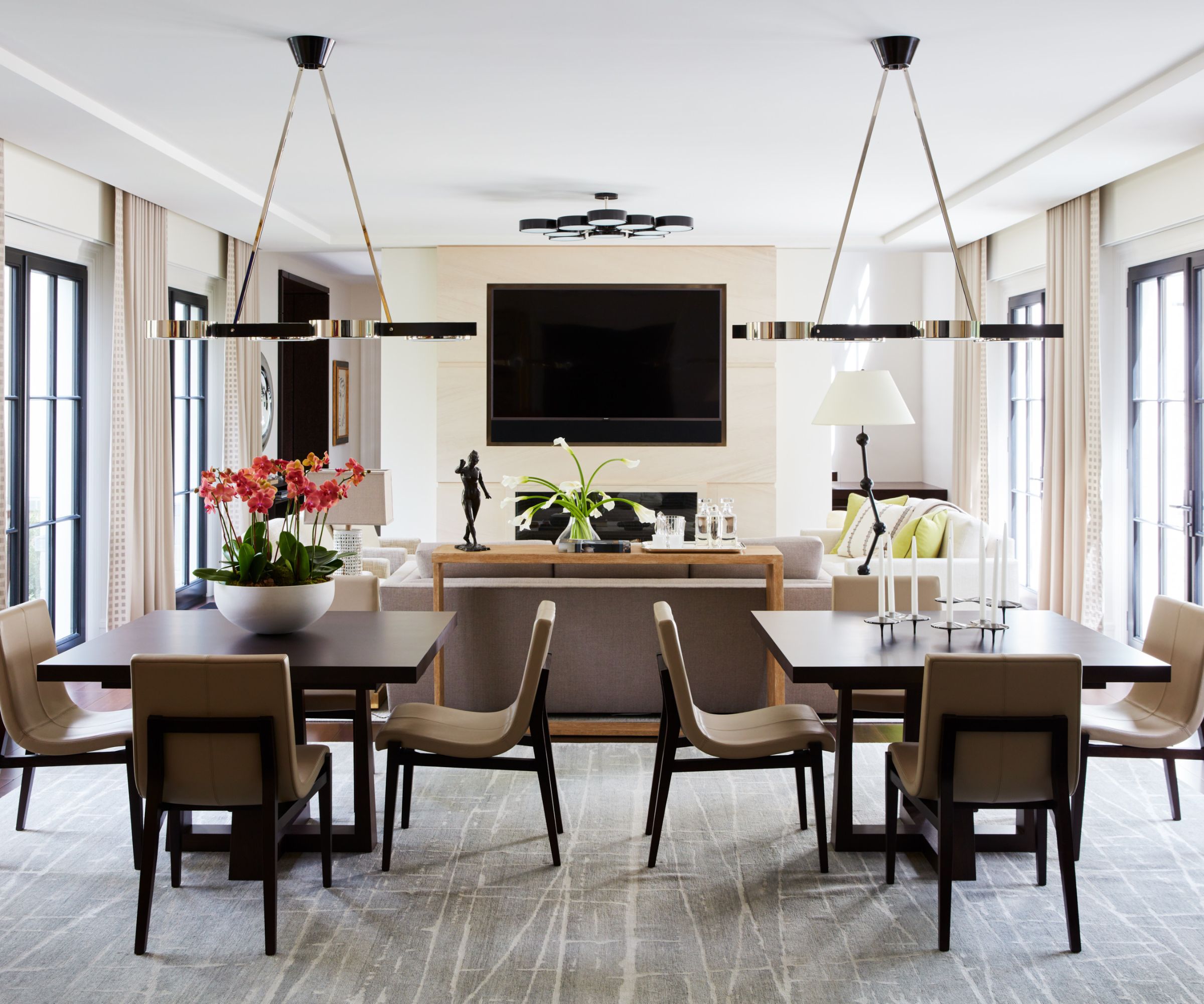
Great Room Dining Room: Light Fixtures by Studio Van den Akker, Dining Chairs by Holly Hunt, dining tables Cliff Young, area rug by Stark Carpet
Informal and easy-going for a fun game night, intimate dinner of four or a fabulous large dinner party – this flexible layout maximizes all possibilities. The hanging pendants are a clever reinterpretation of the living area pendant and are the anchors of the dining area, which adds symmetry and a nice ambiance for gatherings.
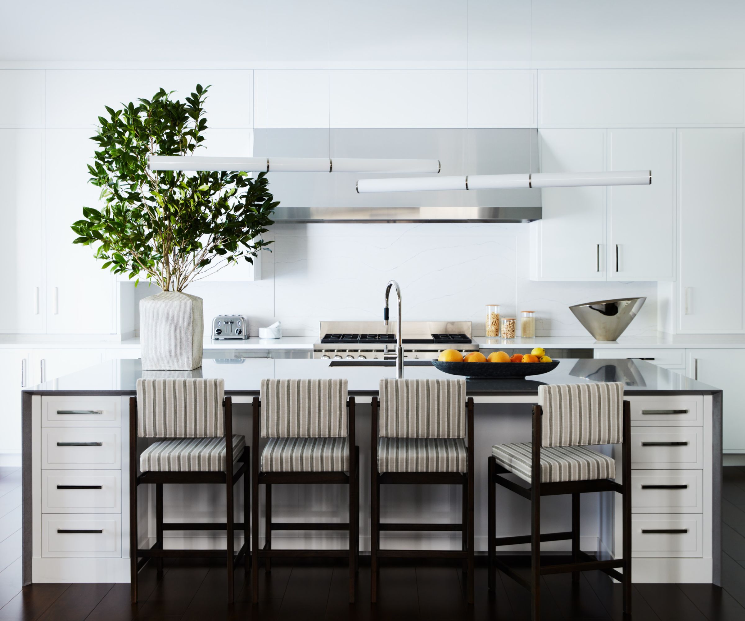
Kitchen: Light Fixtures by Roll & Hill, Thomas Hayes counter stools
Classic and curated – the kitchen design is a pure back drop for all the unexpected layers of interest at the center of the space: overlapping statement milk glass tubular pendants above the island, counter stools in a striped pattern enveloped by the island and found decorative ceramics in nickel and natural glaze. The island is the anchoring 'piece of furniture' in the kitchen
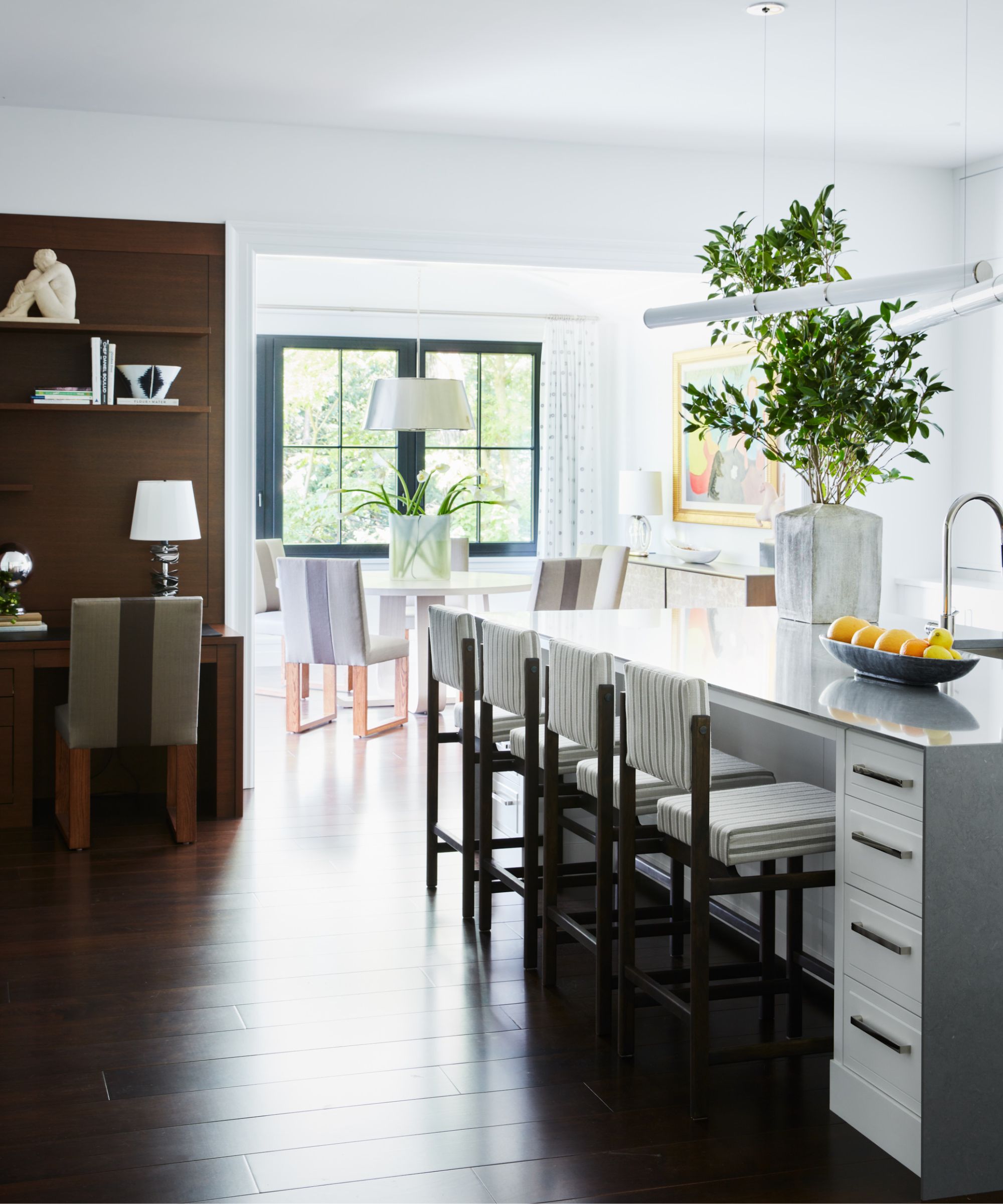
Eclectic and elegant furnishing selections take this space from breakfast nook to refined and attractive. As an extension of the kitchen, the finished selections create a harmonious contrast between luminosity and darkness, from the nickel on a classic round pendant, bleached wood on casual breakfast table, mica finish on a floating wall mount console to the graphic color block stripe breakfast chairs.
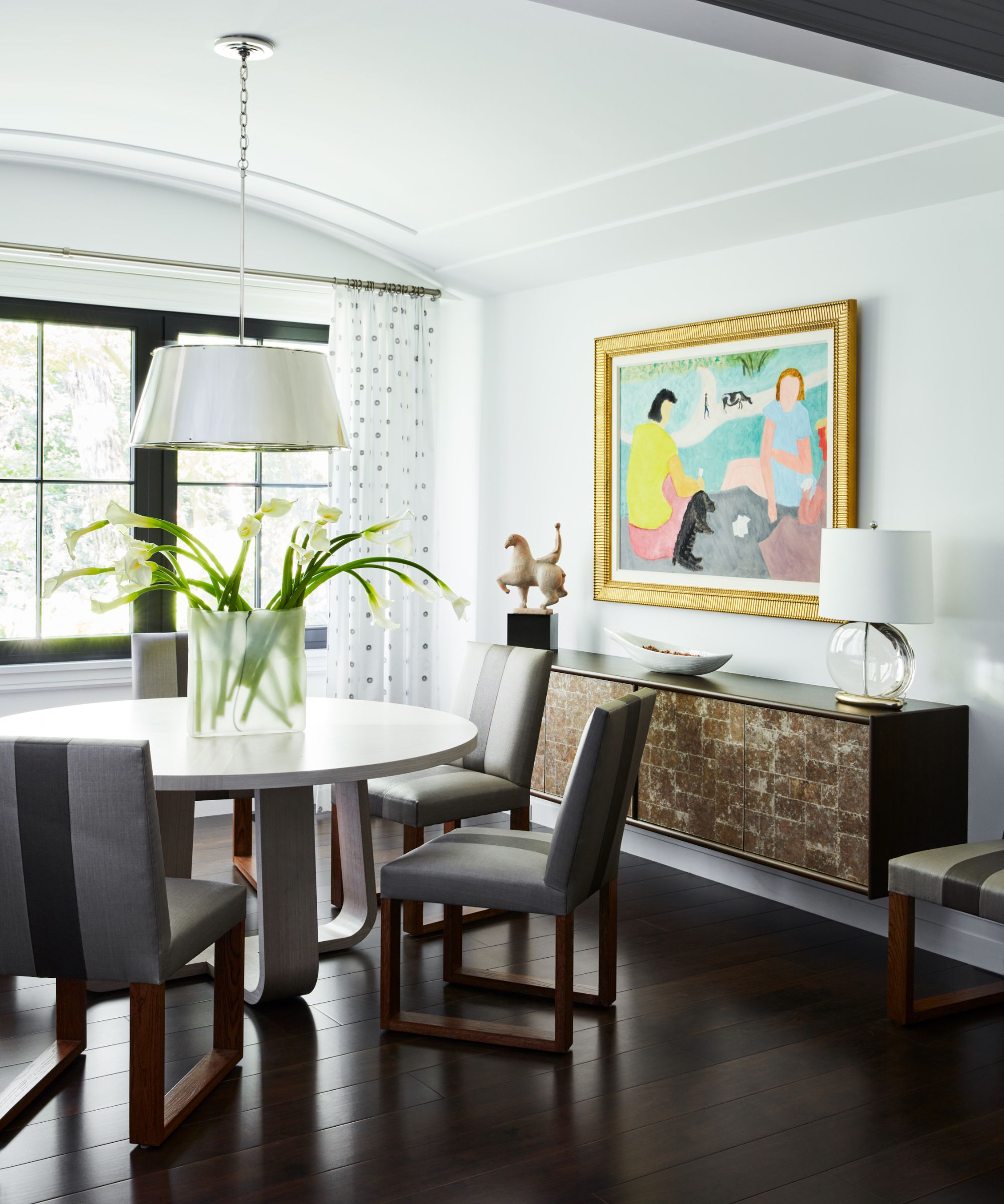
Breakfast Room: Light Fixture by Charles Edwards, Ferrell Mittman table, Custom console by Richomme, art by Milton Avery
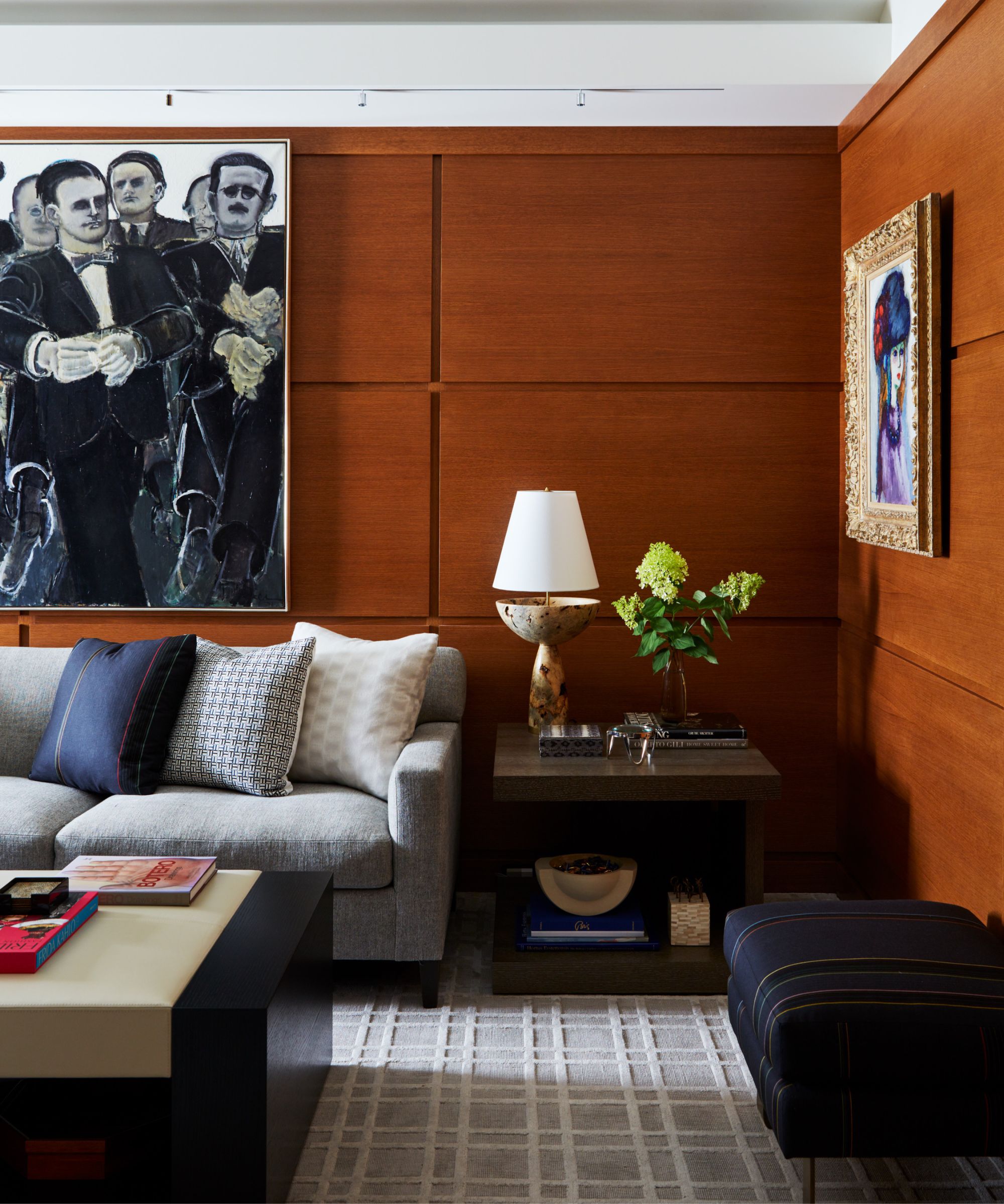
Casual and sophistication in a home office sets the tone for business meetings and quiet catch-up time. The masculine neutral color palette was inspired by the client’s art collection.
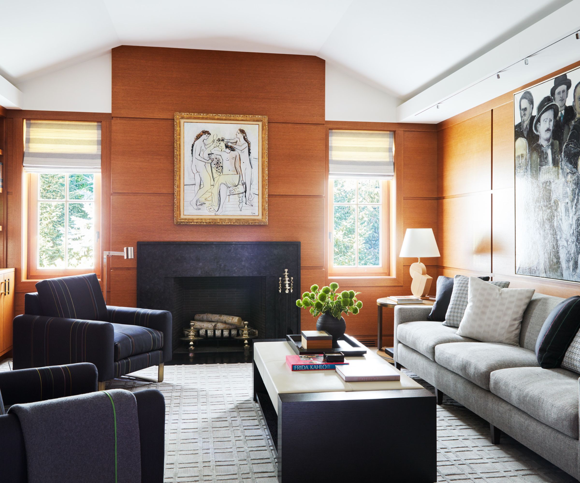
Office: Table Lamp by 1st Dibs, custom sofa by McLaughlin, Chairs by J Robert Scott, Coffee table by Holly Hunt, area rug by Tibetano, art by Picasso and Lester Johnson
Grey tones on the upholstery create a sense of depth in the space while the lounge chairs in a Paul Smith stripe are inviting for private conversation. The cognac finish color on the millwork is a modern twist on the traditional wood paneled workspace.
Calm and serene – get the perfect dose of r&r in the primary suite. A soft mauve color palette is a contrast yet complementary juxtaposition to the outdoor elements. The chandelier with porcelain discs accentuates the proportion of the space while the drapes add a layer coziness and warmth.
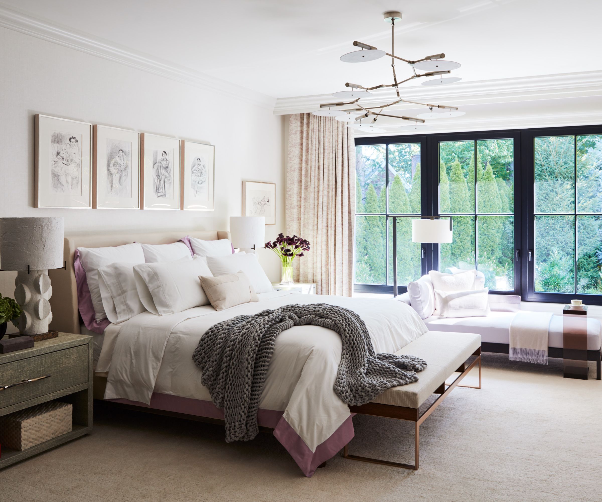
Primary Bedroom: Light Fixture by Lindsay Edelman, Area Rug by Holland & Sherry, Custom Night Stands by Richomme, Bedside Lamps by Blackman Cruz, Daybed by Christian Liaigre, Bench by KGB Limited, art, Henri Matisse drawings
The wall-to-wall carpet is soft on underfoot while emulates the sense of walking on the cloud. The chaise invites for curling up under a throw blanket and daydreaming – this suite is a sanctuary.
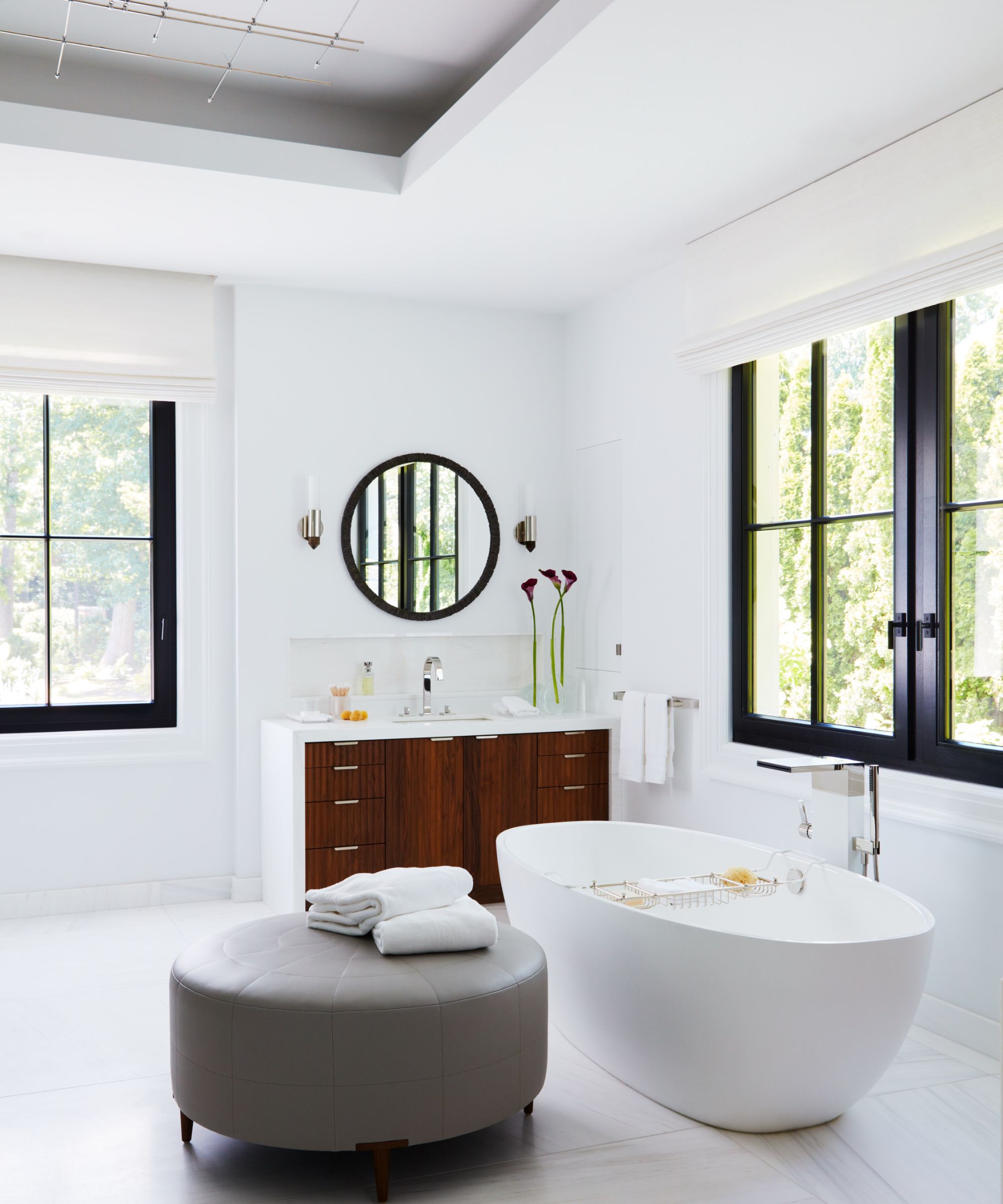
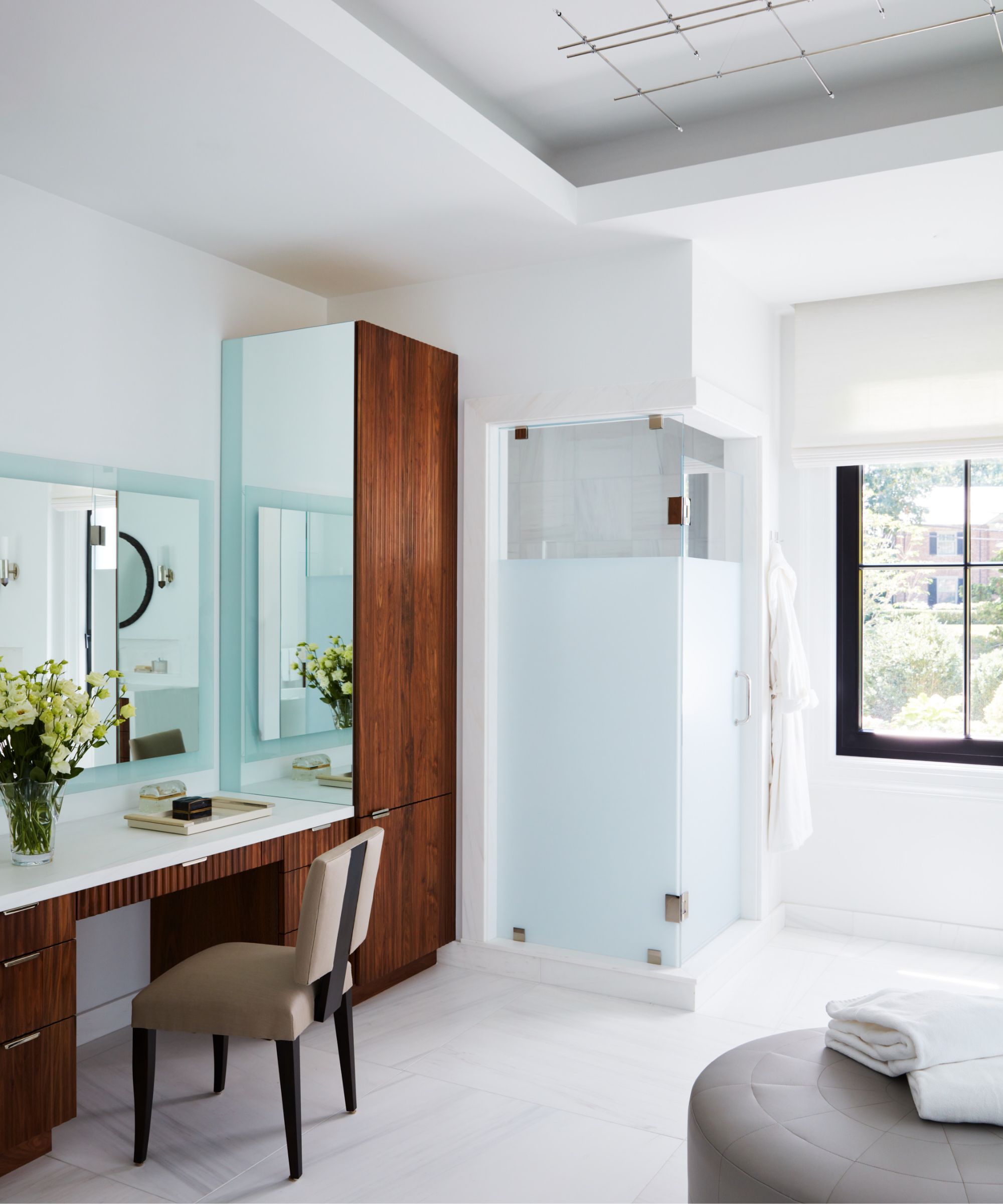
Primary Bath: Mirror by Donghia, Sconces by Matthew Studios, Tub by Teuco, Custom ottoman by Peruvian Touch
Pure and clean crisp white finishes from the inviting tub to the marble selections, this primary bathroom is instantly refreshing. The finishing layers like the woven tailored Romans, upholstered round ottoman and custom wood vanity add warmth and distinctiveness to an ultimate spa experience.
Calm and cozy – a space away from everyday living leaves no area in the home unused. Whether it’s afternoon tea or reading, this second story nook is enveloped with warmth from the honey hued millwork finish to the natural glow light.
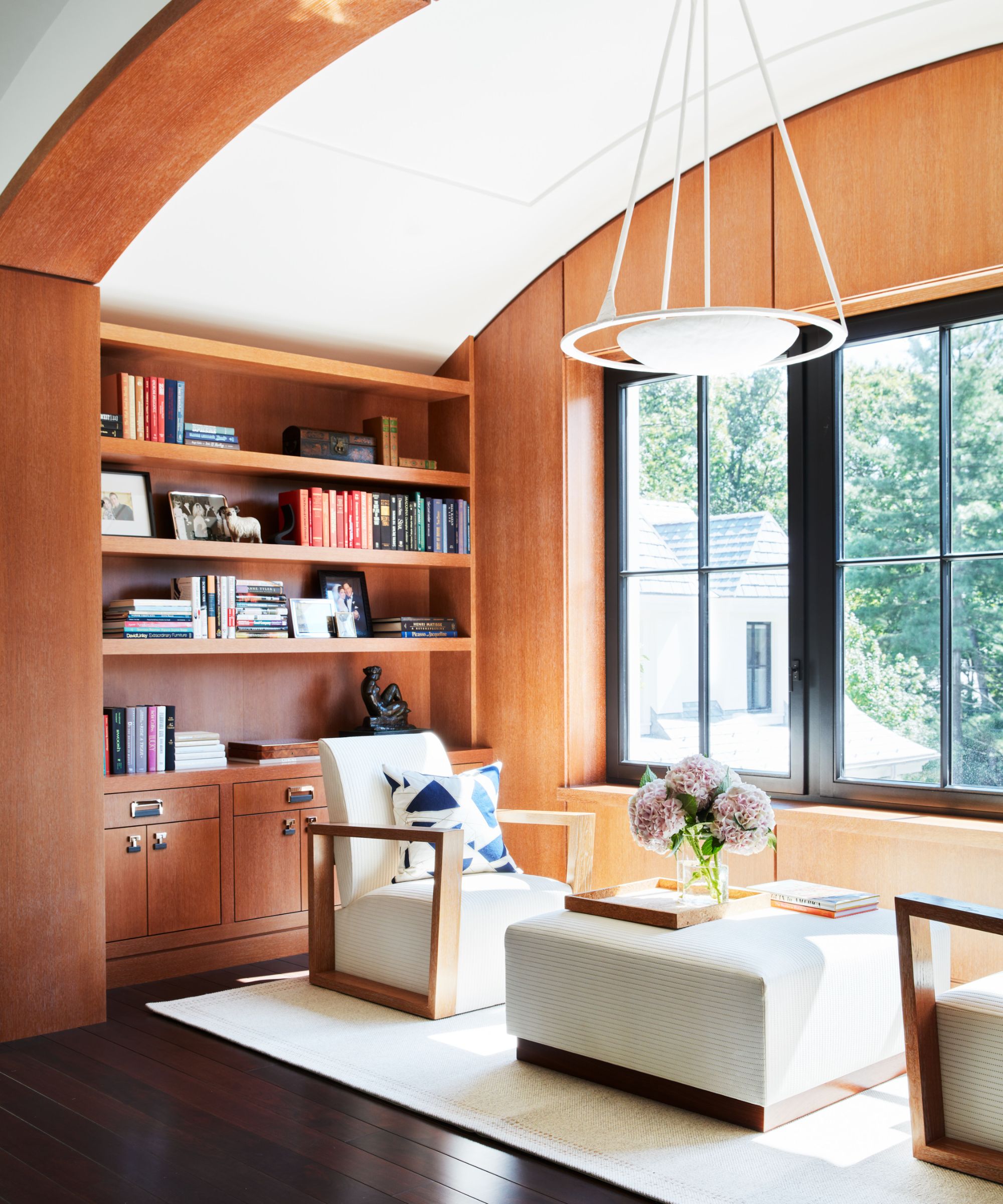
Second Floor Landing Seating Area: ceiling fixture by Ironware International through John Roselli, chair from foley&cox HOME custom collection, area rug by Merida, custom ottoman by Peruvian Touch
The lounge chairs and ottoman in embossed leather invite you to sit back and kick up your feet while a subtle plastered jewel light fixture adds a soft halo along with the elegant lines of the arched ceiling.
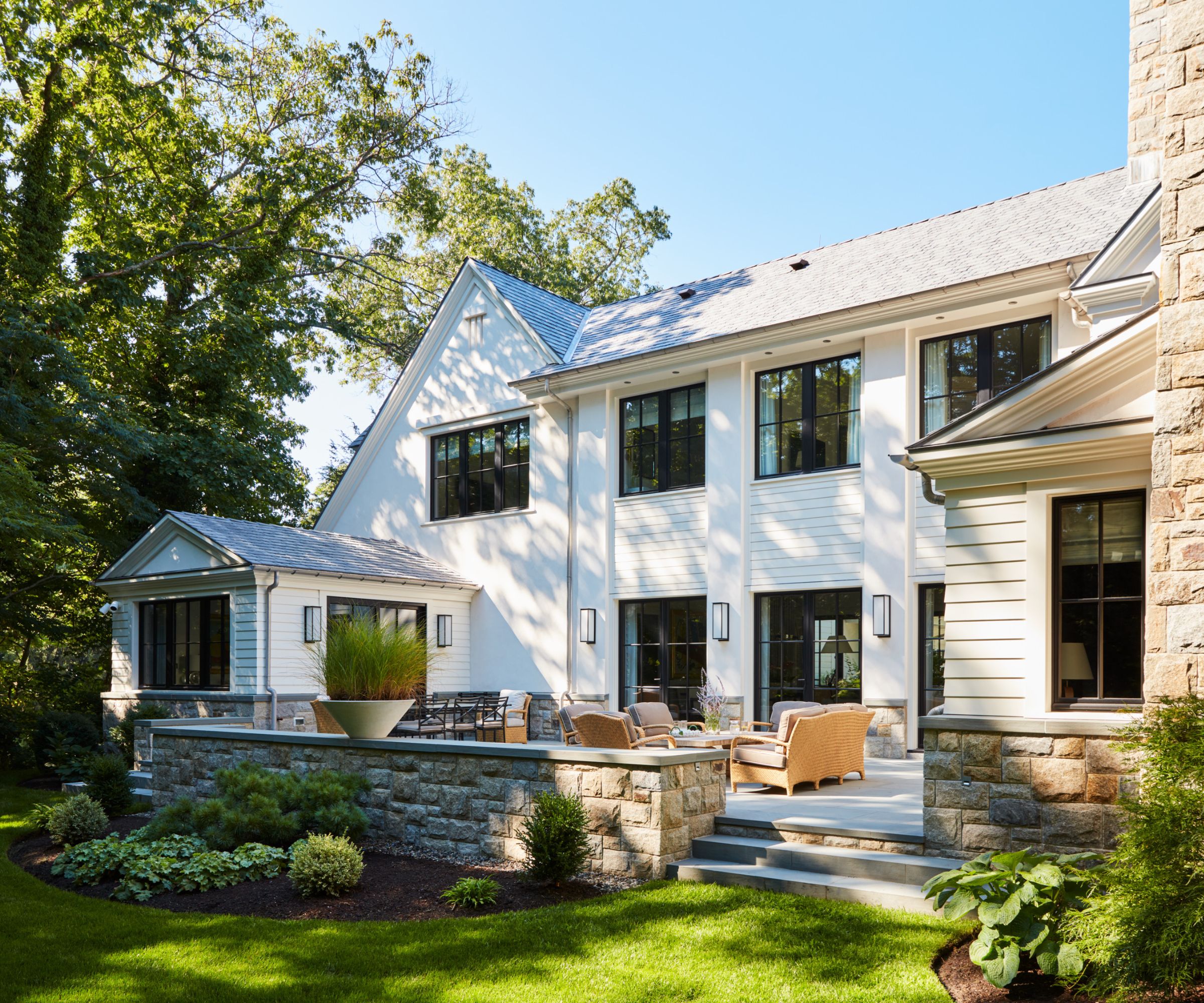
The juxtaposition of the natural elements against the pure and textural plaster finish of the home has a gracious appeal. The modern architecture informed the approach for the interior design, which is serene, inviting and bespoke
The lush living elements entice outdoor living and dining. The continuity of naturalism was the source of inspiration for repurposing the client’s outdoor furnishings in woven ranging from medium to dark naturals.
Are the clients happy with the interior design? 'The comments that came back were: “Perfect! Better than we could have imagined”; “Incredible! Magnificent! Amazing!"; "I know we will have many, many wonderful years living here enjoying friends and family!",' says Michael.
Interior design: foley & cox
Sign up to the Homes & Gardens newsletter
Design expertise in your inbox – from inspiring decorating ideas and beautiful celebrity homes to practical gardening advice and shopping round-ups.

Lola Houlton is a news writer for Homes & Gardens. She has been writing content for Future PLC for the past six years, in particular Homes & Gardens, Real Homes and GardeningEtc. She writes on a broad range of subjects, including practical household advice, recipe articles, and product reviews, working closely with experts in their fields to cover everything from heating to home organization through to house plants. Lola is a graduate, who completed her degree in Psychology at the University of Sussex. She has also spent some time working at the BBC.
-
 What colors go best with butter yellow? 8 equally delicious shades to pair with spring's hottest color trend
Inspired to elevate your home this spring with chic pale yellows? Here are the best colors to complete your scheme
By Emily Moorman
-
 Sarah Michelle Gellar's entryway is tranquil and elegant thanks to white and wood accents – her neutral style is replicable from $33
The actress's entryway features a wood console table, wood floors, and crisp, white paint for a warm and inviting atmosphere
By Hannah Ziegler