This NYC apartment had an elegant open plan update for modern family living
Streamlined and open plan for easy entertaining and modern family life, this Upper East Side apartment has a new identity
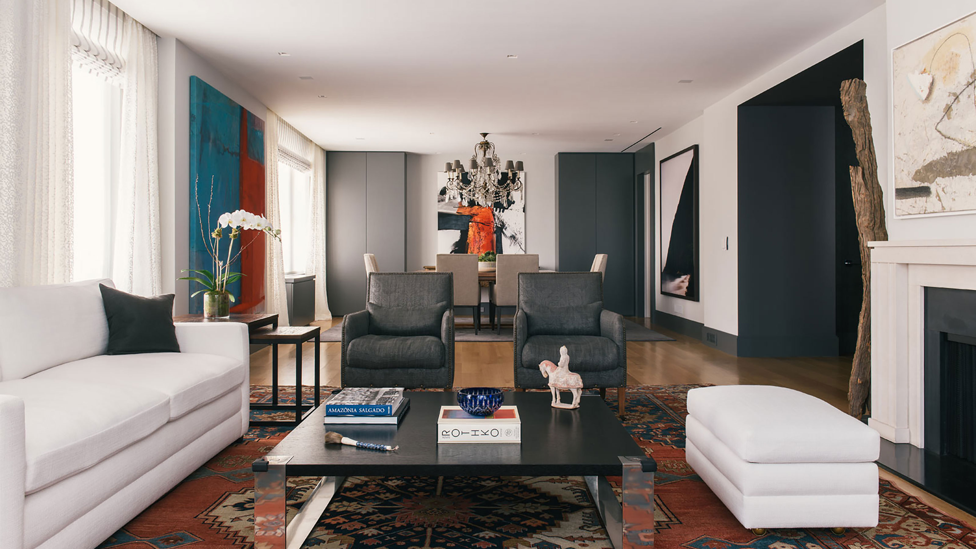
This apartment on Park Avenue, on the Upper East Side of Manhattan, New York City was originally several apartments which had since been combined. Designed by architect Emery Roth, and built in 1925, apartments in this building are highly sought after. This one, one of the world's best homes, has recently been renovated, with the aim to transform a traditional Park Avenue apartment into a modern home for a family of five.
'Modern, elevated, but warm and comfortable,' is how Thomas Morbitzer of Ammor Architecture describes the apartment's new style, the result of a collaboration between the firm and the apartment's owners, a couple with three young children. The redesign took a very classic Upper East Side apartment, with multiple rooms, separate kitchen, formal dining room, sitting room and bedrooms arranged off a central hallway, and transformed it into something much more modern.
'Much of what we did was to reorganize the structure of the space to create expanse – or a blur,' explains Thomas Morbitzer. 'From the way the main living/dining is combined into one volume, to other kinds of details like the long expansive sofa in the play room – or the master closet which used to be many spaces – we made it one. It’s a New York apartment that doesn’t feel cramped.'
Indeed, Morbitzer and his colleague Goil Amornvivat at Ammor Architecture, have worked wonders in this space, confidently bringing it into the 21st century, while still respecting its historic origins and character.
Kitchen
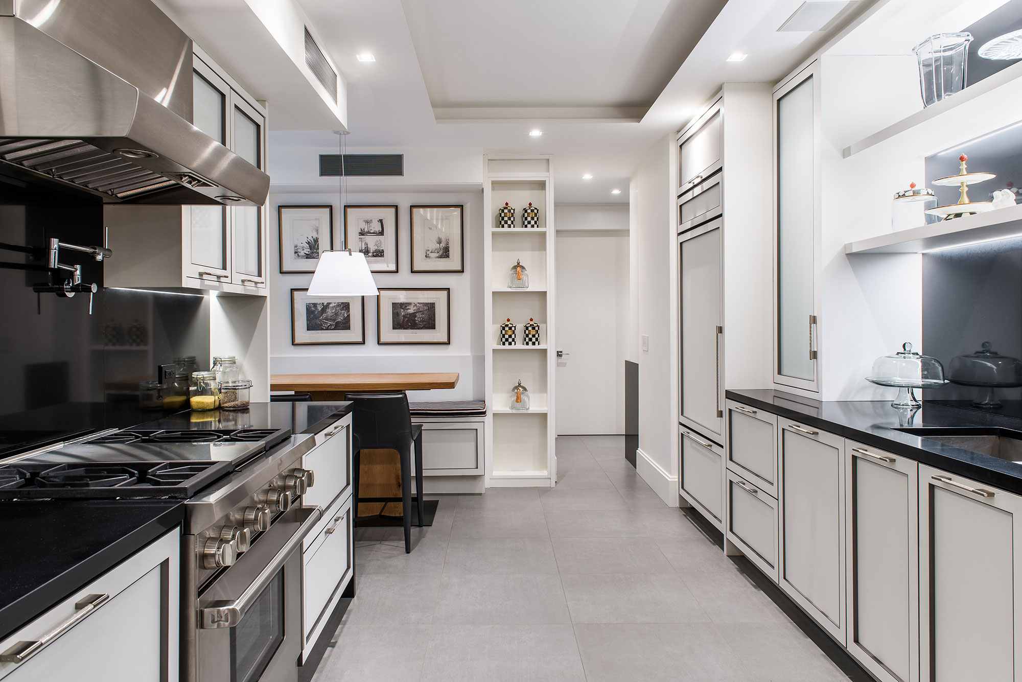
Anyone looking for smart kitchen ideas can't fail to be inspired by this streamlined space.
The Kitchen is by Ornare, a Brazilian cabinet company that features luxury details. 'Important in this space is the new ambient lighting and a dining area that better utilizes the space with a counter-height banquette,' explains Goil Amornvivat.
The flooring is large format grey porcelain from Roca. The counters are manmade stone from Silestone.
Breakfast nook
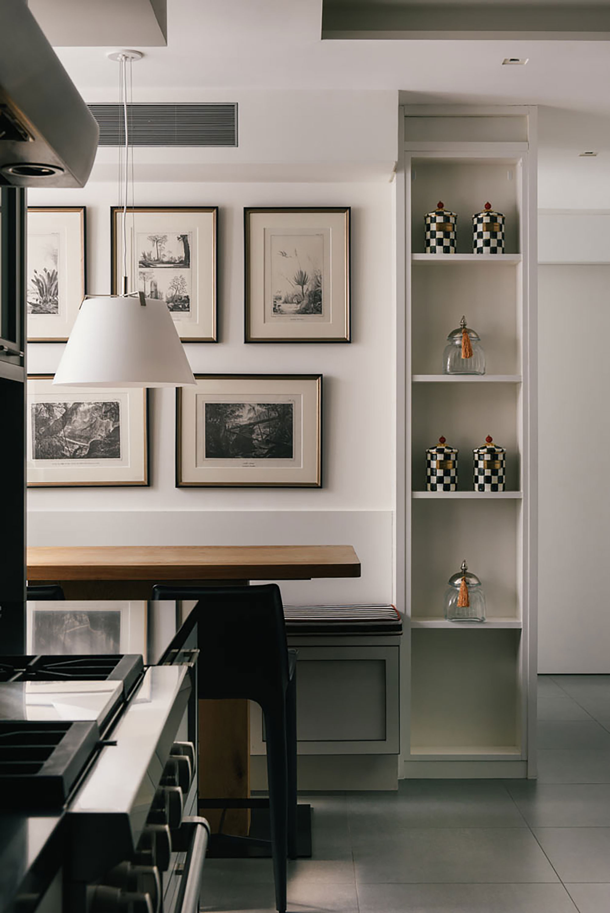
Perhaps the biggest symbol of this apartment's transformation into modern family living, is the addition of the new breakfast nook in the kitchen space. With its smart gallery wall behind, it keeps a lid on 'casual'. In this Manhattan apartment, even when you're sitting on a custom banquette and grabbing a quick bite to eat, traditional elegance is maintained!
Formal dining room
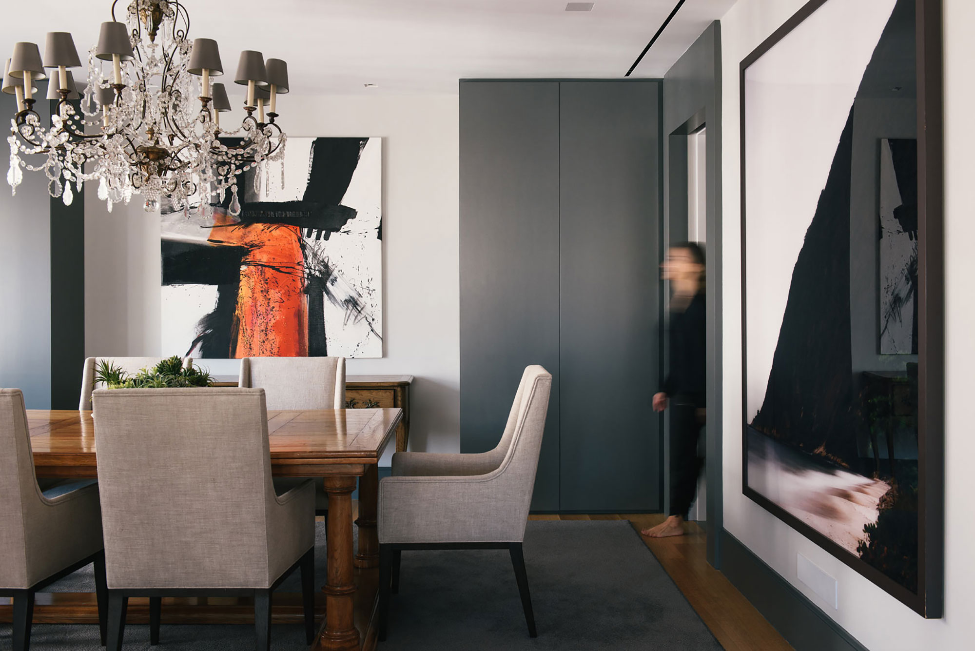
Previously a separate space, the dining room is now open plan to the living room. Dining room ideas include wide width clear oak floors and custom cabinetry. 'It was key to have one gracious space for extended family gatherings and day to day life,' explains Goil. An elegant chandelier and contemporary artworks help to reference the apartment's traditional origins and its new modern-day persona respectively.
Living room
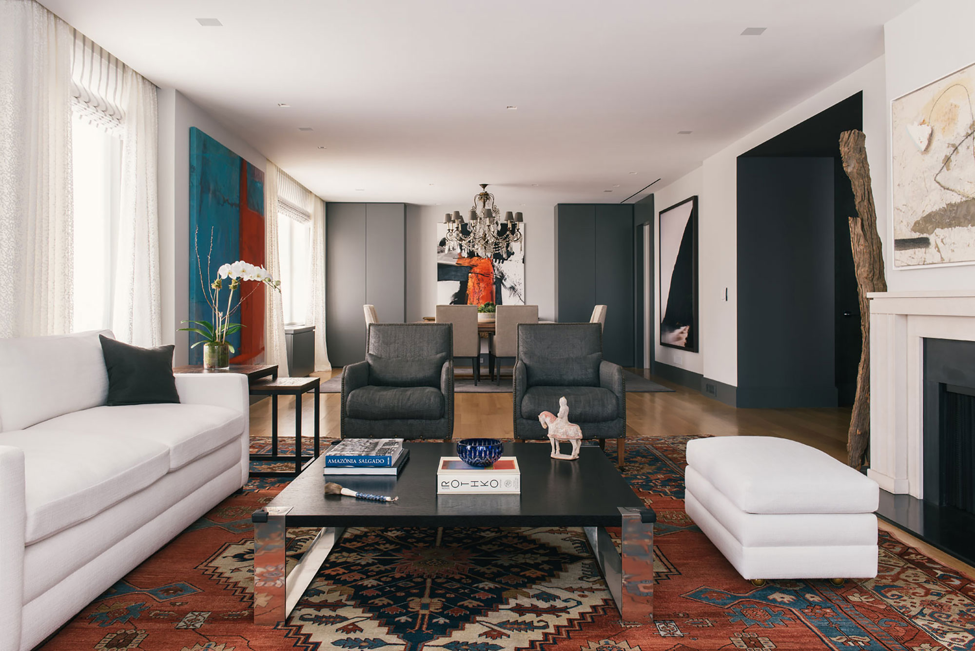
This view of the open plan living-diner shows how the new dropped ceiling provides uniform lighting to the enlarged space. It also conceals a new sound system.
'The ceiling crown was eliminated, and the drapery now recesses into a pocket above the drop ceiling. The absence of added trims adds expense to the walls and ceiling in a very modern definition,' adds Goil.
Living room ideas for the open space include the bright white sofa and ottoman, which help to emphasise the apartment's brighter look, and a traditional rug that introduces a splash of color, plus Dolcezza fixed sheer drapes by EILITIS.
Home office
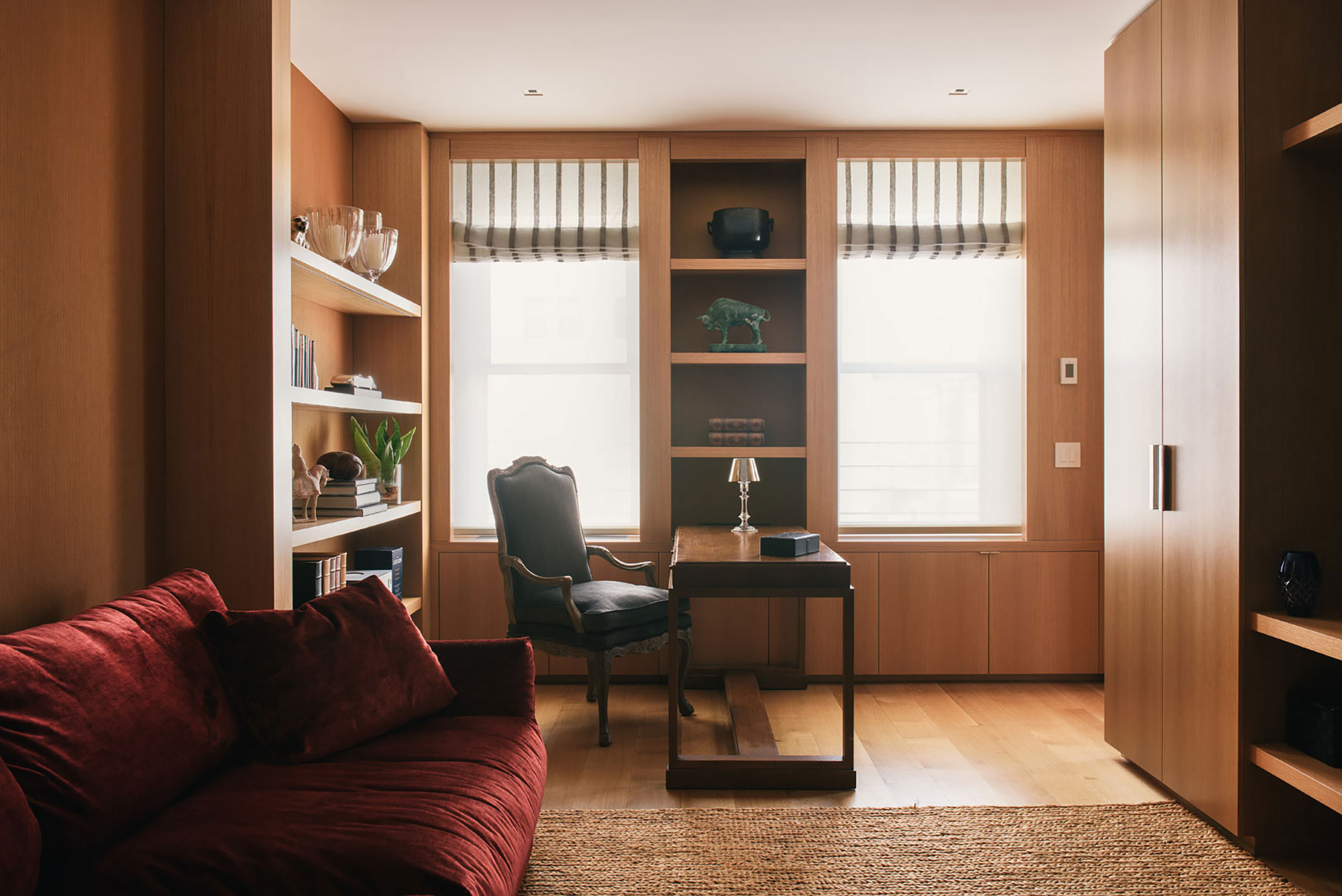
Anyone looking for Home office ideas will feel a pang of envy at this well-designed space. The office has a new pocket door from the living room and double pocket doors to the gallery. An inviting sofa adds an extra touch of luxury and comfort to the work room.
'The room can be made open, but also private,' explains Goil, 'and features a partner desk so the couple can work together. It is a custom jewel box with white oak panels and wood cabinetry. We created a simple base for décor to be placed.'
Young child's bedroom
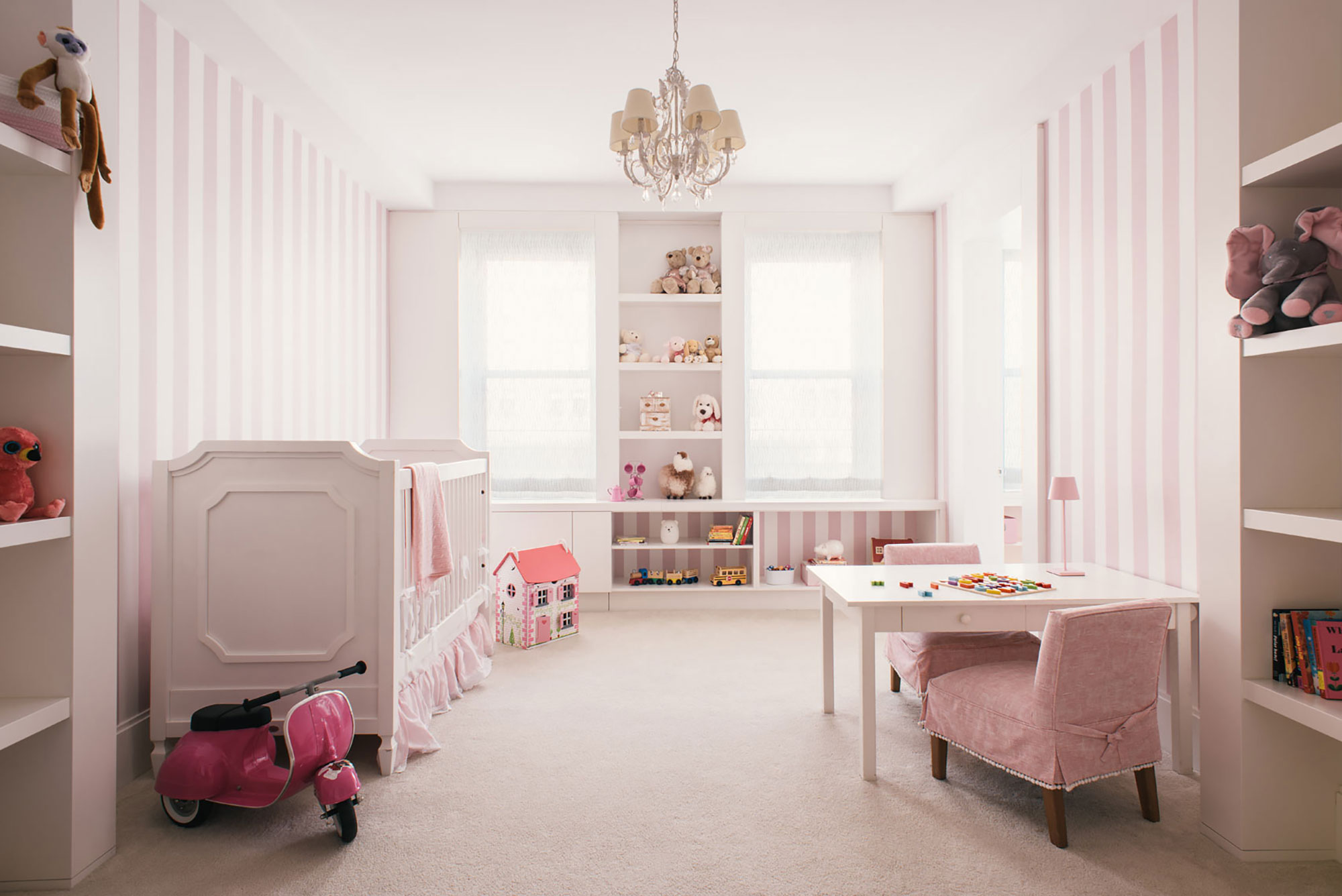
If you're looking for classic baby girl nursery ideas this baby’s room might be exactly what you had in mind. With its delicate pink and white stripe wall covering and custom cabinets. The same pink was used for a custom en-suite vanity.
Older child's bedroom
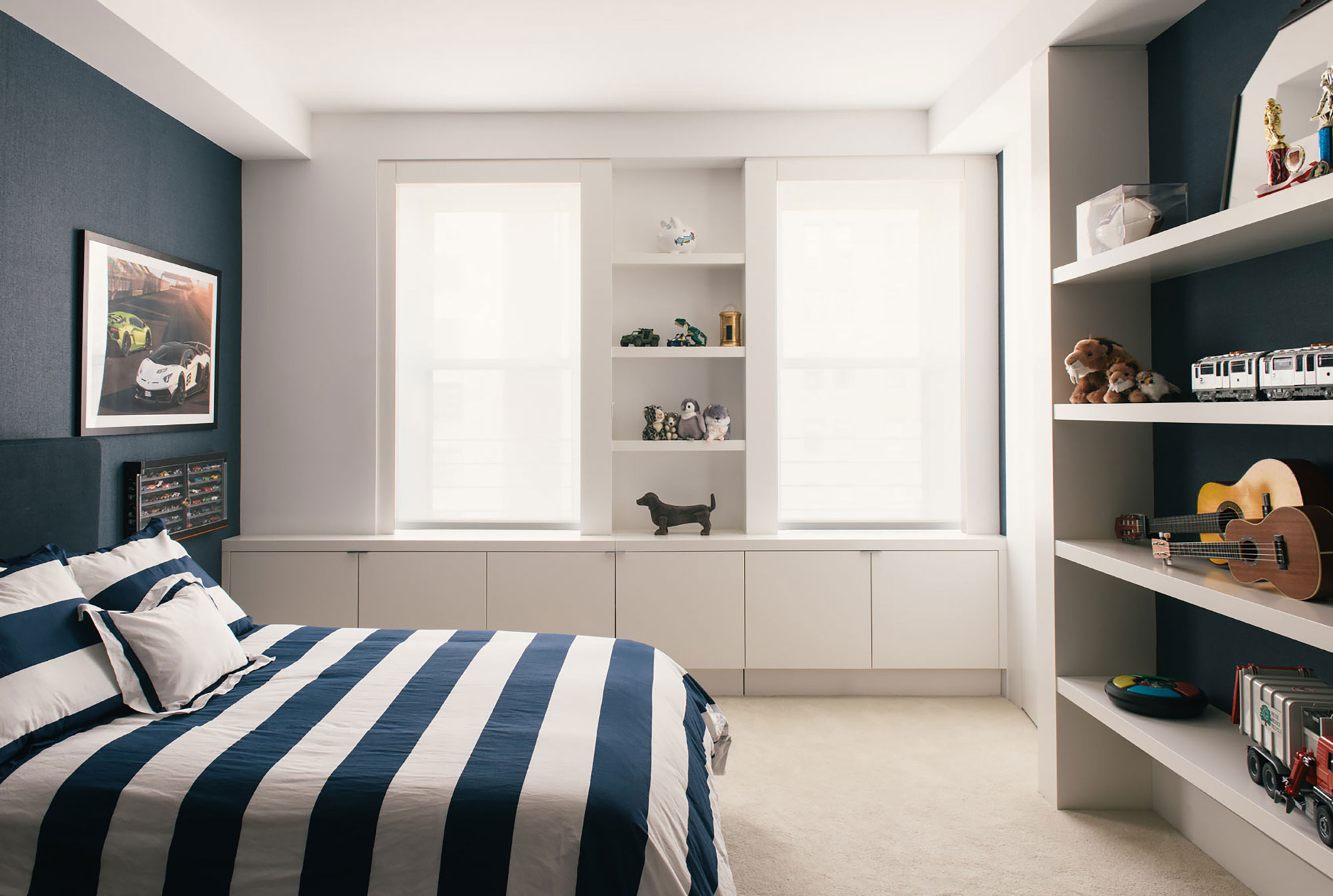
The boys bedrooms both have custom white cabinetry that provides a sharp contrast to the deep denim color wallcovering by Holly Hunt. Open shelves and a run of low cupboards under the windows help to keep toys tidy.
Now the work is finished, how do the owners feel about their redesigned space?
'The clients were thrilled and are very happy in the new home. The house affords enough space for work and school at home as well as getting back to ‘normal’,' says Goil Amornvivat of Ammor Architecture. 'We were very pleased with their commitment to the modern design elements that create a sense of order and balance, from the overall look to individual elements and details. The contrast in color makes the spaces feel brighter and highlights the art and personal elements.'
Architecture, Fittings, and Custom Millwork: Ammor Architecture LLP
Design: Ana Maria G. de Vieira Santos
Sign up to the Homes & Gardens newsletter
Design expertise in your inbox – from inspiring decorating ideas and beautiful celebrity homes to practical gardening advice and shopping round-ups.
Karen sources beautiful homes to feature on the Homes & Gardens website. She loves visiting historic houses in particular and working with photographers to capture all shapes and sizes of properties. Karen began her career as a sub-editor at Hi-Fi News and Record Review magazine. Her move to women’s magazines came soon after, in the shape of Living magazine, which covered cookery, fashion, beauty, homes and gardening. From Living Karen moved to Ideal Home magazine, where as deputy chief sub, then chief sub, she started to really take an interest in properties, architecture, interior design and gardening.
-
 Kourtney Kardashian's cloud-like chair taps into 2025's most interesting furniture trend – it has the unique ability to improve spatial flow in any room
An accent chair highlights the beauty of the natural world in the socialite's living room – experts explain why it's trending and how to recreate the look
By Sophie Edwards
-
 Little Greene paint colors in real homes – 19 rooms decorated by designers with tried and true paint shades and wallpapers
Gain fresh paint color inspiration with these timeless Little Greene shades, from rich greens to elegant neutrals
By Emily Moorman