Cohesive design and characterful finishes give this LA new build true California soul
There's space for family life and entertaining in this well-designed home, where practical solutions are beautiful too
It was the classic blank canvas, a newly built home on the Westside of Los Angeles in the Cheviot Hills district. The property was spacious indoors and out, and everything was in good condition as you'd expect from a home that was completed in 2021. There was, however, still something missing. The owners were looking for a way to bring their new home to life, to add character and a cohesive sense of style throughout.
In short, the brand-new property needed a new identity. Once that was established and in place, this LA family home became one of the world's best homes. It's relaxed and welcoming and gets the balance just right between practical everyday living and generous entertaining. Nothing is too perfect that you're afraid to use it but there's a touch of luxury to the designs and finishes that elevates the space.
Interior designer Jenn Feldman is the creative talent behind the home's transformation and says: 'Our challenge was how to create a contemporary, comfortable home that was well-loved and could be well lived in... how to keep everything clean-lined and tailored and let them live.'
Find out how, as Jenn Feldman shares her solutions and design insights below.
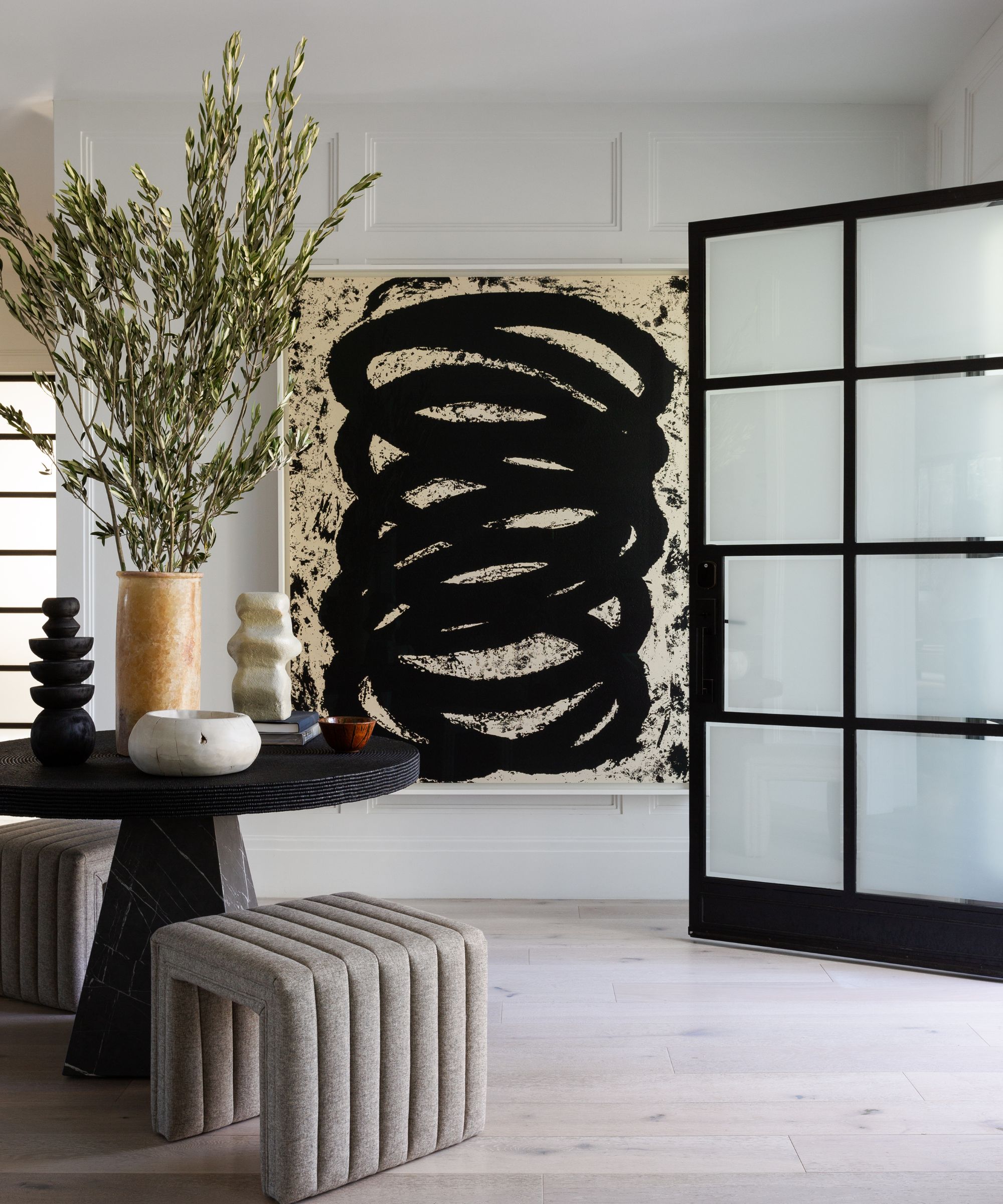
'We approached every space with equal parts fixed and flexible,' says designer Jenn. 'Beautiful silhouettes but with performance fabrics. Vintage curations layered throughout kept the home grounded with the large, open space plans.'
This is apparent from the moment you step through the (very fine) front door. Entryway ideas take their cue from the strong design elements of the large steel-framed door, and the statement Baker table, stool and artwork by Richard Serra. 'It's the entry hall of our dreams' says Jenn.
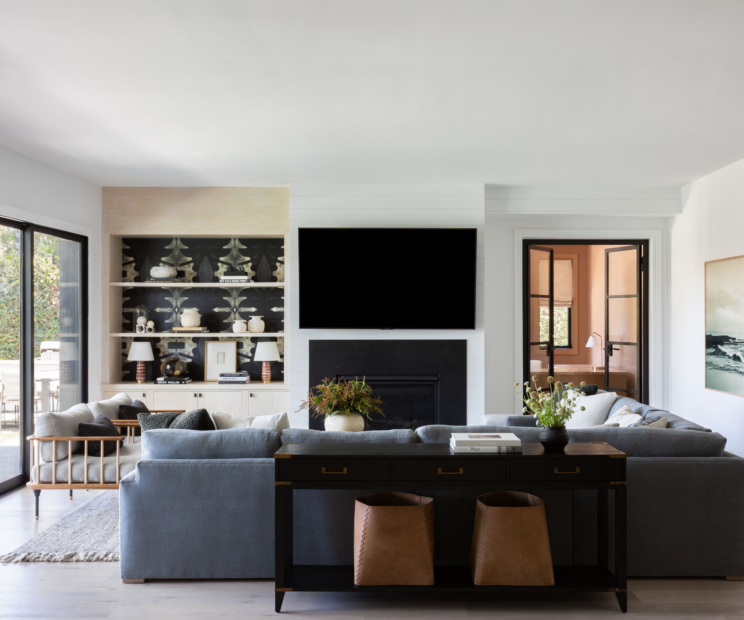
Family room ideas in California are as much about the outside living spaces as the inside ones, and this relaxed seating area fits the bill with its glass wall and doors to the garden. 'The family room shines with light and showcases California indoor outdoor living at its best,' says designer Jenn, who specified a custom Sofa by JFD and wallpaper by Lindsay Cowles.
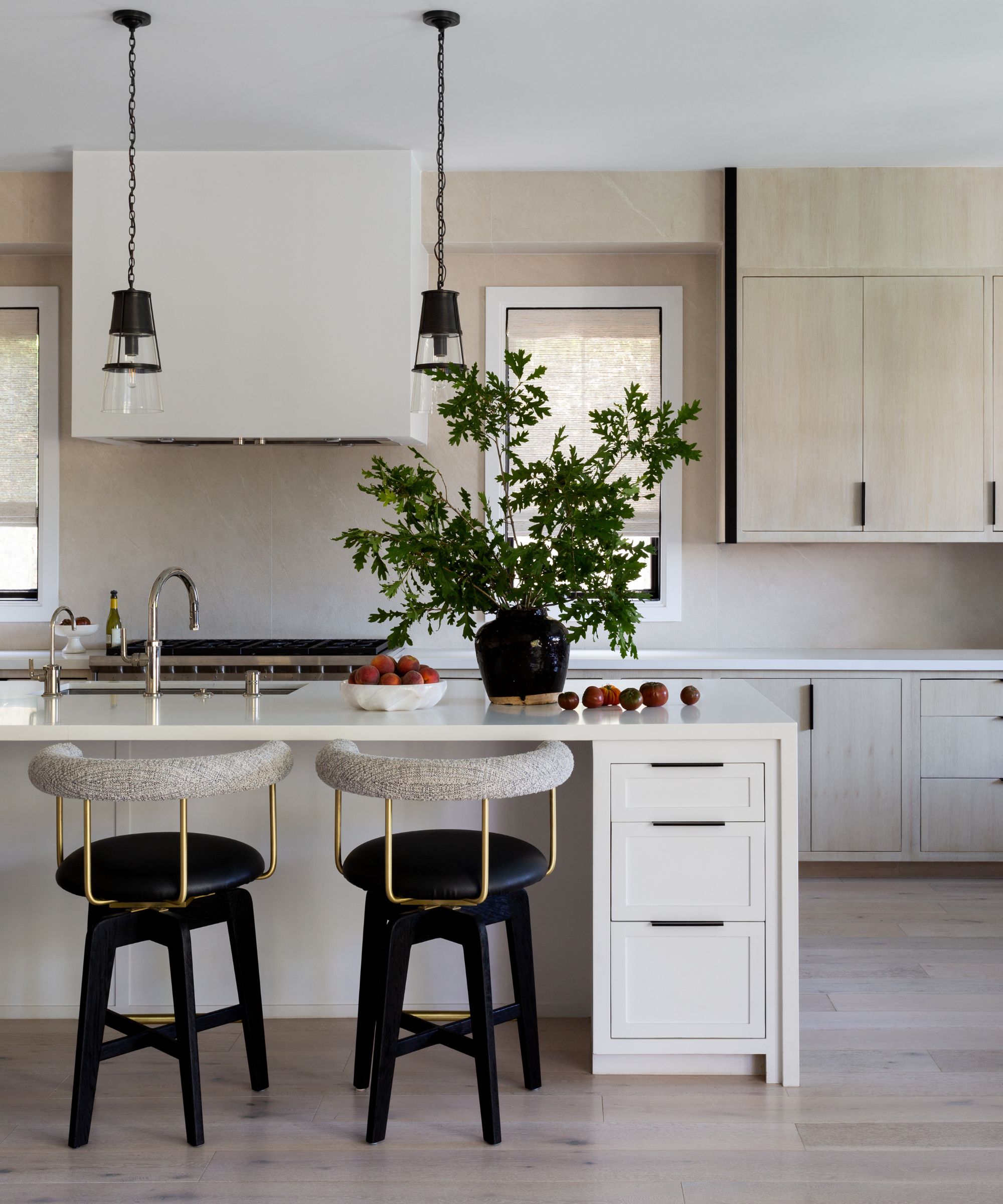
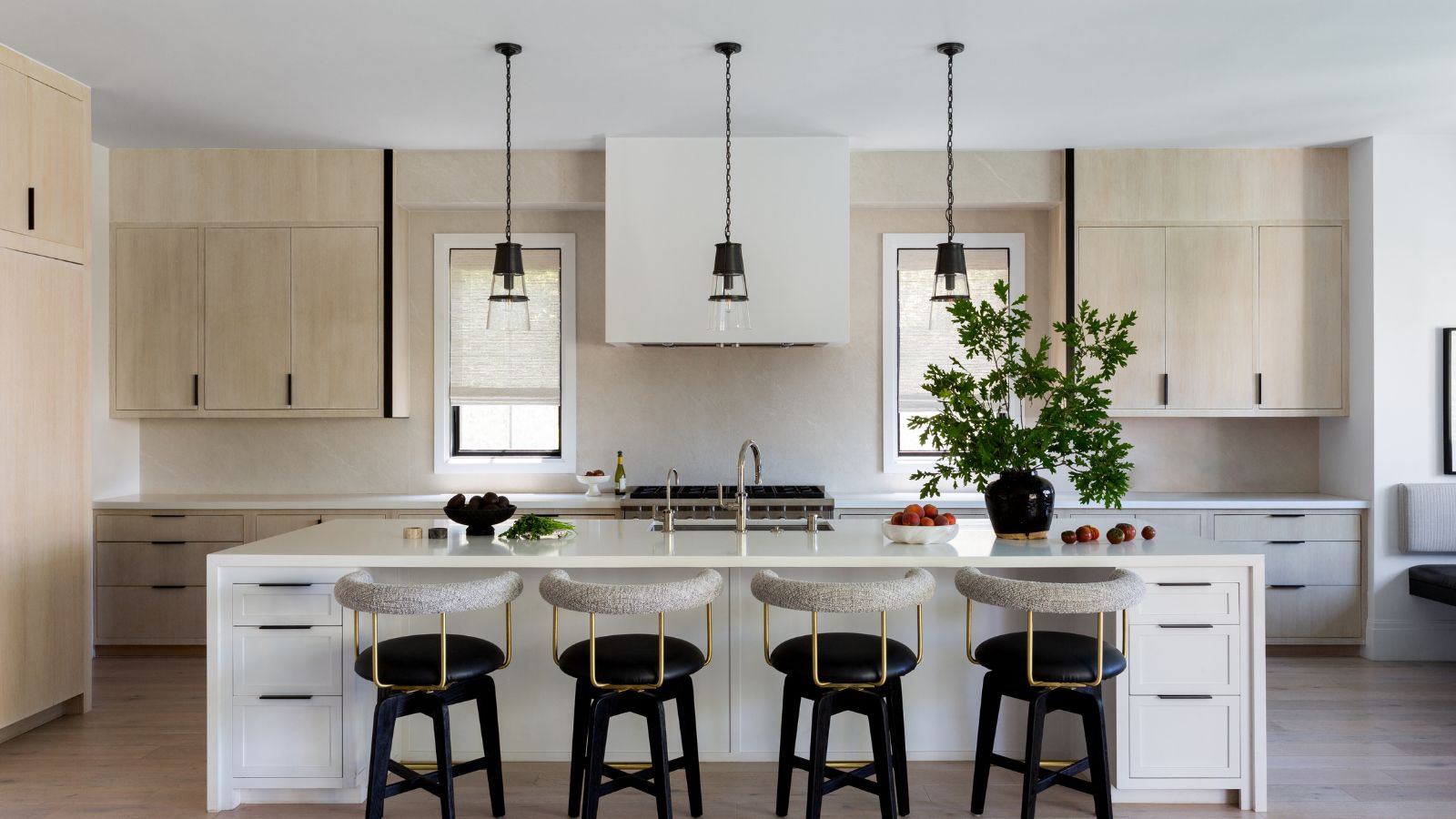
Who wouldn't want to cook and entertain from this glorious kitchen? Better still, who wouldn't want to just hang out on the smart bar stools chatting to the cook! Anyone looking for kitchen ideas for a larger space, can't fail to be inspired by the serenity of this set-up, where pale wood finishes combine with white countertops to ensure there's a sense of calm whether catering for the family or a big party crowd.
'The open concept kitchen was packed with function and finished details,' says designer Jenn. The custom stools are from Thomas Hayes, the lighting is from Visual Comfort, and many of the accessories are vintage, giving that layered lived-in look that had been so lacking before the redesign.
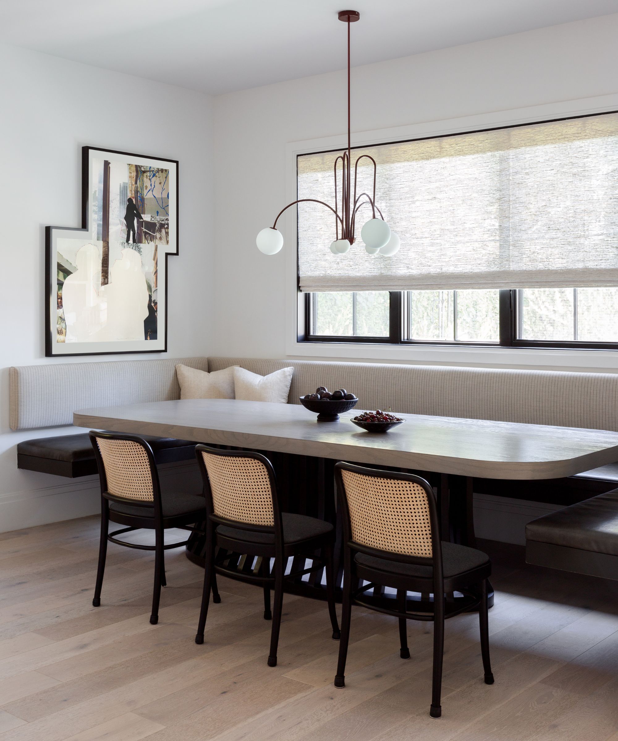
This tailored corner of the open-plan kitchen takes eat-in kitchen ideas to the next level. With an unusual long, oval table, banquette seating on three sides and a finish to tone with that in the working part of the kitchen, it's not hard to see why this is one of designer Jenn Feldman's house highlights - although getting her to admit that was tricky. 'It’s like picking a favorite child! I can't! But if I really had to, I'd say, the kitchen nook came out really special. As did the front entry hall. I love when a space feels like it’s always been there and just “fits” and both of those areas really had that feeling and connection.'
Banquette custom designed by JFD, fabric by Schumacher, chandelier from Mint Bliss Decor, chairs from Design Within Reach and art by John Baldessari.
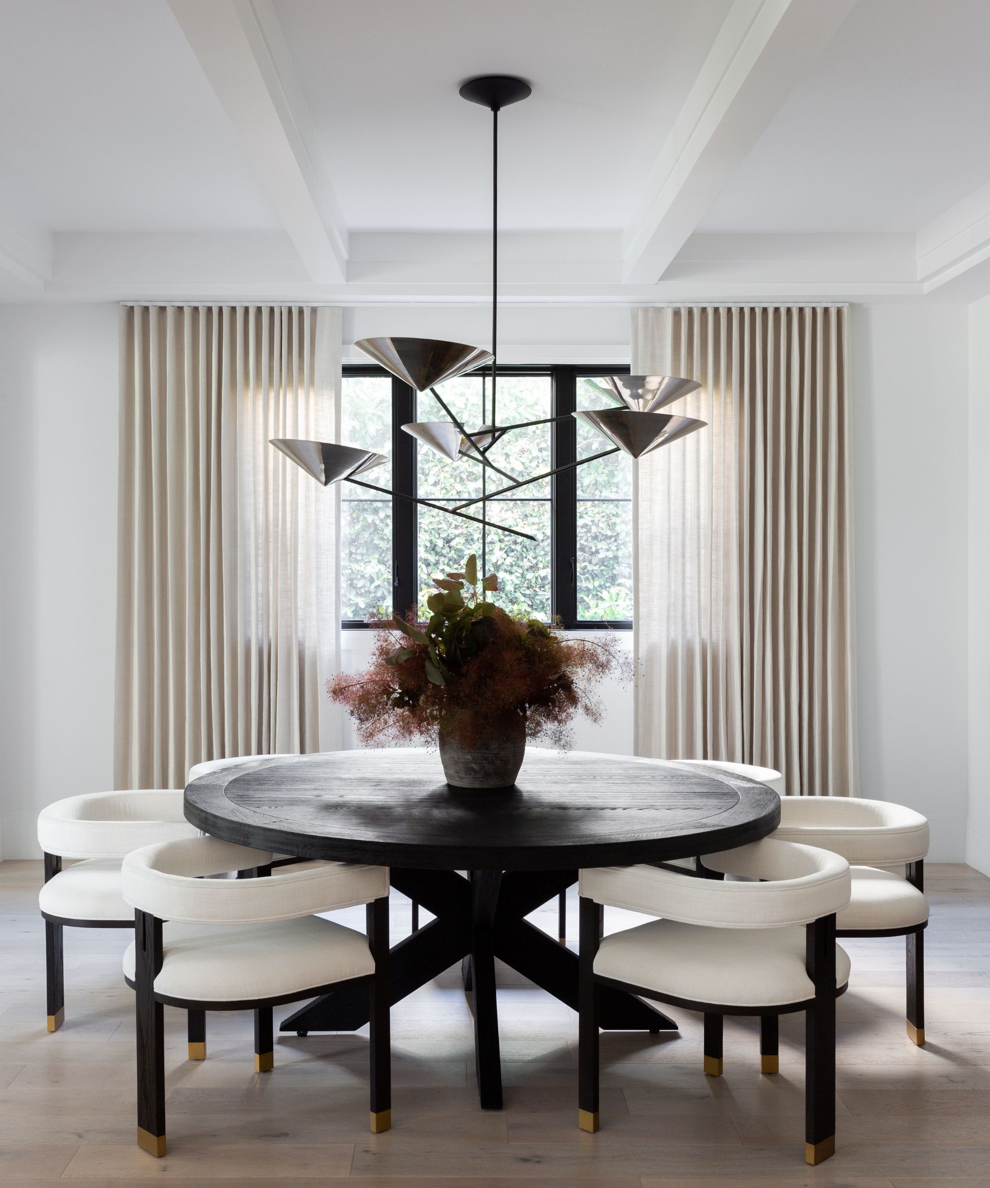
This more formal room marks quite a contrast with the other parts of the house. Explaining her dining room ideas, Jenn Feldman says she was aiming for a timeless and tailored look. When you look at how the curves of the chairs, table and then the pendant light all complement one another like a well put together outfit, you realize that 'tailored' is exactly the right word. Dining table by Restoration Hardware, chairs custom by JFD.
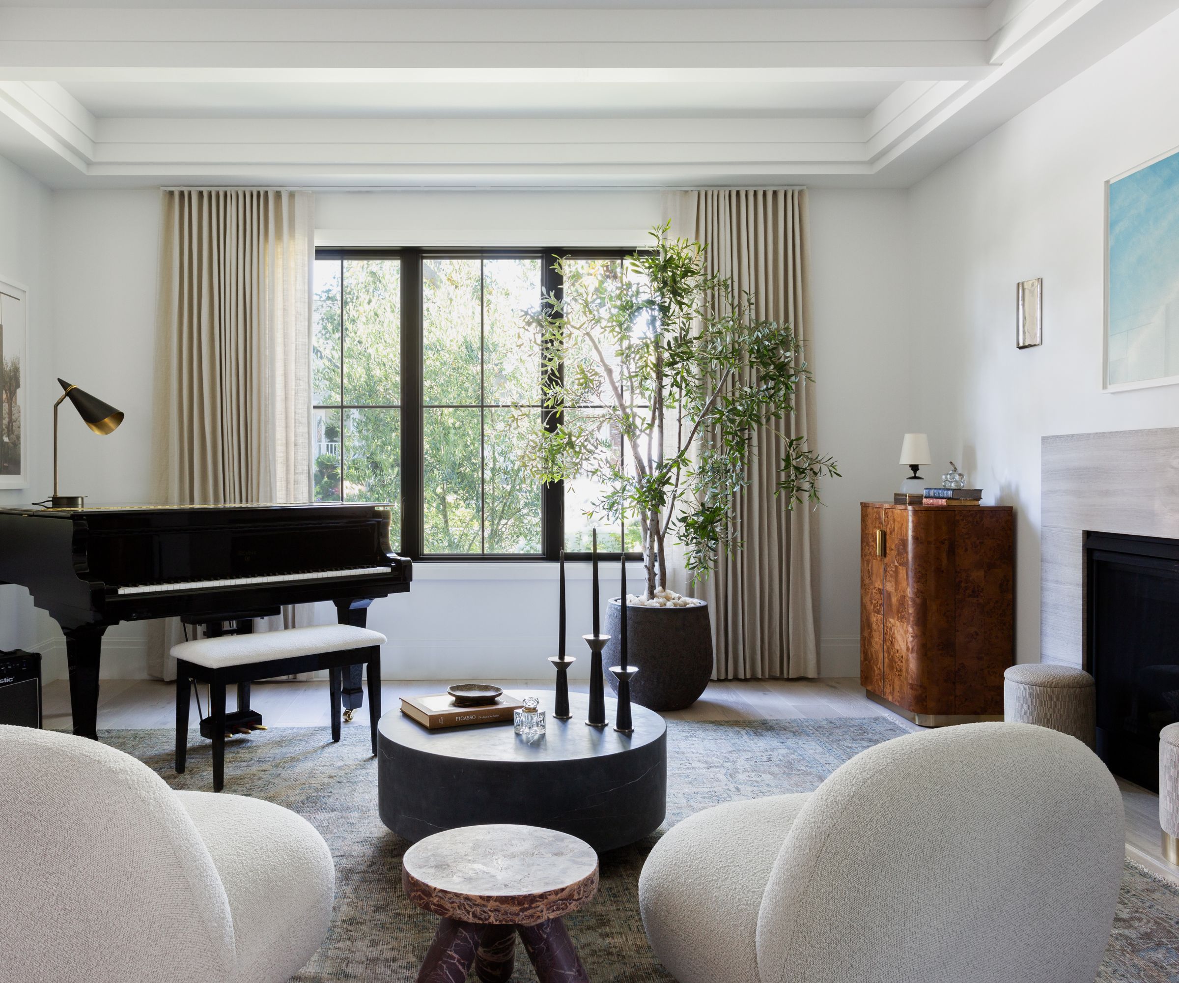
When the room doubles as a music room, your living room ideas have to work doubly hard. This room is also the 'front of house showpiece' according to designer Jenn.
A pair of Pacha chairs by Pierre Paulin flank the family’s grand piano. The art is from Amalia Saban, the rug is a vintage find.
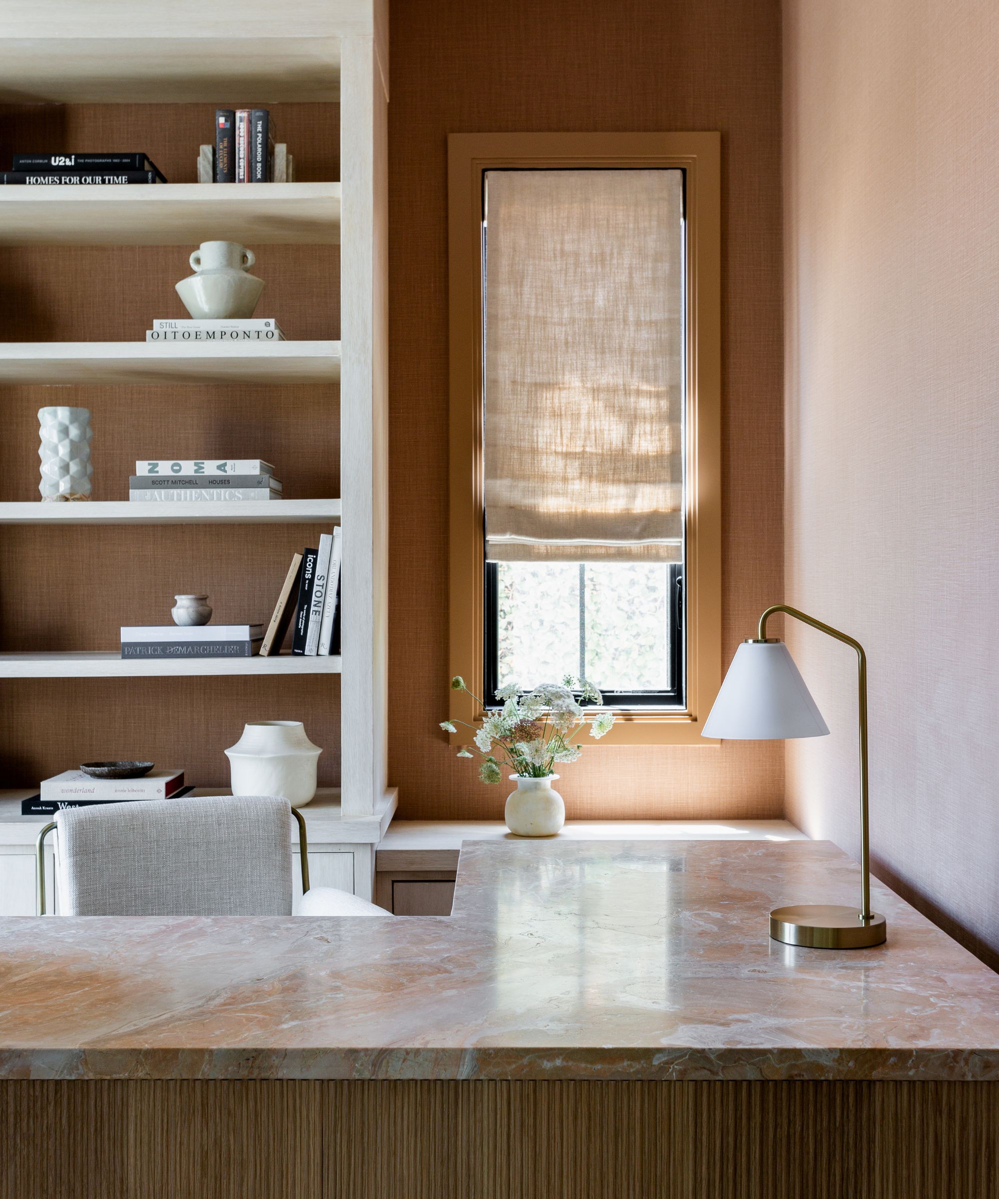
As discussed earlier, there's a sense of luxury even in this home's most practical spaces. Keeping this element to the fore in her home office ideas, Jenn says 'our client's home office was drenched in sun-kissed, tonal splendor.' A fair summary, I'd agree, and doesn't having a beautiful workspace do wonders for productivity? The custom fluted front desk was designed by JFD, the wallcovering is by Kravet.
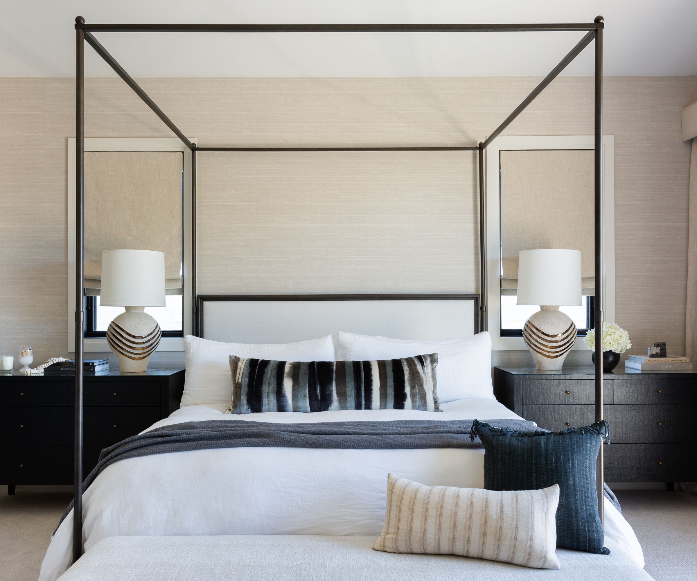
If it's bedroom ideas you're after, then this clean-lined look might just be the perfect solution for an uninterrupted night's sleep. 'The Primary Bedroom was scaled large enough for a canopy bed which was high on our clients' wish list,' explains Jenn. The pared back minimalist design is the perfect option in this setting.
Wallcovering by Phillip Jeffries, lumbar pillow custom in a fabric by Romo. Vintage lamps from Amelia Tarbet.
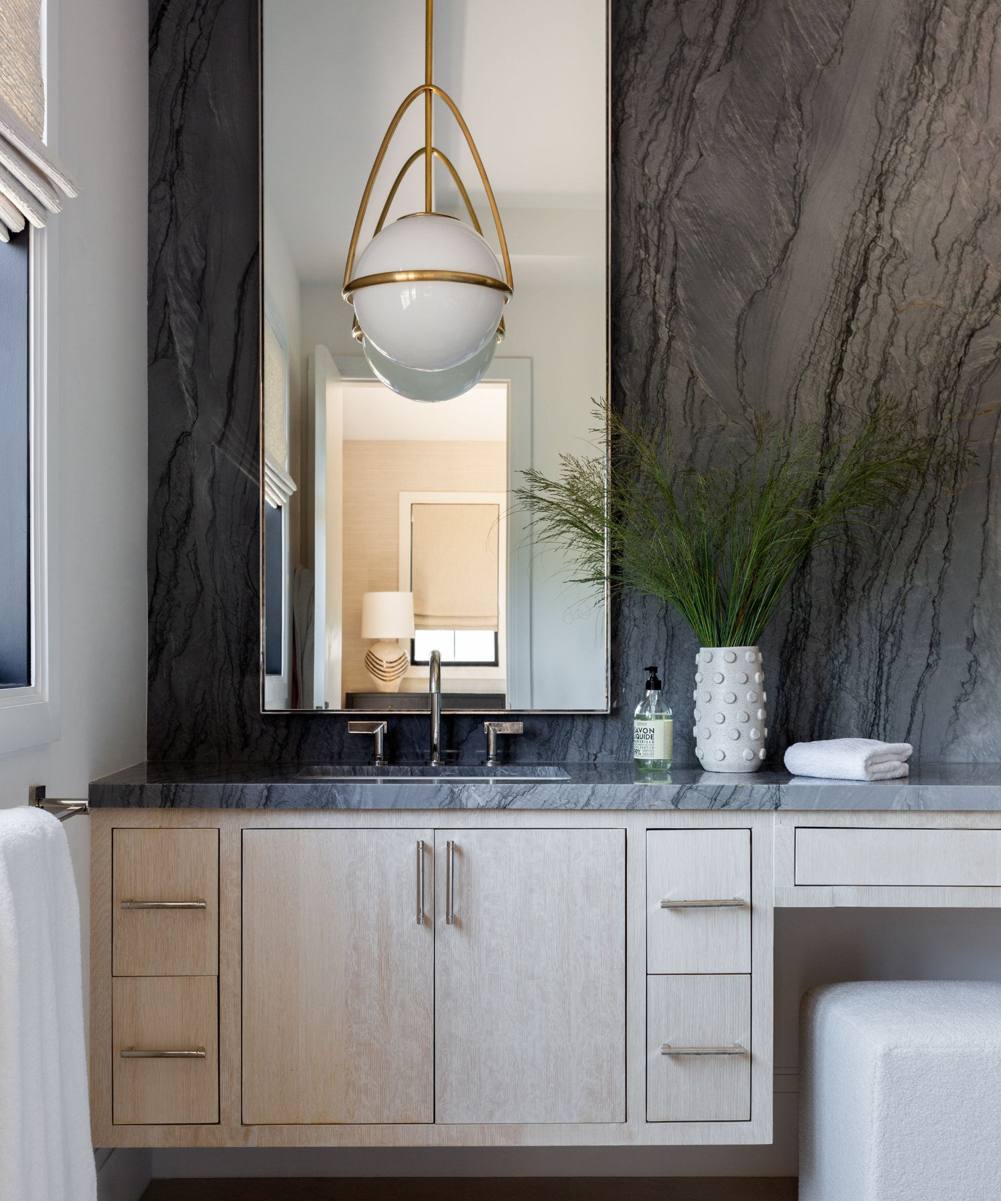
Bathroom ideas in the primary bathroom are all about contrast. It's a long, lean room, with a full dark-colored marble wall on one side, providing a counterpoint to the pale wood cabinet, and warm-white walls. Lighting by Visual Comfort.
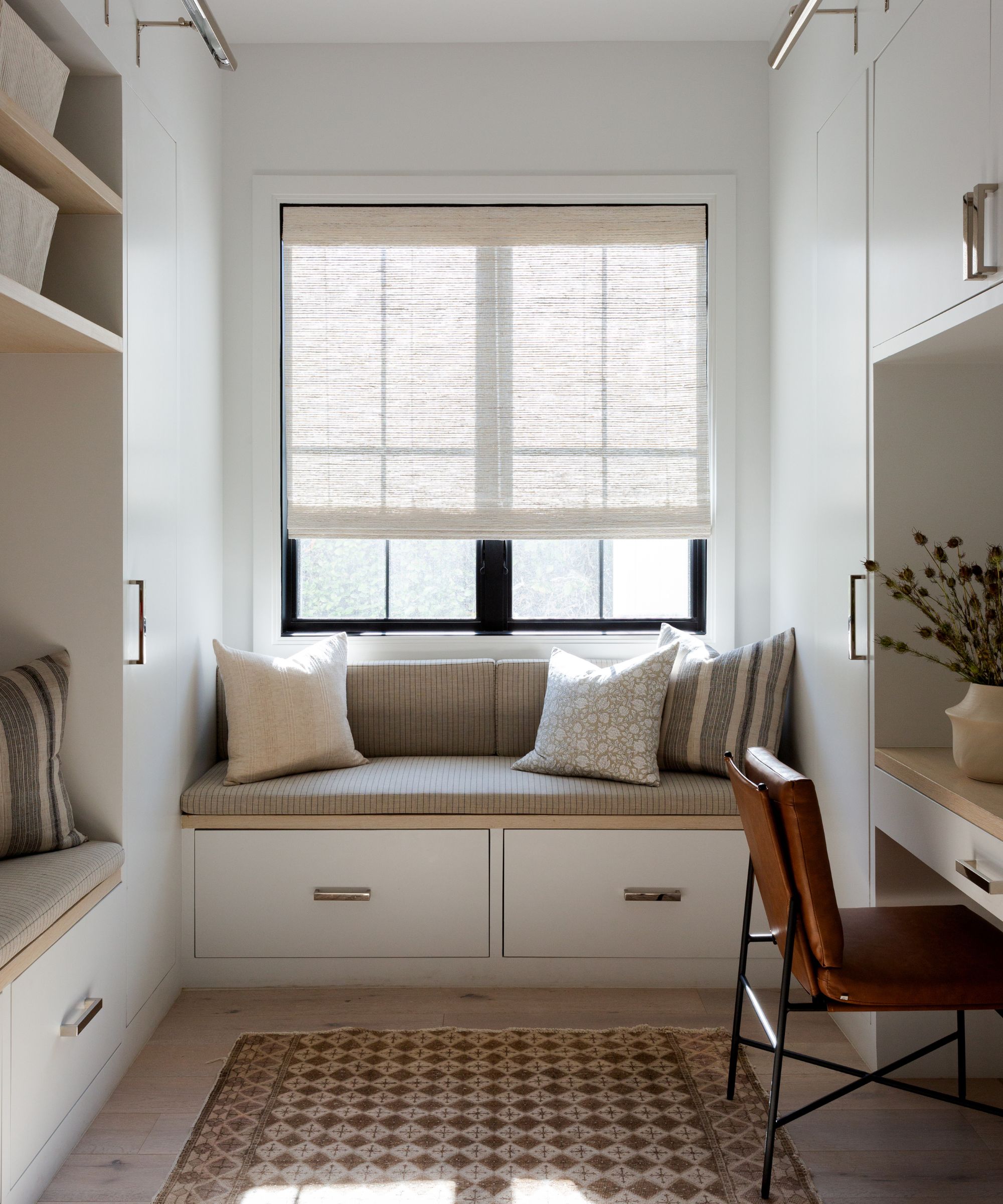
I'm not sure I've ever seen such comfort-first mudroom ideas. Well-organized built-ins provide storage for all manner of household and personal items, and there are two smart storage bench seats with Schumacher fabric covers and even a desk. The rug is vintage.
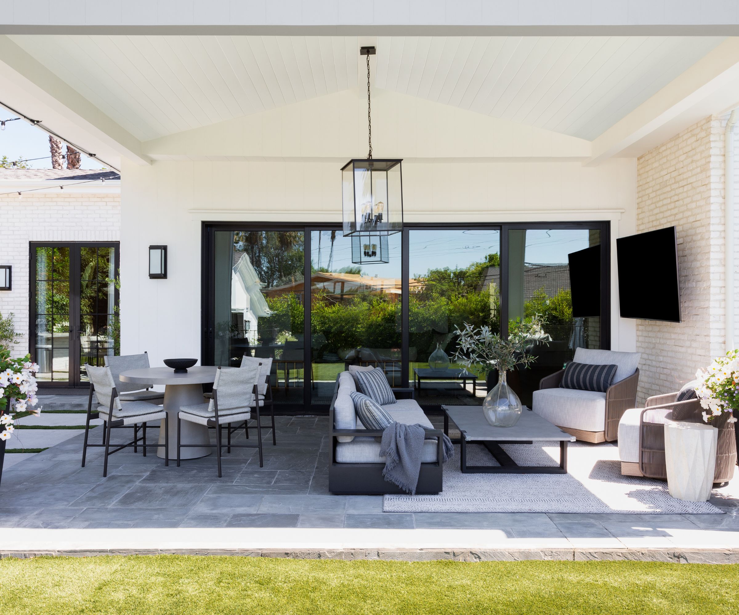
'Los Angeles living means outside areas are used the same if not more than interiors,' says designer Jenn Feldman. 'The lifestyle is to live outside most of the year and it’s always a priority to give the exterior spaces the same level of detail and aesthetic integrity to the interiors. We had so many areas to play with and create meaningful spaces.' This outdoor living room is directly outside the family room, easily accessible and ready for lounging, eating and socializing whenever the need arises.
The outdoor-indoor living space is what puts the whole of this home into perspective: it's both luxurious and down to earth, comfortable and smart. In fact, when we asked designer Jenn Feldman how she'd describe the home's style, she came up with even more descriptors, 'Modern Aged. Clean, classic, tailored, and layered, curated and collected'. All apply equally to this multi-faceted family home, for this is a success story on so many levels.
Interior design: Jenn Feldman Designs
Photography: Amy Bartlam
Sign up to the Homes & Gardens newsletter
Design expertise in your inbox – from inspiring decorating ideas and beautiful celebrity homes to practical gardening advice and shopping round-ups.
Karen sources beautiful homes to feature on the Homes & Gardens website. She loves visiting historic houses in particular and working with photographers to capture all shapes and sizes of properties. Karen began her career as a sub-editor at Hi-Fi News and Record Review magazine. Her move to women’s magazines came soon after, in the shape of Living magazine, which covered cookery, fashion, beauty, homes and gardening. From Living Karen moved to Ideal Home magazine, where as deputy chief sub, then chief sub, she started to really take an interest in properties, architecture, interior design and gardening.
-
 These are the 6 must-have colors to decorate with in April 2025
What do retro-inspired yellows and beautiful blues all have in common? They're on our hot list for the season ahead
By Sophia Pouget de St Victor Published
-
 Plants never to grow next to fruit trees
Expert advice on which plants to keep away from fruit trees to encourage a healthy harvest
By Jacky Parker Published