Want to achieve true English style? This Victorian home is bright, beautiful, and practical – family-friendly style at its best
This London home works well for family life and entertaining, thanks to some genius style updates from designers Kitesgrove
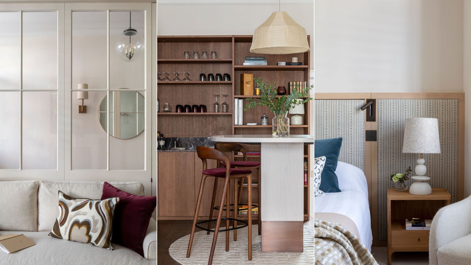
This Victorian home in southwest London was in good condition but lacked character and personality, having been renovated and finished to a standard developer specification. The home's new owners, a couple with young children, were looking for a way to introduce interest, warmth and texture with bespoke joinery and finishes, all the while keeping the property's feet firmly on the ground as a practical family home.
Anyone looking for home ideas for interior design will find plenty of practical - and beautiful - inspiration in this home. The stylish new look is pared back, with a neutral, calming palette that's everyday-functional for family life, but with an added sophisticated edge in the entertaining spaces.
The team responsible for taking this home up a level is Kitesgrove, the London-based studio. The firm's head of design, Clara Ewart, talks us through the highlights of the recent redesign and shares the thinking behind some of the design decisions.
'We focused on bringing warmth and style to the space,' says Ewart. 'One of the biggest single improvements we made was replacing the ceramic tiled floor in the large open plan kitchen/living/dining space with a light oak herringbone.'
To introduce warmth and texture elsewhere in the home, Kitesgrove introduced a palette of more natural materials throughout, including walnut, light oak, cane, rosso levanto marble, etc.
'The addition of bespoke joinery to several key rooms not only added much needed character, but practical storage solutions – the different door styles, ranging from more traditional shaker panel details to contemporary flat panel doors with integrated handles was another opportunity to add interest,' says Ewart.
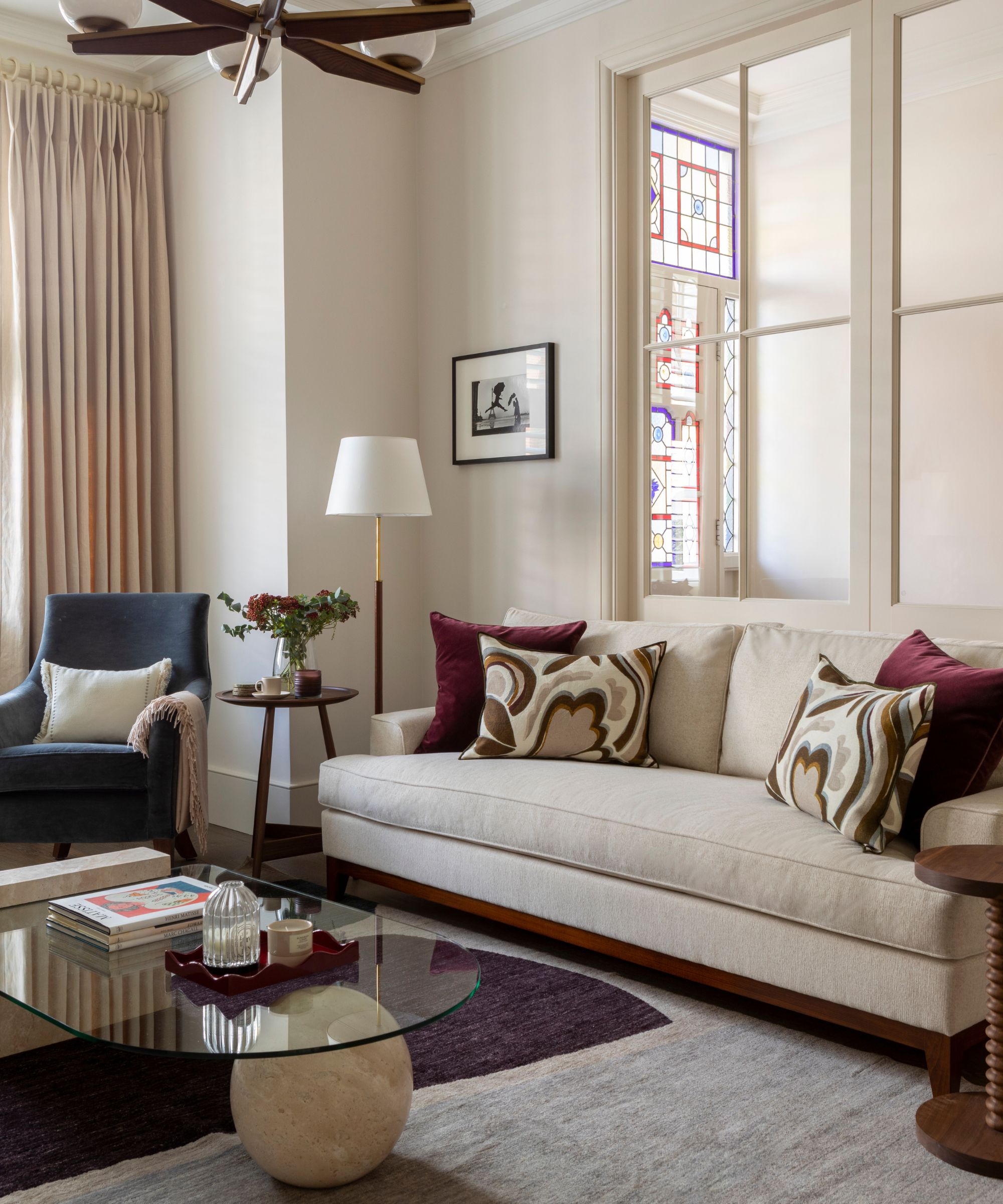
The design team wanted to honor the traditional Victorian features of the property, such as the ornate cornicing, while also introducing contemporary elements and maintaining a design that was practical for a family home.
Living room ideas take into account the owners' preferred aesthetic, a light and neutral overall palette with accents of rich burgundy, teal, and navy. 'We wanted to introduce personality to the house and make it feel like a home suitable for the whole family,' explains designer Clara Ewart. 'We chose a pared back scheme that felt sophisticated and versatile, and would remain appealing and adaptable for a growing family throughout the coming years.'
The Huaras rug from Christopher Farr was specified early on in the design process, providing a fantastic starting point and inspiration for the scheme. 'We chose a mix of dark woods and pale accents that complement the soft neutrals and deep accents of the rug,' adds Ewart. The dark wood Clyde Side Table is from Pinch. Boule Tavertine Coffee Table by Sazy.
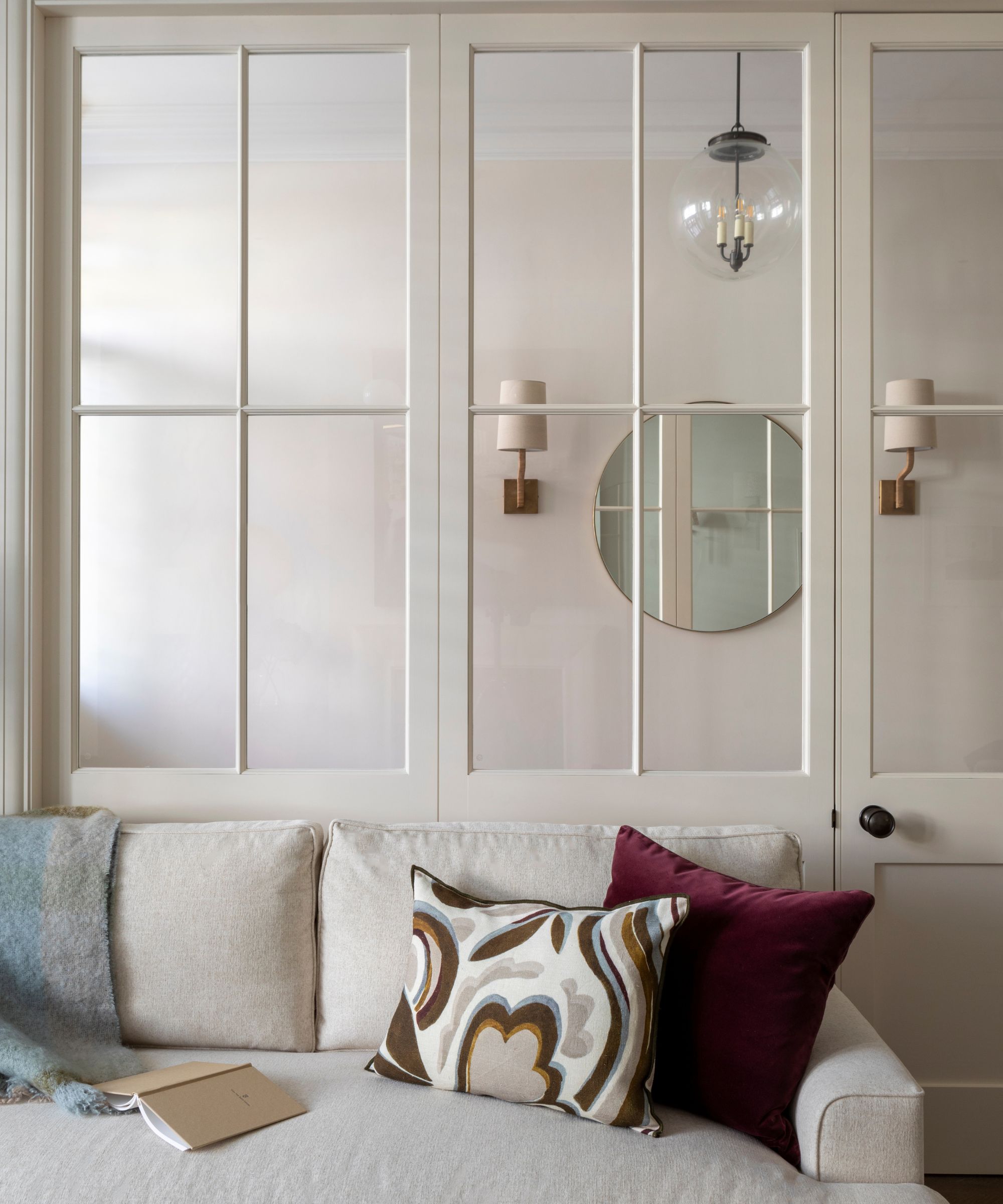
The glazed panel doors between the hall and living room were one of Kitesgrove's most innovative hallway ideas, and one of the firm's favorite design elements focusing on the interior architecture, says designer Clara Ewart. 'We loved how much the natural light this added to both spaces.'
'We increased the width of the original double doors between the entrance hall and reception room, and introduced glazed paneling with traditional detailing that enhanced the space’s Victorian identity,' adds Ewart.

Head of design at London studio Kitesgrove, Clara Ewart oversaw the redesign of this Victorian home. The chosen palette of neutral colors, with accents of teal and burgundy, combines with a mix of natural materials to add warmth and texture to the space. Clara brings her understanding of the architectural complexities of a project to every brief and is equally confident designing the interior architecture and flow of a building as she is selecting an artwork or perfect fabric for a client.
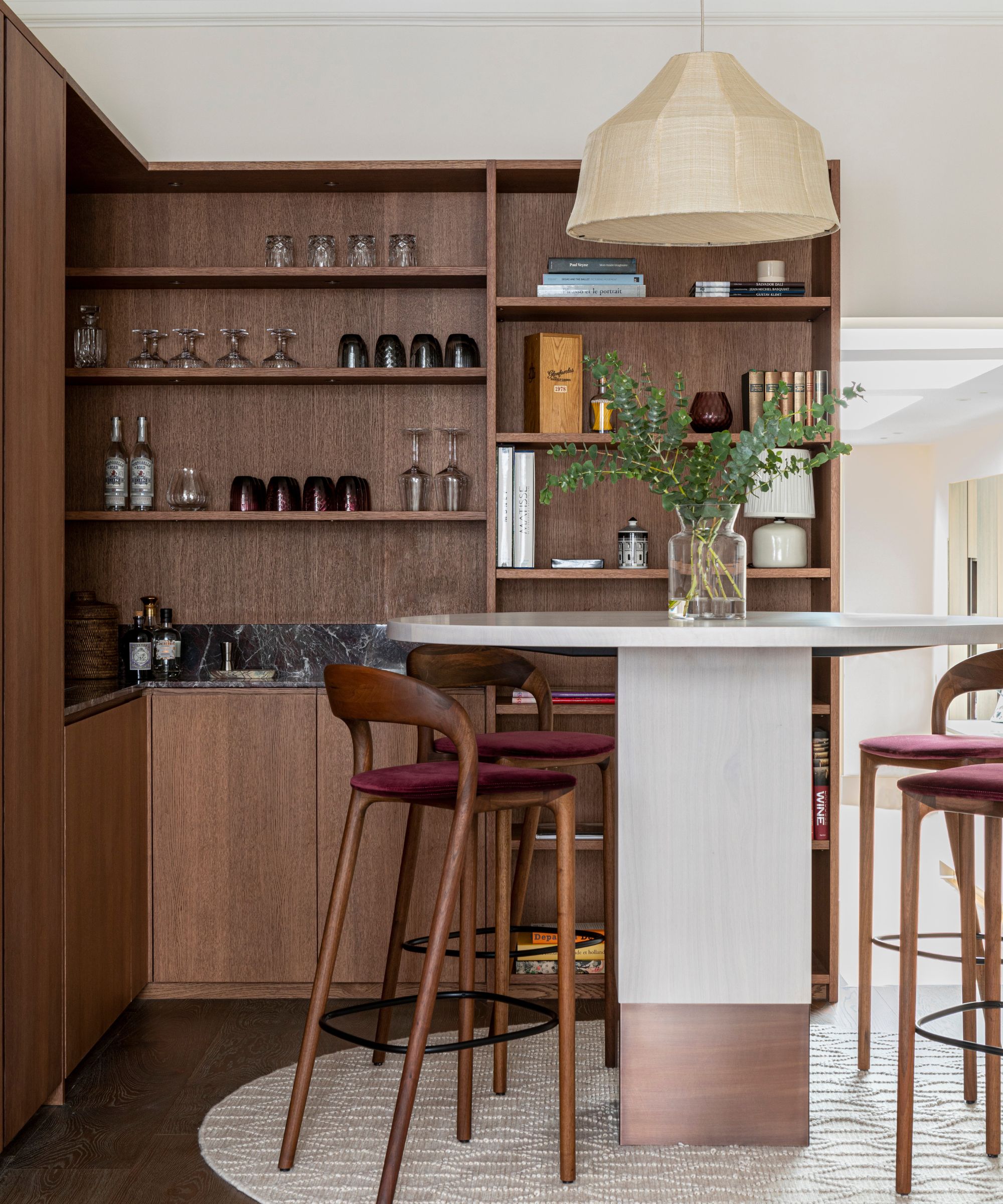
The bar area was the design team's favourite room overall, with beautiful but very practical walnut joinery, generous storage for coats and shoes, as well as glassware, open shelving and space for hidden fridge drawers from Fisher & Paykel.
'The Nota Bene bar table from Van Rossum, Neva Light bar stools from Nina’s House and Soren hanging light from Pinch create a beautiful area to enjoy a cocktail, while quietly echoing the scheme of the adjacent reception room,' says designer Clara Ewart.
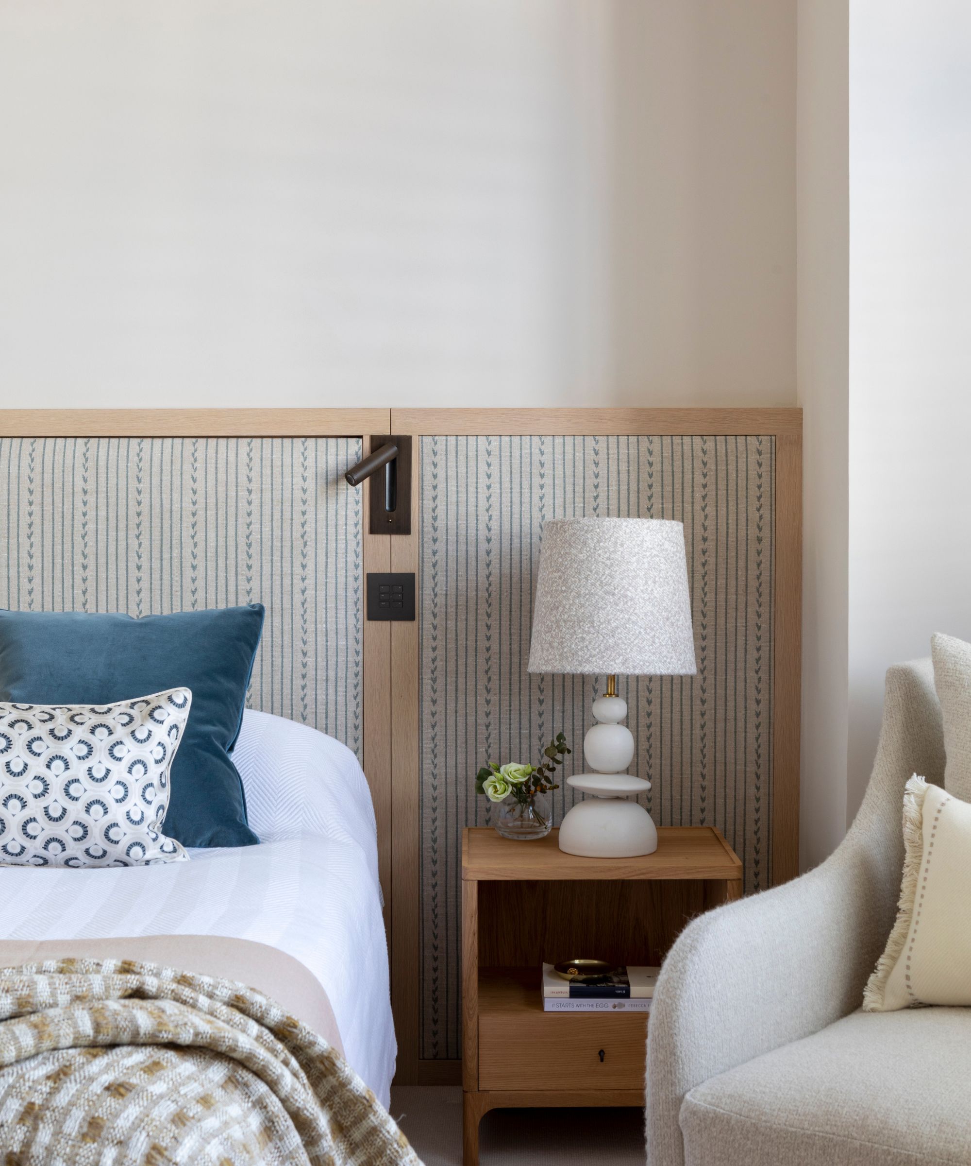
'The main bedroom follows the same pared-back palette used elsewhere, introducing a sense of calm and continuity, with elements of light oak and soft neutrals used to create a relaxing space,' says Clara Ewart. Bedroom ideas here include key design elements such as the headboard, upholstered in fabric from McLaurin & Piercy, that extends across the back wall to create a sophisticated focal point. 'The armchair by Giovanna Ticciati, has a beautiful, contemporary shape with a light silhouette that perfectly suits a bedroom scheme,' adds Ewart.
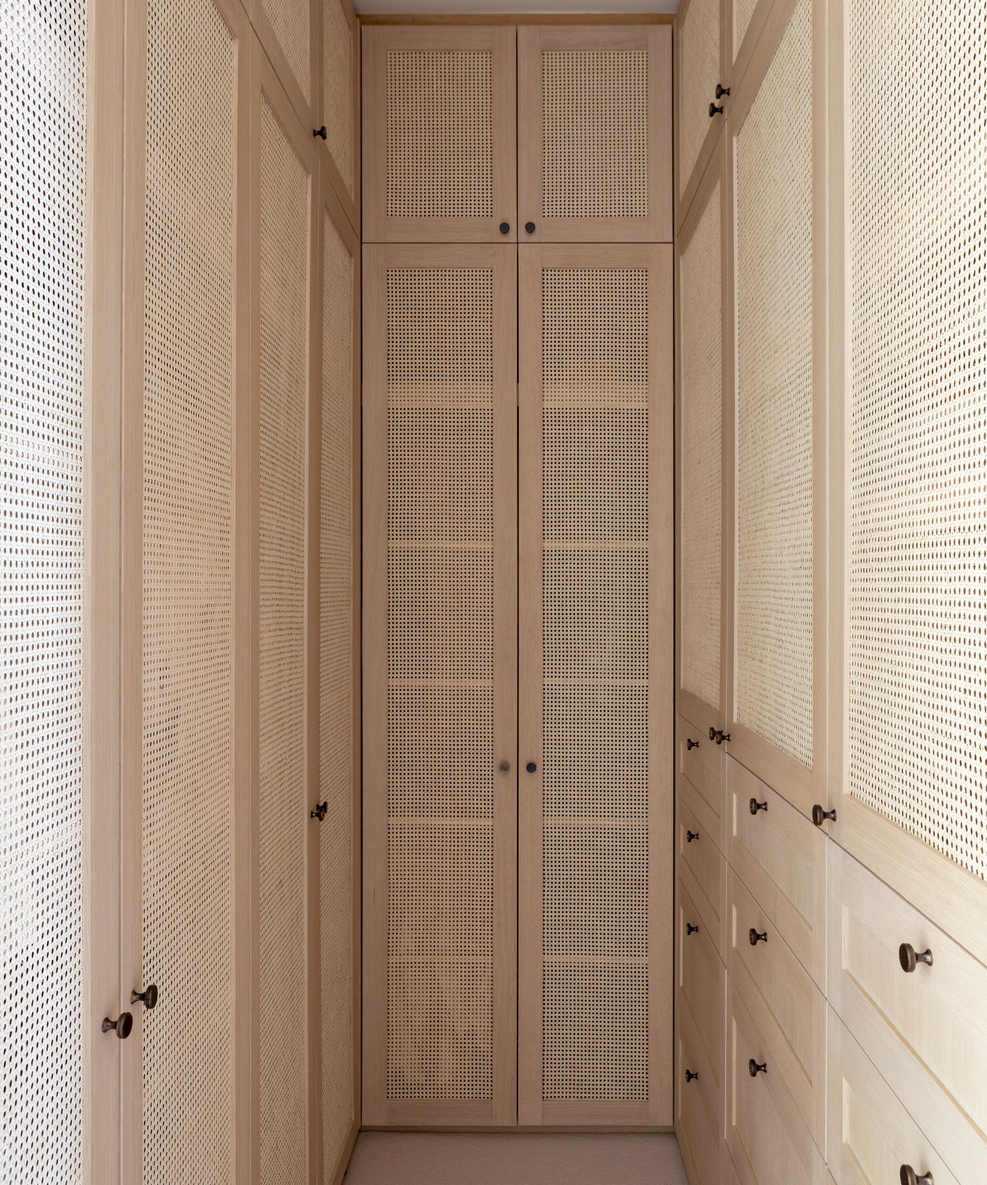
Anyone who's looking for walk-in closet ideas, can't fail to be impressed by this super-organized space.
'It's understated and functional, featuring floor to ceiling wardrobes, drawers and cupboards in a light oak with inset cane panels which brighten up the compact, but well considered space. As with all our work, we prioritise natural materials and the cane helps to create a timeless, sophisticated overall aesthetic,' says Kitesgrove's head of design Clara Ewart, explaining the thinking behind the design choices here.
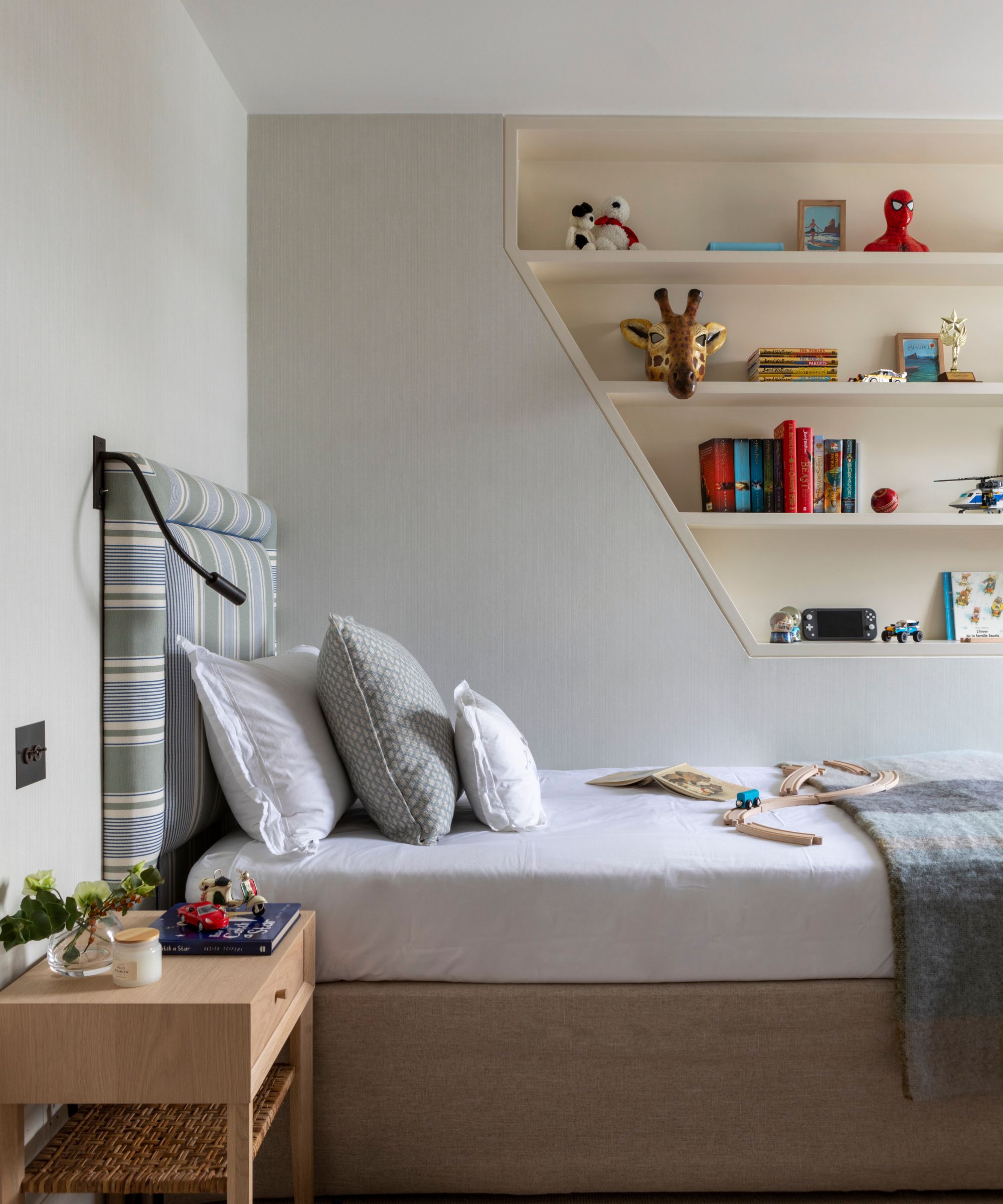
Kids' room ideas were just as important as the grown-up spaces in this family home. Design solutions include fitted bespoke alcove shelving to incorporate additional storage without taking up valuable floor space. 'Alcove shelving is also an easy way to introduce hints of contrast through colour and depth,' says Clara Ewart, 'and here is used to display books, toys and artwork that can be updated and changed over time.'
A George Spencer Designs Strie wallpaper provides a stylish contrast to the painted shelving.
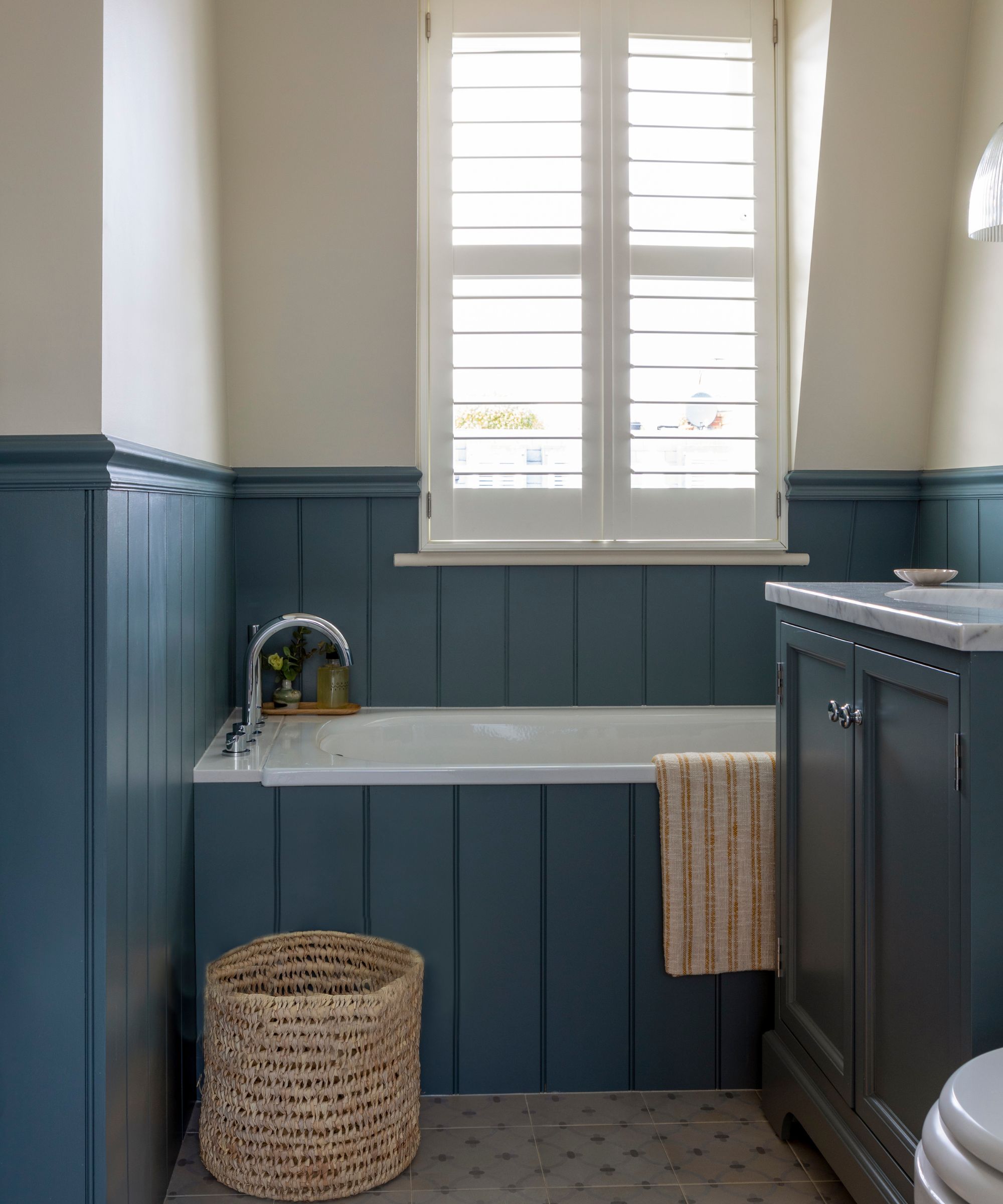
Bathroom ideas in the family bathroom include wooden paneling in Farrow & Ball De Nimes to introduce color and a classic warmth without overwhelming the space. The shade contrasts with the light neutral paint used on the walls and ceiling to make the room feel bright and airy. Patterned floor tiles from Solus Ceramics balance the scheme and add a decorative touch to the space.
Looking back on the project as a whole, Kitesgrove's head of design, Clara Ewart says: 'We’re very pleased with the finished result and feel we succeeded in creating a space that felt refined while also fulfilling its ultimate purpose of a family home.'
Sign up to the Homes & Gardens newsletter
Design expertise in your inbox – from inspiring decorating ideas and beautiful celebrity homes to practical gardening advice and shopping round-ups.
Karen sources beautiful homes to feature on the Homes & Gardens website. She loves visiting historic houses in particular and working with photographers to capture all shapes and sizes of properties. Karen began her career as a sub-editor at Hi-Fi News and Record Review magazine. Her move to women’s magazines came soon after, in the shape of Living magazine, which covered cookery, fashion, beauty, homes and gardening. From Living Karen moved to Ideal Home magazine, where as deputy chief sub, then chief sub, she started to really take an interest in properties, architecture, interior design and gardening.
-
 Kevin Bacon and Kyra Sedgwick's rustic kitchen island is stunning, but controversial – designers say you can get the look without the hassle
A popular material finds an unorthodox home in the couple's kitchen, but experts disagree on whether it should be used – here's how to do it instead
By Sophie Edwards
-
 How to grow grapefruit for homegrown sweet and tangy, highly nutritious harvests – a fruit tree expert shares their planting and care tips
From planting to harvesting, this is all you need to know about grapefruit trees
By Drew Swainston