This London townhouse's soft and serene Japandi interior belies its busy location
De Rosee Sa has transformed this period home into a design triumph with a remodeled layout, a statement staircase and a pared back Japandi interior
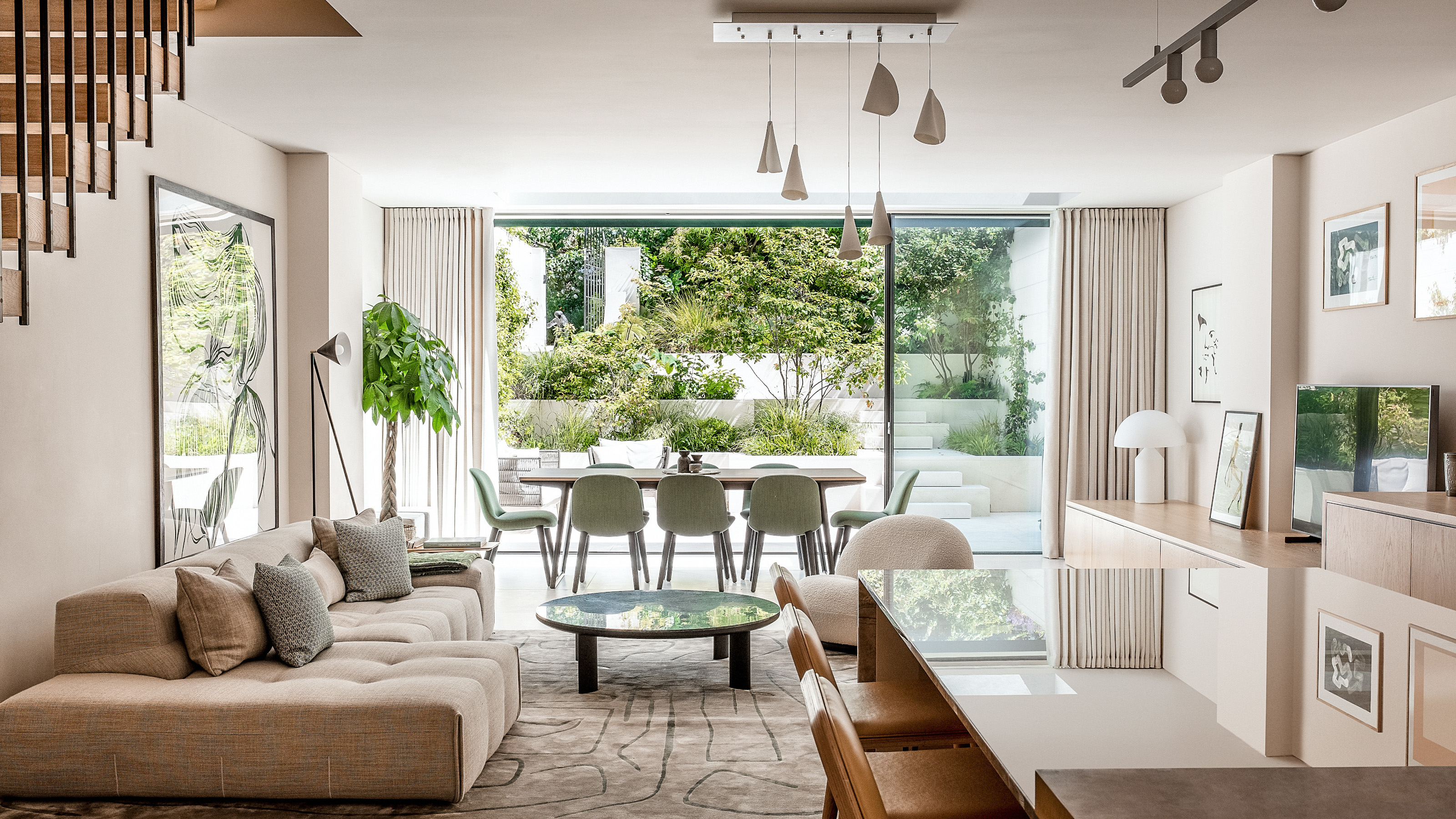

East meets west in this magnificent Japandi style, five storey Notting Hill townhouse, which has been transformed into one of the world's best homes thanks to a cleverly remodeled open plan layout by architect and interior design company De Rosee Sa.
Built in the Victorian era, the terraced house originally had an impractical layout and was a rabbit warren of small sized rooms. A modern London townhouse vibe has brought it into the 21st century, and integral to this are the new large entertaining spaces where the owners can gather with family and friends.
Interconnecting spaces, rather than rooms off corridors, has resulted in a sense of flow throughout, while zoning of areas means each space serves a purpose. In addition, joinery was used to enhance the architectural language and maximise the feeling of space.
Key to the calm and serene aesthetic is the Japandi style interior that focuses on a neutral yet warm color palette, and includes natural materials and textures. Spaces were designed to be minimalist but not clinical, with pared back design details, clean lines and a focus on craft and the honesty of natural materials. A minimal palette of materials avoids the project feeling fussy or overworked – Caliza Capri limestone was used on the lower ground floor, landscaping, raised ground floor fireplace and a family bathroom, for instance, while the same oak timber was used on the floor, kitchen, joinery and staircase.
Kitchen
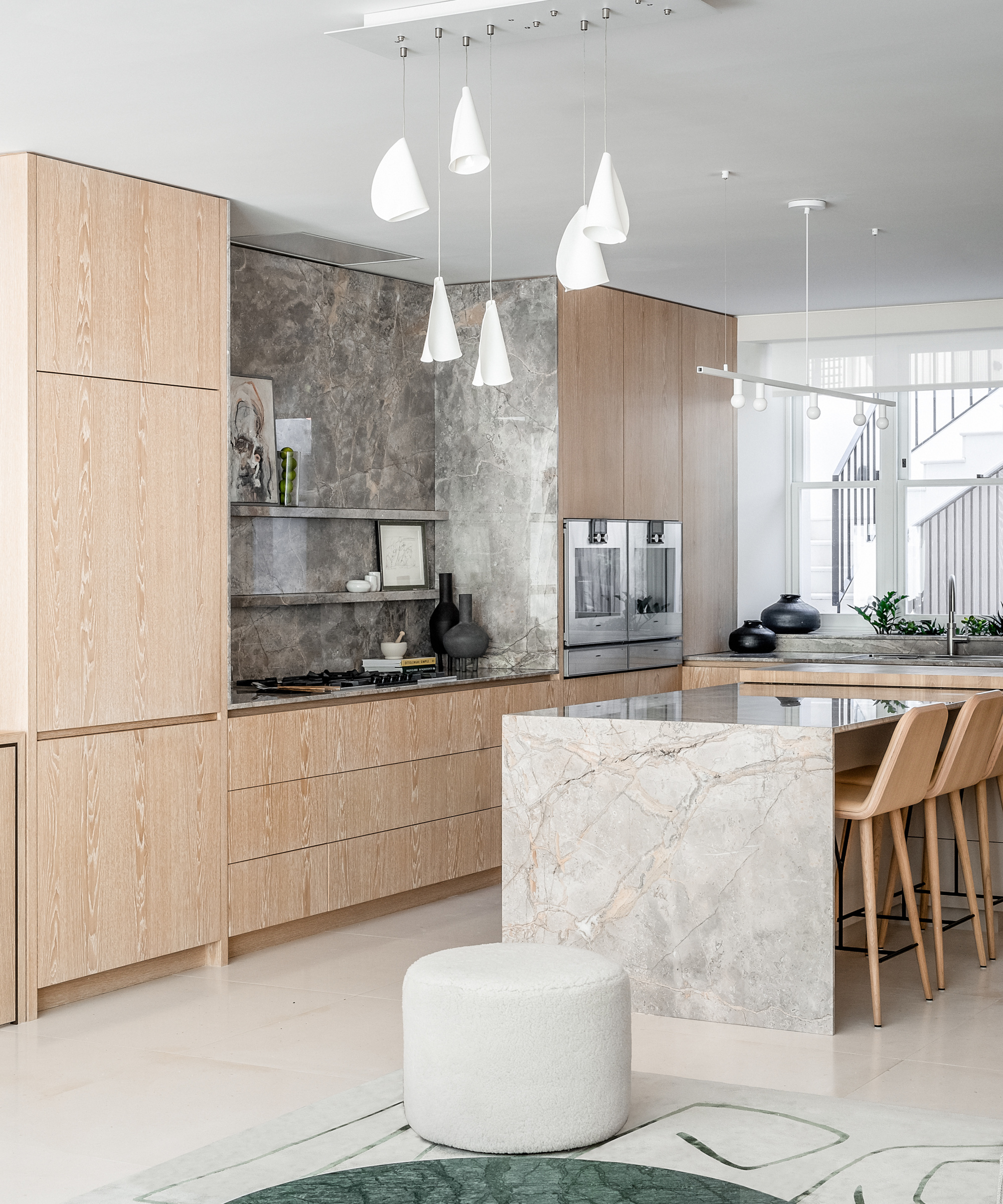
The kitchen is located at the front of the house and a widened window, complete with an integrated herb planter built into the sill, helps drench the space with natural light.
Kitchen ideas to provide a clean aesthetic include handleless streamlined oak cabinets. They are teamed with Tundra Gray marble on the island and backsplash, and natural stone flooring is used to keep the look light and complement the light oak joinery.
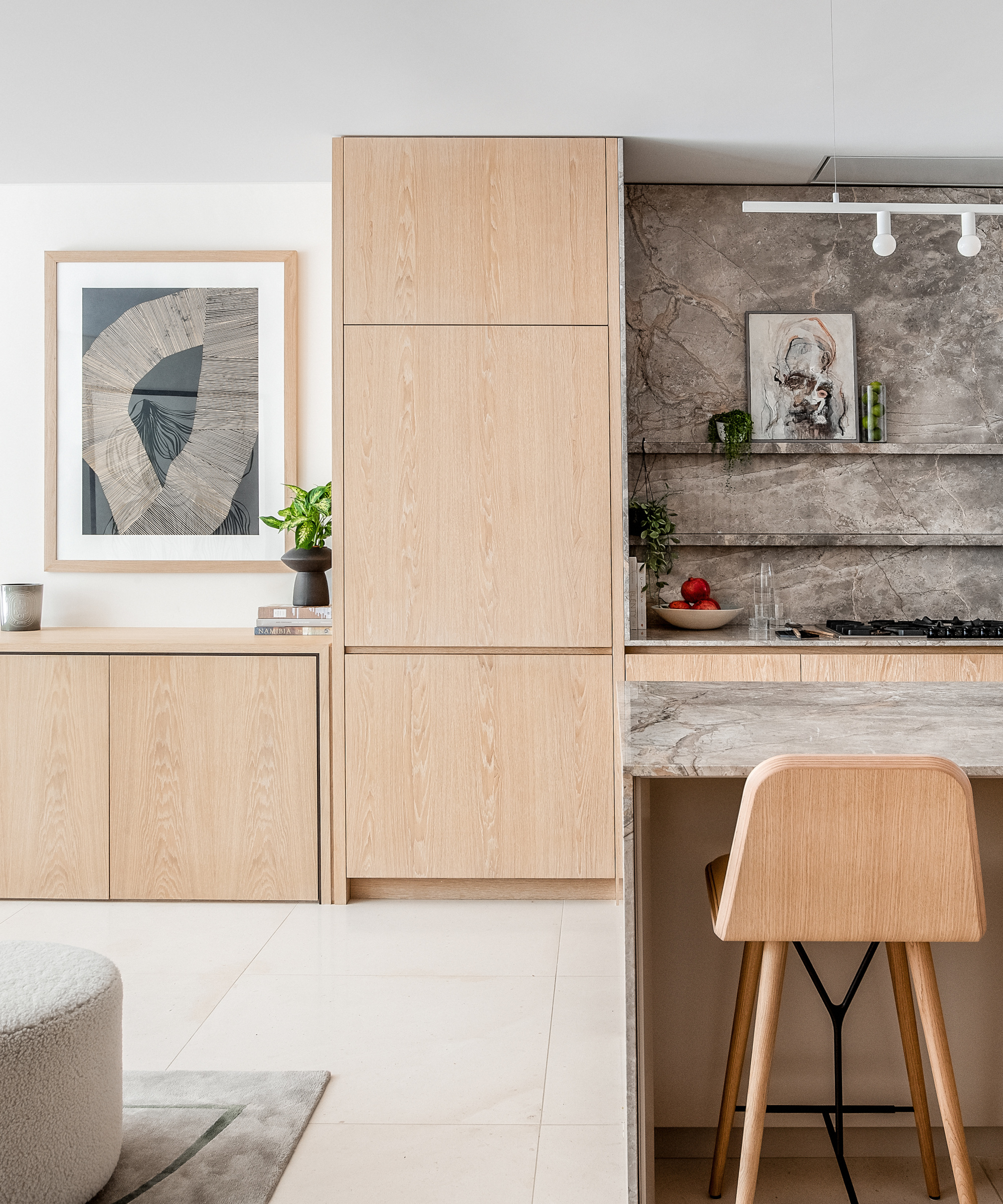
The island provides an informal seating area in the kitchen, with the oak chairs picking up on the cabinets. Shelves animate the full height marble splashback, which adds a powerful backdrop and focal point to the space.
Living/dining area
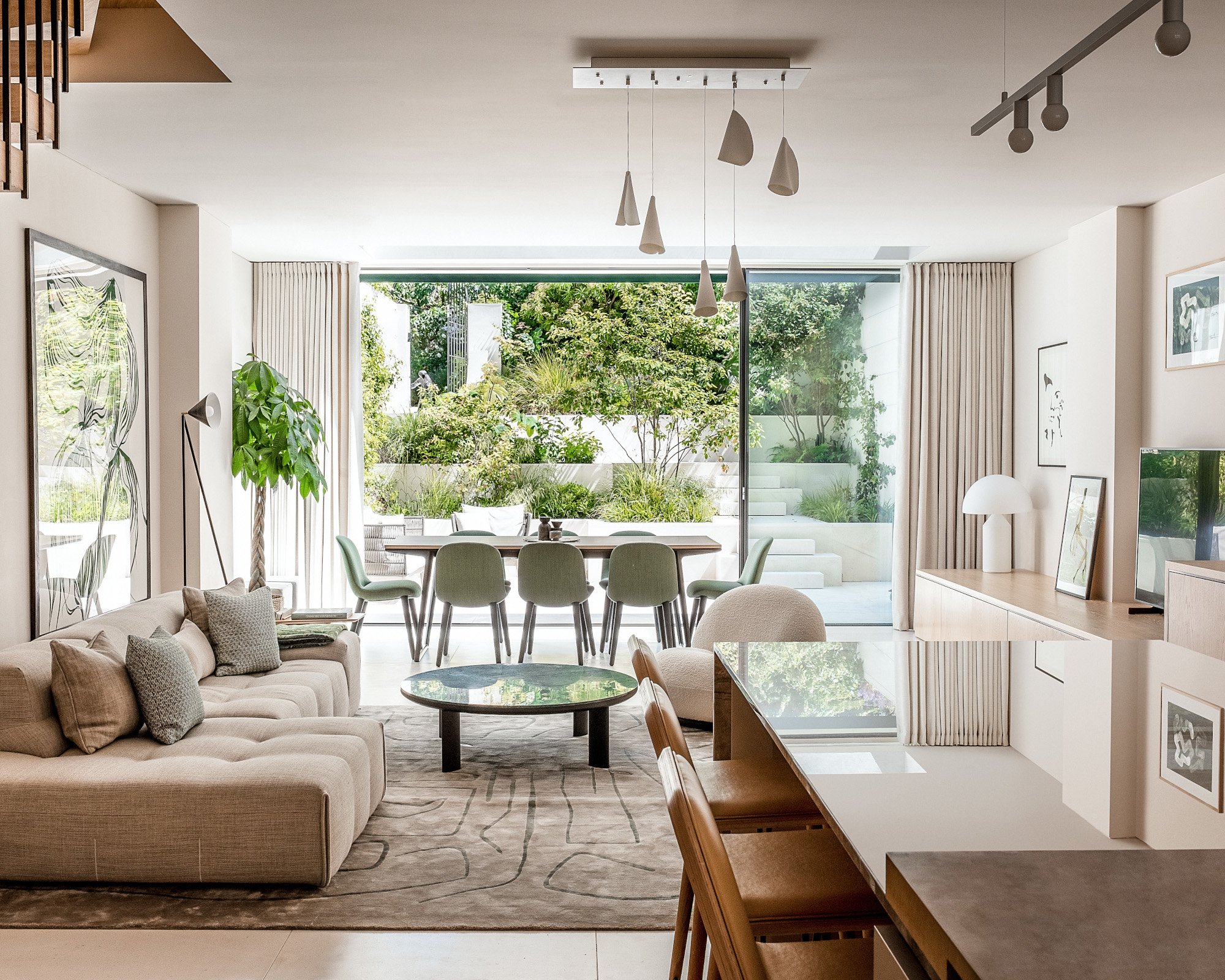
The open plan ground floor living space connects to the garden, creating a flow and easy accessibility from the indoor to the outdoor space. The lower ground floor’s floor level was lowered and it transformed the space, and improved the natural daylight and connection to the outside and nature of the garden. 'You maintain a view of the sky and greenery further back in the plan than you would otherwise,' says George Yallop, Project Architect.
Zoned areas across the lower ground floor create different spaces for the family at different times of the day. Triple sliding glazed doors move to either side of the space and open up the interior to the garden, flooding the space with natural light. Established planting creates a green blanket from terrace level up to the communal garden, immersing the house into the natural surroundings.
Dining room ideas include positioning the dining table and chairs to take advantage of the seamless transition from house to garden, creating an entertaining space that doubles up as a semi-outdoor space with the sliding doors open.
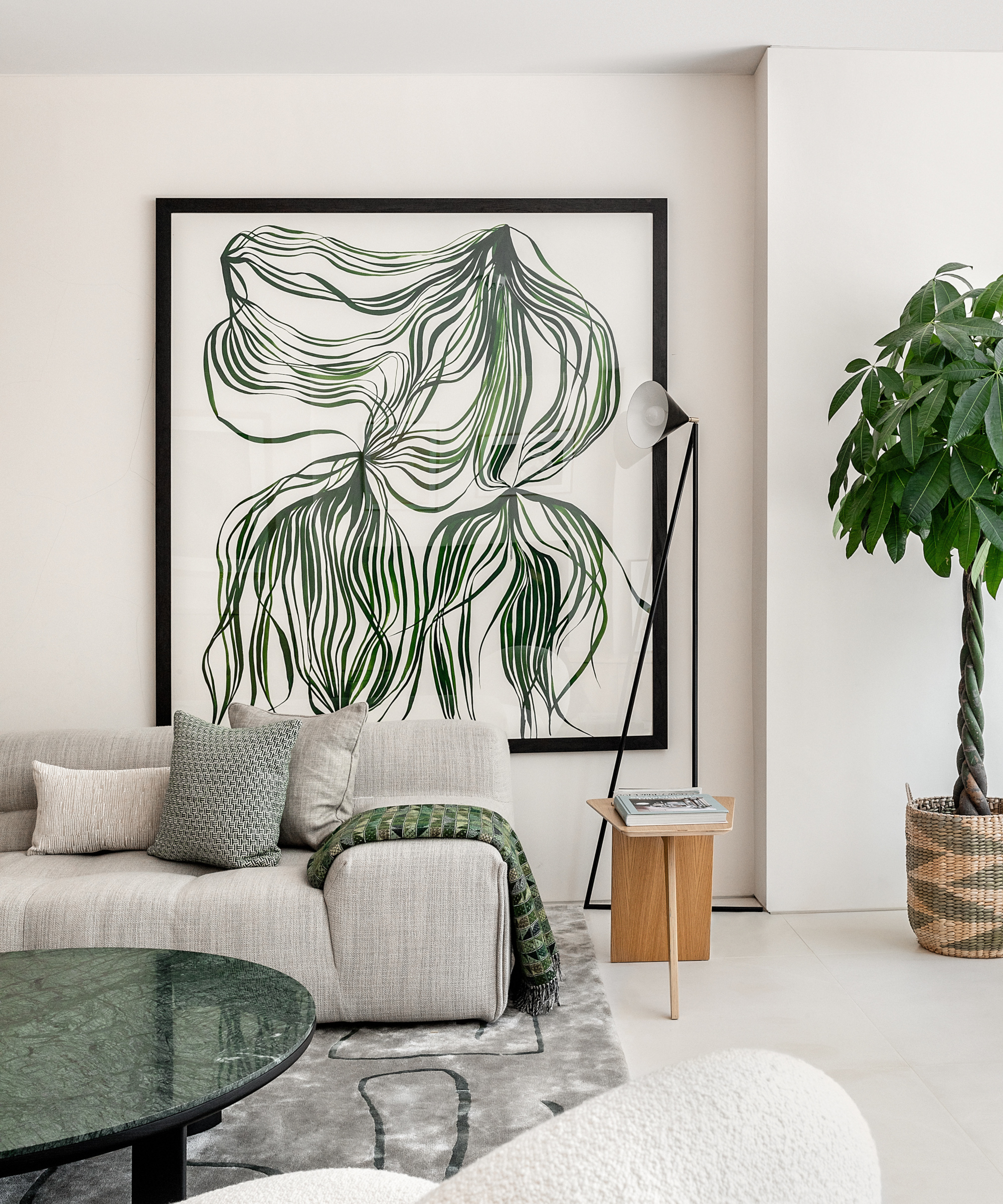
Integrating green accents through artwork, a green marble coffee table, soft furnishings and plants were among the living room ideas. 'They add a natural feel to the spaces and reflect the garden,' says George.
Staircase
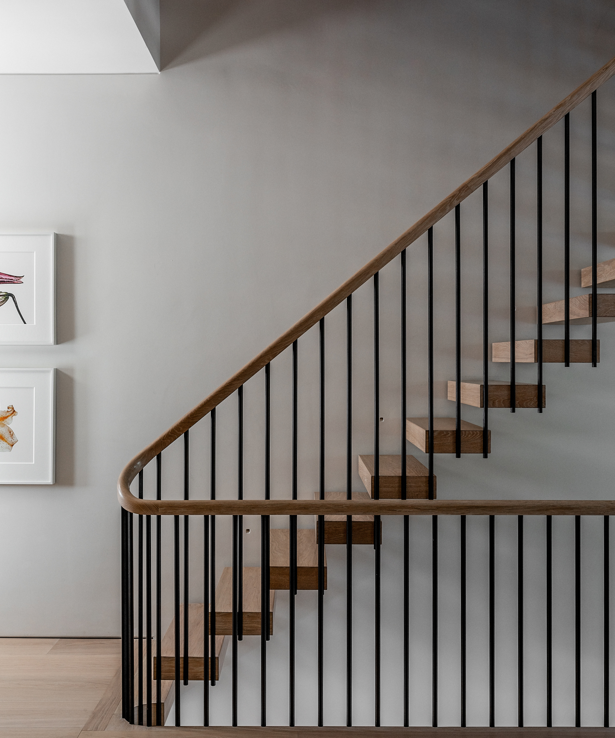
'The staircase is an incredibly special feature of the project as it’s hugely impactful on the open nature of the house – the first thing you see as you come into the raised ground floor,' says George. Running the height of the property, the staircase creates an openness between levels. The design of the floating treads are elevated by the extended and inset hexagonal balusters and ‘draped’ handrail, which run the height of the building. The floor, handrail and steps use the same timber, reflected elsewhere in the project, creating a sense of calm and refinement.
Main bedroom
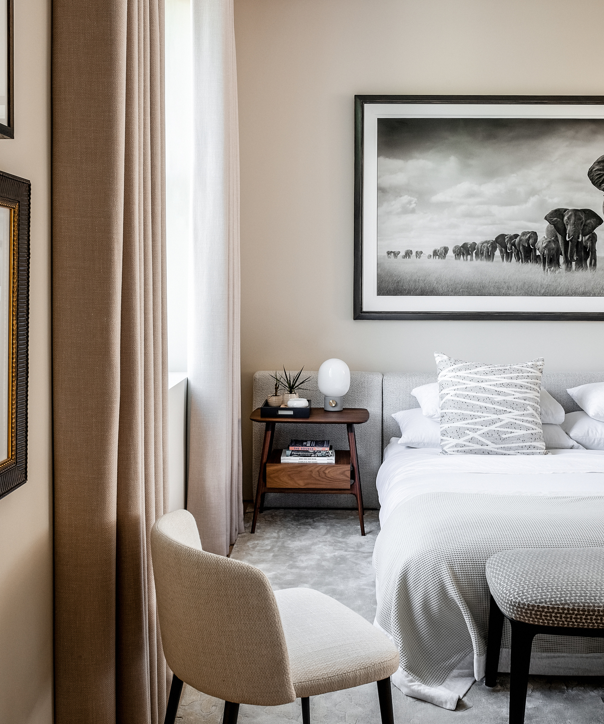
'The main suite, accommodating the entire first floor, feels special - a generous, calm oasis,' says George. 'Positioning the bed space at the rear of the property, it benefits from views over the garden and communal garden, taking you away from London’s busyness, and transports you to this English garden square.' Large windows make the most of the incredible garden views.
Bedroom ideas for creating a calm space include incorporating subtle wall color, which provides a backdrop for the client's art and photography collection, and neutral furnishings. The furniture and fittings nod to Japandi style, with elegant, timeless pieces.
Ensuite
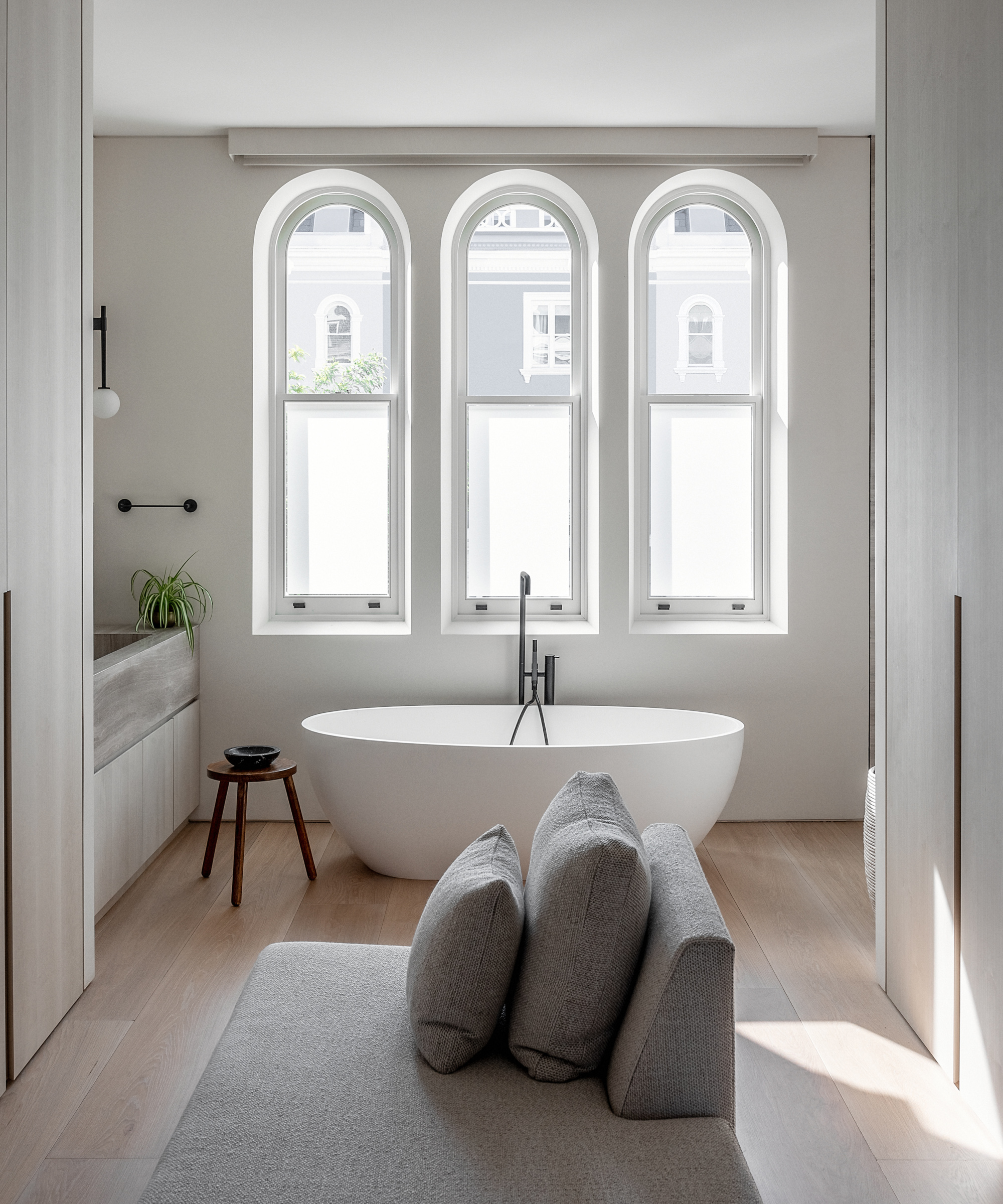
The main suite was designed as a series of flowing spaces: bedroom, dressing area and ensuite. The arched windows in the ensuite sit opposite the rear bedroom window, forming a double aspect space flooded with light.
A focal point freestanding tub beneath the arched windows was one of the bathroom ideas. Subtle tone changes between materials add character and interest.
Kid's bedroom
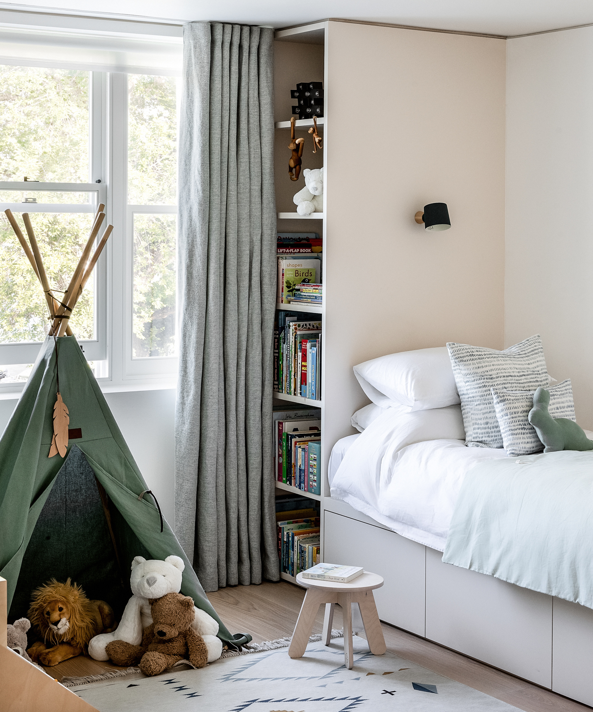
A full wall of joinery with integrated bed space creates a fun space for the client's child, with niches at the end of the bed for toys and books to animate the space.
Top floor living room
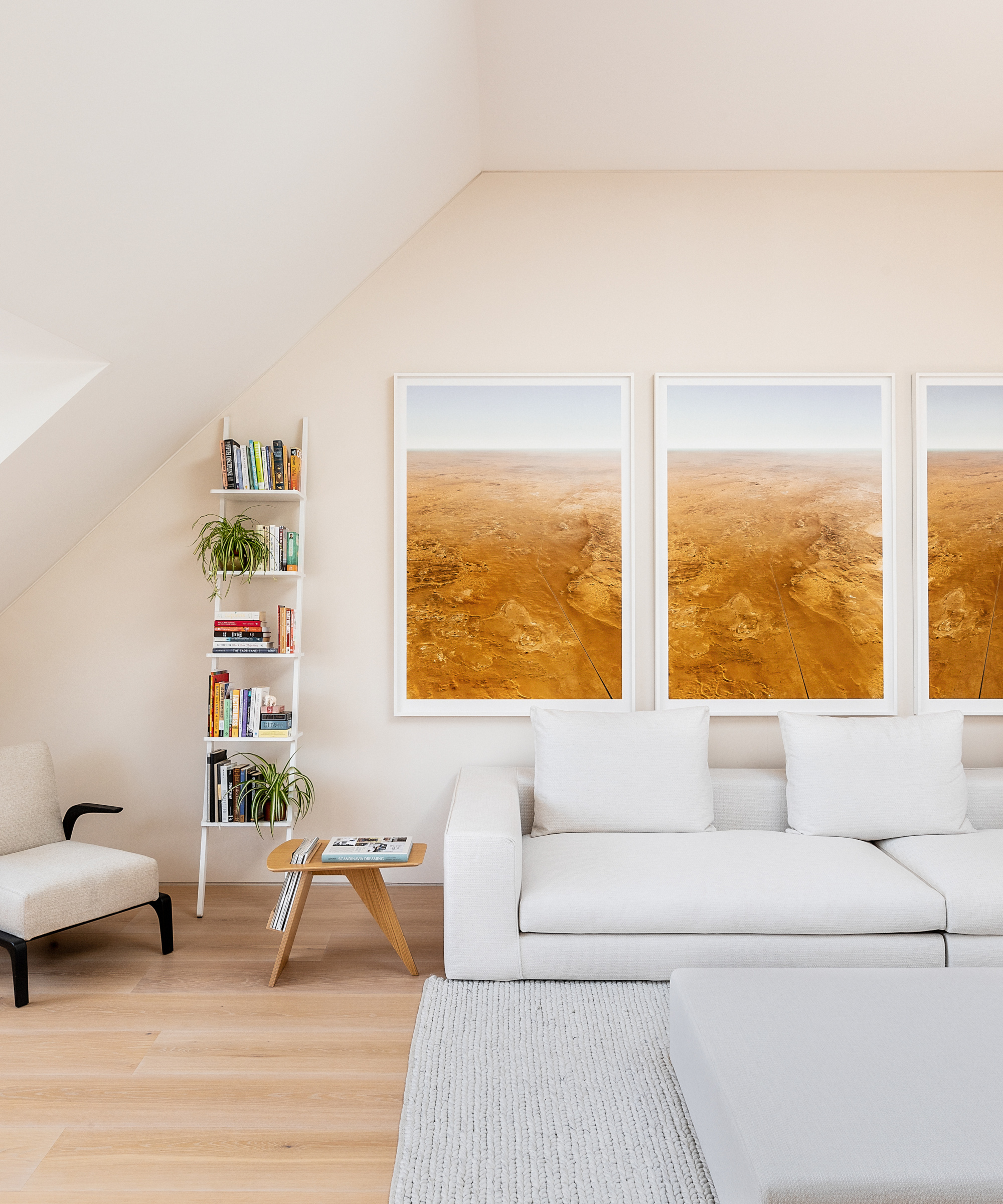
The top floor living space is flooded with natural light through the two wide dormers and oversized rooflight above. The client’s artwork complements the architectural aesthetic, subtly lifting the space and adding character.
Garden
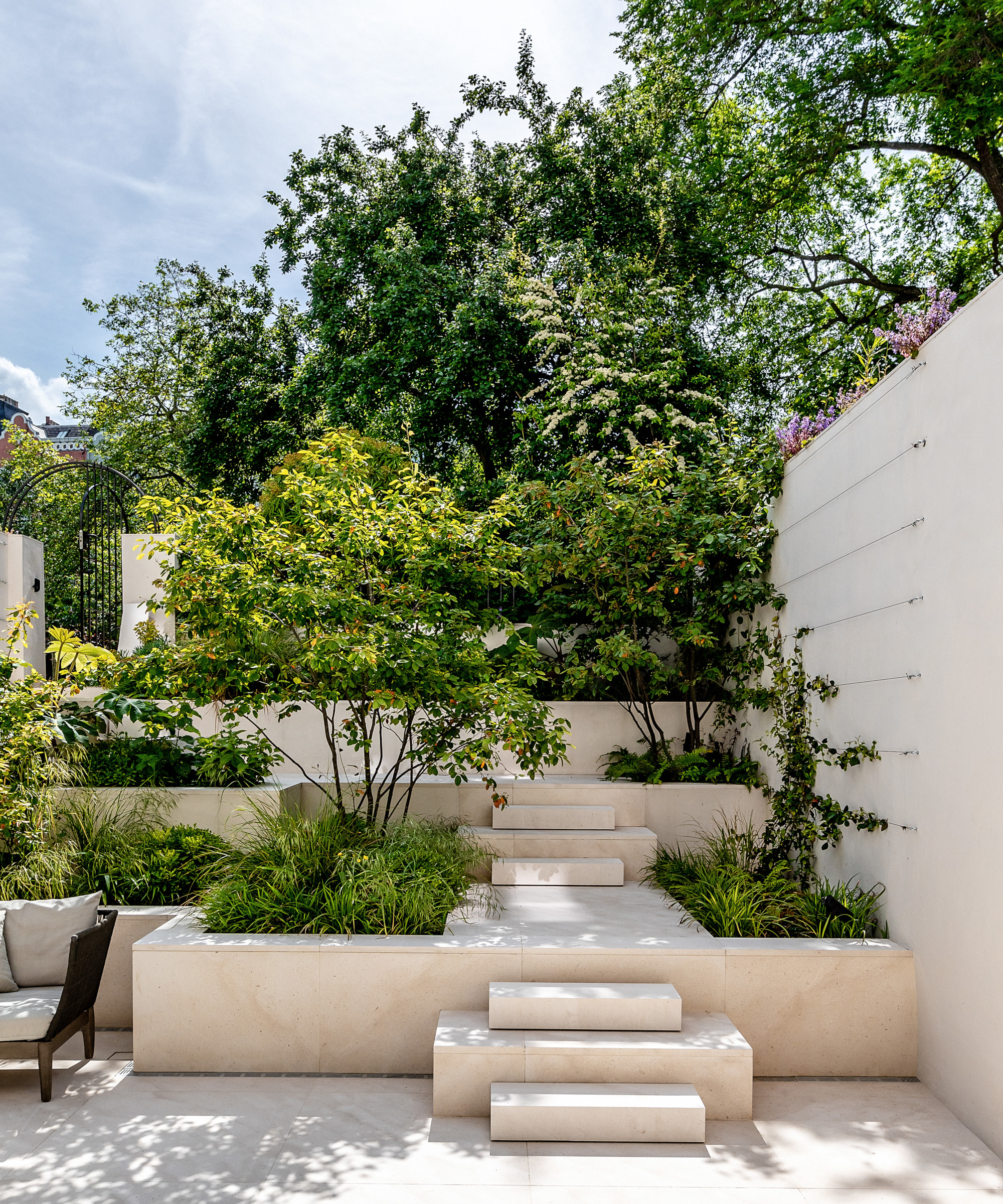
'The design of the outside space was an important element in the overall design. The goal was to create a successful greened up zone that the client could retreat to, that still felt part of the interior space. Access to the communal garden elevated the importance of the garden space,' says George.
The use of tiering creates a flow of green space away from the house, up to the mature planting of the communal garden beyond, encouraging use of the space for entertaining. Beds of planting combine with climbers that green up the side walls to create a true oasis away from the city.
Architecture/ De Rosee Sa
Interior design/ De Rosee Sa in collaboration with Alix Lawson
Photographs Taran Wilkhu
Sign up to the Homes & Gardens newsletter
Design expertise in your inbox – from inspiring decorating ideas and beautiful celebrity homes to practical gardening advice and shopping round-ups.

Interiors have always been Vivienne's passion – from bold and bright to Scandi white. After studying at Leeds University, she worked at the Financial Times, before moving to Radio Times. She did an interior design course and then worked for Homes & Gardens, Country Living and House Beautiful. Vivienne’s always enjoyed reader homes and loves to spot a house she knows is perfect for a magazine (she has even knocked on the doors of houses with curb appeal!), so she became a houses editor, commissioning reader homes, writing features and styling and art directing photo shoots. She worked on Country Homes & Interiors for 15 years, before returning to Homes & Gardens as houses editor four years ago.
-
 These 5 plant species will help to attract and nurture an underrated nighttime pollinator that's crucial to every yard
Discover the best plants for attracting moths to your yard
By Ciéra Cree
-
 I have been looking for a versatile backyard furniture color that will look just as good in summer 2026 – Stanley Tucci proposes gray
Stanley's gray and wood patio furniture is modern yet natural, making it a timeless color choice for backyard color palettes
By Hannah Ziegler