This London townhouse is a masterclass in decorating with restful pastels
The owners of this home stepped out of their comfort zone and embraced an adventurous scheme that oozes calm and wellness
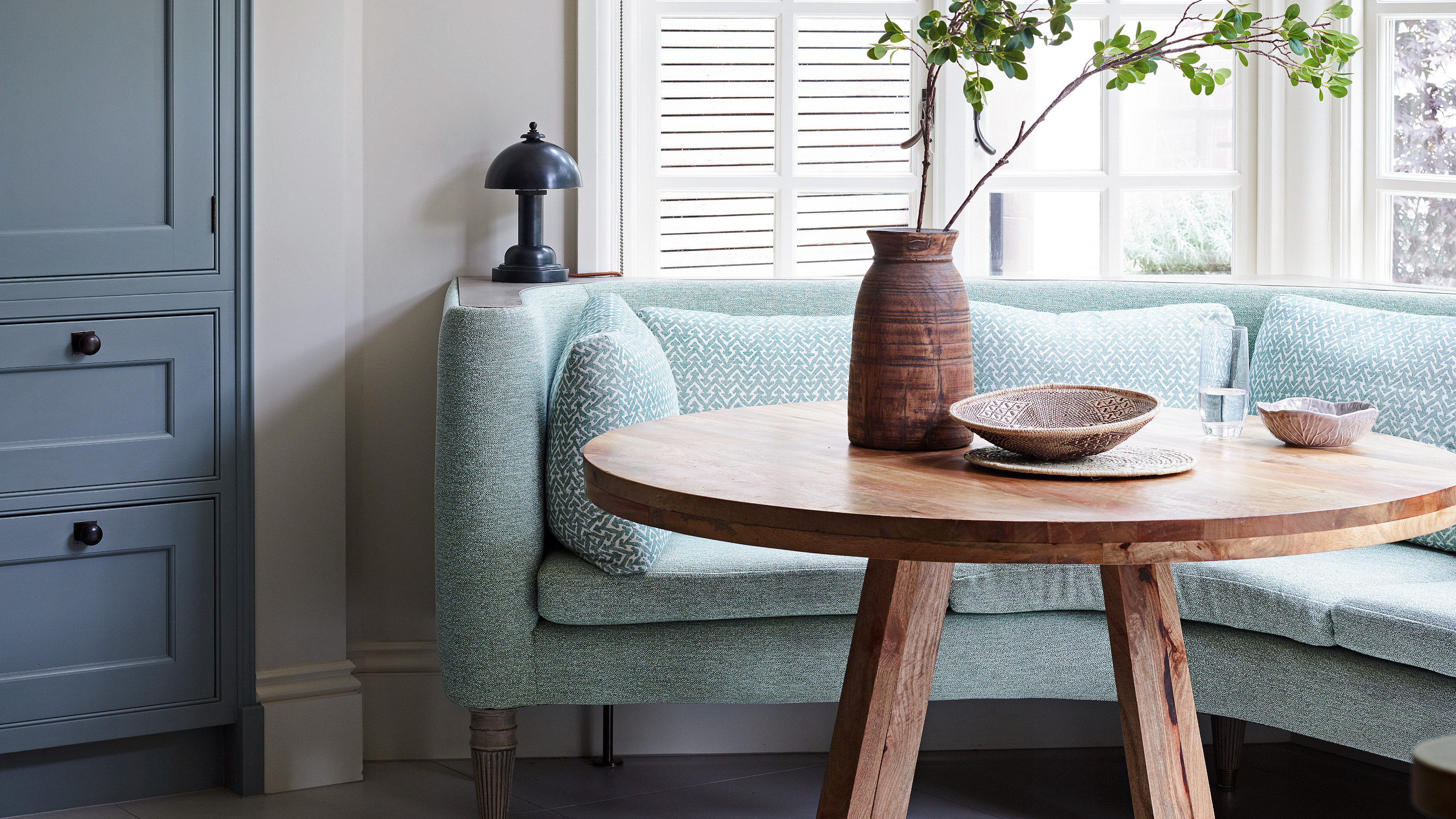

Sometimes a new chapter in the life of a period property happens organically, as the needs of its inhabitants change over time; on other occasions, a renewed decorative confidence prompts a definitive step change.
In the case of Amalie and Charles White, the latter is true. The couple, who have two young boys, decided to shake things up three years ago and move from their Hertfordshire home.
Craving a return to life in the capital, they found a large Edwardian home close to Hampstead Heath, London, location of many of the world's best homes, and undertook an imaginative renovation guided by Nicky Mudie of design firm Violet & George.
‘We probably played it safe before, with lots of easy-on-the-eye neutrals,’ says Amalie. ‘But this time, we were craving more colorful interiors that better reflected our personalities and our love of travel; we wanted schemes that were adventurous.’
The property the couple found required what they thought would be a few minor architectural tweaks and a decorative facelift. But when they discovered some unexpected structural issues, including rotting joists, they decided on a complete strip out.
Unusually for such a comprehensive renovation, they did not extend or significantly alter the original footprint. Instead, on the ground floor, the kitchen and rear sitting room swapped places, bifold doors were added for a better connection to the garden and corridor space was reworked to allow for a cloakroom, mud room and extensive storage.
Hallway
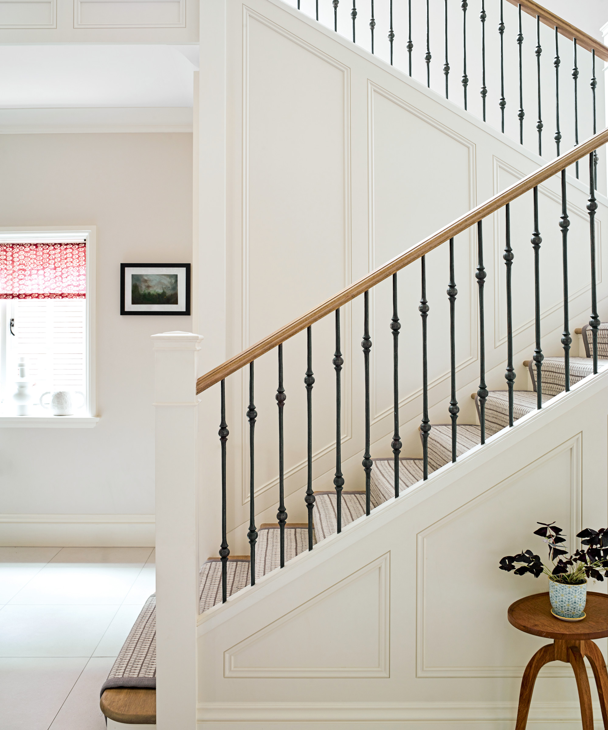
Hallway ideas centered on keeping the walls neutral so the beautiful banister would stand out.
Practical solutions in this family home include hidden understairs storage.
Living room
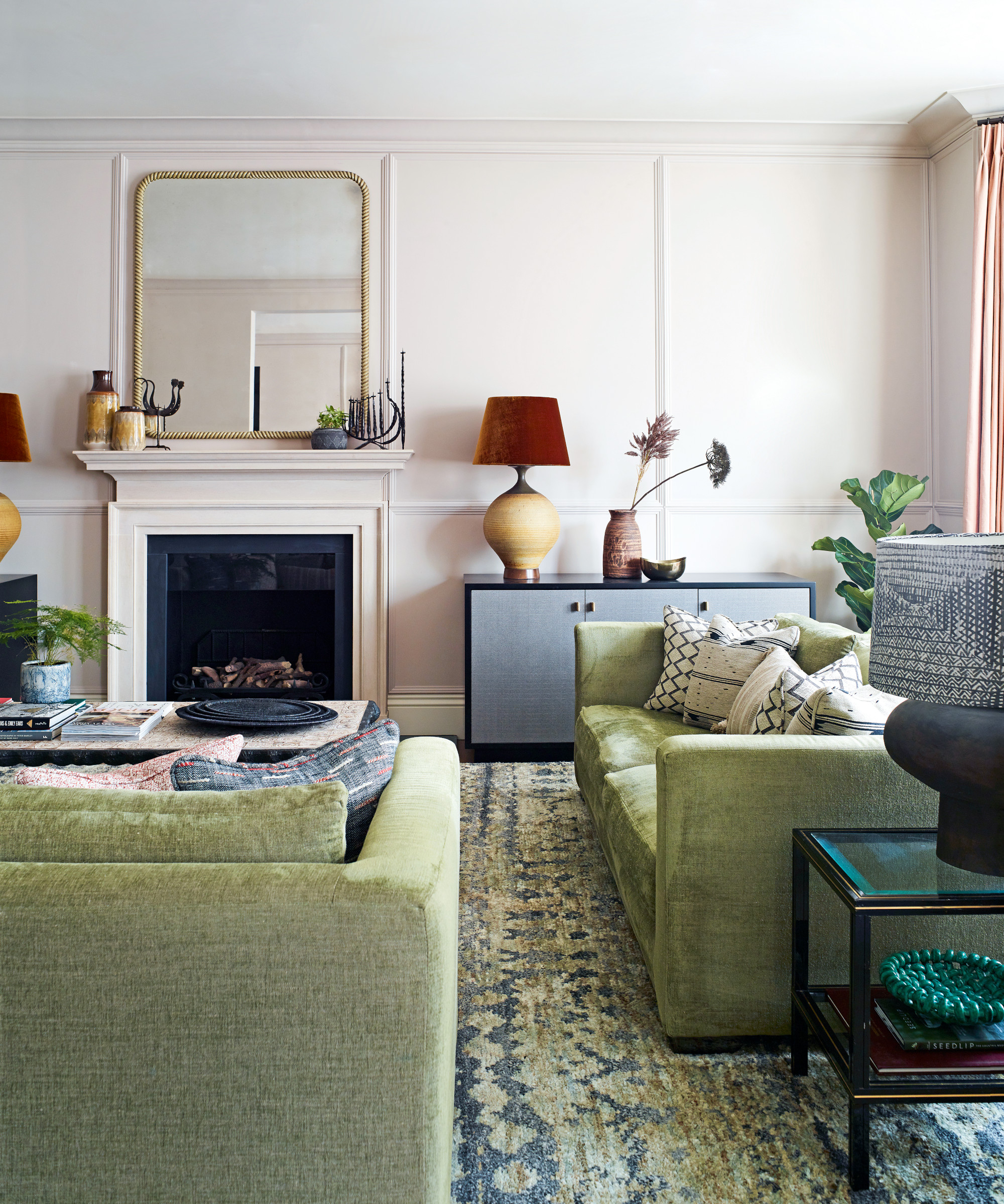
Among Nicky's living room ideas is the use of a palette of greens and blues, a recurring motif, seen in joinery finishes and soft furnishings. ‘They are prominent but not overpowering,’ says Amalie, ‘which makes them a brilliant alternative to traditional neutrals.’ Seen in the living room, along with flashes of red, they evoke a wonderful richness.
Soft pink paneling enhances the period feel.
Dining area
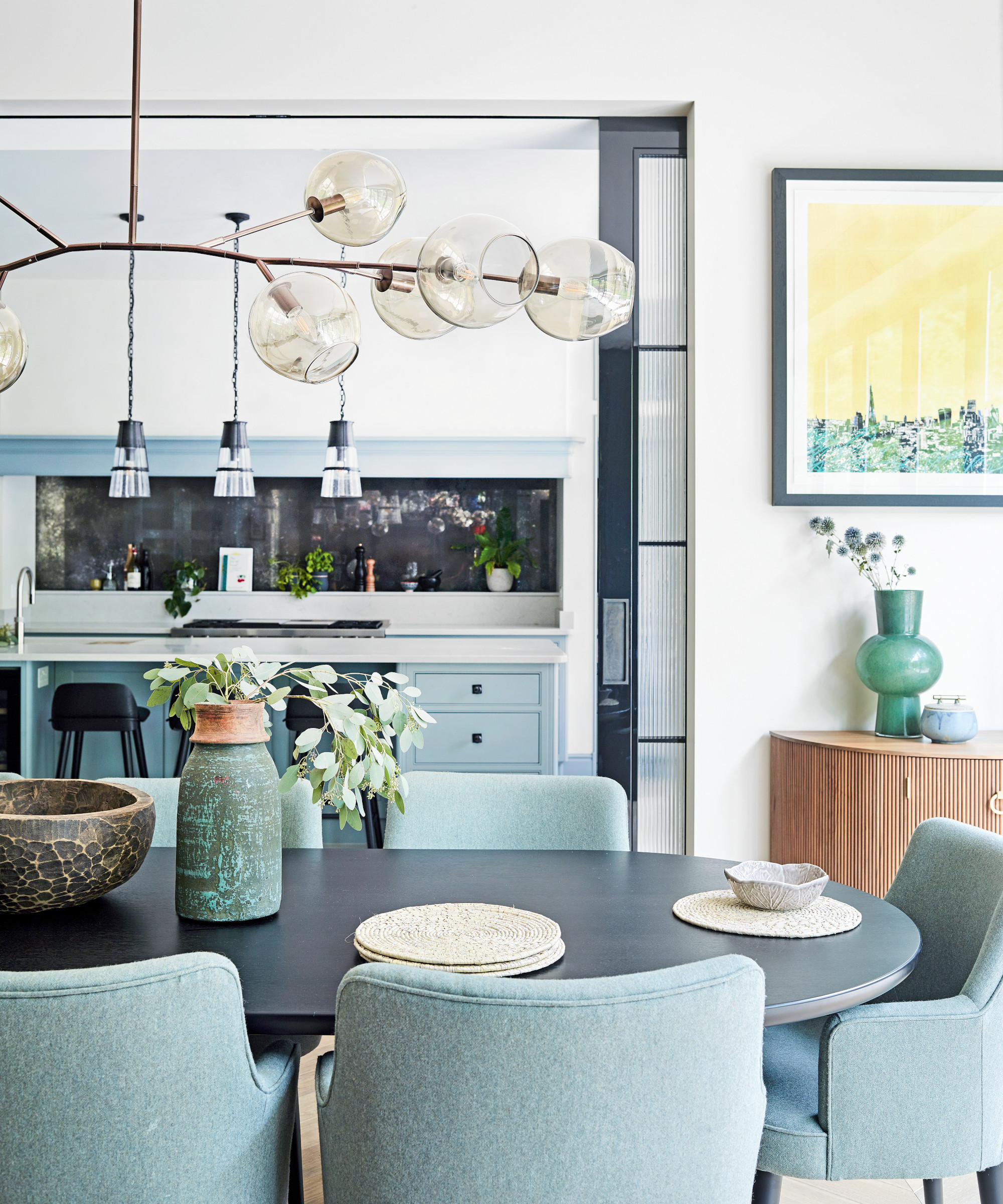
Taking into account zoning, dining room ideas include effective elements such as the metal-framed pocket doors dividing the dining room and the kitchen. (A free-standing divider helps to create a distinct informal living space just beyond.) The steel-framed pocket doors and a curved ebony table bring graphic elements to the space.
‘Though this is a hard-working family home, the idea was that it could be relaxed and playful too,’ says Nicky. ‘We echoed the country feel of Amalie and Charles’ previous home with a generous kitchen island (seen above), for example, but we switched up the schemes by using stronger colors and more graphic silhouettes.’
Kitchen
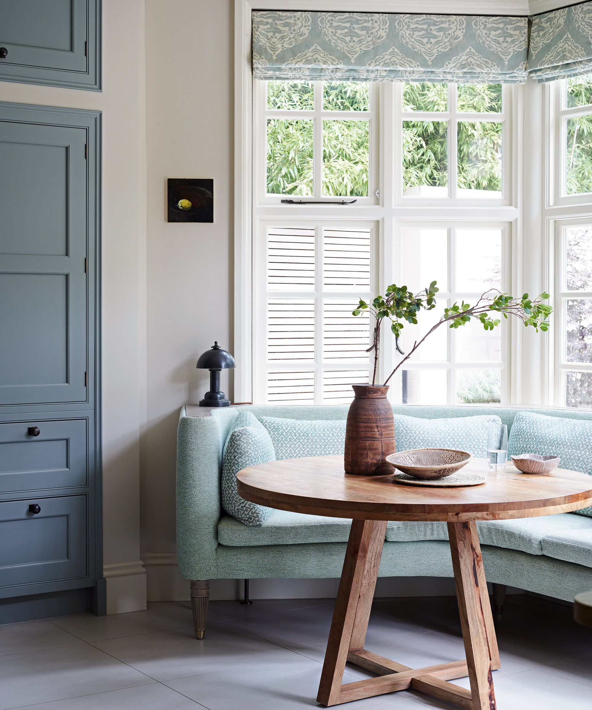
Creating an informal dining area in the kitchen was one of Nicky's kitchen ideas. Custom made sofa-like seating injects a sumptuous touch.
Bedroom
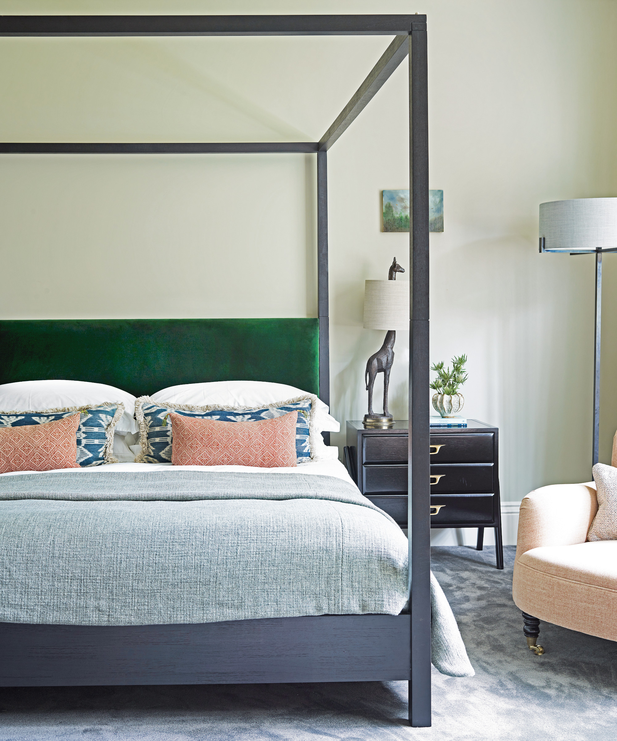
Bedroom ideas included choosing an unadorned four-poster bed to complement the graphic shapes throughout the home. ‘We wanted that sense of opulence without any fussiness,’ says Amalie.
En suite
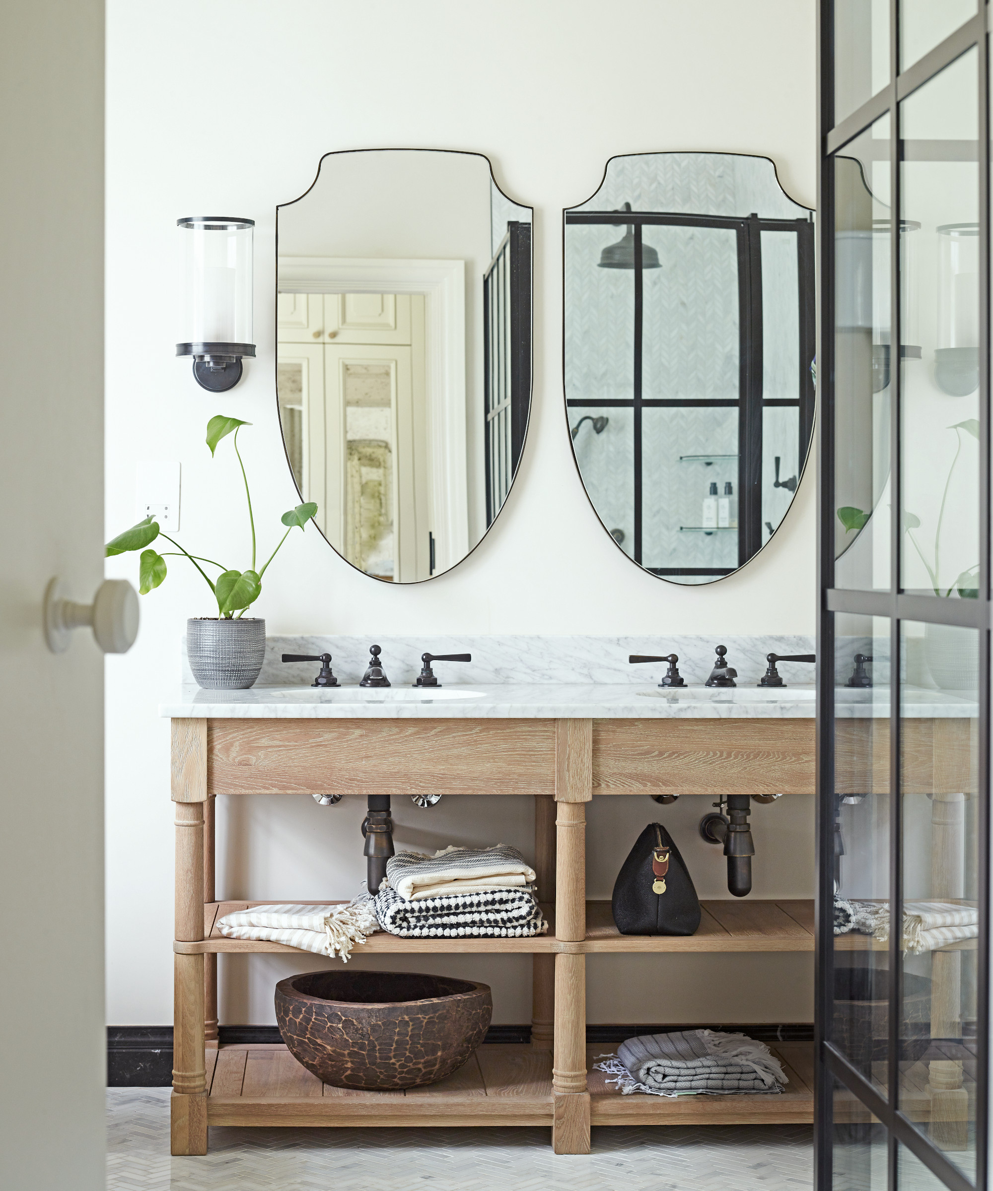
Introducing inviting texture with a marble-topped washstand and herringbone floor tiles was one of the bathroom ideas, resulting in a practical yet elegant space.
Shower room
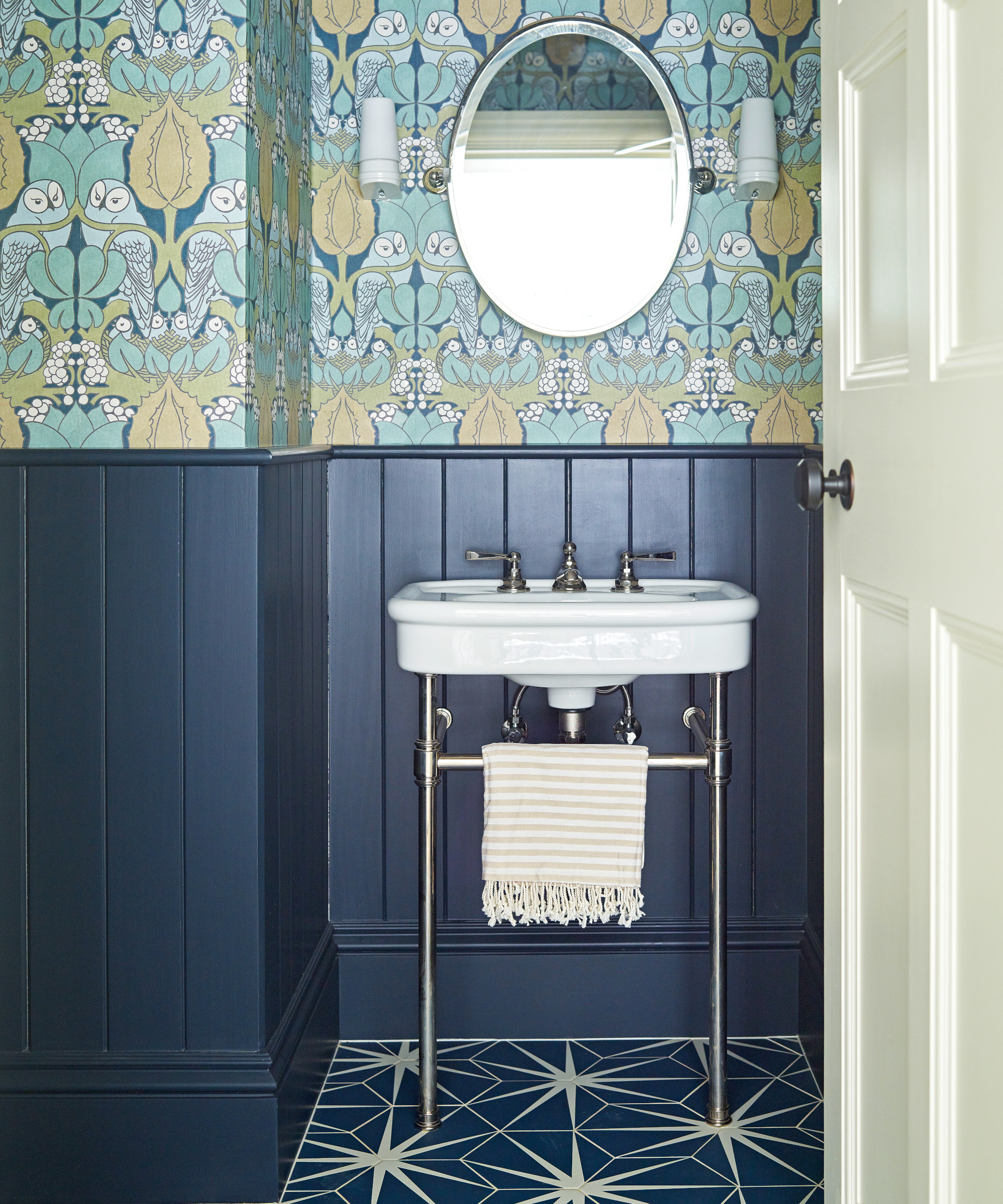
A considered pattern clash is pulled together with a cohesive palette of blue, white and green.
‘I think most people would agree that if they knew what a project entailed from the get-go, they mightn’t go through with it,’ says Charles. ‘Fortunately, we didn’t anticipate the scope of the works, which meant we weren’t daunted.’
At times, the family needed a friendly nudge to embrace decorative elements that they wouldn’t usually have considered. ‘I never thought that we’d go for an avocado suite in the cloakroom, for example, but combined with the navy and gold foil wallpaper, it strikes just the right modern-retro look,’ says Amalie.
At one point during the renovation, Charles asked of their decorative choices, ‘What if we’ve gone too far?’. ‘If it feels that way once the project is complete, I won’t have fulfilled my role,’ reassured Nicky. Needless to say, the finished interiors have turned out to be testament to a job brilliantly well done.
Interior design/ Violet & George
Photographs and styling/ Mary Wadsworth
Text/ Emma J Page
Sign up to the Homes & Gardens newsletter
Design expertise in your inbox – from inspiring decorating ideas and beautiful celebrity homes to practical gardening advice and shopping round-ups.

Interiors have always been Vivienne's passion – from bold and bright to Scandi white. After studying at Leeds University, she worked at the Financial Times, before moving to Radio Times. She did an interior design course and then worked for Homes & Gardens, Country Living and House Beautiful. Vivienne’s always enjoyed reader homes and loves to spot a house she knows is perfect for a magazine (she has even knocked on the doors of houses with curb appeal!), so she became a houses editor, commissioning reader homes, writing features and styling and art directing photo shoots. She worked on Country Homes & Interiors for 15 years, before returning to Homes & Gardens as houses editor four years ago.
-
 5 plants that are illegal to grow in California – how to control these invasive species in your yard, plus the native alternatives to use instead
These troublesome, invasive species will outcompete native plants and you could face a fine for growing them
By Thomas Rutter
-
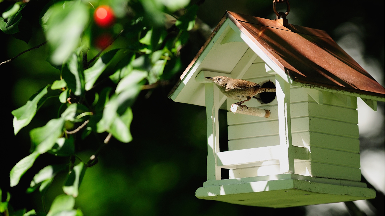 An architectural birdhouse is the most charming backyard trend I've ever seen – and there are lots on sale for Way Day
Will you treat your garden birds to a Victorian manor, or perhaps a Cape Cod cottage?
By Tenielle Jordison