This airy London pied-à-terre showcases the owner's beautiful artwork collection
A 19th century mansion block apartment has been updated by Turner Pocock with an open plan layout and a chic interior featuring eyecatching works of art

Design expertise in your inbox – from inspiring decorating ideas and beautiful celebrity homes to practical gardening advice and shopping round-ups.
You are now subscribed
Your newsletter sign-up was successful
Want to add more newsletters?
Twice a week
Homes&Gardens
The ultimate interior design resource from the world's leading experts - discover inspiring decorating ideas, color scheming know-how, garden inspiration and shopping expertise.

Once a week
In The Loop from Next In Design
Members of the Next in Design Circle will receive In the Loop, our weekly email filled with trade news, names to know and spotlight moments. Together we’re building a brighter design future.
Twice a week
Cucina
Whether you’re passionate about hosting exquisite dinners, experimenting with culinary trends, or perfecting your kitchen's design with timeless elegance and innovative functionality, this newsletter is here to inspire
Creating a comfortable pied-à-terre in London, location of many of the world's best homes, for a family who live in Gloucestershire was the focus of this renovation. 'The end result needed to be able to give this family of five a sense of space while also being practical, with plenty of elegant storage solutions,' says Emma Pocock of interior design studio Turner Pocock who were brought on board to update the property.
The apartment is situated in a late 19th century mansion block. 'London mansion blocks are notorious for being tricky to work in, with tight rules and regulations, and pipe runs need extra consideration as they tend to be fixed,' says Bunny Turner. 'For this project, we felt strongly that we wanted to open it up and keep it as lovely and light as possible.'
Turner Pocock have also worked on the clients' apartment in Switzerland. 'We wanted to give their London apartment a similar feeling in terms of opening up tight spaces to improve flow, and zone living areas without the use of too many walls,' says Emma. 'We’re so happy with the result of this project, and most importantly the client and family were thrilled too. The space was transformed into a light, bright place to stop and enjoy, rather than being a crash pad with a very long corridor running through it.'
The interior is now chic and classic with a mix of mid century and modern design. 'The owner has a marvellous collection of 20th century art and furniture – and a crucial part of the design was to ensure that we could incorporate her collection seamlessly into the scheme,' says Bunny. 'We often ask art consultants such as Rebecca Gordon and gallerists such as Lyndsey Ingram to work alongside us and our clients to develop collections of art. We are always thrilled when a partnership comes together and we’ve created a space that is a home that looks like it’s very much the voice of the owner, with a dusting of Turner Pocock.'
Kitchen diner

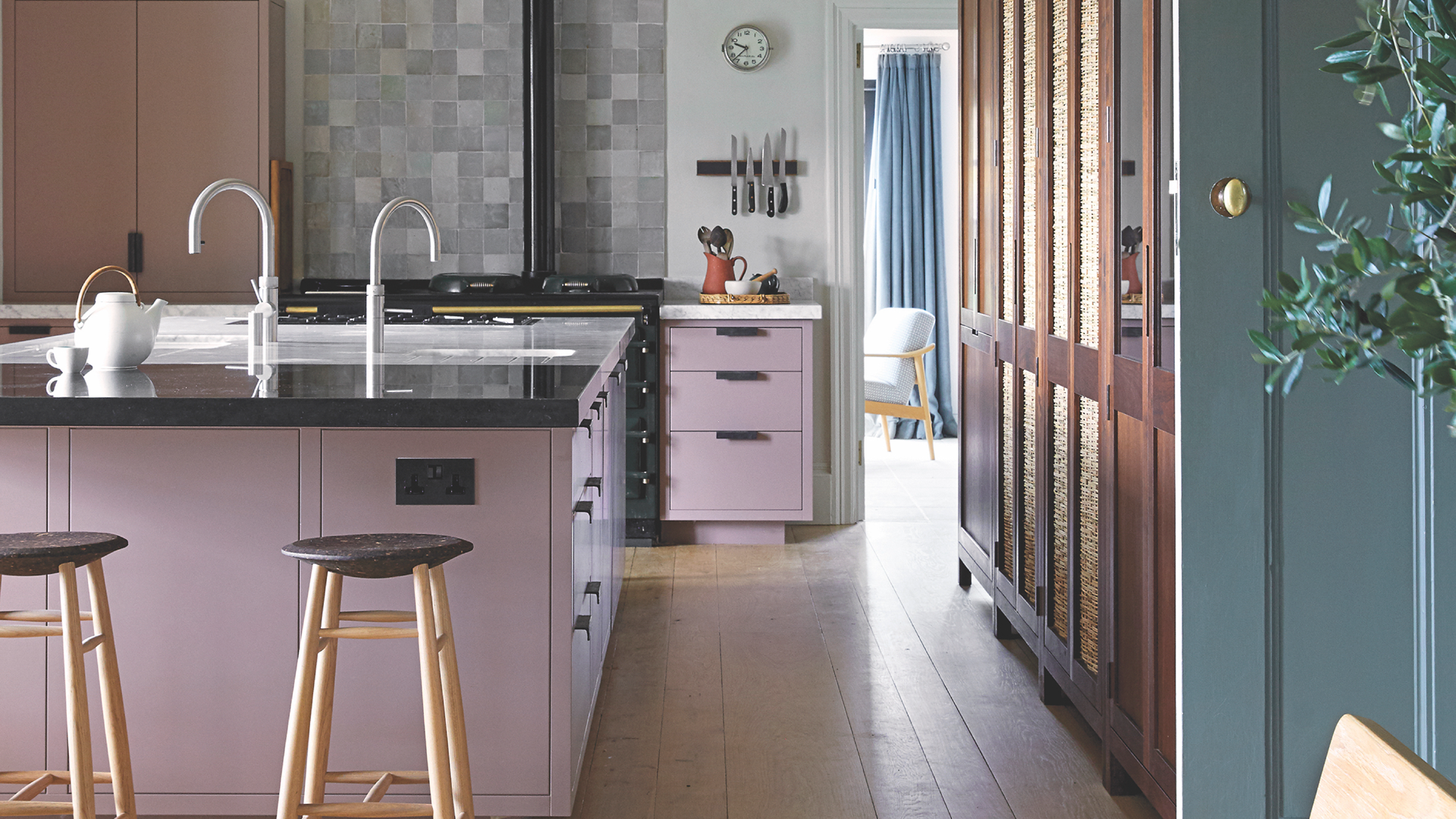
Kitchen ideas included streamlined, handleless cabinets for a minimalist look, while a palette of white keeps the look bright and breezy.
Dining area
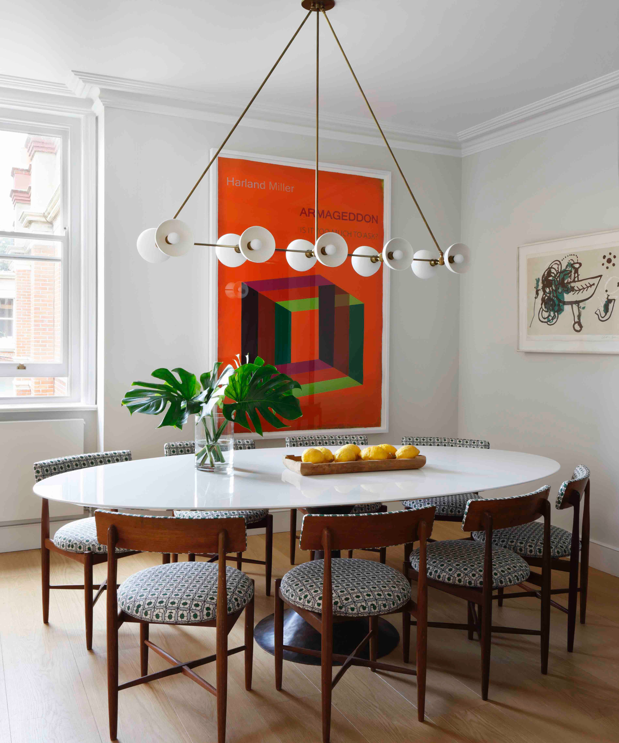
This large space is linked to the kitchen and dining room ideas involved keeping the space white and simple to act as a gallery for the art pieces the client has collected.
The table and light fitting were selected to complement the existing upholstered 20th century dining chairs, which were reupholstered.
Design expertise in your inbox – from inspiring decorating ideas and beautiful celebrity homes to practical gardening advice and shopping round-ups.
Living room
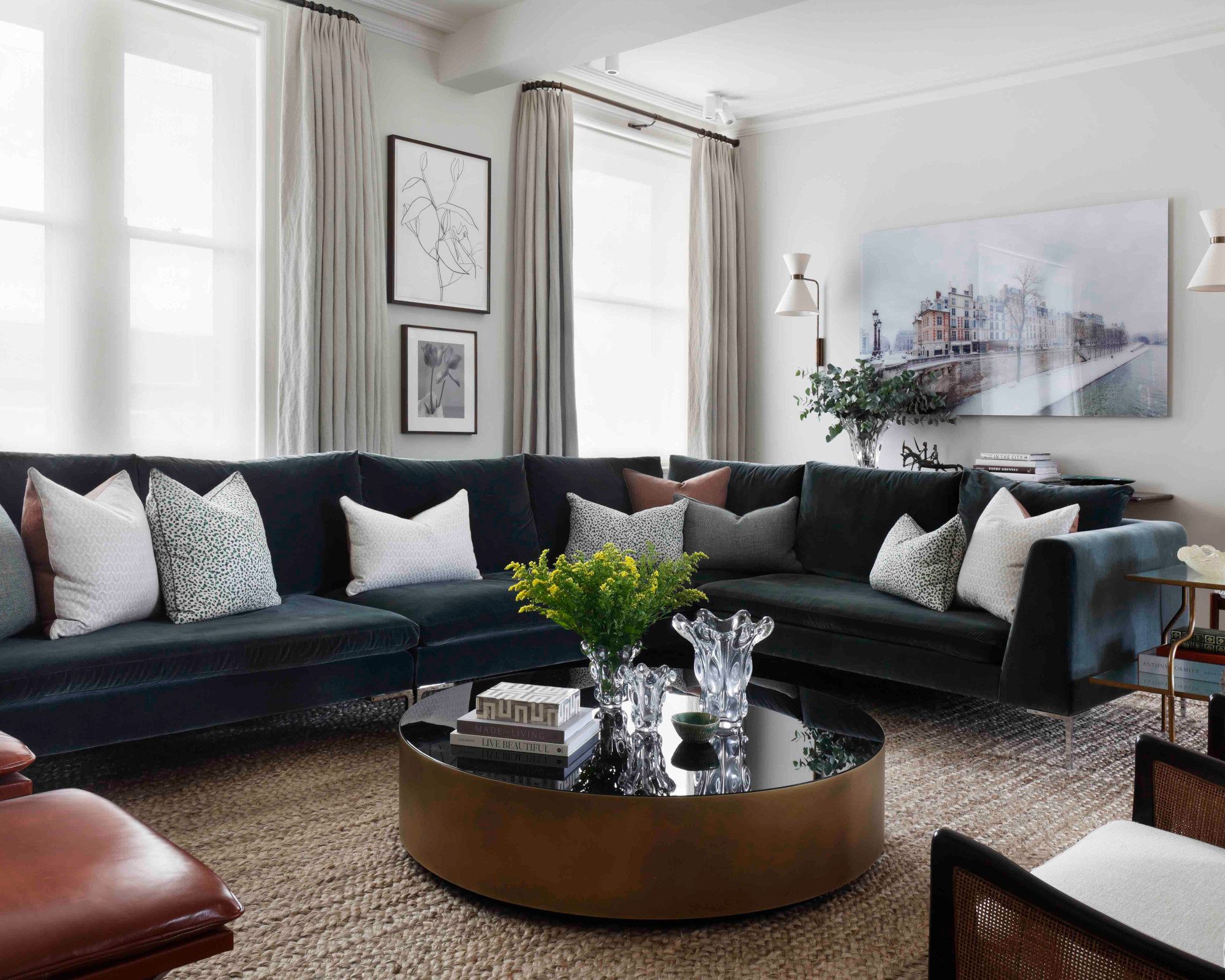
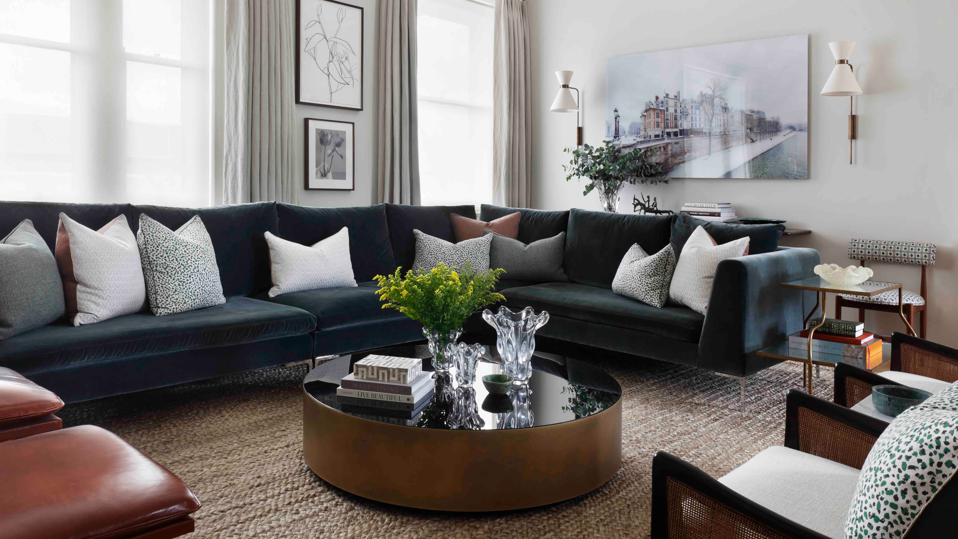
Paramount among the living room ideas was ensuring that the room was super comfortable. 'The large bespoke corner sofa ensures that all the family can gather and entertain guests and also helps to zone the open plan living space,' says Emma. 'We wanted to keep the pieces of furniture to a minimum but loved incorporating the family's existing iconic 20th century pieces of furniture.'
Snug
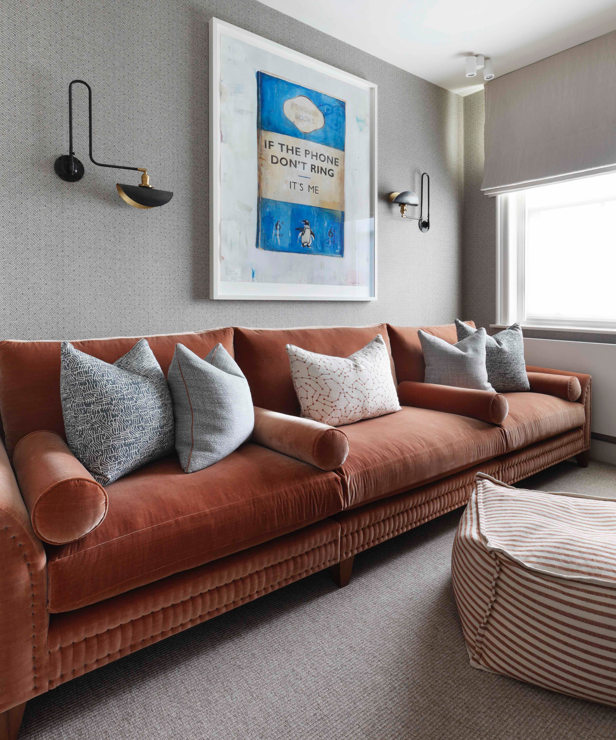
'This room had been deemed by the owners to be too small to really be nice,' says Bunny. 'However, by filling the width of the room with a huge sofa to sit opposite a built in TV wall, the room was used to the best of its ability, creating a fabulous vista for the Harland Miller print.'
Main bedroom
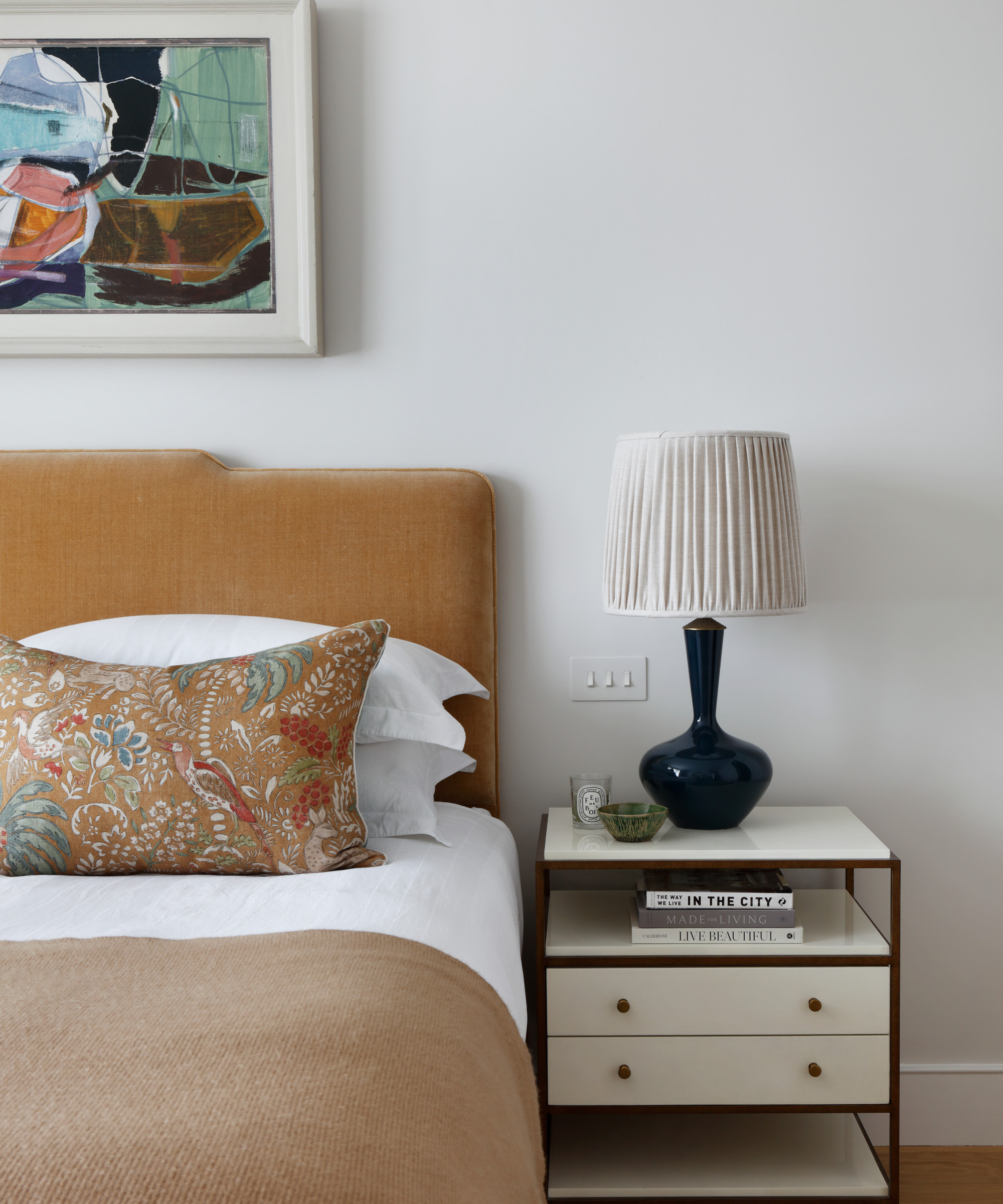
One of Bunny and Emma's favorite rooms is the main bedroom. Among their bedroom ideas to transform the space was creating a much larger room by removing all the existing joinery and installing a walk in wardrobe, with a bathroom coming off the bedroom. 'Seemingly small changes like these often have the greatest impact,' says Emma.
The clients fell in love with a beautiful ochre fabric that is used for the cushions on the bed. A toning headboard fabric and blanket carry through the shades.
Bedroom
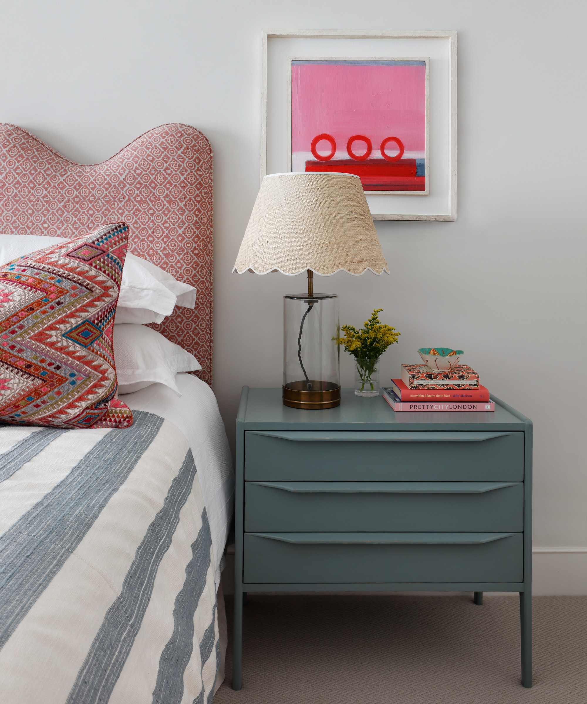
The starting point for the fun and lighthearted scheme was the Emily Crookshank prints that flank the bed and inspired the color palette.
Bedroom
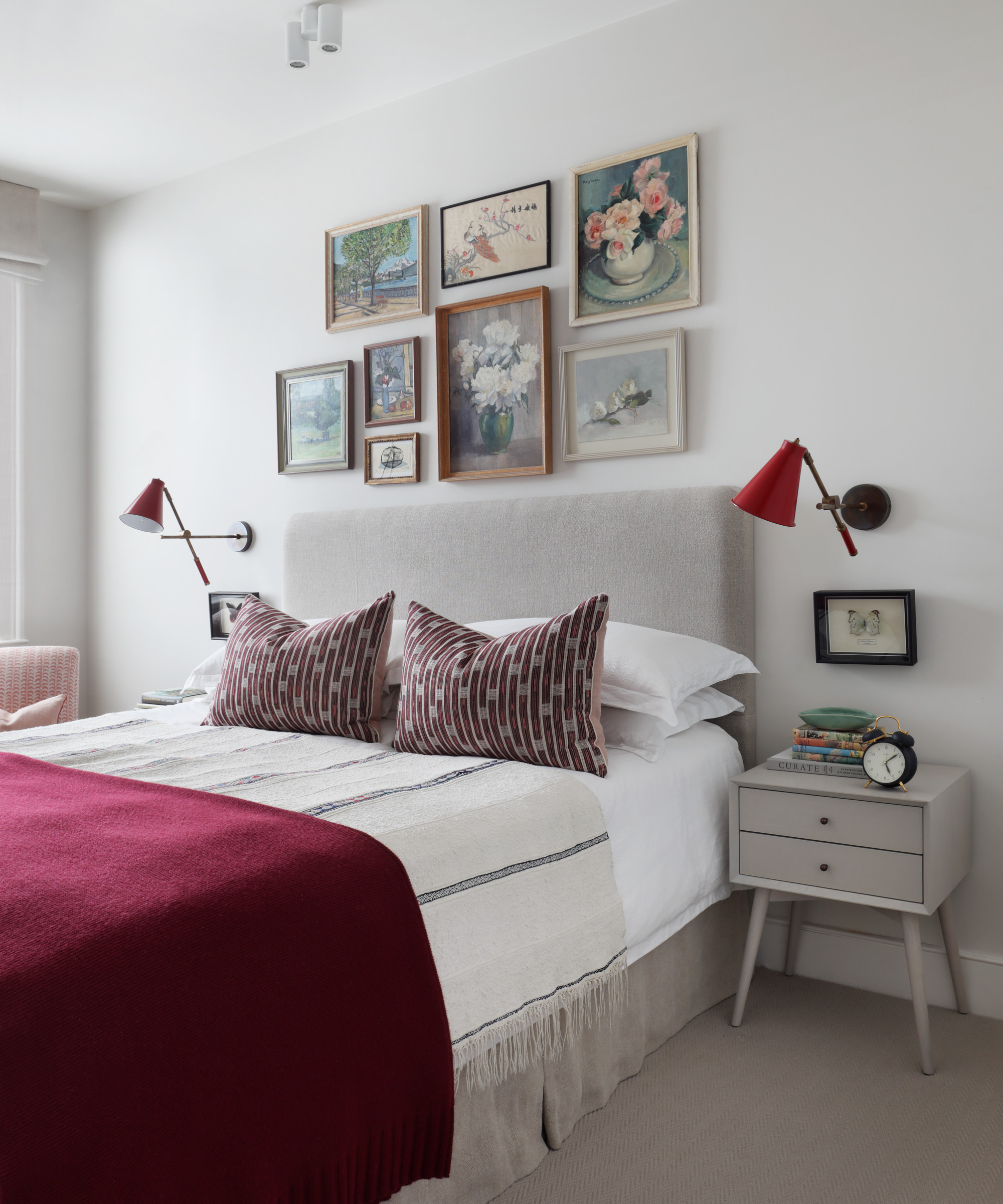
The main focus of this space is the beginning of a gallery wall, which will eventually spread to fill the wall, so a simple scheme was chosen to provide a calm backdrop.
Son's bedroom
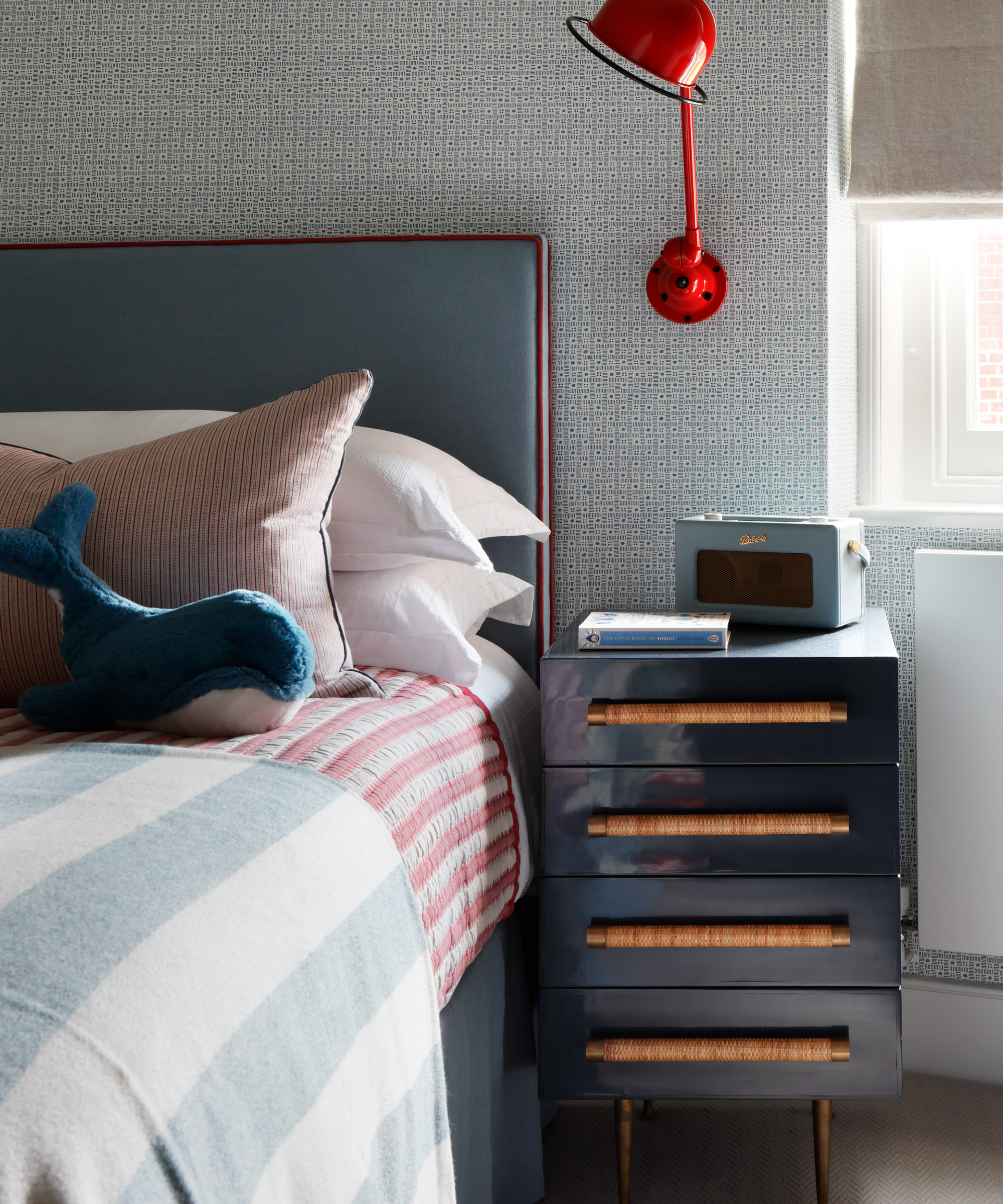
The space needs to serve the son, the youngest in the family, into adulthood, so Turner Pocock chose a slightly more masculine scheme to differentiate from the girls' spaces. 'We love the use of lacquer paint for the side table – this is a finish we often use,' says Bunny.
Bathroom
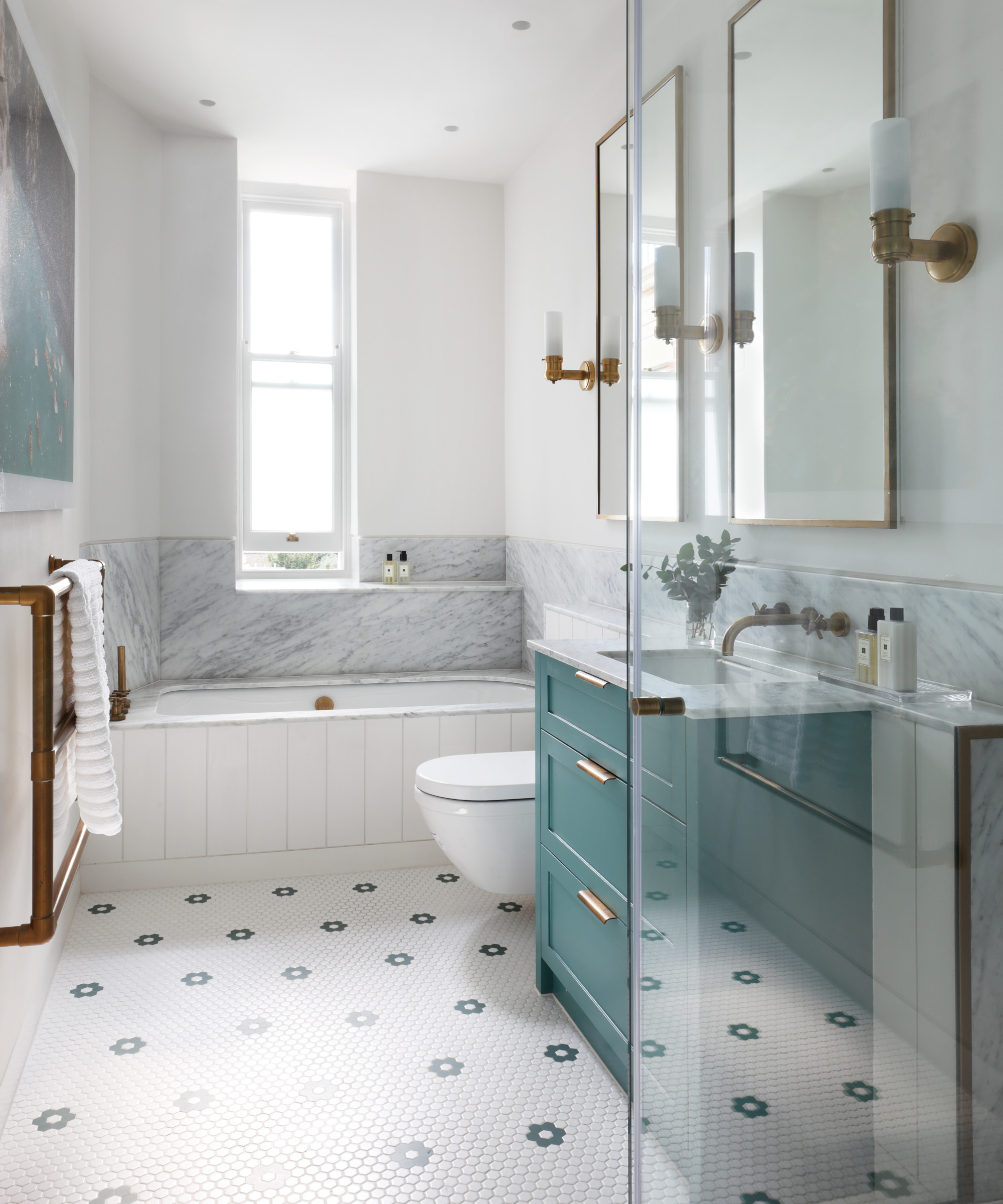
The brief was for a luxurious but not too grown up scheme. Bathroom ideas were inspired by the large Massimo Vitali photograph, which is part of the client’s collection. An aqua washstand pulls out the color from the artwork.
Interior design/ Turner Pocock
Photographs/ Alexander James

Interiors have always been Vivienne's passion – from bold and bright to Scandi white. After studying at Leeds University, she worked at the Financial Times, before moving to Radio Times. She did an interior design course and then worked for Homes & Gardens, Country Living and House Beautiful. Vivienne’s always enjoyed reader homes and loves to spot a house she knows is perfect for a magazine (she has even knocked on the doors of houses with curb appeal!), so she became a houses editor, commissioning reader homes, writing features and styling and art directing photo shoots. She worked on Country Homes & Interiors for 15 years, before returning to Homes & Gardens as houses editor four years ago.