This interior designer shows how to mix Ibizan beach style with Californian cool in a transformed London home
This post-war semi-detached property in London gets a new lease of life, transformed into a serene space inspired by sunnier climes
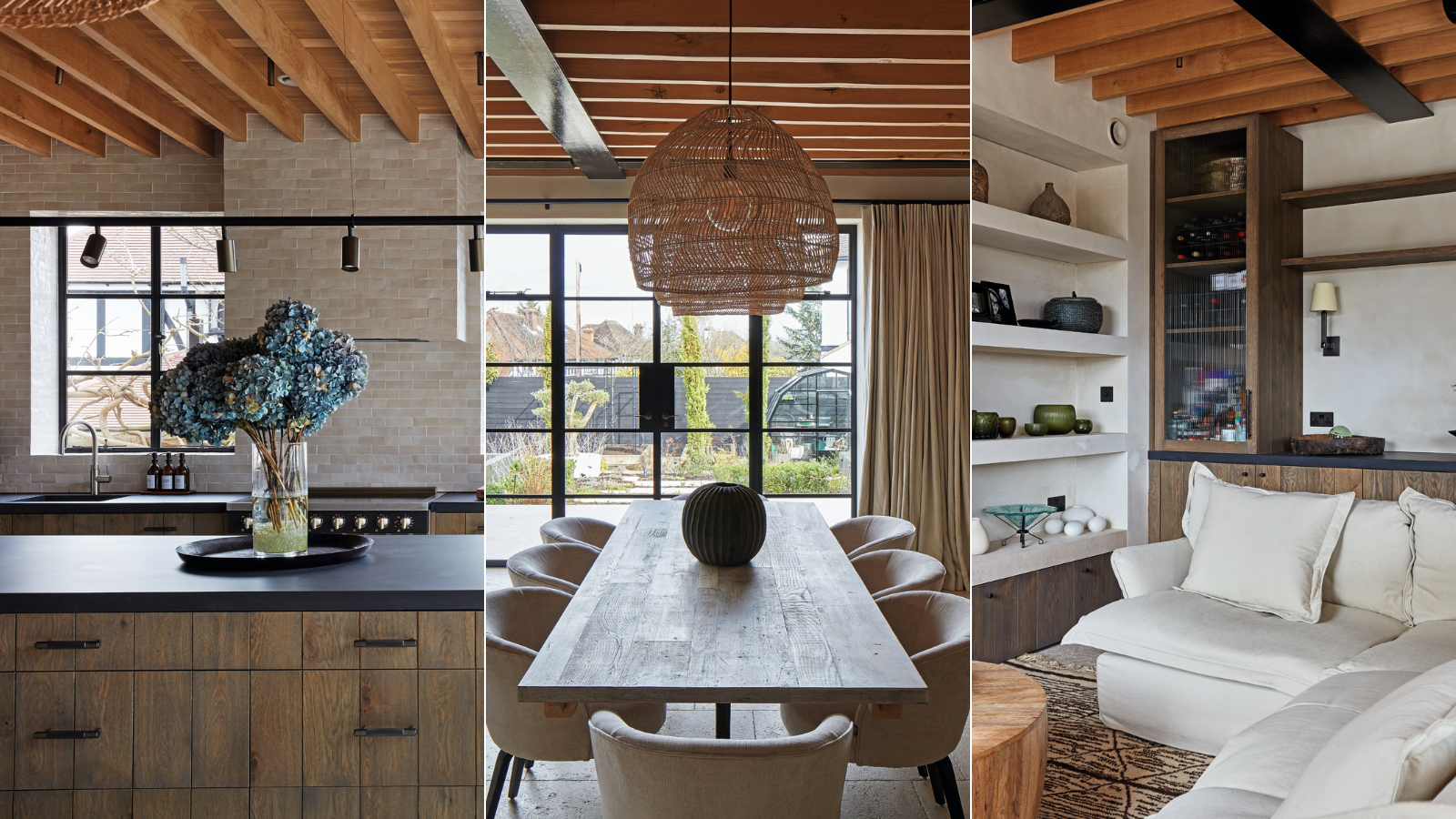

What was once a rather unremarkable post-war semi in north London is now a fabulous example of a house design that successfully embraces a fusion of styles. Miami art-deco villa meets Santa Fe adobe Pueblo, with a hint of bohemian Ibizan beach style – all inspired by the homeowner’s travels.
Interior designers The Want Room and architecture practice Delve were engaged to bring the owner’s vision to life. Not only was she keen to inject individuality and create a sustainable house but, as a gardener, she wanted to cultivate a backyard oasis and maximize the views of it from the house.
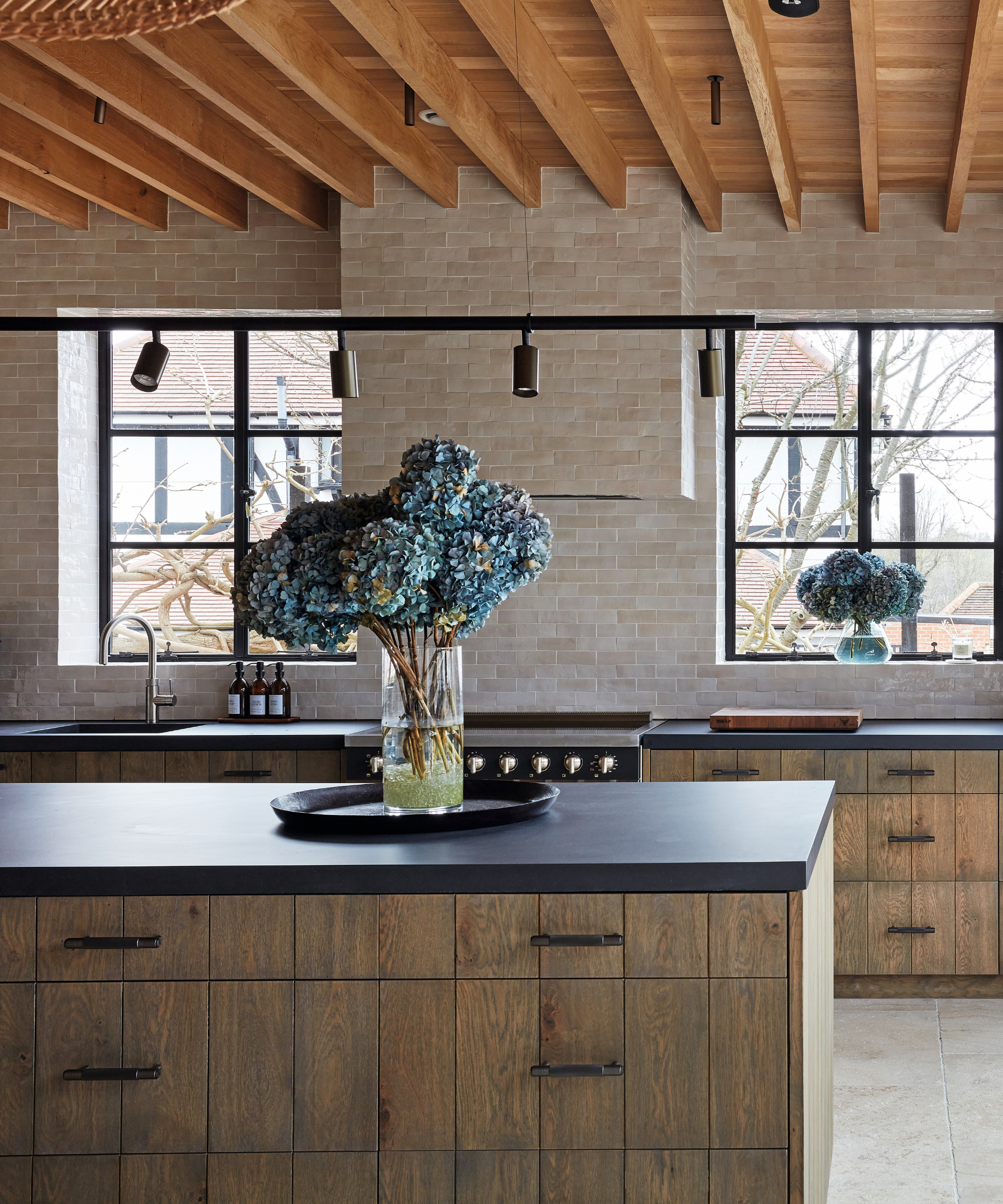
Bespoke cabinetry, The Main Company. Wall tiles, Arcturus Stone. Flooring, find similar at Artisans of Devizes.
‘The existing house didn’t have much character,’ reveals Edward Martin, director at Delve. ‘It hadn’t been updated since it was built. There had been a few ad-hoc additions, but internally it was a rabbit warren of different-sized rooms with little flow, and there was no real link to the garden from the main areas.’
Extending and reconfiguring was the priority, with the emphasis on creating an indoor-outdoor feel. A rendered extension was built at the side and back, with pitched roofs blending with the local vernacular, and a hip-to-gable loft conversion was undertaken.
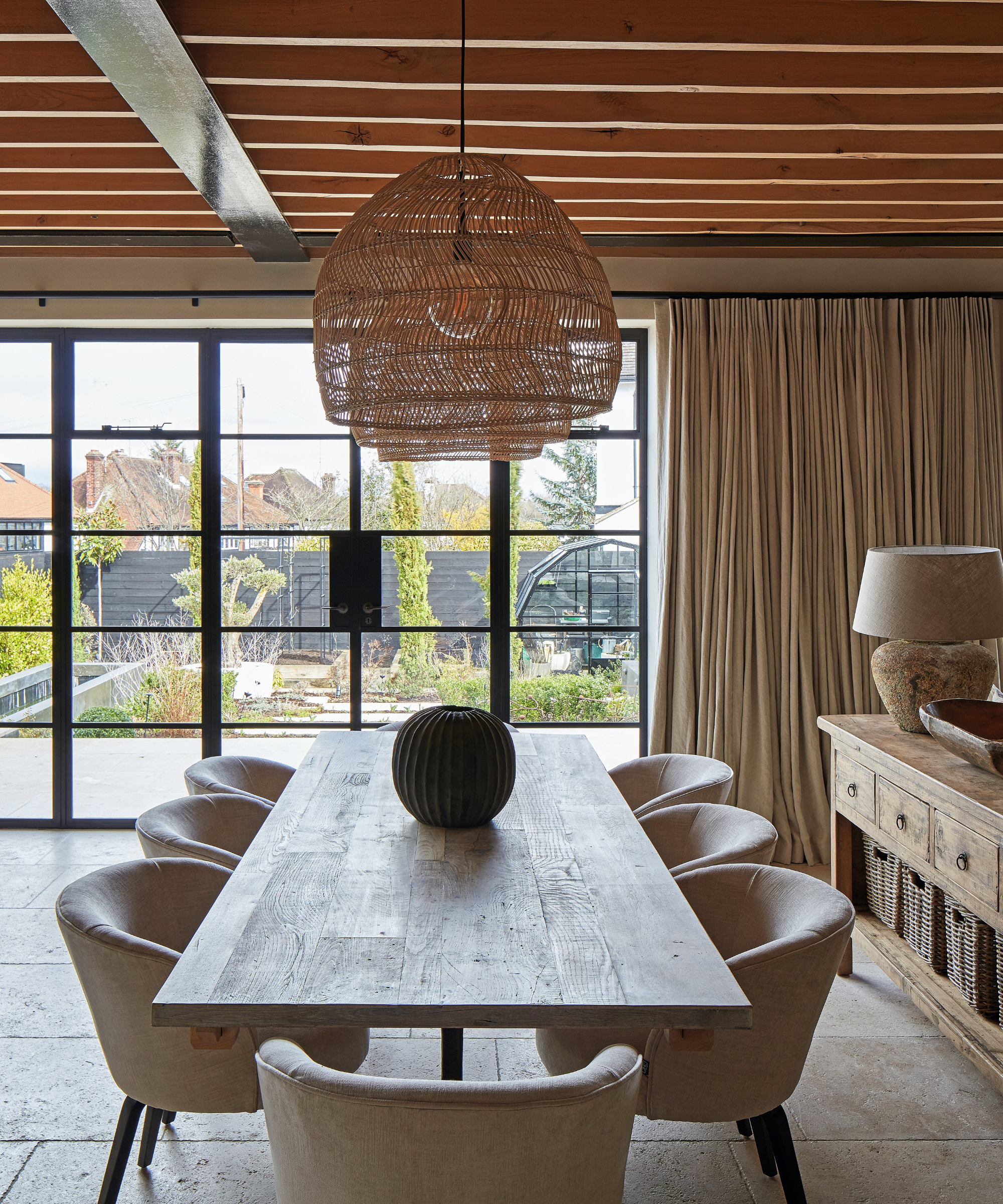
Bespoke table, The Main Company. Chairs, Eichholtz. Pendants, HKliving. Console and table lamps, Home Barn.
When it came to the interior, the client wanted to use soothing decorating ideas to create a relaxing space, incorporating natural materials that would age beautifully over time. Black metal windows and doors are married with limestone floors downstairs, reflecting the mix of black and white that’s a feature of art deco, but in a softer, more muted Ibizan palette.
Pigmented clay plaster was introduced on the walls throughout the house to link with the external render and provide a textural backdrop. ‘It gives a beautiful cohesive look that runs all the way through,’ explains Rakhi Kapila-Nowell, co-founder of The Want Room.
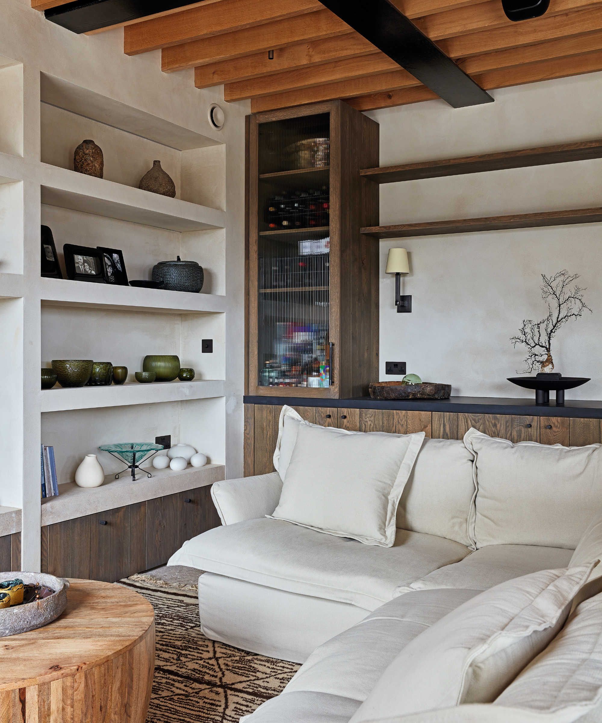
Sofas, Maker & Son. Curtains, The Want Room.
The staircase was flipped from one side of the house to the other to allow a direct view from the entrance to the garden. ‘As it’s in the darkest part of the interior, we wanted something soft that bounces natural light up and down the house,’ explains Edward. The eye-catching sculptural staircase extends to the top floor, providing vertical movement, and combines the clay plaster and wood used elsewhere in the house.
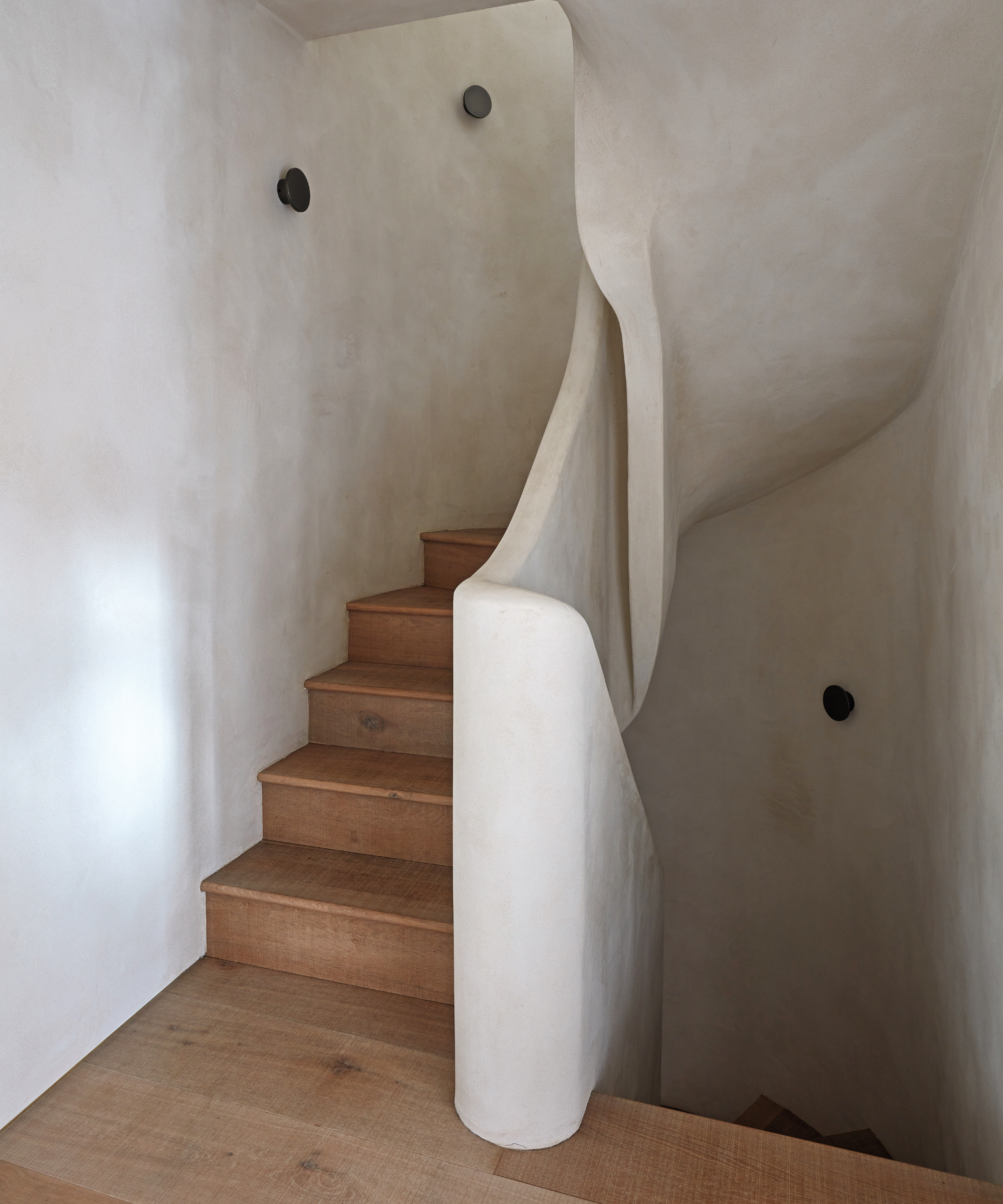
Clay plaster, Mud Finishes.
The core of the home is the open-plan kitchen-dining-living space at the back. ‘We exposed all the ceiling joists, oak rafters and steel beams, as we didn’t want a single white painted ceiling with a room of that size,’ says Edward. Complementing the ceiling, bespoke cabinetry by The Main Company emphasizes the natural beauty of wood.
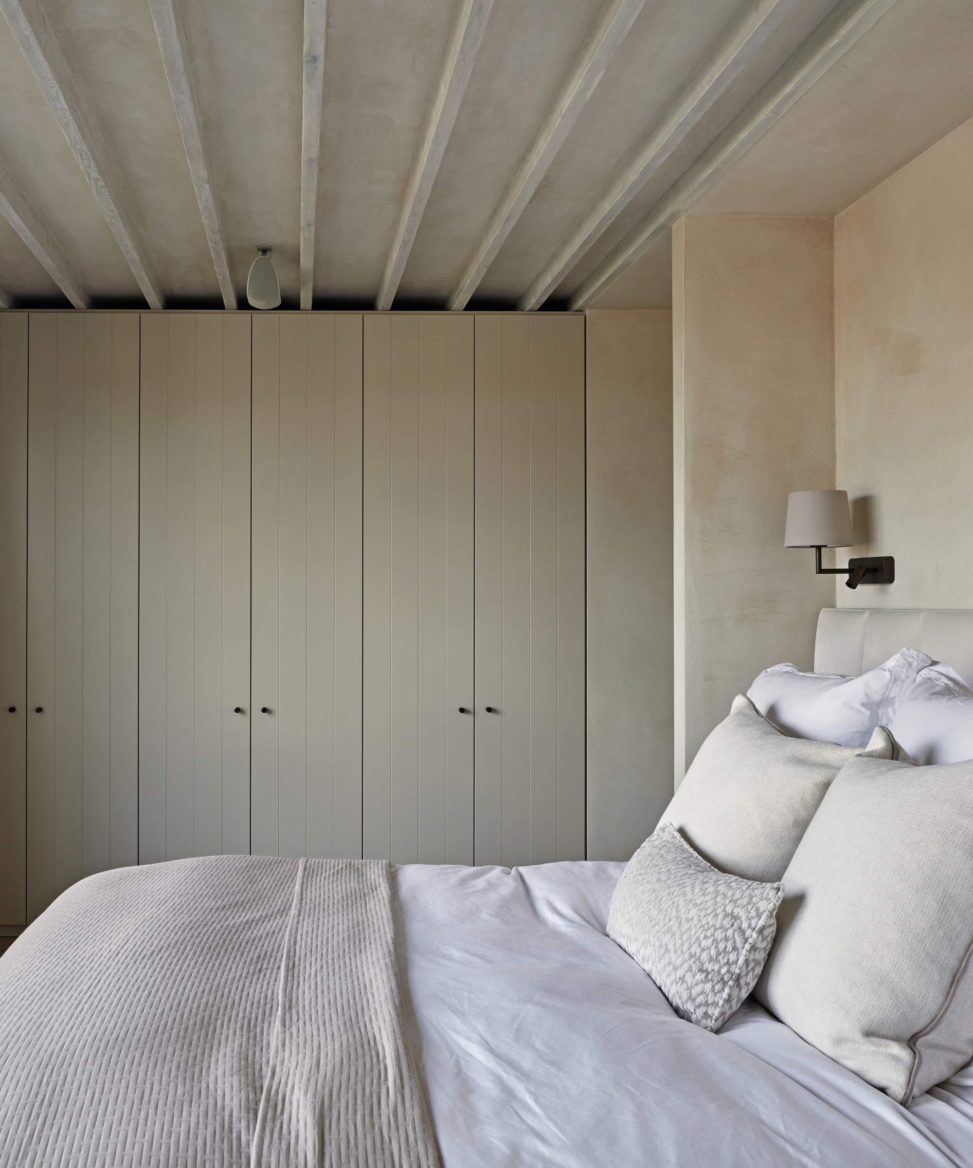
Curtains in Romo fabric; bespoke cushions, all The Want Room. Bed linen, Soak & Sleep.
Crafted using engineered hand-aged oak, the cabinetry is topped with a concrete worktop for an industrial twist. The same wood was used throughout the living space and also in the separate boot room and utility. Continuing the theme of incorporating as many natural materials as possible, Rakhi brought in natural fabrics including relaxed linens and wools and woven ceiling pendants.

Bespoke vanity with Corian basin, Riluxa. Footstool, Soho Home. Flooring, Sconces, Astro Lighting. Mirror, Heal’s.
Carefully considered forms play a key role, too. ‘We introduced rounded tub dining chairs and curved furniture in the snug to create the feeling of organic spaces and evoke a less formal sensibility,’ says Rakhi.
Against this calm and serene backdrop, artwork from the homeowner’s travels takes pride of place. ‘Our brief was to make the interior feel as if you’re in a different part of the world,’ says Rakhi, ‘and it definitely has that look'.
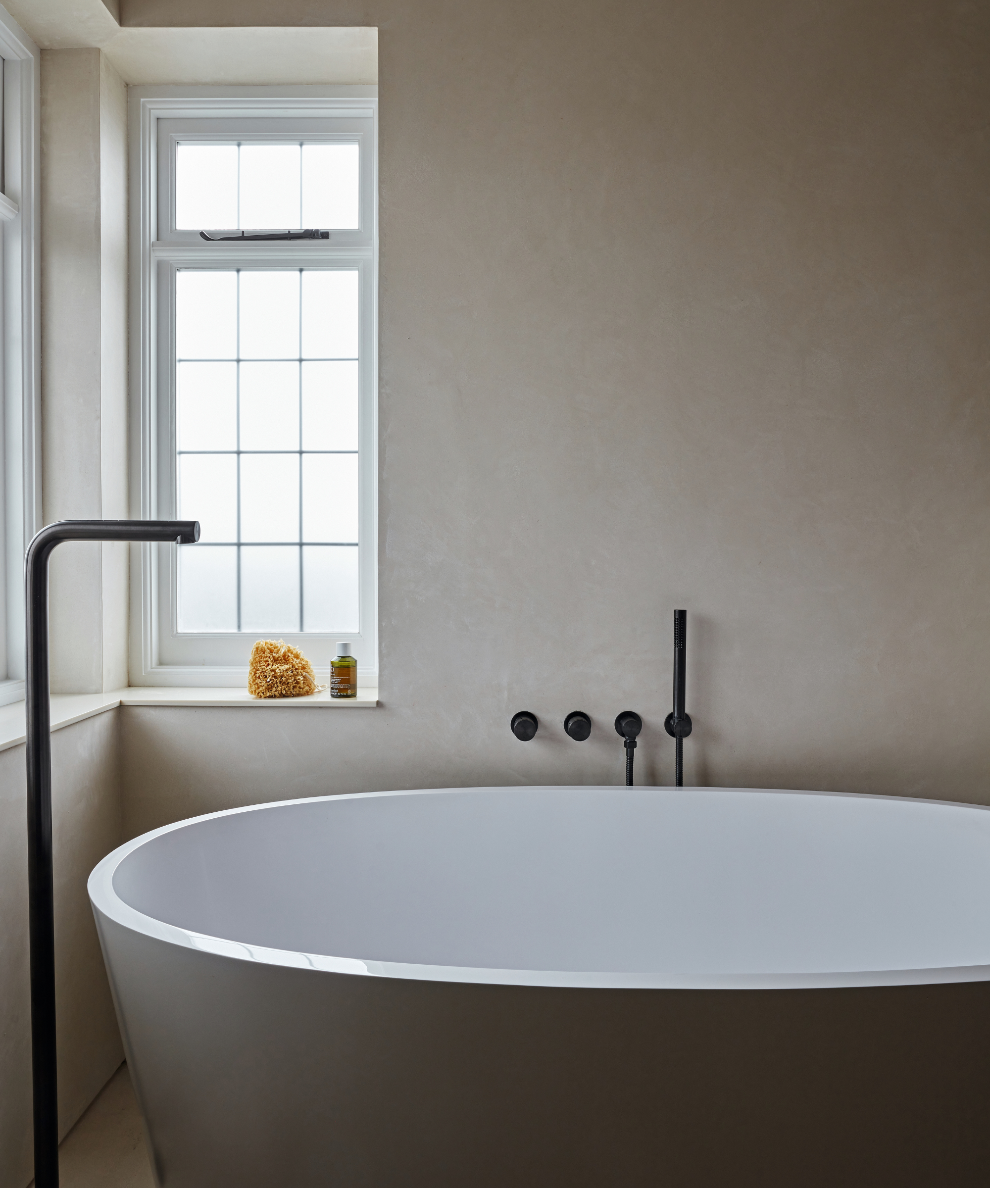
Bath, Living house. Taps, Lusso. Flooring, Domus.
Meet the designer
Rakhi Kapila-Nowell shares her style inspiration...
What's your favorite architectural feature of the project?
The stunning metal garden doors.
Which part do you feel most proud of?
The use of space in the kitchen/dining/living area and marrying old and new. Our client had a number of sentimental objects that had to be integrated with the new design style.
And your favorite design detail?
The perfect color palette can create a flowing, cohesive look.
Tell us one small change that has a huge impact.
The lighting – from statement pieces to ambient designs – has been transformative.
How do you find inspiration?
Different cultures and environments through our travels. Architecture, colors and design elements from around the world.
Finish the sentence, 'I know I'm a creative because...'
I find innovative solutions to challenges.
Can you reveal a secret address we should have on our radar?
Home Barn in Marlow in the UK.
How does home make you feel?
Peaceful and calm.
Sign up to the Homes & Gardens newsletter
Design expertise in your inbox – from inspiring decorating ideas and beautiful celebrity homes to practical gardening advice and shopping round-ups.

Interiors have always been Vivienne's passion – from bold and bright to Scandi white. After studying at Leeds University, she worked at the Financial Times, before moving to Radio Times. She did an interior design course and then worked for Homes & Gardens, Country Living and House Beautiful. Vivienne’s always enjoyed reader homes and loves to spot a house she knows is perfect for a magazine (she has even knocked on the doors of houses with curb appeal!), so she became a houses editor, commissioning reader homes, writing features and styling and art directing photo shoots. She worked on Country Homes & Interiors for 15 years, before returning to Homes & Gardens as houses editor four years ago.
-
 This one plant can reduce pest problems in 3 ways – a horticulturist reveals exactly how it will help you grow better-than-ever vegetables
It is time to be amazed by all the benefits that come from planting this edible flower for pest control
By Drew Swainston
-
 7 underrated kitchen features that are sure to make your life easier, according to interior designers
From game-changing storage to functional decor
By Molly Malsom