This London home shows how colorful touches can transform neutral spaces
A combination of designer Kate Guinness’ creativity and a collection of striking artwork has made this home exquisitely colorful
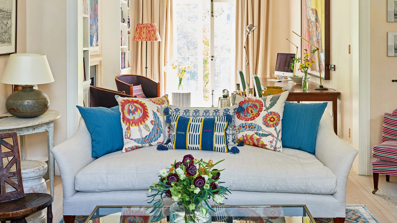

It was only a week after founding her own interior design firm that Kate Guinness was called upon by new clients to bring color and personality to their home in Notting Hill, location of some of the world's best homes.
Kate has a knack for creating authentic and lived-in looking schemes, which are achieved by an avoidance of trends and over-styling. She instead anchors her interiors with timeless details that will never age.
‘Creating a home that feels as if it has gradually grown over time is one of the things I pride myself on. With these clients, there was also an accumulating art collection to work with,’ says Kate. While the owners had completed some of the bedrooms, much of the property was painted white and it lacked characterful fabrics and furnishings.
‘The house had fantastic bones and the architect had already done a great job so I was able to completely concentrate on paint finishes, fabrics and furnishings. What was different about this project to how I usually work was that the design process was so gradual, unfolding room by room over a period of time,’ Kate recalls.
Kate’s schemes were definitely dictated in part by the artwork the homeowners, a couple with three young children, were investing in. ‘For the lower ground and ground floors we chose a specialist paint finish, with the lower floor being a slightly lighter shade of the corresponding colour above. The walls have these broad brushstrokes that give depth and a sense of movement but, crucially, it doesn’t compete with the artwork,’ Kate observes.
The property, being the classically tall, narrow Victorian townhouse so indicative of the area, had lots of stairs, so Kate helped to reorganise the home, giving each floor its own sense of identity and function.
Hallway
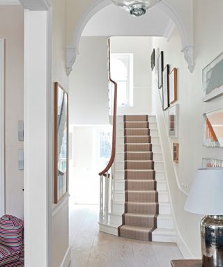
Hallway ideas include decorating with a simply beautiful stair runner and neutral walls to allow the many artworks to draw attention.
Study
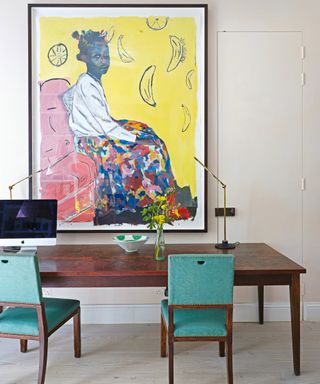
Kate assisted her clients in finding a new purpose for the old dining space next to the sitting area. ‘We created an open-plan sitting room that leads onto a study area with a large antique desk,’ she says.
Home office ideas revolve around flexibility – the large antique desk, which matches the scale of the painting, occasionally doubles as a dining table when the owners host intimate dinner parties.
Living room
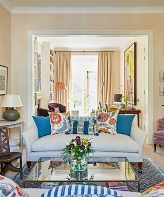
The calm, elegant sitting space is reserved for the grown-ups. ‘We used a special paint and bold brushstrokes to give the walls a sense of movement and depth,’ says Kate.
Living room ideas include incorporating a colorful Luke Irwin rug, representing the mosaic he discovered under the floor in his home in Wiltshire, to ground the neutral scheme.
Kitchen diner/family area
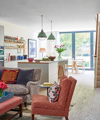
‘The basement is where the family spend most of their time across the kitchen and family room, which is also used as a playroom. The dining section of the kitchen leads out to a communal garden so we had to make this whole area very resilient to high traffic,’ says Kate.
Kitchen ideas include choosing a large island to zone the different spaces in the basement.
Family area
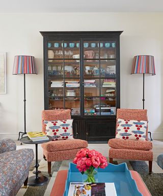
The formal air of this space is softened with the eclectic choice of fabrics.
‘The owner has a great eye so every cushion was carefully considered and she really knows her fabrics, too. One of the most enjoyable and challenging parts of my job was introducing her to fabrics she didn’t know in order to surprise her,’ Kate reveals.
One of the defining features of Kate’s work is the ability to masterfully combine unexpected materials and colours, from the horsehair fabric used on the ottoman in the family room area to the antique Hungarian miners’ bottles that she has had made into lamps. ‘Working so gradually was a bit of a challenge in some ways, but I think it’s had an interesting outcome and looks carefully considered,’ notes Kate.
Dining area
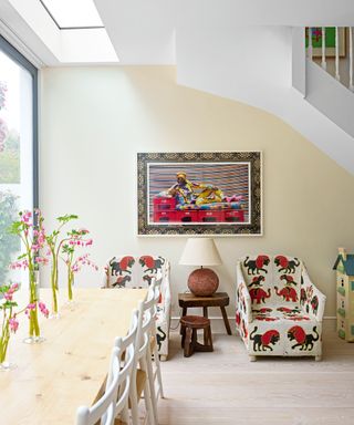
Among Kate's dining room ideas was the positioning of neatly proportioned African Yoruba chairs hand-embroidered with thousands of tiny beads to make a statement and add personality.
Landing
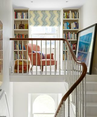
Bookshelves and an occasional chair have transformed this once neglected upstairs landing area into a charming reading nook.
Main bedroom
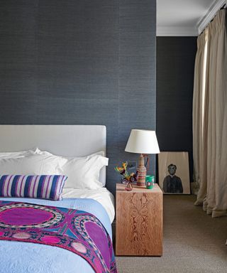
Dramatic dark walls are one of the bedroom ideas used to provide a cosseting feel. Carefully chosen fabric details and the natural beauty of wood lift the pared-back scheme.
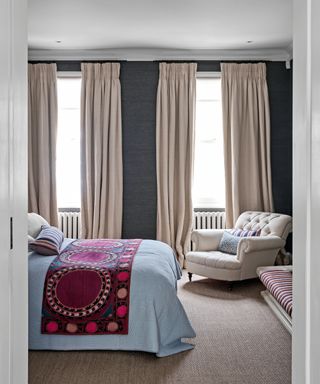
A neutral button back armchair provides handy seating and provides contrast to the dark gray walls.
Daughter's bedroom
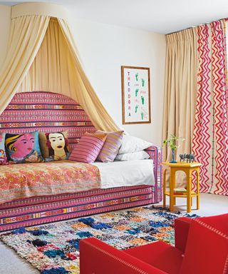
Using a Kit Kemp fabric as the leading edge for the curtains brought a cohesive identity to the daughter's bedroom but ensured the print didn’t dominate.
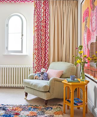
Statement artwork pulls together the colors used in the scheme.
Son's bedroom
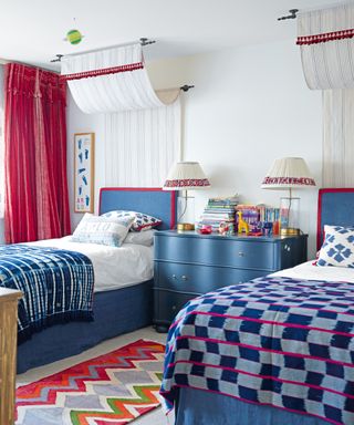
In the son's bedroom, canopies above the beds give the impression of grandeur, while the colorful, eclectic textiles add a playful twist.
Interior design/ Kate Guinness Design
Photographs/ James Merrell
Styling/ Mary Weaver
Text/ Juliet Benning
Sign up to the Homes & Gardens newsletter
Design expertise in your inbox – from inspiring decorating ideas and beautiful celebrity homes to practical gardening advice and shopping round-ups.

Interiors have always been Vivienne's passion – from bold and bright to Scandi white. After studying at Leeds University, she worked at the Financial Times, before moving to Radio Times. She did an interior design course and then worked for Homes & Gardens, Country Living and House Beautiful. Vivienne’s always enjoyed reader homes and loves to spot a house she knows is perfect for a magazine (she has even knocked on the doors of houses with curb appeal!), so she became a houses editor, commissioning reader homes, writing features and styling and art directing photo shoots. She worked on Country Homes & Interiors for 15 years, before returning to Homes & Gardens as houses editor four years ago.
-
 Farrow & Ball's De Nimes is 'timeless and flexible to use in any room' – here's how to decorate with this muted blue paint
Here's all you need to know about decorating with De Nimes for a sophisticated space
By Emily Moorman Published
-
 Khloé Kardashian's neutral terrace masters the 'conversational seating' method – it's perfectly arranged for entertaining guests outside
Khloé's stunning terrace intertwines a laid-back vacation villa atmosphere with conversational seating – for the perfect relax-and-catch-up setting
By Ciéra Cree Published