This small London apartment is a jewel box of color and pattern, filled with unexpected design moments
The London pied-à-terre of a French collector, this apartment is filled with the kind of design that delights the eye
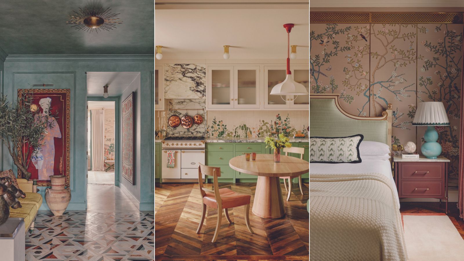
Color, pattern and sculptural forms create a feast for the senses in this London pied-à-terre. Home to a French national with an eye for art and textiles, the apartment brims with unexpected style moments. A fine thread gathers those moments together, a fantasia of beautiful objects curated in an exquisite house design.
It’s the result of a collaboration between an owner who has a penchant for botanical prints and a fearless disregard for conventional interiors, and designer Sophie Ashby of Studio Ashby, who wanted to create ‘a scheme that would be the perfect fit for the client’s character, lifestyle and taste’.
At 180 square meters, it is a relatively small space. ‘But whether we’re working on a huge sprawling house or a smaller apartment, the clients’ requirements are the same: to have a practical set-up, good storage, moments of calm versus areas for entertaining,’ says Sophie. ‘It’s all about making the best of the space.’
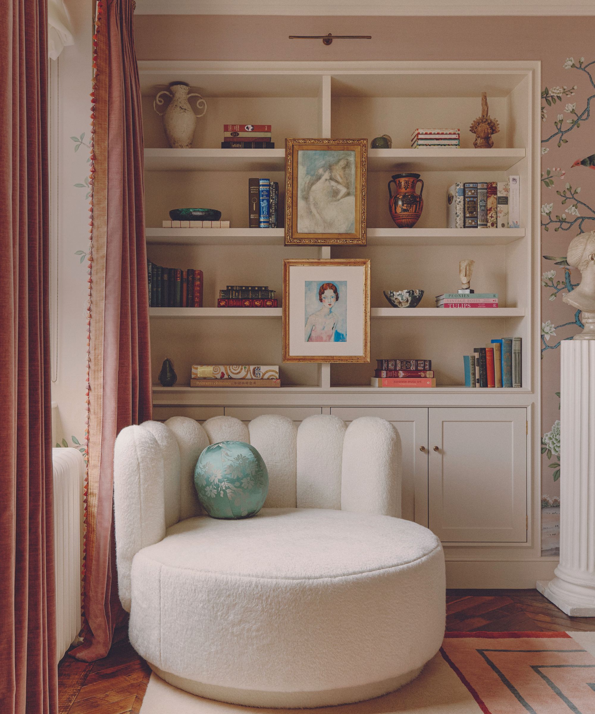
A major steer in the interiors was showcasing the client’s paintings and sculptures, a challenge the designer relished. ‘My client loves color and pattern, as do I,’ says Sophie, ‘but while my instinct is to exercise restraint, more is more for her. That attitude is fun for a designer and it opened my eyes to another world.’
Much to Sophie’s delight, it turned out to be a world where portraits hang nonchalantly on top of de Gournay wallcoverings. ‘People are usually afraid to cover handmade wallpaper,’ says Sophie, ‘but the client was happy to hang paintings and mirrors to make an even more interesting build-up of layers.’
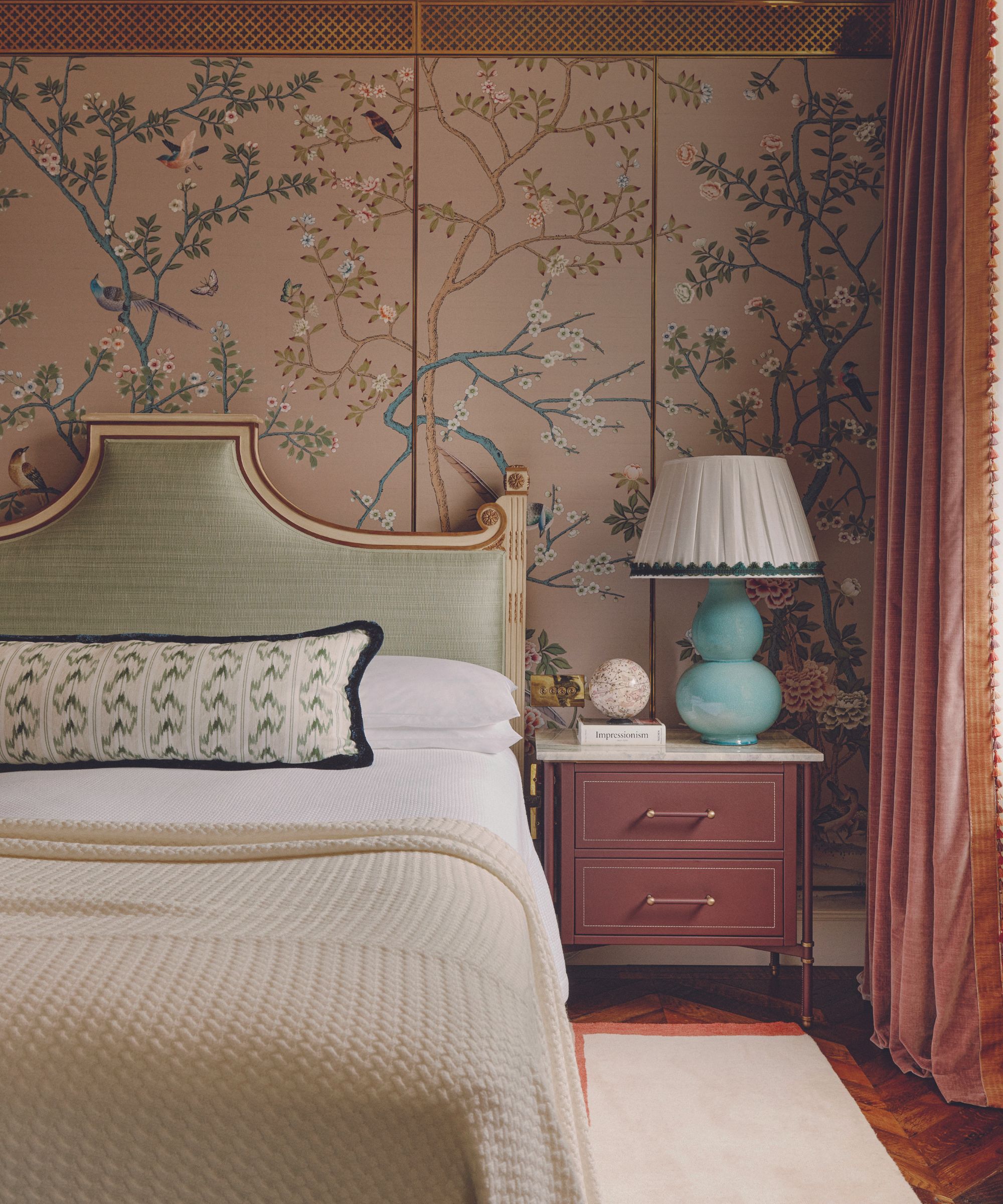
She also convinced Sophie that the two bedrooms should be wrapped wall-to-wall in the papers, whereas the designer had initially specified it only in the main bedroom behind the bed. ‘There were moments,’ says Sophie, ‘when I worried whether it was going to be balanced enough, but I’m so pleased with the result.’ Indeed, the effect is magical, a kind of flowery bower.
In the living room it’s the floor that gets the floral treatment, with a poppy-scattered rug adding a touch of the countryside. ‘I knew the client would appreciate the design as I’d seen her wear similar patterns in her clothing,’ says Sophie of the Rodarte collaboration rug.
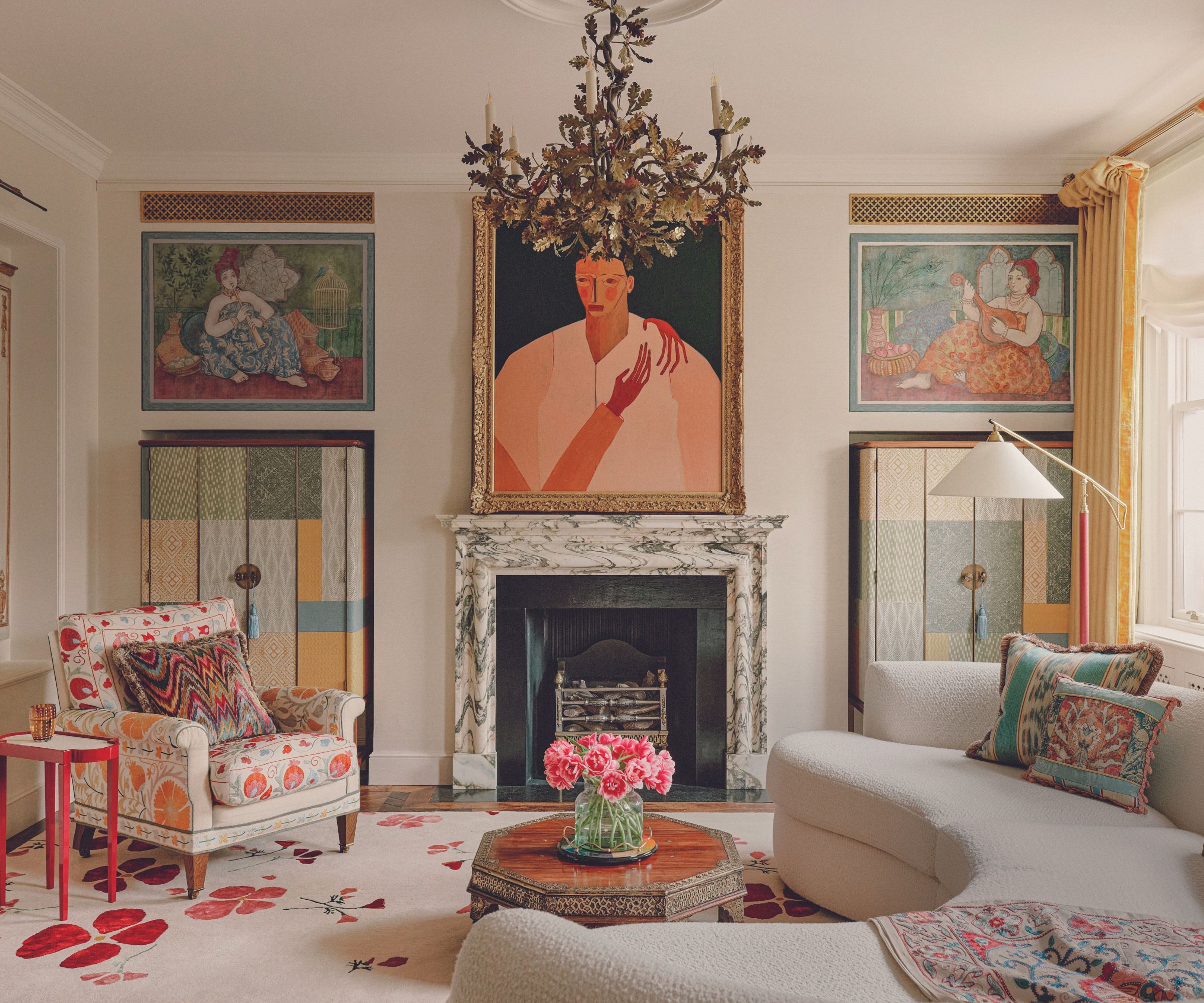
The fireplace wall was going to be mirrored, but plans were changed to incorporate access panels to the heating and cooling system. The volte-face offered an opportunity to display more art. ‘The client embraces intense portraiture of any period,’ says Sophie, and there are portraits from her collection in each alcove, while Studio Ashby sourced the mesmerizing Irreversible by Peggy Kuiper above the fireplace.
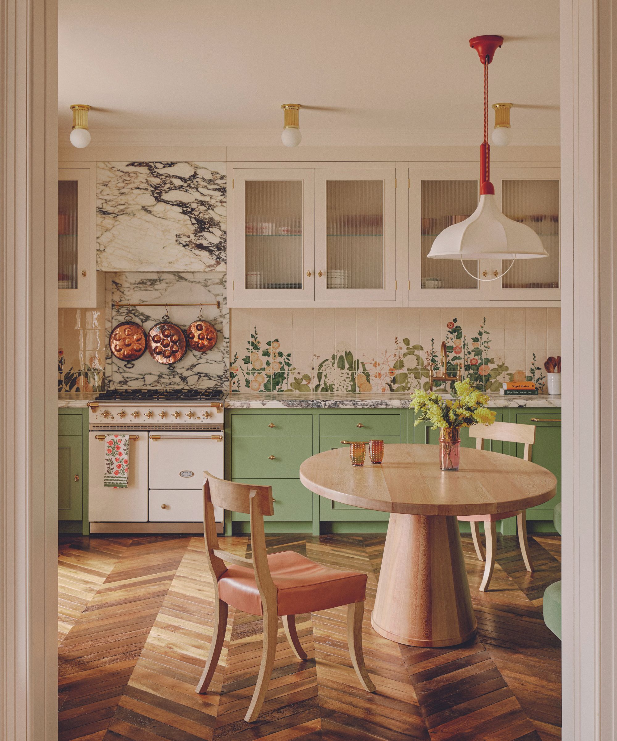
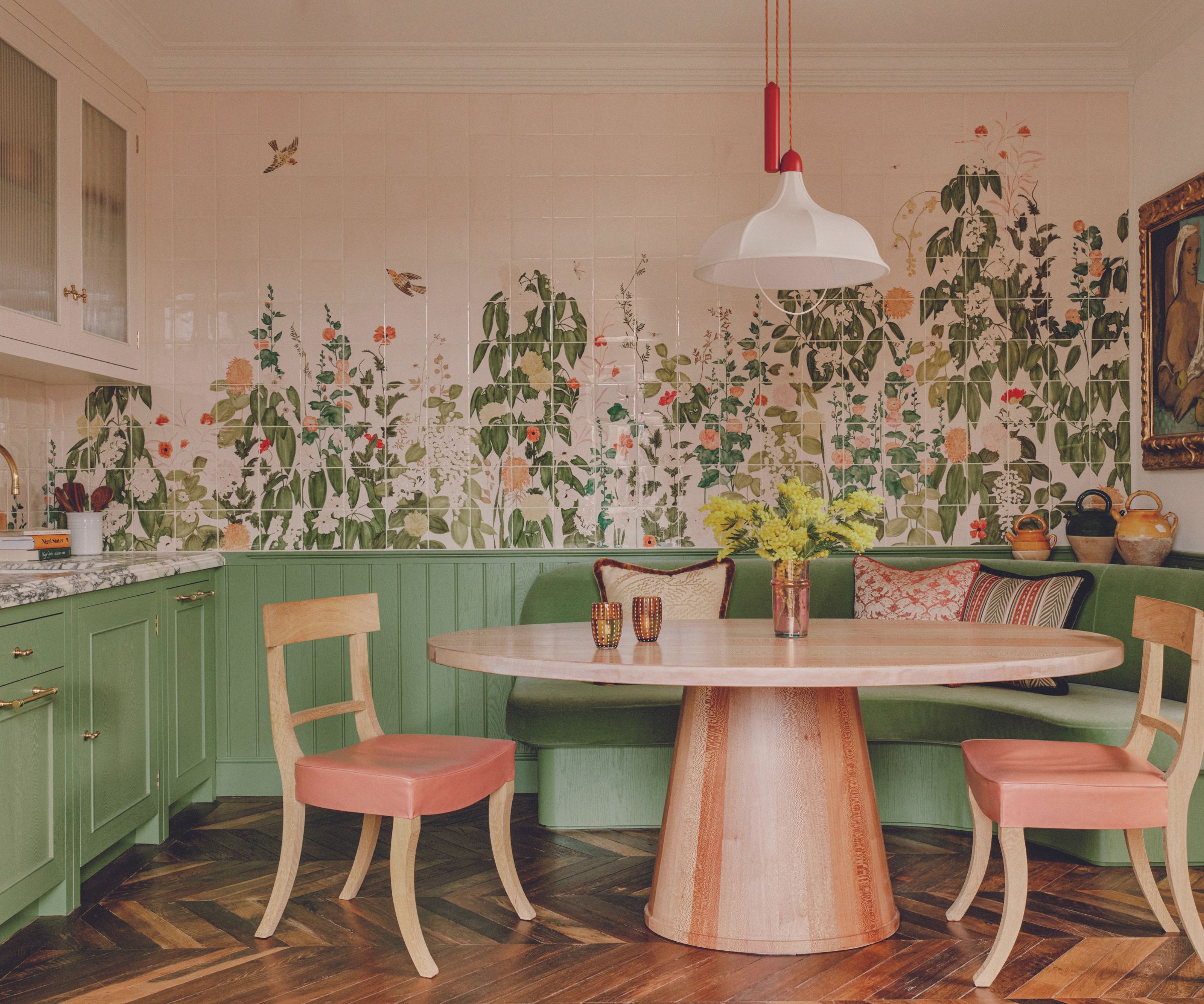
The sitting room and bedrooms were a collaboration between client and designer but Studio Ashby led on the more practical decisions. The tile installation in the kitchen is a case in point. ‘The design was based on a Japanese vintage screen,’ says Sophie. ‘I wanted to treat the kitchen walls as art, not another piece of chinoiserie, but a fresher look. A kind of meadowy, floral wrap, as if you’re in a garden.’
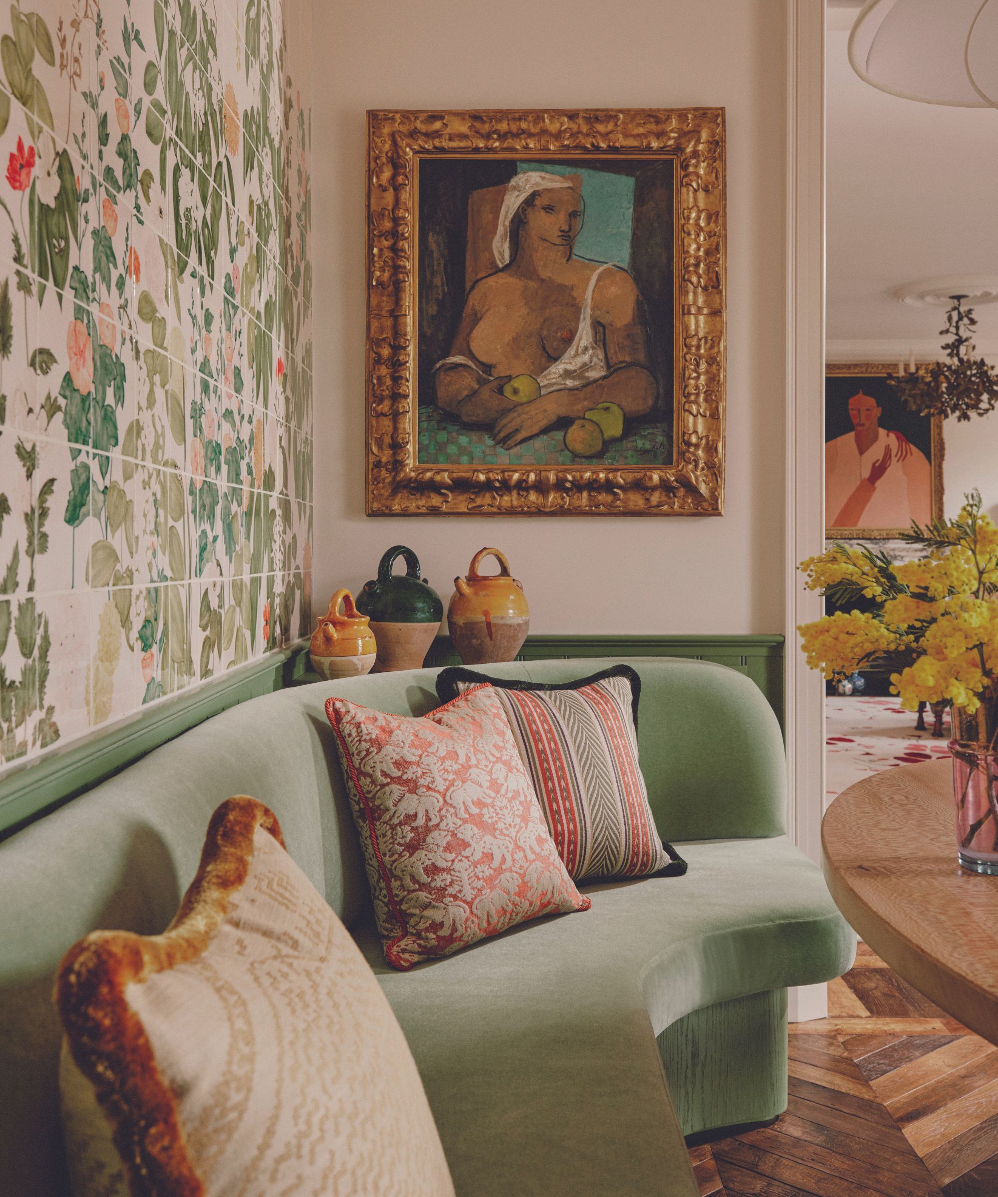
So far, so flowery – but where do you go with kitchen furniture against such a rich backdrop? Strong and sculptural was the response: green units, a banquette in toning fabric, and the room’s co-star (alongside those tiles), a table made of London plane wood.
Exquisitely proportioned with a cone-shaped base, the table is an oasis of calm. Spend a little time there and you’re refreshed and ready to appreciate the color, pattern and florals all over again
Meet the designer
Sophie Ashby shares her style inspiration
BIGGEST INDULGENCE
The bespoke de Gournay wallcoverings.
GREATEST SUCCESS
The tile mural in the kitchen, which we commissioned Anna Glover and Balineum to create.
SMALL CHANGE, BIG IMPACT
The reclaimed timber parquet flooring was hugely successful in bringing character and warmth to the interior. I
INSPIRATION
Art, travel, nature.
NEXT GAME-CHANGER IN DESIGN
Humbly, I hope United in Design, the charity I co-founded to address the lack of diversity in my industry, will bring lasting and badly needed change.
YOUR STYLE IN THREE WORDS
Artful, soulful, layered.
WORDS TO LIVE BY
Don’t sweat the small stuff.
LAST PODCAST DOWNLOADED
Incredible Women by Net-a-Porter.
Sign up to the Homes & Gardens newsletter
Design expertise in your inbox – from inspiring decorating ideas and beautiful celebrity homes to practical gardening advice and shopping round-ups.
Karen sources beautiful homes to feature on the Homes & Gardens website. She loves visiting historic houses in particular and working with photographers to capture all shapes and sizes of properties. Karen began her career as a sub-editor at Hi-Fi News and Record Review magazine. Her move to women’s magazines came soon after, in the shape of Living magazine, which covered cookery, fashion, beauty, homes and gardening. From Living Karen moved to Ideal Home magazine, where as deputy chief sub, then chief sub, she started to really take an interest in properties, architecture, interior design and gardening.
-
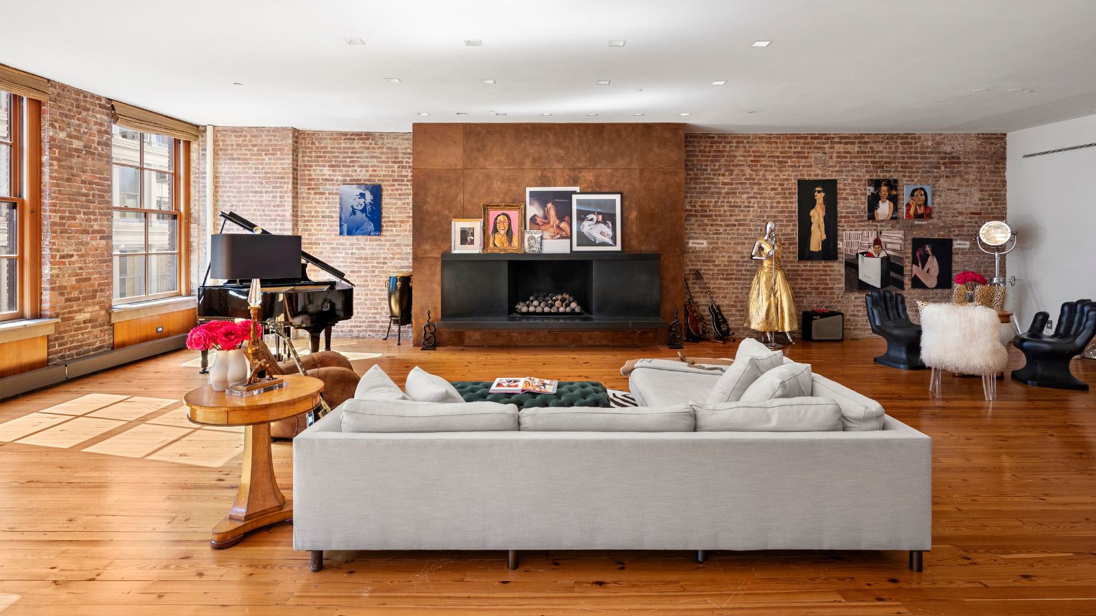 Courtney Love's historic loft combines rock star luxury with raw New York bones – it's on the market for almost $9.5 million
The singer's former SoHo home features exposed brick walls, original wooden columns, a gas fireplace, and high ceilings – take the tour
By Hannah Ziegler
-
 Triangular shaped garden ideas – landscape designers share 9 ingenious ways to redesign your corner plot
Expert tips for planning, planting and finessing a triangular shaped plot, so you can savour the space year round
By Jill Morgan