This serene LA home combines English country with a relaxed Californian vibe
Jake Arnold’s integration of contemporary Californian style and traditional British design has produced a luxurious home
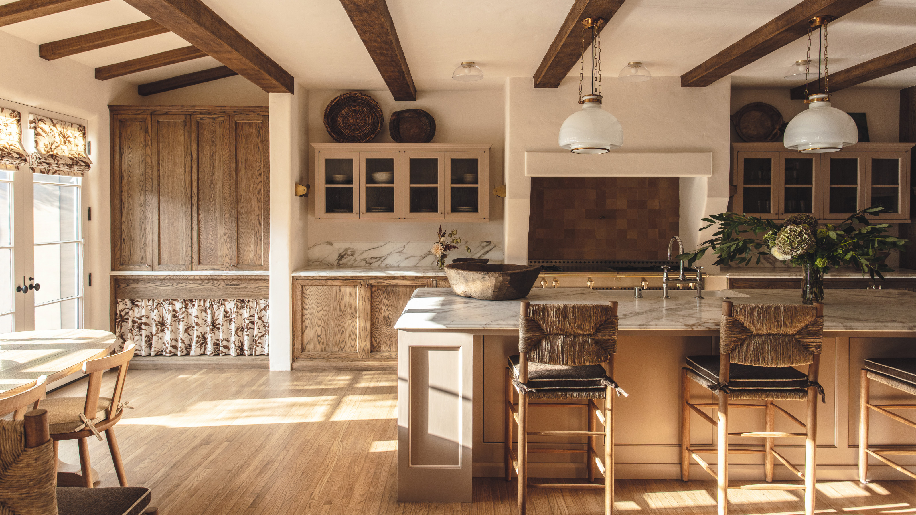

Paying homage to the original 1930s architecture of Paul Williams, who created homes for Hollywood stars, including Frank Sinatra and Lucille Ball, was the intent of British-born, LA-based interior designer Jake Arnold when tasked with remodelling this Spanish Revival property in LA, one of the world's best homes.
Jake, whose clients are just as illustrious – John Legend, Aaron Paul and Sophia Bush, to name a few – is known for his effortless integration of the timeless, traditional design aesthetic of his London upbringing with the more laid-back Californian lifestyle he has embraced for the past 10 years.
For this family home, he wanted, he says, to create ‘high impact liveable spaces that brought in textures and richness through textiles and vintage lighting. We were very much inspired by certain elements of the English countryside when it came to the kitchen, while giving it a California relaxed look.’
And he has certainly succeeded, creating an interior that exudes warmth, yet is practical for the family that lives there and faithful to the original design. ‘The owner purchased the home in 2019,’ he says. ‘It had been previously remodelled within the last 10 years but it was far from the level of quality that you would expect. We took over the renovation, which took a year and a half to complete. I worked alongside architect Xavier Beltran, who specializes in renovating historic houses. We doubled the square footage of the house to make it fit for a family home.’
While Jake worked hard to retain original features – ‘It was really important to maintain the terracotta floor in the entryway and ceilings in the living room, library and entry,’ he says – he and Beltran recognized the need for a modern interior layout.
Entry way
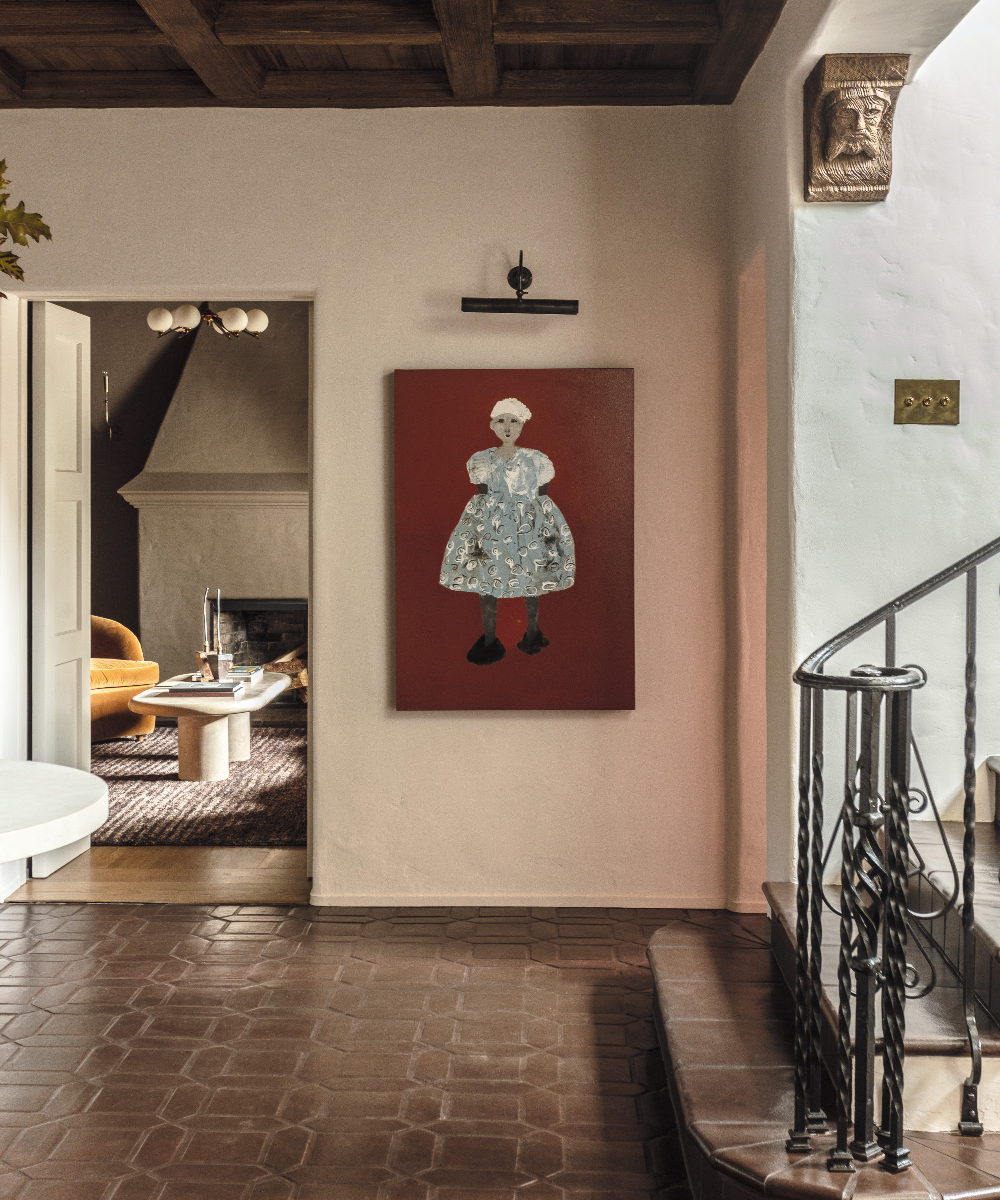
Hallway ideas included retaining the original floor tiles from Paul Williams 1930s design and are just one of the authentic elements kept during the renovation. Beyond the entry way is the family snug.
Living room
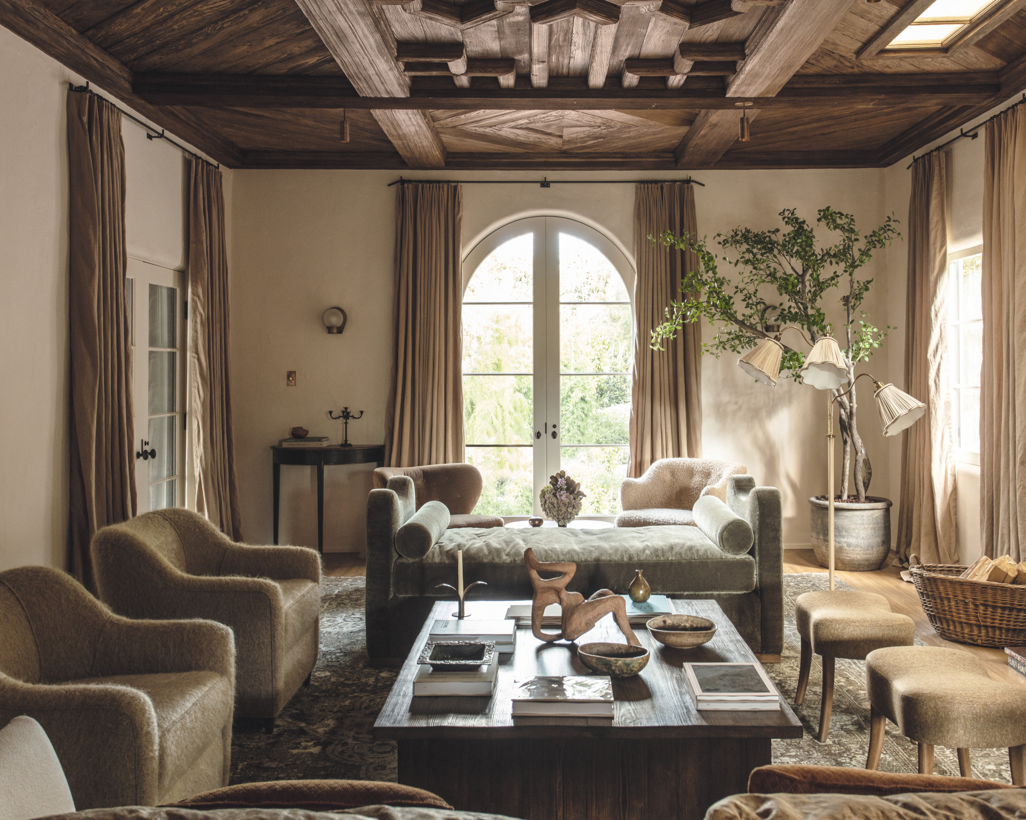
The Spanish Revival architecture, including the timbered ceiling, was carefully preserved. The introduction of bespoke beautifully curved pieces of furniture, perfect for lounging and as a contrast to the lines of the ceiling, is one of Jake's clever living room ideas.
When it came to the color palette, textures, lighting and drapery, Jake and his clients opted for plush, luxurious-feeling materials. ‘The main driver for this direction was the clients’ desire to have all of the spaces be fully liveable and not precious,’ says Jake.
Dining room
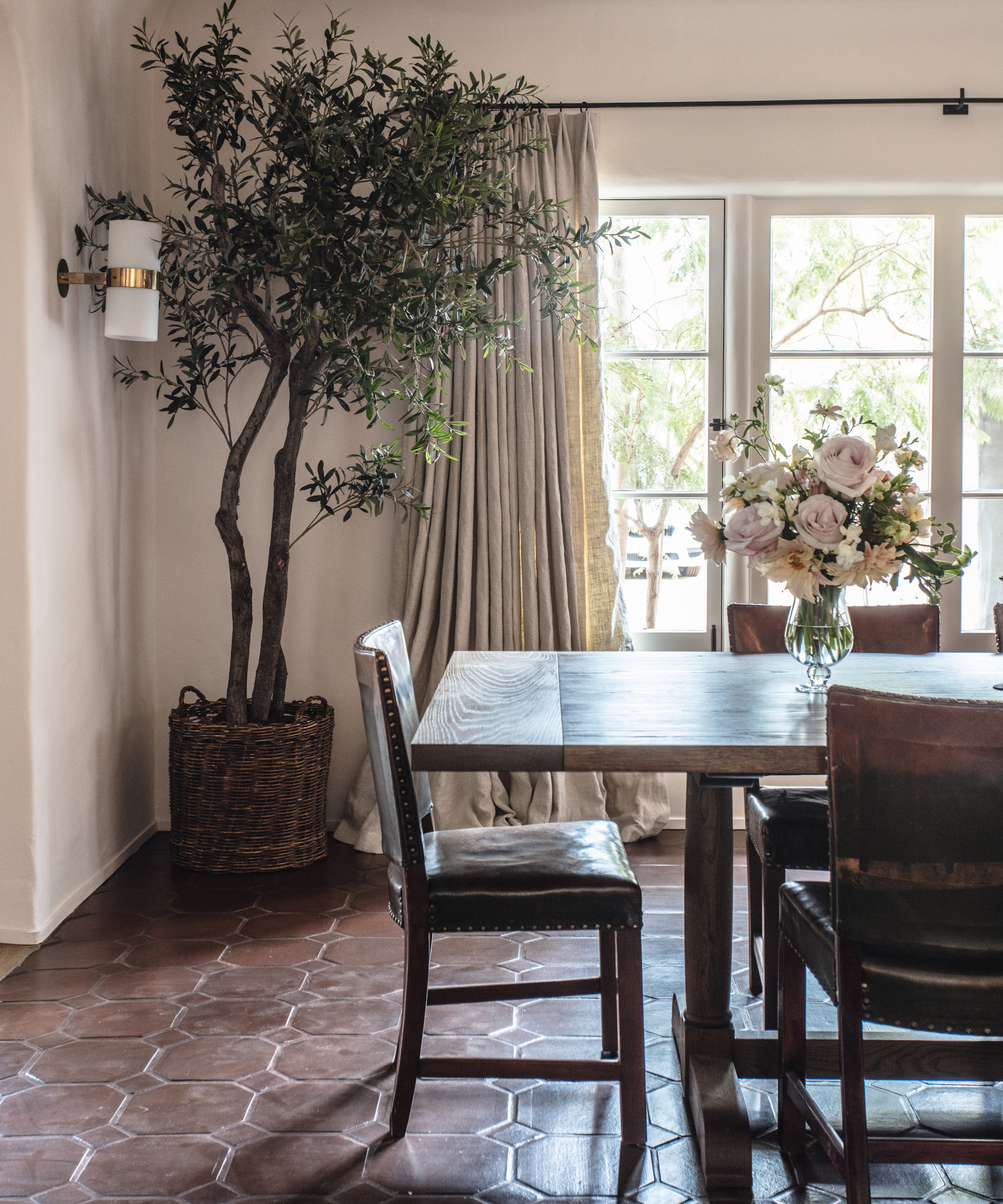
The entry way tiles lead into this dining space, which overlooks the terrace and, like other rooms in the house, is lit with vintage wall lights. Dining room ideas include introducing pops of color through lighting. ‘The client wanted to maintain a fairly neutral palette so we introduced bold lighting complements such as red picture lights in the dining room,’ says Jake.
Kitchen
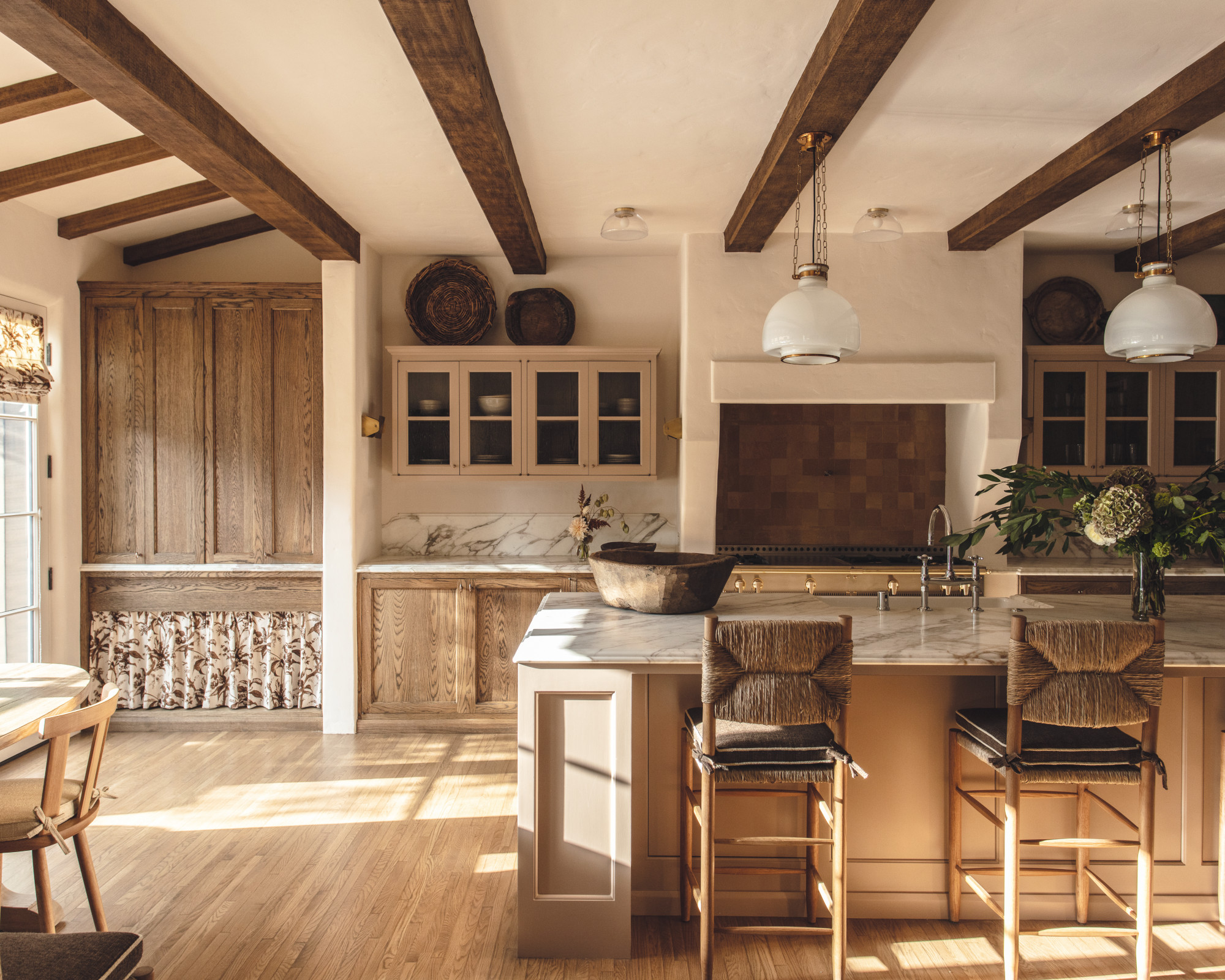
Timelessness was key when it came to the kitchen. A neutral scheme with different variations of the color mocha was used, exuding warmth with its rich textures. The introduction of a whimsical accent fabric was one of the kitchen ideas.
‘We wanted to create a well-appointed space that functioned as a central hub for the home, so we developed a rich warm wood tone for the cabinetry, coupled with hand-painted cabinets, antique bronze hardware and a classic La Cornue range. It was important to combine high impact with minimal materiality. Lastly we chose an ogee edge for the stone to enhance the natural veining of the marble,’ says Jake.
Home bar
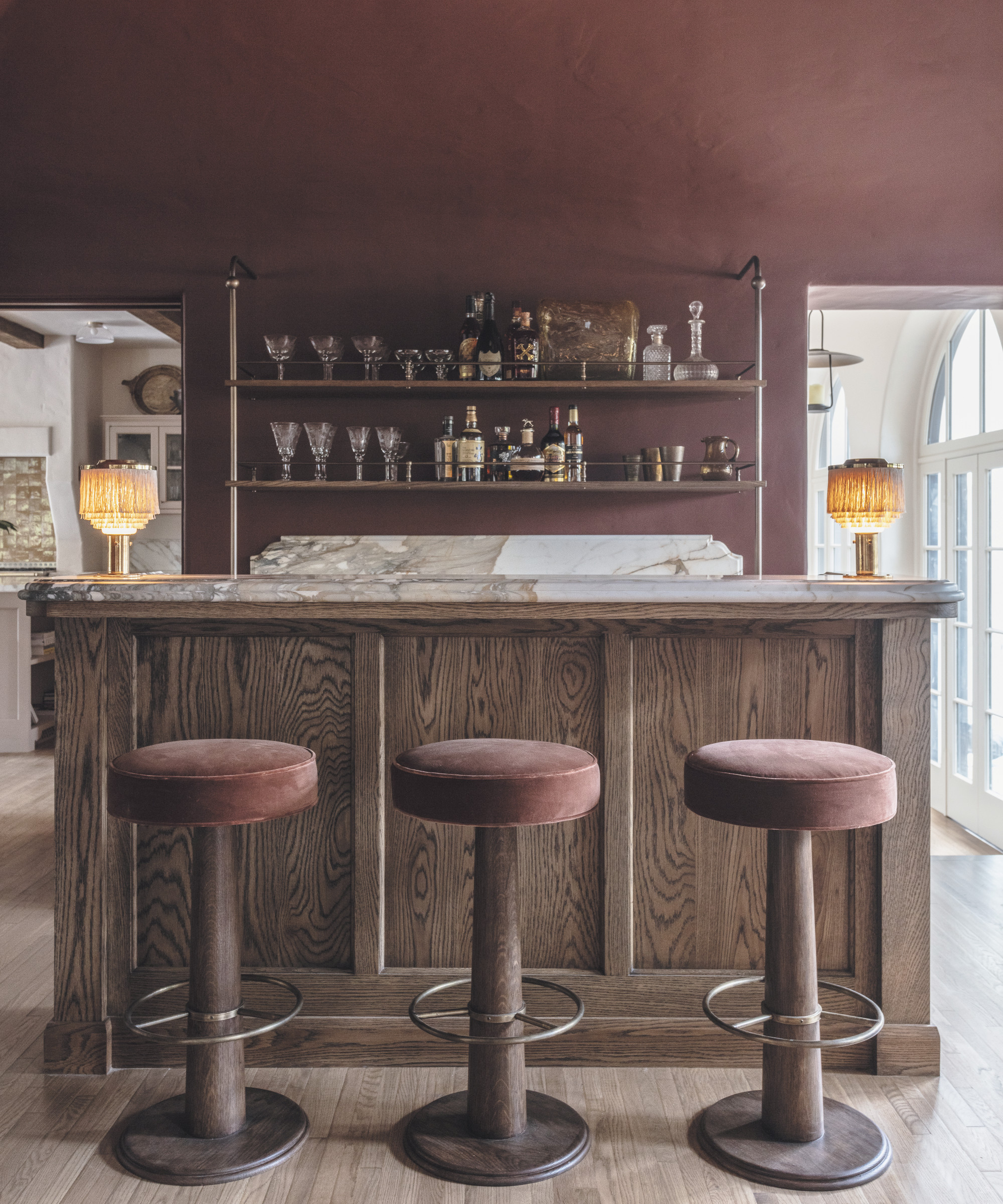
The home bar is an elegant space to gather with friends. ‘We chose a bold, deep burgundy and paired it with a monochromatic palette, which felt like a nice departure from the otherwise white plastered rooms,’ says Jake.
Family room
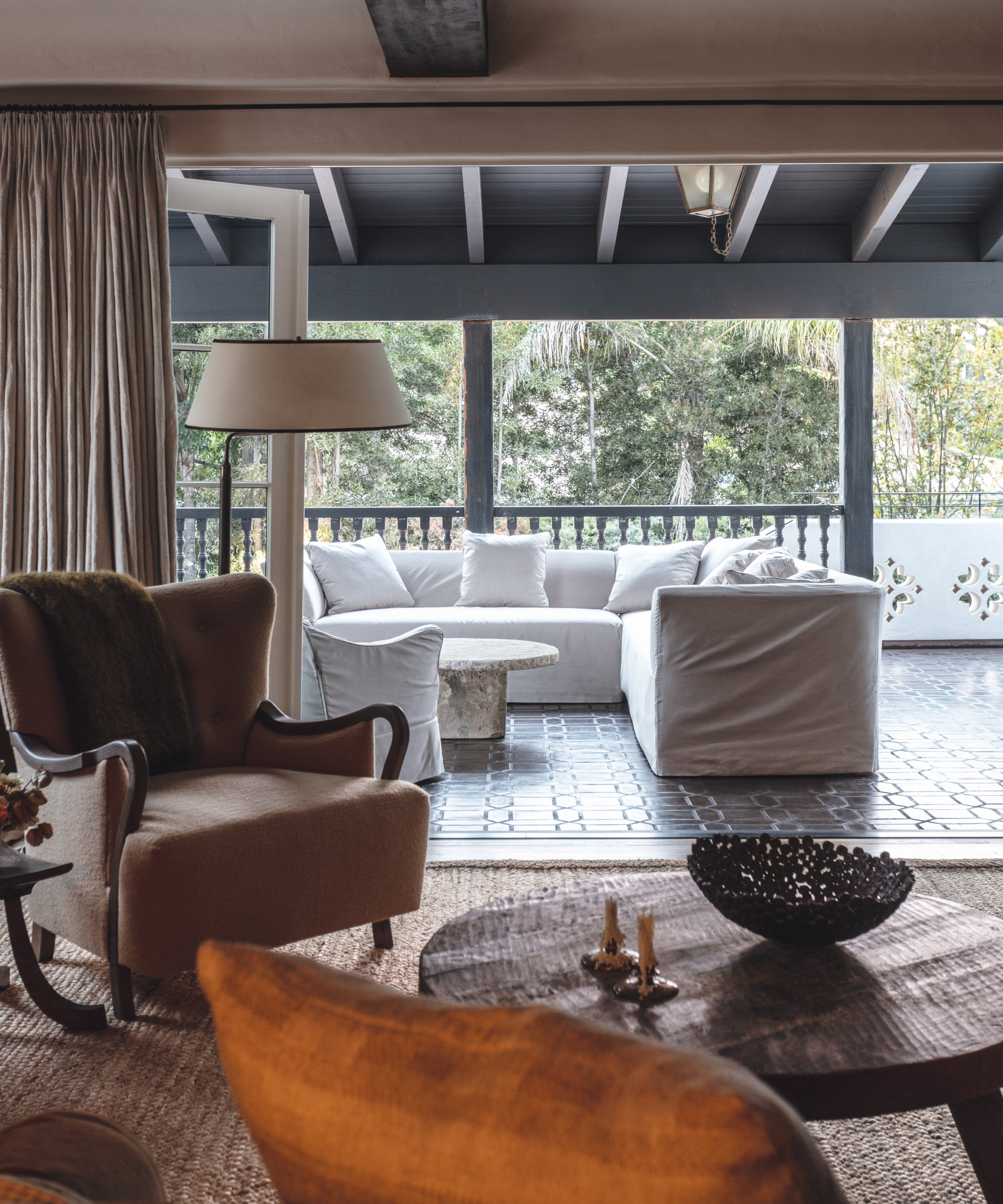
Beyond the kitchen is another living space that opens onto a covered patio, which speaks to the home’s Spanish Revival style.
‘This is a primary residence for a family. It was important to create a space that had an open-plan kitchen and family room where they could come together while also having intimate spaces for entertaining and working from home,’ says Jake.
Bedroom
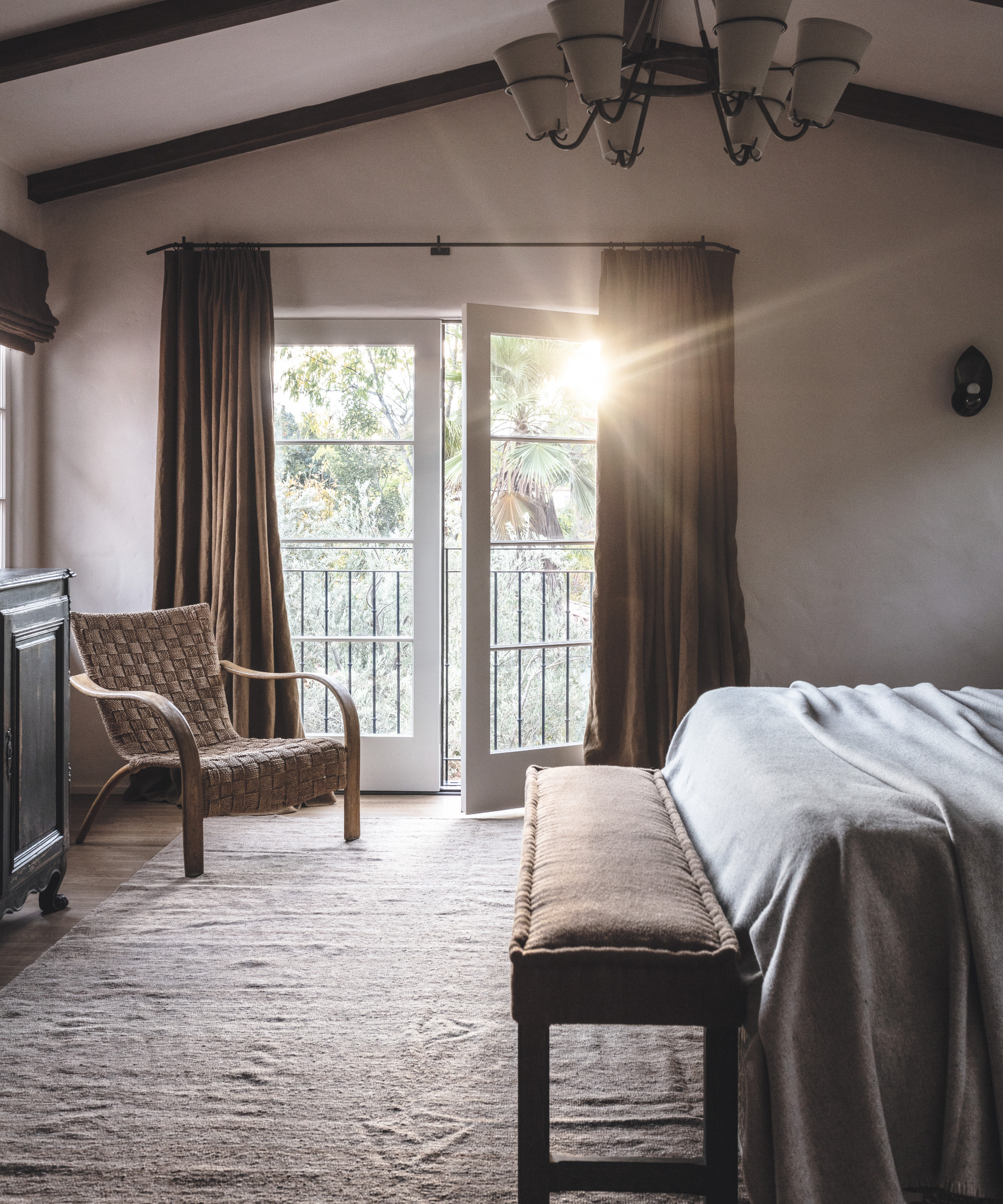
Jake’s use of soft brown accents is particularly successful in the bedroom, creating a feeling of comfort. A retro-style woven chair is one of the bedroom ideas for incorporating texture and shapely curves.
Bathroom
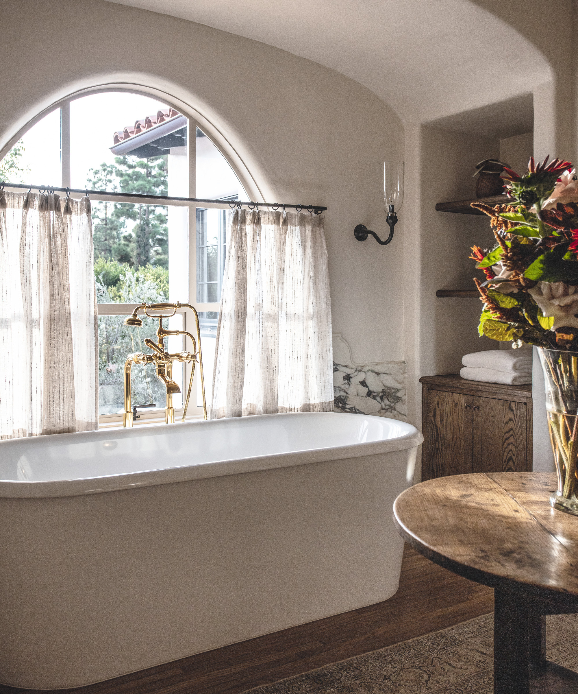
‘The direction in the bathroom was to create drama with rich stone and cabinetry. We chose to have a wainscot by the tub of stone, which felt more architectural. The water closet was painted by James Mobley,’ says Jake.
Bathroom ideas to ensure this is a place to linger and relax include an antique rug and table, along with floaty curtains.
The result is a home that’s loved equally by Jake and his clients. ‘You can immediately feel the rich history and beautiful bones of the house when walking in,’ he says. ‘And the new design gives it a fresh, yet timeless and comfortable feel.’
Interior design/ Jake Arnold
Architect/ X Beltran Architects
Contractor/ Valle Rhenis
Photographs/ Michael P H Clifford
Sign up to the Homes & Gardens newsletter
Design expertise in your inbox – from inspiring decorating ideas and beautiful celebrity homes to practical gardening advice and shopping round-ups.

Lucy Searle has written about interiors, property and gardens since 1990, working her way around the interiors departments of women's magazines before switching to interiors-only titles in the mid-nineties. She was Associate Editor on Ideal Home, and Launch Editor of 4Homes magazine, before moving into digital in 2007, launching Channel 4's flagship website, Channel4.com/4homes. In 2018, Lucy took on the role of Global Editor in Chief for Realhomes.com, taking the site from a small magazine add-on to a global success. She was asked to repeat that success at Homes & Gardens, where she has also taken on the editorship of the magazine.
-
 This simple marble hack elevates my budget-friendly wooden kitchen countertops and prevents the dreaded water damage for way less than you’d think
This design trick looks expensive, solves a problem, and was the easiest decision I made during my kitchen reno
By Charlotte Olby Published
-
 Emily Blunt gifted Cillian Murphy this $545 pillow – she's 'obsessed' with these luxury pillows, and frankly, so are we
The Oppenheimer stars sleep on this ultra-luxe goose down pillow – here's why we love it – plus our affordable alternatives from $35
By Sophie Edwards Published