A chic and eye-catching interior oozes wow factor in this London apartment
Unexpected, colorful, yet pulled-together – that was designer Irene Gunter and her clients’ end goal for this Victorian duplex
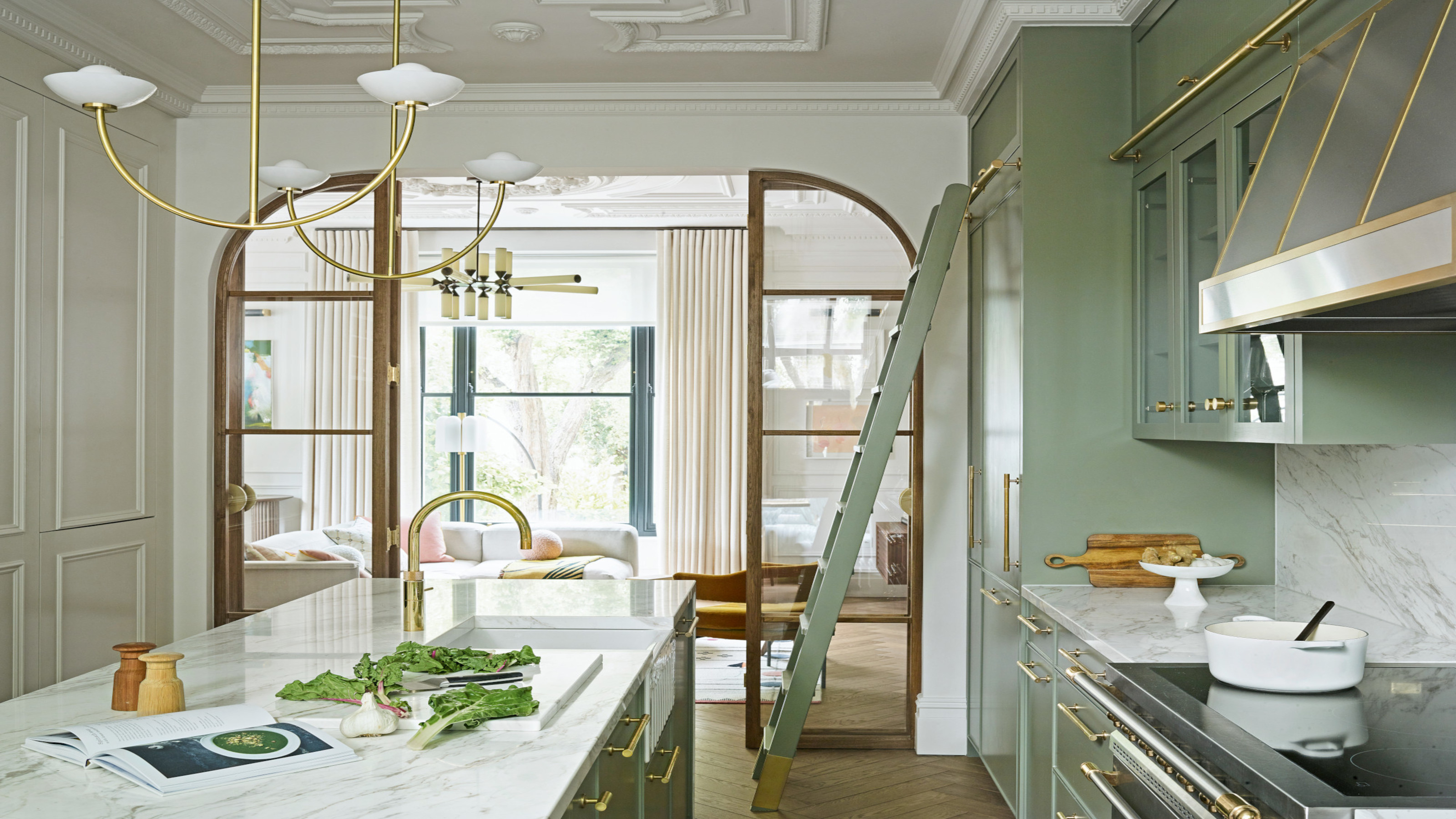

According to legendary American magazine editor Diana Vreeland, ‘the eye has to travel’, and that oft-repeated maxim couldn’t be more apt when it comes to the layered, playful interiors of this London duplex, undoubtedly one of the world's best homes. Intriguing details are everywhere, from inset terrazzo archways to intricate fluted tiling, each inviting the eye on a journey of exploration.
Owned by Rebecca Young Riboldi, who grew up in North Carolina, and her Italian husband Riccardo, the reconfigured space has a distinctly international flavor, encompassing an irreverent mix of global elements.
‘We share a very similar sense of humor and I think that comes through in the interiors,’ says Rebecca, who turned to designer Irene Gunter of Gunter & Co to help revitalize the space.
‘We like light, fun touches and also to go off-piste and even get a bit messy and imperfect at times.’
Messiness aside, Irene took that brief and ran with it. ‘We took our cue from the couple’s love of contemporary, abstract art,’ says Irene.
Behind the decorative details lie a host of clever designs that have transformed the flat. Irene undertook ‘opening-up works’ to acquaint herself with the bones of the building and found that ceilings had been lowered and original proportions obscured. In the end, not a single room went unaltered, yet the resulting schemes look as if they have always been there.
Living room
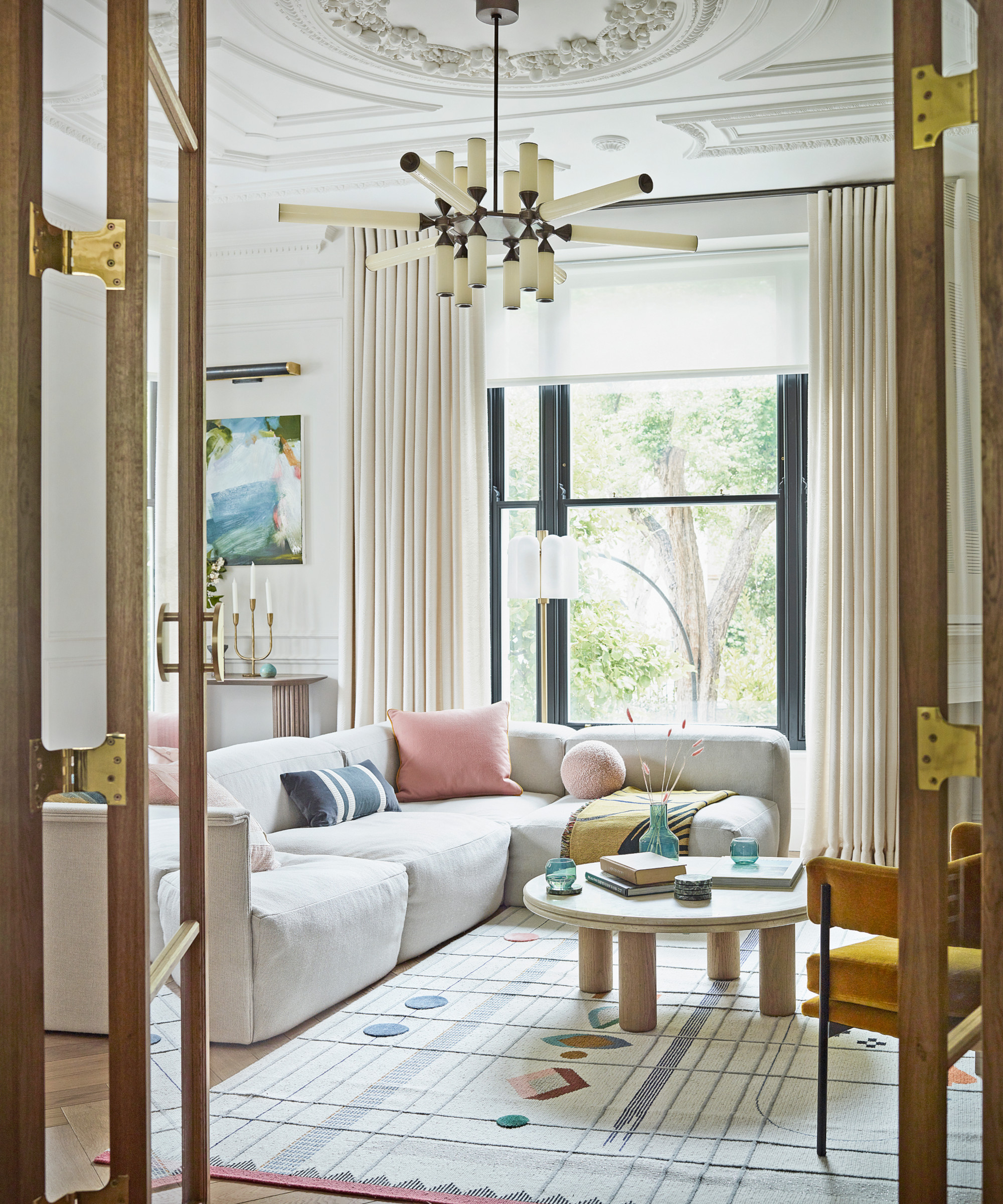
One of Irene's decorative living room ideas was injecting interest with shapes. ‘We enjoy round shapes and softened edges,’ says homeowner Rebecca of this space, where a modern pendant and rug introduce a graphic element.
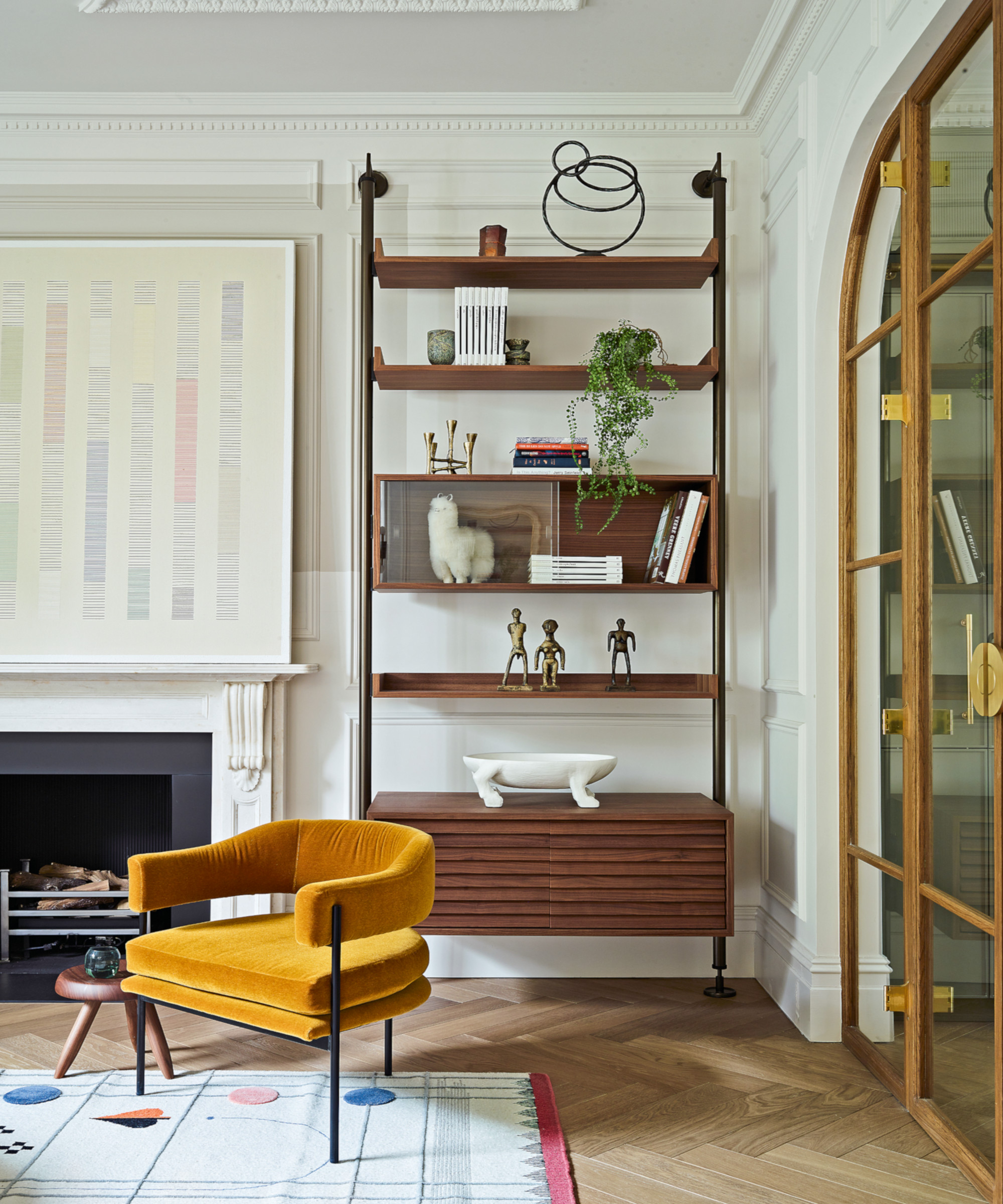
The contemporary lines of the alcove unit and chair are a striking foil to the period architecture.
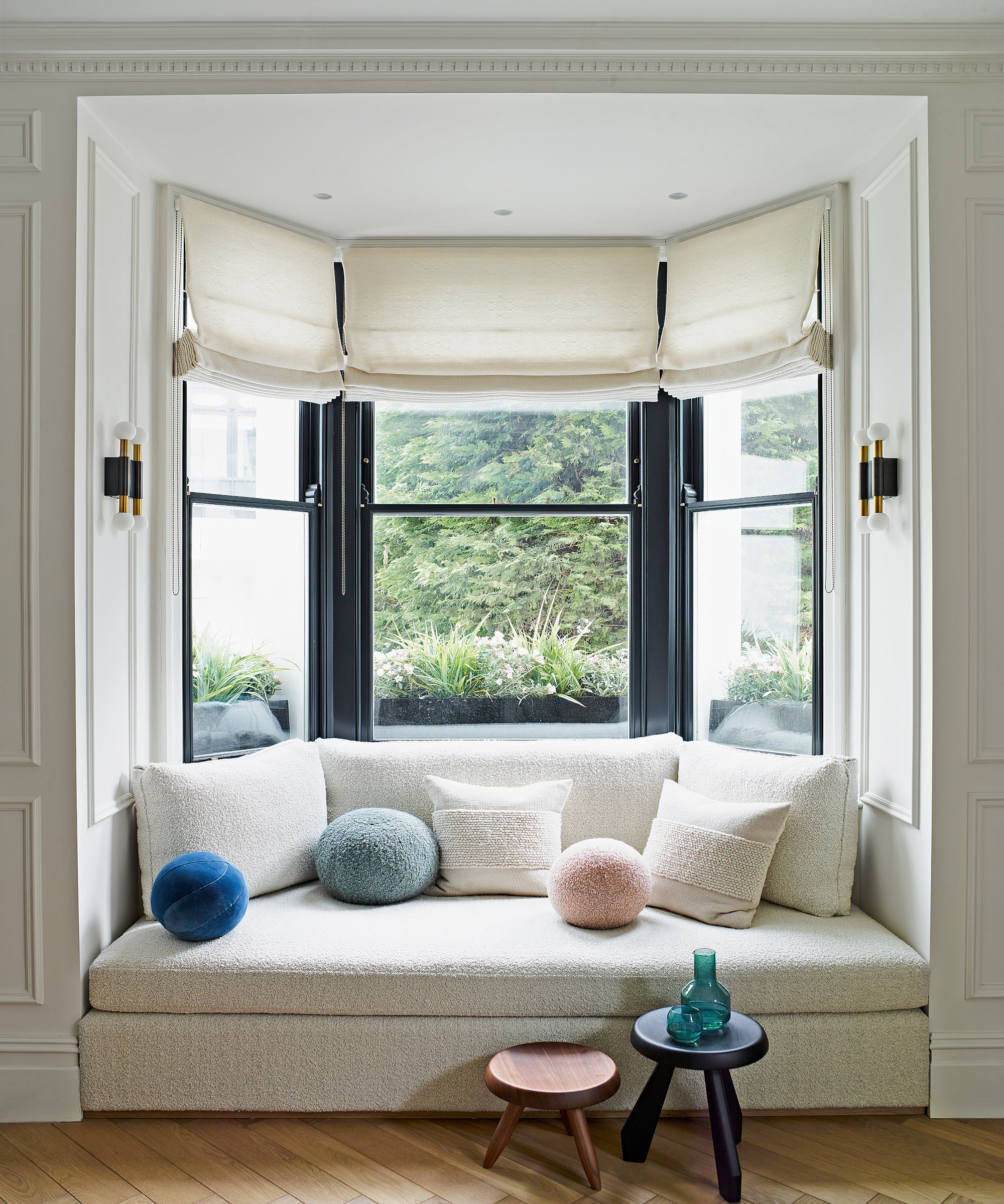
A built-in seat by Gunter & Co makes a feature out of this bay window. ‘It’s one of my favorite places to relax with a book,’ says Rebecca.
Kitchen

A narrow hall was removed between the kitchen and living room to join the spaces.
Other kitchen ideas include the generous arched oak-framed doorway with double doors, an unexpected element that is decorative yet contemporary. ‘We wanted to reference the traditional use of oak in period homes but with a modern twist,’ says Irene. 'Victorian houses have always featured oak, so we wanted to return to that look, albeit in an updated way.'
Color and pattern are essential elements. ‘Where I grew up, in the American south, color was everywhere,’ says Rebecca. Riccardo, who was raised in Milan, also has a keen eye for design. ‘That has come through in our kitchen, which is a real cook’s space,’ says Rebecca. ‘And also in our use of terrazzo, which is a key Italian motif. While we were reworking this home, we were also renovating a place in Puglia and some of those design choices have been replicated here in London, including our large collection of Pugliese ceramics.’
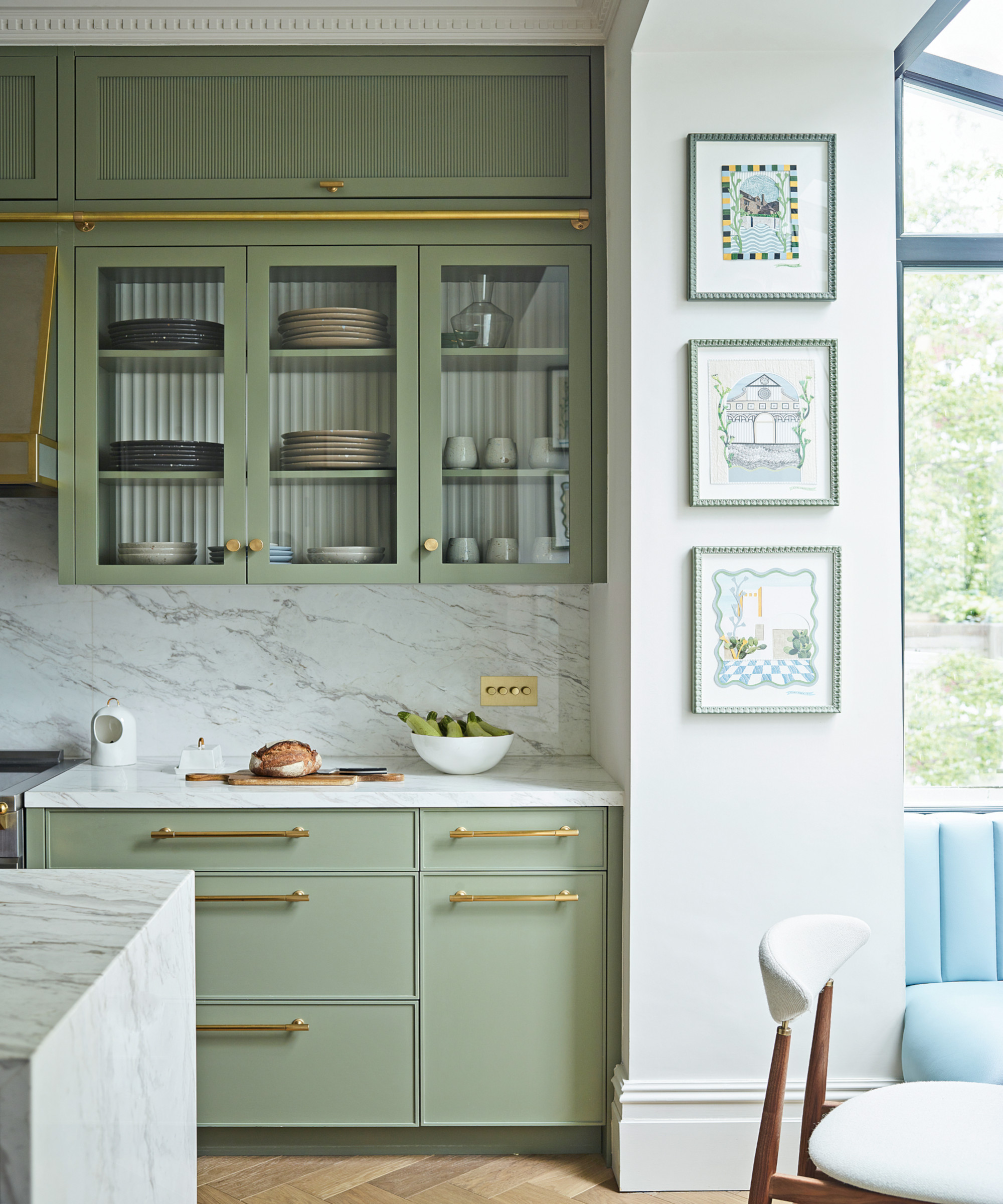
The glass-fronted cabinets have fluted detailing, which brings a whimsical touch.
Kitchen diner
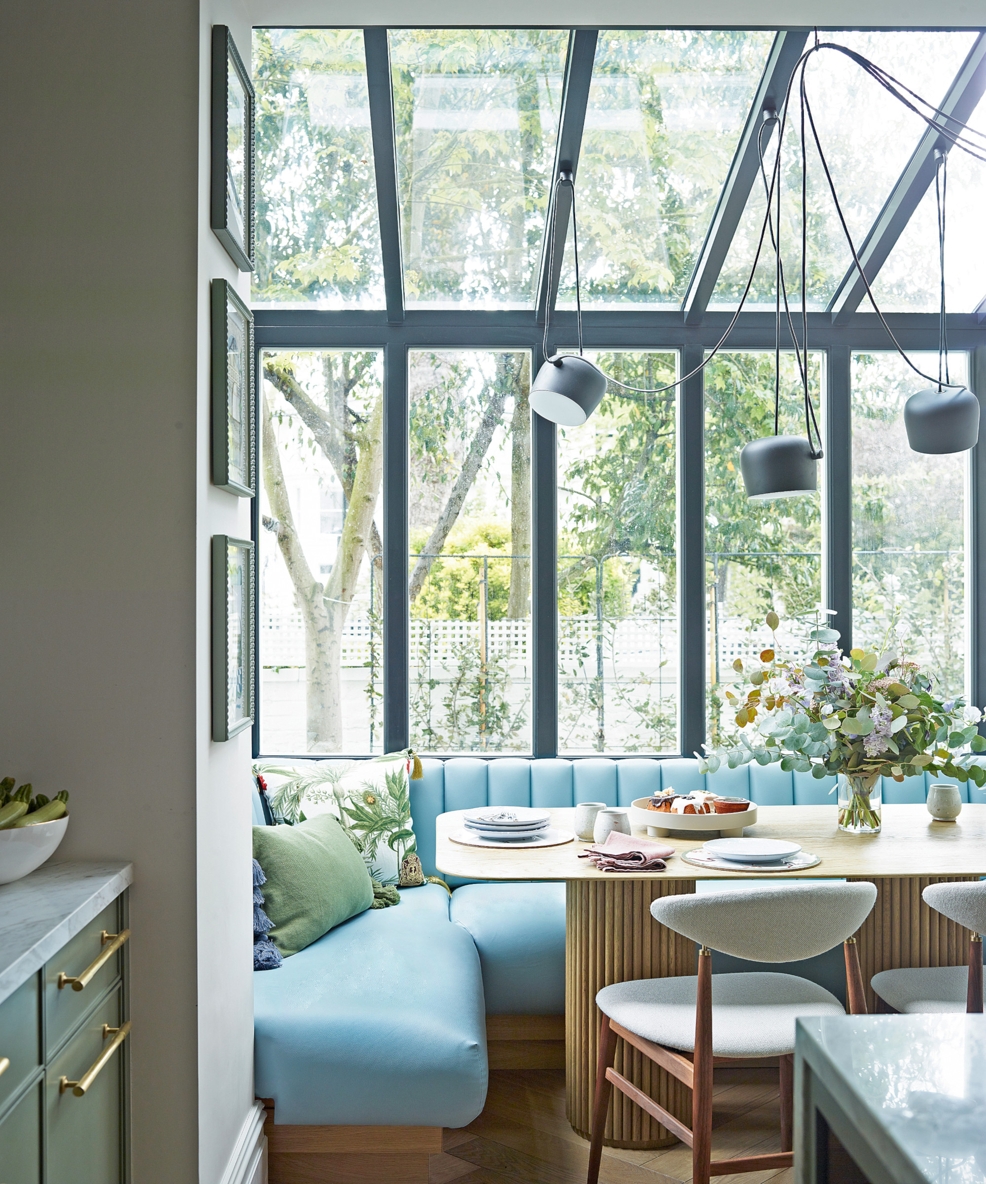
The couple extended at the rear to create a light-filled dining space. Dining room ideas include introducing a faux blue leather banquette for stylish yet informal seating. The glass extension's black metal frame is complemented by a classic Flos pendant.
Main bedroom
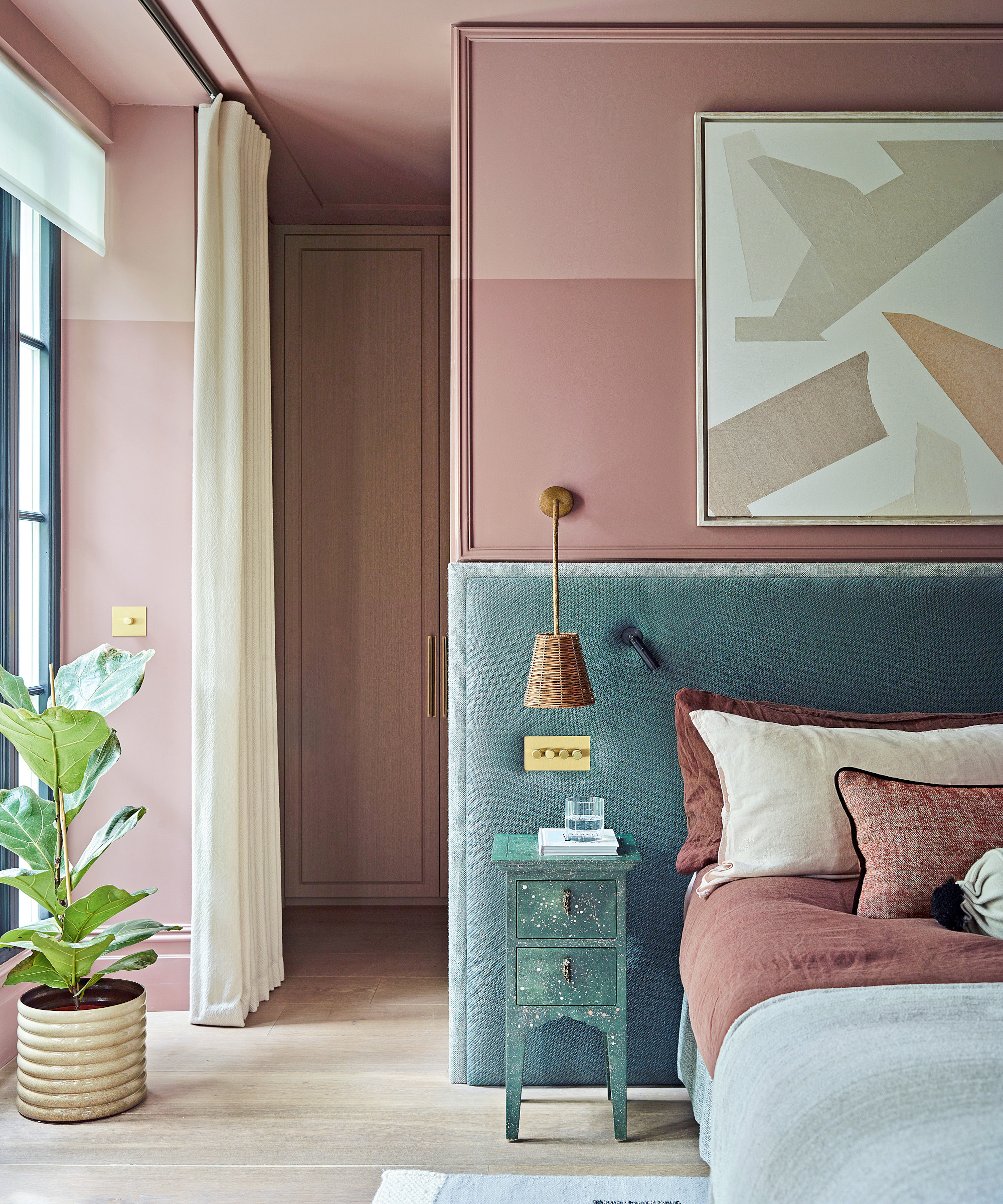
Downstairs, three bedrooms became two to make room for an en suite and dressing room, a guest bathroom and a cloakroom.
One of Irene's bedroom ideas was to introduce striking layered tones of pink inspired by the couple’s Puzzle IV artwork by Kim Bartelt above the bed. 'Seeing how unexpected colors can work on a canvas makes it much easier to make braver interiors choices,' says Irene. The green headboard and black window frames ground the swathes of pink.
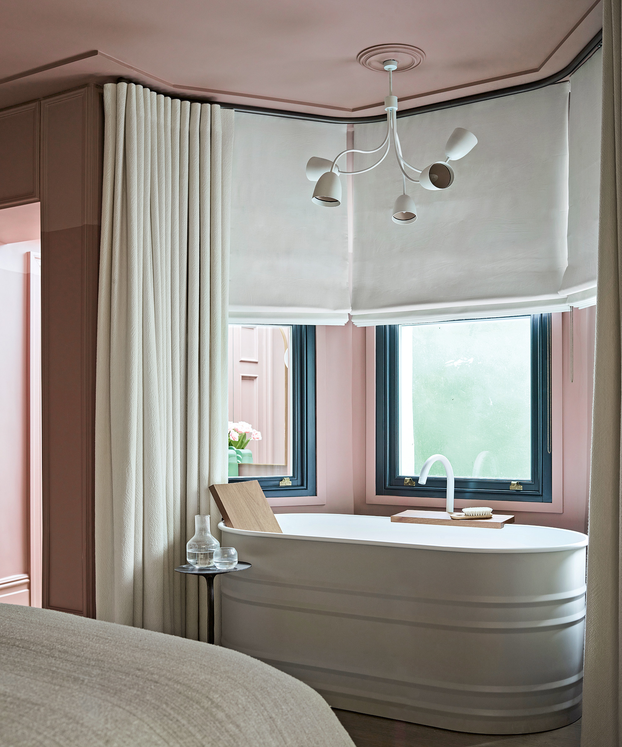
A curved bath sits snugly under the window, affording the couple space for a generous shower in their en suite. ‘Some decisions were practical rather than stylistic, such as placing the bath under the window in the bedroom to free up space in the shower room,’ says Irene. ‘But it works brilliantly – we enlarged the windows so that bathing there feels like a luxurious and cozy experience.’
Four years in the making, Irene says that this project has barely strayed from the couple’s initial vision of an unstuffy, colorful yet pulled-together home. ‘As an interior designer, you come to expect a little pushback from clients who might be nervous of making a leap of faith,’ she says. ‘But in this case, we couldn’t be freethinking enough.’ The eye-catching results are testament to that spirit of adventure.
Photography/ Mary Wadsworth
Text/ Emma J Page
Design expertise in your inbox – from inspiring decorating ideas and beautiful celebrity homes to practical gardening advice and shopping round-ups.

Interiors have always been Vivienne's passion – from bold and bright to Scandi white. After studying at Leeds University, she worked at the Financial Times, before moving to Radio Times. She did an interior design course and then worked for Homes & Gardens, Country Living and House Beautiful. Vivienne’s always enjoyed reader homes and loves to spot a house she knows is perfect for a magazine (she has even knocked on the doors of houses with curb appeal!), so she became a houses editor, commissioning reader homes, writing features and styling and art directing photo shoots. She worked on Country Homes & Interiors for 15 years, before returning to Homes & Gardens as houses editor four years ago.