How do you redesign a home fast? This 90s-style home was remodeled with small and speedy changes – here are the steps the designer swears by
Time may have been tight, but the results are stunning
- 1. Keep structural changes to a minimum
- 2. Select in-stock items to save wait times
- 3. Paint kitchen cabinetry instead of replacing it
- 4. Don't rip out wood flooring, try refinishing it
- 5. Give molding details a new look with paint
- 6. Embrace and enhance existing architectural features
- 7. Ring the changes with dramatic dark paint
- 8. Streamline the look by evening out dropped ceilings where possible
- 9. Plants, artwork and a warm palette are speedy bedroom updates
- 10. Simply adding texture can make all the difference
- 11. More space or built-in storage? Decide what works best for you
- 12. Look for quick fixes for wasted space
This California ranch-style home had a distinctly 90s-noughties look about it when its new owners took it on around 12 months ago. Now, however, with a sophisticated, pared-back décor that puts it among the world's best homes, the one-story home in Saratoga, CA, is far better set up for modern family life, entertaining and all-round relaxing.
Following a redesign, spearheaded and project managed by interior designer Carolyn Brandwajn of CBespoke, the once-bland and somewhat problematic 2002-built living space has been transformed.
Carolyn describes the new look as 'hints of New England with a splash of California Casual meets Upper East Side', a winning combination that you'd expect to have been a long and complicated job, involving building, renovation and wholescale replacement of fittings, and that's before you even get to the redesign.
However, time was of the essence here so designer Carolyn had to work smart, as she explains. 'The couple was expecting their second child six months out from when they bought the property. They were living on the East Coast while I managed the design and installation and they wanted a quick turnaround time so they wouldn't be bringing a baby into a construction zone.'
The project was completed on time. 'It took us six months with not a minute to spare!' says Carolyn. 'The baby came home from the hospital as the cleaning crew was finishing up! The designer gives us a tour of the redesigned home, and shares her tips for creating sophisticated, livable style when there's no time to lose.
1. Keep structural changes to a minimum
'The house had a lot of the 90s, early 00s interior design that dated the aesthetic,' explains Carolyn. 'But the bonuses were tons of light and a one story layout for the kids to run around in. My approach towards the design was to pull elements from the family's current home in New York, as well as favorite places they have traveled to. The goal was to give them the look of a custom new build without having to start from scratch since we did not have the luxury of time. They wanted the design to look elegant but approachable, and their must-haves were a practical, working kitchen and a spacious dining room for hosting family and friends.'
Keeping structural changes to the absolute minimum is one of the key ways to keep to a strict timeline when you're renovating, freeing up time for the design, refurbishment, and install stages.
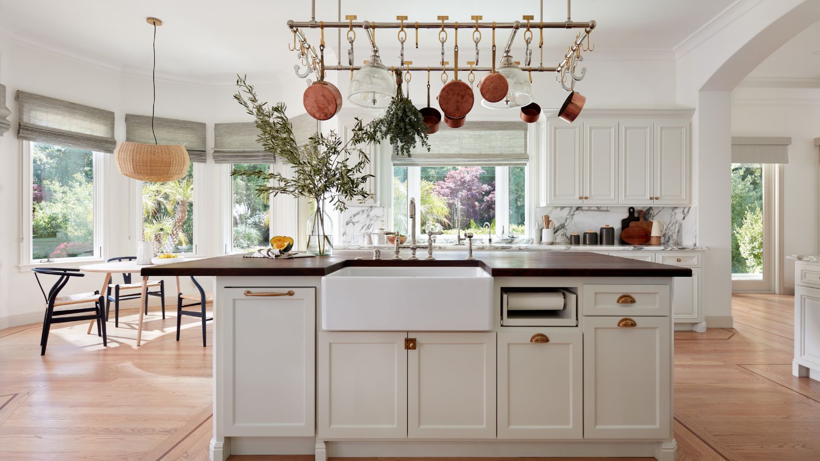
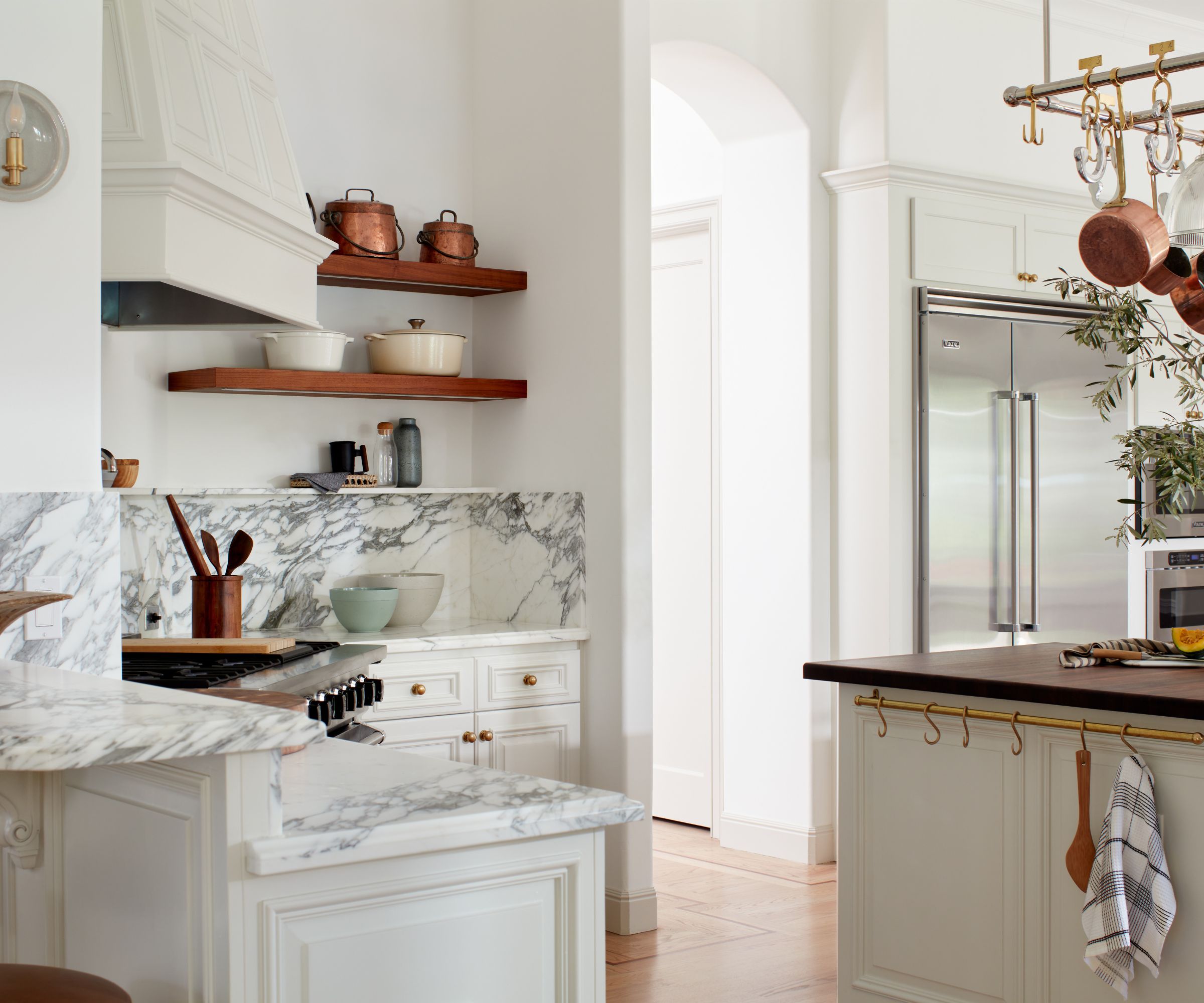
Carolyn worked with architect Glenn Katz to put her kitchen ideas into practice. 'He moved one non-structural wall where the refrigerator is and almost doubled the size of the kitchen, instantly opening it up.' This was the one small change to the home's layout, but it has had a huge impact on the space.
2. Select in-stock items to save wait times
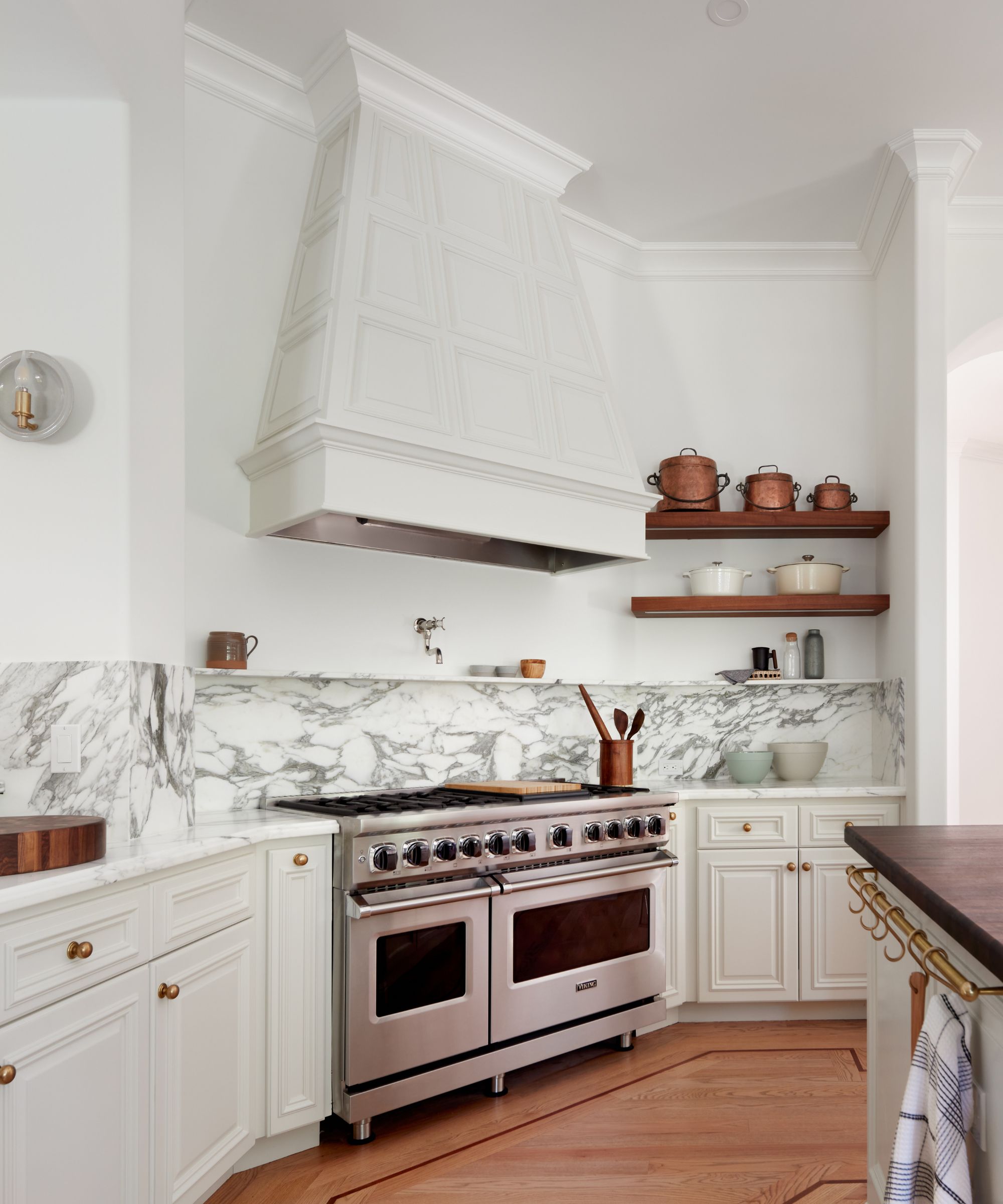
Carolyn's next practical tip relates to supply hold-ups, which can be a real drain on already limited time. 'We used only in-stock materials throughout the house,' she says, 'and leaned really hard on the vendors we work closely with for items with longer lead times, such as the appliances and the huge pot rack in the kitchen.'
Put simply, don't order something unless it's in stock or unless you can have guaranteed delivery dates. So if you're updating a kitchen and working to strict deadlines, supply delays are definitely something to bear in mind when buying a range oven. Waiting for a product to arrive on-site may cause knock-on delays for the remainder of the project.

Carolyn Brandwajn is the owner and principal designer of CBespoke – a full service interior design firm, based in the San Francisco Bay Area.
CBespoke specializes in residential construction with an emphasis on strong architectural design. Carolyn harmonizes contemporary elements with classical details to add depth and character to the spaces she designs.
3. Paint kitchen cabinetry instead of replacing it
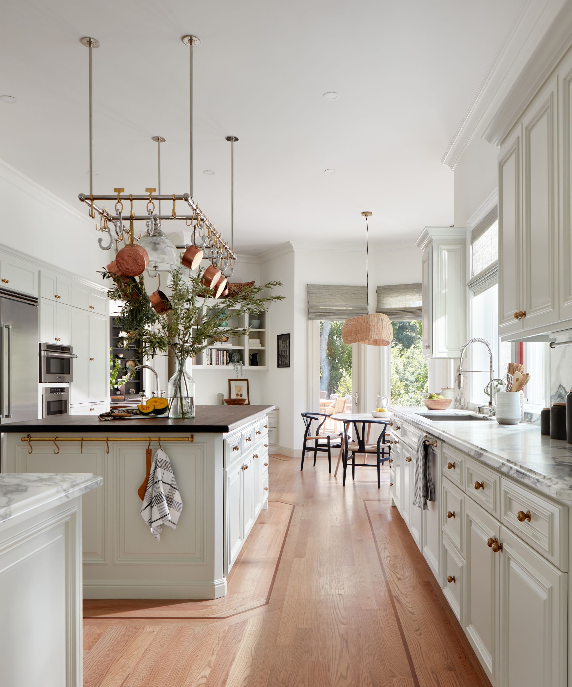
This is a popular time- and money-saver for refreshing a kitchen. If the cabinetry is of good quality and in good condition, it's more sensible and sustainable to give it a new look by painting it. Brush up on your painted kitchen cabinet ideas to get some inspiration. Find out how to paint kitchen cabinets for a good finish if you're planning on doing it yourself, or consider having them repainted professionally. Cabinets can even be relocated to suit a new kitchen layout, which will still be a quicker and cheaper option than replacing the whole kitchen.
Designer Carolyn opted to keep the existing cabinets here, which were good quality. They've been painted in Benjamin Moore's Creamy White. 'We used both burnished brass and polished nickel finishes, as well as a walnut countertop opposite the marble countertops to add warmth and depth to the room,' says Carolyn. The cabinet hardware is from Armac Martin.
4. Don't rip out wood flooring, try refinishing it
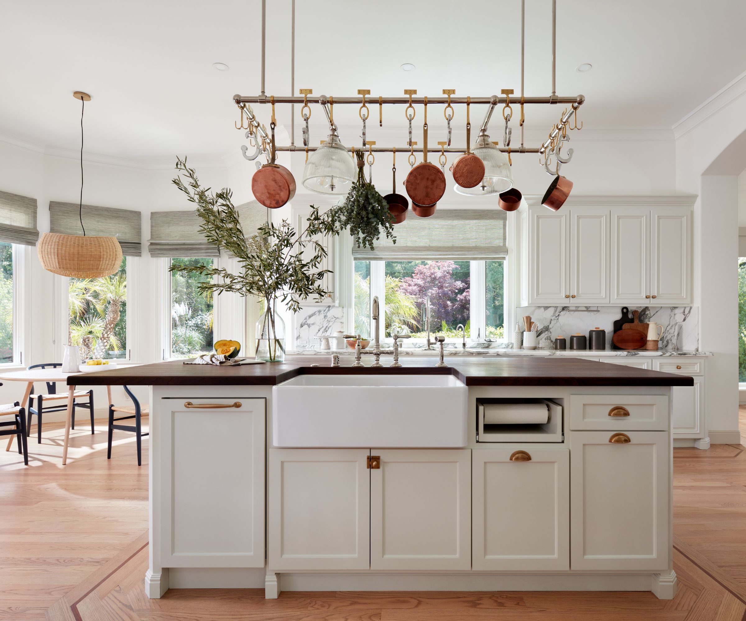
Flooring can make or break a space, especially in an open-plan layout where the floor is very much on display. Designer Carolyn was confronted with a red oak hardwood floor and if her flooring ideas had involved replacing the existing one, this would have significantly added to the project's timeline. Instead, she chose to refinish the existing flooring, 'picking a stain color that was more current with the style'. Again, this is a more sustainable approach that saved time and money, and instantly brightened the space.
Although this is an expansive open-plan space, it was important for it still to have character and interest. The bespoke Ann Morris two-tone pot rack is one of the kitchen's key accessories and showcases the clients’ growing pot collection.
5. Give molding details a new look with paint
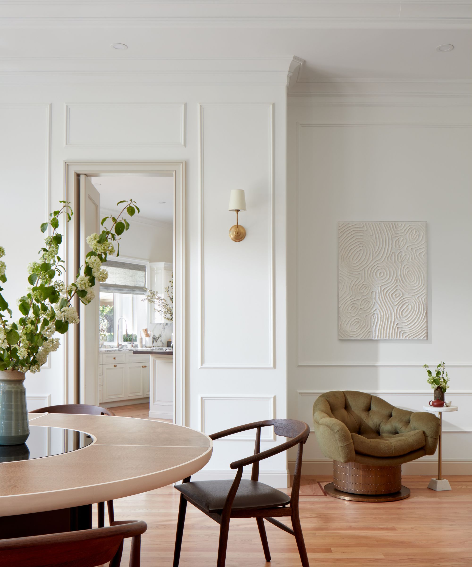
There was one detail running throughout the house that designer Carolyn couldn't wait to update. 'Every room had 10'' tall cherry red crown molding that screamed 1990. We painted these the same colors as the walls to blend them in,' she says. 'The transformation is amazing and makes a much more contemporary look.' Wainscoting was then added to the entire wall to balance out that large crown molding,
The family uses this unusual space to play games or enjoy afternoon tea, although since it's just off the kitchen it could also work well as an informal dining nook.
'We converted this space into a flex room,' says designer Carolyn, 'where multi-generational family members gather to or enjoy afternoon tea or play mahjong.'
6. Embrace and enhance existing architectural features
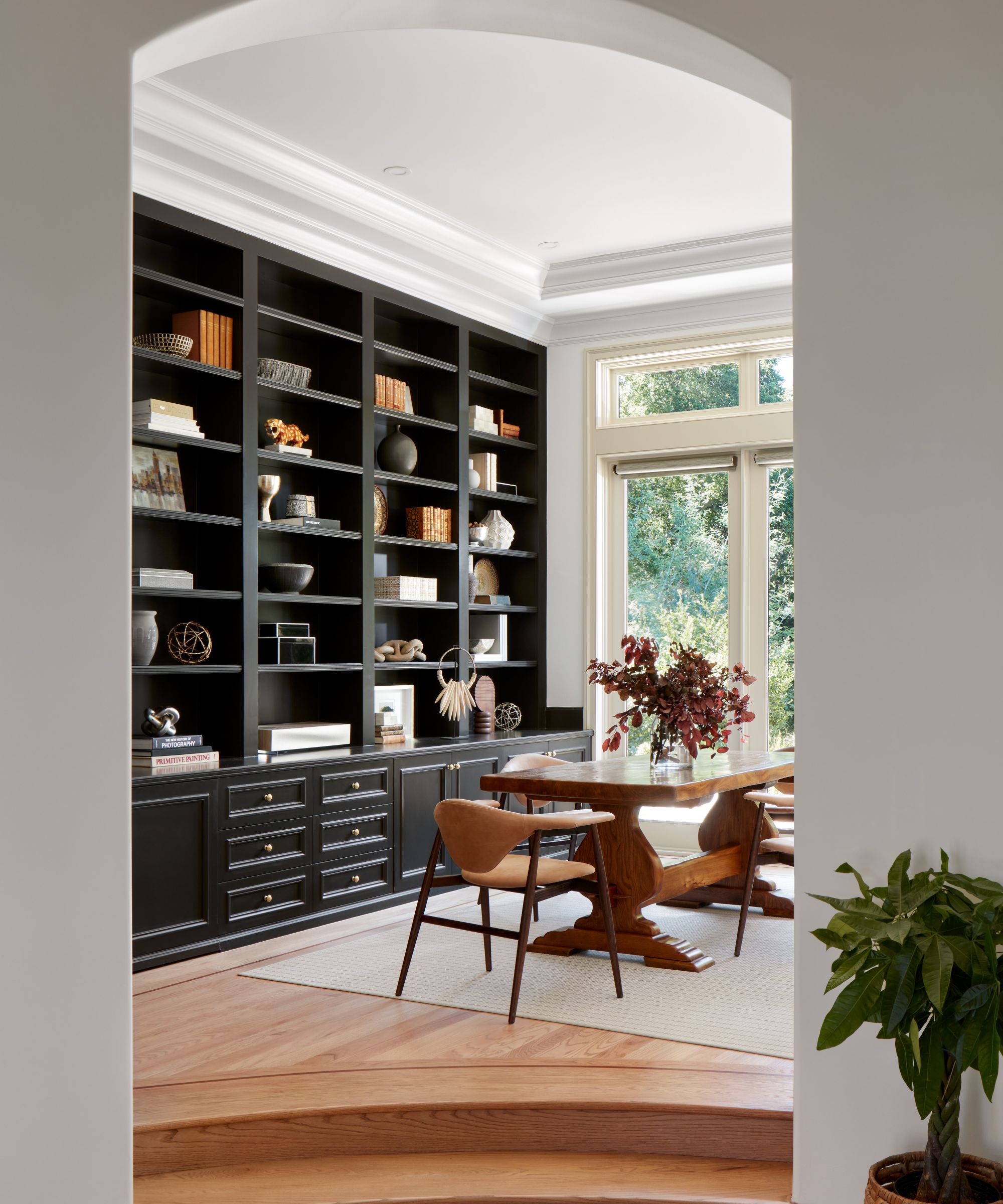
An arched opening and sweeping curved steps up to the dining room might not be to everyone's taste, but since they worked well to divide the room from the rest of the space, designer Carolyn chose to embrace rather than replace them. The lighter finish for the flooring has improved the look of the steps up to the dining area, and the arch, painted in Benjamin Moore's Simply White, to match the walls throughout, creates a pleasing frame.
Among Carolyn's other dining room ideas for the space is the new area rug, from Suite NY.
7. Ring the changes with dramatic dark paint
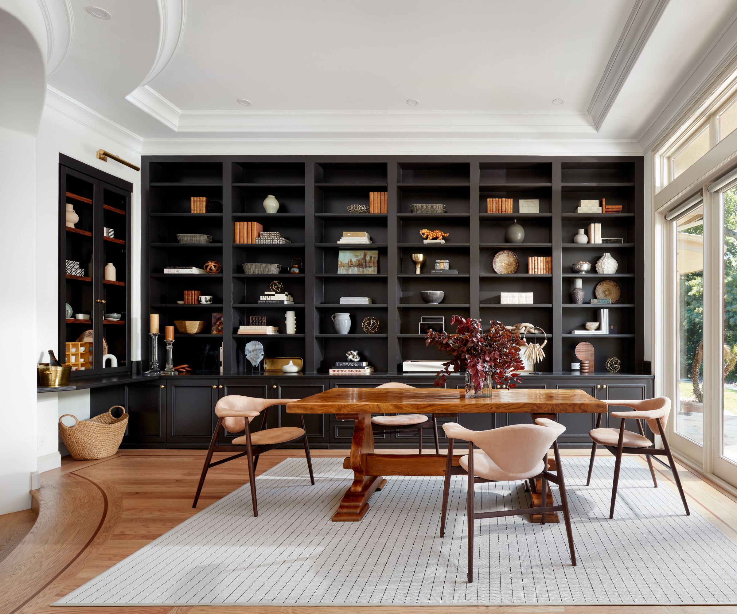
'My favorite space is the library which is now also a formal dining room,' says designer Carolyn. 'The high ceiling and the incredible light gave us the confidence to paint the cabinets a dark color, giving the room a very dramatic feel. I love how grand the space is, the way the morning light hits the dark cabinets and the room feels both formal and casual at the same time.'
The existing built-ins have been painted in Benjamin Moore's Black Beauty. And the dining chairs are by Suite NY.
8. Streamline the look by evening out dropped ceilings where possible
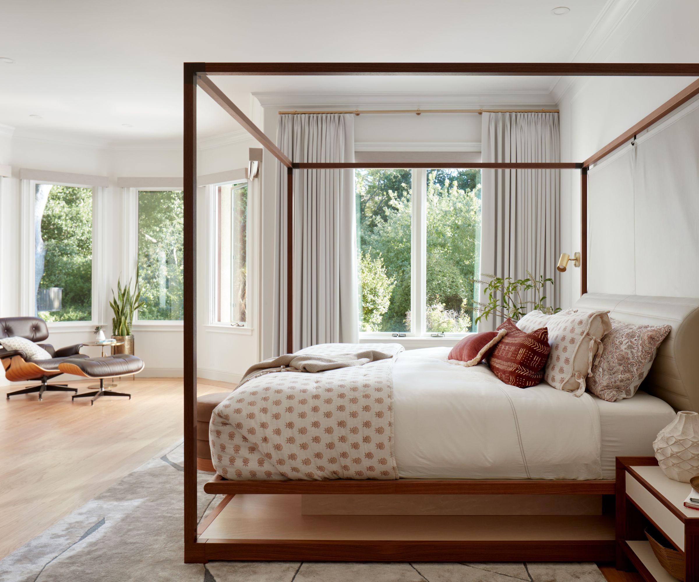
Designer Carolyn's main bedroom ideas began with a desire to streamline the space and give it more of a serene look and feel. First, however, there was a bit of a structural obstacle to overcome.
'There was a strange and unnecessary dropped ceiling in the primary bedroom,' says designer Carolyn. 'We evened it out, then added wainscot for architectural interest and infused the clients’ Manhattan background with West Coast vibe.'
9. Plants, artwork and a warm palette are speedy bedroom updates
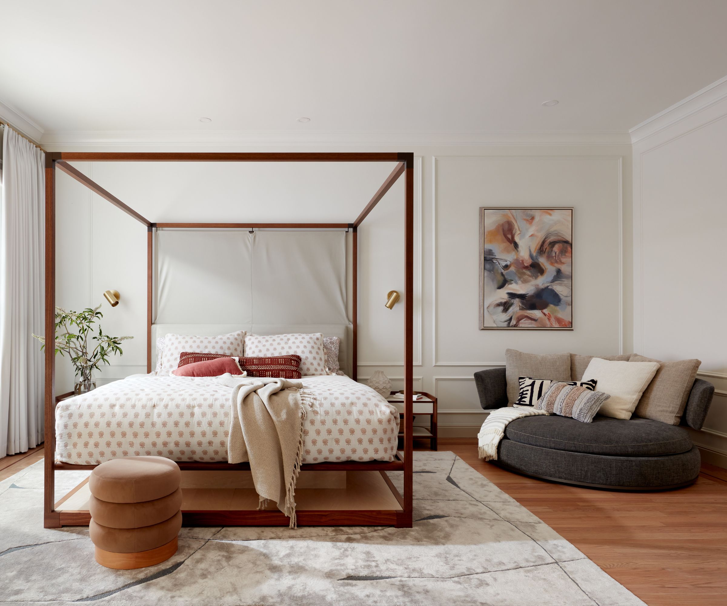
This room was furnished and set up in just one day, once the furniture arrived. With the new-look flooring already giving the bedroom a warmer look, it was simply a matter of bringing the space to life with a new plant, a striking painting, and a curved sofa for added luxury. The minimal four-poster bedframe with no drapes elevates the space while keeping to the contemporary vibe.
10. Simply adding texture can make all the difference
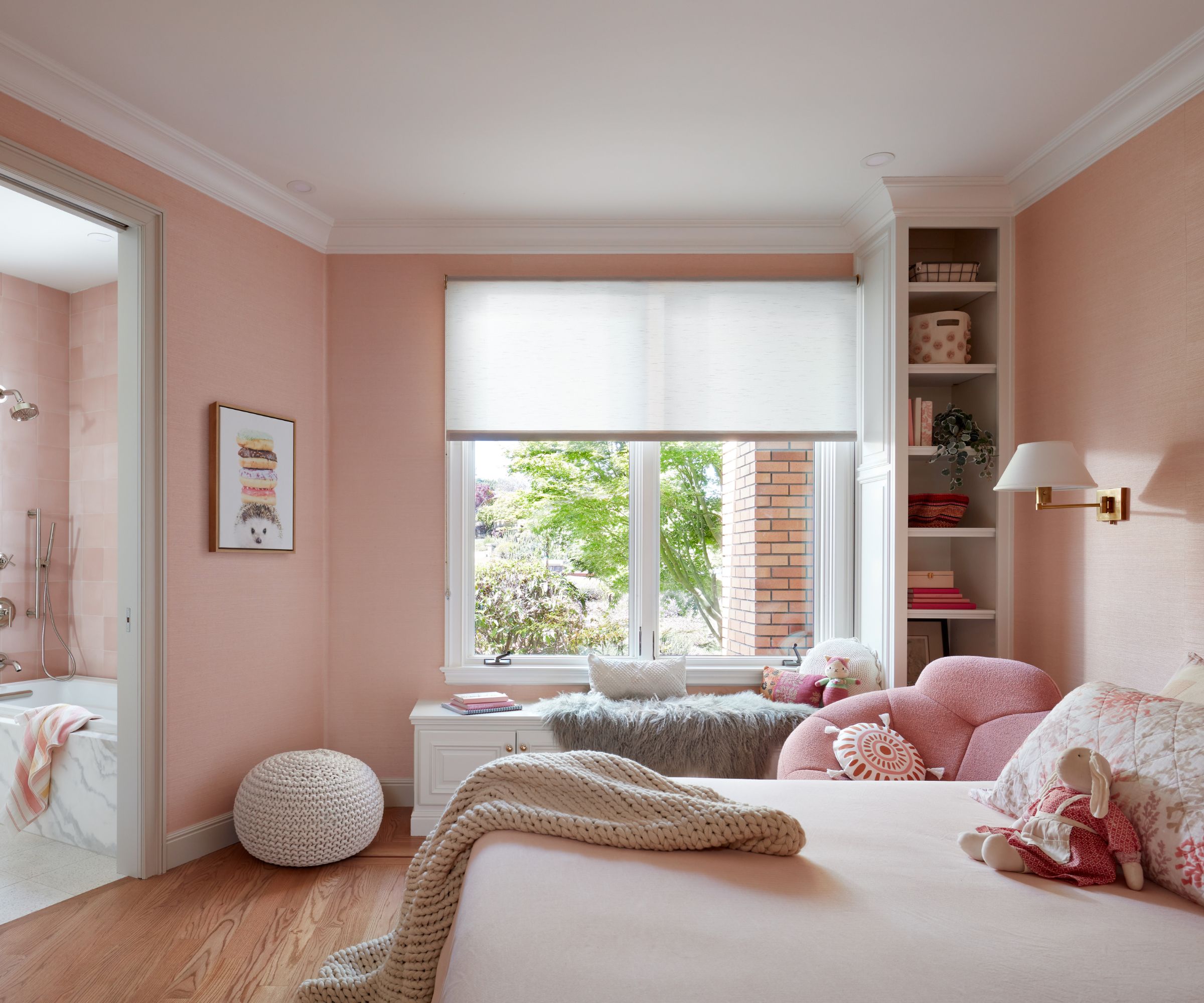
'The couple's young daughter wanted an all pink room ( who doesn’t? ) so we focused on adding texture by using cement tile for the bathroom shower wall and Schumacher sisal wallpaper,' says designer Carolyn. Including textures in your kids' room ideas in this way gives the room a more sophisticated look, which will help to ensure its longevity.
11. More space or built-in storage? Decide what works best for you
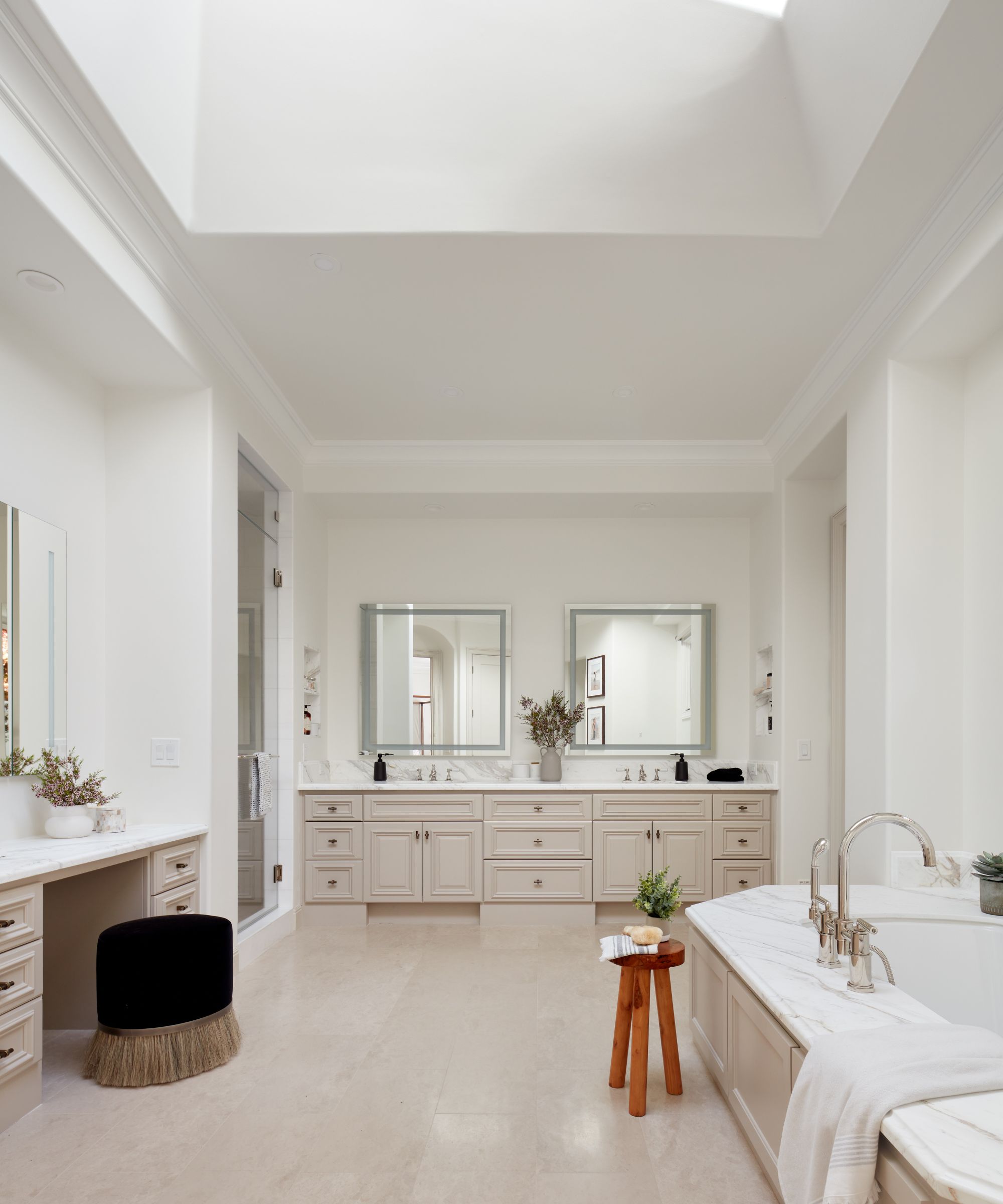
In the family's bathroom, designer Carolyn Brandwajn was faced with a dilemma: keep the wall of cabinets for extra storage, or remove them to make space for a larger bath? In the end, she opted to remove the cabinets, since the room already featured ample storage in the double vanity and dressing table set-up. 'That way we could accommodate a large tub so the kids can bathe in it. The family lives mainly in Manhattan so we want to emulate the Upper East Side vibe.'
And there was another issue to tackle: 'The space is large but it felt like a cave because of various soffits and another dropped ceiling constructed for no reason at all,' adds Carolyn. 'With an evened-out ceiling, the primary bath is now bright and spacious.'
12. Look for quick fixes for wasted space
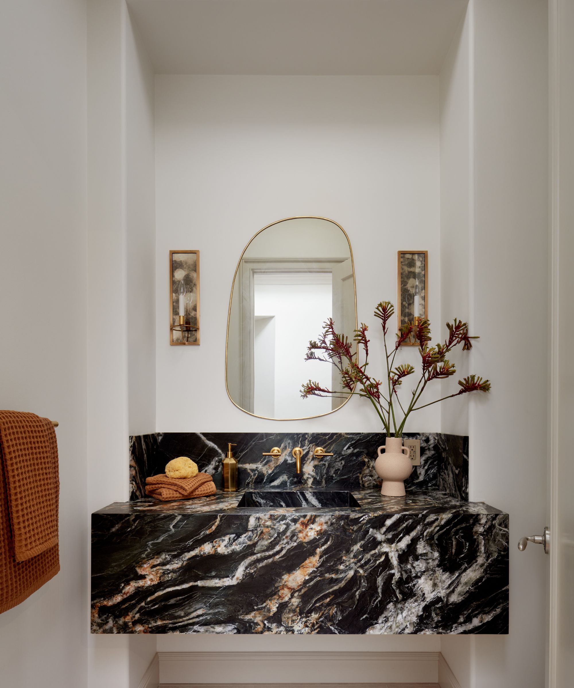
That's a masterclass on how to maximize space in a powder room, right there.
As Carolyn worked through the house planning its new look, she realized there was good space going to waste behind a false wall. 'We expanded the existing vanity niche by opening up the wall,' she says, 'which has given the small room a much-needed boost.'
Explaining her powder room ideas, Carolyn adds: 'As the main palette of the house is fairly neutral, the husband wanted to use a more masculine piece of stone for the powder room. The leathered quartzite has a rich dark base, yet a lot of lighter warm veins that tie in really well with the limestone floors and the rest of the house.' The elegant sconce lights are from Visual Comfort.
We are so impressed with designer Carolyn Brandwajn's practical approach to redesigning and updating this Saratoga home, working under such tight time pressure. Not only has she created a sophisticated and elegant new look for the family home, she's also made sensible and sustainable decisions to update and adapt the home's existing features where possible, with no detriment to the finished effect.
'I am happy we reached our goal of giving clients a custom look that reflected their lifestyle without taking the house to the studs,' the designer concludes.
Interior design: Caroline Brandwajn at CBespoke
Photography: Agnieszka Jakubowicz
Sign up to the Homes & Gardens newsletter
Design expertise in your inbox – from inspiring decorating ideas and beautiful celebrity homes to practical gardening advice and shopping round-ups.
Karen sources beautiful homes to feature on the Homes & Gardens website. She loves visiting historic houses in particular and working with photographers to capture all shapes and sizes of properties. Karen began her career as a sub-editor at Hi-Fi News and Record Review magazine. Her move to women’s magazines came soon after, in the shape of Living magazine, which covered cookery, fashion, beauty, homes and gardening. From Living Karen moved to Ideal Home magazine, where as deputy chief sub, then chief sub, she started to really take an interest in properties, architecture, interior design and gardening.
-
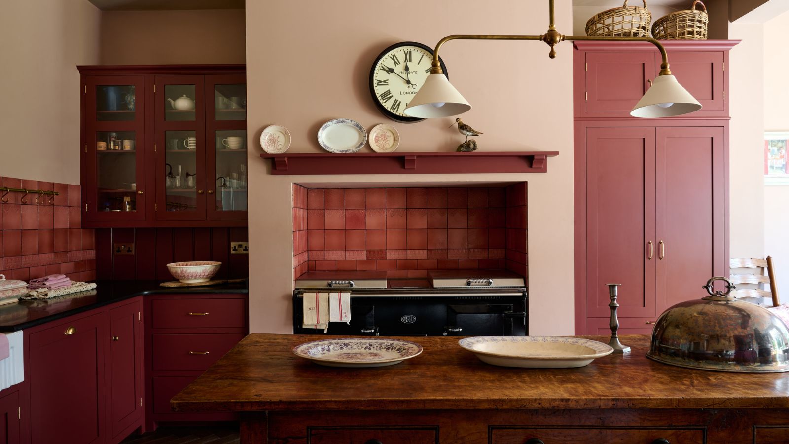 Everyone is obsessed with vintage tiles right now – bring the nostalgic charm of this classic design feature into your home with our 5 design ideas
Honor the past with our favorite ways to decorate with vintage tiles, as suggested by interior design experts
By Eleanor Richardson Published
-
 'It's a fast reset button' – using the 1, 2 ,3 ,4, 5 decluttering method cleared my persistent mess in seconds
It's easy, effective and so quick to do
By Ottilie Blackhall Published