This carefully considered luxe family home combines function and fun
Bold use of color and pattern and customized areas to suite the family's needs ensure this Houston newbuild stands out from the crowd

Home really is where the heart is for the family of six that lives in this fabulous newbuild in Houston, Texas.
With its sumptuous feel, the New Southern Louisiana Acadian property, built in 2020, is without doubt one of the world's best homes, designed to look as though it has been in place for decades.
The aim was to create a fun and colorful home that was tailored to the specific needs of a family that loves to spend time together. 'They wanted spaces where they could all gather, spaces where the kids could bring friends and hang out, and spaces where they’d each have a room of their own,' says interior designer Courtnay Tartt Elias, principal and creative director at Creative Tonic, who joined the team after the architectural plans were drawn up.
The house has six bedrooms and six bathrooms, so there is plenty of room. 'Each of the areas of the home have been planned and thought out with specific needs in mind – it is truly customized, down to the kitchen drawers for each of the homeowners' serving napkins,' Courtnay says. 'We really focused on personalizing each space in the sprawling home. In each room you’ll find specific areas that have been customized to the family’s needs, from her office/lounge with its storage for the client's photos, to the built-in cigar storage in his office/lounge, and even the kids' rooms – there's a homework loft and guitar storage in one of the daughter’s rooms.'
Above all, the homeowners wanted a refined, casually elegant, yet fun and functional home where nothing would be considered too fussy or off limits for family and visiting guests.
Foyer

'The foyer provides an open, airy glimpse of what’s to come in the rest of the home,' says Courtnay.
Hallway ideas include two curved custom benches, clad in a fun geometric fabric with matching pillows, that add a soft touch to the space.
'The focal point is a stunning commissioned Hunt Slonem landscape painting that celebrates the beauty of nature and serves as a catalyst for the color story of the home,' Courtnay continues. 'The greens and blues found in the painting are thoughtfully carried through almost every room of the home in some form.' The painting is flanked by two statement Visual Comfort Kelly Wearstler Liaison statement sconces from Circa Lighting, with two rattan-wrapped lanterns providing open and textural lighting above.
Kitchen
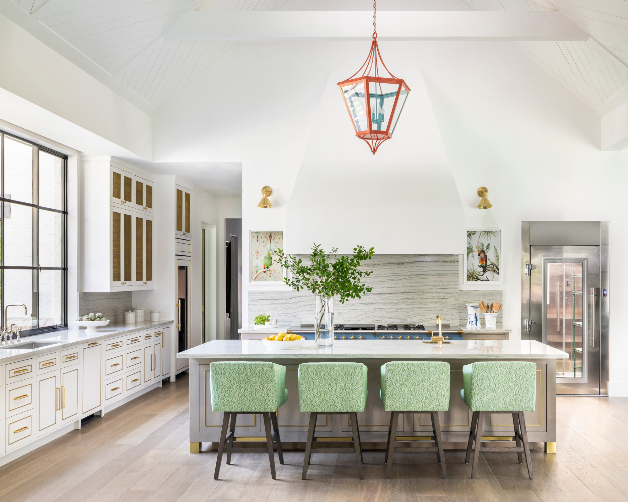
The kitchen and adjoining living room were designed to provide a space for the family to spend time together. 'The kids enjoy having friends over and, with a family of six, an open and inviting space to gather was paramount,' says Courtnay.
The working kitchen space is fairly intimate. 'The girls love to cook and bake with their Mom – the kitchen spaces were all designed with this in mind. The range in a lovely cornflower blue inspired the color story for the kitchen and the home more generally.'
Kitchen ideas include custom designed lanterns, custom powder-coated in coral and blue, which add a pop of color to the high chevron-patterned shiplap ceilings, while eyecatching green swivel counter stools from The Joseph Company, covered in a Thibaut fabric, inject extra color and are perfect for socializing.
Kitchen living area
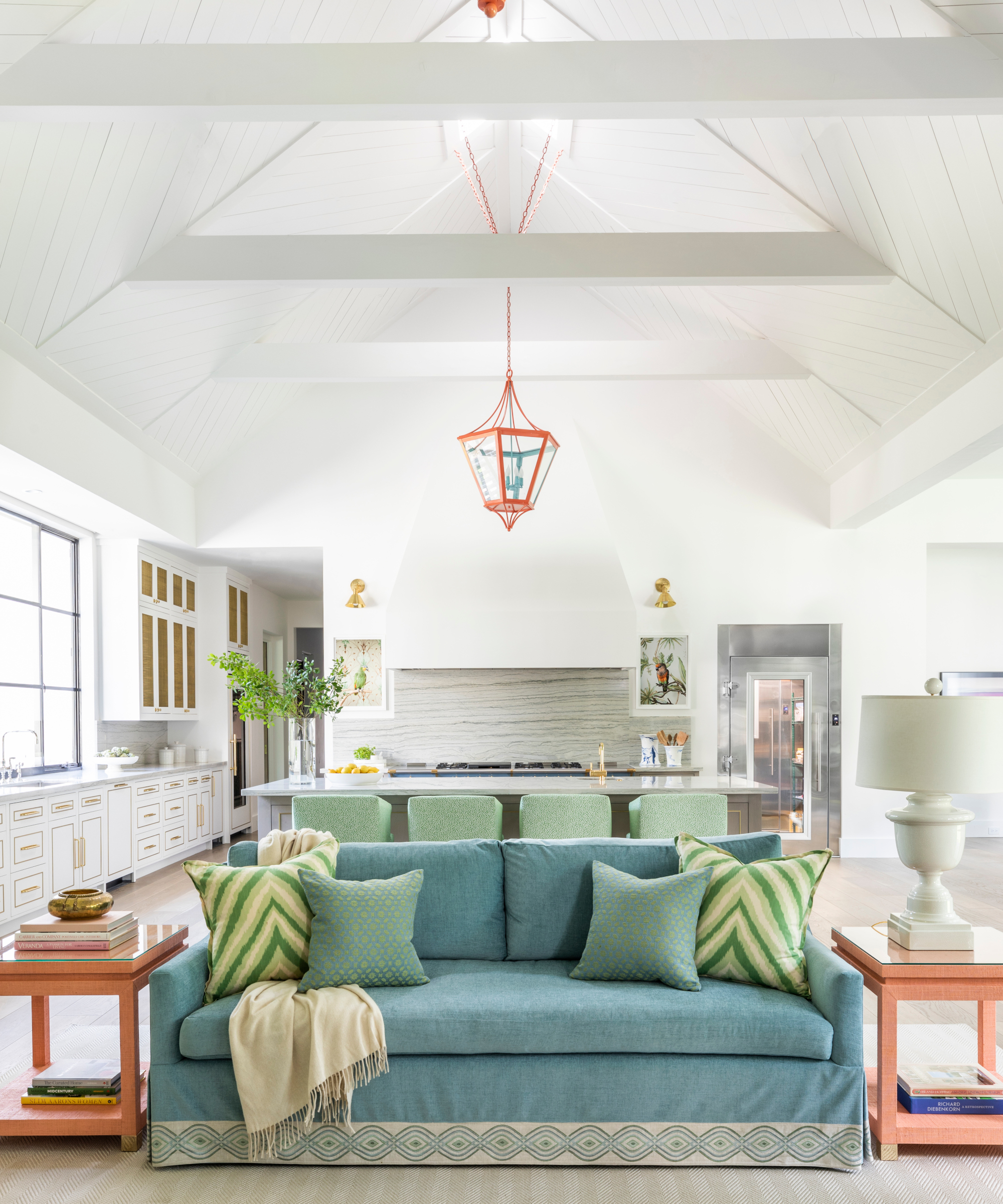
Courtnay was keen to create an easy flow into the adjoining living room, so she continued the palette of corals, blues, and greens in the space. Comfy seating allows for the family to watch TV.
Butler's pantry
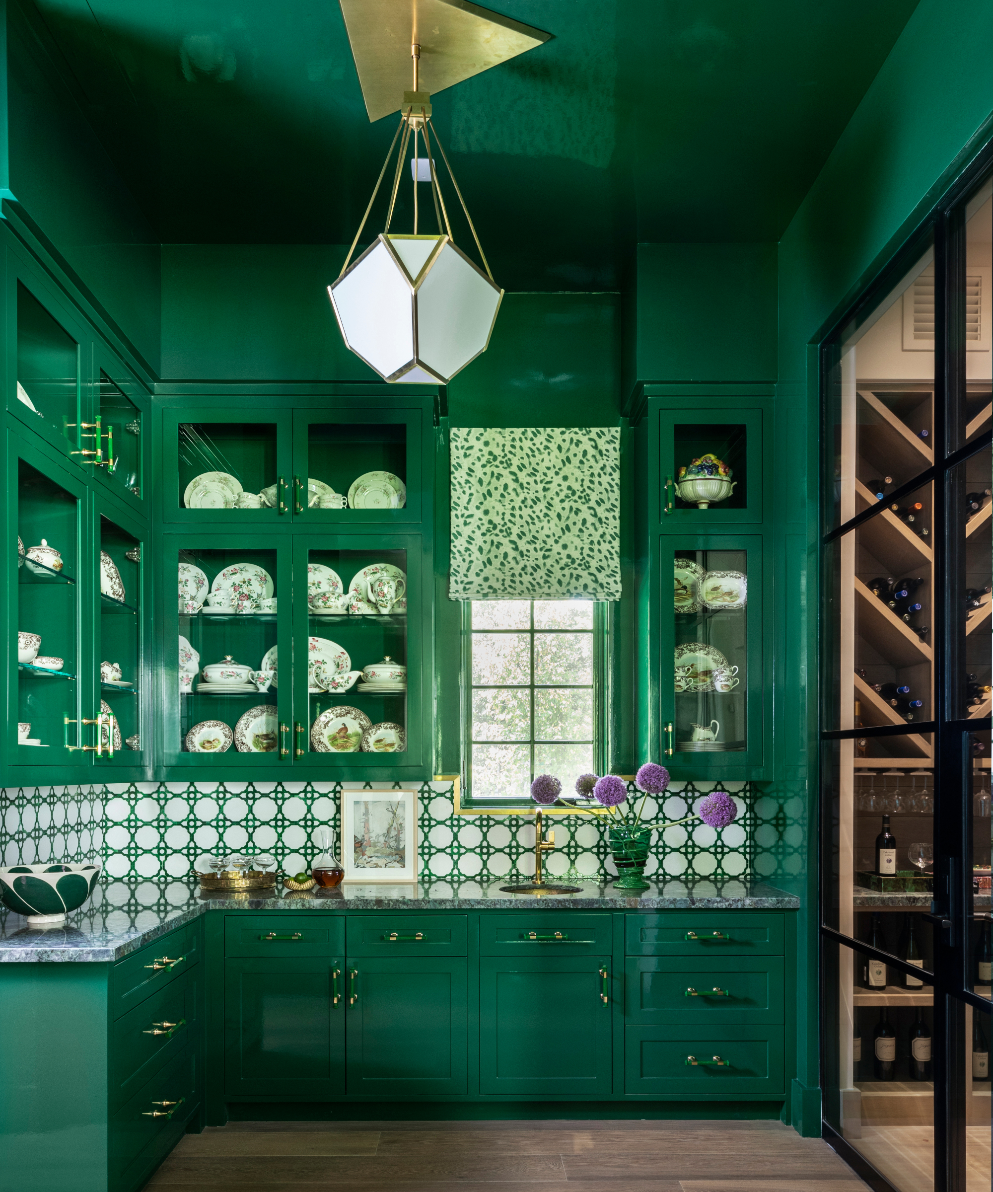
Courtnay describes the butler's pantry as a 'true showstopper'. Located just off the kitchen, it was designed to showcase the client's extensive china collection in custom cabinetry with each item measured and cataloged for display and storage.
High-lacquered emerald green walls, cabinetry and ceiling conjure up a rich and cheerful space, with patterned backsplash tiles breaking up the solid color. A whimsical Roman shade injects movement.
The custom brass triangle canopy holds an Urban Electric light fixture, providing a geometric juxtaposition to the delicate china showcased in the glass-front cabinets.
Dining room
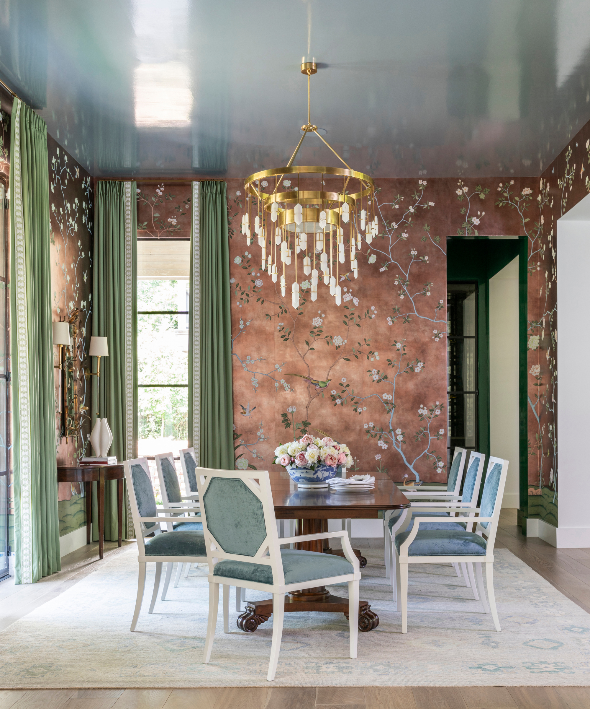
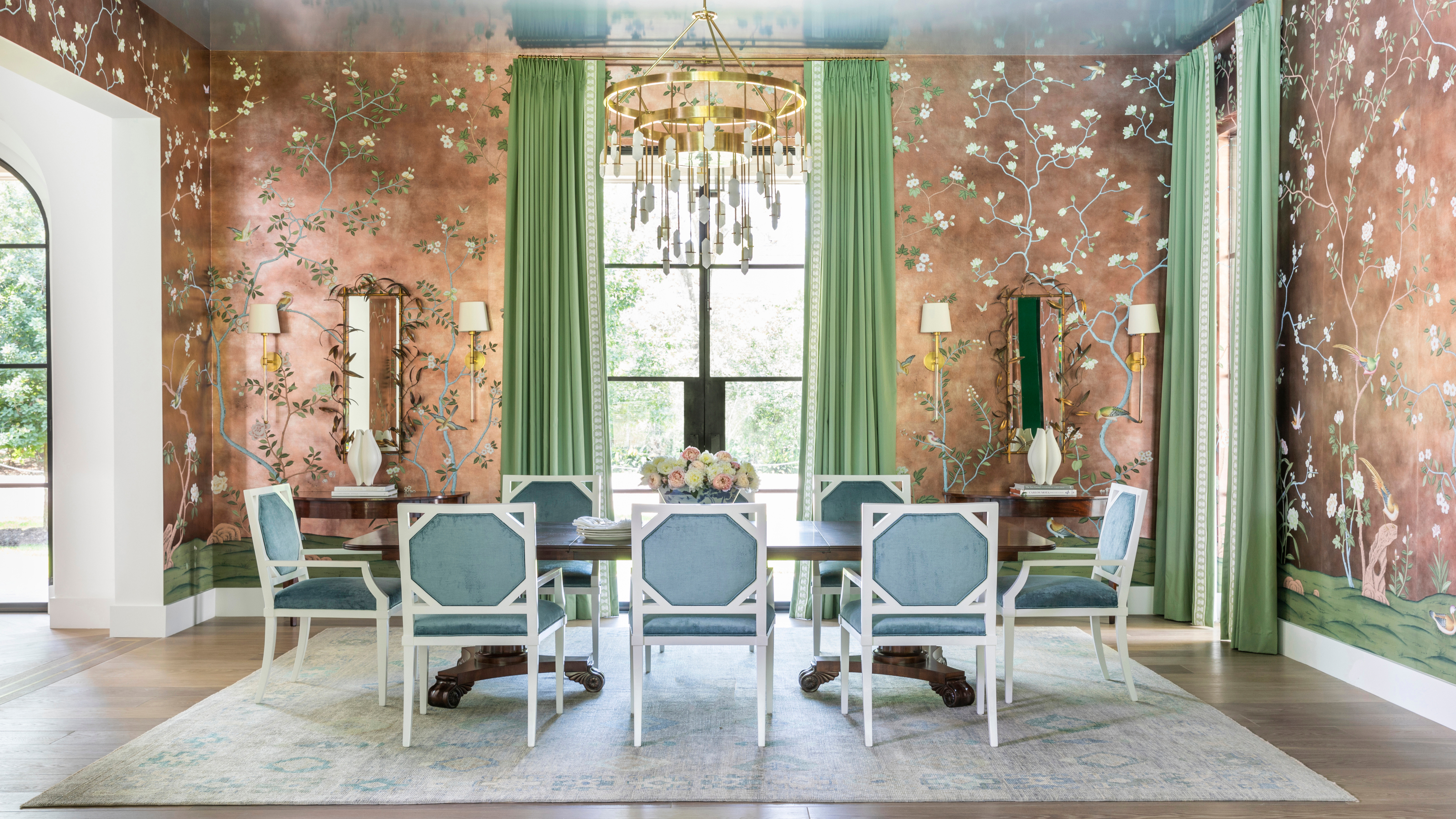
Dining room ideas center around the custom copper, handpainted de Gournay wallpaper. 'It's my favorite design element of the home,' says Courtnay. 'It is such a show-stopping element and lends an elegance to the space without being too formal. The homeowners both loved the paper because it wasn’t overly feminine – the antique copper background provides a real depth to it. The overall feel of the wallpaper suits the couple and the way they envisioned the home as having an old-world, family home feel – the flowers are for her, the antique copper for him.'
Courtnay added in modern elements with casual chairs with a geometric back. The chairs, paired with simple drapes in Schumacher Blake Polished Cotton in Sage with Samuel & Sons Milo Border in Matcha, take the drama of the room down a little. Antique consoles inject a period feel. The finishing touch is a stunning chandelier for added drama.
'The idea for the room was to continue the feel of the spaces around it, but to elevate it just a bit, to add elegance to the home,' says Courtnay.
Living room
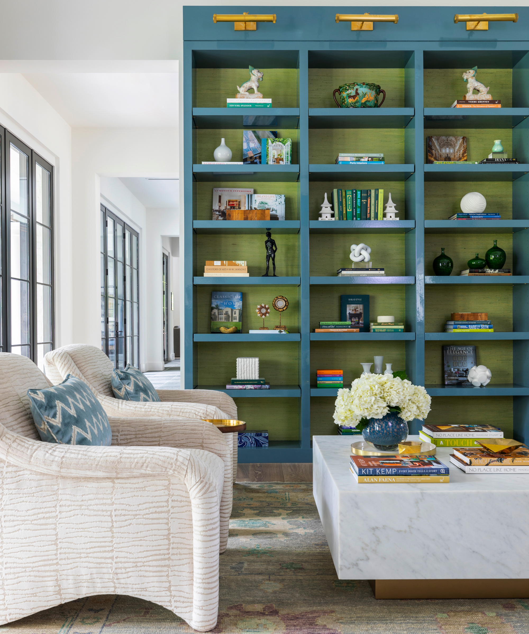
The dining space is open to the living room. Living room ideas include continuing the use of the soothing blues and greens in the custom bookshelf, draperies and artwork.
To ensure that their large family and guests felt welcome and comfortable, luxurious fabrics are combined with plush, curvy seating.
The draperies used in the dining room are also found here. 'We absolutely loved carrying over small hints of other spaces into adjacent rooms of the home – you’ll find small touches like this throughout,' says Courtnay.
Office
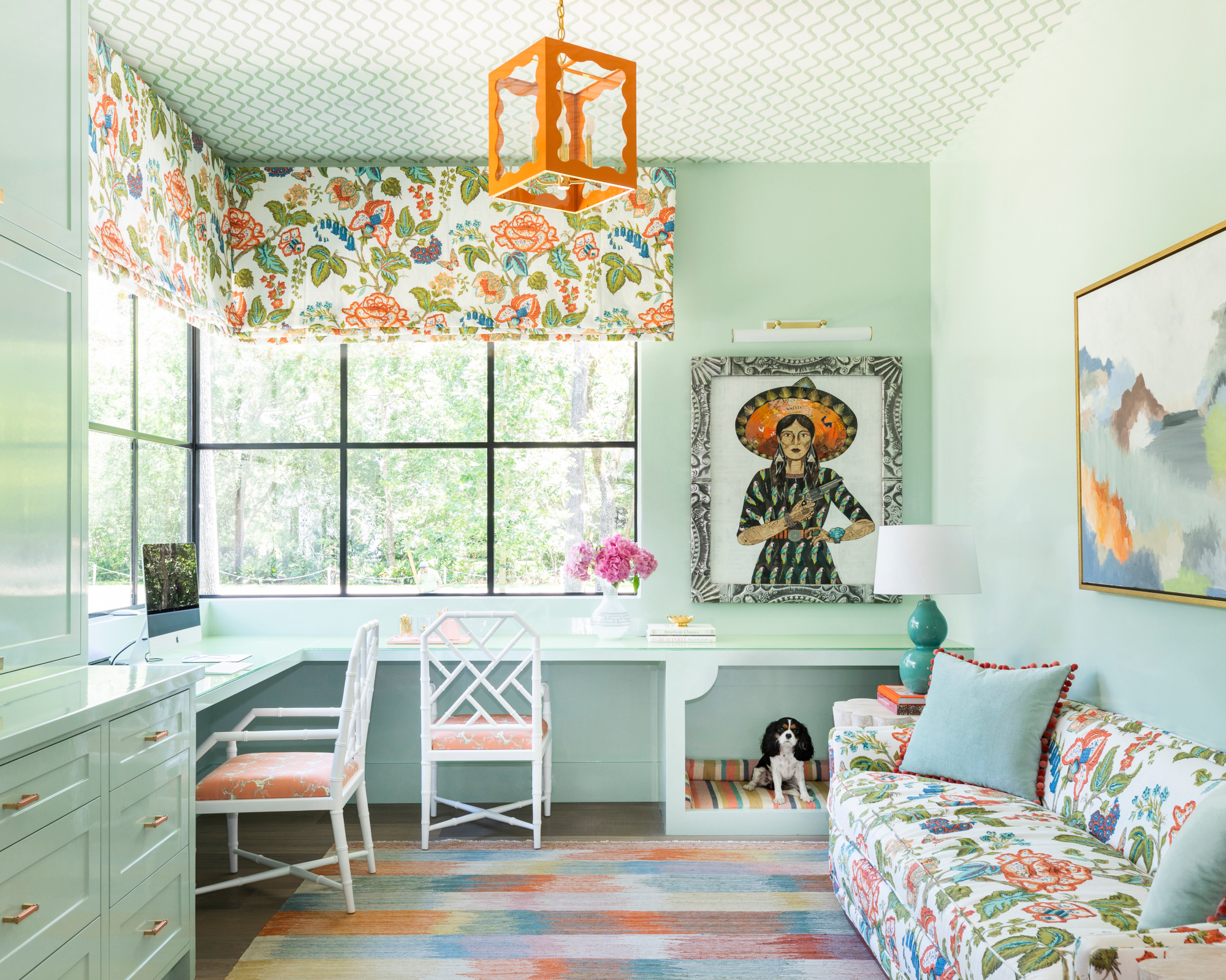
'I jumped at the chance to design an office space that was truly bespoke for the lovely mom of the family,' says Courtnay. 'She gave us carte blanche to create a fun and colorful oasis.'
Home office ideas center around the Peter Fasano fabric, which was the main inspiration for the soothing green color story, punctuated by pops of bright orange. The fabric was used on the custom sofa, as well as the window dressings. 'It beautifully complements the fun Katie Leede ceiling wallpaper, and the high lacquered millwork seen throughout,' says Courtnay. The bamboo desk chairs are upholstered in a Root Cellar Designs fabric, which tones with the orange of the Coleen and Company lantern above.
Main bedroom
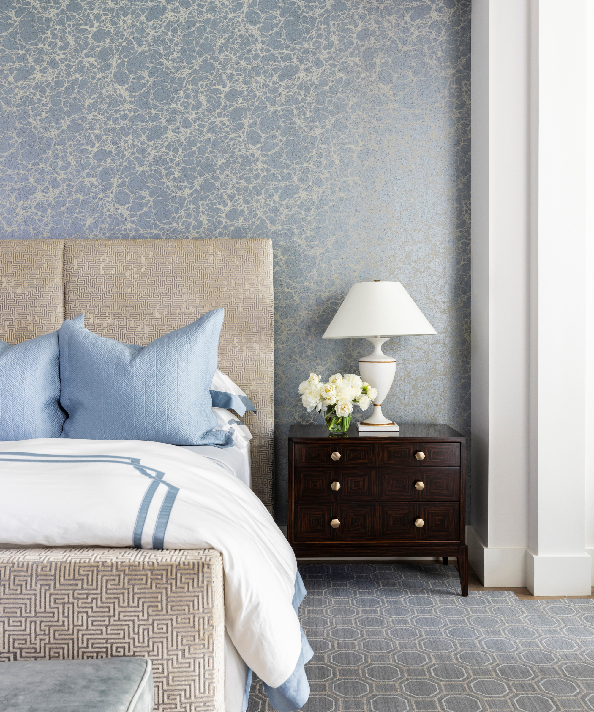
'This room was so much fun to design and the homeowner started with a very distinct and clear vision,' says Courtnay. Bedroom ideas are focused around the owner's love of Houston luxury home goods store Longoria Collection. 'She wanted the primary bedroom and sitting area to feel as if she were there,' says Courtnay.
'The bedding is all by Matouk from Longoria Collection – it was newly released at the time we were furnishing the home and she was one of the first to have it.' The space continues the use of soft blues found in other areas of the home, with the focus on the stunning Cowtan & Tout wallpaper behind the custom bed upholstered in an Old World Weavers cut velvet. The acrylic bed bench is clad in an icy velvet fabric, adding to the luxurious feel of the space.
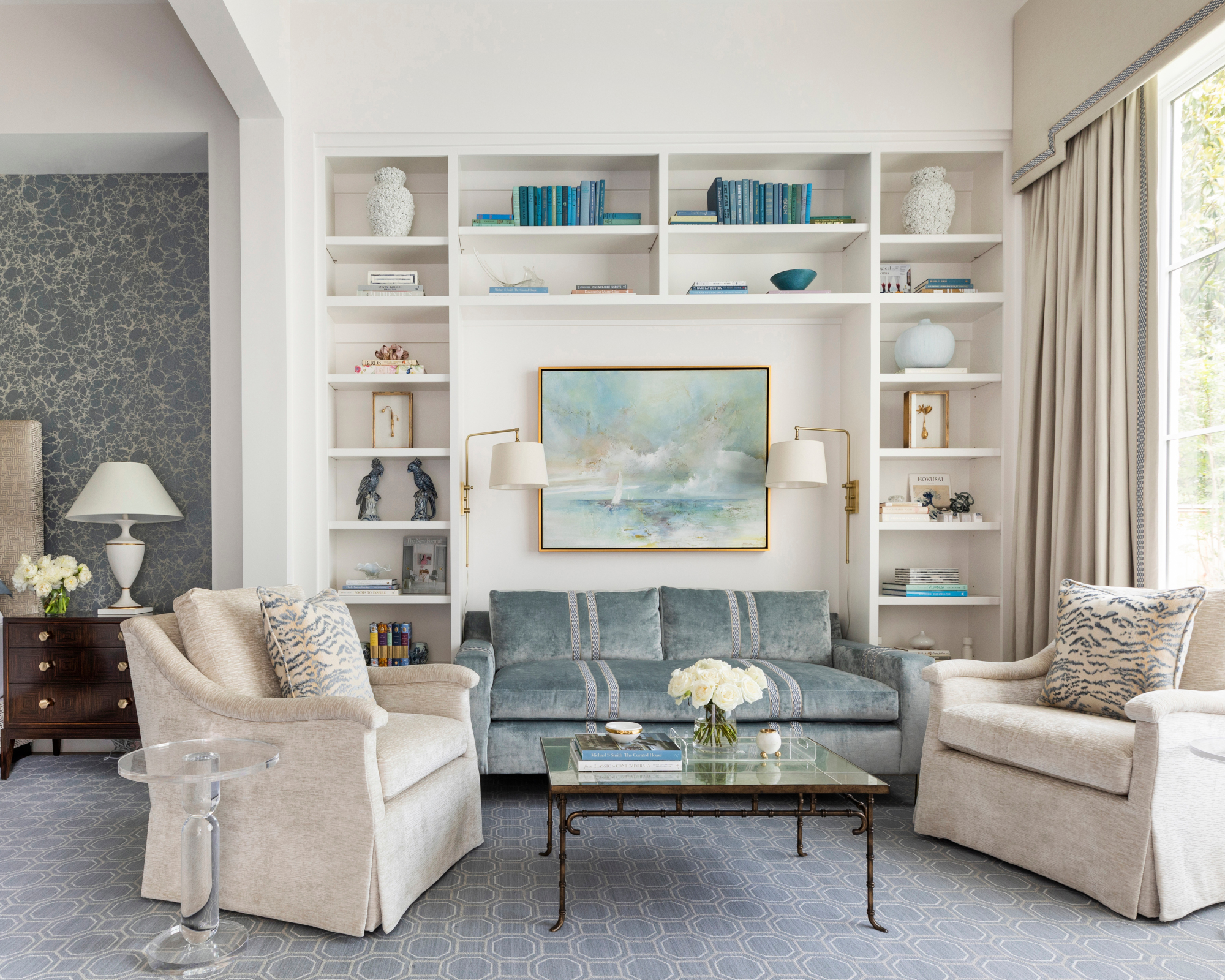
The primary bedroom sitting area continues the soft blue palette with custom shelving specially designed to display books and ceramics.
Main bathroom
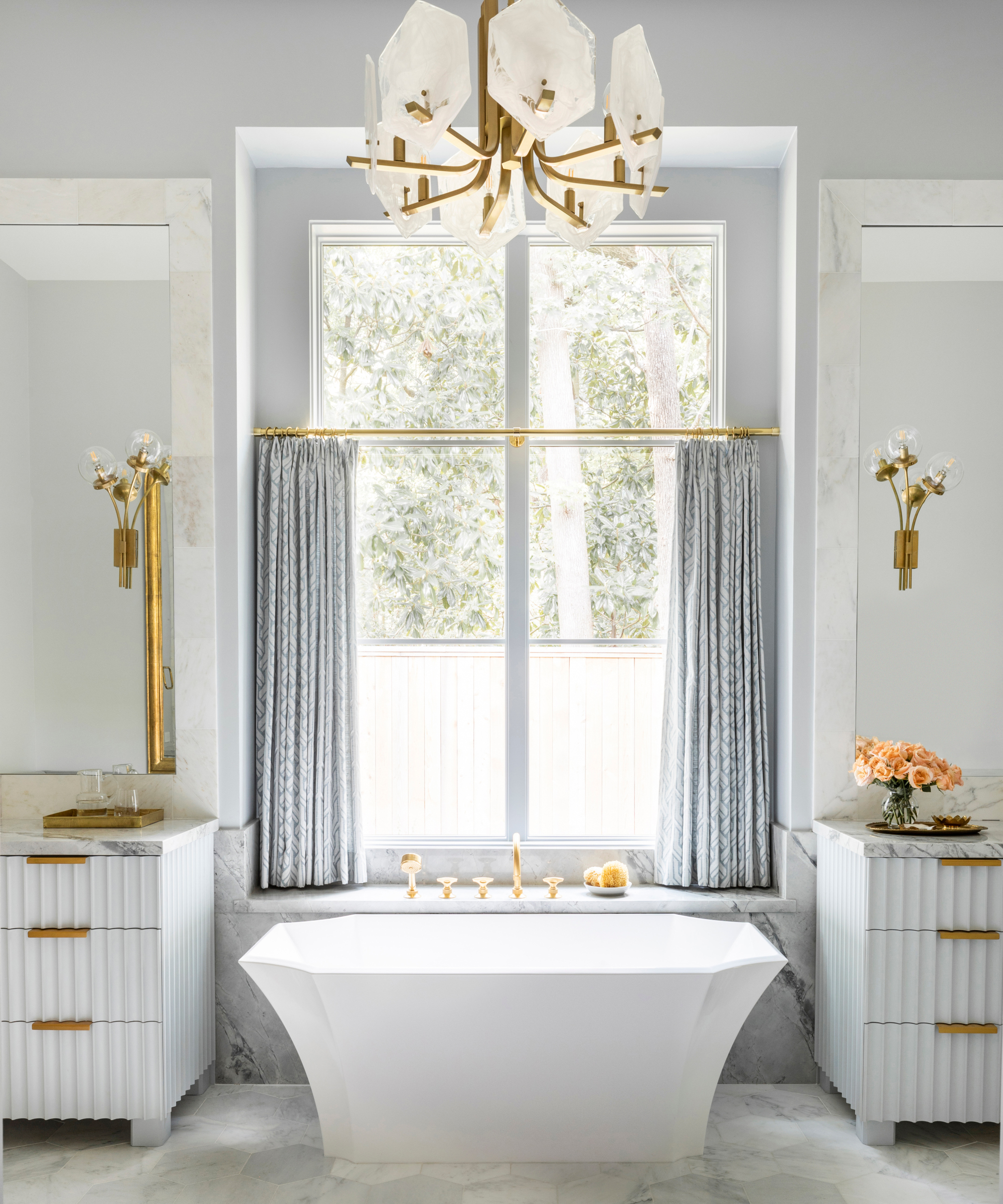
In the primary bathroom, bathroom ideas include a statement bath. 'I had been wanting to use this bathtub for years – it's a very special, scallop-front bath,' says Courtnay.
The shape of the tub corner was repeated on the custom fluted cabinets, which also feature in the dressing and vanity area, though painted to fit the individual spaces. 'We thought it was a lovely way to create distinct spaces that flow together nicely,' says Courtnay.
Curved brass sconces provide a touch of whimsy.
Dressing area
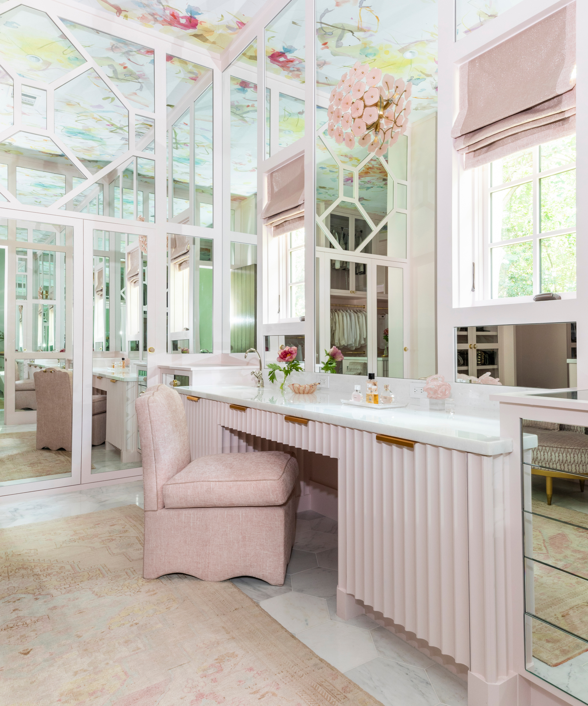
This super feminine dressing area was created specially for the mom. 'The goal again was to customize everything to her needs. The millwork is all custom – I worked with the homeowner to measure, catalog and plan for every item she wished to display via lovely mirror-fronted cabinets and what she wished to hide in drawers and behind cabinets. We ensured that her girls had a spot to sit down and chat with mom while she was dressing,' says Courtnay.
Courtnay made a feature of the ceiling by covering it in a stunning floral wallpaper, Area Environments’ Breeze, and punctuated it with the Leighton Small Chandelier by Kate Spade via Visual Comfort.
Bedroom
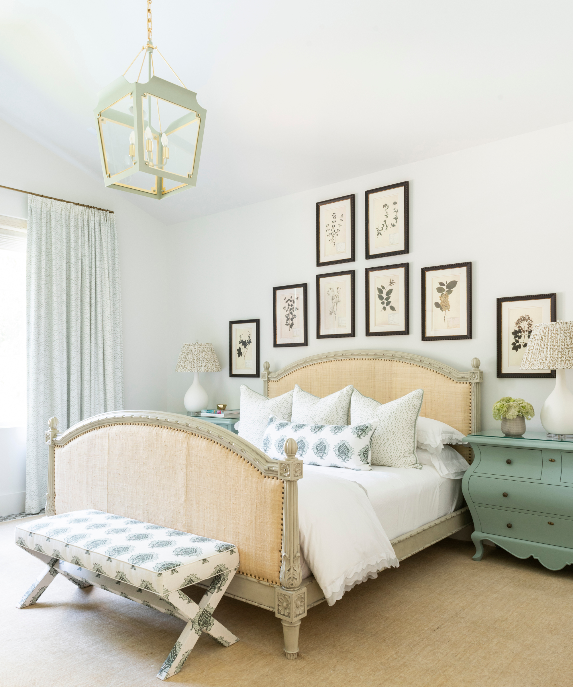
Courtnay has created a serene and relaxing space with soothing green accents for guests. The custom bench at the foot of the bed is upholstered in Erika M Powell’s Artichoke fabric, which was also used on the bed’s lumbar pillow, while another Erika M Powell fabric is used on the curtains and the other pillows.
Daughter's bedroom
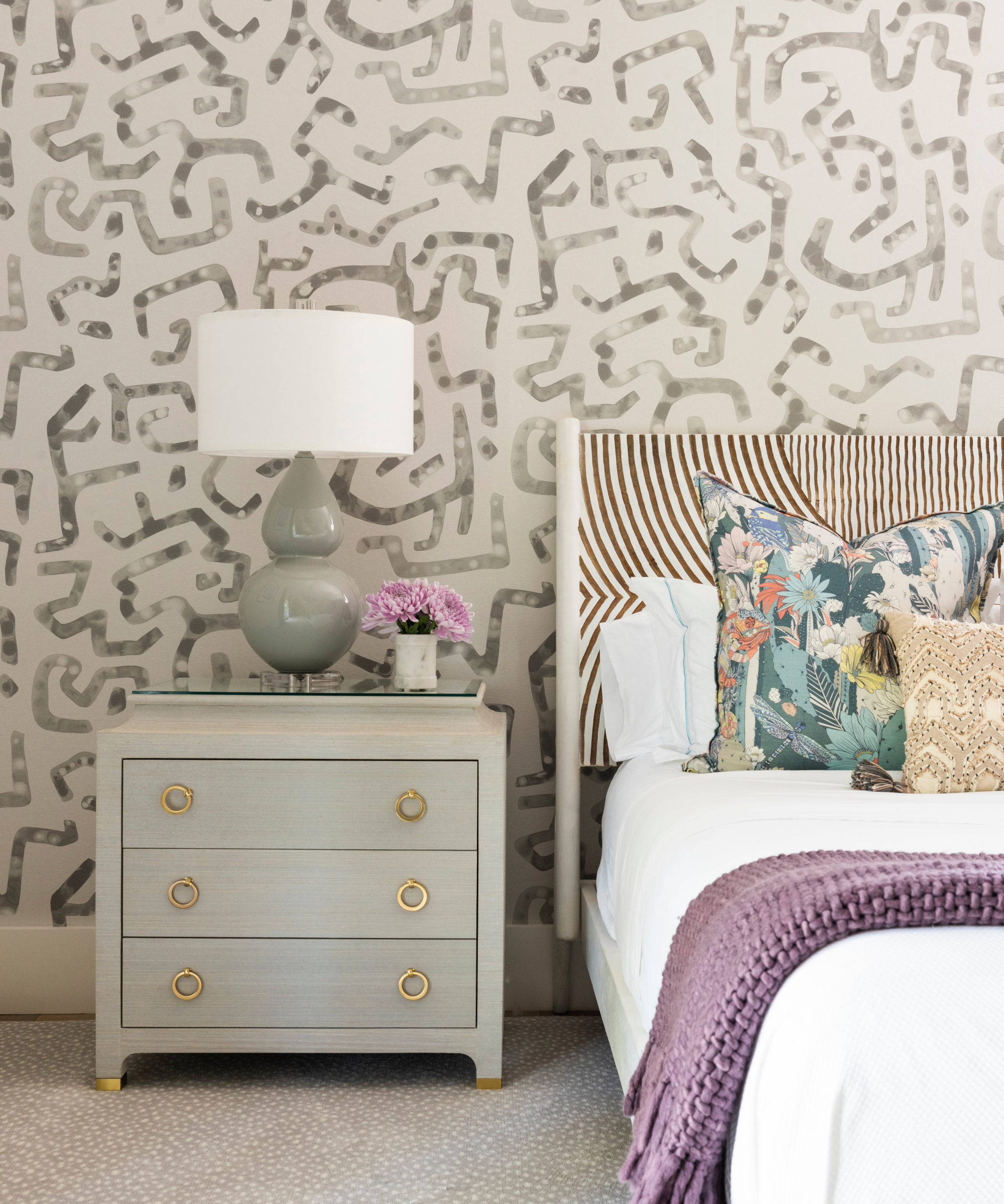
'In this space, we wanted to capture the whimsy of youth with the feeling of refinement – a perfect depiction of a not-so-young, not-yet-adult young lady,' says Courtnay. A funky wallpaper is teamed with a patterned bed from Anthropologie, creating a youthful vibe.
Son's bedroom
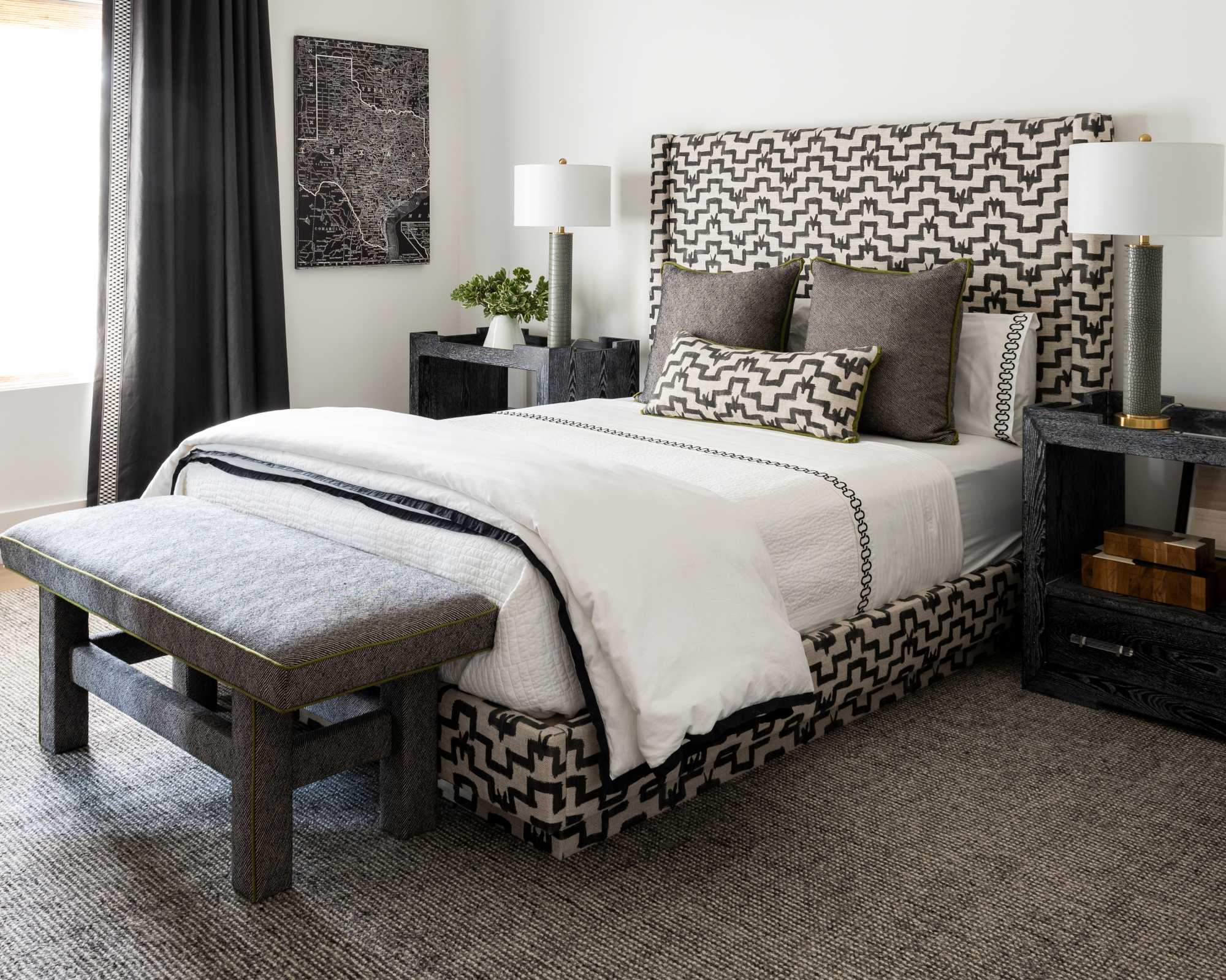
'We wanted to create an elevated, yet youthful and personal space, clad in soothing grays,' says Courtnay. 'The Zak + Fox fabric headboard and pillow provide a touch of graphic movement and serve as the defining feature of the space. Dark curtains, perfect for a teen, are functional and masculine. The wall art depicting a map of Texas is a personal touch, speaking to the family’s home.'
Interior design/ Creative Tonic
Architect/ Robert Dame Designs
Builder/ Thompson Custom Homes
Photographer/ Julie Soefer
Sign up to the Homes & Gardens newsletter
Design expertise in your inbox – from inspiring decorating ideas and beautiful celebrity homes to practical gardening advice and shopping round-ups.

Interiors have always been Vivienne's passion – from bold and bright to Scandi white. After studying at Leeds University, she worked at the Financial Times, before moving to Radio Times. She did an interior design course and then worked for Homes & Gardens, Country Living and House Beautiful. Vivienne’s always enjoyed reader homes and loves to spot a house she knows is perfect for a magazine (she has even knocked on the doors of houses with curb appeal!), so she became a houses editor, commissioning reader homes, writing features and styling and art directing photo shoots. She worked on Country Homes & Interiors for 15 years, before returning to Homes & Gardens as houses editor four years ago.
-
 Kevin Bacon and Kyra Sedgwick's rustic kitchen island is stunning, but controversial – designers say you can get the look without the hassle
A popular material finds an unorthodox home in the couple's kitchen, but experts disagree on whether it should be used – here's how to do it instead
By Sophie Edwards
-
 How to grow grapefruit for homegrown sweet and tangy, highly nutritious harvests – a fruit tree expert shares their planting and care tips
From planting to harvesting, this is all you need to know about grapefruit trees
By Drew Swainston