This Houston home mixes old and new with soft pastel shades for a refined look
A confident mix of antiques and new furnishings gives this 1970s Houston home a touch of 1870s elegance
The new owner of this home in Houston, Texas, wanted a warm, comfortable and traditional look that felt elegant yet not overly formal.
Two years on, with a mix of well-curated antiques from different eras and newer pieces, plus a supremely livable color palette of soft blues, greys and warm neutrals, the impressive interiors make this one of the world's best homes. It's full of inspiration for anyone seeking a similarly refined look.
It was a very different story, however, before interior designer Sarah Eilers of Lucas Eilers Design Associates became involved, as Sarah herself explains: 'It had been a rental house for several years, so it really needed a lot of love. I was very fortunate to assemble the team of D.L. Doyle Construction and architect Kevin Dahlstrand to help with the renovation.'
The overall design concept was developed from the client’s Southern roots and fondness for mixing traditional and contemporary styles. 'With plans to accommodate large groups for entertaining, it was important that the remodeled living spaces maintain an open concept, including a large island for gathering in the kitchen, and multiple areas with comfortable seating,' adds Sarah Eilers. 'My client also loves antiques and we had fun sourcing pieces from all over the country.
Stately antique furnishings and lighting fill the interiors. A mix of playful patterns and textures can be found throughout, beautifully balancing soothing color palettes and lending a laid-back refinement.
New dining room with traditional style
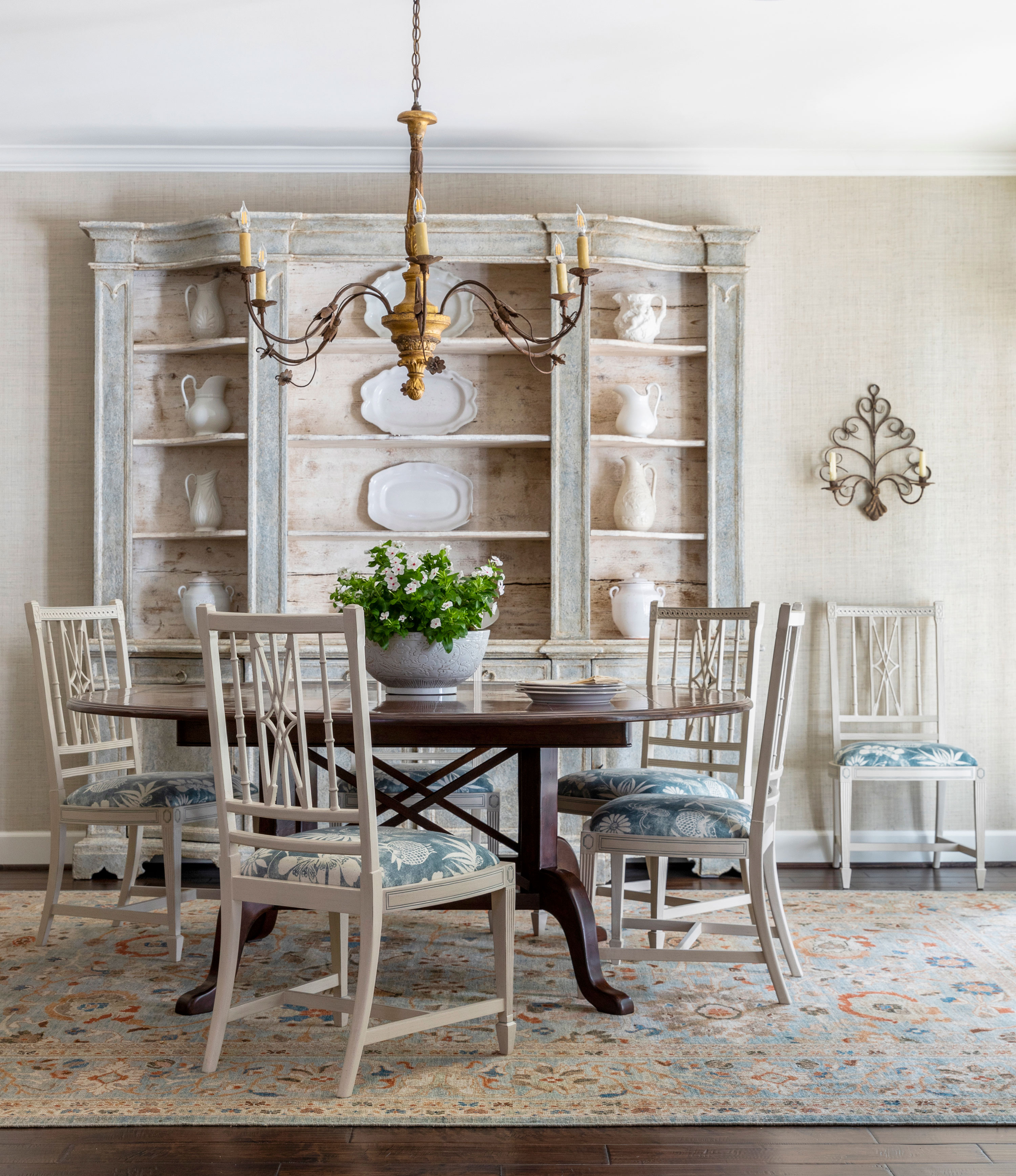
A few changes were needed to make the house work as a sociable space for entertaining. 'One of the first things we did was to review the overall layout, especially the first floor,' explains Sarah Eilers. 'We turned the old breakfast room, which was huge, into the dining room and we took the old study and combined it with the small kitchen, opening it up to the family room.'
Anyone looking for dining room ideas will find plenty to inspire in this calm, relaxed room, which has a hint of Gustavian style about it. Key style points here are a new round dining table from Alder & Co, a painted 19th-century bookcase from Italy for much needed storage, and a beautiful Persian Sultanabad rug from Matt Camron, chosen, says Sarah, 'to complement the color palette of blues with accents of coral used through the house'.
She adds: 'I love to find one-of-a-kind items that lend personality and individualism to a project. The chairs were found at Jere’s Antiques in Savannah and were originally stained, but we painted and glazed them. An antique gilt chandelier is the finishing touch.'
Library
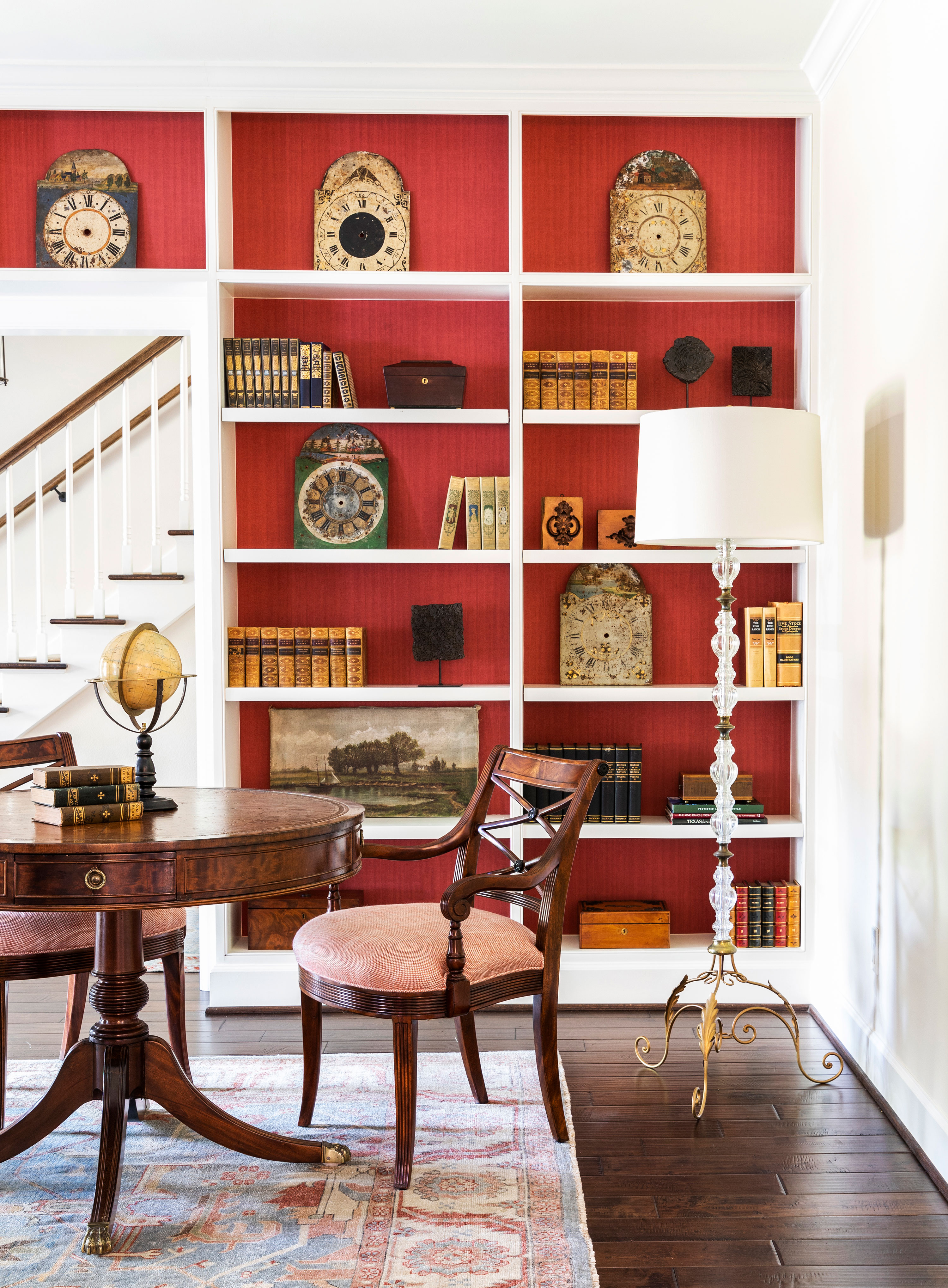
This is designer Sarah Eilers' favorite room in the new-look home. 'I adore the library!' she says. 'The Brunschwig & Fils red wallcovering inside the bookcases serves as a beautiful contrast against a quirky collection of antique clock faces we found from a dealer at the Round Top Antique Fair and my client's Texas history books.'
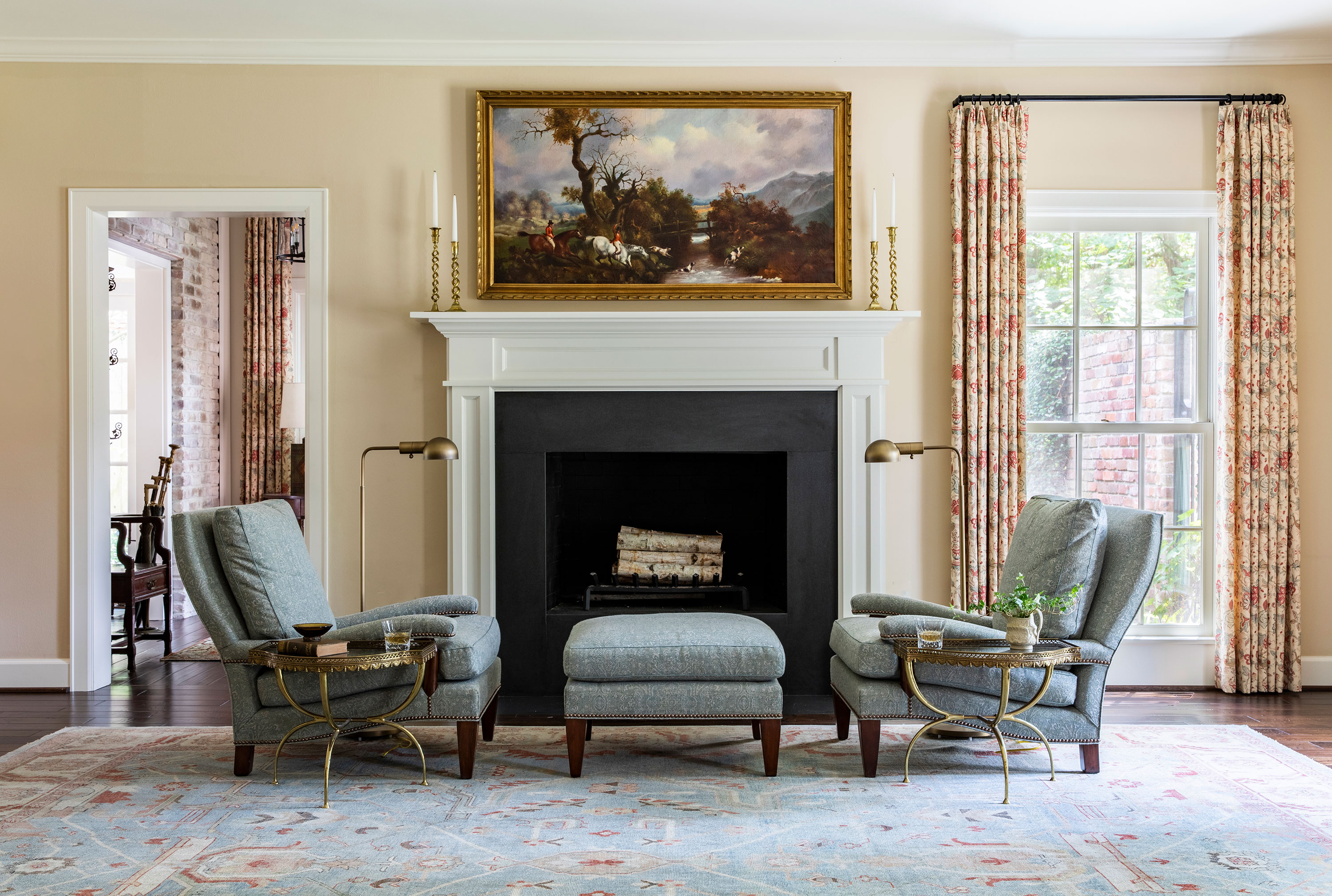
At the opposite side of the library is a traditional grouping of comfortable armchairs, arranged symmetrically around an ottoman, with mirror image coffee tables and reading lamps.
'The Serapi rug from Matt Camron really sets the tone for the entire color palette, and I love the Robert Kime 'Arles' linen curtains and Gemelli lounge chairs sitting in front of the fireplace,' says Sarah of this cozy spot.
Family room
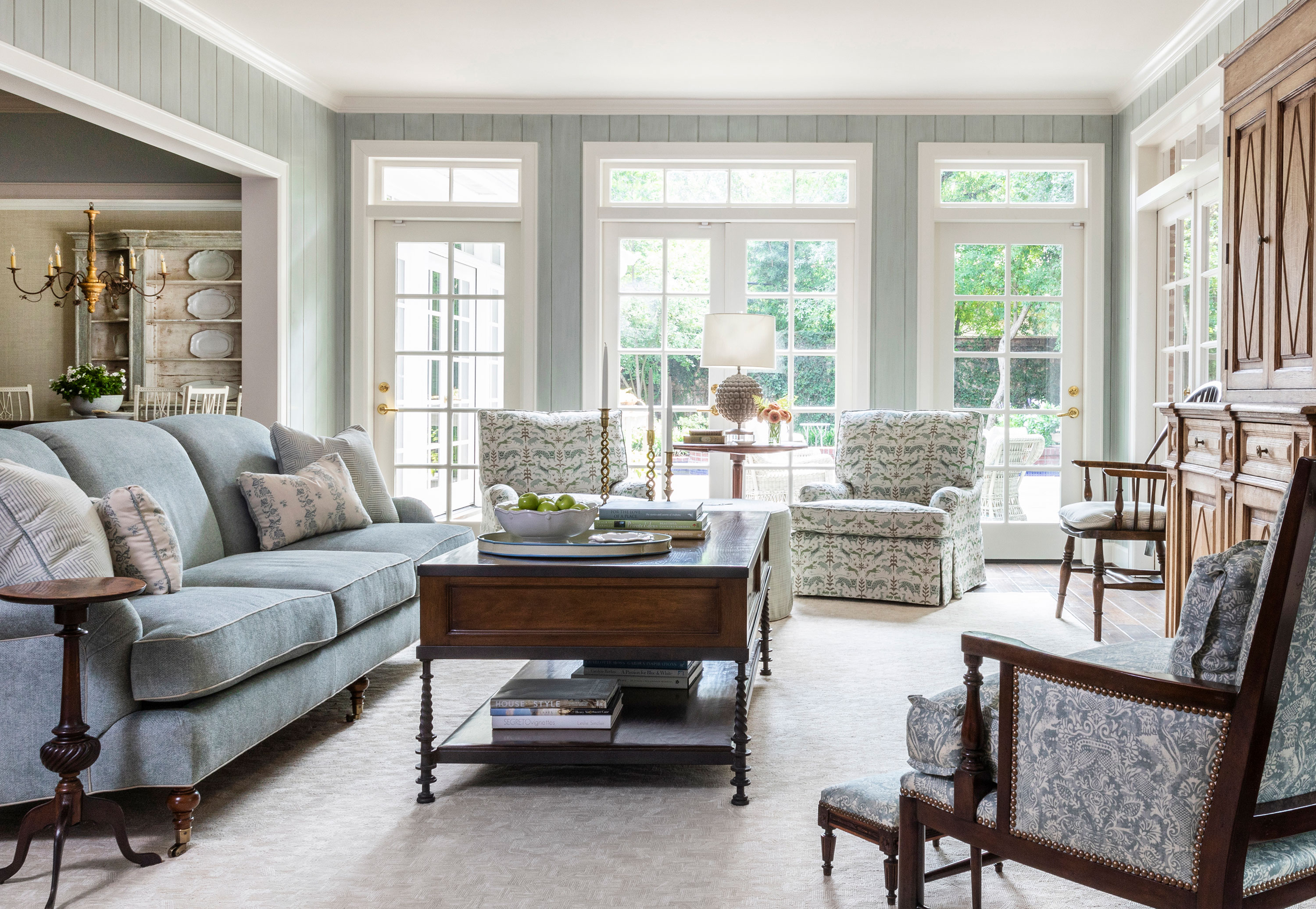
If it's living room ideas you need, take inspiration from this comfortable space – particularly if you have a more traditional setting in mind. Sarah Eilers explains that the original room has been radically altered with some quite substantial building work to create its current light, elegant look.
'In the original plan, there was a fireplace in the center at the end of the room,' she says. 'There was a low spot in the plot and water was coming in through each of the doors on either side. Instead of rebuilding the fireplace, we decided to take it out, open that wall, and add more windows to give a better view of the backyard and the pool.' Groundworks outside solved the flooding issues, and the new space is infinitely lighter than the original room.
Key pieces here include an O’Henry House sofa combined with a Minton-Spidell occasional chair and Paul Ferrante coffee table. A 19th-century low cabinet found at Joyce Horn Antiques in Houston provides storage with a custom-built wall cabinet above it with double doors to hide the TV. This is a great solution if you're furnishing a traditional-style room where modern technology may look unsightly and out of place.
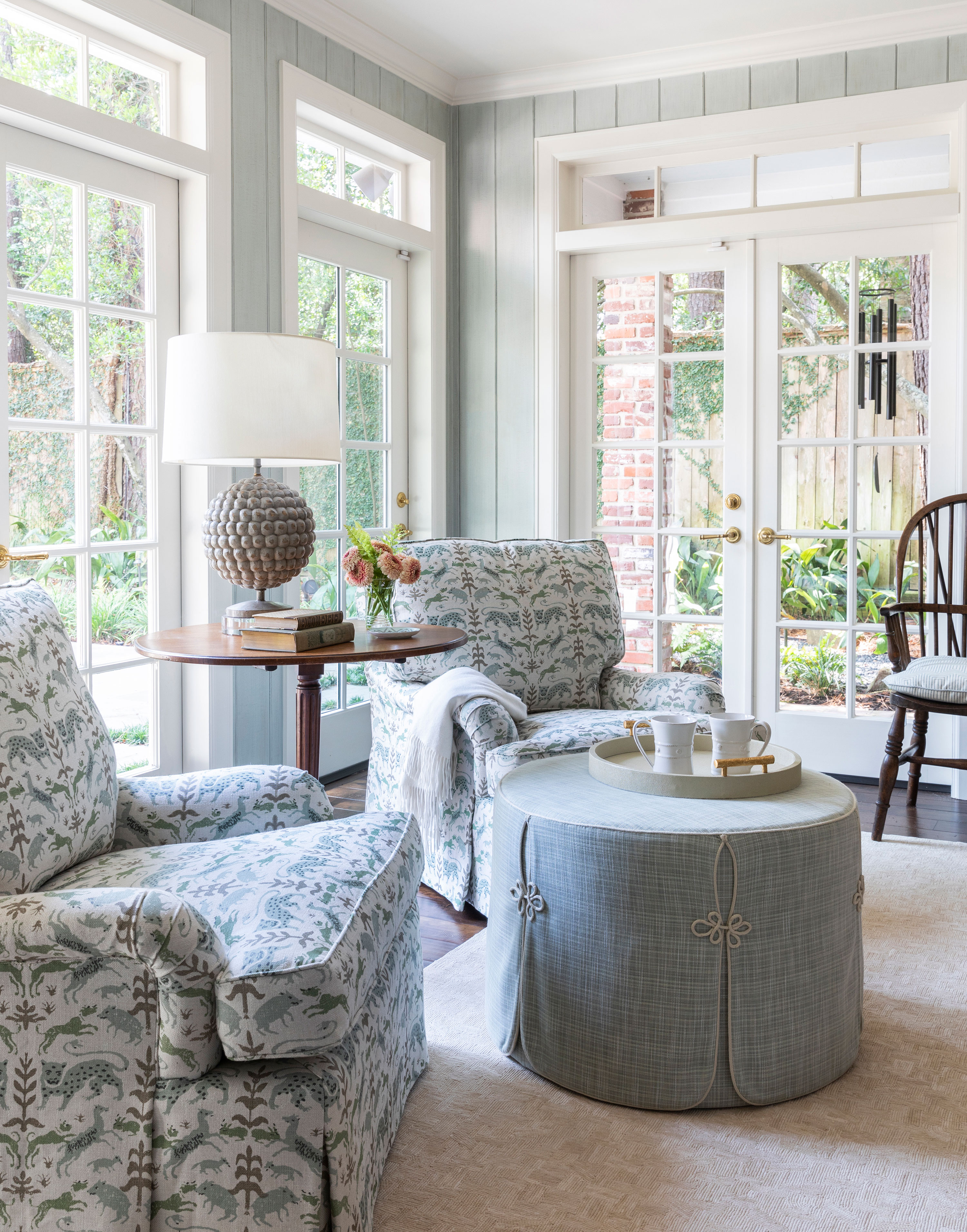
In the newly created window space is an intimate seating area with two Brunschwig lounge chairs in a custom Pintura fabric paired with a Cameron Collection ottoman in a Perennials fabric for durability. The antique tripod table was sourced by Janet Weibe.
The kitchen – enlarged to create a sociable space

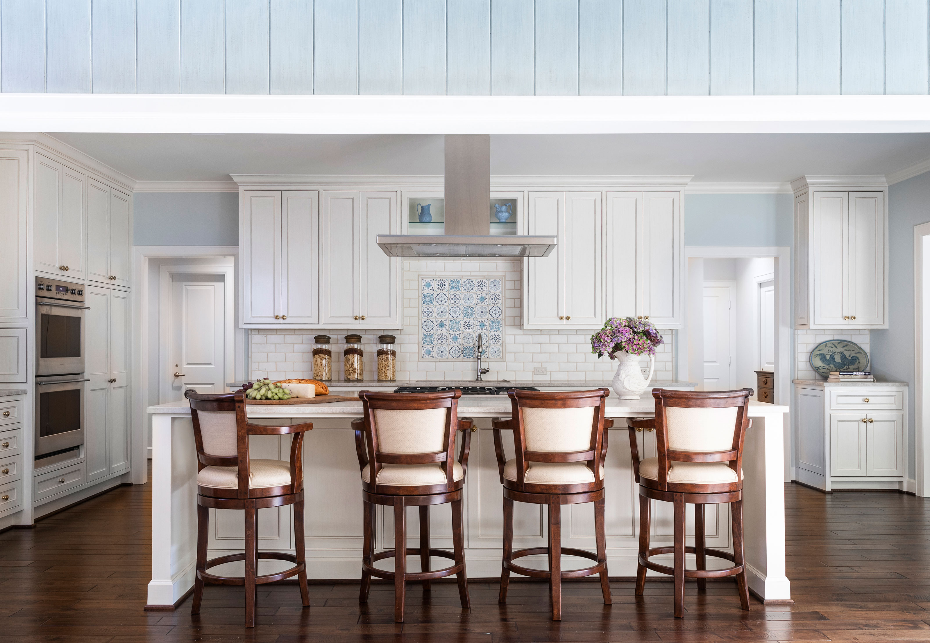
The kitchen was reconfigured and walls were removed so that it could connect to other entertaining spaces within the home. By incorporating the footprint of the adjacent study, Sarah Eilers worked with the architect to expand the kitchen and extend the island to allow seating for four.
'The kitchen is now completely open to the family room via a large cased opening and the new kitchen feels so much brighter and fresher for modern living,' says Sarah. 'Clean lines in the kitchen bring an updated sensibility to the home while coordinating with blue hues in adjacent rooms while the blue and white backsplash over the sink adds charm and personality to the space.'
Kitchen ideas worth a steal from this beautiful room include the practical dark hardwood floors, which give a smart and hardwearing finish that doesn't show up marks, and the dark wood upholstered counter stools that reference the flooring. The pretty inset backsplash of pale blue patterned tiles above the sink, with plain white tiles around it, is an unusual feature that would work well in any kitchen. The decorative tile backsplash is from Walker Zanger and the counter stools are from Alder & Co.
Entryway redesign

The property has a classic Charleston-style architecture which often puts entryways on the side. In this case, the entry was in the front but the owner agreed that moving the front door would fully embrace the home’s intended charm.
Reconfiguring the layout created space for a more spacious entryway. If you're looking for hallway ideas, this one includes classic furnishing choices, such as the elegant half-moon console table, an antique Persian Malayer rug (from Matt Camron Rugs) and tapestry-style curtains are made up in Robert Kime's Arles linen fabric, a design inspired by a fragment of a 19th-century French textile.
Luxurious primary bedroom
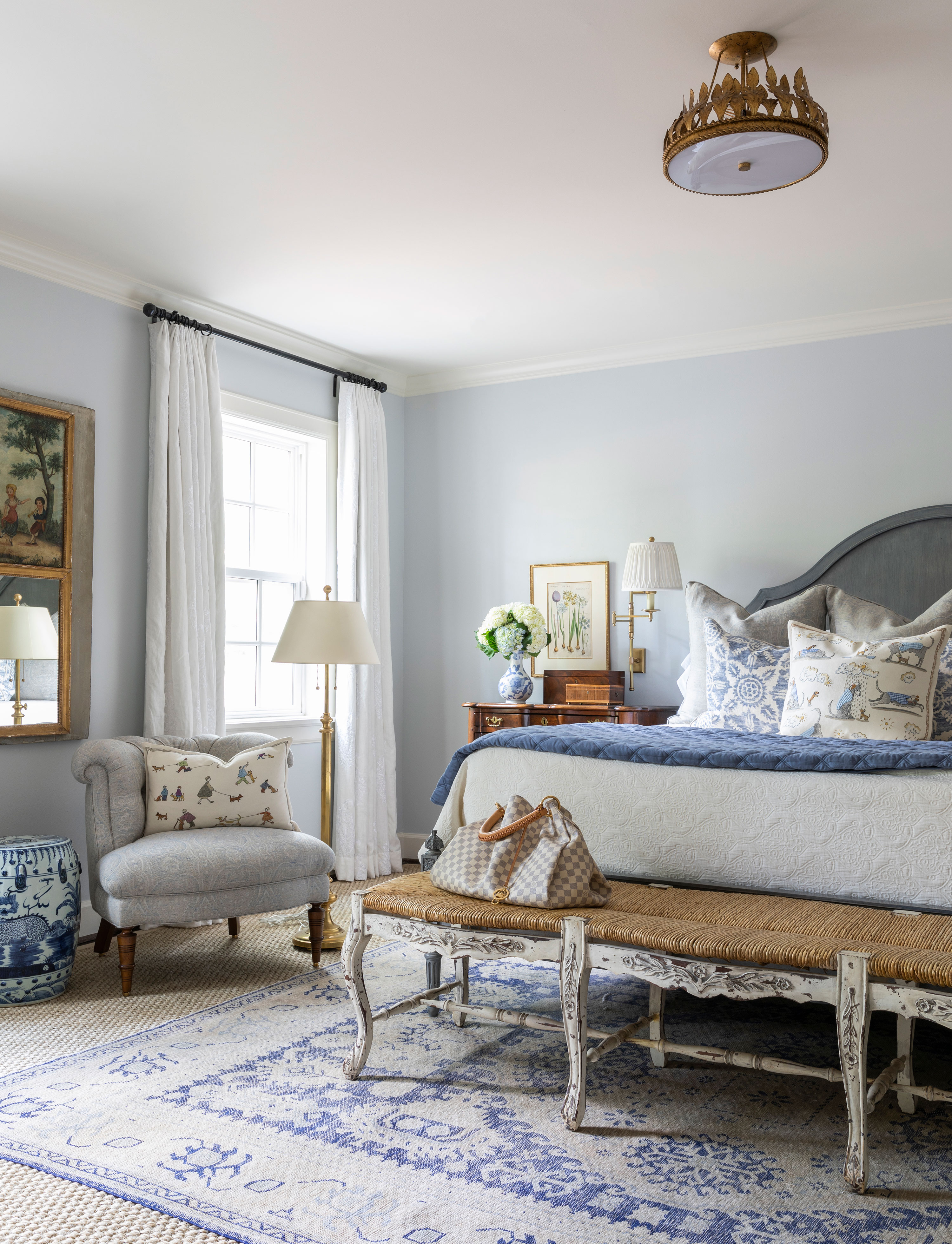
Sweet dreams wouldn't be far away in a luxurious bedroom like this one. Bedroom ideas include a custom sisal rug cut to the room’s size, layered with a smaller antique faded blue rug from Matt Camron Rugs on top. The bed is the Hickory Chair Simone bed with an O’Henry House occasional chair, and Chelsea Edition throw pillows.
Guest bathroom
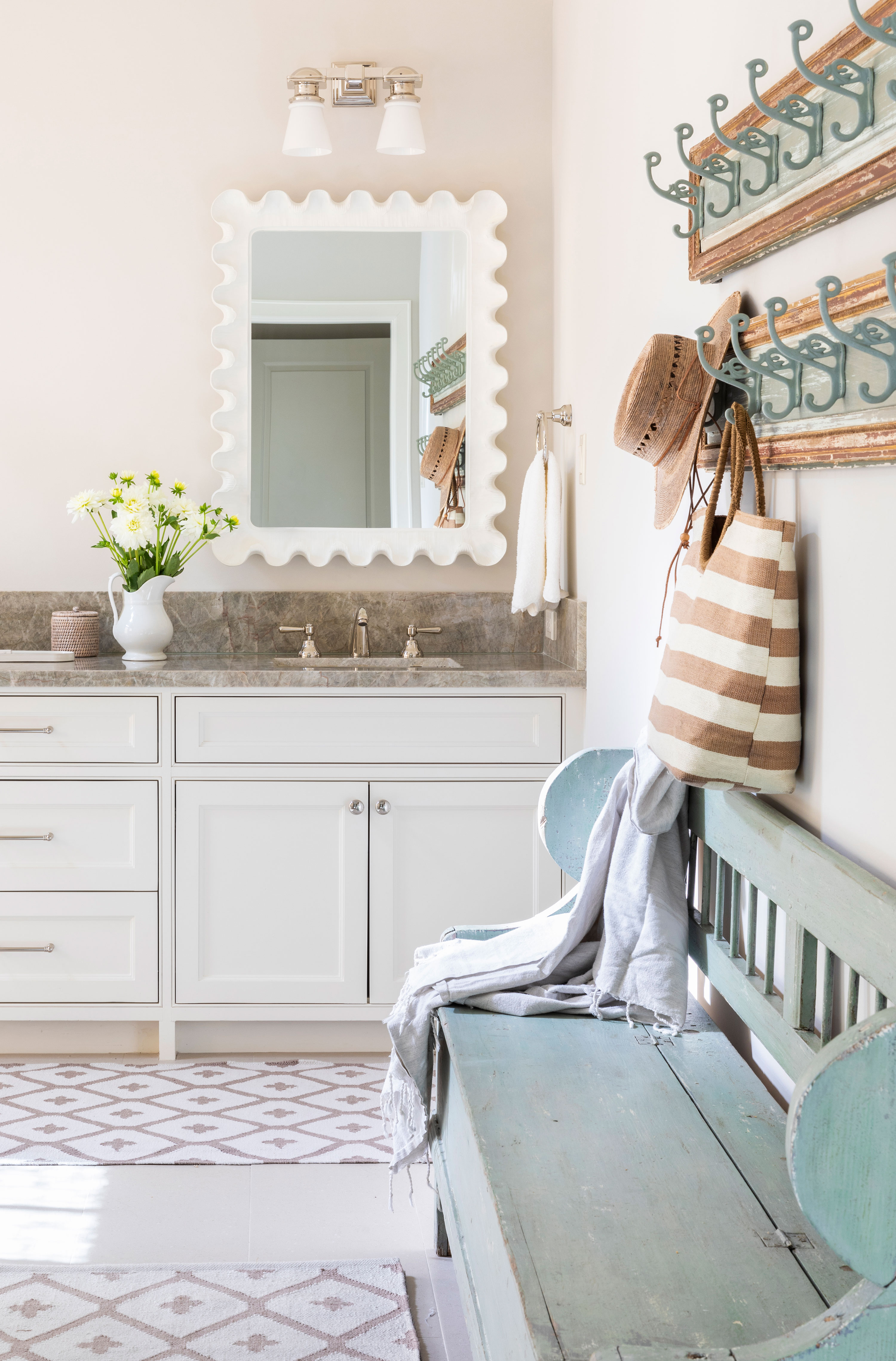
This simple but appealing guest bathroom was created when the downstairs floorplan was updated. If you're looking for bathroom ideas consider adding a long bench, if space allows. This vintage piece really adds character to the space and provides storage within the seat.
'We primarily focused on changing out the finishes here,' says designer Sarah Eilers. 'We found a pair of antique panels at the Round Top Antiques Fair and added hooks for bags and beach towels. They are hung above an antique bench we selected from Chairish, and the decorative lighting is from Circa and the Wave mirror is from Carvers' Guild.
Pretty powder room
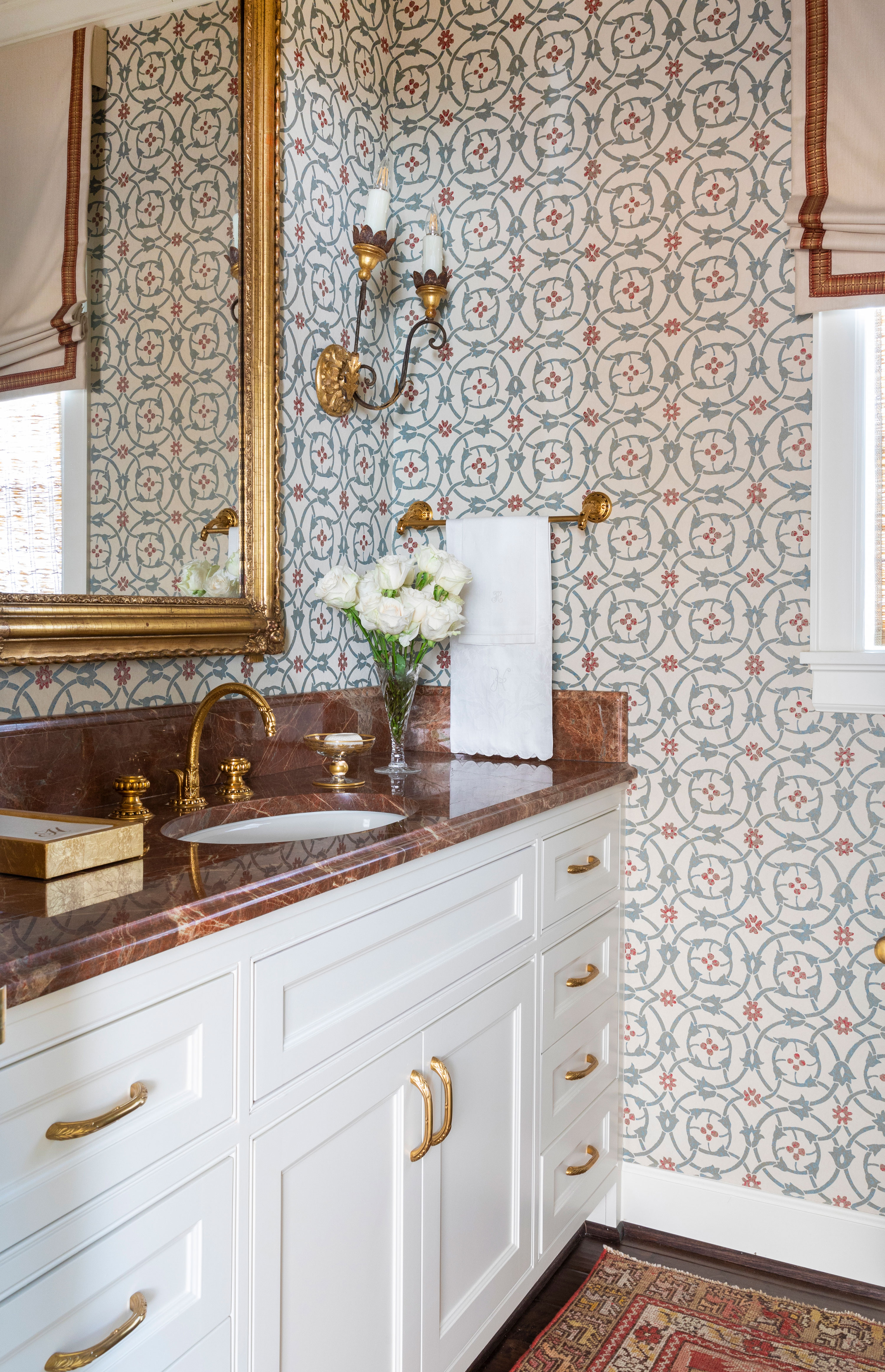
An old cabinet with side display shelves was replaced with this smart, higher vanity unit topped with a remnant piece of Rojo Alicante marble, which gives a beautiful finish and complements the custom Pintura wallcovering, antique mirror, and sconces, which are from Joyce Horn Antiques. The antique rug lends a welcome sense of warmth. A small room like this is a great place to splash out on luxury finishes – marbles and special tiles in this case – as you don't need them in such quantities and they make a big impact.
Exterior
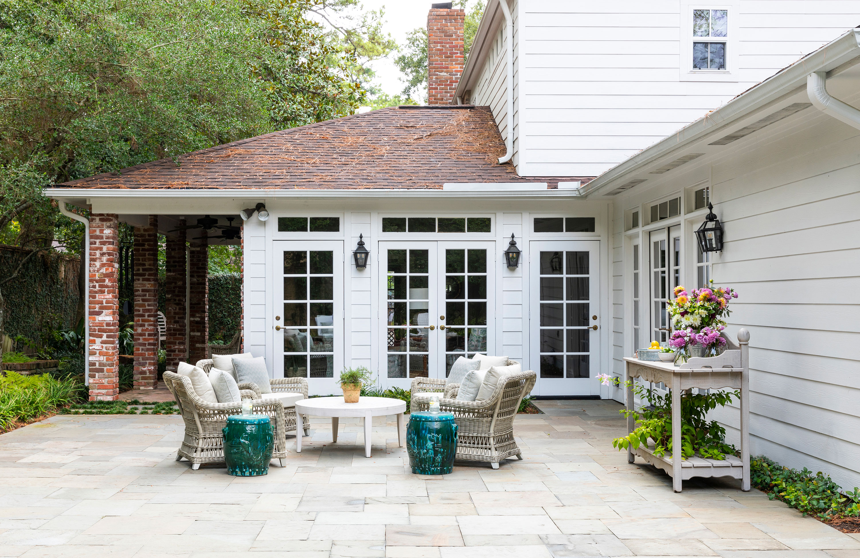
The home has attractive Charleston-style architecture and the outside space is almost as important as the inside of this Houston home. McDugald Steele did extensive work to correct the home’s drainage and improve the backyard.
'The homeowner enjoys spending time on the patio and garden all year round, so the pool area was especially important for those hot Houston summer months!' says Sarah. 'Each unique design element, inside and out, was carefully considered to build a warm, joyful home that the client and her family will enjoy for generations to come.'
Sign up to the Homes & Gardens newsletter
Design expertise in your inbox – from inspiring decorating ideas and beautiful celebrity homes to practical gardening advice and shopping round-ups.
Karen sources beautiful homes to feature on the Homes & Gardens website. She loves visiting historic houses in particular and working with photographers to capture all shapes and sizes of properties. Karen began her career as a sub-editor at Hi-Fi News and Record Review magazine. Her move to women’s magazines came soon after, in the shape of Living magazine, which covered cookery, fashion, beauty, homes and gardening. From Living Karen moved to Ideal Home magazine, where as deputy chief sub, then chief sub, she started to really take an interest in properties, architecture, interior design and gardening.
-
 Can you revive woody rosemary plants? Expert pruning advice from a professional gardener to save old, leggy herbs
With the right pruning approach, old and woody rosemary plants can be brought back to life
By Thomas Rutter
-
 Barbra Streisand spotted a 'little miracle' on her garden's rose bush – landscaping experts say you can grow her 'joyful' flowers on a smaller scale
The singer's rose bushes are among the most abundant and beautiful we've seen this year – with the right advice, you can follow her example
By Megan Slack