A historic residence in San Francisco gets a serene and elegant makeover – take the tour
A neutral color palette is paired with striking architectural delights...
Even among San Francisco’s extensive stock of legendary Victorian-era homes, this historic residence is distinguished.
Over several years of scrupulous planning and construction, the house was fully restructured and given an entirely new interior layout for a large family by Richard Beard Architects.
Exteriors were repaired and preserved, consistent with the Secretary of Interior Standards for the treatment of historic properties, and given a fresher and more welcoming look to a very visible corner of the neighborhood.
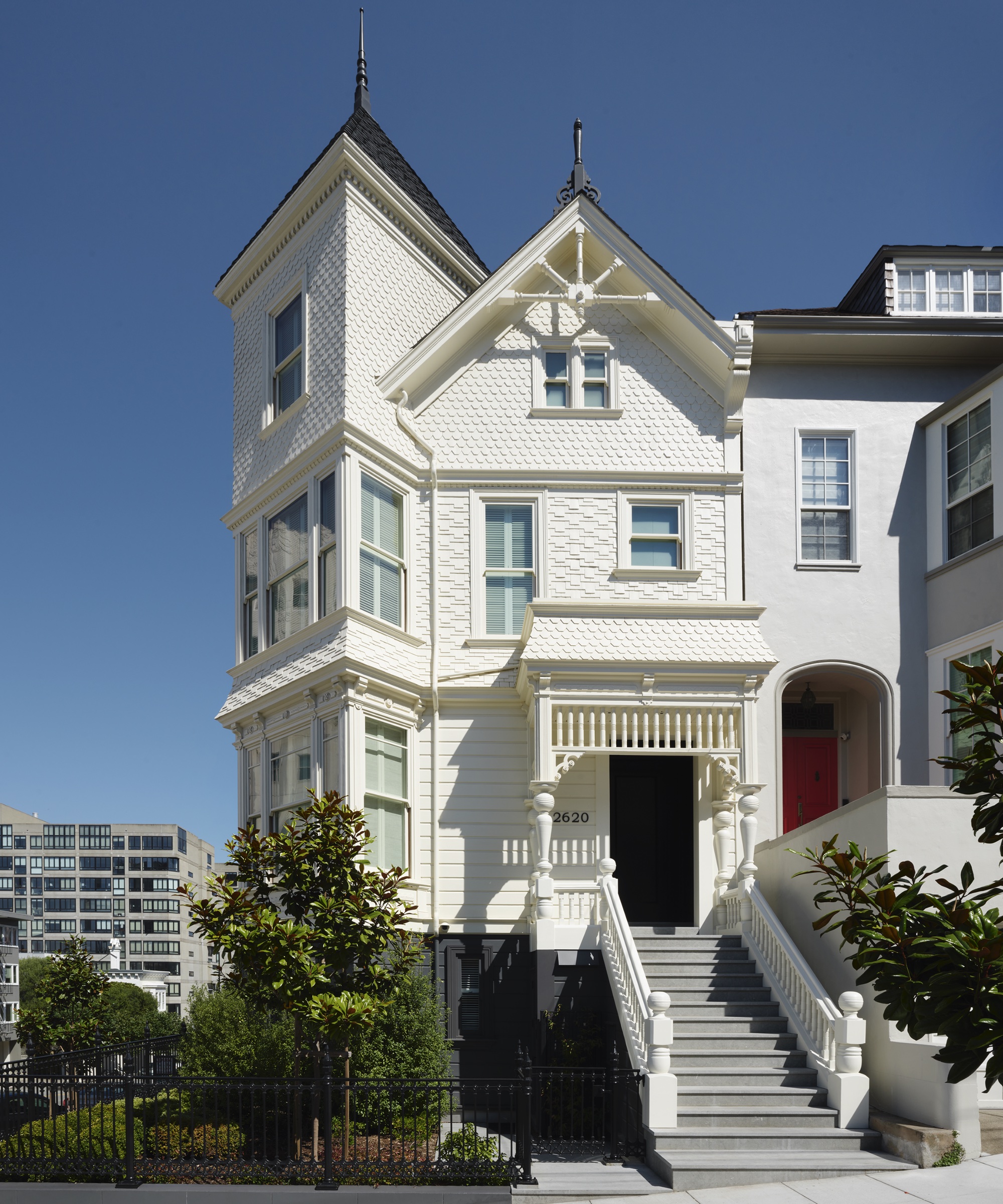
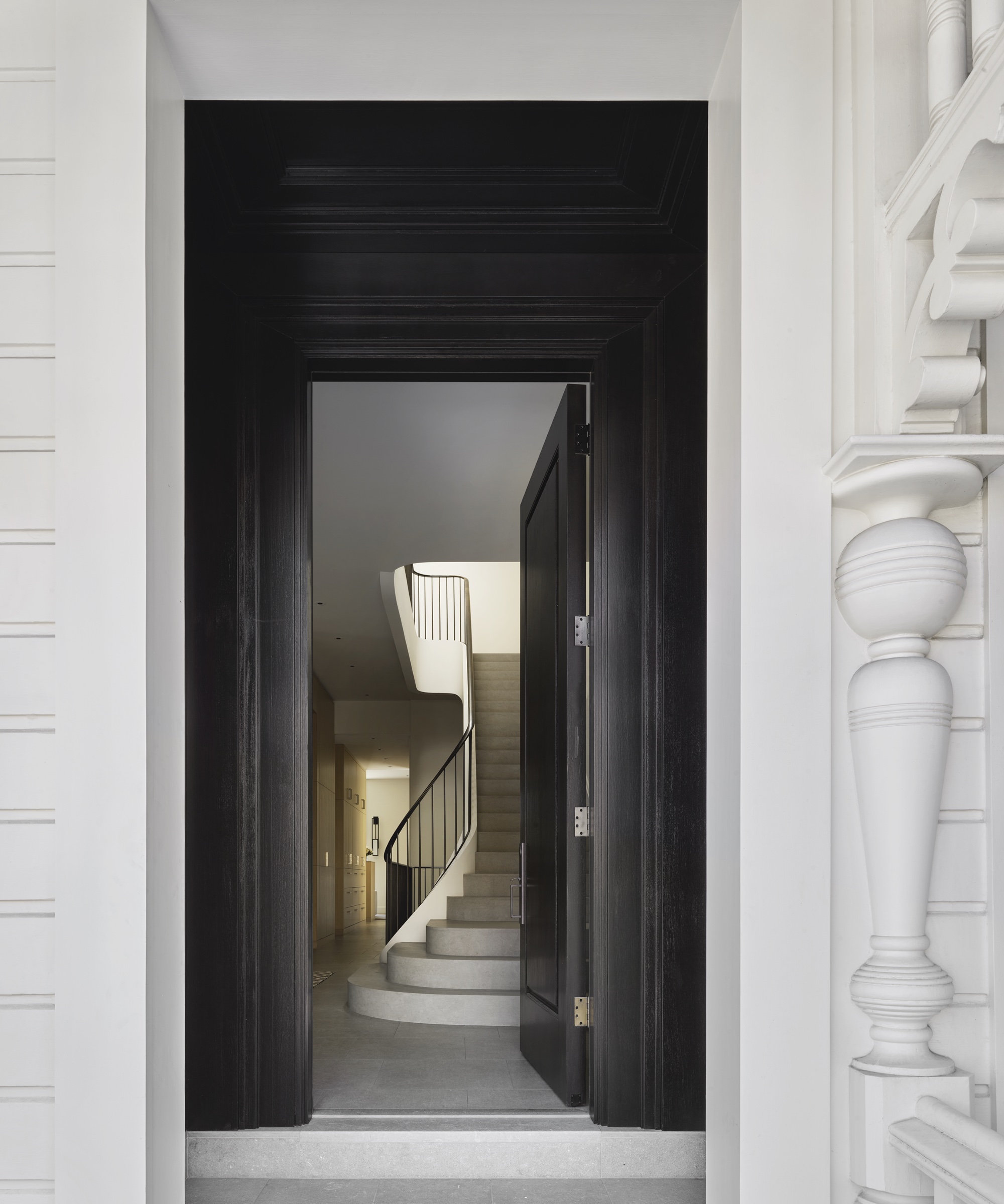
The house design exterior was to remain in its traditional Victorian state with the front door being the first glimpse of the more modern interior you would soon enjoy as you entered.
The Wiseman Group worked closely with the clients to design a home that was warm, inviting and comfortable, yet indestructible for their large family.
This home was created as a labor of love for a family of six with every detail studied and executed with their lifestyle in mind.
Paul Vincent Wiseman says: 'Being a native Californian who grew up 80 miles from San Francisco in an 1860s Victorian house, I was keenly aware of the problematic nature of Victorian room arrangements. Richard Beard did a remarkable job of reorganizing this house.'
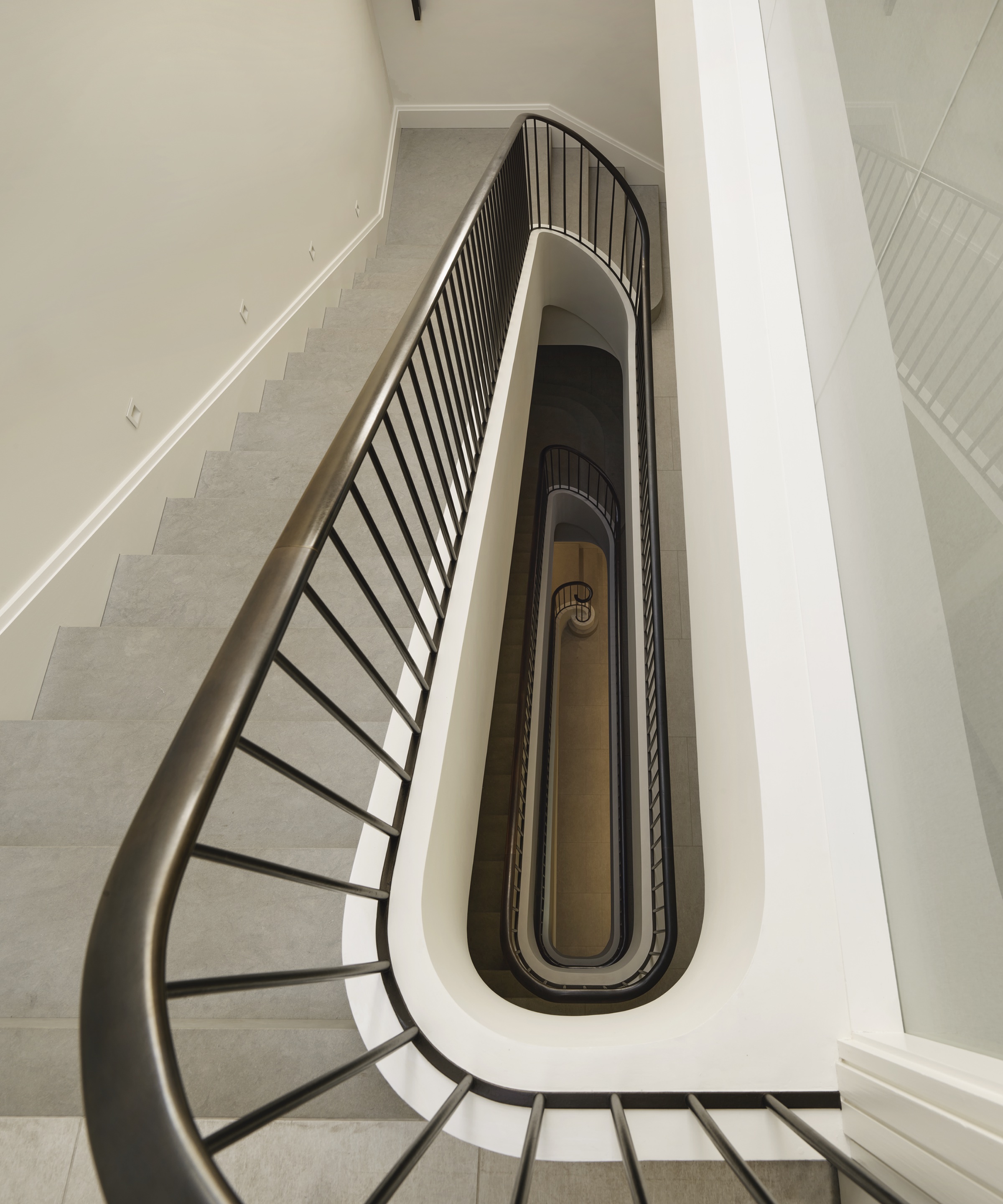
A great room that could be intimate yet host a dinner party for 12 (the table in the bay window extends from 4); a family room that was connected to the kitchen for the Greek-style family dinners that would be prepared; a primary suite at the very top of the architectural elliptical stone staircase.
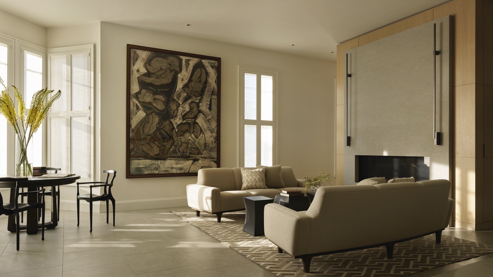
Material selections played a vital role in achieving this goal – ceramic tiles were laid on the floors throughout rather than typical hardwood floors, all fabrics and rugs were outdoor fabrics or high-performing fabrics that would protect against spills and the likes of children, and surfaces were ‘spot’ tested to ensure they could withstand the most intense of curry spices.
Jess Redondo comments: 'Being able to use outdoor fabrics in all of the communal spaces without losing a sense of luxury speaks to how far these fabrics have come over the years. You would never know the fabrics on the sofas are outdoors unless you read the label. The spaces are warm and inviting.'
Take the full tour below:
Hallway
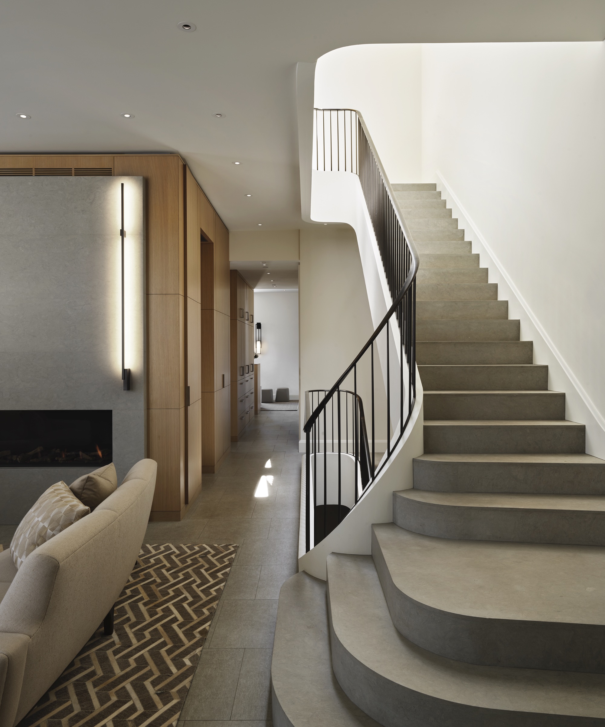
The only place in the house where you will find real stone is at the five-story grand elliptical staircase (limestone stair and a custom bronze handrail), and at the fireplace.
The great room
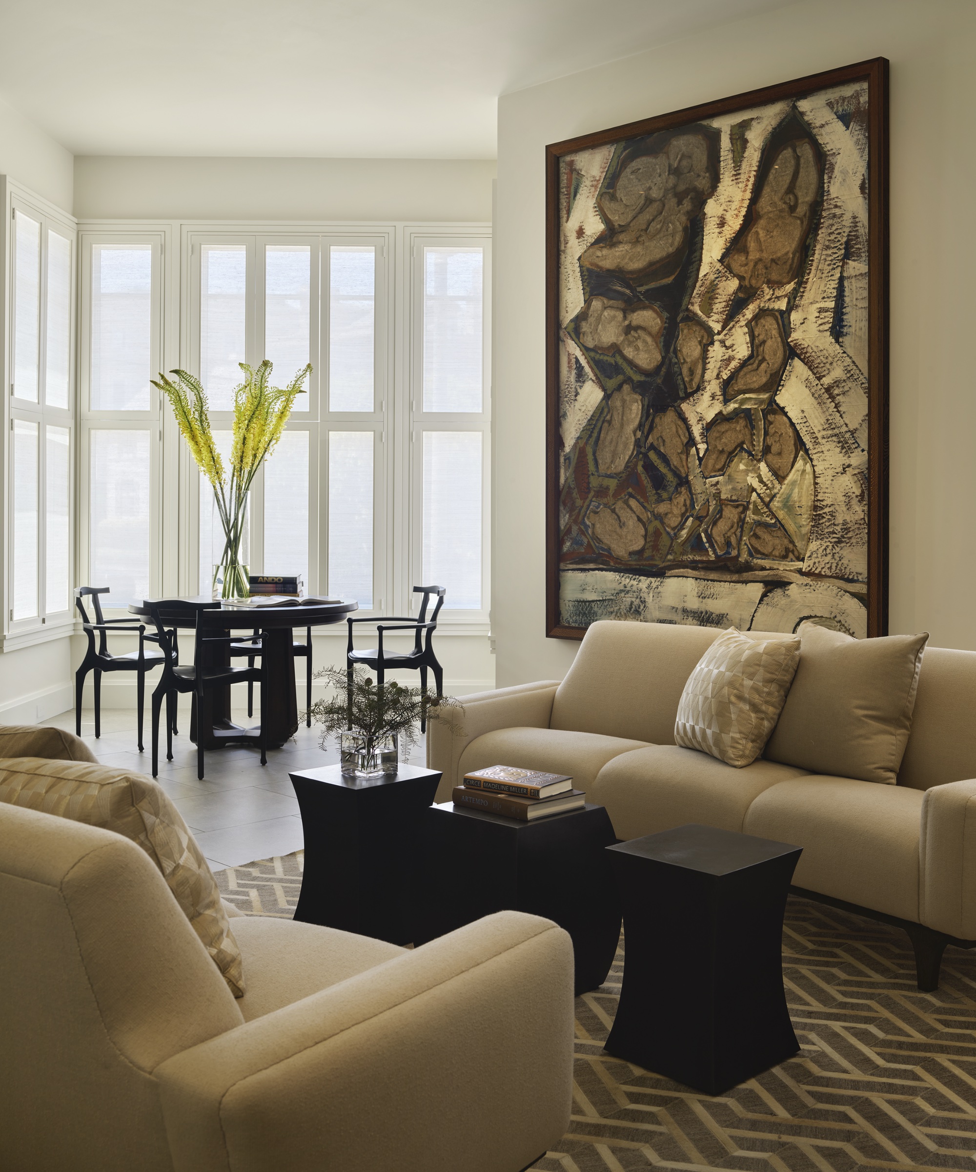
The great room needed to be a space that could be intimate yet host a dinner party for 12; the table in the window can serve four or up to 12, with the extension leaves and center leg being stored in an existing cabinet of the clients'.
Paul says: 'We refinished it and customized the interior by adding slots for the leaves and legs, all lined in felt.'
Kitchen
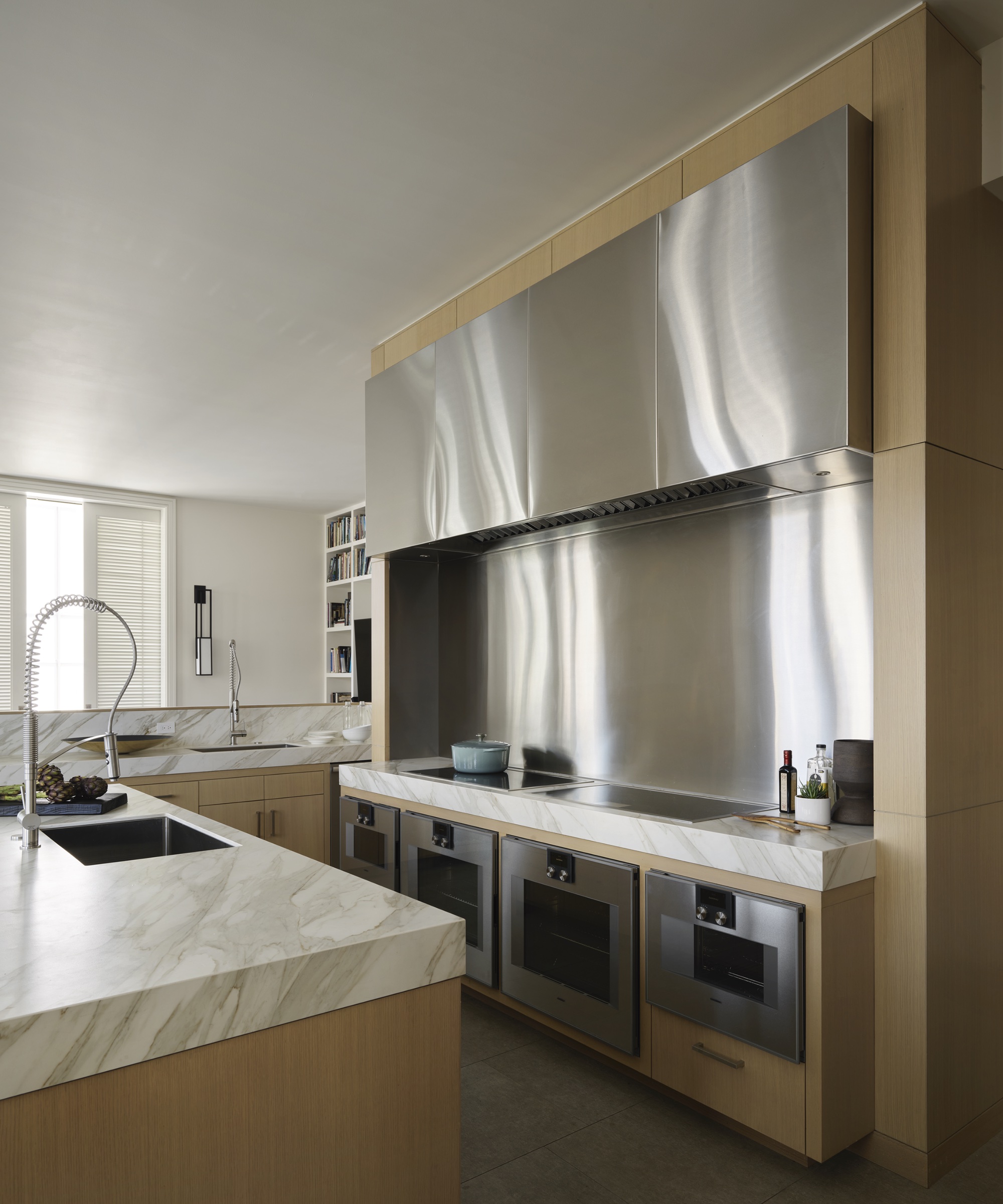
The open-plan kitchen was a requirement of the client whose Greek heritage inspired their nightly family dinners.
The kitchen countertops are neolith – a requirement for very durable counters that could withstand the stains of the family's favorite food: curry.
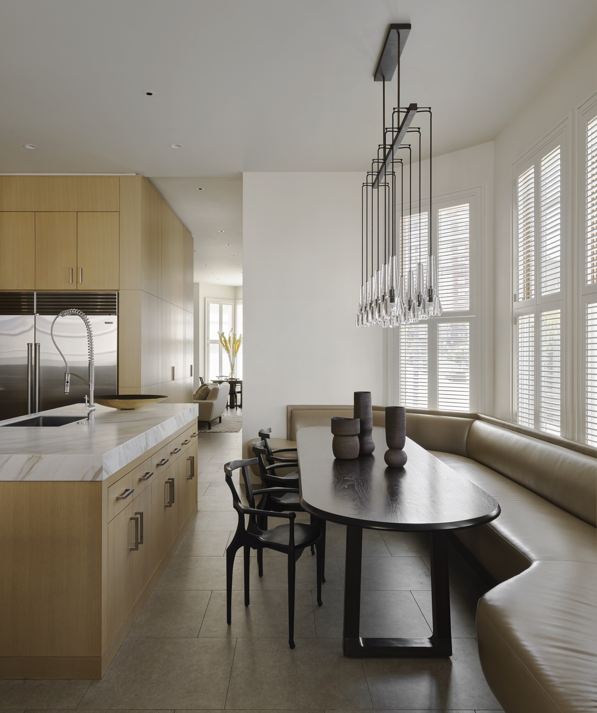
A custom banquette with faux leather and an oval table for large Greek-style family meals was installed in the kitchen.
Shutters were used throughout the house with louvers and fabric as a way to maximize the light while having privacy at the same time.
Family room
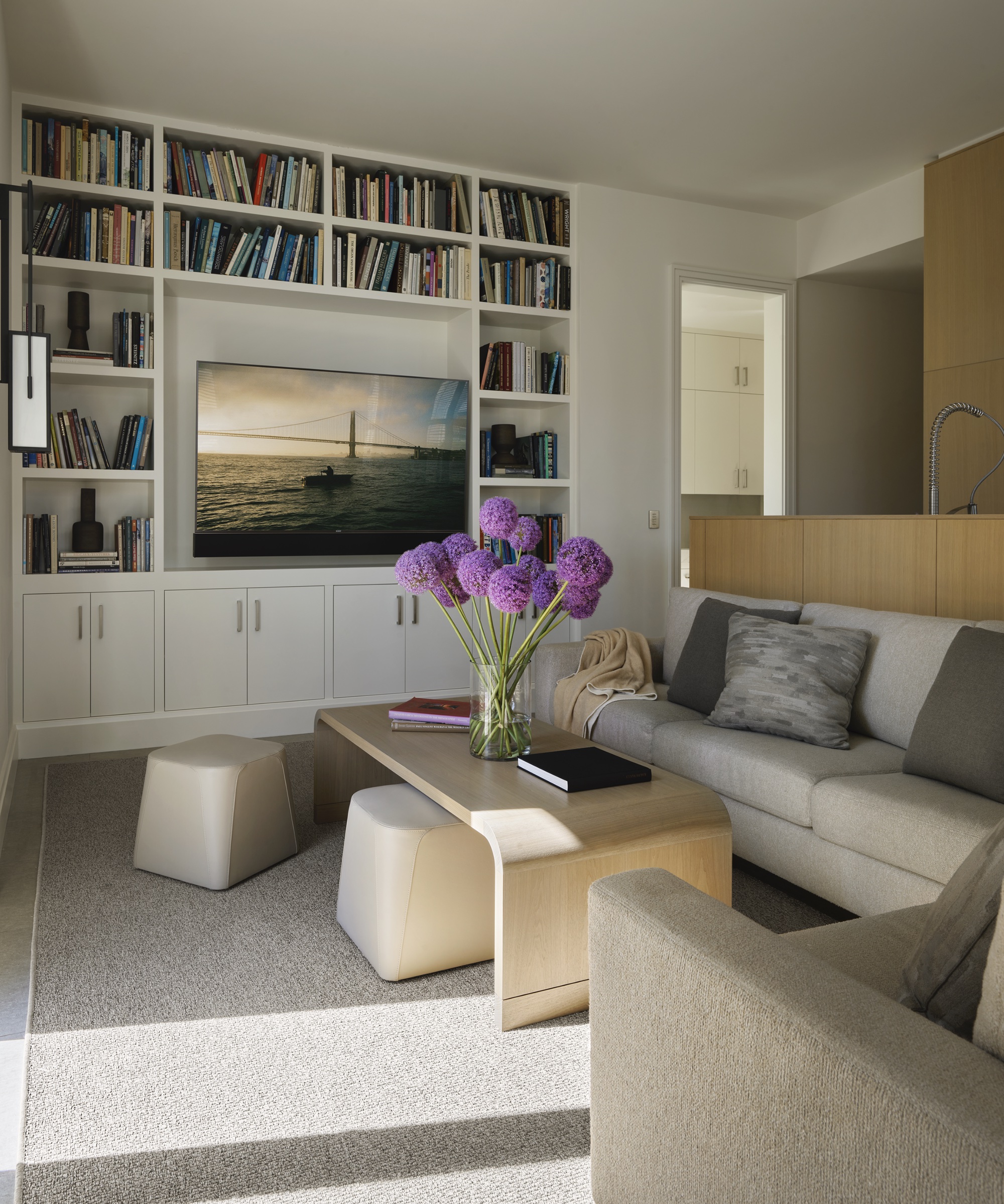
The family room is connected to the kitchen and is a place where the whole family can gather, play games and eat meals together.
Primary bedroom
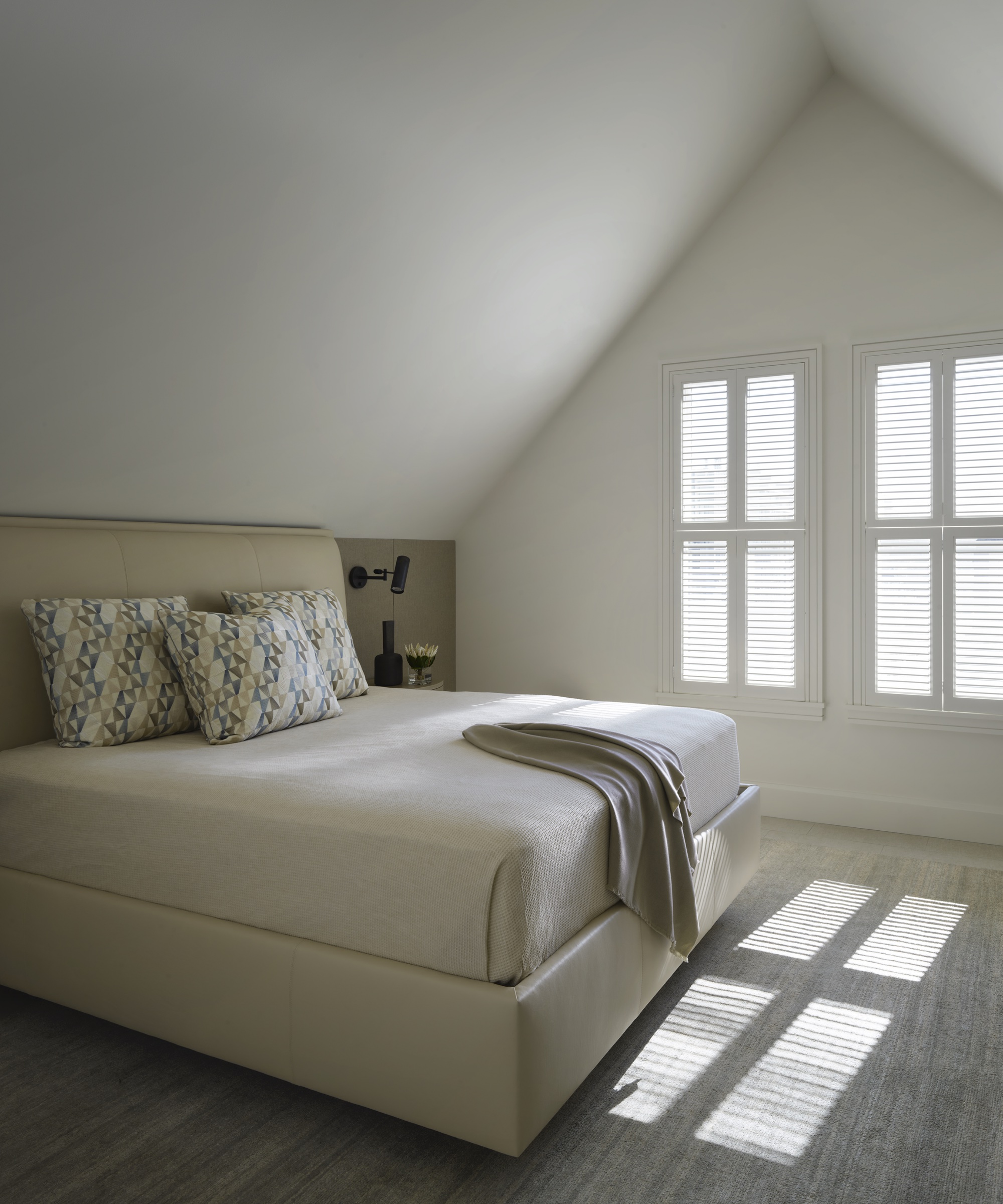
'The main bedroom is the one room in the house where durability slipped some,' says Paul. 'We were able to use natural materials such as leather, silk, and wool.'
Primary bathroom
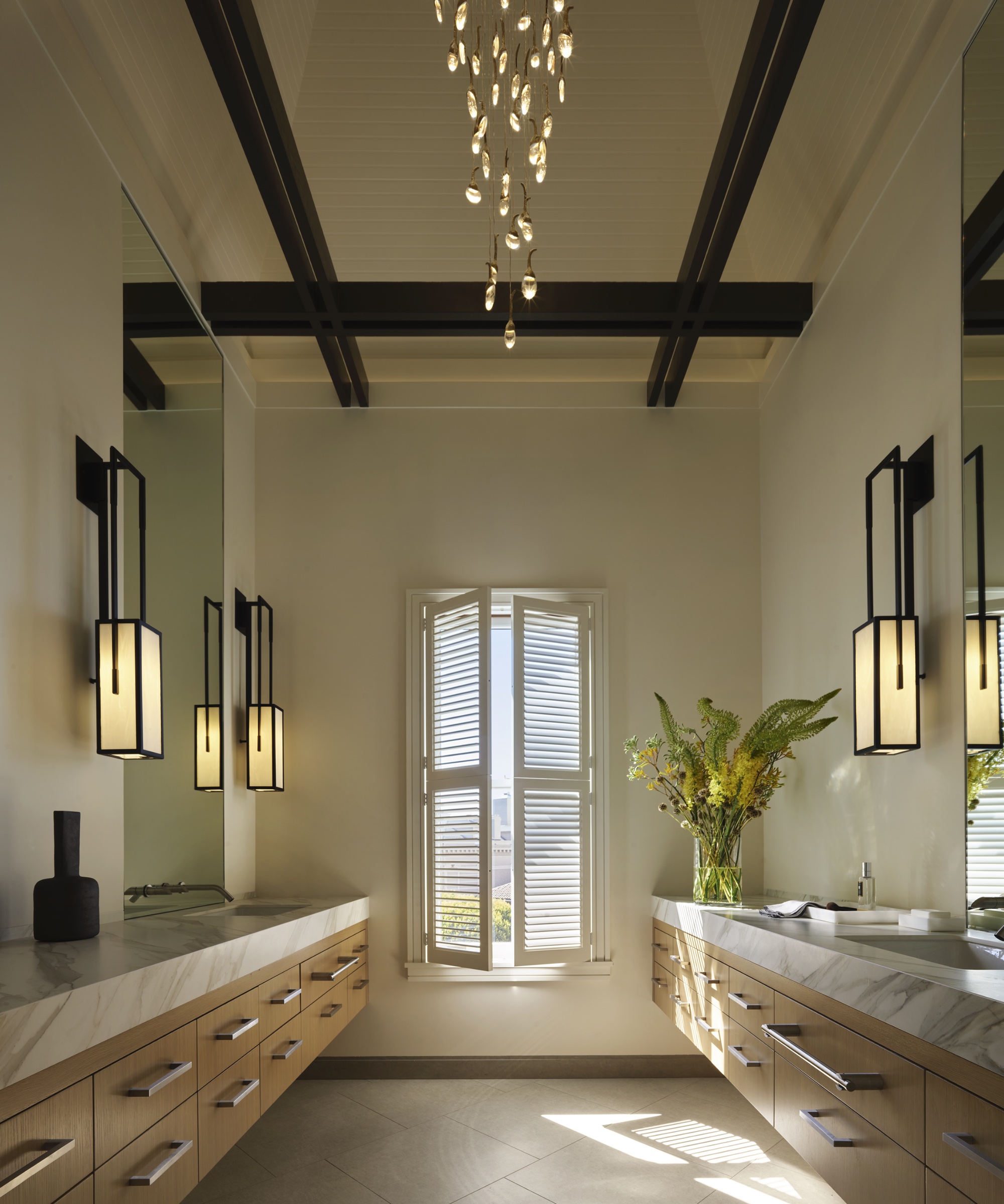
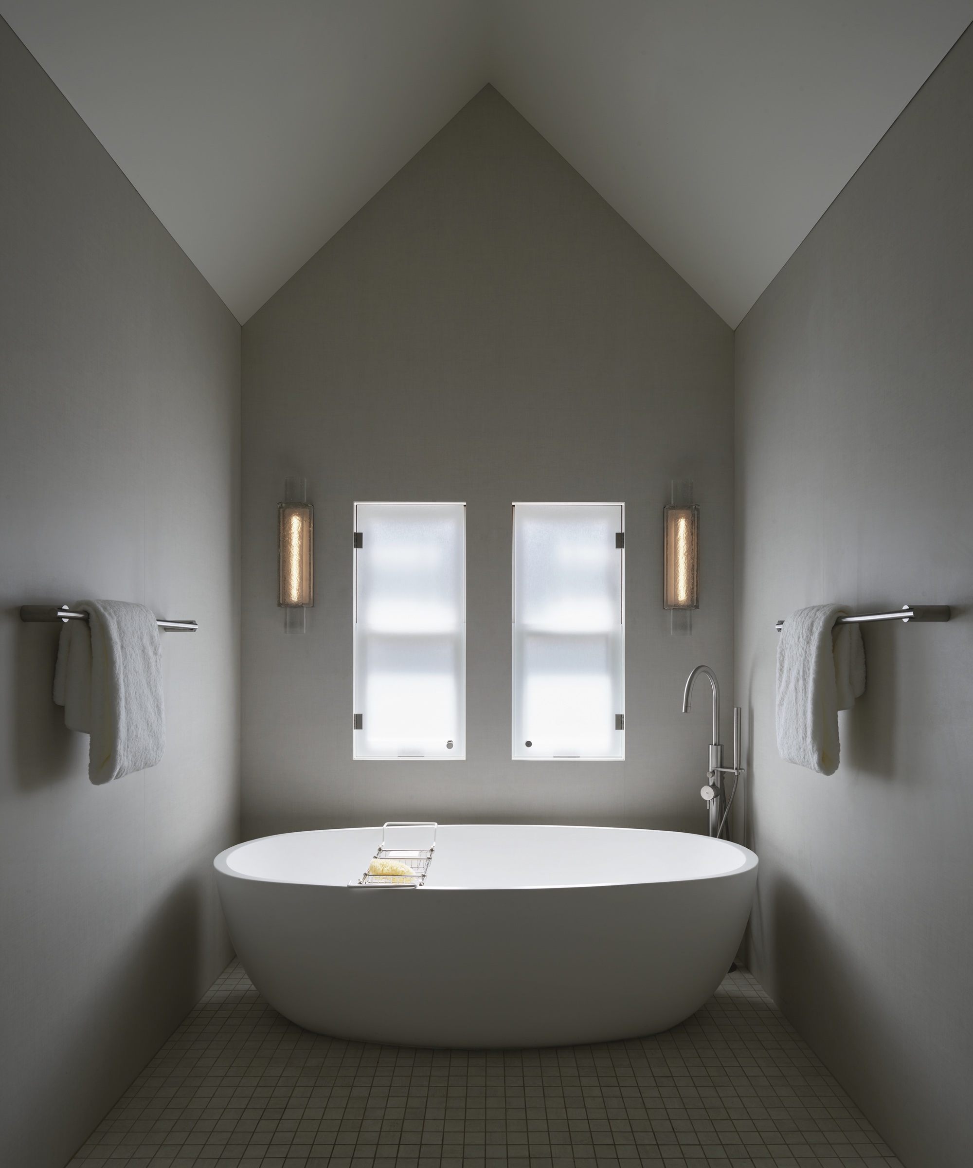
'This turret is original to the house and was exposed during the demo,' explains Paul. 'To keep with the light and modern language of the house, we painted the beams dark and captured the magnificent view of the bay
'The clients are very tall so all cabinetry was designed specifically for them, taller than most.'
Girl's bedroom
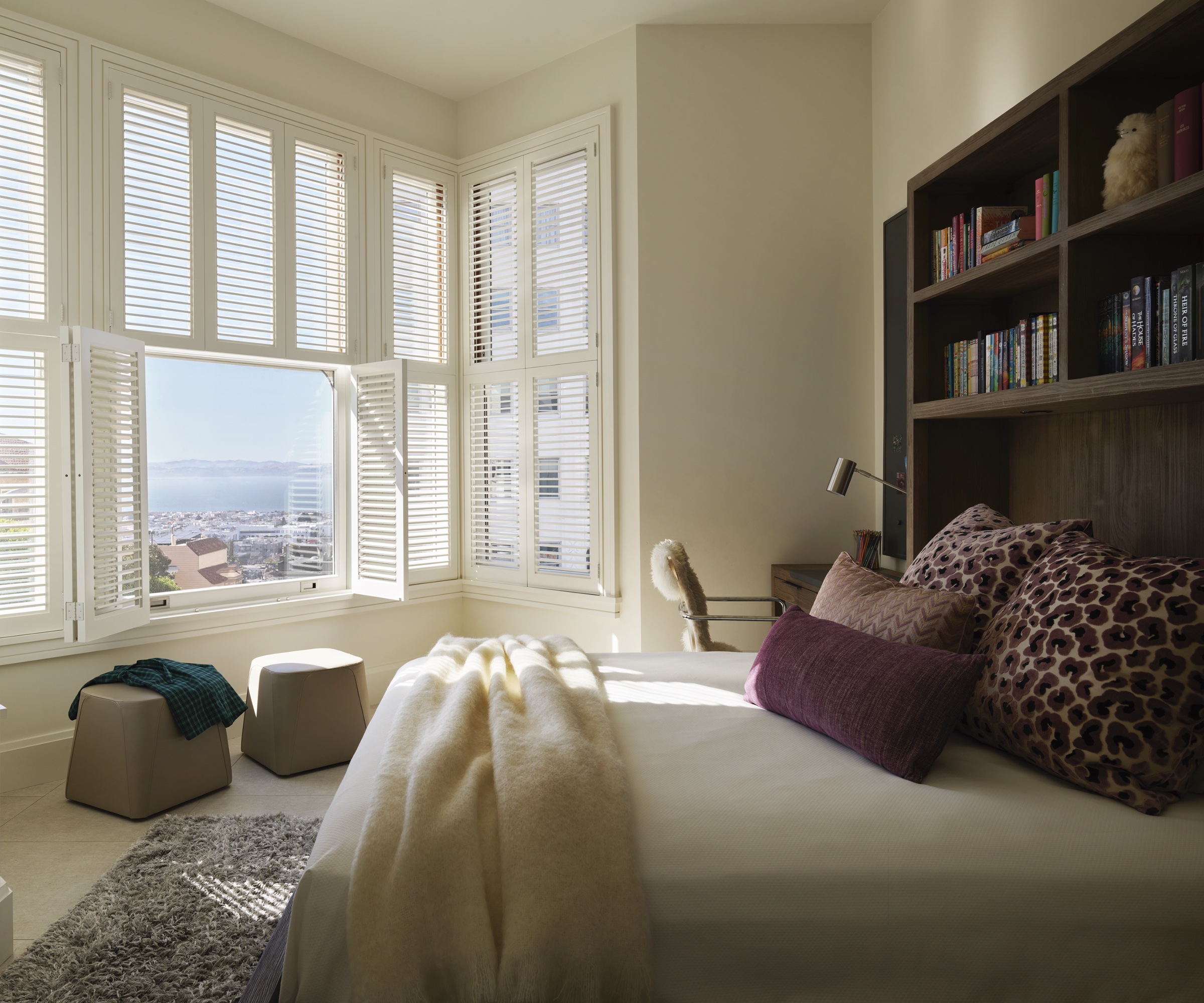
All four girls received the same bed with bookcase headboard surround, however, they got to choose their own colors,' says Paul.
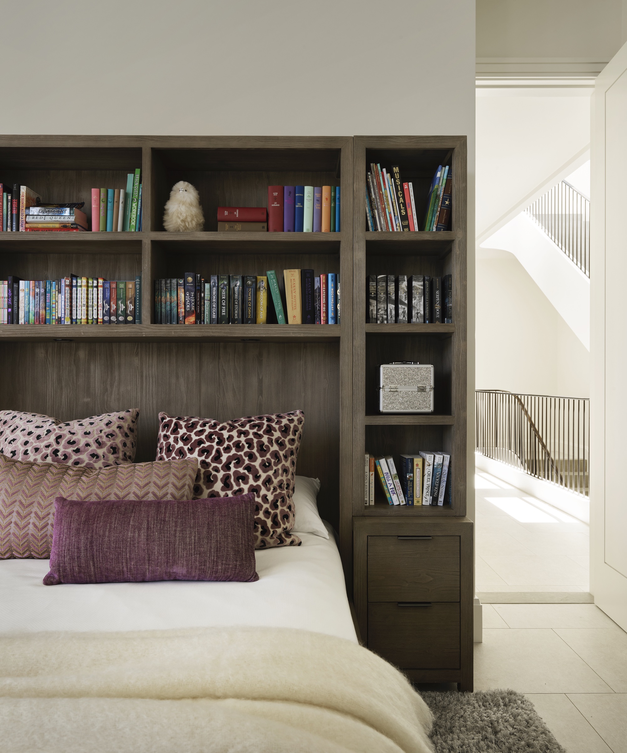
He adds: 'We provided different color stories for the girls to choose their fabrics from.'
Lower level and garden
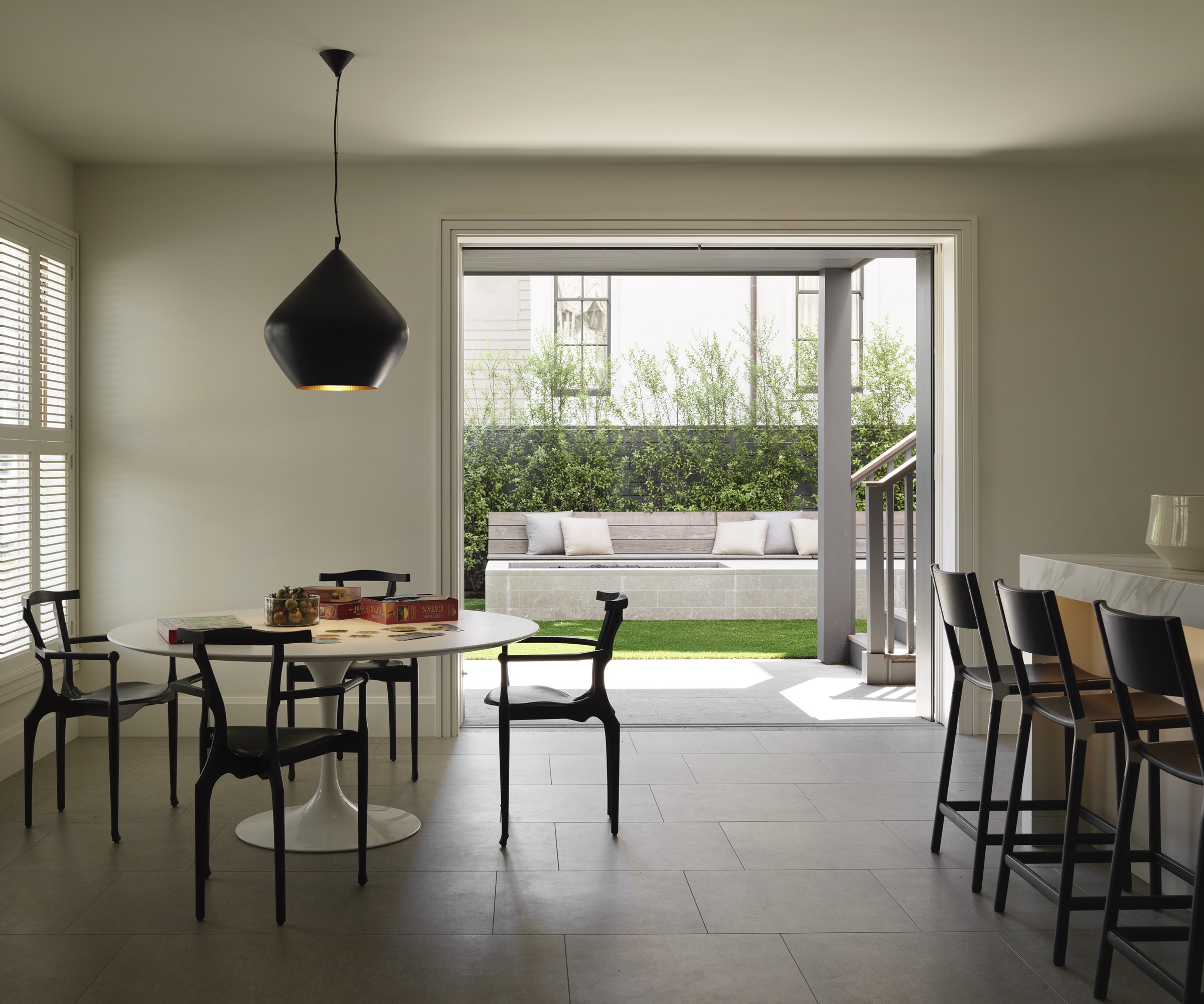
'The lower level was one of the levels that opened up to the streamlined backyard,' says Paul. 'A second kitchen diner was added for easy entertaining.'
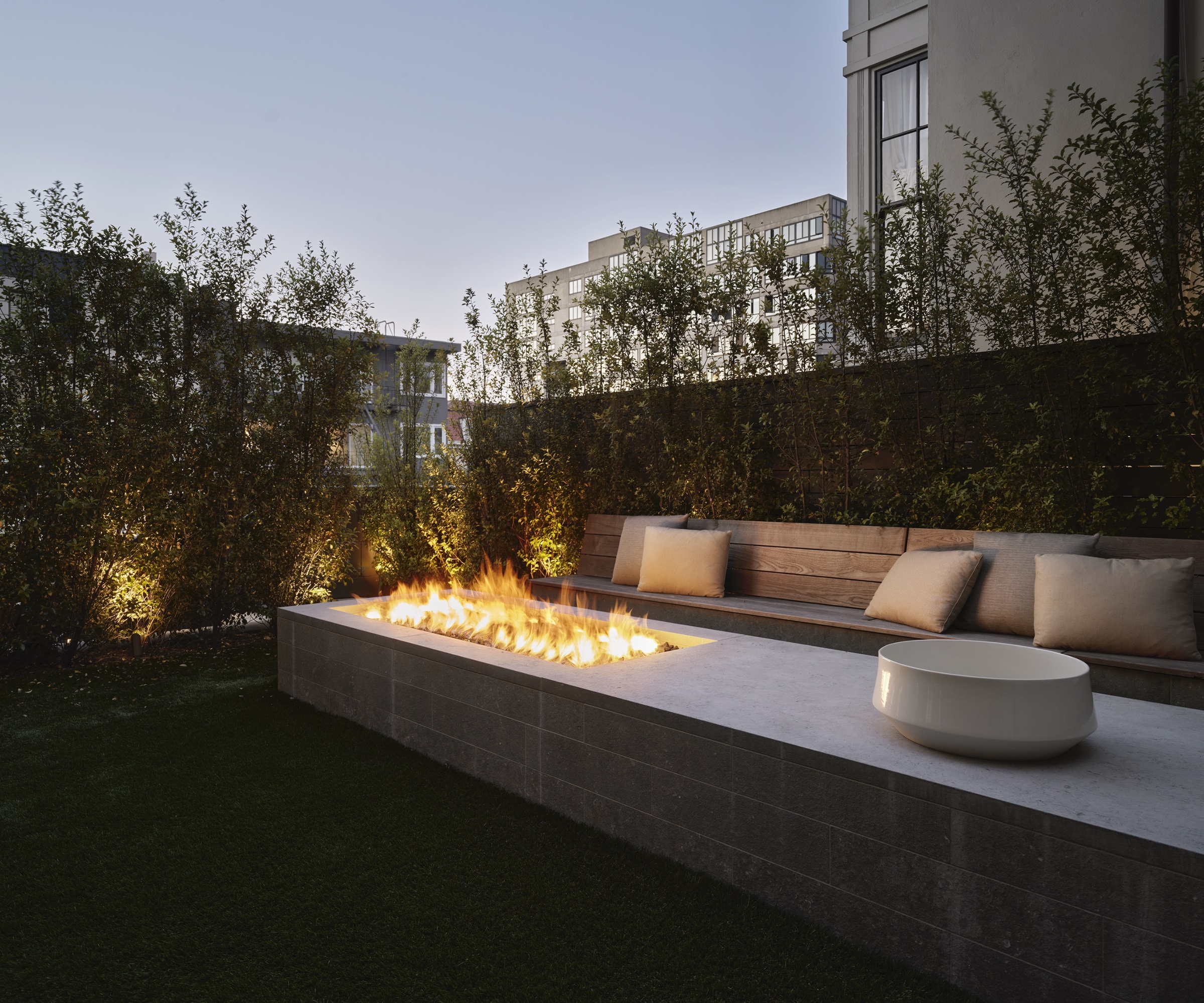
The garden is a chic space to relax, featuring a seating area with an integrated fire pit.
Architecture: Richard Beard Architects
Sign up to the Homes & Gardens newsletter
Design expertise in your inbox – from inspiring decorating ideas and beautiful celebrity homes to practical gardening advice and shopping round-ups.
Ruth Doherty is an experienced digital writer and editor specializing in interiors, travel and lifestyle. With 20 years of writing for national sites under her belt, she’s worked for the likes of Livingetc.com, Standard, Ideal Home, Stylist and Marie Claire as well as Homes & Gardens.
-
 This is the single best upright vacuum we've ever tested – and it's on offer with $130 off at Shark for a limited time only
You won't want to miss this one
By Dan Fauzi
-
 Nate Berkus says slipcovered sofas are back on trend – and I just found a way to create this designer-approved laid-back look from just $86
This classic style is making a strong comeback, but did you know you don't have to buy a whole new couch to get this Nate-approved look?
By Eleanor Richardson