This historic house is a treasure trove of period features and rich jewel tones
Under the eye of Dunning & Everard design studio, the opulent original features of this listed country house have been restored and enhanced
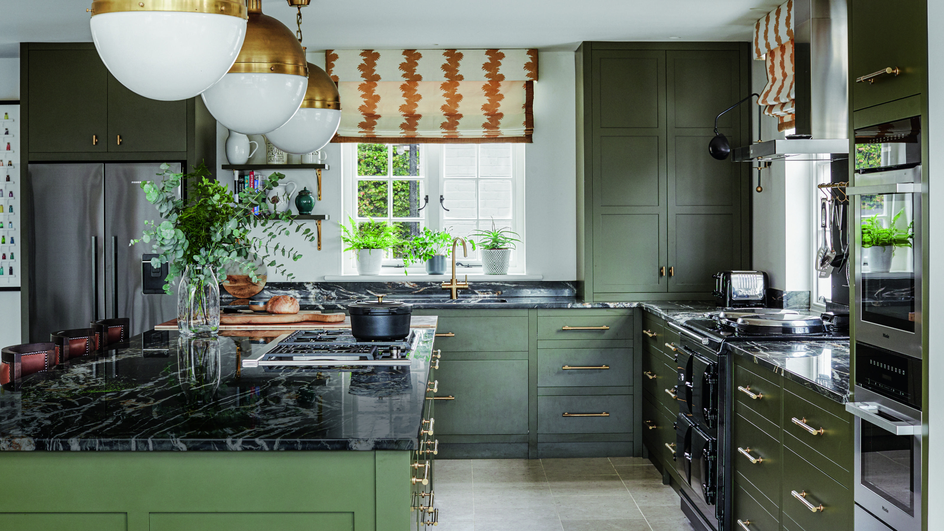

‘It was a sad, crumbling edifice and we brought her back to life,’ says Stephanie Dunning of the historic home in the New Forest that she and her team at interior design studio Dunning & Everard, alongside Sheerin Bettle Architecture, recently renovated, and that has now been transformed into one of the world's best homes.
The Grade II-listed house was constructed in the 1770s. Later additions were built and it became the home of the local magistrate, complete with cells (which still exist) in the cellar. Rare and beautiful papier-mâché ceilings that date back to the 18th century adorn the hallway and the study, but these, like other features in the house, were in a sorry state.
The owners, two successful London lawyers with three boys in their teens and early twenties, had bought the house as a holiday home seven years ago with a view to it becoming their full-time residence eventually. ‘It needed to be a good family home where they could work and entertain,’ says Stephanie. Extensive renovations were necessary, as well as making the parts from different eras work better together. ‘It was a case of bringing the building back to the 21st century as it hadn’t been touched in almost 70 years.’
The work took 18 months, hampered by Covid lockdowns. ‘It was difficult because there could only be one person in each room at certain times,’ observes Stephanie. ‘Every part of the building was restored. We consulted the conservation office about any changes.’ Expert conservator Peter Martindale was brought in to restore the papier-mâché ceilings. ‘As much as possible was reused and restored in the house to make it work for another 100 years,’ says Stephanie. Little by little, the house was refashioned for family living.
Hall
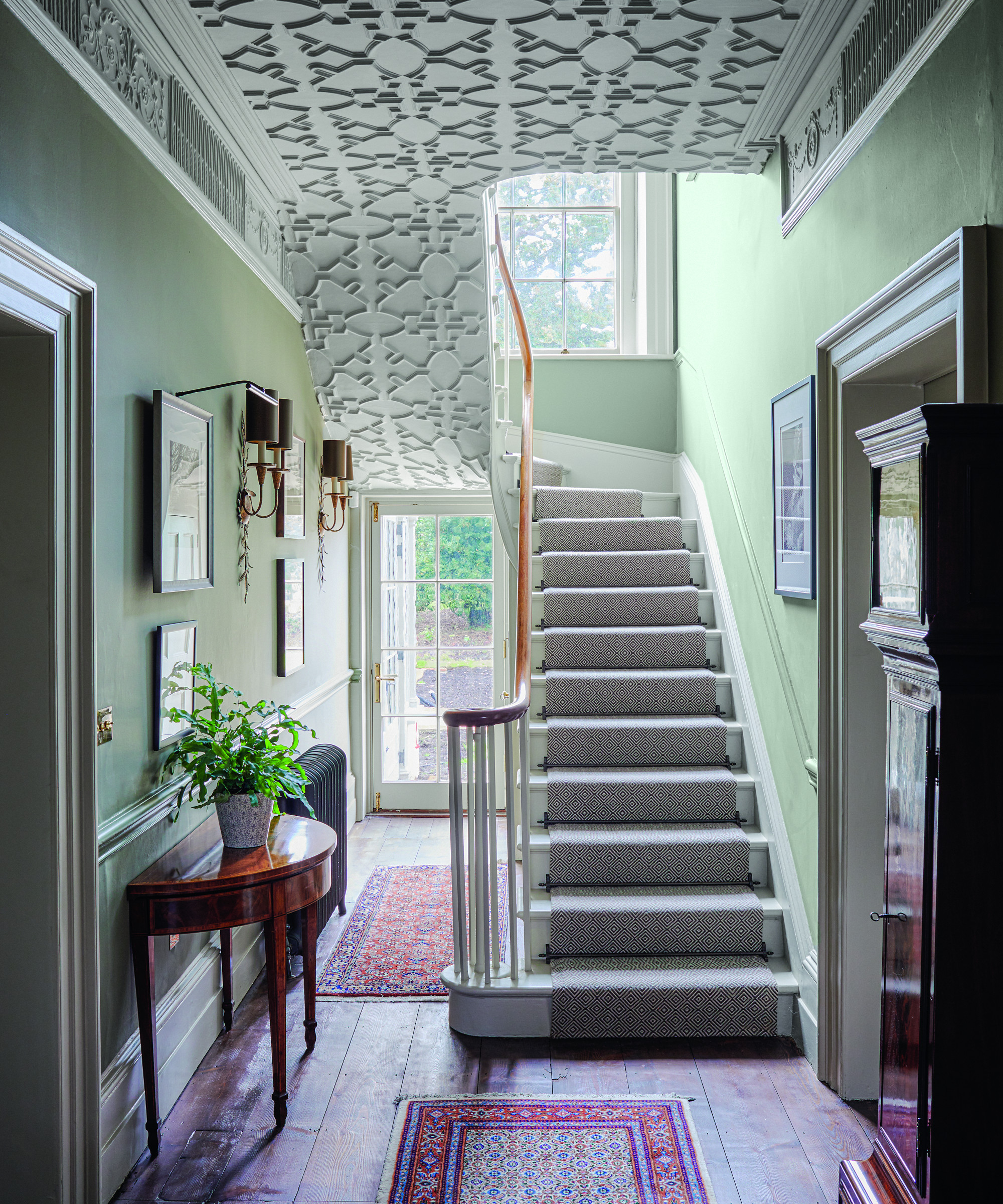
The rare and beautiful papier-mâché ceiling is the focal point of the space so hallway ideas included painting the ceiling with a historic paint and choosing a scheme that was appropriate to the period. Antique furniture injects warmth and character. A wool flatweave stair carpet was chosen for its subtlety and to allow the antique rugs and artwork to shine.
Living room
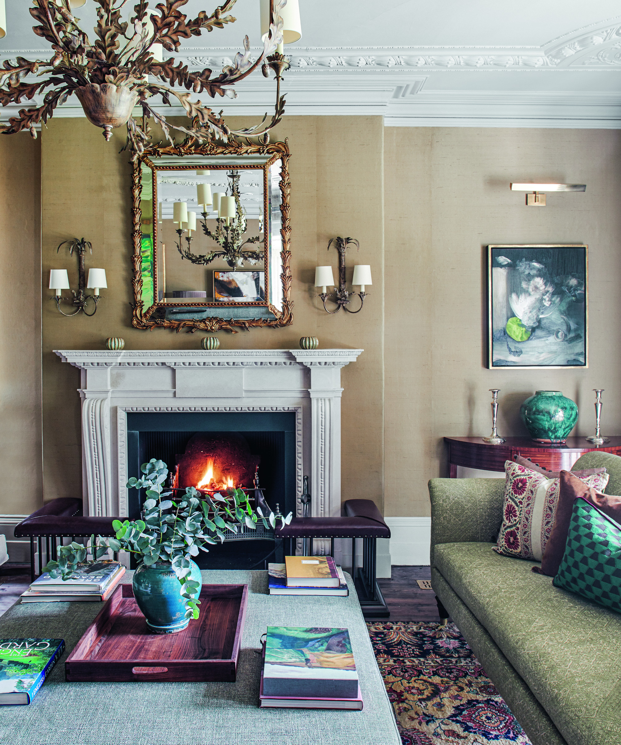
Decorative pieces chime with the lavish original features and the silk wallpaper continues the luxurious aesthetic and injects texture. Living room ideas included adding an elegant fireplace that was in keeping with the period feel as the original one hadn't survived.
Kitchen
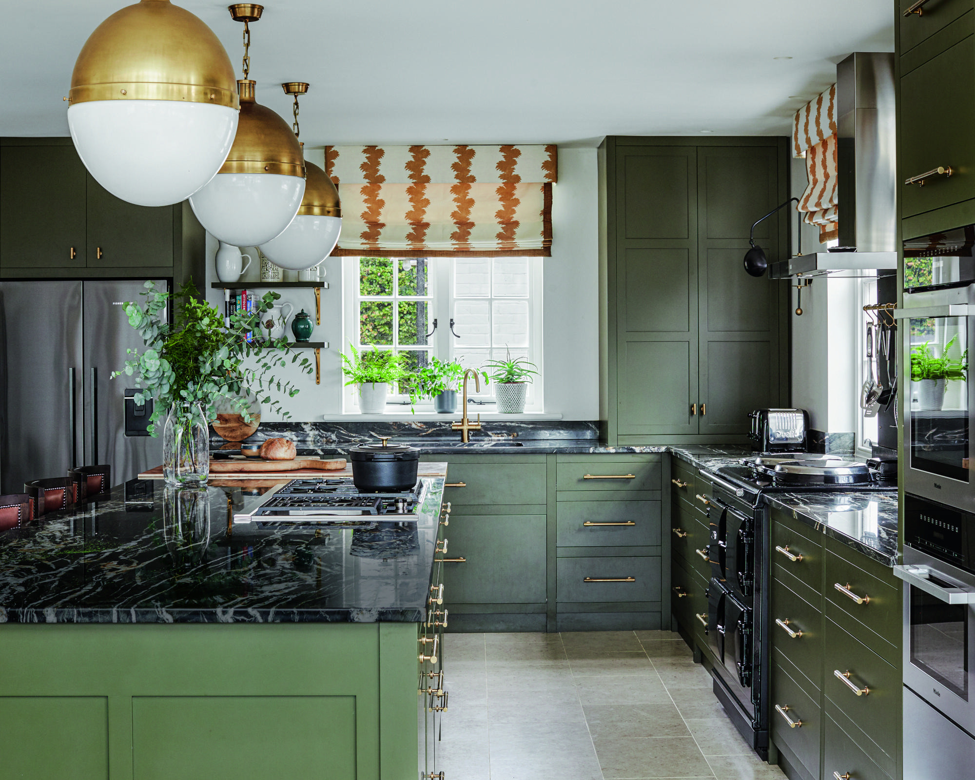
At the house's core is the convivial, open-plan kitchen. The existing conservatory was replaced with a new one and houses the dining area. The room also has an informal seating space with a modular sofa. Kitchen ideas included choosing a strong green shade for the kitchen cabinetry and island as a nod to the rural surroundings, as well as to provide depth. Brass accents in the lighting, handles and blind fabric introduce a dash of glamor.
Key to the aesthetic of the interiors are bold colors. ‘The house was originally a panoply of beige,’ says the owner. While pale shades were used in the lighter Regency part of the house, Stephanie went to town with color in the older Georgian rooms because of their lower ceilings. The downstairs cloakroom is a luxurious space with deep-brown lacquered walls, while a gorgeous sap green was used in the back hallway. ‘We wanted to think out of the box,’ says Stephanie. Art is particularly important to the couple, so colors were carefully considered and formed a backdrop for their pieces. ‘We painted the architraves and doors in the back hall the same color as the walls and the artwork popped out,’ observes Stephanie.
Home office
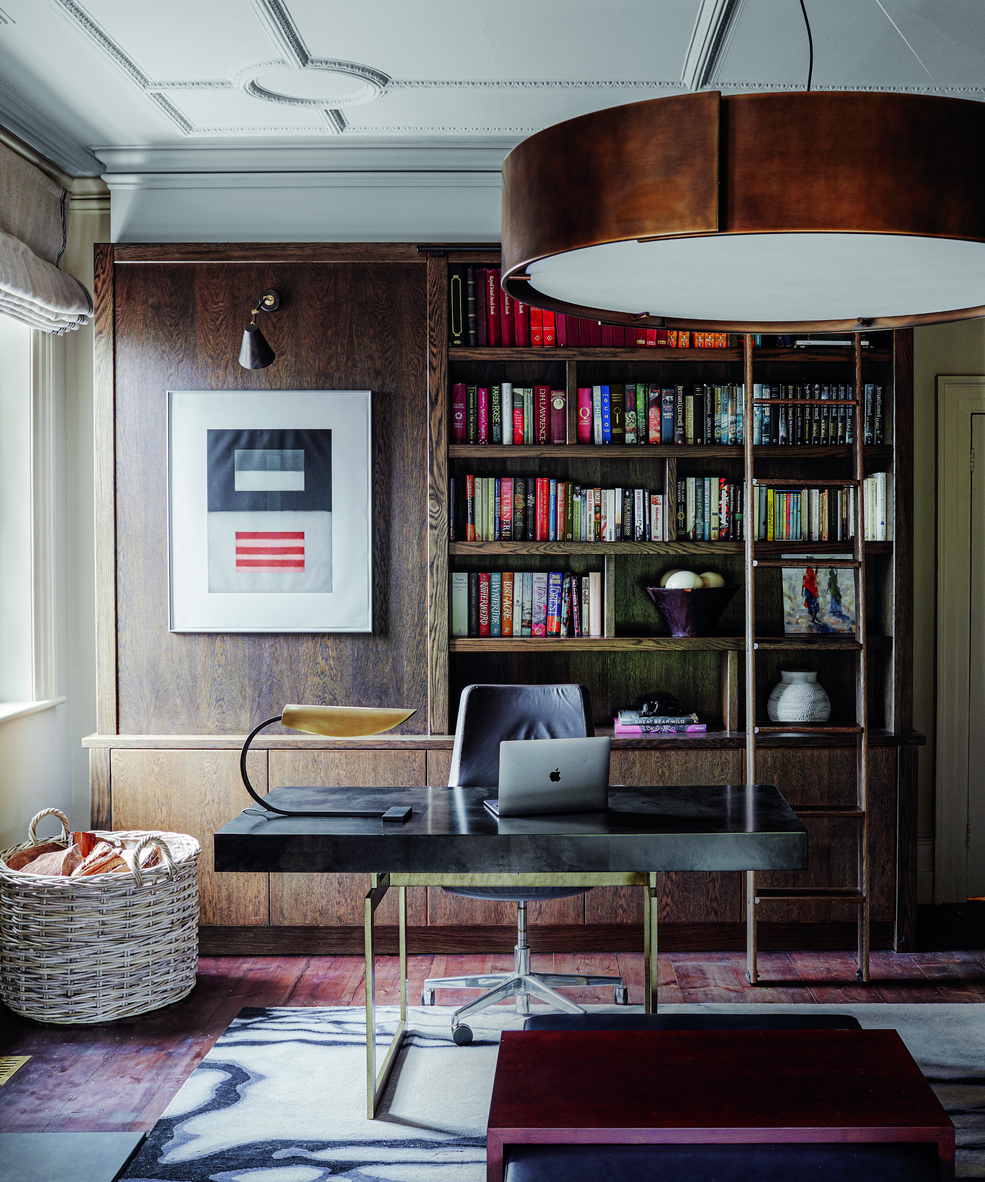
Home office ideas include bespoke joinery specifically designed with shelves and drawers large enough to store work equipment. The lines of the contemporary joinery sit beautifully with the original decorative papier-mâché ceiling.
Bedroom
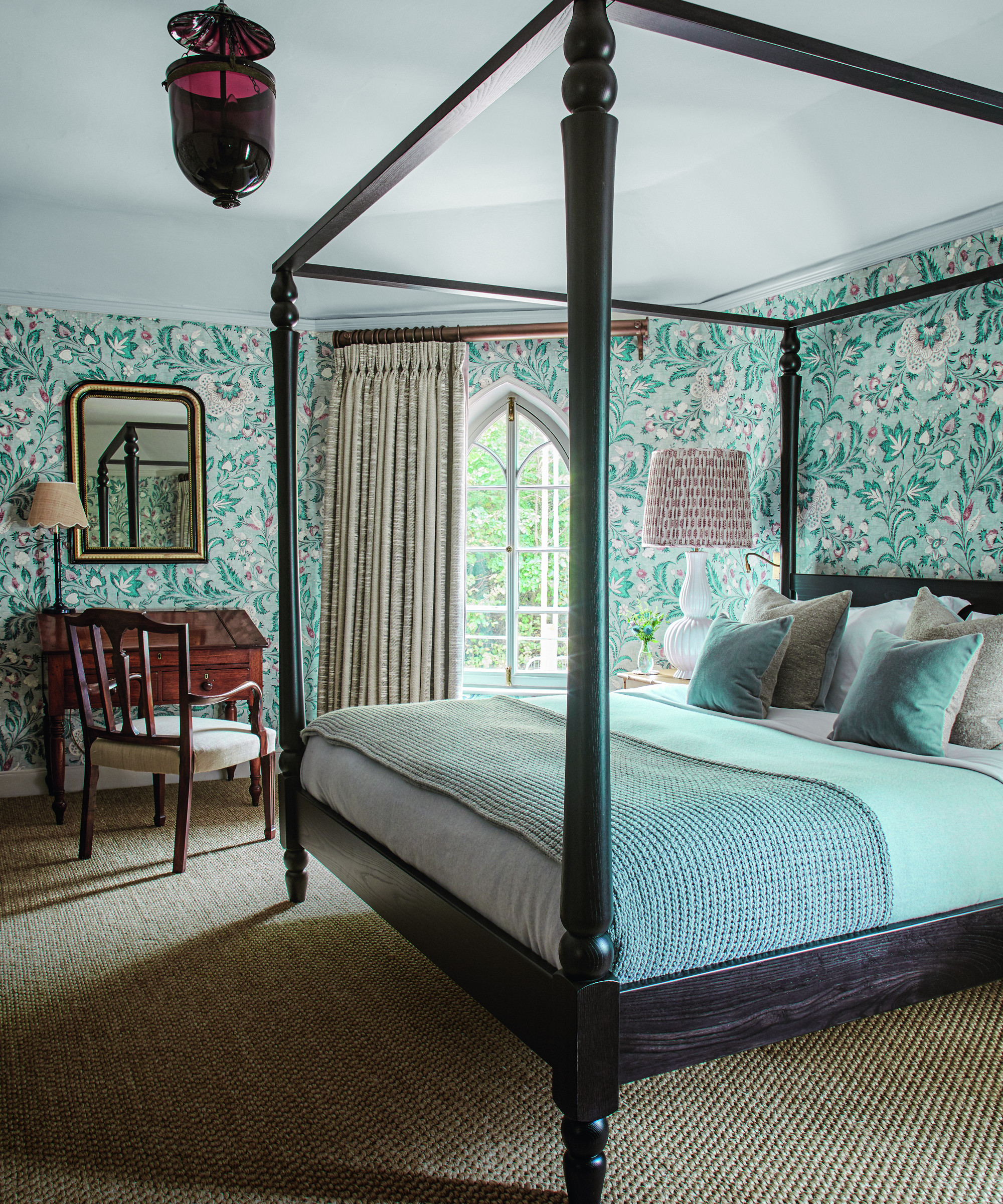
Bedroom ideas included using a patterned wallpaper for drama and warmth. The paper and four poster felt like appropriate partners to the fairytale window.
Son's bedroom
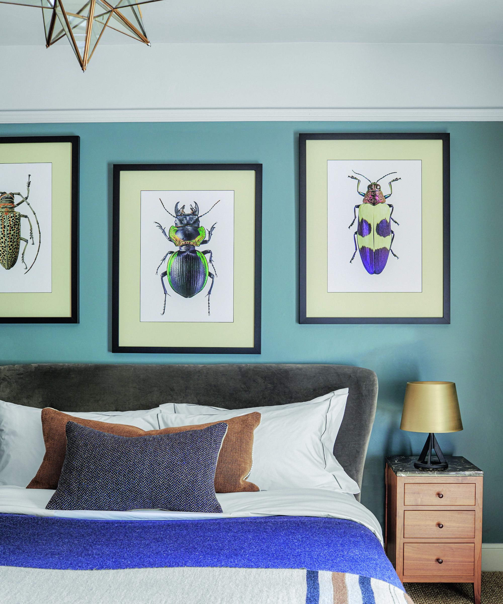
Strong blues and bold artwork in the son's bedroom create impact and are timeless.
Main ensuite
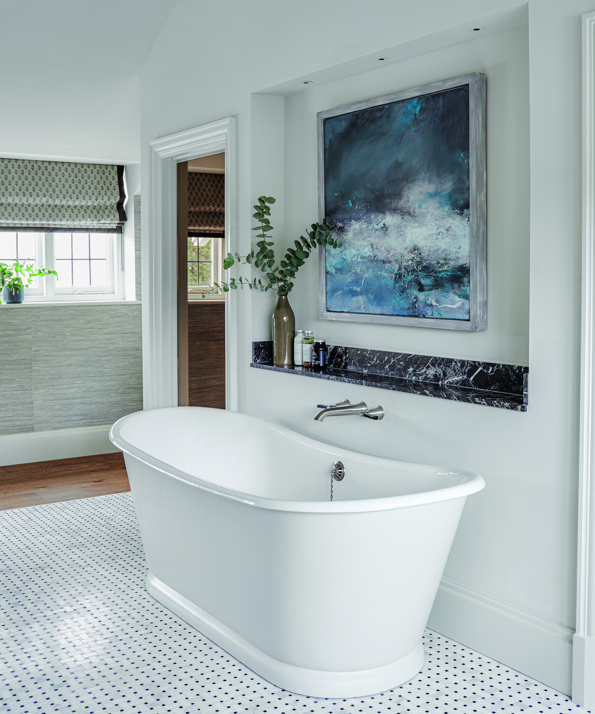
The waterscape can be appreciated when soaking in the bath. Bathroom ideas include bespoke doors with a smoky mirrored finish, which are glamorous and increase the sense of space.
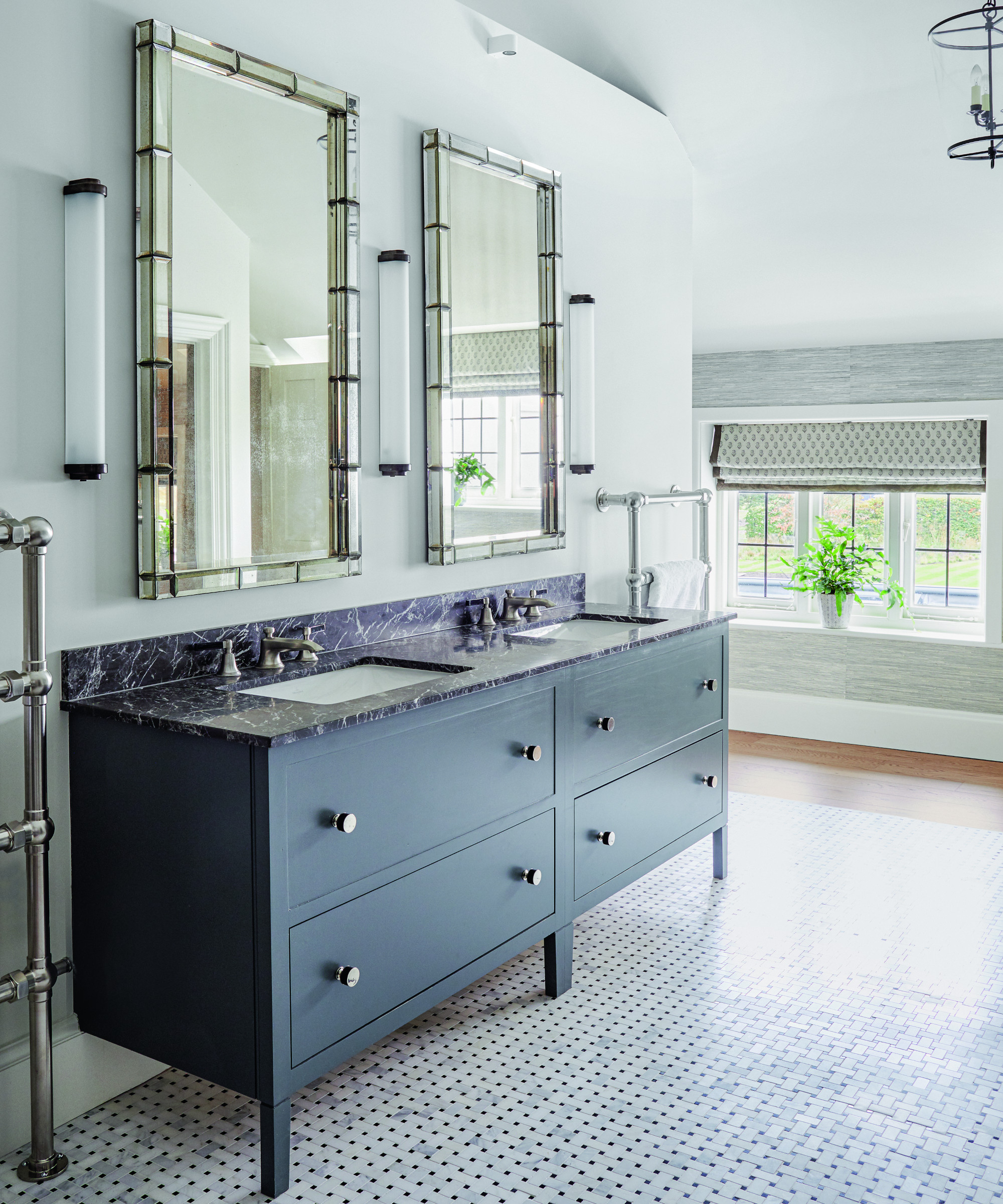
The his and hers washstand is matched with two towel rails.
‘In every scheme we took the opportunity to mix antiques and more modern furniture to reflect the different elements of the house, and it flows beautifully,’ says the owner. ‘Stephanie wove together a blend of old and new very well – it doesn’t feel curated, it feels lived-in.’
Stephanie took care to use sustainable fabrics made from traditional fibers, using local suppliers as much as possible. ‘We chose robust, comfortable fabrics such as wool, horsehair, velvet and linens.’ Textural wallpapers bring an additional tactile element. The end result is exactly what the owners envisaged. ‘It’s a comfortable, welcoming, lived-in house. We’re absolutely delighted.’
Interior design/ Dunning & Everard
Photography/ Brent Darby
Sign up to the Homes & Gardens newsletter
Design expertise in your inbox – from inspiring decorating ideas and beautiful celebrity homes to practical gardening advice and shopping round-ups.

Interiors have always been Vivienne's passion – from bold and bright to Scandi white. After studying at Leeds University, she worked at the Financial Times, before moving to Radio Times. She did an interior design course and then worked for Homes & Gardens, Country Living and House Beautiful. Vivienne’s always enjoyed reader homes and loves to spot a house she knows is perfect for a magazine (she has even knocked on the doors of houses with curb appeal!), so she became a houses editor, commissioning reader homes, writing features and styling and art directing photo shoots. She worked on Country Homes & Interiors for 15 years, before returning to Homes & Gardens as houses editor four years ago.
-
 Hailey Bieber's curvaceous toaster is an Italian design staple (with roots in the 1950s) – it blends retro style with modern capabilities
This toaster has stood on the countertops of 'It girls' since the '50s, and Hailey Bieber has just resurged the trend – you can follow suit for $250
By Megan Slack
-
 5 fast-growing tiny flowers – expert recommendations to fill your pots and borders with color in record time
These fast-growing tiny flowers prove that miniature can also be marvelous
By Thomas Rutter