Mix don't match is the key to this historic home's blend of old and new styles
More is more in this Victorian home, where antique and modern prints, textiles, and furnishings all get along just fine
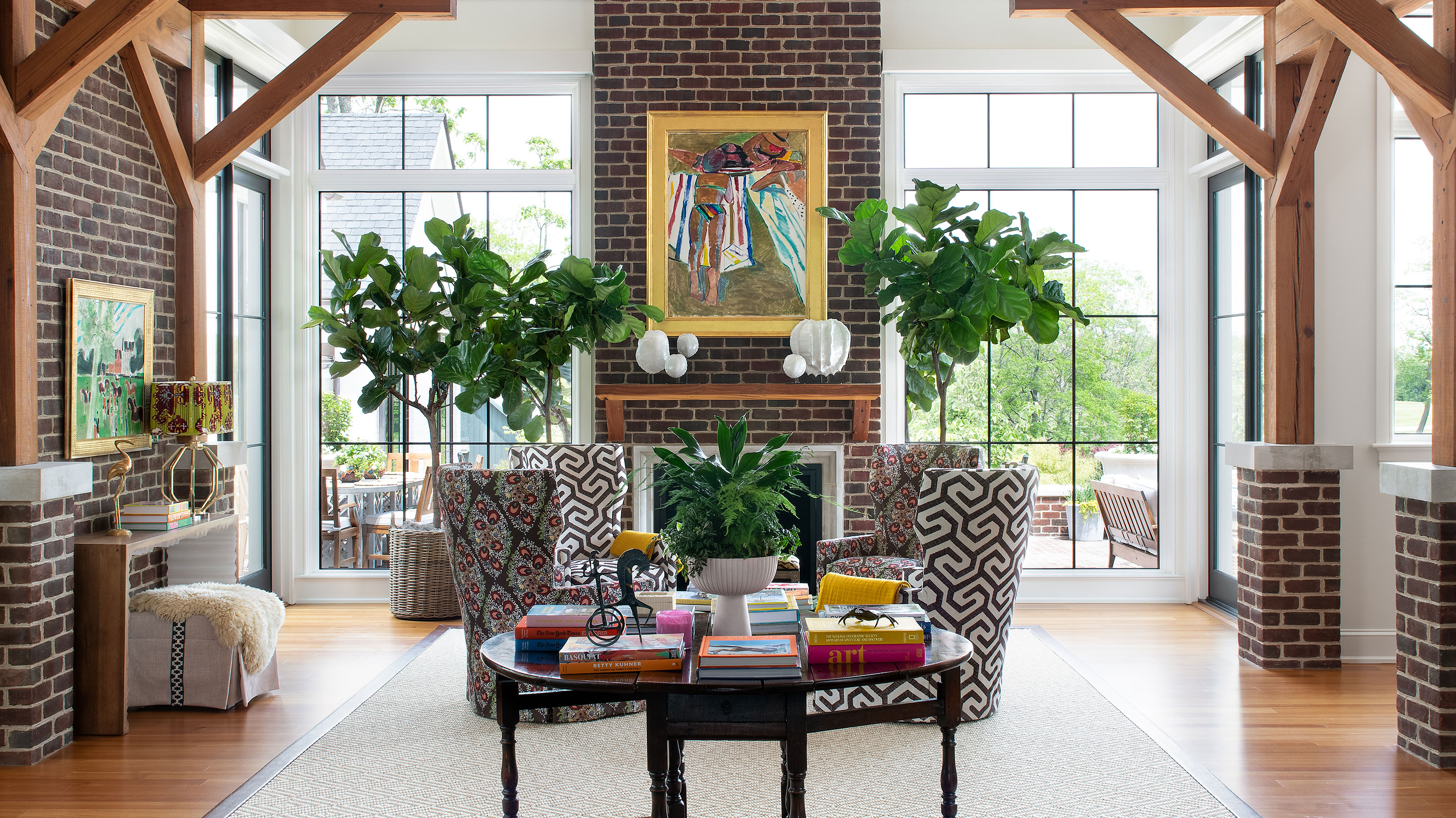
Renovating and building a worthy addition to a characterful Victorian home was a big responsibility, especially since it was the childhood home of one of its owners and had been in the family for years. They needn't have worried however, the house in Fayette County in Kentucky is now one of the world's best homes, and the careful additions and reworking of the interiors have only enhanced its original charm.
The owners may have had their own sentimental reasons for wanting to do their best for the house, but they decided to get some expert help to ensure they struck exactly the right balance between updating and preserving the home's many original features. They contacted nearby Lexington-based interior designer Isabel Ladd to advise them on the right approach to the renovations. Working in tandem with architects Gibson Taylor Thompson and builders Fox Hill, Isabel came up with some stunning interior schemes for the whole house, that embraced the very best of the old and new sections of the property.
Dining room
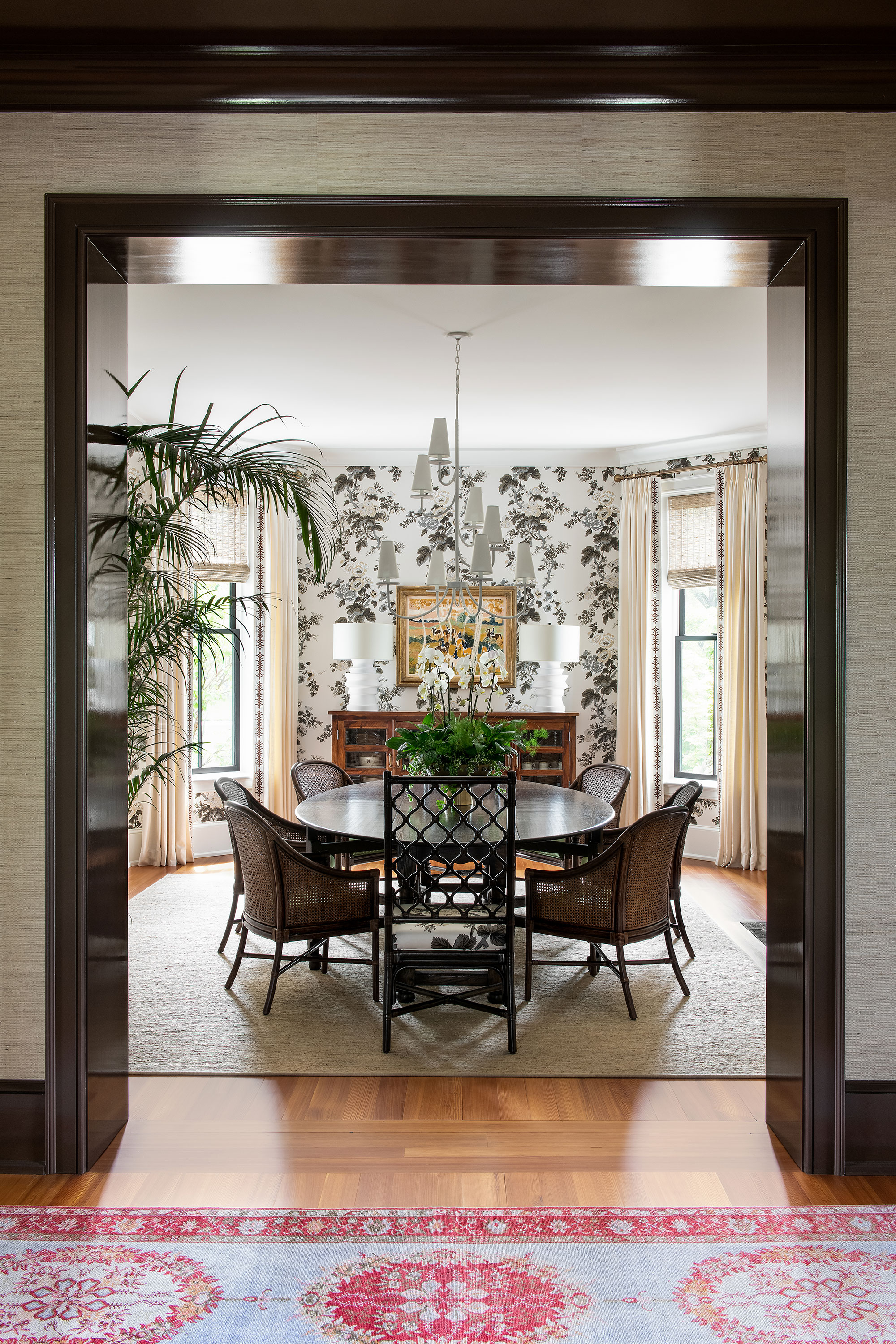
Built in 1889, the striking Victorian Italianate home still has many of its original features and the homeowners were keen to allow these to shine through in the older sections of the house.
From the get-go, the homeowners wanted quality goods that would be beautiful and unique. Beautiful textiles, colors, and textures were also imperative and designer Isabel Ladd's layered, 'mix-don’t-match' aesthetic shines through in all of the rooms.
'The mixing and layering of exquisite prints and colors through wallpapers and textiles is my favorite design element across the project,' says Isabel. 'I affectionately call it curated maximalism – a tight and intentional, but wild and unique mix of everything the clients and I love.'
There are a few eating spaces in the house, but in this formal entertaining setting the owners were looking for an updated Victorian aesthetic to set the scene against the striking backdrop of a curved wall and bay windows.
Designer Isabel's dining room ideas include Schumacher's Hollyhock Pyne wallpaper, with the same pattern on the seats of the dining chairs. The chairs are by Selamat; the Eclipse rug is from Fibreworks.
Parlor – a cozy seating space
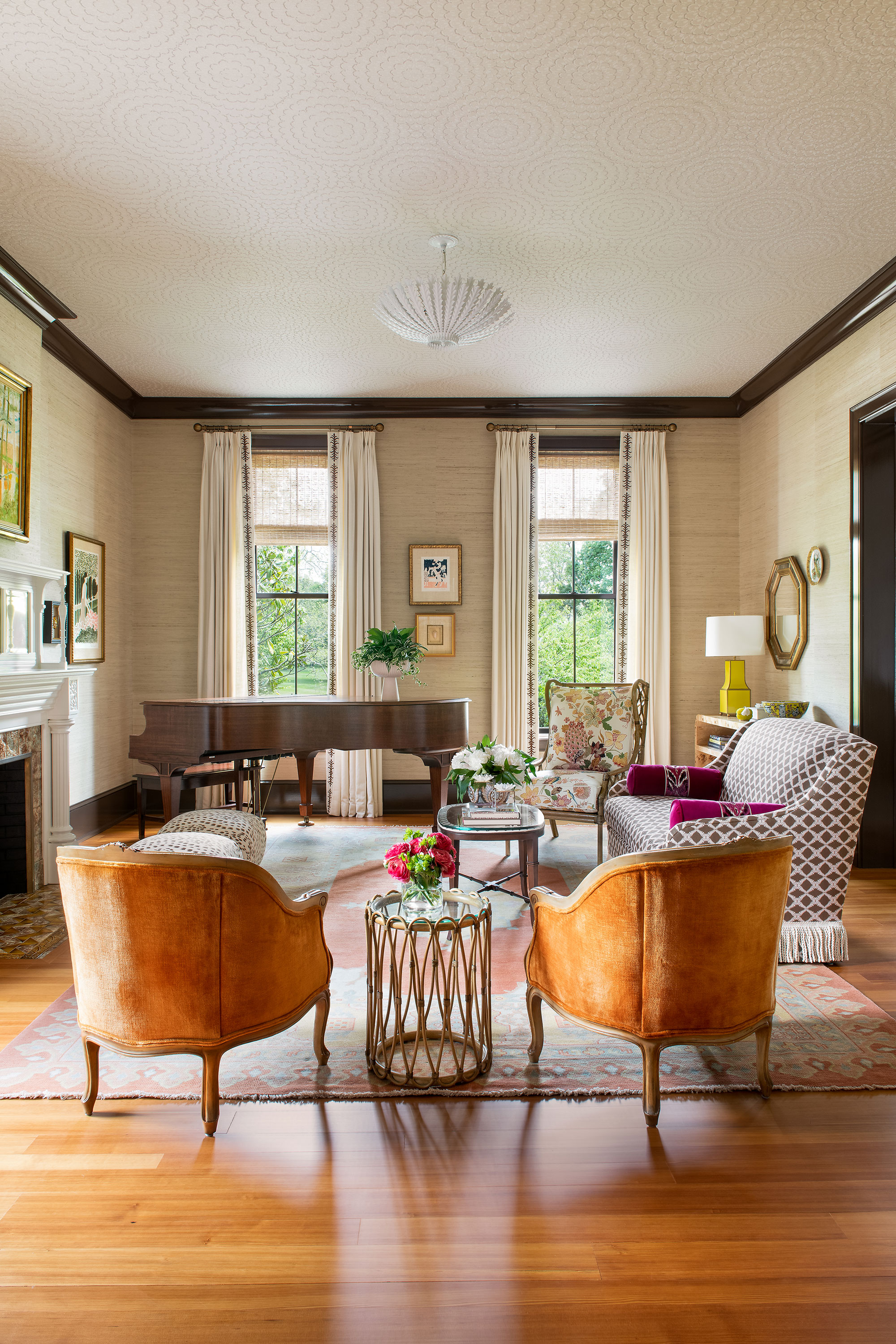
No self-respecting Victorian home should be without one – a cosy parlor, that is. Directly off the foyer this formal living room is focused around a family heirloom piano and original fireplace.
Living room ideas include a custom sofa by Charles Stewart Co, Upholstered in Fern Trellis by Cotton & Quill, and a corner chair by Selamat upholstered in Lansdale Bouquet by Schumacher. The contemporary living room pieces are mixed to perfection with antique French bergere chairs and a vintage rug, along with the treasured piano.
Living room
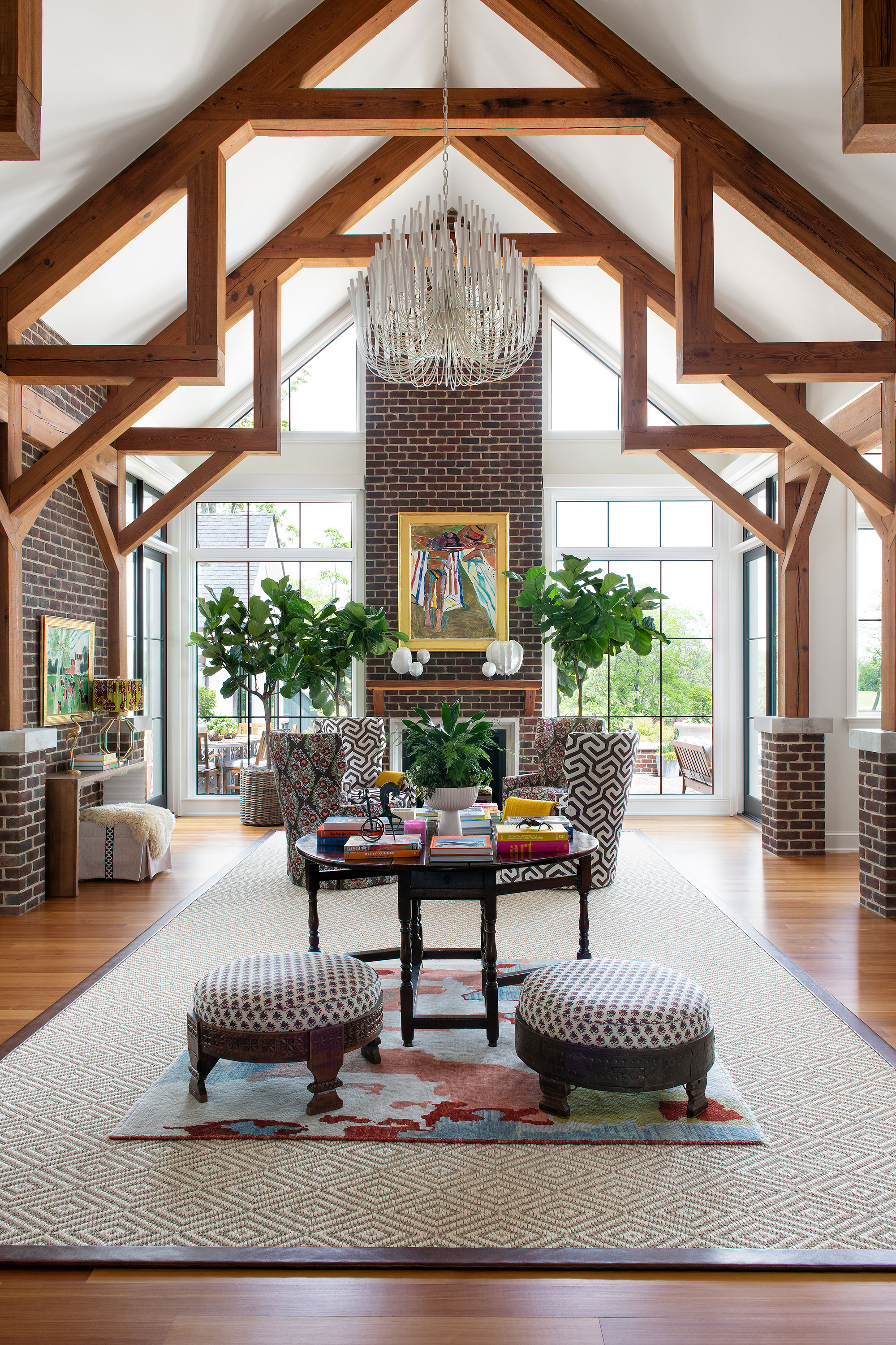
Bringing the living room ideas right up to date again is this magnificent new build open-plan addition.
'The great room is the heart of the home, with its commandeering architecture of exposed beams, bricks and trusses. The family room, kitchen and staircase feed off of the great room,' says designer Isabel. The designer ties the new space into the older sections of the house with artwork, careful color and fabric choices, curated antique pieces, such as the round table, and her signature layering of textures and colors.
Art and framing, Cross Gate Gallery; light, Tilda by Arteriors; floral chairs upholstered in Heather by Ferrick Mason; rug, by Fibreworks.
Breakfast nook
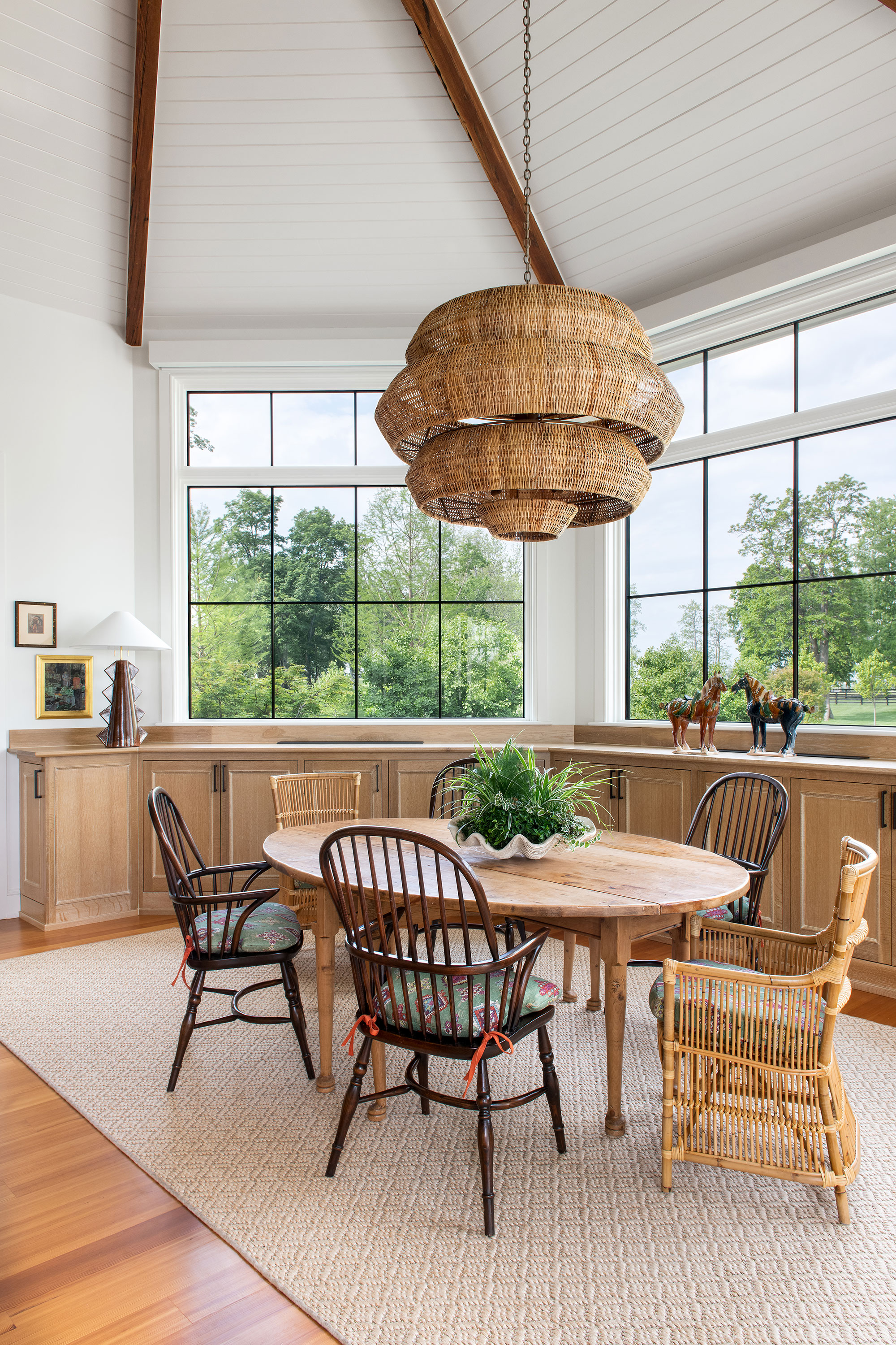
This relaxed breakfast nook is tucked into a corner of the kitchen, the perfect place for a change of mood, as Isabel explains. 'With vivid colors and patterns going on in adjacent rooms and a lush, spectacular vista, this was a moment to reign in the colors and practice neutral textures and organic materials,' she says. Key pieces include the Antibes light by Currey and Domino rug from Fibreworks, rubbing shoulders with an antique table and chairs.
Kitchen
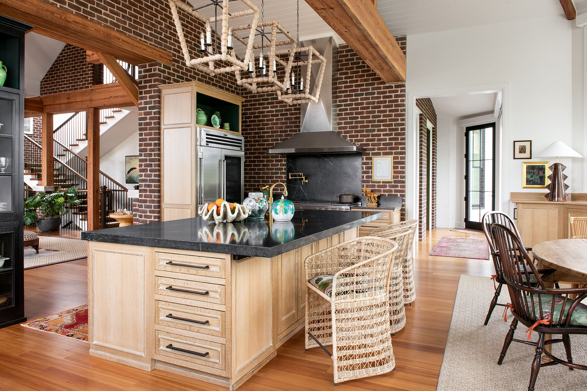
The kitchen has splendid views of the lush farmland adjoining the property, so key kitchen ideas focused on keeping cabinetry, lighting, and materials neutral and organic. A soapstone countertop and embedded backsplash above the stove ground the space. Although the counter stools are new pieces and their rattan finish is very now, their country styling also bridges the gap between the home's vintage elements and new additions. Island Pendants: Perennials by Regina Andrew; counter stools, Libby by Gabby.
Entry foyer
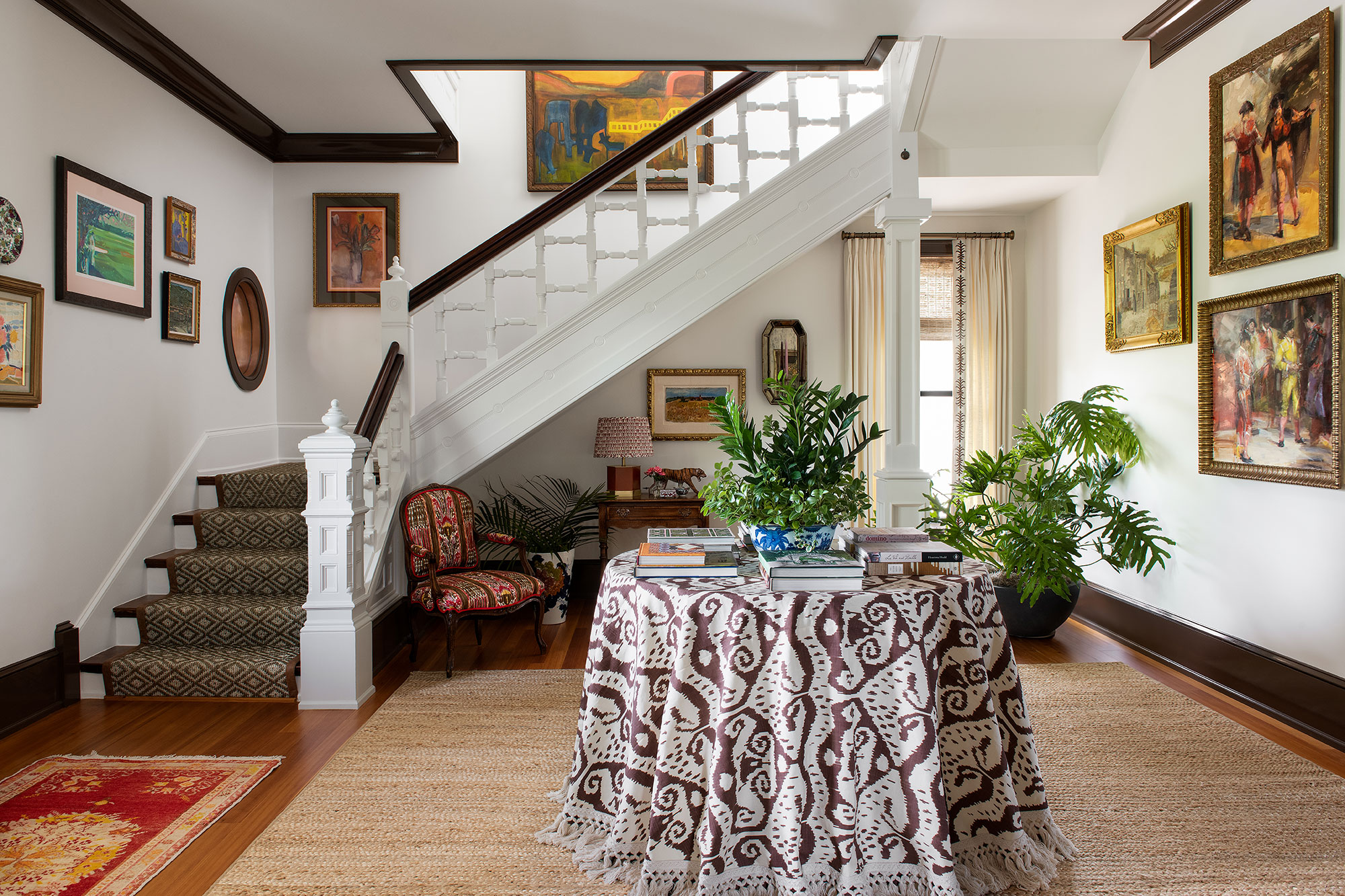
The entry foyer makes a strong style case for the home's original features, with the decorative staircase central to the design here. Hallway ideas include the two gallery walls of art in unique frames, which set the tone for this collected and curated home.
Designer Isabel says the foyer is one of her favorite rooms. 'I’ve always wanted to float a foyer table in the middle of a room, and the drama of the fringed tablecloth stacked with books and treasured accessories makes such a statement,' she says. 'I love a ‘more is more’ aesthetic, and the oodles of art floating around really works here. The center table grounds the space.'
Art and framing, Cross Gate Gallery; Zira rug and Neygi stair runner by Fibreworks; tablecloth fabric, Malaya by Quadrille.
Primary bedroom
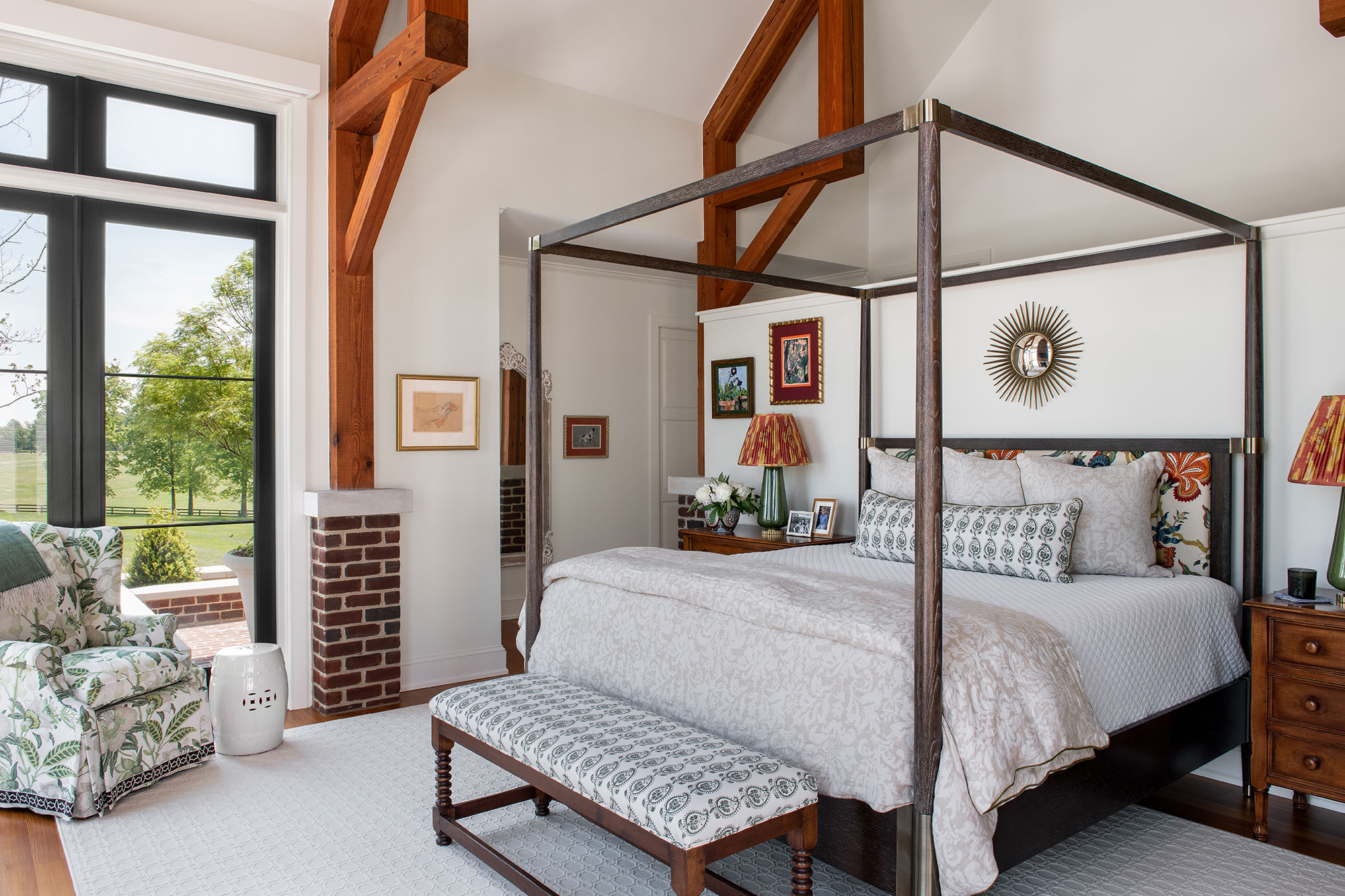
Bedroom ideas include a contemporary statement four-poster bed that's the perfect balance for the room's architectural pine beams and trusses. The wall behind the bed divides the sleeping area from a hallway connecting to the bathrooms. The floral headboard picks up the colors in custom silk lampshades.
Since the renovation was taking place at the beginning of the pandemic when everything shut down and furniture was hard to come by, Isabel and the owners decided to upcycle some existing pieces by reupholstering and repainting.
'That not only saved quality goods from destruction, but inspired us to pivot during the shutdown and obtain goods a little quicker than if we had stuck it out with factory-made goods only,' says Isabel.
The bench at the foot of the bed, and the armchair were discovered in the client's storage room and given new life with hand-blocked fabric. Among the room's other key pieces are the bed by Bernhardt, upholstered in Schumacher's Hothouse Flowers fabric. The lampshades are from Slightly East, and the chair upholstery fabric is Davenport from Lee Jofa.
Primary sitting room suite
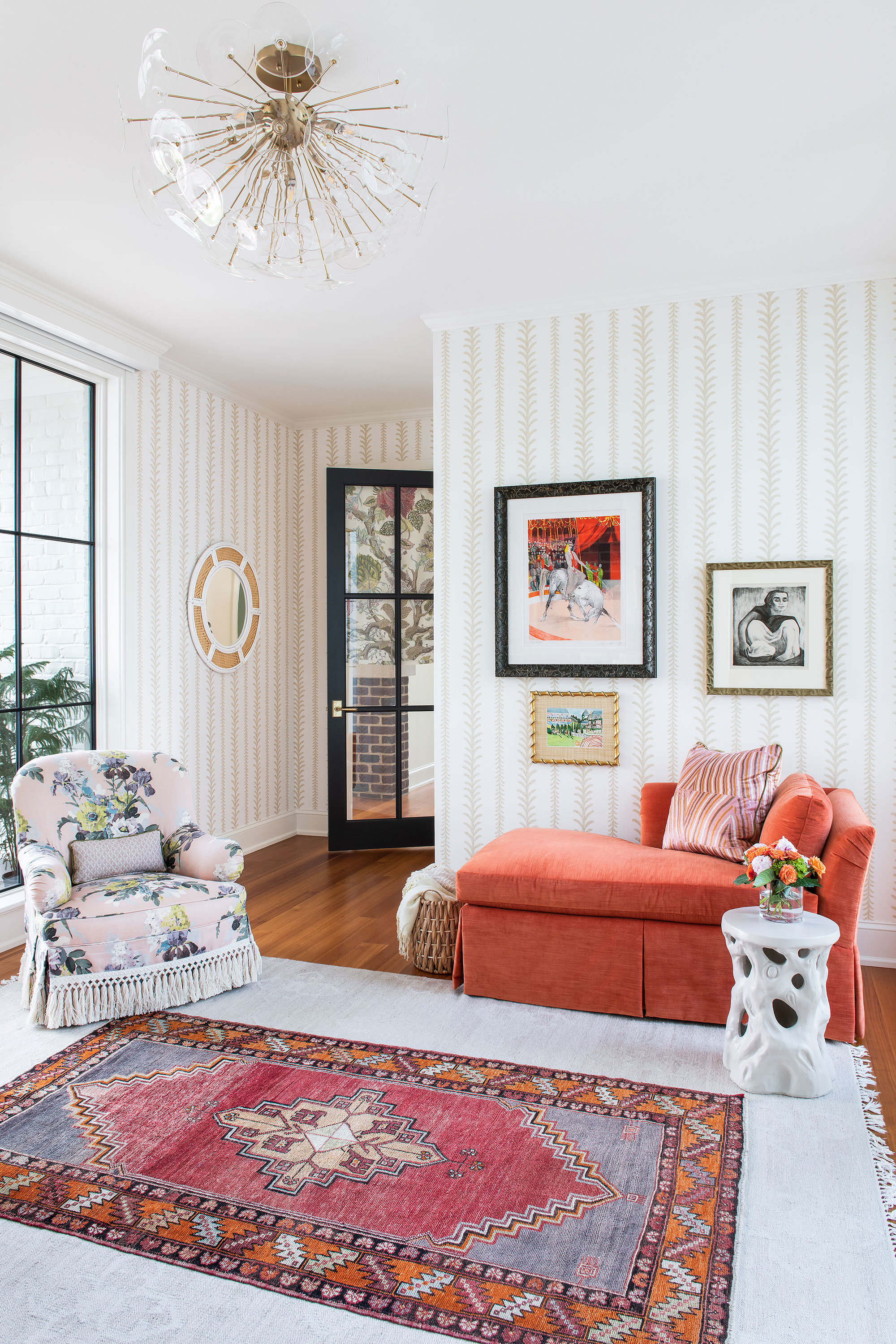
Since space wasn't a problem, Isabel was keen to give the homeowners a little extra luxury. Off the primary bedroom, this suite is a cozy, quiet room for reclining and relaxing, a latter-day boudoir if you will. The walls are covered in Thibaut's Cantal, a soft stripe that's perfect for this contemporary interpretation of Victorian style.
Art and framing, Cross Gate Gallery; chaise upholstered in Palisades Velvet by Vern Yip for Trend. Armchair upholstered in Bird & Iris by GP&J Baker. Poppy light by Regina Andrew.
Daughter's bedroom
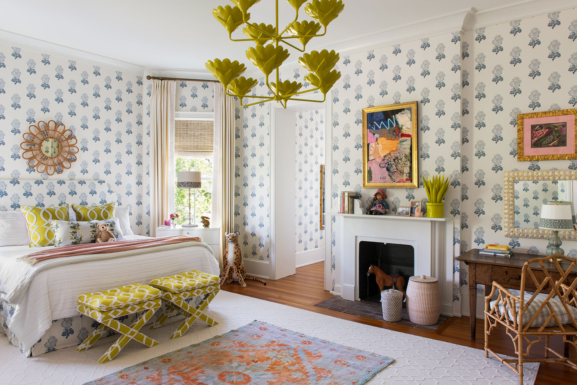
The daughter's room is designer Isabel's favorite space and is full of creative touches.
'There are so many lively prints and mix of colors and styles in here! I had always wanted to do a room with wallpaper, headboard, and bedskirt In a matching pattern. It's punctuated with my client's favorite color, Chartreuse,' says Isabel. 'I layered an antique rug, desk, and chair with modern, abstract art and handmade papier-mache light and aloe plant on the fireplace'
Wallpaper and bedding, Aldith Blue by Thibaut; Overhead light: Arlo by Stray Dog Design; Art over fireplace, Lesley Grainger; Baroque rug, Fibreworks. Ottoman, custom made with Kate Spade's Maxime fabric
Bathroom style
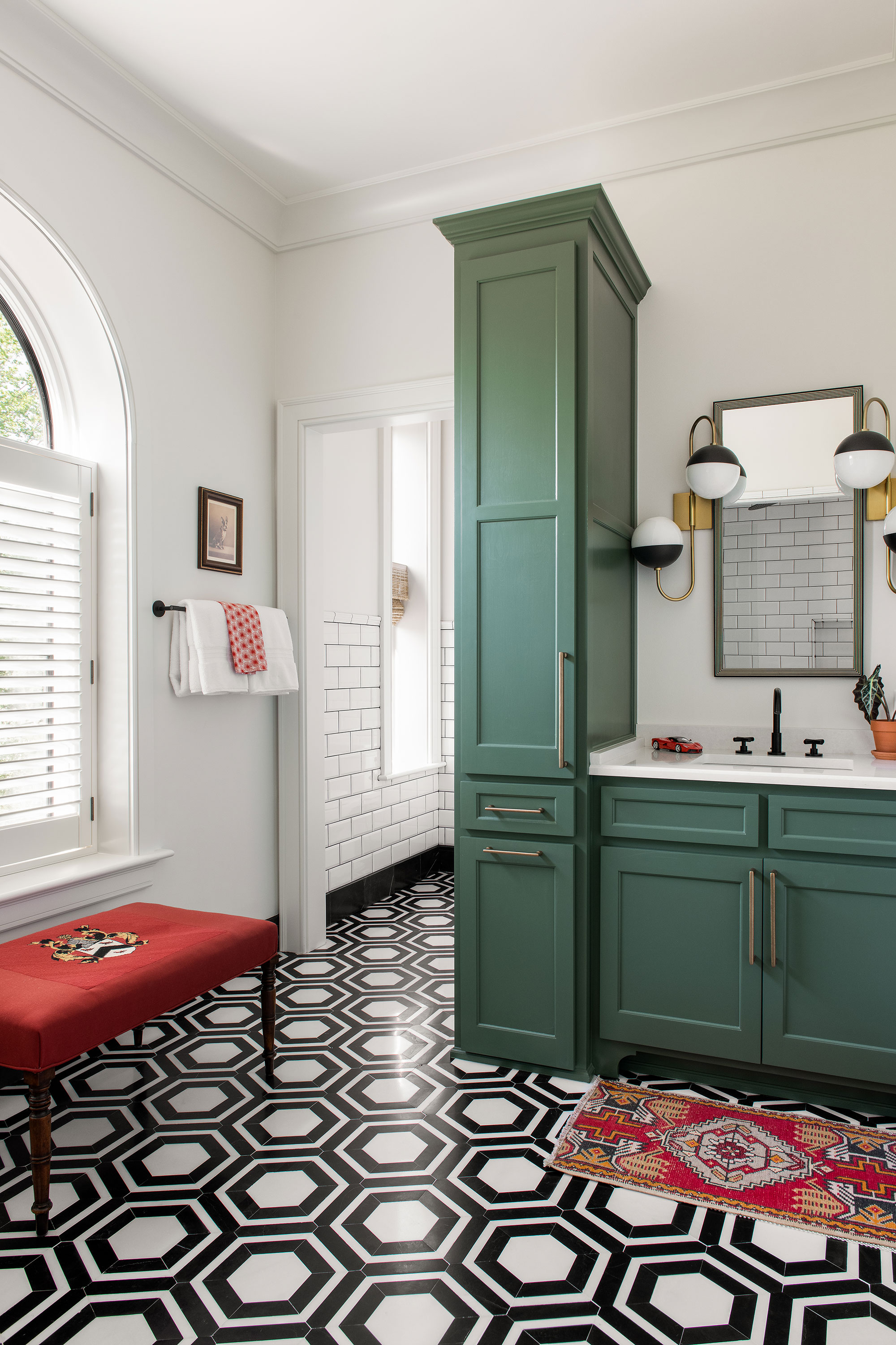
Bathroom ideas for the boy's bathroom allowed designer Isabel to express some of her more playful design ideas. 'I wanted something more fun and modern in here,' she says, 'so I had a wild streak with this Thassos marble tile and rotating sconces positioned over the mirror.' The green cabinetry, antique rug, and needlepoint bench marry traditional elements to ensure that even this fun space does not look out of place next to the other rooms where old and new elements are so successfully blended.
Cabinets painted in Palmer Green by Benjamin Moore; Renee sconces by Hudson Valley Lighting.
Powder room
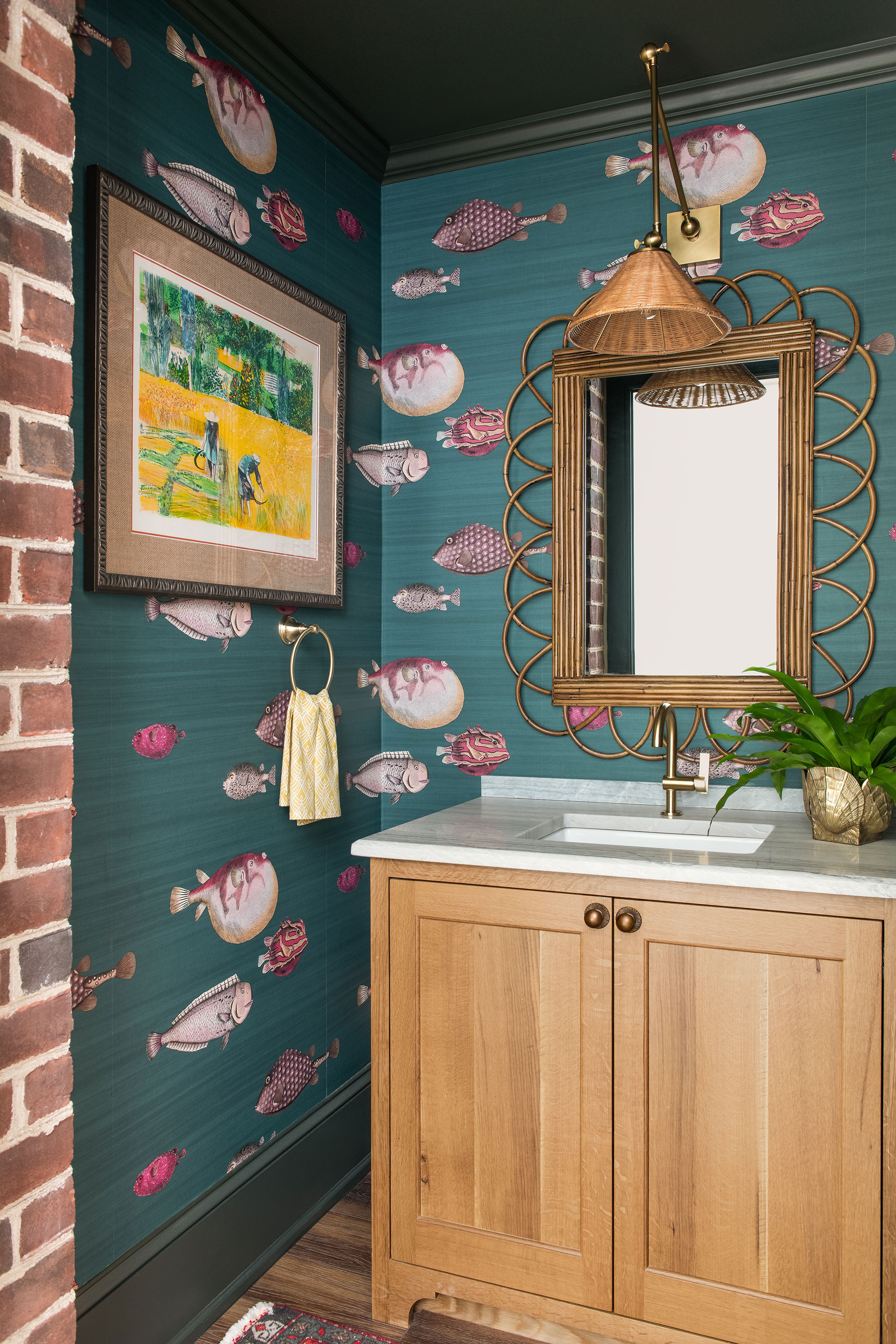
This room, in the newly built addition to the house, may be small but it packs a style punch and somehow combines the curated maximalism aesthetic, blending old with new just as the larger rooms do.
'I wanted a paper that was dramatic, but dark, so the fish imagery paired well with natural elements of rattan and bleached wood,' says Isabel. 'The countertop has soft blue veining that mimics a tide.'
Acquario wallpaper by Cole & Son; Padma light, Arteriors.
Victorian house exterior
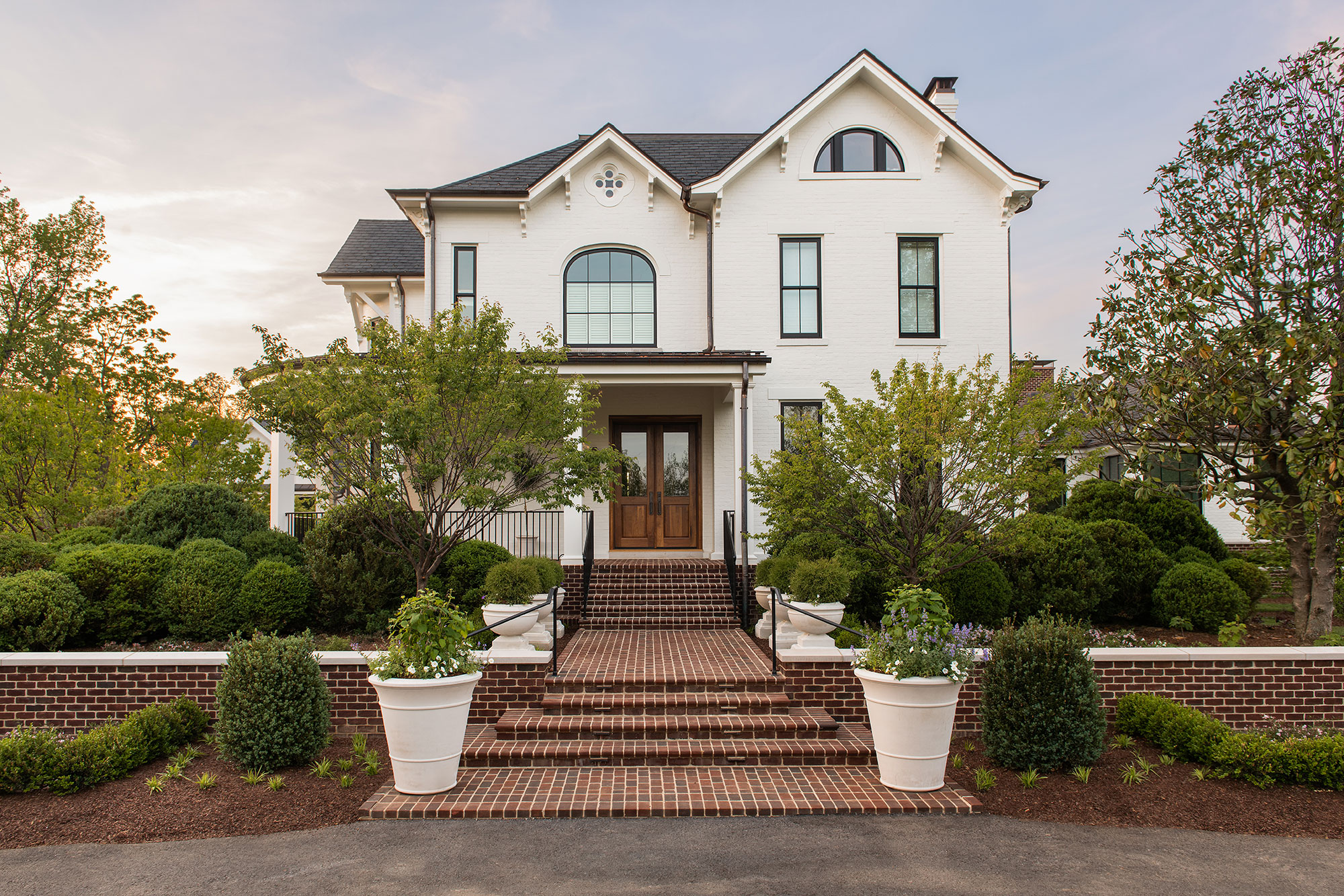
The house, built in 1889, is surrounded by lush farmland, so it was very important to have a fluid transition between the inside and outdoor spaces, says designer Isabel. Plenty of indoor plants, natural materials, plus floral and leafy prints for fabrics and wallcoverings help to blur the boundaries between indoor and outdoor spaces.
Sign up to the Homes & Gardens newsletter
Design expertise in your inbox – from inspiring decorating ideas and beautiful celebrity homes to practical gardening advice and shopping round-ups.
Karen sources beautiful homes to feature on the Homes & Gardens website. She loves visiting historic houses in particular and working with photographers to capture all shapes and sizes of properties. Karen began her career as a sub-editor at Hi-Fi News and Record Review magazine. Her move to women’s magazines came soon after, in the shape of Living magazine, which covered cookery, fashion, beauty, homes and gardening. From Living Karen moved to Ideal Home magazine, where as deputy chief sub, then chief sub, she started to really take an interest in properties, architecture, interior design and gardening.
-
 I tried this one easy dishwasher trick and made the annoying need for manual drying a thing of the past
If you hate those little pools of water left on your cups and crockery, this towel trick is for you
By Punteha van Terheyden
-
 Renovation Aloha's Tristyn and Kamohai Kalama share the front color you need to sell your home – they explain, 'it's one of the areas you can go a little bolder'
In Homes & Gardens' exclusive interview with the Kalamas, they explain the renovations to make to the front of your home for property value
By Sophie Edwards