9 sustainable design lessons we've learnt from an historic Connecticut home
Sustainability was key in this stylish redesign of a 1920s home, where upcycled materials play their part in its fresh new look
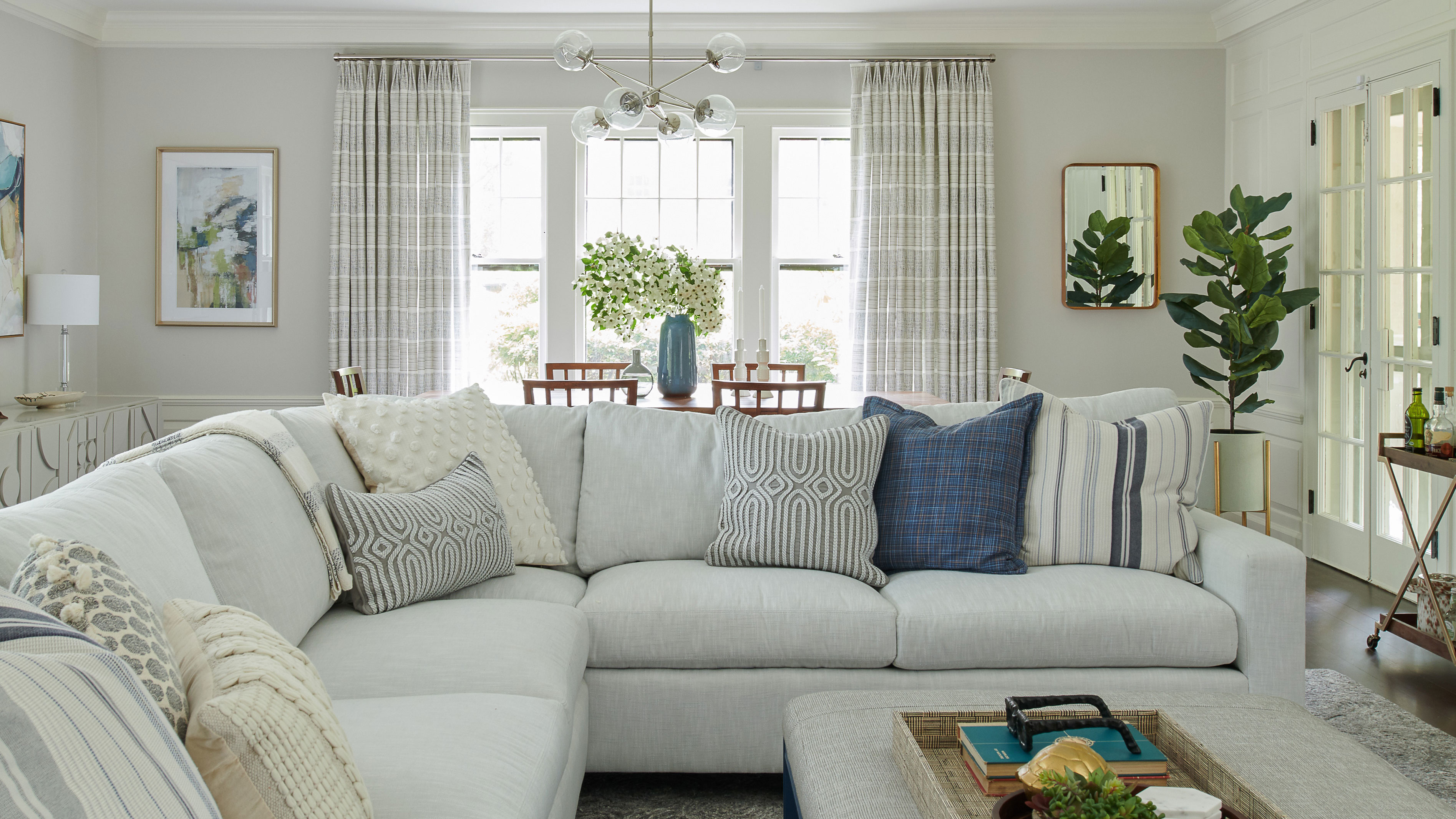
When an environmentally conscious couple and their two young children relocated from NYC to a 100-year-old house in West Hartford, CT, they wanted to preserve as many of its original features as possible. The house is historically protected, but the family needed the property to work for them as a comfortable and practical living space. They wanted to update the interiors to fit their modern family lifestyle while still retaining its historic charm. They called in an interior designer to help them achieve the right look.
The resulting redesigned home offers exactly the balance the family were looking for. A stylish combination of new and original features, alongside upcycled and repurposed elements, preserves the character of the original building and makes it one of the world's best homes.
The family called on interior designer Georgia Zikas, who was delighted to come up with inspiration and practical solutions for a full renovation of the 1920s historically protected home. She understood their desire to preserve many of the existing original features and cut down on waste. The ideas Georgia presented involved upcycling as many of the home's existing materials as possible within the new redesign and the family are delighted with the results.
We've picked out our top 9 design takeaways from the reconfigured home.
1. Open-plan kitchen-diner
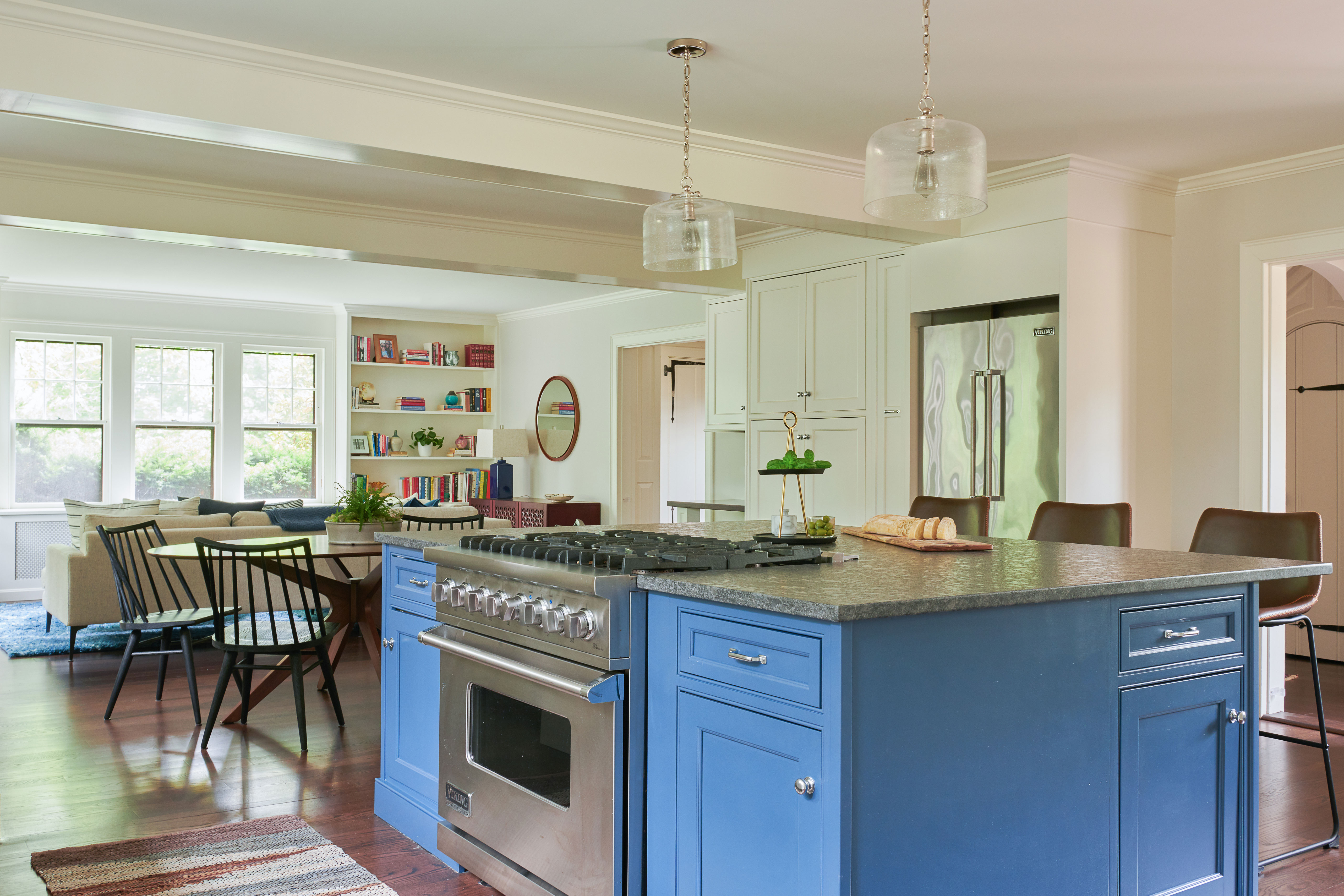
The house is packed with clever ideas for upcycling and repurposing materials in a way that honors the original character of the home and adds a fresh sense of style. What's more, since a key motivation was for the redesign to be environmentally conscious, it really didn't cost the earth – being both planet friendly and budget friendly.
Anyone looking for kitchen ideas will find plenty to inspire them in this spacious open-plan setting. Designer Georgia Zikas says the kitchen is her favorite space. 'We opened up walls and combined the butler's pantry into the kitchen,' she explains. 'We did away with the old dining room to instead function freshly as an open-plan kitchen leading into their new family room.'
2. Lighter and brighter
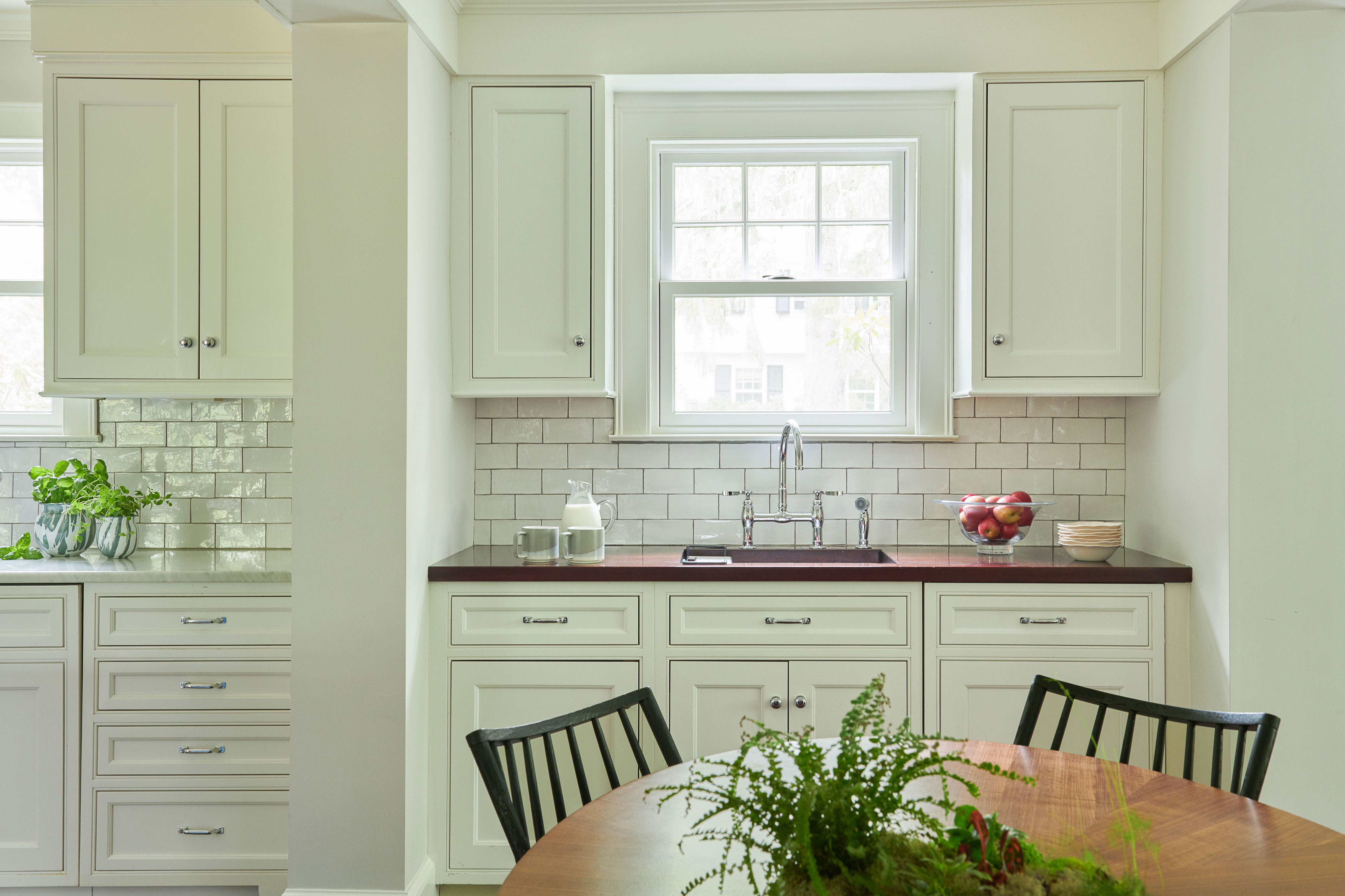
One of the main requirements in updating this family home was to make it brighter. All the original 1920s woodwork was dark and dated, explains Georgia, and the wood was not in good enough condition to repair. 'It was in great condition to take coats of paint, however,' she says, and a light, neutral palette of Benjamin Moore paints have been used on all the walls and woodwork, brightening the property throughout.
Georgia suggested removing the walls between the old butler's pantry and the new kitchen to open up the space. Remnants of the old pantry - including its original walnut worktops (seen around the sink, above) - have been saved in the family dining area as a reminder of the history of the house. The oval walnut table provides a landing spot for family dinners and school projects. And this informal open-plan dining area is another great takeaway from the home for those in search of dining room ideas.
3. Island made from upcycled cabinets
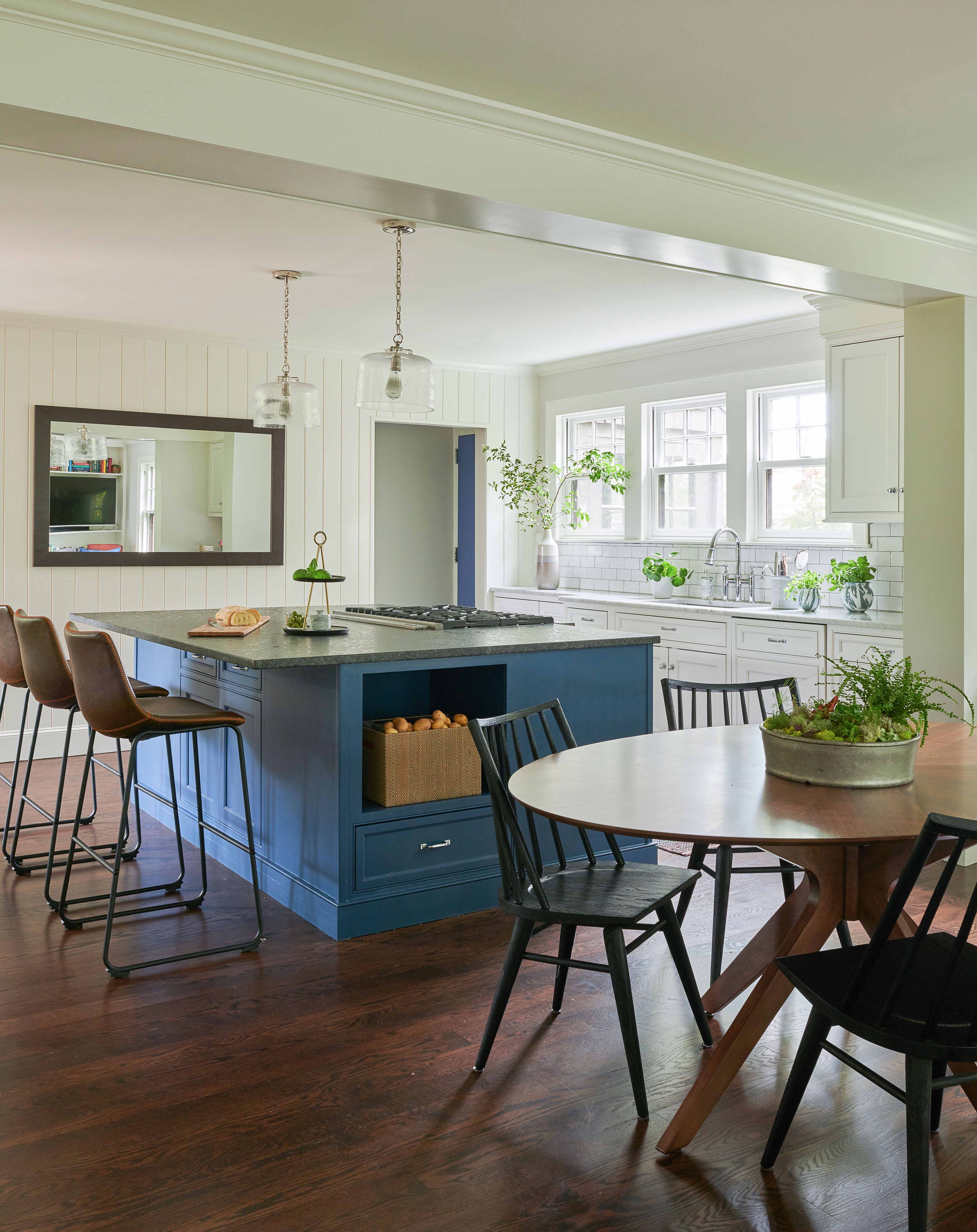
Georgia describes the kitchen island as 'a Frankenstein-like creation made from cabinets from the old kitchen, combined with new pieces for filler'. This is a great way to repurpose unwanted sections of an old kitchen and make a cost-saving for anyone looking for kitchen island ideas.
Georgia respected and shared her clients' sustainable approach to the renovation, adding, 'We didn’t want to be wasteful by throwing away nicely made cabinets, so we were careful during the demo phase to salvage them, and we painted them fresh to contrast against the white surround.' The couple found the barstools online, opting for inexpensive ones that could withstand the children's greasy fingers!
The pendant lights over the island are from Visual Comfort.
4. Multifunctional space for adults and kids
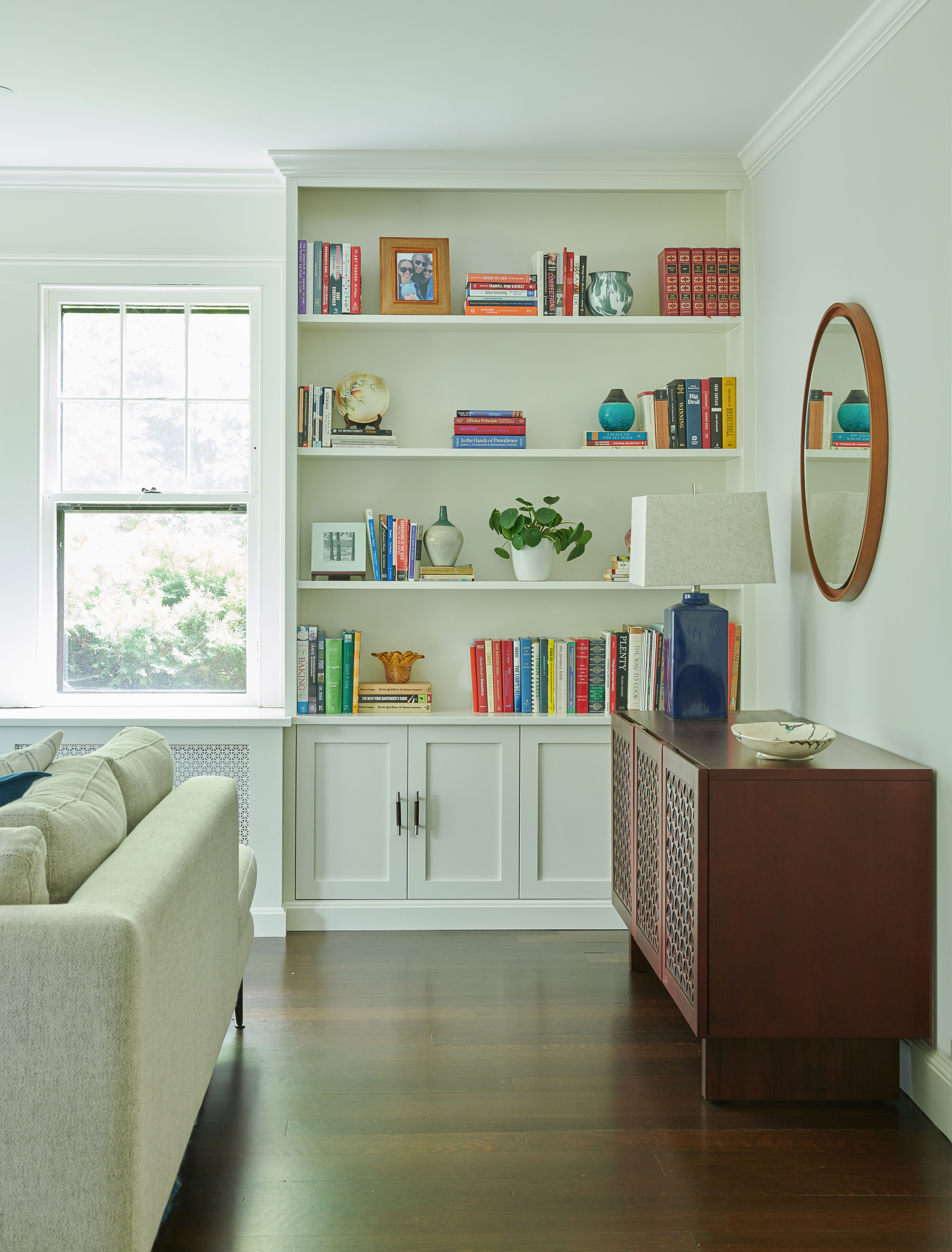
By opening up walls and incorporating the old dining room into the new open-plan kitchen, there is now space for a relaxed seating area at the far end of the kitchen. This fits in with the family's ideas of creating a multifunctional space to suit adults and children alike. 'The result is a sophisticated space but yet nothing too precious for the kids to destroy,' explains Georgia. 'We designed the bookcases flanking the windows for modern living and storage function. With young children around, space for storing toys was essential.'
5. Fresh but timeless look
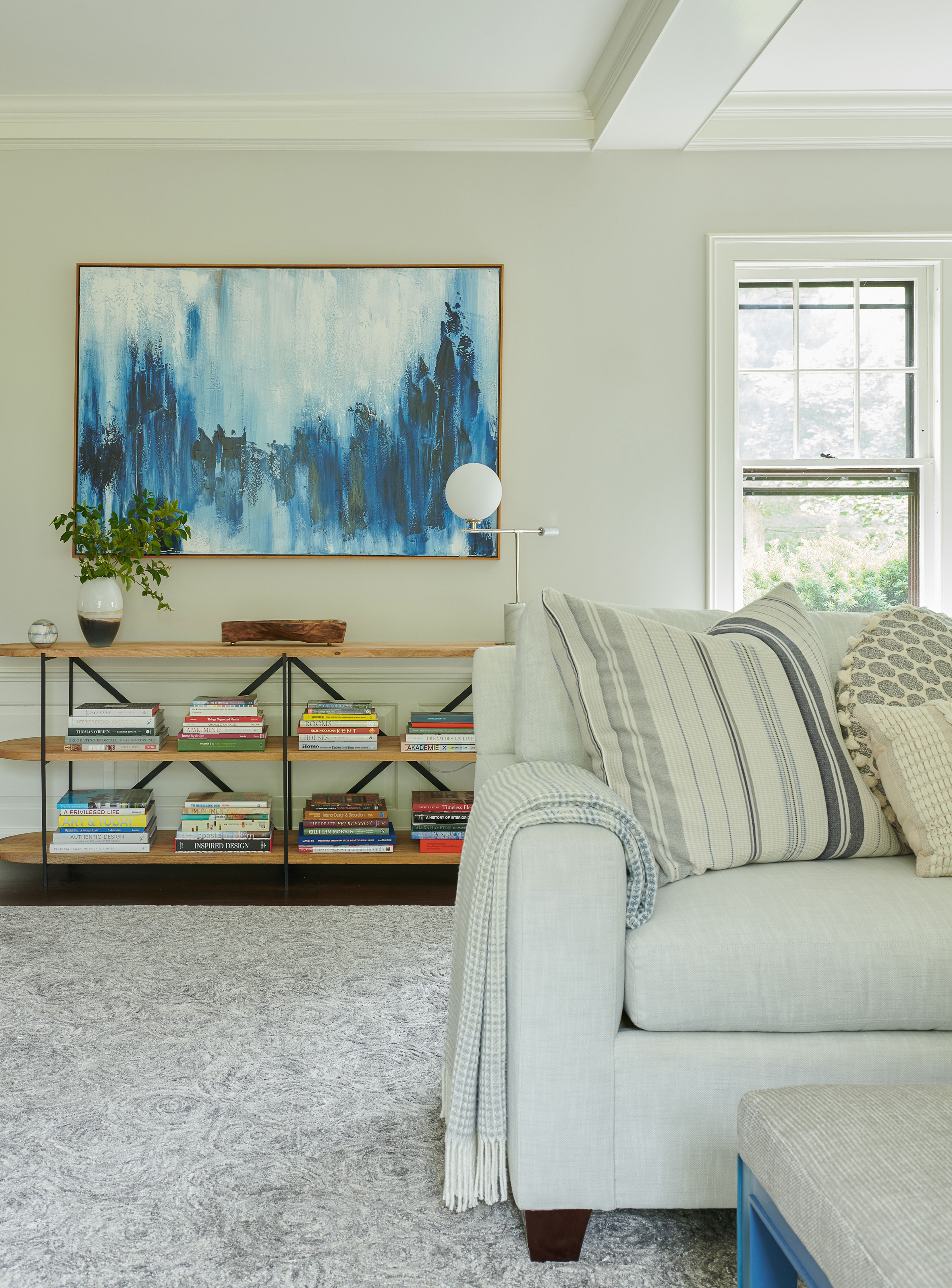
The updates to this 100-year-old home needed to balance its history and original features alongside the family's wish for a new look. 'They wanted it to feel fresh, but timeless – and nothing trendy,' says Georgia.
The soft palette of Benjamin Moore paints in off-whites, with occasional bursts of fresh coastal blues really tick the boxes for anyone searching for living room ideas. The modern abstract blue painting provides a great scale and dose of color to the room.
6. Fire surround made from old marble worktops
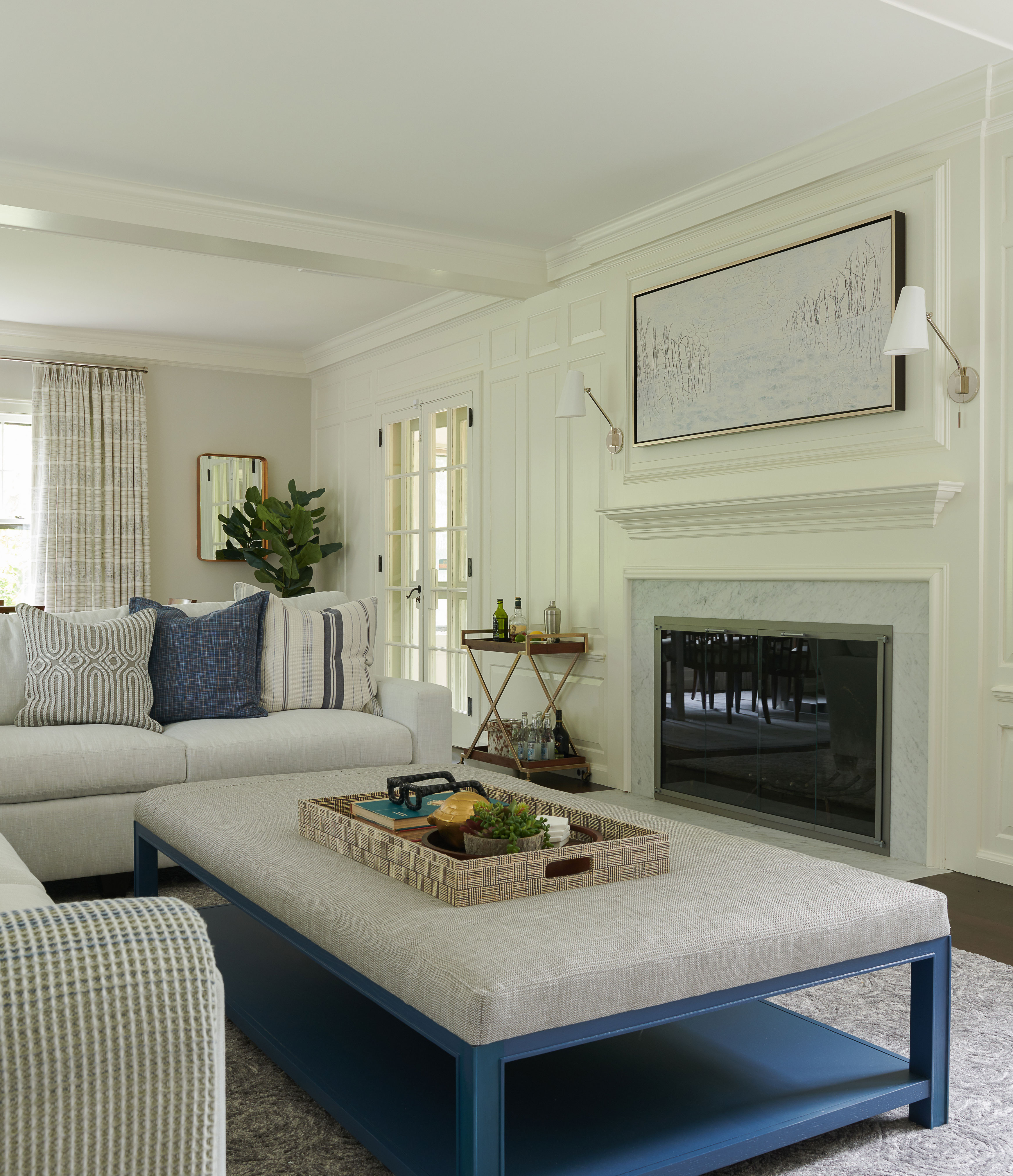
In a masterstroke of upcycling genius the couple decided to repurpose the old marble worktops from the kitchen to create a fire surround for their new living room. It's certainly one of the best living room fireplace ideas we've come across for those keen to salvage and reuse old materials. 'We saved everything we could,' says Georgia. 'Not really for money savings as much as we just didn’t want to be wasteful.'
The custom size sectional sofas from Highland House are covered in performance fabric as they get a great deal of use in this family room. The ottoman is also custom-sized, with the legs painted in Benjamin Moore paint. The rug is from Stark.
7. Dining space for entertaining
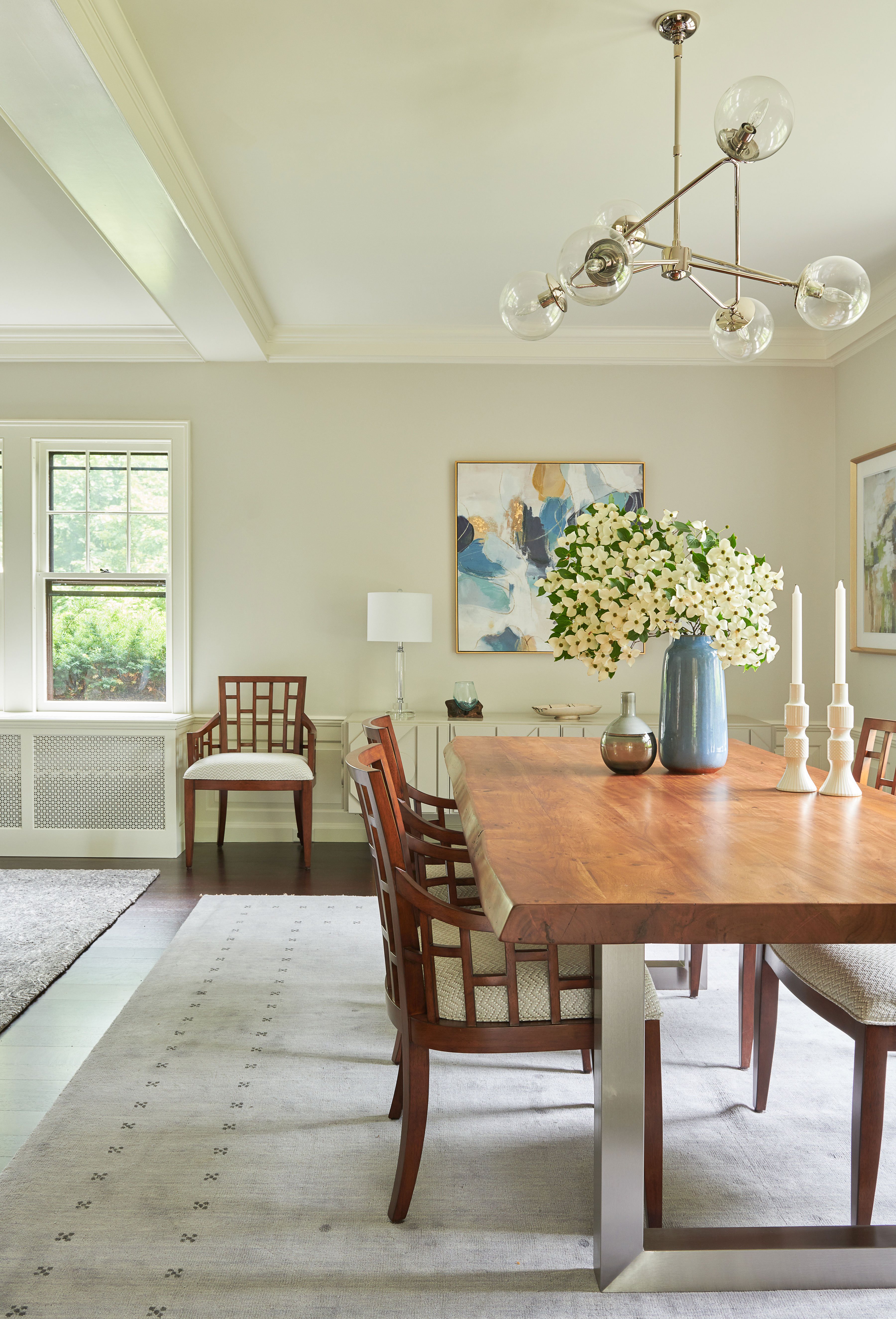
Why devote a whole room to formal dining and entertaining? That's the question Georgia asked as she approached the redesign. And it's a question we should all be asking ourselves when we're looking for dining room ideas.
'Although they need a place to entertain and have adult meals with their friends, it happens seldom, so it didn’t need the grandstand location,' she explains. The reconfigured downstairs layout allows for a formal dining space at one end of their main living room. This also has the advantage of great access to the sunroom, outdoor patio and outdoor kitchen.
Dining table from West Elm. Chairs from Lexington.
8. Bathroom for family use and luxury spa time
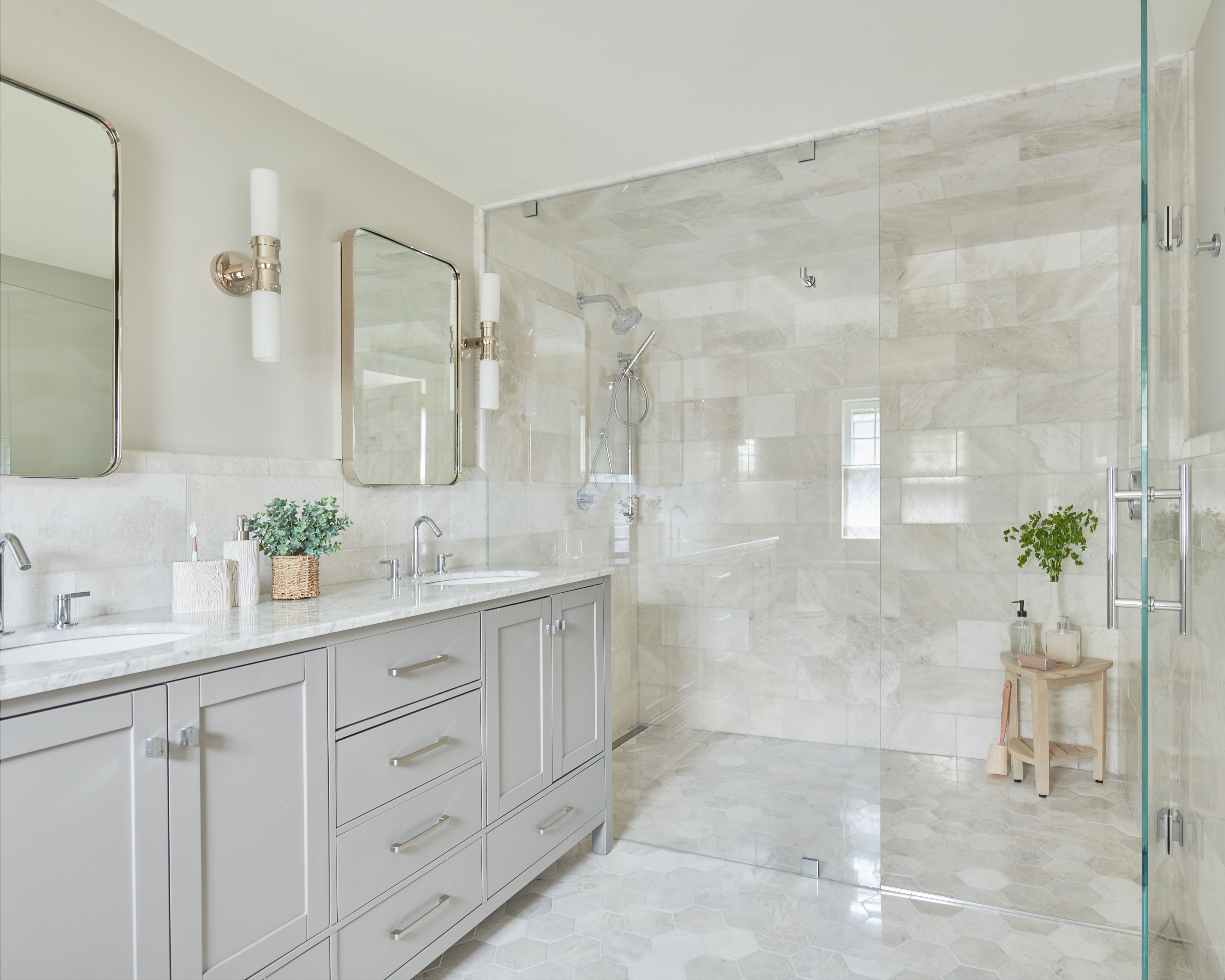
When you're thinking about bathroom ideas, how on earth do you combine two seemingly contrasting needs – children's showers and a luxury spa vibe for adults – in one main bathroom?
Here's how Georgia's complete gut renovation of this family's primary bathroom did it:
A twin vanity provides great storage, together with recessed medicine cabinets, and flush flooring for no tripping in and out of the huge shower. 'The mom explained that it's often easier to clean the little boys in a "big human car wash"' says Georgia, 'so that’s what it is, toys and all. Plus it's luxe living for the adults as they begin or end their busy work days.'
9. Calm bedroom styling

Updating an old house sympathetically and in keeping with its character doesn't mean rigidly sticking with furniture styles specific to the era.
'The clients appreciate midcentury modern design,' says Georgia, 'so we stayed true to that style in the primary bedroom with sleek, walnut furniture, still allowing for great bedside storage.'
The bed and bedside table provide fresh, clean lines and a calm uncluttered look, essential elements in all great bedroom ideas.
Bed and bedside table from Room & Board. Throw pillow from Rebecca Atwood Designs.
Sign up to the Homes & Gardens newsletter
Design expertise in your inbox – from inspiring decorating ideas and beautiful celebrity homes to practical gardening advice and shopping round-ups.
Karen sources beautiful homes to feature on the Homes & Gardens website. She loves visiting historic houses in particular and working with photographers to capture all shapes and sizes of properties. Karen began her career as a sub-editor at Hi-Fi News and Record Review magazine. Her move to women’s magazines came soon after, in the shape of Living magazine, which covered cookery, fashion, beauty, homes and gardening. From Living Karen moved to Ideal Home magazine, where as deputy chief sub, then chief sub, she started to really take an interest in properties, architecture, interior design and gardening.
-
 Triangular shaped garden ideas – landscape designers share 9 ingenious ways to redesign your corner plot
Expert tips for planning, planting and finessing a triangular shaped plot, so you can savour the space year round
By Jill Morgan
-
 These are the 6 things designers say you should never put in a small living room
The items that should be banned from a small living room are right here along with what you should opt for instead
By Sarah Warwick