A heritage home that perfectly blends traditional and modern interiors
This historic San Francisco home mixes traditional and modern styles for a relaxed family living space

Design expertise in your inbox – from inspiring decorating ideas and beautiful celebrity homes to practical gardening advice and shopping round-ups.
You are now subscribed
Your newsletter sign-up was successful
Want to add more newsletters?
Built in 1905 in the Pacific Heights neighborhood of San Francisco, this Colonial Revival style home already had many advantages. The young family who had made it their home had got to know the house when their friends lived there.
Although they loved the property and particularly its historic detailing, they were keen to put their own stamp on the space and update it in areas, to improve the connectivity between the formal and informal spaces, but also to improve its offering for entertaining guests.
Following a recent redesign, the house is one of the world's best homes, and interior designer Marea Clark, who spearheaded its renovation, shows us round.
Article continues below 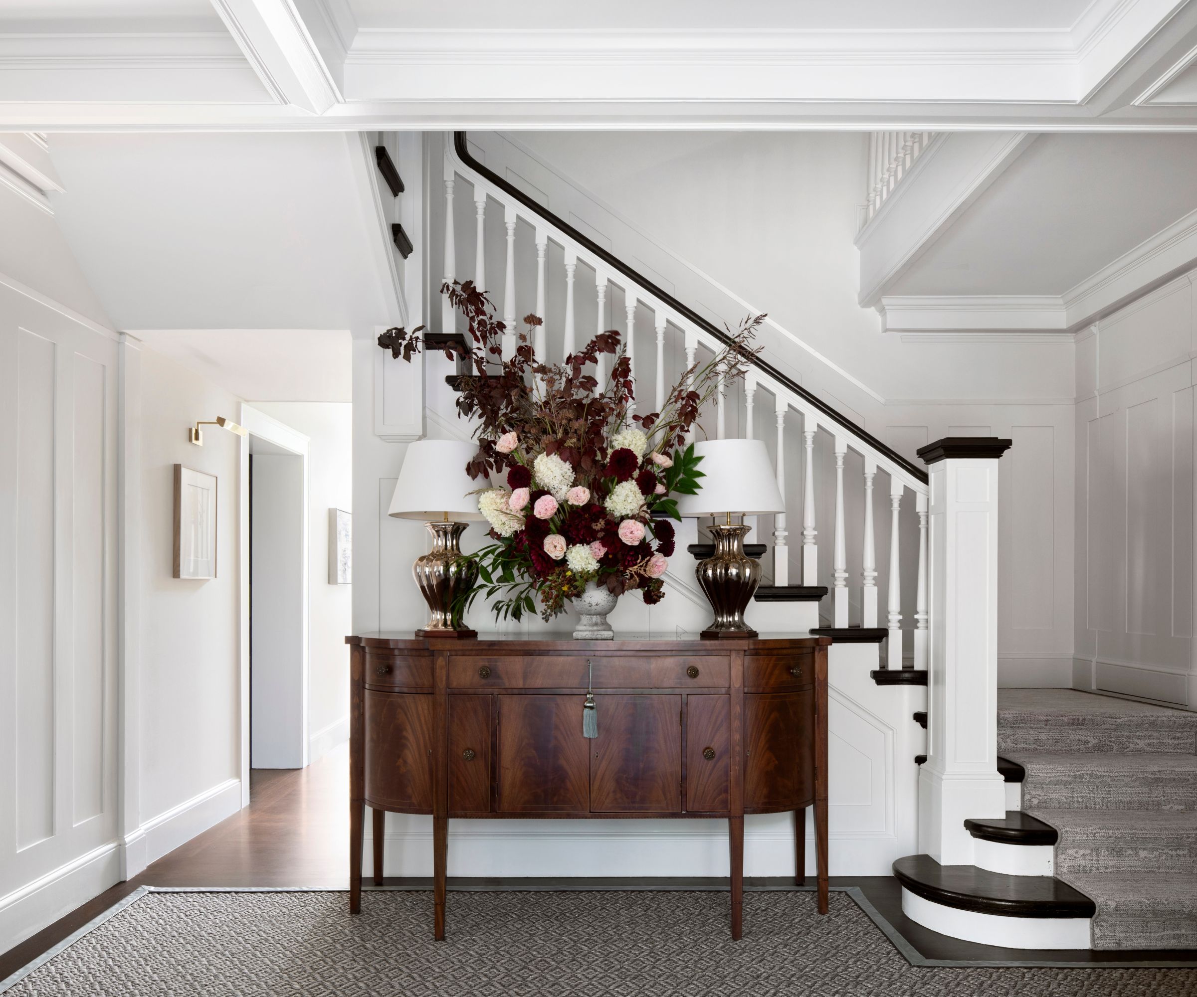
'Preserving the home’s original details while updating outdated features for modern living always requires a lot of thought and planning,' says designer Marea Clark. 'We wanted the more informal spaces to flow to the more formal spaces with ease, and balancing the design of these was a challenge - making sure it felt like a family home, but also sophisticated.'
We think the entry and stairs really aces the sophisticated look. Less is more here, and by keeping the entryway ideas simple, with white walls and just one or two well-chosen pieces of furniture, including a well-matched vintage console, the entrance appears more spacious and luxurious.
Vintage console, refurbished by Antonios Antiques. Lamps by Christopher Spitzmiller
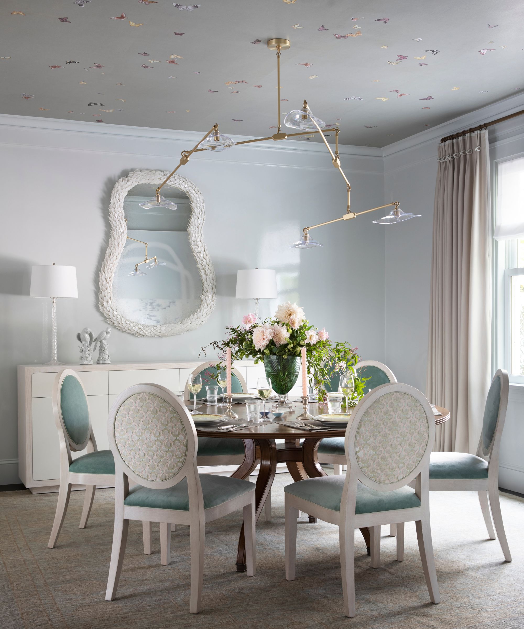
The dining room was an important space in this house as the homeowners use it a lot. 'We wanted it to feel ethereal and playful - not childlike but that children live there, so although it's a formal space it still has a playful, approachable quality that feels appropriate for a lively family of six,' says designer Marea, who explains that her dining room ideas started with the De Gournay butterflies. 'Putting them on the ceiling was a way to bring the outside in and add a whimsical quality to the room,' she adds.
Design expertise in your inbox – from inspiring decorating ideas and beautiful celebrity homes to practical gardening advice and shopping round-ups.
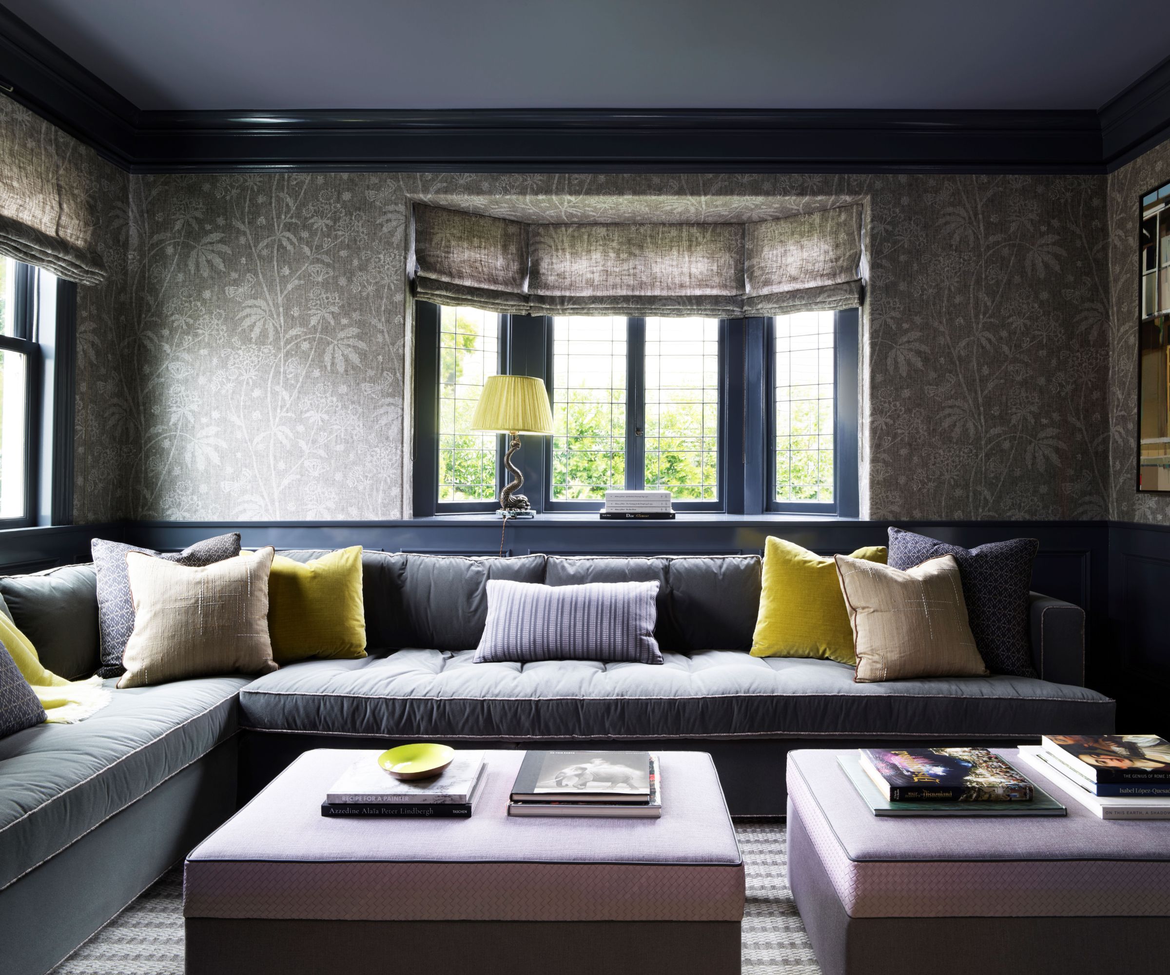
It was important for the home to be kid-friendly but also elegant and interesting, explains the designer, adding: 'The moody den we created was meant to feel like a place that you could pour a cocktail or hang out and watch TV with the family.'
The library/den is connected to the living room so den ideas had to be somewhat formal but comfy and inviting too. 'We wanted the two rooms to speak to each other but still feel separate. We made the custom sectional with storage ottomans,' adds Marea.
Walls painted in Temptation, with the ceiling in Sea Life, both Benjamin Moore, with Fermoie's Hewn Pattern Astrea. The sectional sofa is custom from Marea Clark Interiors. The rug is from Abbey Carpet.
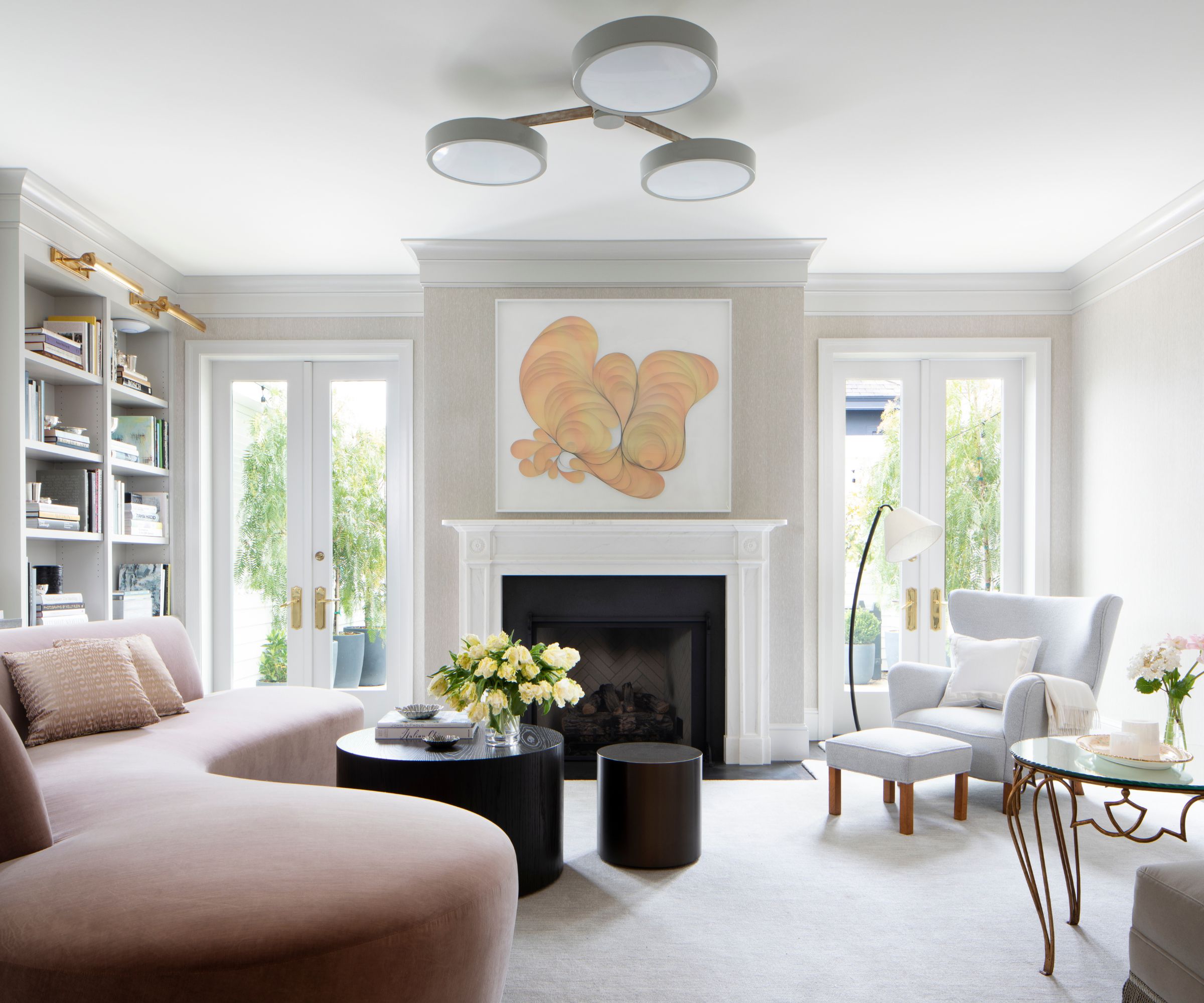
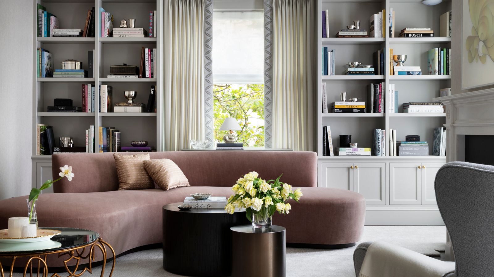
'The home as a whole is now a good mix of modern and traditional styles,' explains designer Marea Clark. 'Our goal was to give the home an ethereal and romantic quality, using moody purples, pinks, and coastal blues to achieve a subtle femininity
Occasional table: Kneedler Fauchere Lens Table. Rug: Abbey Carpet & Rug. Central light fixture: Urban Electric. Art above fireplace by Hunt Rettig at Dolby Chadwick Gallery.
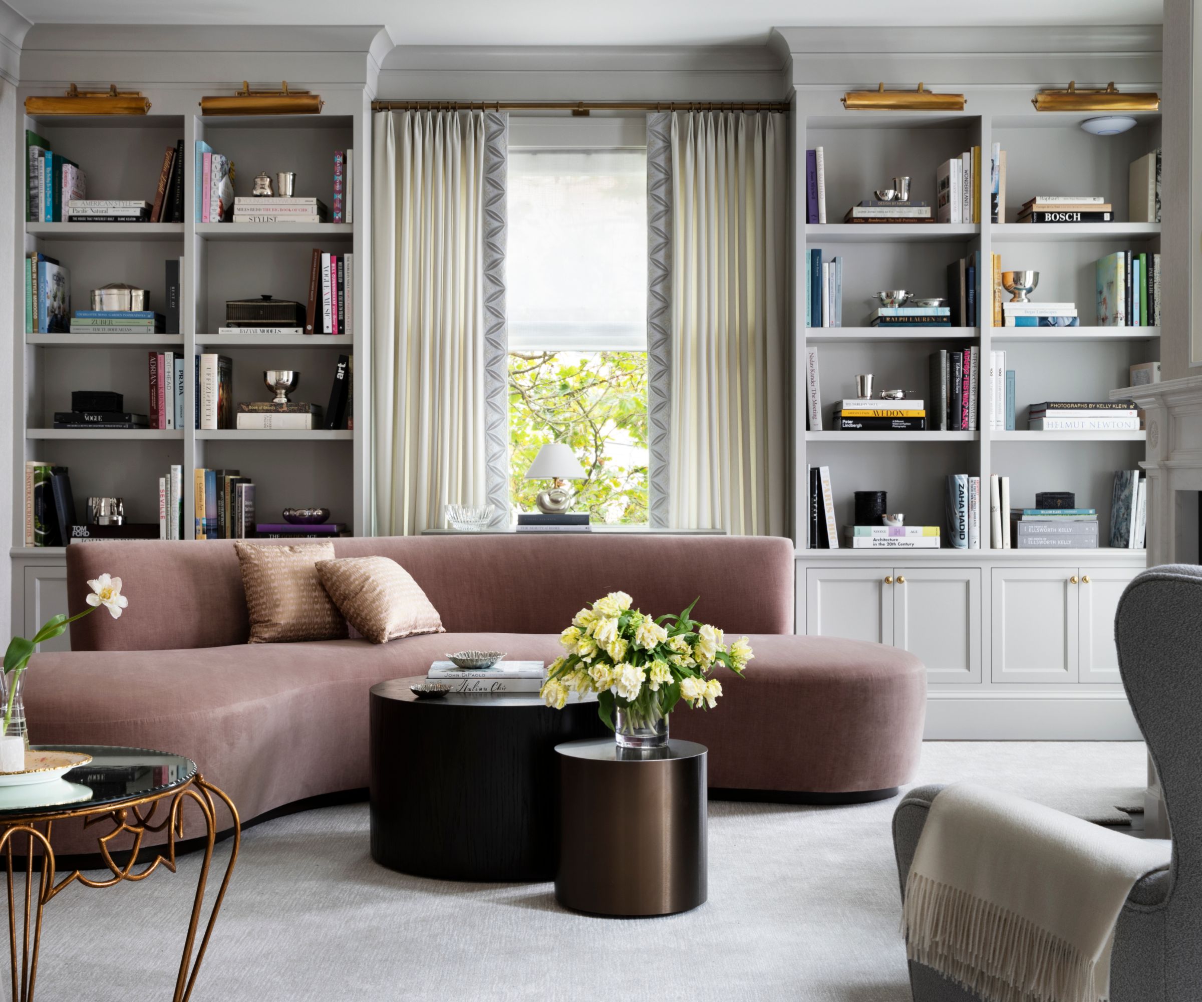
The designer's living room ideas really showcase that balance between traditional and contemporary ideas, with a contemporary curved sofa, and classic and traditional built-in shelving.
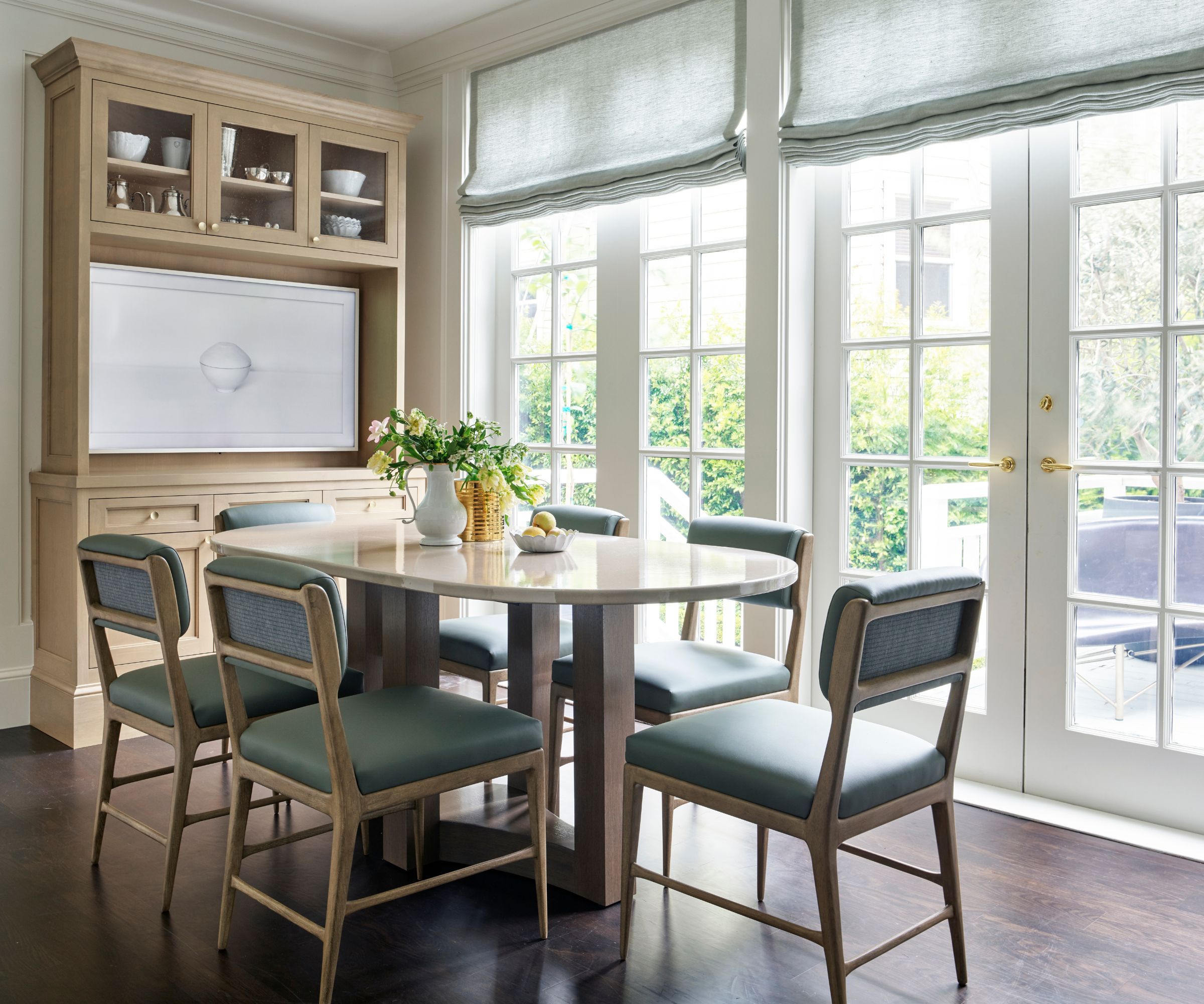
This more casual eating space is a part of the kitchen. Eat-in kitchen ideas were all about creating a functional space for everyday meals, so designer Marea built a custom dining table with enough seating for the whole family.
'We worked with the architect to create a larger opening between the kitchen and dining room to allow for better traffic flow, adding a new pocket door, and made a few changes in the kitchen like building a larger storage hutch.'
Dining table: custom made by Marea Clark Interiors, with a lava stone top. Chairs: Quintus Upholstery. Art: Jenifer Kent at Dolby Chadwick Gallery.
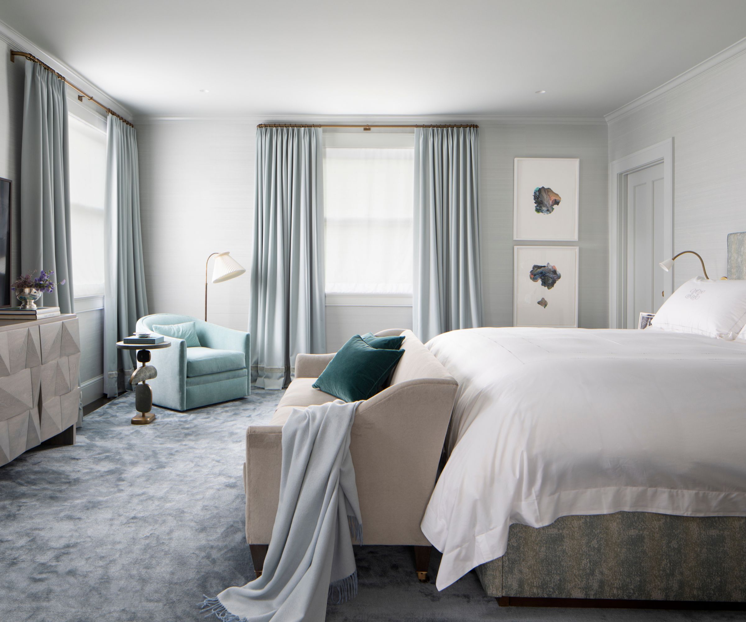
The primary bedroom is clad with a pale blue silk wallcovering from Holland & Sherry, that gives the space a soft sheen, and fits right in with the designer's wish to create an ethereal, romantic space. Anyone looking for bedroom ideas could take inspiration from the cool, relaxing shades layered in this space.
The carpet is from Abbey Carpet. Loveseat at the foot of the bed, custom from Marea Clark Interiors. Console, Cuff Studio.
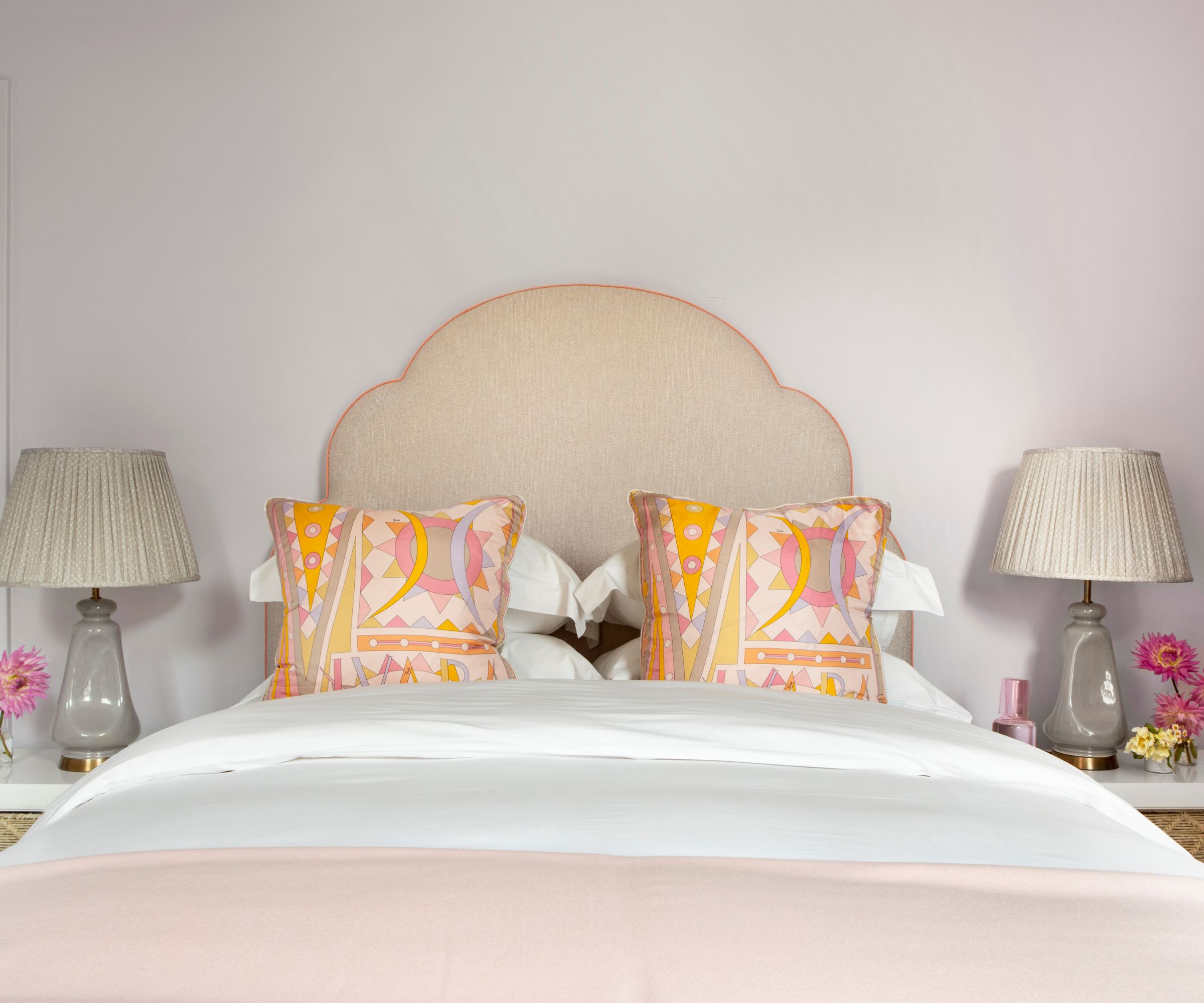
Bedrooms for visitors can occasionally look somewhat soulless, and lacking in personality. Not so, this room because even though space is tight, it's packed with guest room ideas that add character. Check out the warm color scheme of blush and apricot shades, the pretty pillows and throw on the bed, and the pleated lampshades.
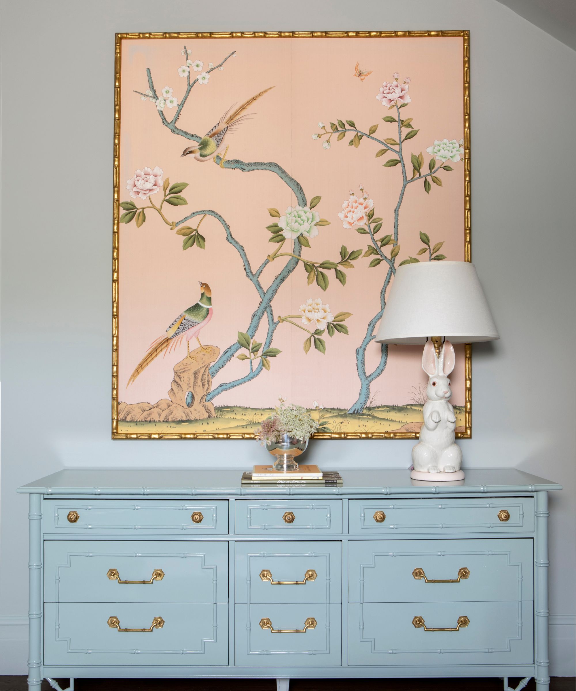
A painted console and framed wallcovering print add more pretty details to the room.
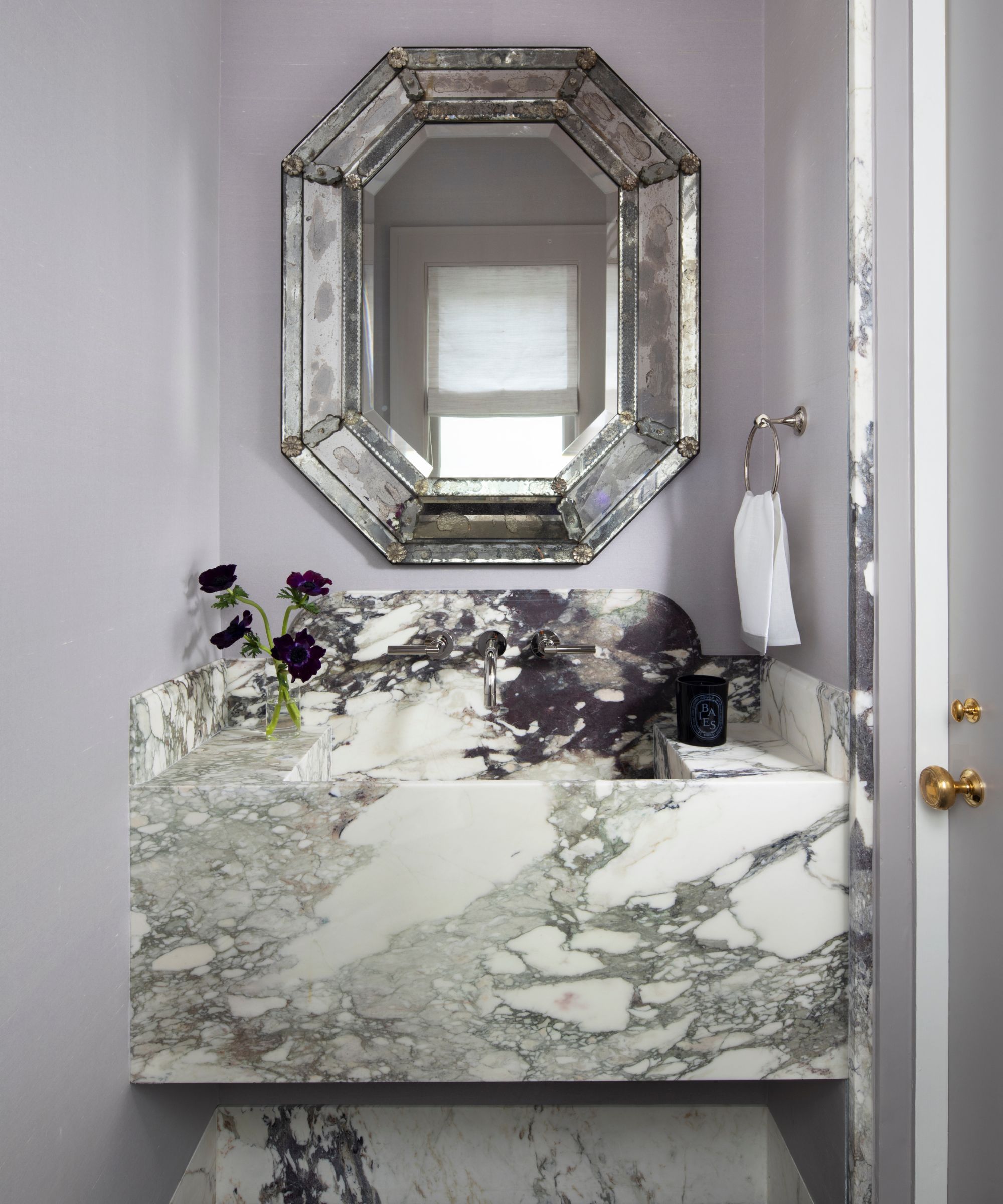
This eye-catching vanity is part of the primary ensuite, 'an intimate little jewel box of a nook within the larger space, for the owner to get ready at'. Vanity ideas we'll be copying from here, include the striking quartz backsplash and basin, and the vintage-style foxed mirror above. The black flowers, well, they're an optional extra.
Interior Design: Marea Clark Interiors
Photography: Paul Dyer & Isabelle Eubanks
Styling: Kendra Smoot
Architecture: Stephen Sutro
General contractor: Clayton Timbrell
Karen sources beautiful homes to feature on the Homes & Gardens website. She loves visiting historic houses in particular and working with photographers to capture all shapes and sizes of properties. Karen began her career as a sub-editor at Hi-Fi News and Record Review magazine. Her move to women’s magazines came soon after, in the shape of Living magazine, which covered cookery, fashion, beauty, homes and gardening. From Living Karen moved to Ideal Home magazine, where as deputy chief sub, then chief sub, she started to really take an interest in properties, architecture, interior design and gardening.
