European chic, and a mix of traditional and contemporary styles – Gillian Segal's vision for this Vancouver redesign
A fire nearly destroyed the first phase of this home's redesign. Now restored, it's smart and serene with plenty of sass
The renovation of this Vancouver home was just nearing completion when a freak electrical accident caused the entire roof and attic floor to burn down, leaving water damage in the newly redesigned rooms of the rest of the house. The young family had originally bought the early Dutch revival-style house for the location and bones of the house, and had brought in expert help to come up with interior design ideas.
So now, once the initial shock of the fire had subsided, interior designer Gillian Segal was back to work on phase two of her redesign.
'I worked with the homeowners to make the most of the unexpected incident,' says Gillian, 'using this as an opportunity to open up the house even more to perfect a bespoke layout for the family’s needs.'
The designer used the time while the house was being rebuilt to commission custom details and pieces for the design of the house, making the finished project, one of the world's best homes, and a true symphony of architecture and design. Inspired by European styles, designer Gillian mixed the old with new in this house for a balance of contemporary design while staying true to the bones of the traditional home. Stunning blonde hardwood flooring laid in a herringbone pattern, adding arches to the doorways and plaster finishes scattered throughout; it is these details that make this home feel fresh.
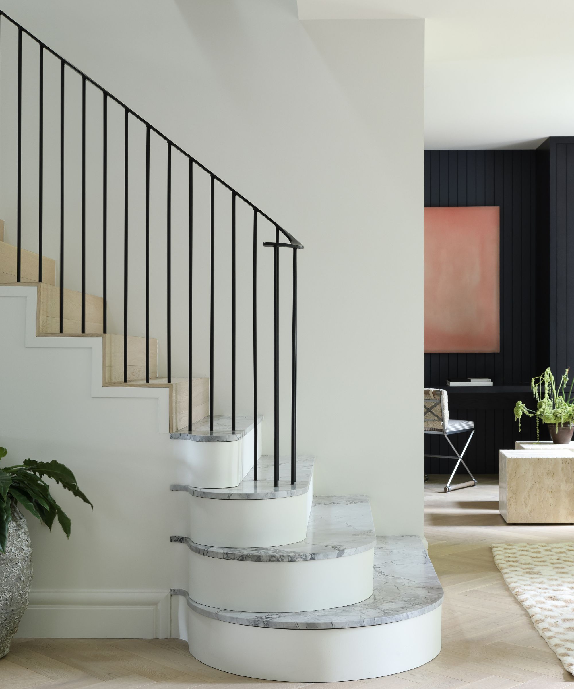
Like most traditional Dutch Revival-style homes, this had a central staircase that naturally divided the home. Gillian kept this placement in her hallway ideas but opened the floorplan up elsewhere, and designed custom silverstone marble steps in a dramatic curved shape for a more open effect. Through the widened doorway there's now a pleasing view to the study space.
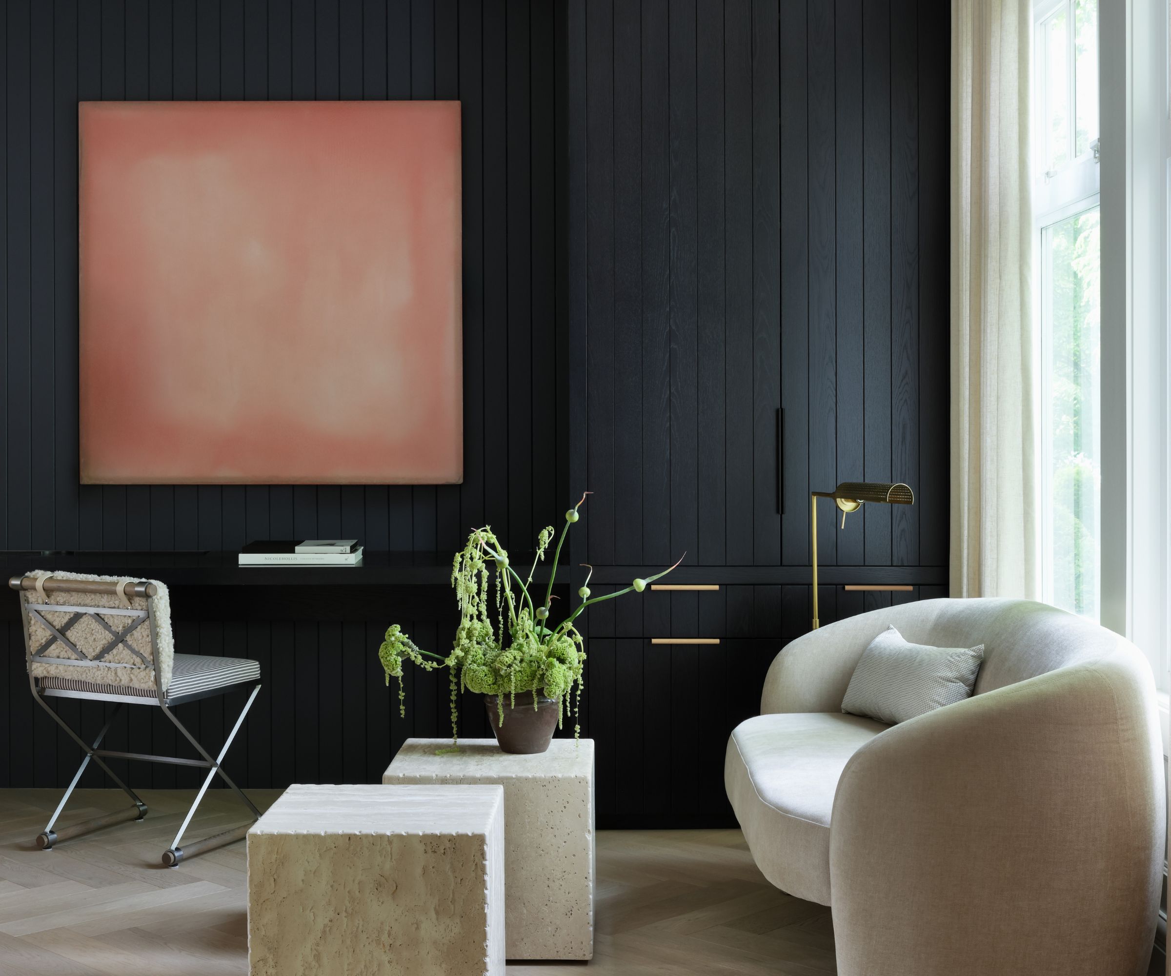
'While the homeowners needed a designated home office, they also wanted it to be a flexible space, as it was situated in the heart of the home and they like to entertain,' explains Gillian. Home office ideas involved keeping the desk tucked out of the way and adding in a small seating area to provide that dual purpose.
Key pieces include a desk chair from Thomas Hayes Studio; floor lamp, Circa Lighting; sofa, L’Atelier Home; and art by Tom Burrows, Bau-Xi Gallery.

Gillian Segal is principal and founder of Gillian Segal Design, a Vancouver-based firm that specializes in residential design. GSD blends old and new, creating unique spaces that are comfortably luxurious. This Vancouver renovation was one of the firm’s longest projects to complete to date. The redesign of the early Dutch Revival-style house started more than five years ago, but work was unexpectedly halted by fire damage and ensuing building work. The finished results were better than ever, as the team made good use of the added build time to perfect the layout and commission bespoke finishes.
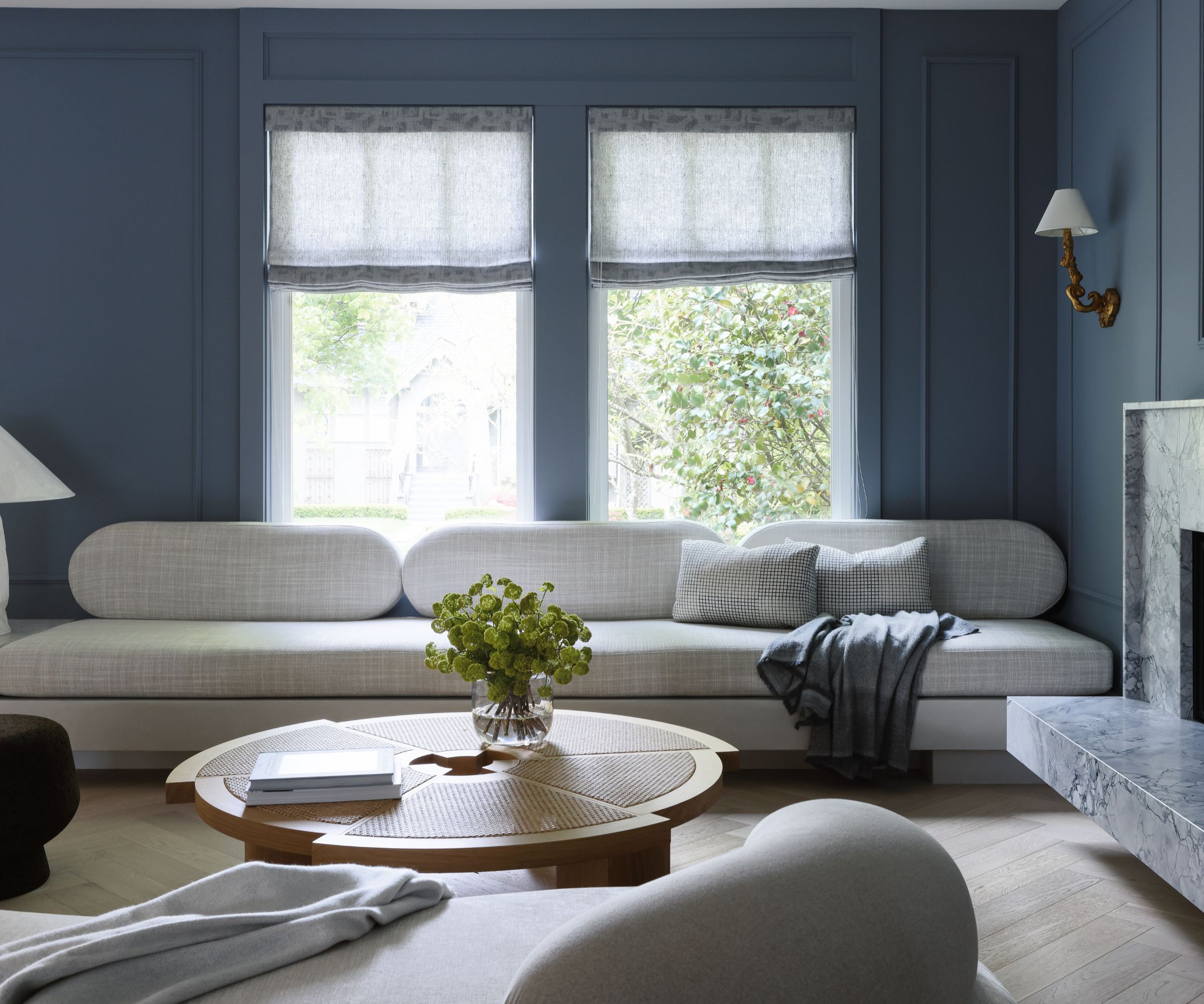
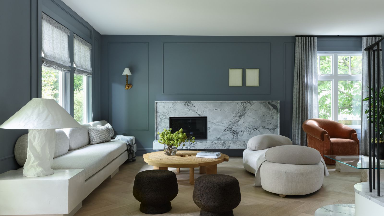
Among Gillian's living room ideas here in the formal living room was to marry traditional elements with modern twists, including wainscoting alongside very contemporary sofas, for instance.
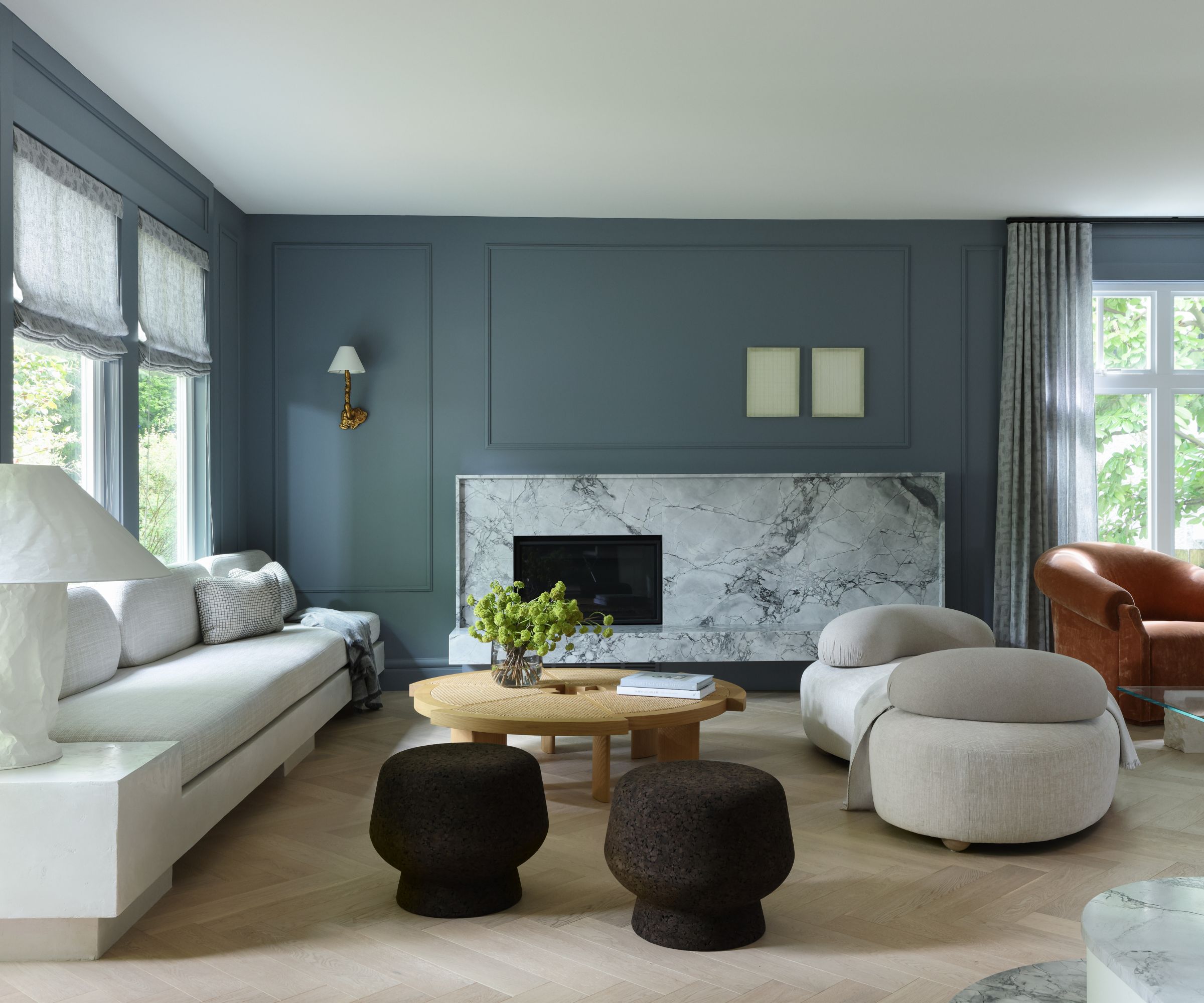
But by far the most innovative touch is the decision to make the marble fireplace asymmetrical and adding custom millwork to mimic the design. 'A single wall light on one side balances out your eye while exciting it at the same time,' says designer Gillian. Note also how the marblework fire surround echoes the marble staircase, clearly visible through the enlarged opening.
Key pieces include the sconce from Arteriors; stools, Inform Interiors; table lamp, Ingo Maurer
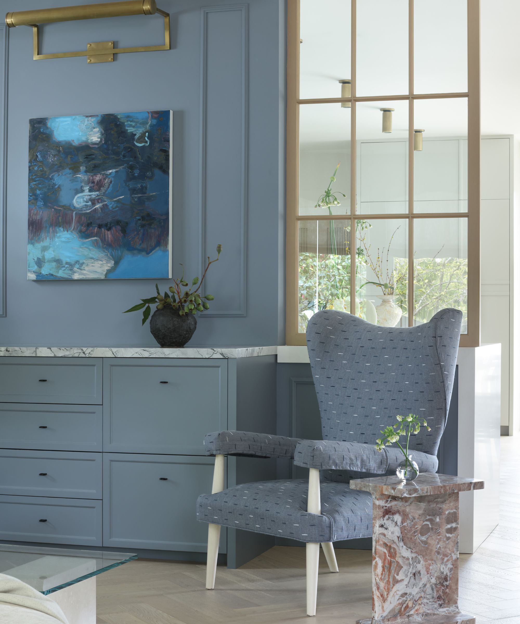
The homeowners were hesitant to fully open up the kitchen to the rest of the home, so Gillian came up with the perfect compromise. 'I suggested they add in two interior windows that kept the sense of openness and flow to the house but added a formal sense of separation as well,' she says. The gilded Georgian-style multipane design lends extra elegance to both kitchen and living room.
Key pieces include: Art light, Circa Lighting; armchair, Bunny Williams Home; side table, CB2; art by Anne Griffiths, Bau-Xi Gallery.
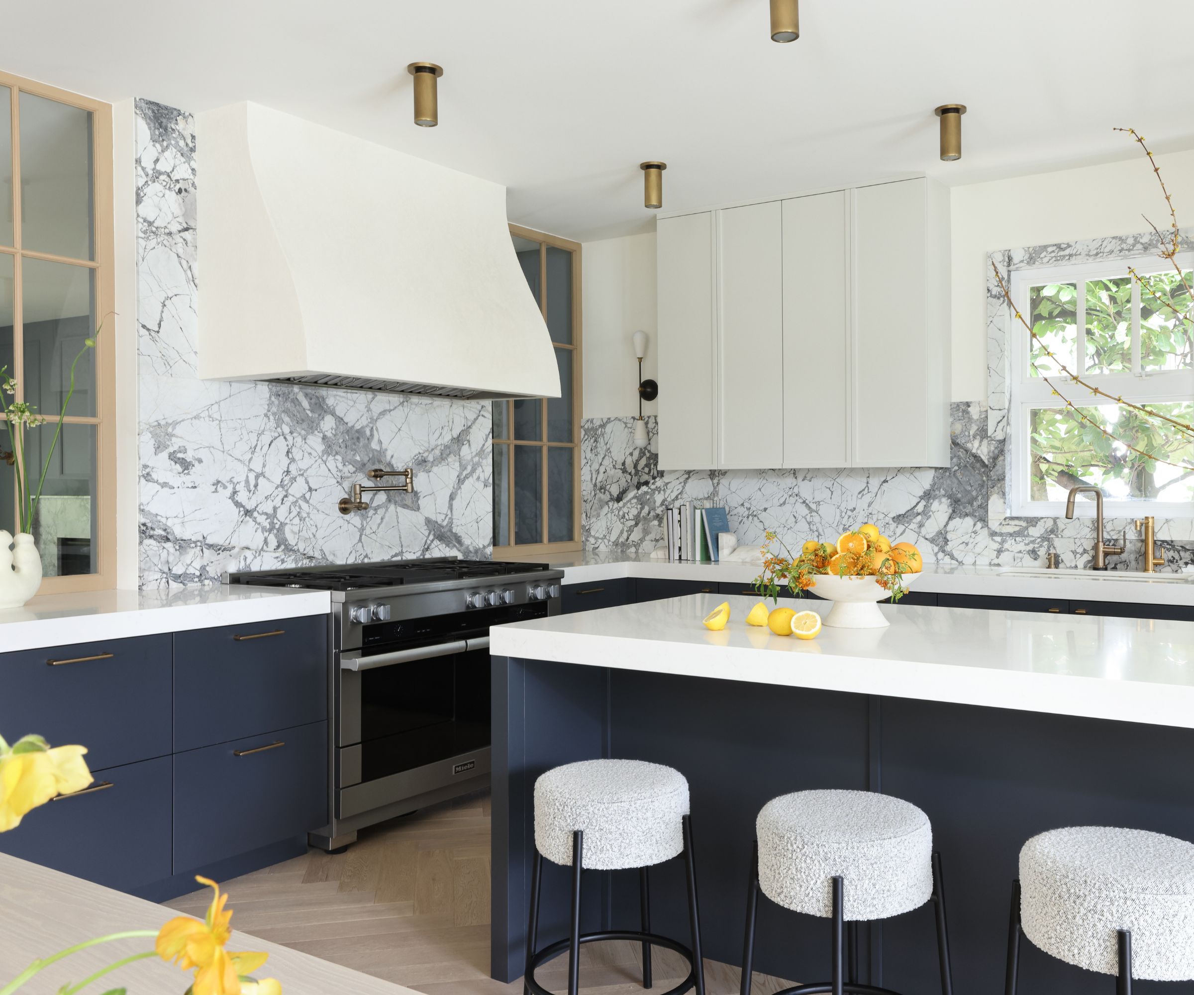
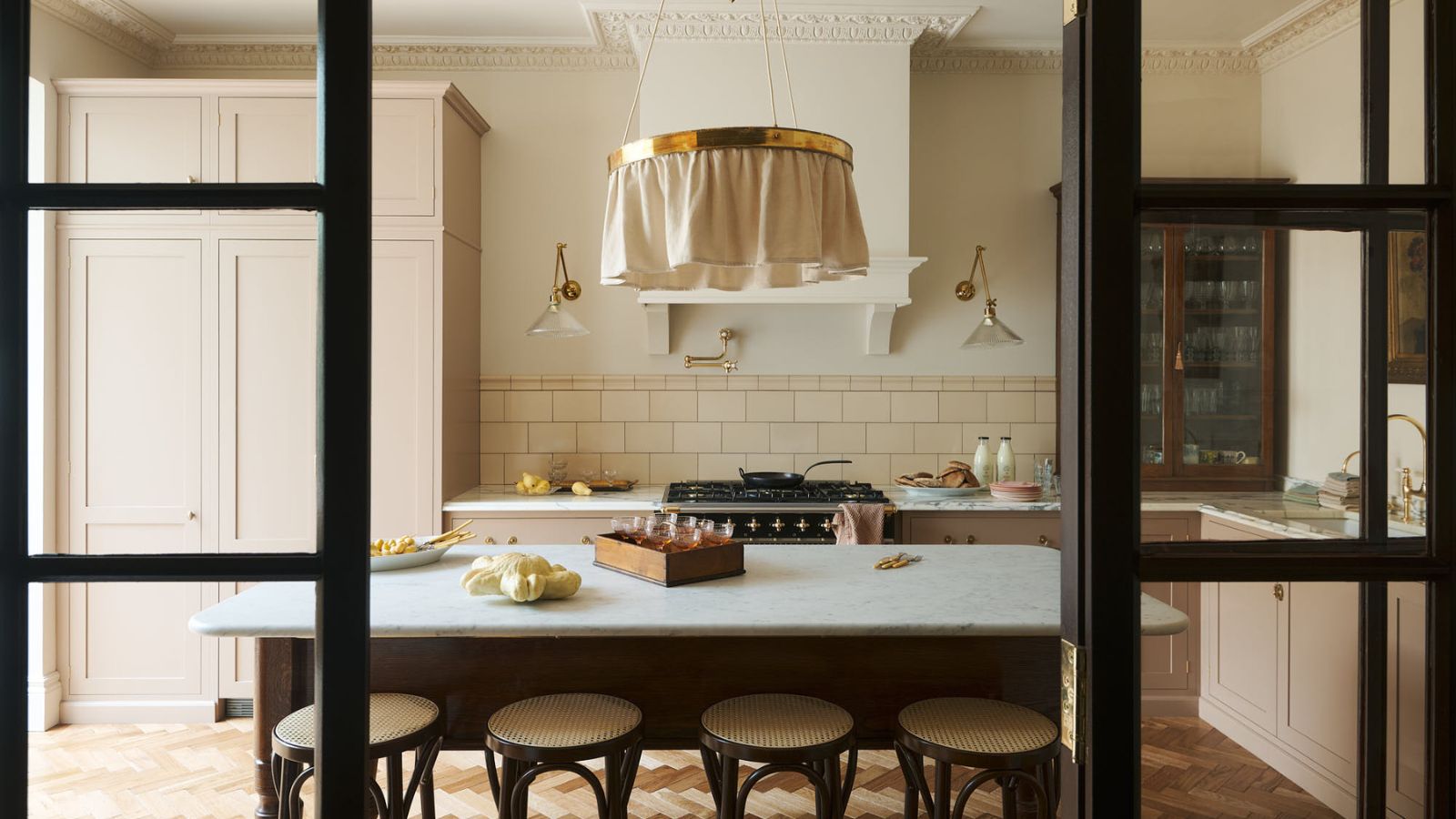
Kitchen ideas include a modern take on a Shaker cabinet with a ‘pencil-edge’ version for a cleaner look. 'The backsplash itself is a work of art,' adds Gillian, 'a piece of marble with deep veining in a leathered finish making it more forgiving for a family with two little kids.'
Gillian did not want an overhead pendant light to compete with the neighboring dining room chandelier and so opted for a flush-mounted option instead, for a clean look.
Key pieces include: Sconce, Apparatus Studio. Counters, Caesarstone; faucet, Brizo; sink, Kohler; stools, CB2; hardwood floors, Kentwood.
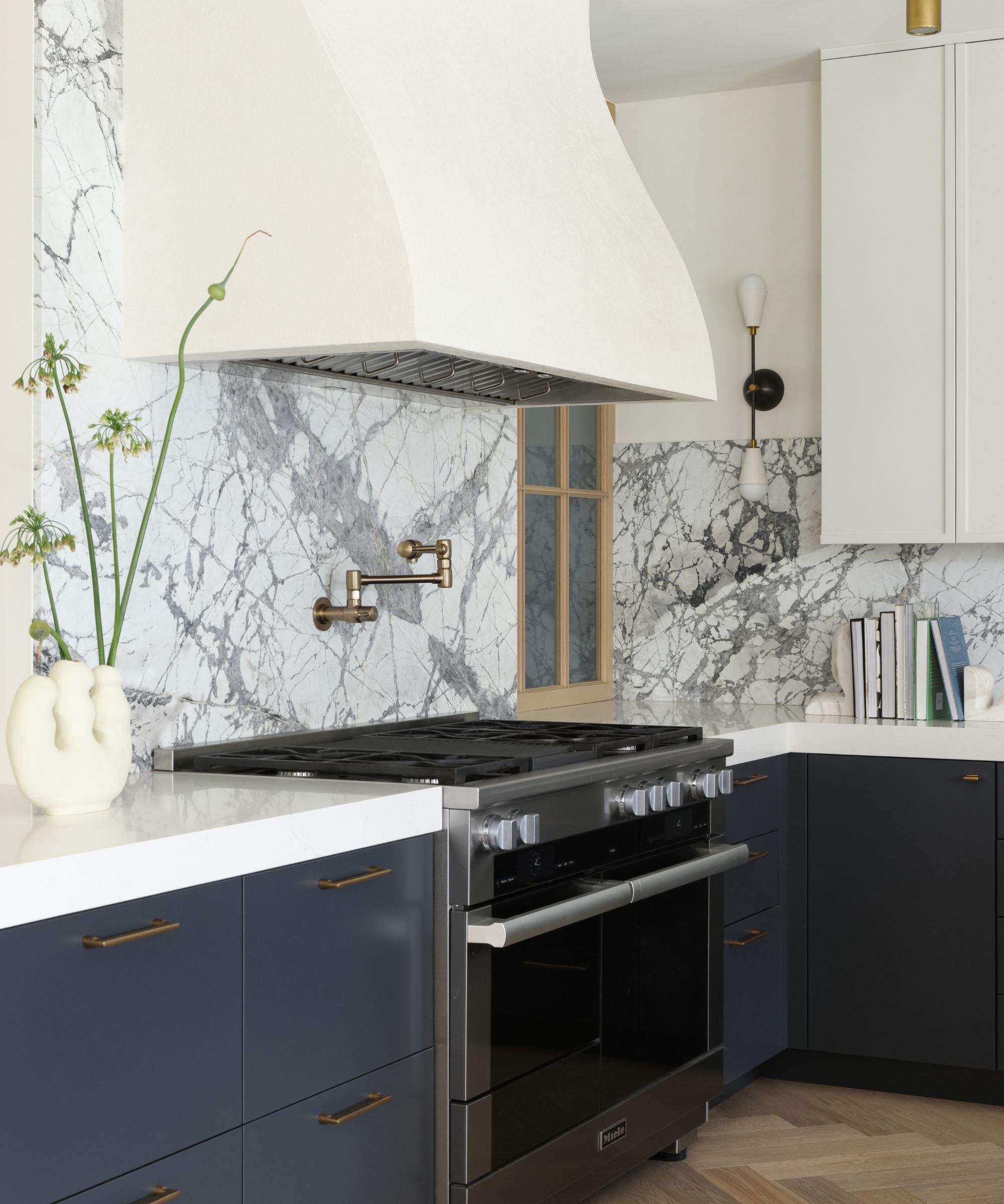
'This kitchen is the jewel of the project,' says designer Gillian, 'with European elements like a custom plaster finished hood paired with a traditional herringbone wood floor.'
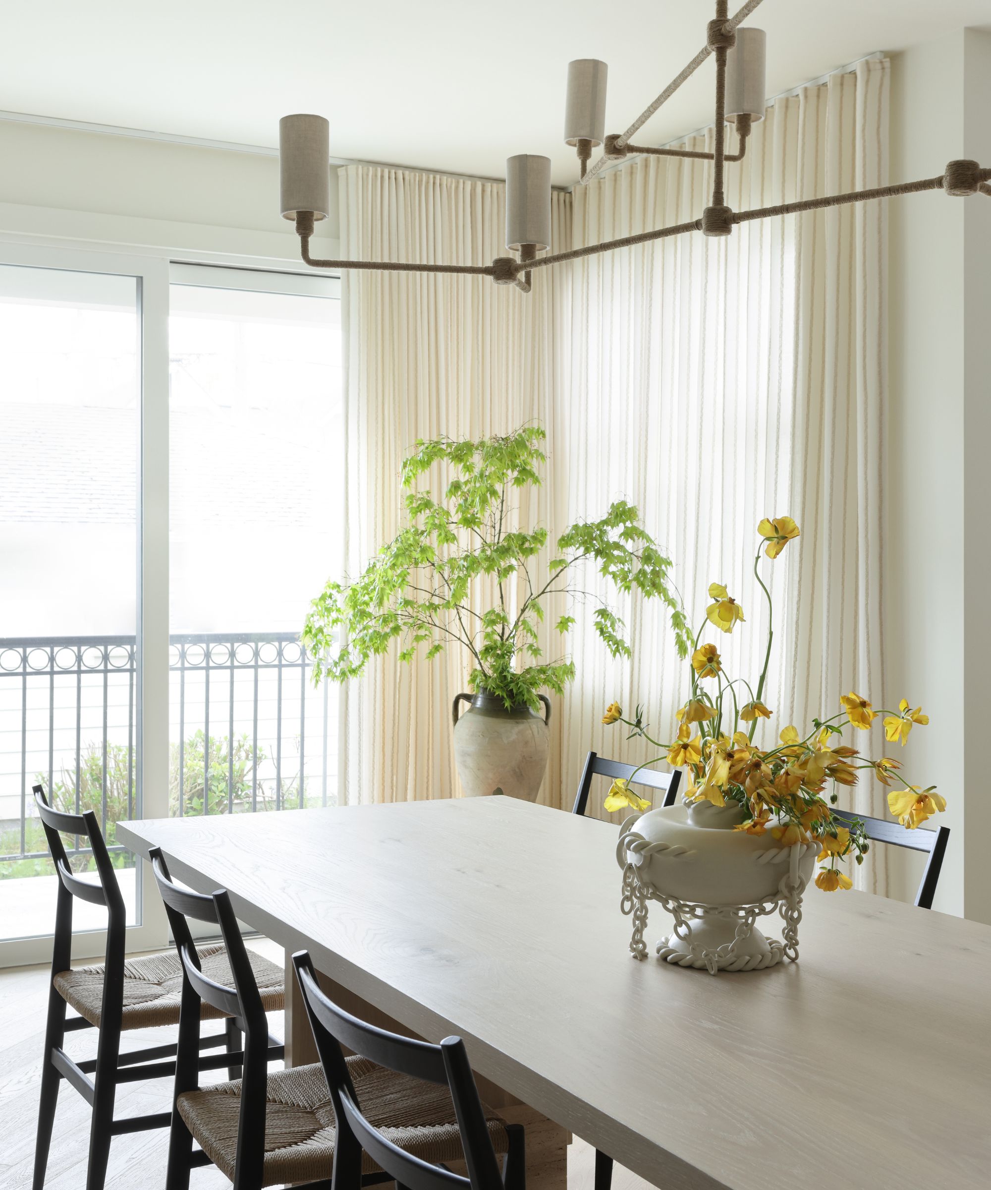
The formal dining room has stunning views, which pushed Gillian and her team to find the perfect light fixture that elevated the space but didn’t obscure the view through the windows. 'We chose a Bone Simple Design piece that is wrapped in rope for texture but an overall sculpturally simple design,' adds Gillian.
Other dining room ideas for this space, that's open plan to the kitchen on one side, include a pale wood dining table from Lock & Mortice paired with dining chairs from Inform Interiors.
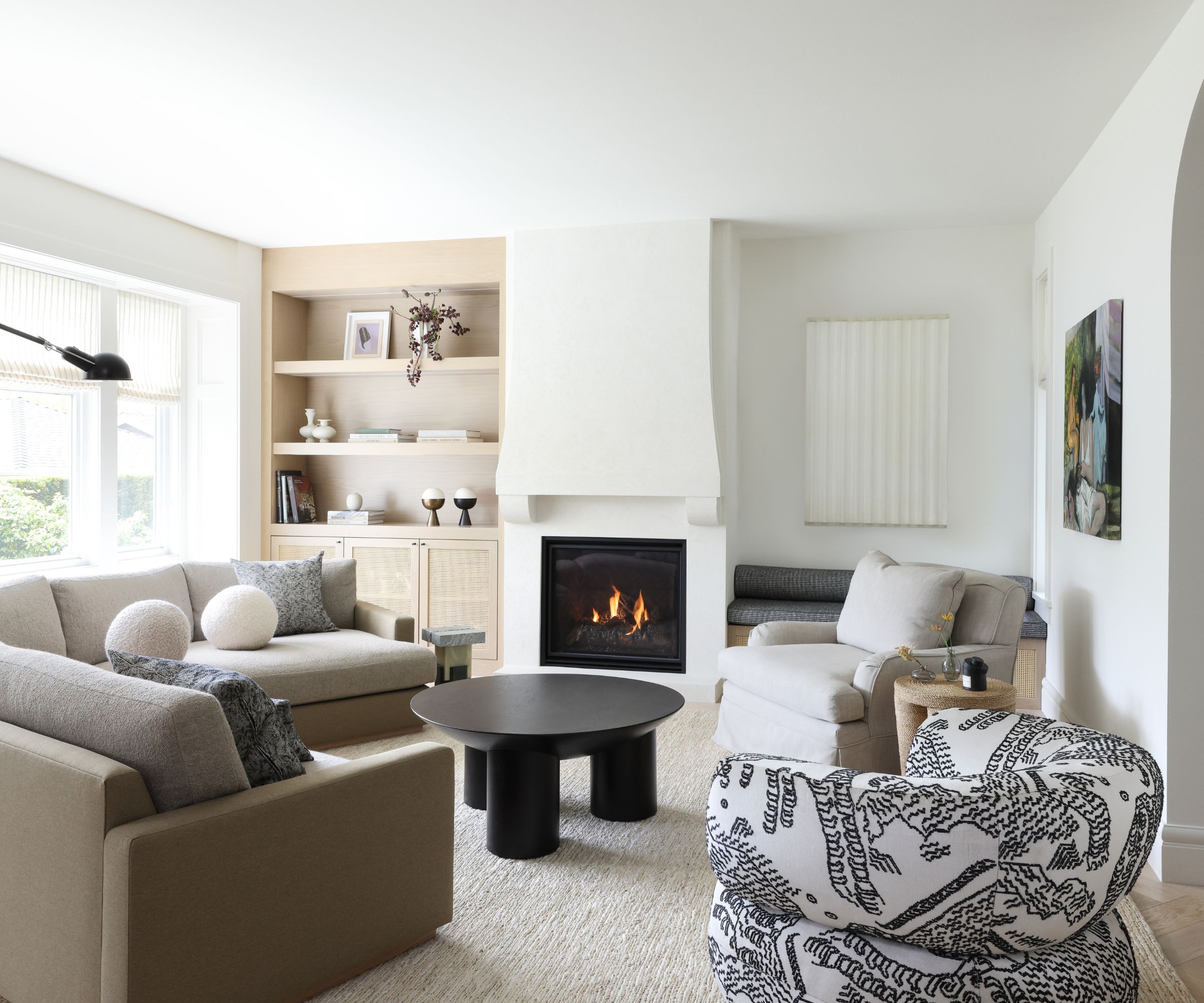
For the second living room, Gillian kept the color scheme minimal throughout, with shades of charcoal, taupes and steely blues for a cohesive and calming look. 'Pairing white walls with deep or cool colors and warm woods keeps the design fresh and bright,' the designer explains.
Key pieces include a sectional from Ffabb; coffee table from Crate & Barrel; and patterned upholstered chair from Moving Mountains.
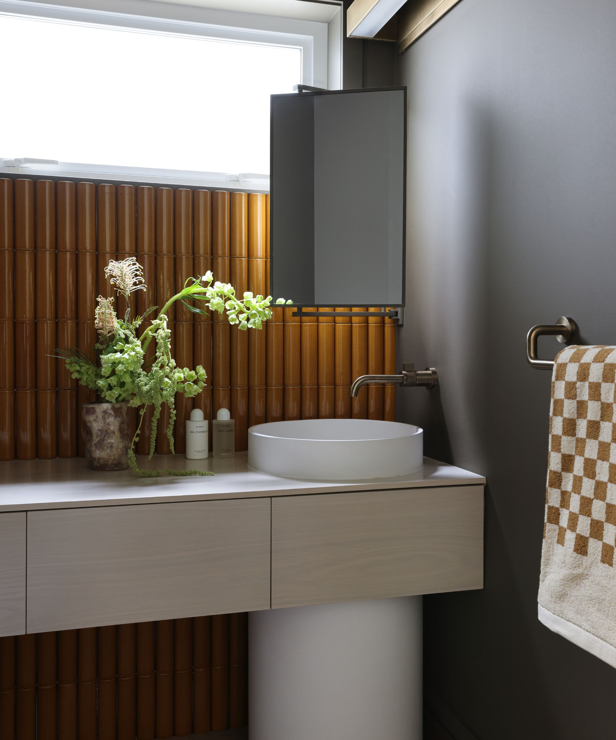
'I love to make a powerful design statement with a powder room,' says designer Gillian. 'The smaller square footage prevents bold choices from being too overwhelming.' Here, she chose a cognac-colored tile with a unique barrel edge to playfully mimic the curvature of the column sink.
Key pieces: mirror, DK Hardware Supply; tile by Kaufmann Keramik at Avenue Road; faucet, Brizo; sink, Blu Bathworks.
Interior design: Gillian Segal
Photographs: Ema Peter
Sign up to the Homes & Gardens newsletter
Design expertise in your inbox – from inspiring decorating ideas and beautiful celebrity homes to practical gardening advice and shopping round-ups.
Karen sources beautiful homes to feature on the Homes & Gardens website. She loves visiting historic houses in particular and working with photographers to capture all shapes and sizes of properties. Karen began her career as a sub-editor at Hi-Fi News and Record Review magazine. Her move to women’s magazines came soon after, in the shape of Living magazine, which covered cookery, fashion, beauty, homes and gardening. From Living Karen moved to Ideal Home magazine, where as deputy chief sub, then chief sub, she started to really take an interest in properties, architecture, interior design and gardening.
-
 Jeremiah Brent's new NYC-inspired rug collection has got to be the easiest way to bring his modern Manhattan style into your own home
Jeremiah Brent has teamed up with Loloi Rugs to create a contemporary collection of home furnishings inspired by his city
By Eleanor Richardson
-
 I tried this one easy dishwasher trick and made the annoying need for manual drying a thing of the past
If you hate those little pools of water left on your cups and crockery, this towel trick is for you
By Punteha van Terheyden