The worst home on the block became one of the best – natural colors were the key
This neglected home in an NYC suburb has been transformed with earthy colors and natural textures for instant curb appeal
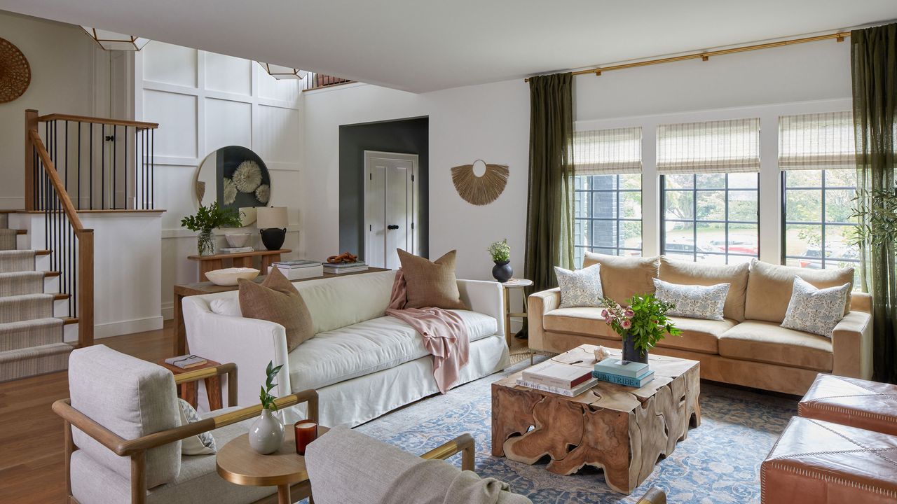
It's been quite some turnaround for this family home. Originally dubbed ‘the worst home on the best block’ of a prestigious NYC Suburb by the homeowners themselves, it is now truly one of the world's best homes.
Following a major redesign and reworking of the internal layout, the house is unrecognizable from the tired 1950s home the family bought early in 2020. They had real vision for the property, and knew that they would be able to take it down to the studs and rebuild their forever home with a little help from some interior design professionals.
Cue the Long Island-based Danielle Rose Design Co, whose founder and lead designer Danielle Chiprut was enlisted to help improve the functionality of the home. Danielle explains that the aim of the rebuild was to add the square footage needed for a growing family. 'We added a third floor to the home, allowing for a grand two-story entry, as well as three kids bedrooms, a bathroom and a loft space,' she says. 'We also added an addition off the kitchen, which included a powder room, mud room, laundry room and pantry.'

Interior designer Danielle Chiprut founded the Danielle Rose Design Co and worked with the owners on the rebuild of this NYC suburb home. Well known for her use of earthy colors, natural materials, and trademark bohemian style, she says she wanted to make sure that the home had soul, and a warm and welcoming feel. She describes the home's look as 'earthy modern eclectic'.
Living room
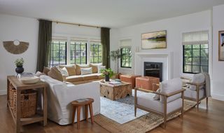
Living room ideas in the newly renovated home showcase the designer's – and the homeowners' – love of earthy colors and textures. White walls and sofas lift and lighten the scheme.
'This is my favorite room,' says designer Danielle. 'I love the layered texture, subtle print and rich color. The camel velvet sofa pairs so beautifully with the white linen sofa and brass accent chairs. The warmth and comfort we were able to create in this room was something we are very proud of.'
Key pieces include leather poufs by Jamie Young and a natural wood coffee table by Noir, with knots and texture which Danielle says 'grounds the room and gives it life.'
Kitchen
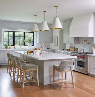
Anyone looking for kitchen ideas will find inspiration in this bright space, whether it's the huge pendant lights from Circa Lighting, the upholstered bar stools from Essentials for Living – which definitely don't compromise on comfort – or the mix of warm gray Shaker cabinetry and quartz countertops. A family-size range cooker and plaster range hood, plus brass hardware are additional design high notes.
Dining room
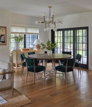
Speaking of the home as a whole, designer Danielle Chiprut says: 'The overall design was routed in lush textures, earthy tones, pops of brass and natural materials. We used a throughline of greens throughout the home to add interest and depth to the design.' Indeed, her dining room ideas incorporate green in one of her favorite furniture choices, the dining chairs by Four Hands. 'They are the perfect jewel-toned, emerald green and the worn velvet fit the earthiness of the space beautifully. We fell in love with the rich color and the vintage brass detail along the back of the chairs,' she says. The round table is from Arhous.
Family room
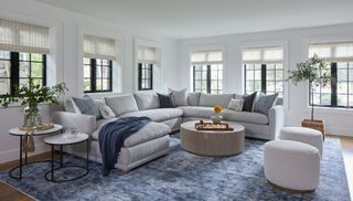
For this family of five, with three very young children, family room ideas were a key part of the plans for the home's renovation. It was important to create a space where everyone could relax.
'We created a custom sectional sofa using Robin Bruce’s Sylvie bench seat sectional and paired it with a gray crypton fabric,' says Danielle. 'We layered the room with blue tones and greenery. This room once was a dark and dingy basement-feeling room, and now feels like a light and bright space for entertaining or relaxing as a family.'
Mud room and laundry
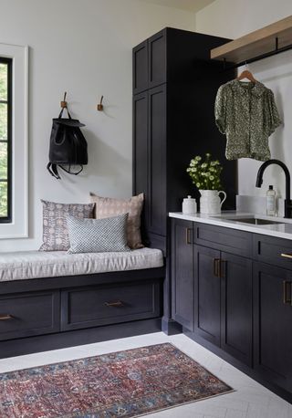
A new mud room and laundry area has been created at the back of the house, in an addition accessed through an archway in the kitchen. Laundry room ideas feature smart, stained black cabinets, which allowed the wood grain to show through, and a bench seat with a deep cushion with storage drawers below for outdoor clothing.
Front hallway
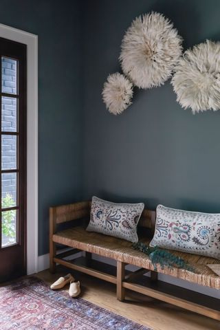
Double steel-framed doors at the front of the house, and a woven seat bench, ensure the entrance to the house is just as stylish and welcoming as its new interiors. One of Danielle's key hallway ideas was to 'create an intimate space when you first enter the home, giving guests a moment to settle in before moving into the expansive two story entry.' The walls and ceiling of the foyer are painted in an earthy green, ‘Intrigue’ by Benjamin Moore, a brass semi-flush mount light fixture, and juju hats, sourced from Cameroon, make an unusual and very tactile wall display.
Double-height entry
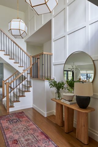
As visitors progress further into the two-story entry, a vintage, hand-knotted runner adds color and texture to the space. Key to the staircase ideas here is the paneled wall. Wainscoting adds an additional texture and interest, and gives a smart finish for a stairway. 'The two hanging lantern lights were sourced from Visual Comfort and were one of our favorite elements of the project,' adds designer Danielle. The console is from Anthropologie, the mirror from Four Hands.
Primary bedroom
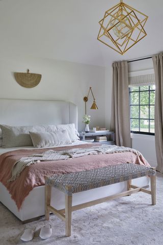
If you're searching for inspiration for bedroom ideas, take note of this calm space. 'We wanted to create a sanctuary for my clients, and to give them a serene retreat with a lush, yet grounded feel,' explains Danielle. 'We went with a plush area rug that brings out the mauves, grays and taupes used throughout the room. We added touches of brass throughout, most notably in the chandelier and sconces, both sourced from Visual Comfort. We would describe this room as soft and romantic.'
Guest room style
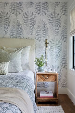
The soft, romantic look continues into the guest bedroom, which is papered in vintage palm printed wallpaper. 'We had fun layering prints and patterns in this guest suite,' says Danielle.
Baby's nursery
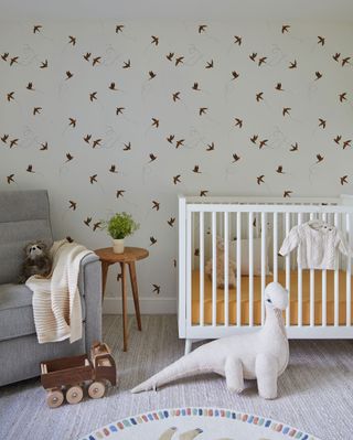
If you're in the market for nursery ideas, congratulations, and stop right here as there's plenty of inspiration for a fun baby's room in this appealing set-up. A sparrow print wallpaper by Rylee + Cru, a white spindle crib, a gray glider and handmade stuffed animals all help to set the scene. 'We wanted this room to feel whimsical and playful, while staying gender neutral, as our clients were not going to find out the gender of the baby before they were born,' explains Danielle.
Powder room prettiness
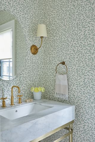
If it's powder room ideas you're after, why not steal a few from this smart space? A carrara marble vanity with a brass frame sets the luxury tone, with Sandberg's Karoline wallpaper design sounding a more eclectic and vintage note. The wall sconces are from Visual Comfort.
The outside view
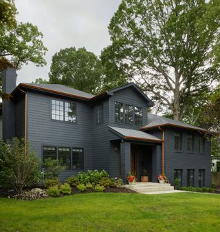
The home's smart contemporary exterior couldn't be more different from the crumbling exterior that designer Danielle saw on her first site visit.
'This home was truly the ‘worst home on the best block’. The the lawn was unkempt, and the shrubs were overgrown. It was an eye sore on a beautiful block. We wanted to breathe new life into the facade of this home and amp up the curb appeal,' she says. 'We wanted the home to feel modern and impactful, a real ‘wow’ as you drive down the tree lined street. We went with a dark black hardie board and painted the brick in a custom-match color. All of the window frames were black, inside and out. We added copper gutters and copper lighting for a dramatic contrast, and dark brown wood door for warmth.'
A true transformation, inside and out.
Designer: Danielle Rose Design Co
Architect: Hierarchy Architecture
Builder: Universal Services of Long Island
Photographer: Raquel Langworthy
Stylist: Deirdre King
Sign up to the Homes & Gardens newsletter
Design expertise in your inbox – from inspiring decorating ideas and beautiful celebrity homes to practical gardening advice and shopping round-ups.
Karen sources beautiful homes to feature on the Homes & Gardens website. She loves visiting historic houses in particular and working with photographers to capture all shapes and sizes of properties. Karen began her career as a sub-editor at Hi-Fi News and Record Review magazine. Her move to women’s magazines came soon after, in the shape of Living magazine, which covered cookery, fashion, beauty, homes and gardening. From Living Karen moved to Ideal Home magazine, where as deputy chief sub, then chief sub, she started to really take an interest in properties, architecture, interior design and gardening.
-
 Walton Goggins' magical 'snug room' is one of the coziest spaces I've ever seen – it might be spring, but I am dreaming of the holiday season
Beautiful materials, natural finishes, and pared-back design – The White Lotus stars' home takes a warm, cozy, and calm turn
By Jennifer Ebert Published
-
 This is the one place in the home you should never steam clean – and what to do instead
Steam cleaning hardwood could ruin your natural, beautiful flooring
By Dan Fauzi Published